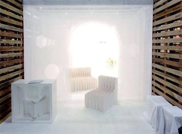
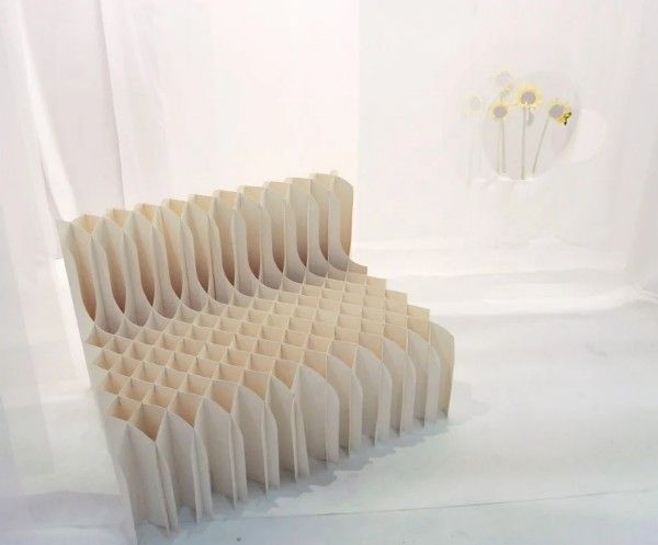
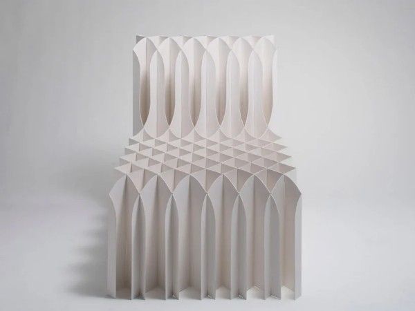
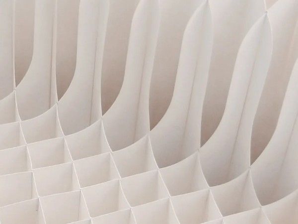
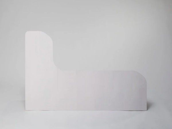
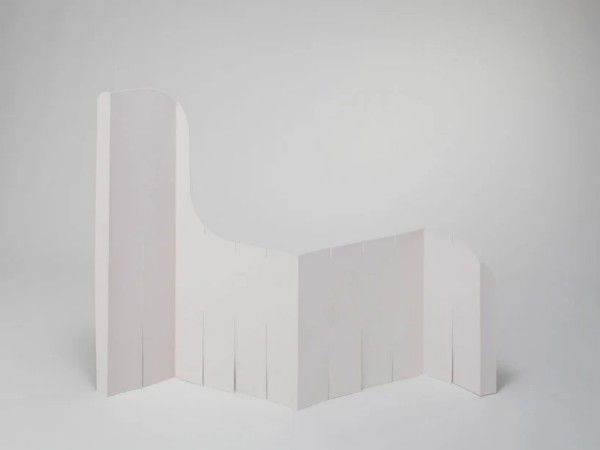
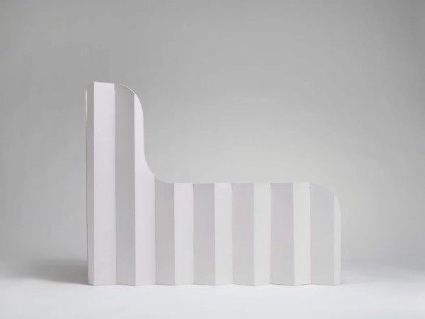
What is structural? Does structure imply mass? If it does, then Mist, the Singapore Furniture Design Week 2012 exhibit by Koji Sekita Design seems to disagree. Constructed of woven paper and existing in a world of thin, translucent fabric, it is a graceful interpretation of the slotted-together forms, which I am sure show up at least once in every architecture school. The subtle difference that seems to make the chairs exceptional is the ‘fluid skew’ of the gridding. Rather than straight out from backrest to seat, the paper wafers are turned and fitted at 45 degrees to the main axis. This draws the eye across and over the form rather than letting it stagnate at a flat, straight line.
© Koji Sekita Design
From the Designer;
Booth design of “SINGAPORE FURNITURE DESIGN WEEK2012”.
Set up lace curtains at even intervals to the depth direction.
Area of the exhibits is opened in the curtains.
This opened area become bigger and smaller at regular intervals toward the depth.
The outline of curtain’s opened area is blurred with this technique, and the outline of the exhibits stand out.
It looks like the exhibits are in the mist.
Display to attempt to give its new “values” by accumulating a mass of one “thing”

