MoAE – Huamao Museum of Art Education
Text by Álvaro Siza – A Convivial Relationship
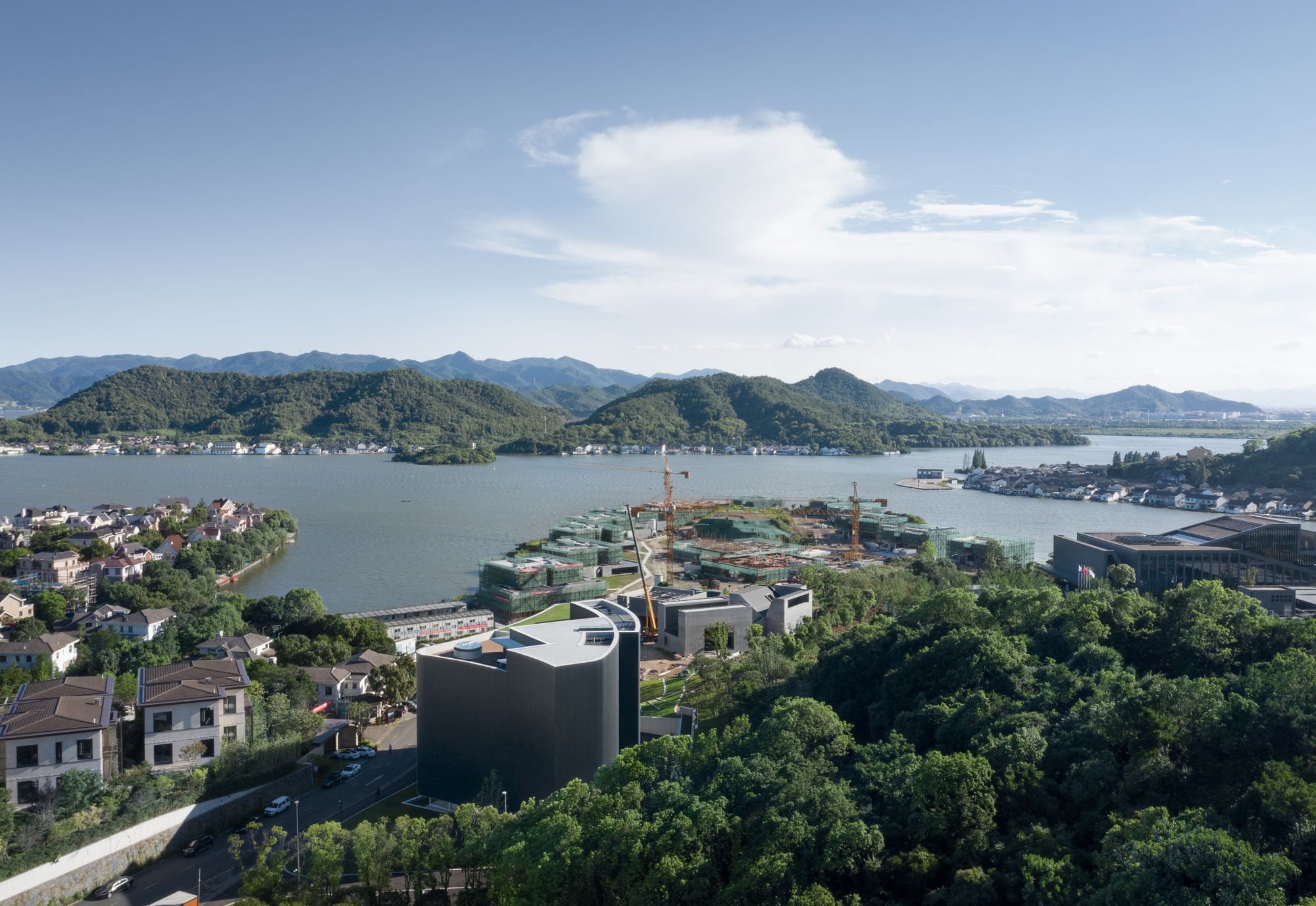
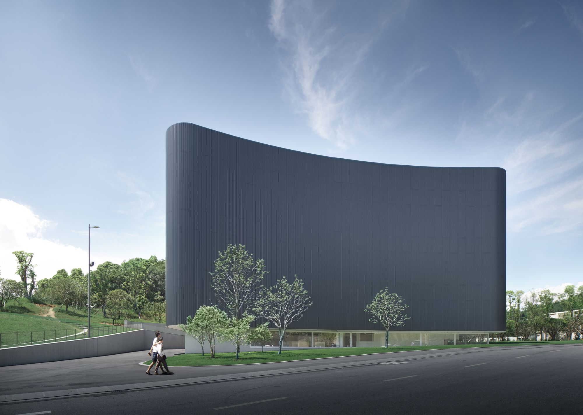
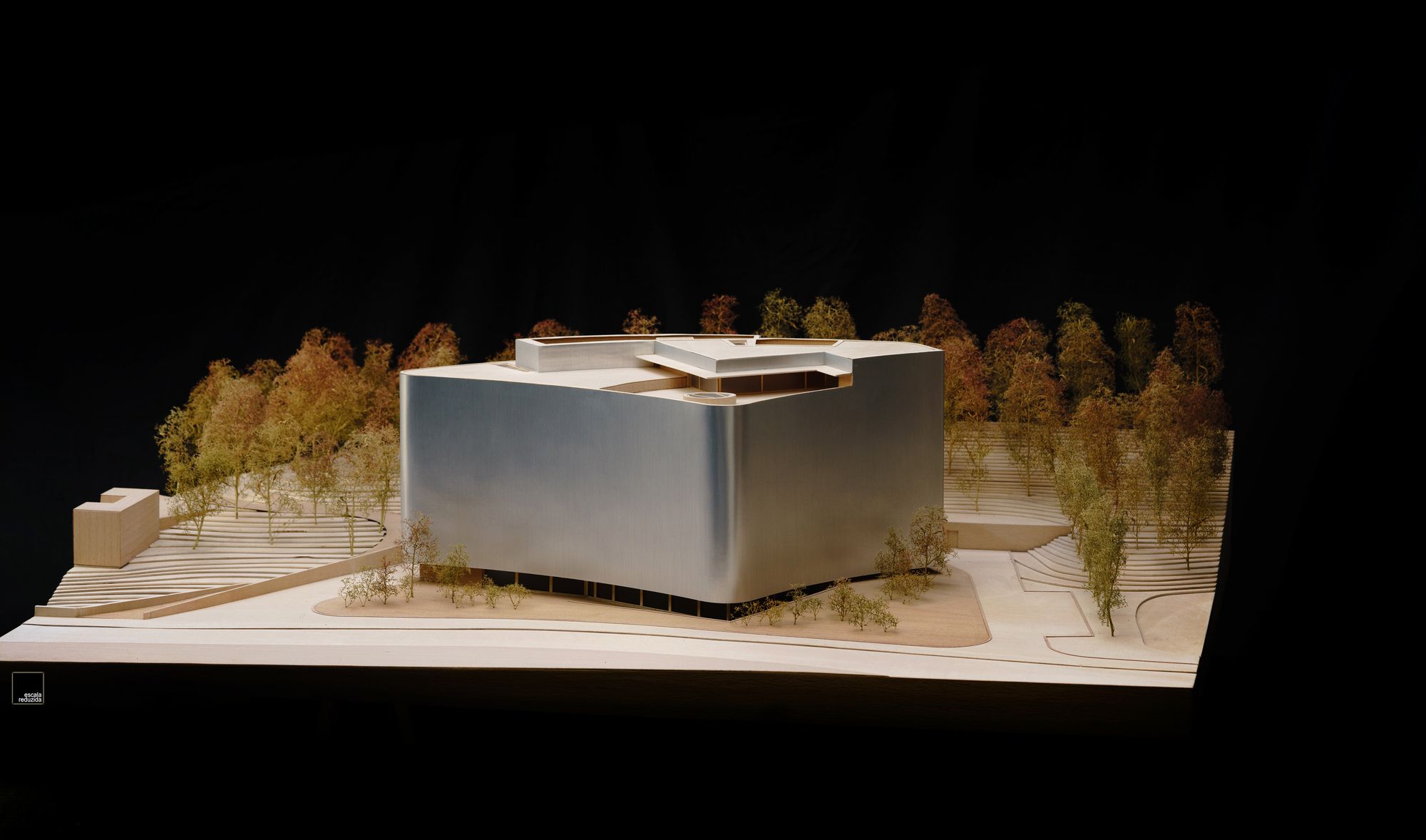
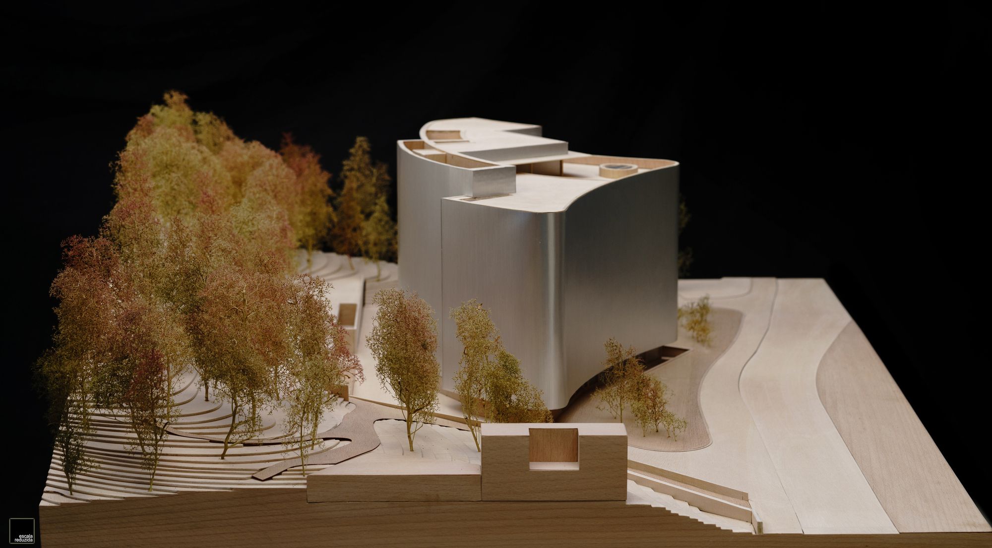
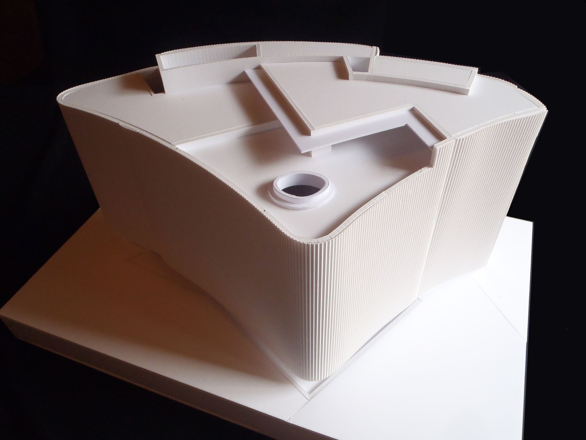
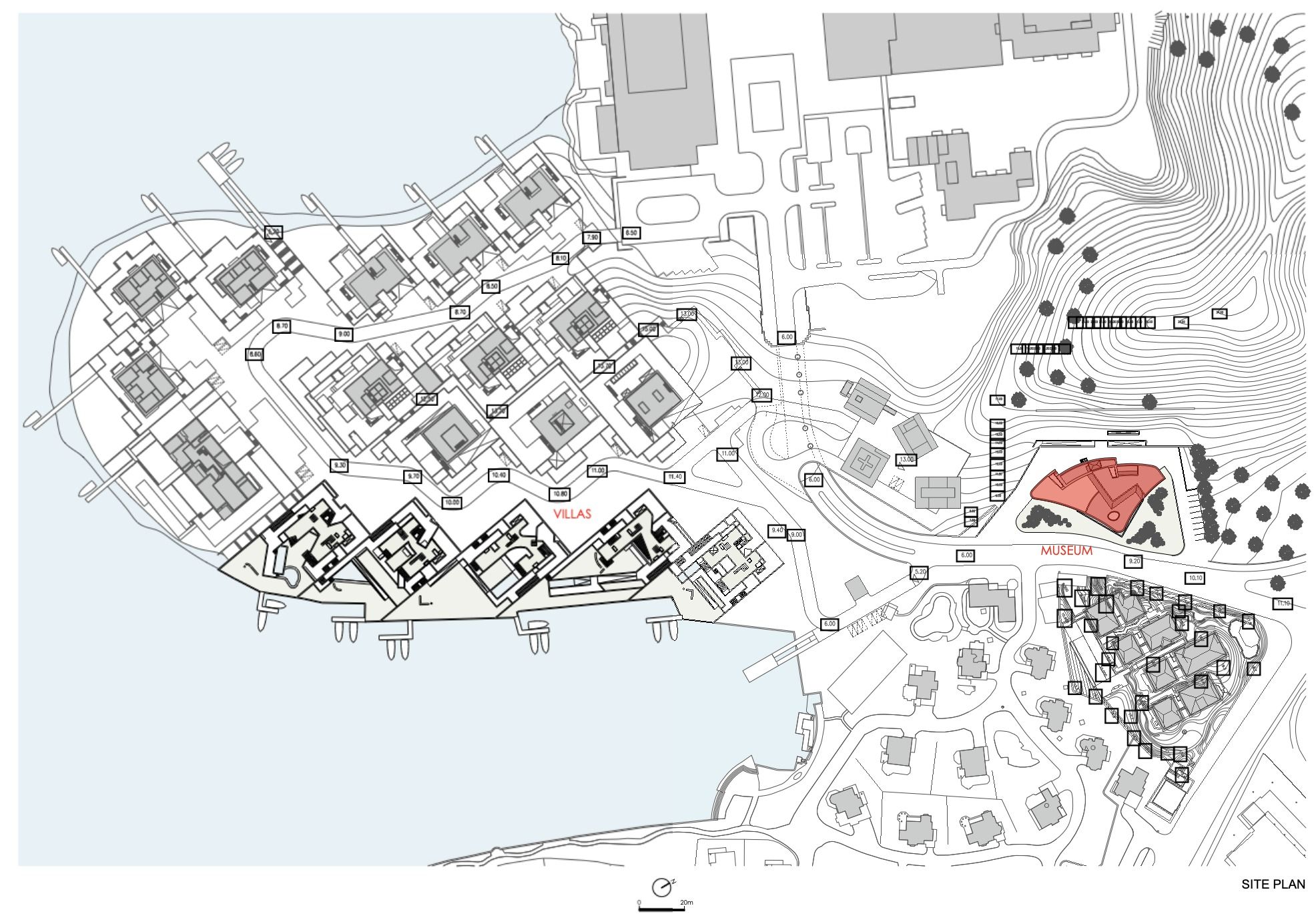
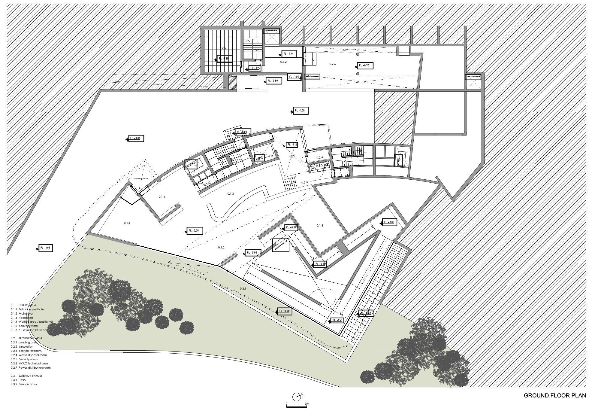
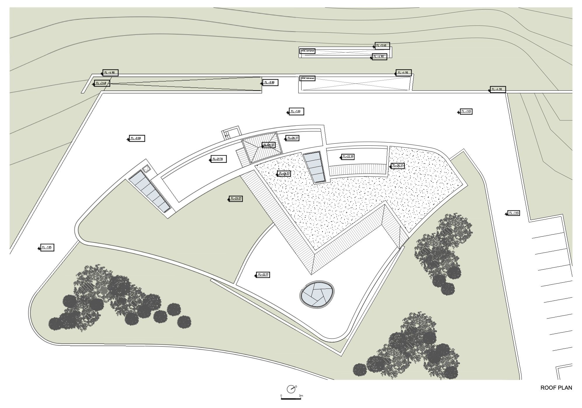
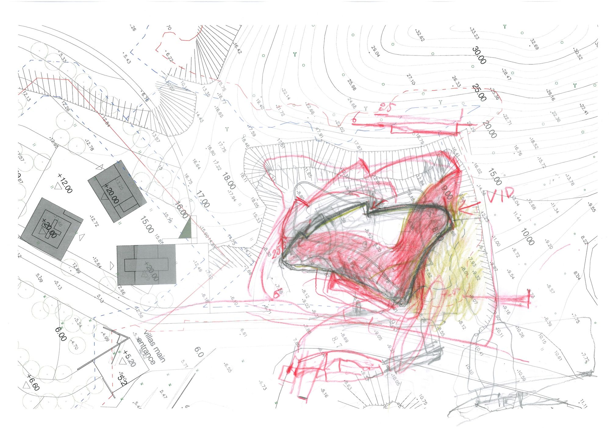
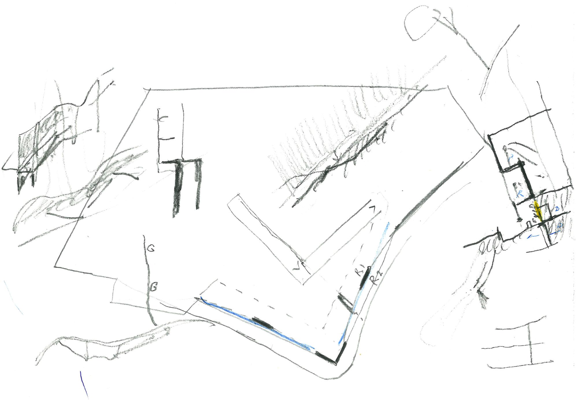
1.The Museum of Art Education of Ningbo occupies a site located along the North shore of Lake Donqian. Its plan has a triangular form, delineated by continuous walls, with slightly curved rather than angled corners.
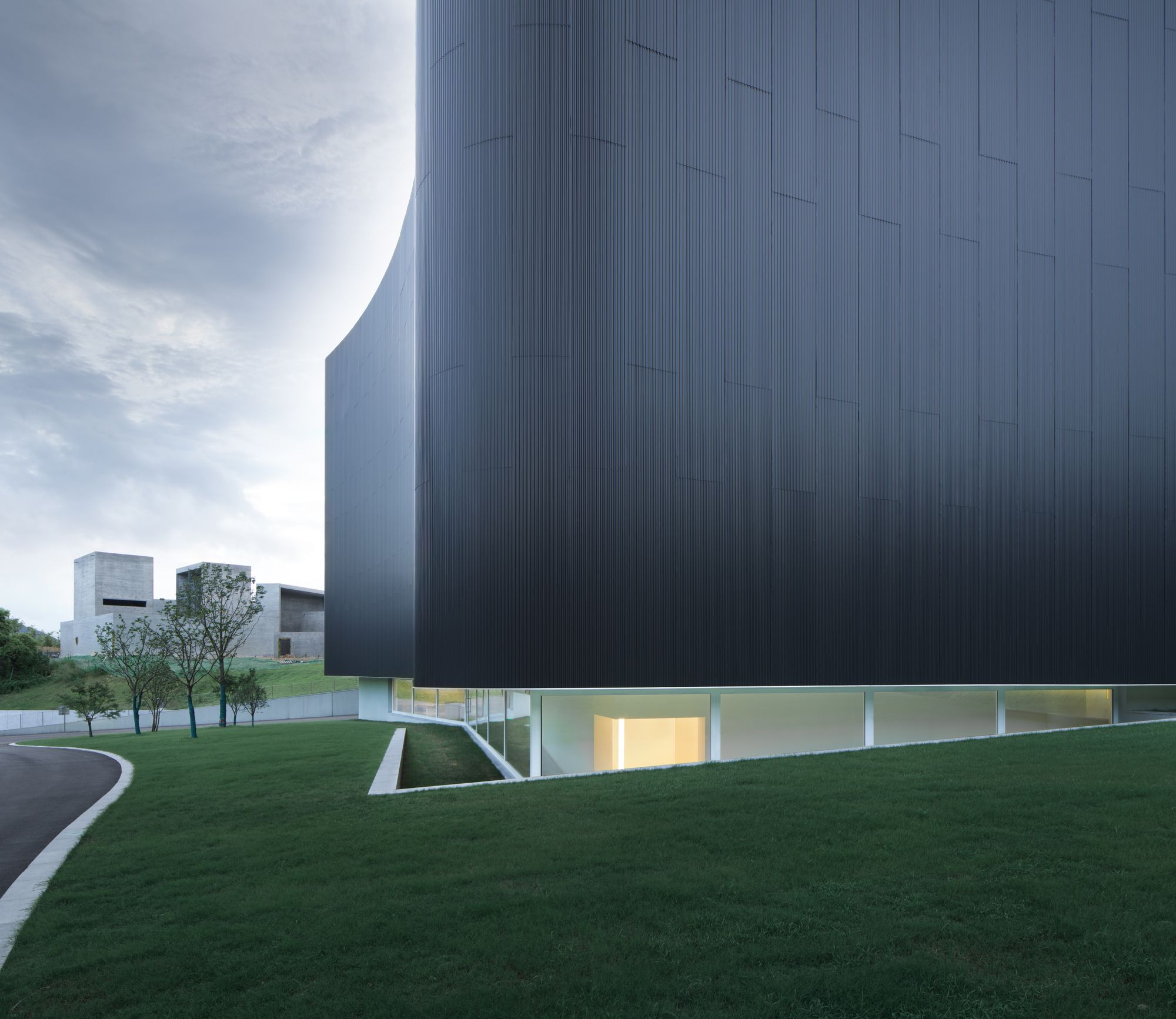
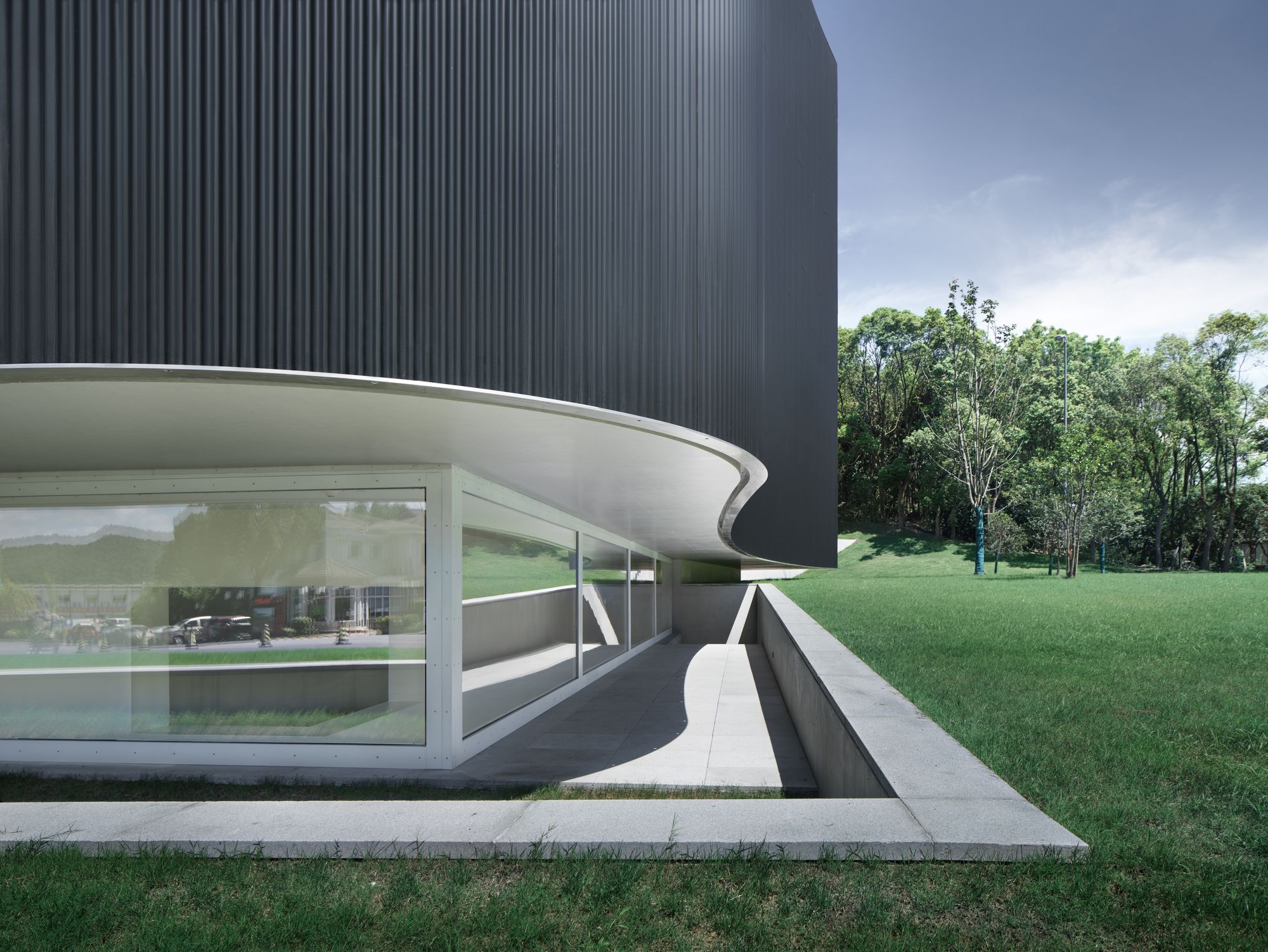
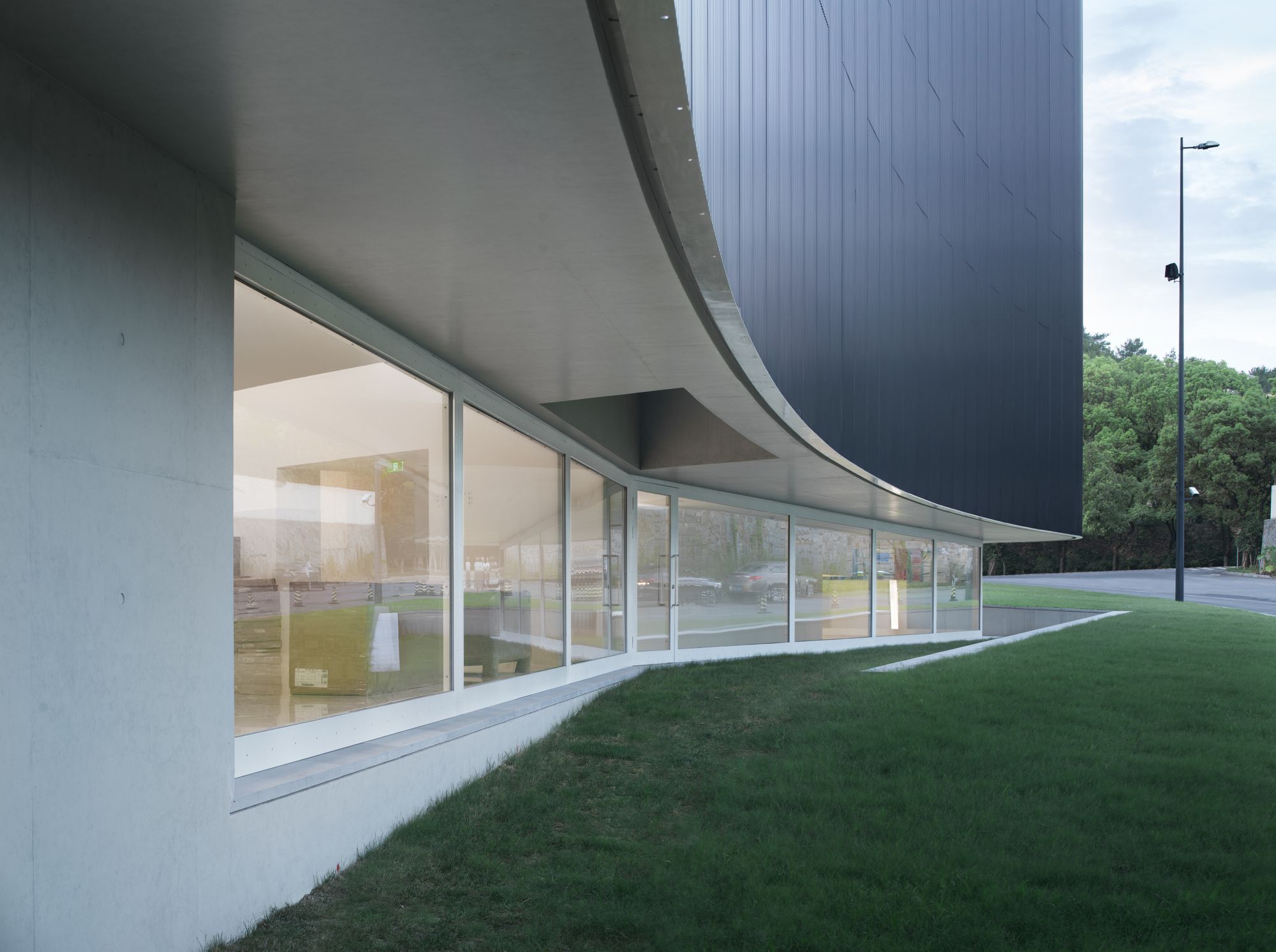
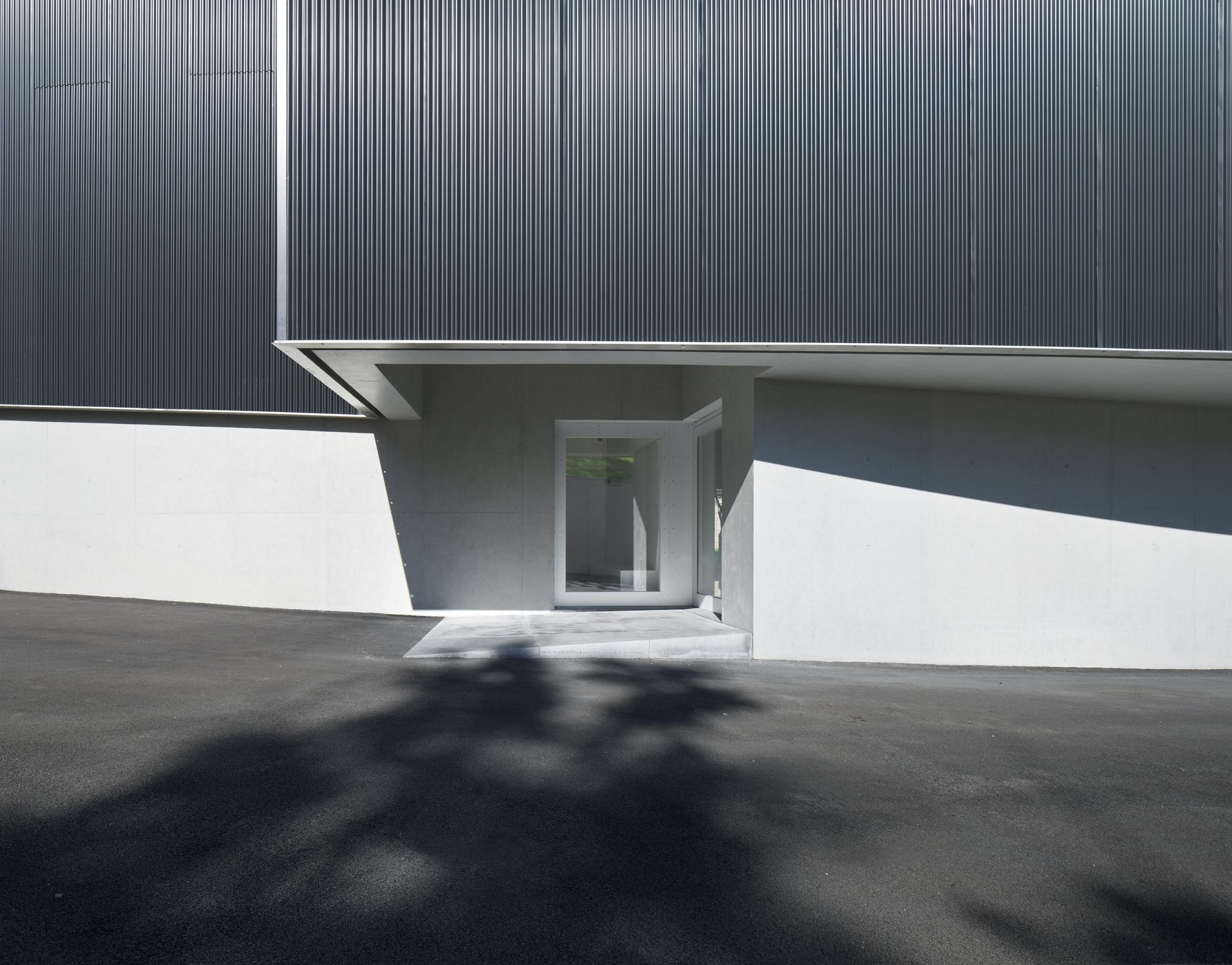
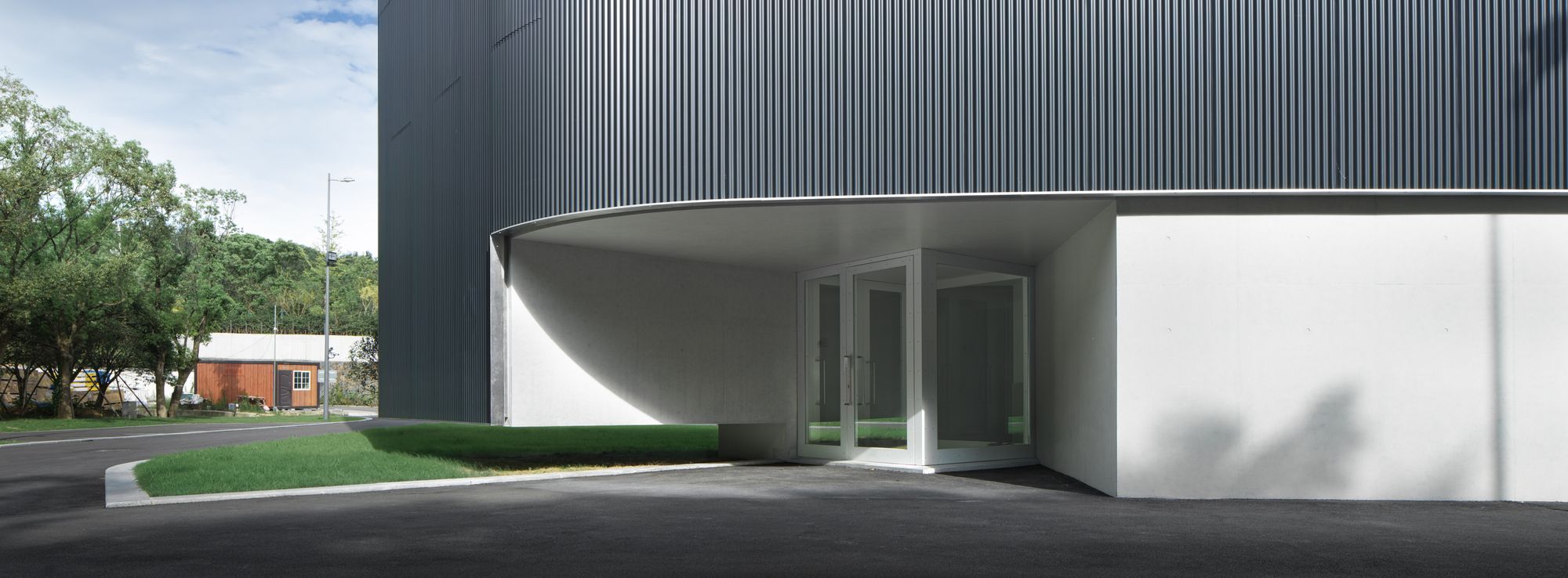
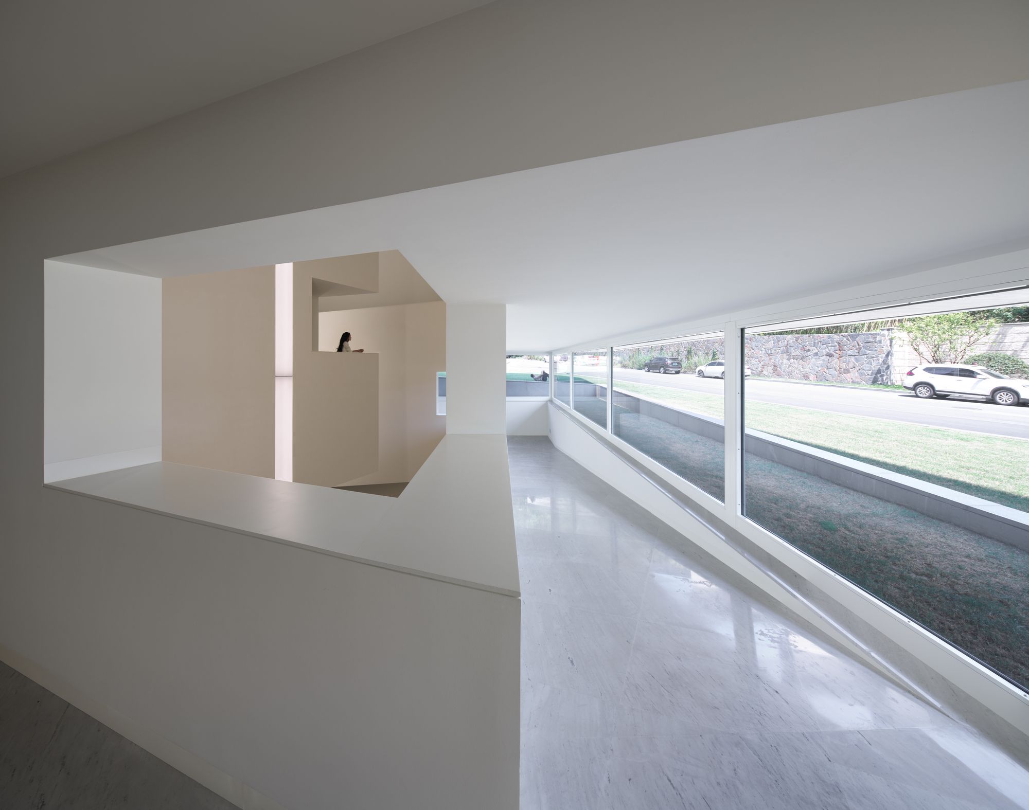
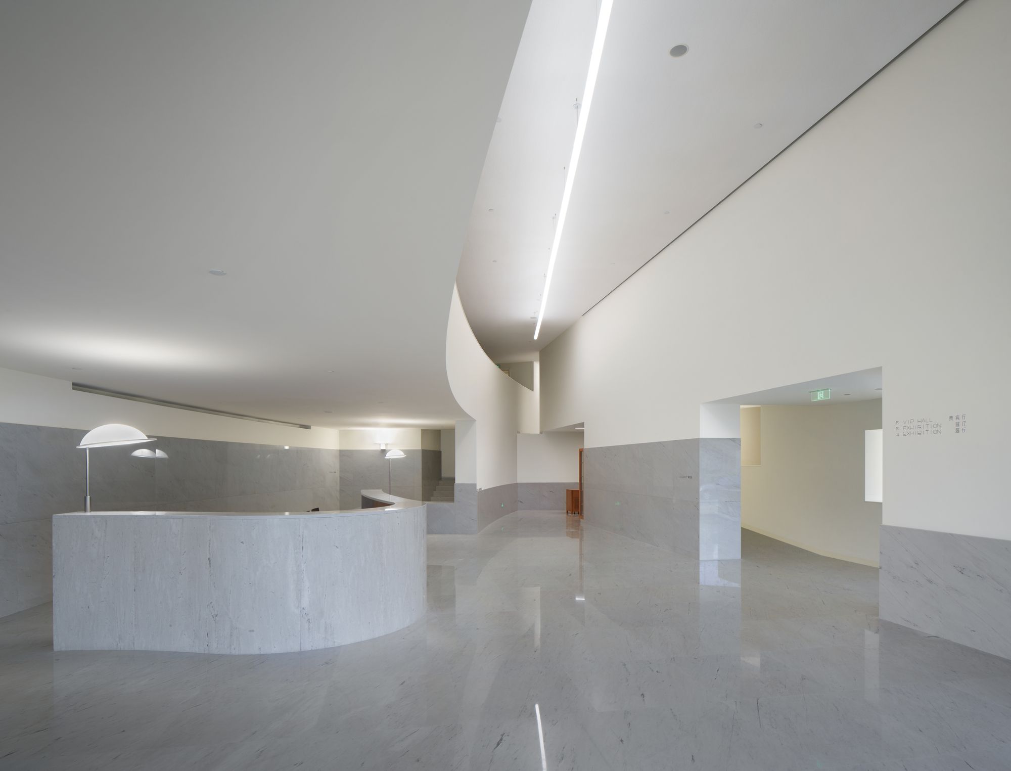
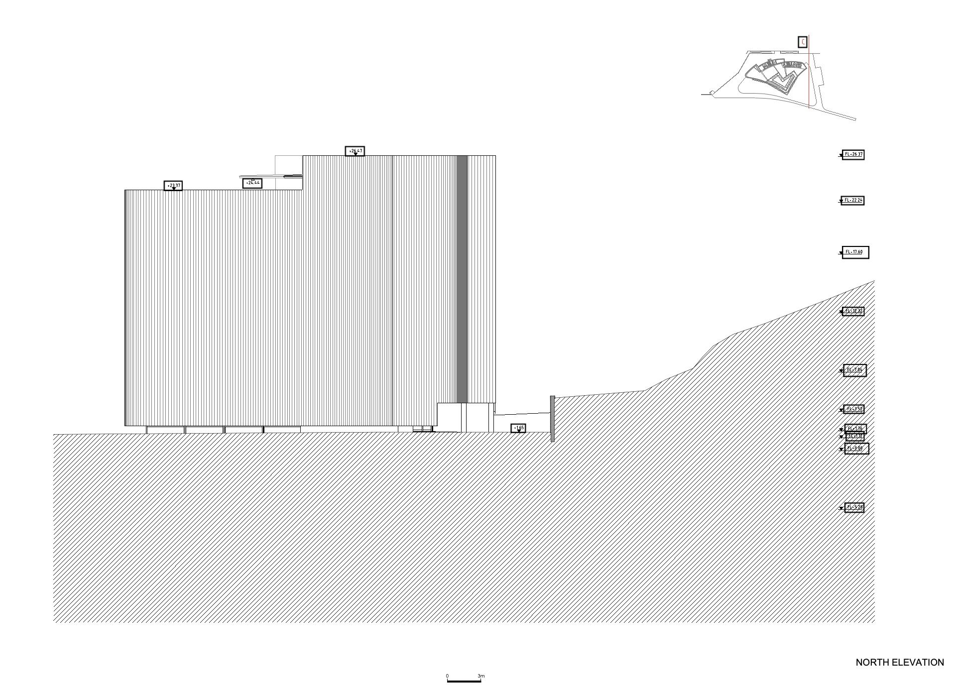
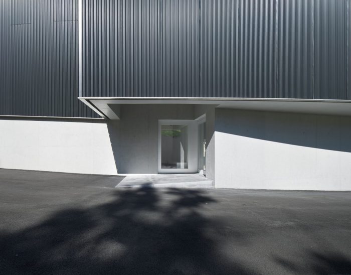
On the ground floor, the volume of the museum emerges isolated and bordered on its three sides by planted or paved areas. Public and service access to this level – which is designated P0 – together with access to the VIP area, are located on the Northwest facade, in the gap between the museum and the hillside. This space extends, wrapping around the museum and connecting with the access road.
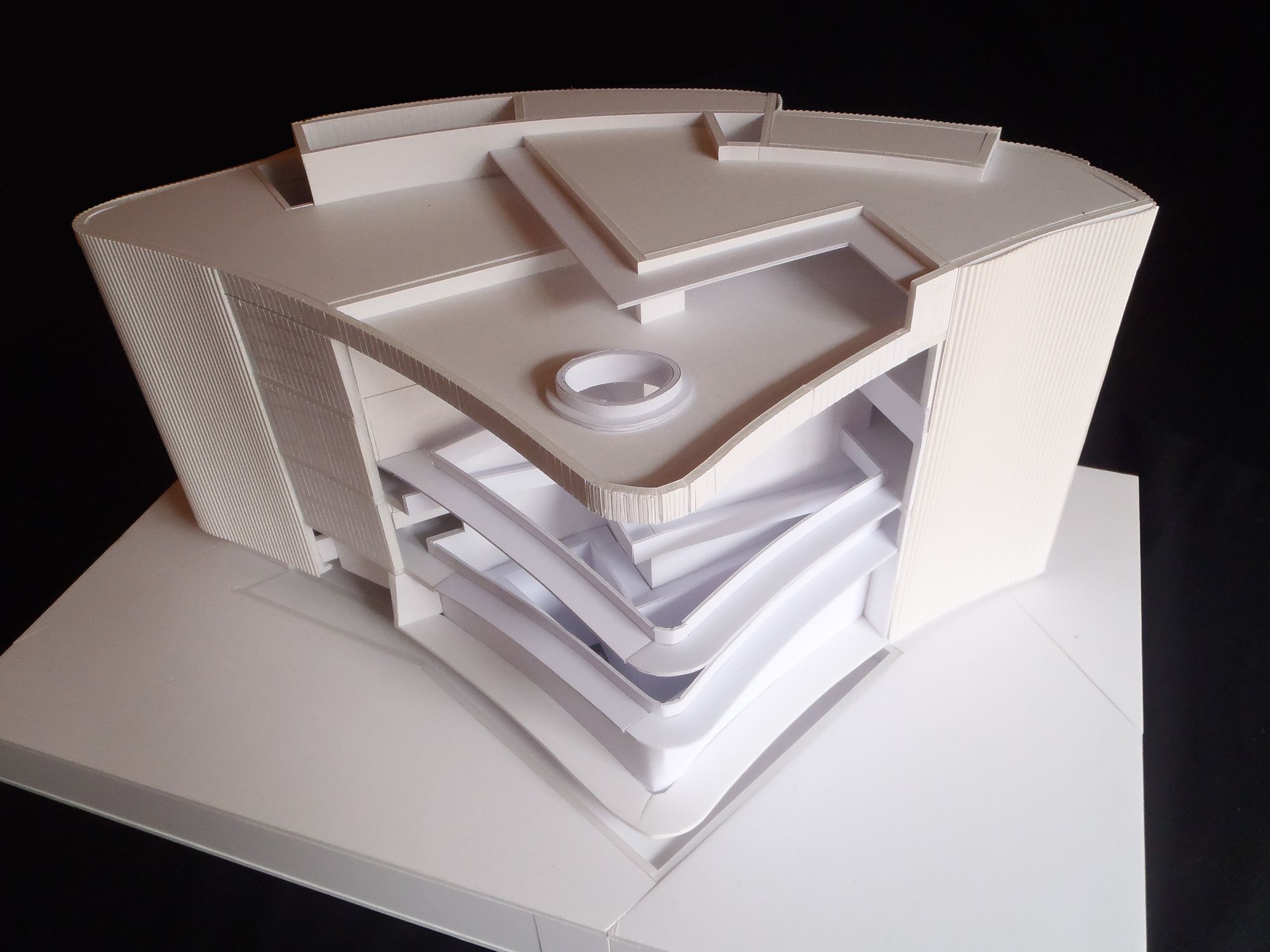
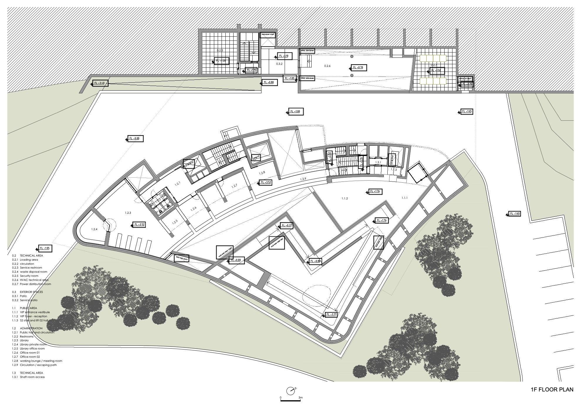
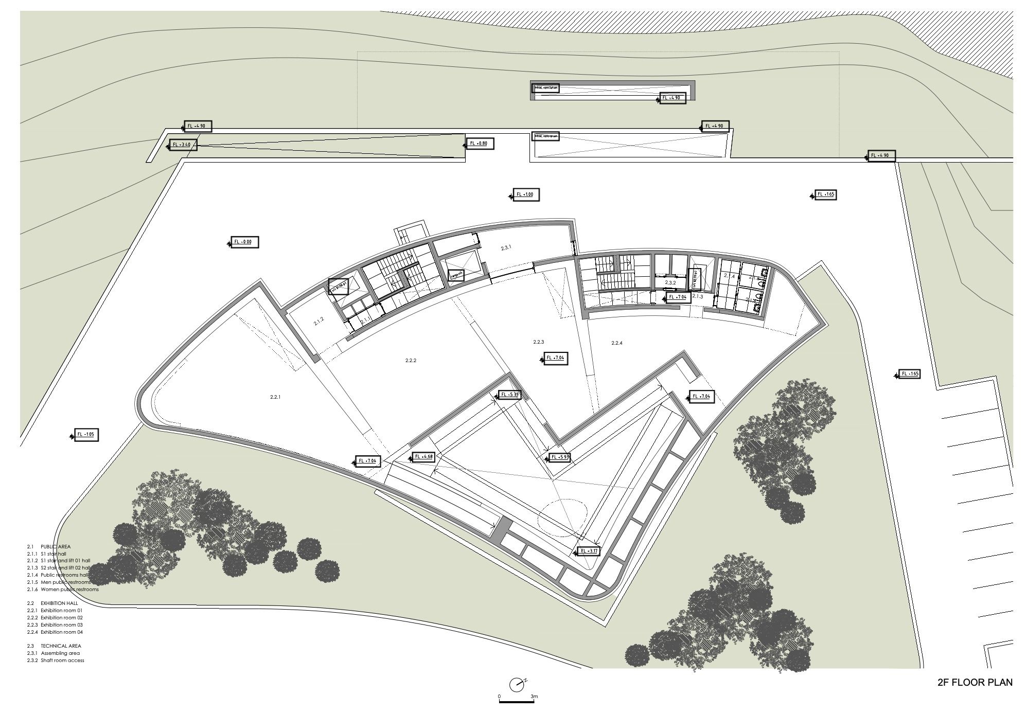
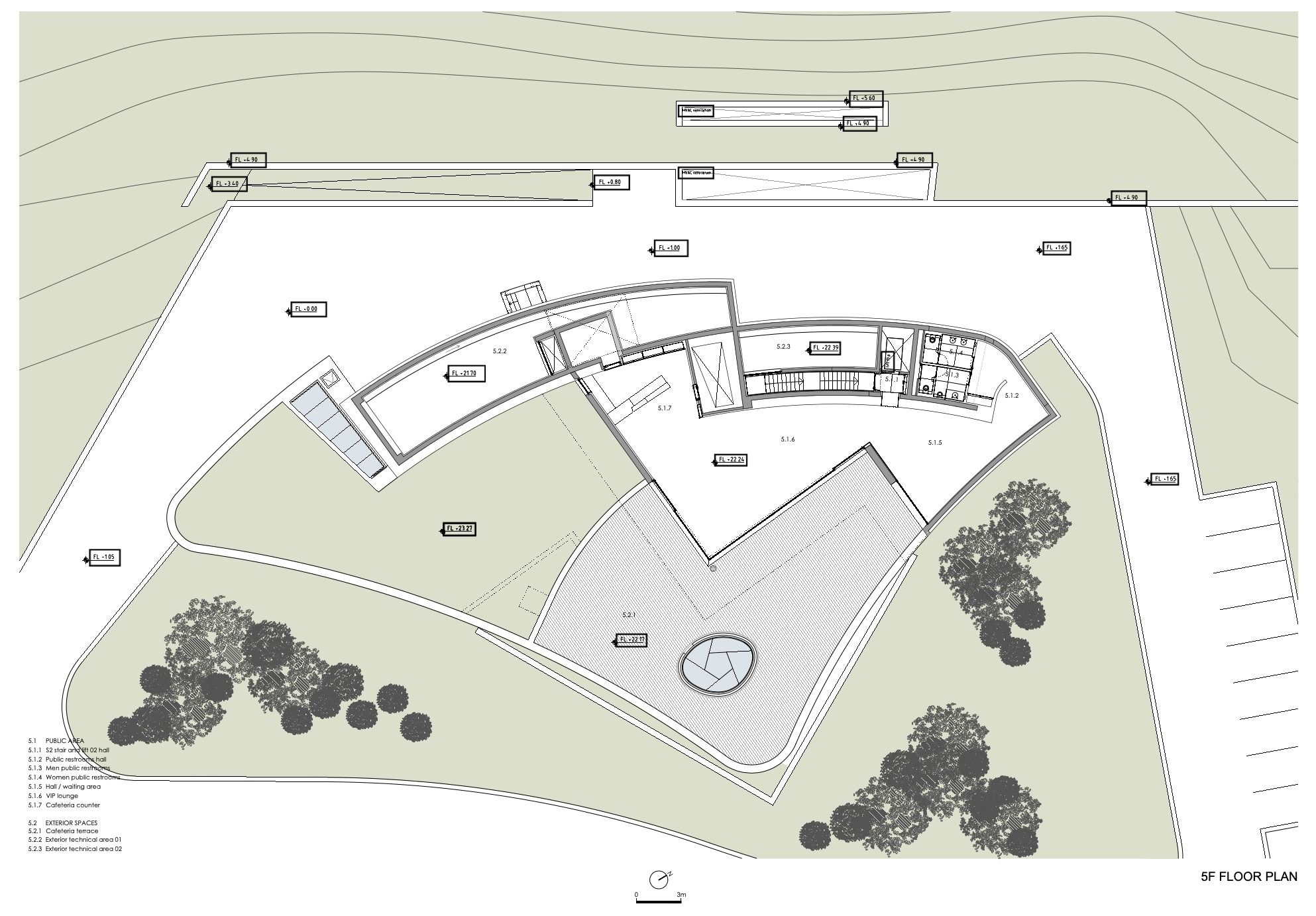
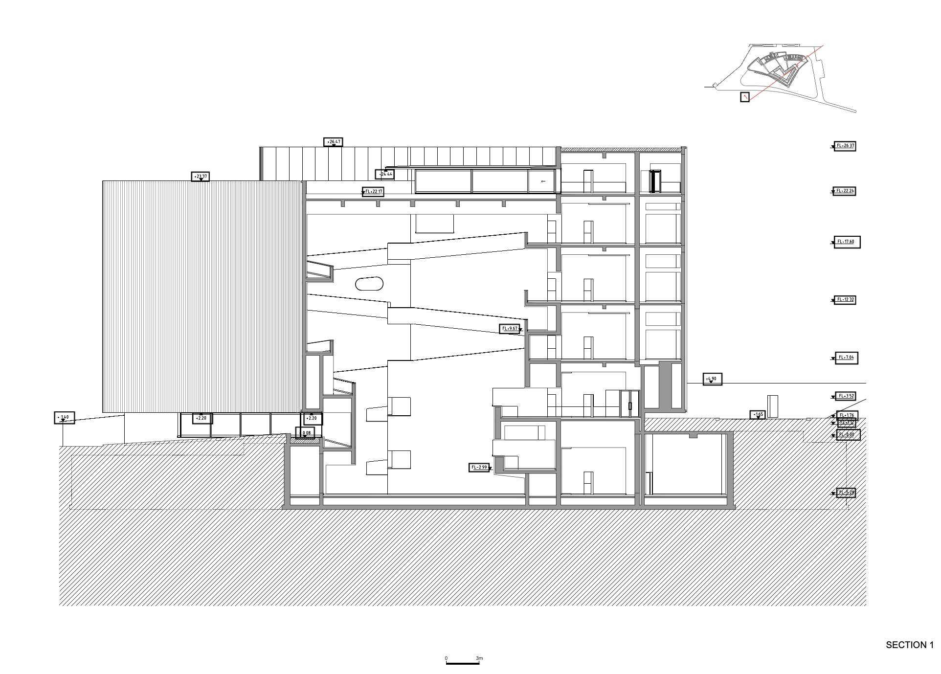
2. Generally, on all floors, the internal spaces in a strip to the Northwest, are occupied by atriums, lifts, stairwells, services and toilets. A second strip is occupied by spaces of larger dimensions: foyer, library, administration and exhibition rooms.
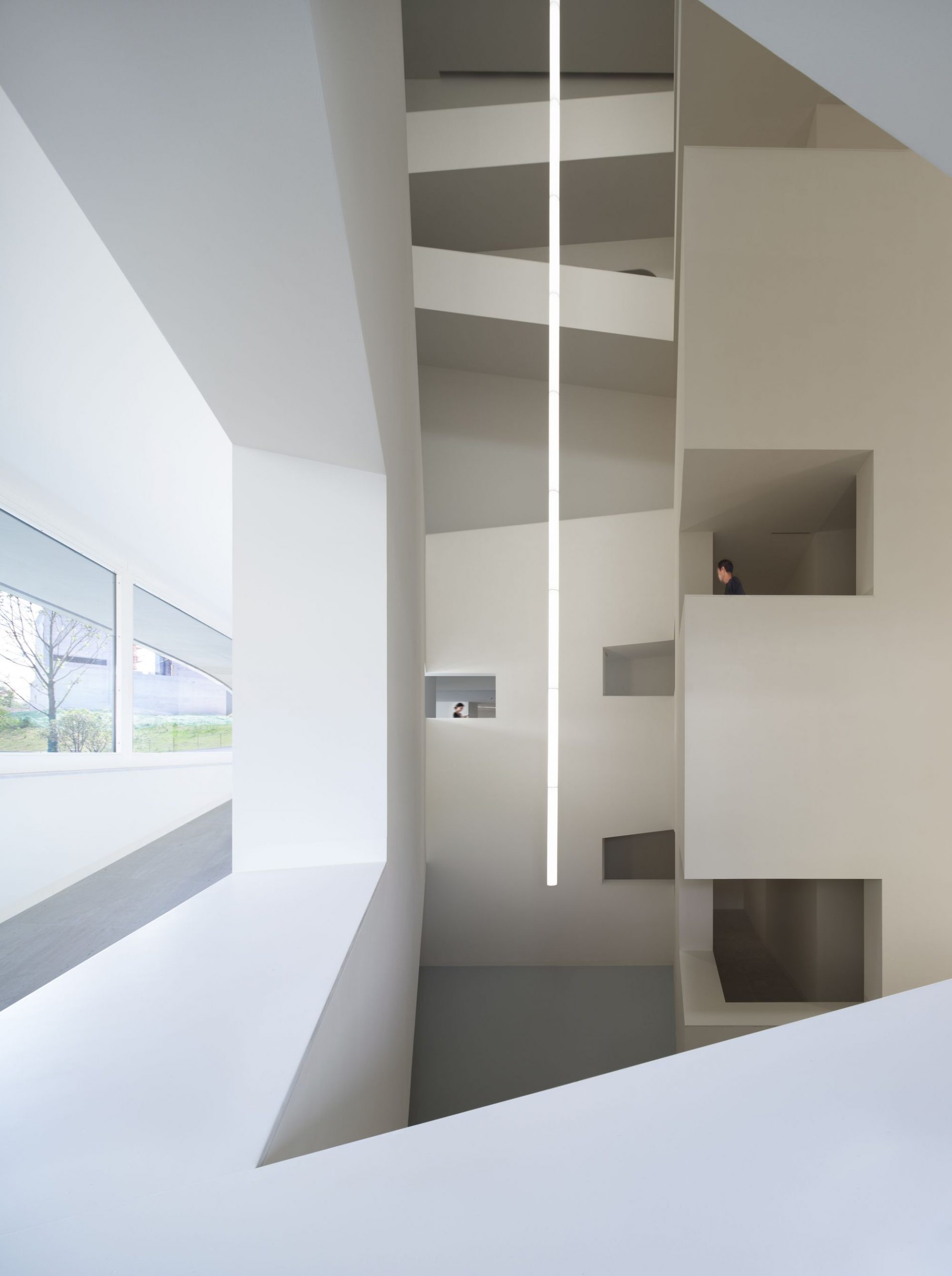
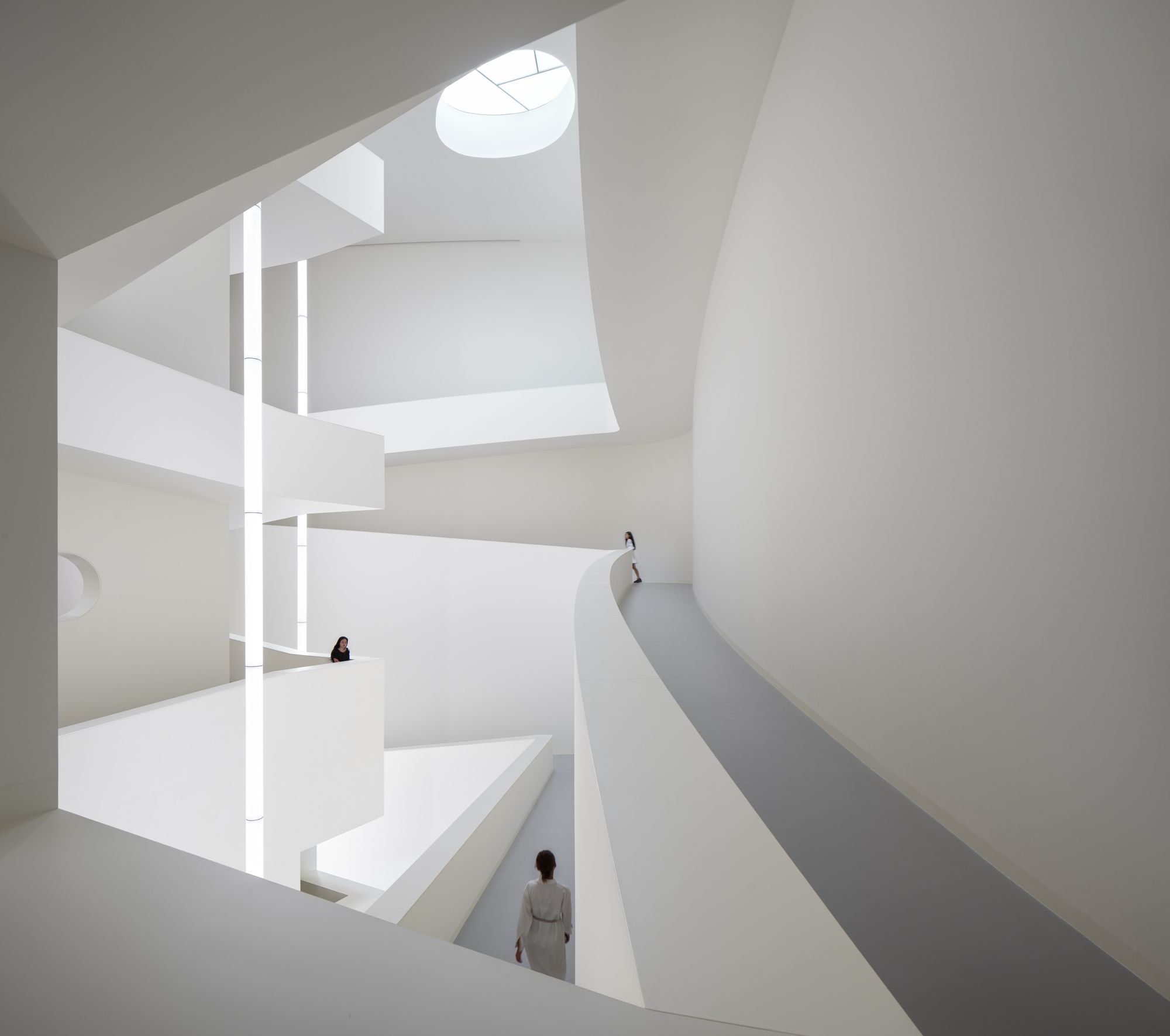
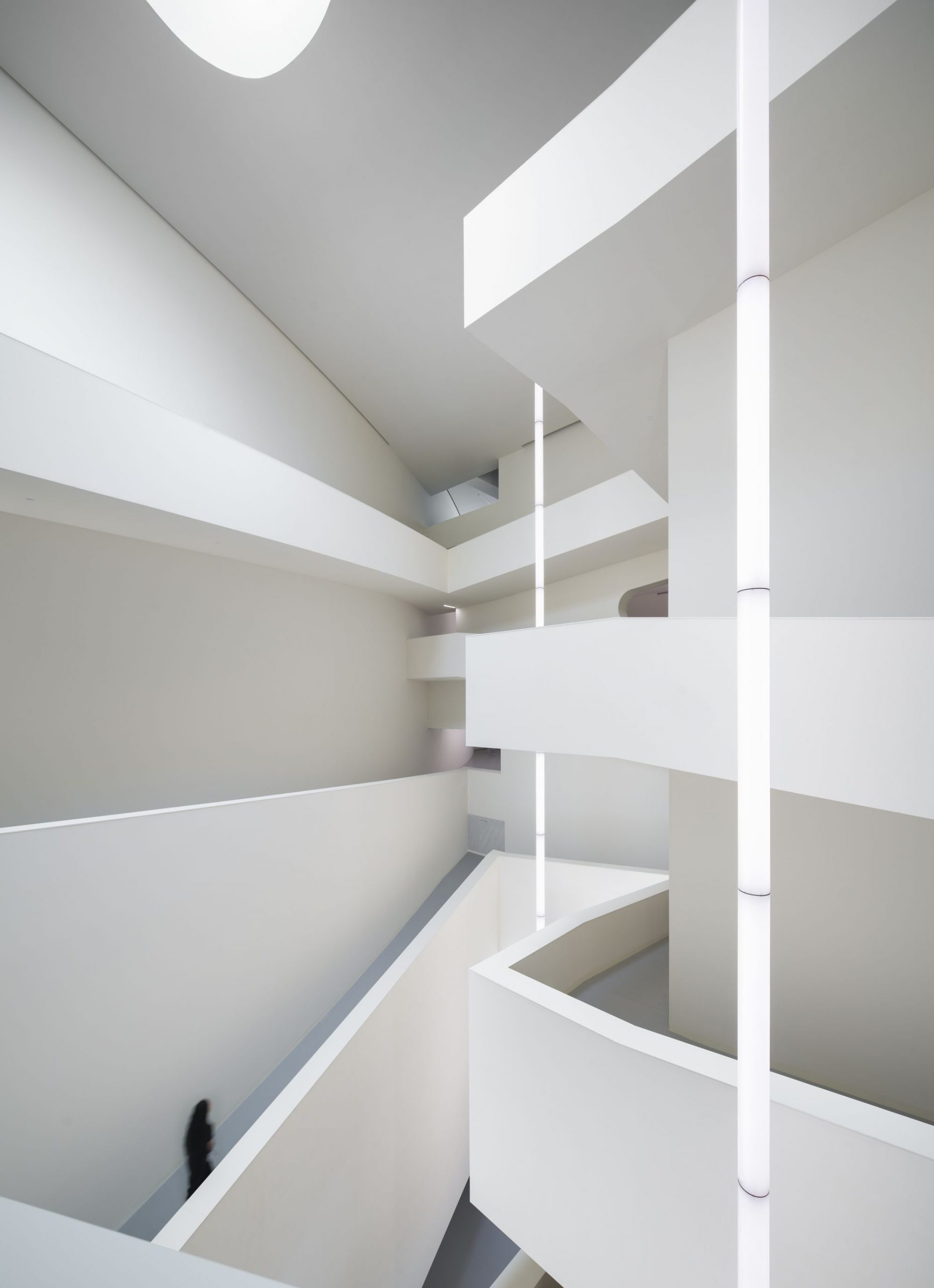
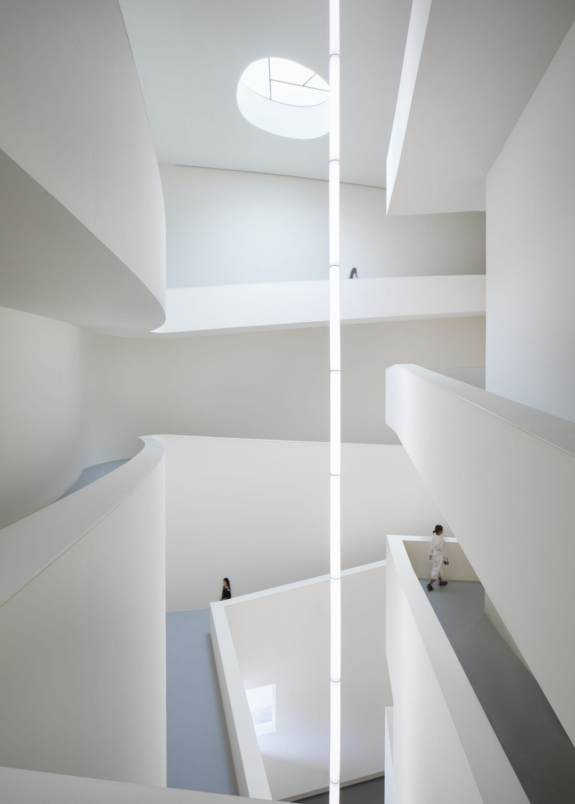
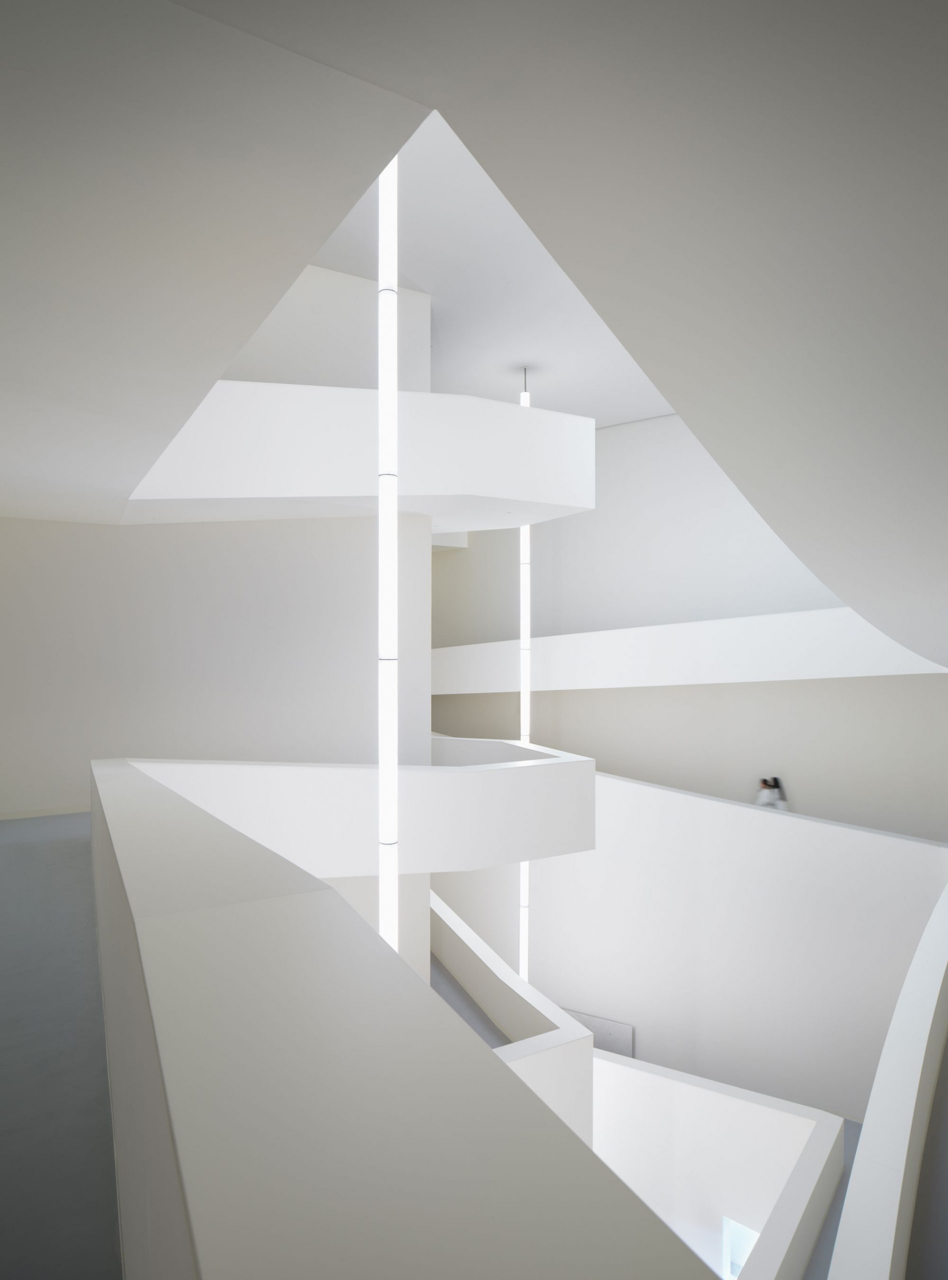
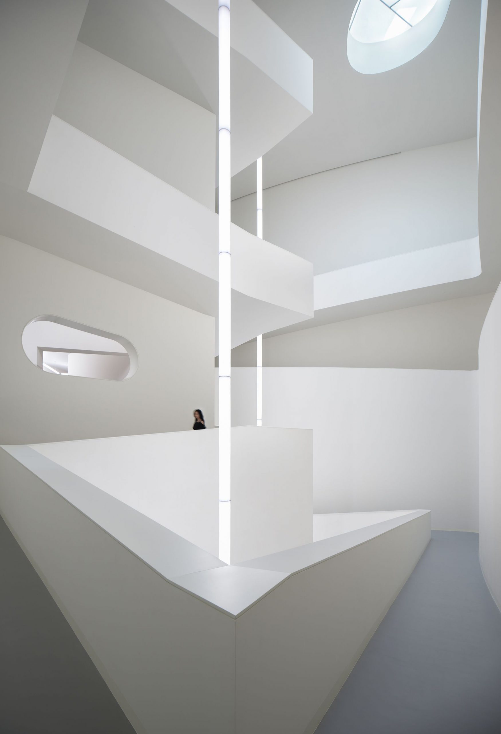
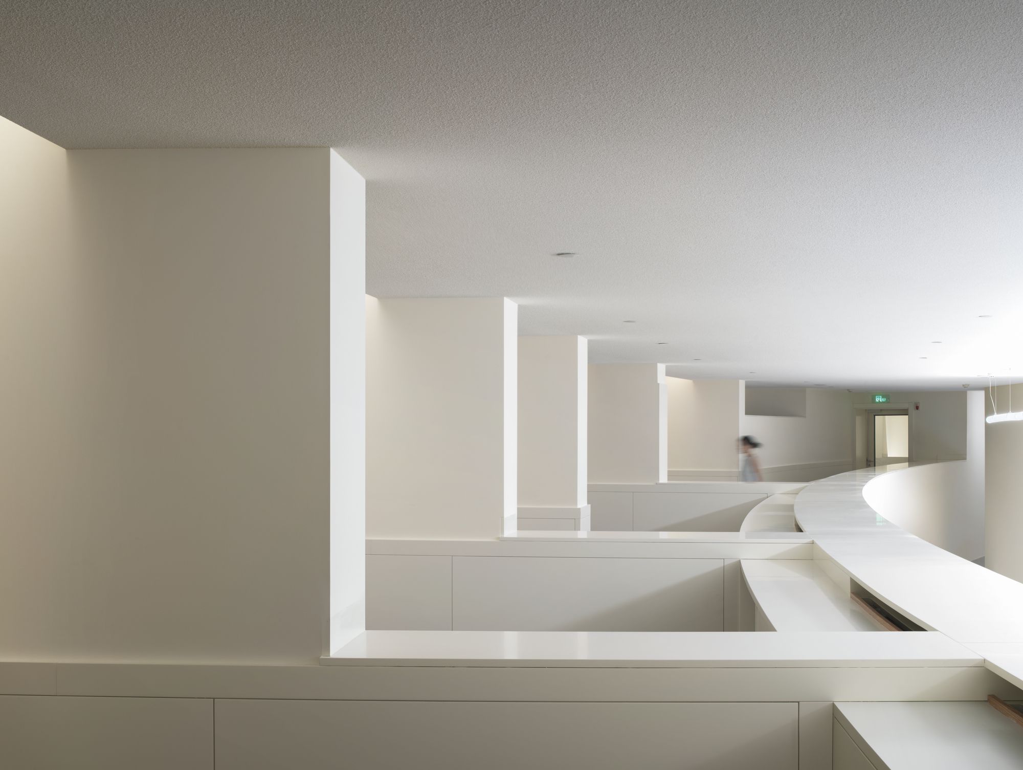
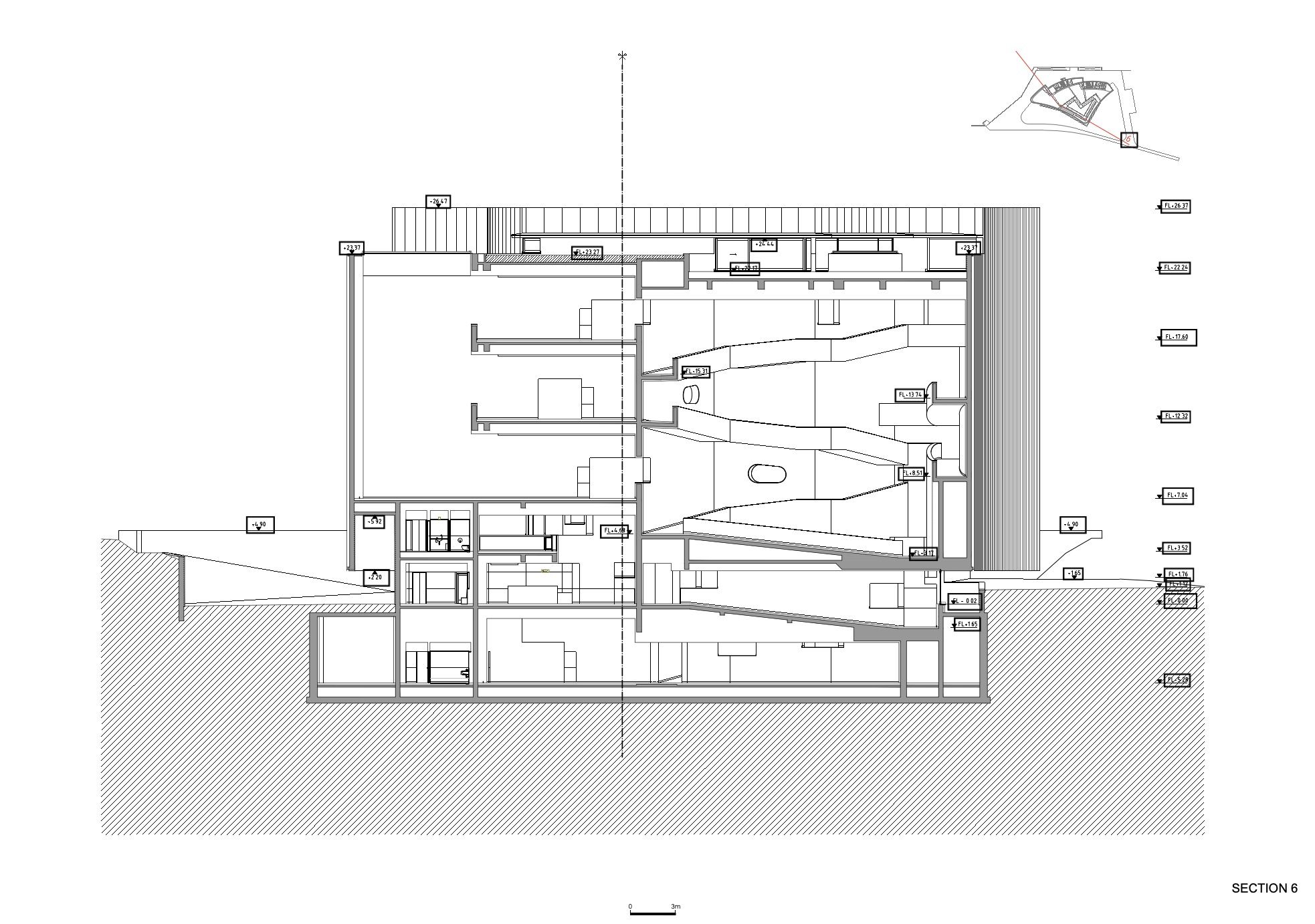
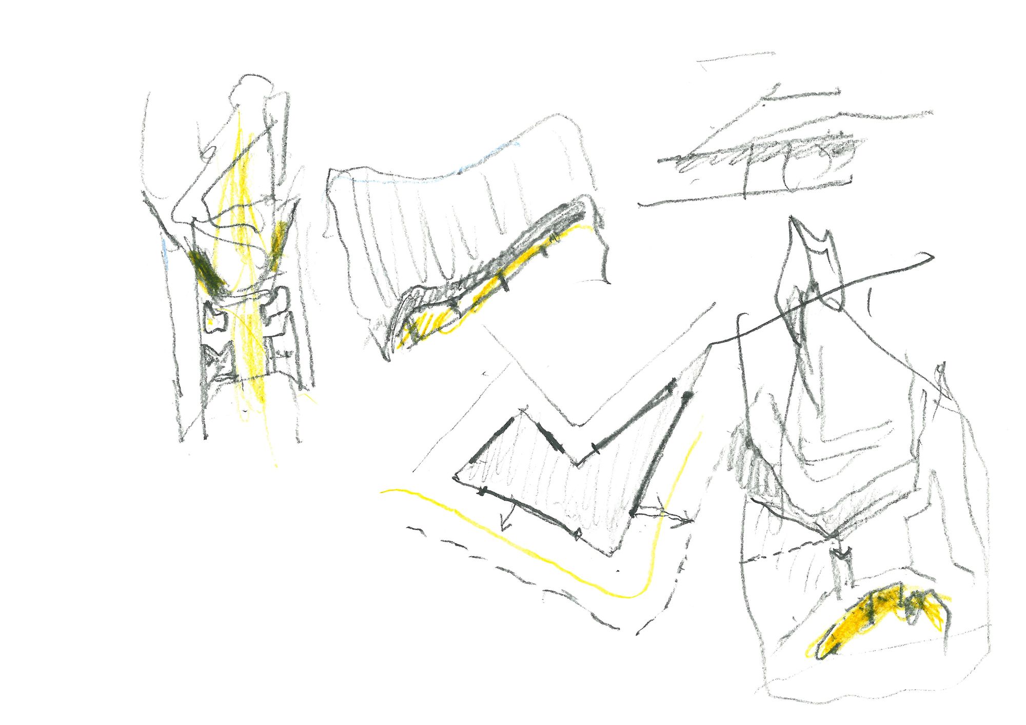
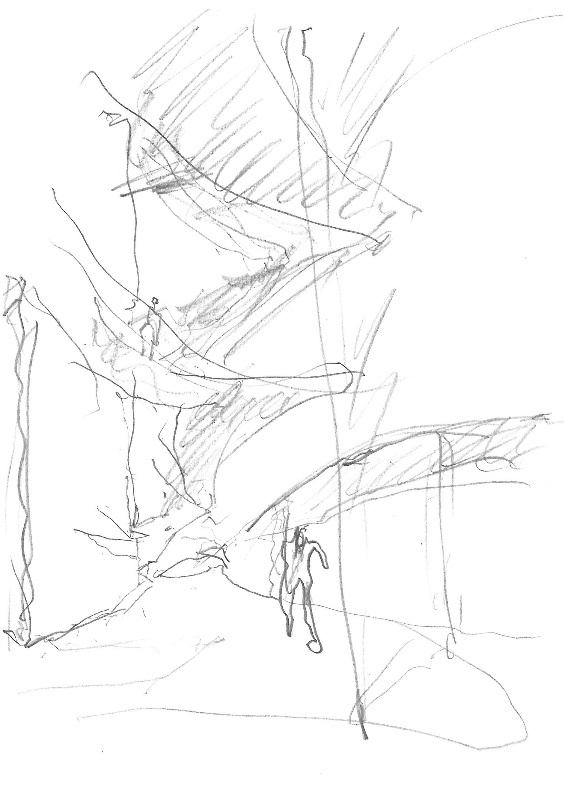
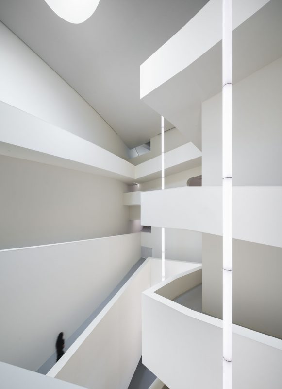
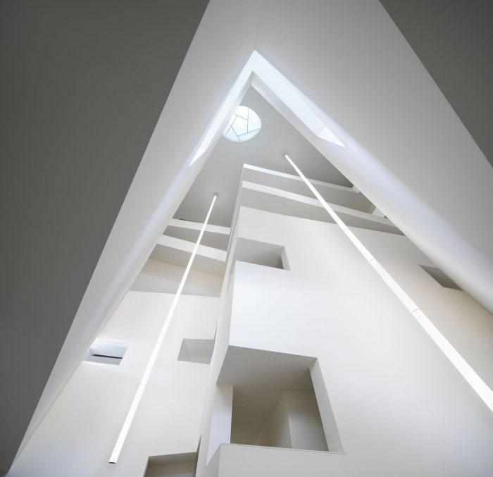
Finally, on the Southeast side, there is an ample, full height triangular space, top lit by a roof light and surrounded by ramps from the first to the fourth floor. The natural lighting is highlighted by the white walls and is brought into the surrounding rooms, through deliberately placed openings.
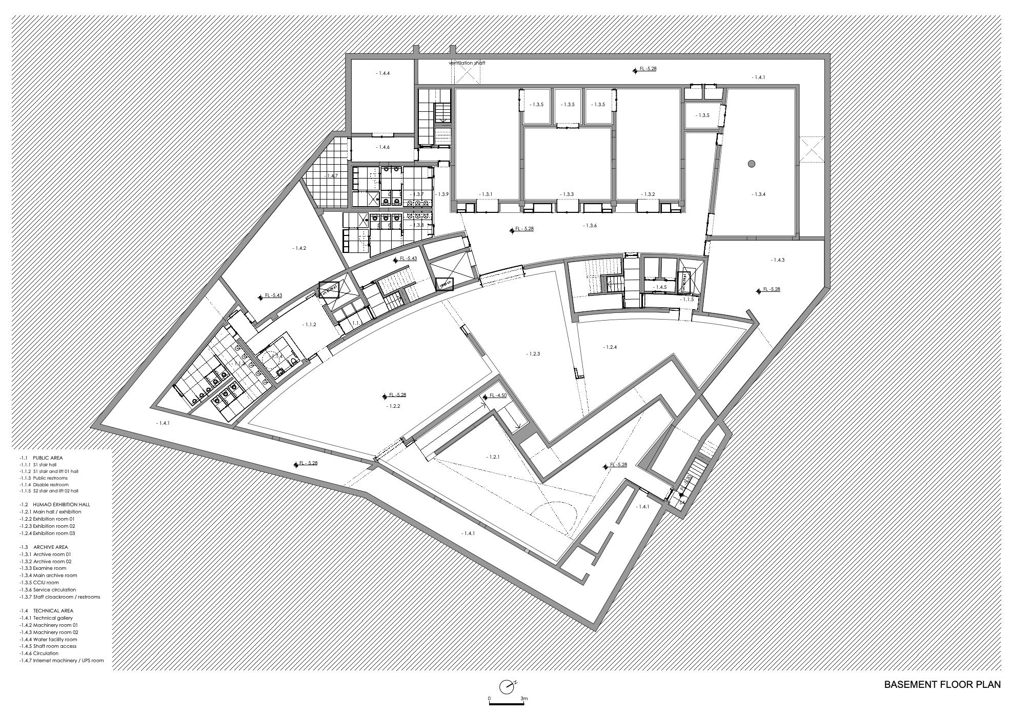
3. The basement and the recessed top floor are differentiated by function and dimension. They are organised according to the planned spatial and structural order and in accordance with the impact of other floors levels. Basement: the area corresponding to the visible volume of the building, with uses and circulation similar to the upper floors, also extends under the entrance way to the Northwest, between the hillside and the museum and under a narrow band of the hillside, accommodating technical areas.
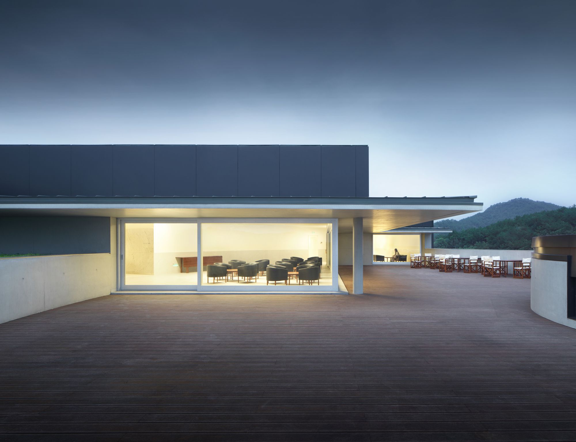
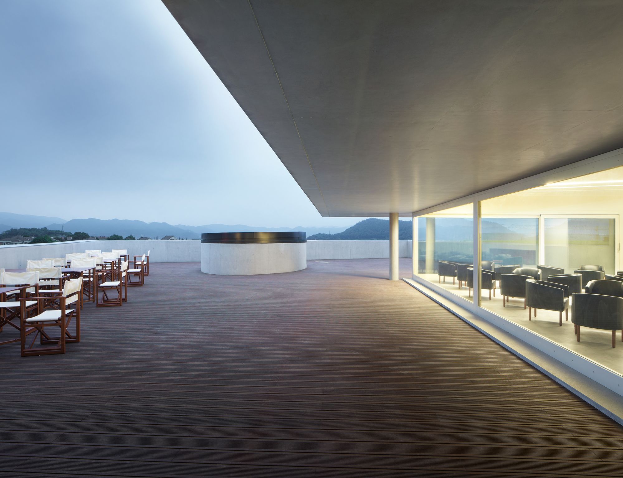
The structure and roof slab for a second level, which is accessible from the basement and from the museum entrance way, retains and limits the hillside and its vegetation. Set-back Floor/VIP Area: only part of the available area is occupied and this opens out to the rooftop terrace.
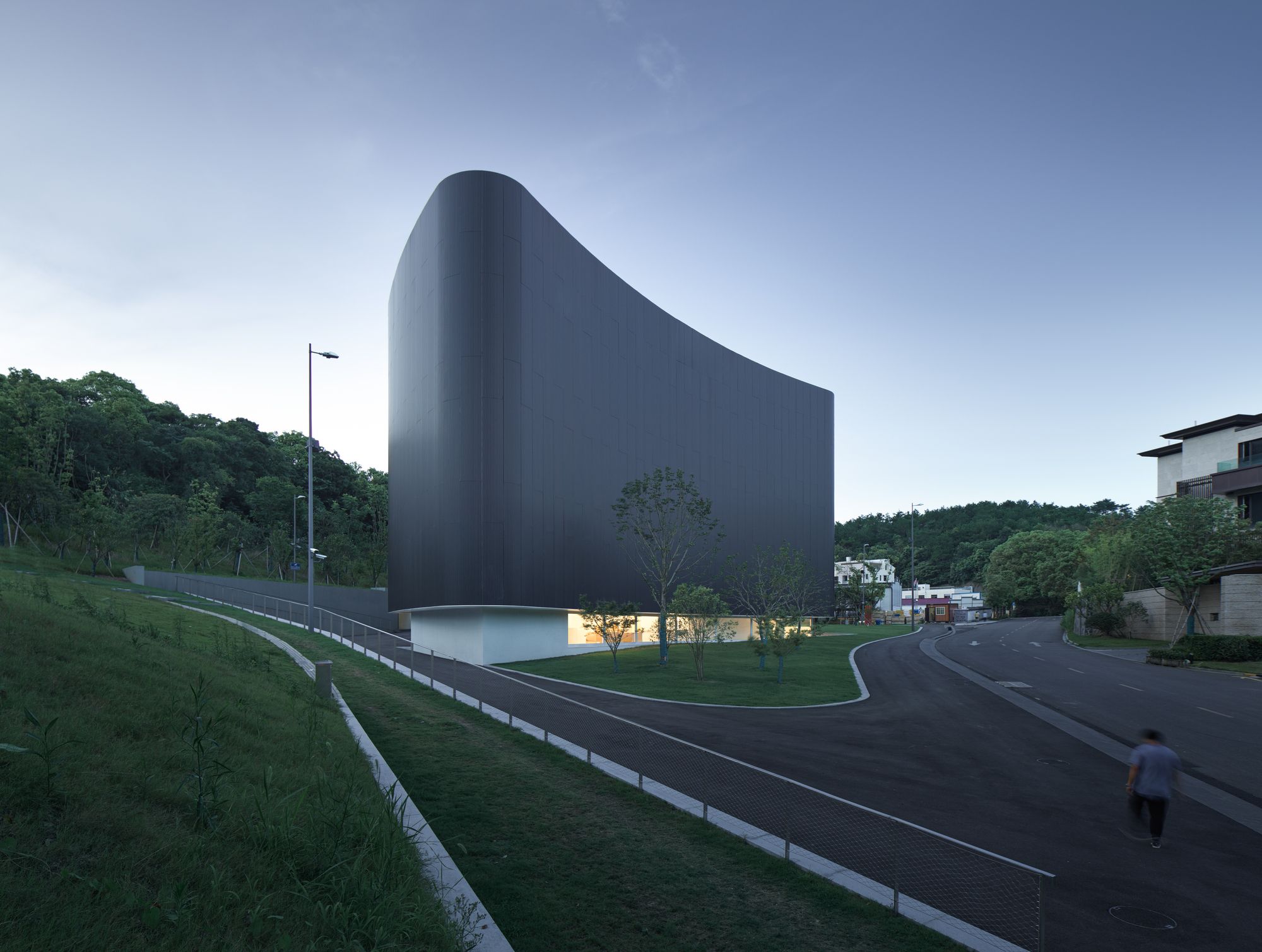
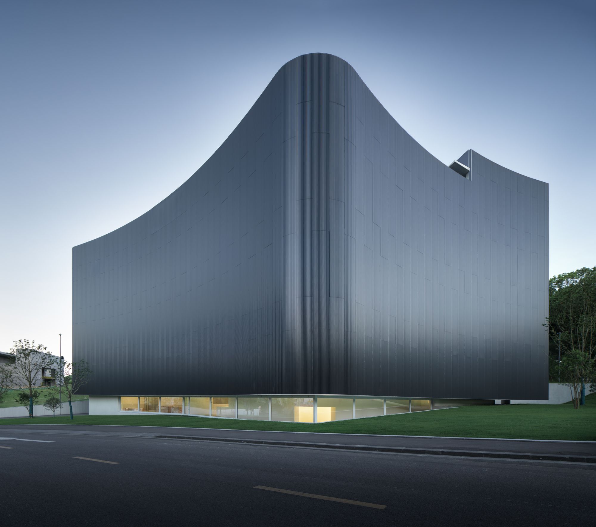
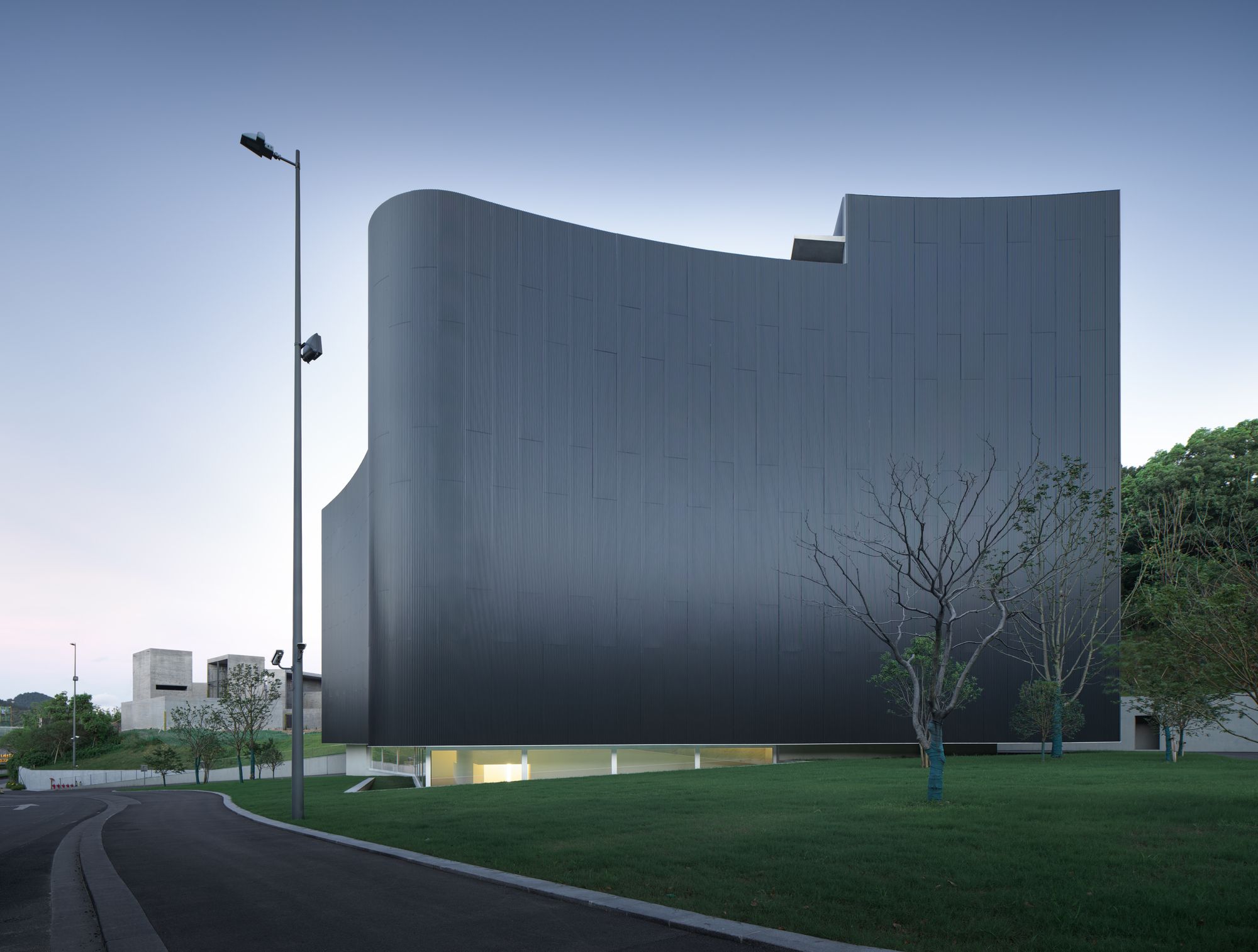
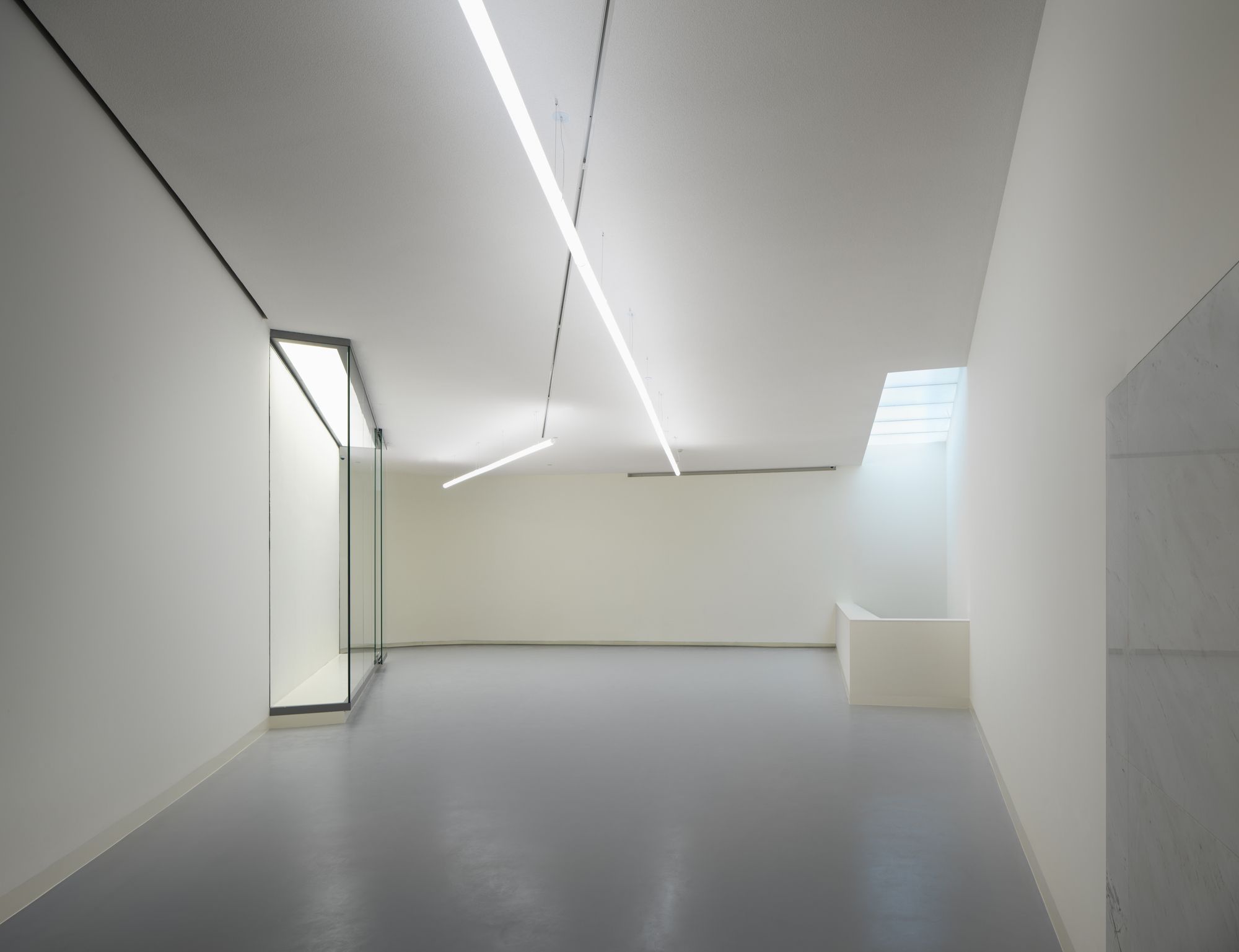
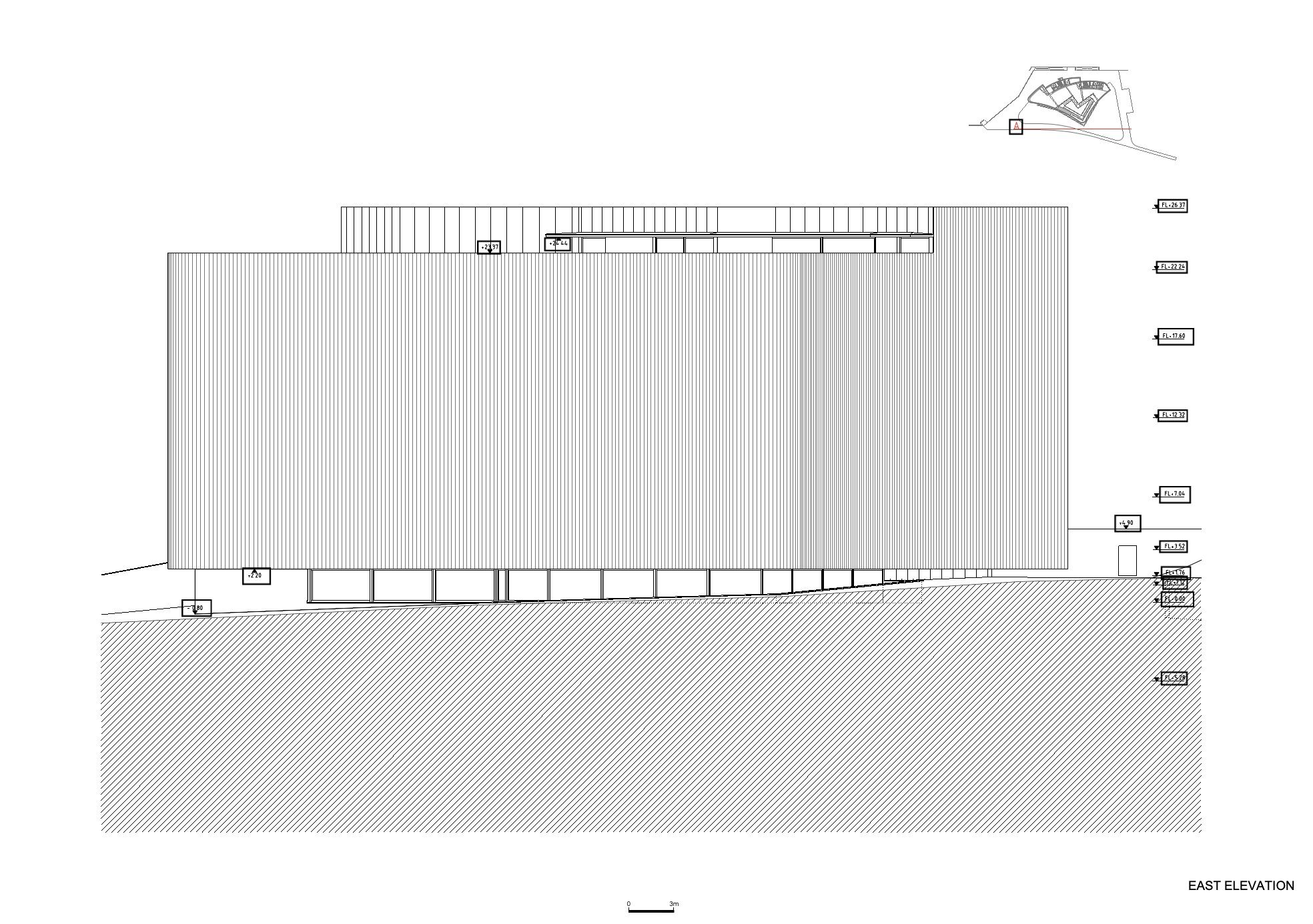
4. The building, cladded in corrugated aluminium sheeting, appears dark in the landscape. Its image constantly shifting from black to silver, depending on the angle of incidence of light and the angle of vision. The interior is an essay on light, captured in the internal patio and distributed from there to spaces arranged around it, becoming progressively less intense. The controlled lighting, specific to the different exhibition spaces, uses tube lights, suspended both horizontally and vertically as suits in each case.
5. Externally, a pedestrian ramp connects the museum entrance way with the road network of the nearby residential area and hotel. A fundamental intent of the project, is for it to be part of a convivial relationship between the natural landscape and the pre-existing and planned buildings, while maintaining the role of protagonist that is appropriate to a public and cultural building.
Text by Carlos Castanheira – Small on the Outside and Immense Inside
A Museum must be big. Inside.
A Museum must be bright. Inside.
The Art Education Museum is a small Museum that is immense inside.
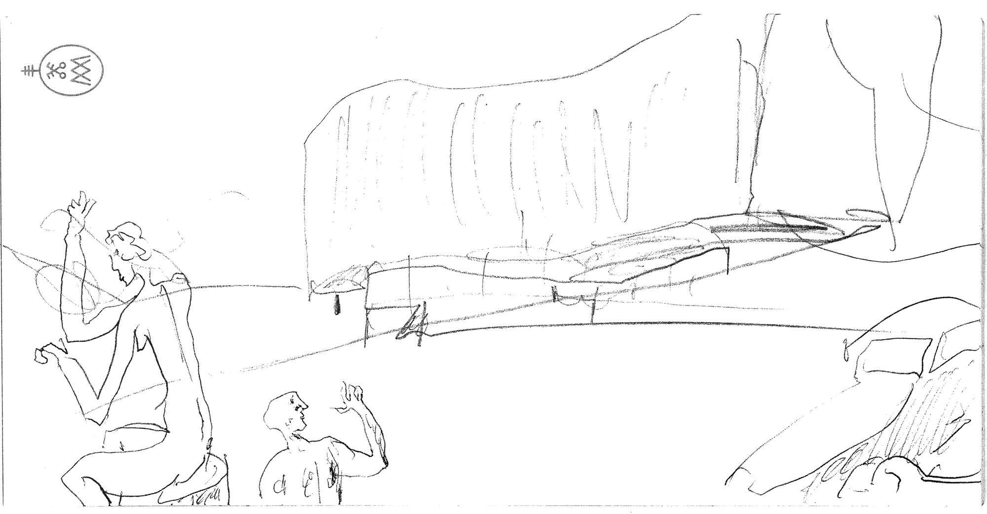
Leaning against on the hillside, its undulating form hovers above the ground.
It is intriguing in its elegance and in its mystery.
Nothing is obvious in this little building.
The public entrance is reached after passing around the form of the building and experiencing an imposed, absorbing compression, to then be released into a vast space, the full height of the building, where a snaking ramp links all the floor levels. This exercise of compression and release is constant during the visit.
This diversity in routes and the interconnection of spaces makes this small building vast inside.
Its volume is equally challenging.
From the exterior it is suspended above the ground as it undulates in its metal cladding.
It reflects the ever-changing daylight that makes the form move and transform. Incessantly.
Inside, the introspective calm of the exhibition spaces contrasts with the movement of the visitors circulating in the enormous void.
Dynamism is taught through Art.
Size doesn’t matter, but a Museum must have a Big Soul.
Project Info:
Architects: Alvaro Siza + Carlos Castanheira
Location: Ningbo, China
Area: 5300 m²
Project Year: 2020
Photographs: Bowen Hou
Manufacturers: Sto, CLIMAR
