Today is a McBride Charles Ryan kind of day. What kind of day is that?! Why, it’s any day you want it to be, as long as you’re viewing MCR architecture and learning bucket loads from it! Whereas normally I would say a few words, give a few quips, provide a few slurs- today I sit back, quite and demure. And I’m sure that the words which I implore, you to read, will give more than I can say, or bleat.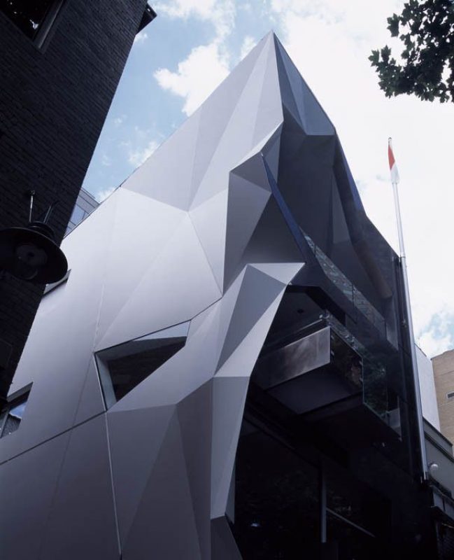

The Monaco House. Take it away, McBride Charles Ryan!
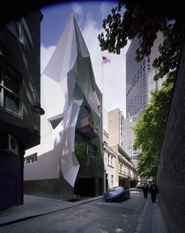
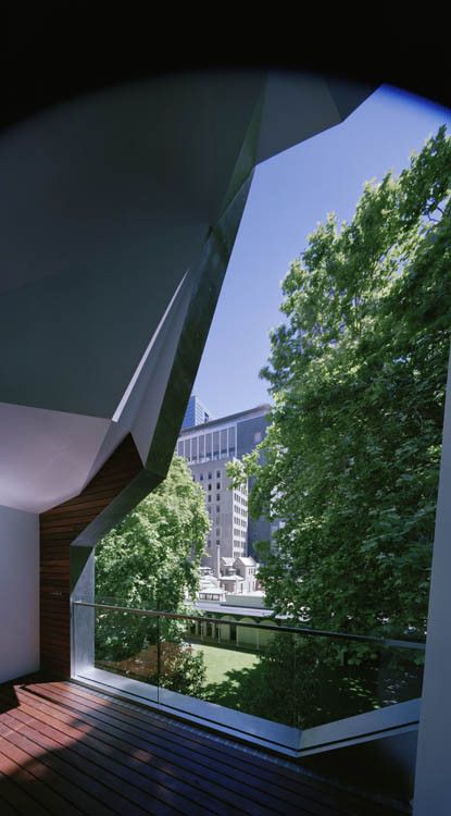
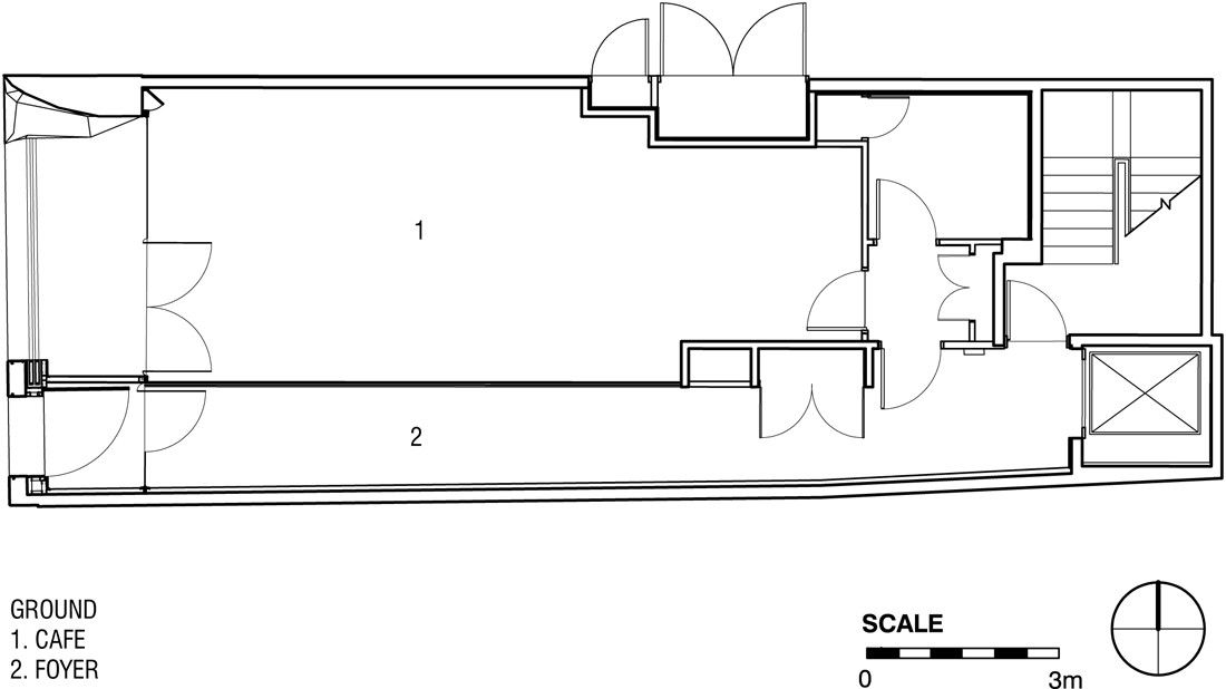
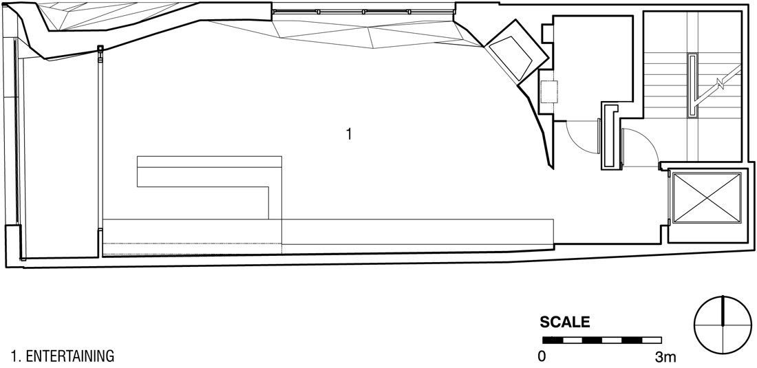
This is a new 4 storey building located in a largely pedestrian lane (Ridgway place) at the East end of Melbourne’s CBD. Dominant in the lane is the historic Melbourne Club wall and the gigantic plane trees emanating from the Melbourne Club Garden which arch over the diminutive lane. The site with dimensions of 6.1 m in width and 17m in depth and a foot print of 102.5 sqm is a postage stamp.
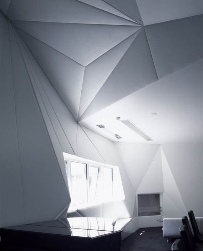
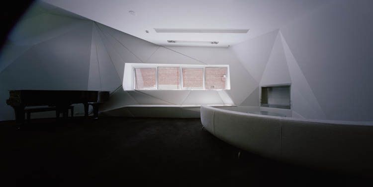
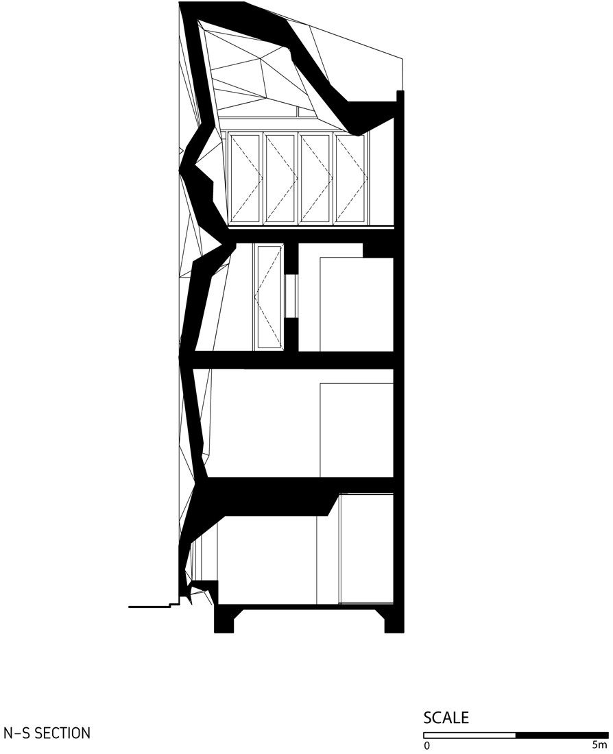
Our brief was to provide a ground level entry and café, followed by two levels of office tailored for the Proprietors Investment and Philanthropic Organisation. The top level contains a small reception area primarily for official functions associated with the client’s role as Honorary Consular of Monaco.
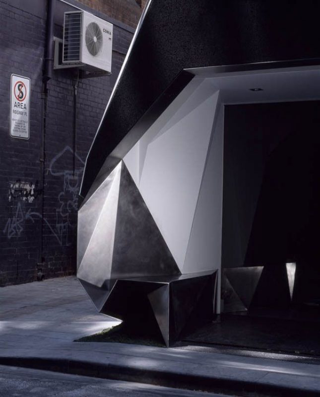 The process of the Aggregation of the Melbourne’s allotments is now almost universally seen as a process which diminishes urban quality and diversity. There is now an earnest attempt, even in large block developments, to reintroduce fine grain urbanism that has been lost to the city. This project is rare; despite renewed respect of fine grain urbanism there are few willing to make the significant investment that this type of building entails.
This was this client’s first foray into what may be considered contemporary architecture. Despite this inexperience, our client had a love of the design of cars, boats (particularly early 20C) and finely crafted objects. He bemoaned the loss of shape in the contemporary world. It was in the area of shape, craft and material that the architect and client found our common ground.
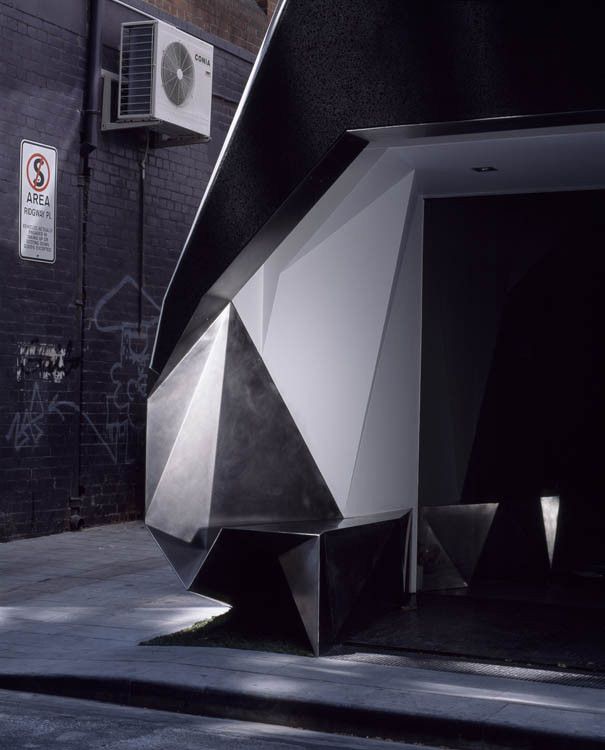
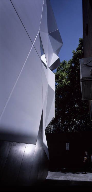
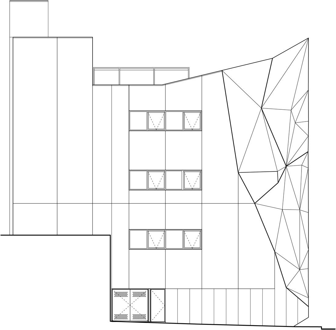
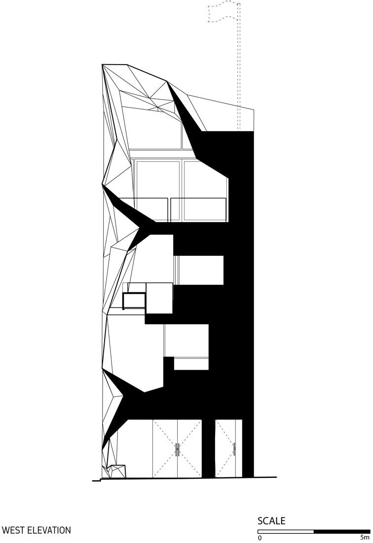
To meet cost constraints building elements had to be structured around crane sizes, and crane sizes around turning circles. Much of the external is pragmatic and unremarkable. It is in the 2 metre frontage zone where for many months we explored and discussed the nuances of composition. We wanted the building to be both abstract and awash with imagery. We looked at the plane trees, the gothic, surrealism, the heraldic, deco and the Prague cubists. We wanted the building to be above all else something that amplified its miniature urban grain and enriched the pedestrian experience of the city.
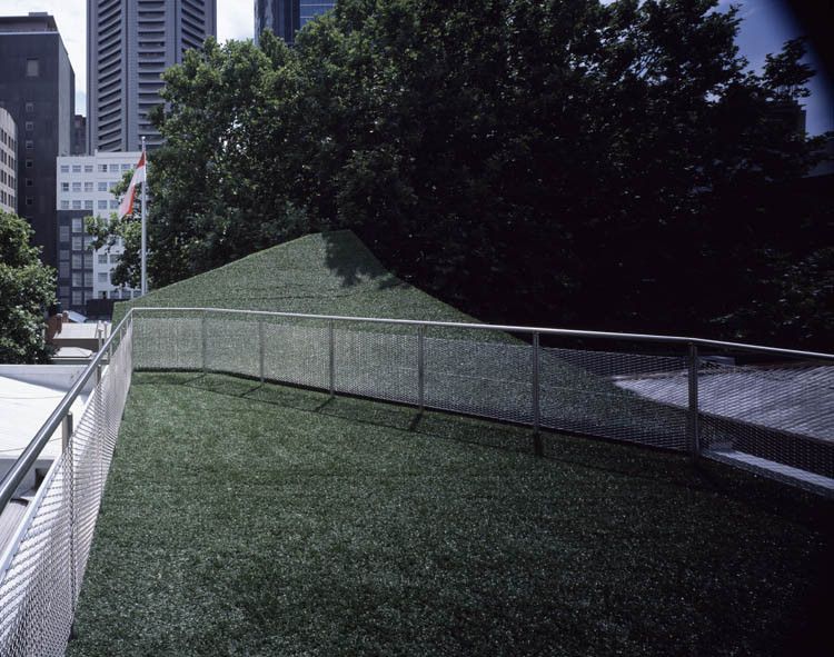
Within the office large apertures to the West are well shaded by deep balconies and the adjoining plane trees. The workspace has good natural light and cross ventilation. Exposed windows have electronically controlled external blinds. Outdoor balconies provide areas of release from the office desk. The ‘green roofscape’ is a similar space but also adds additional insulation to the upper floor. Water is harvested and stored in the stairwell. Fixtures are selected for their low energy and water usage. There is a heavy emphasis on insulation with a combination of closed cell Styrofoam, air cell and bulk insulation reducing reliance on conditioned air.
 From a technical point of view the complex geometry and use of such materials as Glass Reinforced Cement and its structural support demanded sophisticated use of 3d software and integration of those techniques with the off site production. This project may have brought us a small step closer to the ideal where our CAD software can integrate with production and enhance diversity, complexity and apparent craft without large cost impost.