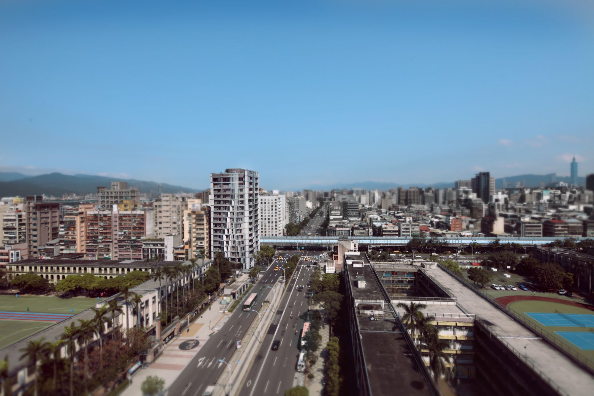
MONARCH designed by Oyler Wu Collaborative, When it comes to large-scale residential buildings, a complex set of economic, urban, and regulatory systems sometimes seem to have left little room for architectural exploration. Architects often struggle to find a point of entry for inserting their creative perspective in a way that would rethink or progress the typology. The resulting buildings typically reflect the reality of the efficiency-driven market – maximized footprint, relentless repetition, and lowest common denominator design appeal.
When we were first approached by a prominent Taiwanese development company to work on the design of a brand new residential high rise, they expressed interest in finding an architectural approach that challenged these conventions. They were interested in a building that pushed architectural boundaries while simultaneously meeting their economic requirements.
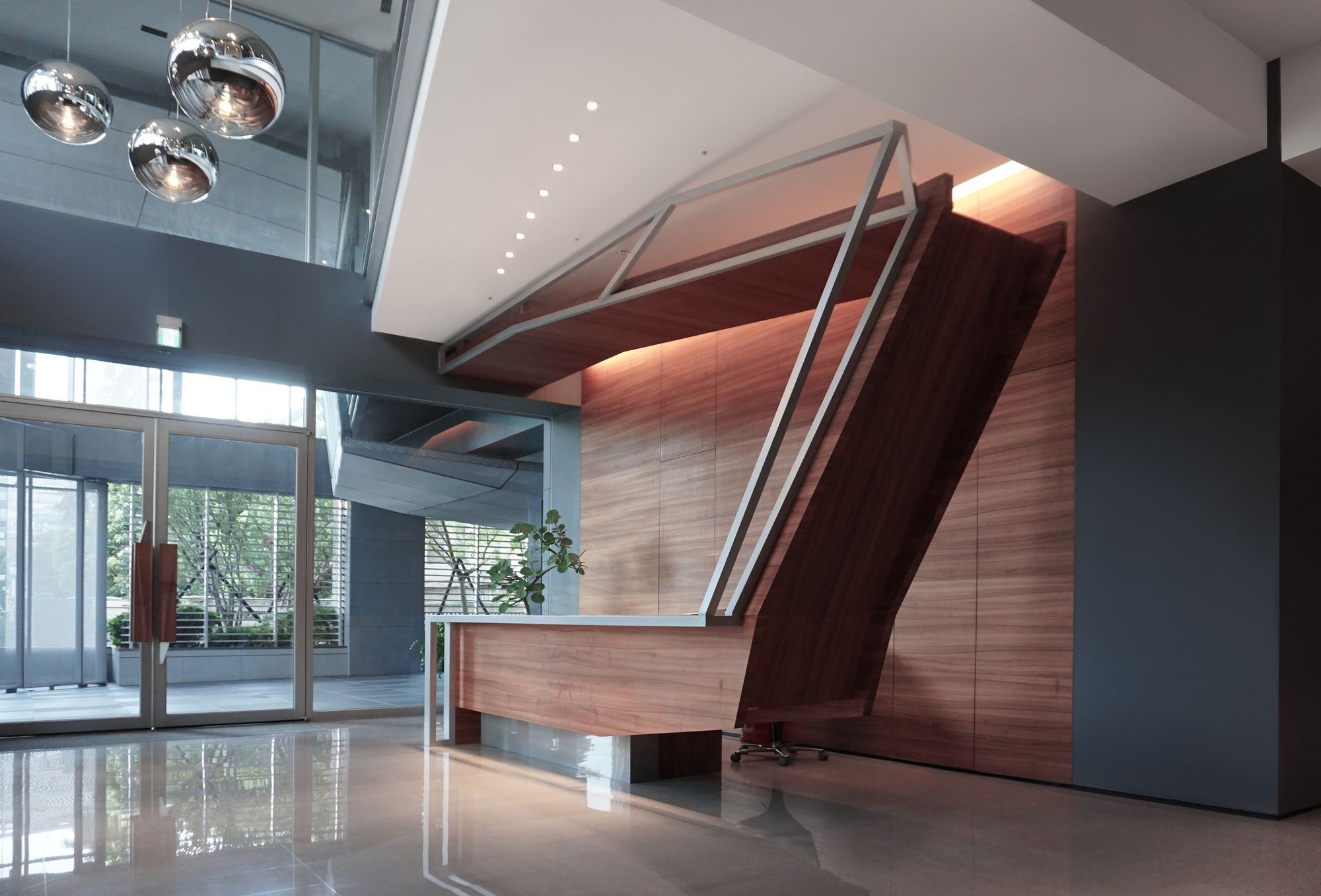
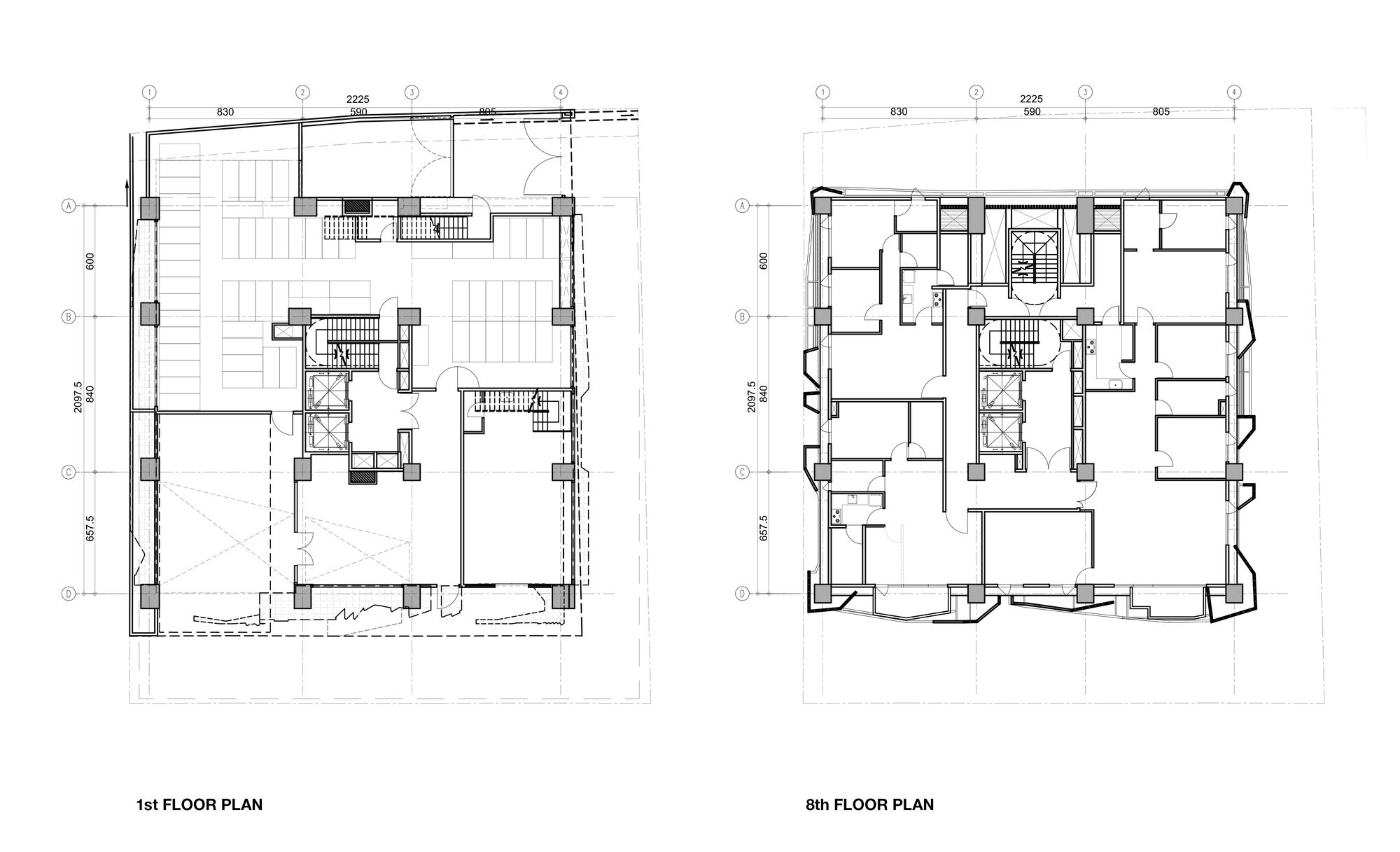
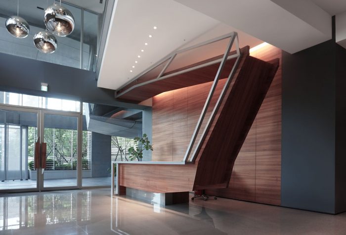
Cautiously optimistic, the developer proposed an arrangement that separated the development of the interior floor plans from the exterior elements, which included balcony floor plans, the front lobby, and all facade design. This left us with 2.5 meters at the front elevation and 1.5m on the side elevations. While it certainly wasn’t what most architects would consider ideal, it was just enough to be our point of entry into what would be our office’s biggest project to date.
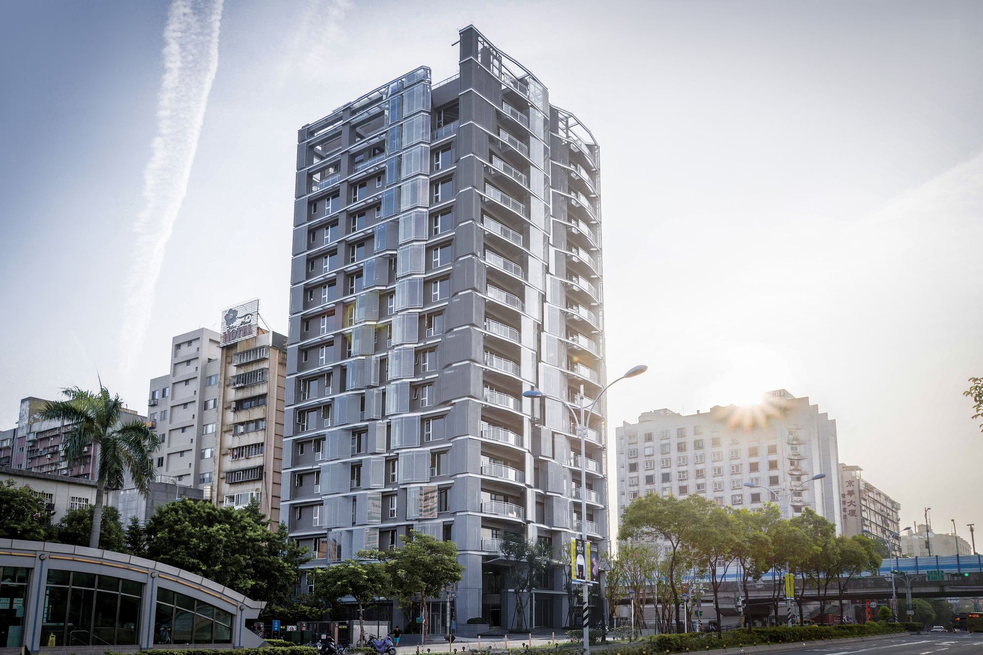
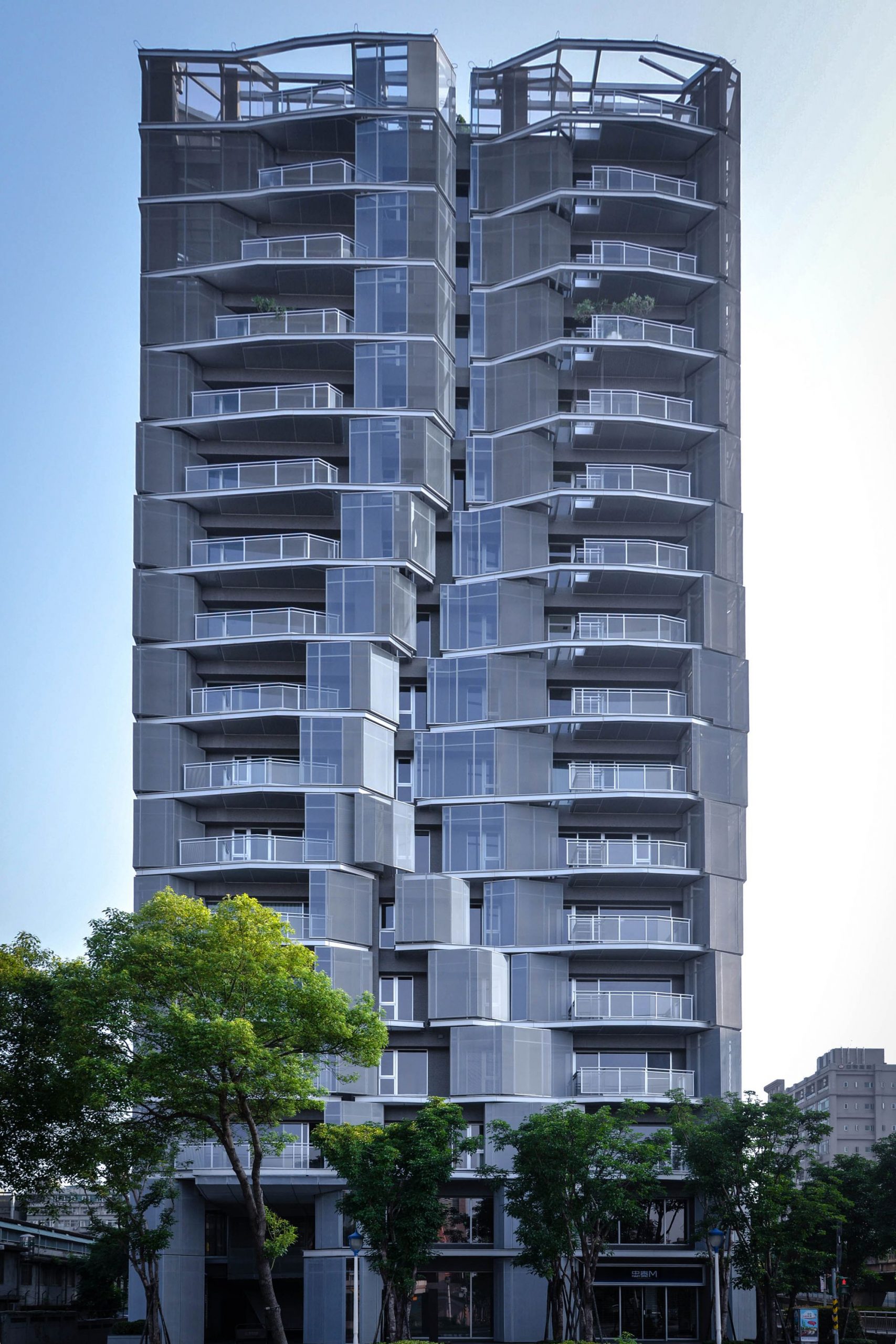
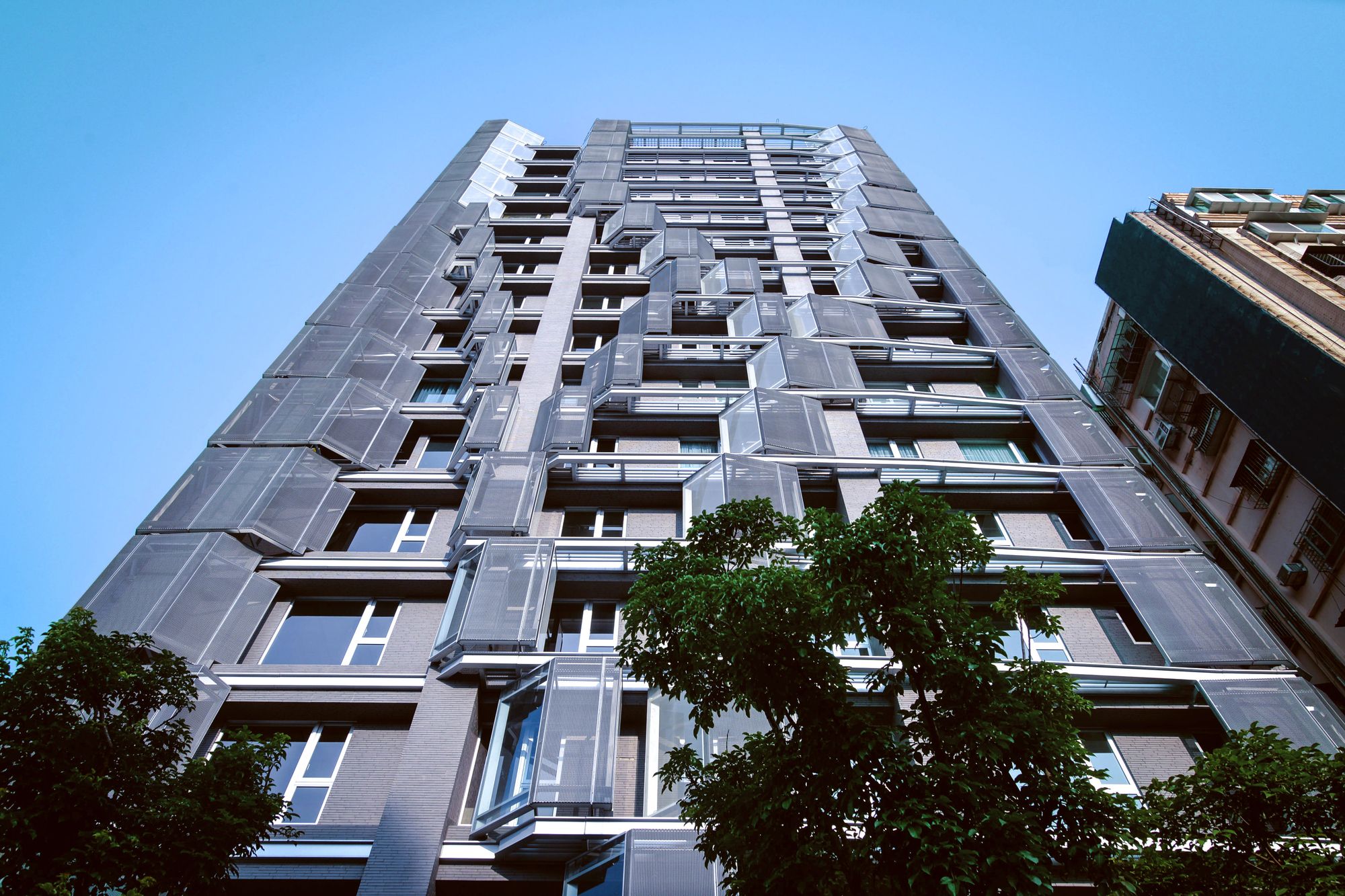
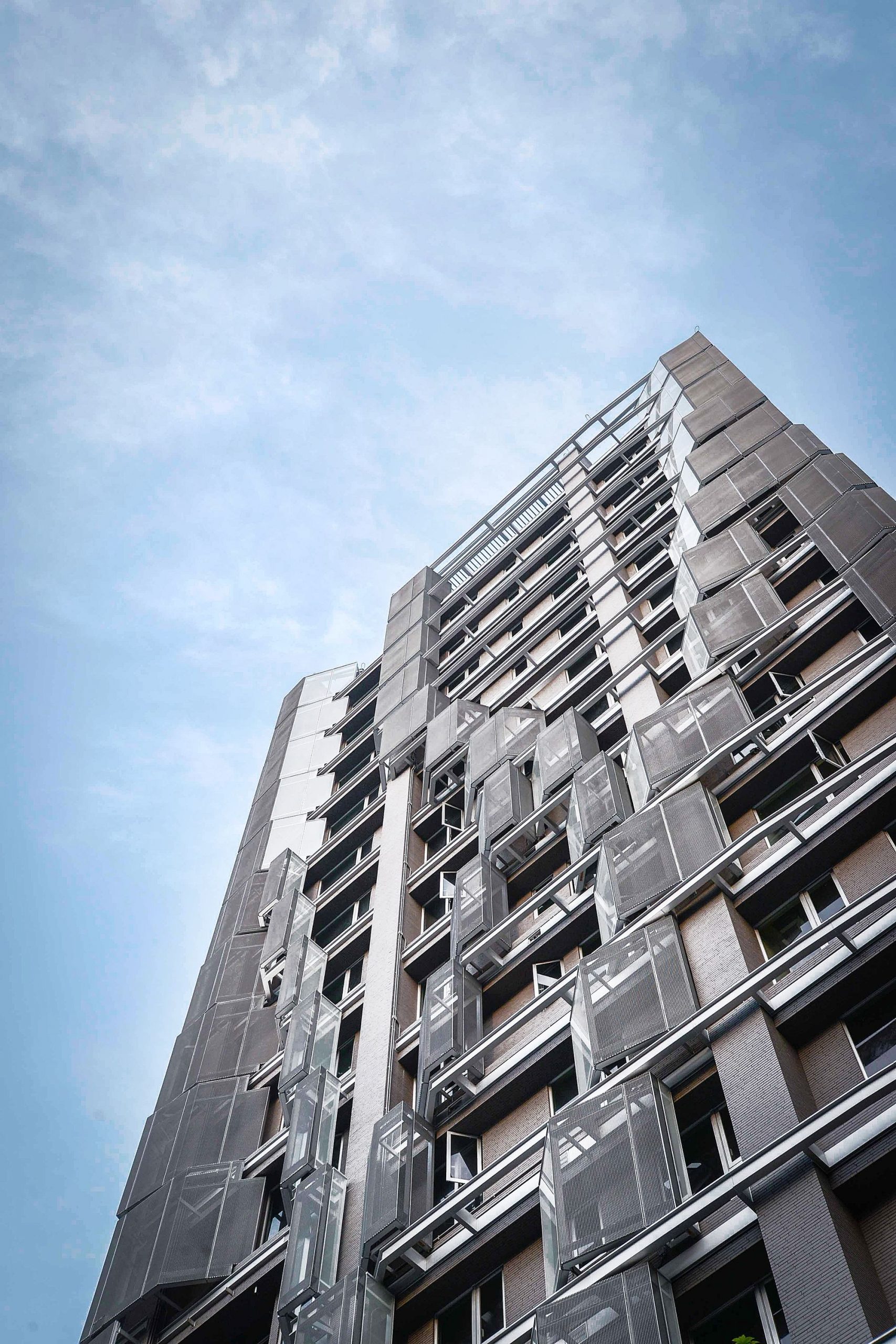
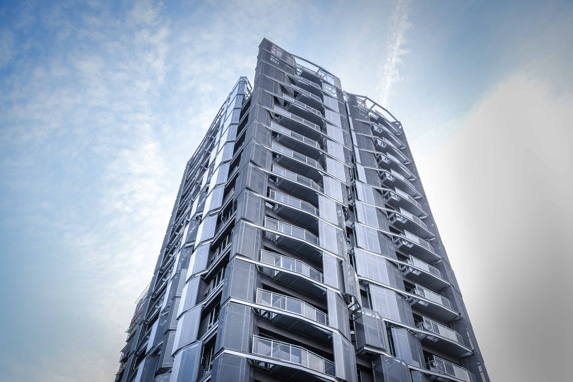
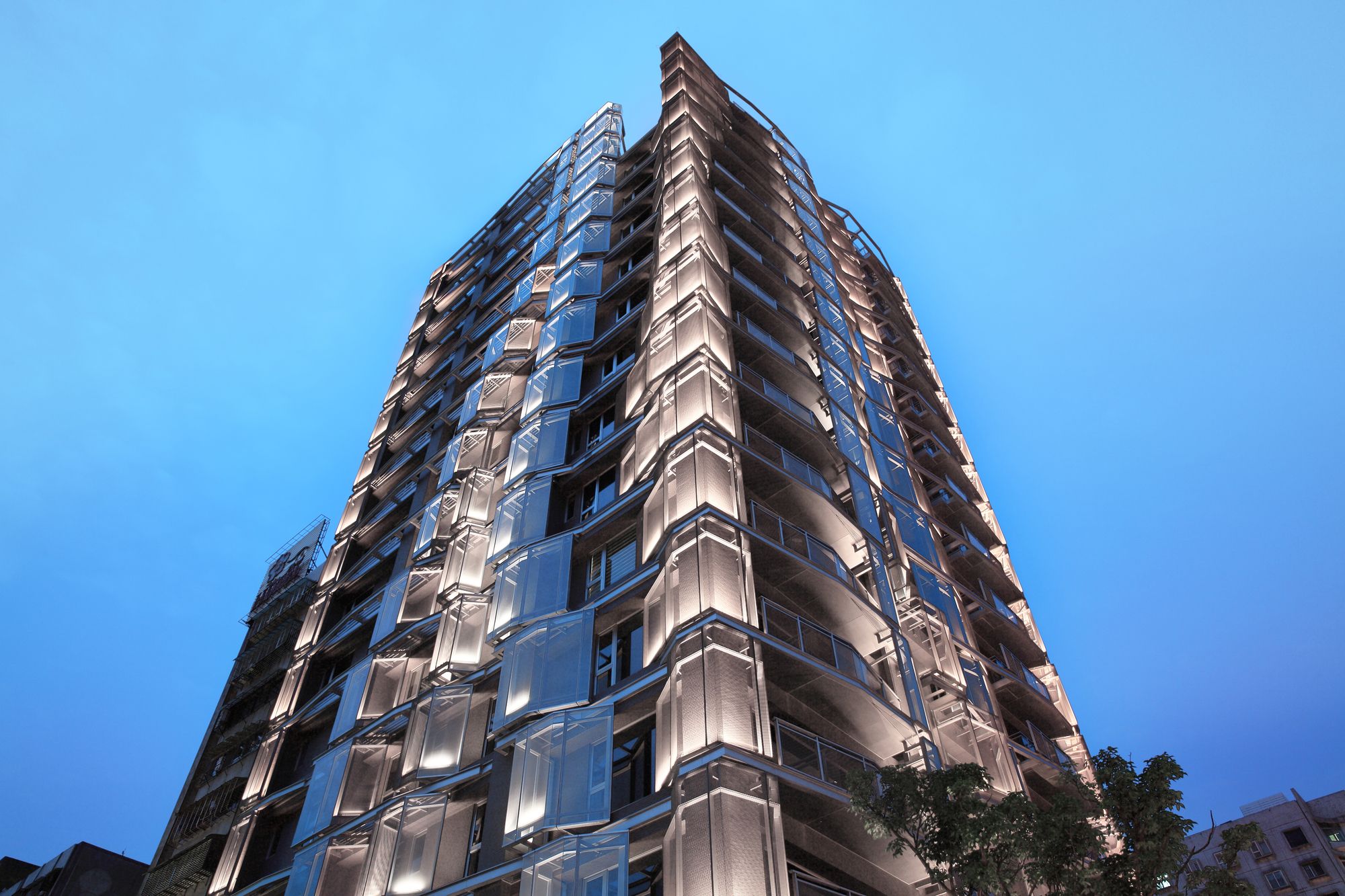
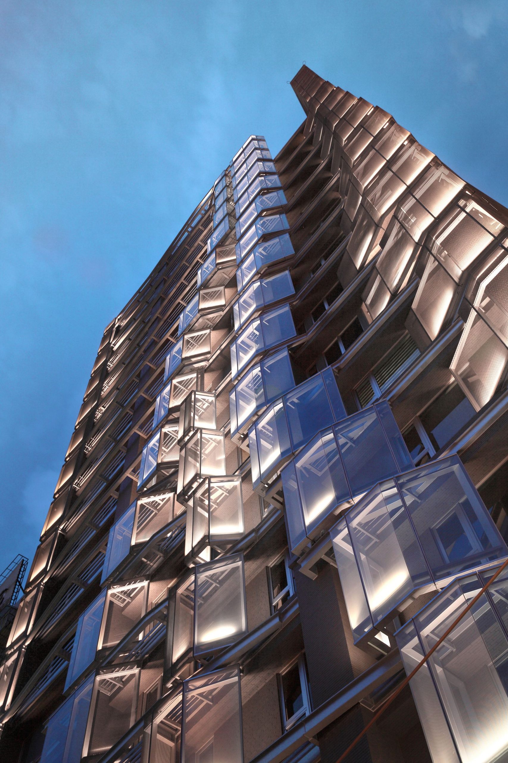
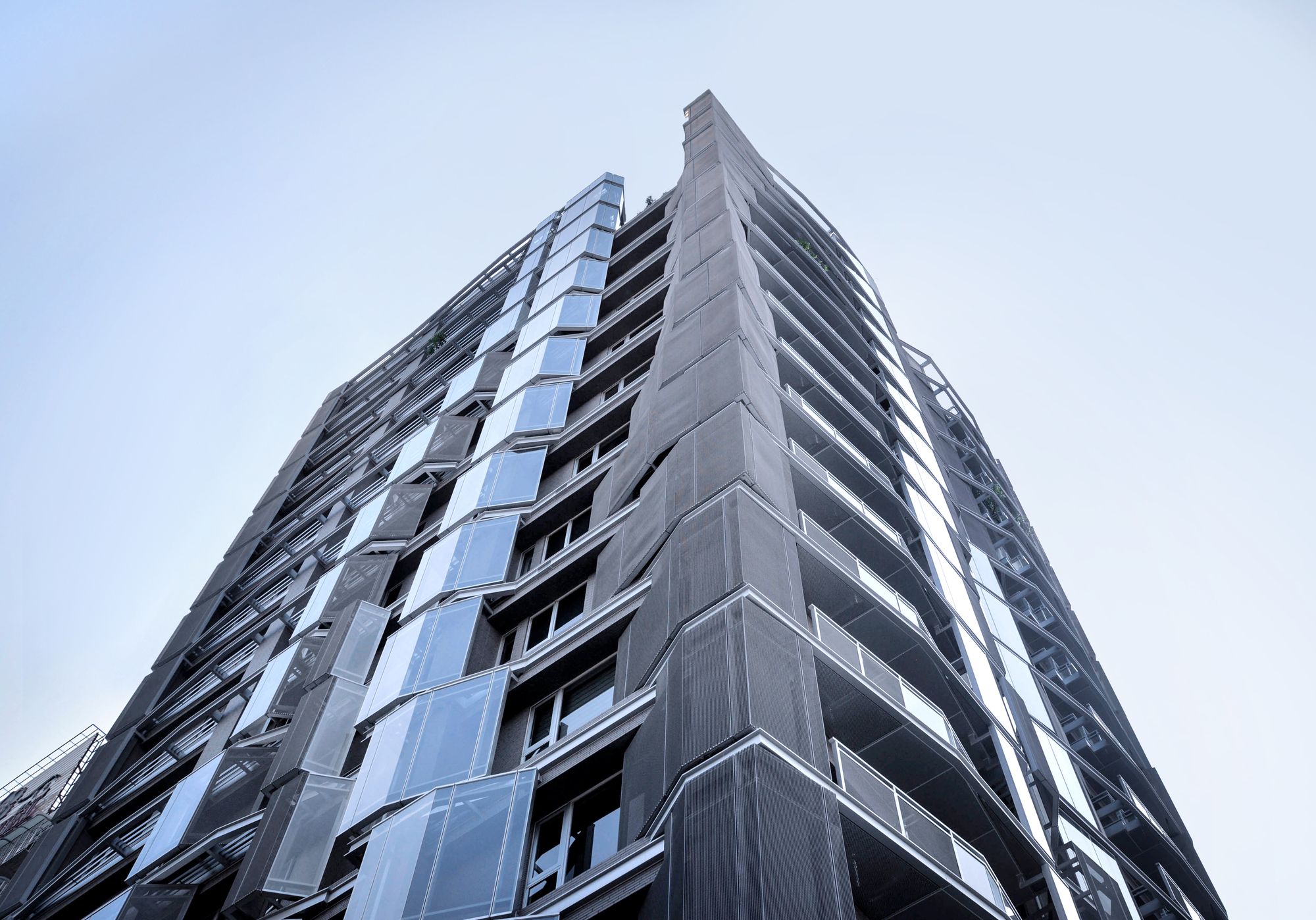
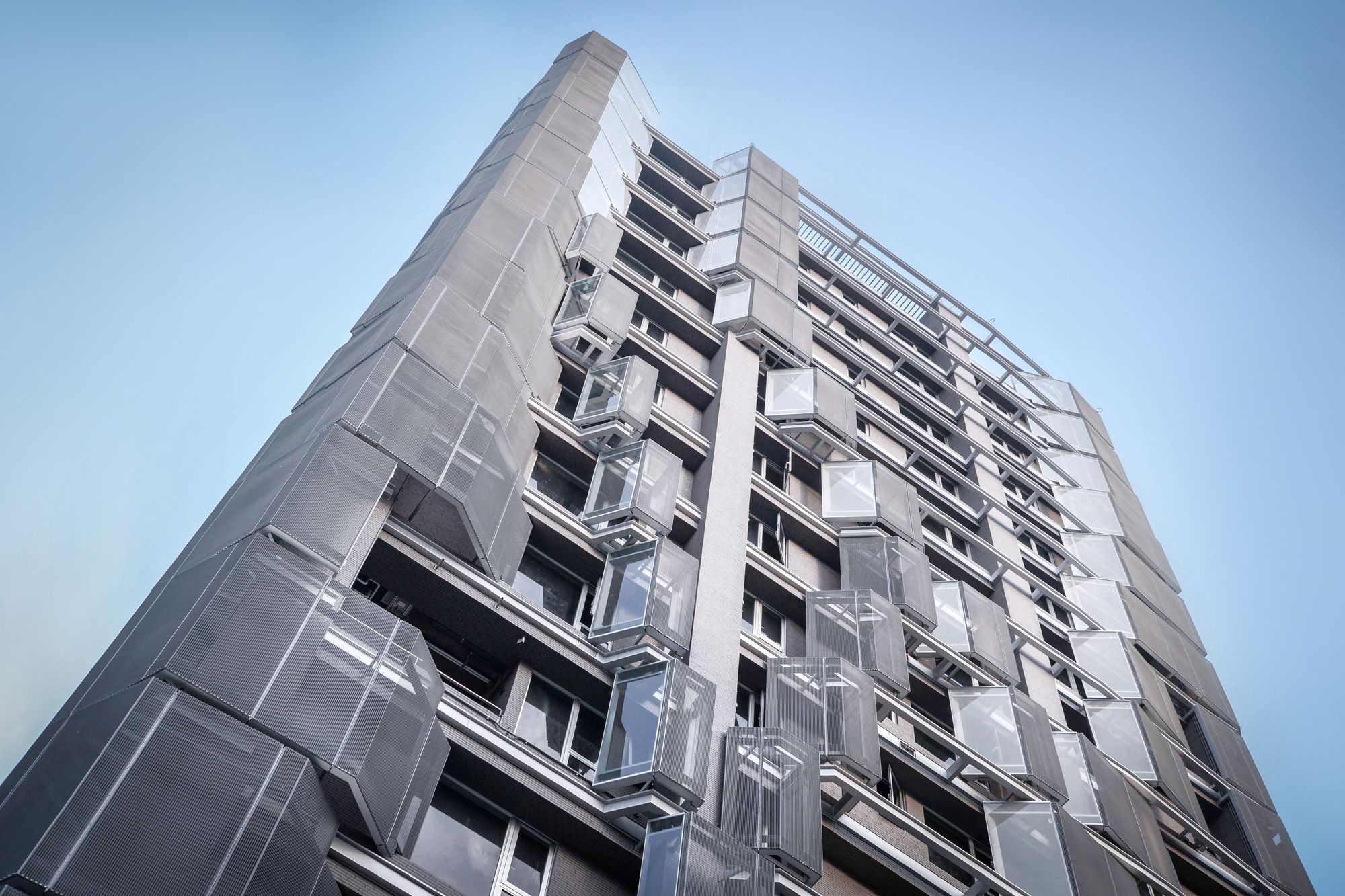
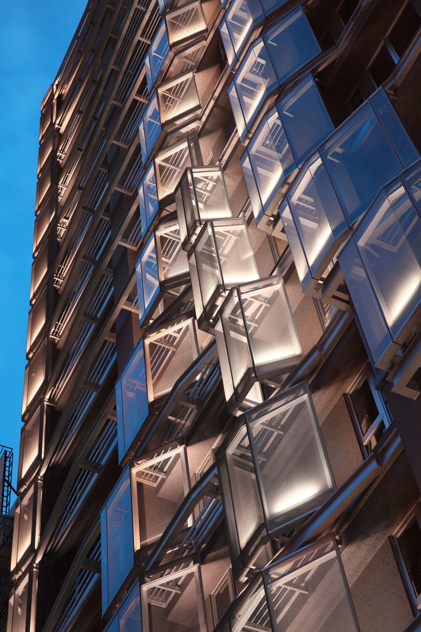
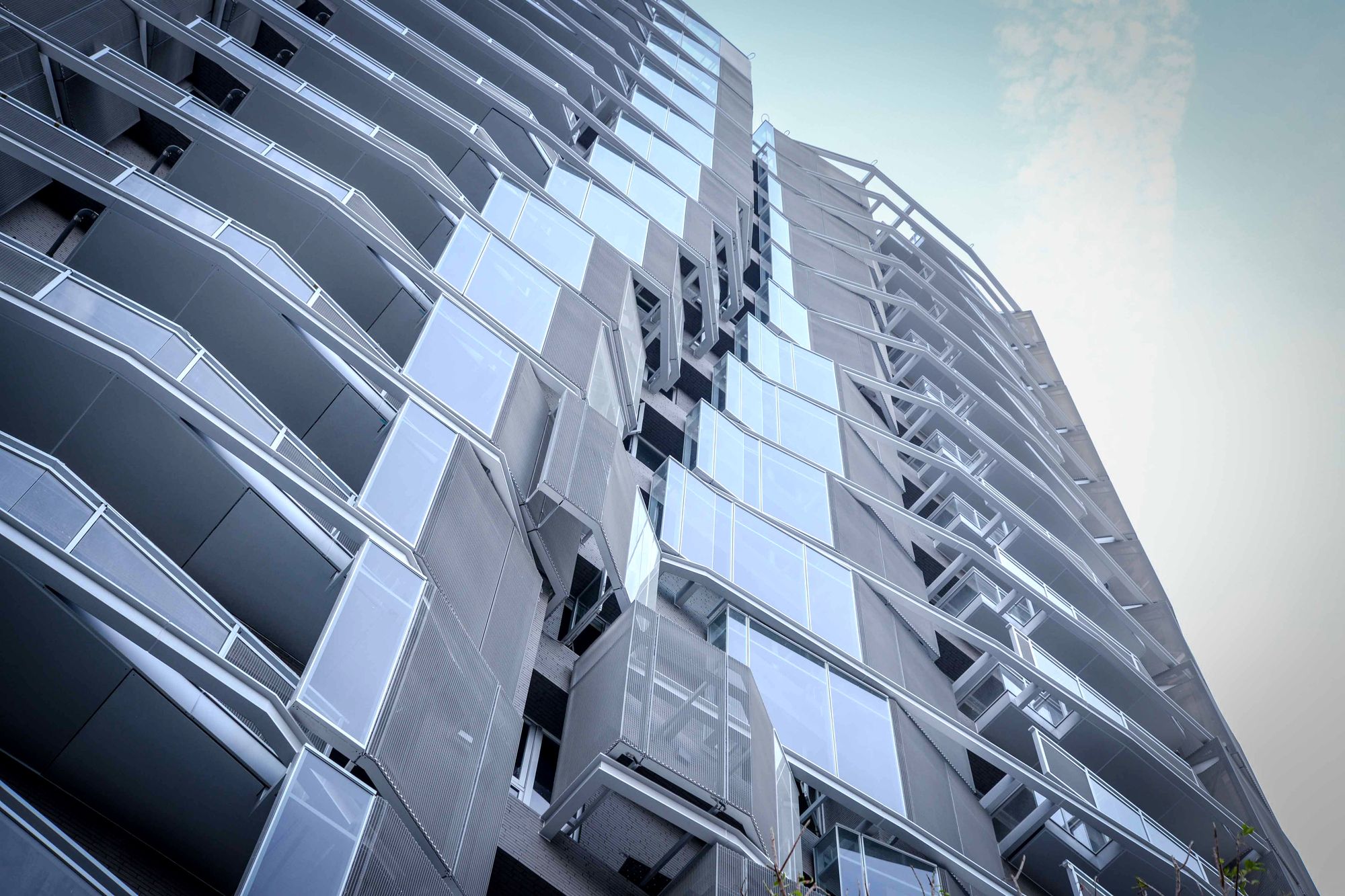
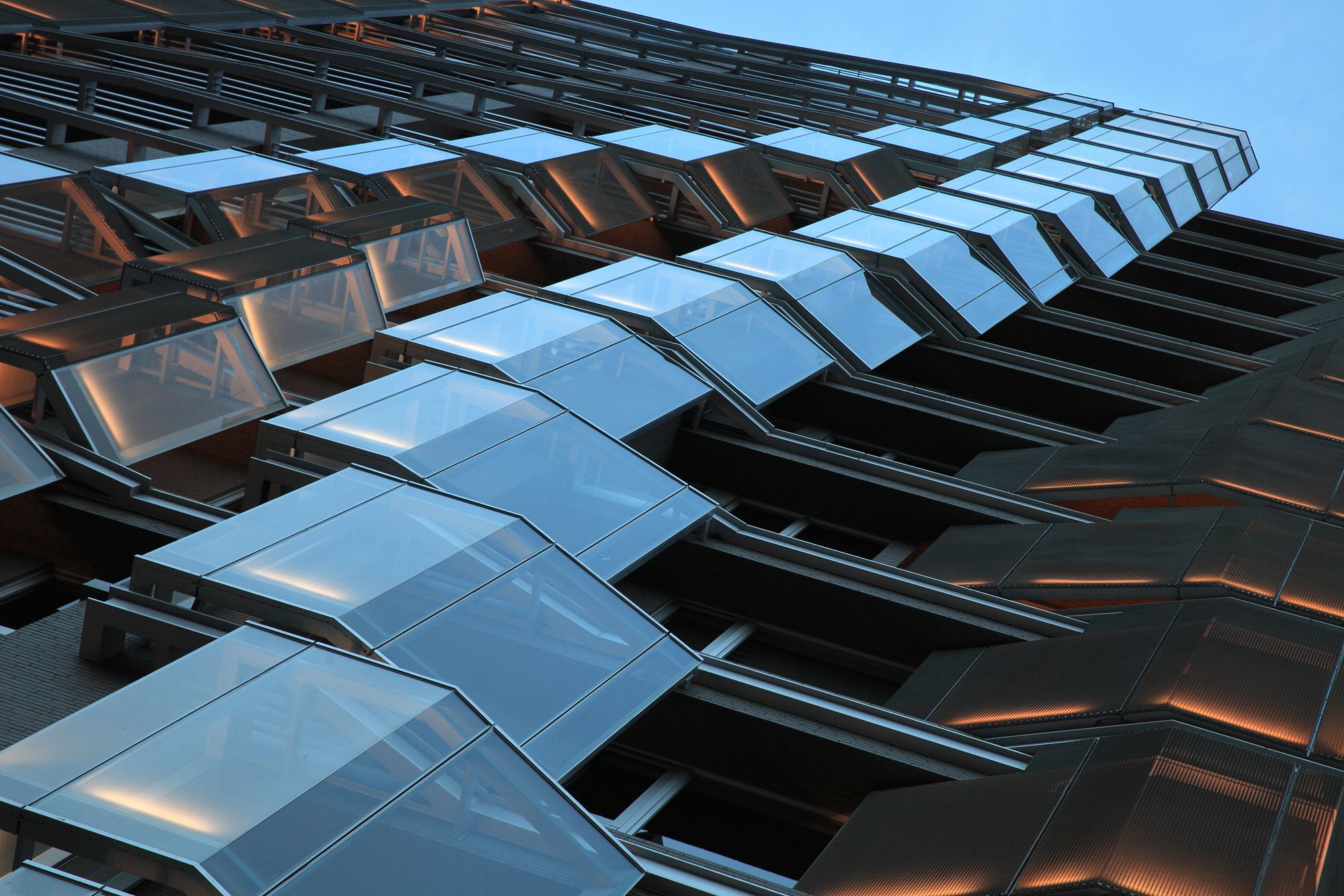
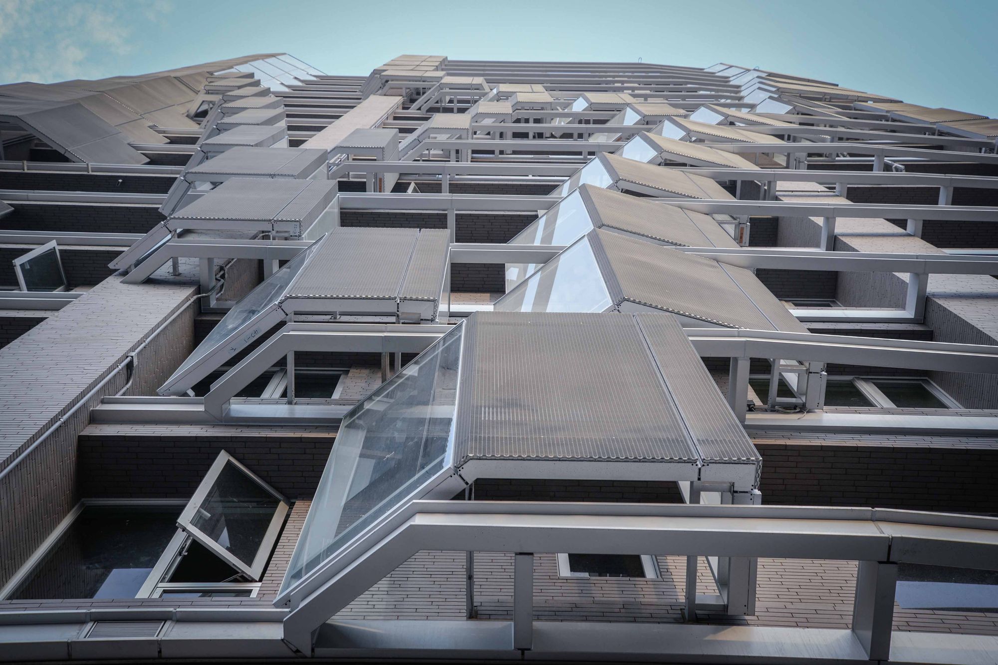
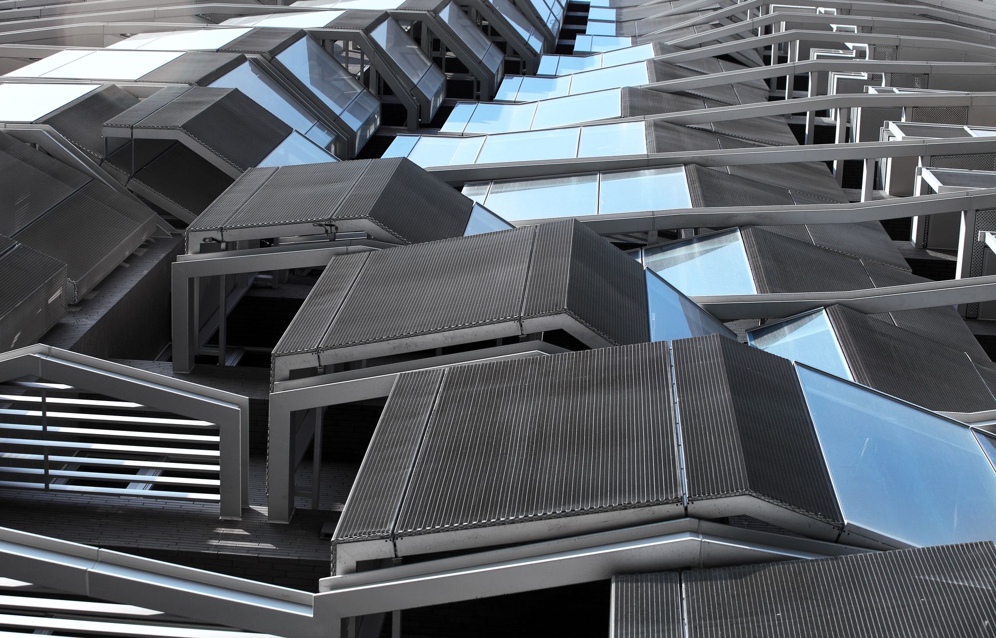
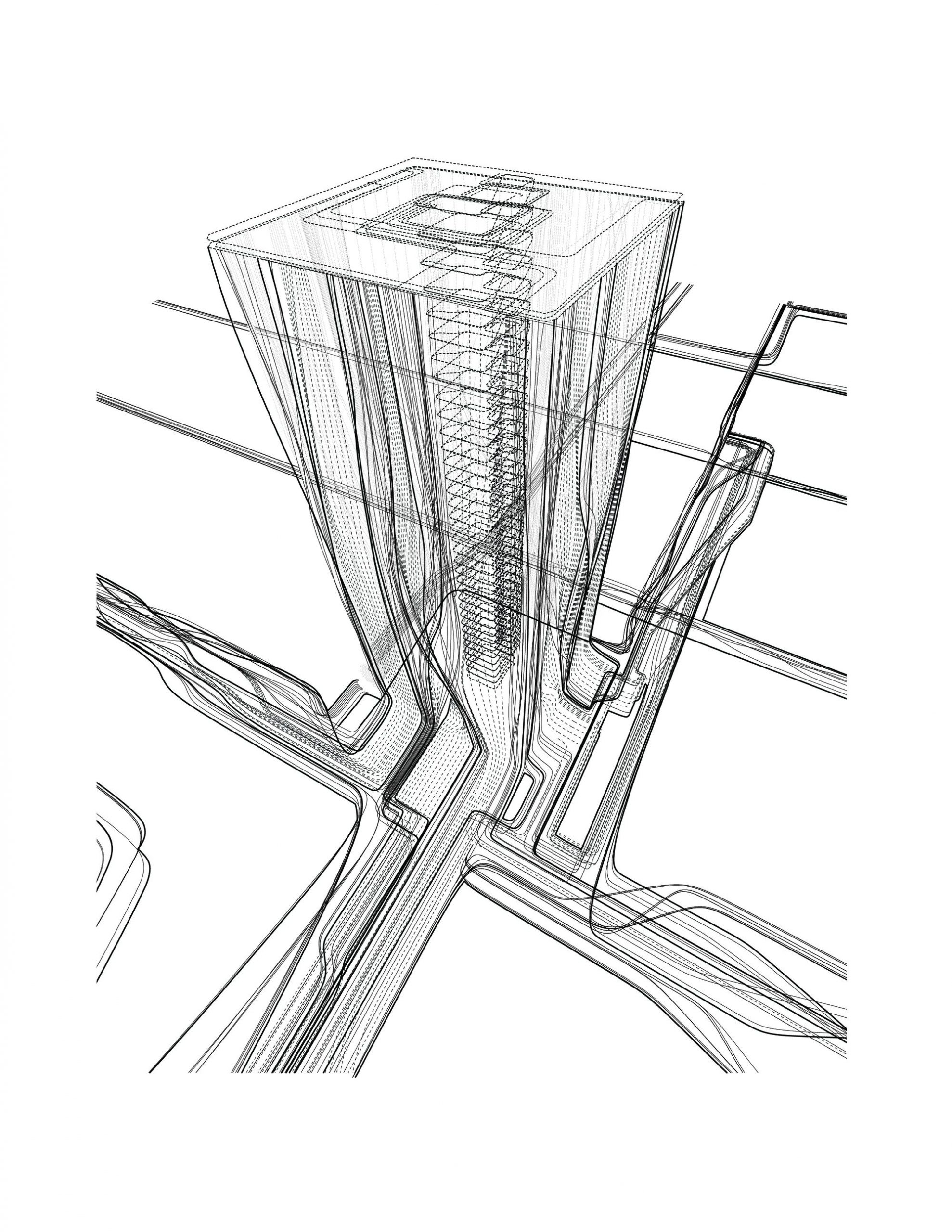
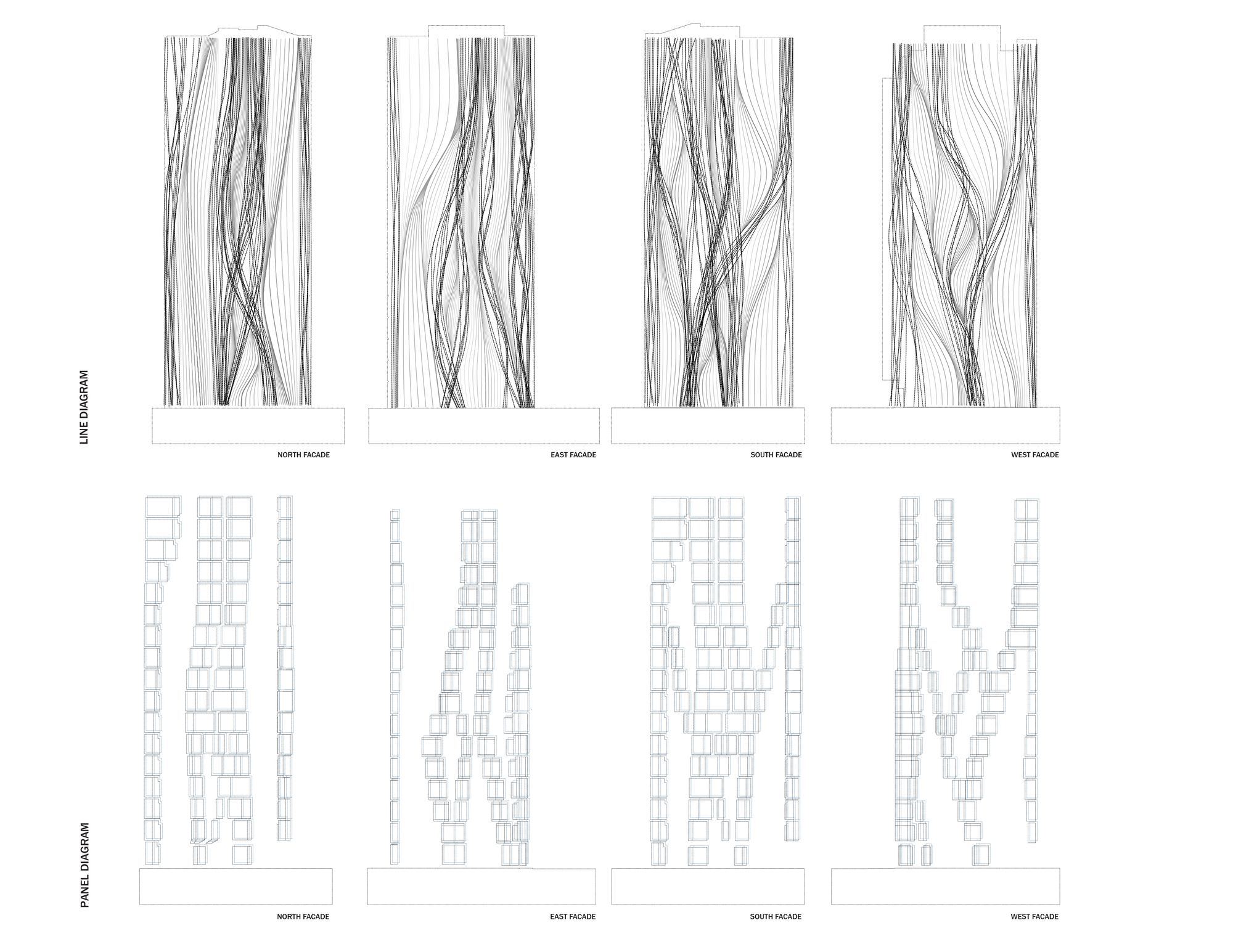
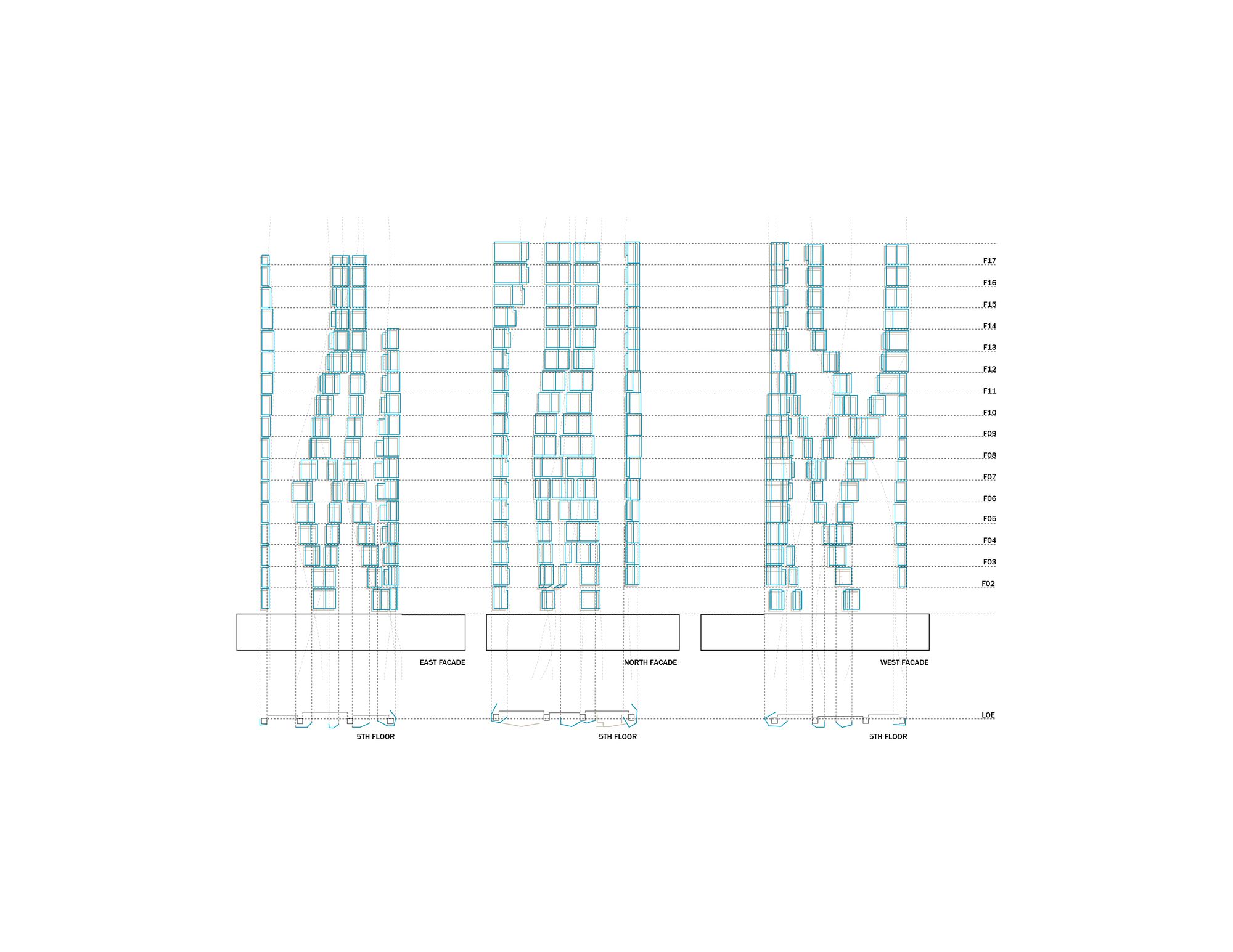
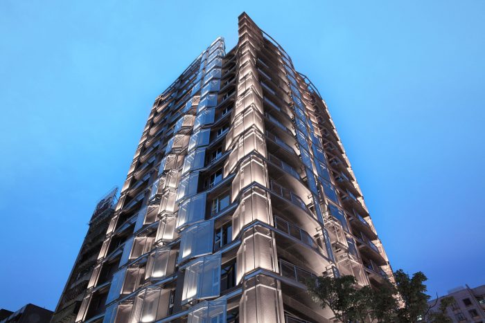
Our proposal utilizes subtle variations in the geometry of the exterior paneling and layering of material to create a scheme that is not based on repetition but still accommodates the needs of the client. We deployed a strategy of “pixilated lines” by applying a set of exterior paneling in varying materials and different geometries to run along the façade of the building as a series of pixilated lines. We also deployed a system of incrementally shifting balconies in conjunction with the panels to add more depth to the facade.
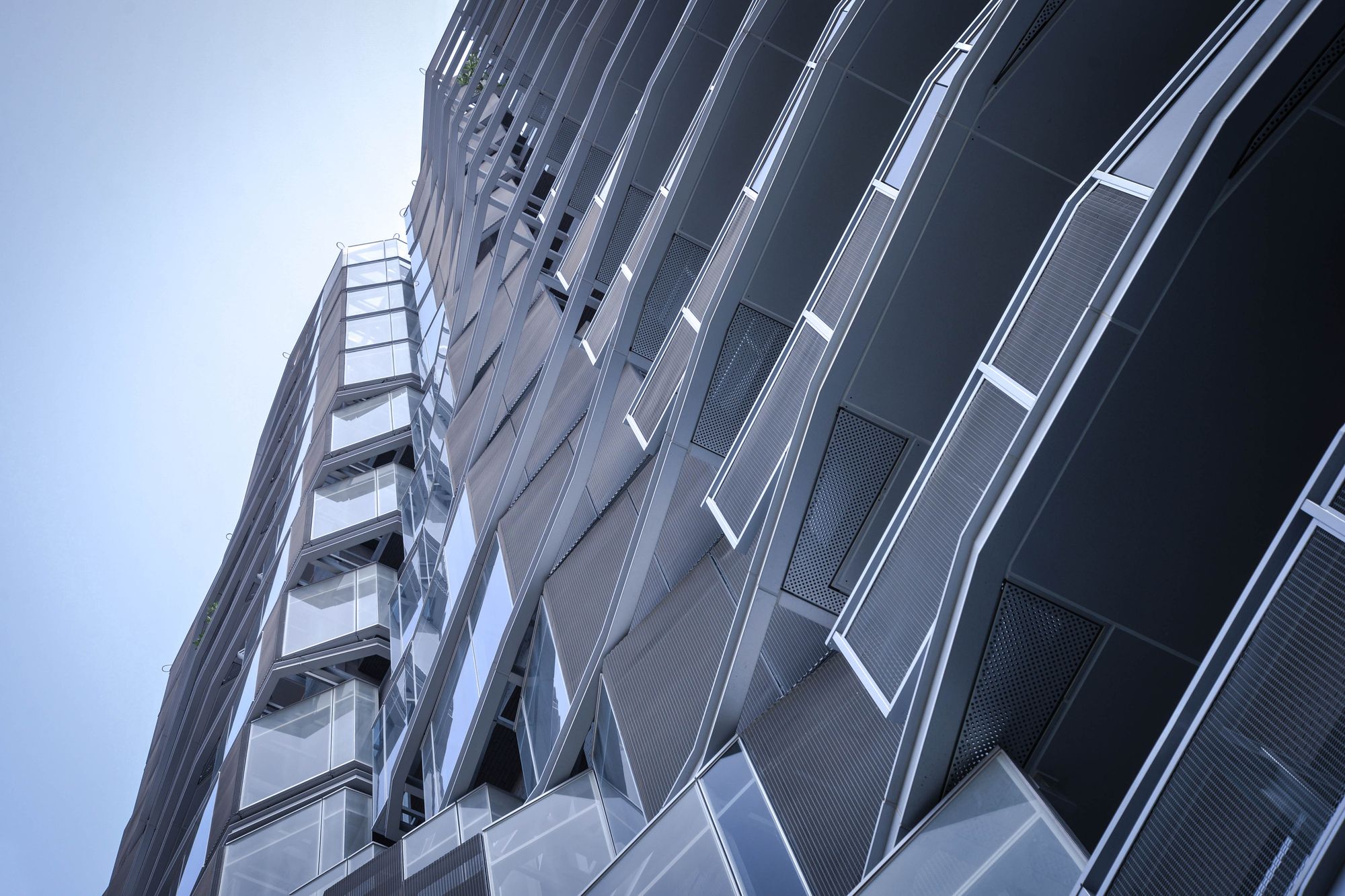
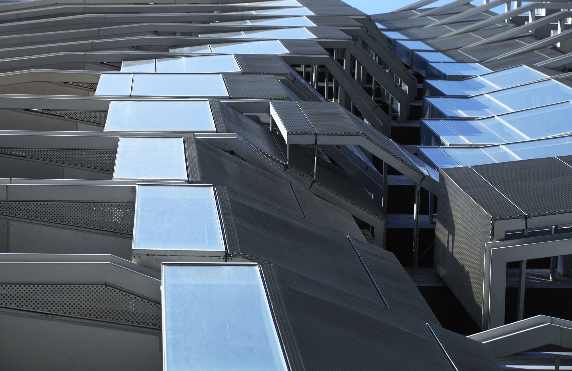
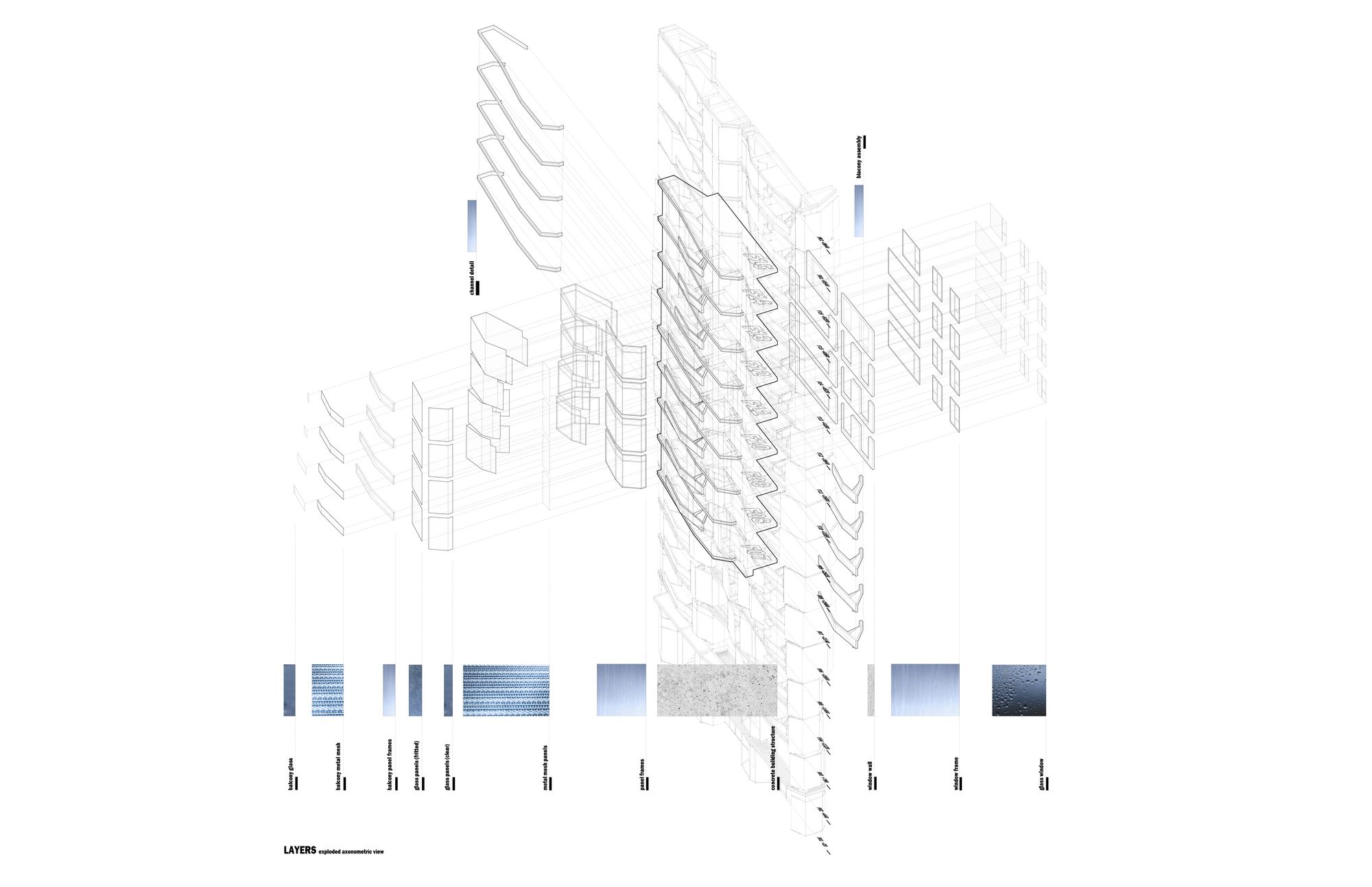
These “lines” of panels extend from the ground to the top floor to give the illusion of depth and movement as well as formal continuity to the overall project. These “lines” often split in order to change material and the voids between “lines” of panels to add depth to the reading of the façade. By shifting sections of fritted glass, expanded aluminum screen, solid panels, and steel structure, the buildup of these small differences create large variations in the façade of the building.
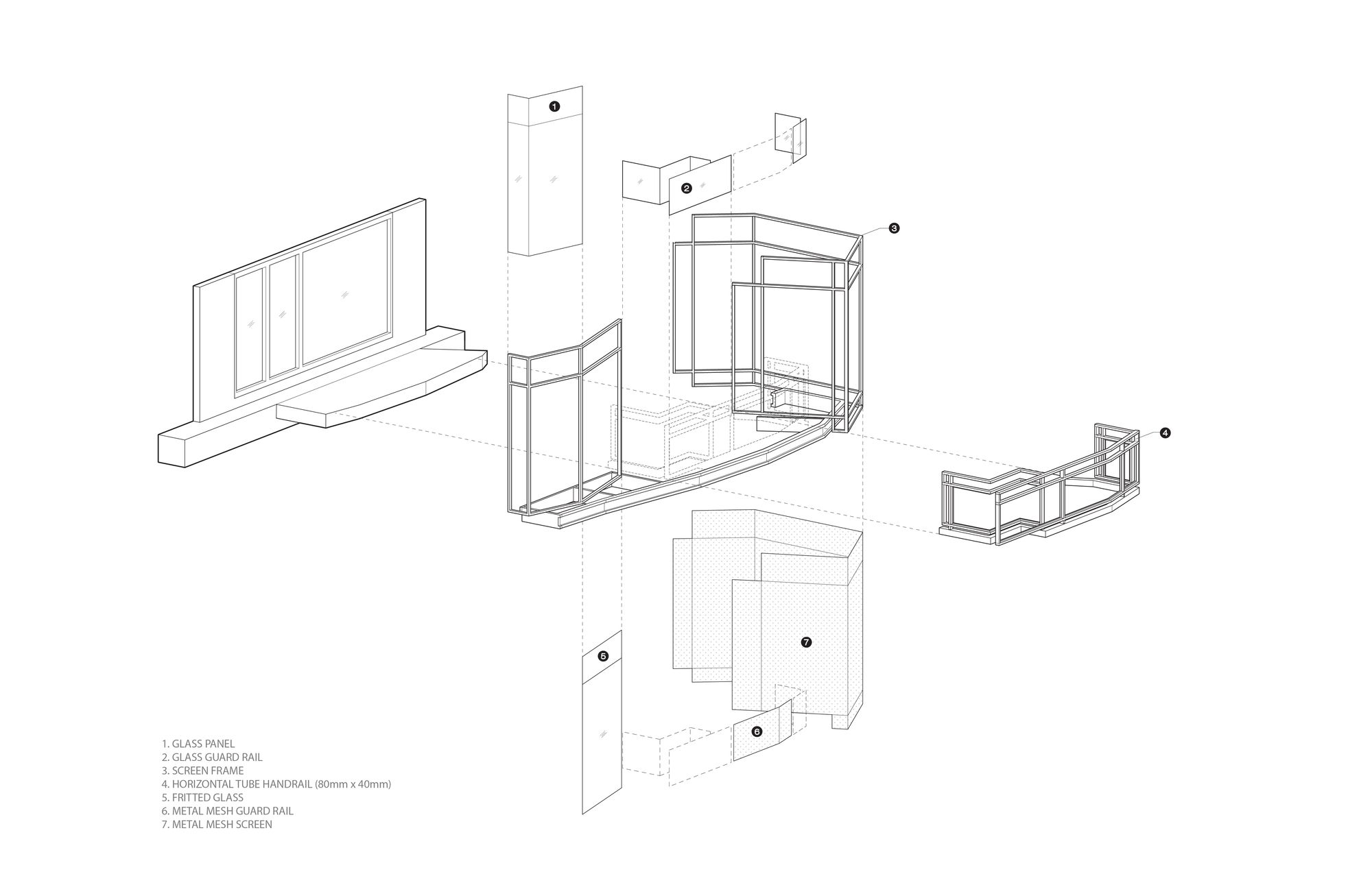
The building includes a carefully considered weaving of four materials: 1) expanded aluminum mesh, 2) fritted glass, 3) solid panel, and 4) steel structure. This is to disrupt the repetitious and occasionally quirky floor plans, while still allowing for views beyond and providing a sun-shading system.
The interplay between metal screens, glass, and solid panels is not merely aesthetic but it also performs functionally. This strategy simultaneously allows for natural light while reducing heat gain, provides privacy for rooms beyond, and it creates a buffer between the interior of the building adjacent elevated highway. And importantly, the exterior of the building communicates a more dynamic building- one that captures the spirit, scale, and multi-layered nature of the city.
Project Info:
Architects: Oyler Wu Collaborative
Location: No. 79, Section 1, Minquan East Road, Zhongshan District, Taipei City, Taiwan
Principal Architects: Dwayne Oyler, Jenny Wu
Design Team: Huy Le, Sanjay Sukie, Shouquan Sun, Yaohua Wang, Lung Chi Chang, Richard Lucero, Chris Eskew, Mike Piscitello
Client: JUT land Development
Area: 9333.37 m2
Project Year: 2017
Photographs: Poyao Shih
Project Name: MONARCH
