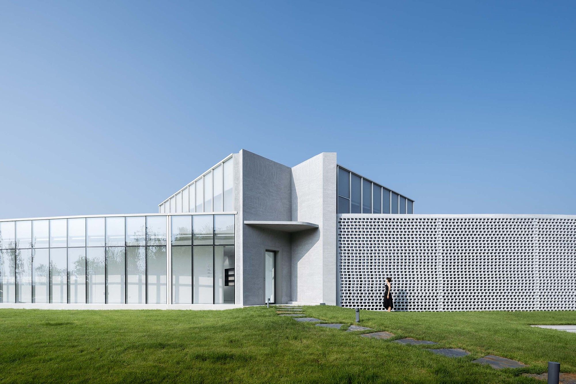
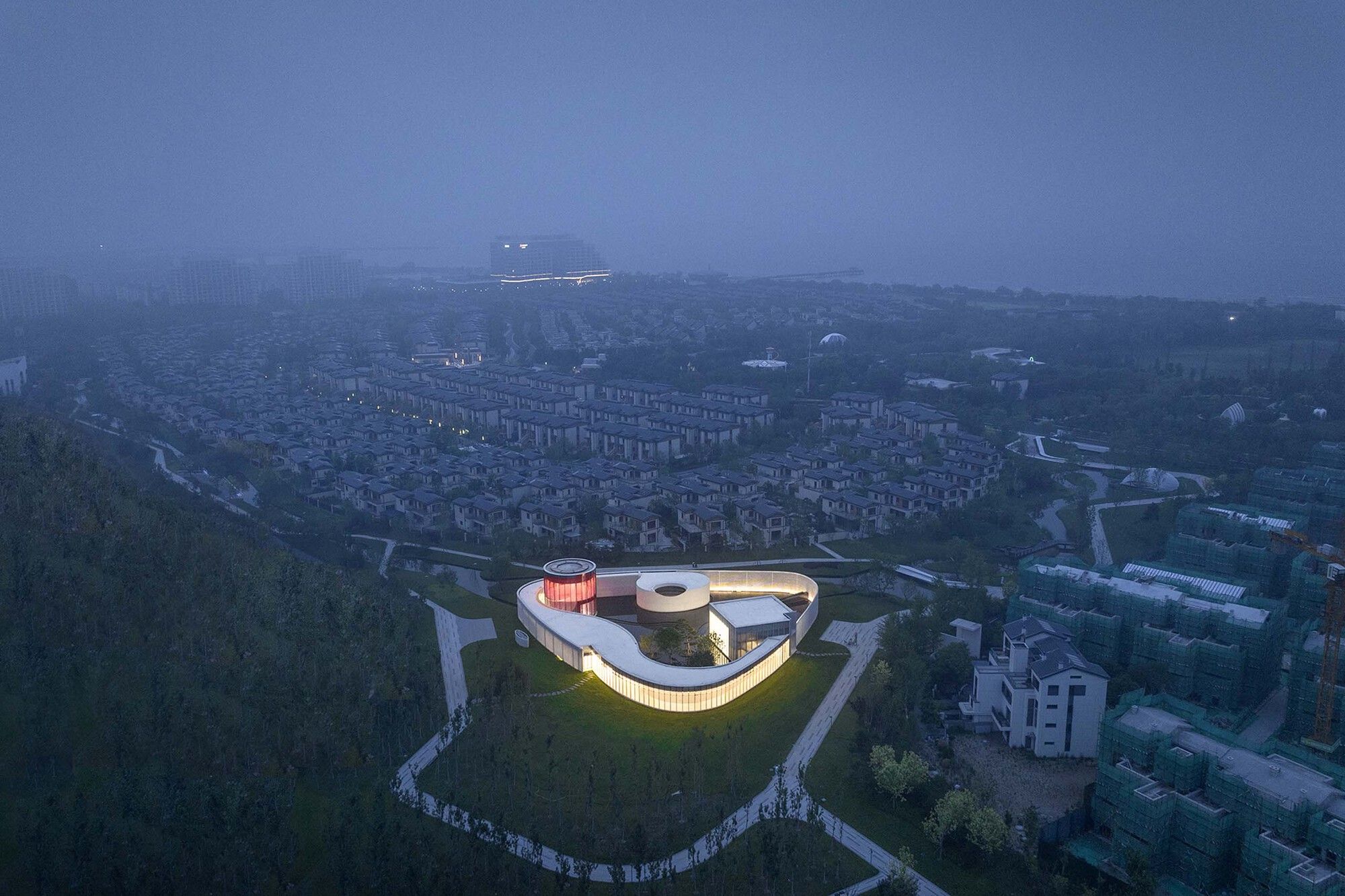
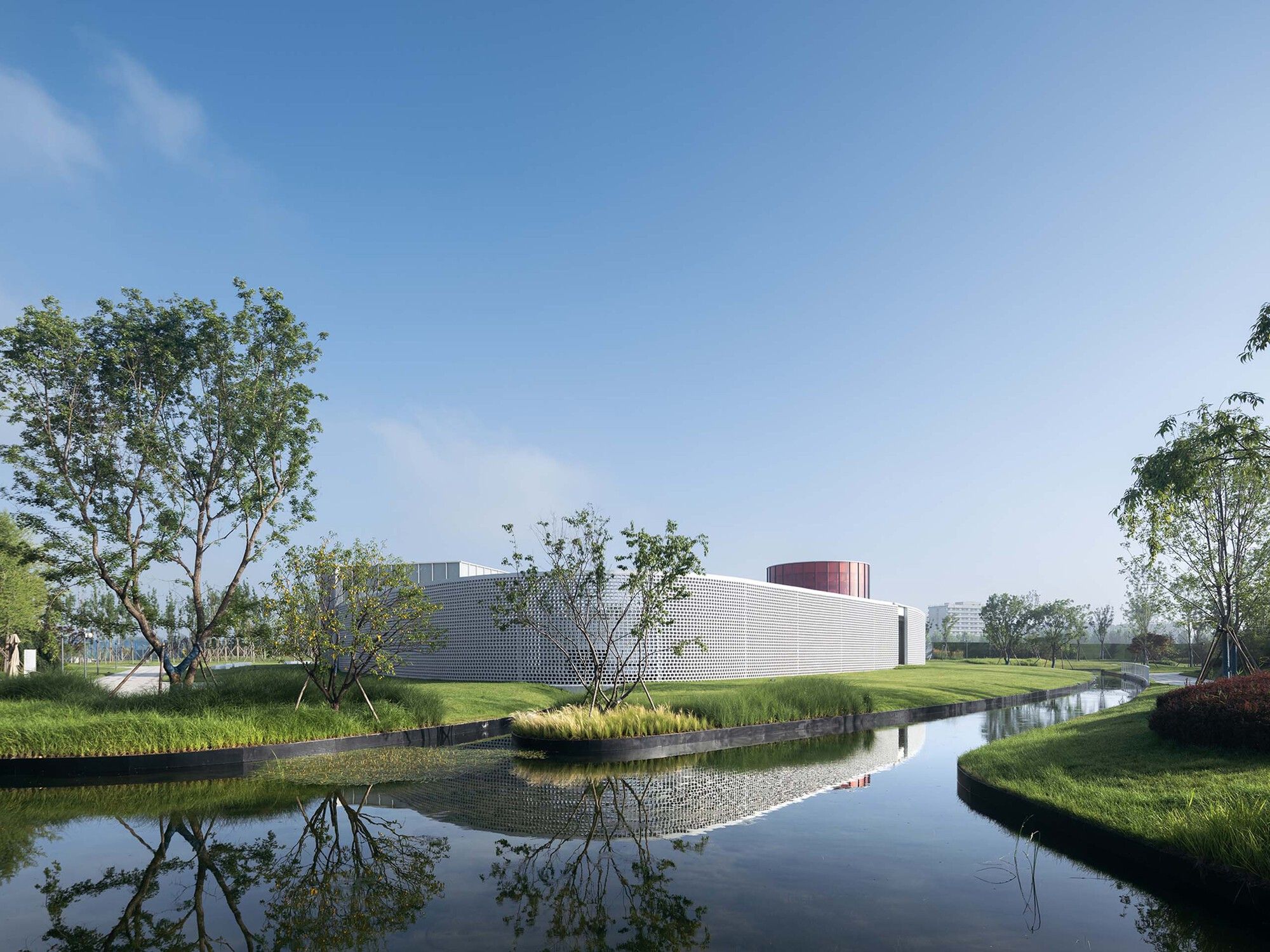
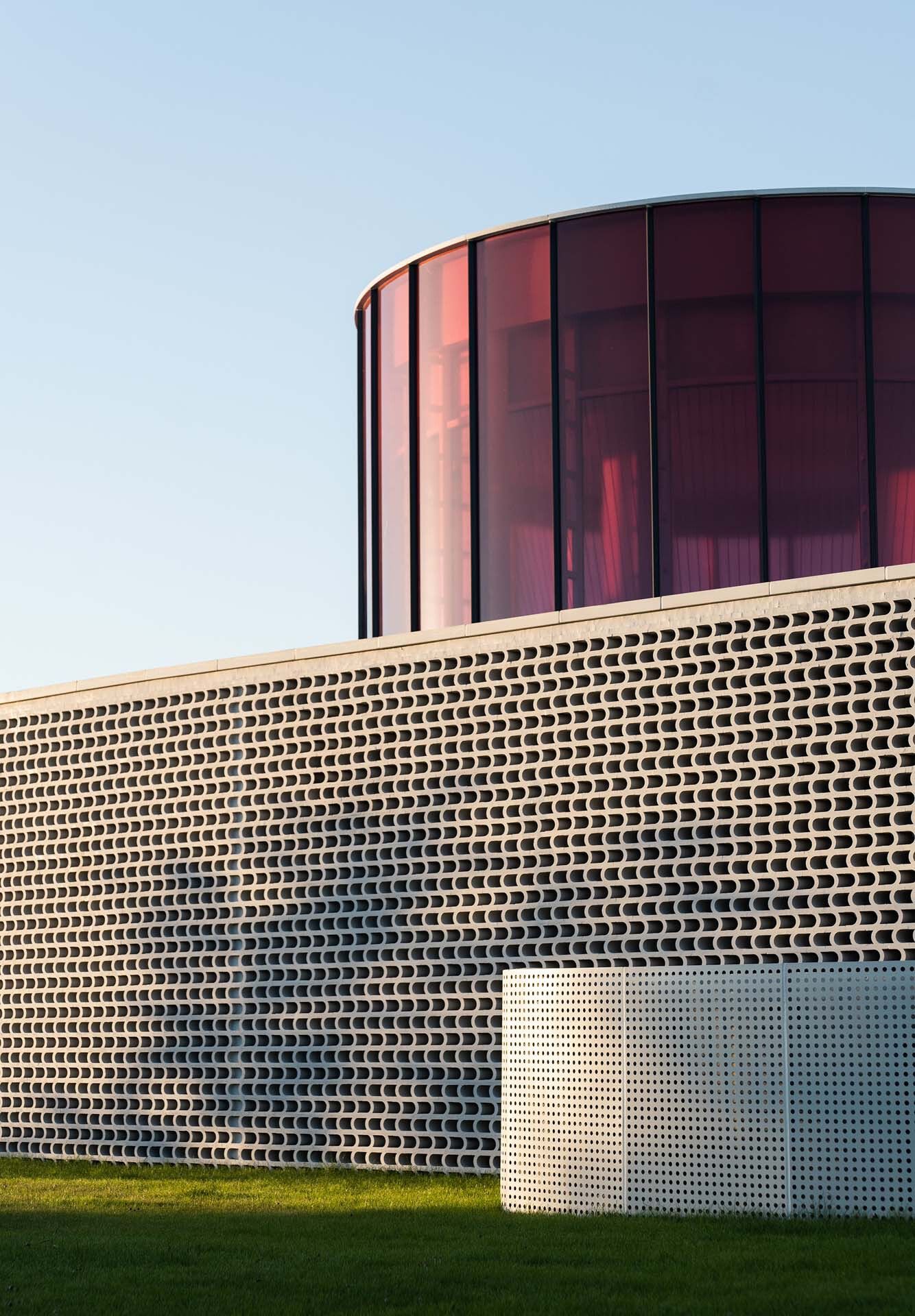
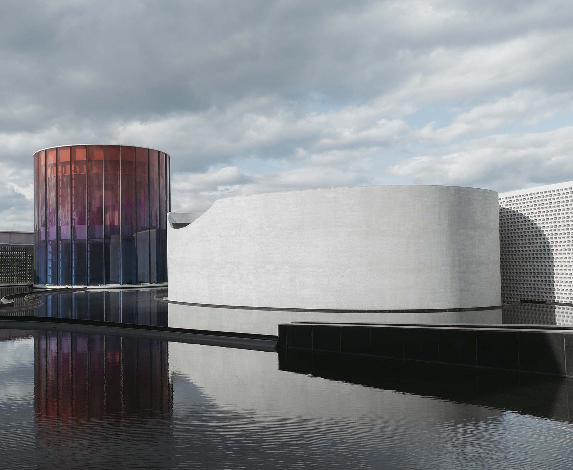
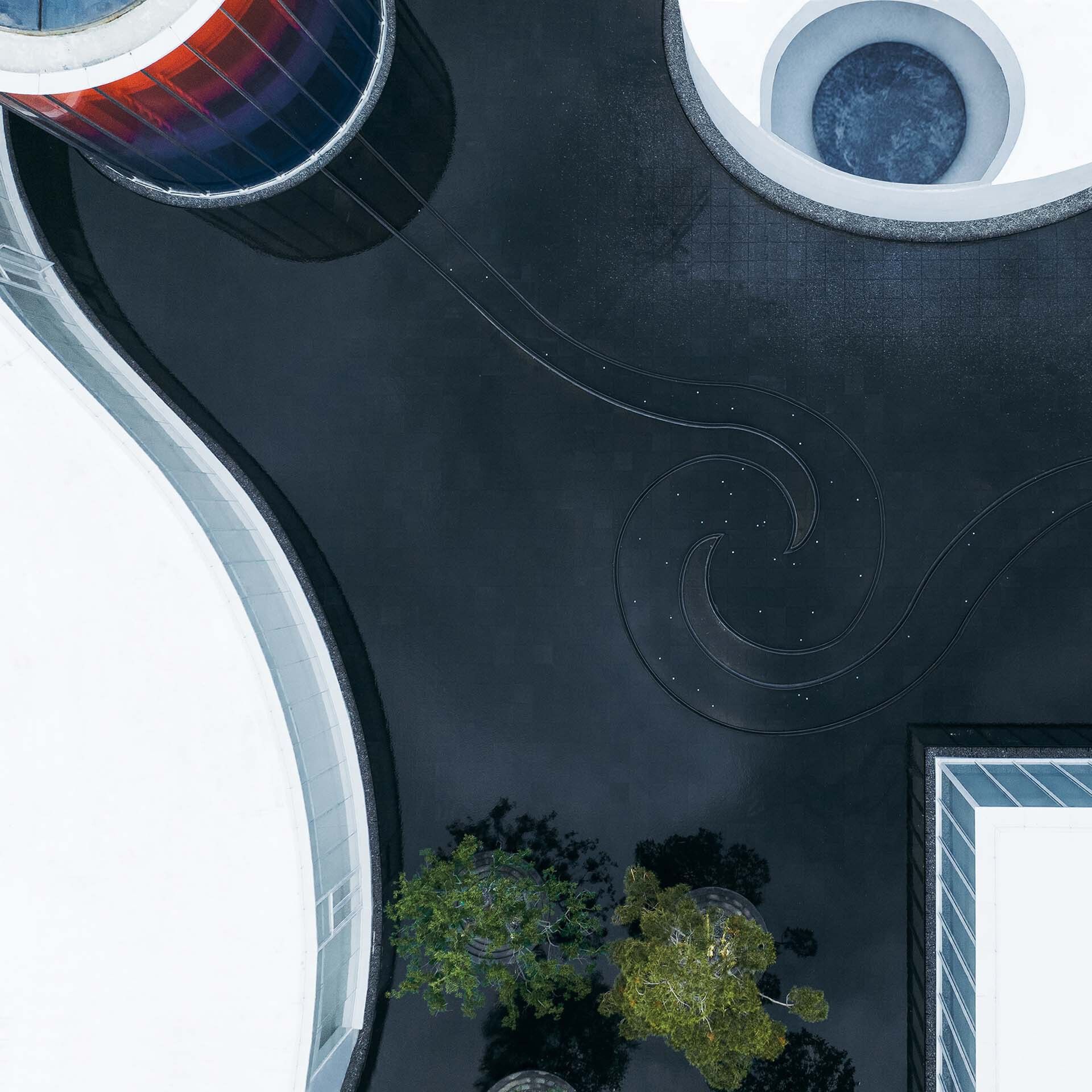
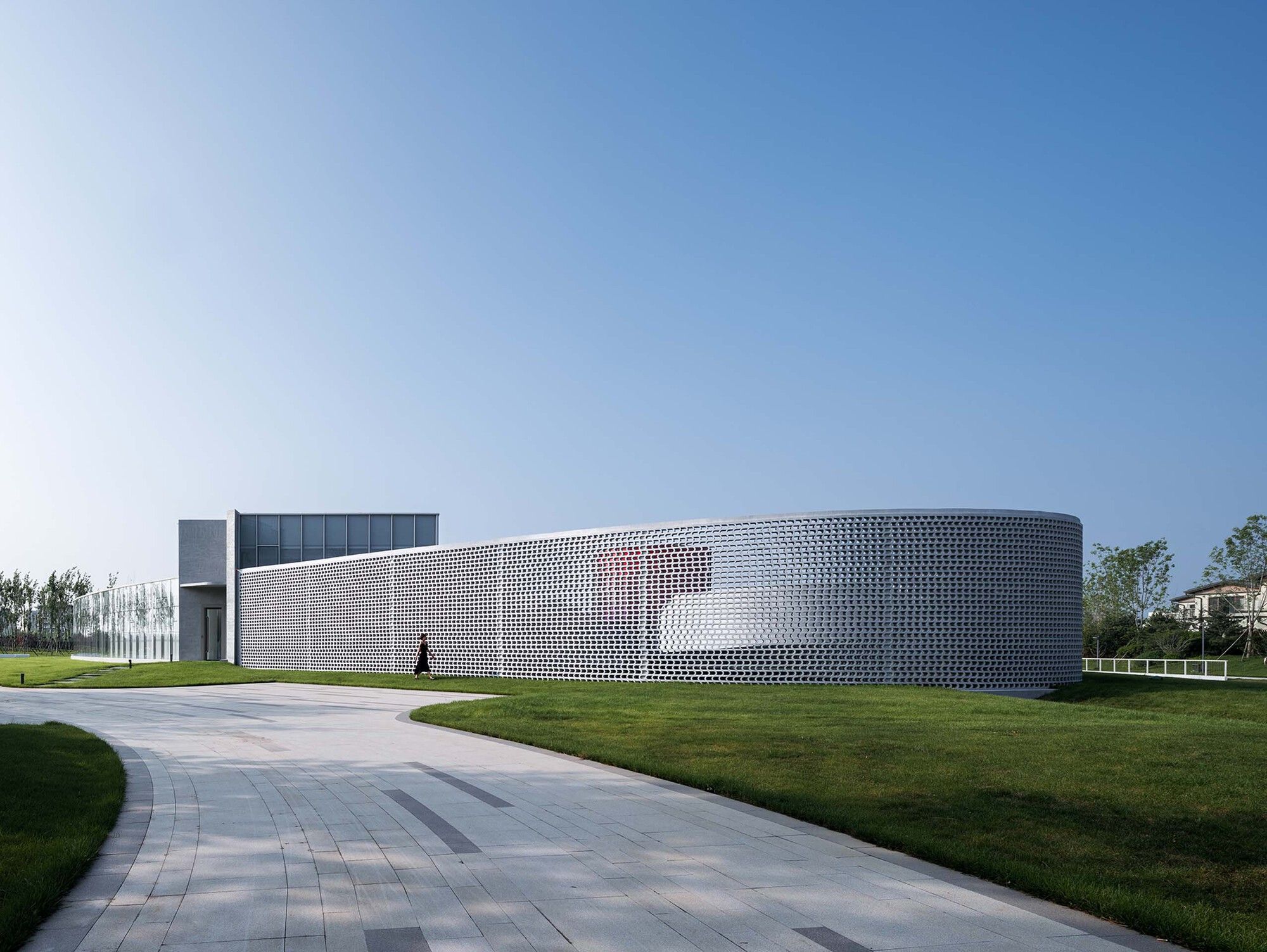
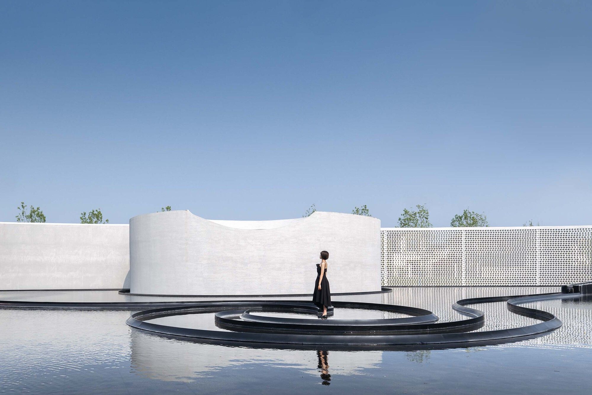
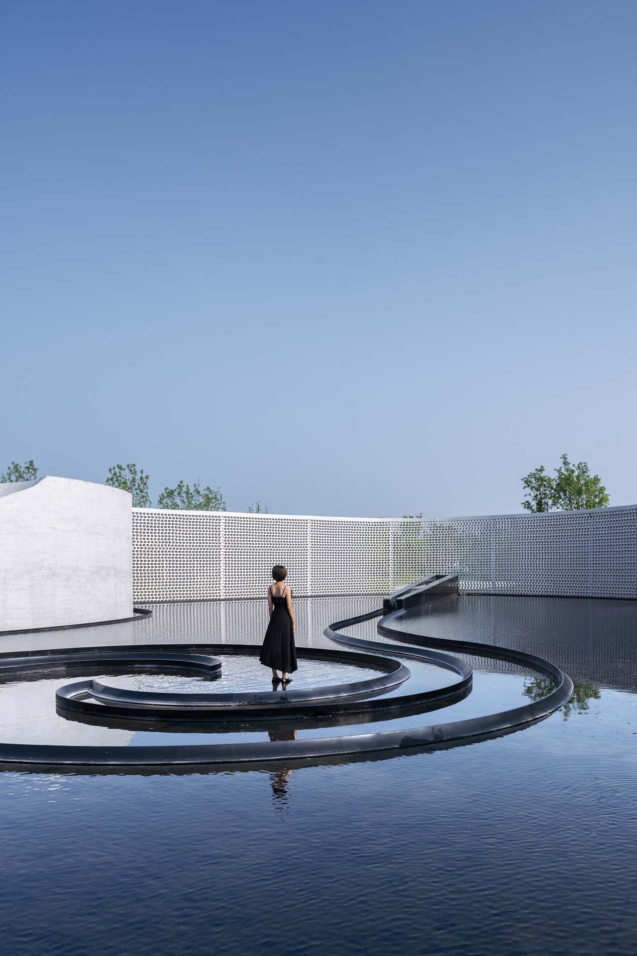
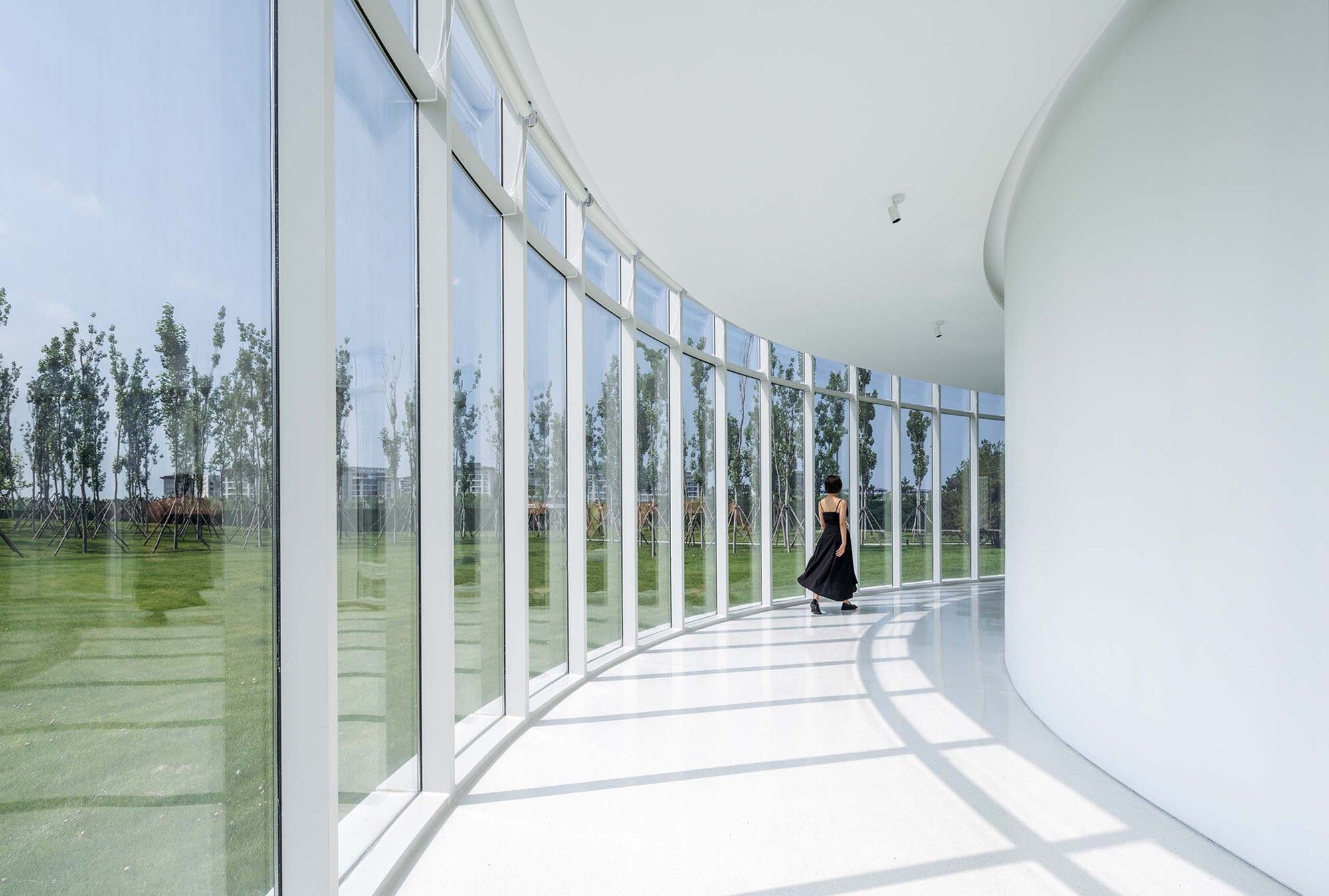
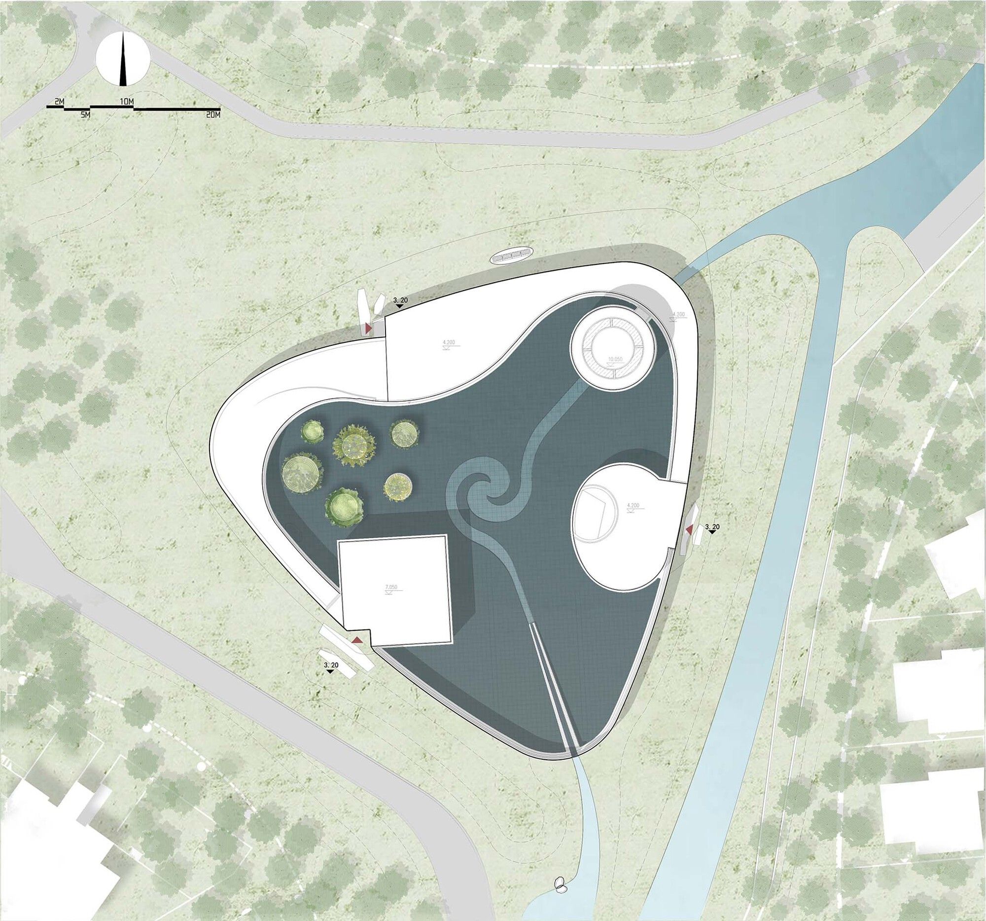
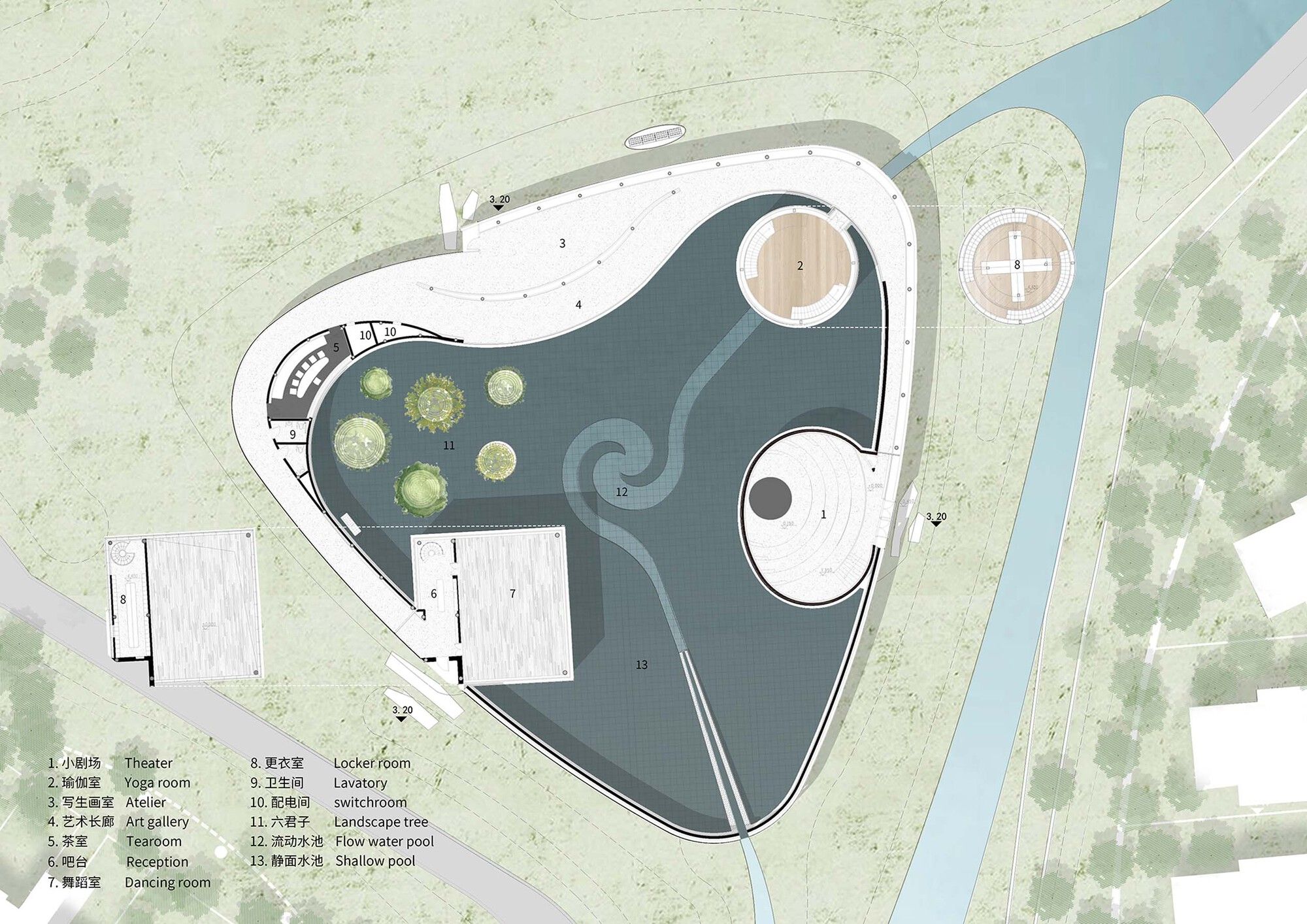
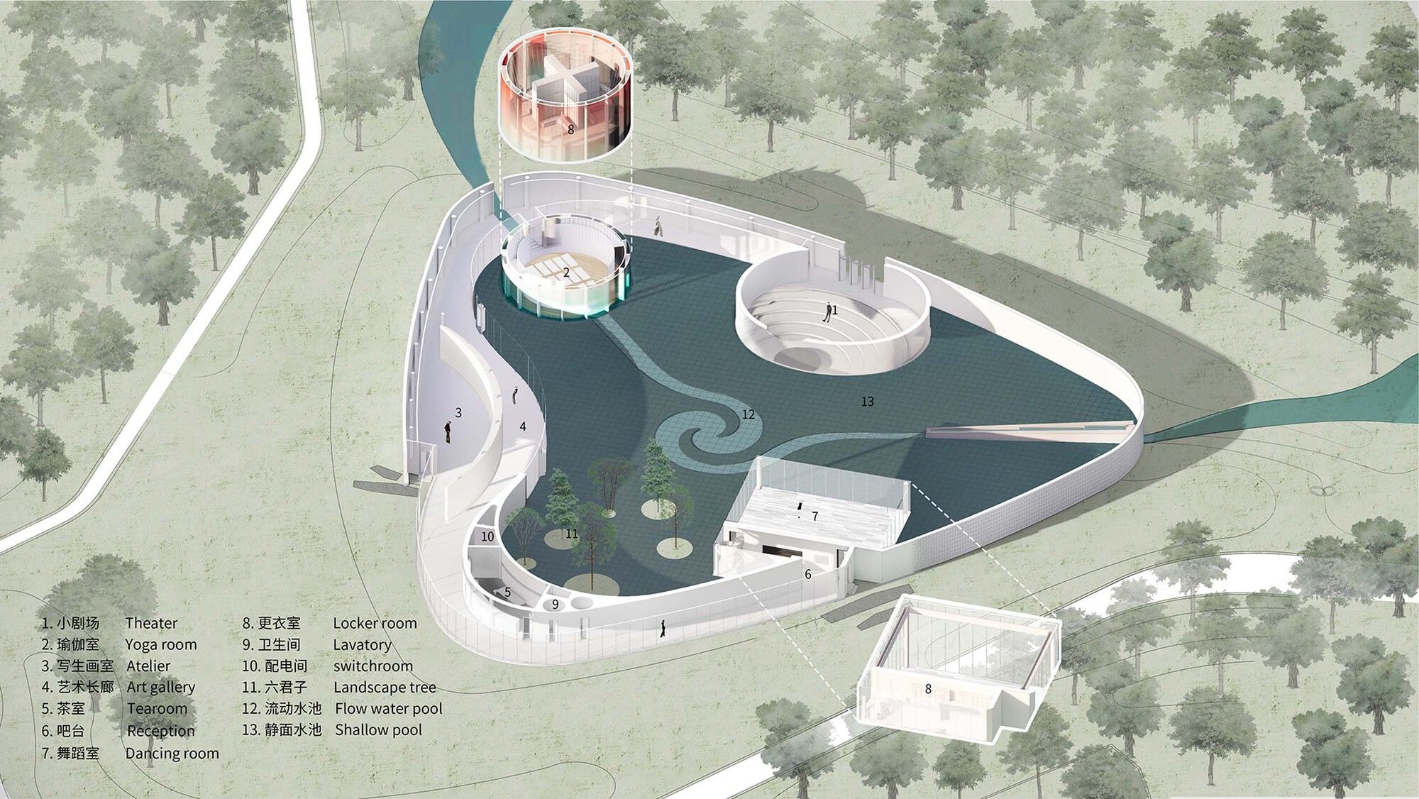
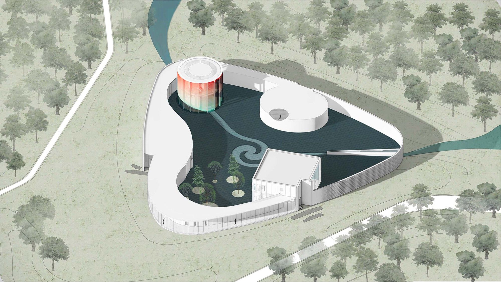
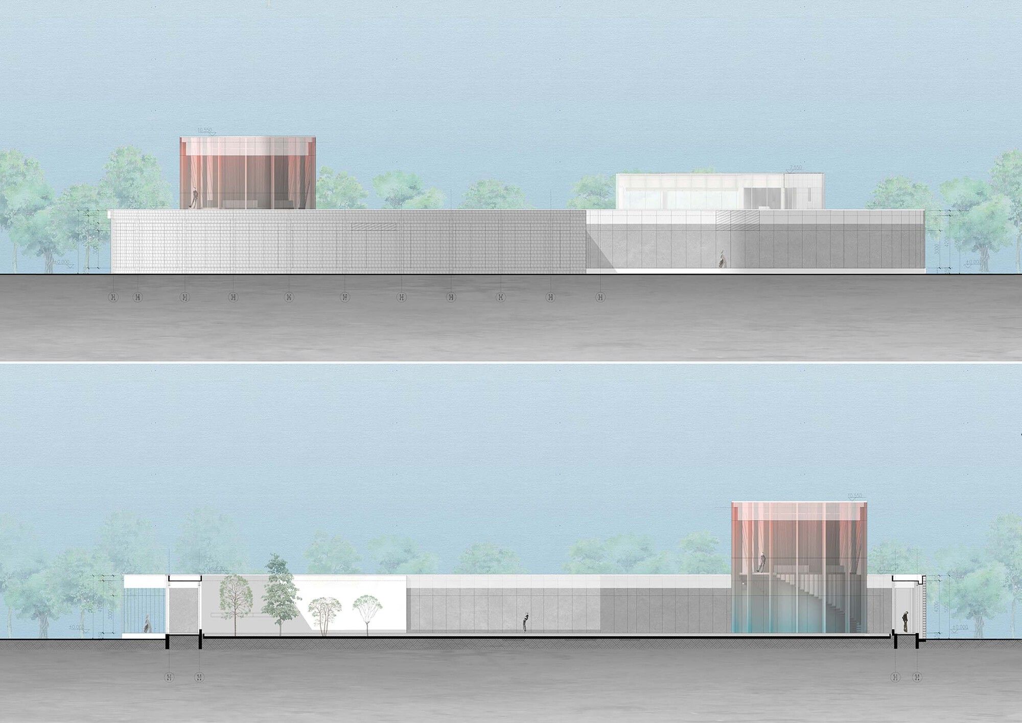
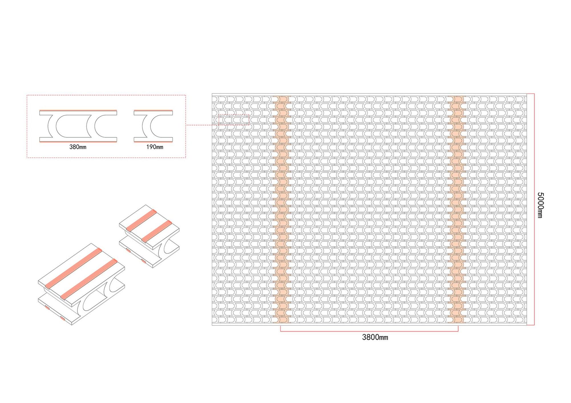
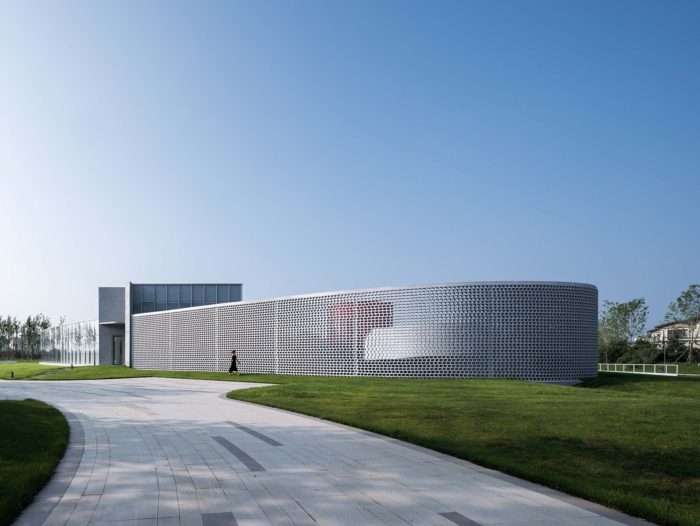
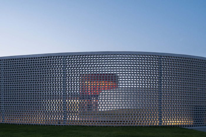
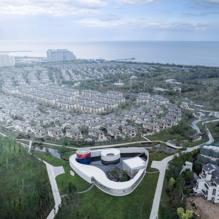
Sino-Ocean Group has hired Wutopia Lab to design a monologue art museum for an endless minority of people who desire to be free from worldly distractions. The museum will be located on the park green of SEATOPIA in Beidaihe, Qinhuangdao. July 2022 saw its completion and public opening. By slicing cowhide into tiny strips and encircling a plot of ground, Queen Dido built the mighty Carthage. I divided the 1,300-square-meter building into various monoliths paired with walls, corridors, and ambiguous spaces to create the 3,600-square-meter Monologue Art Museum, which is situated in an open green area at the crossroads of three residential clusters on the Weilan Coast campus.
Monologue Art Museum’s Design Concept
An Even Greater Charm.
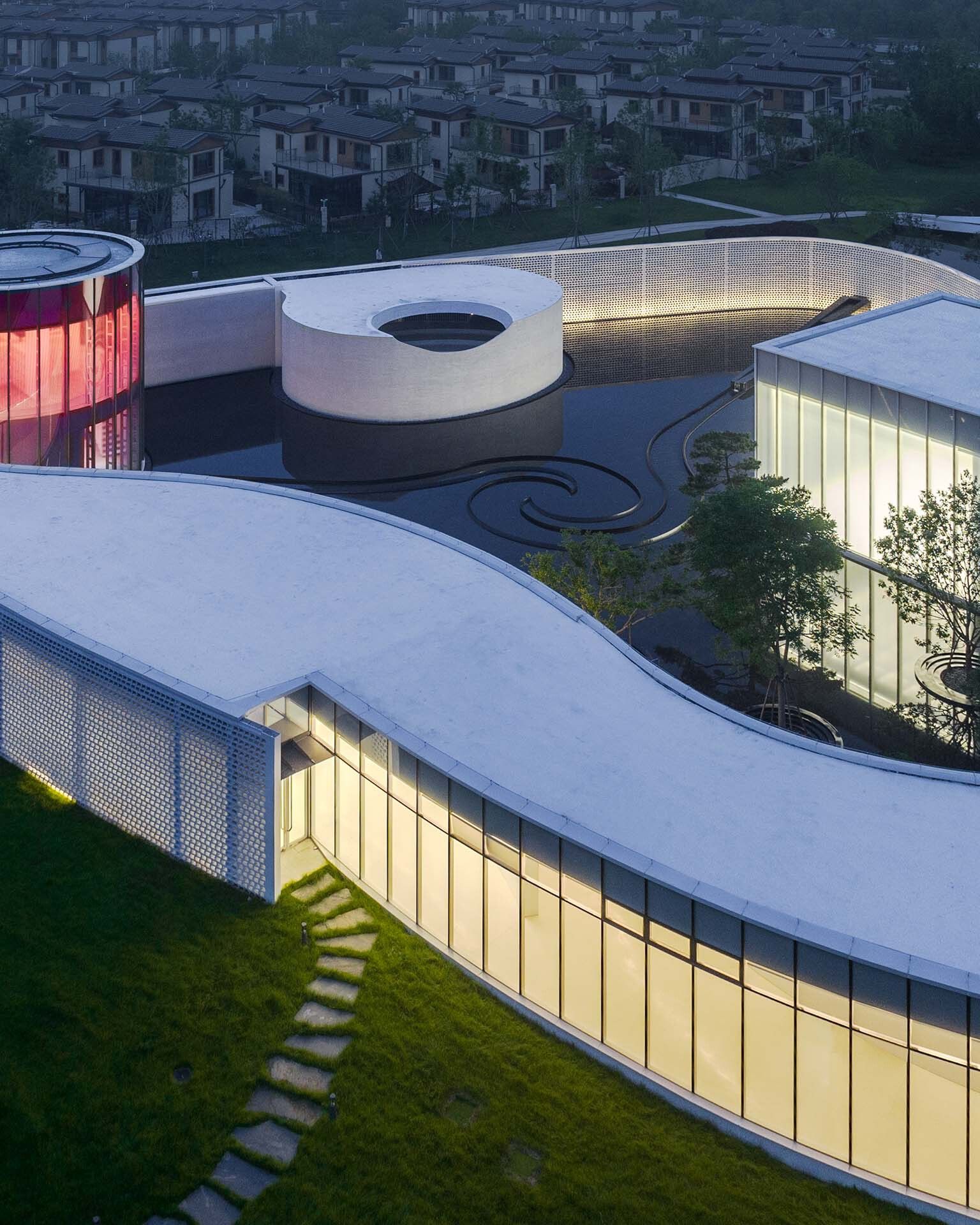
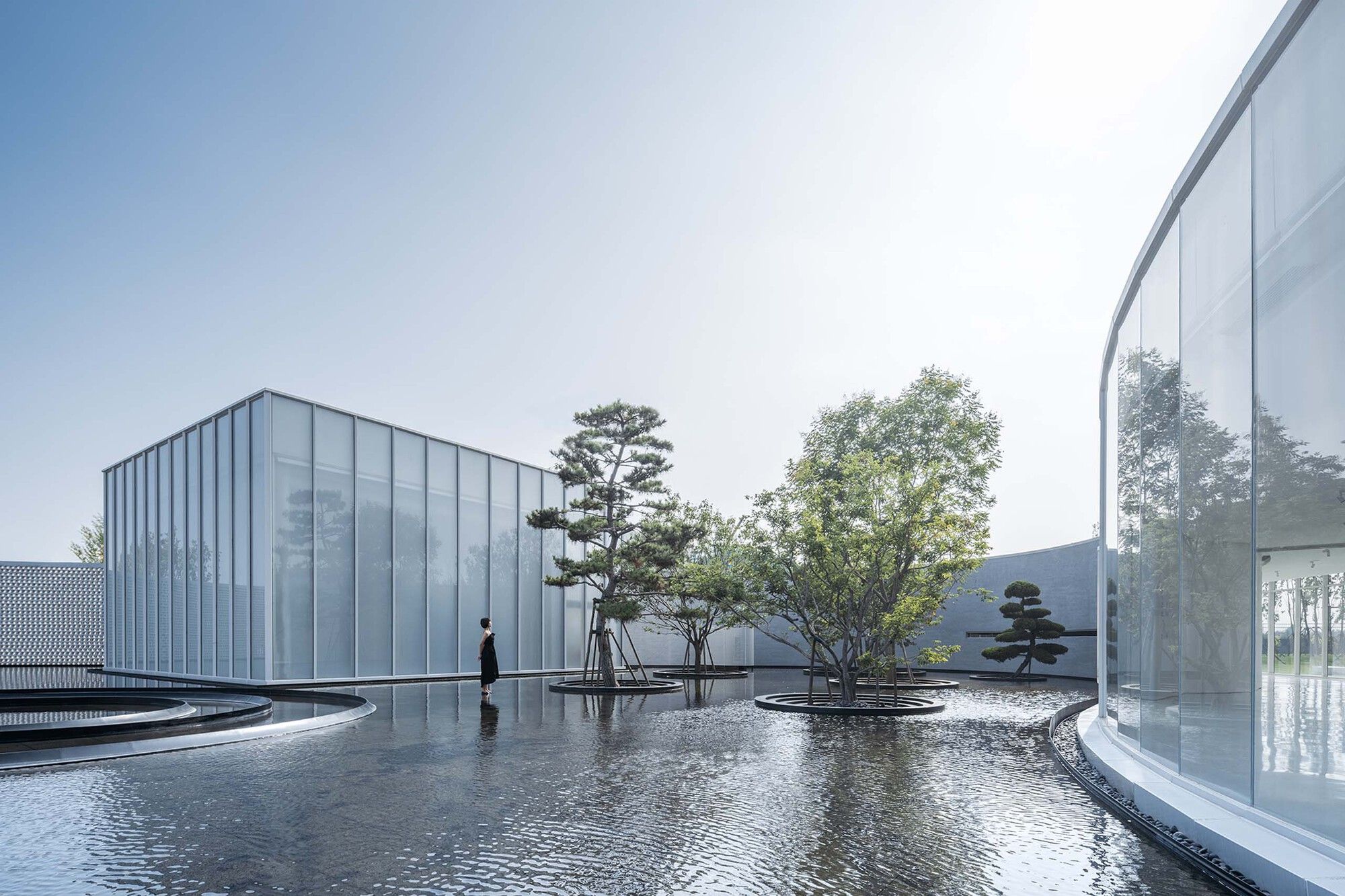
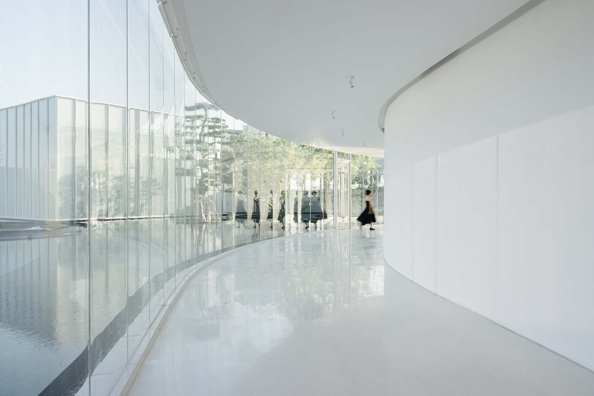
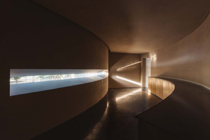
Side A: The Monologue Museum is a scroll of hands that progressively unfolds. Beginning at the tiny entrance theater, where light streams in from the corners, and moving through the colorful yoga room and into the bright art gallery (which houses the exhibition and painting rooms), the peaceful water courtyard gradually becomes visible as you walk along the open corridor with changing lighting. Then the route narrows, and the light fades, almost making you miss the tearoom tucked behind the wall. There’s a dancing studio at the end. After leaving the building, you walk along the flower wall and into the shaded area where the water is wading. Seemingly headed towards the sea, the water flows through the middle of the structure and submerges it. When I discovered the small theater and six trees near the lake, they were swaying their heads in the wind and talking. The entire environment, including the sounds and ideas, gradually came to life in paintings.
Side B: One-sided An art museum is a multipurpose venue. It permits multiple people to occupy distinct areas simultaneously, yet it also permits artistic solitude. The structural design is not earthquake-resistant, and the plan is complicated and asymmetrical. On the other hand, when the museum is divided, the oval theater, the circular yoga studio, the rectangular dance studio, and the art gallery are all symmetrical and regular and have outstanding seismic performance. To split them into four separate structural parts, structural engineer Lao Hu built up three seismic joints in this way. By releasing the extra-long structure’s expansion and deformation, heat stress was lessened, and temperature-related structural cracks were prevented. In order to maintain the visual continuity of my painting, I had to accommodate the seismic joints and carefully construct the nodes to hide their appearance on the façade, inside, and roof.
The Way Back Then, Still.
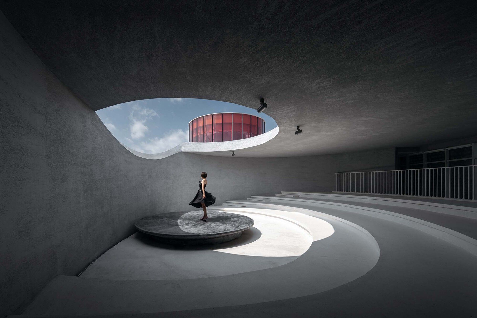
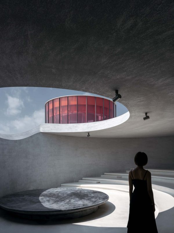
Side A: The Monologue Art Museum’s entryway is home to the little theater. It was intended to be a flexible space in order to minimize the floor area needed to compute the floor area ratio. Simultaneously, the little theater was constructed as a contained area so as to focus the audience’s attention on the performance rather than dramatizing the core water scene. I carved a curved skylight above the rear of the stage so that moonlight or daylight might cascade down like a waterfall because “there is a crack in everything, that’s how the light gets in.”
Side B: Set apart from the main steel structure, an elliptical column resting on the pool forms the little theater’s continuous closure of reinforced concrete wall panels. It is peaceful outside, yet noisy within.
One and Only.
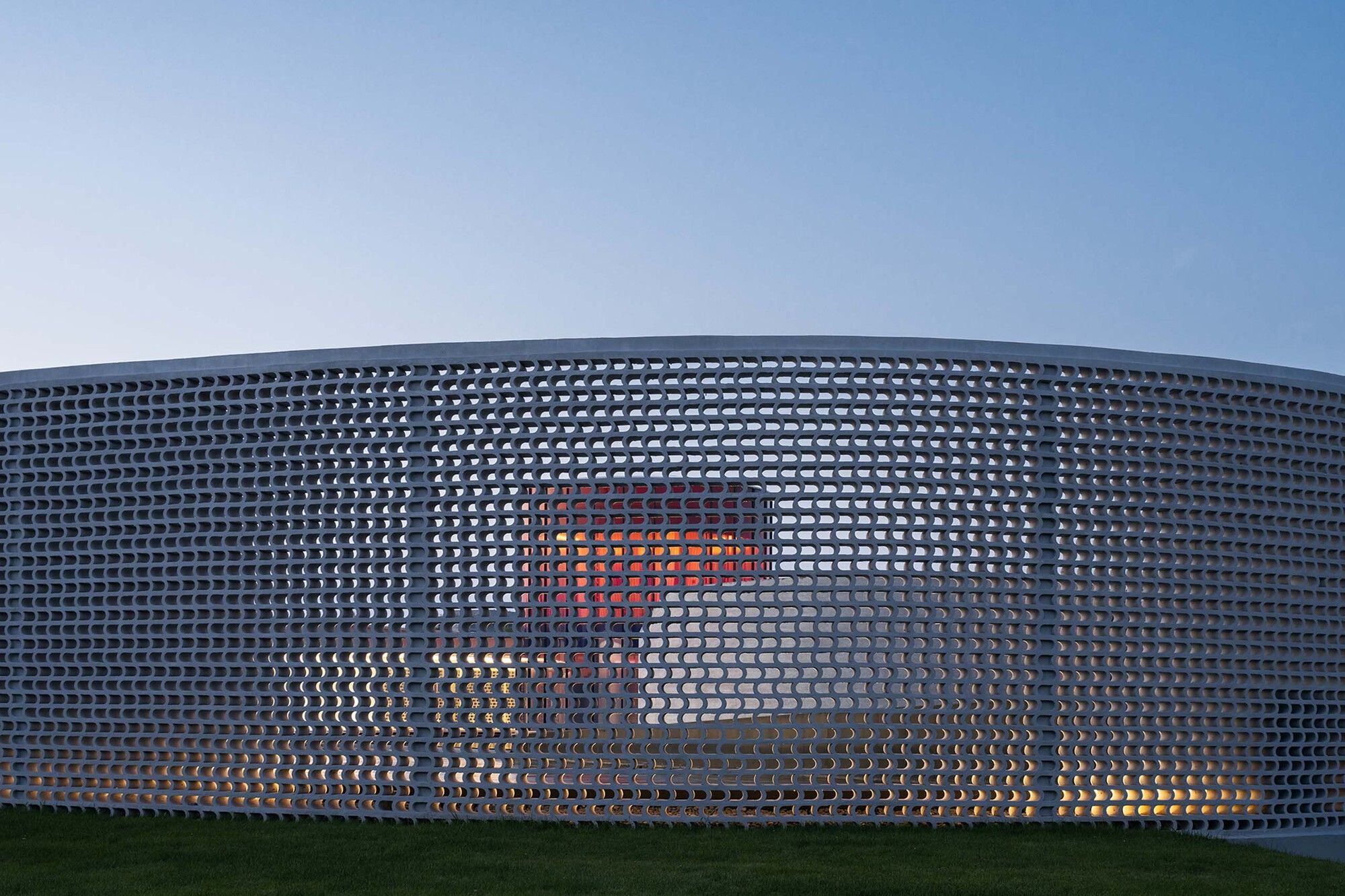
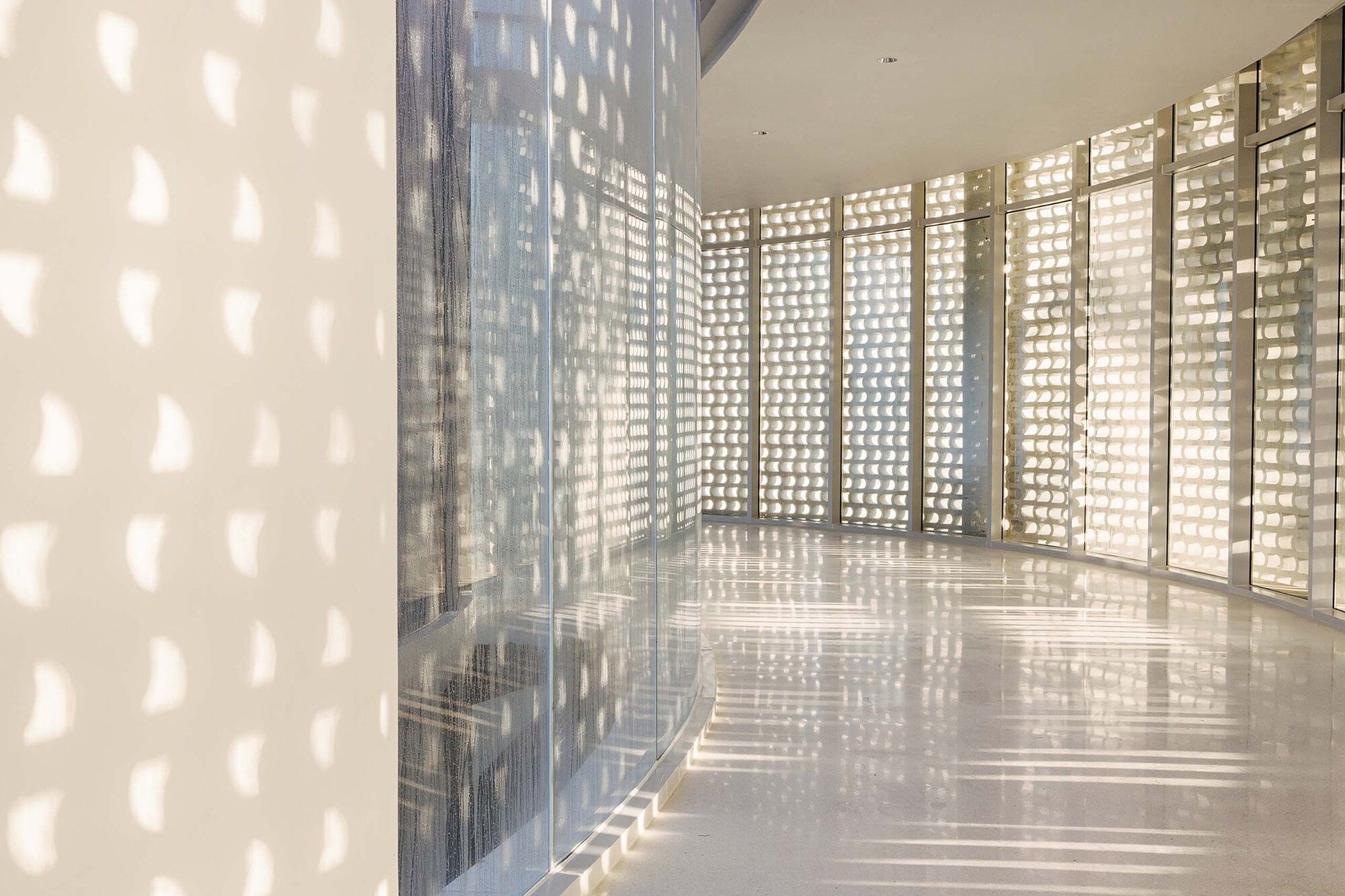
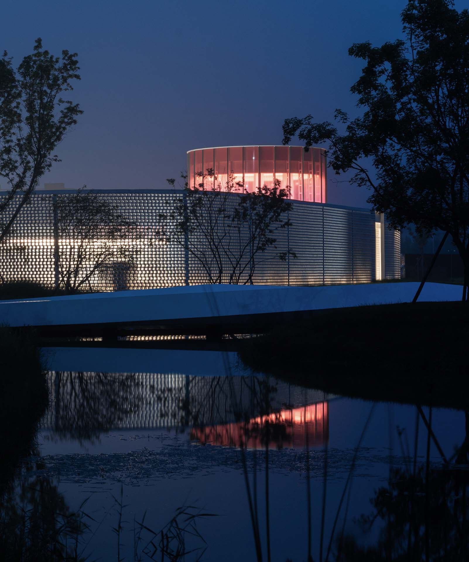
Side A: Lines are the most artistic aspect of Chinese artwork. Several brush sections are utilized to create several kinds of lines on the paper: thick and light, dry and wet, straight and flexible, and continuously varying in thickness. These lines convey frequency information in addition to space. The Monologue’s border appears to be like a moving ink line. In the architecture, I employ white rather than black. The tiny oval theater serves as the initial stroke. The yoga room is the tip; the floral wall is the dried brush; the art gallery is the stroke that unites these; and the hallway with the nib is the thin and relatively fast one. The art museum and gallery are first closed on the exterior and open to the water courtyard on the inside. Later, they are closed on the inside and open to the expansive landscape, which mimics the movement of a pen.
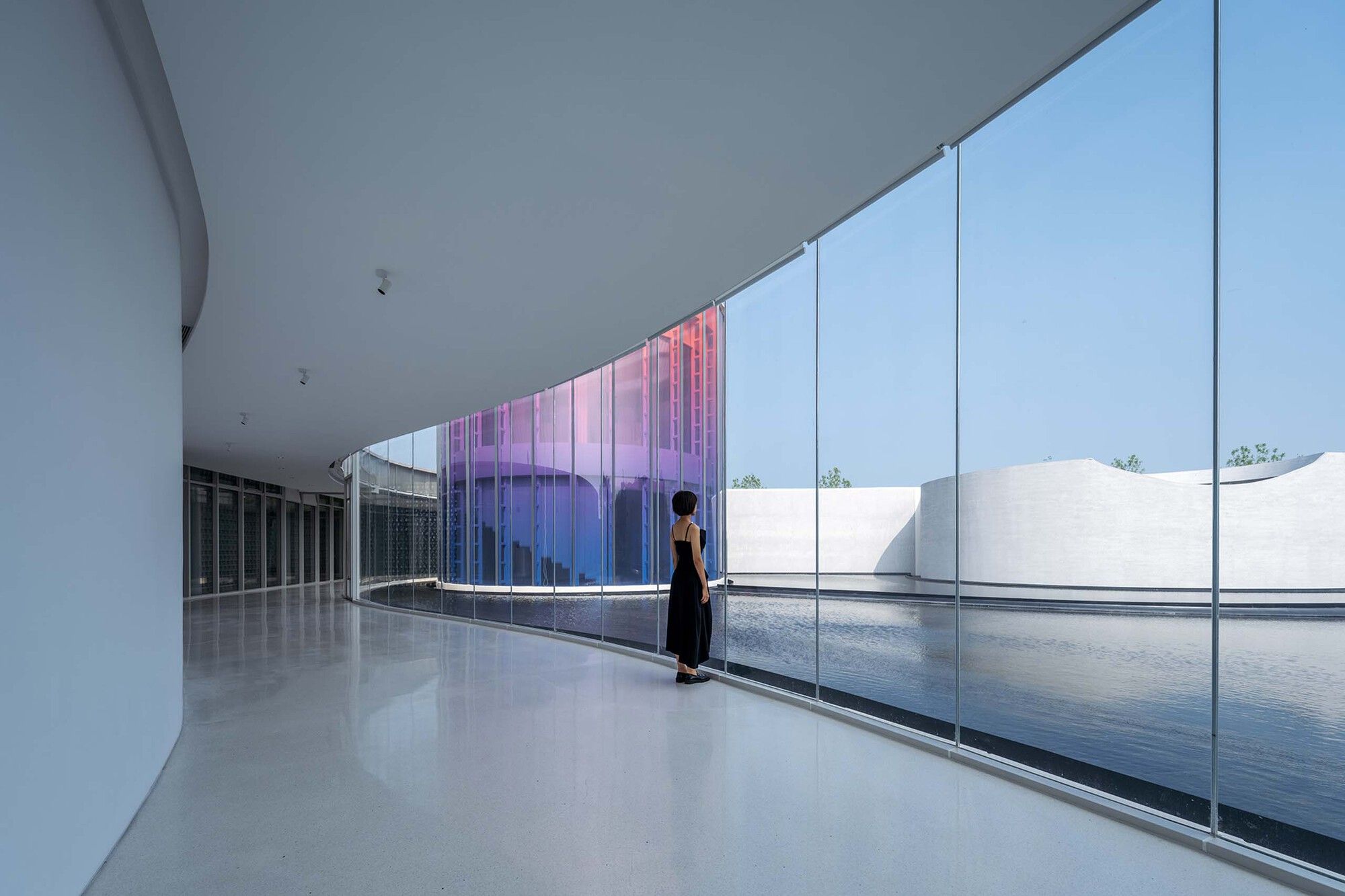
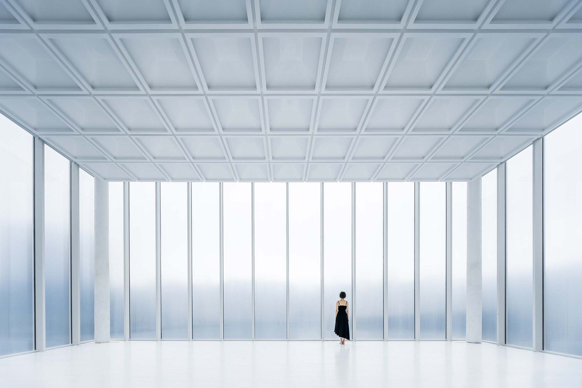
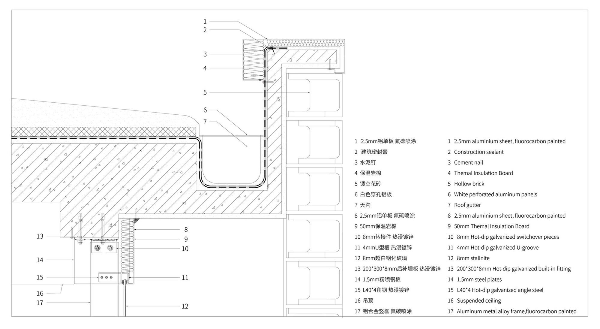
Side B: I wanted there to be no structural features and a continuous view of the courtyard and museum from the glass surface facing them. The roof is composed of a single cast layer of 40mm fine stone concrete with ribbed patterned steel plates on top to provide thermal insulation and waterproof performance. This reduces the self-weight of the structure and the size of the structural elements. Then Lao Hu installed separate steel units with overhanging columns in the little hallway and concealed them behind the walls. In the expanded art museum area, a single-span frame overhanging beam steel construction unit was employed. The overhang measures 4.6 meters at its greatest. With no vertical features obstructing the facade facing the water courtyard, it guarantees a fully permeable effect.
Top and Bottom.
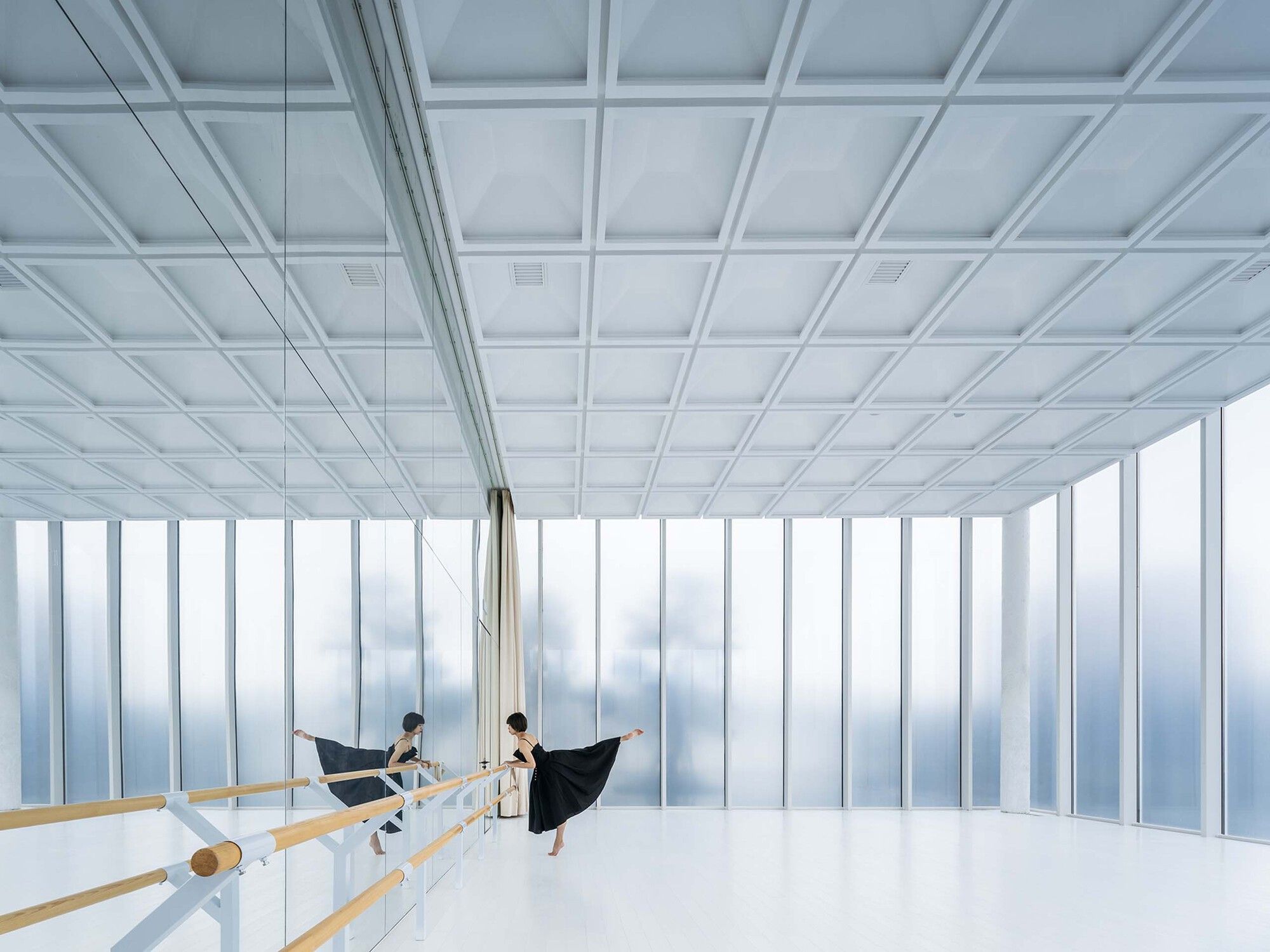
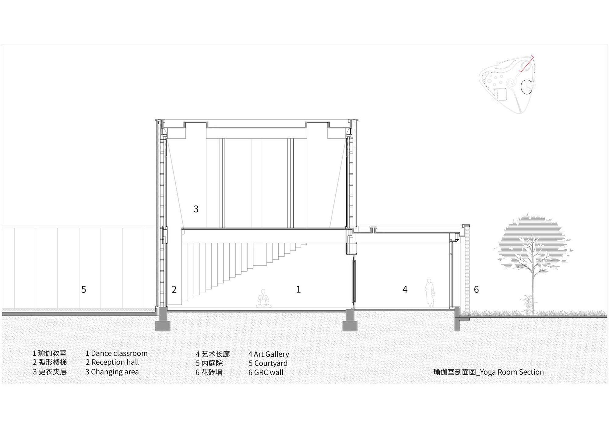
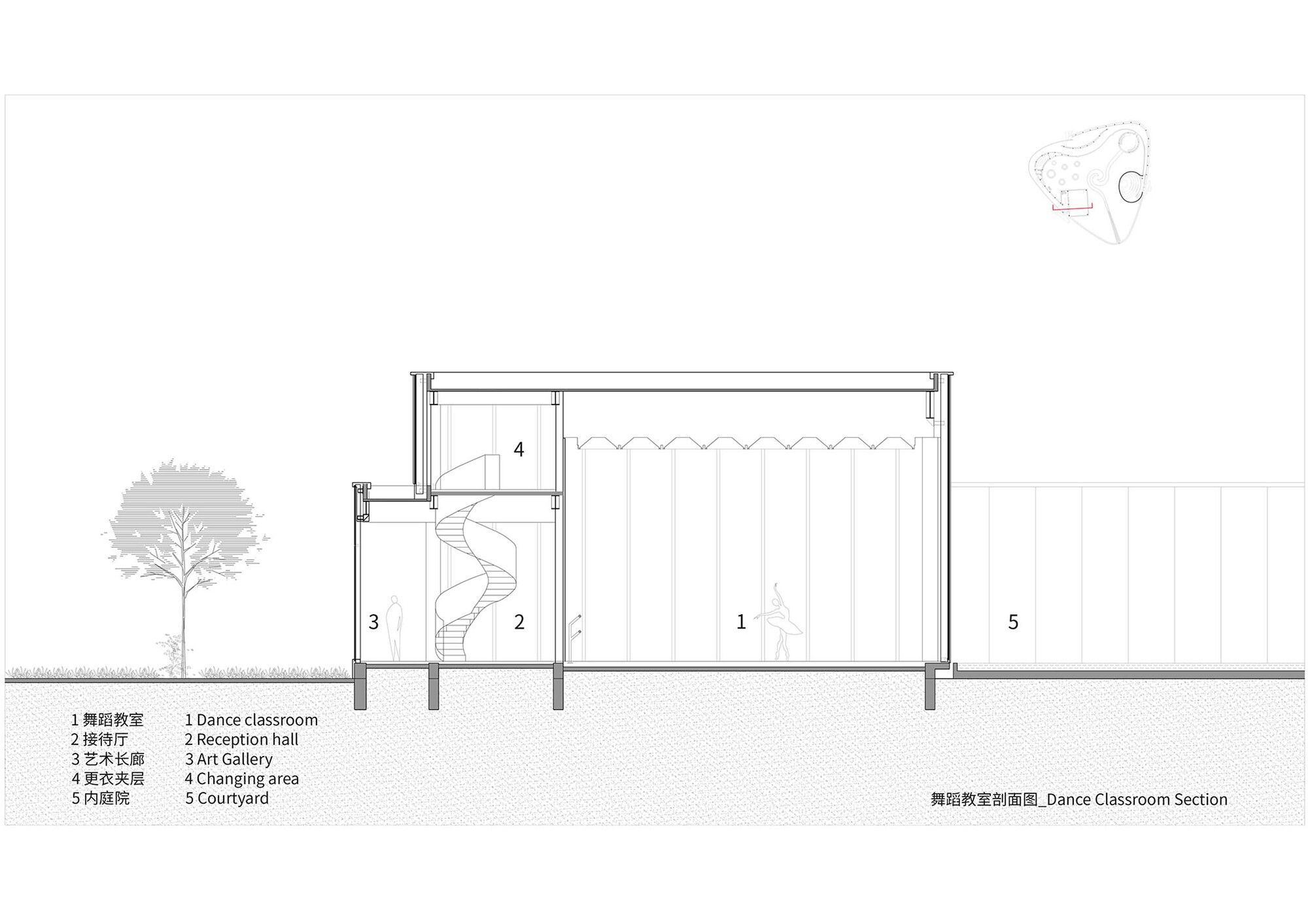
Side A: In 2009, I attended a London dancing school constructed by Herzog & De Meuron. As the director graciously told me, dancers love lots of light while they train. They would be hindered emotionally by the vibrant facade and ostensibly attractive surroundings. I designed and built the transparent glass cage that houses the dancing studio at the Monologue, allowing natural light to filter through yet still obscuring the surrounding scenery. Placed beyond the mirror wall are the classroom’s entry foyer and mezzanine dressing room. The performers might then pretend to be above and below the dance floor.
Side B: Only a small portion of the entire regular plan square’s mezzanine is devoted to the dancing classroom. In order to maintain the classroom norm of a single-story steel frame system and avoid sudden changes in local stiffness on the structure that could have detrimental seismic effects, Lao Hu advised using a hinged connection in the mezzanine beams and columns.
This is how it has always been.
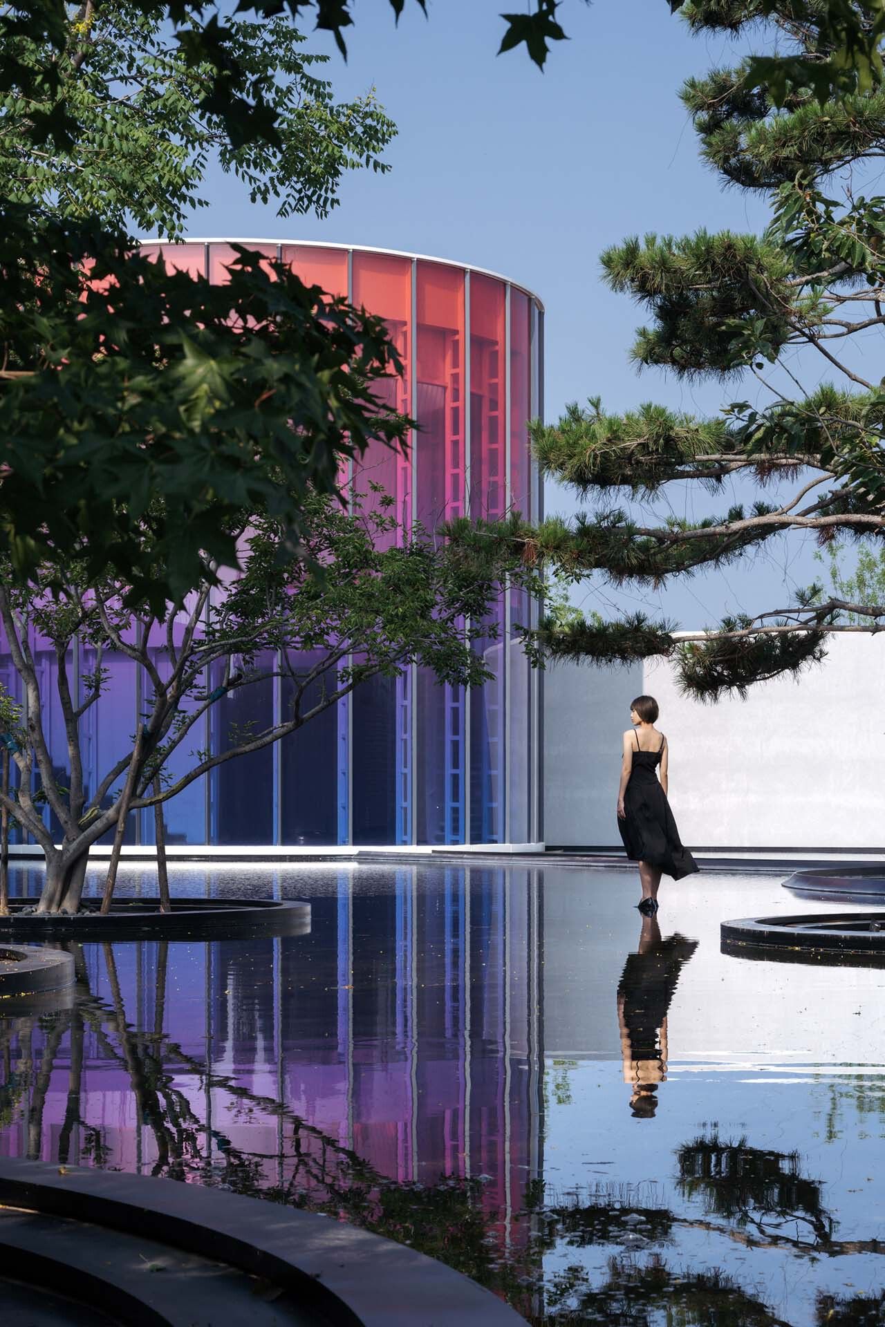
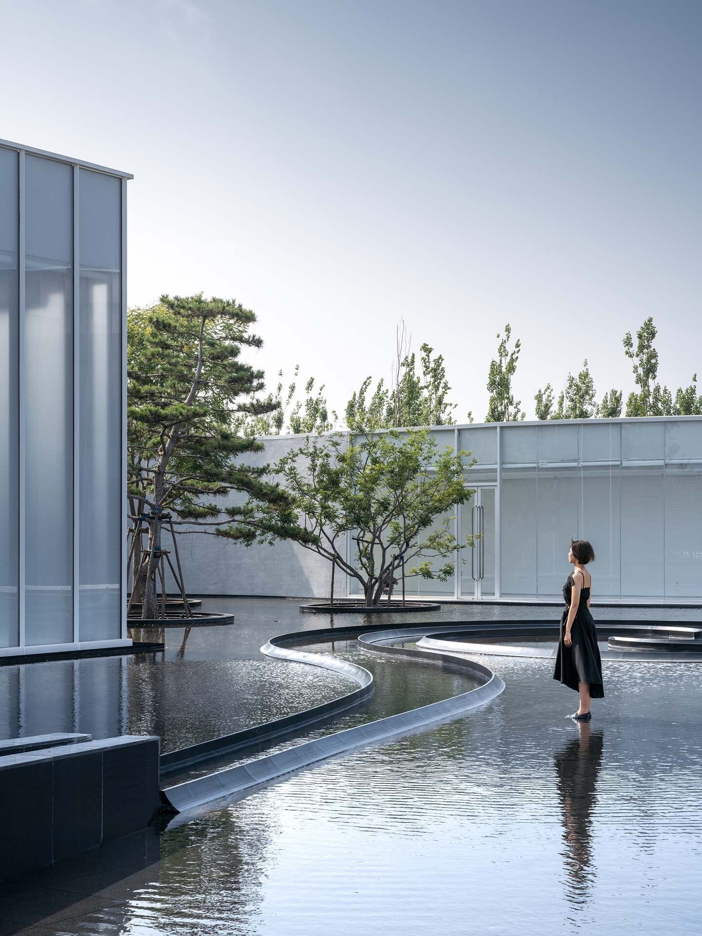
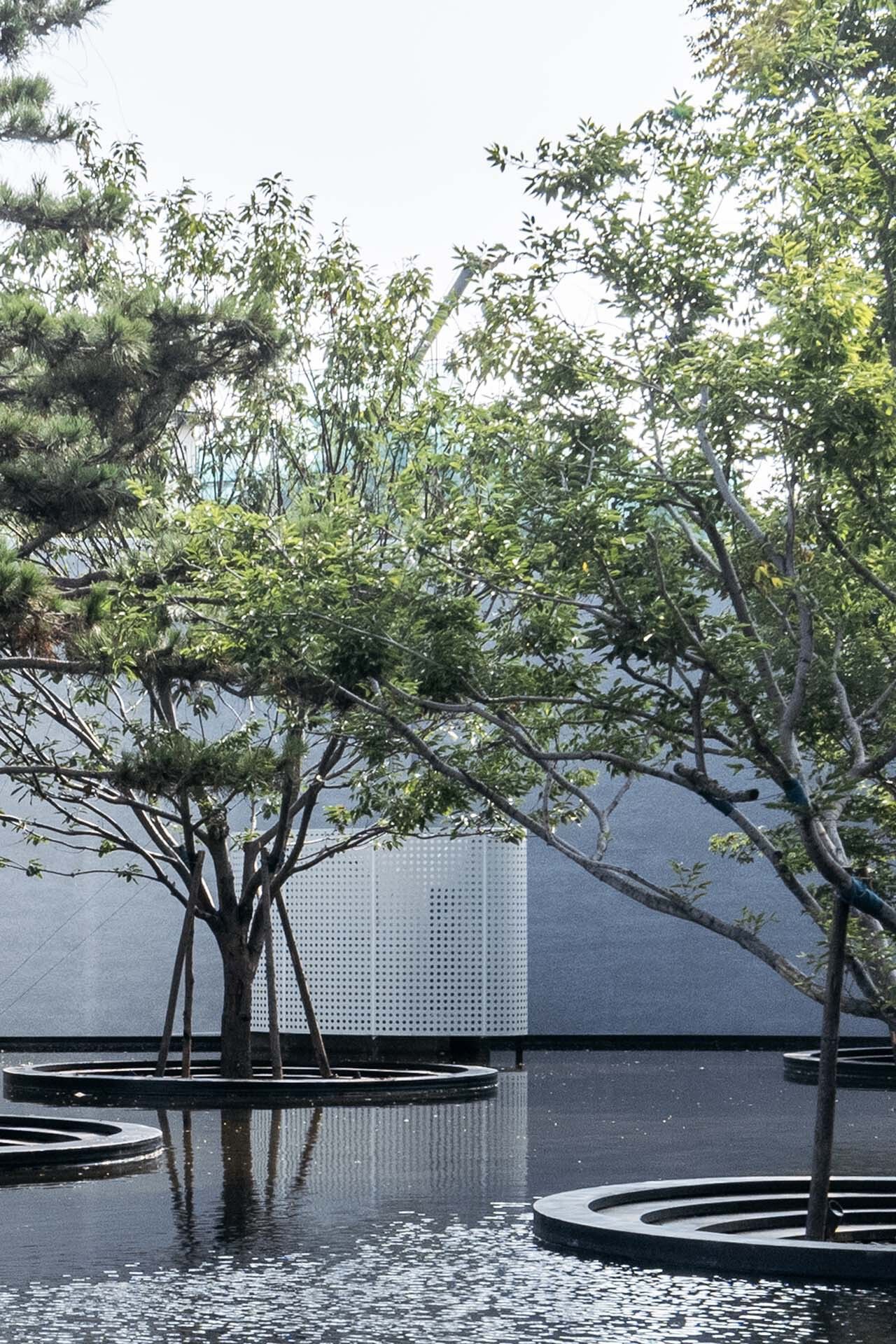
Side A: In my second year, after duplicating Ni Zan’s Six Gentlemen, I gave up on painting landscapes since I knew I could never be as good as him. But I couldn’t shake my fixation on those six trees. As a result, I want to use trees as a point of reference in many of my future works. This time, instead of using Ni Zan’s original six types of trees in Jiangnan, I chose pine, elm, cypress, maple, oak, and Celtis Sinensis in the north to build the new Six Gentlemen of the Water garden due to the limitations of climate and supply.
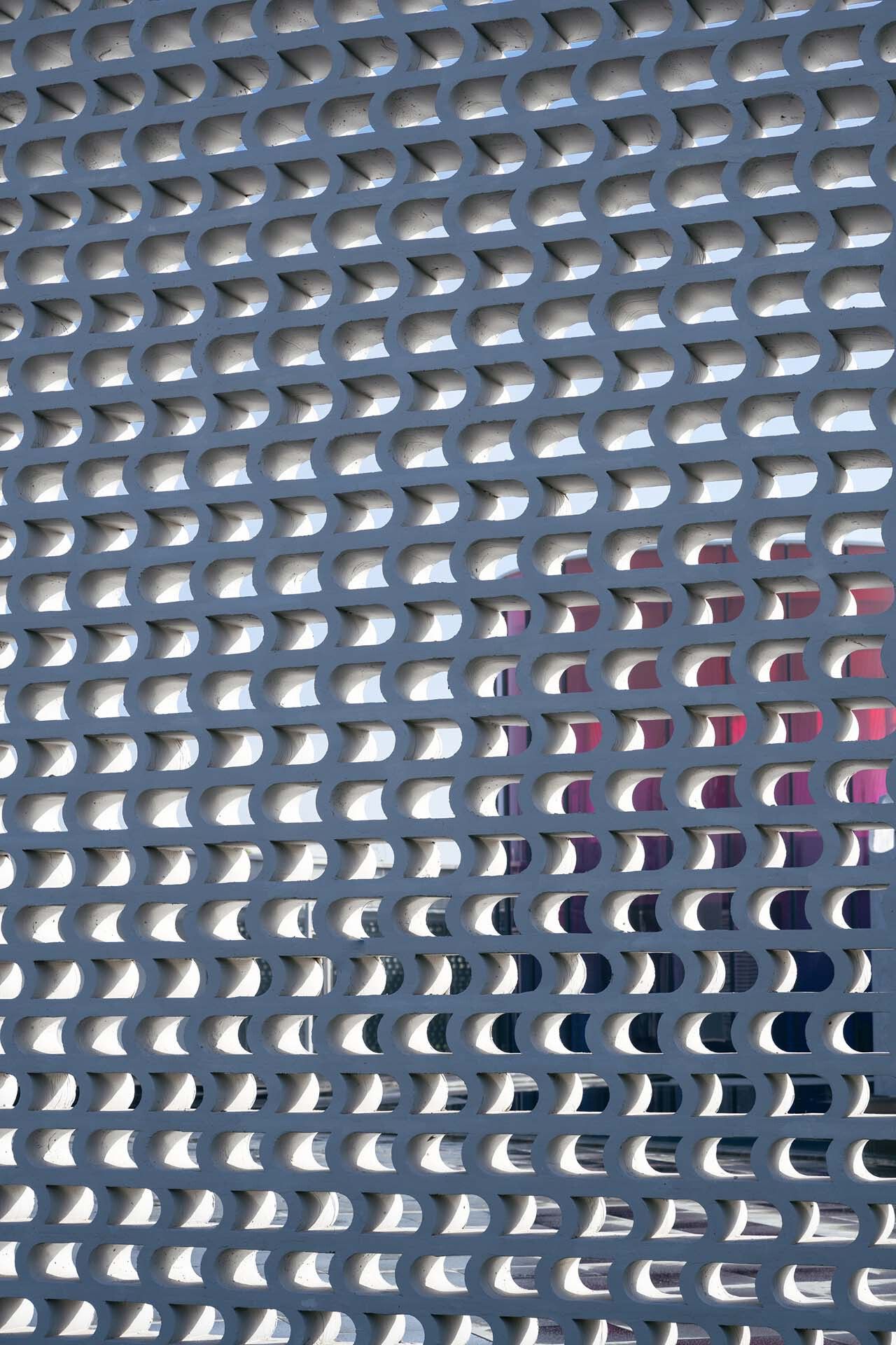
Side B: The customer proposed making the equipment room a tearoom. Next, two groups of equipment had to be set up outside one in the courtyard and the other in the green area outside the gallery. To conceal the equipment, I created a perforated aluminum barrier in the form of a leaf. The apparatus was transformed into a piece of art for the Monologue Art Museum.
The lone light shining in the shadows.
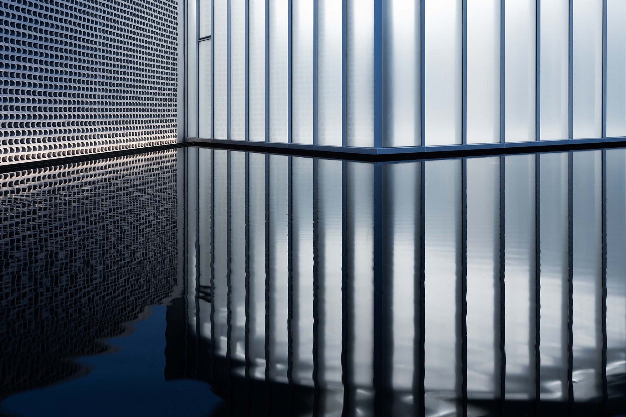
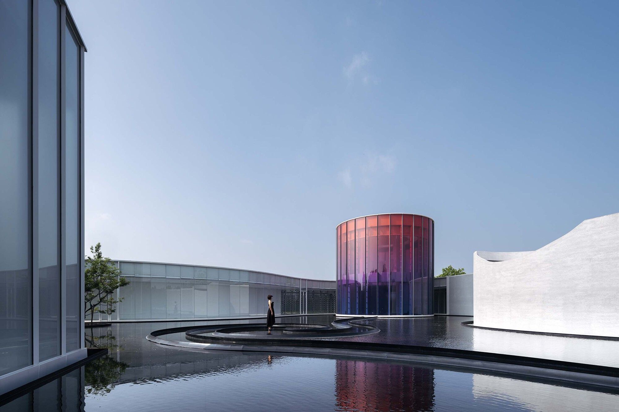
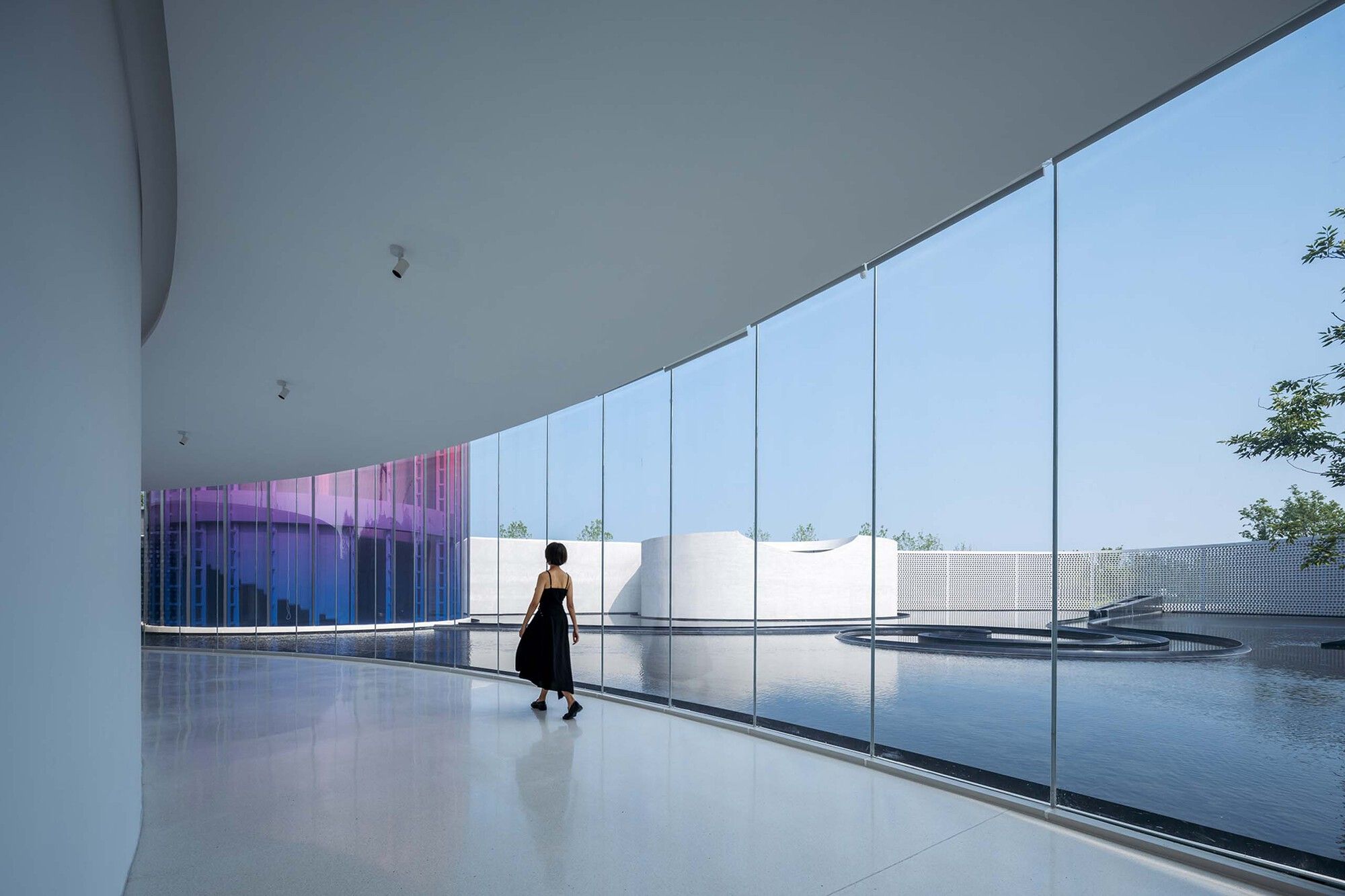
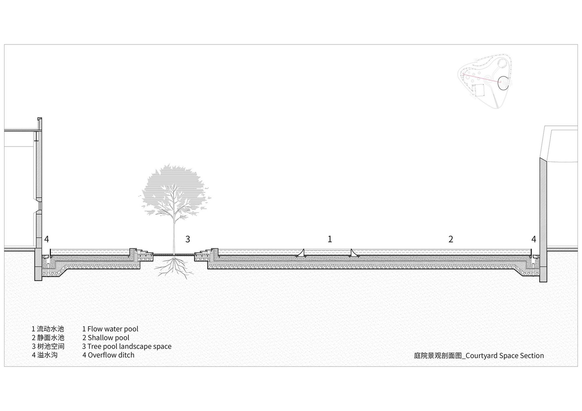
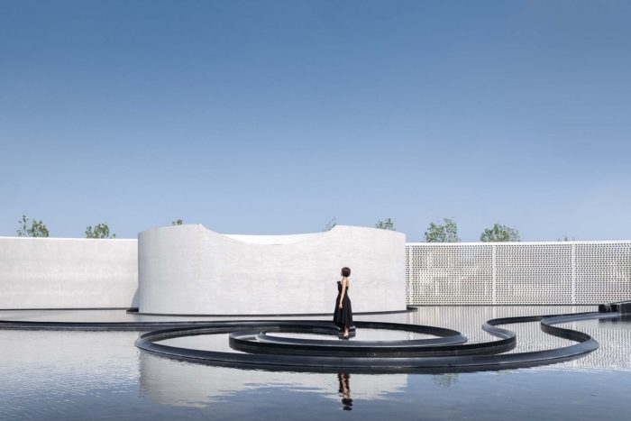
Side A: Originally, the courtyard was supposed to feature a white dry-clay floor. It might give the entire structure a sense of weightlessness, something I was able to experiment with in my White Upland project effectively. After some thought, I decided to convey a somewhat sad vibe rather than go for a slightly lovely dream when I was designing the Six Gentlemen’s presentation. The enormous ocean surface in Six Gentlemen is expressed in the painting with a great deal of emptiness, which allows the image to convey a sublime atmosphere without being constrained by scale. In this sense, I chose to substitute black for white, transforming the visible white square into a visible black pool. This gives the visual element a fresh dimension. This creates a deep pool of silence around the white edifice, and as you stare at it, it stares back at you. All of a sudden, the surroundings are silent. All that can be heard within the Six Gentlemen is the sound of the wind rustling.
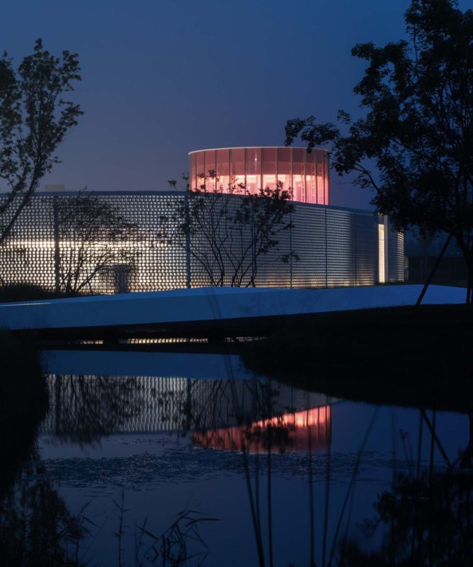
Side B: Nevertheless, I left the original courtyard that embodies the Winding Stream Party intact, including the landscape water system. In the still-water courtyard, I wanted the pattern of the flowing water to transform into a rushing torrent, creating the illusion of water inside the water. From the plunge, water runs into the courtyard’s center, twists and spirals, flows toward the yoga room, connects with the building’s outside water system beneath the structure, and eventually flows silently into the sea. This establishes a link between the Yellow Sea and the independent Monologue Art Museum
The Black that Doesn’t Sink into the Dark.
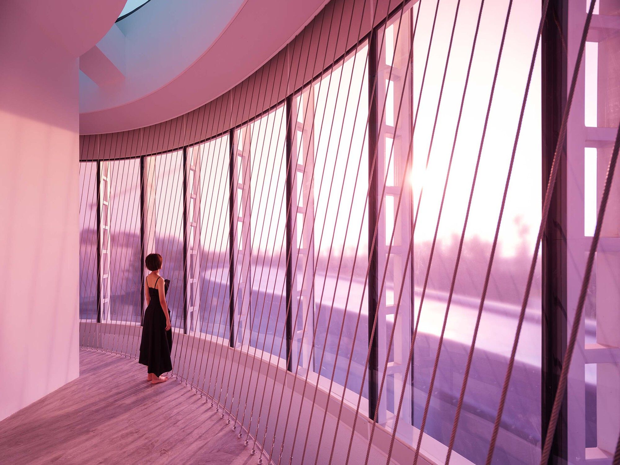
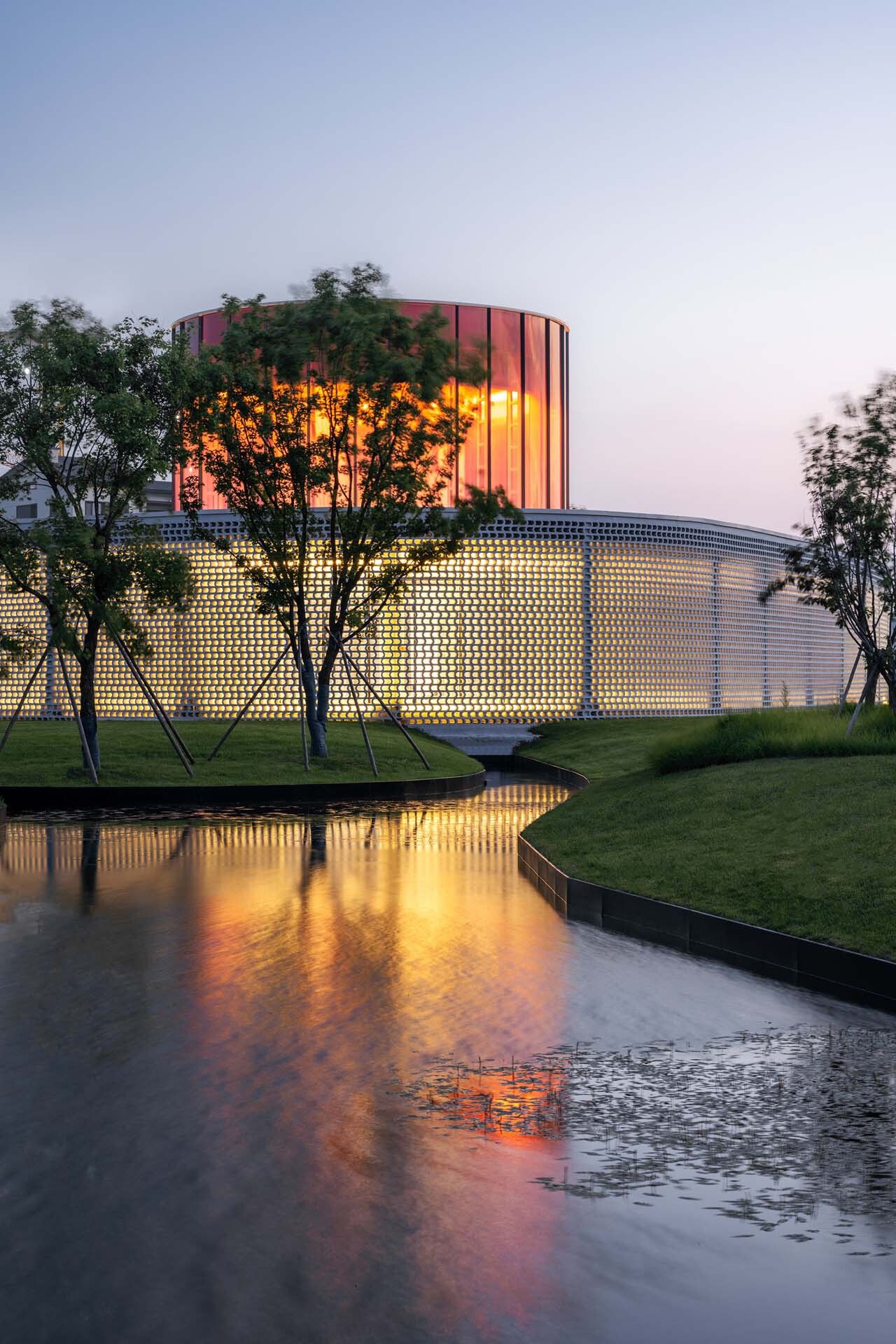
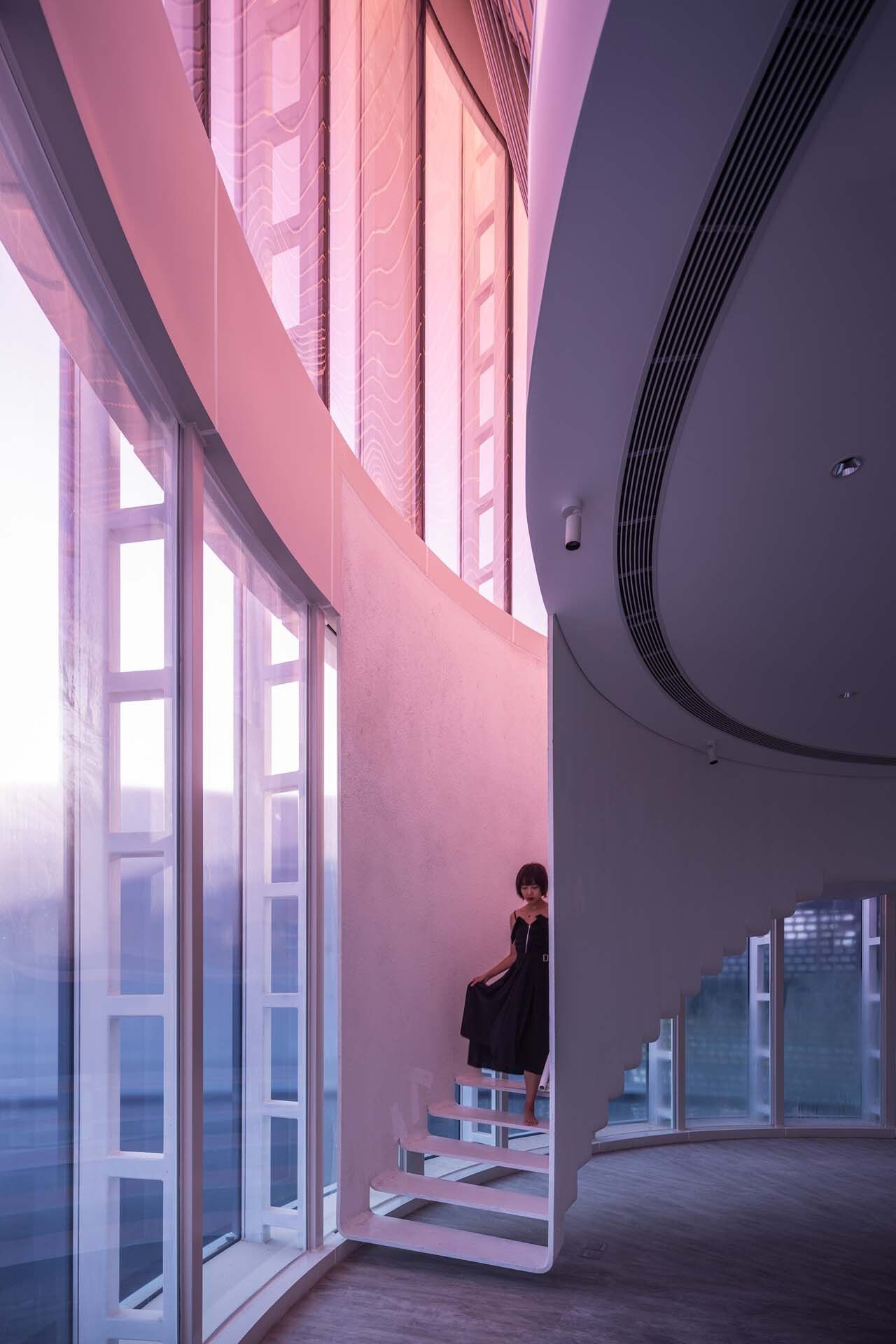
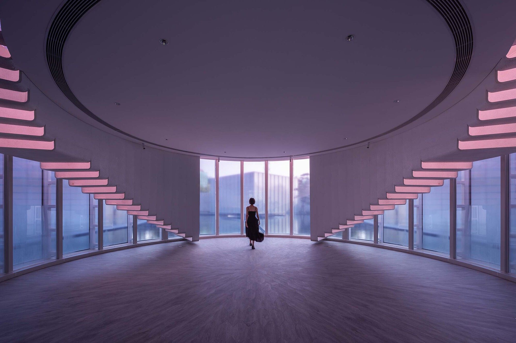
Side A: There is now more calm in the water courtyard. I felt a new familiarity and thought the site was overly corny when I saw the rendering of the white building with a glass façade on the edge of the black pool. I, therefore, made the decision to illuminate it by creating a gradation of stained glass on the exterior of the tallest circular yoga room. The thick ink takes on a hint of color, revealing a dazzling glass castle.
Side B: The customer insisted on having a changing space, and I could only set up a second story for it to ensure the first floor’s visual openness. Originally, the glass fortress had only one floor. Additionally, I wanted the glass façade to remain continuous vertically. To detach the floor from the glass façade, I asked Lao Hu to suspend the floor aloft. In order to create a clear and effective force system, Lao Hu placed the frame in a cross shape to offer horizontal lateral stiffness on the roof. He then linked this frame with the peripheral ring beam to create a frame that provided torsional stiffness. To raise the second-floor slab, he employed four hanging pillars hidden in the closet and strung from the main frame beam. And lastly, there was a light suspension of the staircase from the floor slab. Then, the magnificent light was let into the first floor.
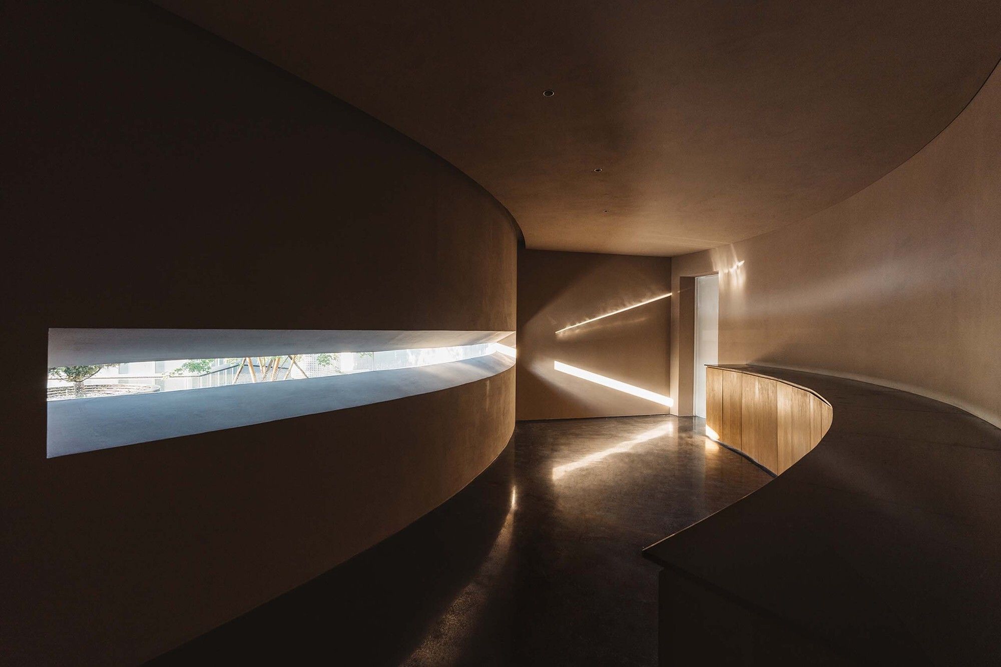
A Man Who Cannot Sleep. I used the white space we leave between brushstrokes to create a tearoom hidden behind the corridor’s rear wall by dividing a single wall in half. It’s a quiet, private area where we go to hide our thoughts. The six gentlemen were revealed when I opened a large horizontal window that ran the height of the sight line and framed the sight like a scroll. “Only time will tell if they stared at each other while silently falling and remaining speechless.”In the resorts, one can find a wide variety of small yet joyful wishes. It might even be excessively loud at times. We must keep silent. Xiaoyan Zhang likely had the idea to name the art museum Monologue because he wanted to construct an island where individuals may live lonely lives in the middle of a busy sea. This is our private haven. There’s also the sea, not too
Project Info :
Area: 1272 m²
Year: 2022
Photographs: CreatAR Images, Seven W
Finishing Contractor: Sino-Ocean Decoration Engineering Co., Ltd.
Curtain Wall Construction: Tianjin Dongfang Haichuan Door Window and Curtain Wall Joint-stock Co., Ltd.
General Contractor: Zhongtian Construction Group Co., Ltd.
Landscape Deepening Team: Beijing Sino-Ocean Landscape Design Institute Co., Ltd.
Gardening: Beijing Shengyuan Ecological Garden Co., Ltd.
Brick Work: Tangshan Yuchuan Construction & Decoration Engineering Co., Ltd.
Cheif Architect: Ting Yu
Project Architect: Hao Li
Design Team: Raven Xu, Zhizheng Wang, Ziheng Li, Xinping Jiang (Intern)
Prototype Research: Xinyang Dai, Jun Ge, Murong Xia, Binhai Miu (Structure)
Lighting Consultant: Chloe Zhang, Shiyu Wei, Xueyi Liu
Material Consultant: Jing Sun
Client: SINO-OCEAN GROUP SEATOPIA
Client Team: Xiaoyan Zhang, Yuemin Jin, Dongfang Zhao, Junhao Li, Yue Yang, Yu Shi, Dongyang Zhao, Jiyao Wang, Hai Dou, Jiang Yu, Zhining Zhang, Ning Su, Xingwang Liu, Yishen Jiao
Facade Consultant: BG&E Façade Technology (shanghai) Co., Ltd.
Construction Drawing Design: Tianjing Tianzituowei Architecture Design Co., Ltd.
Design Development: Shanghai SUNYAT Architecture Design Co., Ltd.
City: Qinhuangdao
Country: China
