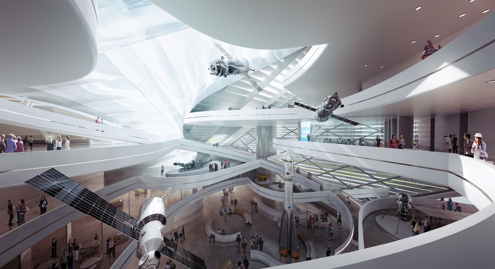
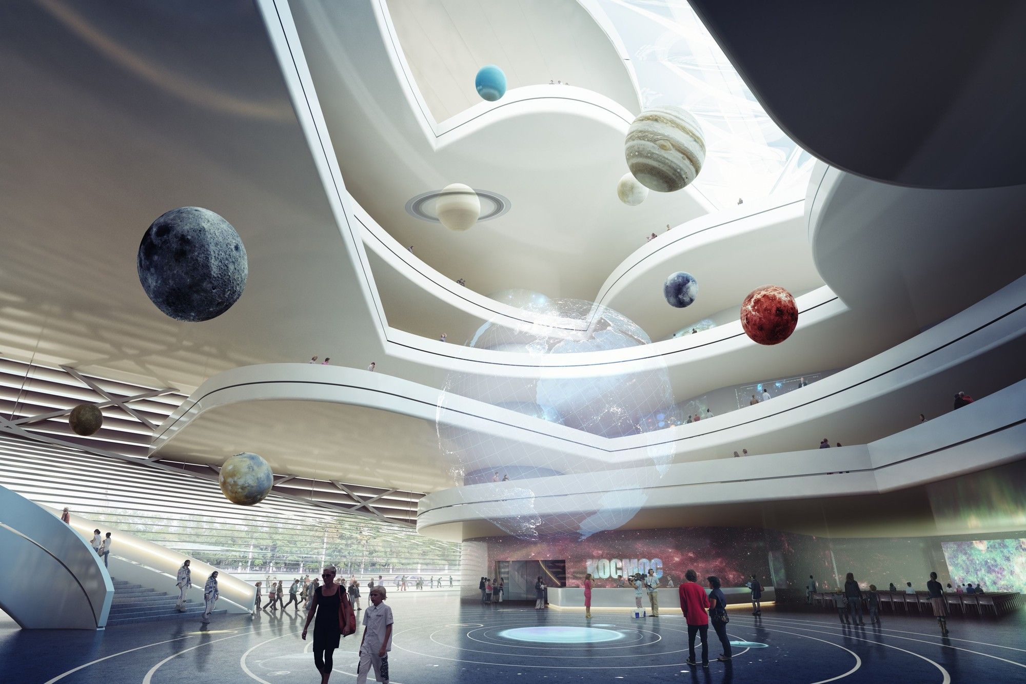
A finalist in an international competition seeking designs for a new Moscow Polytechnic Museum and Educational Center, this scheme by 3XN is centered around a flexible form both inside and out which will be both iconic and functional. Differing scales and levels of transparency and visibility wrap a form based around central atrium filled with light from above where examples of Soviet and Russian achievements in the sciences hang down, sharing the space with visitors and exhibits alike. Below is a further description provided by the architects.
As technology develops and we enter deeper into the 21st century, the convergence of Science and Art becomes even more relevant in our everyday interactions. Today’s society seeks ways that Science and Mathematics can be viewed as approachable disciplines, in order to understand the full potential of technology, and its applications in making our world a better place.The new MEC will be a gateway to this world, challenging and evolving visitors’ perception of science and technology.
In contrast to traditional Museum and Learning culture which constantly advises against ‘No touching’, ‘No talking’, and rule upon rule of what is and isn’t allowed; this building is designed to say – ‘Please interact!’ – ‘Please learn!’ –and most importantly, ‘Please enjoy!’ It is an invitation to the world to enter into a common dialogue with science and technology. It is a building that encourages interaction within and around both its interior and exterior; from both the urban and architectural scale.
The MEC is a building that is best described by three main points. 1.The MEC’s urban concept responds to students’ social, interactional needs and the grandeur of Lomonsovsky Avenue and the MSU’s main university tower. 2.Its architectural concept originates out of a desire to encourage interaction of visitors, information, and architectural space. 3.The MEC has a functional approach that places the work flow and interaction of the visitor, user, staff and collection in a clear strategy for ease of functionality.
Urban Concept
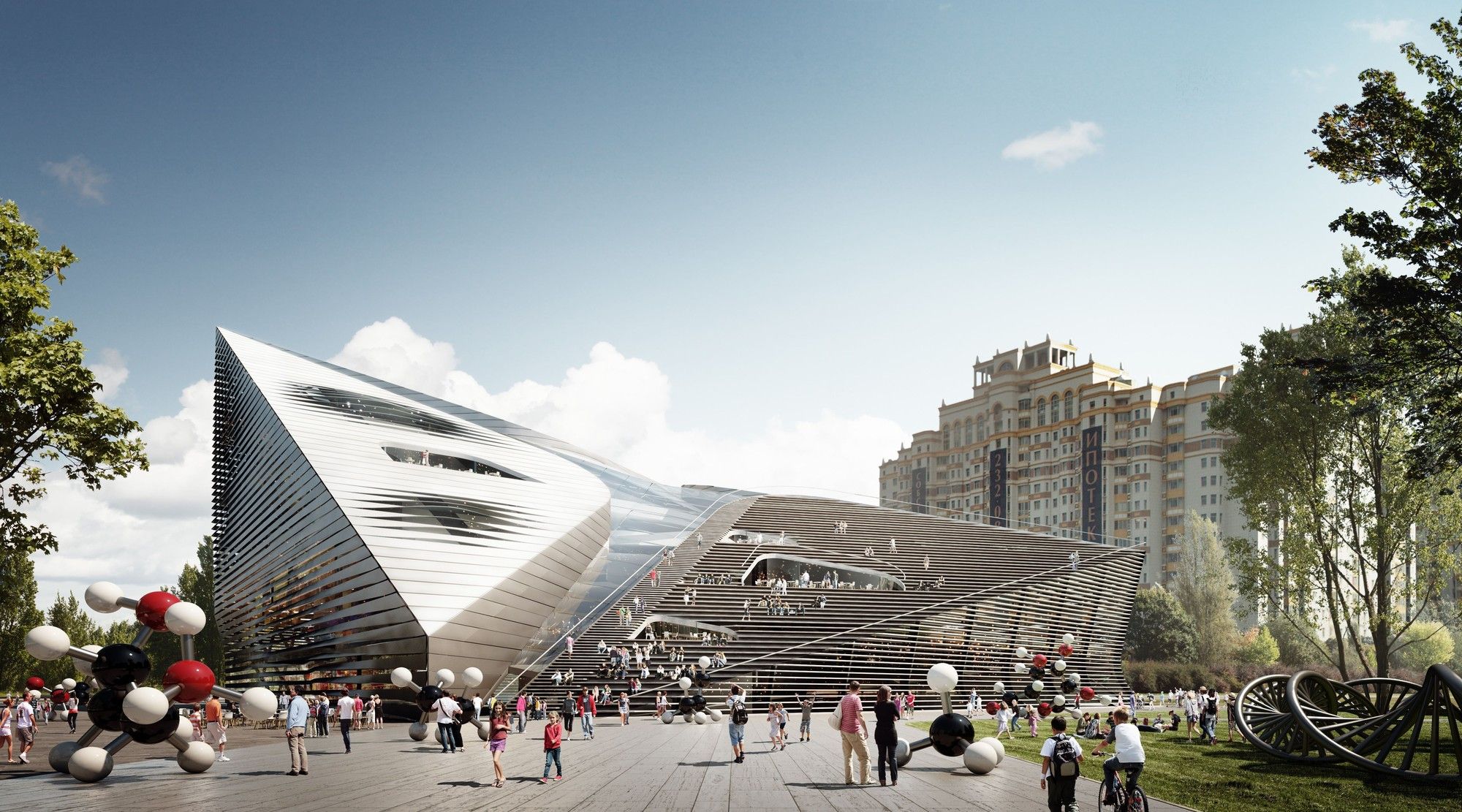
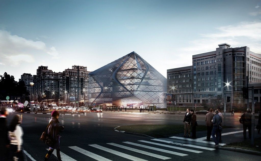
The MEC is placed on the outer, University ring road, yet maintains a strong relationship with the existing, formal axis and semi-circle urban planning strategy.The building is lifted for entry, grandeur and in a respectful gesture towards the main MSU building and Masterplan.The western corner pushes down to capture student activities at a more human scale, while also acting as a terminus for the outer University ring road.The external form responds to the internal concept and spiraling movement around the social and learning hub while also reacting to its surrounding context.
The urban strategy is designed to be both approachable and interactive. The north-east facade responds to the grandeur and dynamism of both Lomonosovsky Avenue and the MSU tower with its ascending corner and proposed Media Facade. The south-west facade, both roof and vertical surface gradually descend and extend out towards the landscape, providing an activity space and amphitheater responding to a more human scale.Roof Café Terraces and seating are distributed around the building creating a visual and approachable building, ensuring interaction between the building and its surroundings.
Architectural Concept
The architectural concept starts from the inside out.It begins with the desire to create a social hub – a central space – encouraging both visual and physical interaction between visitors, users and exhibitions.This is achieved through a large, diagonally oriented atrium space which spirals upwards linking the various programmatic functions and visitor experience.
Shifting from the corner entry to the top-center of the roof, the atrium creates a light filled interior which penetrates deep into the building.The diagonal atrium provides deeper floor-plates at the lower levels for controlled, exhibition lighting, while creating thinner floor widths at the upper levels for non-exhibition spaces; optimizing day lighting.The ETFE roof has the capability to provide sun shading through an inflatable inner layer. The staircase follows the inner spiraling movement of the atrium and floor plates. The atrium’s terraces create double and triple height areas for exhibition, spreading exhibition and program information throughout the various programmatic zones, while also creating a strong sense of place and interaction.
Facade as Daylighting Control and Urban Information
The façade of the building allows for a variety of controlled daylighting scenarios through its twisting, horizontal lamellas.The simple horizontal system also allows for the integration of an interactive media façade to be seamlessly integrated under its projected surfaces.Thus, allowing the architecture to project information to its urban surroundings.
Functional Concept
Functionally the building is quite simple.From ground level, visitors and users get a glimpse of the various program spread throughout the building with the most public program placed on the lower levels and the least public, research and lab based program placed on the upper levels.
The ground floor is a microcosm of the entire MEC, containing reception areas, flexible spaces, workshops, collections storage; and a large auditorium and café which can operate independently after hours to function as a cinema.Oriented around the main atrium at levels 1 and 2 are large, simply shaped gallery spaces along the front and back facades. These climatically controlled gallery spaces are designed for flexibility and can easily allow their exhibitions to extend into the double and triple height spaces around the atrium.
All back of house functions, offices, and collections storage areas are efficiently stacked between the gallery spaces and back of house elevators on the southeast edge of the building.This Back of House strategy allows staff and regular users access to these functions without the need to move through the open, visitor zones. Climatically, the MEC is zoned according to climatic needs. That is, the galleries and research spaces have a high level of climatic and environmental control systems while the public atrium spaces and offices utilize a more passively controlled system helping to balance the energy needs and make the building more sustainable.
Photography by: © 3XN
Photography by: © 3XN
Photography by: © 3XN
Photography by: © 3XN
Courtesy of 3XN


