Designed by Atelier Urban Face, Built on one of Montreal’s most beloved landmarks and urban family escapes, Mount Royal Park, the kiosks are both a poetic and practical response to the surroundings. And through their specific uses and architecture, the kiosk appears to tell us a story – one that has been told for countless generations. Following the spirit of F.L. Olmstead creation, the uniqueness of each individual kiosk is the result of their integration into the park in the most discreet and harmonious manner possible. Not only respecting the environmental integrity of the mountain itself, but blending in with the poetry of the landscape, and all this with an eye on longevity. The three new kiosks, each an original building, take on the shape of the hamlet.
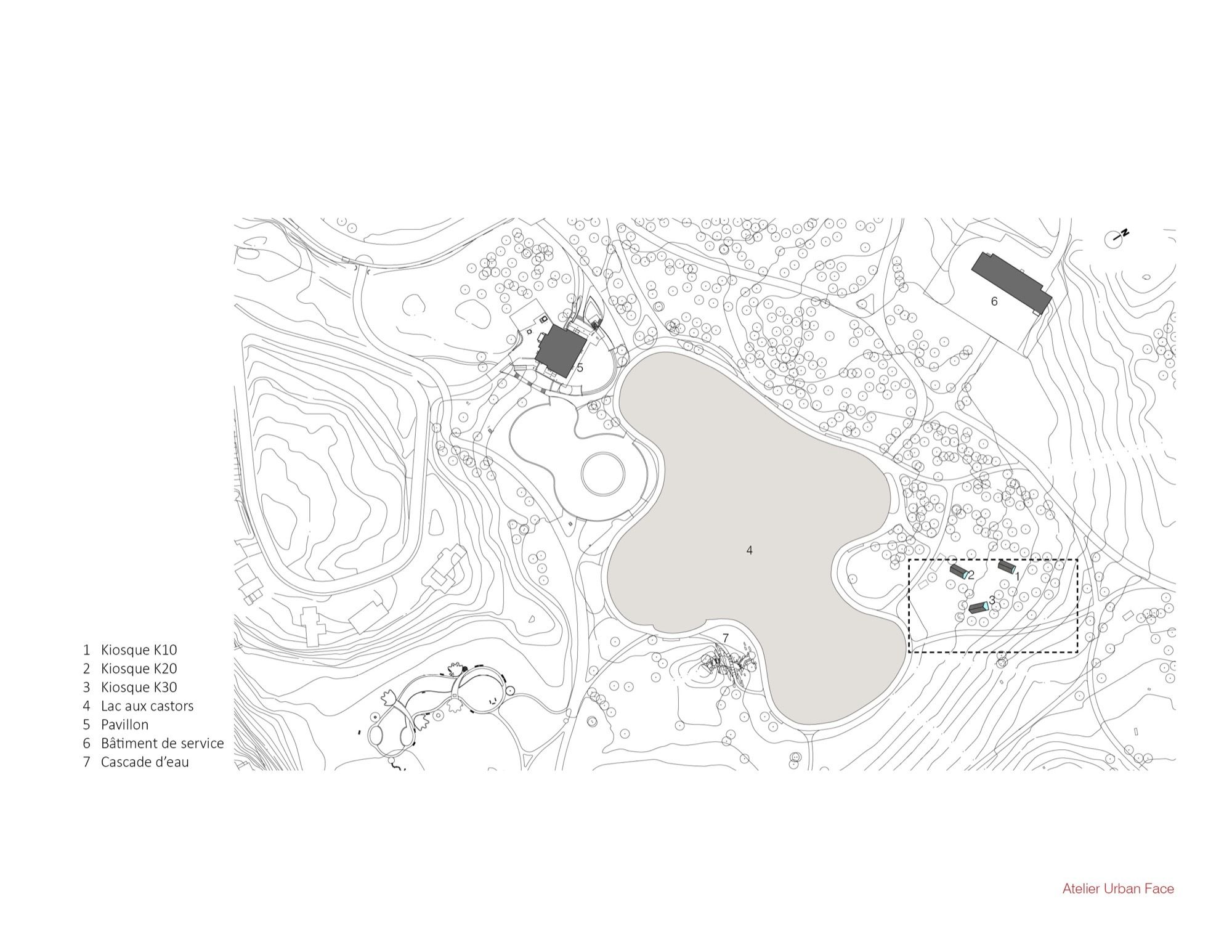
This was an important factor in the design, as a hamlet incorporates the idea of a village, one that encourages a sense of interaction and community. The positioning of the kiosk is random, representing a dialogue between the kiosks and the main pavilion, the waterfall at Beaver Lake. Their random positioning, in effect, encouraging multiple approaches. The spirit of this installation is inspired by two main components. The play of light and the constant shifting of the wind. This was purely intentional and necessary to create a constant sense of movement. A movement that follows the path of the wind and shifts in the light, appearing random and structured all at the same time. In essence, the three kiosks read like a painting, being pushed by the wind at three different speeds – expressing sensitivity to the environs and the elements.
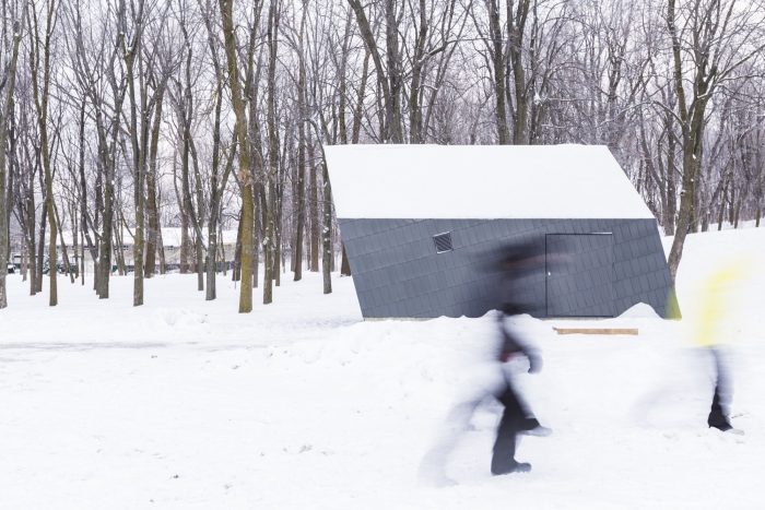
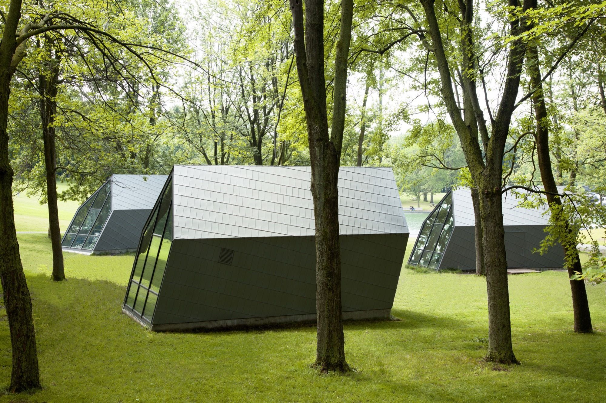
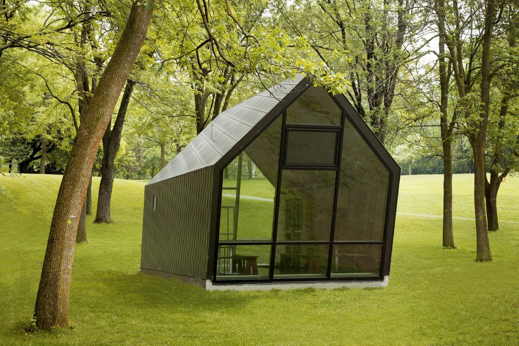
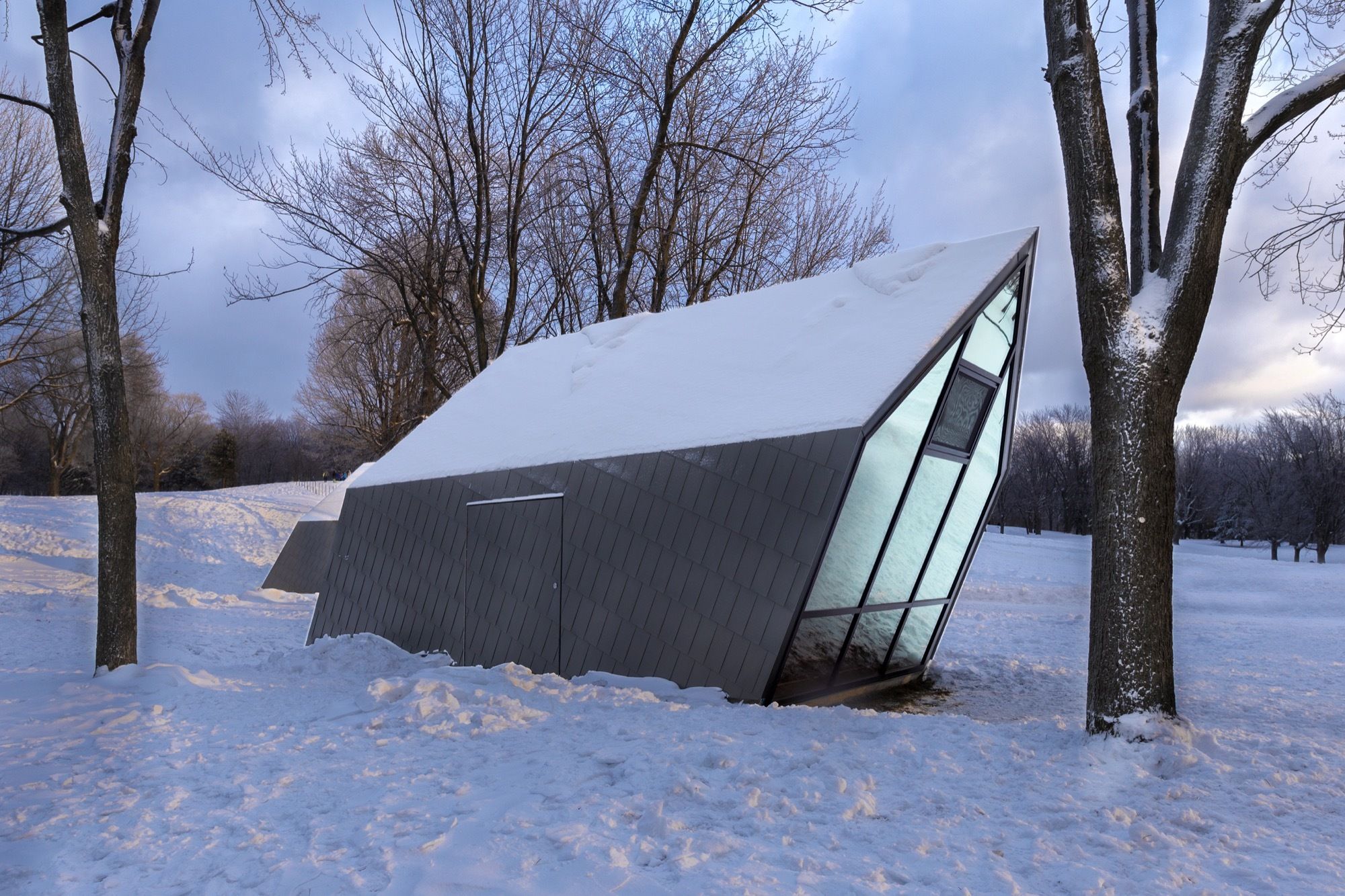
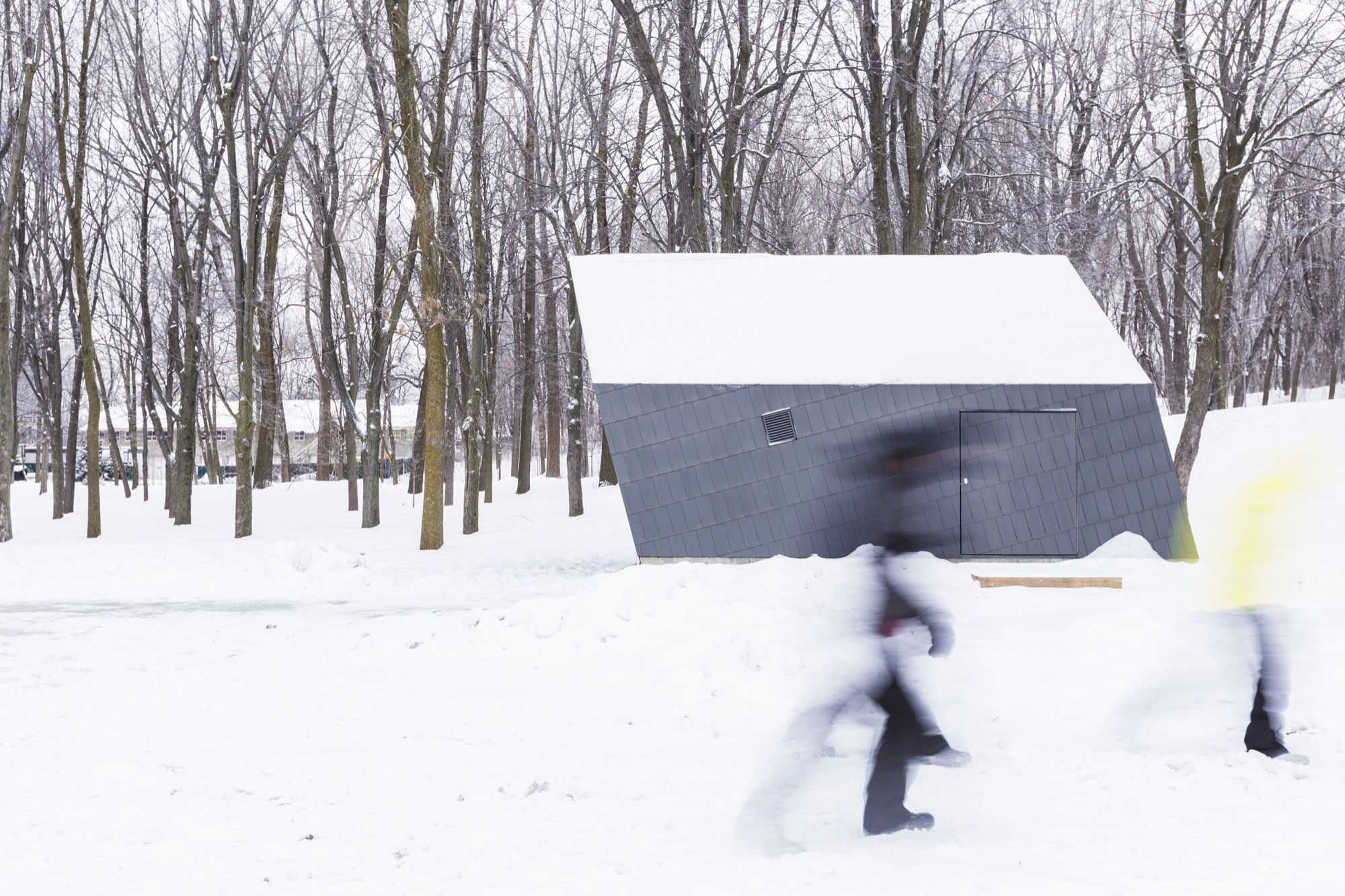
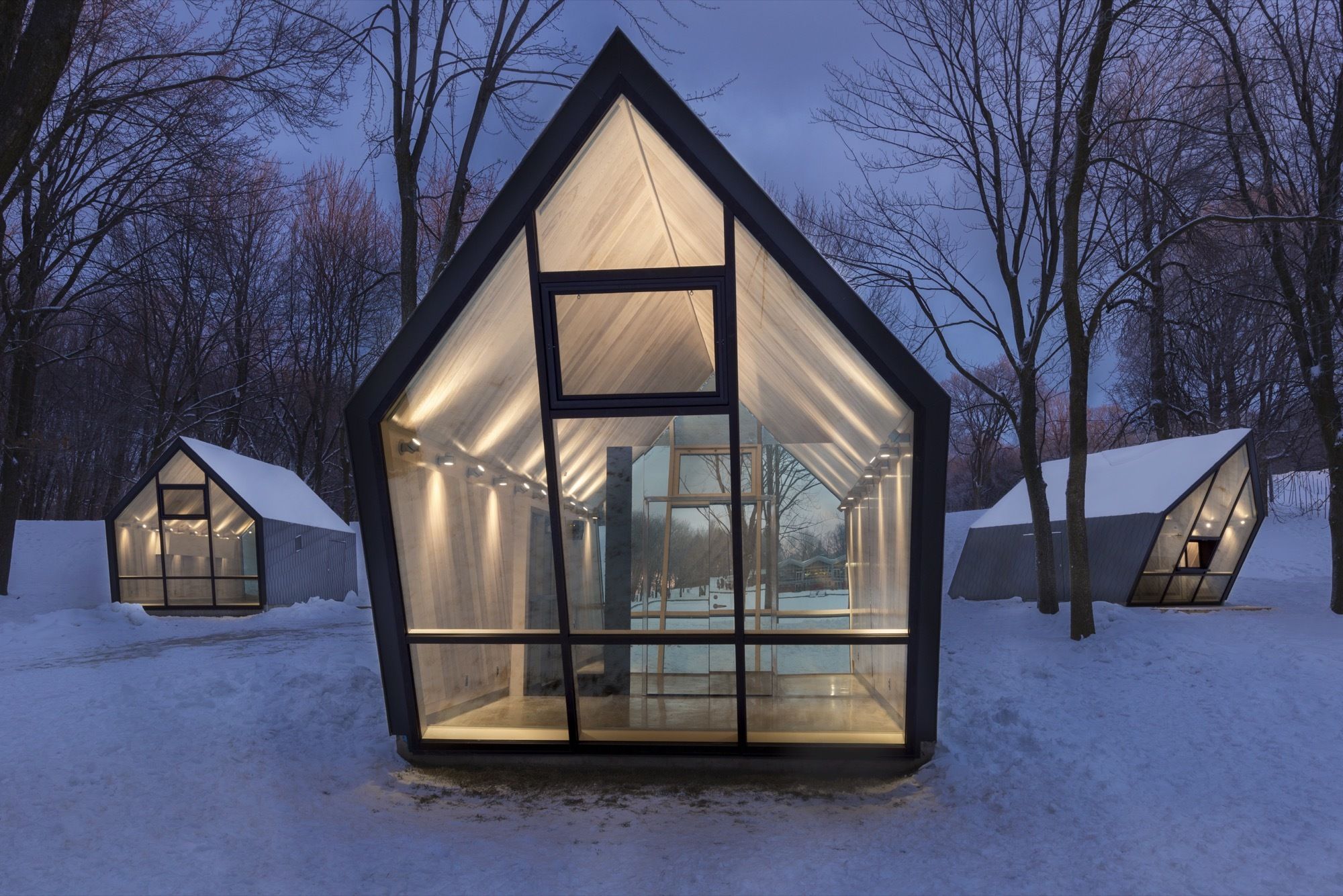
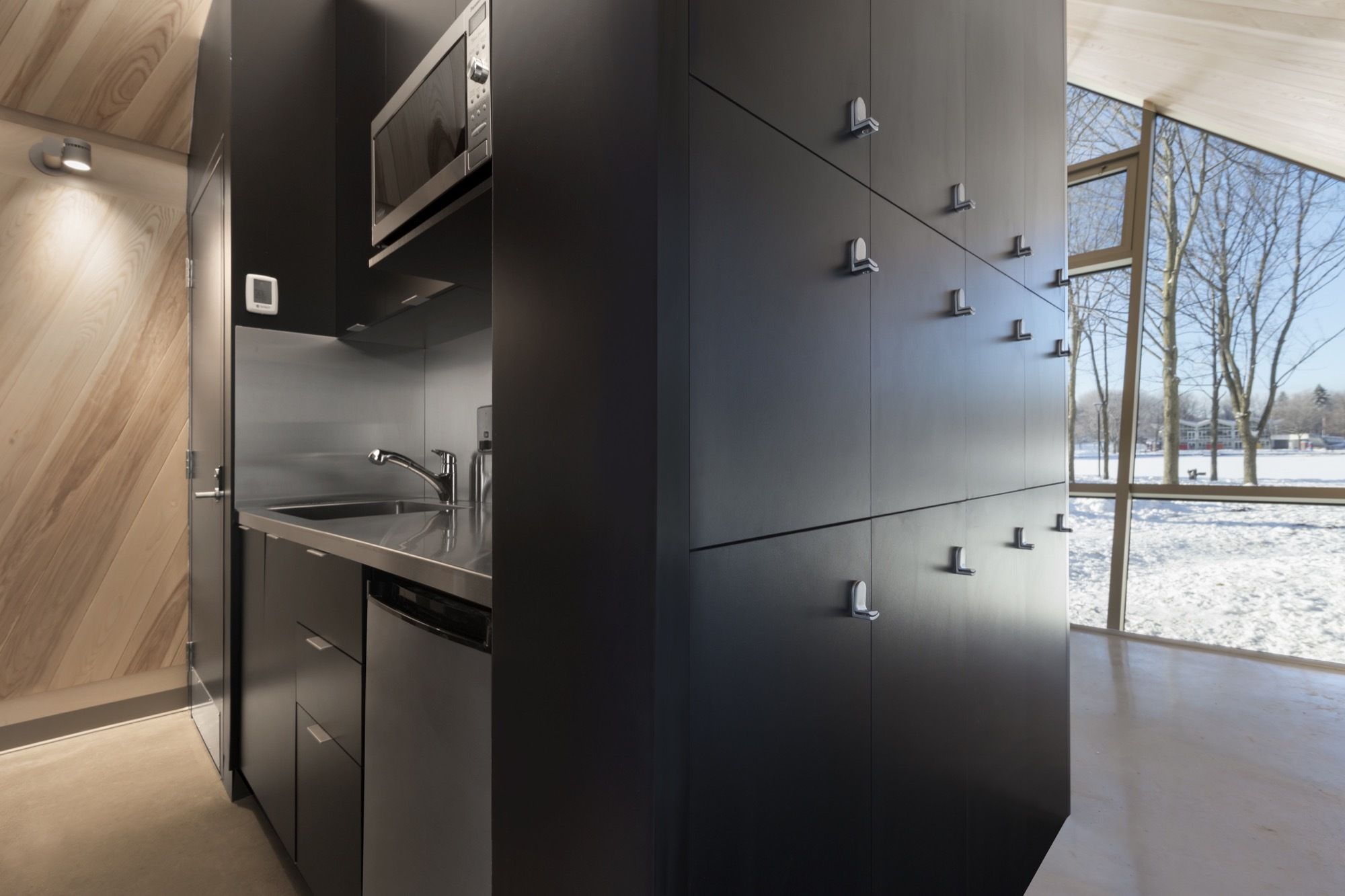
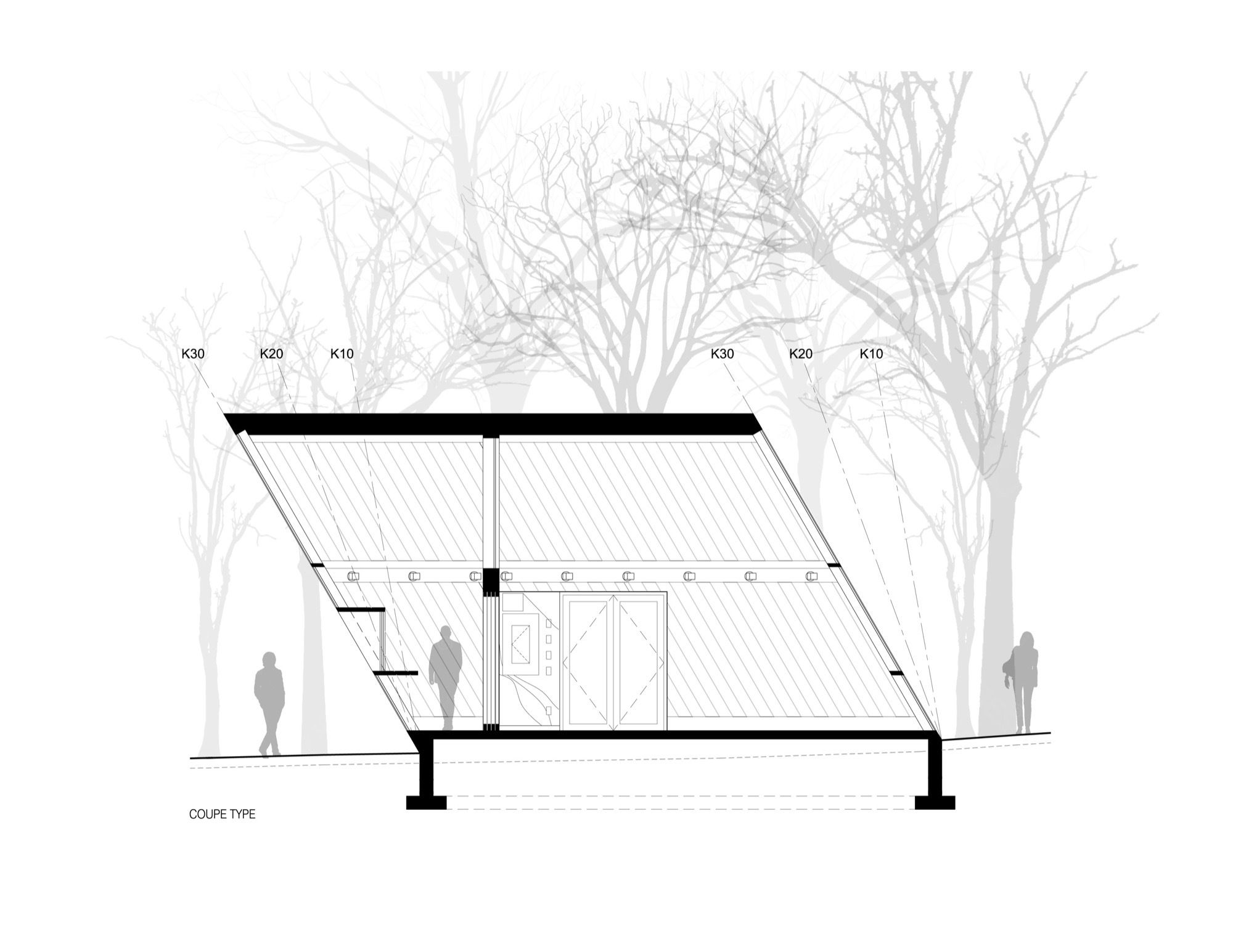
Thanks to steel structures, each kiosk leans at a different angle, as if being pushed by the wind. The first kiosk is inclined at 10 degrees, designed for both summer and winter class field trips. With enough room for up to 30 people, the possibilities for activities are multi-fold. The second kiosk, inclined at 20 degrees, houses tools, and equipment for park services, as well as a first aid station. While the third, with its 30-degree incline, is home to the ticket office, plus storage of recreational equipment. Overall, the shape and transparency of the buildings create an impression of lightness. Three cabins dropped into the park. Visible, and depending on your vantage, invisible in the woods. Their transparency encourages the interplay of light and shadows. Up close, the interior is the essence of simplicity, hollowed out and open on both ends.
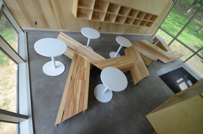
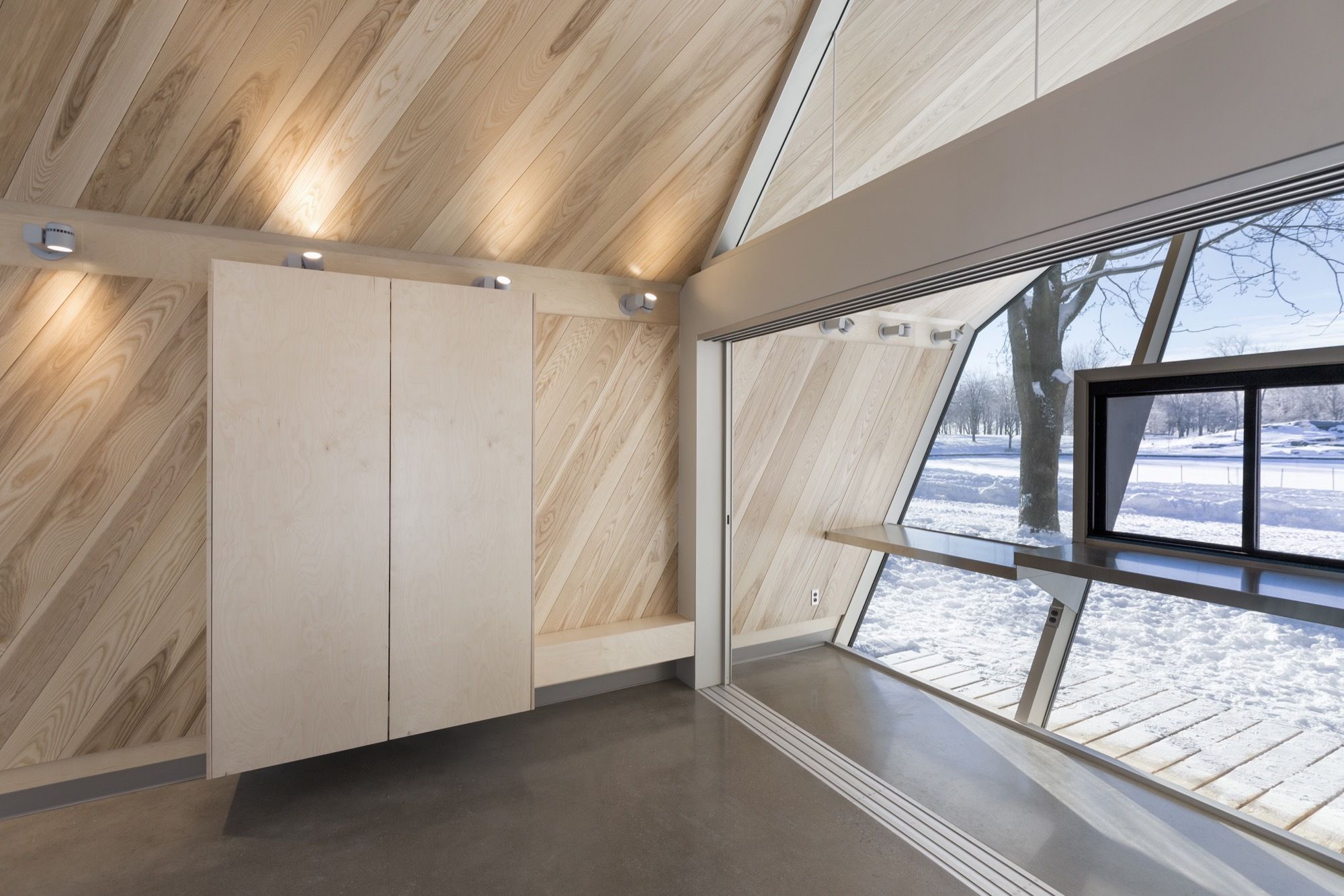
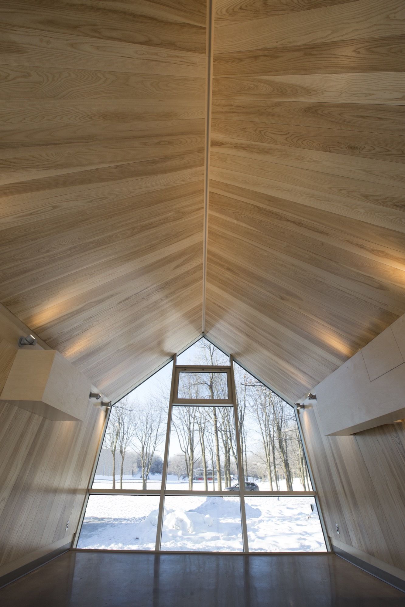
The wood interior is composed of tongue and groove planks stained a neutral color in each of the kiosks. Hence, the light flows through each building and creates a dialogue between the kiosks and the main pavilion. The choice of materials is integral to all of the buildings. Each choice the result of a great deal of reflection that contributes significantly to the architectural and poetic aspects of the buildings. Every roof is covered in zinc tiles, and all tiles are cut and placed to highlight the different angles of the kiosks. In the light, the tiles change color. In fact, every hour of the day, the exterior changes, and shifts according to the natural light of the landscape, enhancing the transparent effect. And a night, a warm glowing lantern effect. The Mount-Royal Kiosks. A moving theatre of light and shadow, perfectly in step with the environment.
Project Info:
Architects: Atelier Urban Face
Location: Mount Royal Park, 1260 Chemin Remembrance, Montréal, QC H3H 1A2, Canada
Team: Sylvie Perrault, Pierre Morency, Geneviève Bouthillier-Martel, Émilie Fortier and Éloize Cotnoir
Area: 45.0 m2
Project Year: 2017
Photographs: Fany Ducharme, Sylvain Legault, Normand Rajotte
Manufacturers: VMZINC, Formica Group, Soprema, SICO
Project Name: Mount-Royal Kiosk
Photography by © Normand Rajotte
Photography by © Normand Rajotte
Photography by © Fany Ducharme
Photography by © Fany Ducharme
Photography by © Fany Ducharme
Photography by © Fany Ducharme
Photography by © Fany Ducharme
Photography by © Fany Ducharme
Photography by© Fany Ducharme
Photography by © Sylvain Legault
Location Plan
Section


