MU:M Office Building
The District 1 in which numerous buildings come together and define spaces is created as a culture & arts complex for publishing/music industry whereas the District 2 is planned by solving various problems found in the District 1 and arranged to accommodate even more companies. And there, inspired by the atmosphere of this culture & arts complex, many companies have built their own buildings displaying all sorts of unique characters.
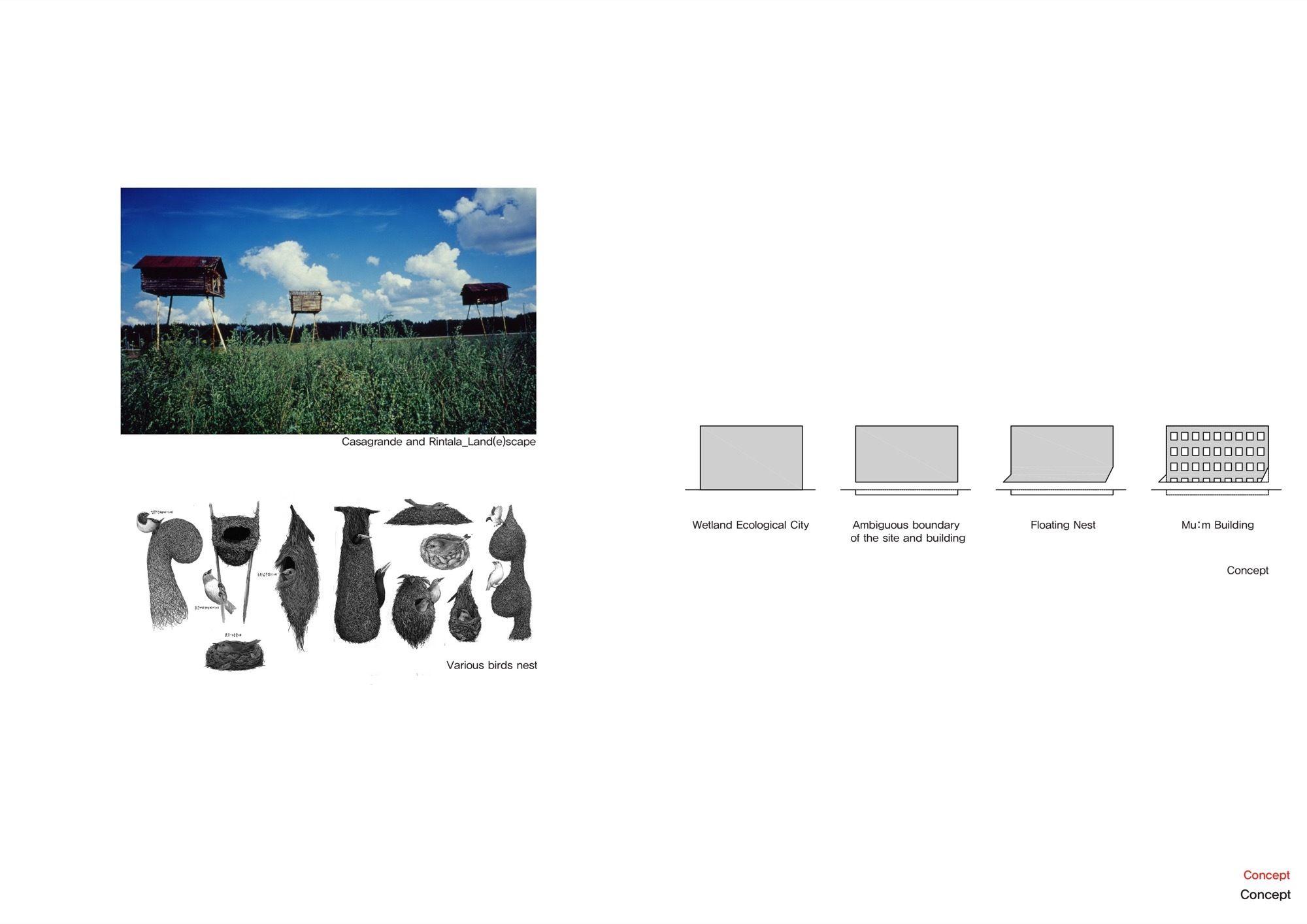
 Located in District 2 block 9, Mum is an English education company having a logo where an owl with big black eyes appears on a yellow background. The logo has a story of the adventure, challenge, and passion of a yellow owl Mu; which sets out to search for the 13th planet of the solar system. the last uncharted planet M.Impressed by the logo, the architect, in the early stage of design, suggested a nest-shape building as he wanted to introduce a space where the owl can rest comfortably. However, in the end, the building is finalized in the form of a stump looking naturally settled down on the ground.
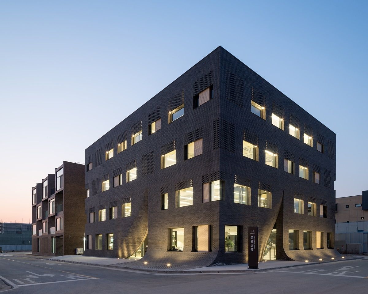
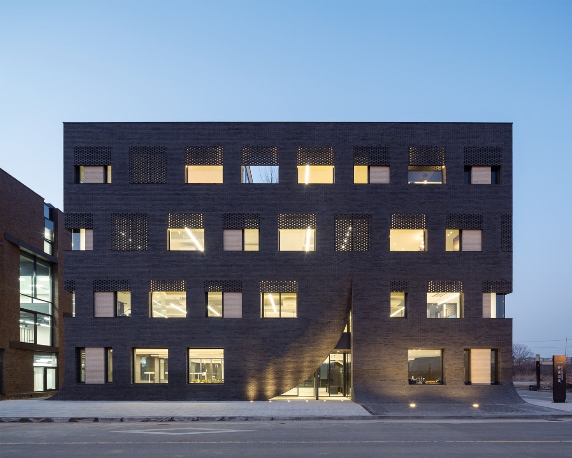
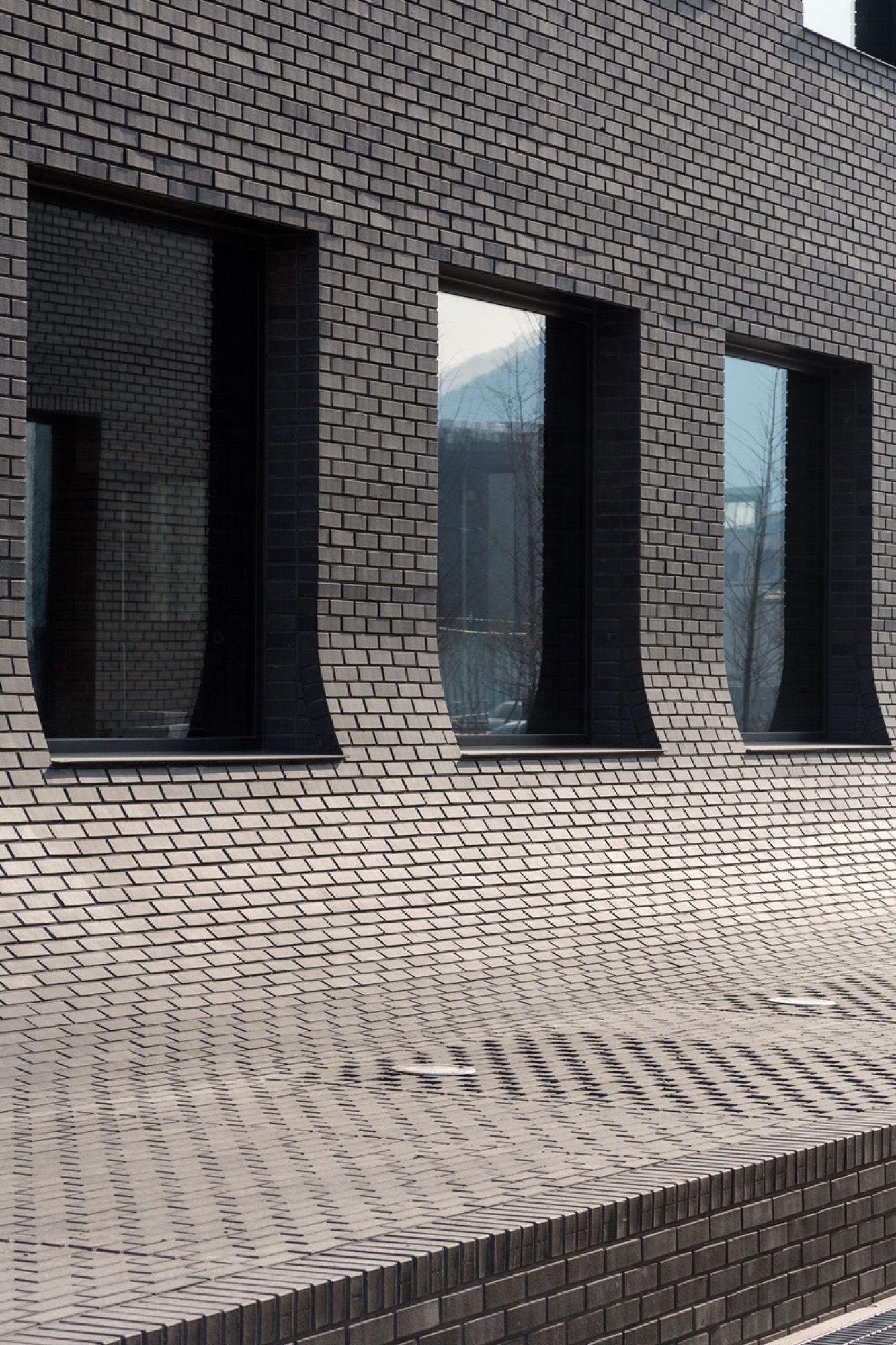
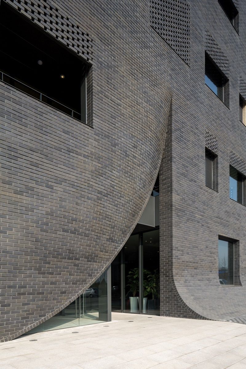
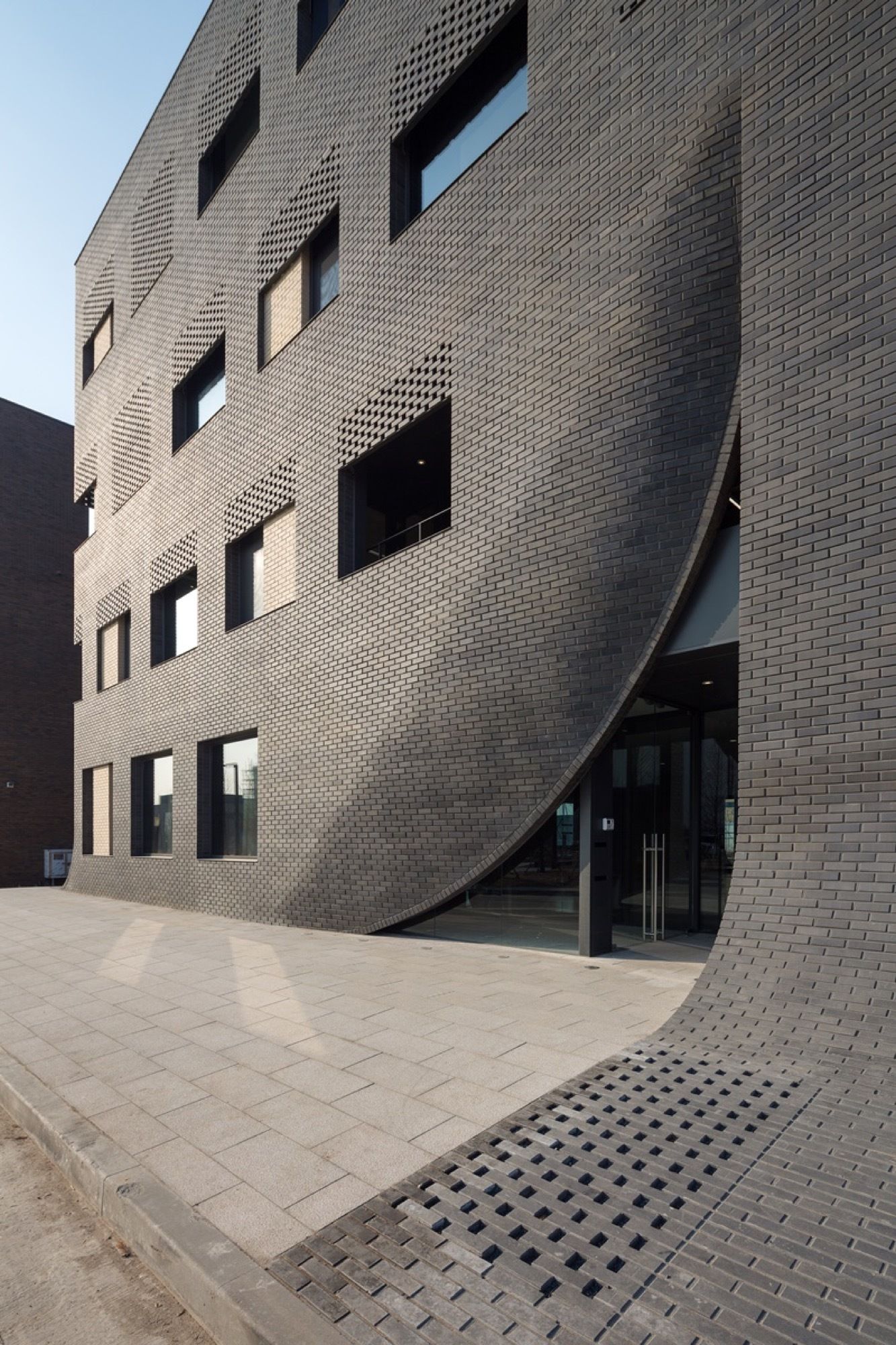
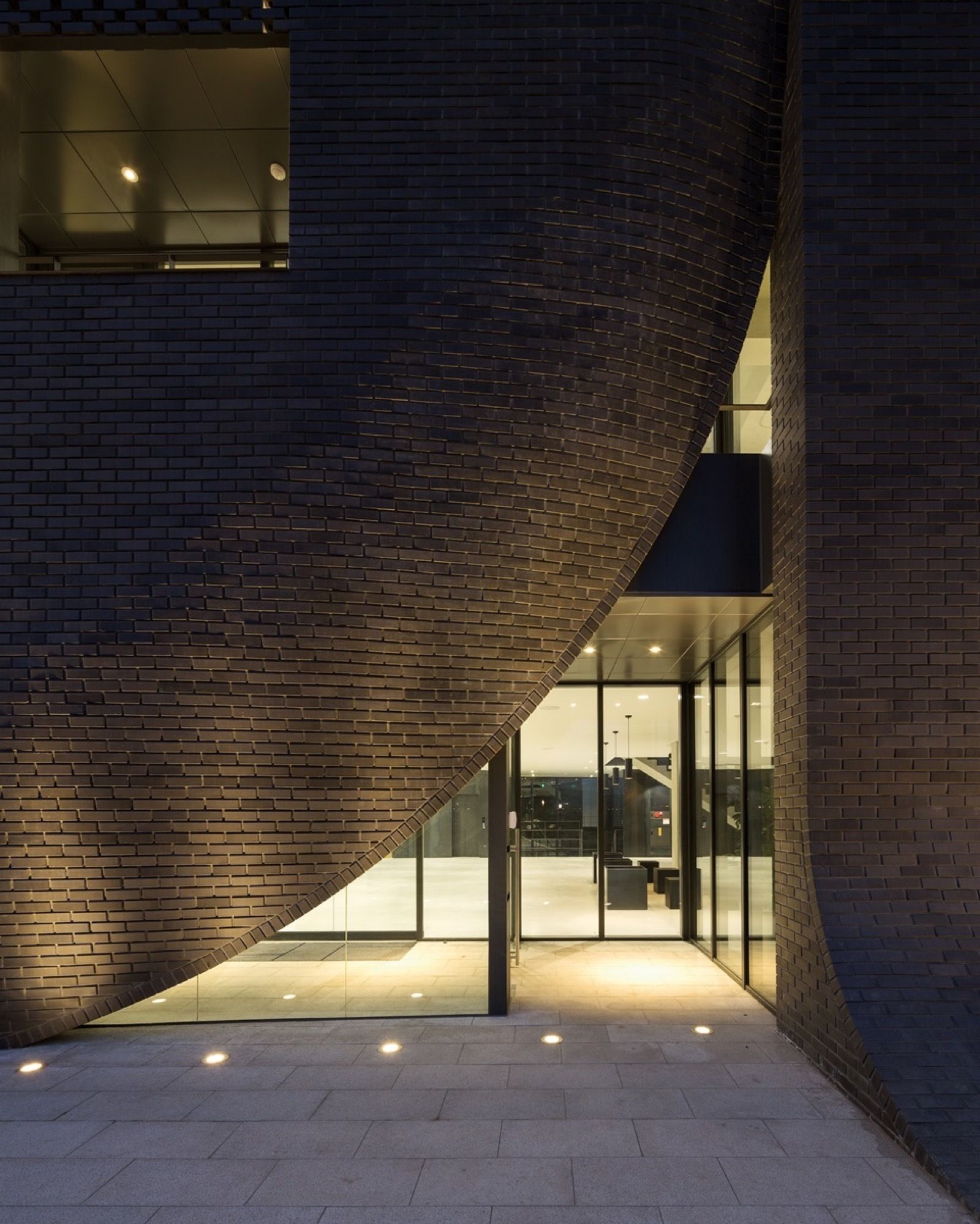
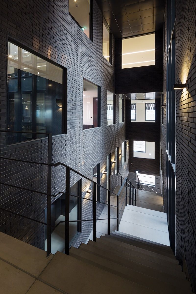
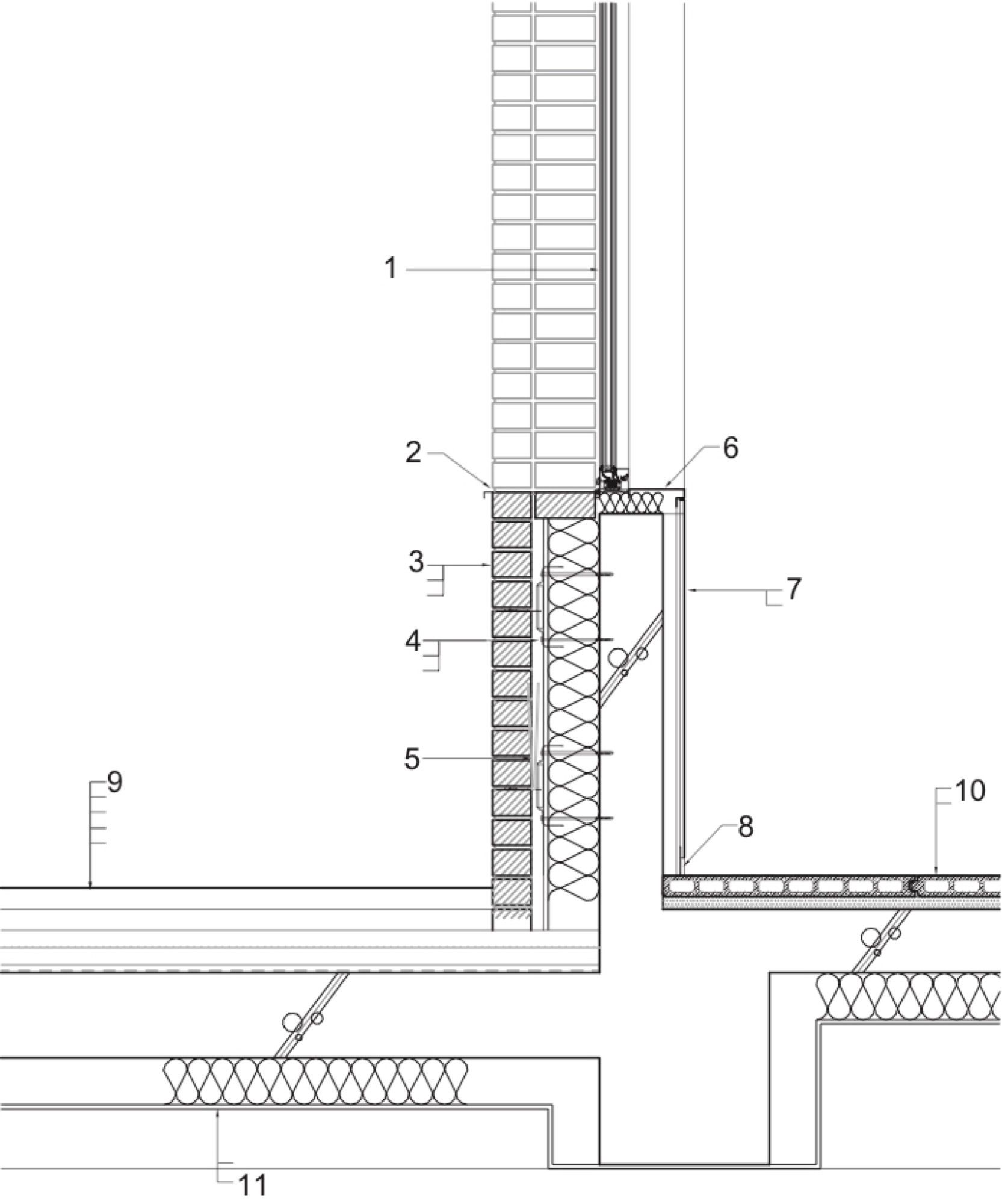
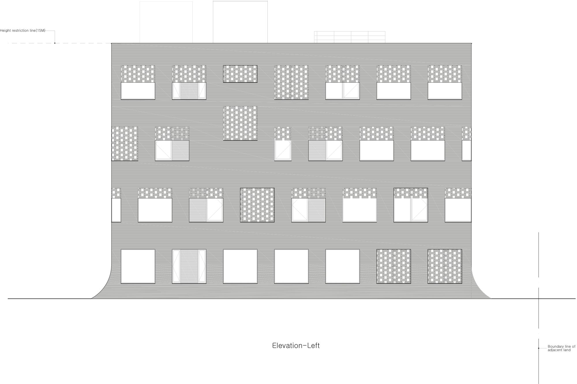
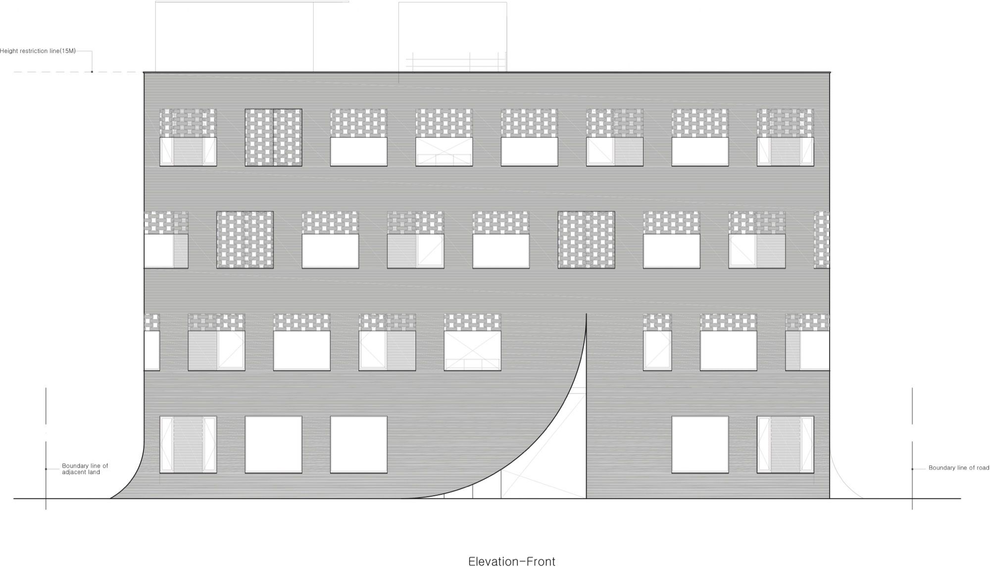
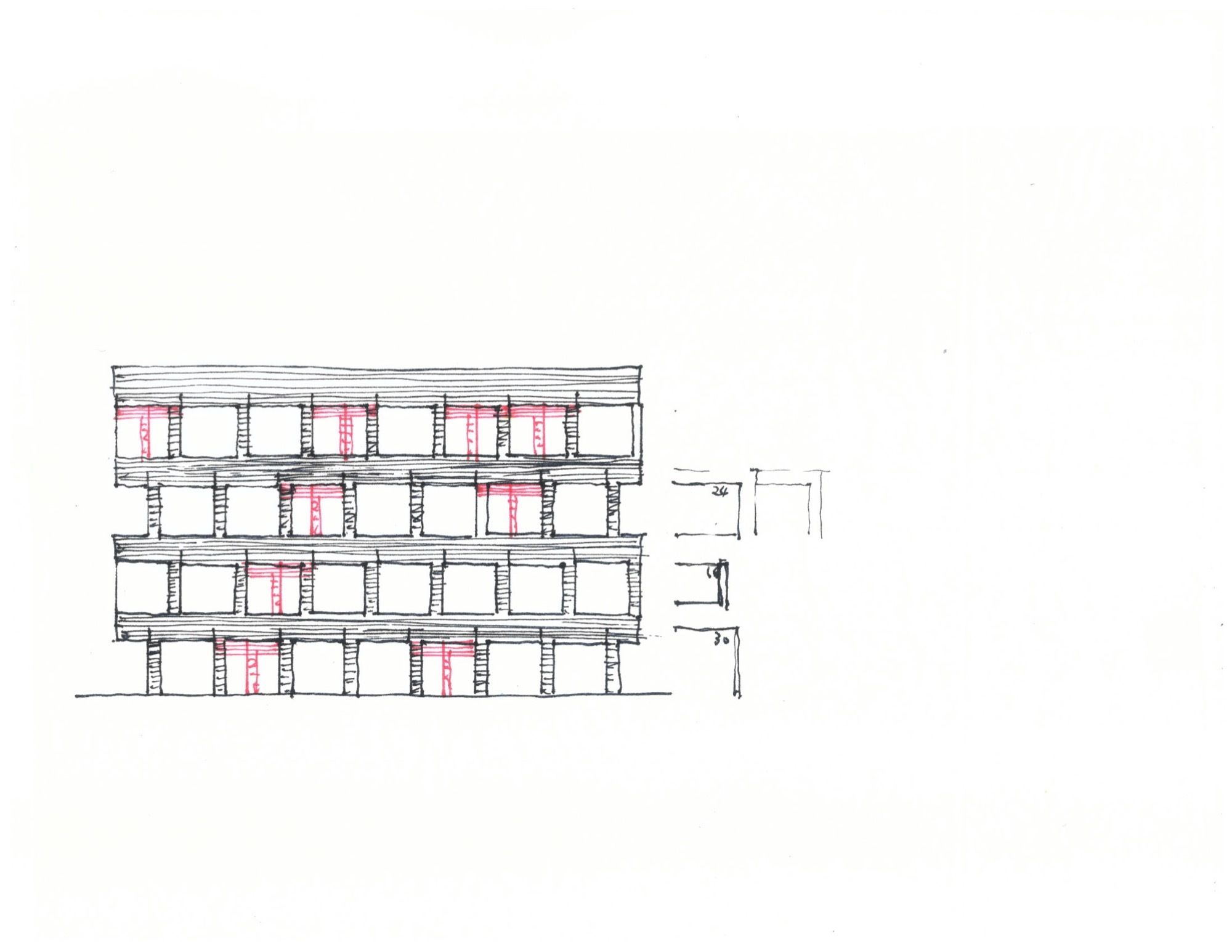
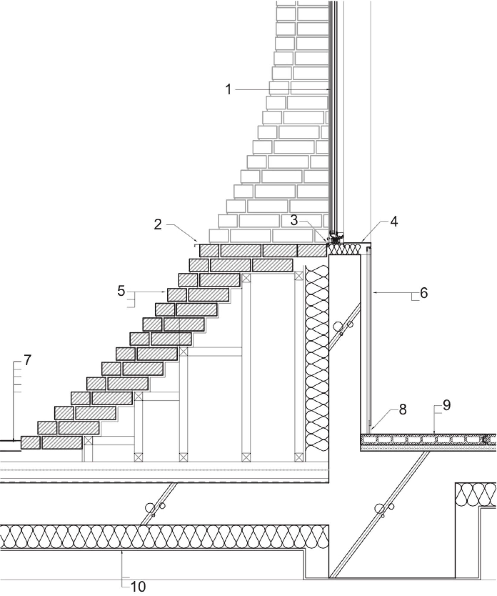
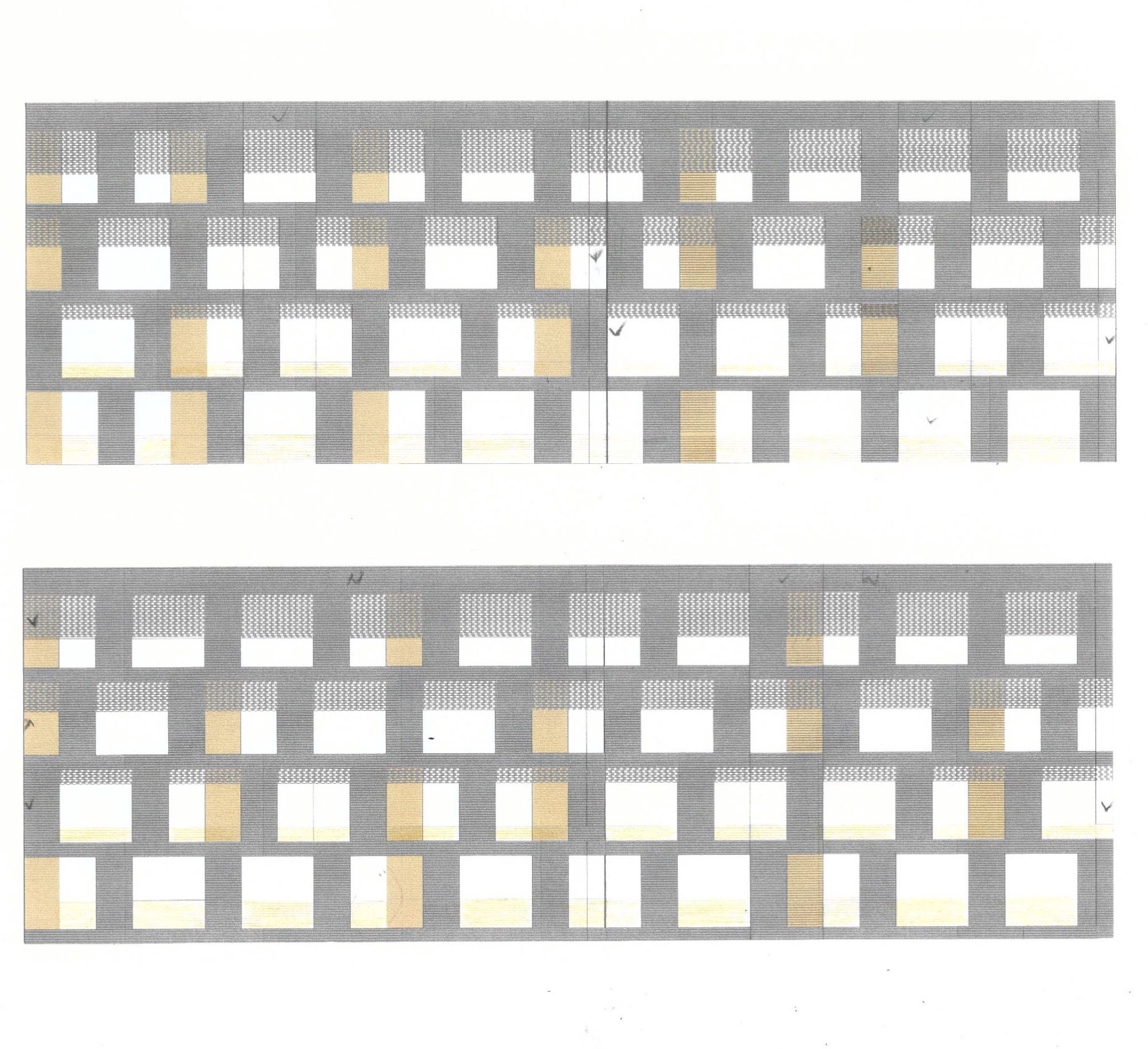
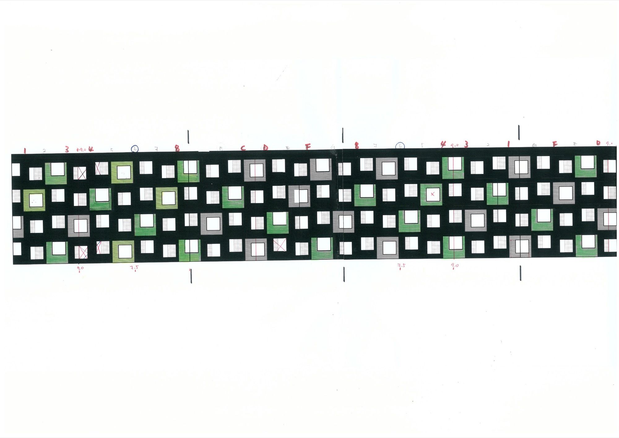
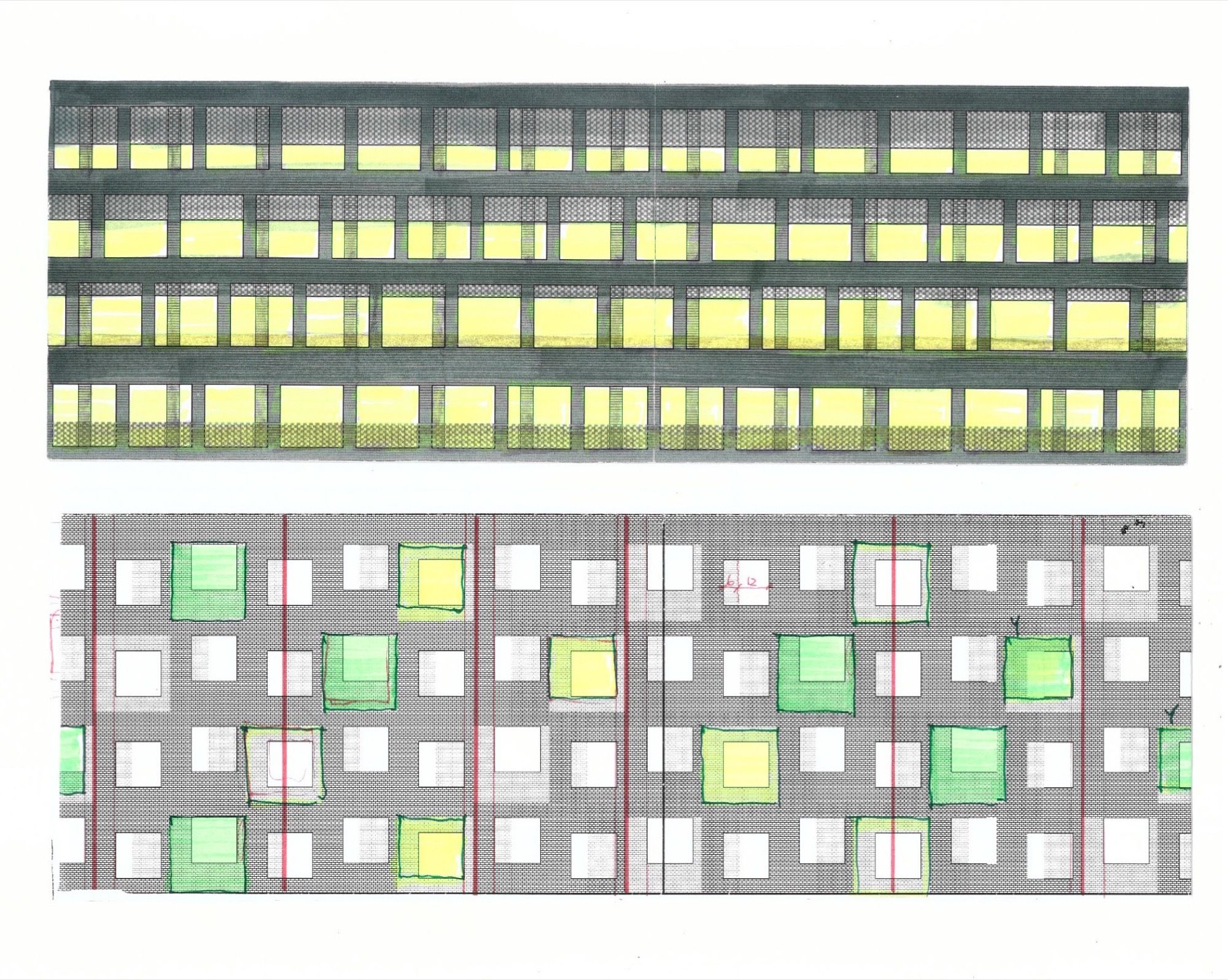
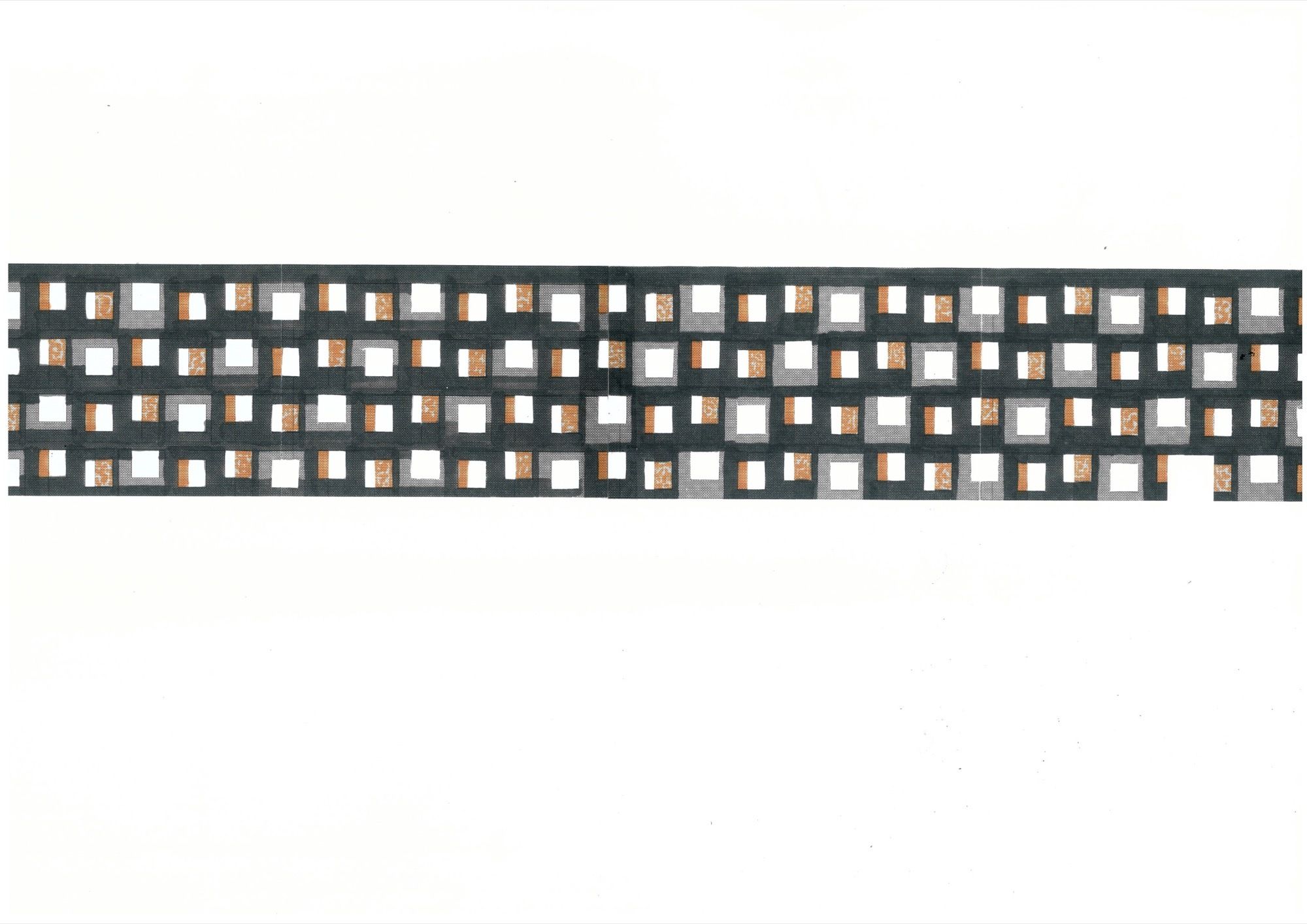
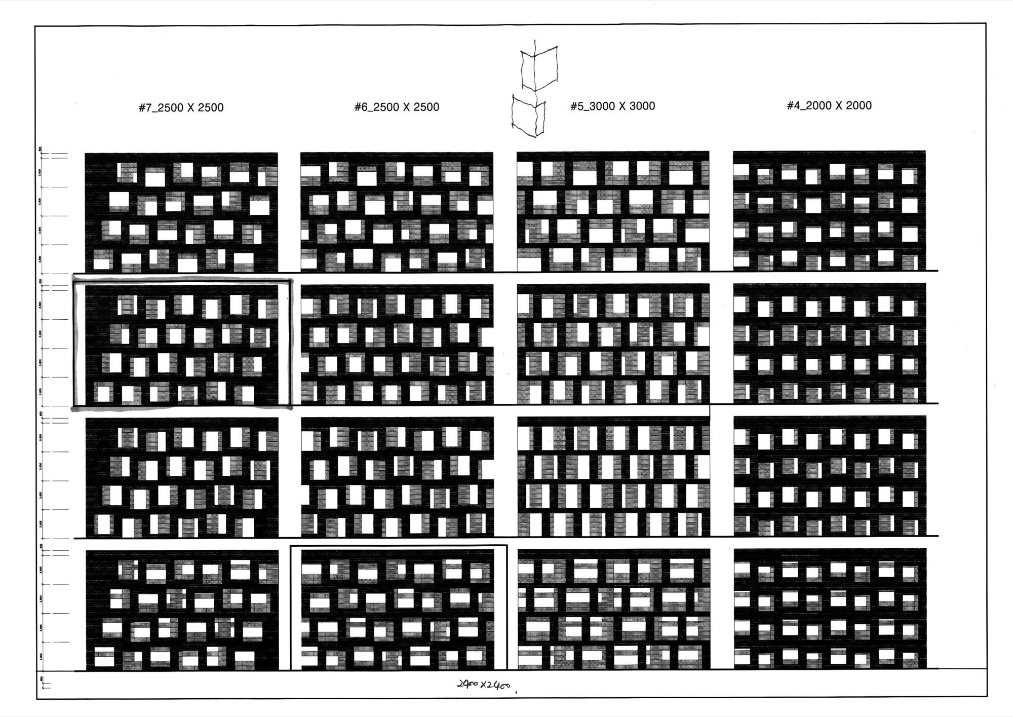
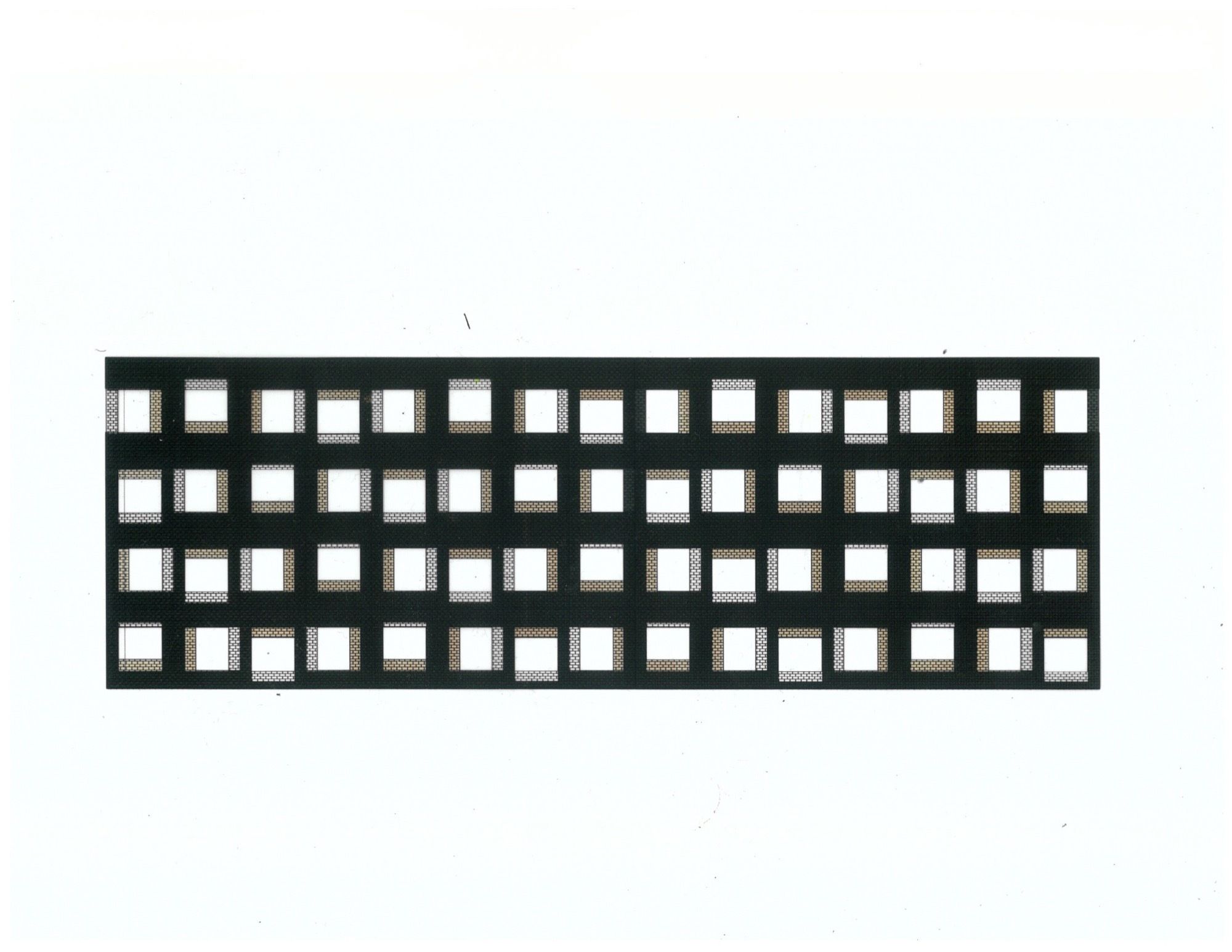
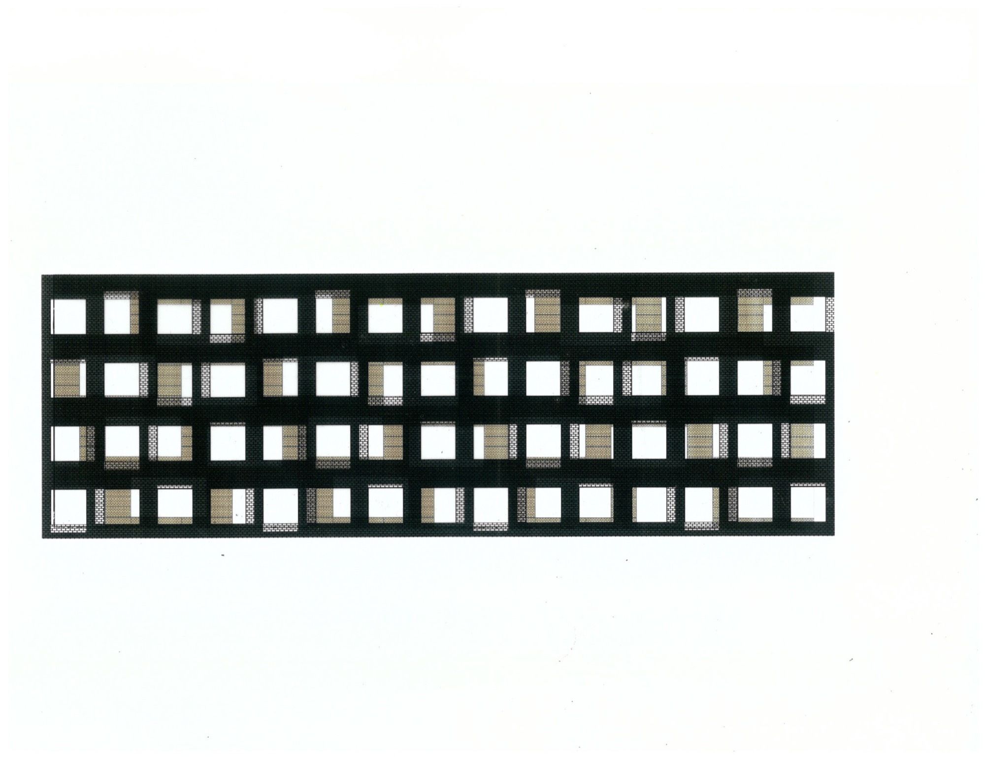
 Entirely covered with black brick, the building has a twisted rectangular shape, and its entrance defined by the incised surface of the distorted structure makes it difficult to distinguish between the front and the back. In contrast to the torn entrance, 2m×2m large windows are installed as openings in order to enhance the sense of openness on the lower floors. To block out the excessive light flowing into the upper floors, the architect designed lintels to be closed gradually rather than installing smaller windows on those floors. And by using the twisted form and repetitive wall pattern, the architect gave a sense of rhythm to the black building which can look plain.
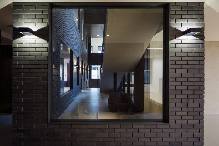
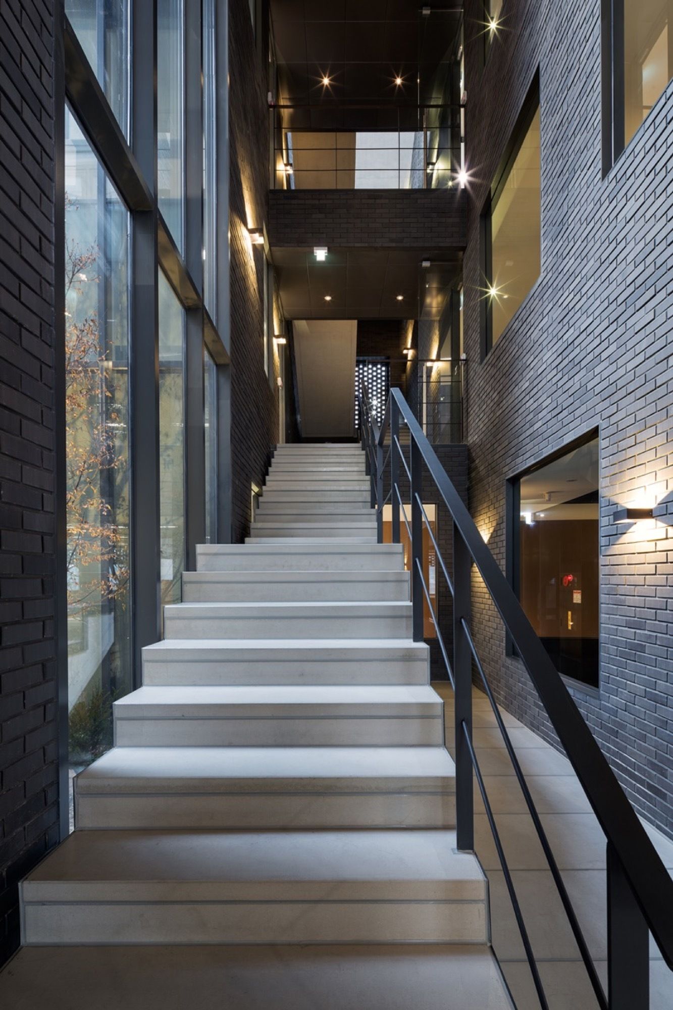
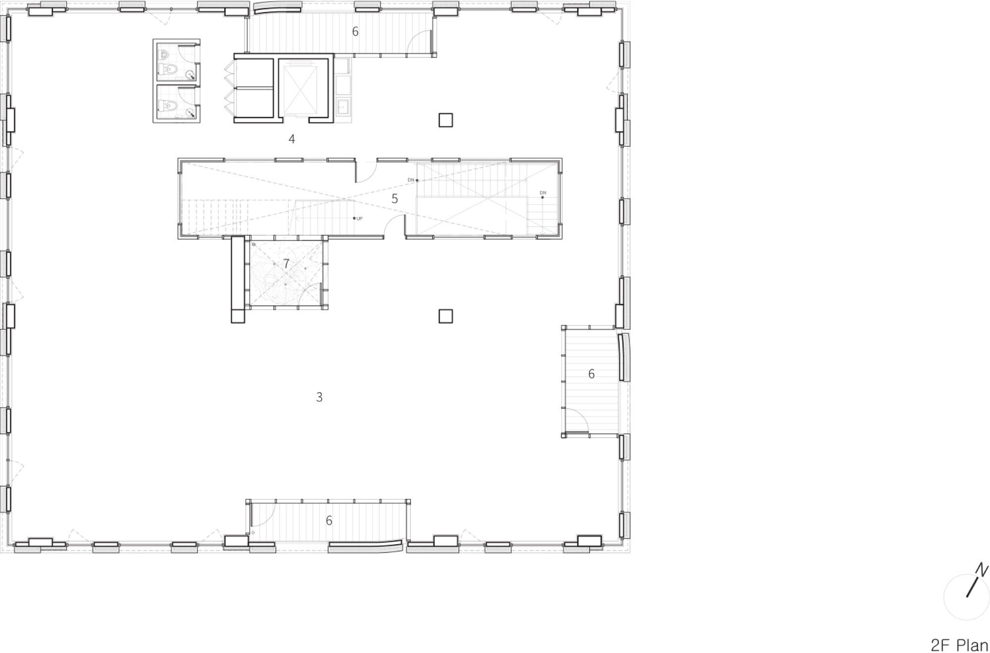
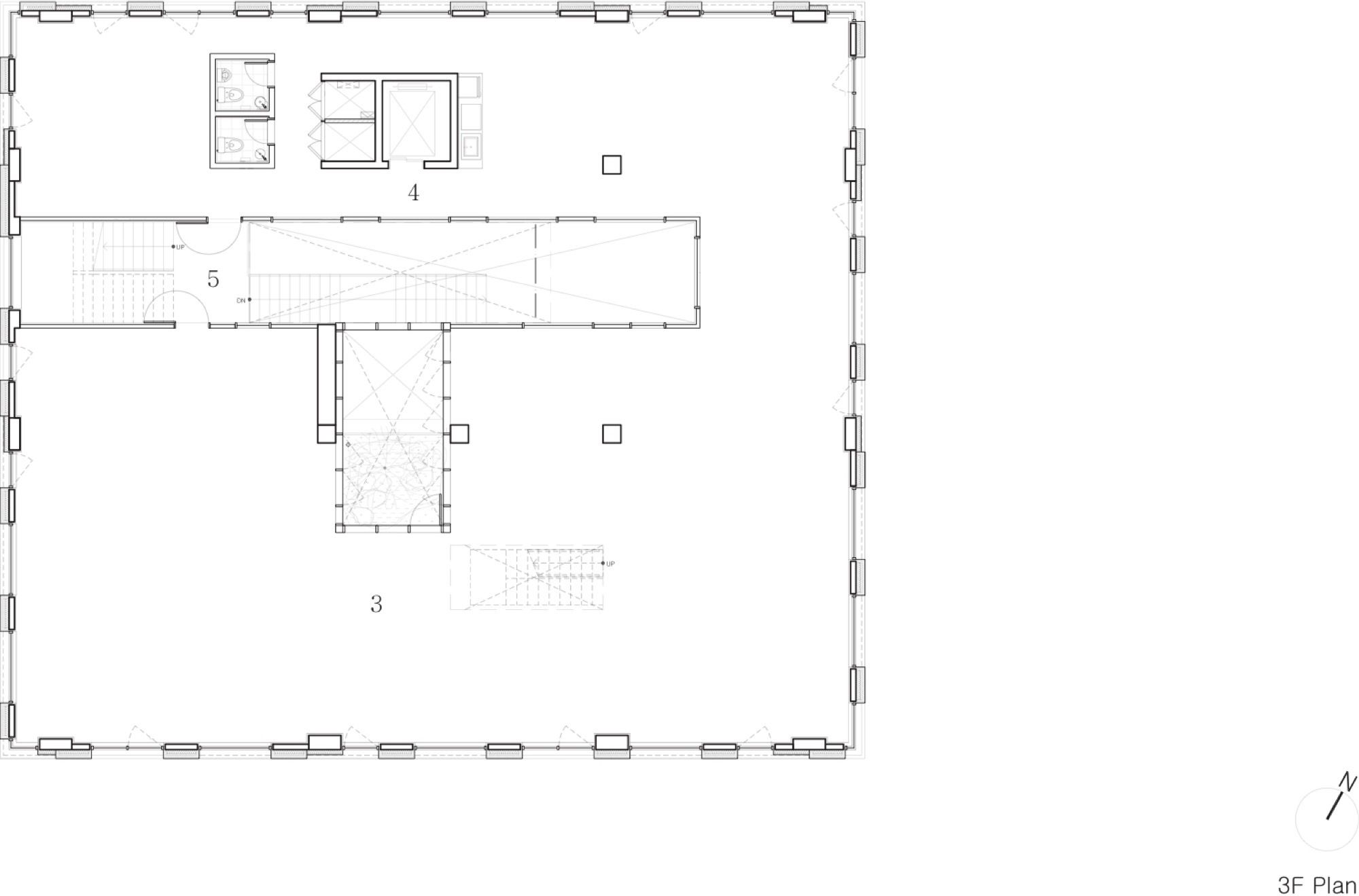
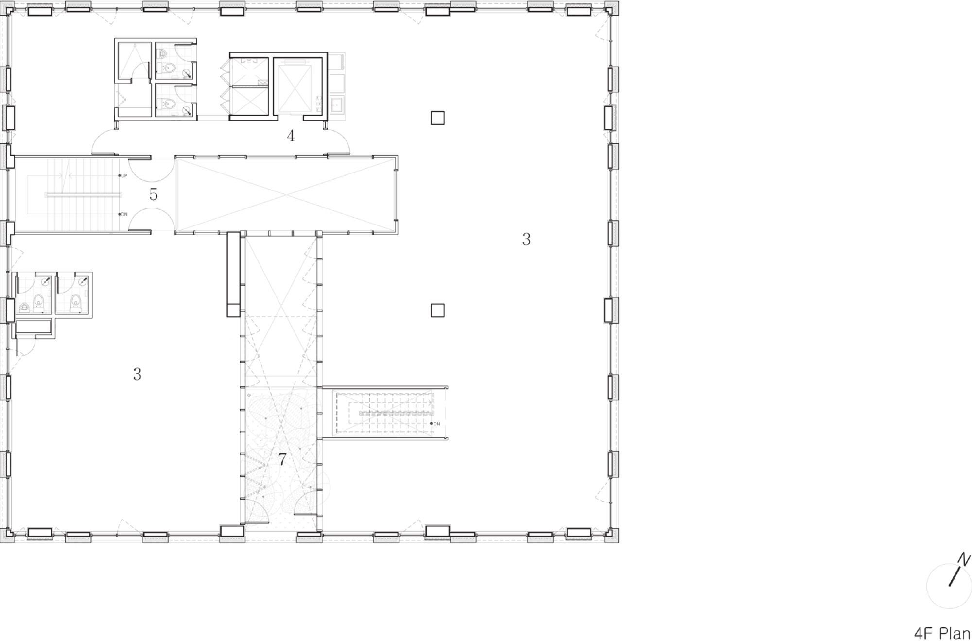
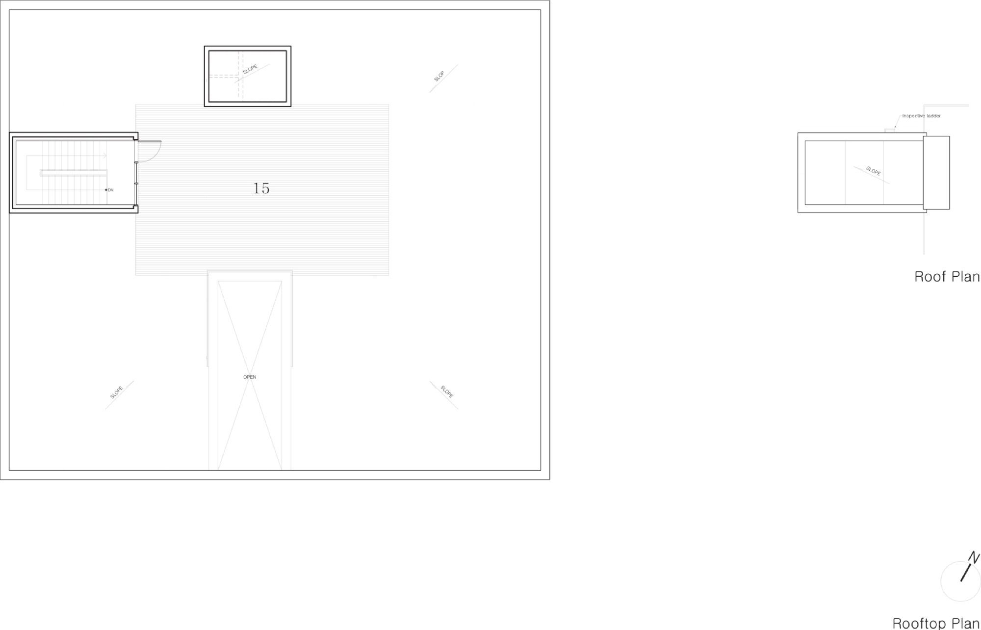
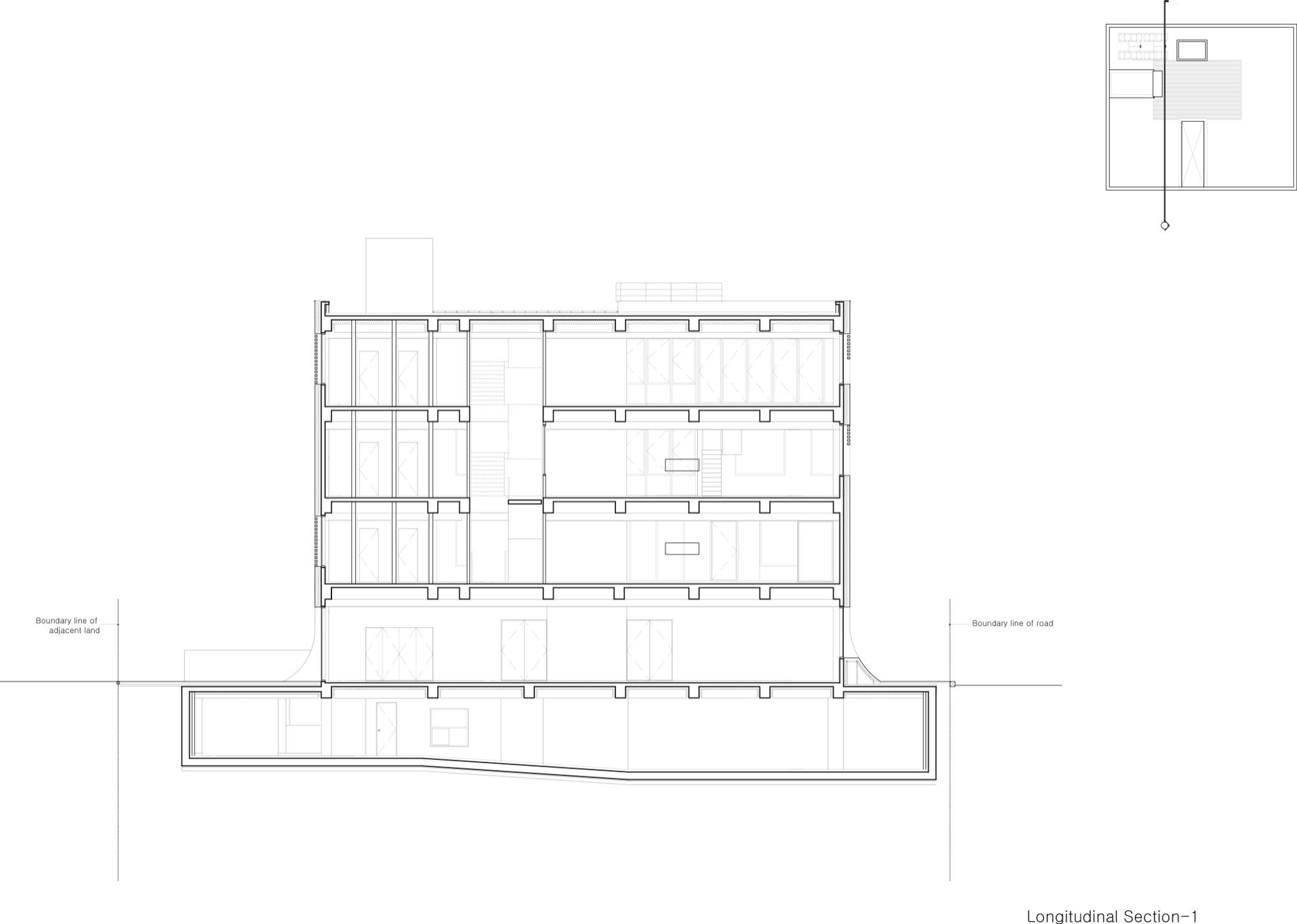
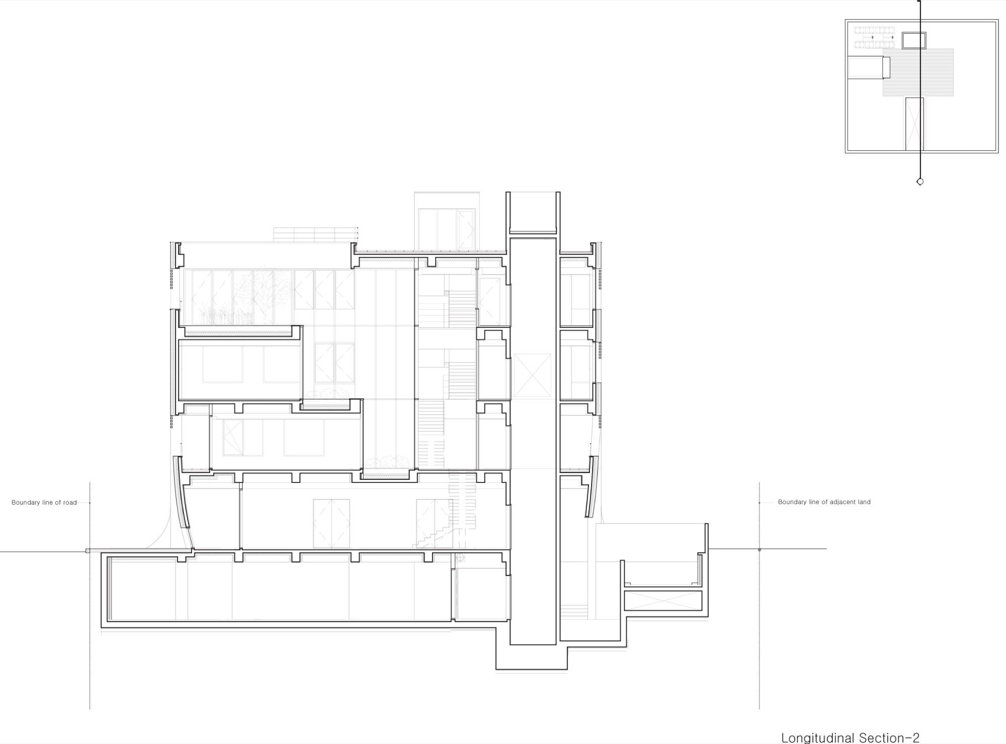
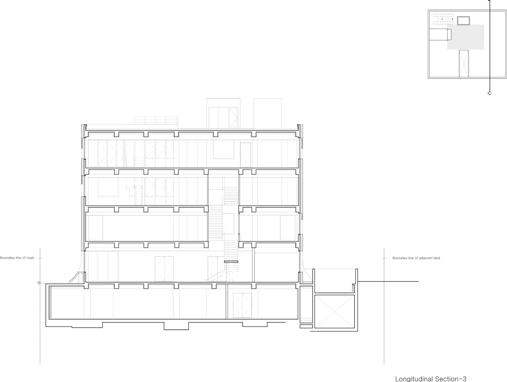
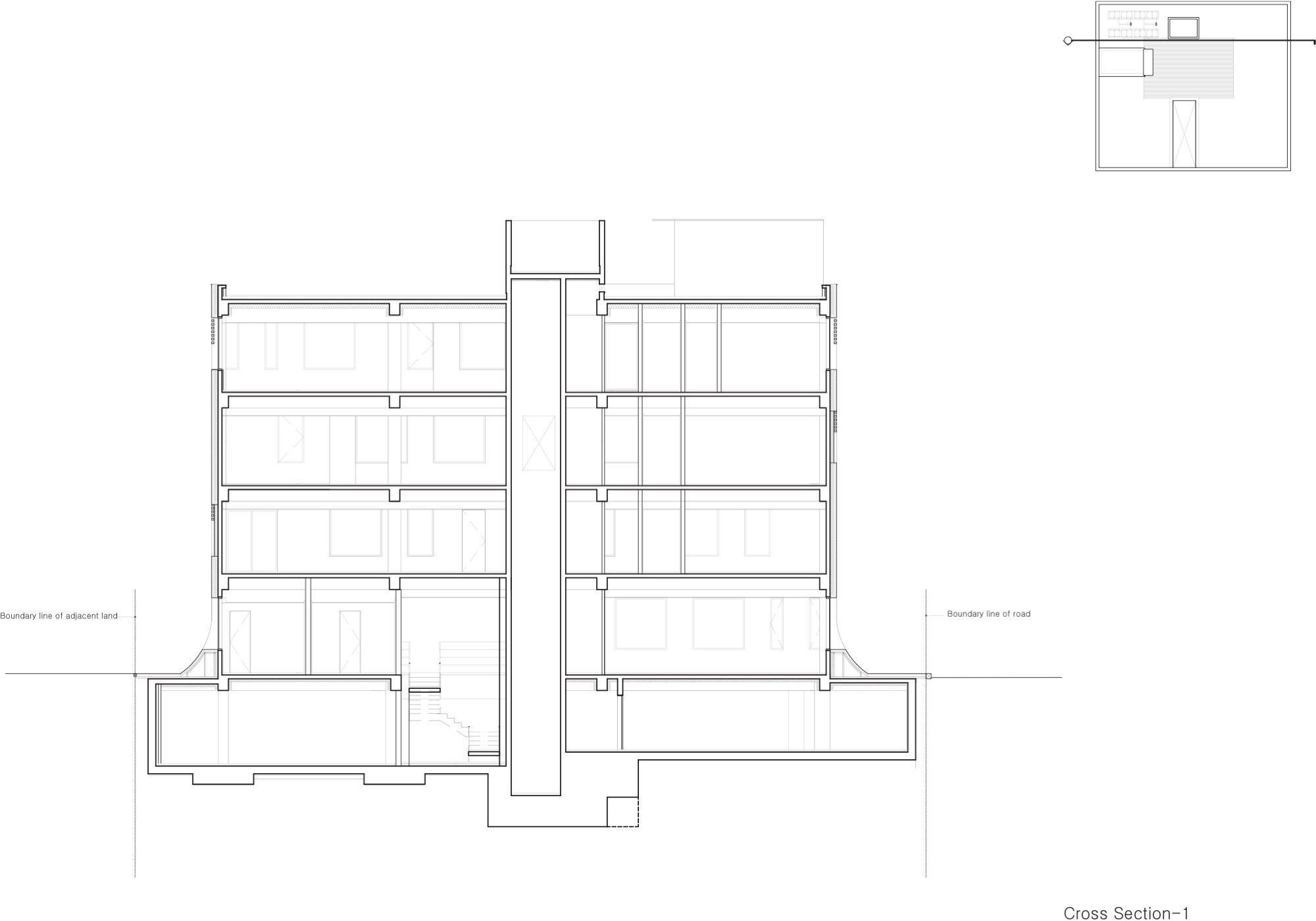
 As the Paju Book City area except for its reserved building construction sites is well arranged systematically, and considering that the area’s cold climate condition, the building is designed as introverted rather than as extroverted. In the atrium of the building, a vertical circulation which runs throughout the whole building and a terraced vertical garden meet at right angles. The building’s exterior is formed in a rectangular shape whereas its interior is composed of a T-shape atrium and ㄷ-shape office area. This specific solution enables the light from the outside to come deep inside through the atrium and so bright up the whole area. The atrium garden allows people to enjoy a brief rest without going outside, and the vertical circulation encourages communication among them and so ends up making the building more lively.
 Project Info
Architects : Wise Architecture
Location : Gyeonggi-do, South Korea
Year : 2015
Type : Office Building
Photographs : Kyung Roh
Photography by © Kyung Roh
Photography by © Kyung Roh
Photography by © Kyung Roh
Photography by © Kyung Roh
Photography by © Kyung Roh
Photography by © Kyung Roh
Photography by © Kyung Roh
Photography by © Kyung Roh
Concept
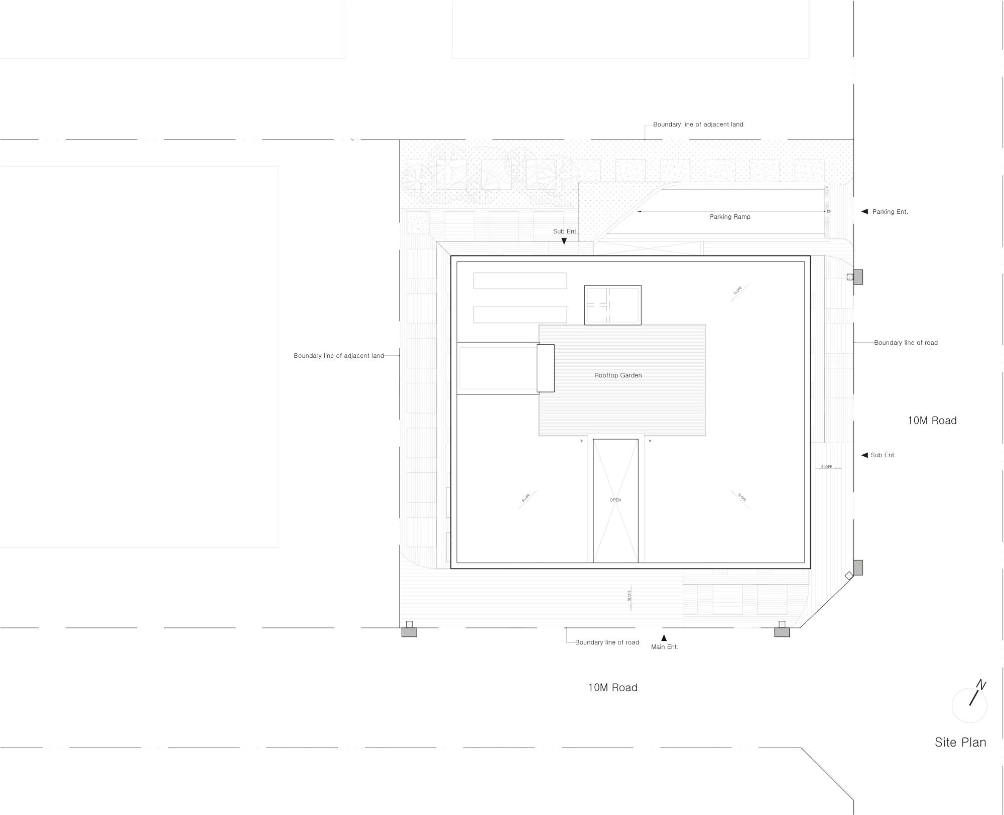
Site Plan
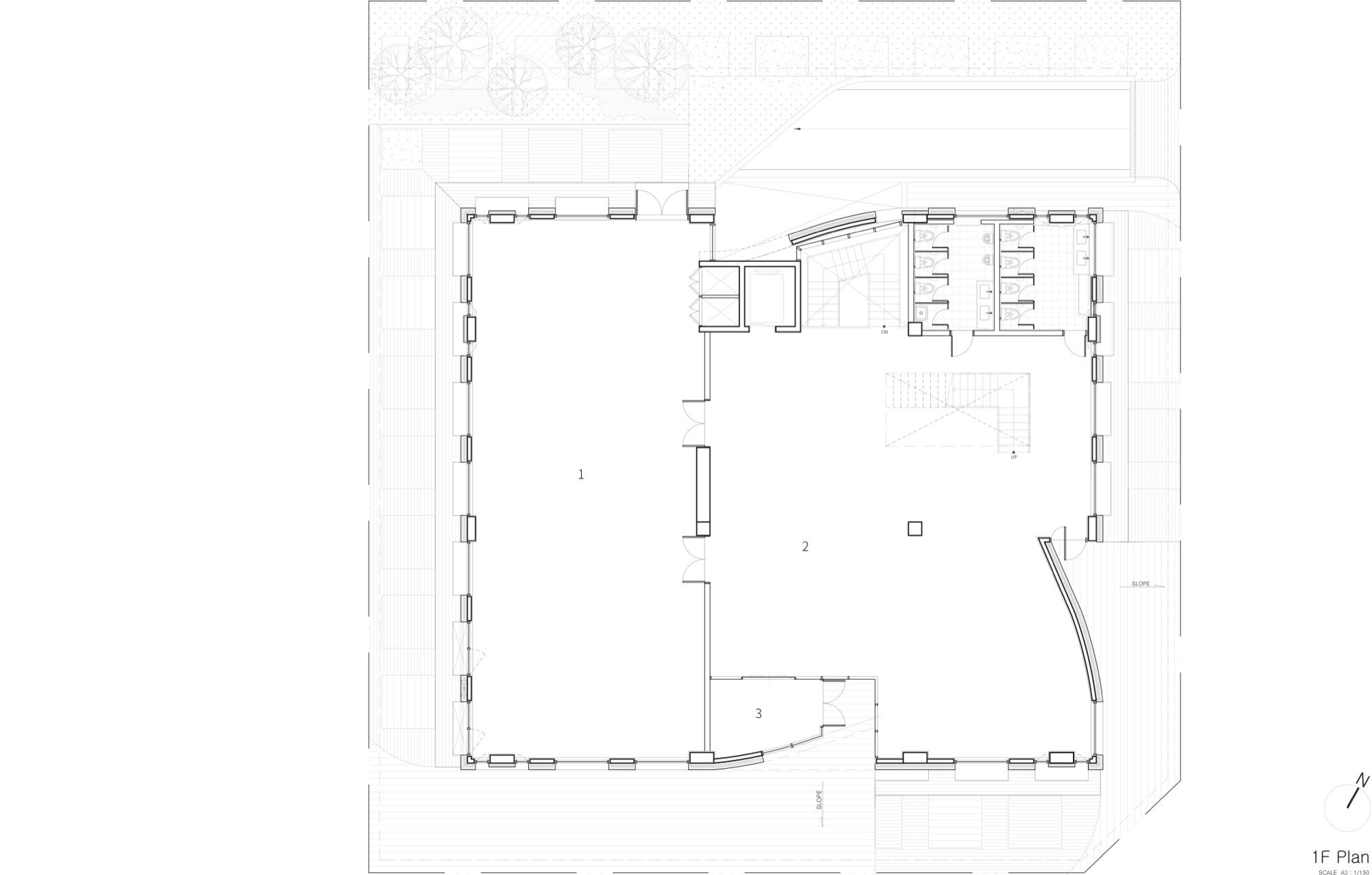
Floor Plan 01
Floor Plan 02
Floor Plan 03
Floor Plan 04
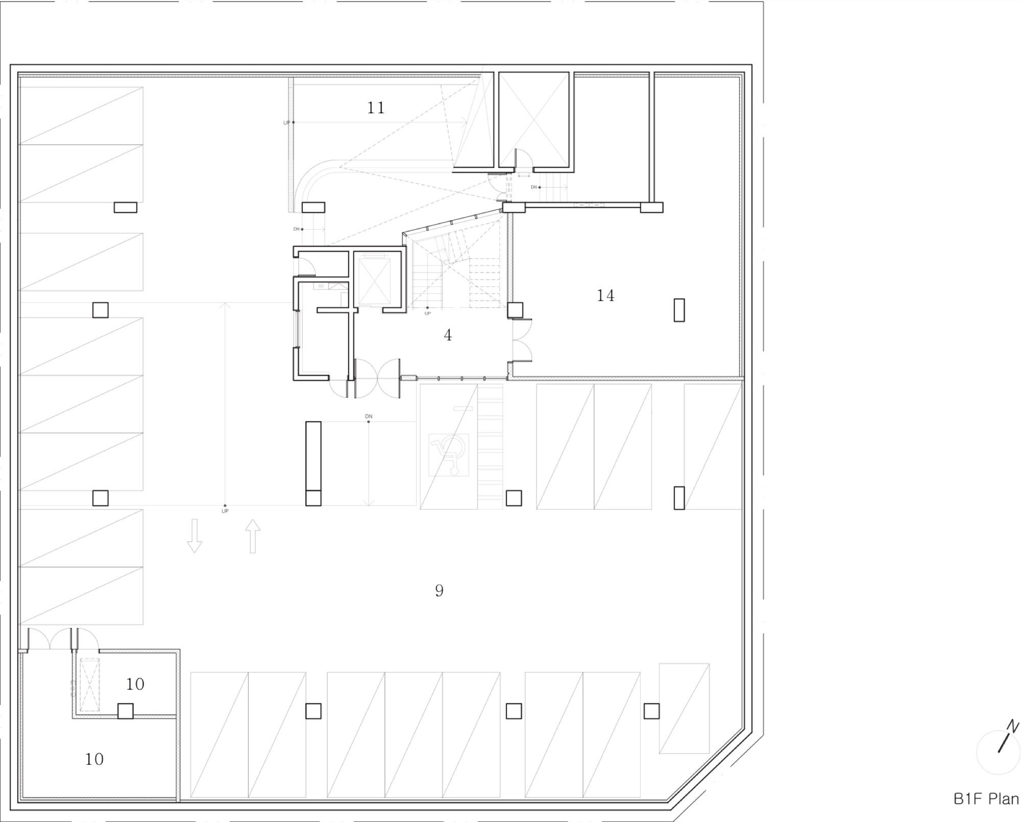
Basement Floor Plan
Rooftop Floor Plan
Section
Section
Detail
Section
Section
Section
Elevation
Elevation
Elevation
Detail
Sketch Study
Detail
Sketch Study
Sketch Study
Sketch Study
Sketch Study
Sketch Study
Sketch Study
Sketch Study
Sketch Study


