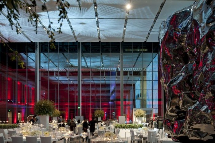
Museum of Fine Arts
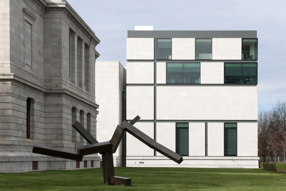
Being one of the biggest neoclassical museums with symmetrical completeness, the Museum of Fine Arts, in Boston, is visited by more than million visitors per year. The increased figure of audience issued the necessity of an extension which will house a wider range of American holdings and will harmonize with the neo-modernist style of architecture. The immensely challenging task of merging the past with the present was handed over to Foster and Partners for their distinguished style of contemporary architecture with sustainable solutions.
Foster and Partners, along with Childs Bertman Tseckares Inc. (CBT), infused the elements of old and new age by breaking the traditional idea of enclosed exposition and restored an augmented visitors’ experience. A concept of courtyard-based interactive space generated from the influence of the German Reichstag and the great court of British Museum. The new development proposals include renovation of the two historic entrances, gallery restorations and a new visitors’ center in order to amalgamate the crystalline late modernism within the solidity of civic stone. “I don’t think there’s any other museum that has united the hemisphere in this fashion“, said Kathleen A. Foster, director of the Center for American Art at the Philadelphia Museum of Art.
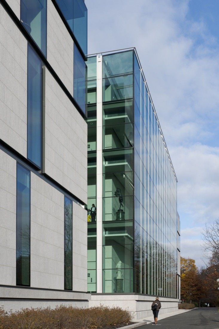
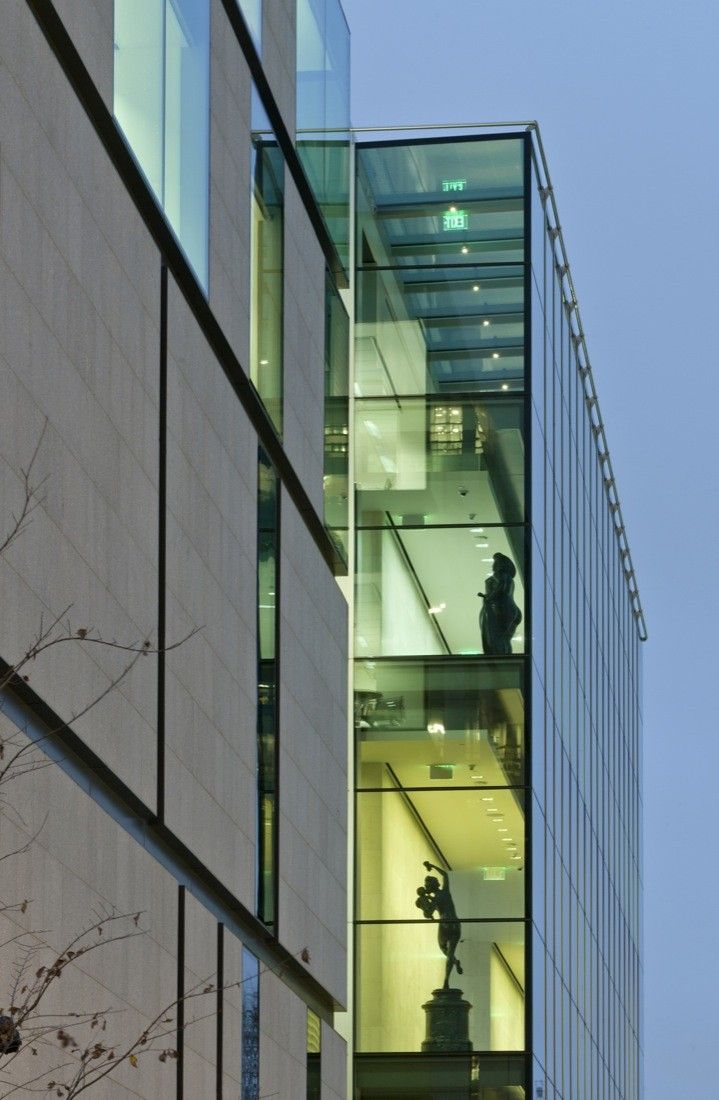
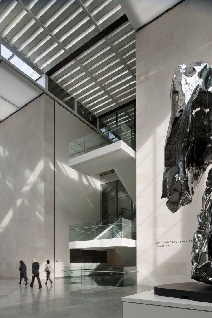
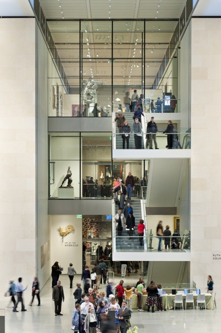
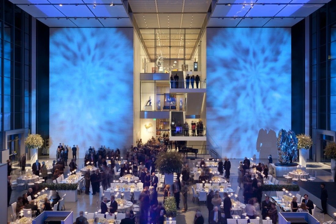
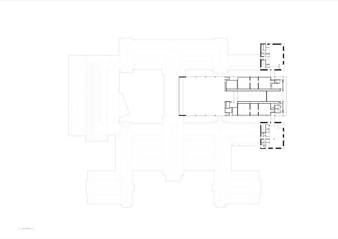
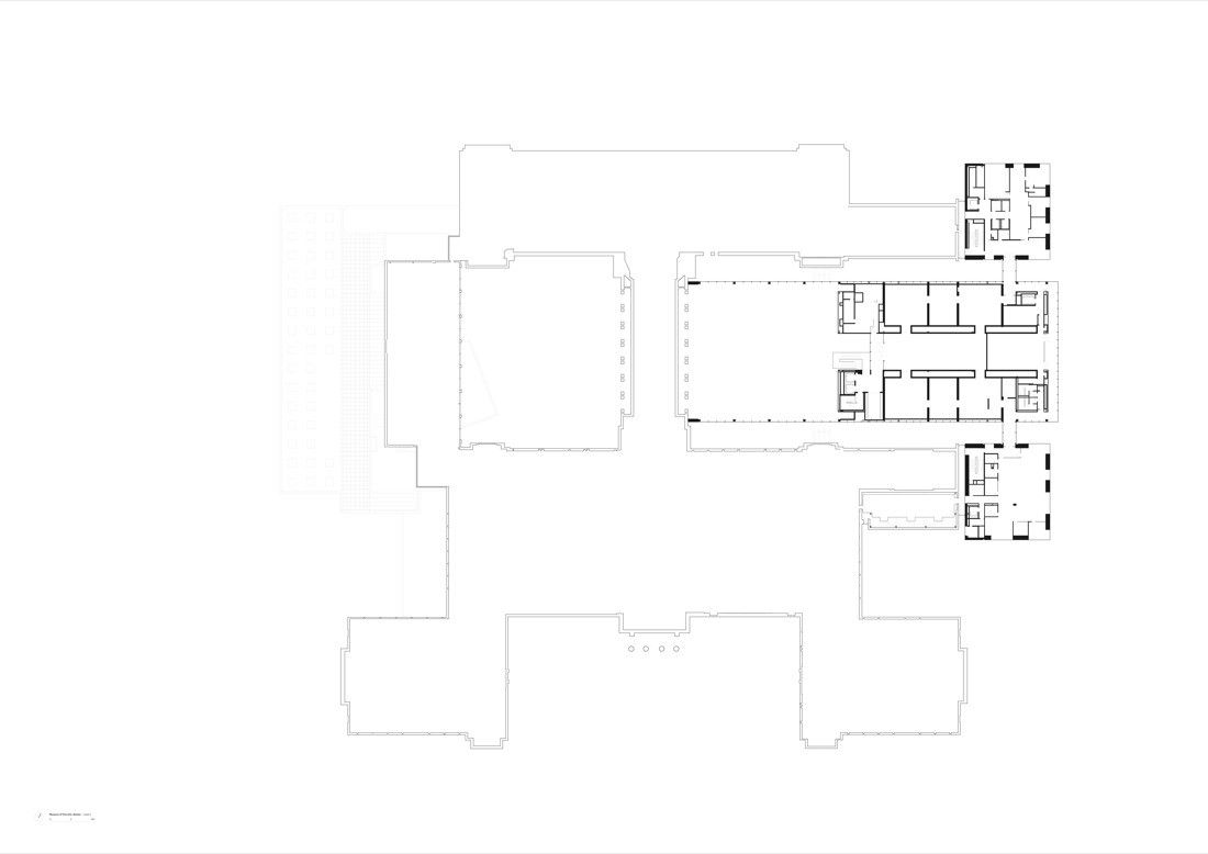
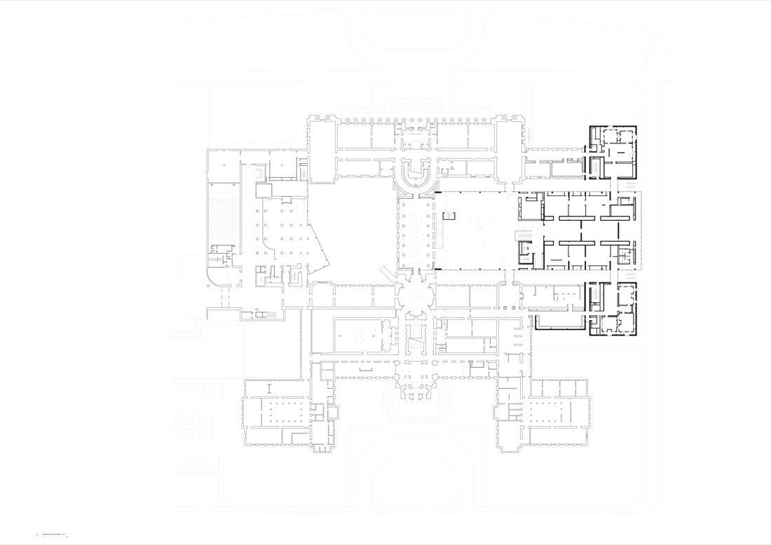
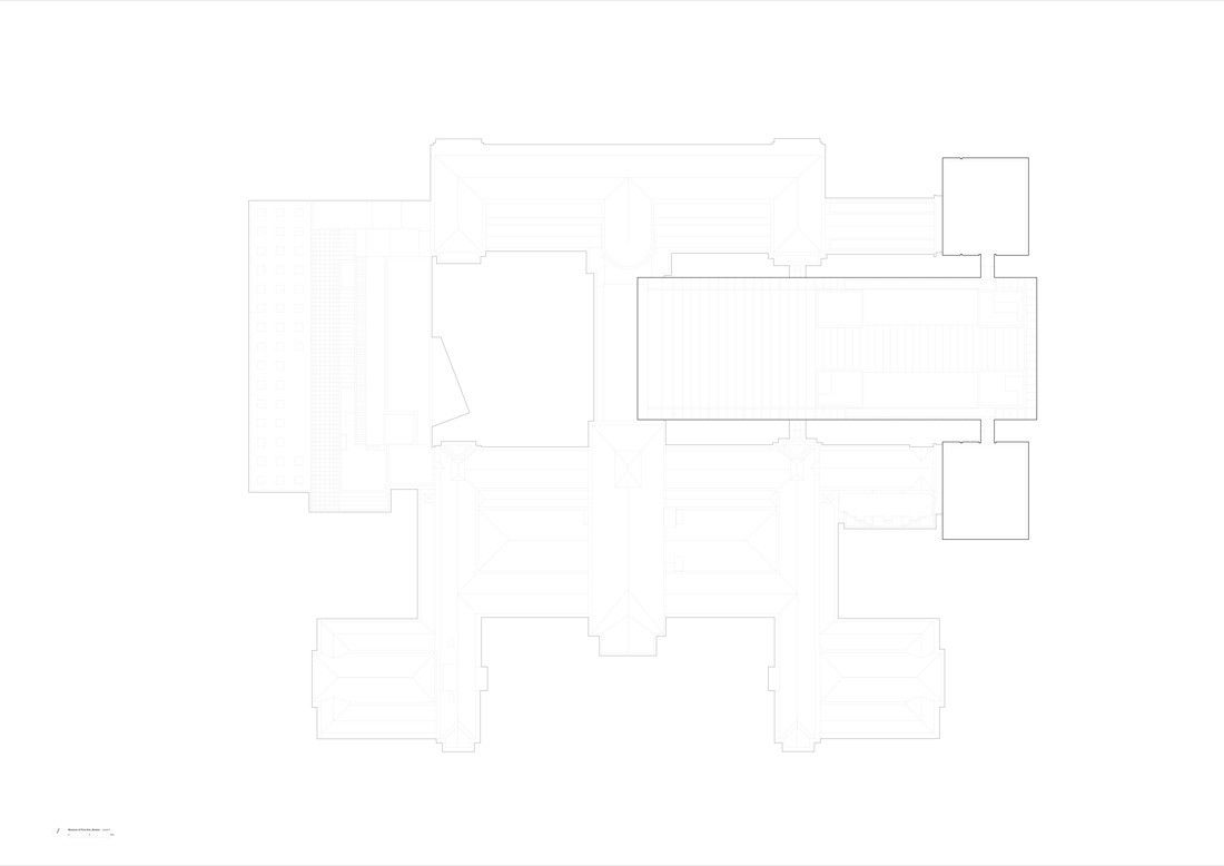
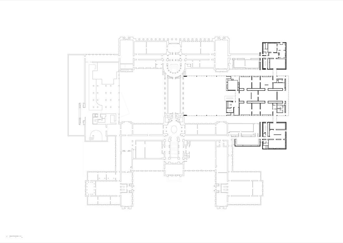
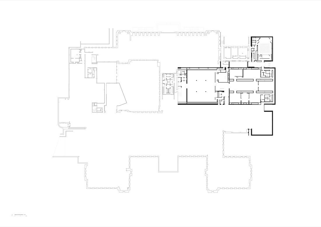
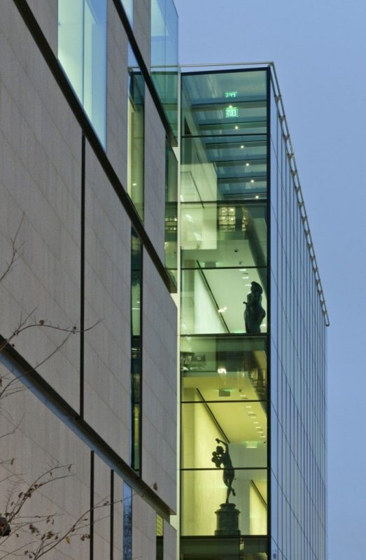
The 103,000 square meters plan of the 133,491 square meters complex consists of a rectangular central building connected by glass bridges to a couple of ancient square pavilions in order to form the Art of Americas Wing. 5000 works, including 30 percent of the American authenticities, are arranged chronologically in 53 galleries of the tetrad floors, which sums three times more to the past exhibits as many of the artifacts, were anguished within the walls of the cellars due to space shortage. Boston architect Guy Lowell’s Beaux-Arts plan from 1907 incorporates the core master-plan and the re-insertion central axis was a part of it. The heart of the axis lifts the soul through a lofty space of 21 meters height while accommodates a new information center. The freestanding glazed structure works as a crystal spine which frames the skyline of the marshy Back Bay Fens Park.
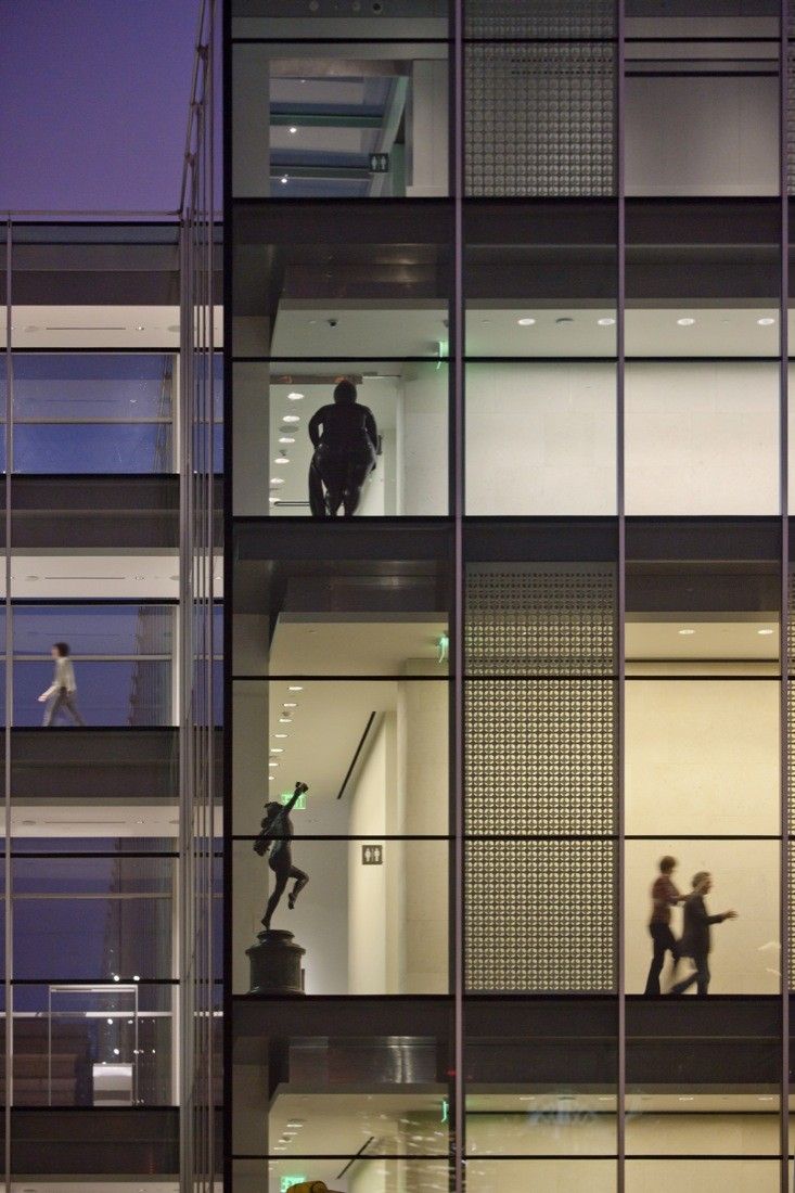
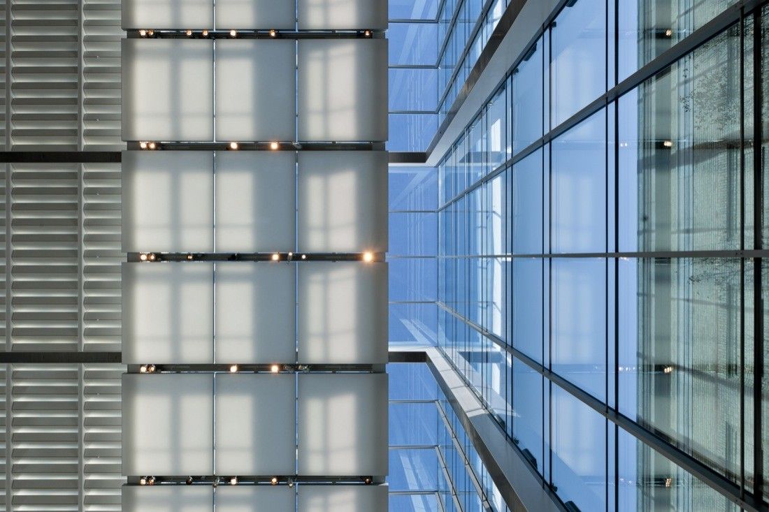
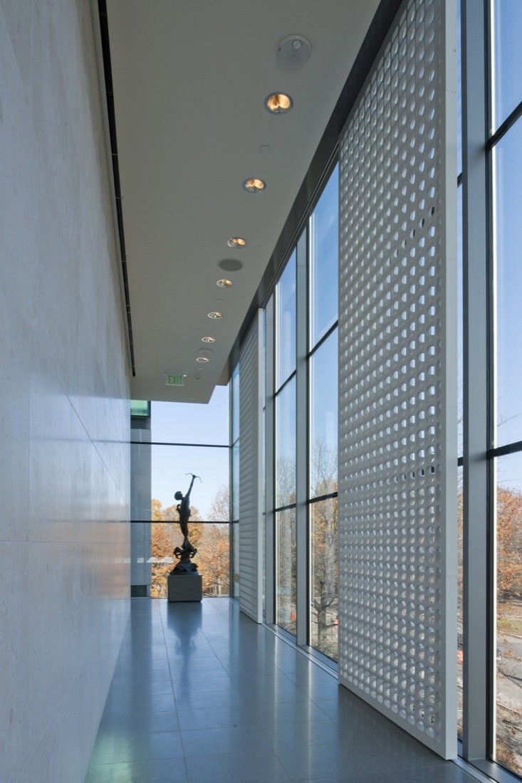
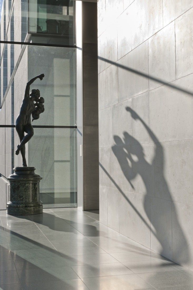
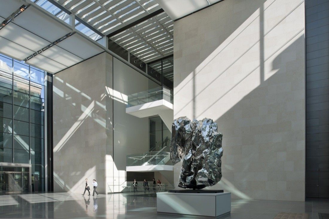
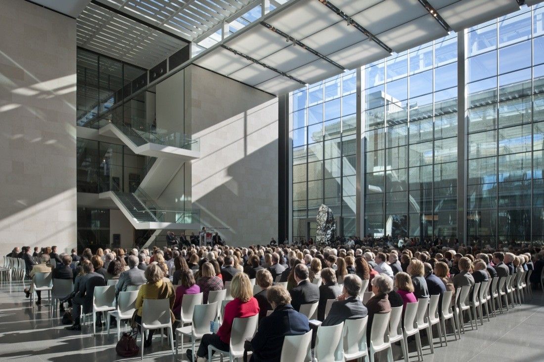
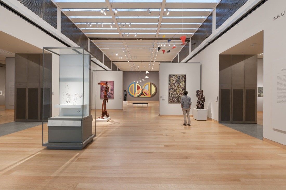
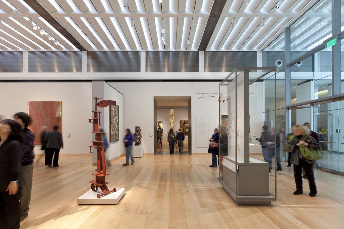
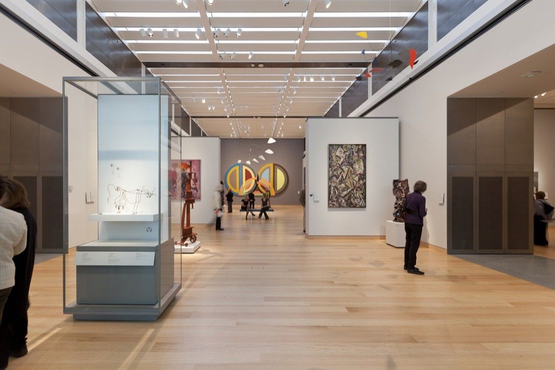
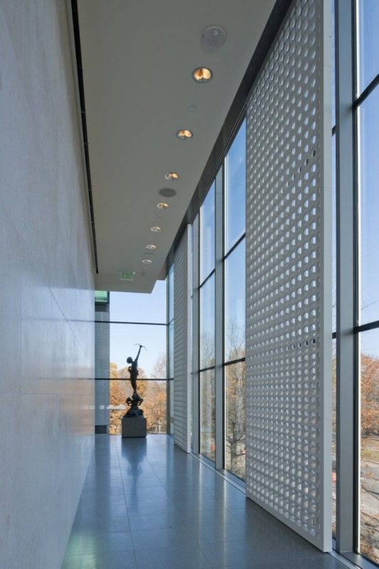
The visitors start their tour from the galleries which consolidate five great collections in a more interconnecting and comprehensible whole. The entrance gallery is flooded with ethereal light infiltrated through the glass façade. The galaxies allow a wider range of flexibility so that the services can be moved to accommodate large objects. Characterized Foster-detailing of the interior is uncompromisingly responsive to the displayed artworks. In response to the obvious sense that art has to be displayed in the clarity of light, the glass façade permits subsequent open illumination which relieves the pressure from the exhibits and actively embraces them as a part of the modernized elevation. Slender steel columns support the thin sheet of glass roofing.
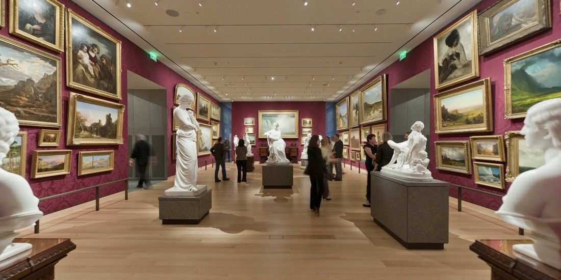
The ground floor features ancient and Native American Art from the Prehistoric Era to the 17th century maritime artworks including Mayan ceramics and Jackson Pollock’s. The level covers the entire hemisphere ranging from the north to the southern parts of America. Level one houses the artistic collection of the 18th century colonial America up to the early 19th, including ‘The Passage of the Delaware’ by Thomas Sully, for the first time in America’s context. A niche in the ceiling of the first floor accommodates this fascinating piece of art which is considered to be one of the largest and significant paintings in entire America.
Late 19th and early 20th century artworks are established in level two, whereas the top level at the third is dedicated to Century Art and Art Deco from the mid-70s. The mixed types of artworks involve varied approaches of the exhibition and weaved series of routes which reincarnates the timeline of American history of art. In order to construct the new American wing, the period rooms were dismantled in 2003. The new design comprises nine period rooms and four ‘Behind the Scenes’ galleries incorporated with touch-screen technologies and handheld multimedia guide. The seemingly random openings of the façade coincide with the windows of the period rooms in order to provide natural illumination. The painstaking process of removing, conserving and reinstalling the period rooms in the new wing has involved curators, conservators, and scores of specialists trained in historic preservation and traditional crafts including woodworking, historic masonry, blacksmithing, glassblowing, textiles and upholstery. The result promises to be spectacular which is later refurbished by traditional finishes.
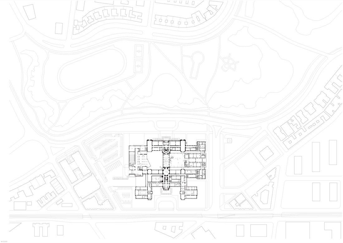
“The MFA is more than a great cultural institution – it is the catalyst for the rejuvenation of an entire neighborhood in Boston. Over time the Museum had lost its connection to the Back Bay Fens and the beautiful landscape of Frederick Law Olmsted’s ‘Emerald Necklace’. In restoring Lowell’s original plan and in opening up and reasserting the grand Fenway entrance, we have rediscovered this link. At the same time, we have drawn the landscape deep into the heart of the building and along Huntington Avenue. The result is a more legible museum that will create new connections between the park, the Museum and the local community“, Lord Norman Foster commented on this project.
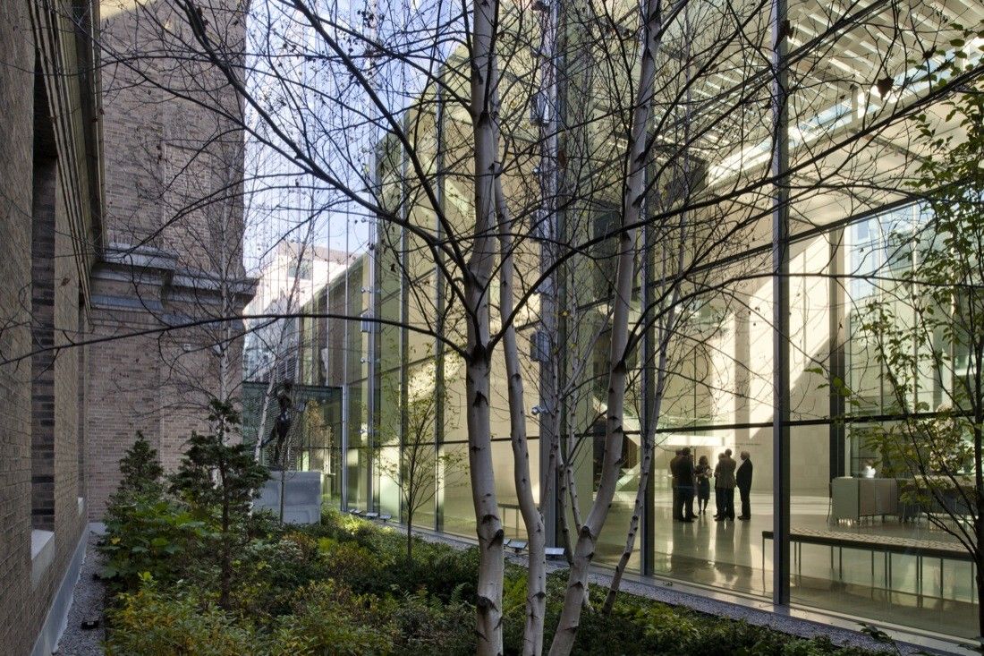
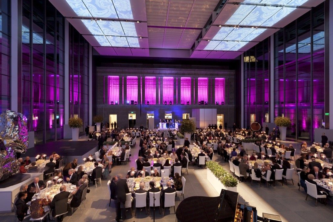
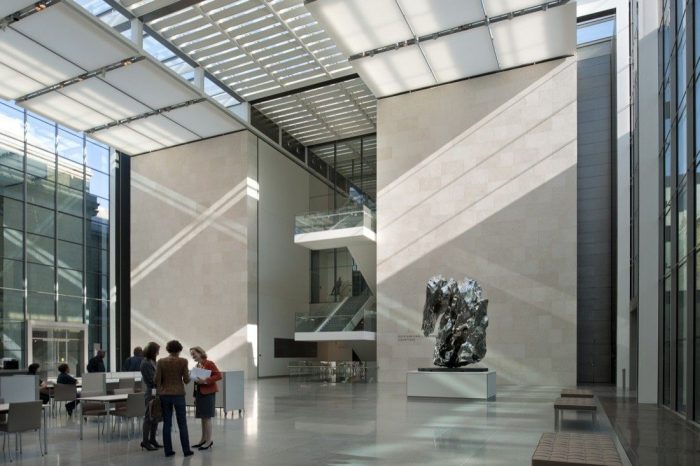
The crystal spine diffuses with the central axis through enclosing a part of the courtyard by the glass ‘Jewel Box’. The 63 feet high ceiling of Shapiro Family Courtyard formulates a lofty breathing space reinforced by a blissful sunshine and the interplay of outside greenery. The courtyard holds spaces for visitors’ orientation, a café and a new gallery for the special exhibitions underneath. A new-state-of-art Alfond Auditorium with a capacity of 150 guests is placed right beside it. A new landscaping approach is applied for the long abandoned park designed by Friedrick Law Olmstead in 1877. The new greening followed Olmstead’s romantic tradition of winding paths and informal planting which invites the green into the heart of the building. The vegetation acts as nodes to the different galleries while composing a successful indoor-outdoor relationship.
Harmonizing with the other Foster and Partners projects, this $345 million structure justifies the budget by maintaining high energy efficiency. The galleries possess customized climate control system and most of the building interiors are naturally illuminated. Also, the project won a number of recognitions for its tremendous success, which include Boston Society of Architects’ People’s Choice Award, Preservation Achievement Award, Boston Preservation Alliance and RIBA International Award.
Spencer de Grey, Head of Design at Foster and Partners, commented: “this has been one of the most fascinating projects. We have sought to combine the constraints of history with a new intervention that will show off the Museum’s extraordinary collection of American Art in a way that will excite entrance and educate. We have designed a major new Wing, inside and out, with 53 new galleries to complement the Museum’s other four collections which are clearly articulated along the original main axis. This re-addresses the balance of the Museum – at its heart the old courtyard is enclosed in glass to create new links and connections“.
Project Information:
Architect : Foster and Partners
Location : Boston, MA, USA
Project Year : 1999-2010
Project Architect of Record : CBT/Childs BertmanTseckaresInc
Design Team : Norman Foster, Spencer de Grey, Michael Jones, Kate Murphy, John Small, William Castagna, BenedicteArtault, Robin Blanchard, Jan Coghlan, Chris Connell, Aaron Davis, Gennaro di Dato, James Edwards, Dagmar Eisenach, Morgan Fleming, Kristin Fox, Herbert Gsottbauer, Anthony Guma, Sean Hanna, RieHaslov, Judith Kernt, Ismael Juan Khan, KohelikaKohli, Abel Maciel, Peter Matcham, Pablo Menendez Paz, Aidan Monaghan, YatLun Ng, Mathis Osterhage, Silvia Paredes, Carol Patterson, Michael Pelken, Michael Richter, Katherine Ridley, Il HoonRoh, Ingrid Sölken, KinnaStallard, Matthew Stokes, Diego Suarez, Jane Tiley, Alexis Williams, Oliver Wong, Richard Yates
