Zory is a town located in the South of Poland. Zory in old polish means “fire” or “burnt”. The town got its name after an event in 1702 where it was almost completely burnt. The people of Zory gather every year to pray and seek safety by the Lord. This annual gathering has been turned into a big summer event, the “Festival of Fire.” The Community of Żory has commissioned the polish architects, OVO Grabczewscy Architekci in order to design a building that would promote the town and its heritage through exhibiting historical and other local collections to visitors, tourists, investors and the young population.
The building and its concept was shaped around the history of the city, the challenges of the topology and the fire itself. The function of the building was not known from the beginning. The architects were given a piece of white paper and they were told that they could do anything. This is not particularly easy as there are numerous variables to be considered. The function and activities changed several times during the design and construction process.
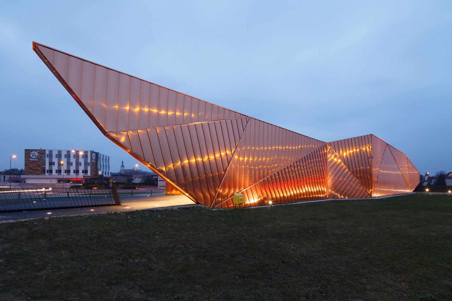
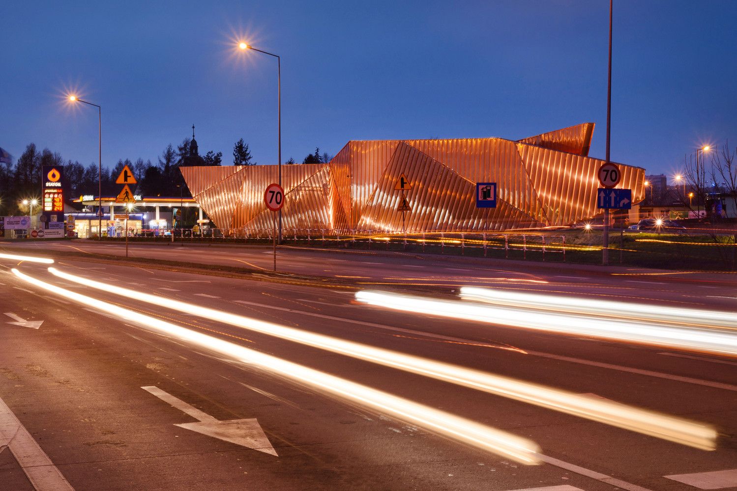
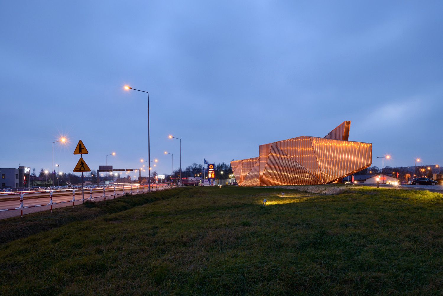
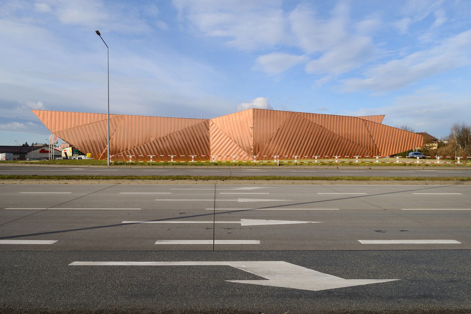
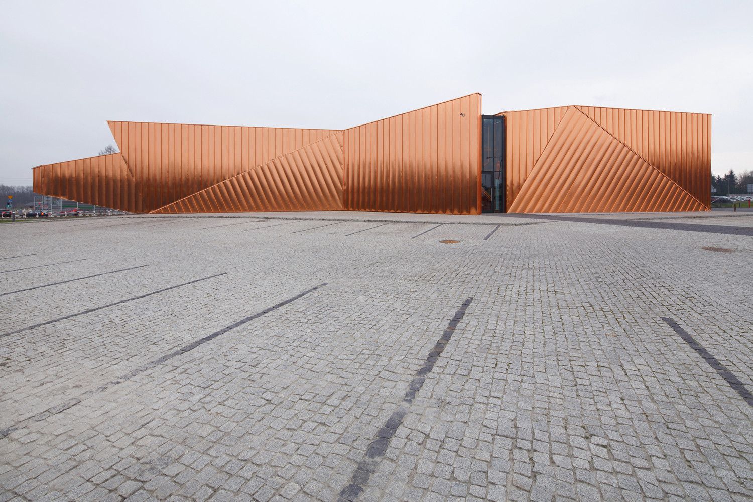
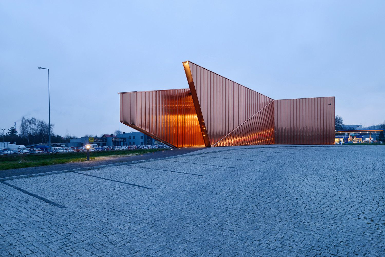
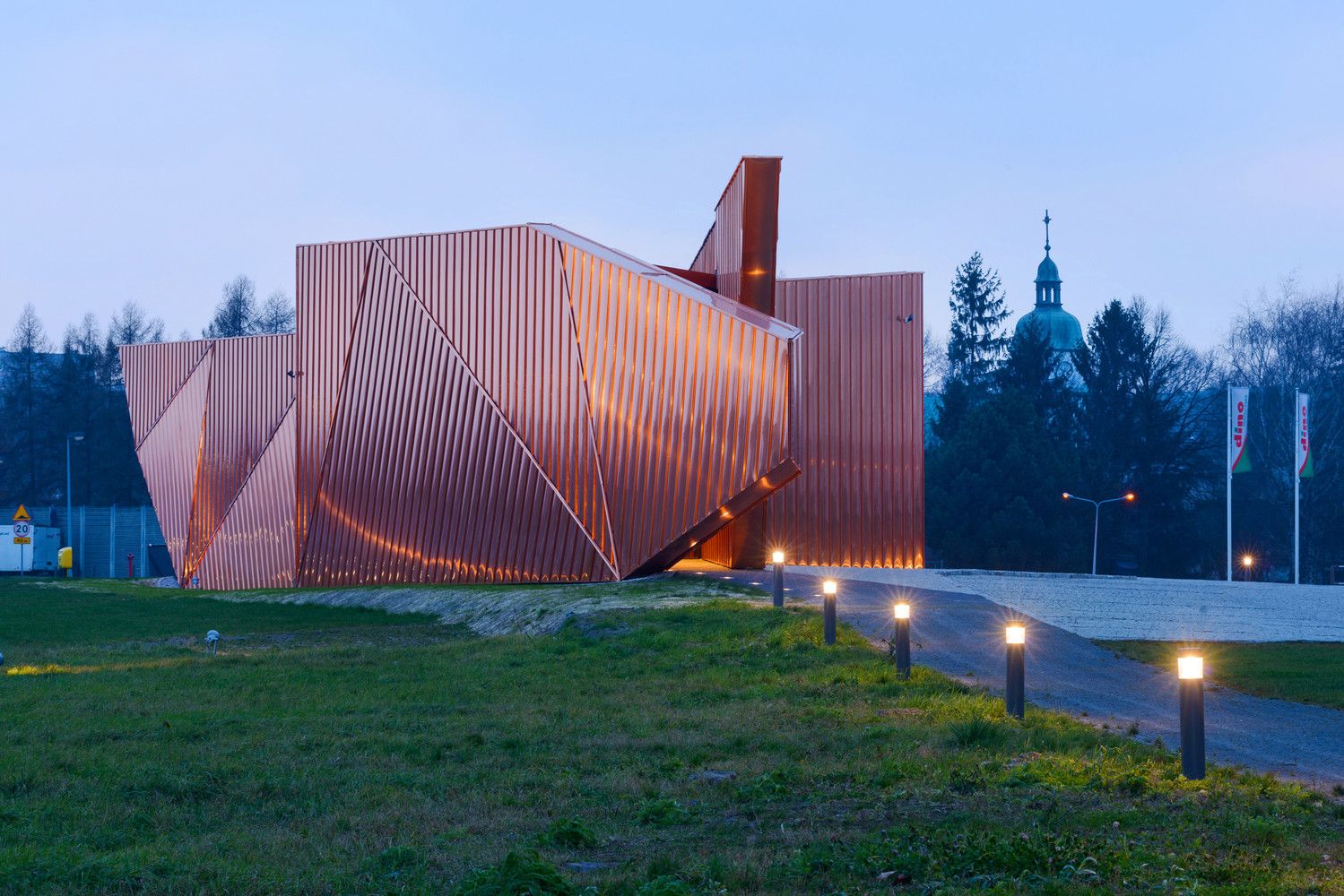
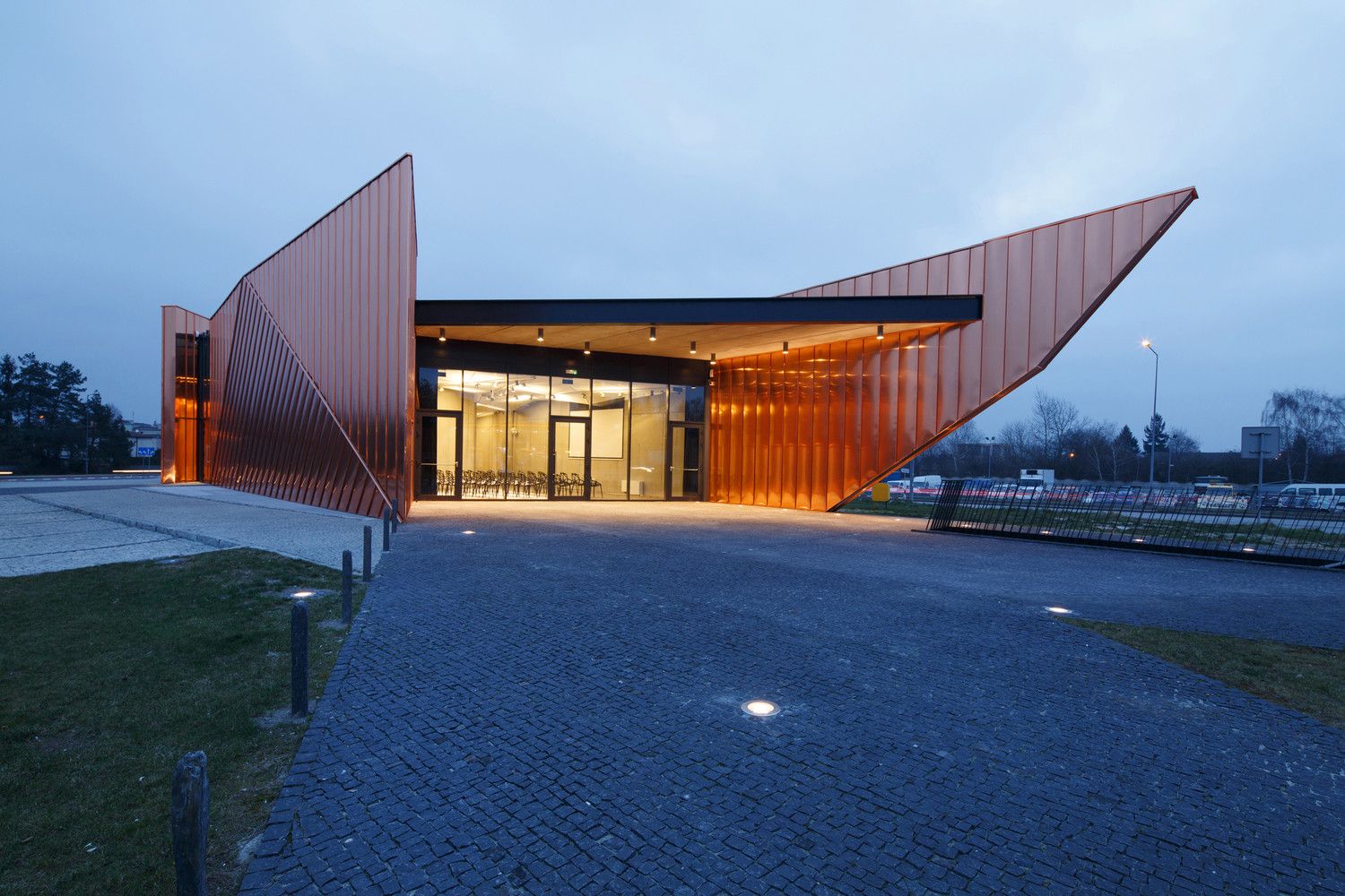
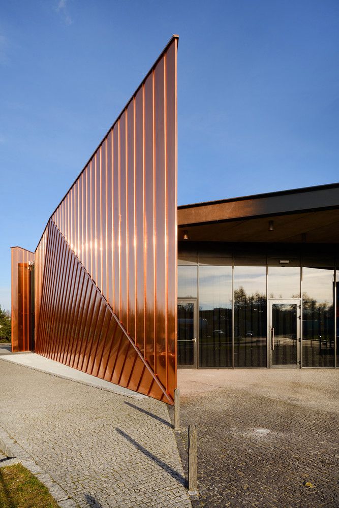
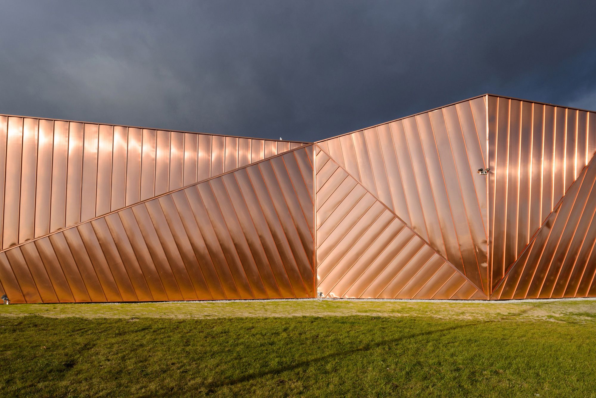
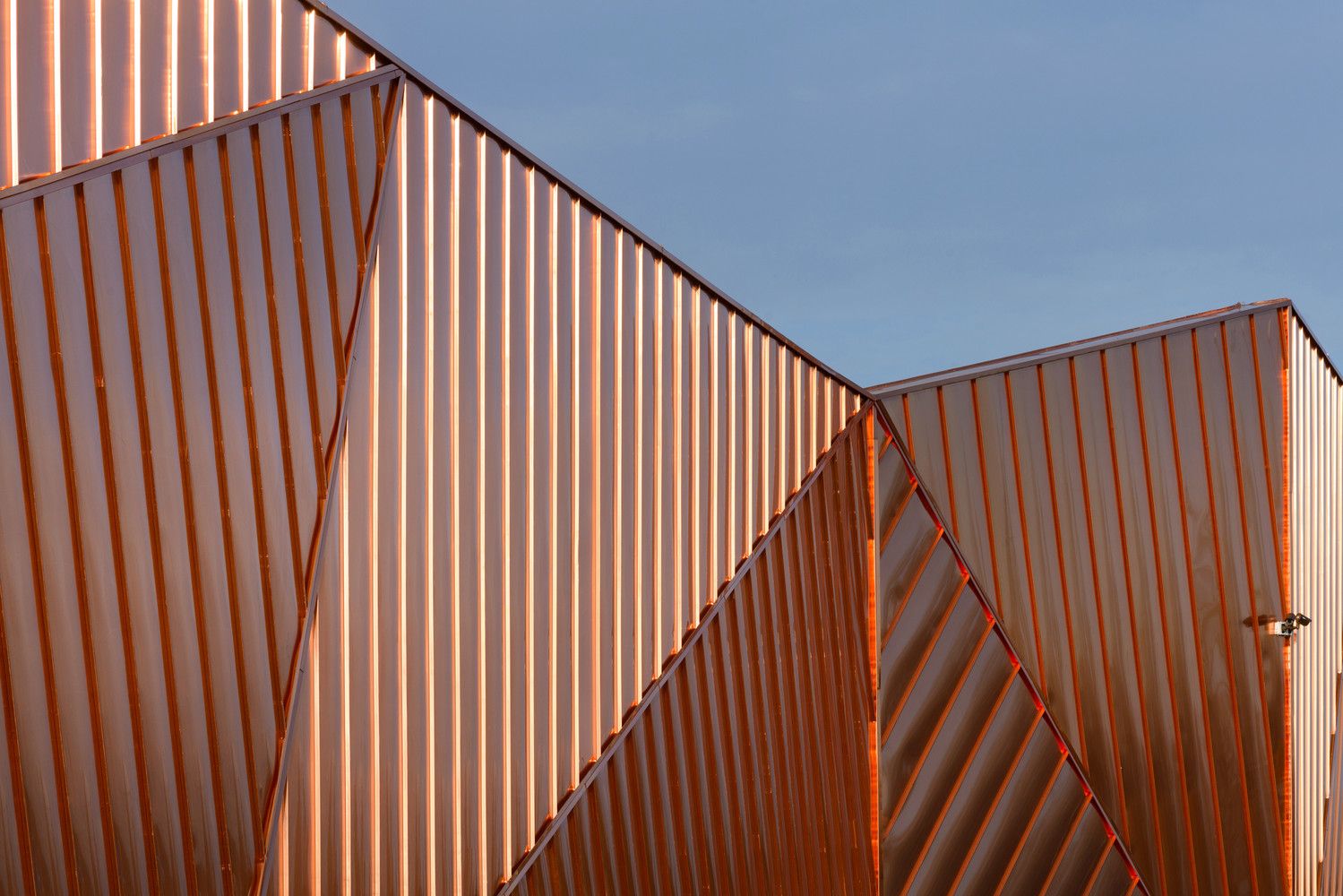
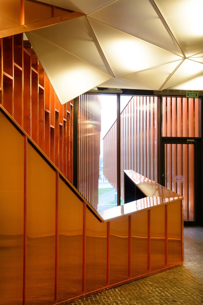
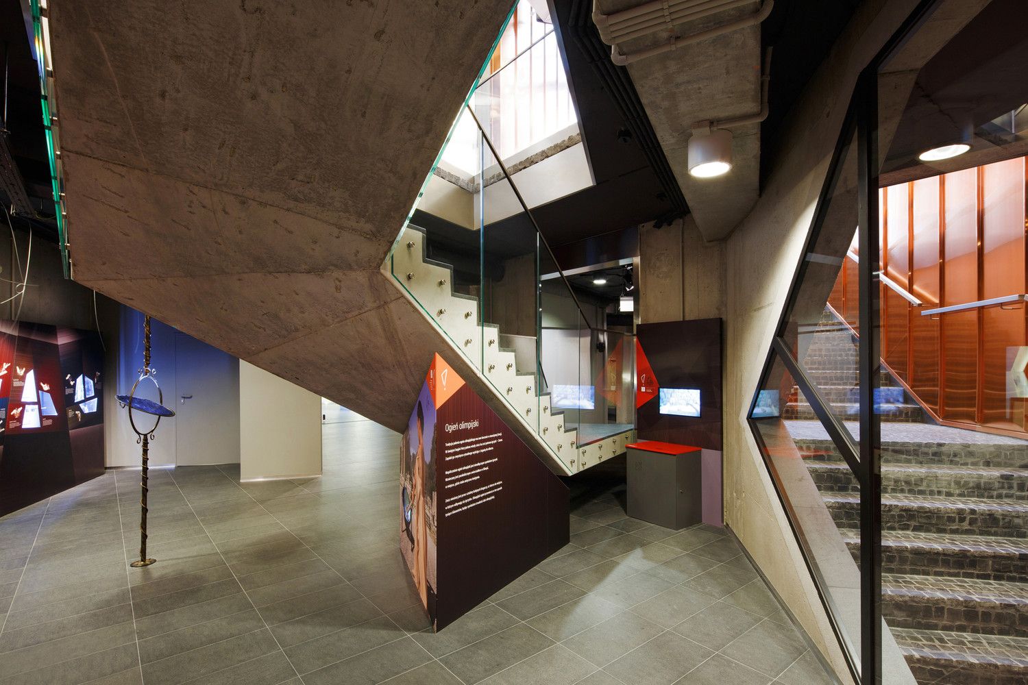
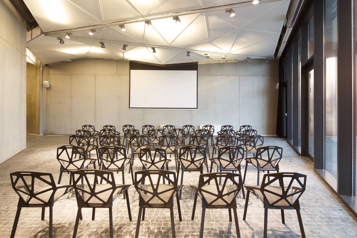
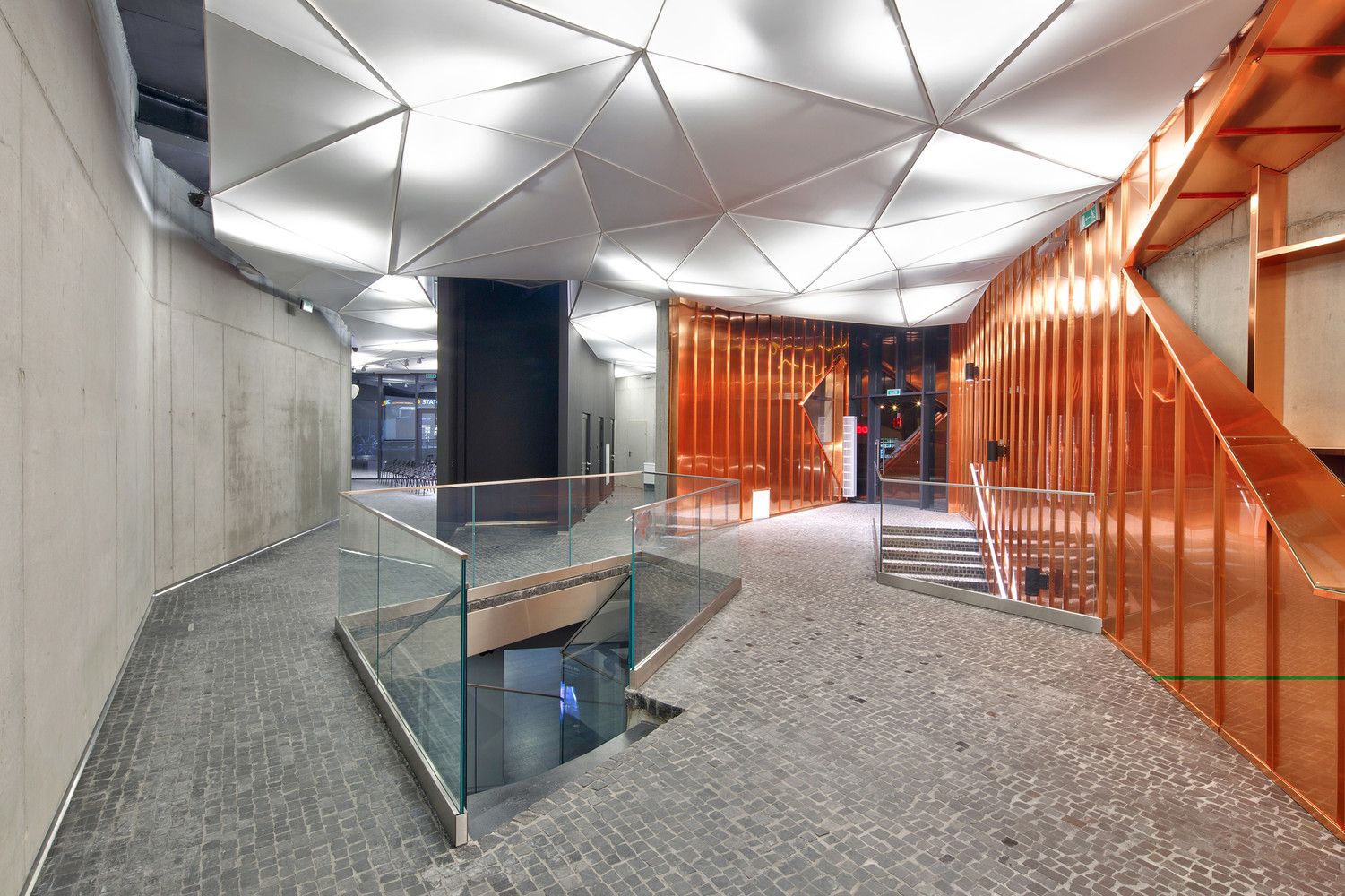
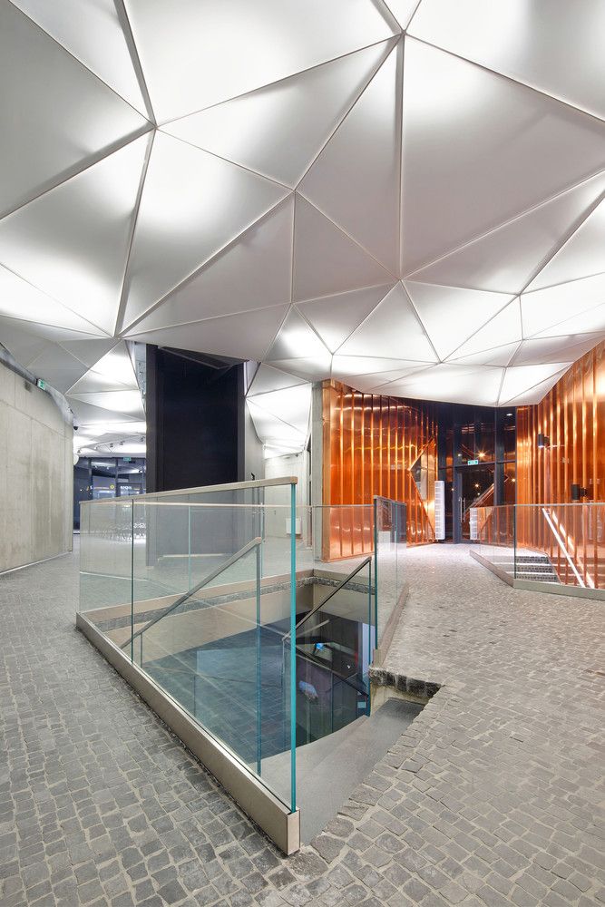
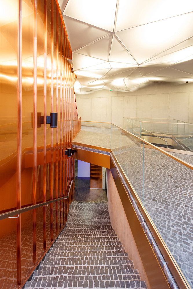
On the exterior, the “Garden of Fire” is located within the surrounding landscape, and it offers the services of an exhibition space which will mostly be used during the Festival of Fire. Pedestrian and green pathways are running through and around the pavilion, in an effort to blend the building with its surrounding landscape. The structure is made out of three independent walls that flow over each other. These are covered in large copper plates that create a colour sensation similar to an open flame. The museum has three entrances that provide access to the interior spaces. These are glazed and clearly visible from afar in order to stand as a visual reference and guide the visitors. The interior is comprised with a reception lobby that offers visitor information and a multifunctional space on the ground floor while a large public exhibition hall is located underground. Restrooms, services and technical rooms complete the typology. The interior floors are paved with small black stones that continue to the exterior and surround the building.
Project Info:
- Architects: OVO Grabczewscy Architekci
- Architects In Charge: Barbara Grabczewska, Oskar Grabczewski
- Photographs: Tomasz Zakrzewski / archifolio
photography by© Tomasz Zakrzewski / archifolio
photography by© Tomasz Zakrzewski / archifolio
photography by© Tomasz Zakrzewski / archifolio
photography by© Tomasz Zakrzewski / archifolio
photography by© Tomasz Zakrzewski / archifolio
photography by© Tomasz Zakrzewski / archifolio
photography by© Tomasz Zakrzewski / archifolio
photography by© Tomasz Zakrzewski / archifolio
photography by© Tomasz Zakrzewski / archifolio
photography by© Tomasz Zakrzewski / archifolio
photography by© Tomasz Zakrzewski / archifolio
photography by© Tomasz Zakrzewski / archifolio
photography by© Tomasz Zakrzewski / archifolio
photography by© Tomasz Zakrzewski / archifolio
photography by© Tomasz Zakrzewski / archifolio
photography by© Tomasz Zakrzewski / archifolio
photography by© Tomasz Zakrzewski / archifolio
plan
section
plan
plan


