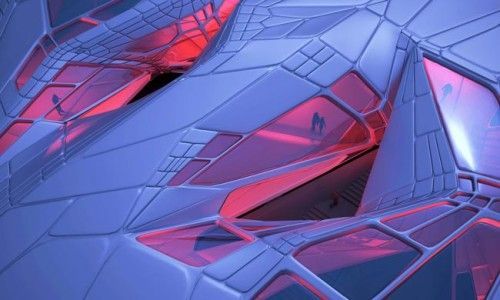
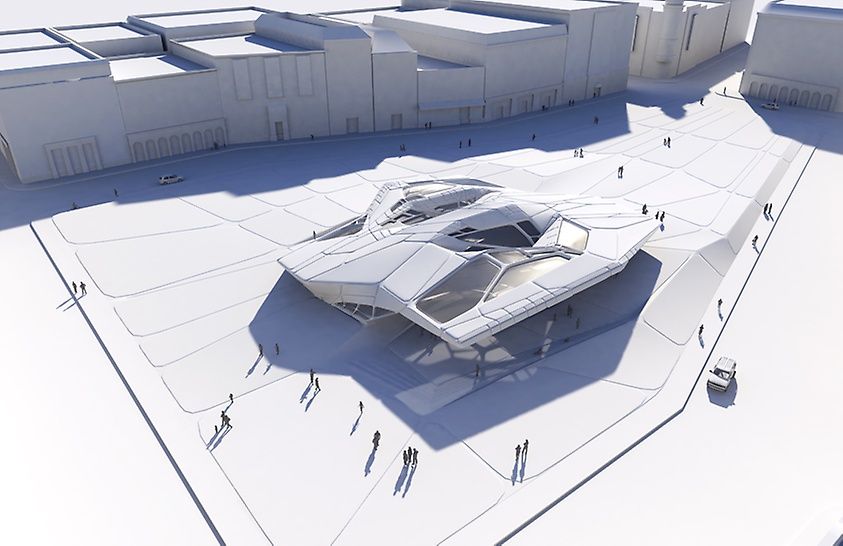
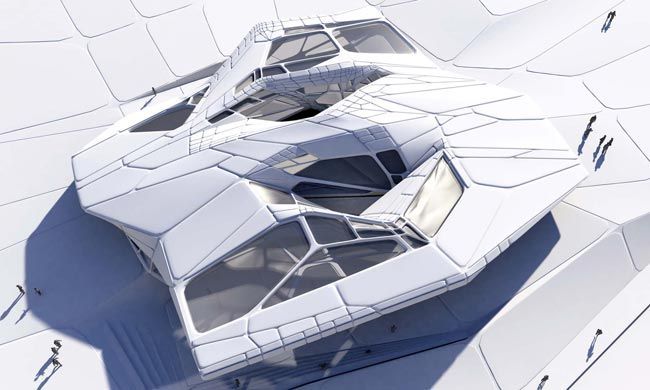
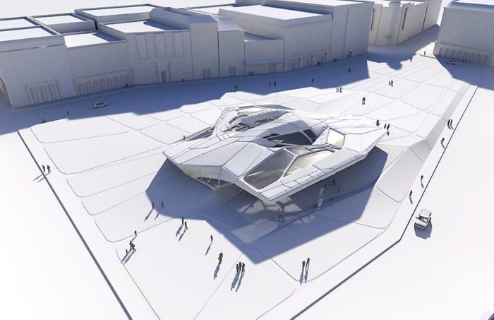
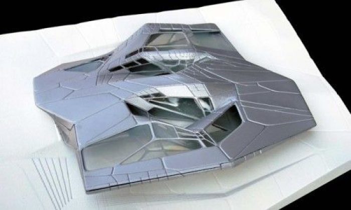
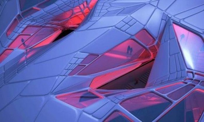
The Novosibirsk Summer Pavilion, designed by Tom Wiscombe Design and the second place winner in a competition set by the client, the Novosibirsk Municipal Government is an incredibly compelling building form with inspirations that reach not decades, but centuries into the past. It is a heartbreaking building, in a way.
The layout is well-balanced, it is thoroughly attractive, the interior conditions- with all those windows- would seemingly be very well ordained… The list could go on. But the thing that holds ideas like this back is the nothing material it is rendered with. What is it? How could this building be real? Please, I would like to know- because I desperately want to see some as I walk down a city block.
On that note, below is a further description provided by the architects. Enjoy!
This pavilion design is the result of research into grid-stiffened shells. Grid-stiffened shells (a.k.a. gridshells), prevalent in 1950s-60s engineering masterworks by Nervi, Otto, and Candela, were part of a lineage of experimentation into material intelligence and analogue shape computation leading all the way back to the Gothic era.
These structures were characterized by form-found curvature and uniform patterns of relief. These solutions were however often limited by their tendency toward minima and rational expression of material limits and stable, familiar forms. The gridshell is newly relevant today, re-invented through non-uniform patterns of relief and non-indexical materiality such as composites, and with novel formal implications.
This design is based on the simultaneous response of pattern to surface curvature and force pathways. Variability in pattern morphology (there are at least three pattern types), density, and depth allow for a localized structural tuning which would be impossible with invariant pattern logic. Limitations of traditional form-finding, where structures tend toward funicular forms, are lifted, and more complex, unbalanced surface shapes begin to be possible.
While the underpinnings of this project are indeed rooted in technology, the visual effects of surface-becoming-line are paramount to the success of the project. Complex seaming, deep relief, embossing, and puffing are all in play, creating a high degree of formal articulation that should not be understood as structural problem-solving. It is rather a search for a seductive alternative to the infinitely malleable and scale-less surfaces of early digital design.

