Designed by blocher partners, A new concrete monolith brings all employees under one roof.
Transparent structures have edged out the mansions built at the dawn of industrialization. A case in point is the new home of Blocher Blocher Partners, at Herdweg 19 in Stuttgart: a building that represents the corporate values of innovation and sustainability. And the standards were high: for here, colleagues were planning for colleagues.
Stuttgart – Much is demanded of today’s office buildings, especially if they are to house many disciplines under one roof, as is the case here: In addition to the office for architecture and interior design, this building houses a firm that develops mono-brand concepts as well as an agency for communications, corporate design and visual merchandising.
The building brings together offices previously dispersed on three separate sites – and it’s only a stone’s throw away from the original location, on Stuttgart’s quiet Lessingstraße. A new site was found on the busy Herdweg Street, on the slope close to the city center. The post-war lodge building that once occupied this lot fell into disuse and disrepair – and ultimately was torn down. But the regulatory requirements for new construction were strict: For example, the new building had to match the footprint and size of the original.
The result is an architecture of dialogue that so embodies the highest global environmental standards that it earned the gold certificate by the Deutsche Gesellschaft für Nachhaltiges Bauen (DGNB), the German sustainable building council.
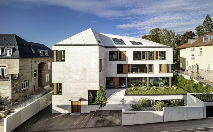
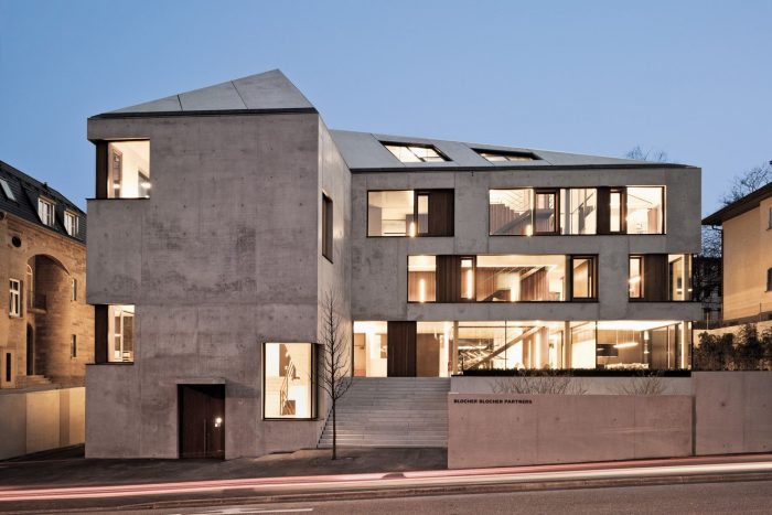
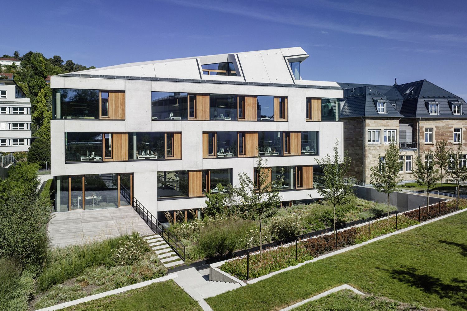
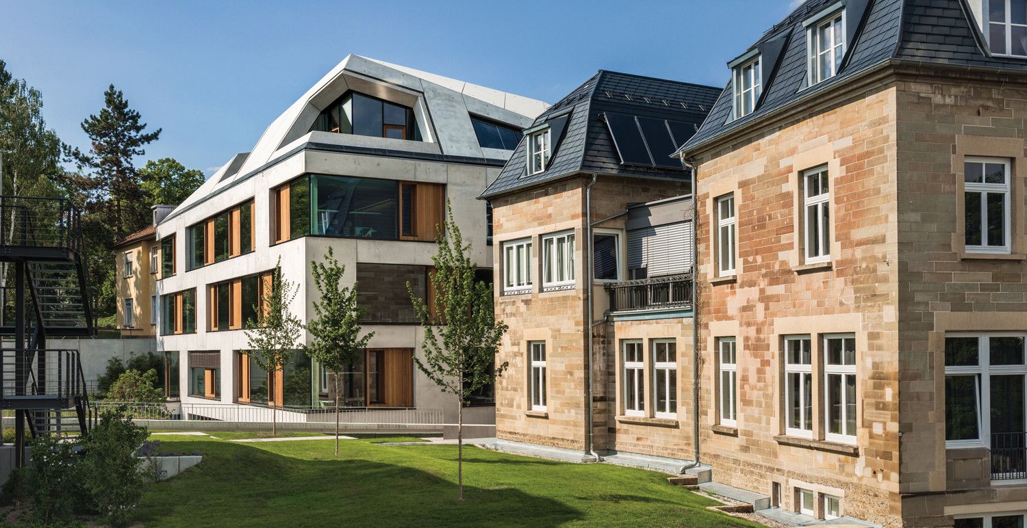
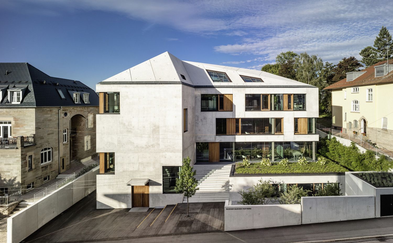
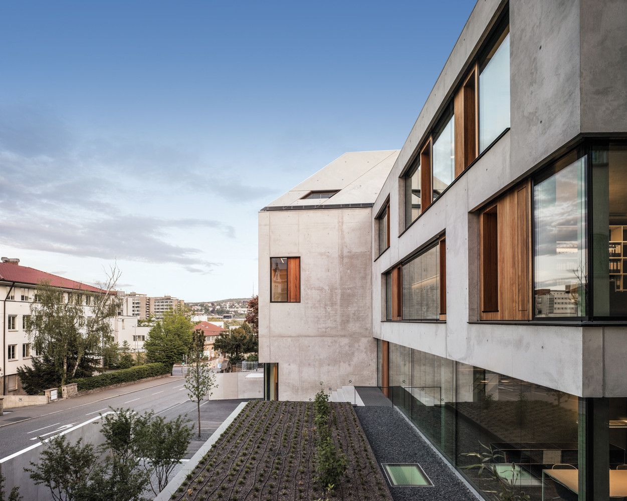
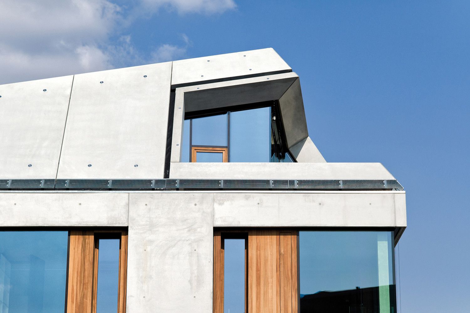
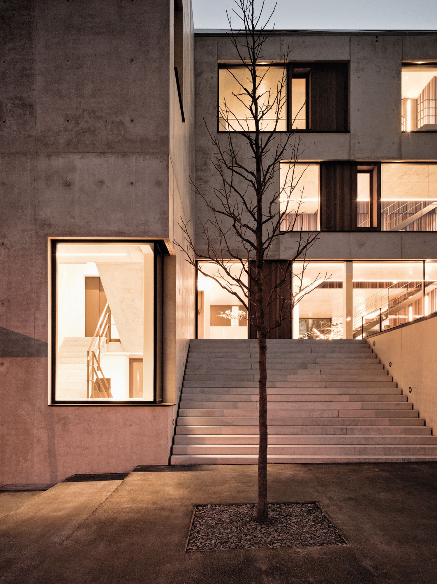
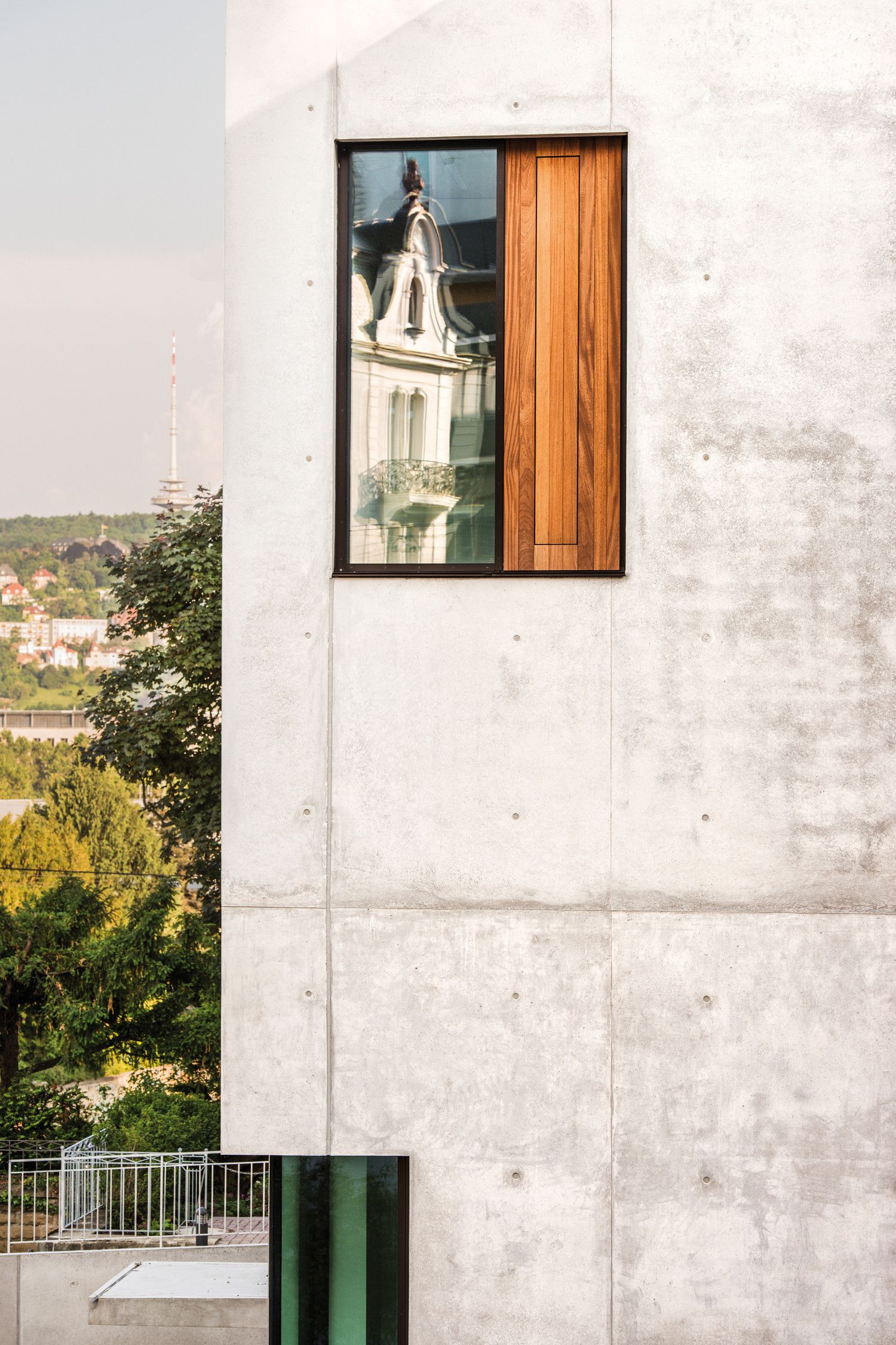
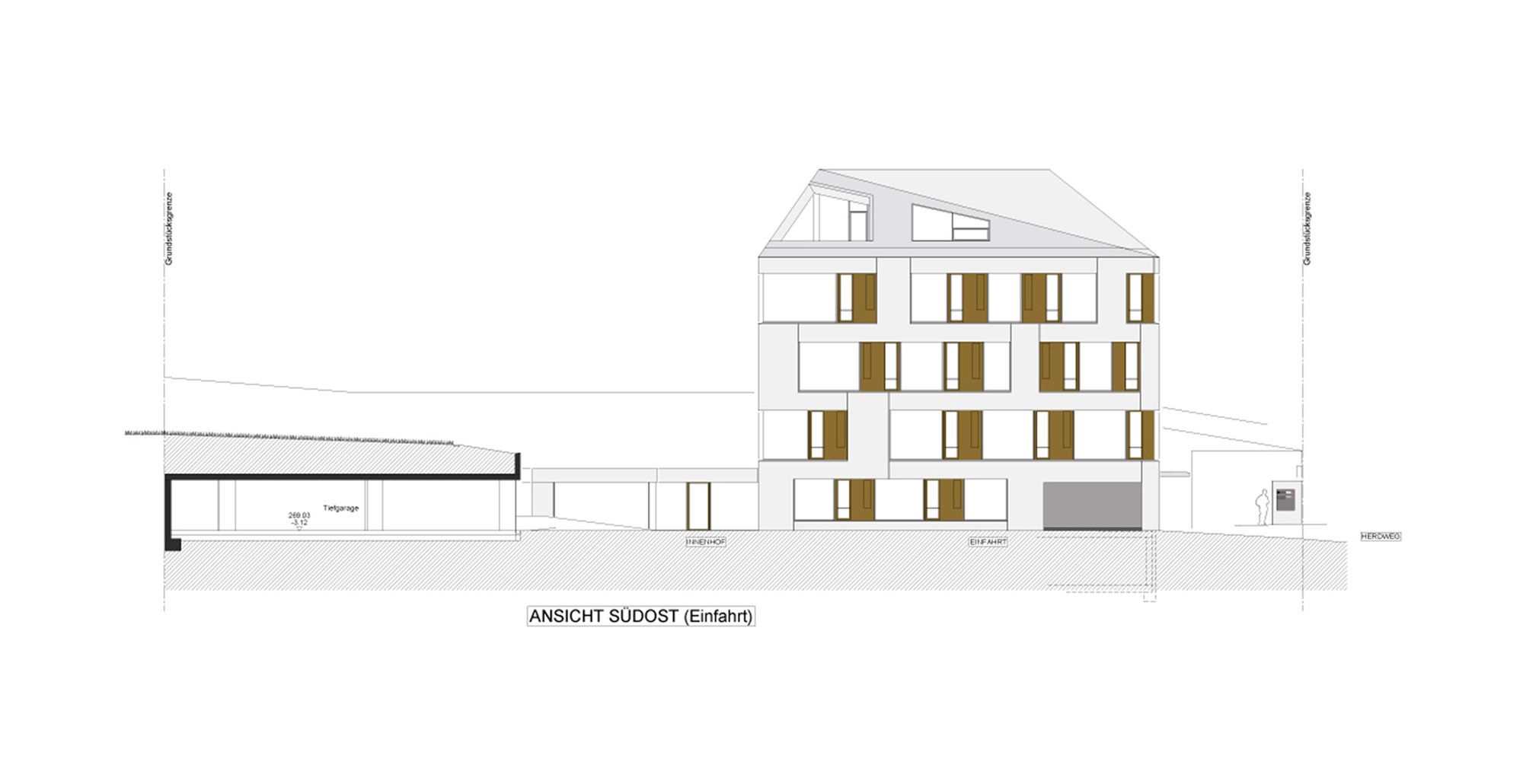
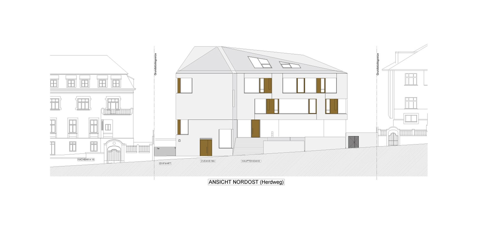
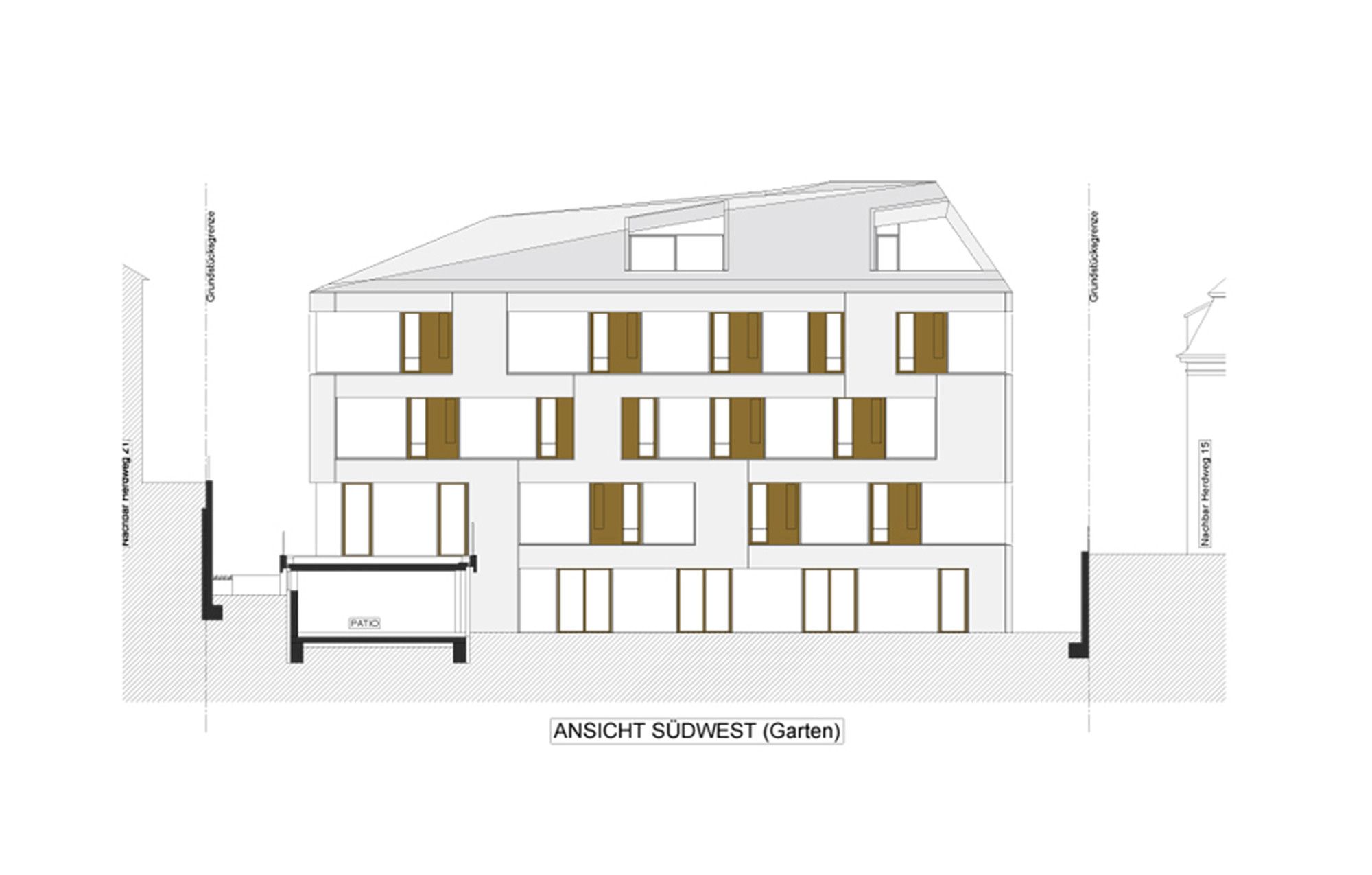
As the setting for their jewel, the architects used the rather heterogeneous urban backdrop of Herdweg: Simple, but striking. An eye-catcher that bedazzles all who walk or drive past. The rustic charm of exposed concrete – a double-layered concrete facade with cavity insulation – plays off against the ethereal transparency of broad windows. Elements of Sipo mahogany, strategically placed, give the façade depth; and the clean lines add a sense of order and dynamics. The percentage of glass reflects the specifications set by the DNGB for the gold certification, while the wooden cubes minimize the appearance of the building’s shell and absorb sound. These cubes also allow for manual control of ventilation, in addition to the automatically controlled blinds that block sunlight.
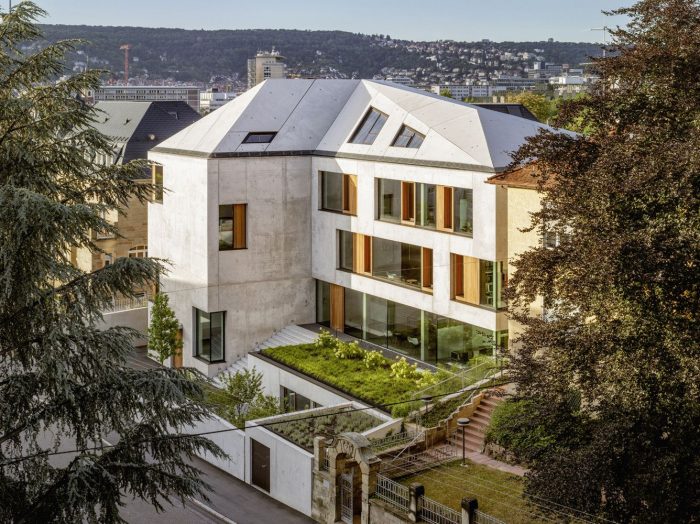
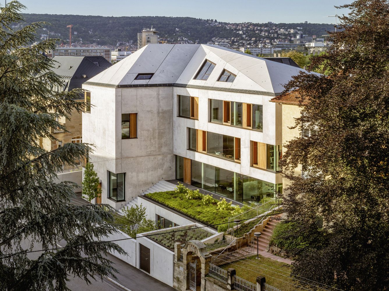
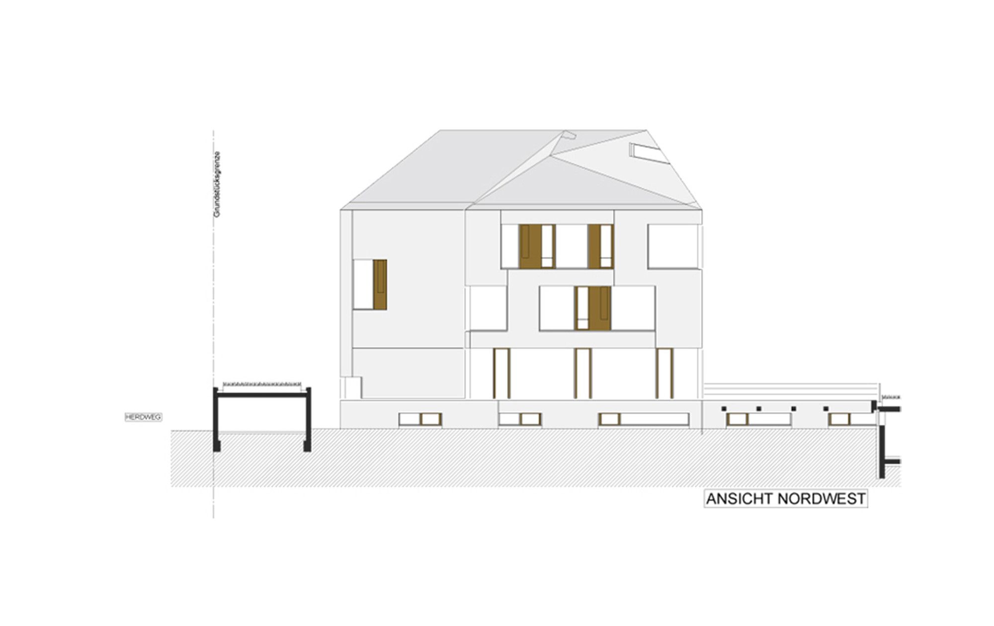
The roof design is especially characteristic of the reinforced concrete construction, which is visible from all sides. The architects took advantage of the plasticity of cement to create a folded roof. The result was a completely new interpretation of the classical gable roof: Large-format pre-cast cement sections measuring eight by three meters were placed over an inner supporting shell. The transition between roof and façade is marked by a horizontal metal band for the rainwater run-off, formed as an angle joint.
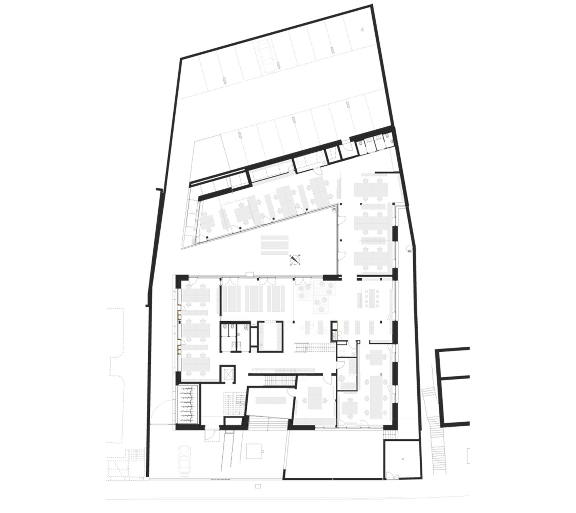
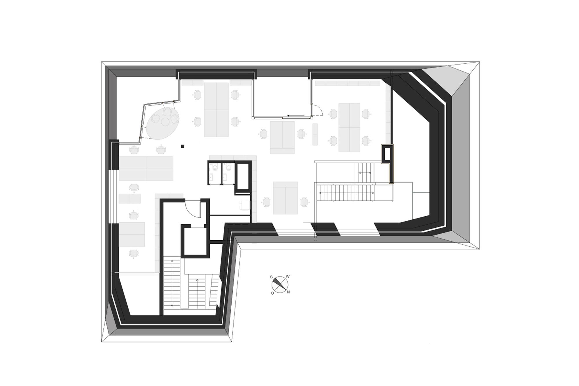
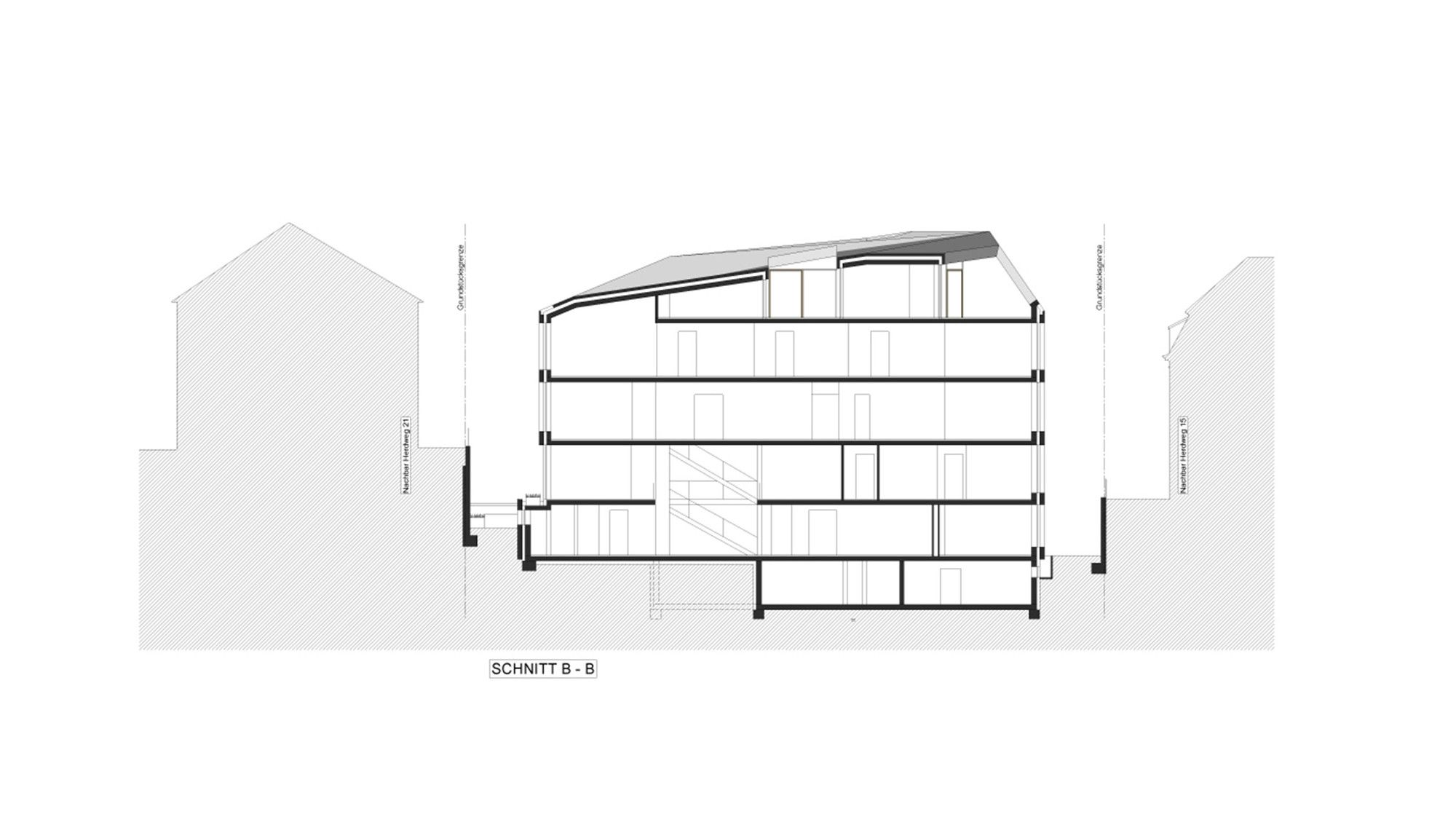
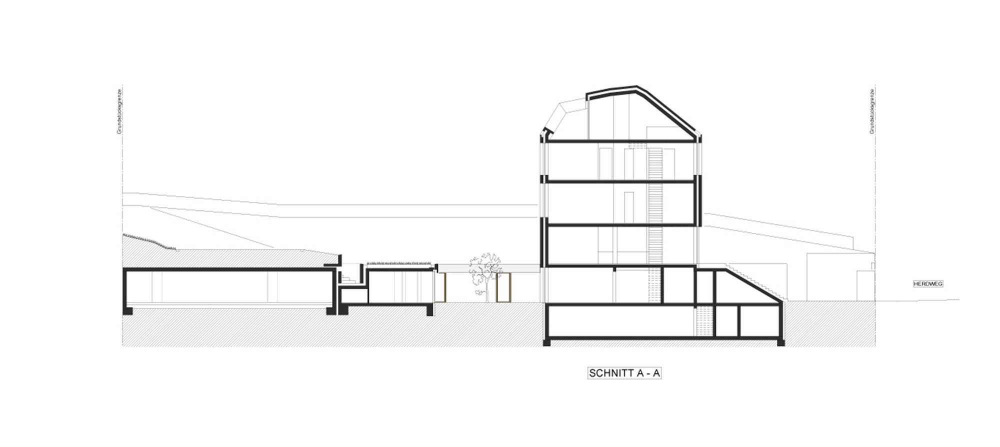
The office building consists of three full floors, a garden, a roof, and a cellar. At the rear of the building, there is an elevated basement floor with an attached underground garage. Because of the hillside location, the first and second stories appear to float. The topography also calls for the relatively large retaining wall to the northwest. Planted with bamboo, it forms a back wall for the two large meeting rooms on the ground floor. The top floor, with its spacious loggias, was initially planned as an apartment. Which is why it not only affords a magnificent view over the Stuttgart valley but also offers working spaces flooded with light.
In front of the garage entrance, a monolithic structure containing the staircase juts out into the Herdweg.
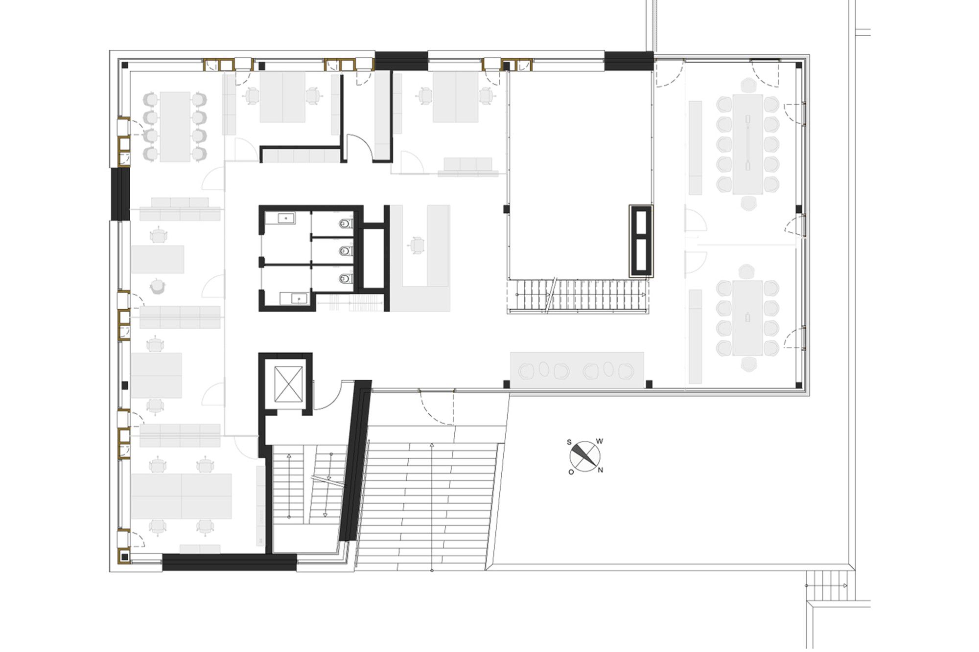
This set-up also allows each floor to function independently. At the street level, there is an entrance for employees, while the main entrance leads up to the first floor via a broad, open stairway alongside a patio-like inner courtyard. Both the ground floor and garden level offer numerous opportunities to step outside. The underground garage links directly to the garden level, from which a ramp leads to another, higher garden, as well as to the building interior via a gateway.
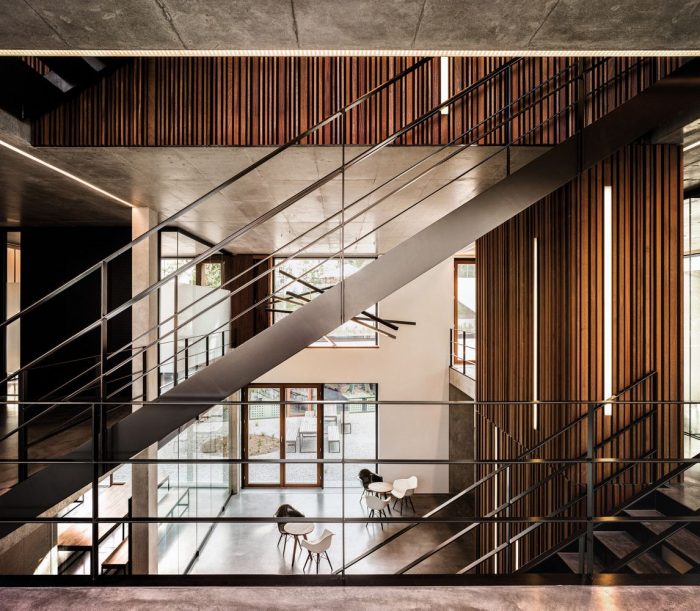
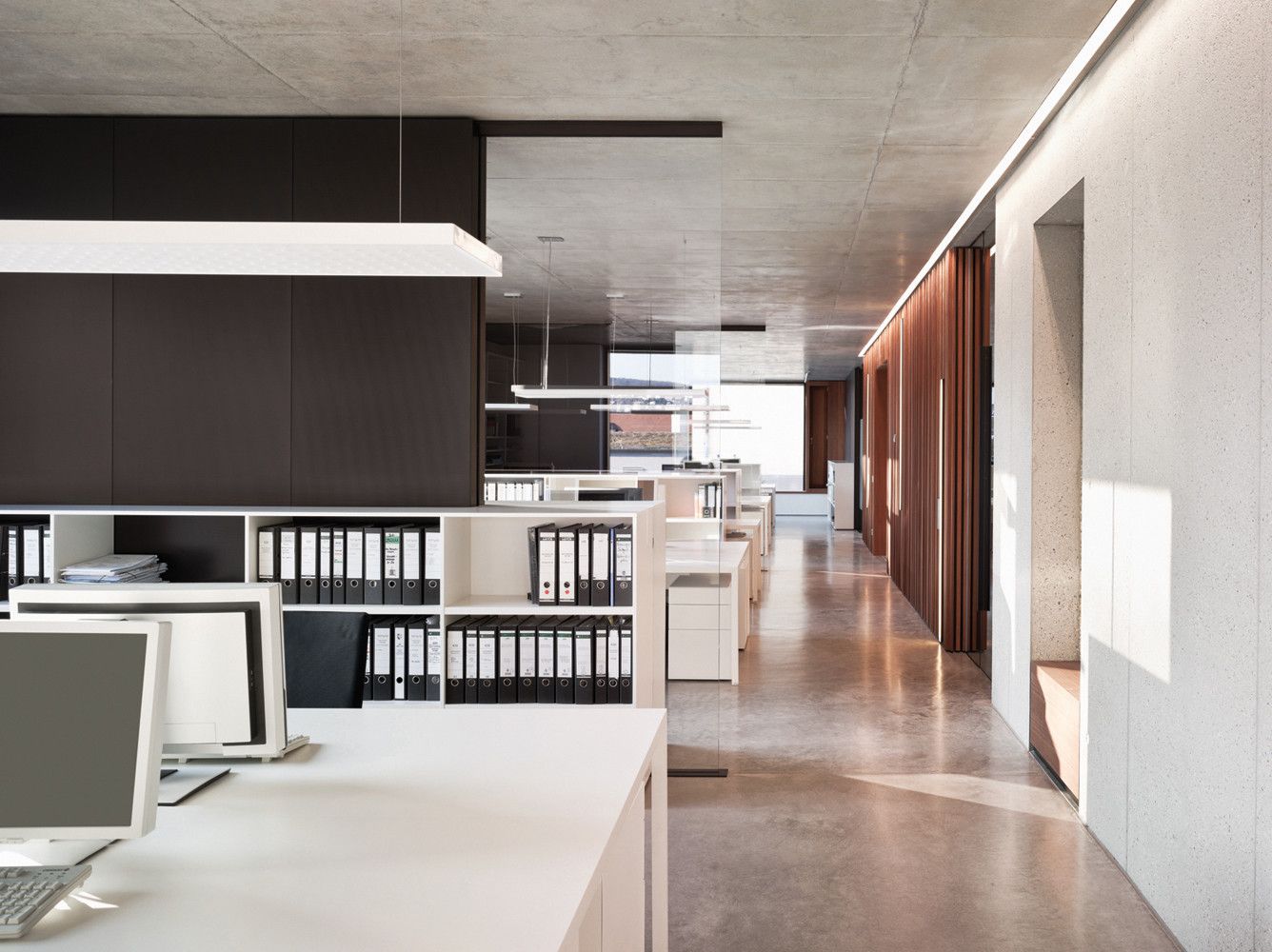
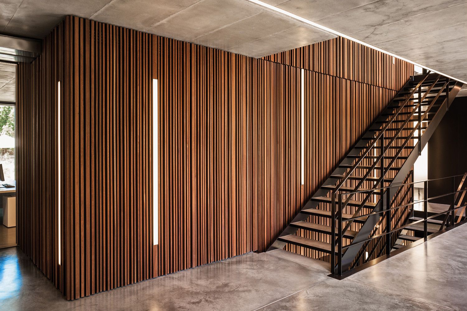
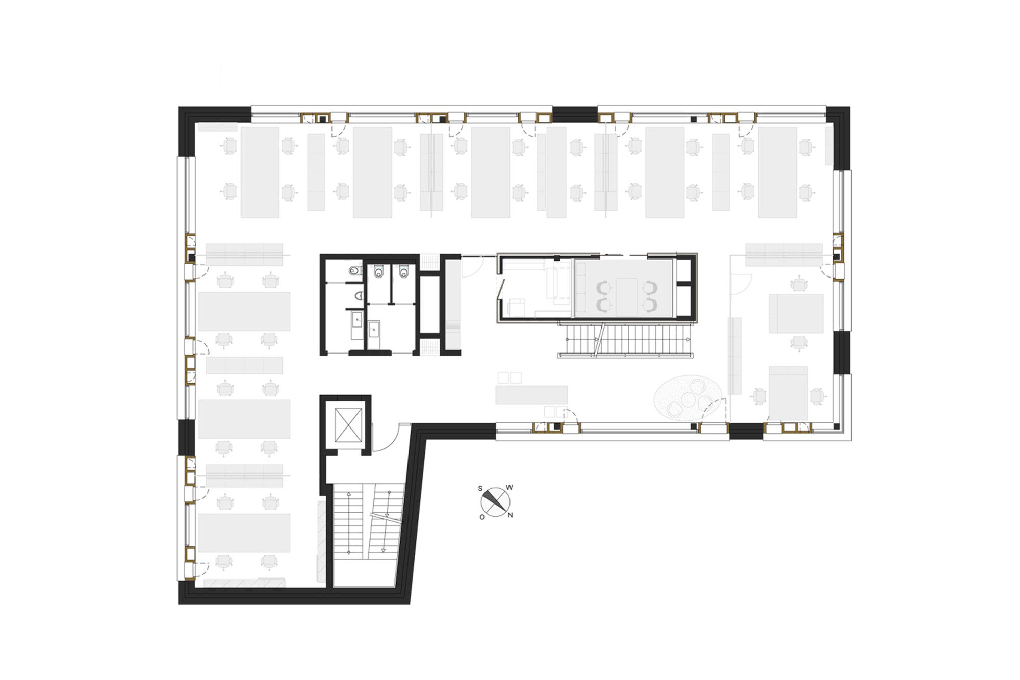
The floor plan encloses a sandblasted concrete core that contains the necessary airshafts, lavatories, integrated cloakrooms, and kitchenettes. Another core, whose lamellar wooden structure is composed of the same Sipo mahogany as the window cubes, is comprised of small meeting rooms for employees as well as copy rooms. These wooden cores are minimized as much as possible on the garden levels and on the top floor. Besides their esthetical appearance, they also have a practical function: to absorb sound.
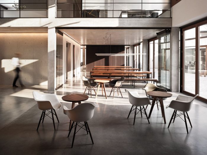
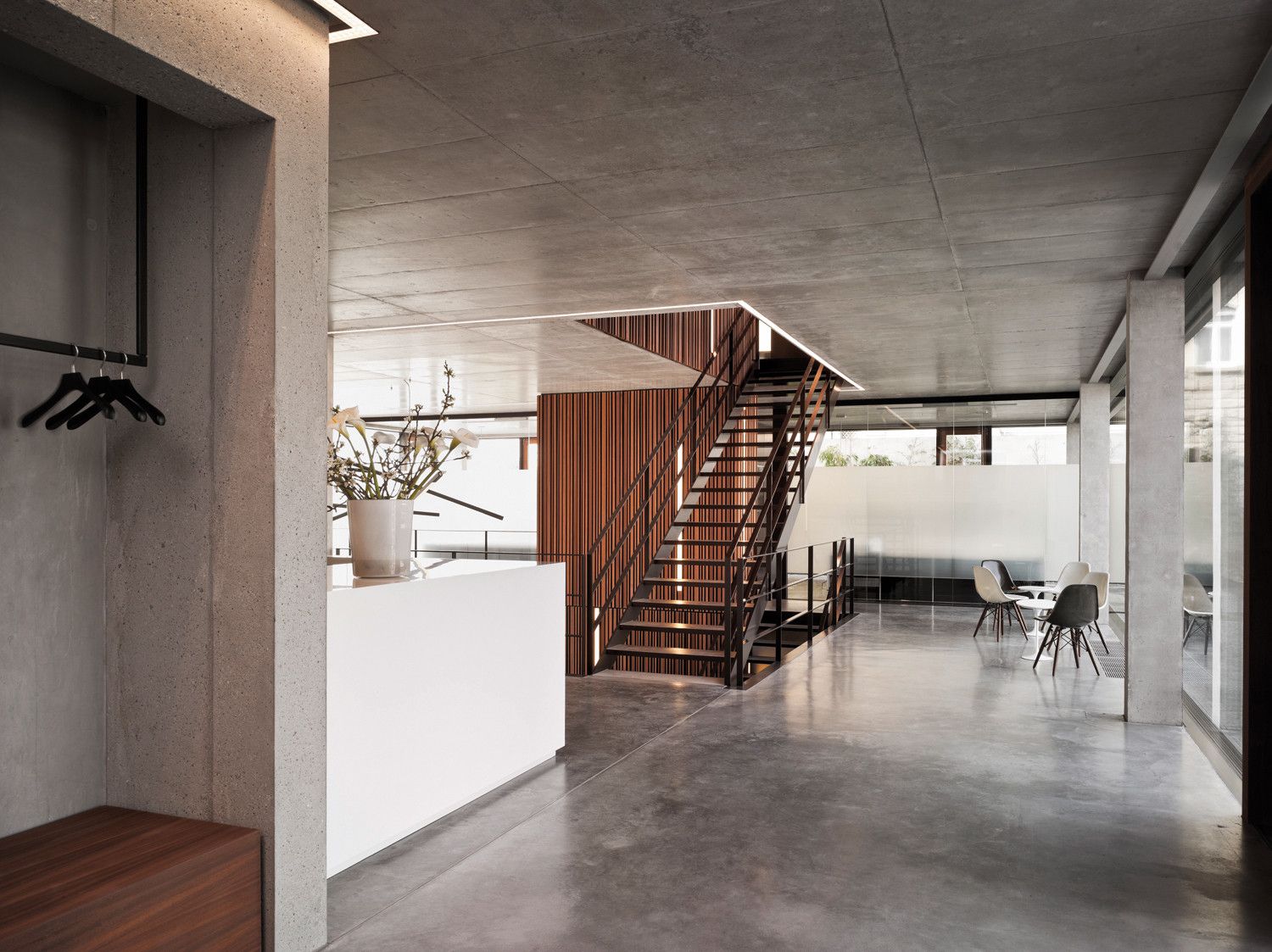
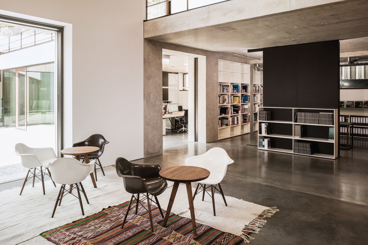
The simplicity of the interior design, with its sandblasted and exposed concrete surfaces as well as its cement screed flooring, works in harmony with the outer appearance. Heating and cooling are conducted via the exposed concrete ceiling. The use of geothermal energy, tapped through 35 ground borings down to a depth of up to 40 meters, was another prerequisite for DGNB gold certification, along with gray water use, actively cultivated green roofs and cost-and energy-efficiency, to name just a few.
Open floors, which nevertheless have clearly defined spaces, make the boundaries between working areas disappear. A central aim of the planners was to enhance the amenity values of the employees. The management wanted to strengthen team spirit as well as the feeling of togetherness and to optimally link the working processes. Three conference rooms are available on the ground floor to meet various needs on an average workday.
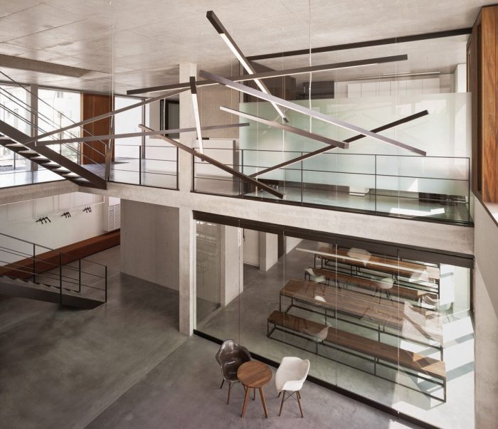
Furthermore, every floor has discussion spaces in addition to a library, a workshop and small communication zones that adjoin the spacious hallway which runs along the street side of the building. A furnished patio adjoins the generous cafeteria on the garden level, flanked on one side by the single-story wing of the building, which houses the communications agency Blocher Blocher View. The other side opens out onto a two-story atrium, separated from the cafeteria only by a sliding glass wall. For major events, a large hall can be created in seconds flat. From the ground floor, the atrium opens into an impressive open space graced by a light- installation inspired by the “jackstraws” or “pick-up-sticks” game. There are also manifold visual perspectives to be enjoyed from the open-designed steel staircase, which leads from the garden level to the uppermost floor.
The open space is not only structured by the furniture but also by glass walls with acoustic absorbers. Cabinets, tables, and sideboards reflect a straightforward design. Employees sit at long tables that are even large enough to accommodate unfurled blueprints. Elbow-high storage units serve as dividers between groups of four or six, or as bar tables for impromptu meetings. The natural light is complemented by LED light strips recessed in the ceiling as well as by suspended LED fixtures with direct and indirect lighting.
From their workspaces, employees look out onto the green space or have a view over the rooftops of the city. Through the patio area into the garden level and the landscaped or garden level on the ground floor, clear visual lines are created, along with orientations toward the outside. In order to meet the DGNB gold standard, the landscape architect favored indigenous trees and perennials. He set off the acetic cement surfaces with a flourishing crescendo of grasses, yarrow, lavender, baby’s breath, iris and peonies, a garden that only in winter abates to a deep green. Chairs and recliners offer a chance to convene with nature. Inside as well as outside. An appropriate environment with a promise of wellbeing was created for the 150 employees of this consortium. An abode of enduring value.
Project Info:
Architects: blocher partners
Location: Herdweg 19, 70174 Stuttgart, Germany
Area: 3300.0 m2
Project Year: 2011
Project Name: Office Building
All Images Courtesy Of blocher partners
Courtesy of blocher partners
Courtesy of blocher partners
Courtesy of blocher partners
Courtesy of blocher partners
Courtesy of blocher partners
Courtesy of blocher partners
Courtesy of blocher partners
Courtesy of blocher partners
Courtesy of blocher partners
Courtesy of blocher partners
Courtesy of blocher partners
Courtesy of blocher partners
Courtesy of blocher partners
Courtesy of blocher partners
Courtesy of blocher partners
Courtesy of blocher partners
Floor Plan
Floor Plan
Floor Plan
Floor Plan
Elevation
Section
Section
Elevation
Elevation
Elevation


