From the architect, Pierluigi Piu:
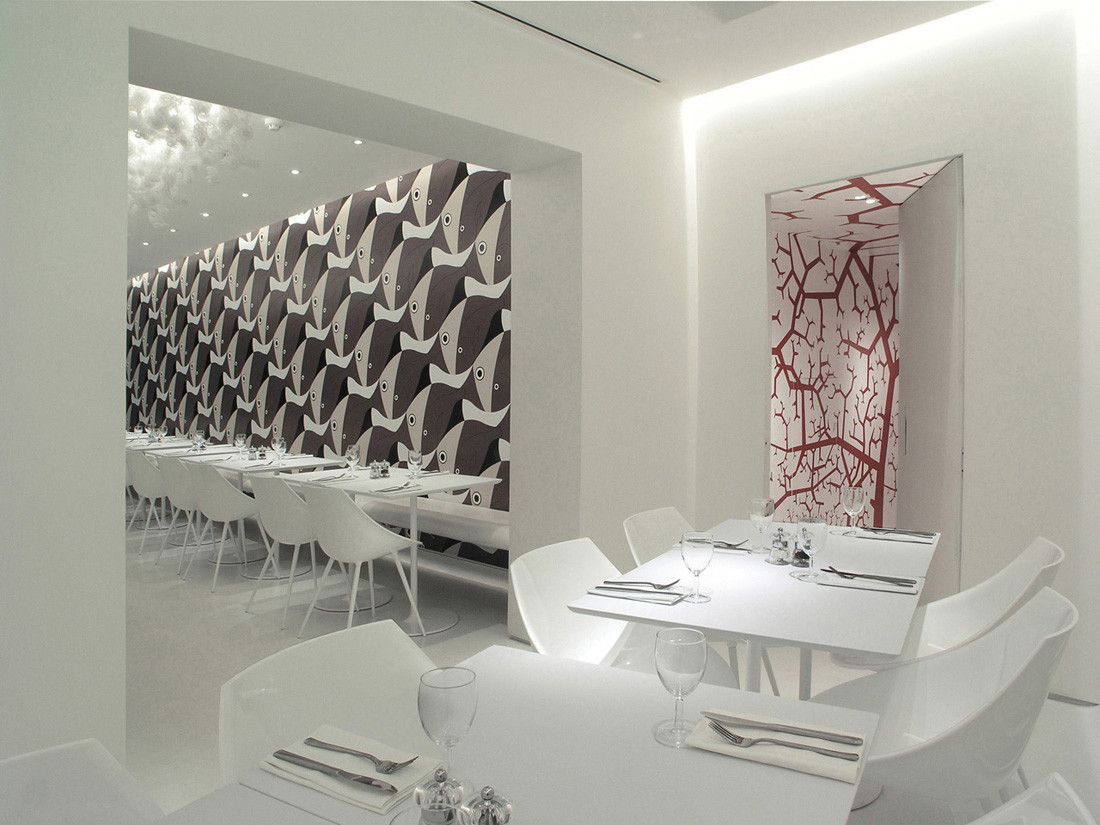
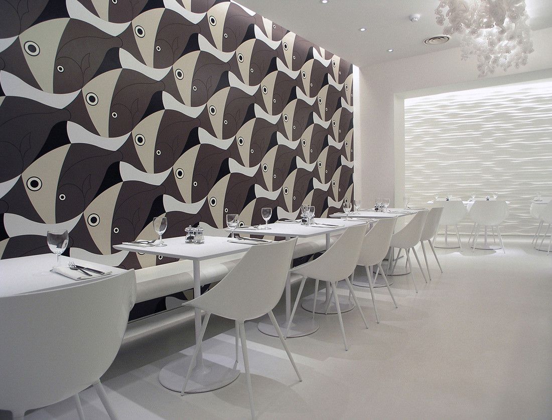
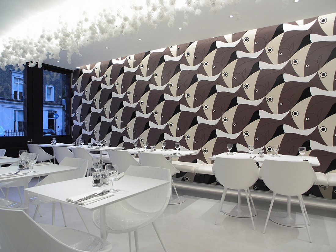
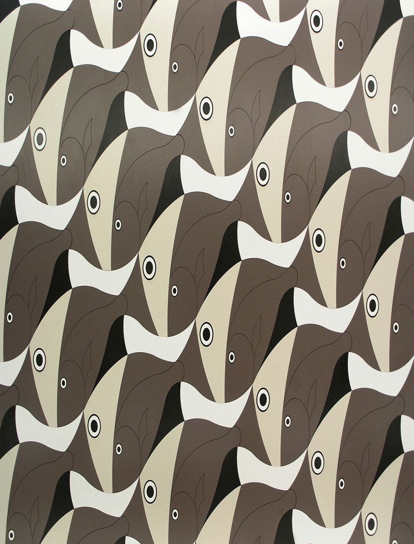
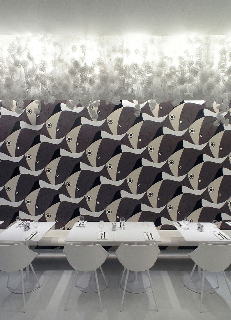
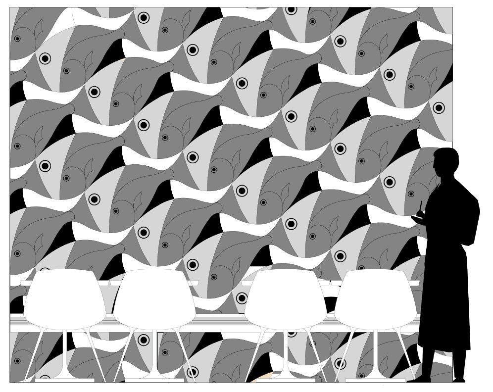
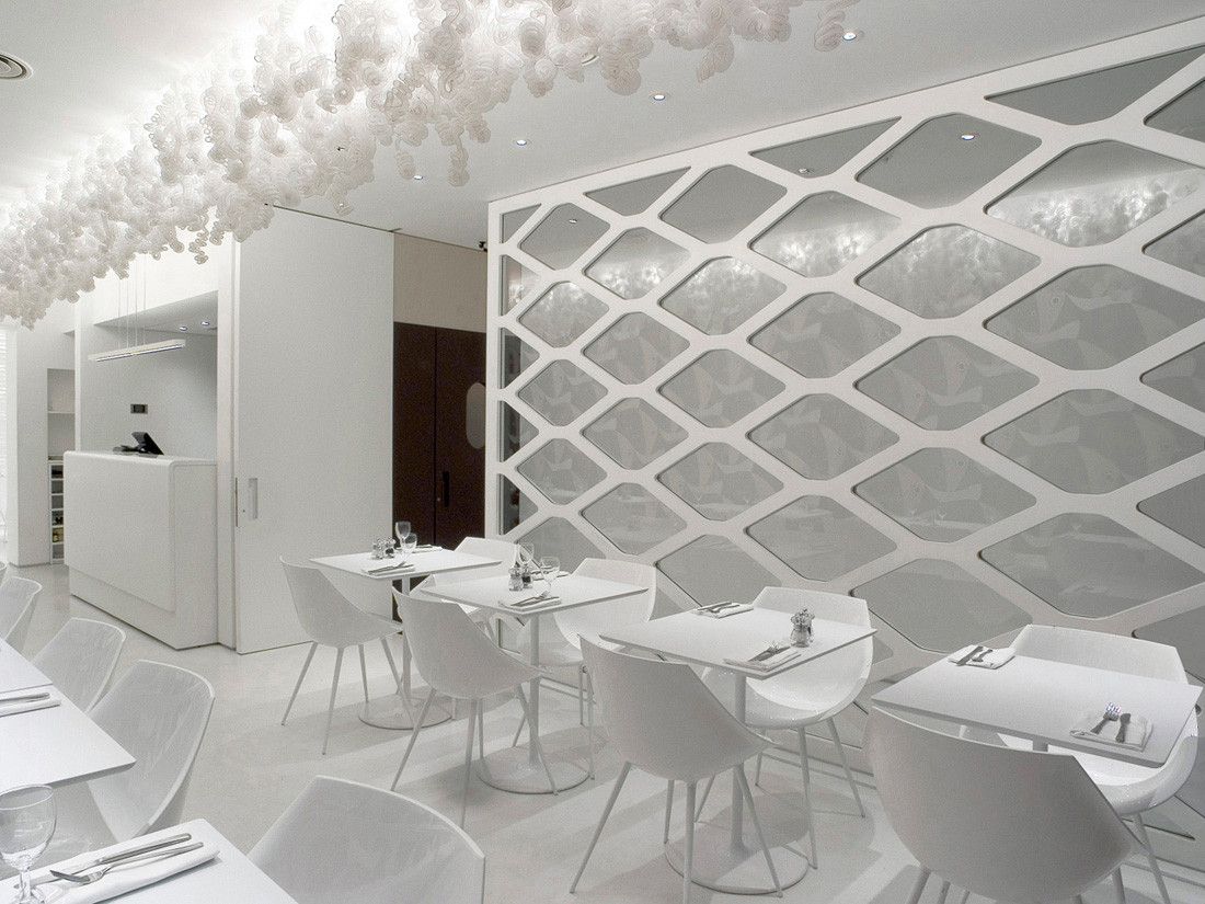
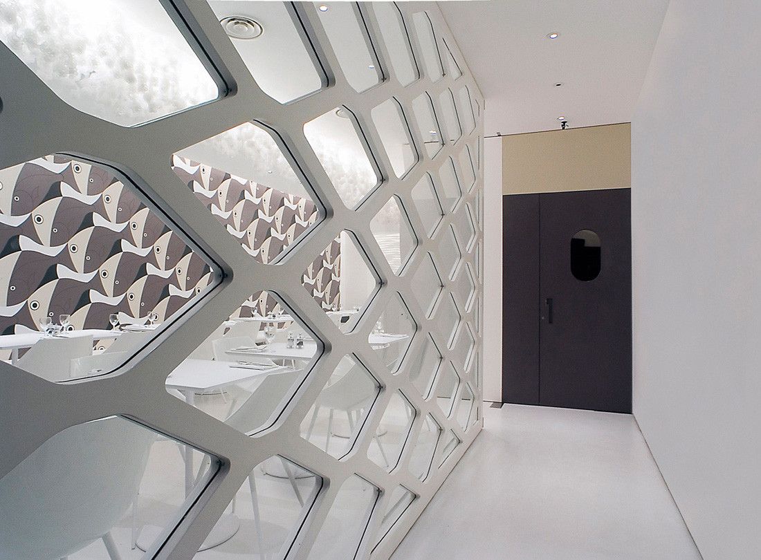
“OLIVOMARE is the last born belonging to the well known London brand OLIVO, and is a restaurant serving seafood. Apart from his name, such peculiarity is highlighted by the formal and decorative language adopted here to focus on its aspect using more or less clear references to the sea world and environment. The most explicit among them undoubtedly is the wide wall that characterizes the main dining room, entirely covered by a large cladding featuring a pattern inspired by the works of the visionary artist Maurits Escher, in which each single portion of colour is laser cut out of a sheet of opaque laminated plastic and juxtaposed on the vertical surface exactly as if it was a huge jigsaw puzzle.
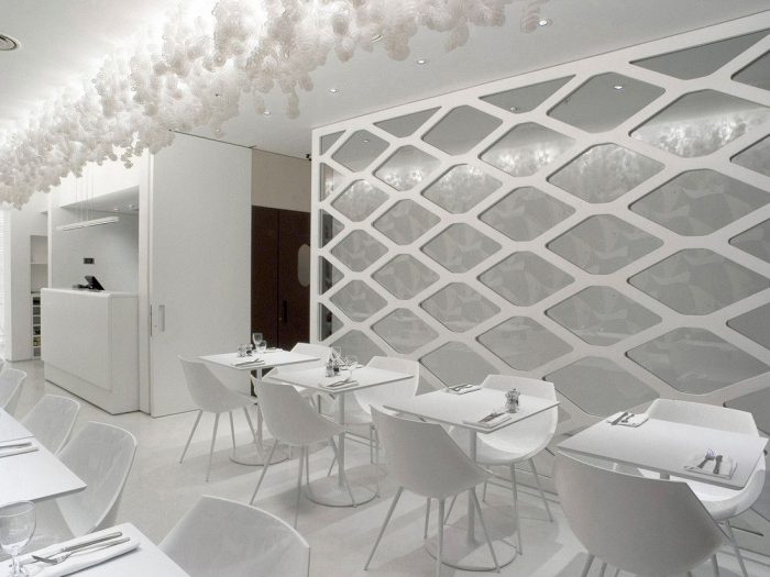
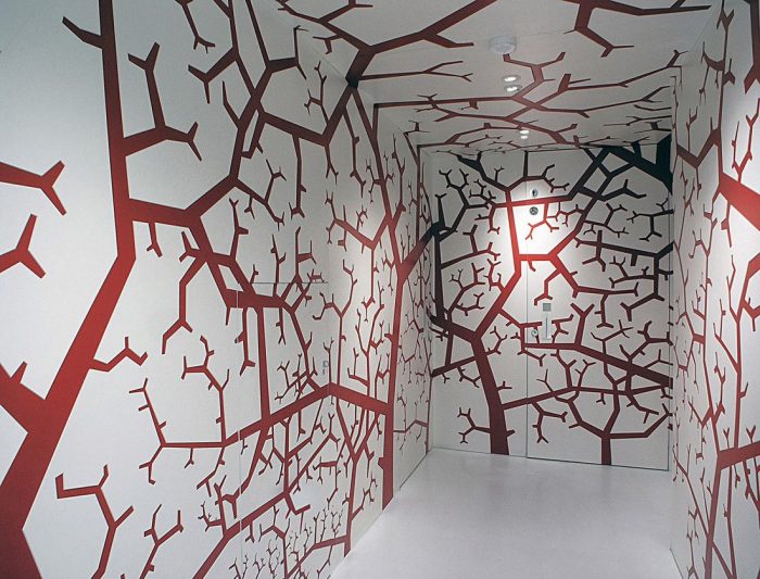
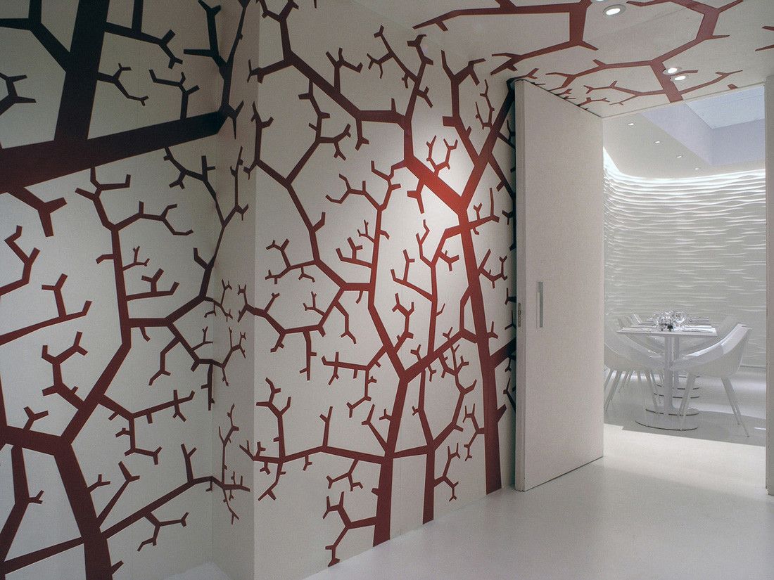
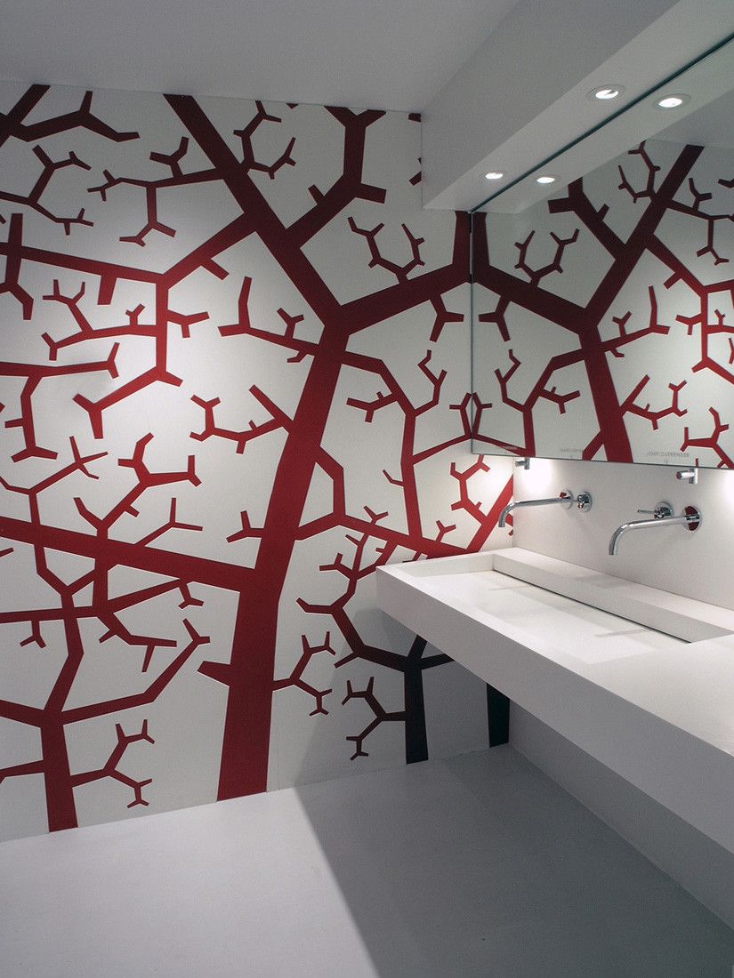
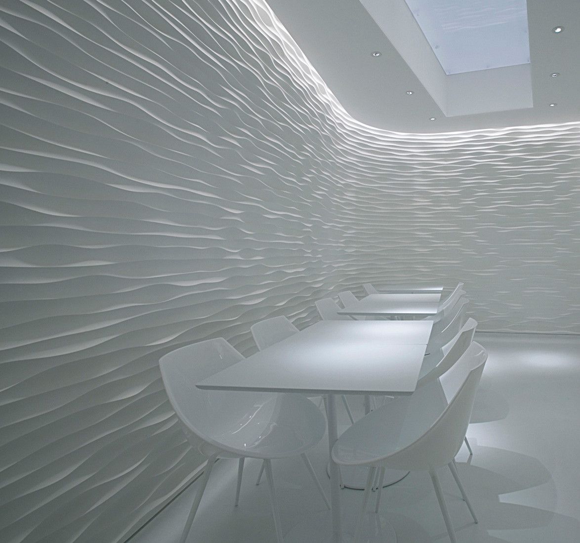
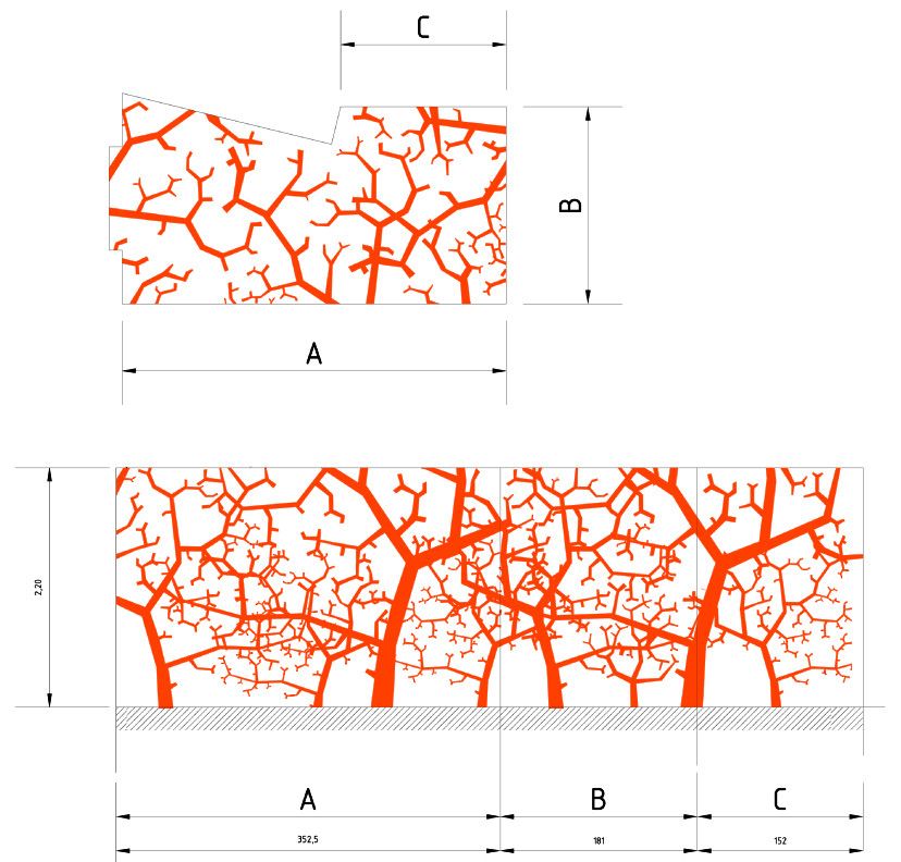
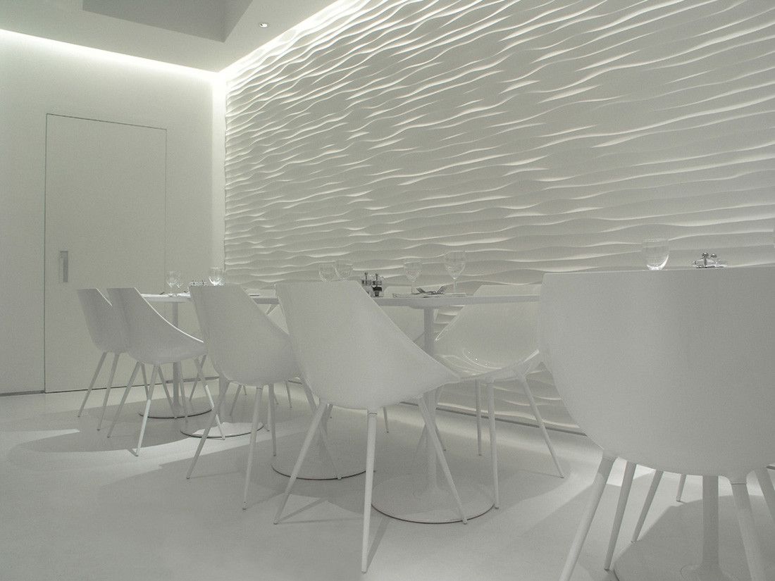
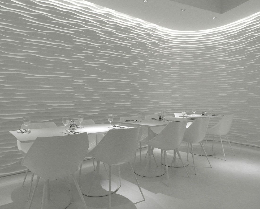
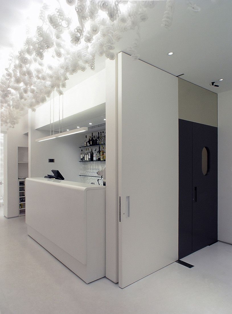
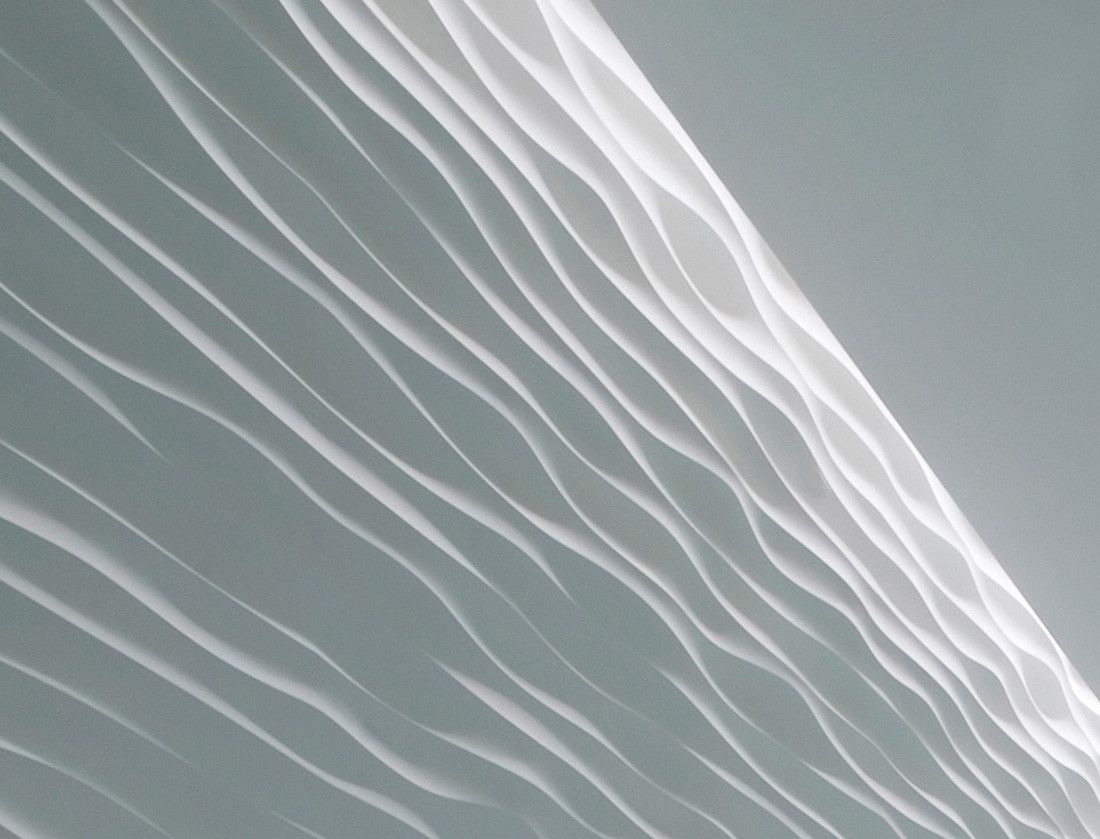
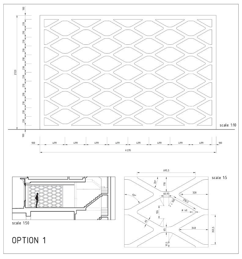
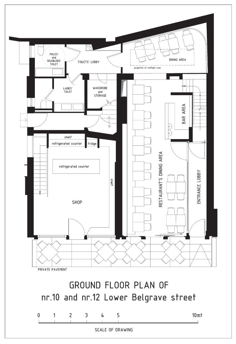
To counterpoint it, in this same room, from a channeling recessed in the fake ceiling drops down a linear sequence of tubular luminescent tentacles (made out of an extra thin nylon net) evoking a stray shoal of jellyfishes or of sea anemones, while in the wide lozengy glazed partition dividing this room from the entrance lobby somebody could vaguely recognize the meshes of fishers’ nets. In the small dining room at the rear (flooded by natural daylight copiously dropping down through a wide skylight expressly open in its roof), the cladding of its only continuous wall – which also includes a large curve – is characterized by a wavy relief meant to evoke the sandy surface of the beach when moulded by the wind, while in the toilets lobby the intricate branches of a coral reef closes in around any visitor coming from the bright and open adjacent room.
Such decorative pattern is obtained by engraving a double layer (white and red) of thick opaque laminated plastic laid onto either walls and ceiling, and its entanglement, when combined with the hidden doors giving access to the toilets, adds a sense of momentary disorientation to its aesthetical surprise.
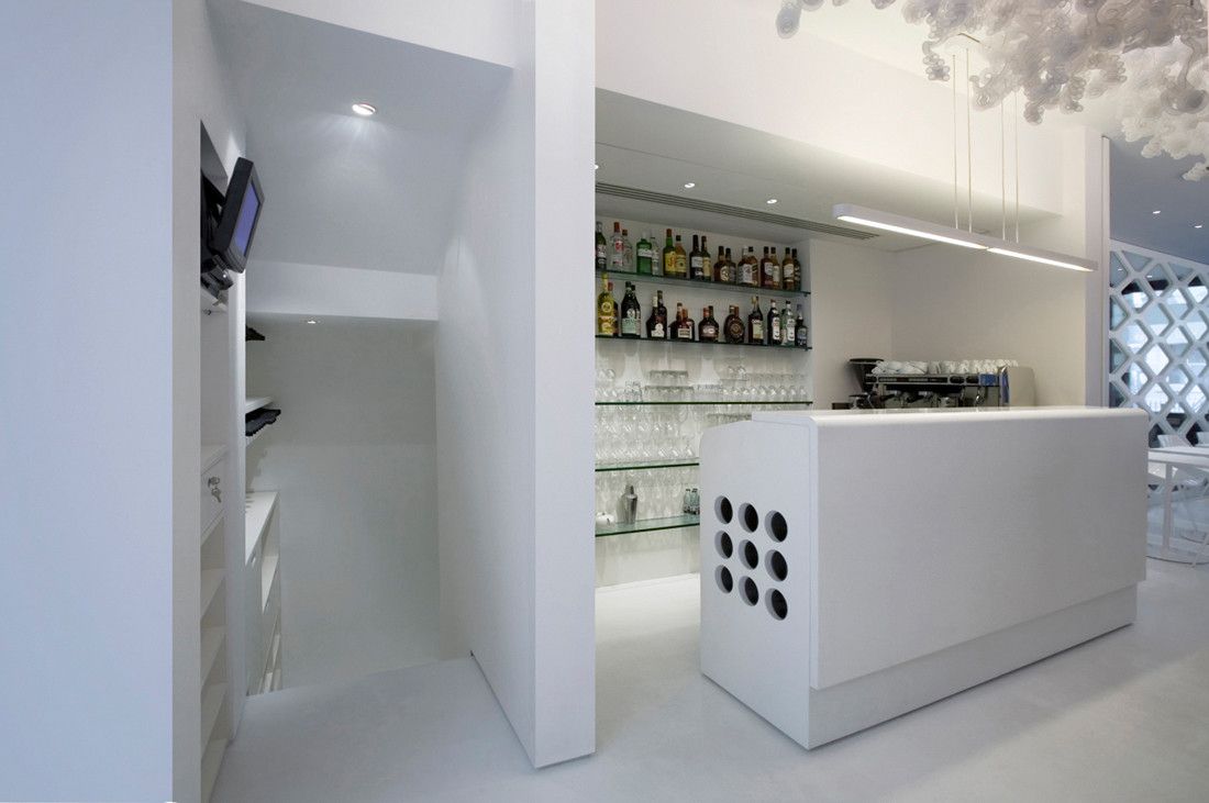
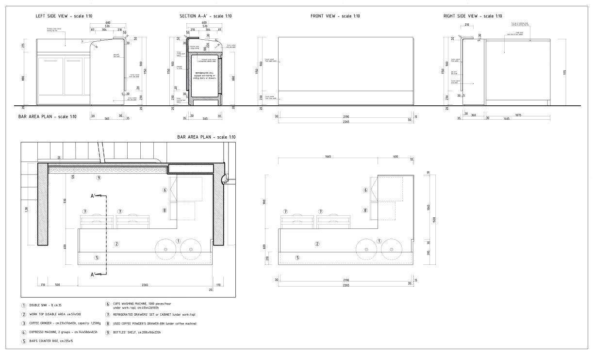
A sea of white colour has been used to enhance and link all these elements, flooding all surrounding parts, from walls to ceiling, from the resin floor to the Corian® made bar counter; a white sea working in this environment as an undifferentiated neutral background that intentionally disappoints any predictable expectation for blue colour.”
By Danya Hakky
Courtesy of Pierluigi Piu
Courtesy of Pierluigi Piu
Courtesy of Pierluigi Piu
Courtesy of Pierluigi Piu
Courtesy of Pierluigi Piu
Courtesy of Pierluigi Piu
Courtesy of Pierluigi Piu
Courtesy of Pierluigi Piu
Courtesy of Pierluigi Piu
Courtesy of Pierluigi Piu
Courtesy of Pierluigi Piu
Courtesy of Pierluigi Piu
Courtesy of Pierluigi Piu
Courtesy of Pierluigi Piu
Courtesy of Pierluigi Piu
Courtesy of Pierluigi Piu
Courtesy of Pierluigi Piu
Courtesy of Pierluigi Piu


