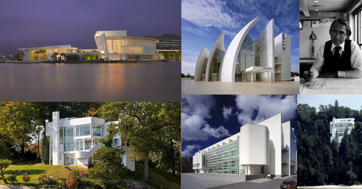
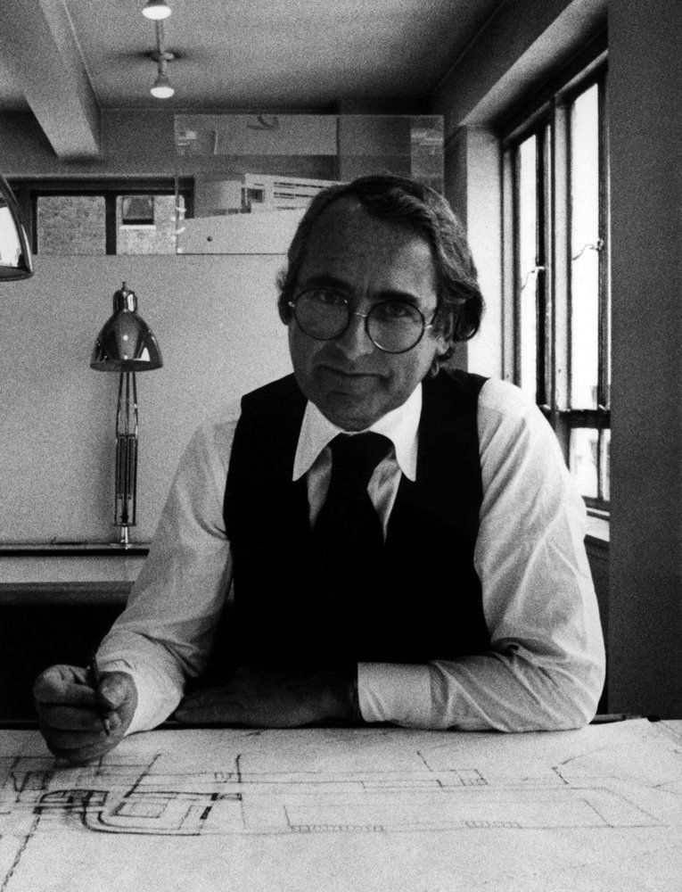
Today is Richard Meiers‘ Birthday—the US-based abstract artist and architect whose buildings are often plain white, mostly minimalistic, and, above all, contemporary. Through his career, Meier has gained international recognition and contributed to modern architecture.
Born in 1934, Richard Meier‘s life is full of notable milestones; he studied architecture at Cornell University, worked for Skidmore, Owings, & Merrill, and then for Marcel Breuer before opening his own firm in 1963: Richard Meiers & Partners.
Moreover, he was one of the New York Five; a group of architects based in New York City whose work was featured in the 1972 book Five Architects and were referred to as “the whites”.
Richard Meier & Partners’ projects went global—it received notable commissions in the United States, Europe, and Asia, and it covered all types of buildings: courthouses and city halls, museums, corporate headquarters, and housing. In 1984, Meier was awarded the Pritzker Prize for architecture, for his abstract sleek designs, innovative use of light and shadow, and -most notably- his signature plain white buildings.
Frankly, Richard Meier has permanently stepped down from his firm after several accusations of sexual harassment, leading to major changes in the firm, including a rebranding campaign; majorly in the terms of who will be leading the studio.
Although Richard’s name has been removed from the firm to be “Meier Partners”, it is said that he will still be available for consultations upon request.
Why did Richard Meier favor plain white buildings?
Meier believes that architecture is mainly about expressing a quality of light—that it should give us the opportunity to appreciate the diversity of nature.
“White is all colors. It’s everywhere. Everywhere you look. Whiteness, in a sense, reflects nature, it refracts light, it makes you more aware of the colors of nature because of the whiteness of the buildings.”
-Said Richard Meier on Whiteness
10 of Richard Meier’s Impressive Plain White Buildings:
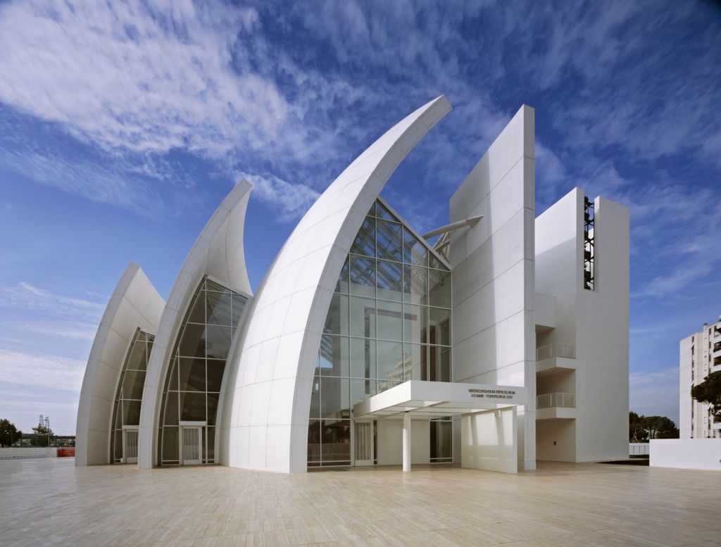
Built in Rome in 2003, the church’s glazed skylights are suspended between the shells and are lit by zenithal sidelight, while the nave is featured by a constantly changing pattern of light and shade. The light is diffused over the inner volume of the Jubilee Church and varies according to the hour, the weather, and the season, imparting a particular character to the aspects of the interior.
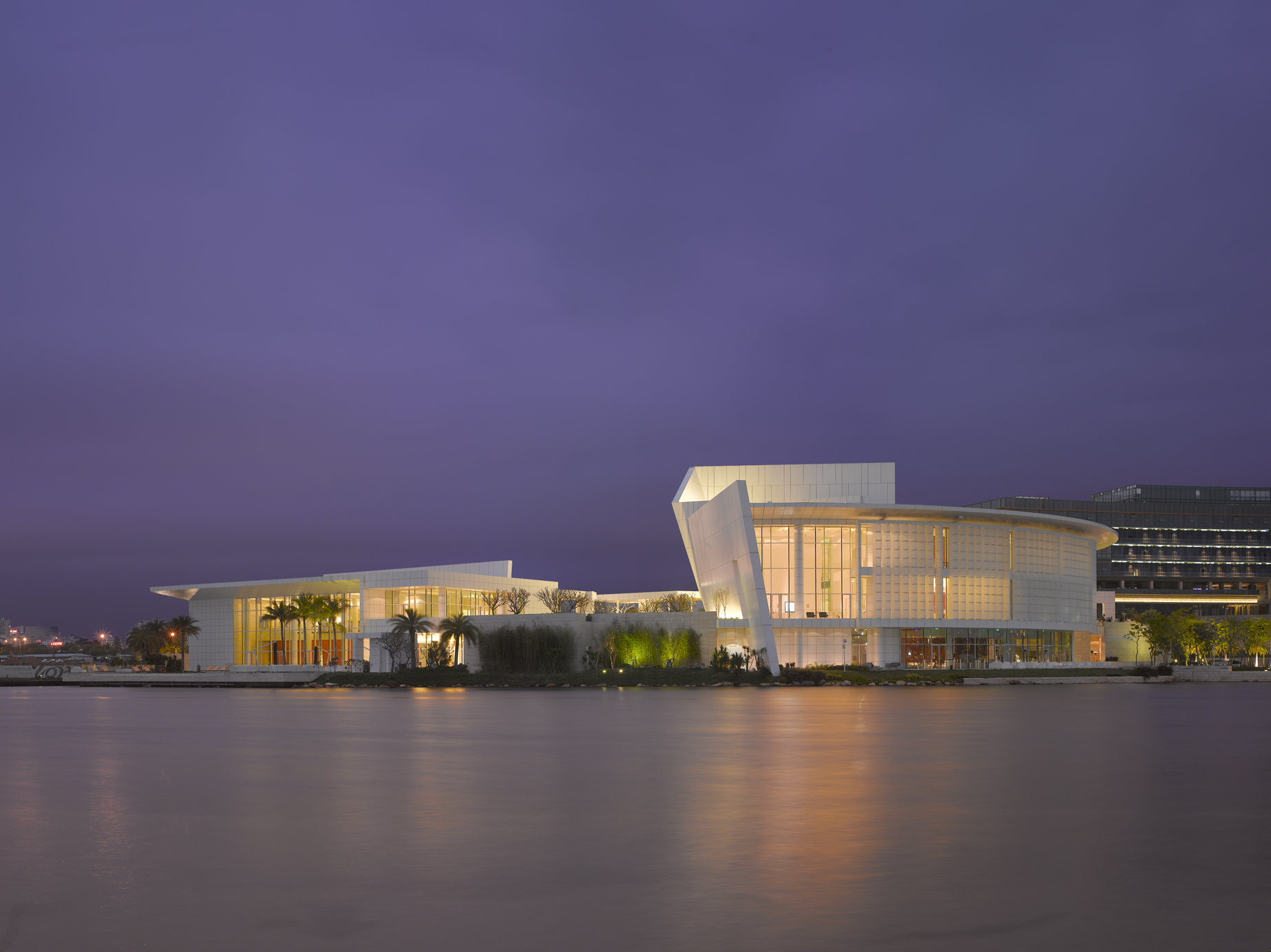
This is the firm’s first completed building in Shenzhen, China. The overlay of solid planes and clear voids creates depth through a play of shades and shadow from skylights and vertical screens. The geometry of the building follows a precise focal point from which “layers” of distinct spaces radiate and terminate in a sweeping curve that is seen from afar.
-
Barcelona Museum of Contemporary Art, Spain
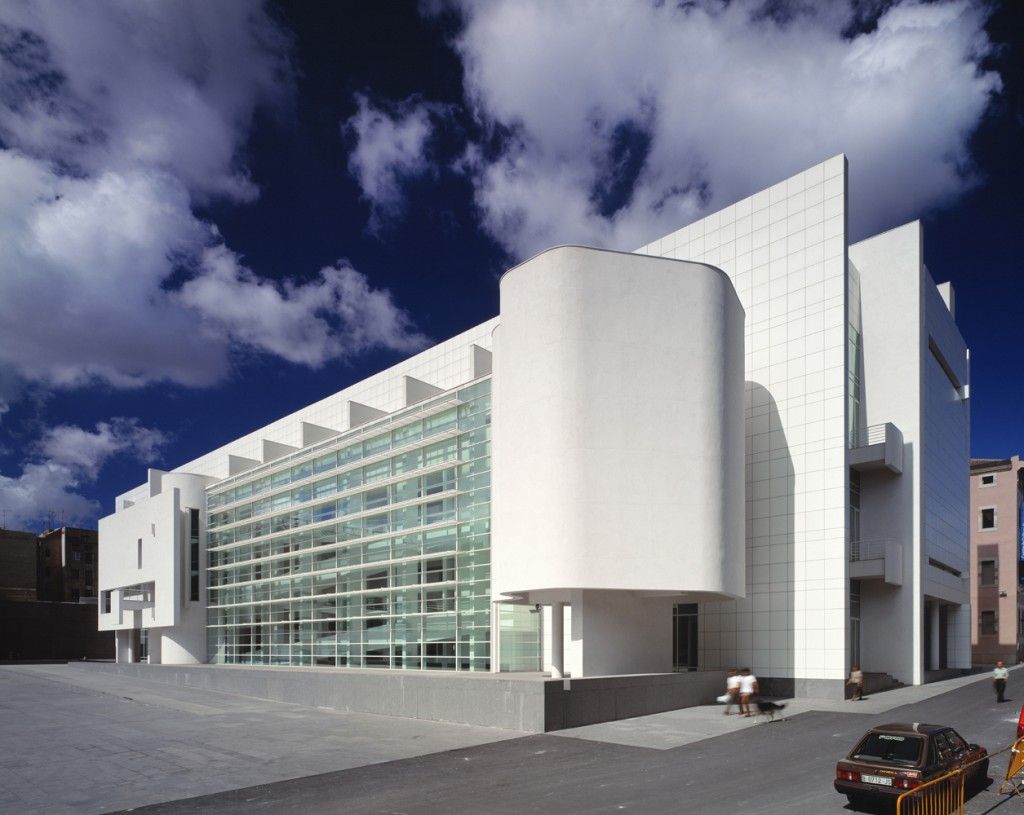
For the MACBA, Meier visioned a building that looks like a large box (120 by 35 meters), clad in white painted steel panels, and approached through a circular pavilion that welcomes visitors. The glazed southern facade fills the interior of the museum with natural light. The light softens the strict geometry of the building and makes it more in harmony with nature.
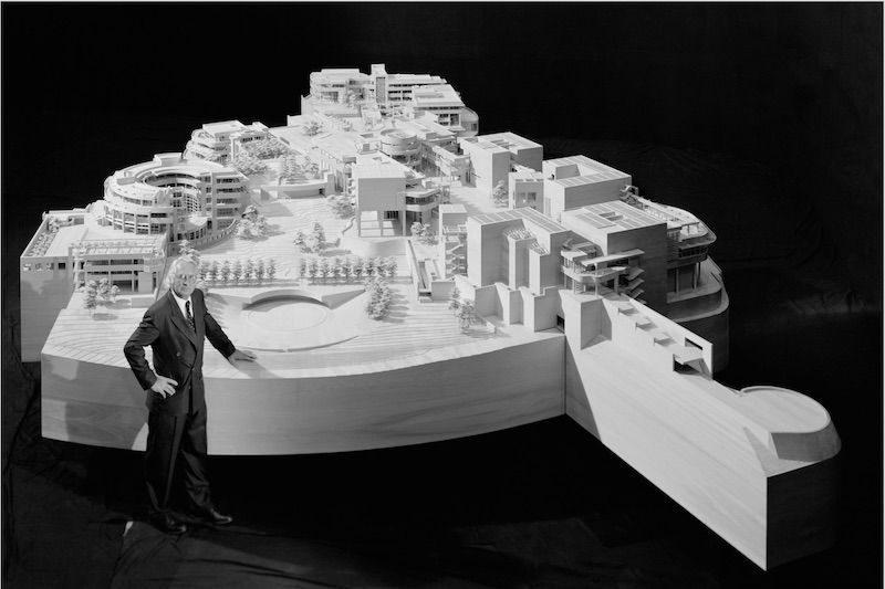
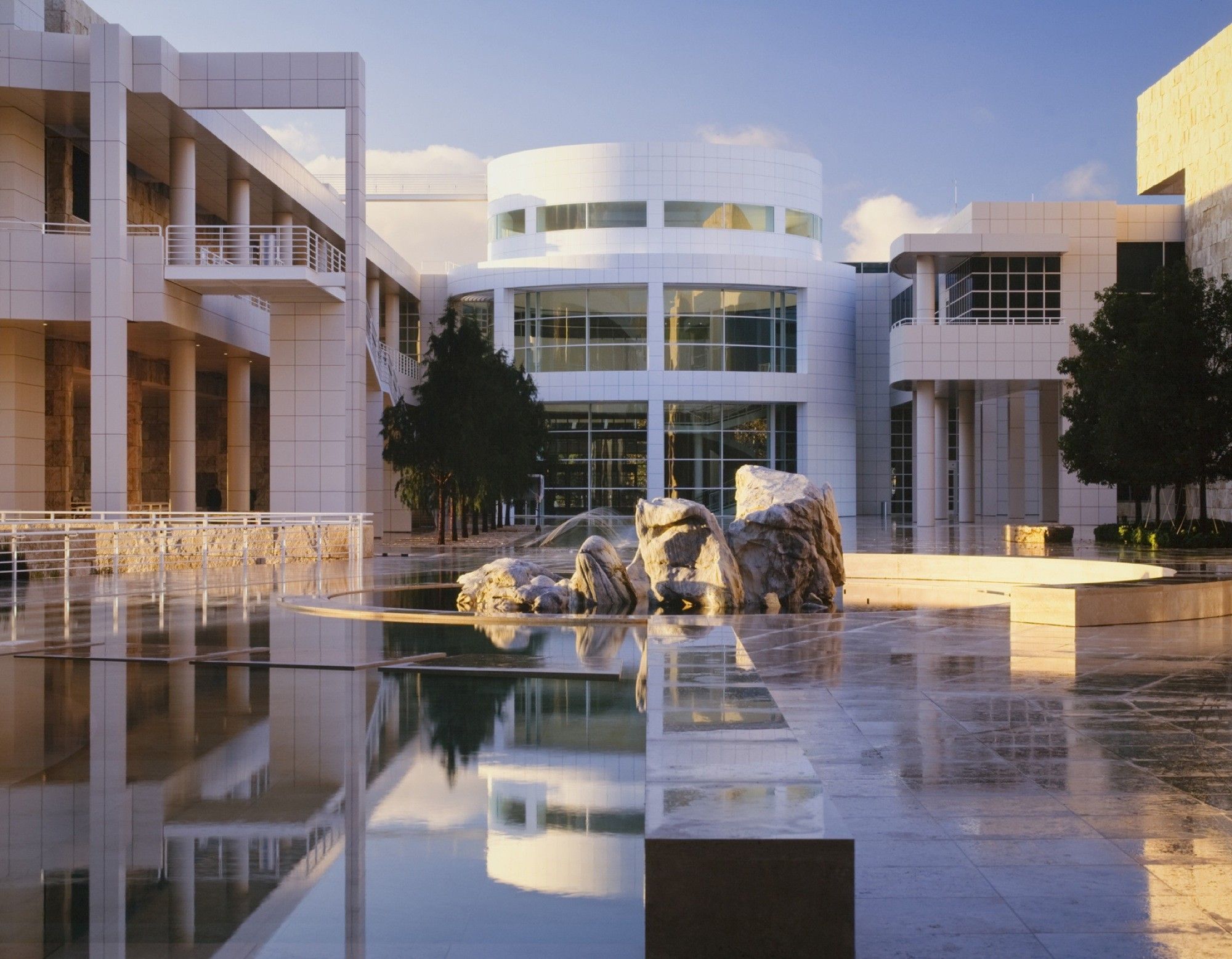
Completed in 1997, Richard Meier’s program brings the seven components of the Getty Trust into a coherent unity, while maintaining their individual identities.
The layout establishes a dialogue between the angle of intersection and a number of curvilinear forms that are largely derived from the contours of the site infected by the Freeway, the metropolitan grid, and the natural topography; the overall parts relate to both the City of Los Angeles and the Santa Monica Mountains.
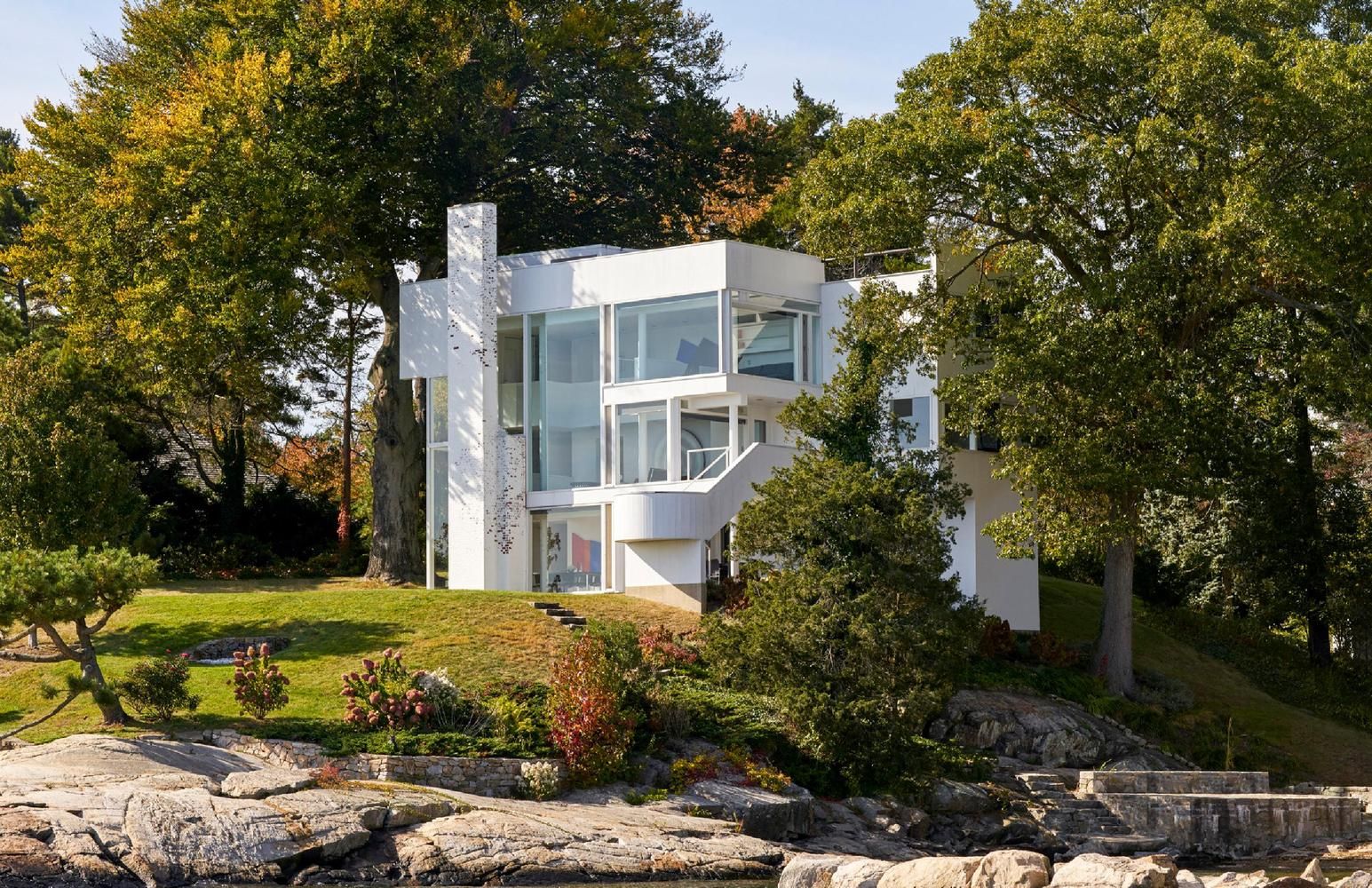
Although the design of the Smith House seems simple at first glance, it has “revolutionized the residential design in the United States and around the world”. The Smith House has even won several awards including the AIA’s Twenty-five Year Award. Meier has many iconic residential works which are taught to students at architecture school.
-
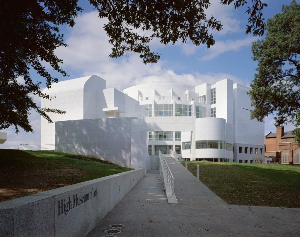
High Museum of Art, Georgia
According to the architects, the High Museum of Art is a major public building and art repository that responds to the typological and contextual aspects of the museum’s program. The city of Atlanta’s progressive building tradition, as well as its role as a developing cultural center, had a strong influence on the design.
-
Douglas House, Michigan
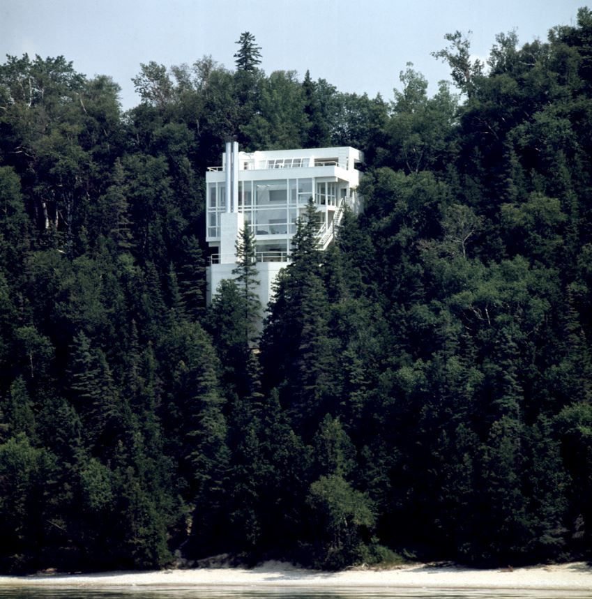
The house is gently placed on a steep slope over the water, almost as if it is floating amongst the trees. Richard Meier said that the dramatic dialogue between the whiteness of the house and the primary blues and greens of the water, trees, and sky allows the house not only to assert its own presence but to enhance, by contrast, the beauty of its natural environment as well.
-
Des Moines Art Centre Addition, Lowa
Meier‘s design for this art center is marked as “more complex and pragmatic than it may at first appear”. It comprises three parts: an iconic pavilion in the Grand Avenue housing permanent collections and temporary exhibitions, a courtyard that functions as a restaurant, and a service area.
This division between functions allows for seamless circulation throughout the facility.
-
Hartford Seminary, US
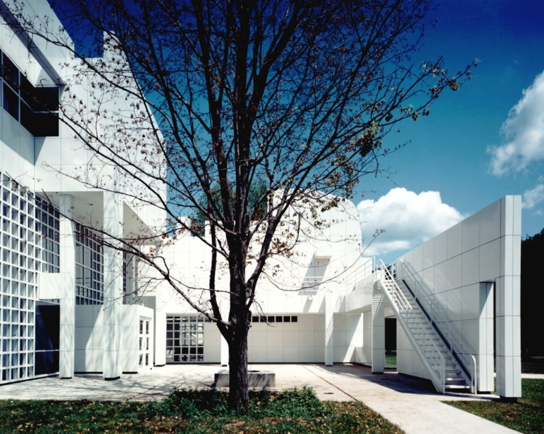
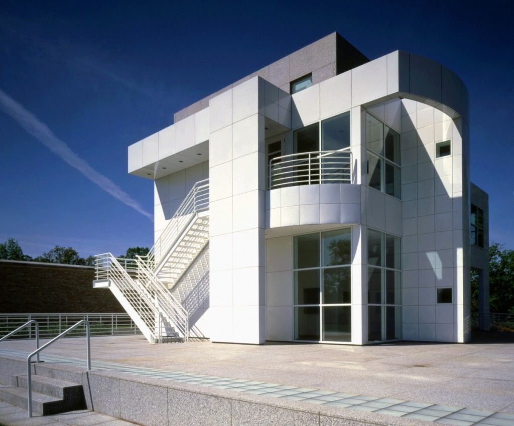
According to the 1982 issue of the Architectural Record, if any religious symbol can be said to dominate Richard Meier & Partners’ design for the Hartford Seminary in Hartford, CT, it is the primordial emblem of creation: light.
Whether silhouetted against a cloudless summer sky or wrapped in the haze of a New England winter, this low white building is an arrestingly luminous presence.
-
The City Hall and Central Library of The Hague, Netherlands
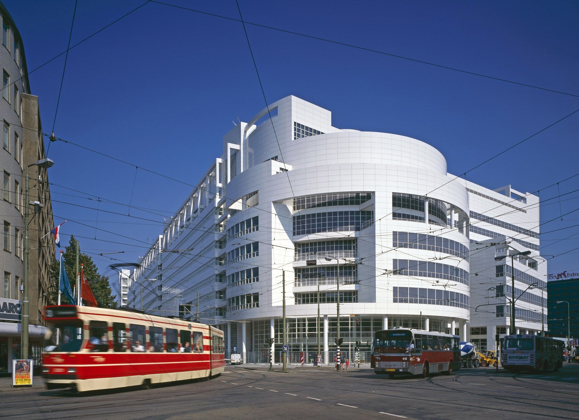
Nicknamed the Ice Palace by locals for its pristine color, the City Hall and Central Library of The Hague, Netherlands, was completed in 2005 with a circular library and an internal atrium. Clad in porcelain-enameled metal, the sprawling building also contains space for the city council, stores, cafés, exhibitions, and weddings.
