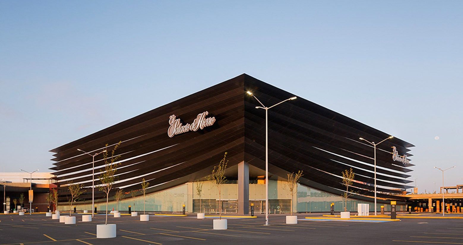
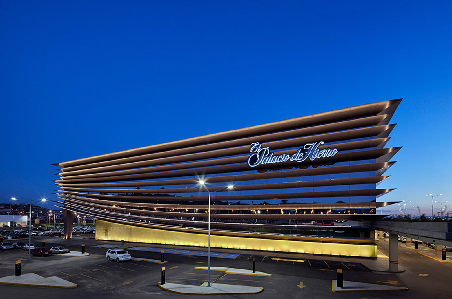
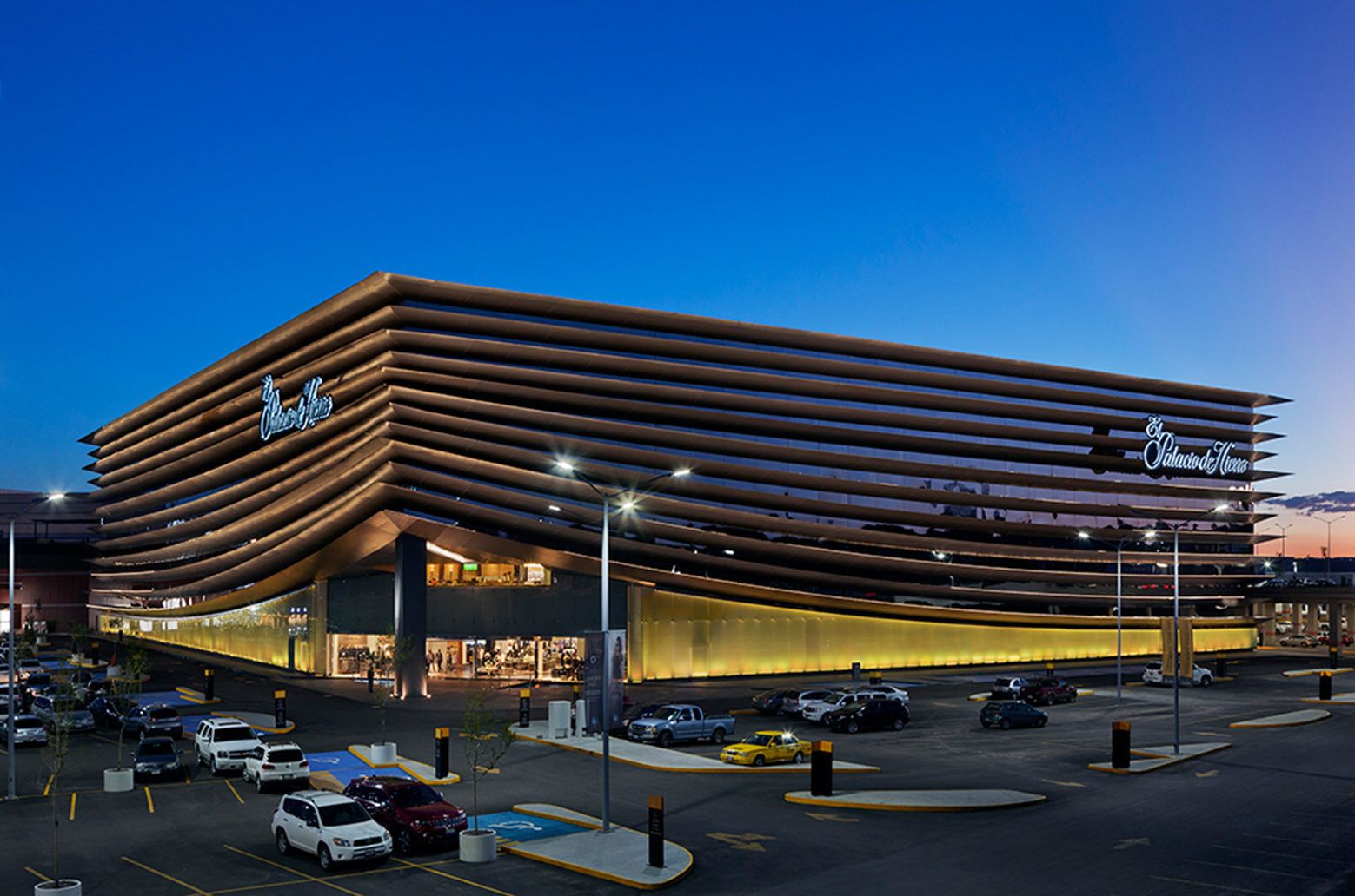
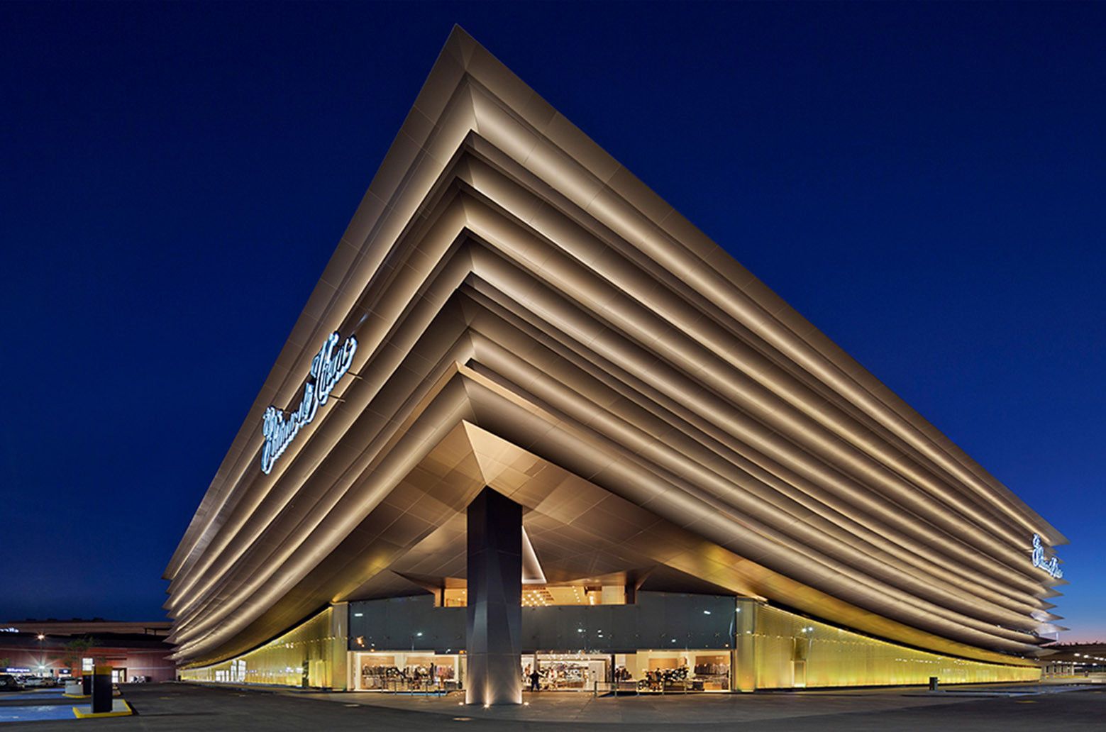
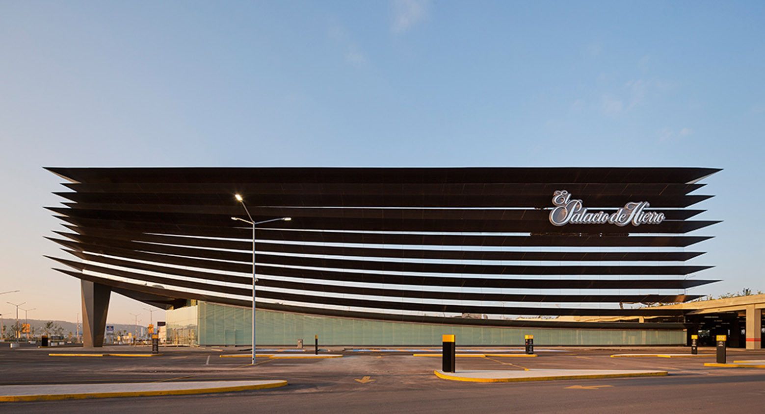
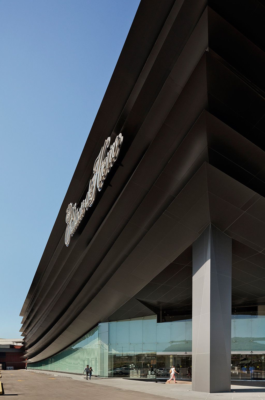
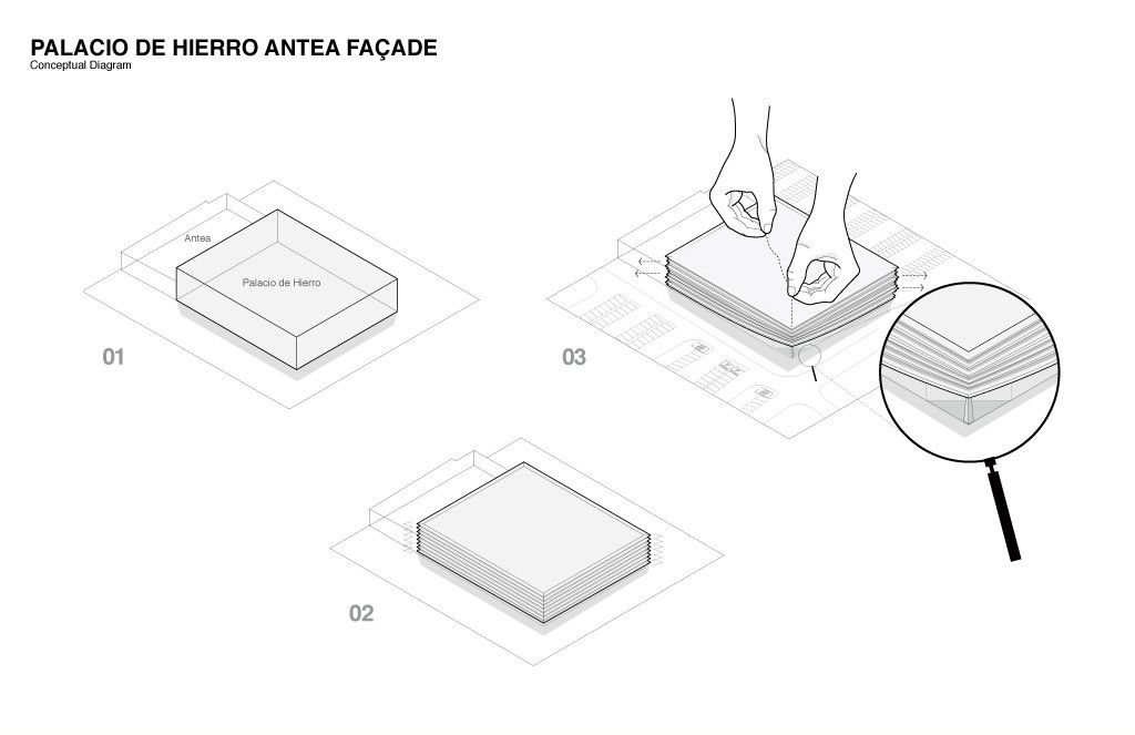
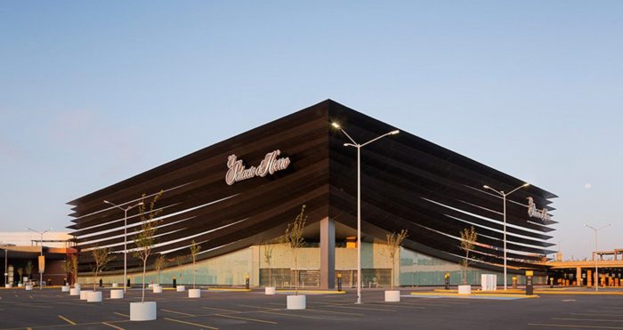
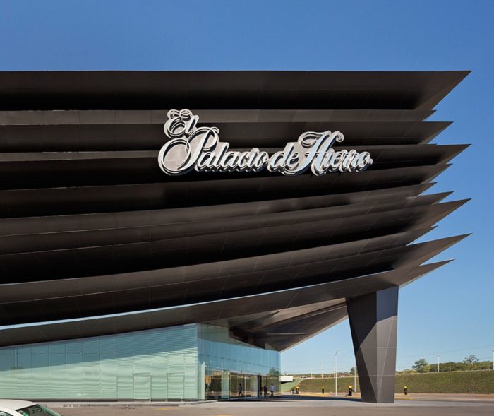
Designed by Sordo Madaleno Arquitectos, The classical department store _ Palacio de Hierro Antea Façade _ is defined by a strict physiognomy: a box with four façades. This constraint was the principal challenge to be overcome in the project. Dematerializing the material was the guiding concept used to create diffuse limits based on the horizontality of the solid and void elements to achieve an effect of floating layers.
The façade is comprised of these horizontal elements designed in a range of dimensions and sections, giving rise to a clean and fluid movement that culminates in the framing of the principal entrance to the store at one of its corners. This entrance is reinforced by a large welcoming vestibule that serves as a transitional element with a majestic double height that permits the permeability of the façade.
From the interior of the ground and first floors—where the gourmet food area is located—the exterior may be observed, thus breaking with the typical blind walls that define most department stores.
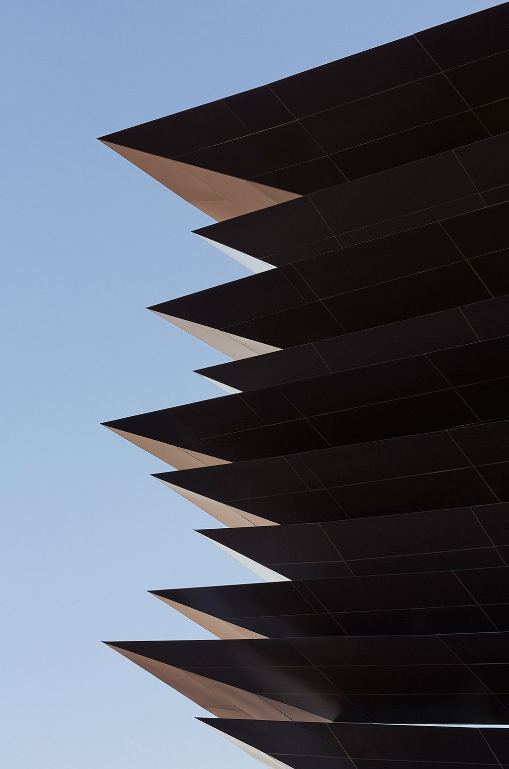
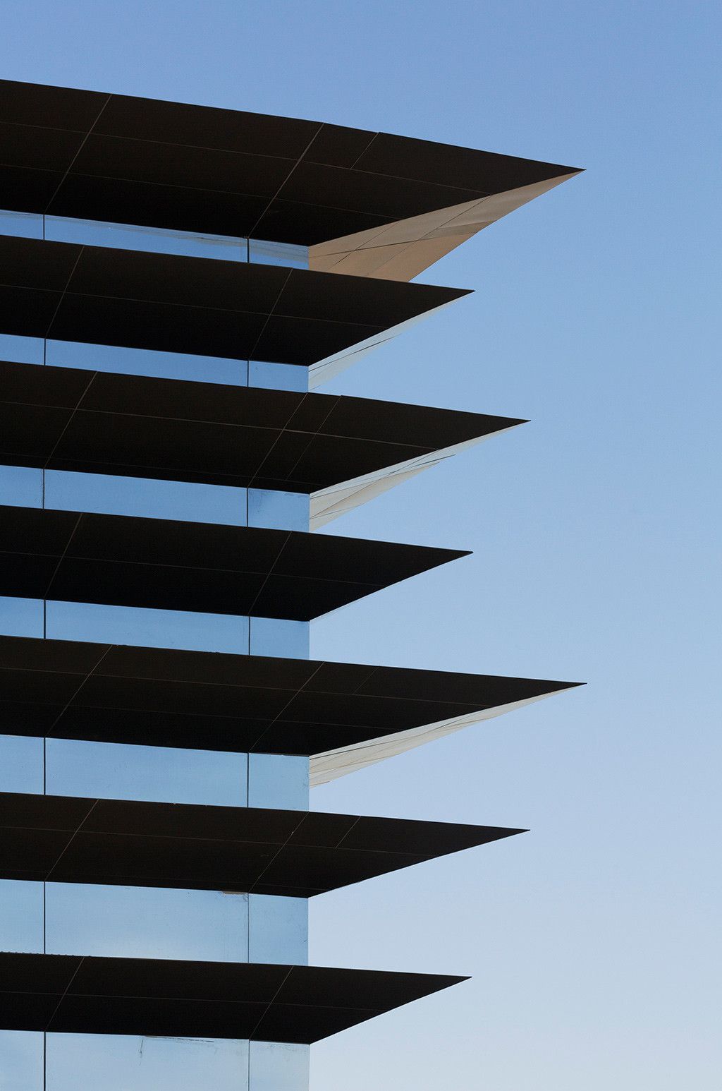
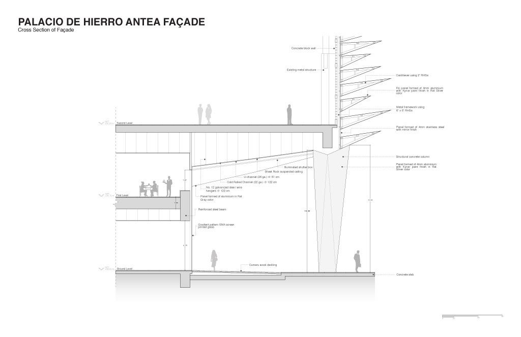
Optimization of resources was essential to the modulation of the façade, meaning it was structured in such a way as to employ a single aluminum panel prototype for all the “layers” even though these have different dimensions, sections, and movements. The “solid layers” range from 1.80 m to 3.40 m across the façade and in each of its corners.
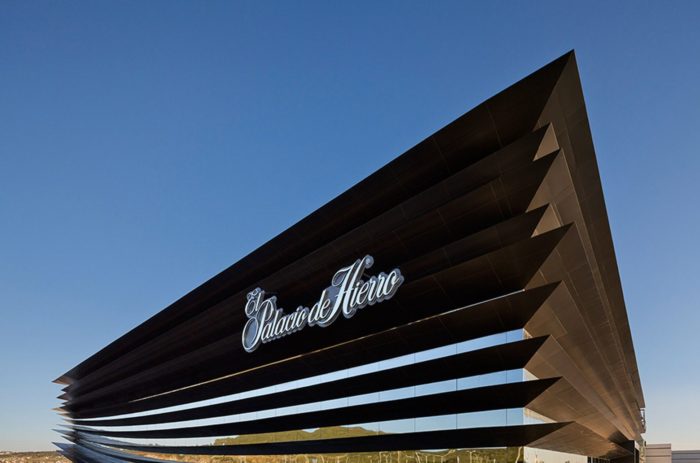
They comprise aluminum panels anchored to a steel structure. The “void” elements are actually aluminum mirrored panels that reflect the project surroundings, vegetation and the extraordinary skies of Queretaro. This effect of reflection creates an optical illusion of seeing through the material, making the solid elements appear to float with a magnetic force that prevents them from touching each other.
The citizens of Queretaro have gratefully received this project, which has become a new icon in the city and acquired the popular name “the great book” due to its resemblance to the leaves of an open book. Palacio de Hierro is part of the Antea Lifestyle Center and is located at the north end of the complex as one of its principal anchor stores.
Antea is a linear development with a volumetry that is closed to the exterior and open to the interior, with a green backbone. The concept of the façade of the Palacio de Hierro in Antea seeks to contrast with the closed volumetry of the rest of the development, standing out with its permeable façade and an effect of openness to the exterior. Both Palacio de Hierro and the Antea shopping mall are designed by Sordo Madaleno Arquitectos.
Project Info:
Architects: Sordo Madaleno Arquitectos
Project Year: 2014
Facade Area: 9000m2
Project Area: 9000.0 m2
Photographs: Paul Rivera
Manufacturers: MARMOLES ARCA
Project Leader: Arq. Humberto Mendoza
Lightning Consultant: Noriega Iluminación
Architecture Leader: Arq. Javier Sordo Madaleno de Haro
Architects In Charge: Arq. Javier Sordo Madaleno Bringas
Project Location: Santiago de Querétaro, Querétaro, Mexico
Media and Marketing: Arq. Rosalba Rojas, Maria Luisa Guzmán
Structural Engineering: y Construction Coordination Grupo RIOBOO
Architecture Team: Fernando Sordo Madaleno de Haro, Juliam Silva, Andrés Muñoz
Project Name: Palacio de Hierro Antea Facade
