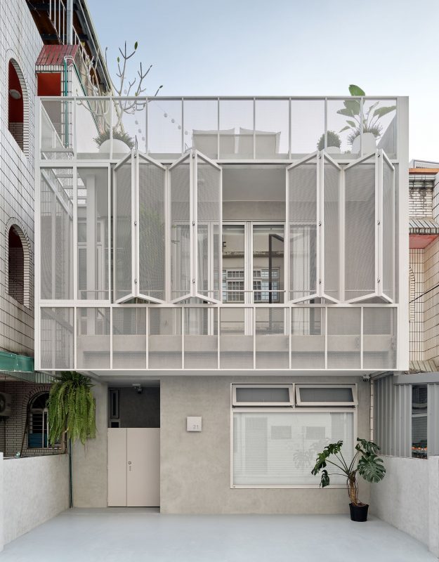
Pan House
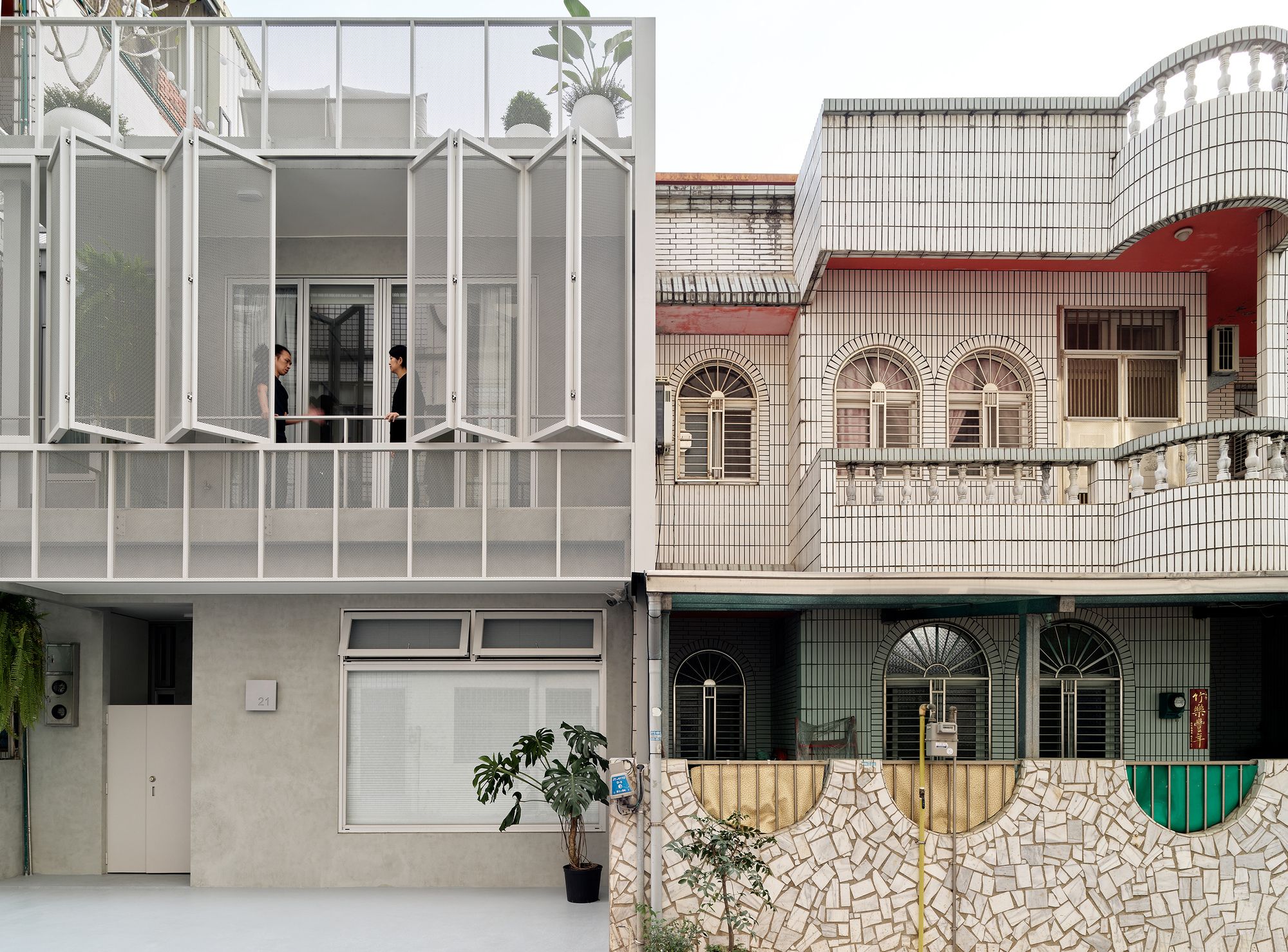
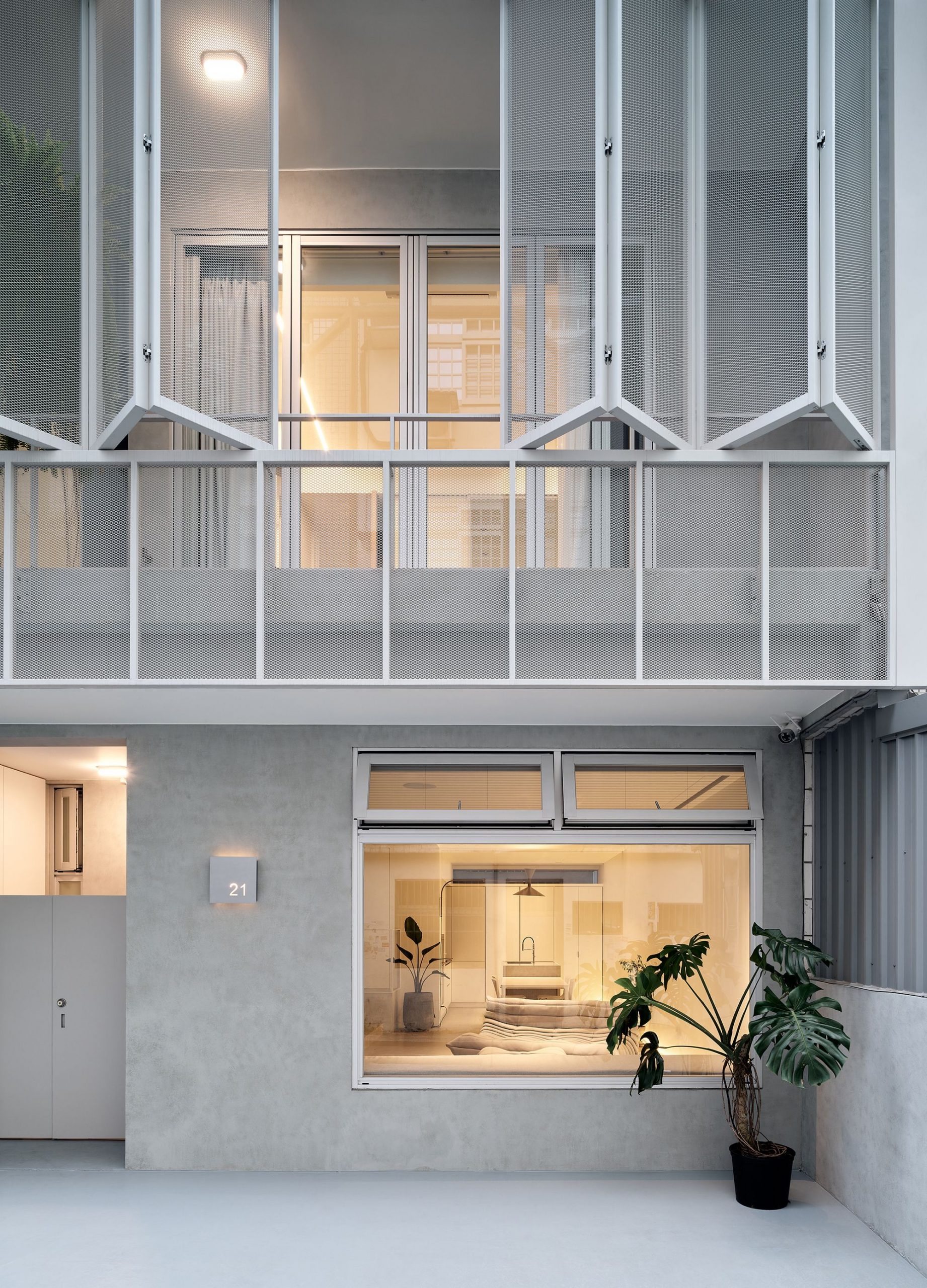
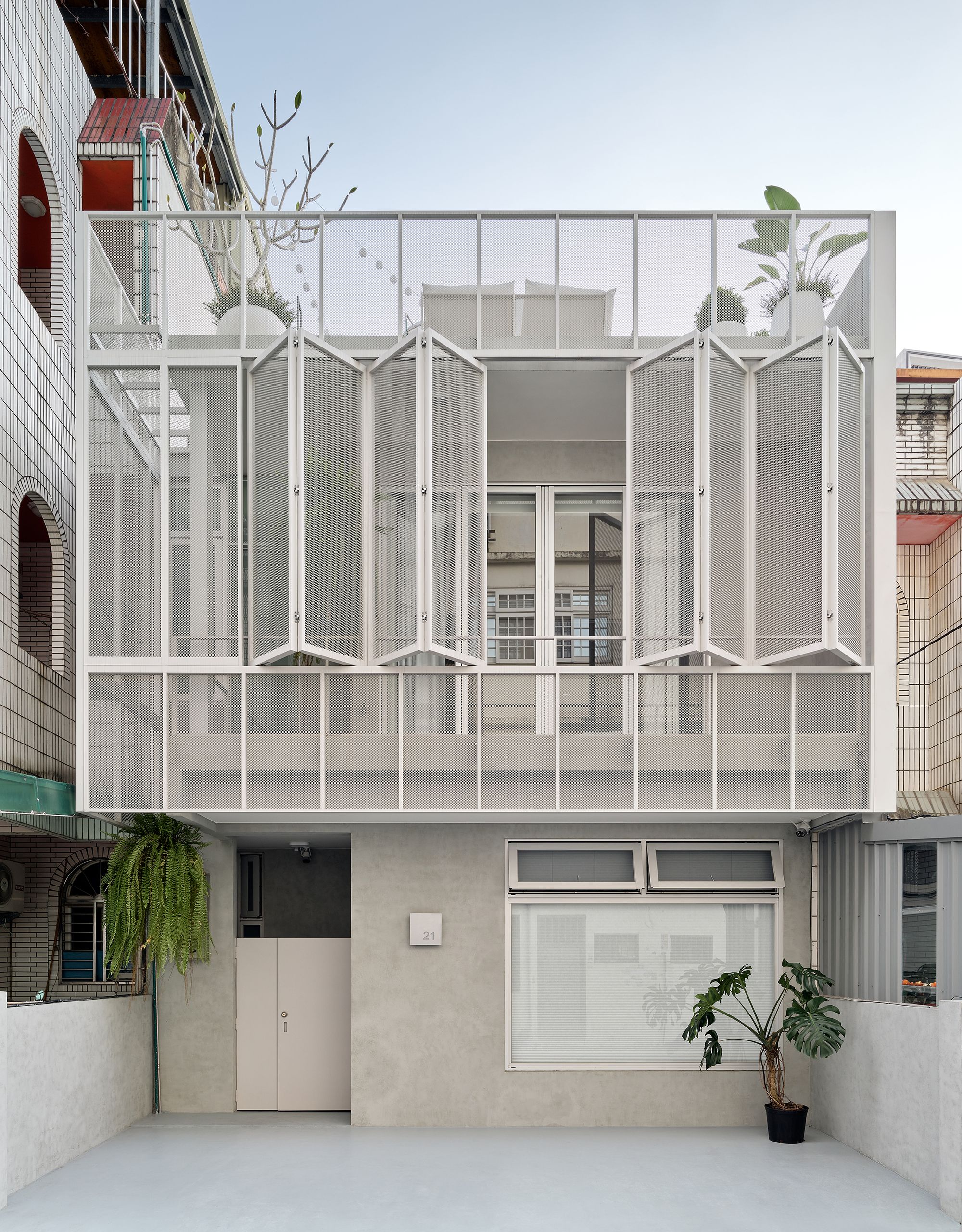
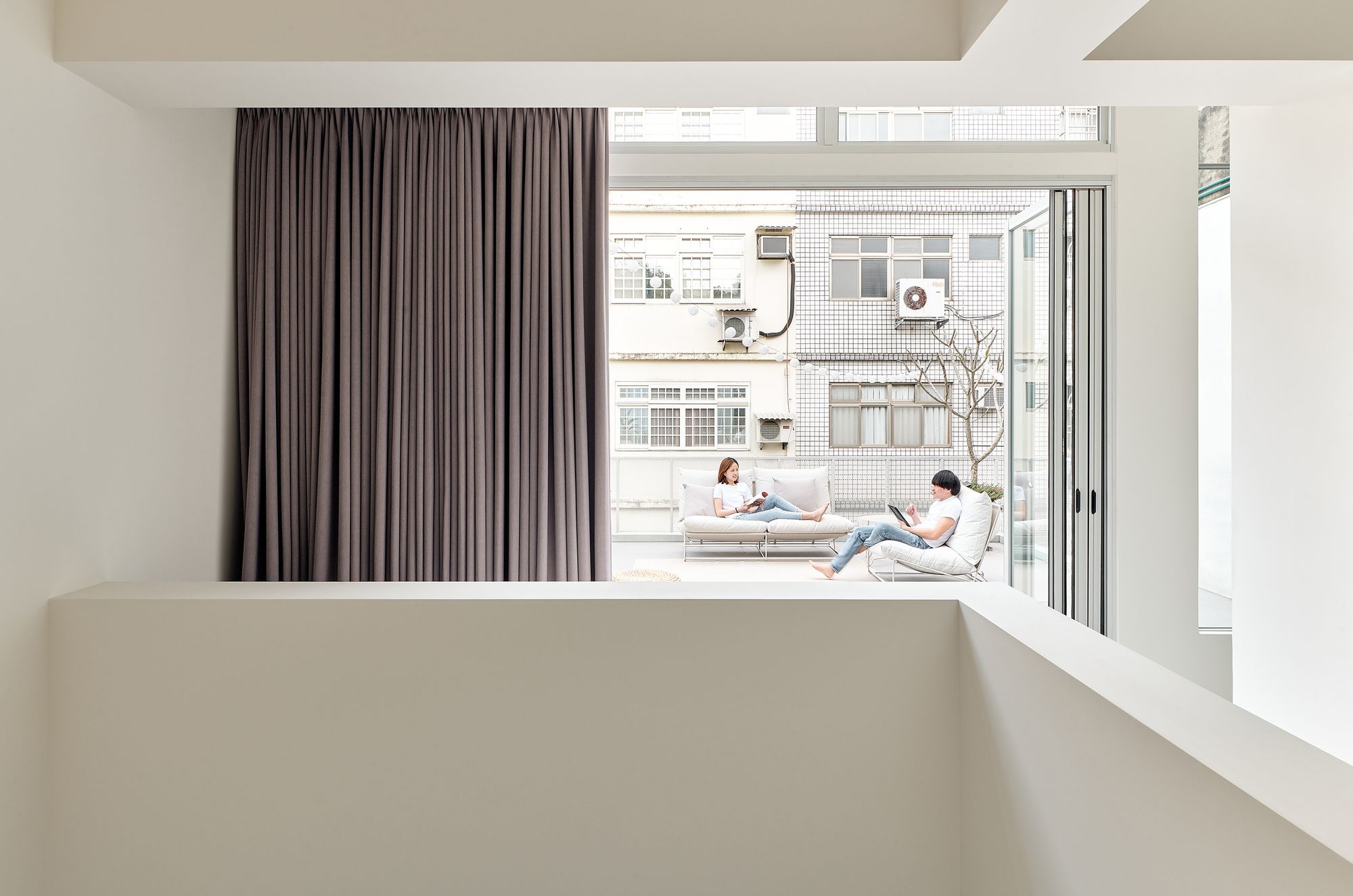
This project was conducted in an old community in Hsinchu with few residents. Its architectural style belongs to that of the traditional terrace house (tou tian cuo), which shares the same exterior construction and interior layout with the buildings in the neighborhood. According to the local residents, due to home burglaries that had been experienced, installing iron gratings outside balconies and windows became a norm. In light of this norm, we developed an interesting starting point in the design, and we were hoping to respond to this typical relationship through the concept of (building) skin. Skin is the outermost layer of a body and it is also integrated with the body. In the context of architecture, the skin is a part of a building that is constructed along with the building instead of being added on later in order to meet demands or address a lack of functions. The difference between building skin and putting on iron gratings is that building skin with the function of resisting invading forces does not give off a feeling of confinement or indifference; it presents a bright and refreshing sense of lightness and transparency.
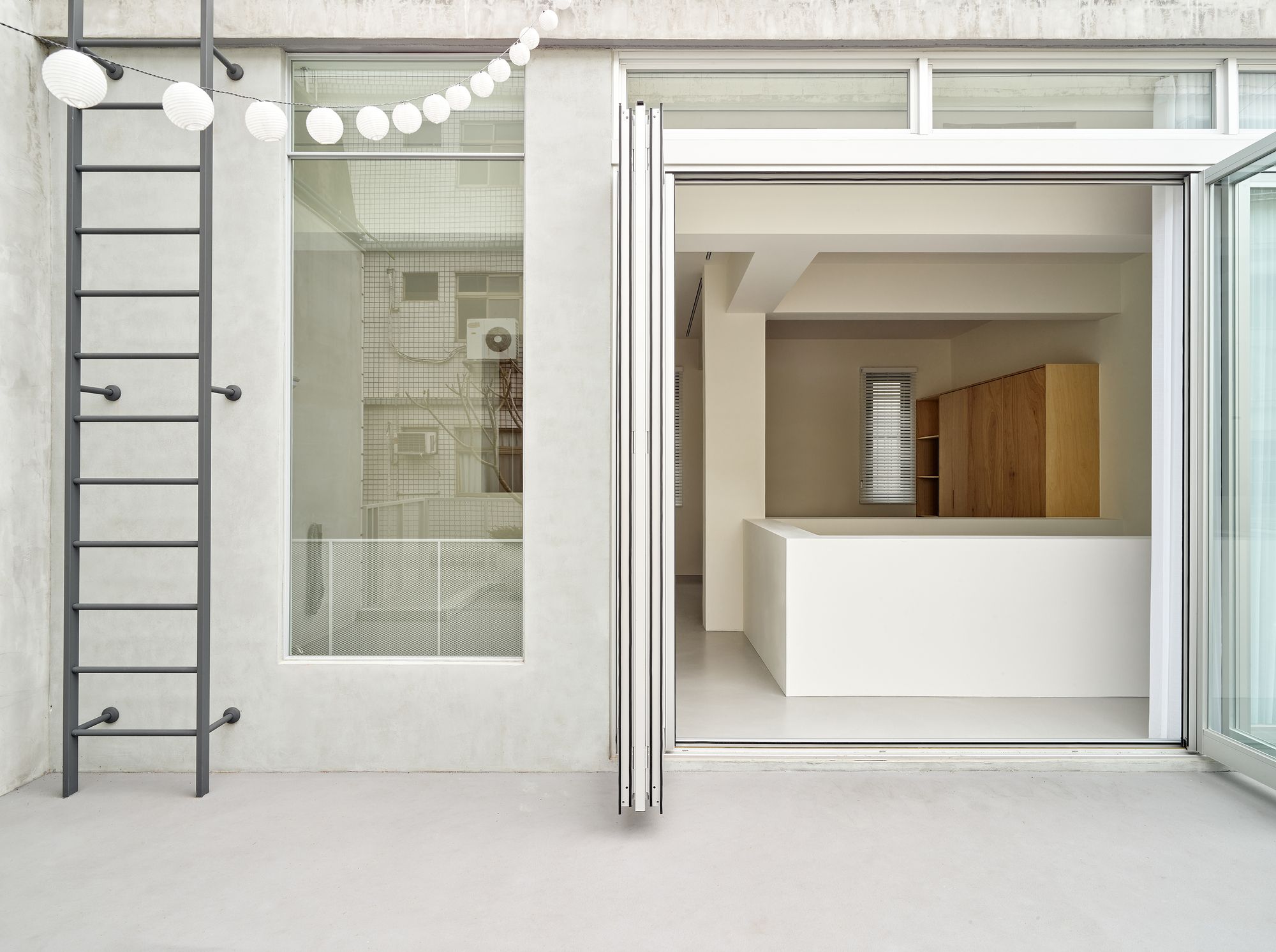
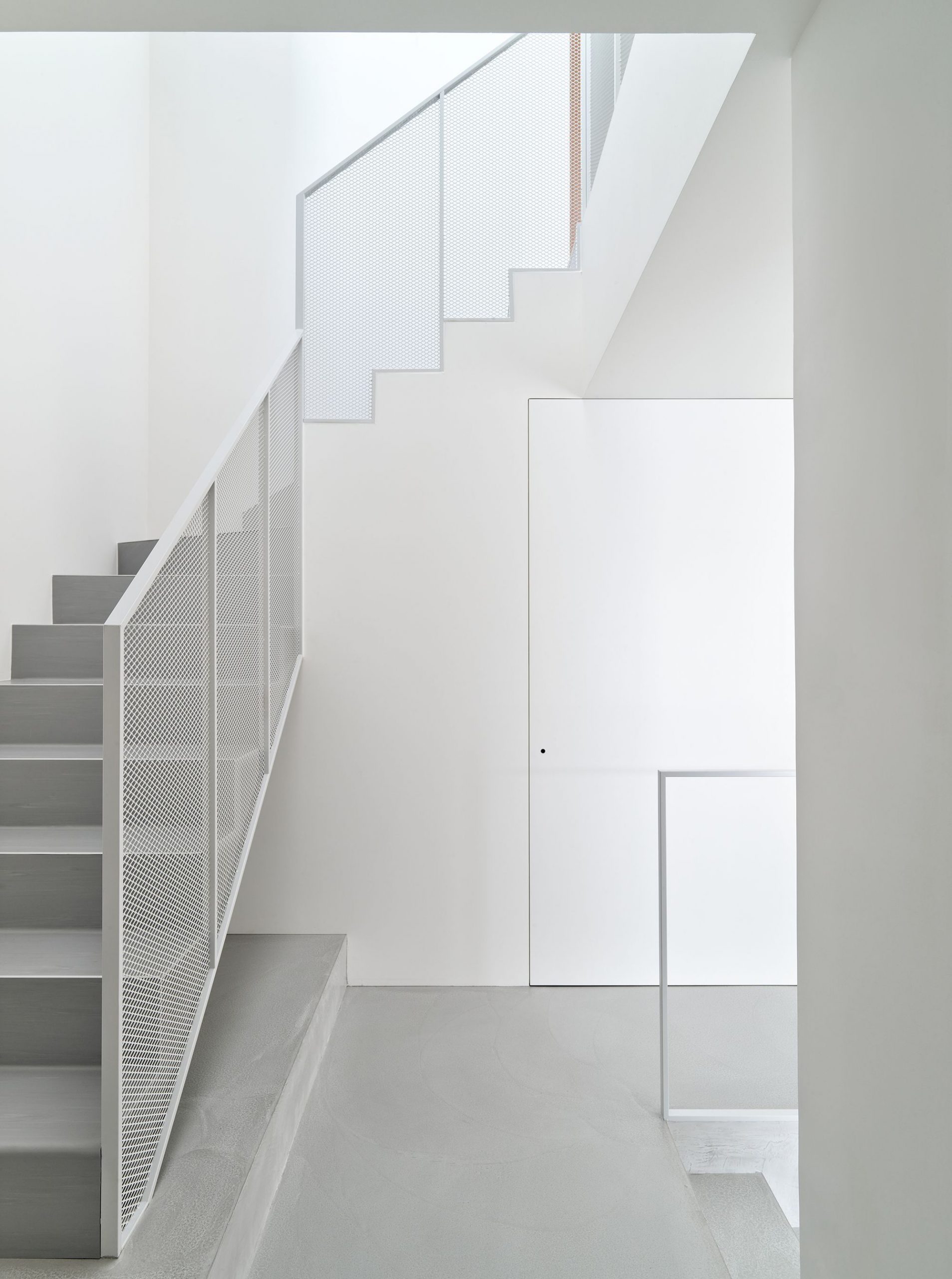
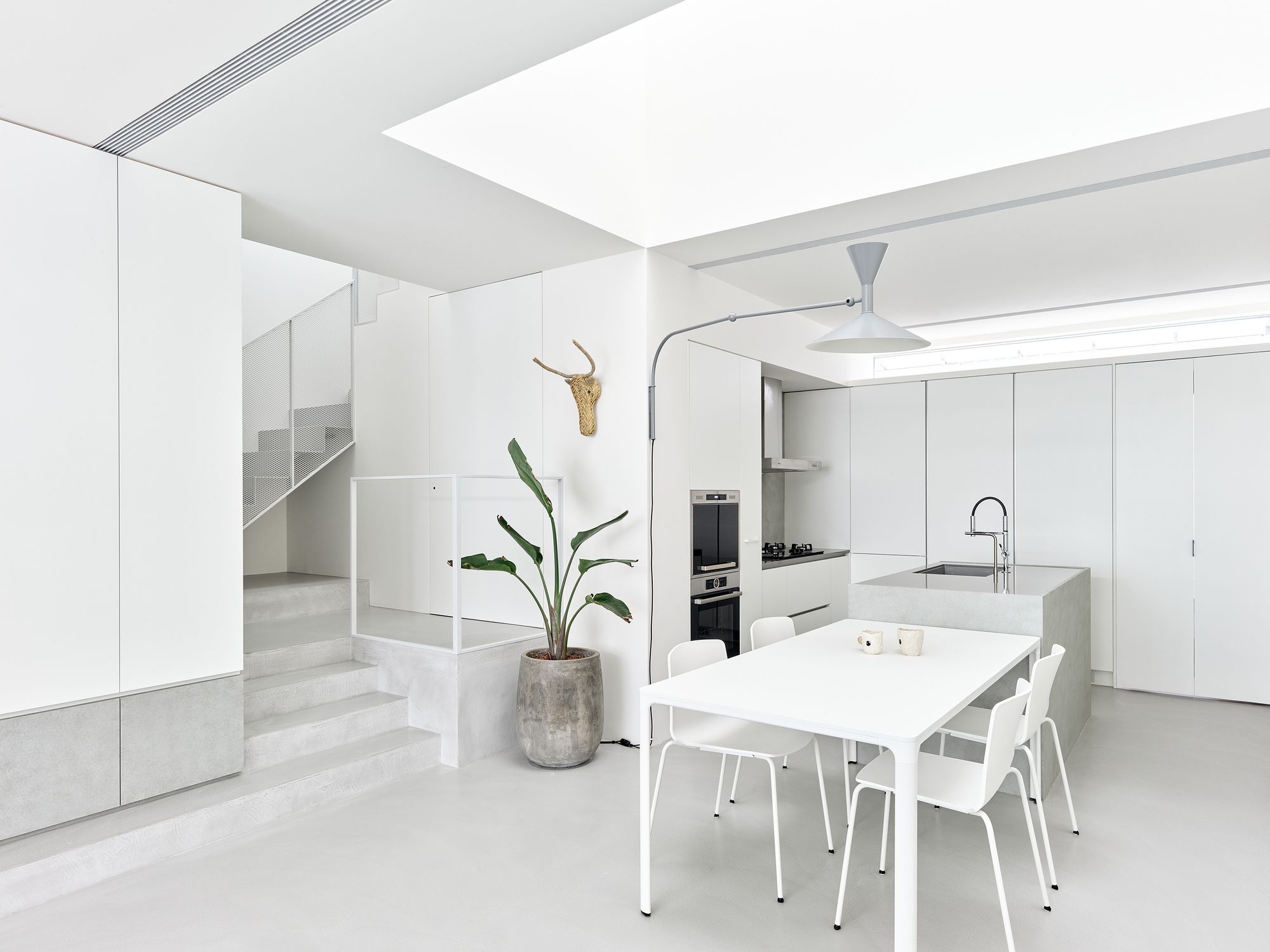
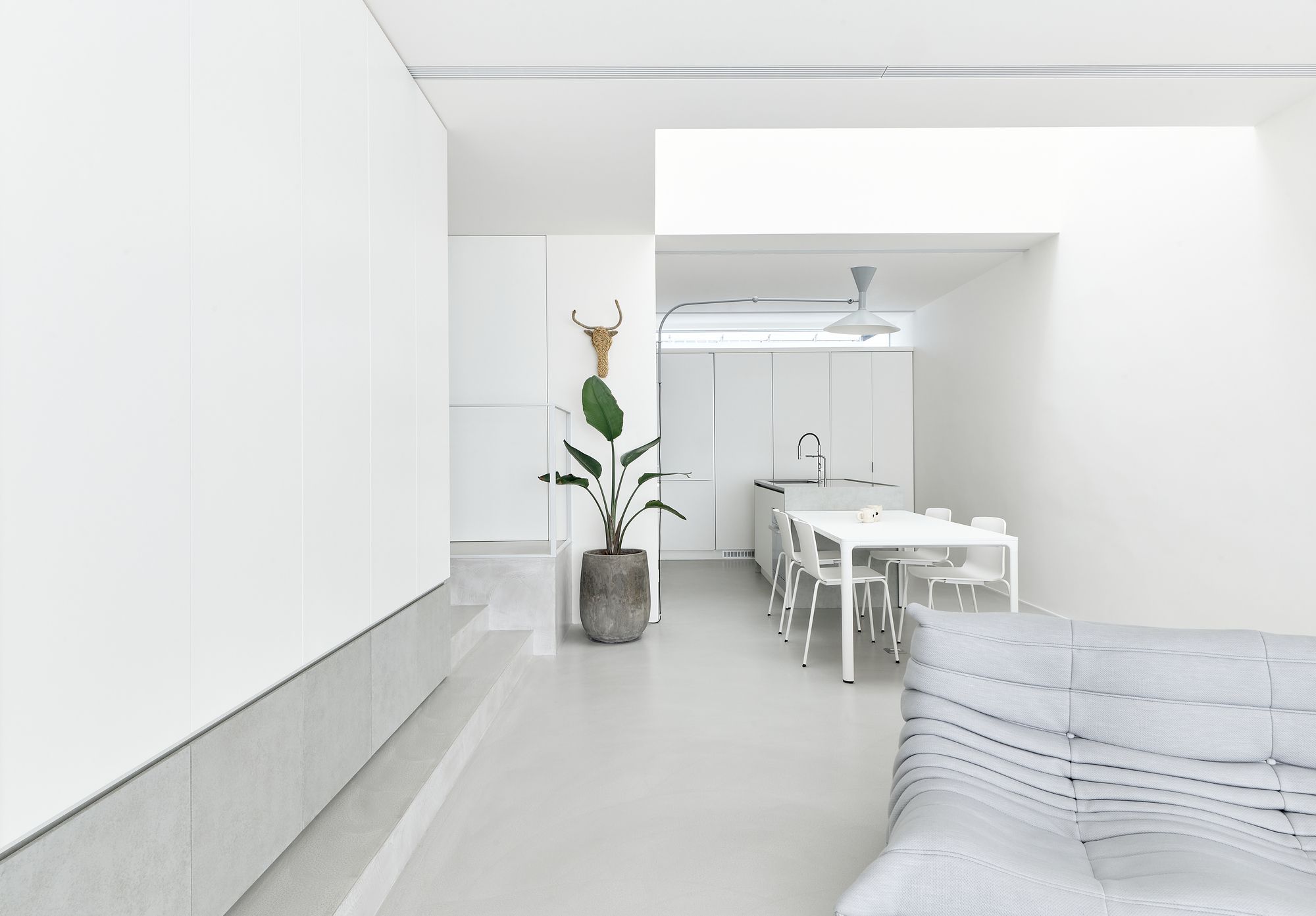
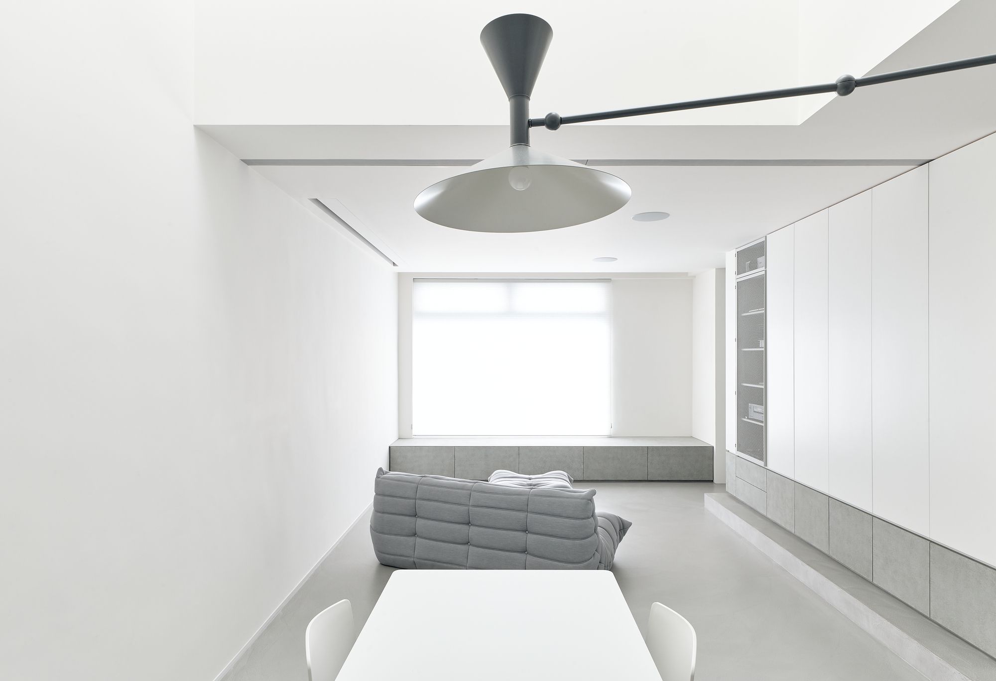
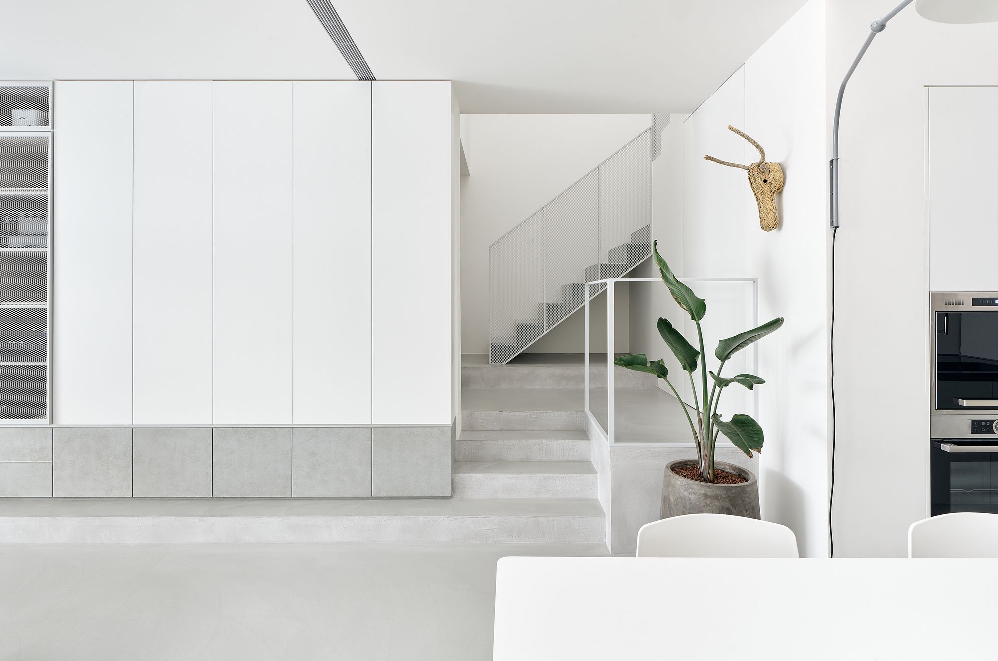
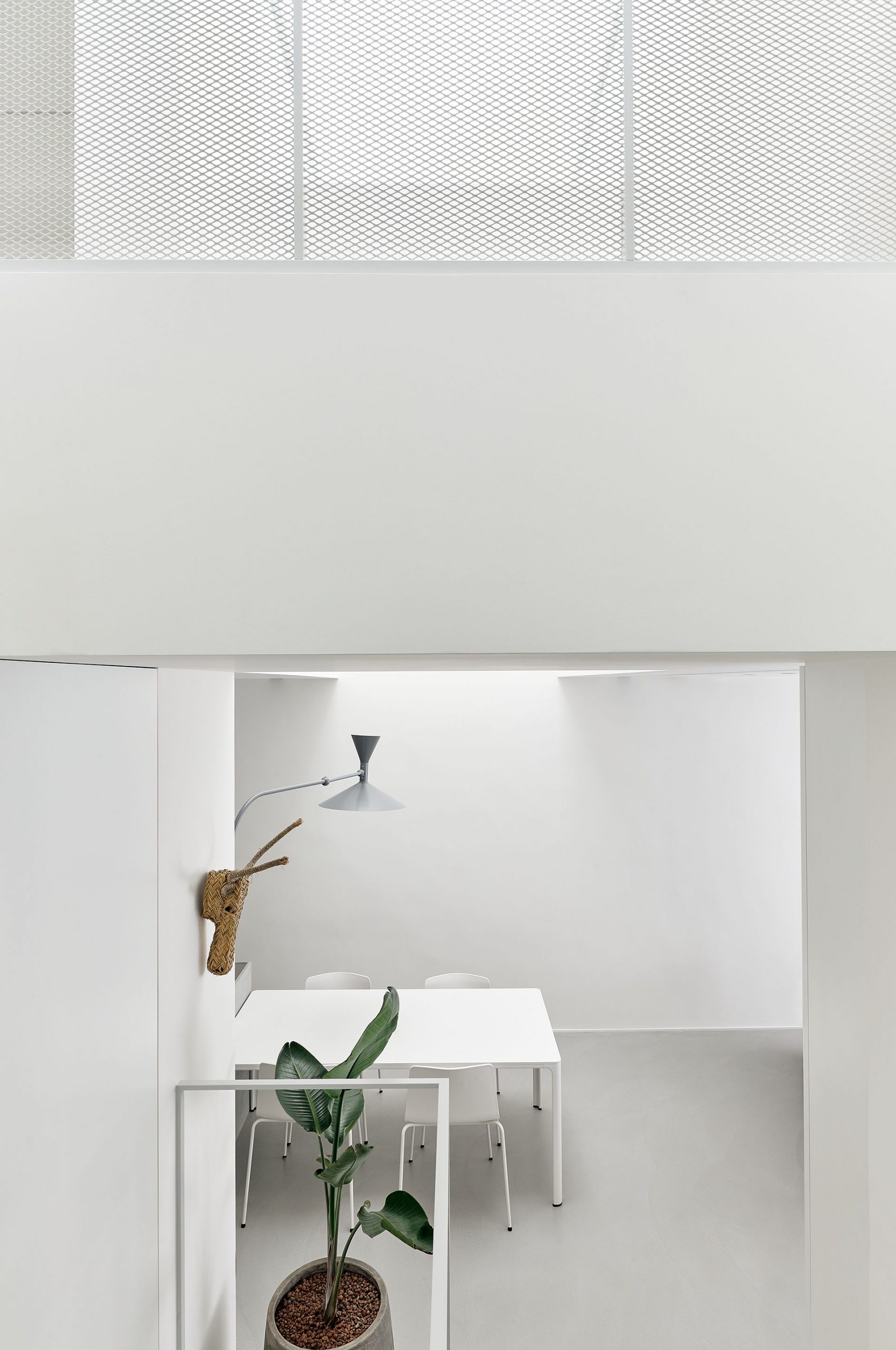
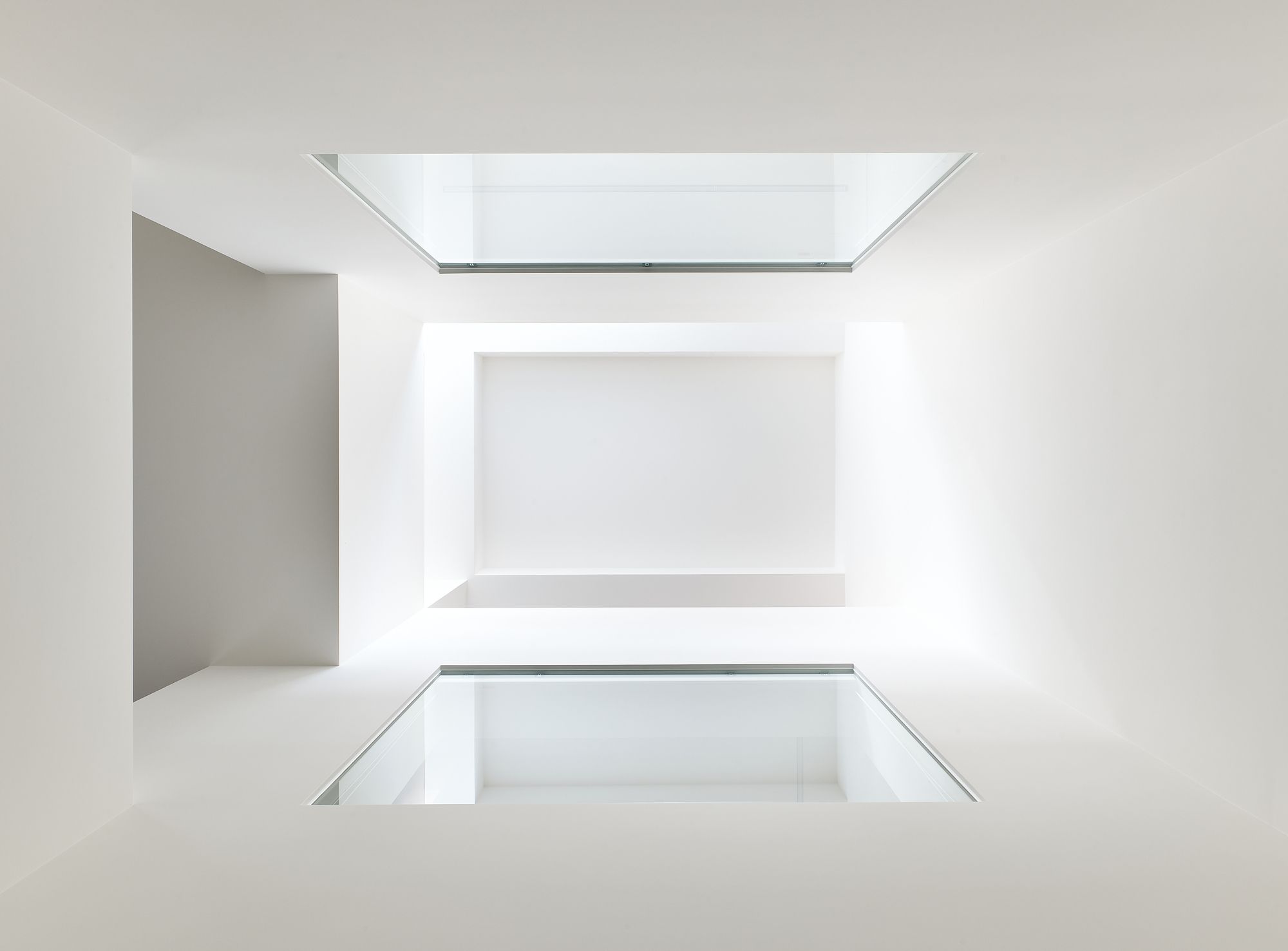
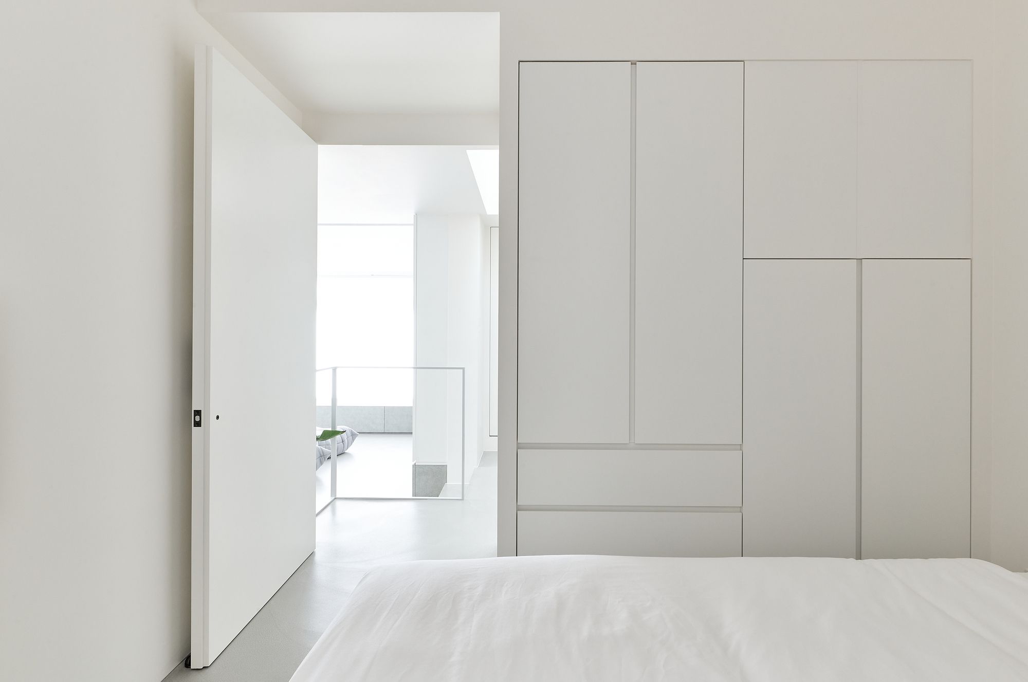
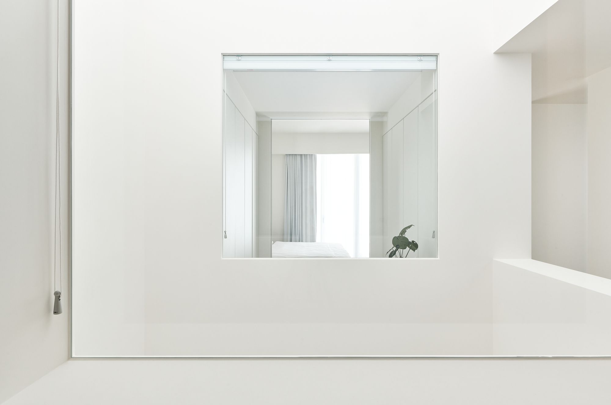
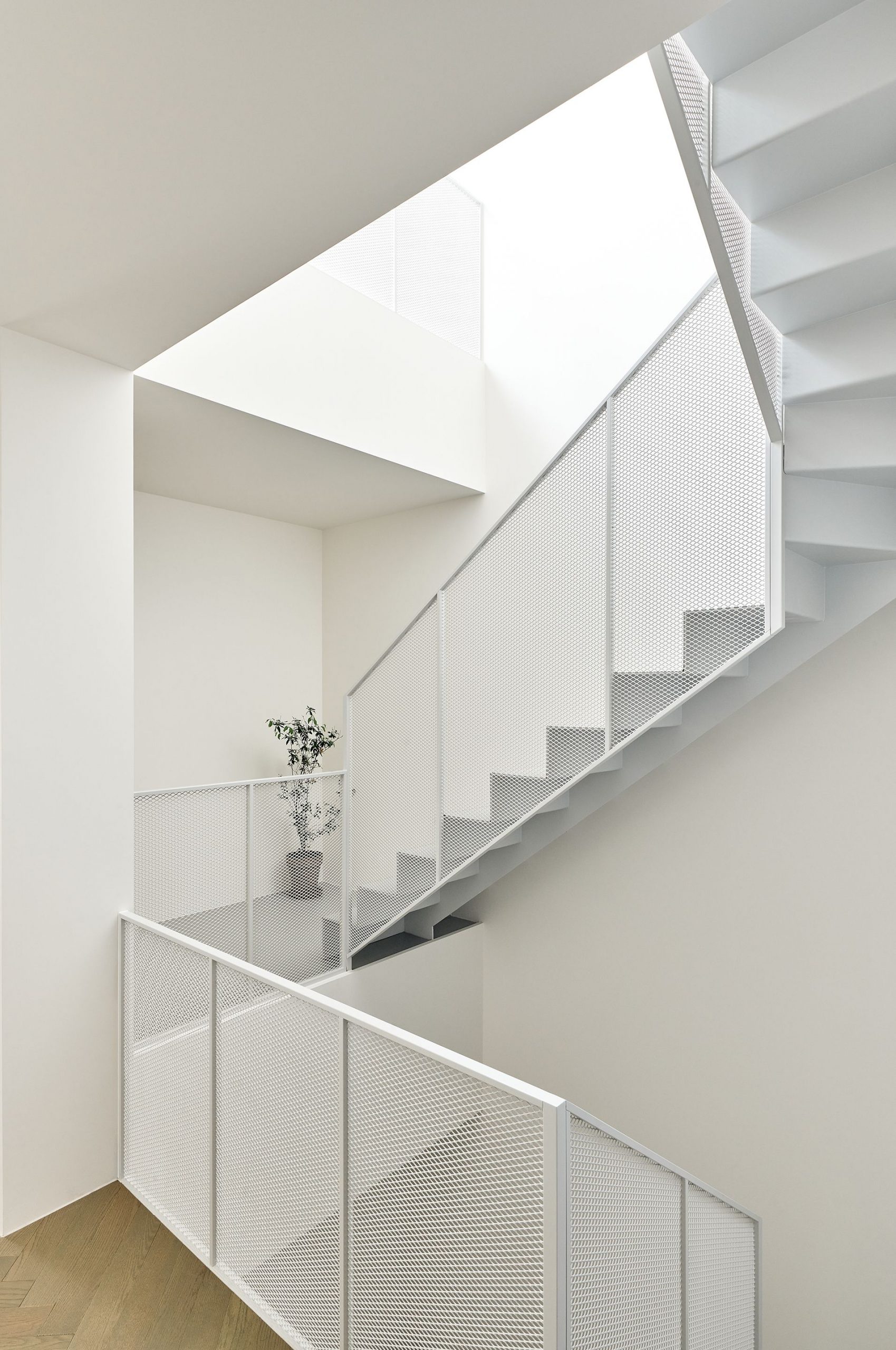
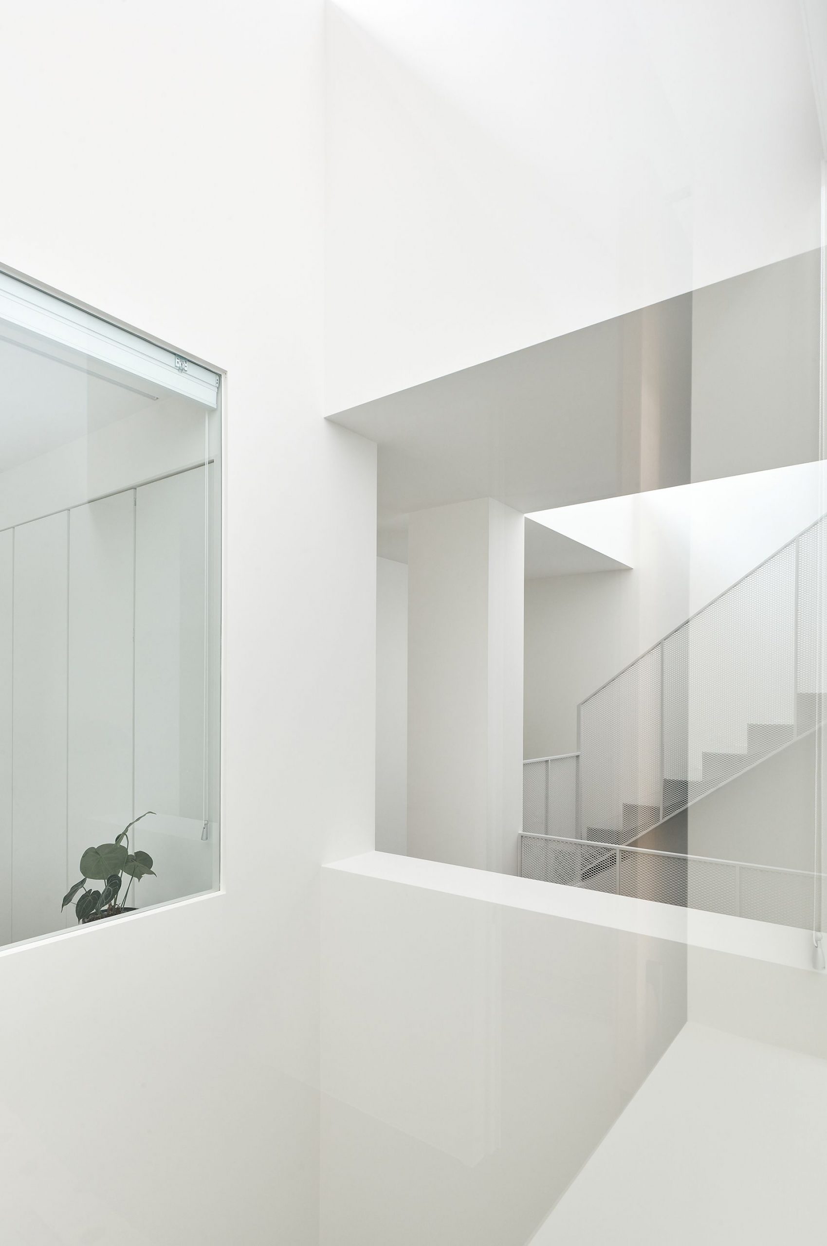
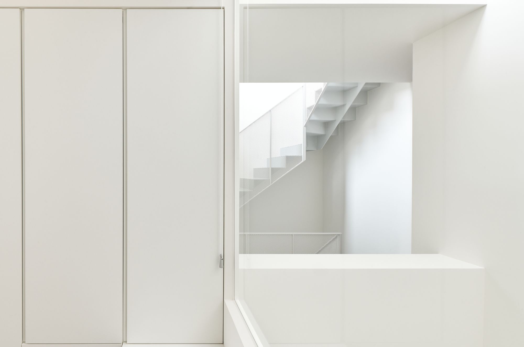
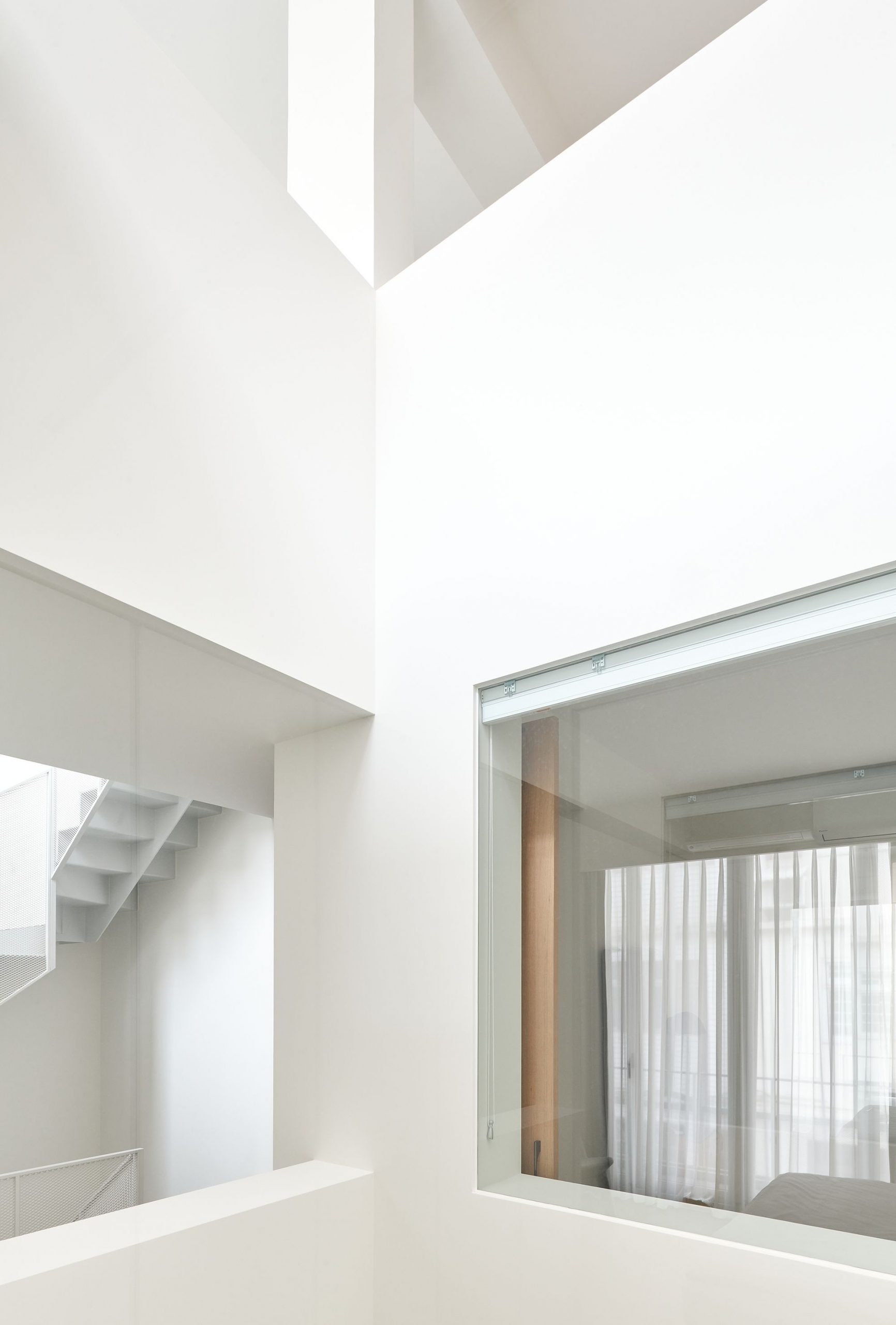
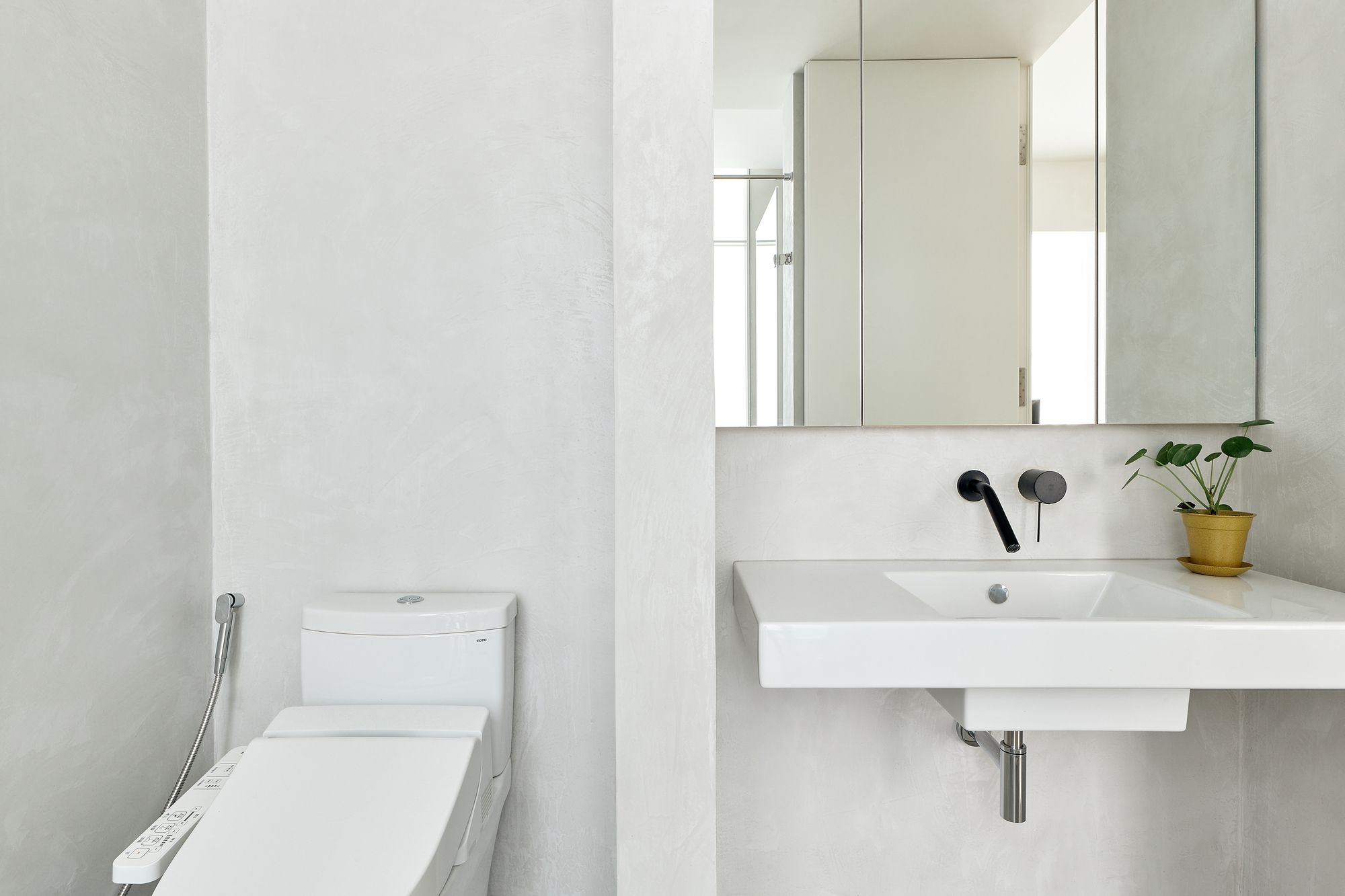
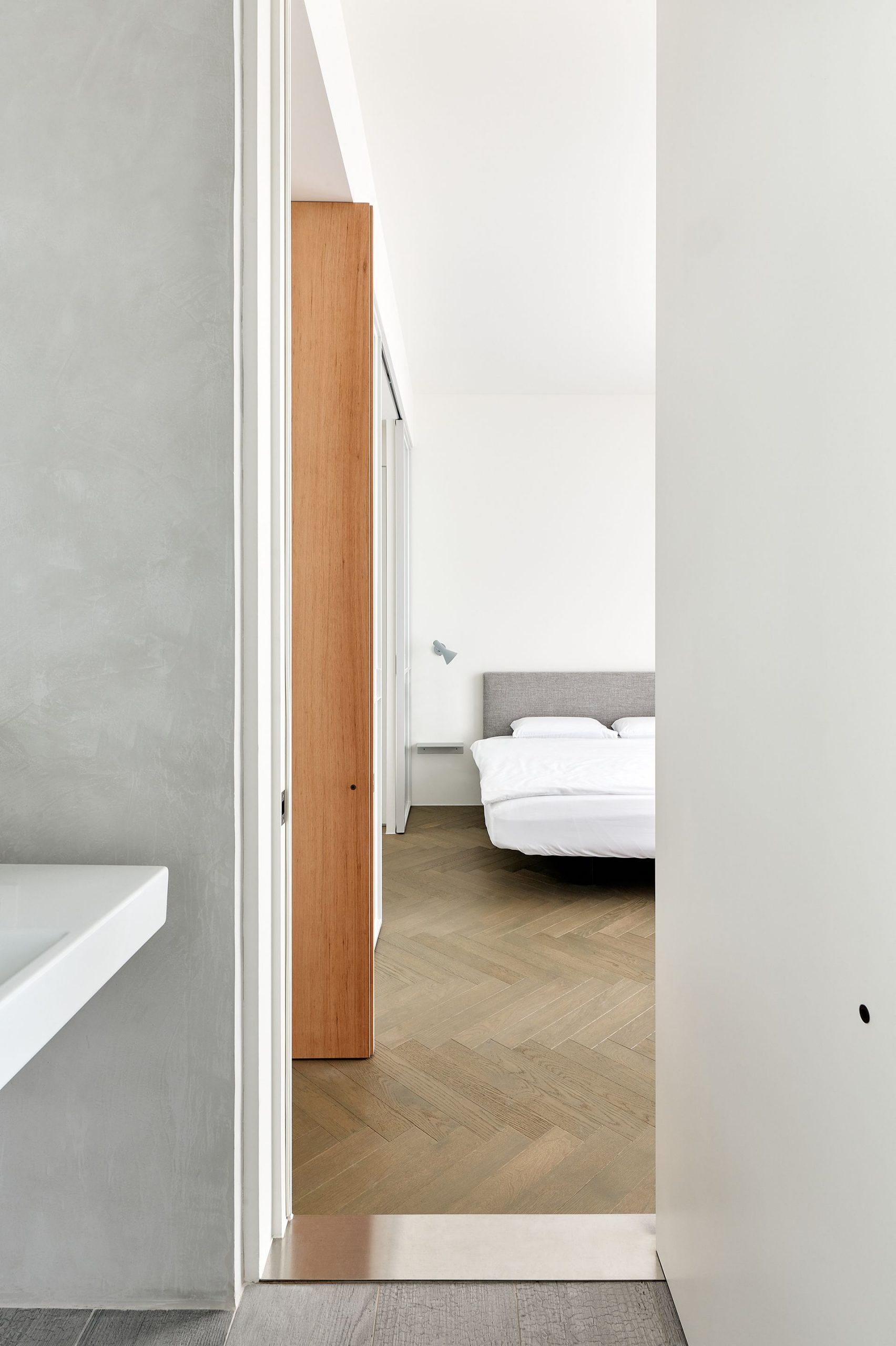
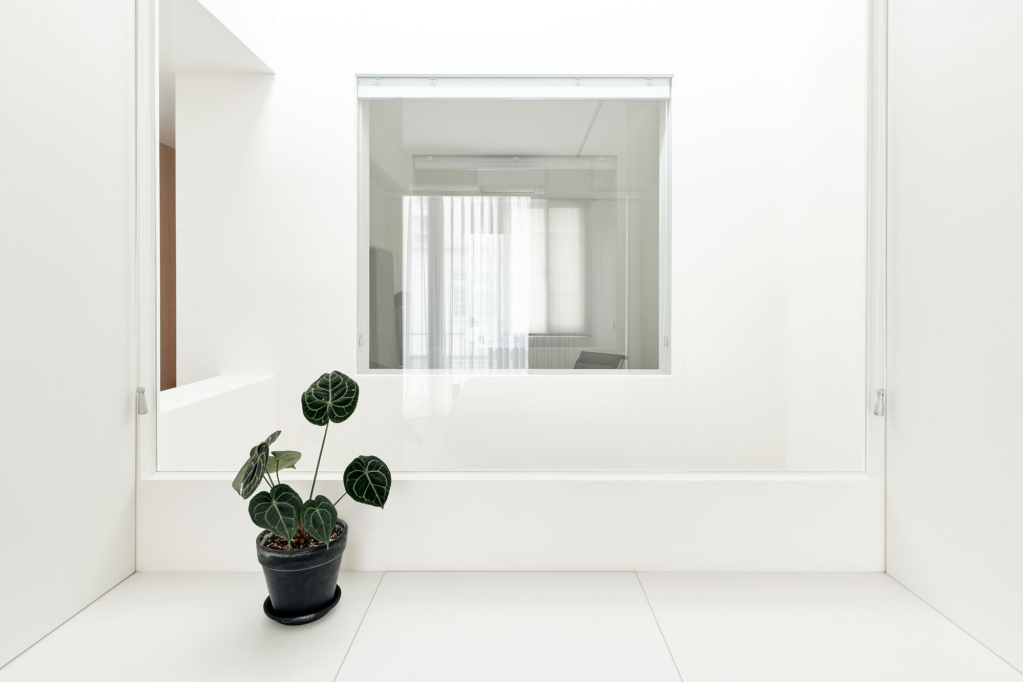
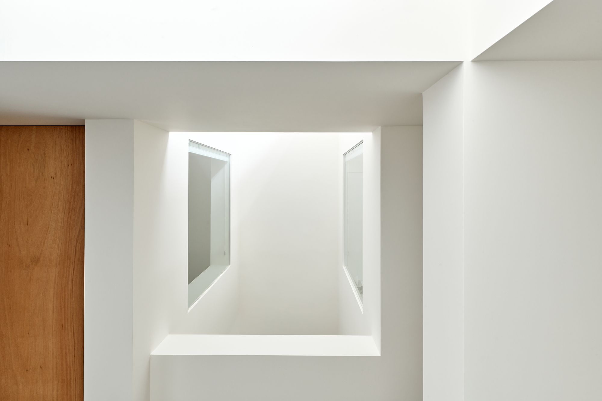
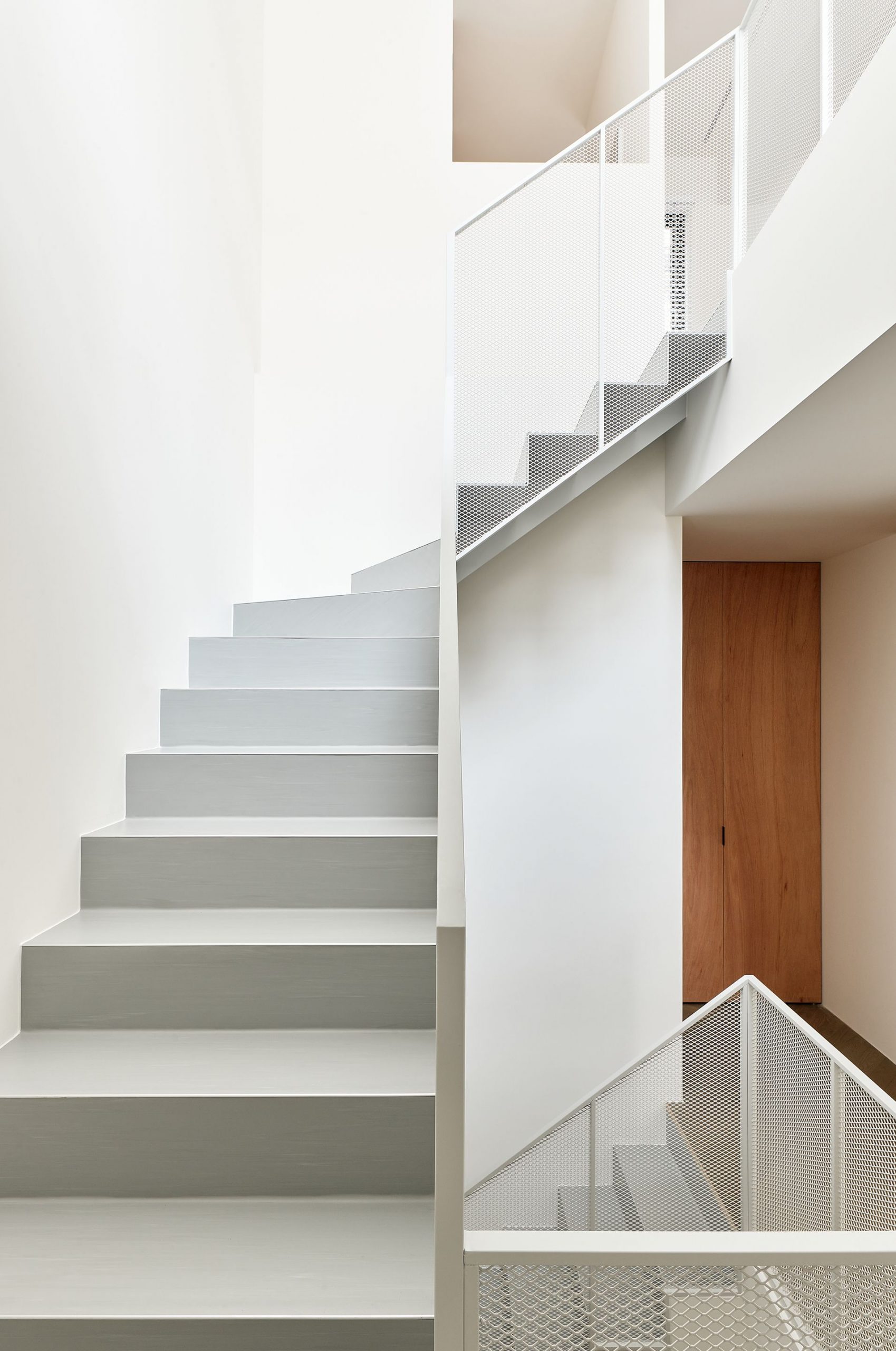
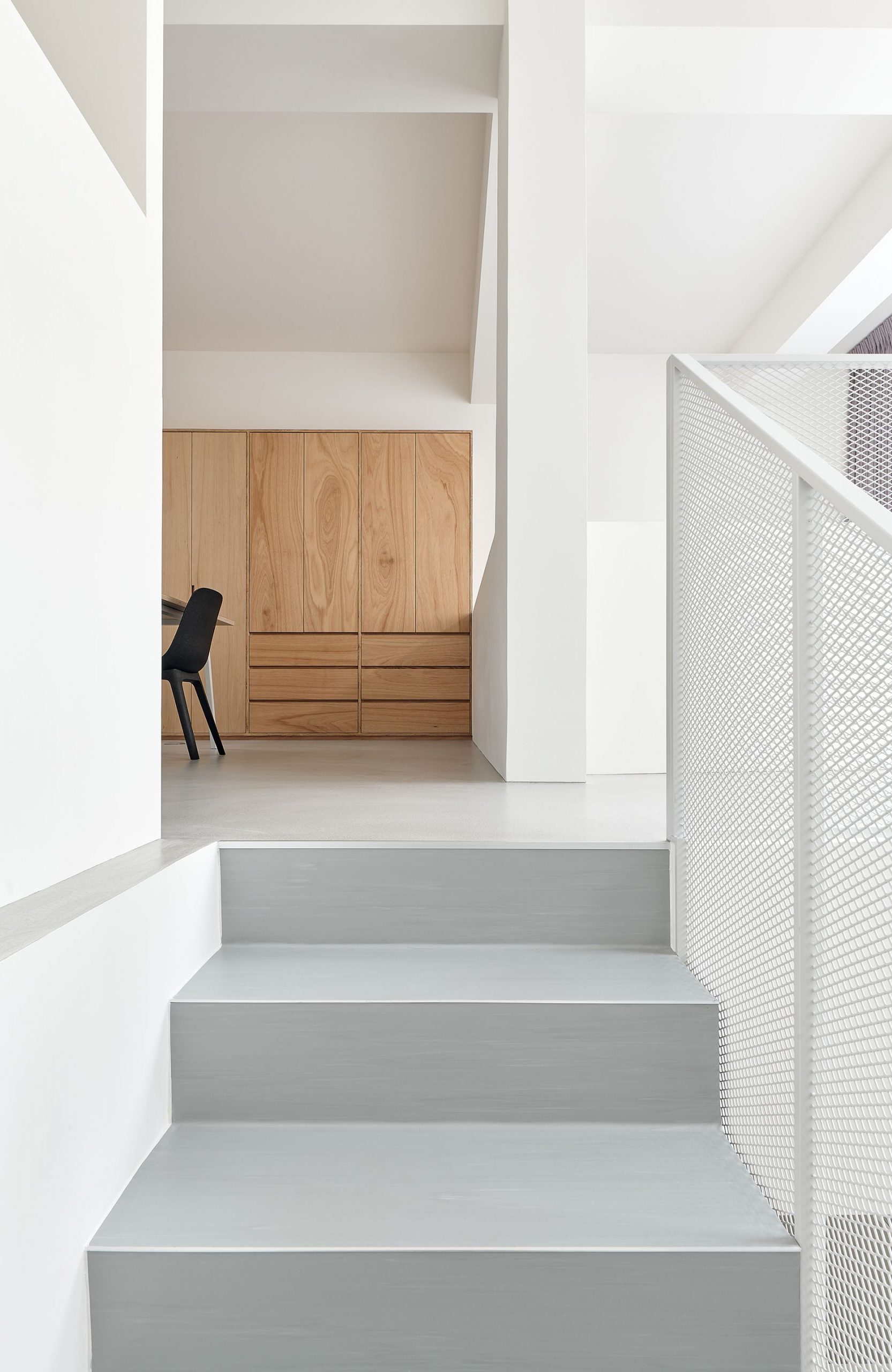
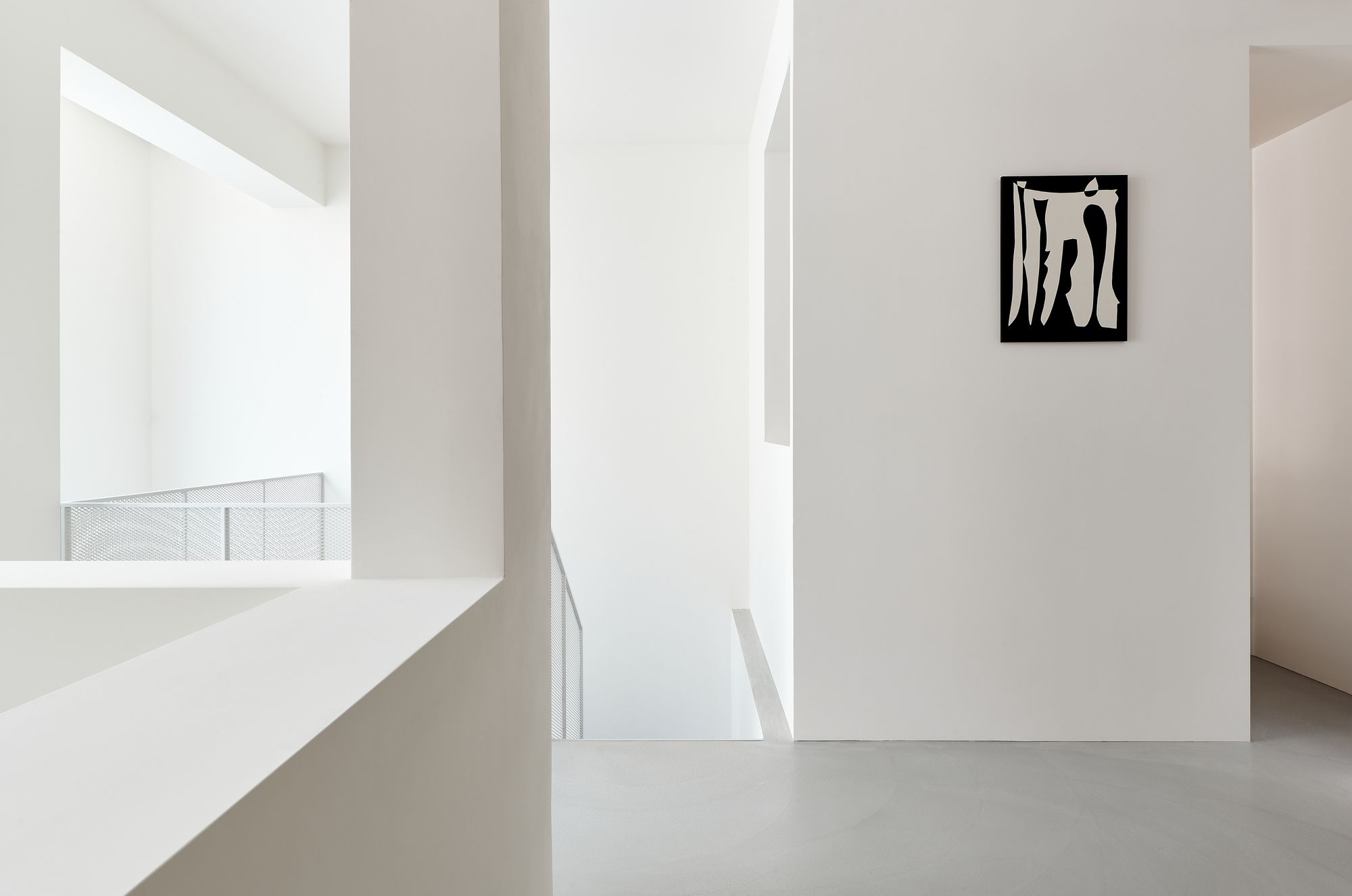
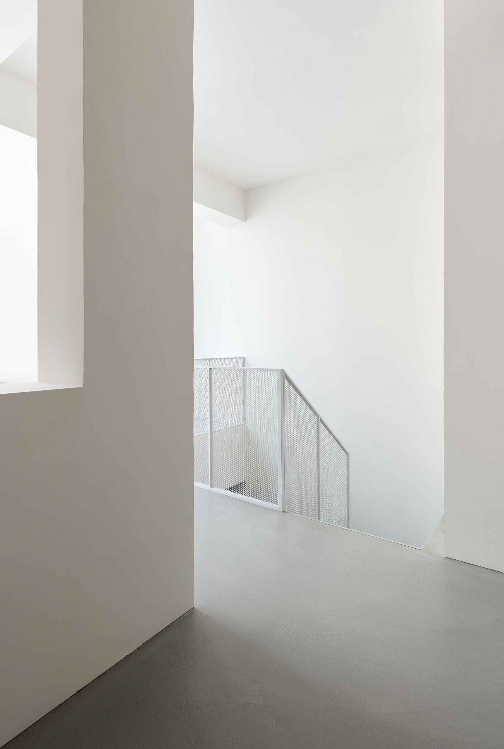
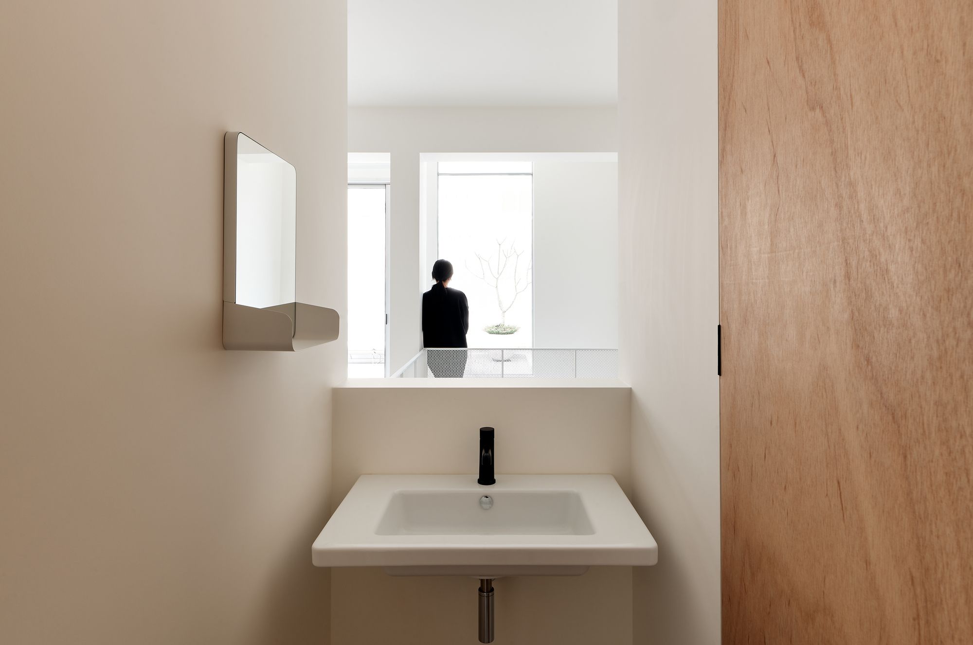
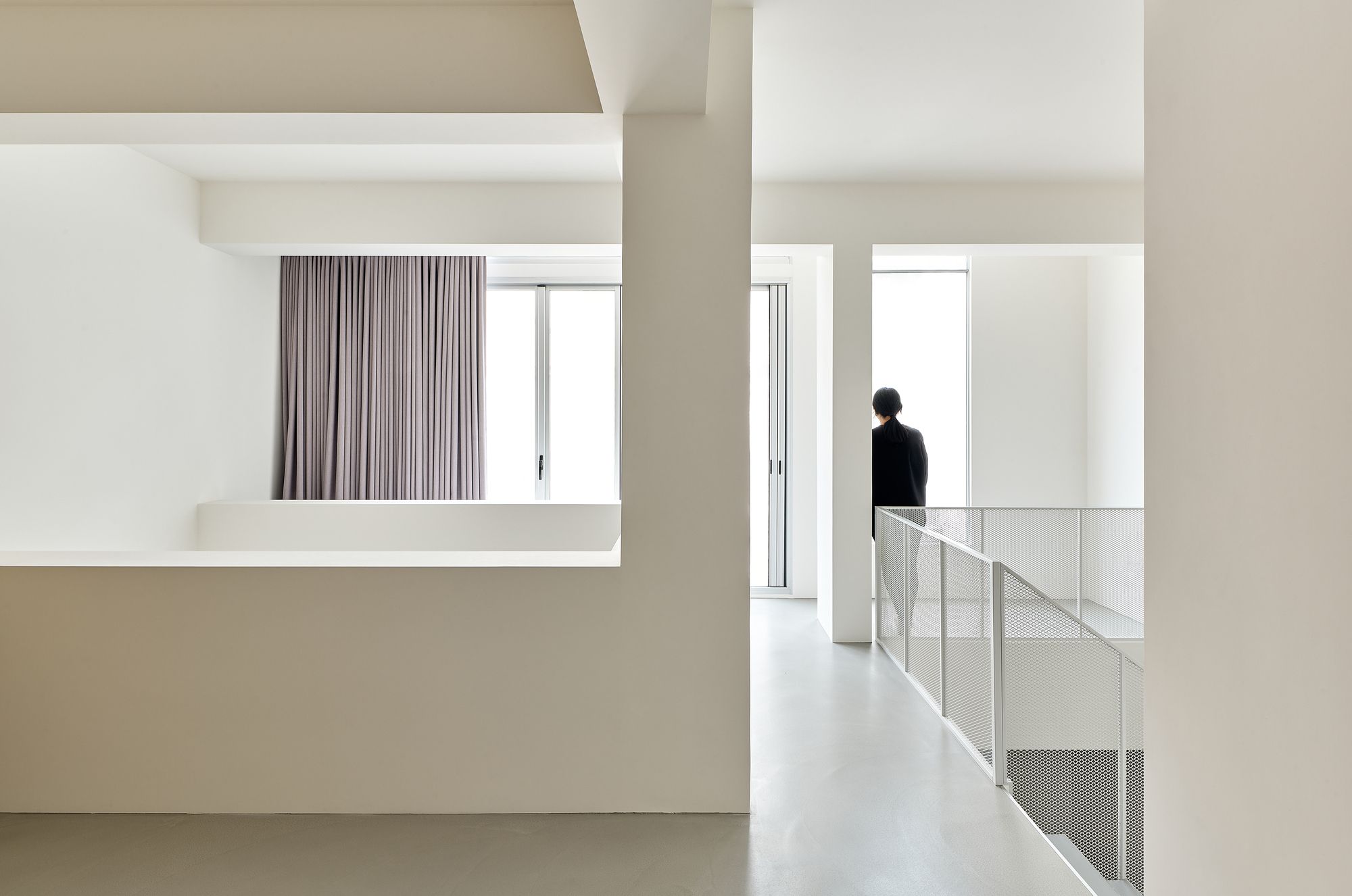
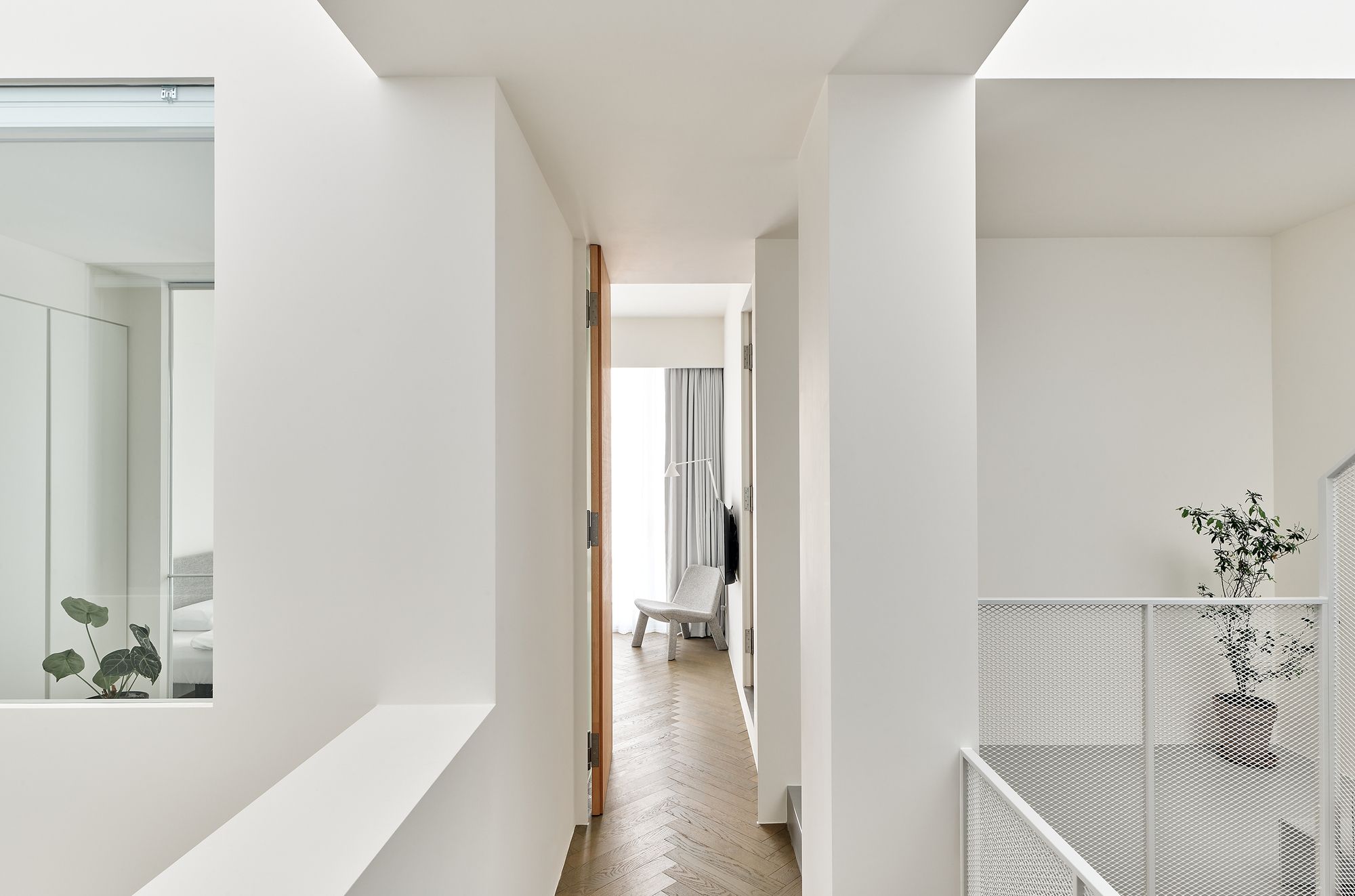
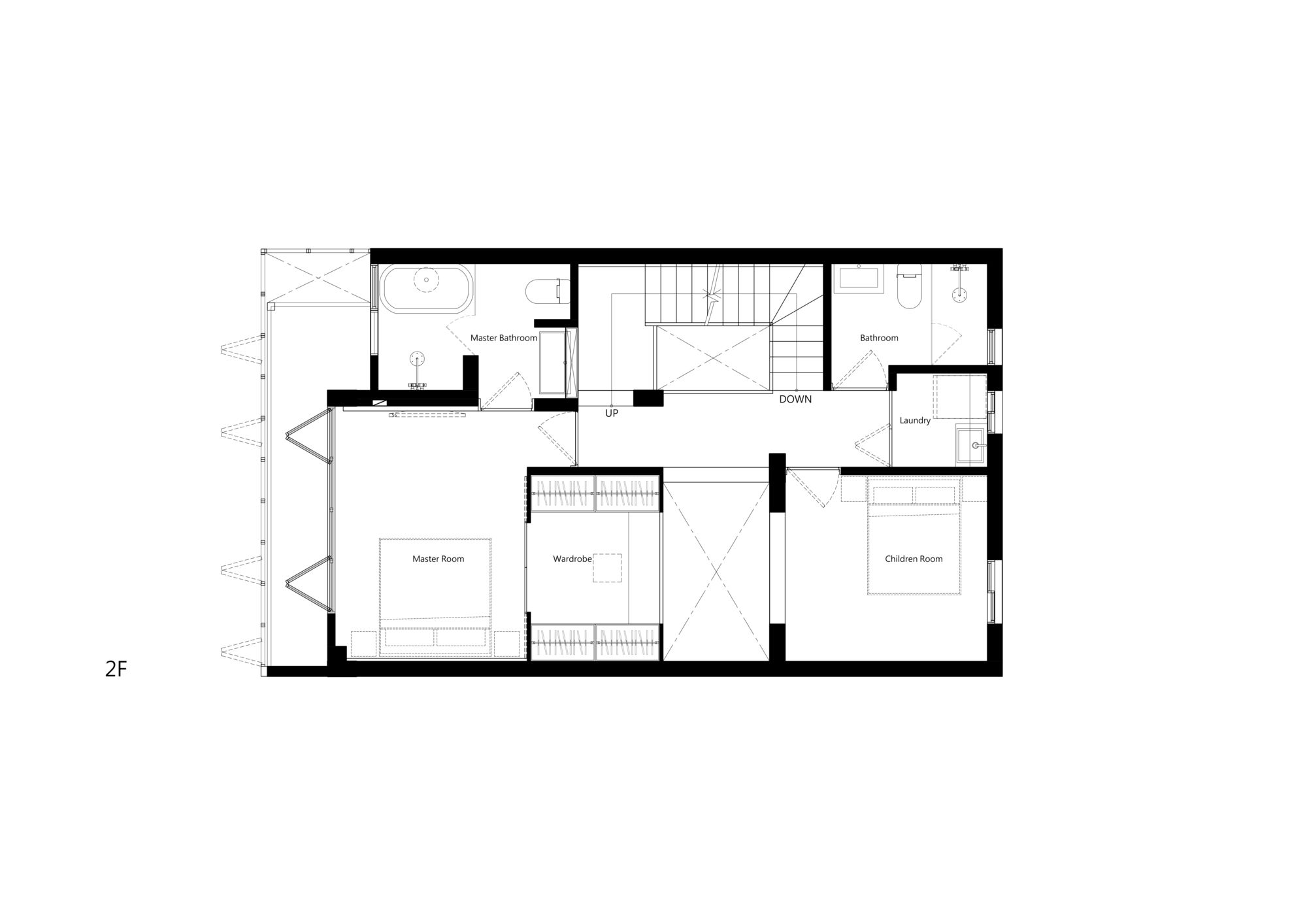
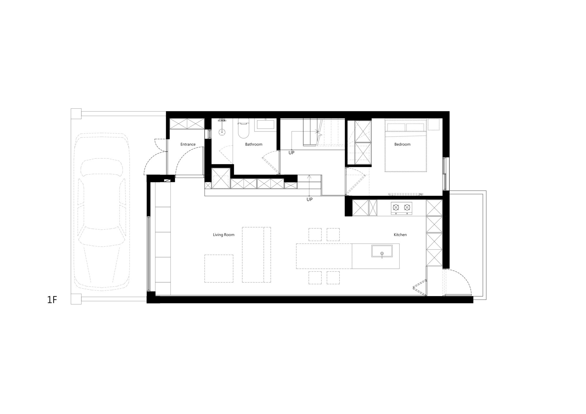
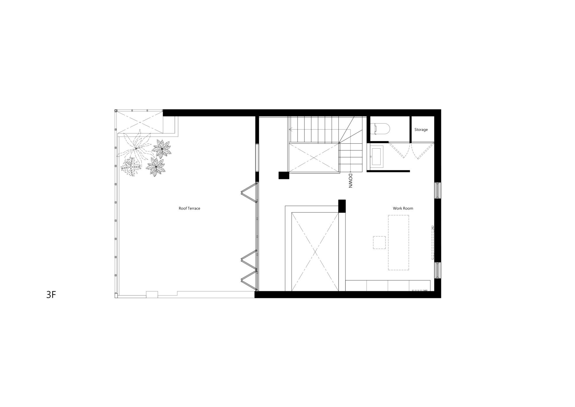
The interior design places the stairs and bathroom on the same side to constitute a service core. The square-shaped staircase produces a small patio on one side of the room, with the stairwell circling inside and light filtering through the areas; the twining of the moving line and light ray creates a Z-axis space that is highly dynamic in the vertical direction. The design of the staircase handrails adopts the material of the building skin used in the exterior facades, and the light and transparent metal mesh make it easier for light to penetrate. Patios are on the other side of the stairs. The design of two patios resolves the problem wherein the traditional terrace houses (tou tian cuo) were only able to receive natural light from the front. For the purpose of allowing more natural light to enter the room and sculpting the spatial texture, we tried to keep the interior layout as simple as possible. A large number of white background walls are used to reflect light, and light grey and white furniture were employed with the intention of reducing the interference of colour on the light.
Project Info:
Architects: 2BOOKS design
Location: Hsinchu,Taiwan (ROC)
Area: 186 m²
Project Year: 2020
Photographs: Millspace&Workpaperpress
Manufacturers: FREDERICIA, Ligne Roset, Nemo

