Good light is something that asks very little. Given the right circumstances, a bare bulb has the potential to outclass the most expensive lamp. And of the many circumstances, geometry is perhaps the most poignant. Geometry of the room; geometry of the shade; geometry of the prism or bulb; geometry of the filament… The list goes on, but they all ultimately come back to the shape of the light or the shape that it fills.
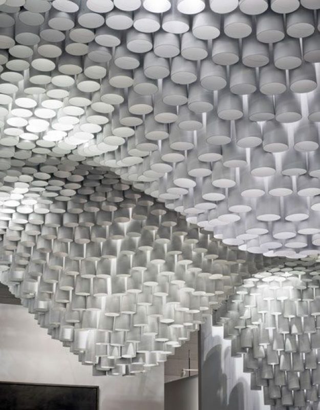
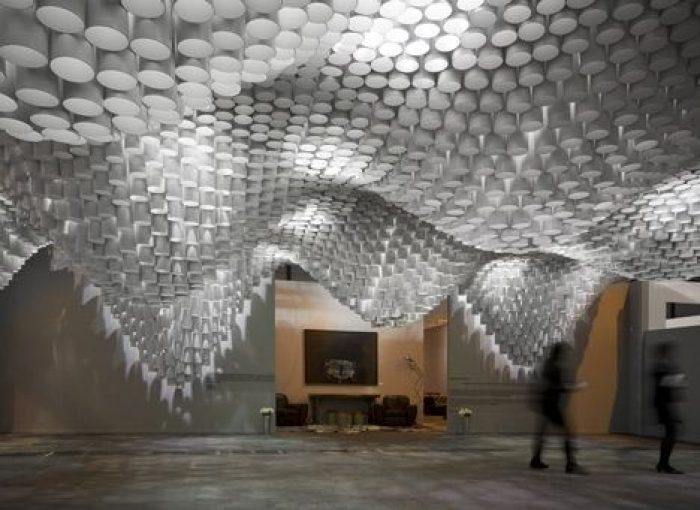
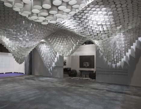
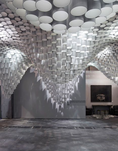
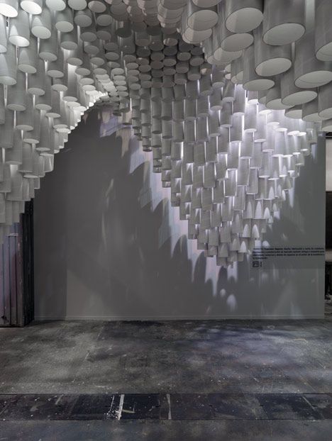
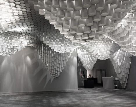
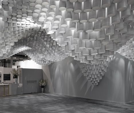
This massive, room-filling paper ‘chandelier’ designed by Cristina Parreño Architecture in cooperation with a team from MIT (James Coleman, Sharon Xu, Koharu Usui, Natthida Wiwatwicha and Hannah Ahlblad), capitalizes on surface geometry. Installed and displayed at the ARCOMadrid art fair in Spain, the light- dazzling in its subtlety, relies not on expensive materials or complex electronics. Instead, hundreds of cardboard/paper tubes are set at differing depths, creating a fluid, swooping topography reminiscent of softened stalactites. The designers describe the fixture, stating that, ‘The light was extremely simple – it was really the geometry of the surface that created the light effect.
Light filters down from above, creating surprising effects of lightness where depth would lead one to expect darkness and vice-versa. The tubes are themselves not longer, instead, the lengths of cables which fix the white paper tubes to the above wire mesh structure are cut at varying lengths. The result, this unique topography.
photography by Luis Asin
photography by Luis Asin
photography by Luis Asin
photography by Luis Asin
photography by Luis Asin
photography by Luis Asin
photography by Luis Asin


