PARKROYAL on Pickering
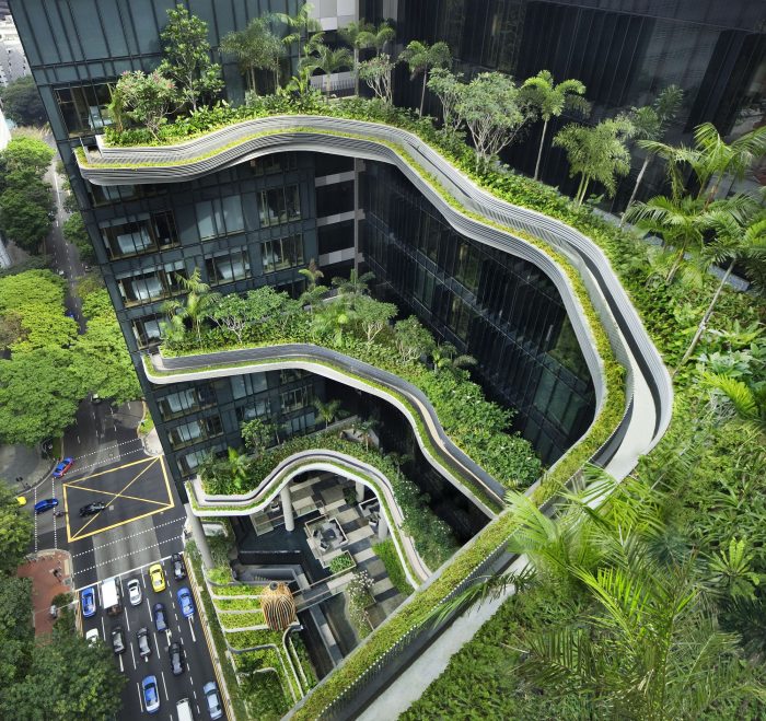
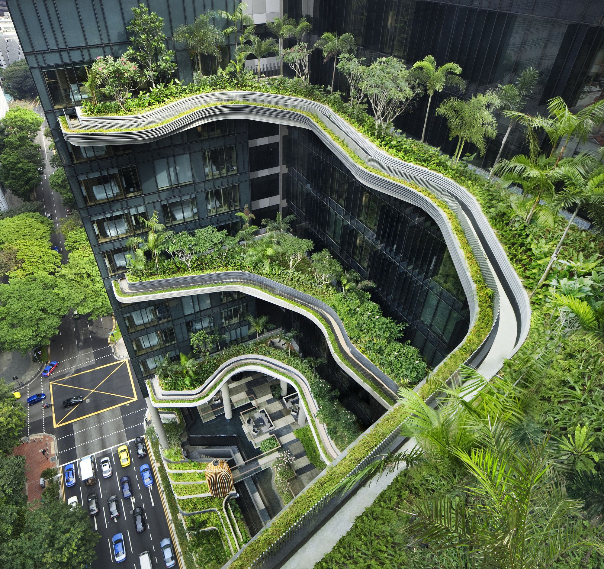
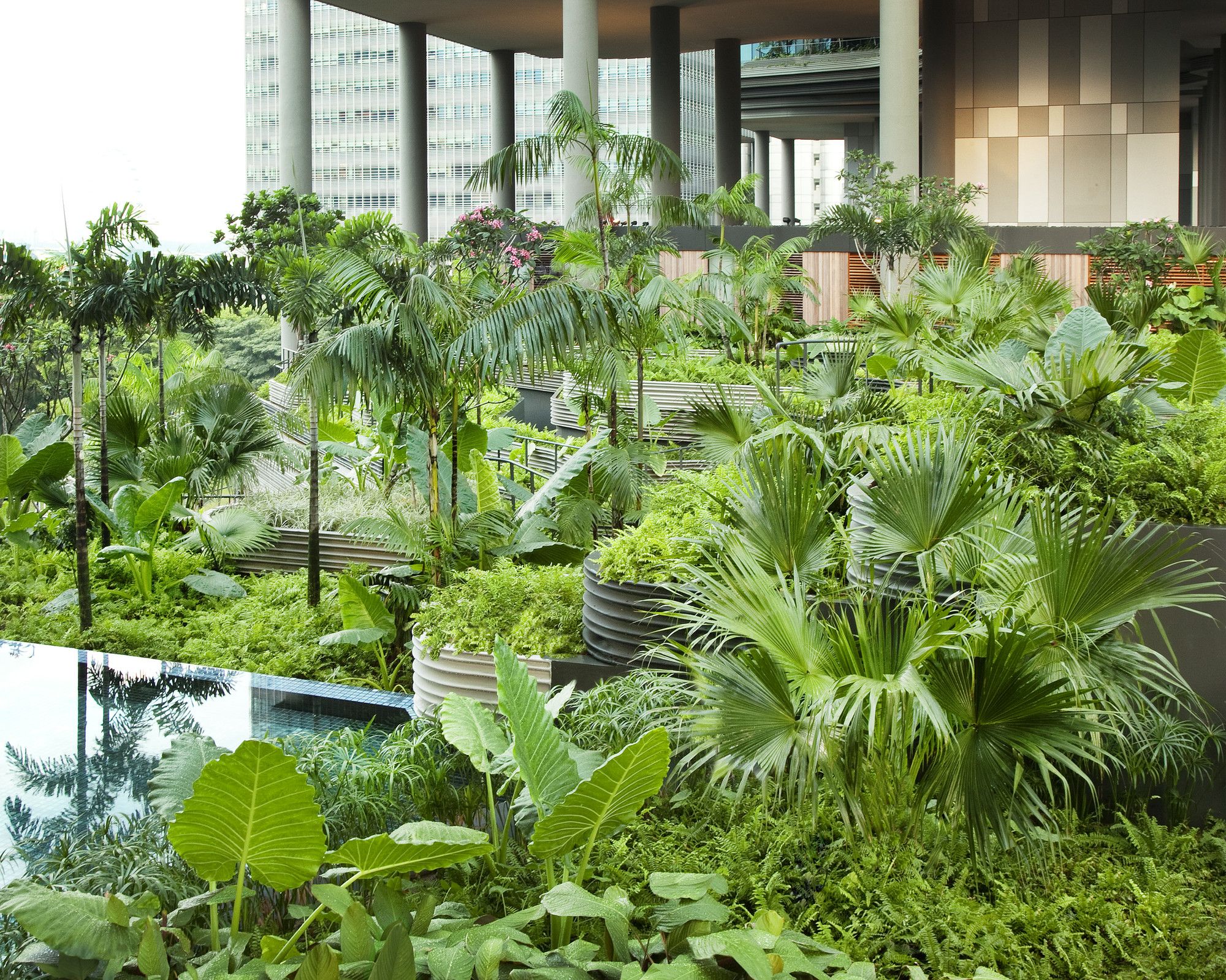
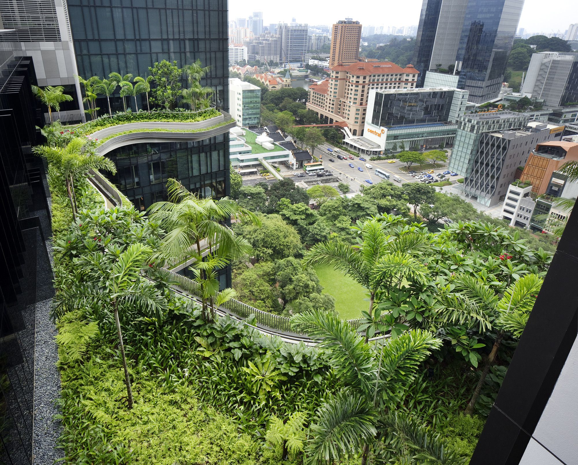
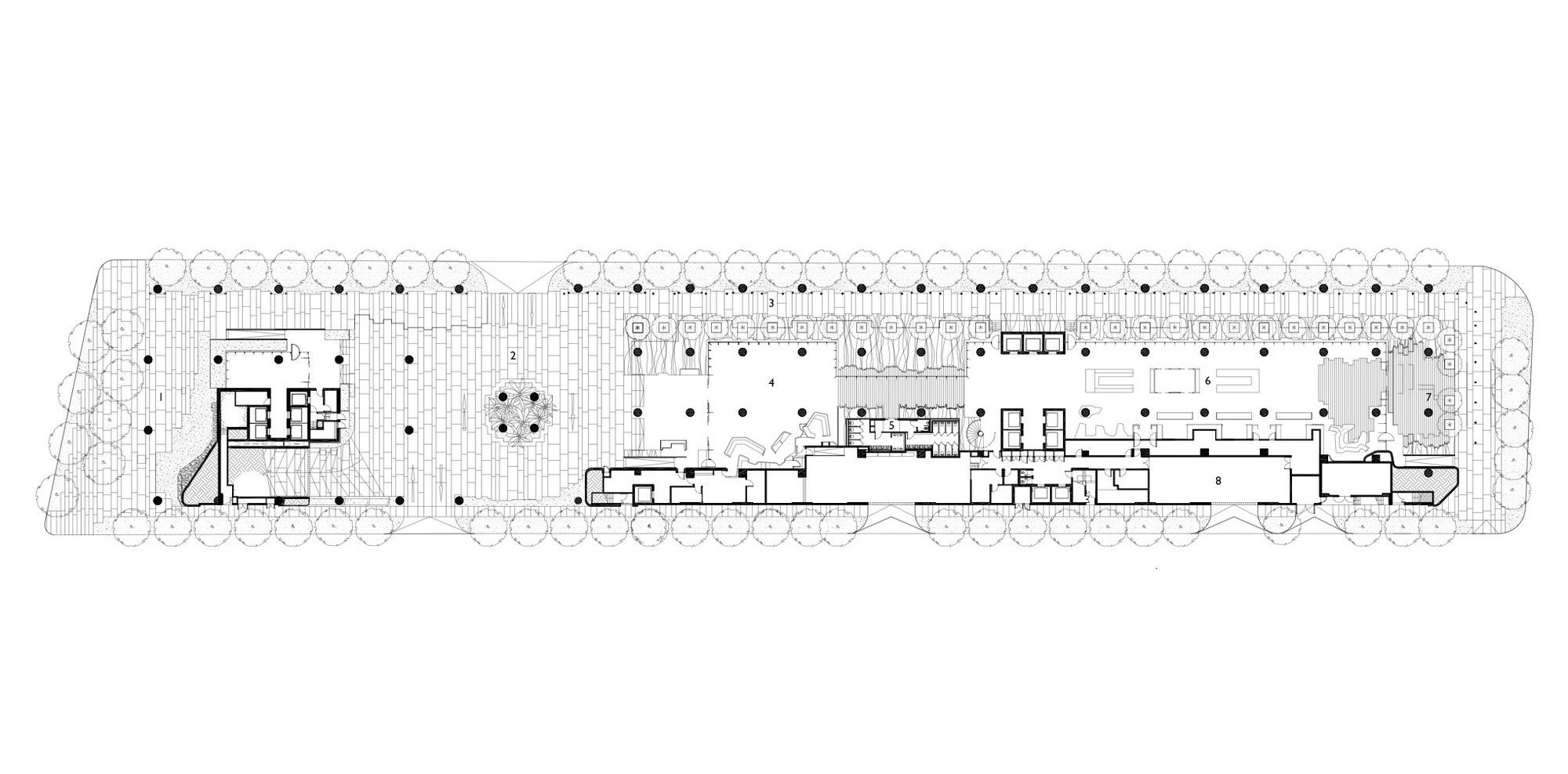
The PARKROYAL on Pickering is a new type of architecture for the city of Singapore. Designed by WOHA, itself based in the city, its conception works off of a principle of the ‘ultimate green city’. The architects define this as a city containing more vegetation than if it had simply been left to wilderness. PARKROYAL lives up to this goal, nearly doubling the vegetation possible if the site were to have been left flat.
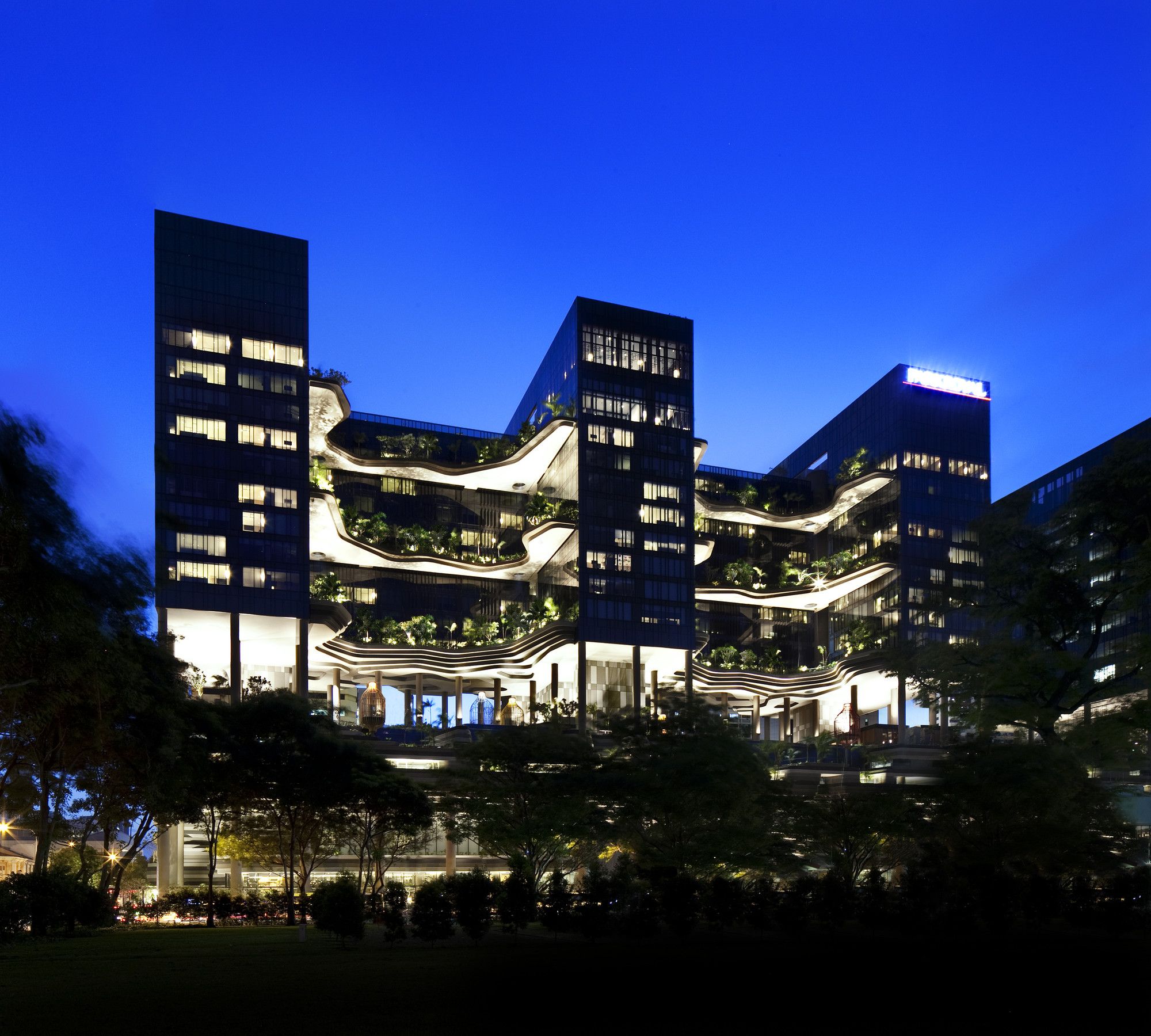
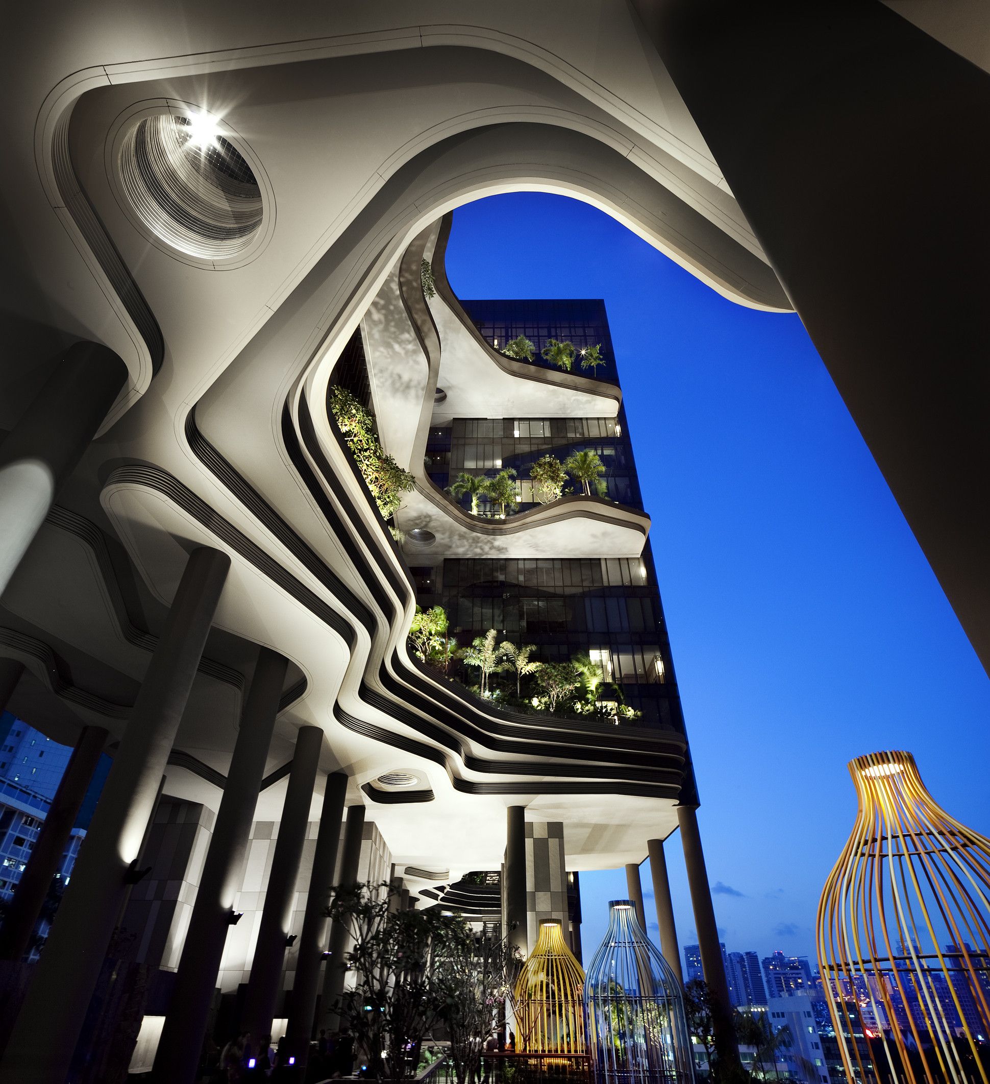
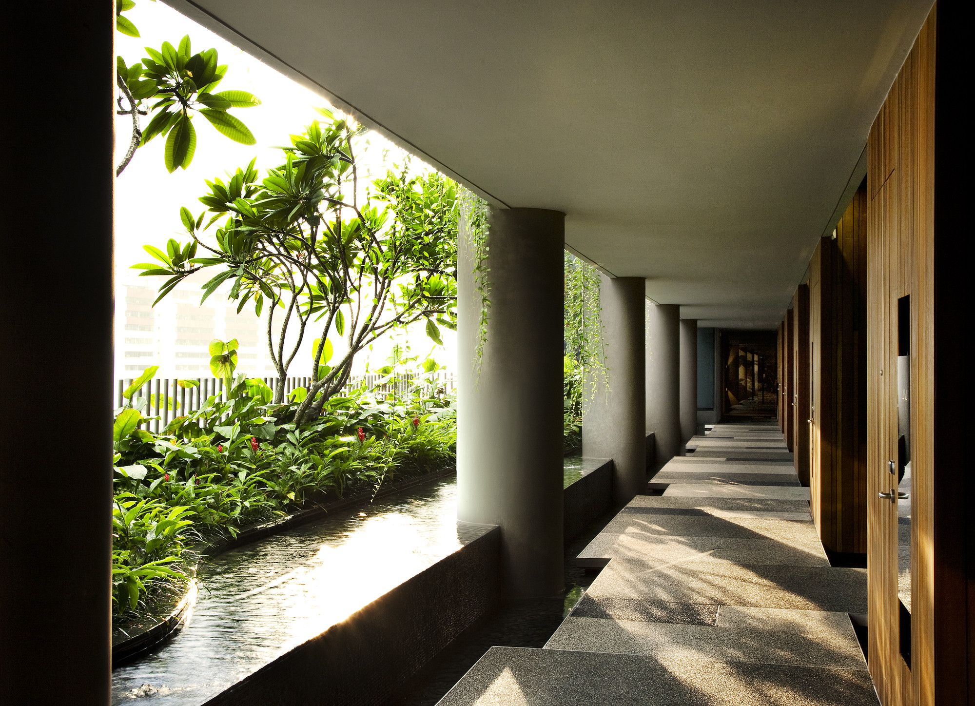
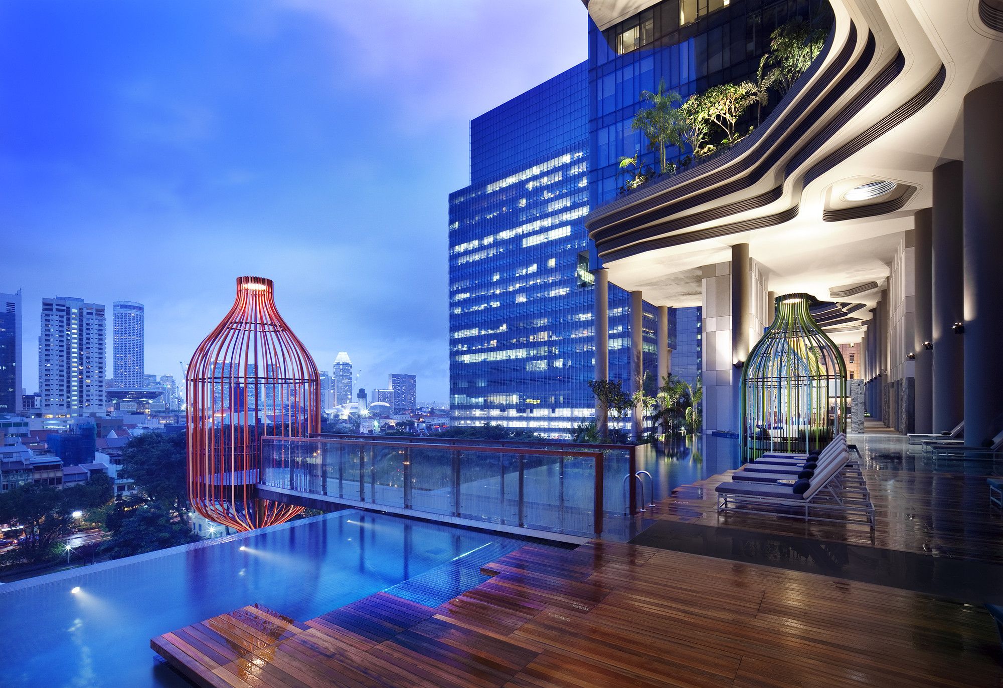
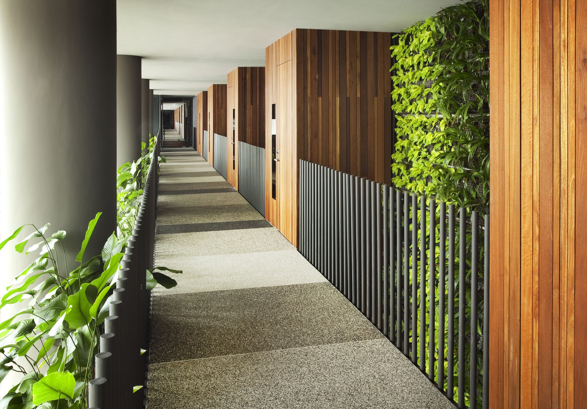
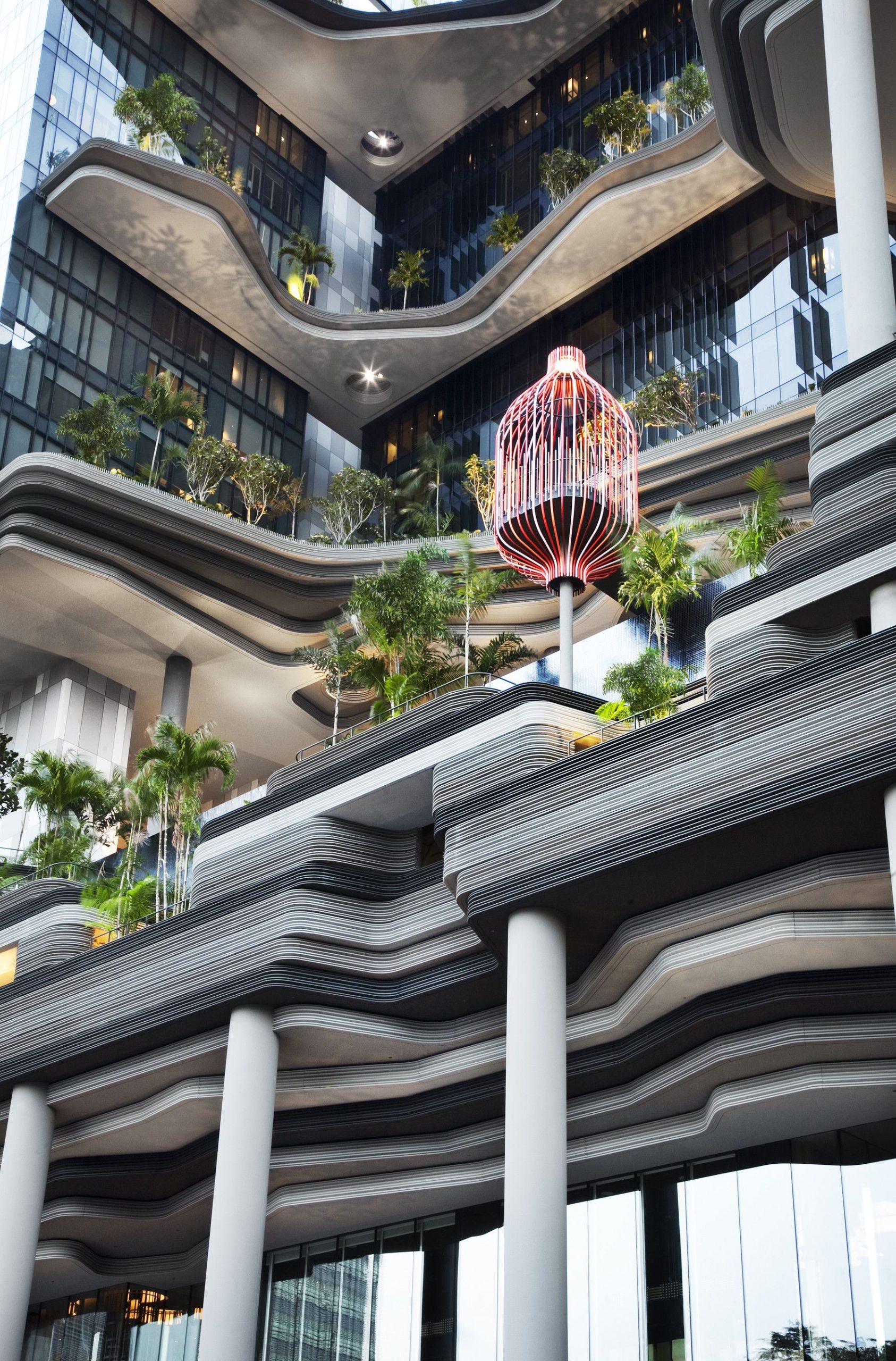
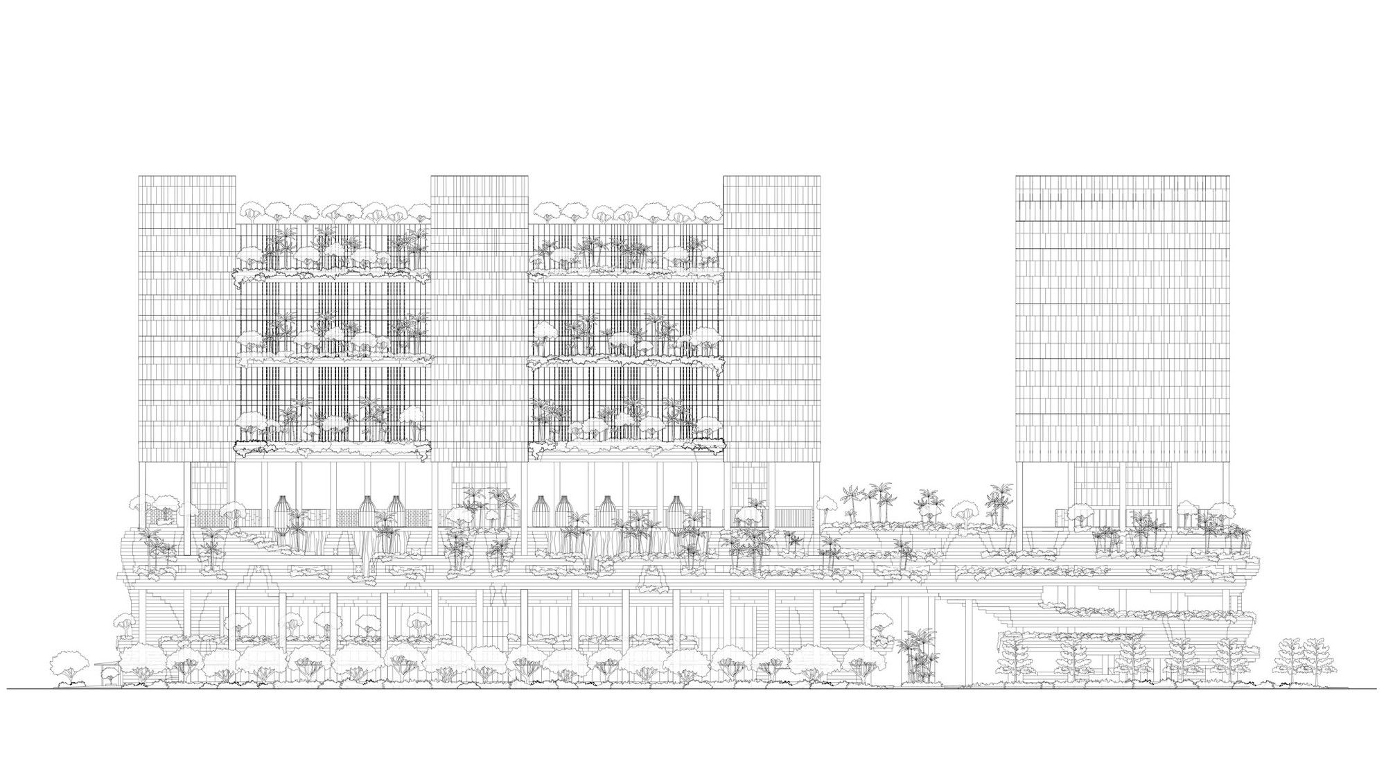
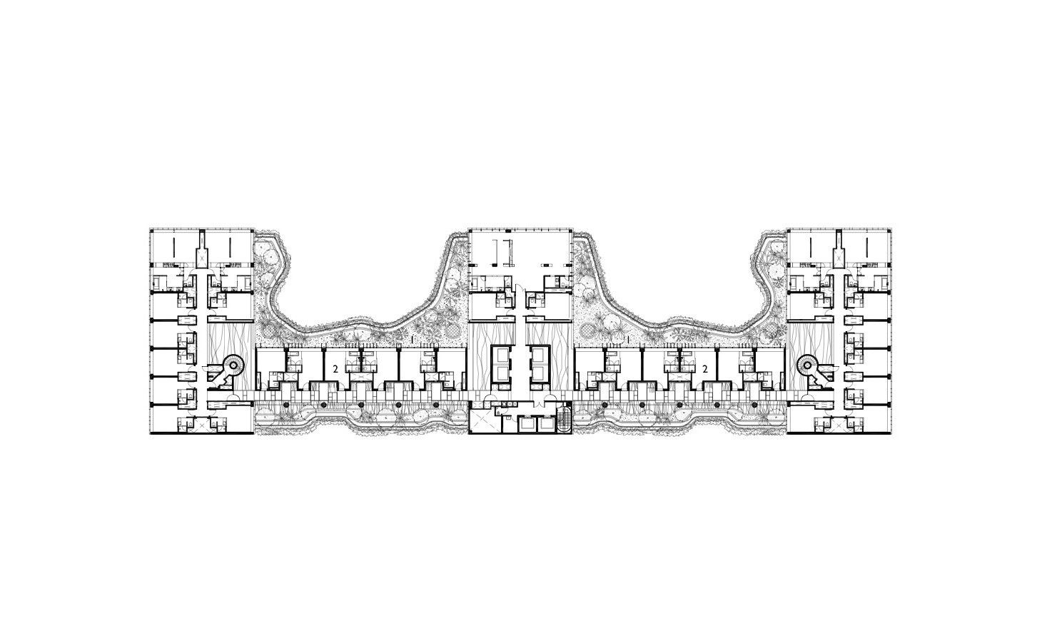
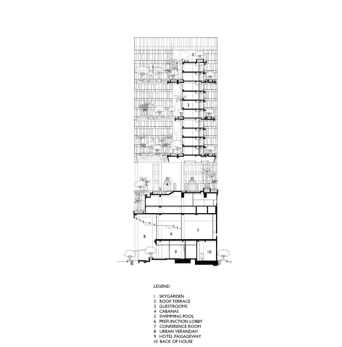
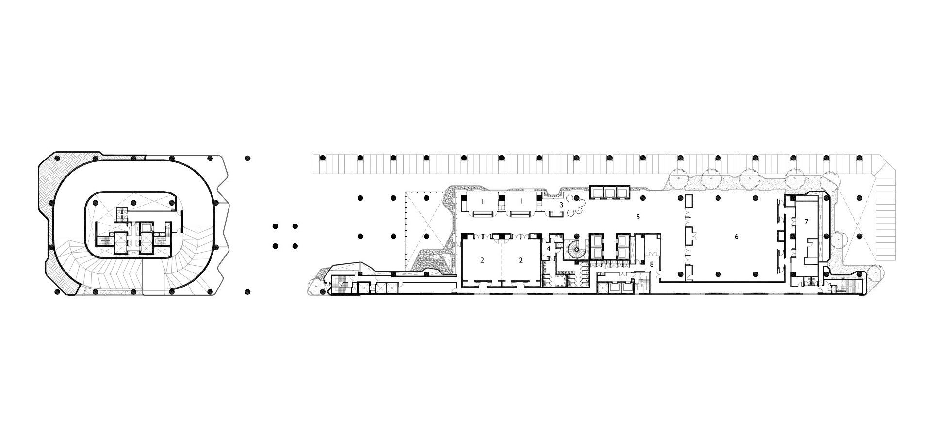
The business hotel is set out along an E-shaped plan composed of an intriguing counterpoint between the realm of the rectilinear and that of the… something else. Canopies and balconies span between the cut-outs of the E, following curvilinear lines that have been faceted, drawing the two motifs closer together formally. These balconies locate every fourth floor and are host to plantings ranging from small fauna, to tropical plants and palm trees. In the world of architectural renderings rife with drawn-in trees, it is agreeable to see a building which follows through and actually includes them when trowel meets budget.
Photography by © Patrick Bingham Hall
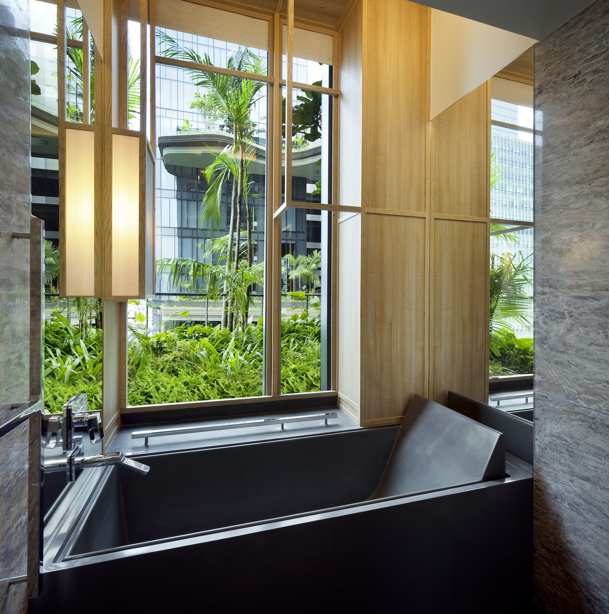
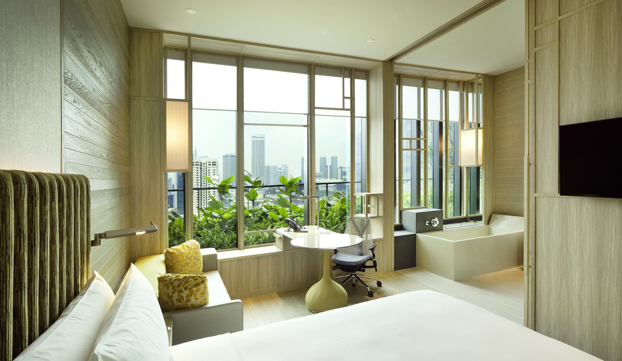
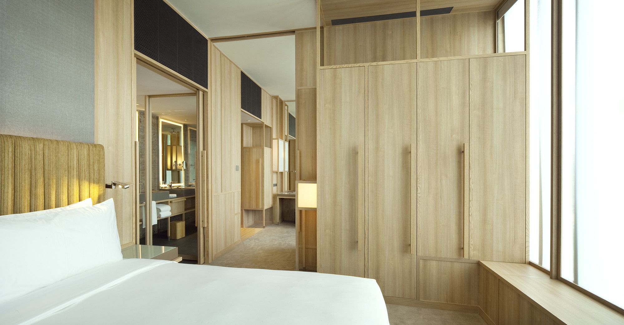
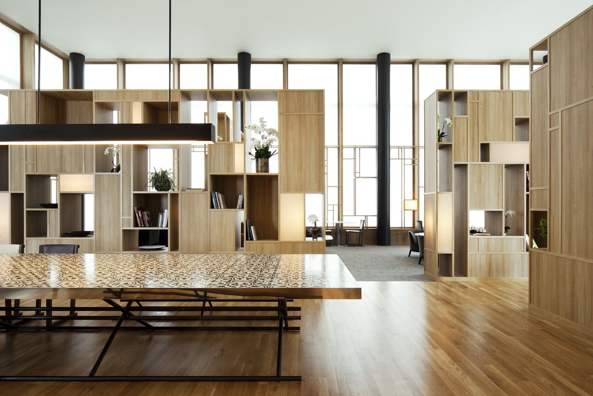
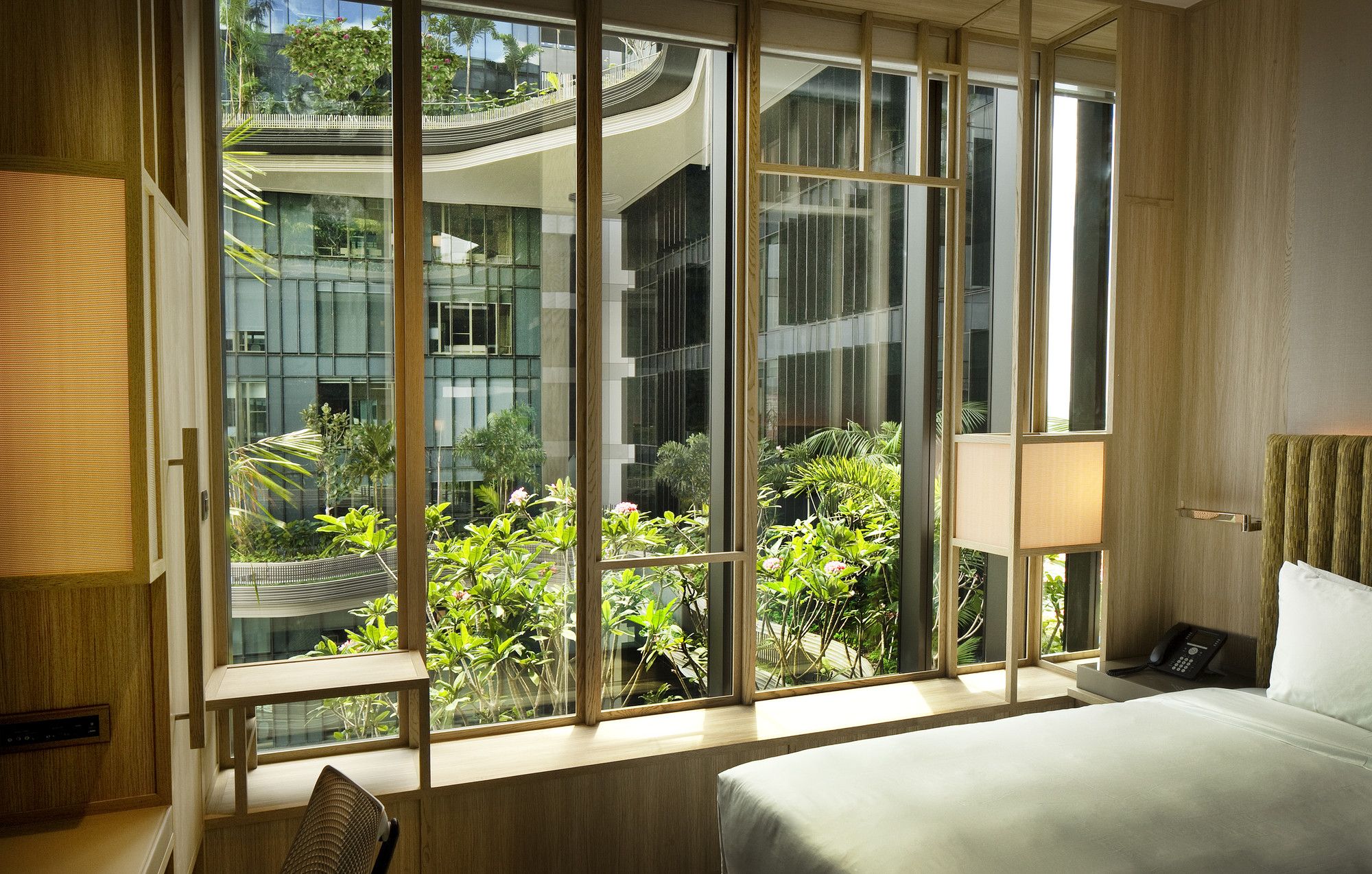
Because of these sky-gardens and the layout of all rooms to north face onto the adjacent park or the hotel’s own sky-gardens, as well as shading provided in mornings and afternoons by nearby buildings, the individual guest rooms are able to be fully glazed with high efficiency glass, opening up spectacular views across the city.
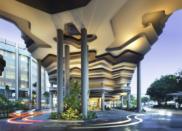
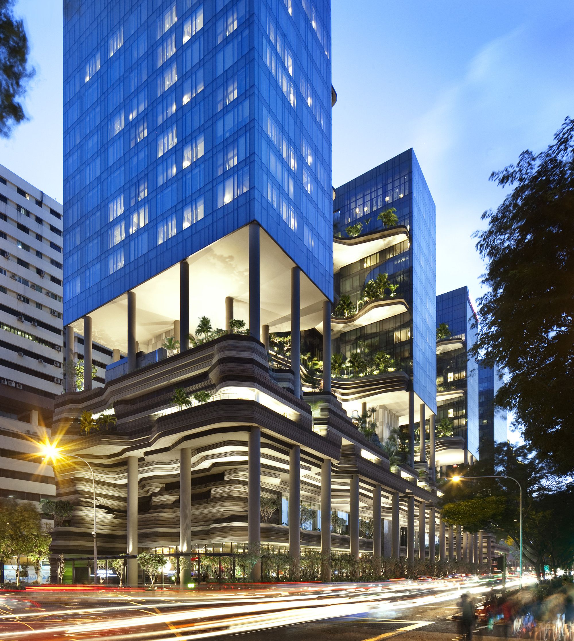
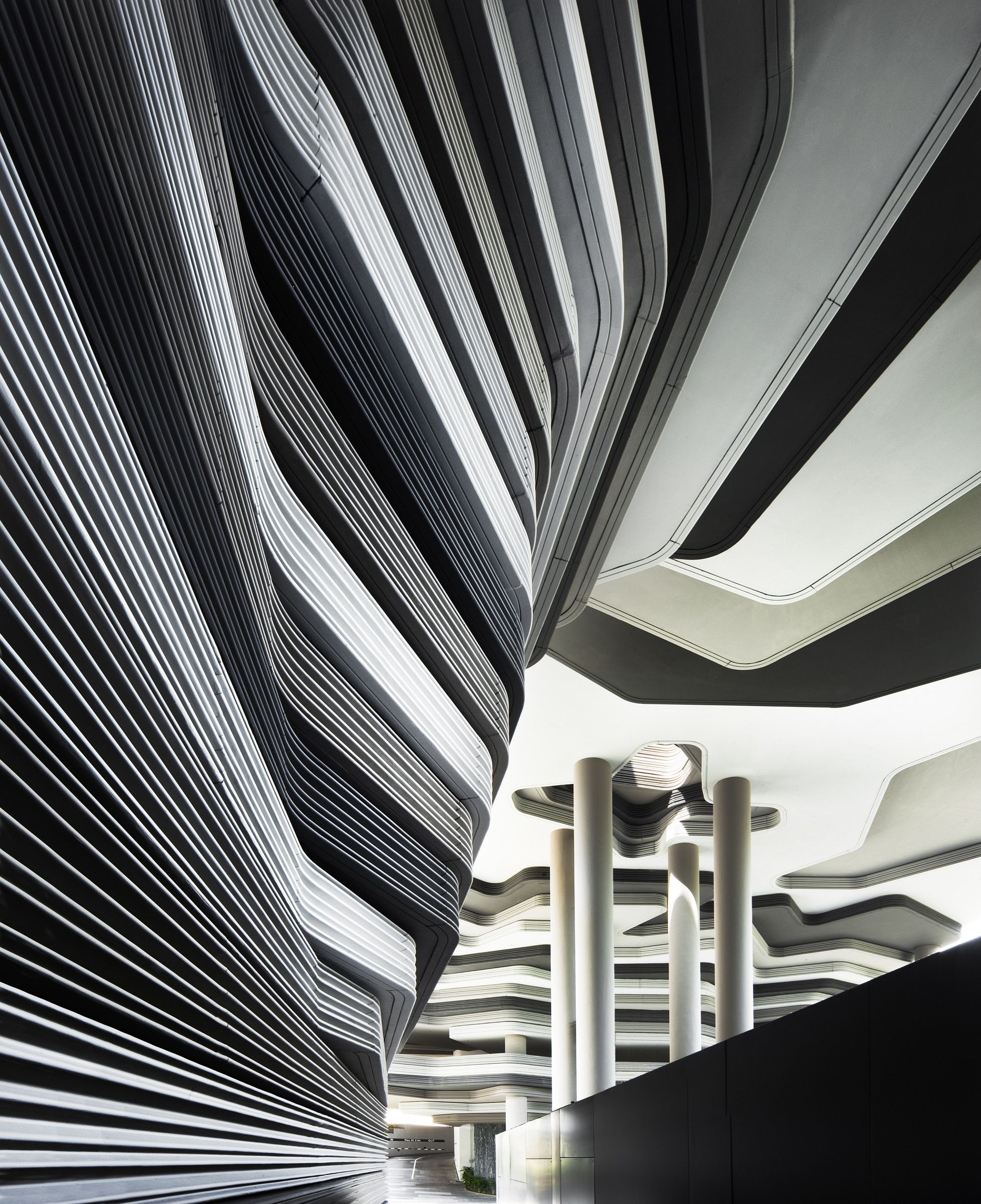
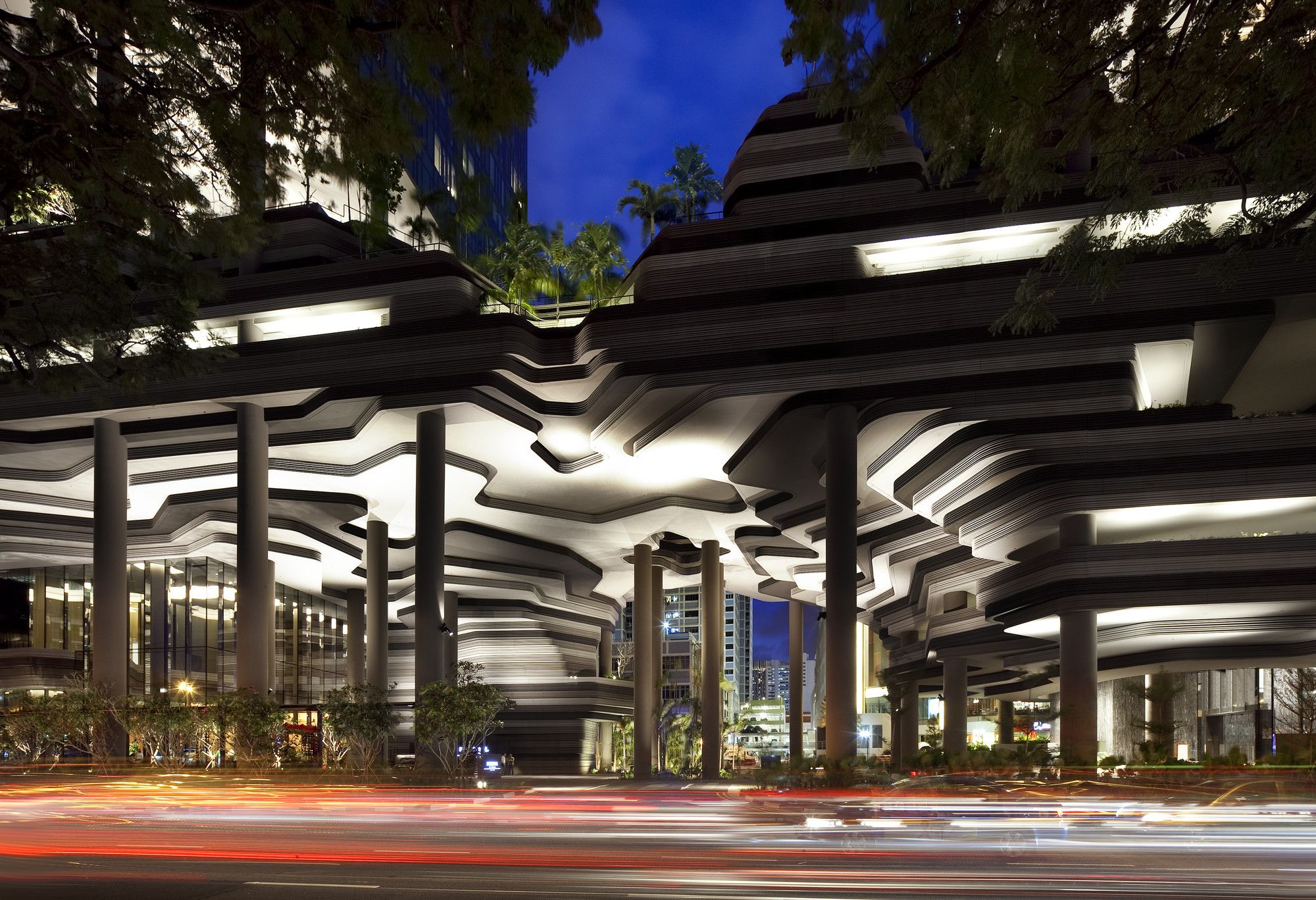
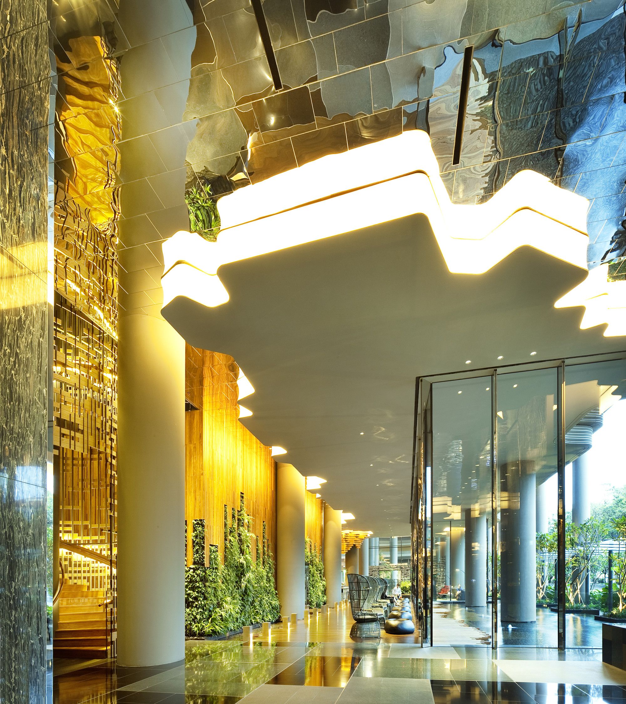
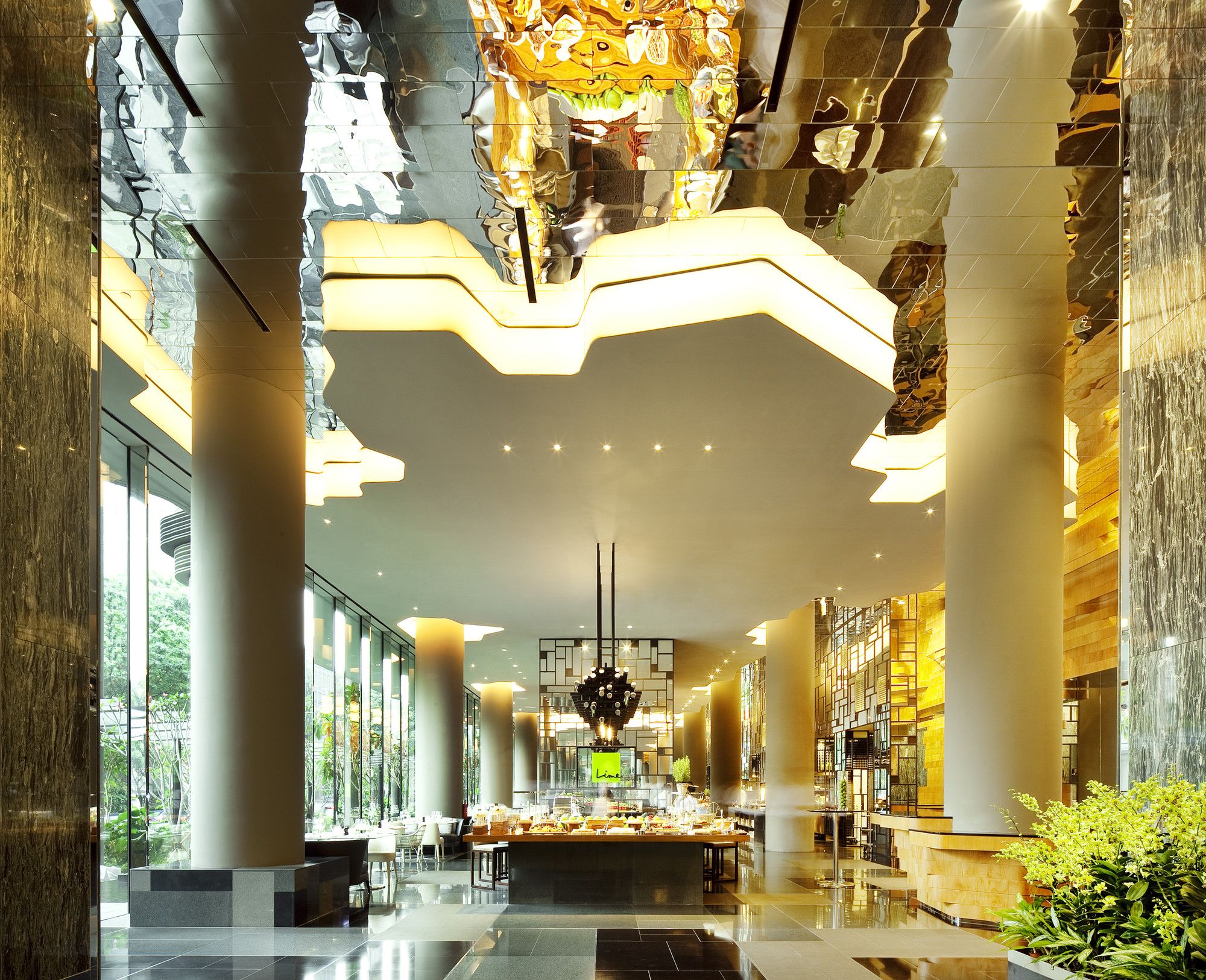
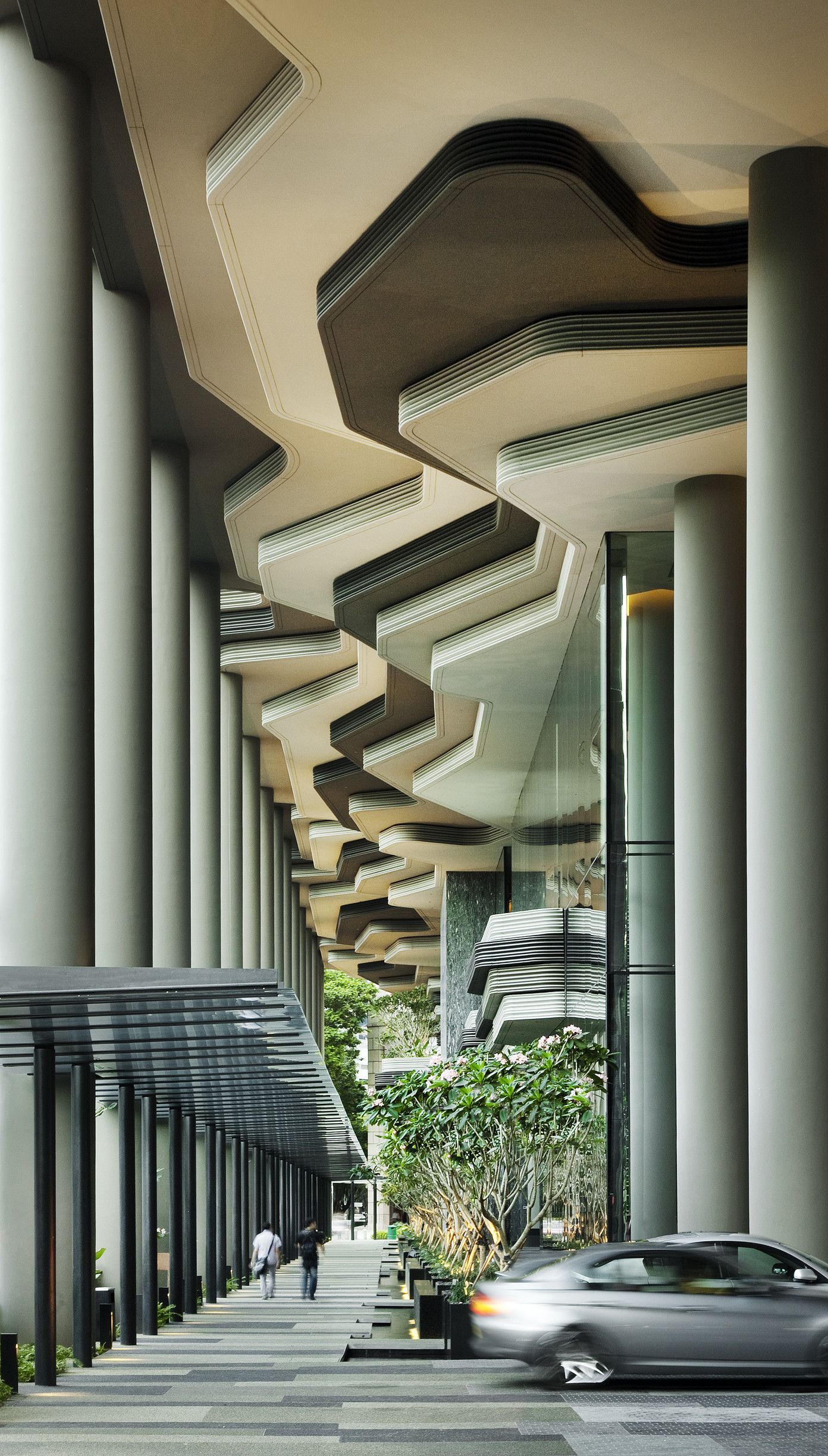
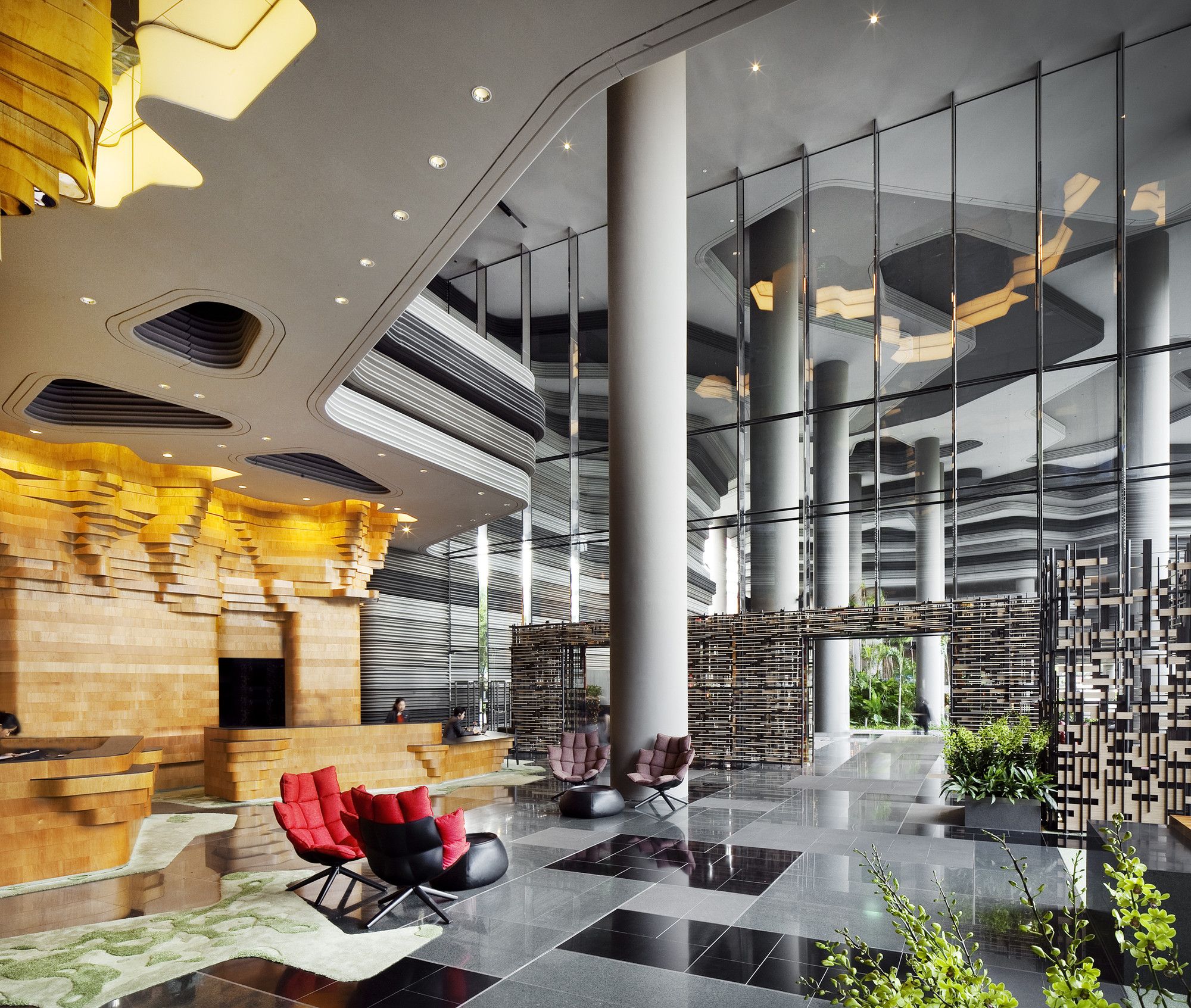
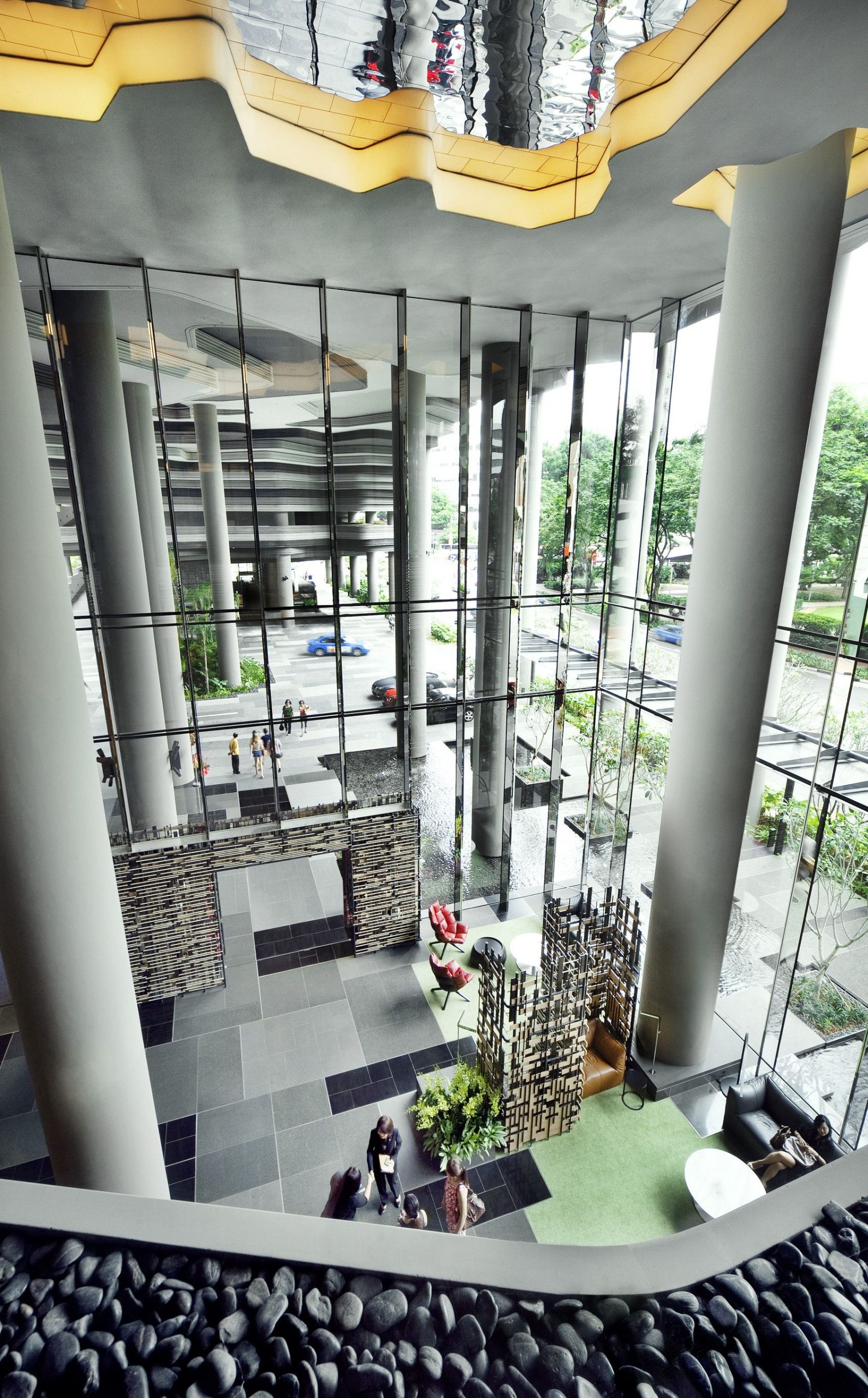
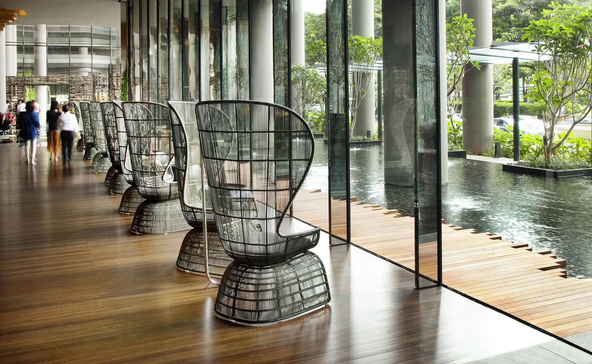
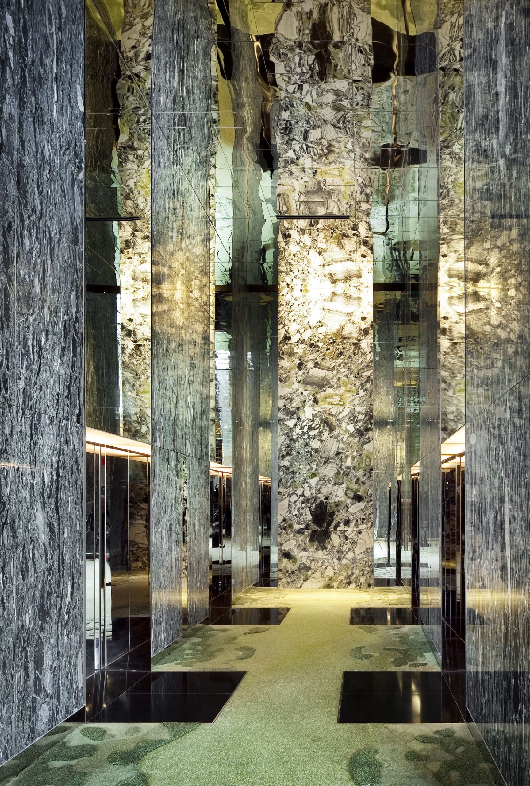
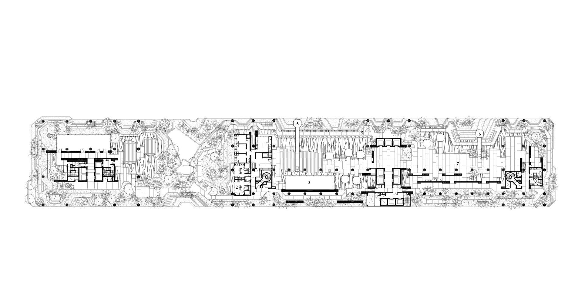
At the street level, the podium is what the architectural photographer and writer Patrick Bingham-Hall has described as ‘a remarkable piece of architectural theatre’. The organic forms of the sky-gardens are given an introduction on the triple-height ceilings in the form of what could be described as topographical stacking. Precast layers compound upon one another and intermingle with round columns- this little bit is always a bit of a sore point for though.
Yes, round columns are the most efficient and cheapest way of doing a column, but if the rest of the building is of a certain character, why are the columns their own independent identity, not in keeping with the rest? Just a small detraction from what is an overwhelmingly successful and forward-looking building.

Courtesy of WOHA – Photography by Patrick Bingham-Hall


