Paul Smith Flagship Store Kim Chan-joong
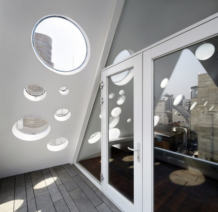
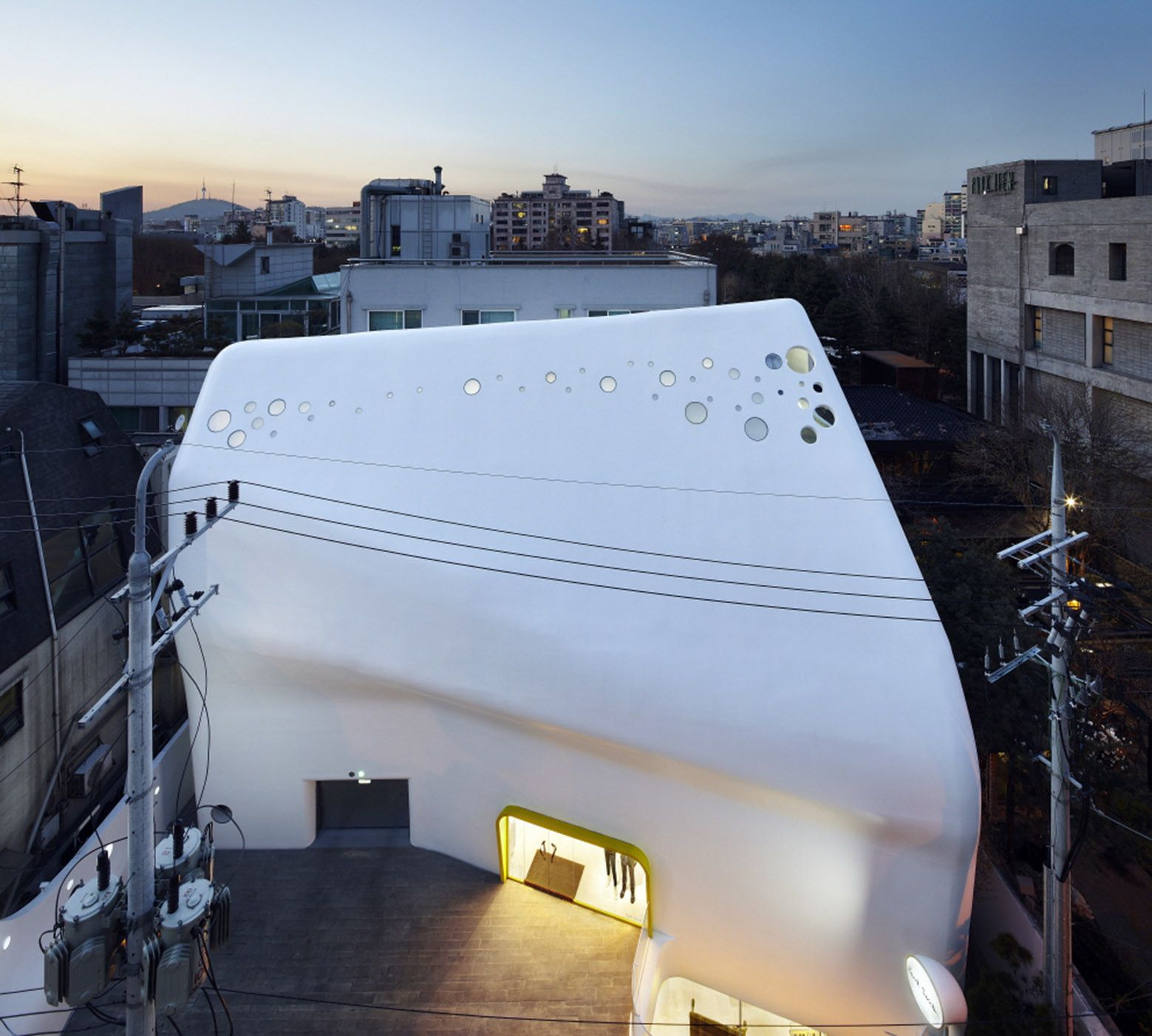
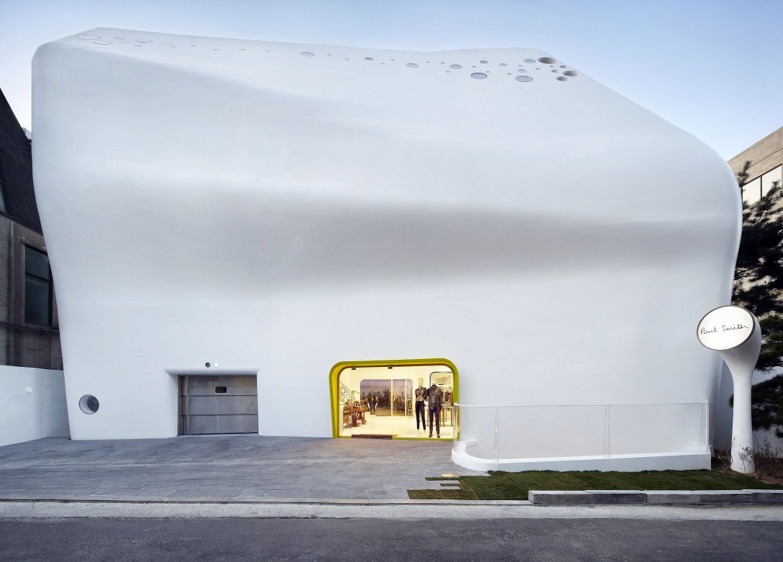
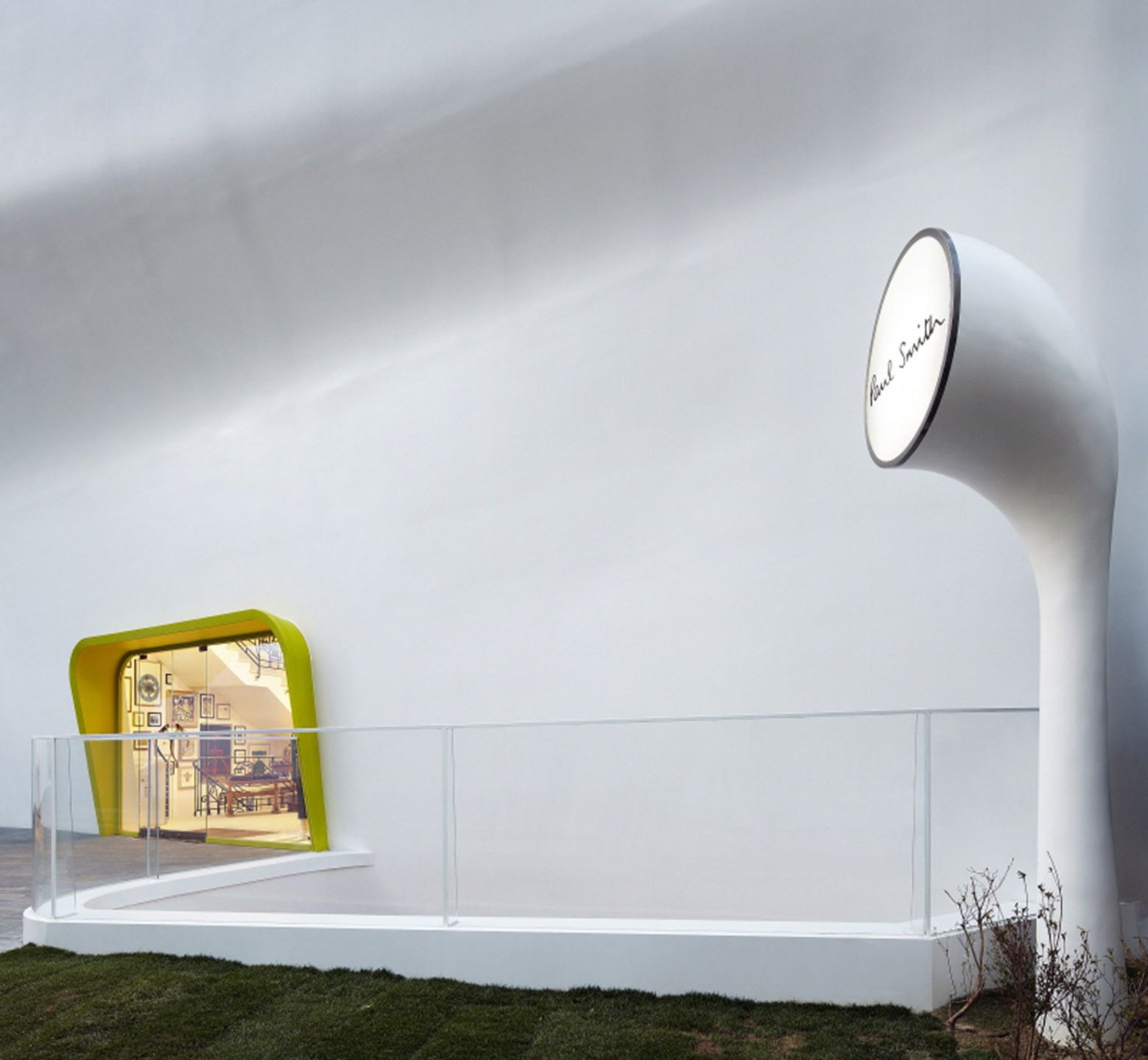
At times when the two arts of fashion and architecture merge, the world is to witness extraordinary structures. As fashion flows and develops from season to season, and year after year, architecture evolves to house this art with its own creative forms. Architecture today is taking on more complex forms and is becoming increasingly about folding, wrapping, and twisting structures. Walking down the high-end name-brand district of Gangnam, Korea, the Paul Smith flagship store stands out. Looking like an iceberg, or as the architect, Kim Chan-joong likes to put it: “you call it what you will” this flagship fashion store is definitely a radical flamboyant piece of architecture.
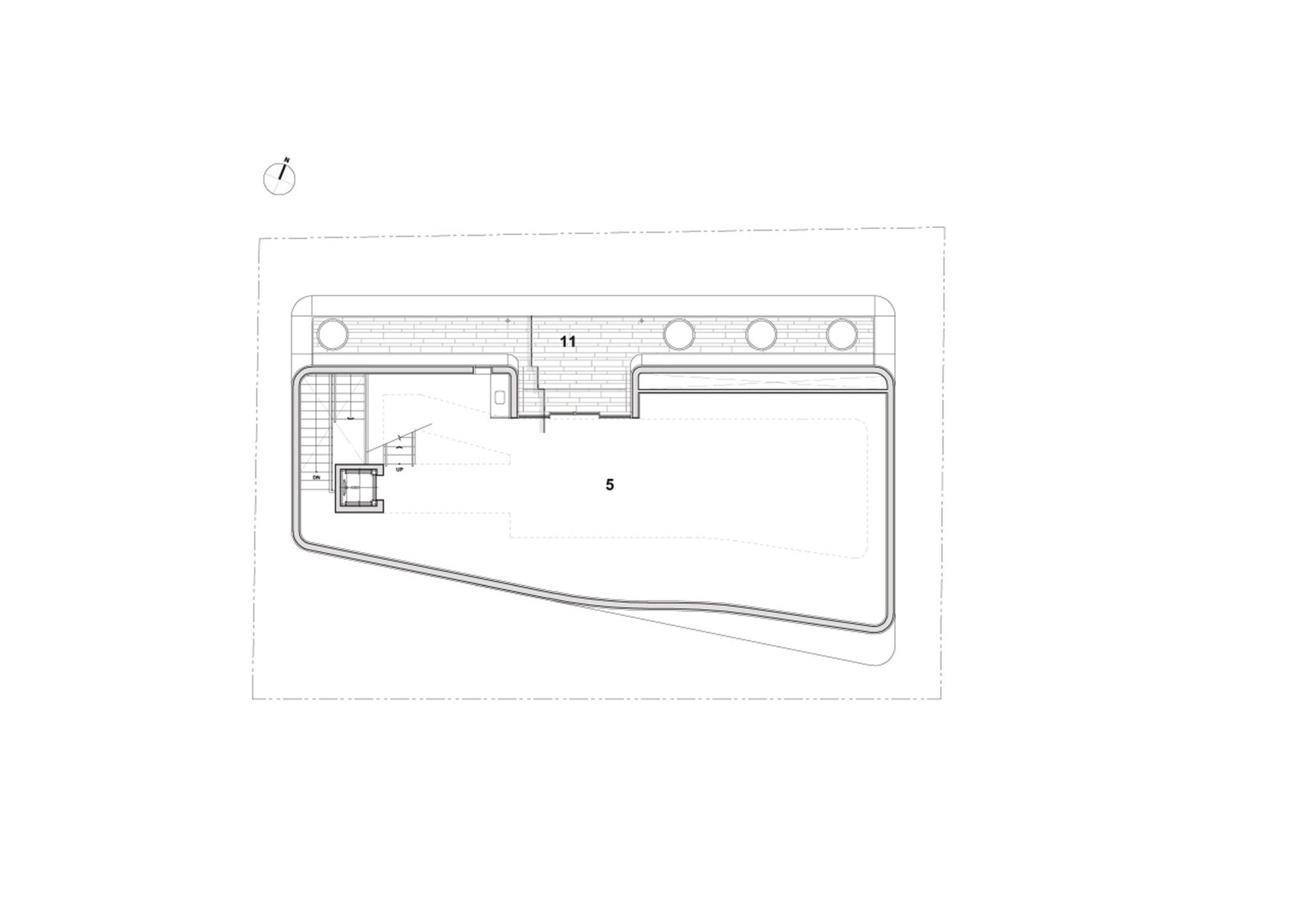
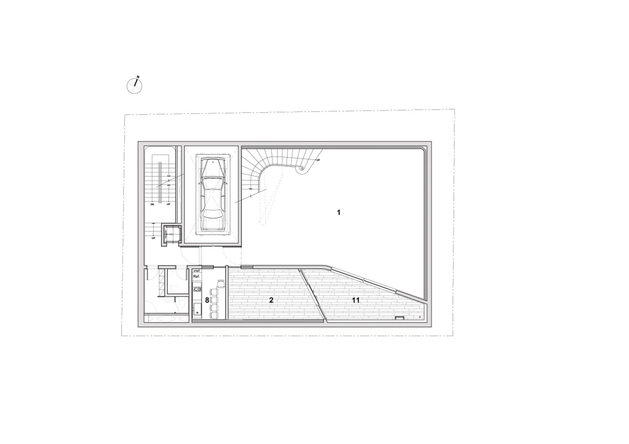
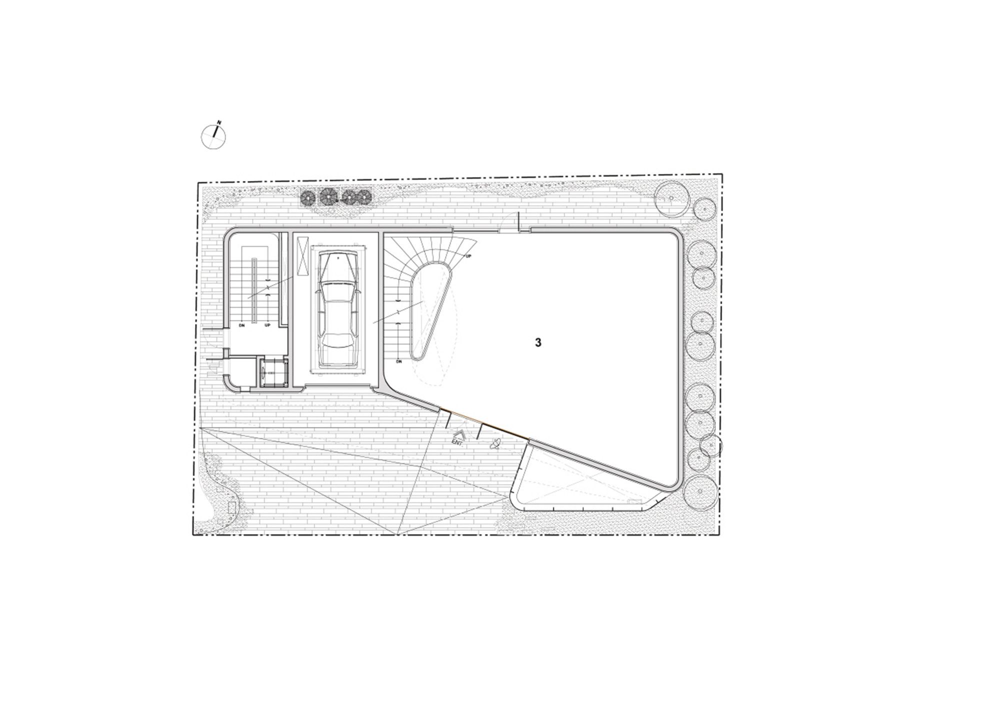
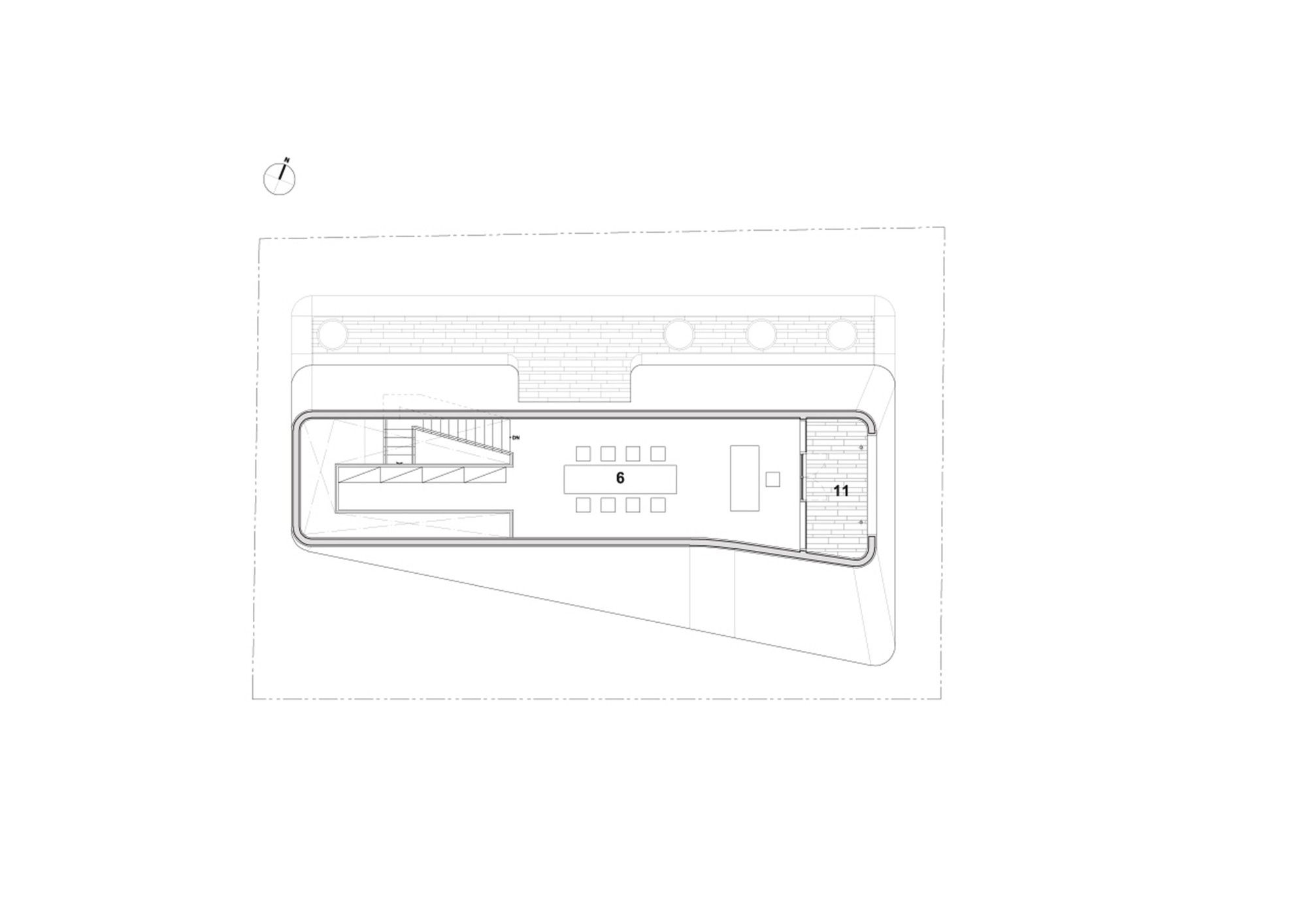
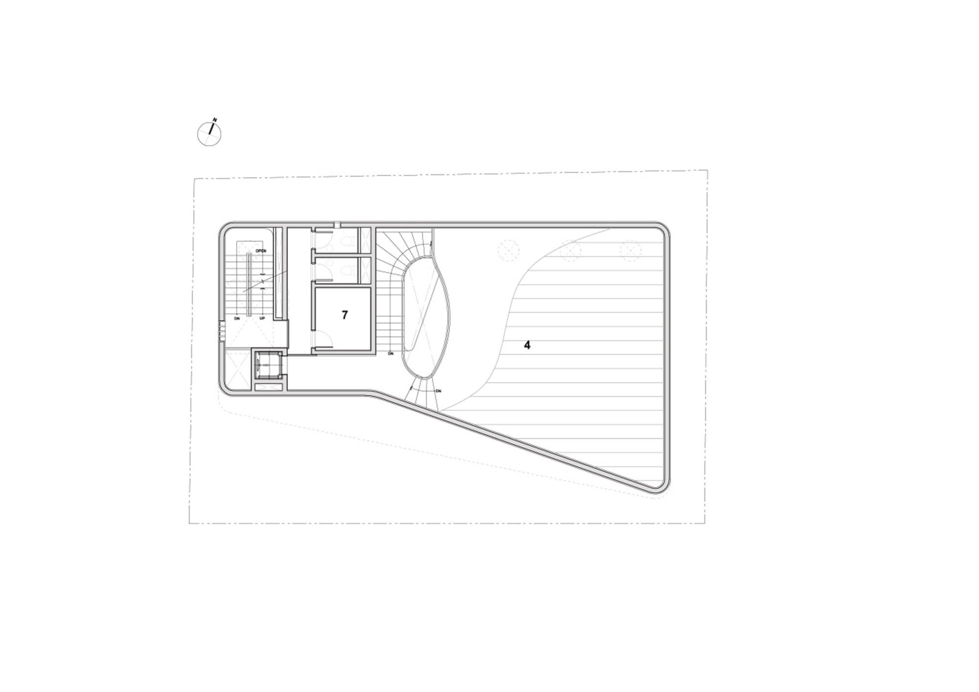
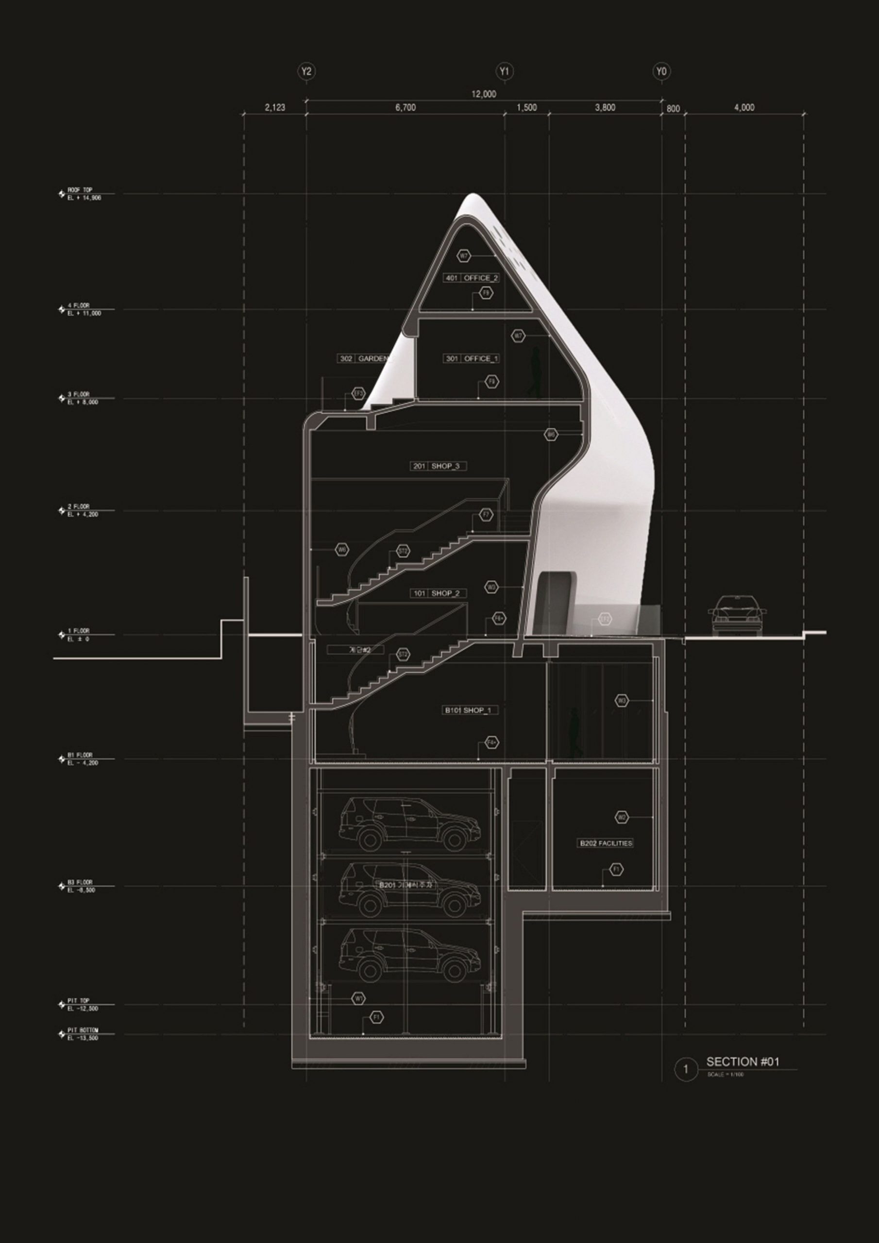
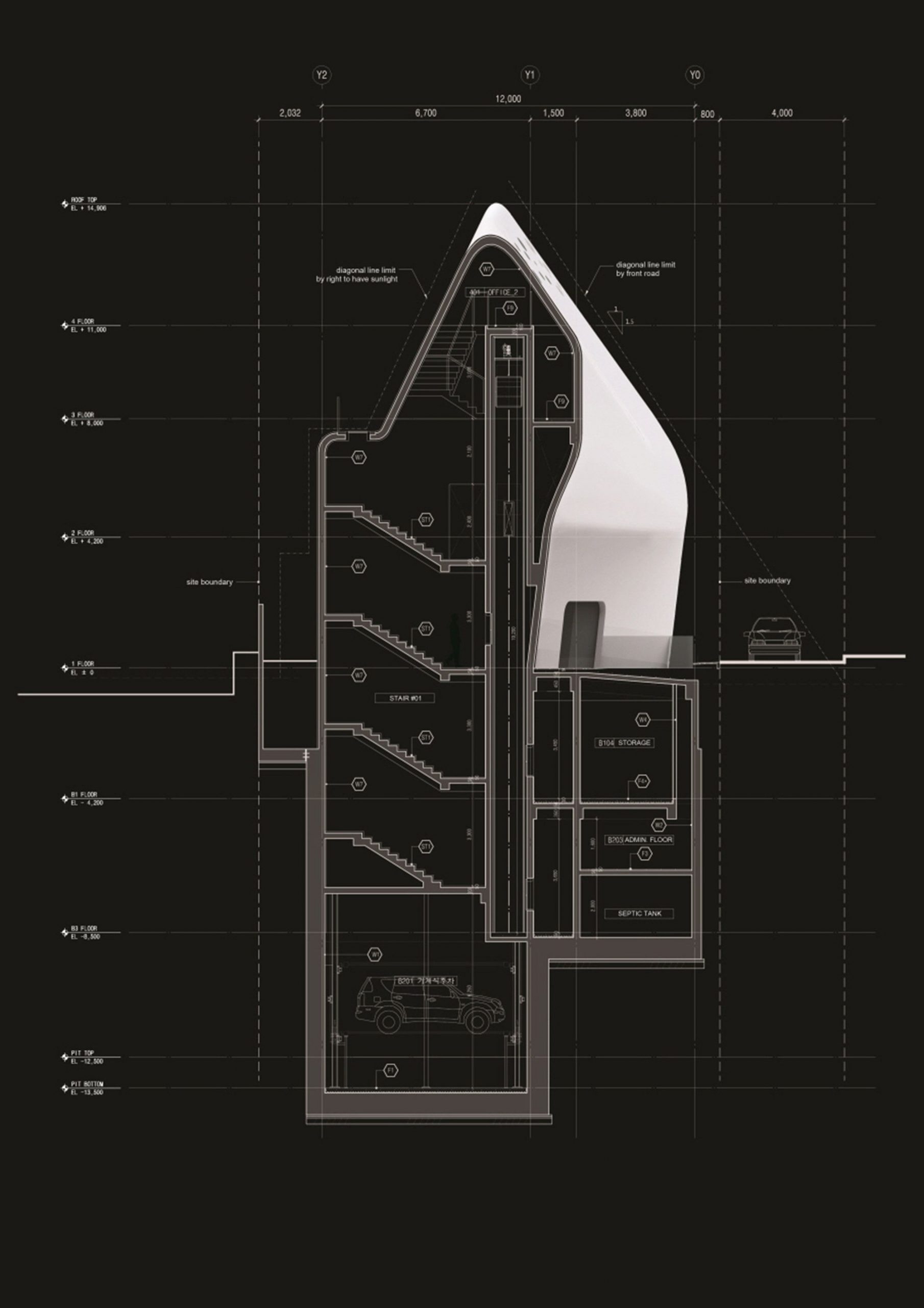
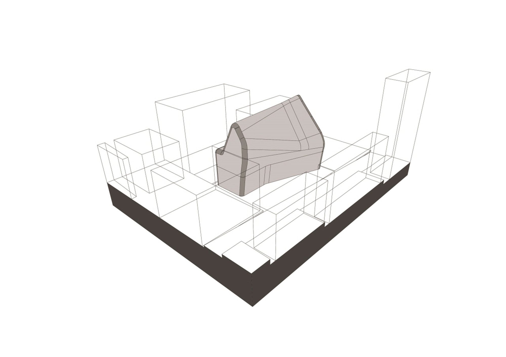
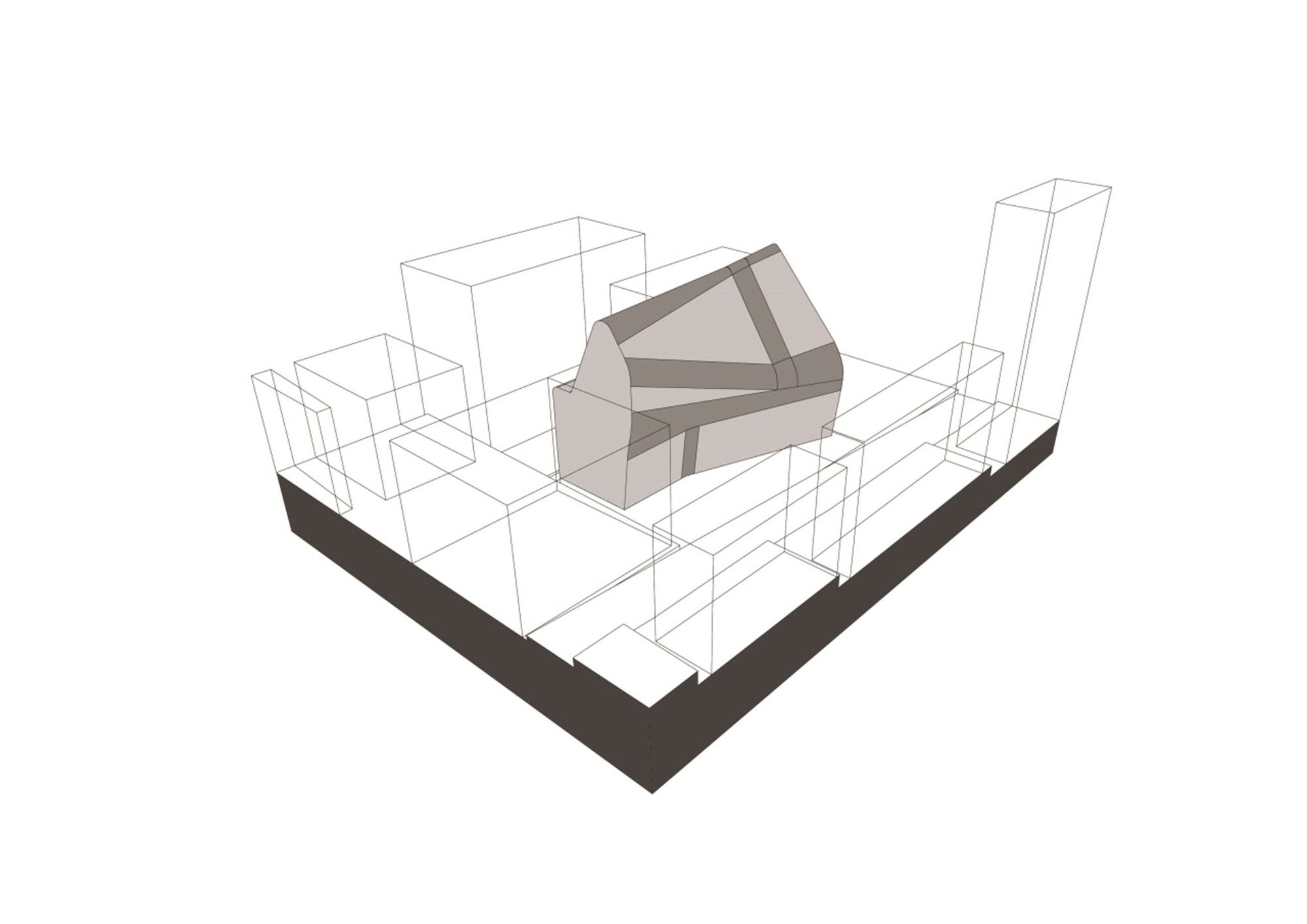
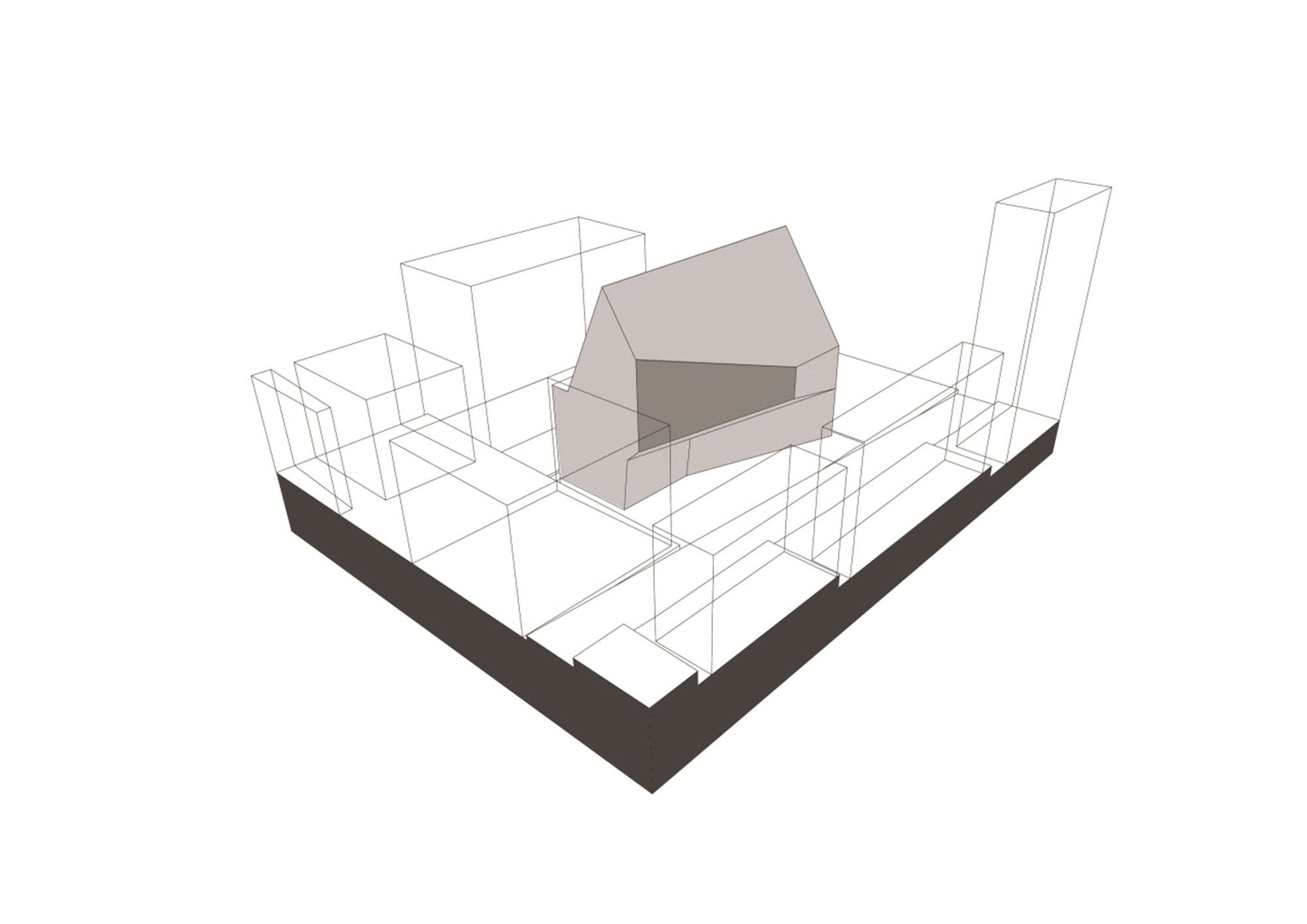
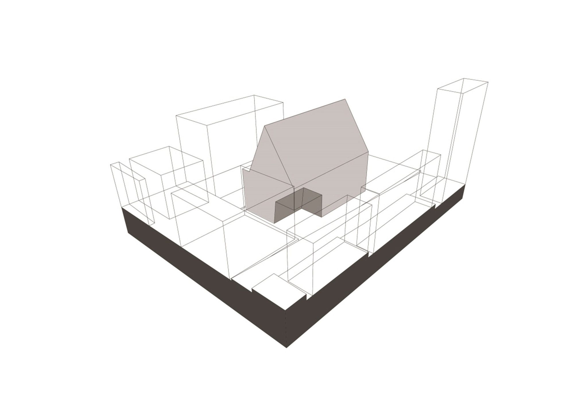
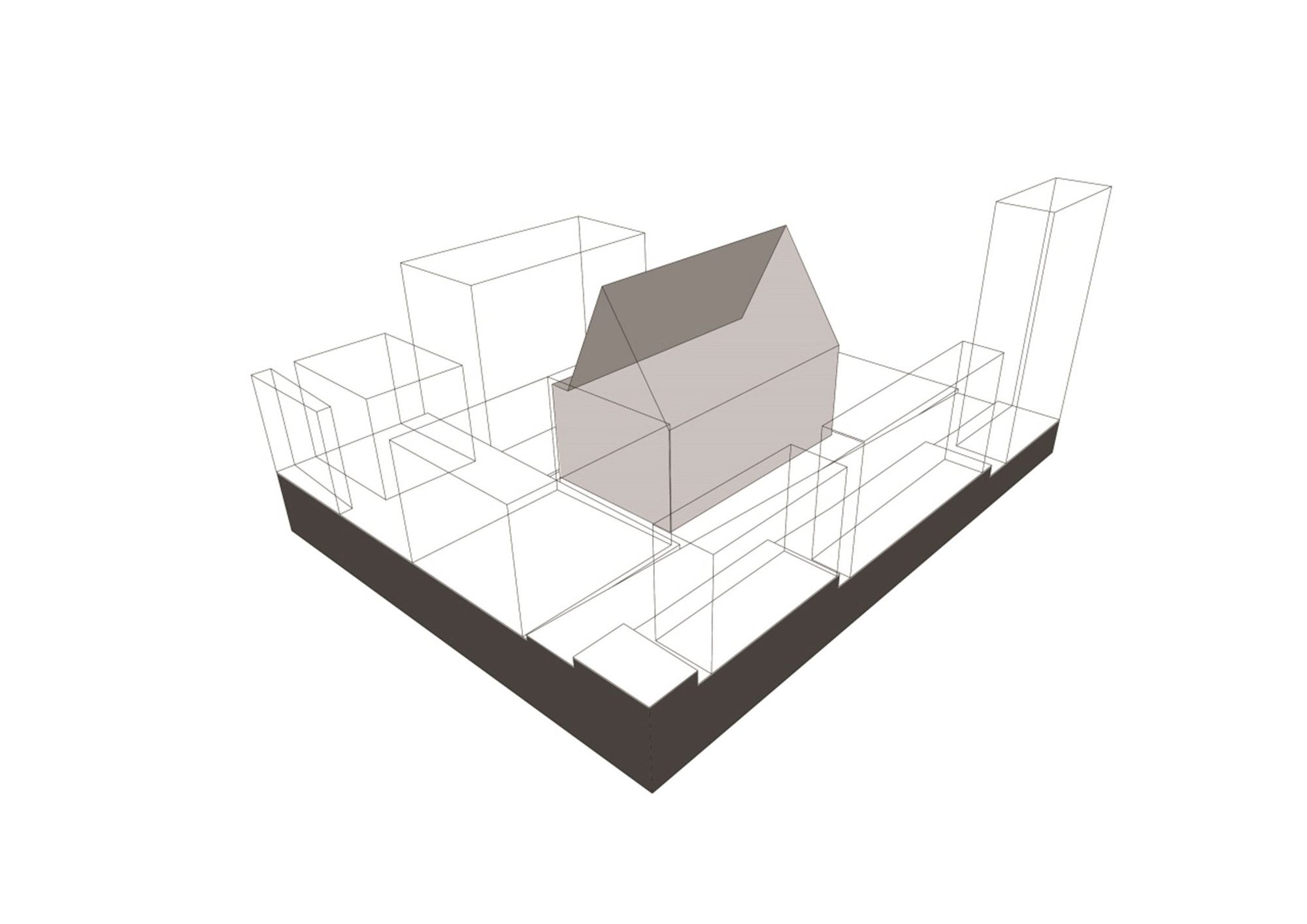
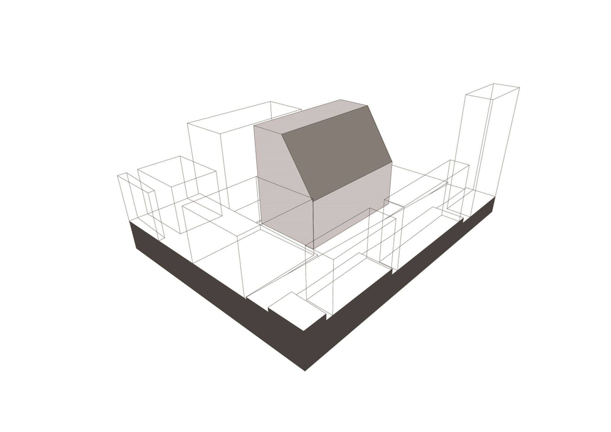
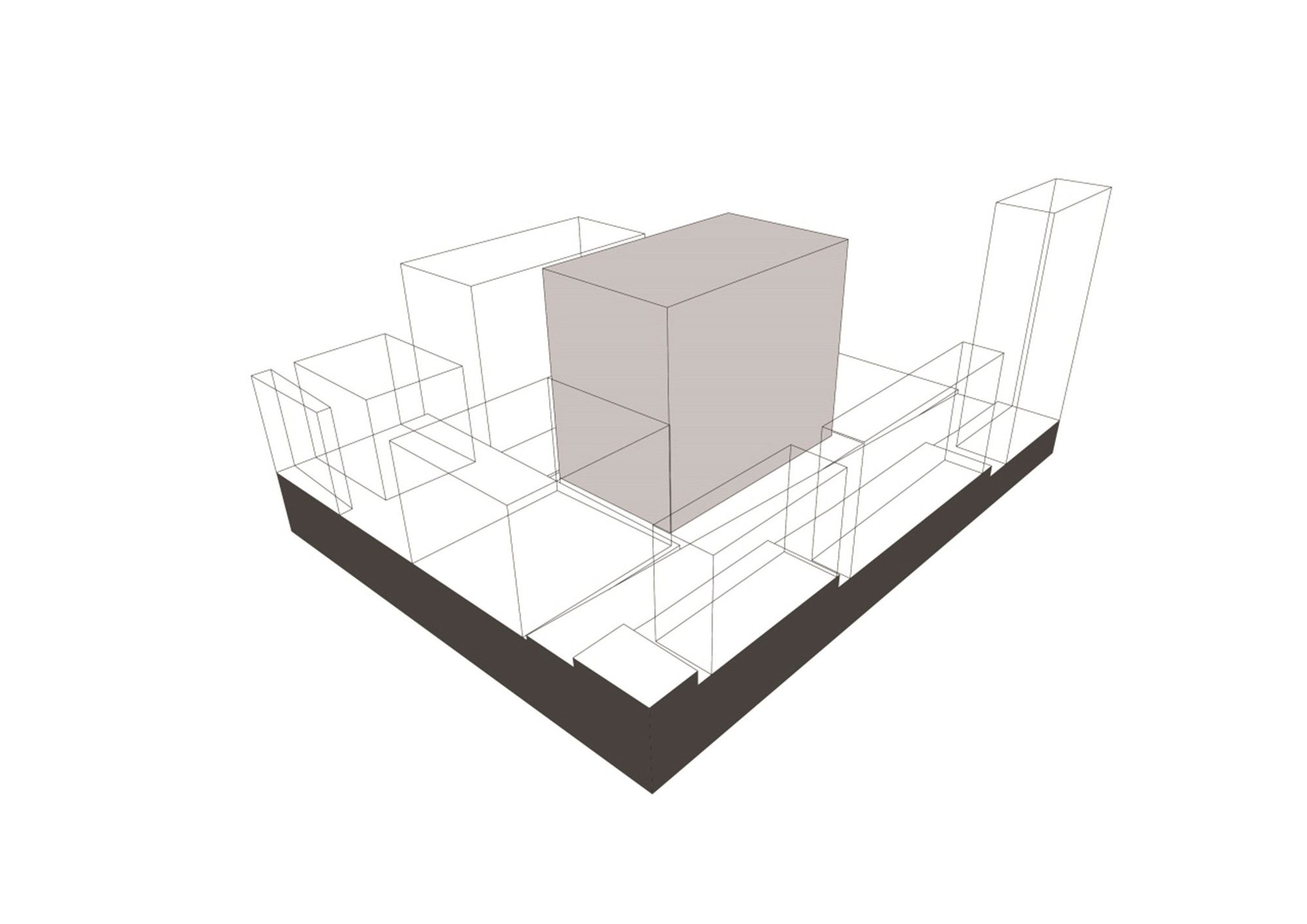
This contemporary piece of architecture was designed to house a large program; it was built on a constrained site of 330 sqm making it quite challenging to propose so many spatial demands. To creatively solve these obstacles the designer reduced the floor area ratio and created the morphed form as a response to local planning regulations. The form aided in maintaining strict plot ratios, building lines, and rights to light.
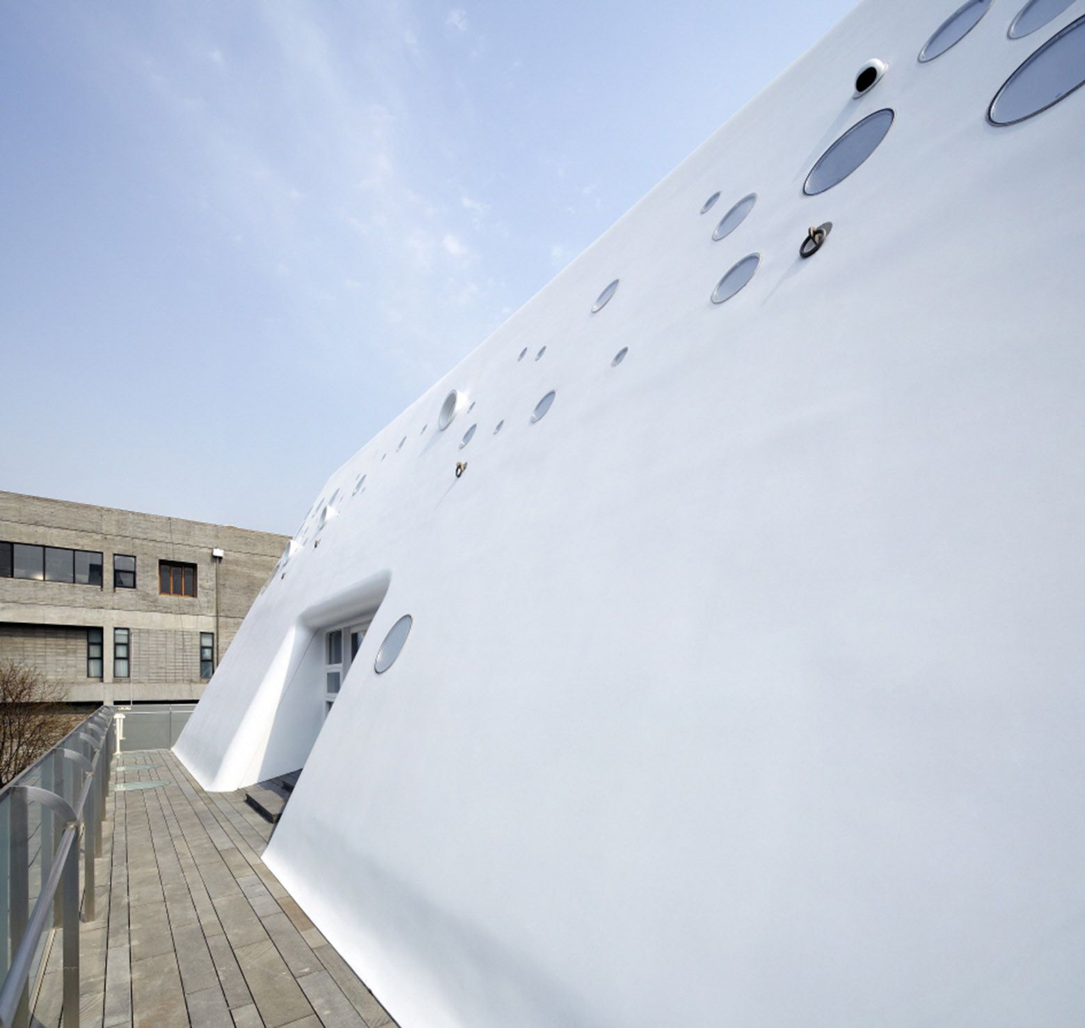
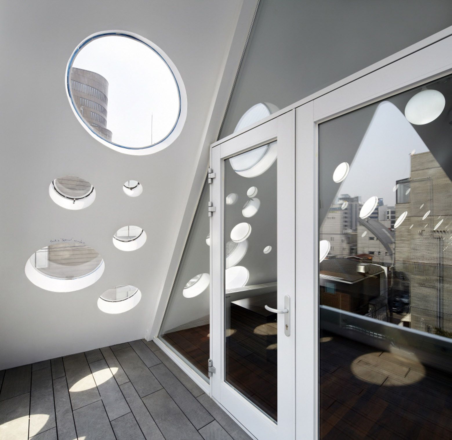
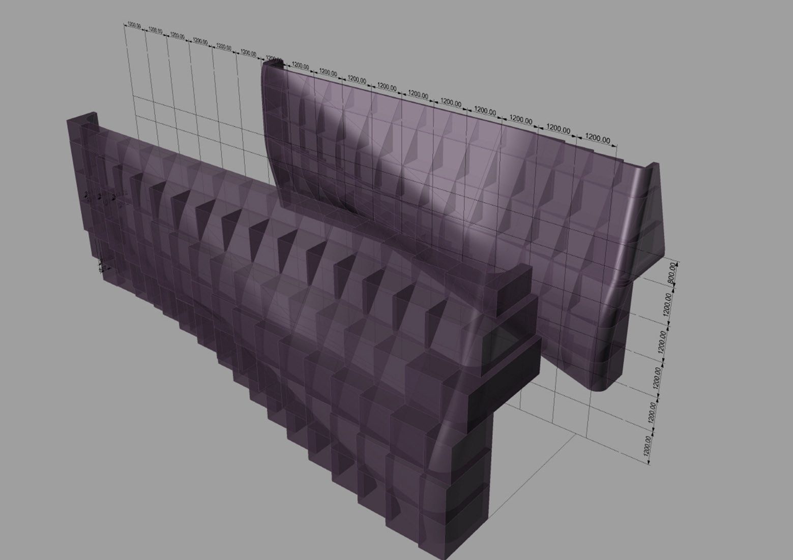
Kim Chan-joong created ‘a more fluid and unified figure that is less building-like, and more ambiguous in character.’ This is a result of chamfering and smoothing-out the basic rectangular volume. The form was constructed using Styrofoam blocks as moulds; those were precut off site with an NV cutter; they were made using computer aided programs to precisely create the double curves and complex details of the form.
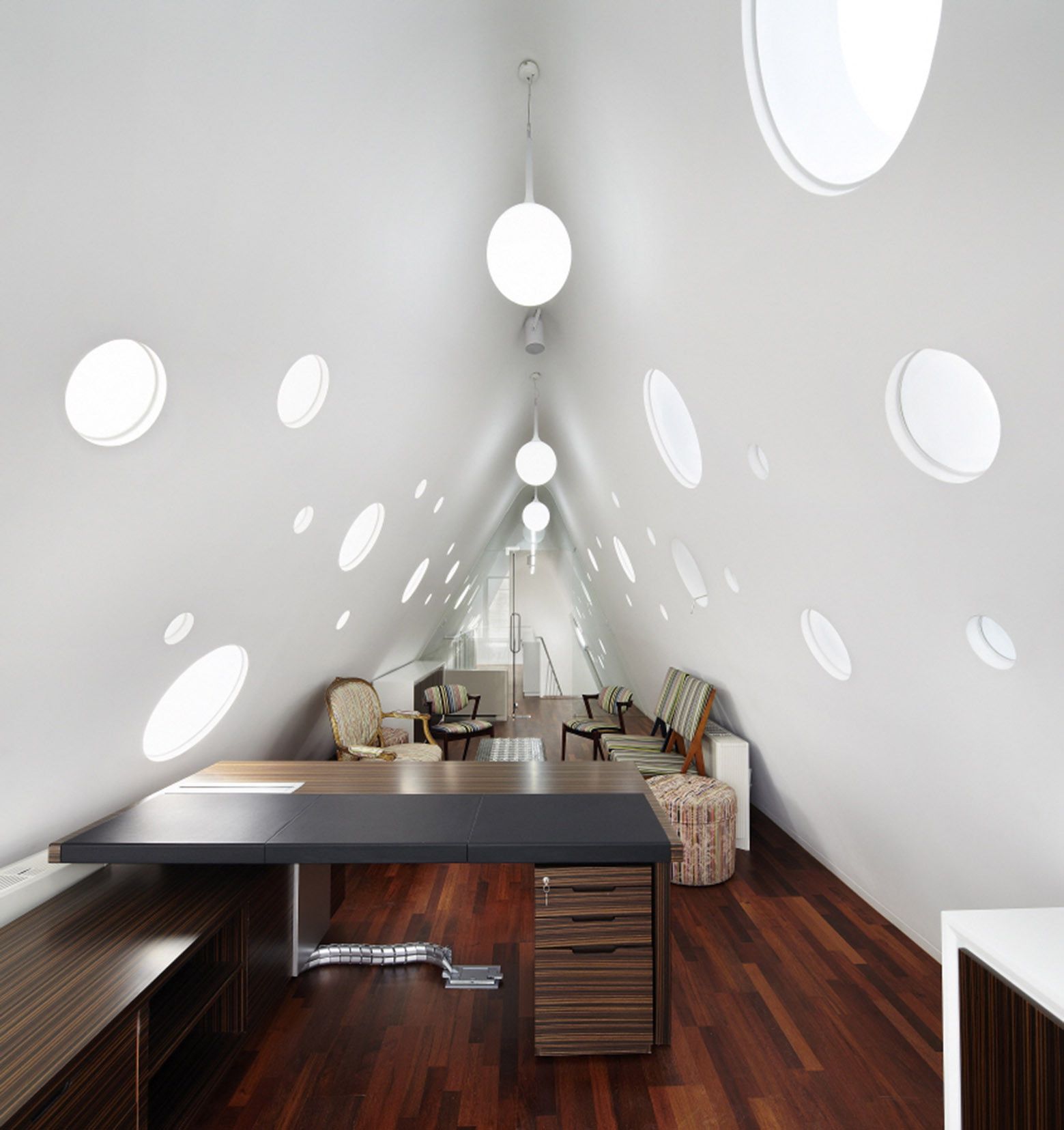
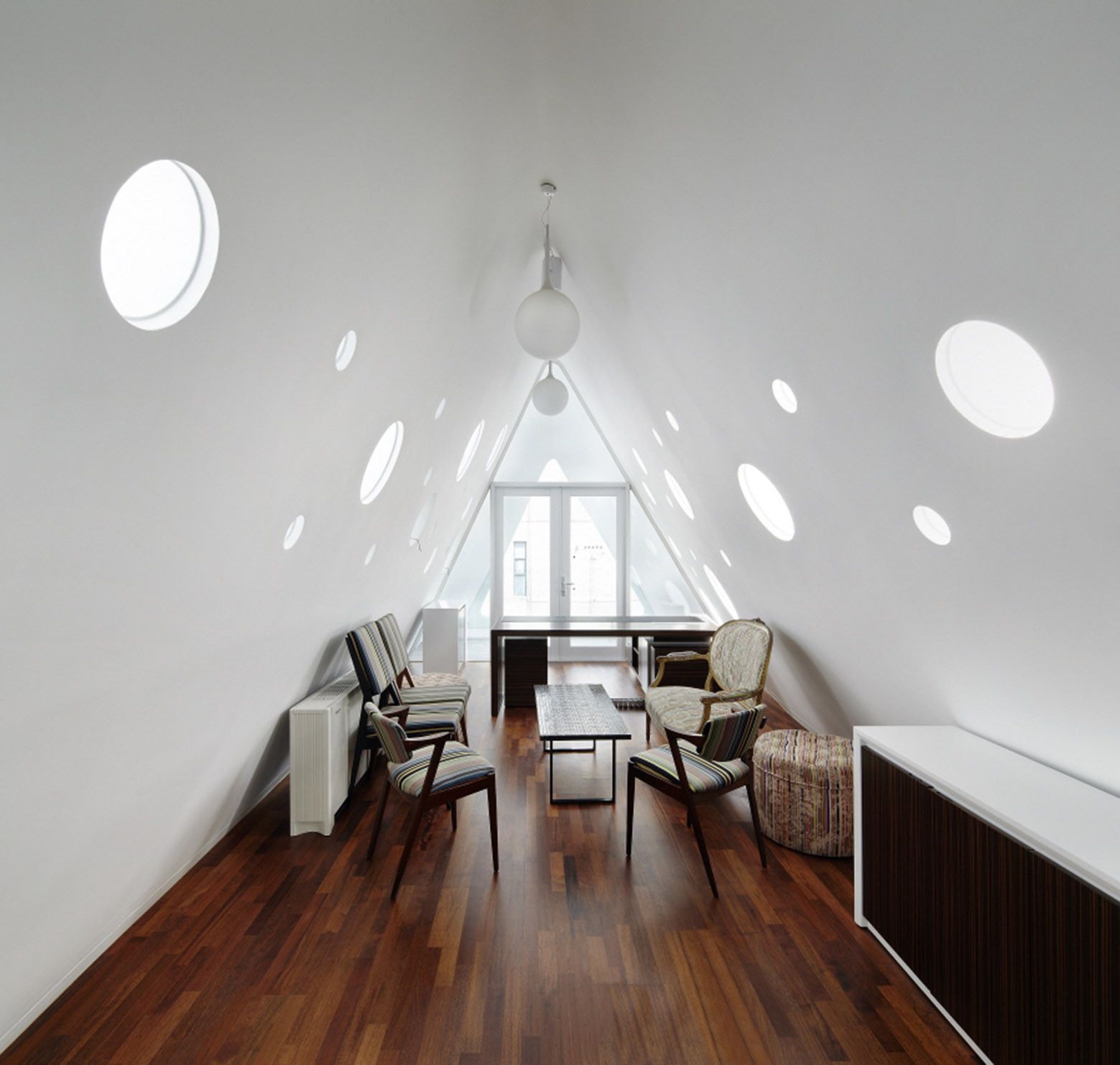
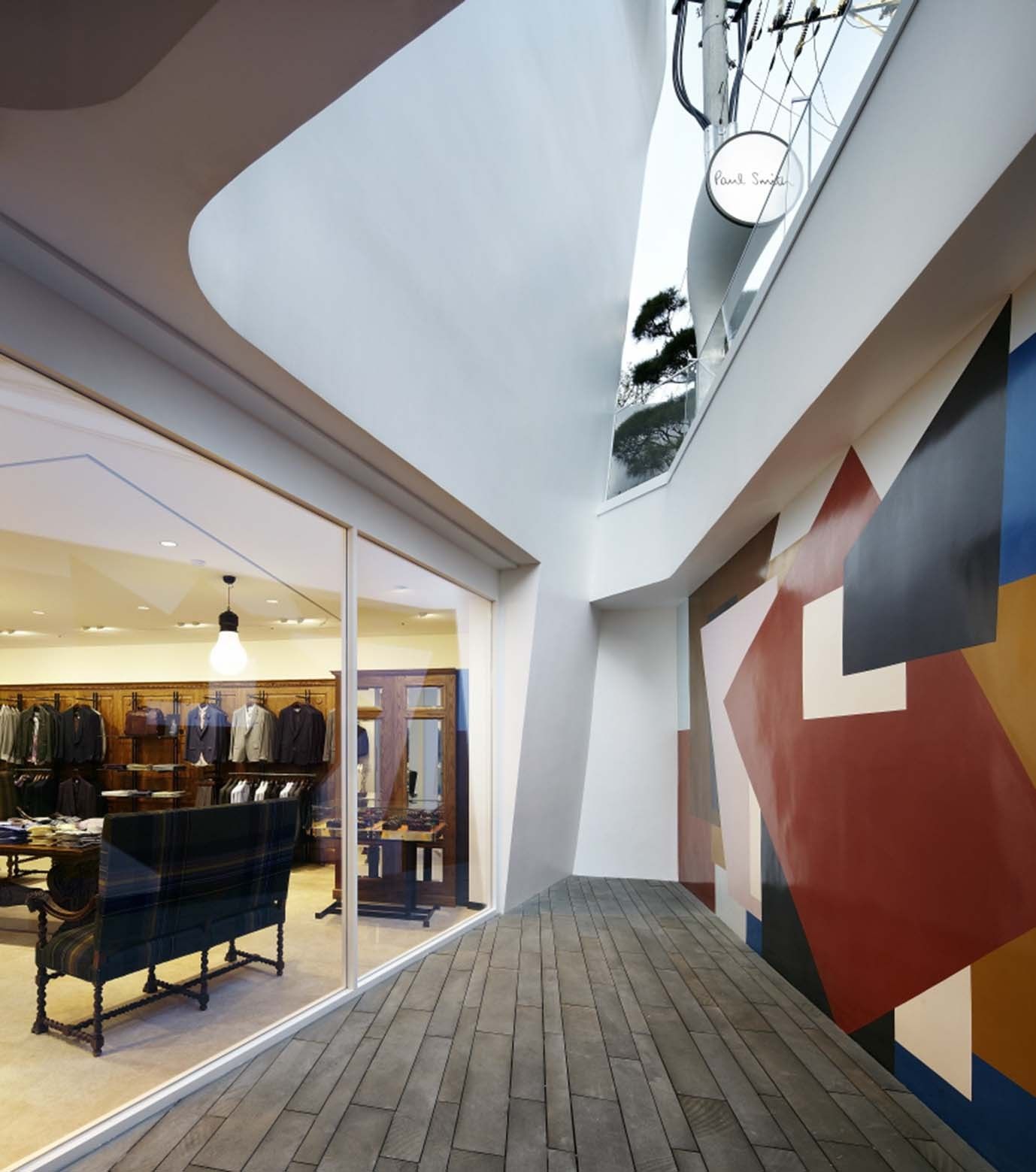
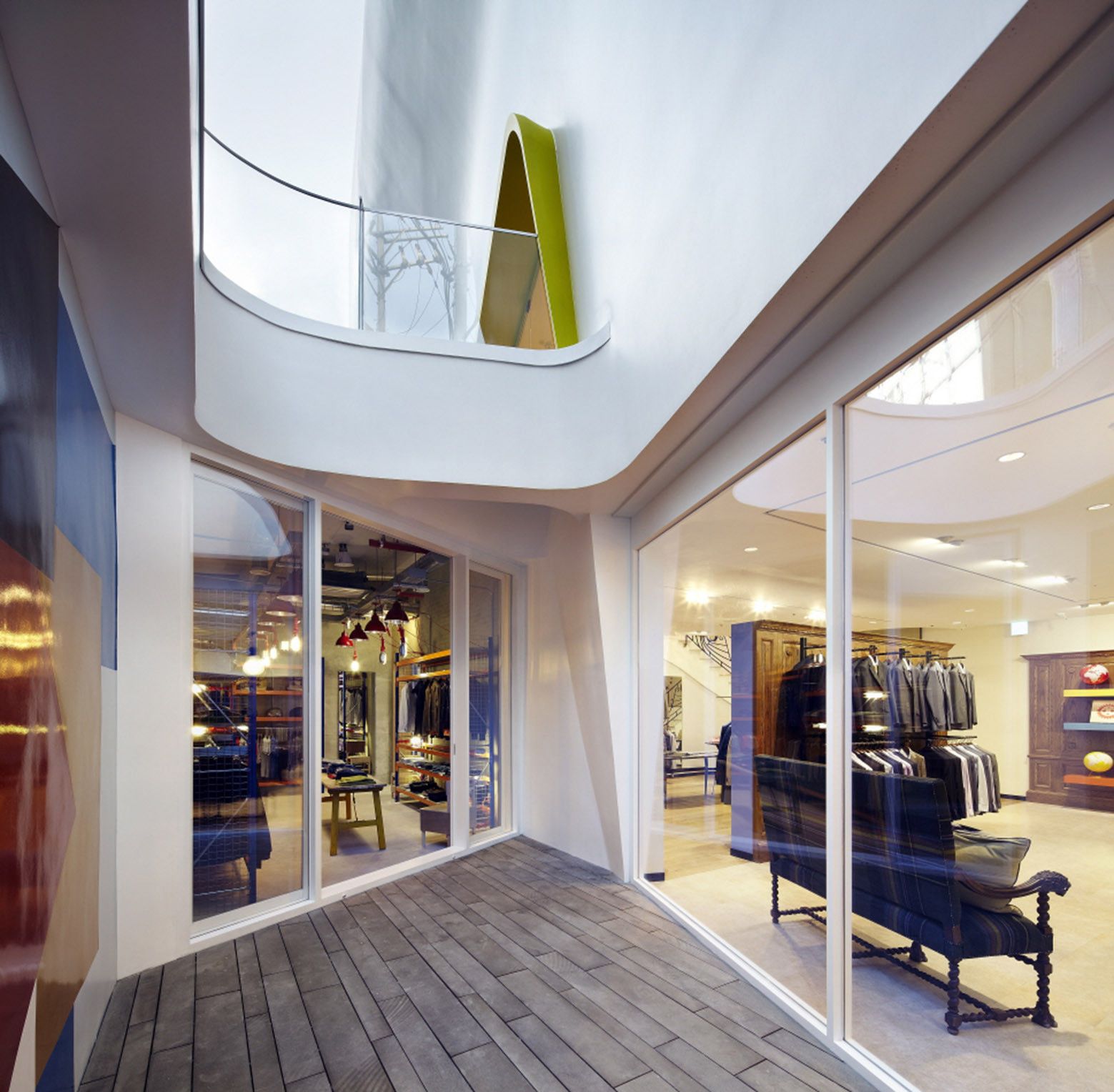
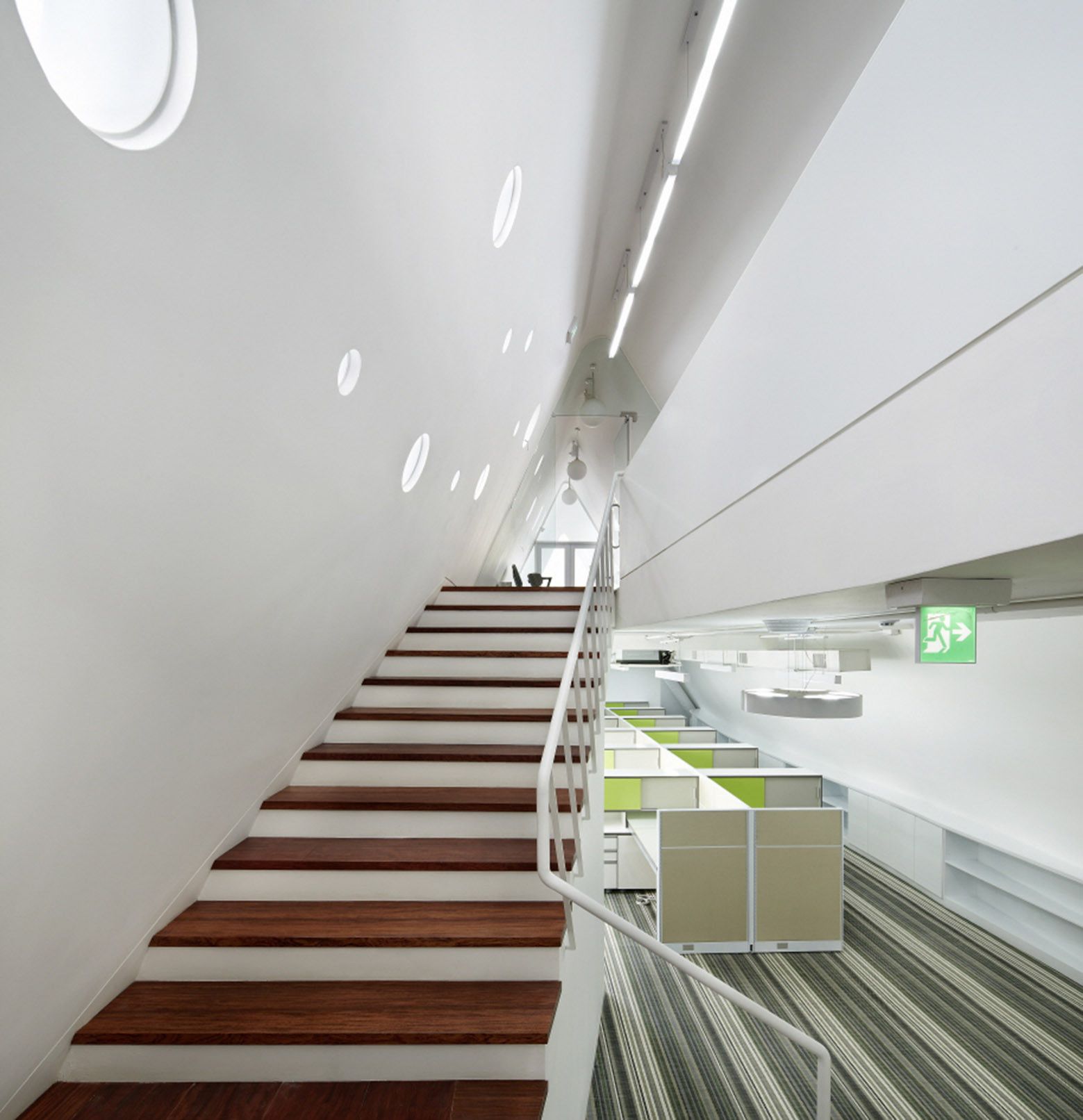
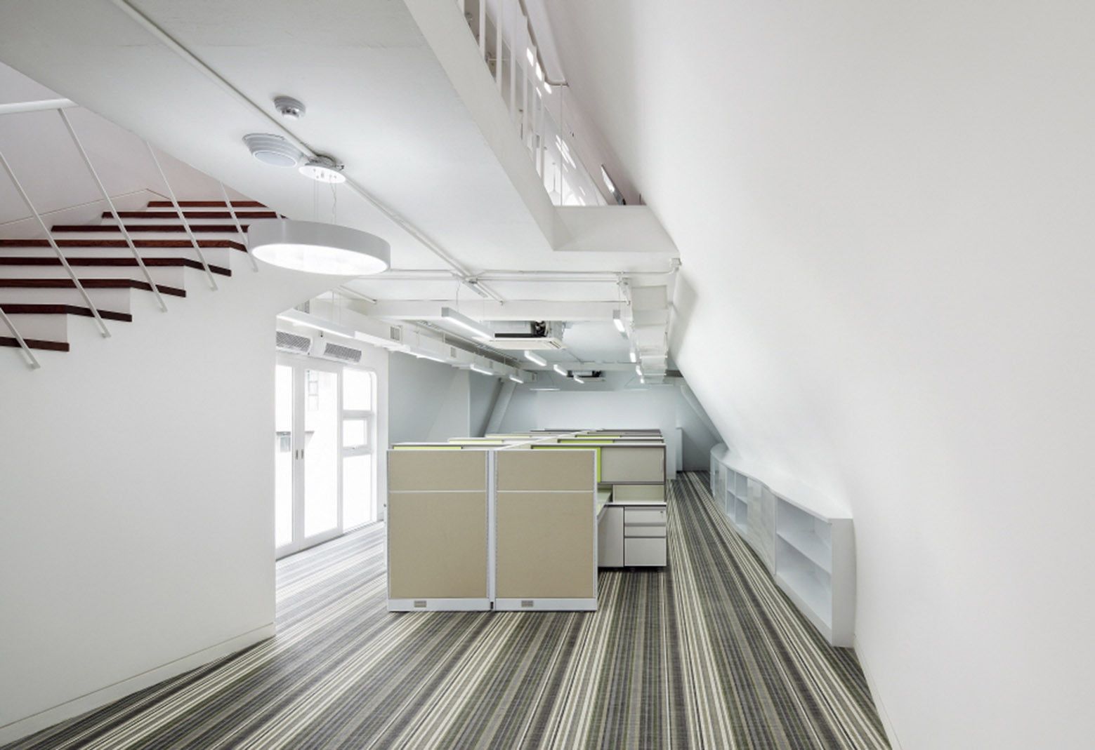
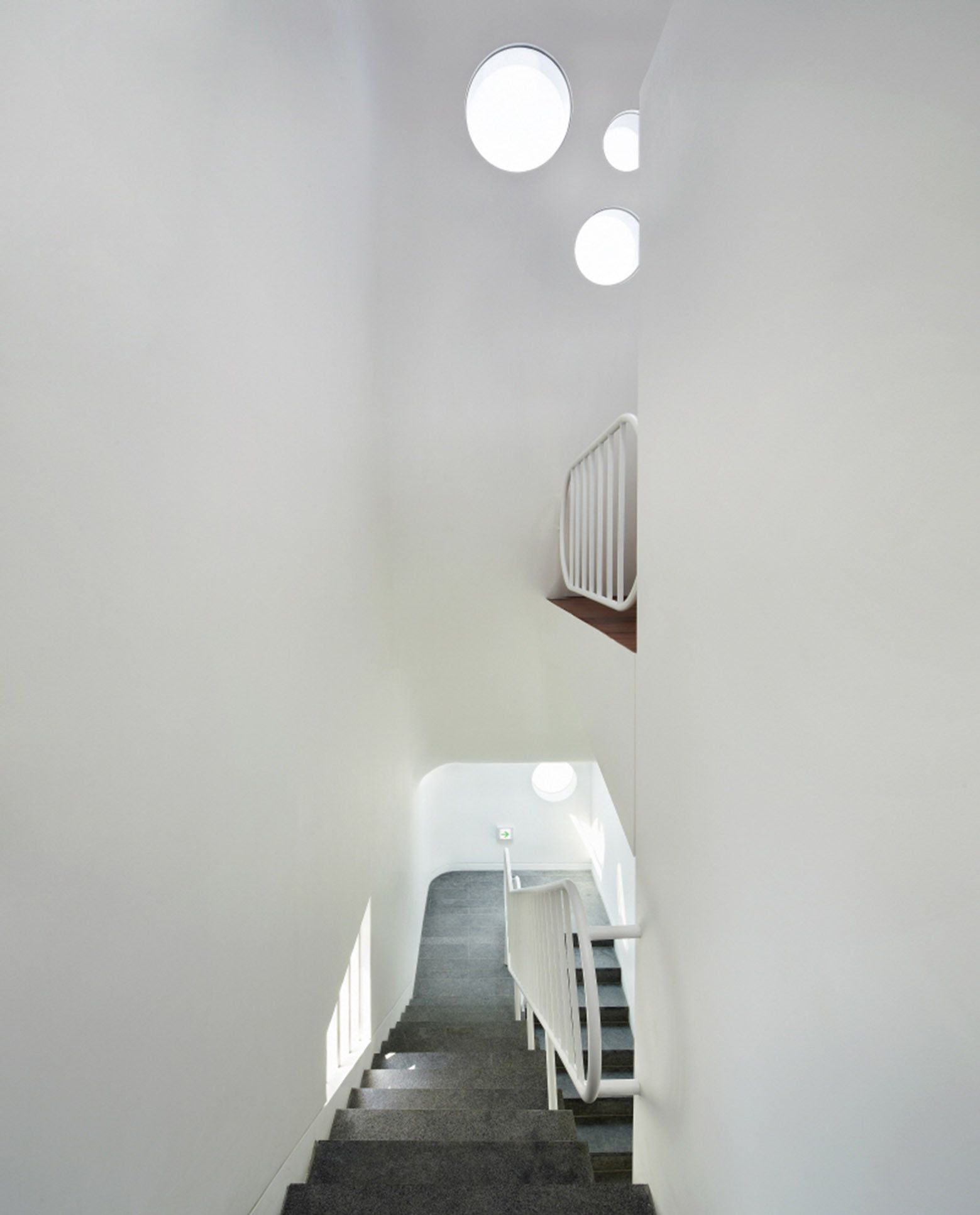
This incredible eye-catching flagship store was constructed on site; it was finished off with a semi-gloss industrial paint. The interior space is as marvelous as the exterior form; Paul Smith’s trademark colour and pattern prevail throughout the interior; simple elements such as light fixtures, shelving units, and entrance frames are painted with a pop of different colours to give Paul Smith’s signature to his store. Wall surfaces and the curvaceous stair were painted with pink and white stripes; the luxurious space also features some examples of Smith’s own furniture. Both arts, fashion and architecture, are always giving designers opportunities to influence the fabric of the city with their beautiful fusion.
By: Ala’ Abuhasan
photography by © Yongkwan Kim
photography by © Yongkwan Kim
photography by © Yongkwan Kim
photography by © Yongkwan Kim
photography by © Yongkwan Kim
photography by © Yongkwan Kim
photography by © Yongkwan Kim
photography by © Yongkwan Kim
photography by © Yongkwan Kim
photography by © Yongkwan Kim
photography by © Yongkwan Kim
photography by © Yongkwan Kim
photography by © Yongkwan Kim
photography by © Yongkwan Kim
photography by © Yongkwan Kim
Floor Plan
Floor Plan
Floor Plan
Floor Plan
Floor Plan
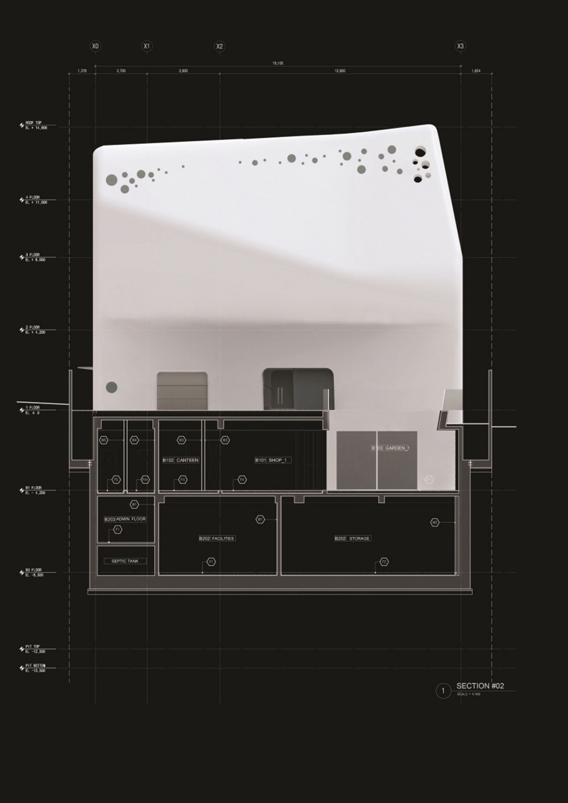
Section
Section
Section
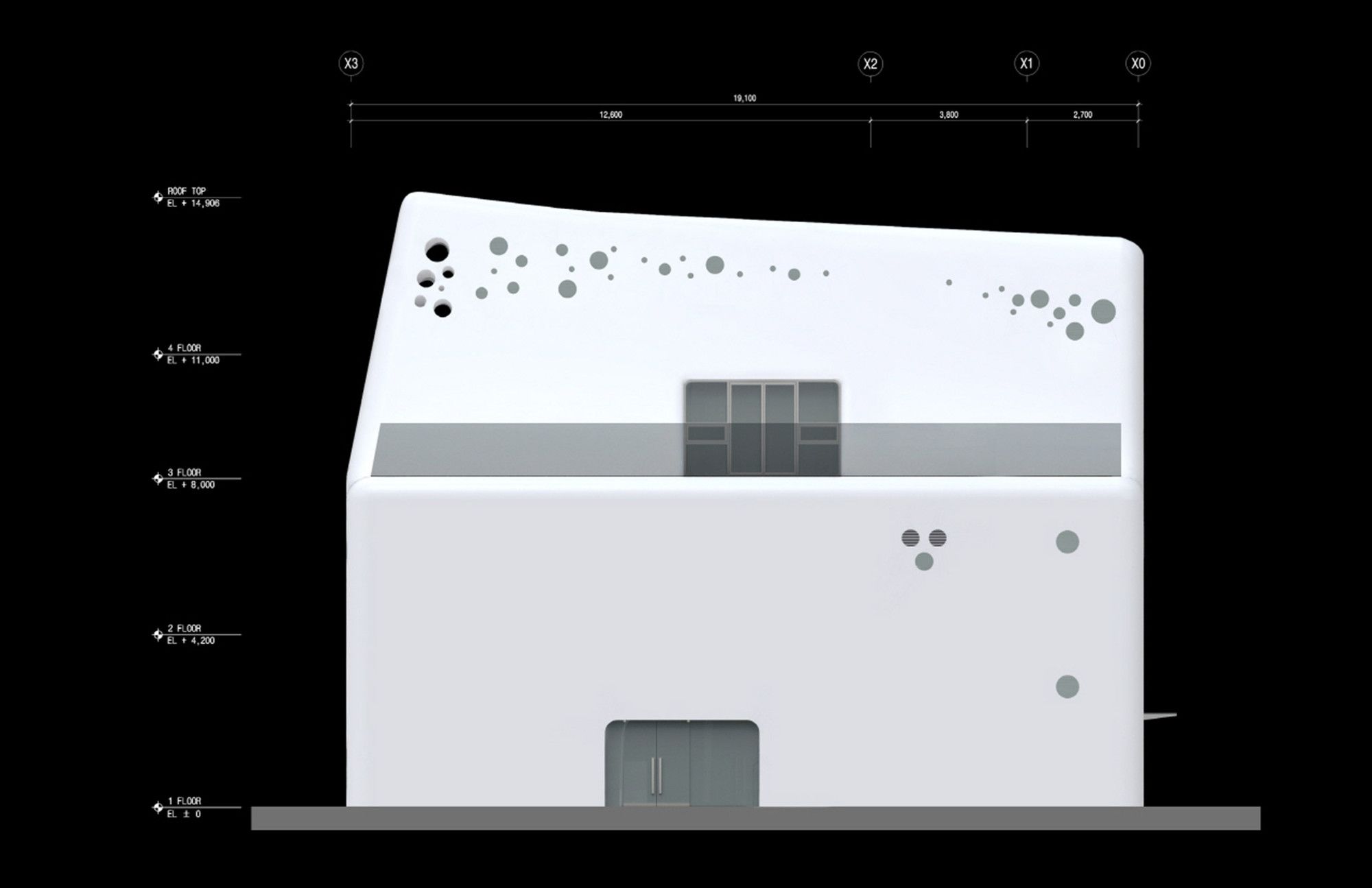
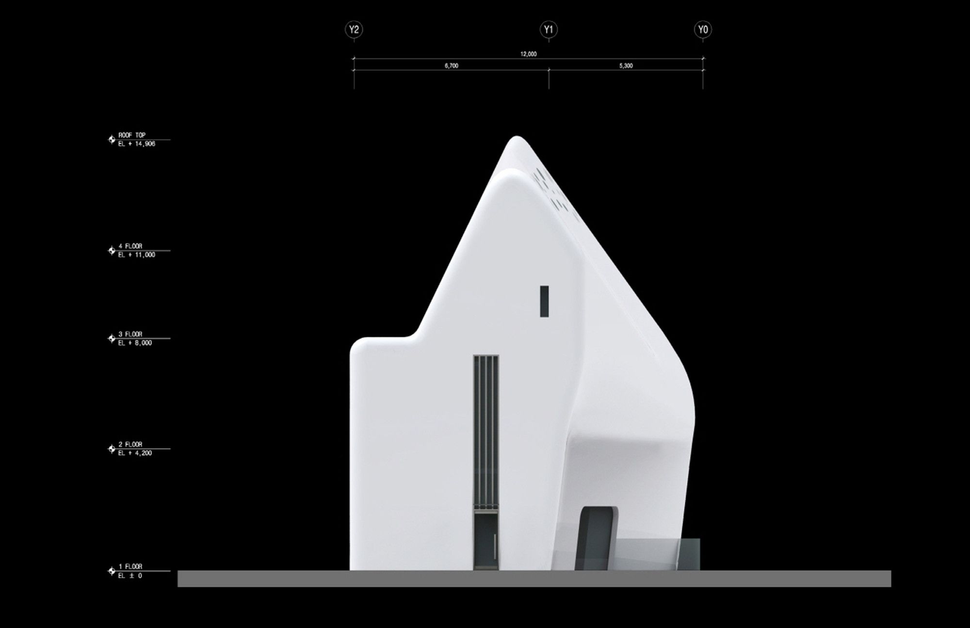
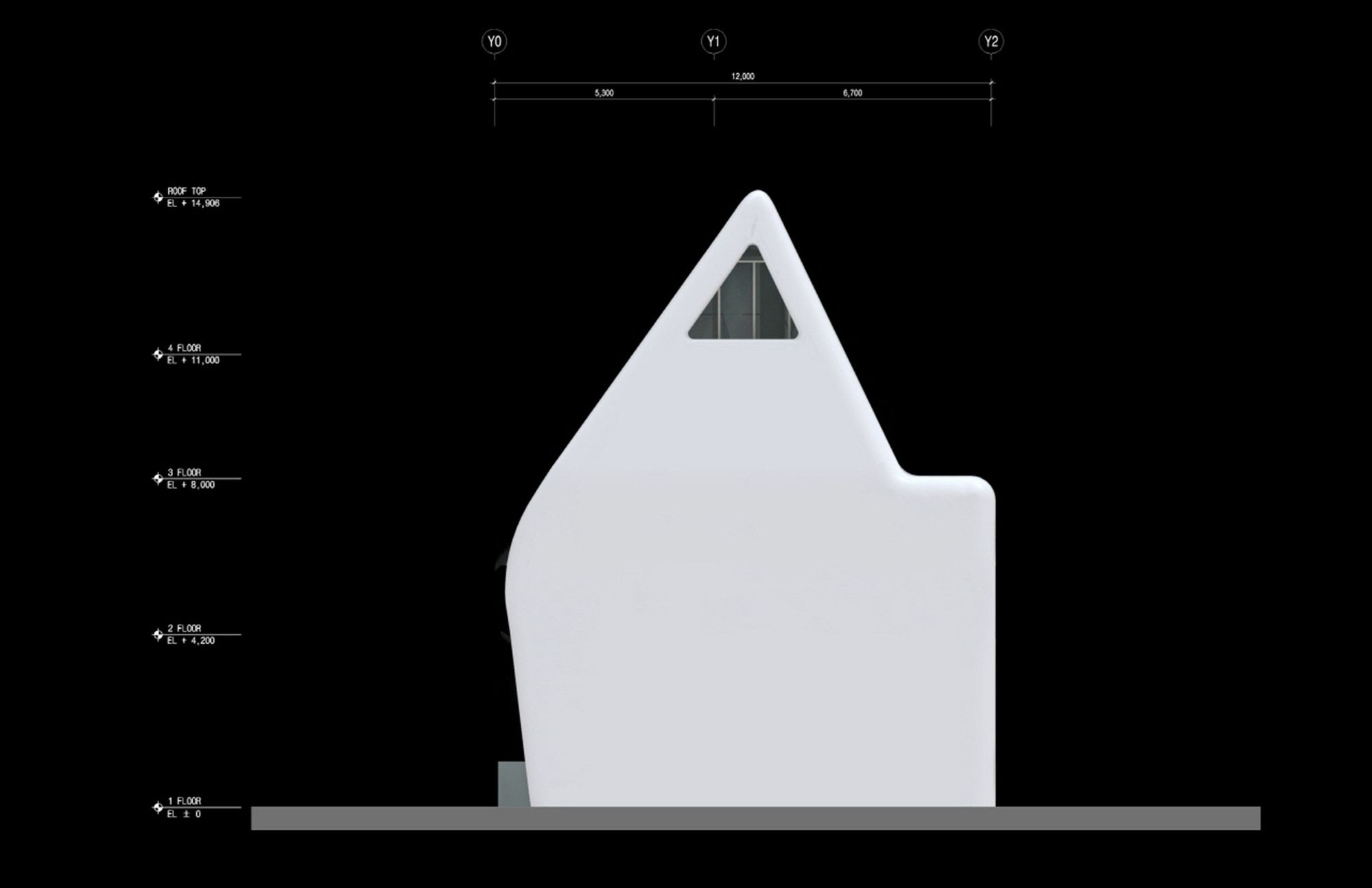
Elevation
Elevation
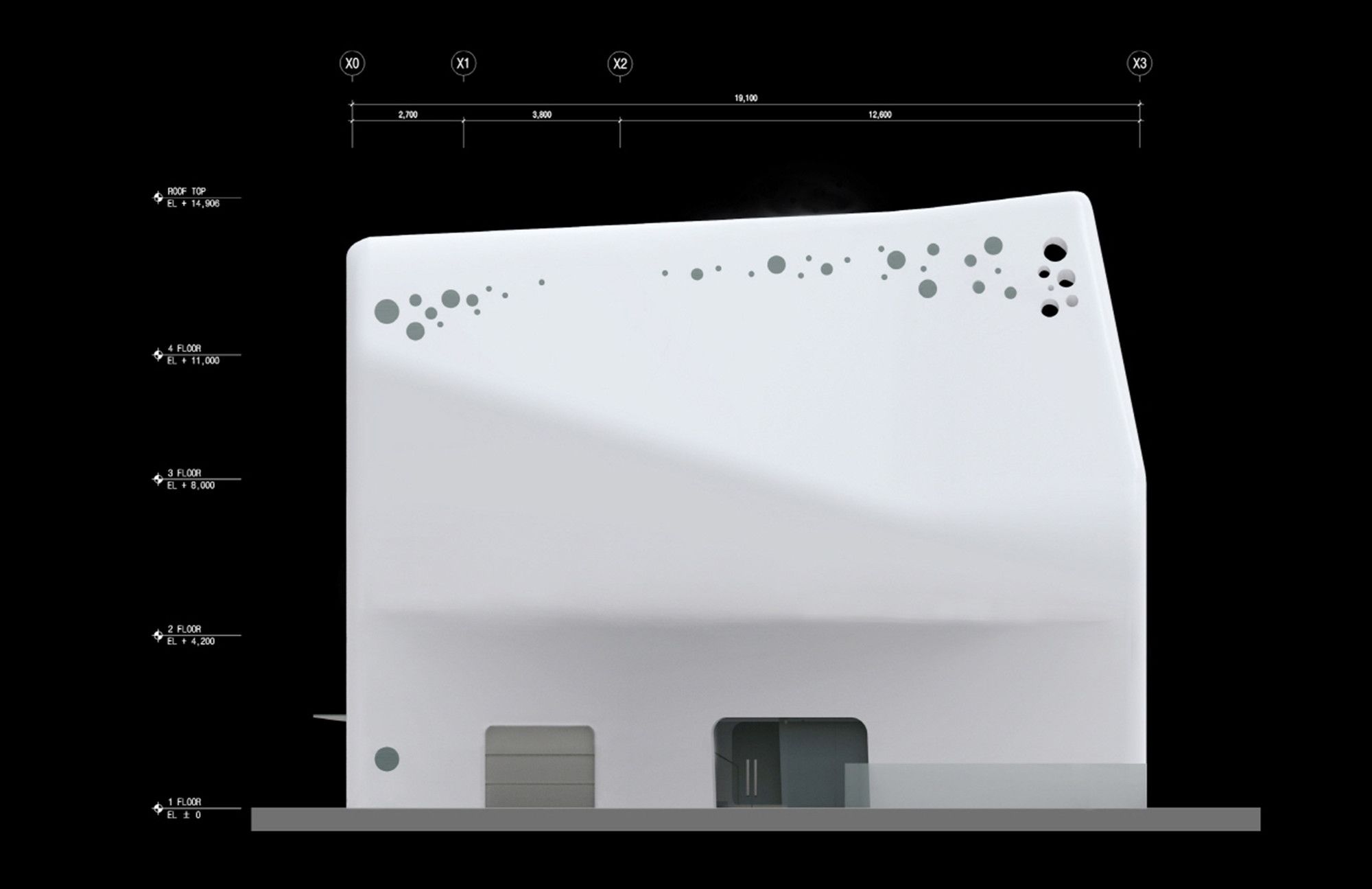
Elevation
Elevation
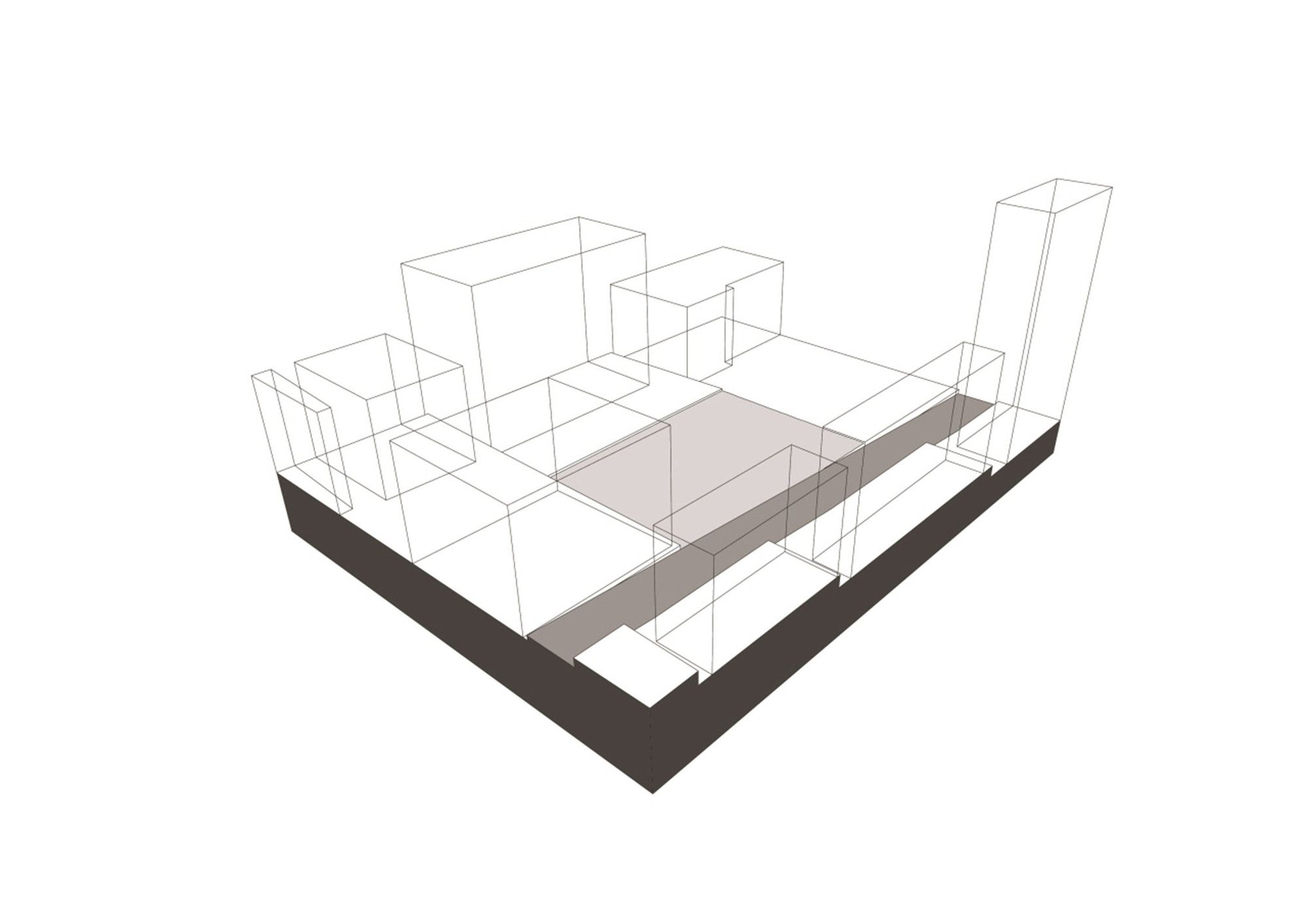
Diagram
Diagram
Diagram
Diagram
Diagram
Diagram
Diagram
Diagram
Diagram
Diagram
Diagram


