When we’ve lived and interacted with an environment for a long time it is easy to be comfortable with it and unable to see how the space can become better. Because of this buildings and places that we all know and love can begin to feel boring and predictable, as though it is stuck in a rut of sorts. What’s worse is when these places become inadequate to serve their purpose, for whatever reason, whether good or bad. The original Pen Station in New York was constructed in the 1960’s, arguably the biggest transit hub in the western hemisphere, it now receives well over half a million people each day, which is nearly triple the amount of people it seen upon first opening, making it a very busy node that could even be described as cramped and dismal. It is because of this, and the fact that the Madison Square Garden’s special arena permit has expired that prompted the Municipal Art Society of New York to challenge four top firms to re-envision Pen Station and Madison Square Garden and integrate them more readily into the urban fabric.
The following designers were chosen for their vast experience with complex urban issues, they include: SOM, H3 Hardy Collaboration Architecture, Diller, Scofidio + Renfro, and SHoP Architects. Their re-envision had to reframe Pen Station as a city-wide symbol of design, engineering, and urban culture so as to comply with the Municipal Art Society’s mission in creating a more liveable New York through intelligent urban planning and design. Part of the project also included creating a clear narrative for the greater midtown area that incorporates exciting possibilities for the 16 acre west side waterfront Hudson Yards site. Provided are short proposal descriptions from each of the architects about their solution. SOM:
SOM:
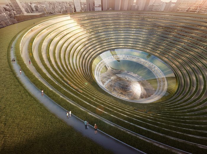
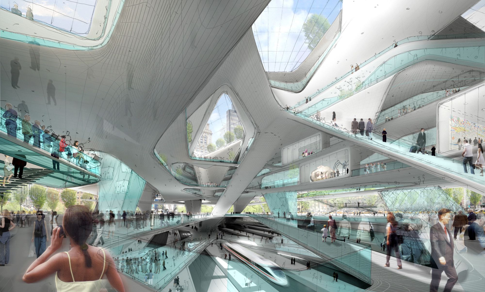
The mega firm proposed to move Madison Square Garden to an adjacent site, while fantastically expanding Penn Station into an efficient, green vortex of circulation. Sporting vegetated space four times the size of Bryant Park, more offices that Rockefeller Center and more cultural hot spots than Lincoln Center, the green-clad funnel of circulation is organized by a large, transparent ticketing hub and four mixed-use towers at the corners greatly expanding footprint of the station.
H3 Hardy Collaboration Architecture:
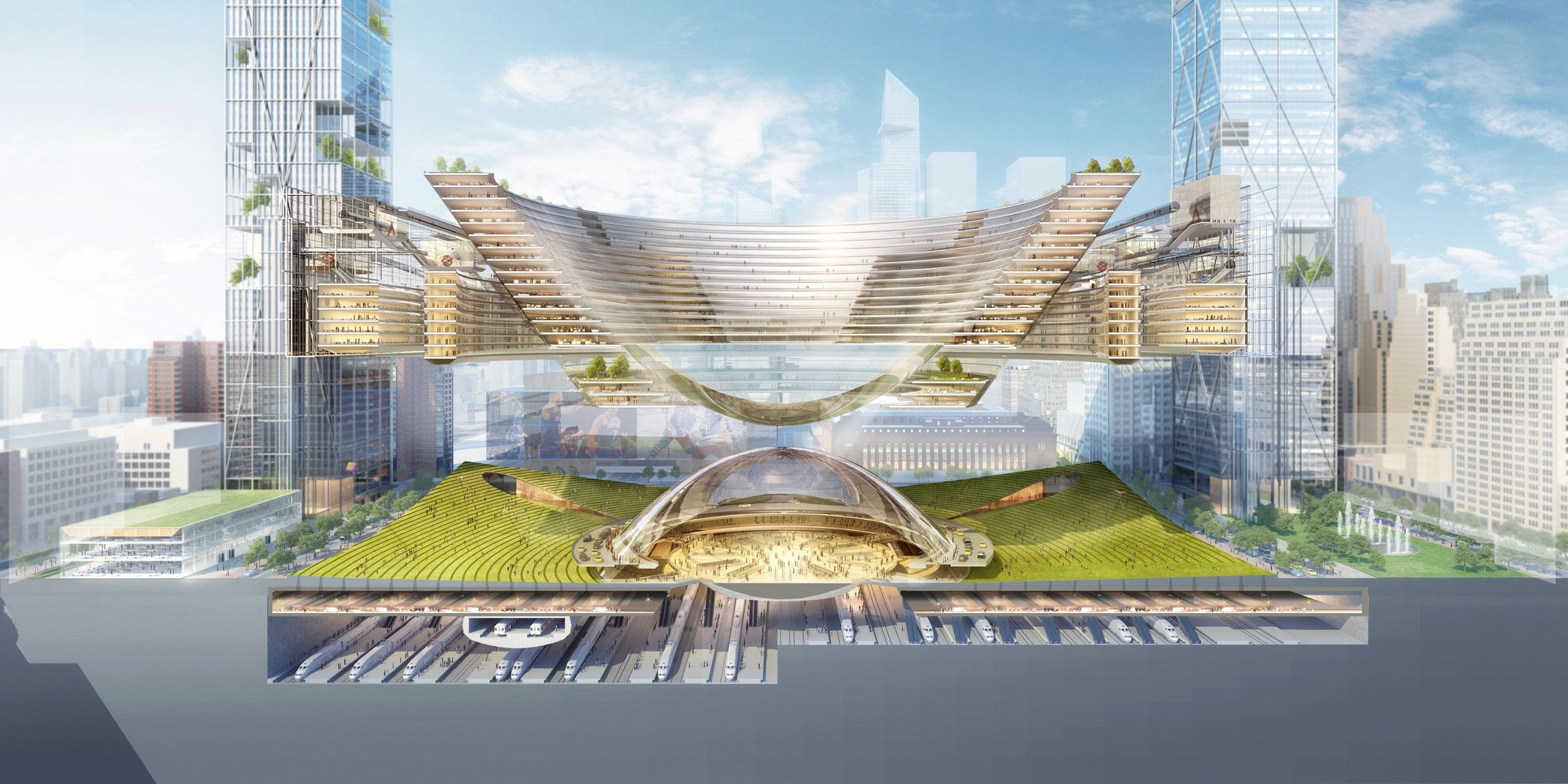
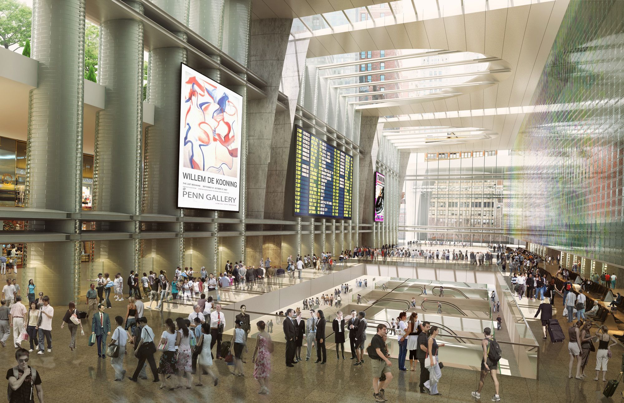
The firm was people-focused, seeking to move the complex to the west side waterfront and prioritizing a range of access, namely in form of a network of bike paths, a three acre public park and a two acre roof garden. Rendering the rail a ‘mode of choice’ was a point of focus. Madison Square Garden would be entirely moved off site. 24 million square feet of private development around Penn Station and up Seventh Avenue serves as an economic engine for improvements and a revived world class commercial district. Diller, Scofidio + Renfro:
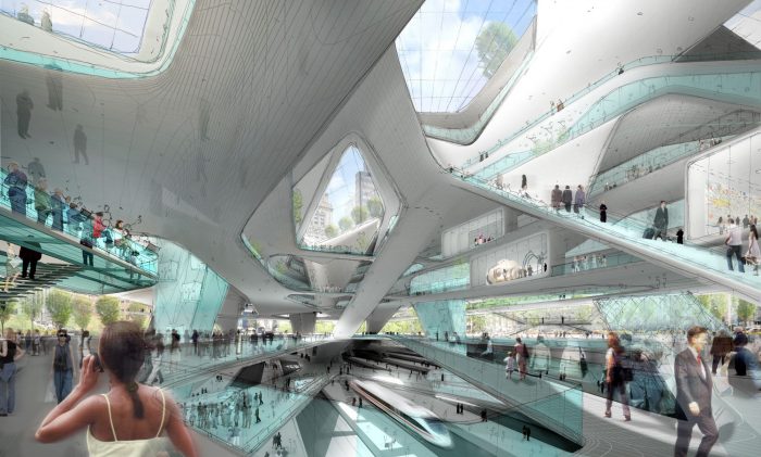
The firm behind the high line, proposes to conceptually reframe the idea of waiting and increase the value of ‘downtime’ by making the station an attractive light-filled and layered space. ‘ Penn 3.0’ seeks to be a destination, not merely consolidated gateway, by providing 24 hour programming and hosting residents and transients alike.
SHoP Architects:
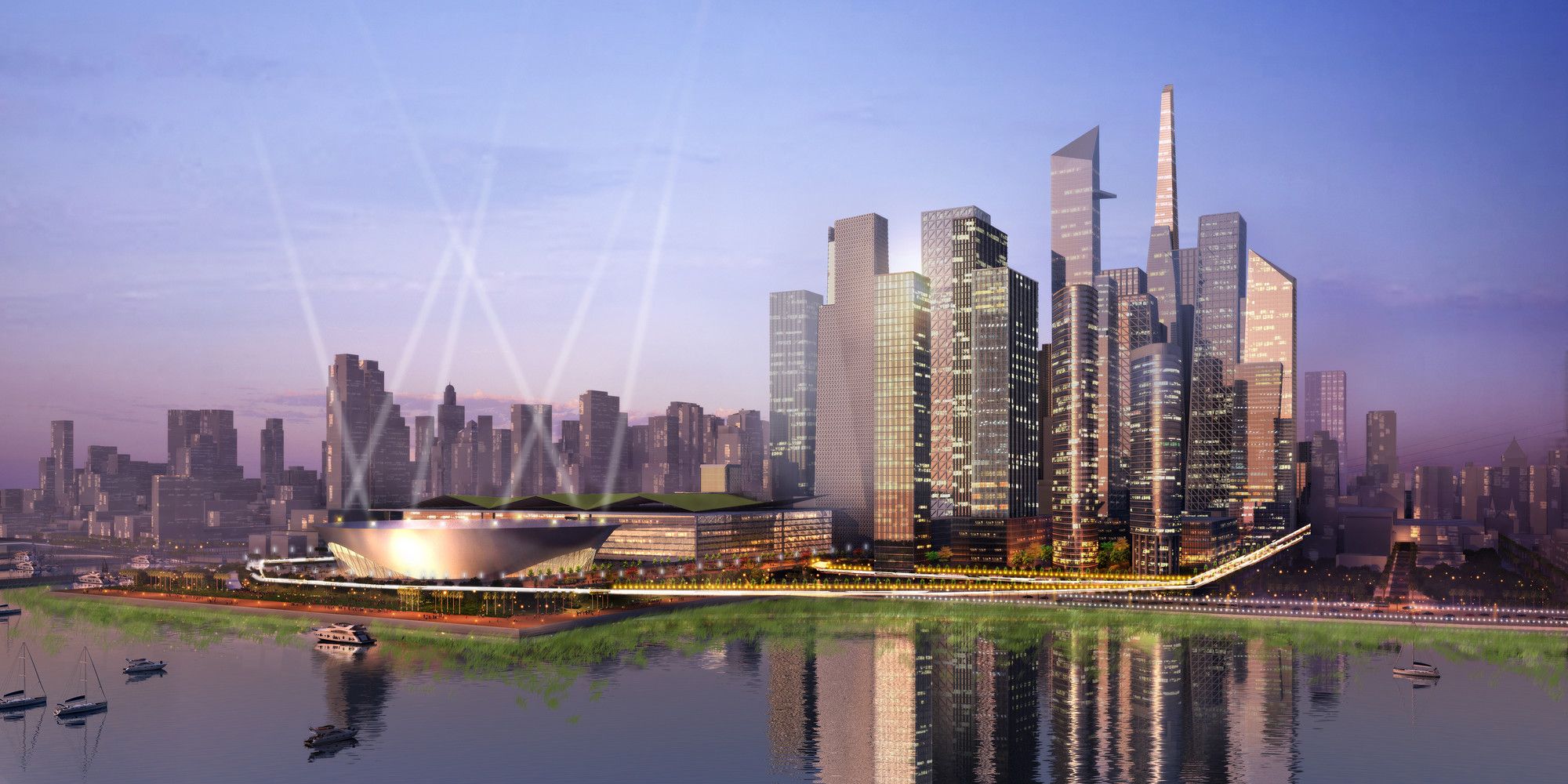
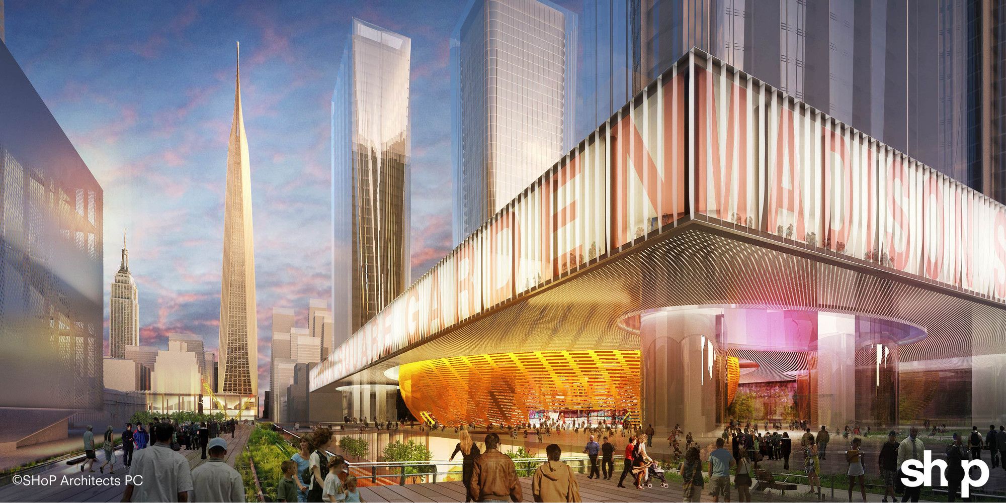
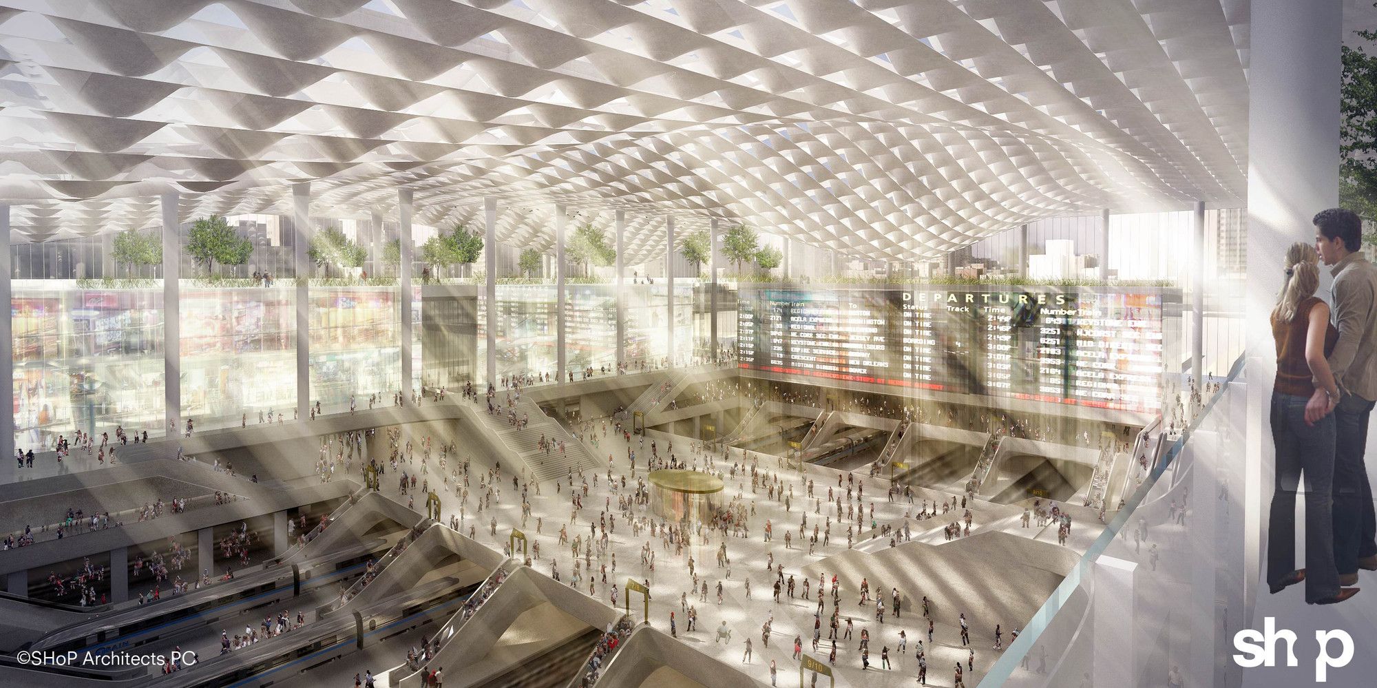
The hall of Penn Station will be a bright, dematerialized, open plan space characterized by intuitiveness. To help defray public investment, the firm suggested a poignant level of civic and architectural synthesis by proposing to extend the highline so that the new station is connected to an offsite Madison Square Garden. A front-facing gateway park would serve as a grand civil feature.
Courtesy of H3 Hardy Collaboration Architecture
Photography by: © SOM
Photography by: © SOM
Courtesy of SHoP
Courtesy of Diller Scofidio + Renfro
Courtesy of H3 Hardy Collaboration Architecture
Courtesy of SHoP


