Pied-à-mer Apartment at Sea
Drawing on Le Corbusier’s interest in streamlined, mid-20th century steamship design and MKCA’s own expertise in creating compact, multifunctional spaces in contemporary urban environments, the apartment is simultaneously adaptable, efficient, and strikingly elegant.
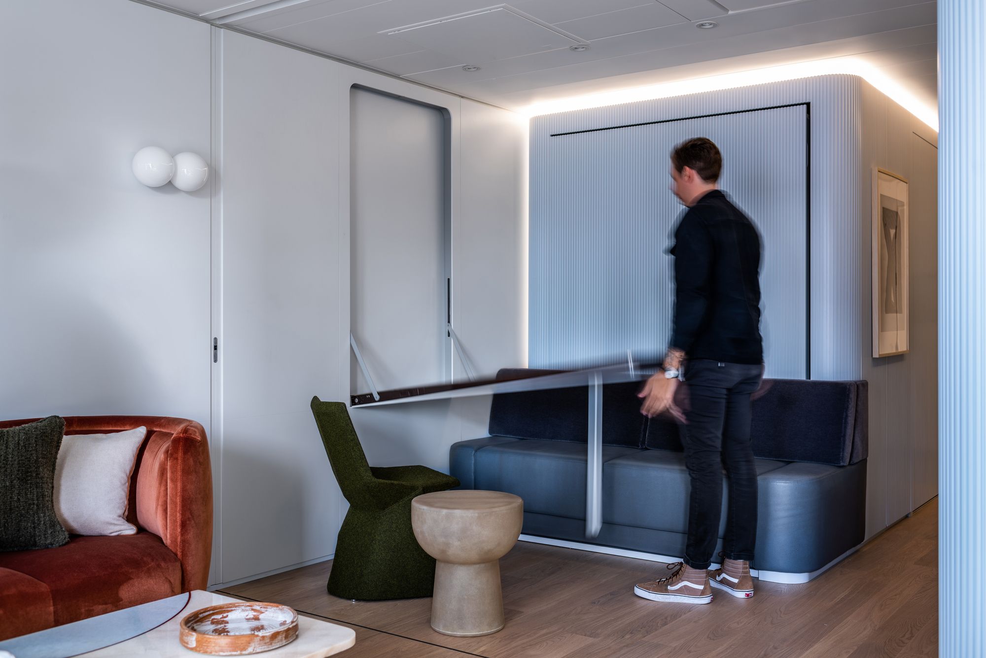
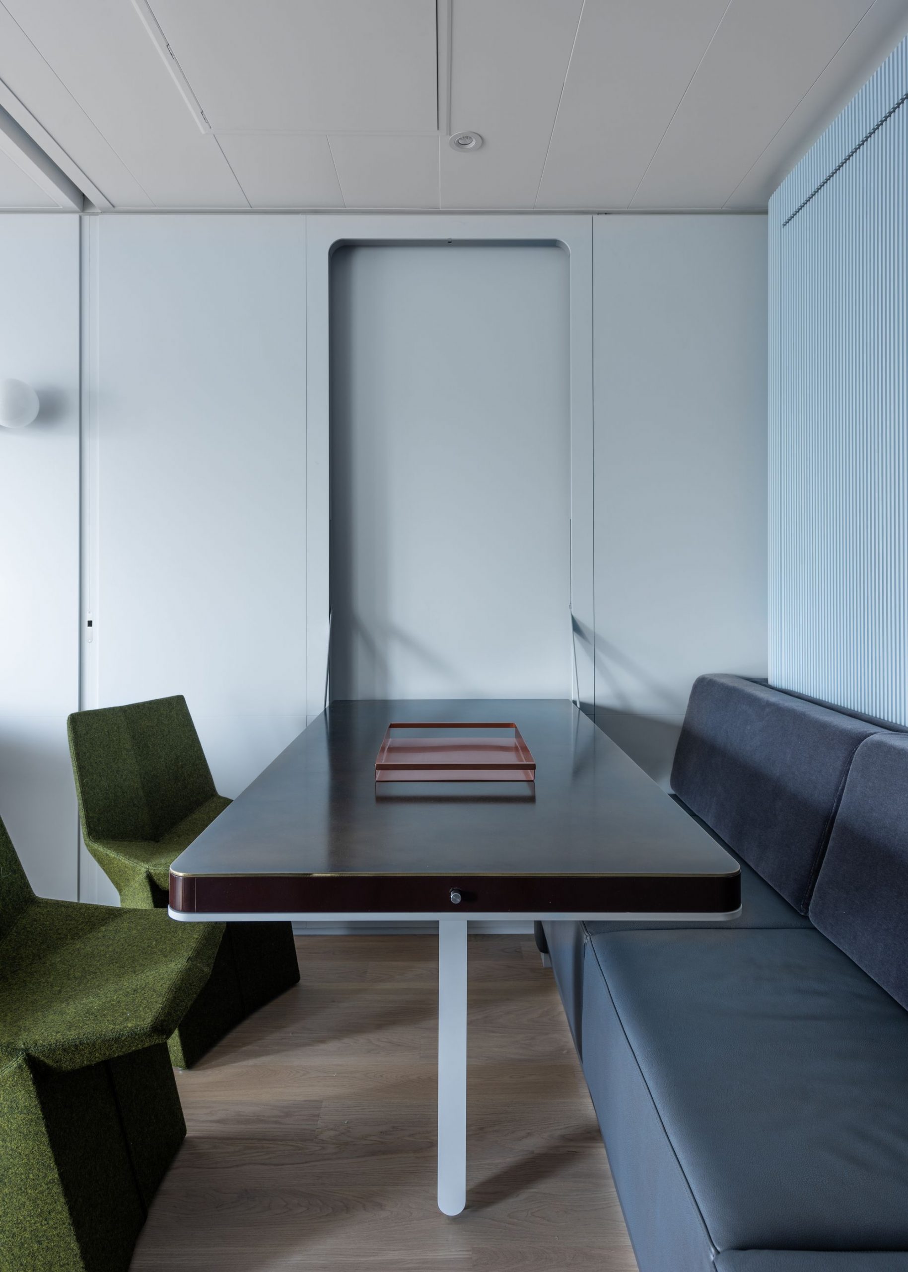
Playfully dubbed by MKCA as a pied-à-mer, the residence serves as a holiday home for a couple and their grown children, transforming seamlessly from a spacious one-bedroom to a two-bedroom apartment through tables and beds that fold away and unfurl as necessary. As a jumping-off point for the project, MKCA looked to modernist architecture’s fascination with nautical design, which optimized for small-scale living, modular organization, and efficiency.
In particular, Le Corbusier’s belief that a home should be regarded as a “machine for living,” as well as his fascination with cruise ships as models for self-sufficient, utopian apartment complexes, like his famed 1952 Unite D’Habitation, offered inspiration, as did Gio Ponti’s work on cruise ships and ocean liners, and Eileen Gray’s villa E-1027 in the South of France for its embrace of earthy materials contrasting against smooth, planar surfaces of the building.
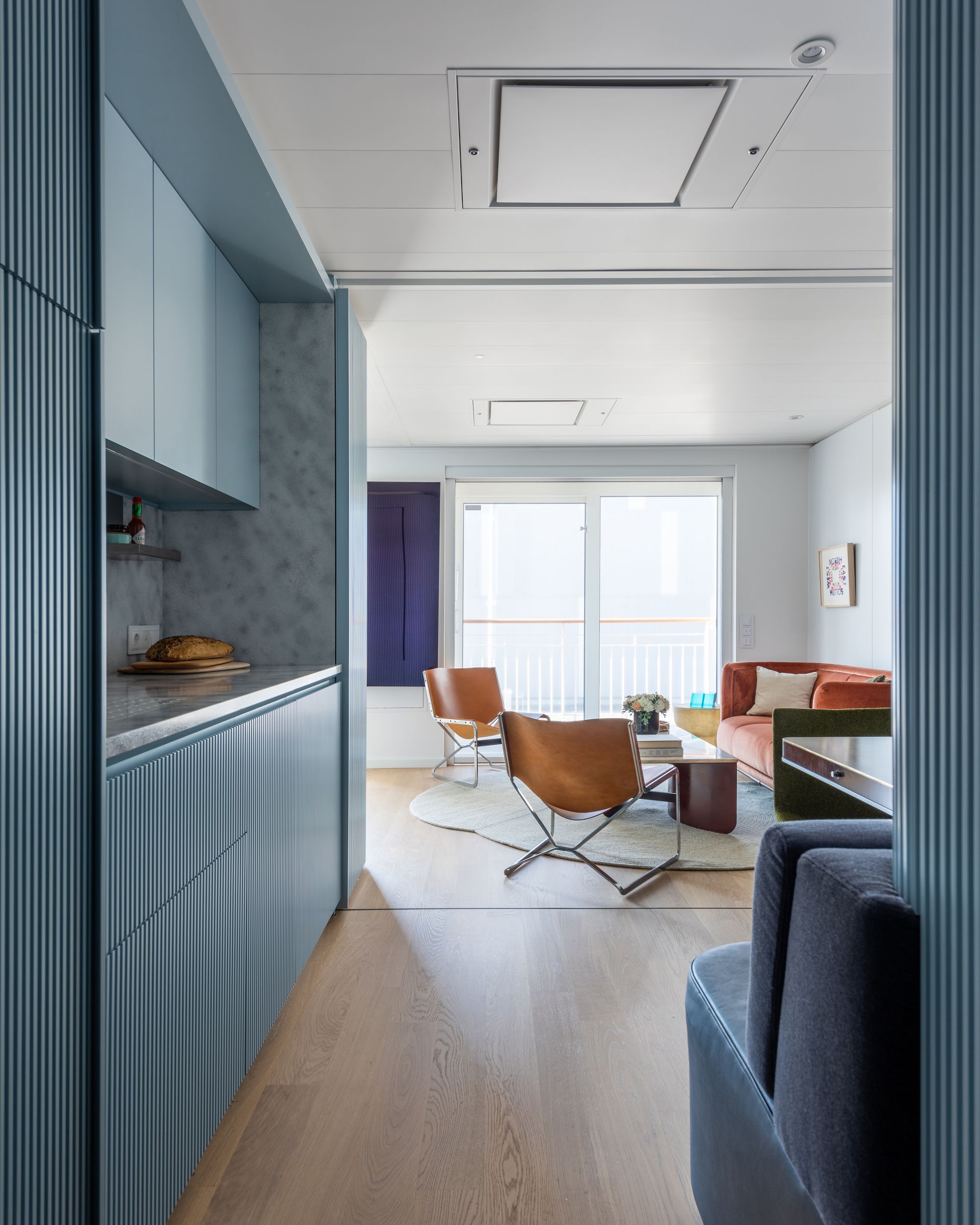
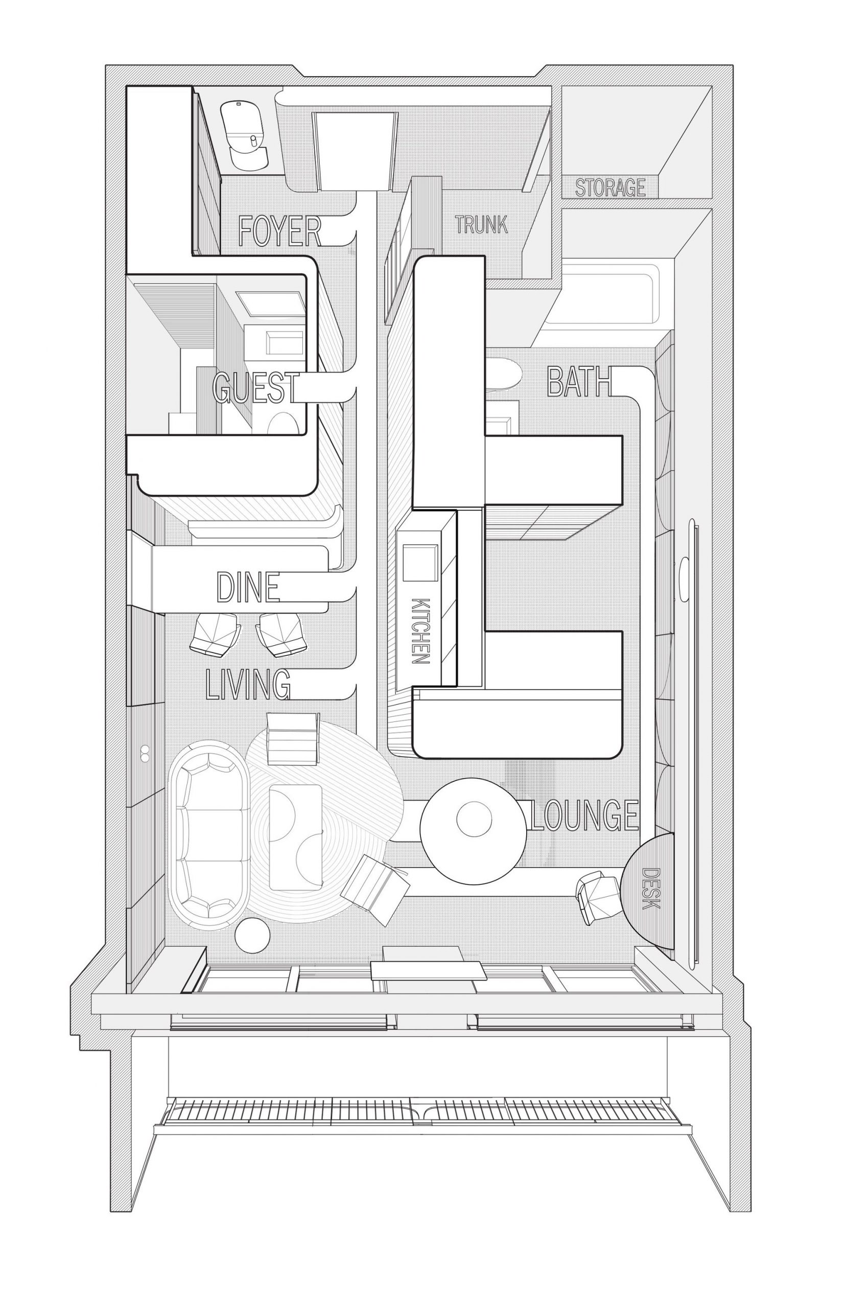
The convertible layout of the apartment pulls from these concepts, enhanced by what Chen describes as a “streamlining and smoothening of its functional dimensions.” Movement, and the unfolding and concealing of different functional zones, is carefully choreographed. By elongating the path of circulation, space appears to expand and compress as one moves around, ultimately appearing, and feeling, more spacious.
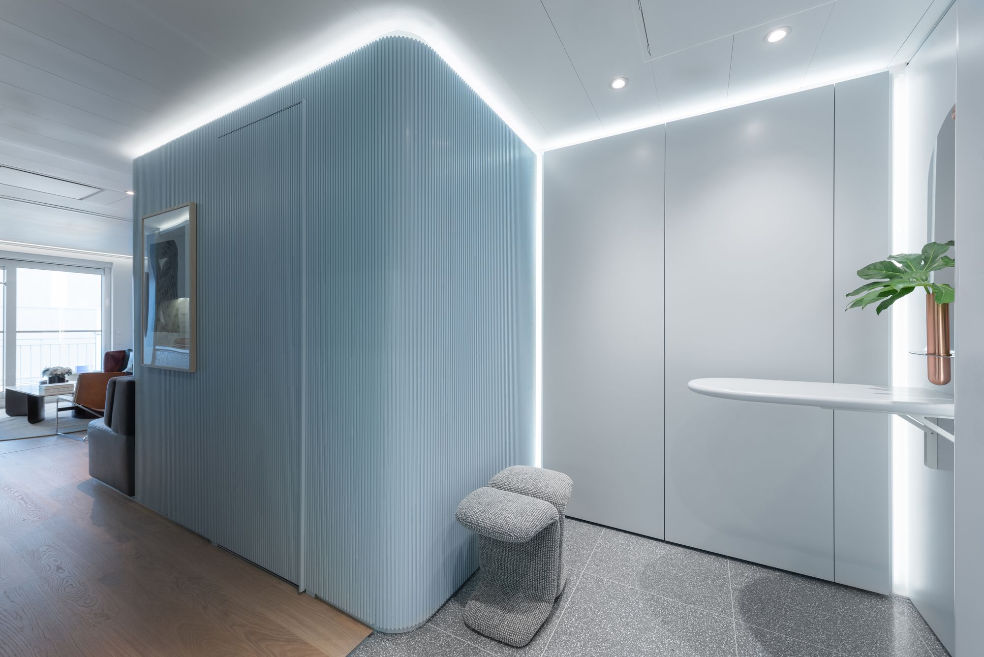
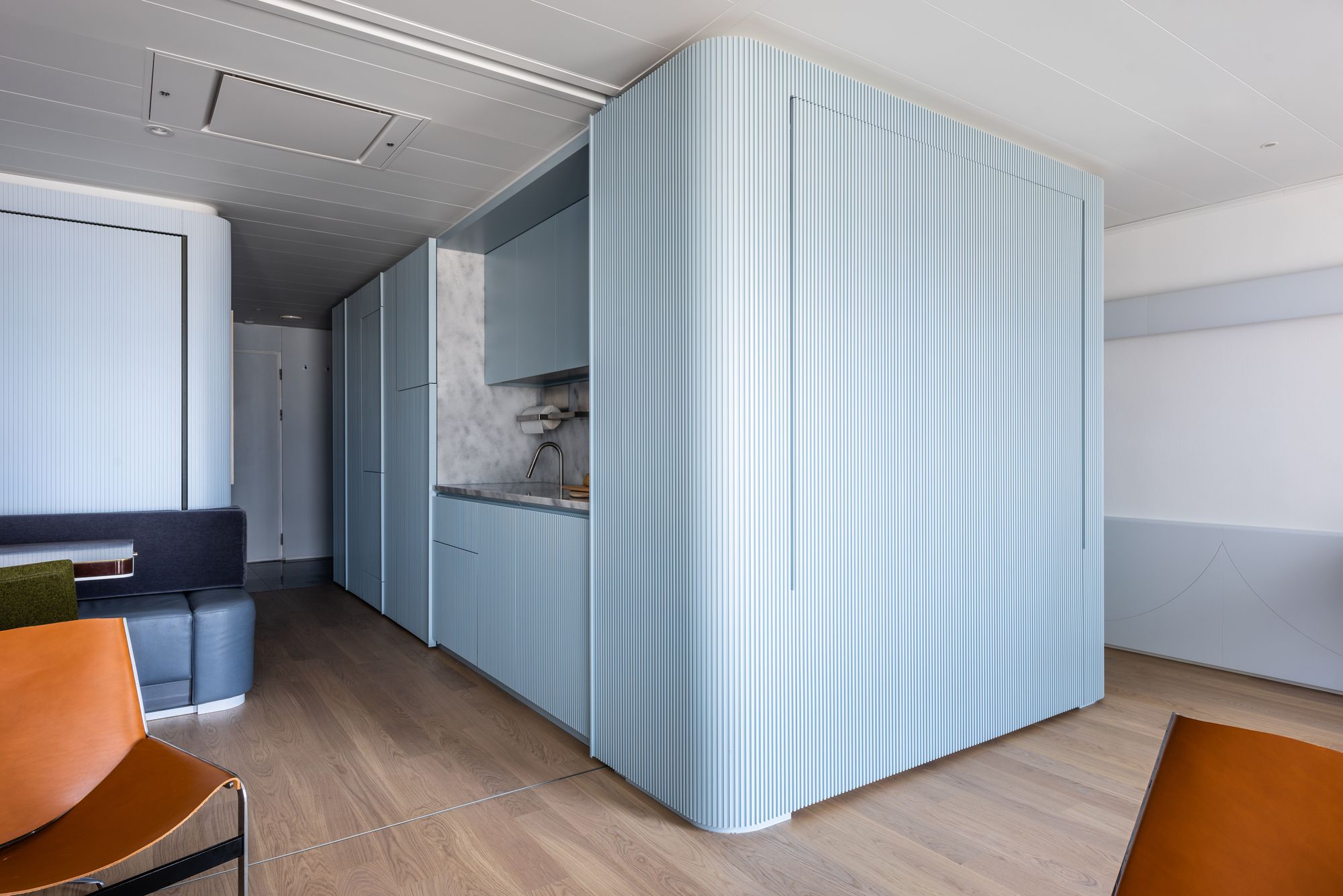
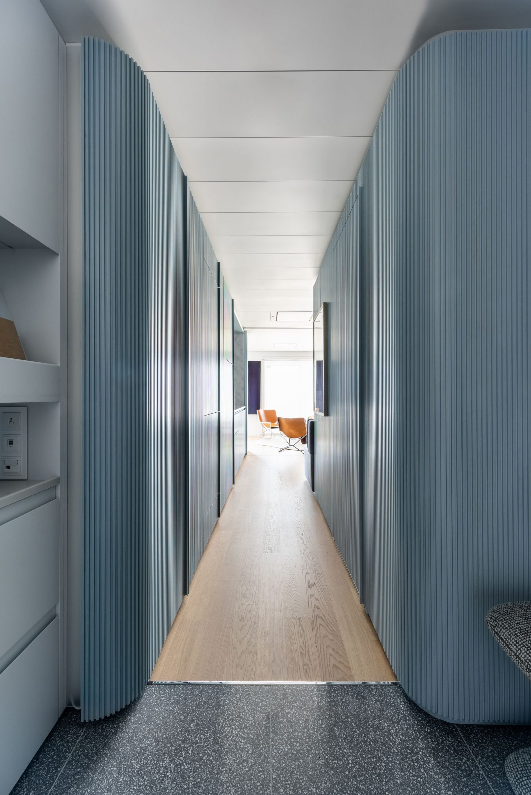
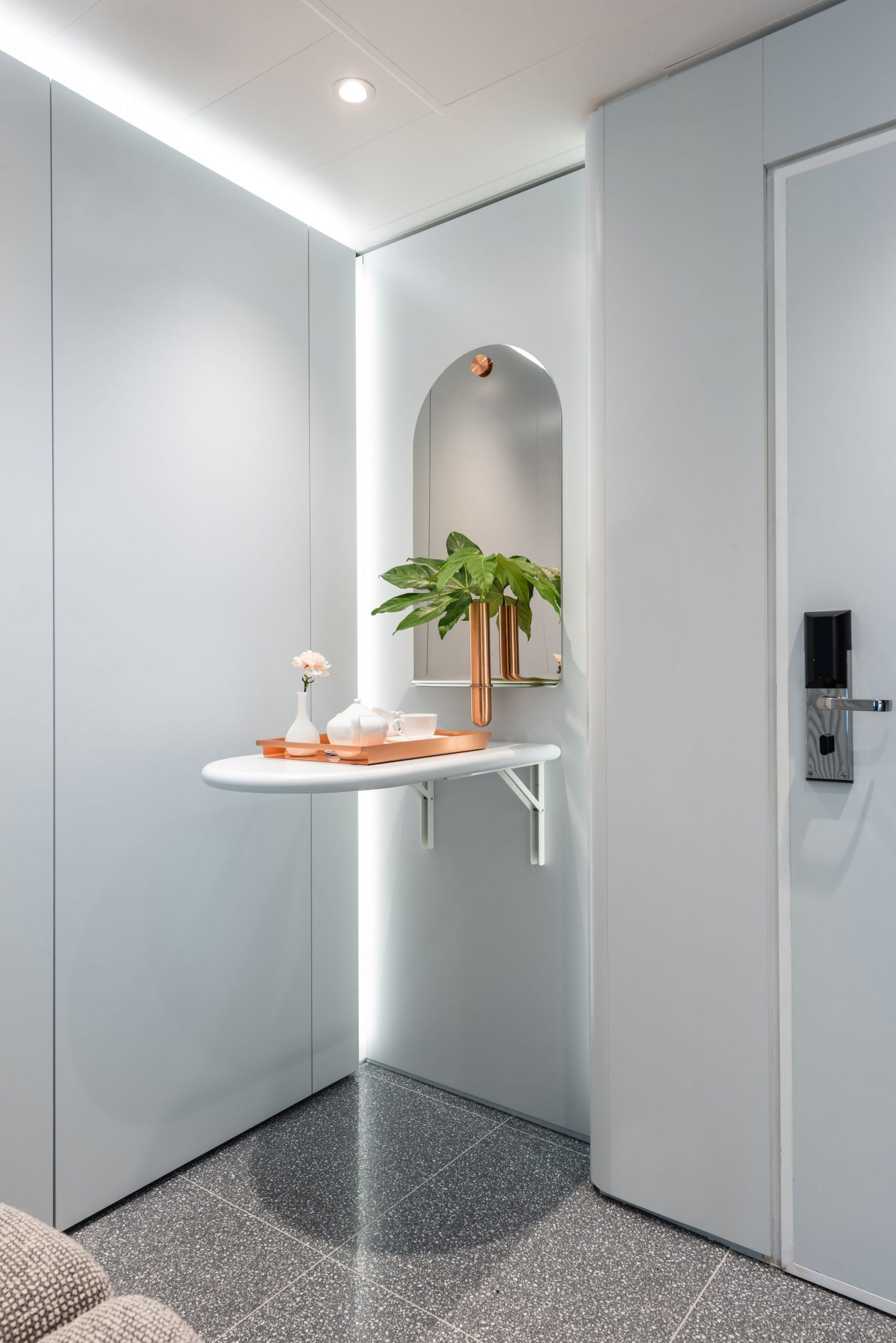
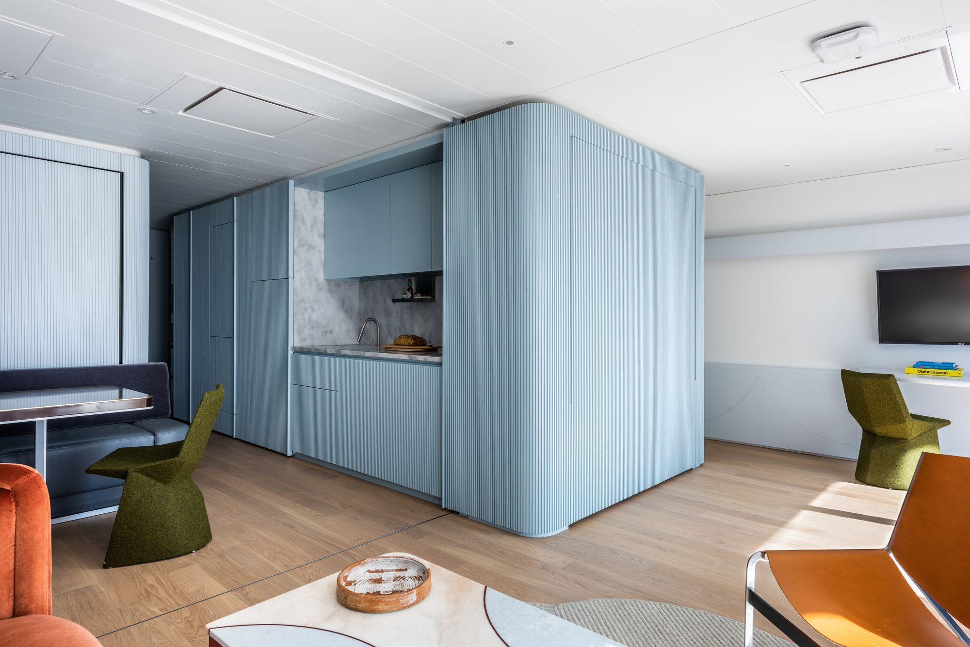
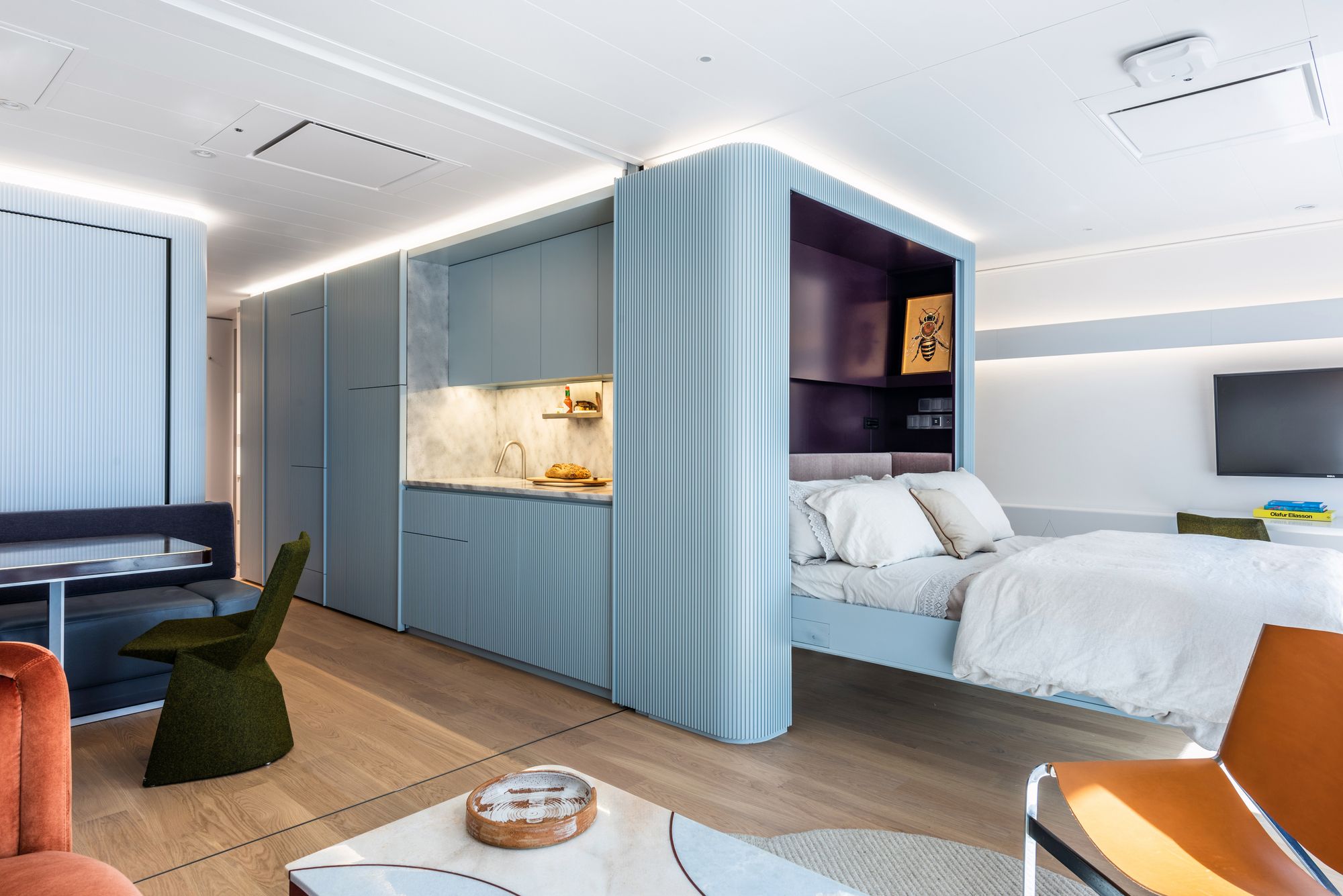
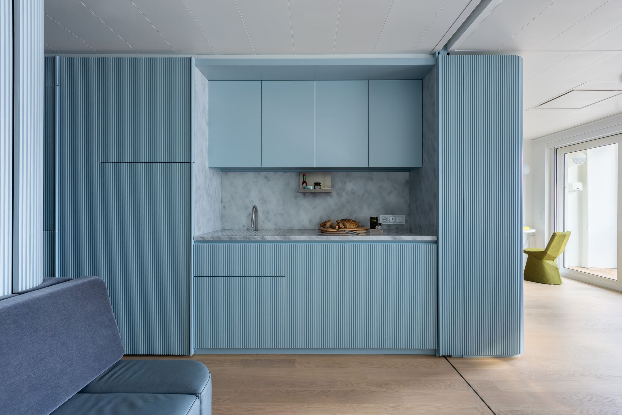
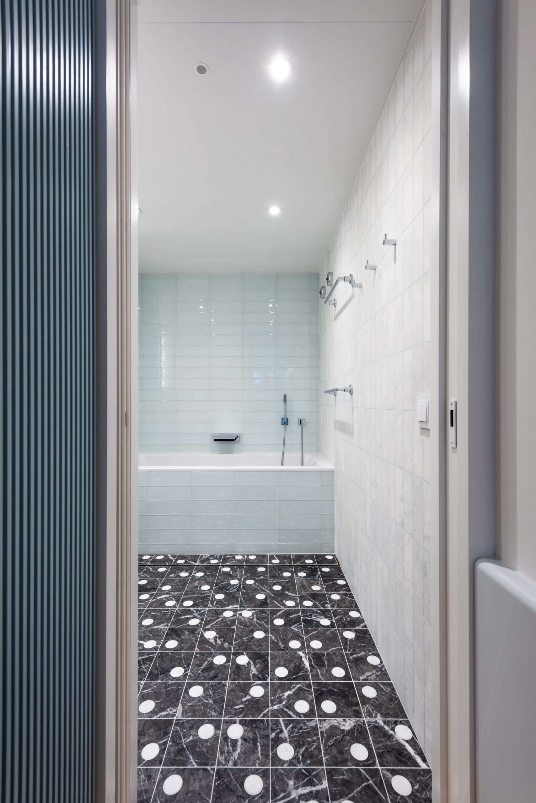
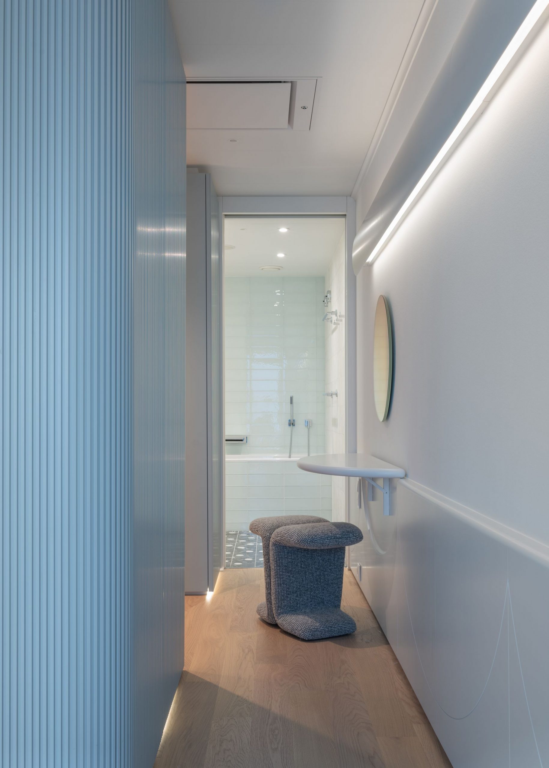
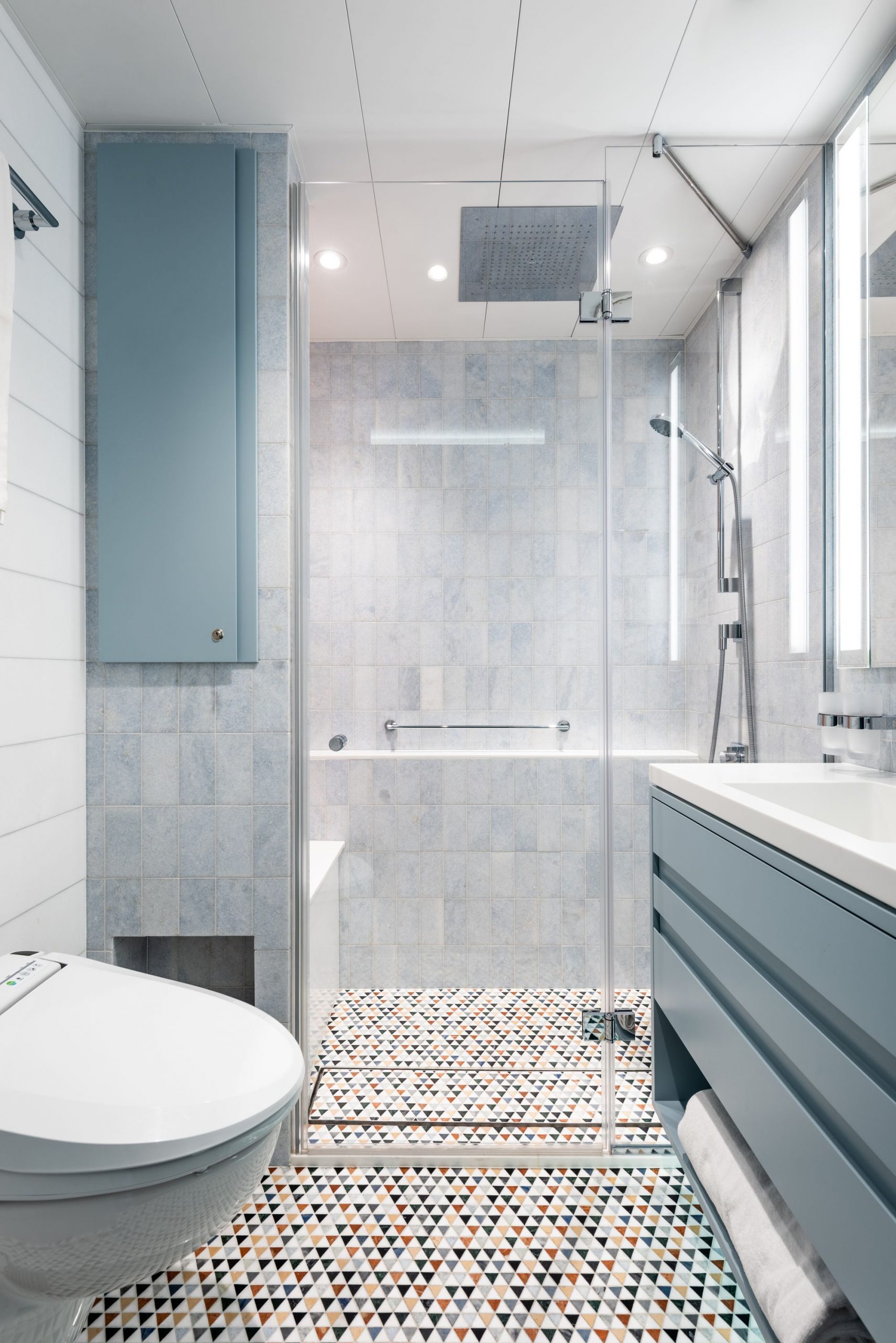
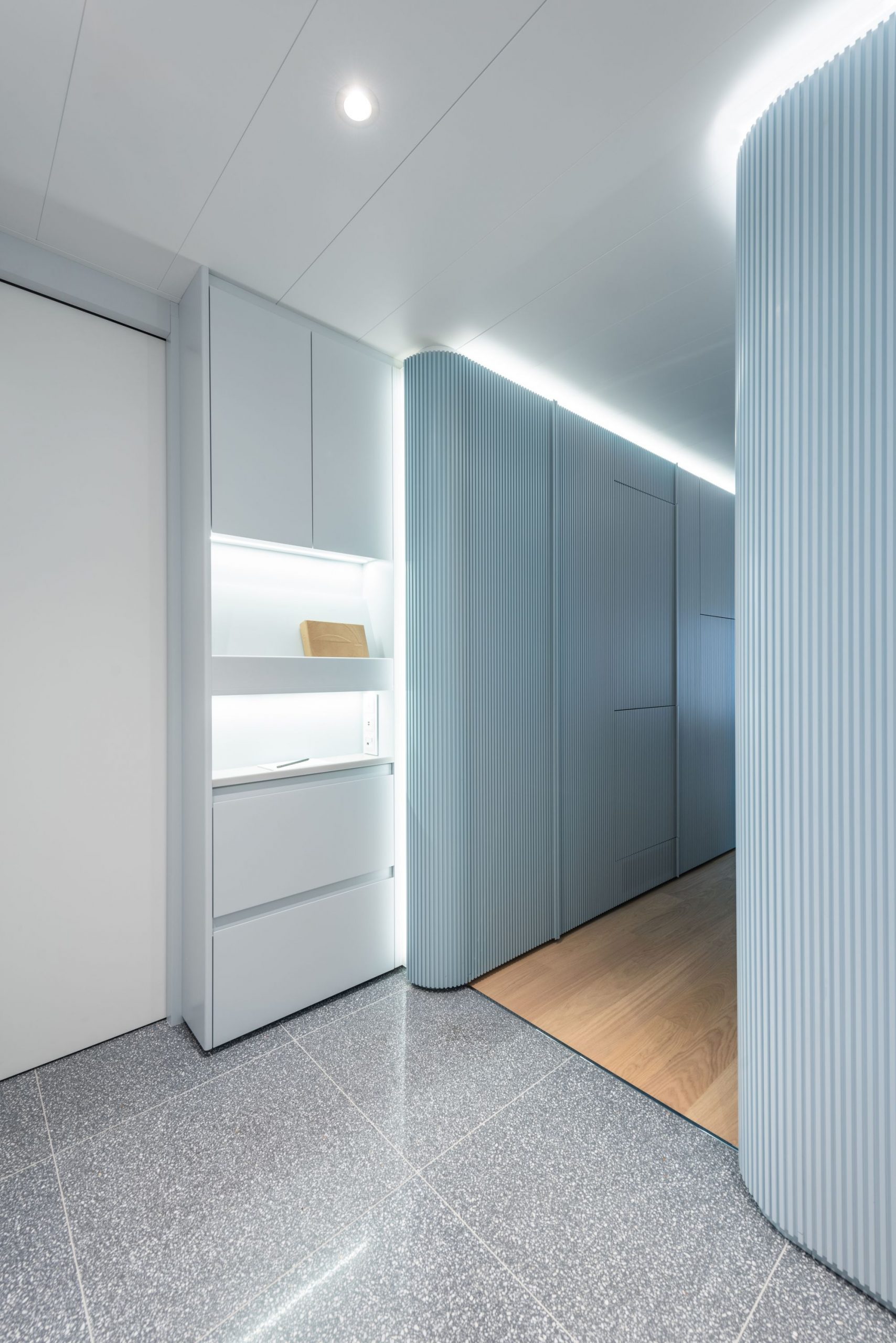
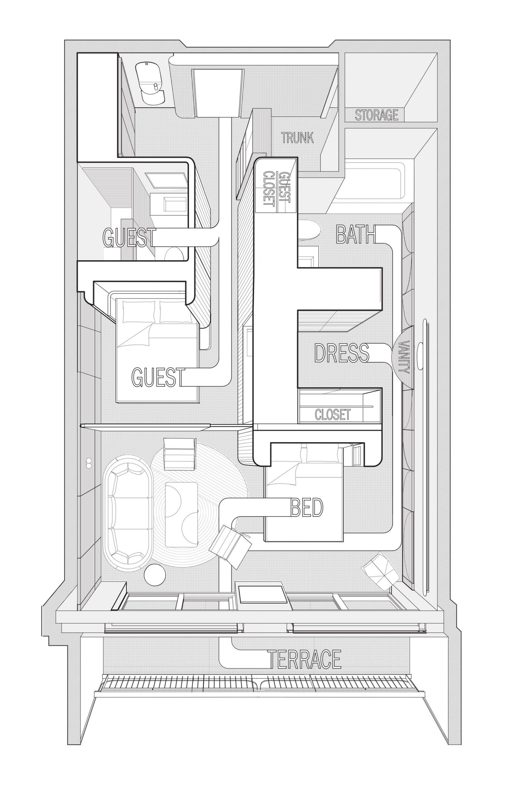
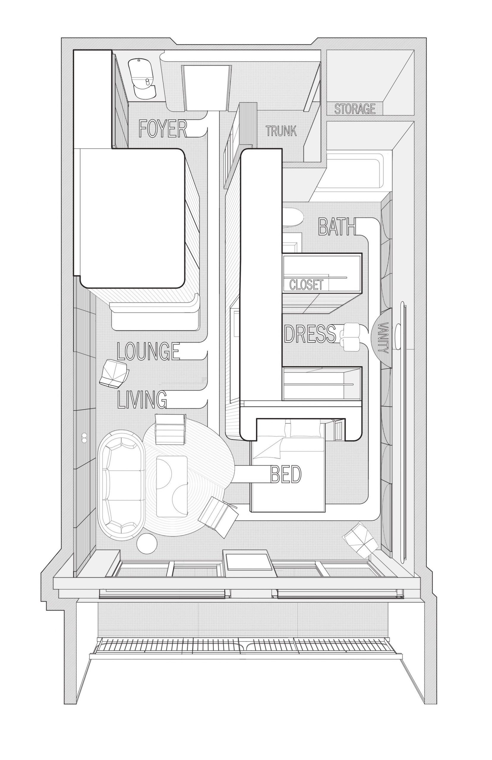
Upon entering the apartment, one moves from a bright foyer towards a broad wall of ocean-facing glass, flanked by two separate ribbed aluminum pod-like volumes, each containing private bath and storage areas. The volumes organize the space and create paths for circumnavigation and movement between and around them, where living spaces are tucked, allowing for peeking around corners. Despite the small footprint, private zones, such as the master bath and dressing room, still feel remote from the entry and living spaces, and there is an experience of moving down long corridors and peeking around corners.
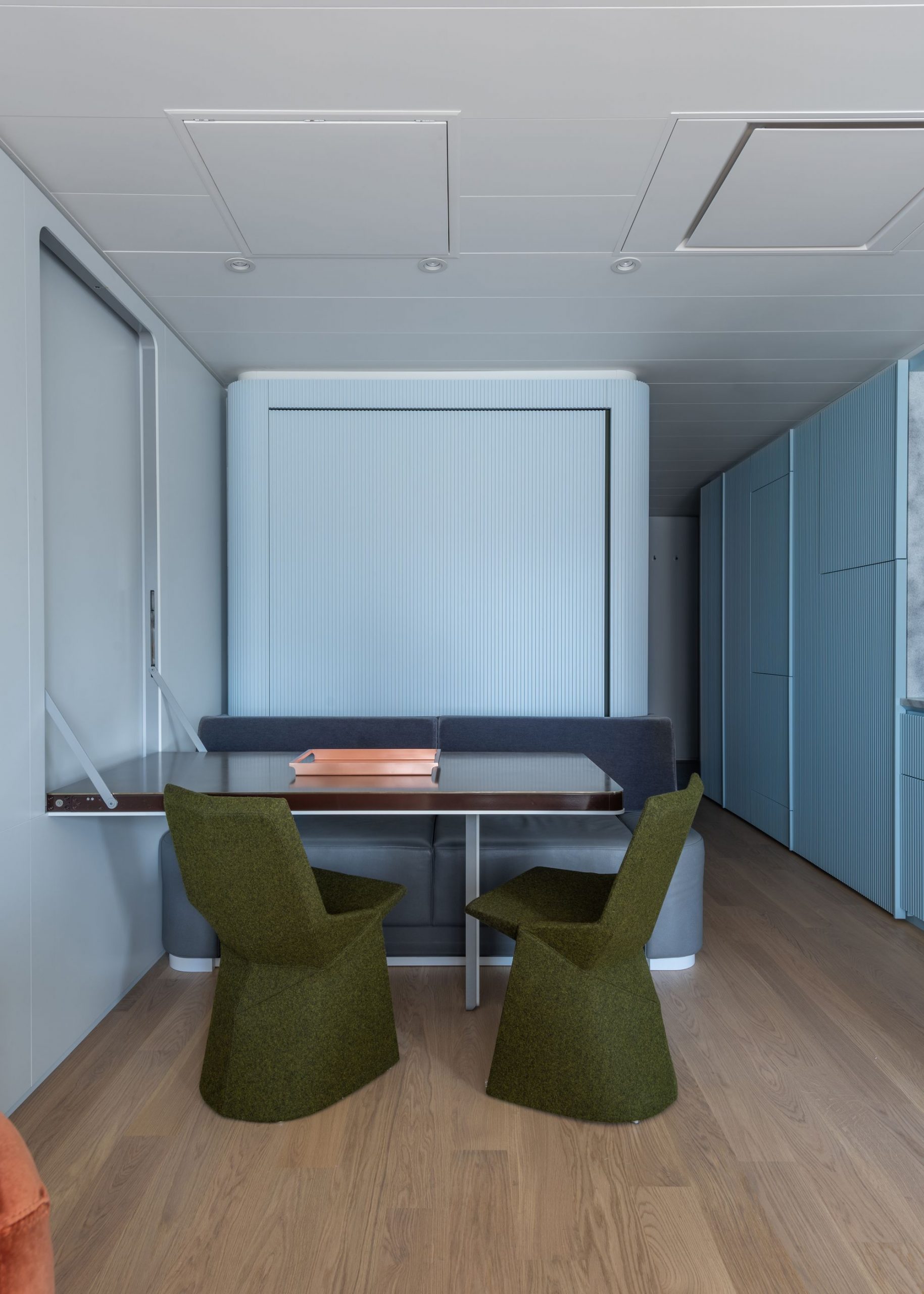
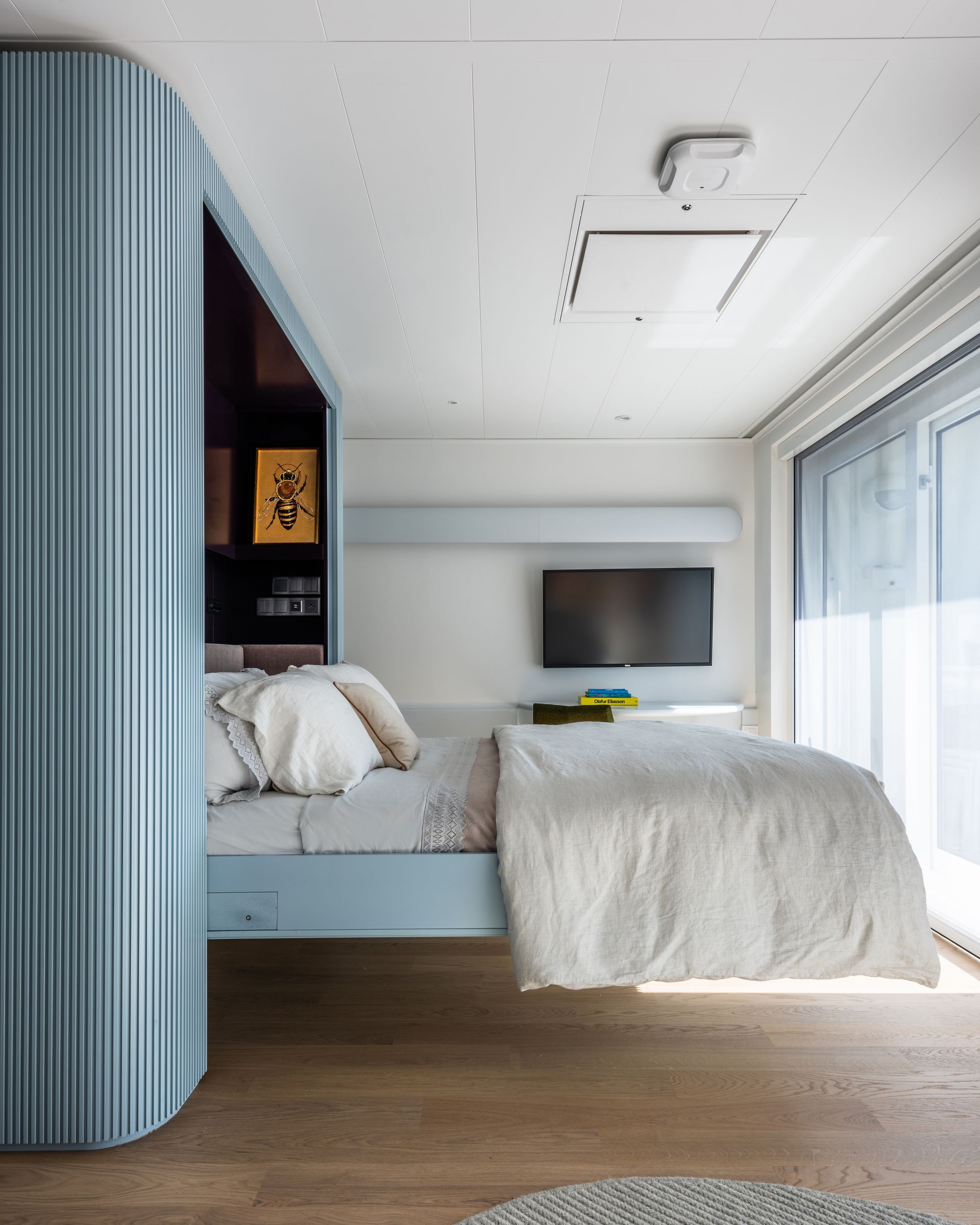
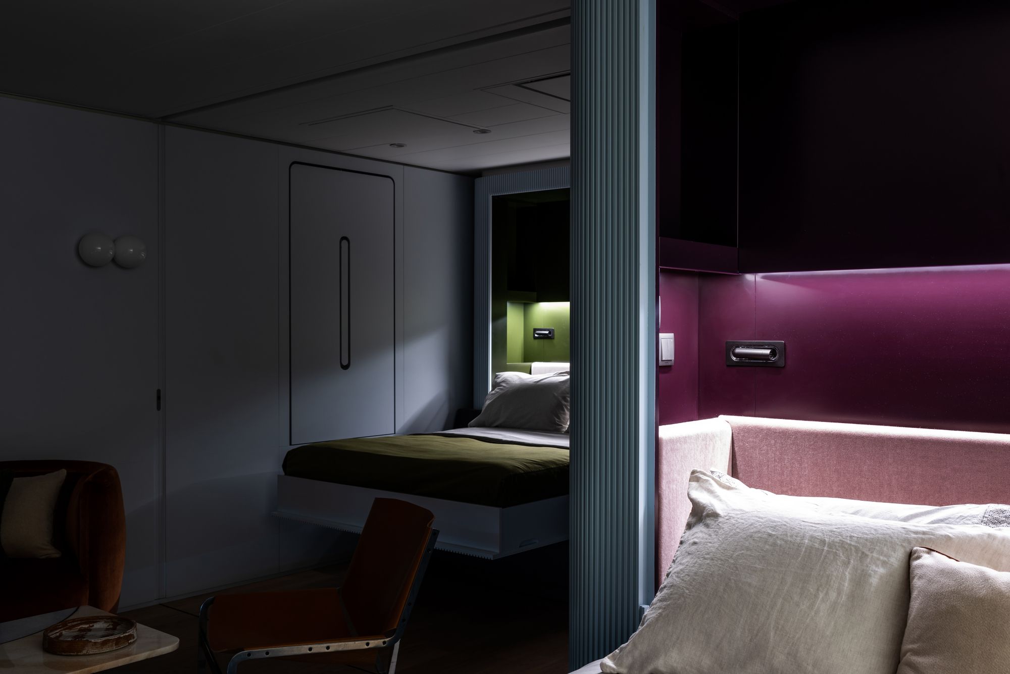
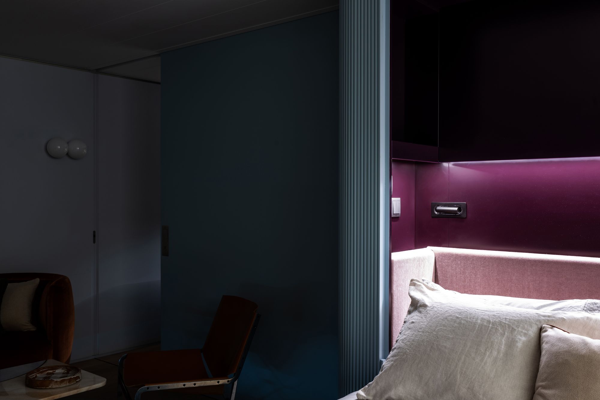
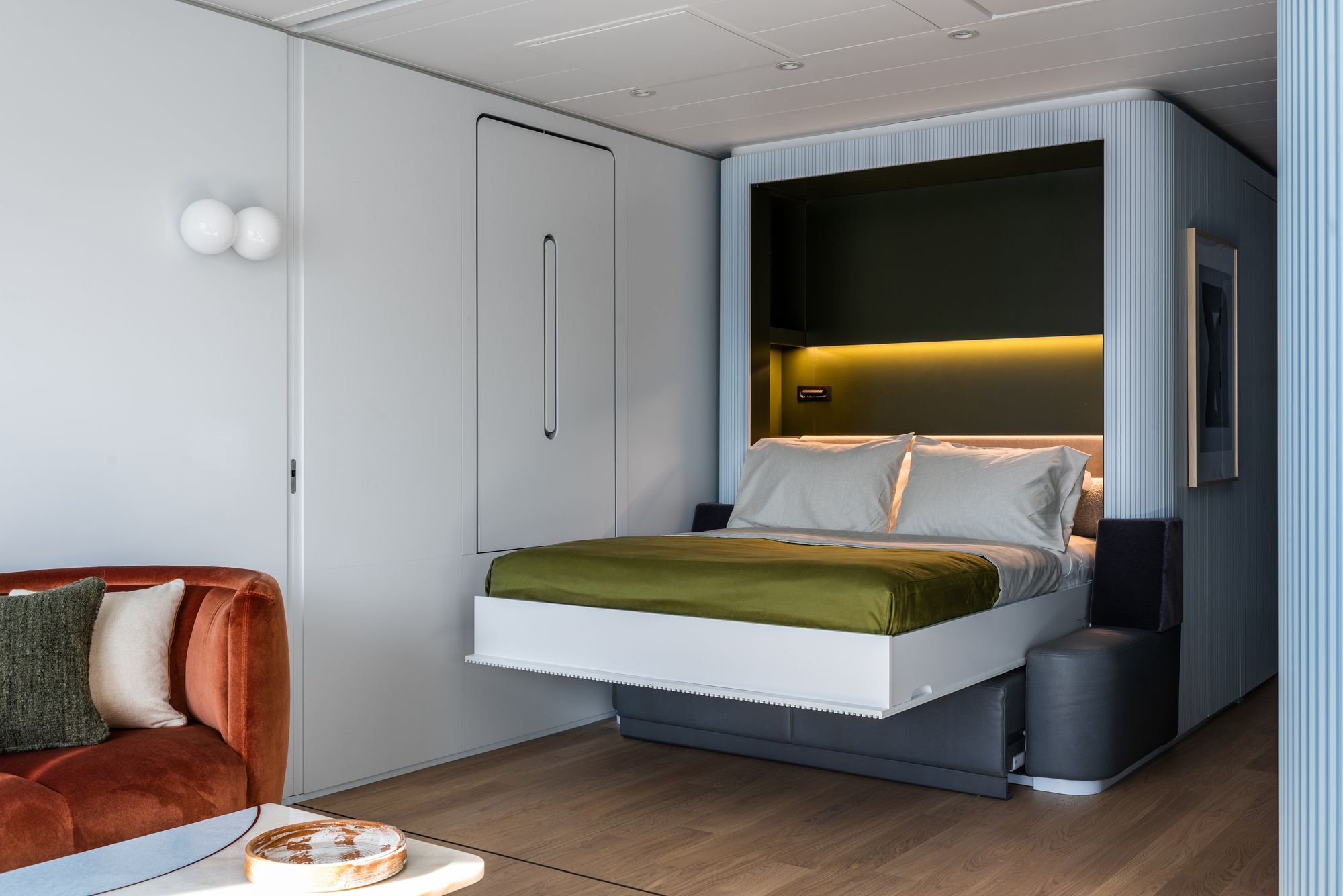
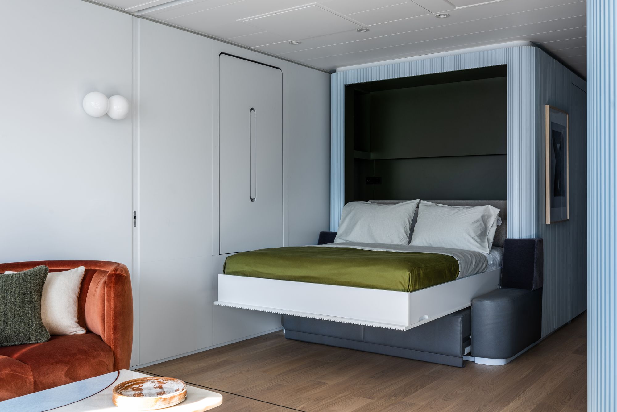
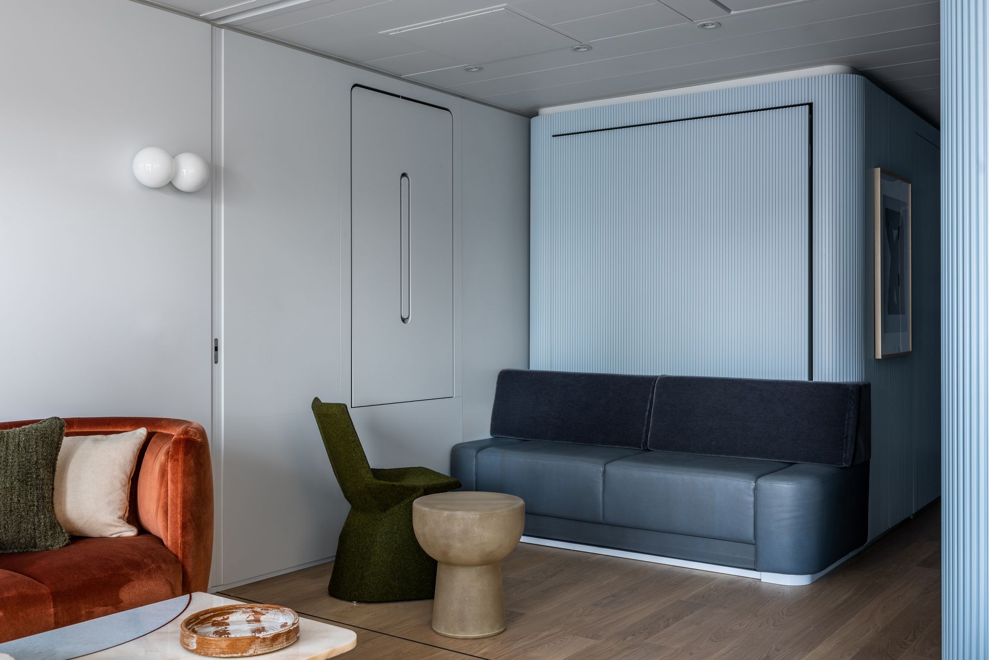
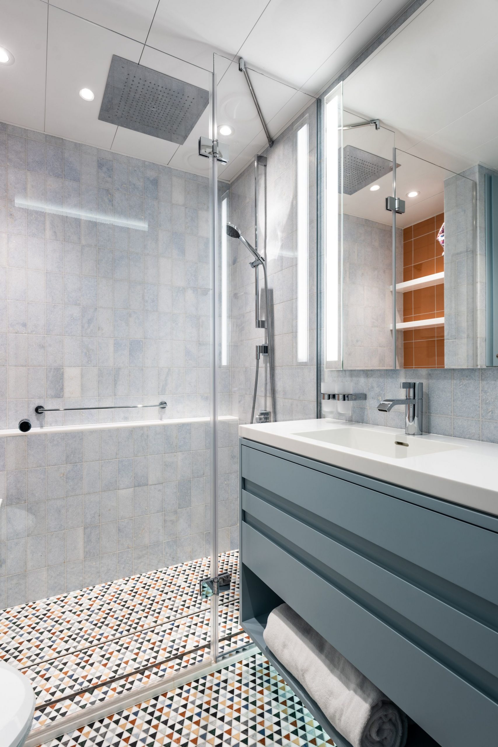
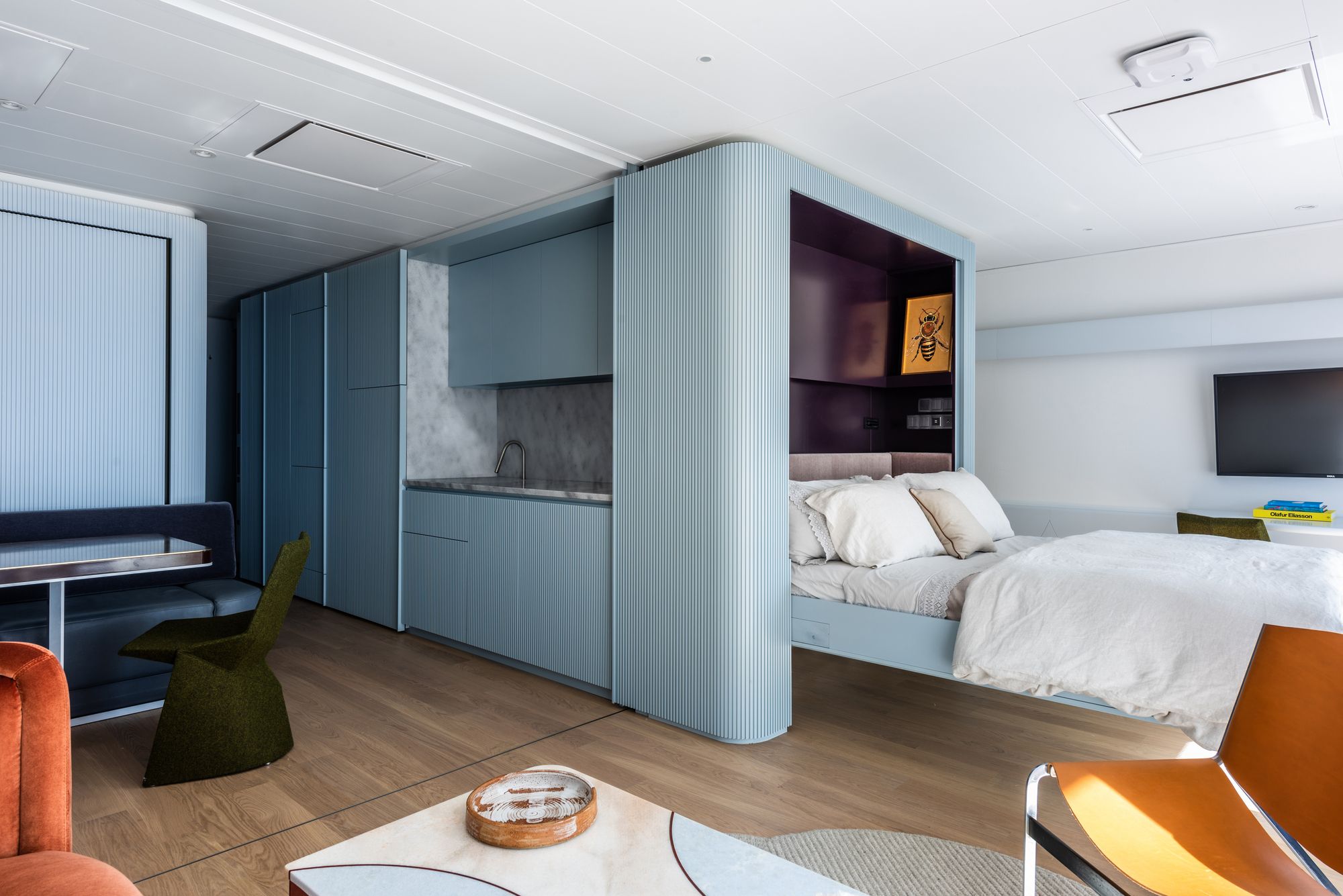
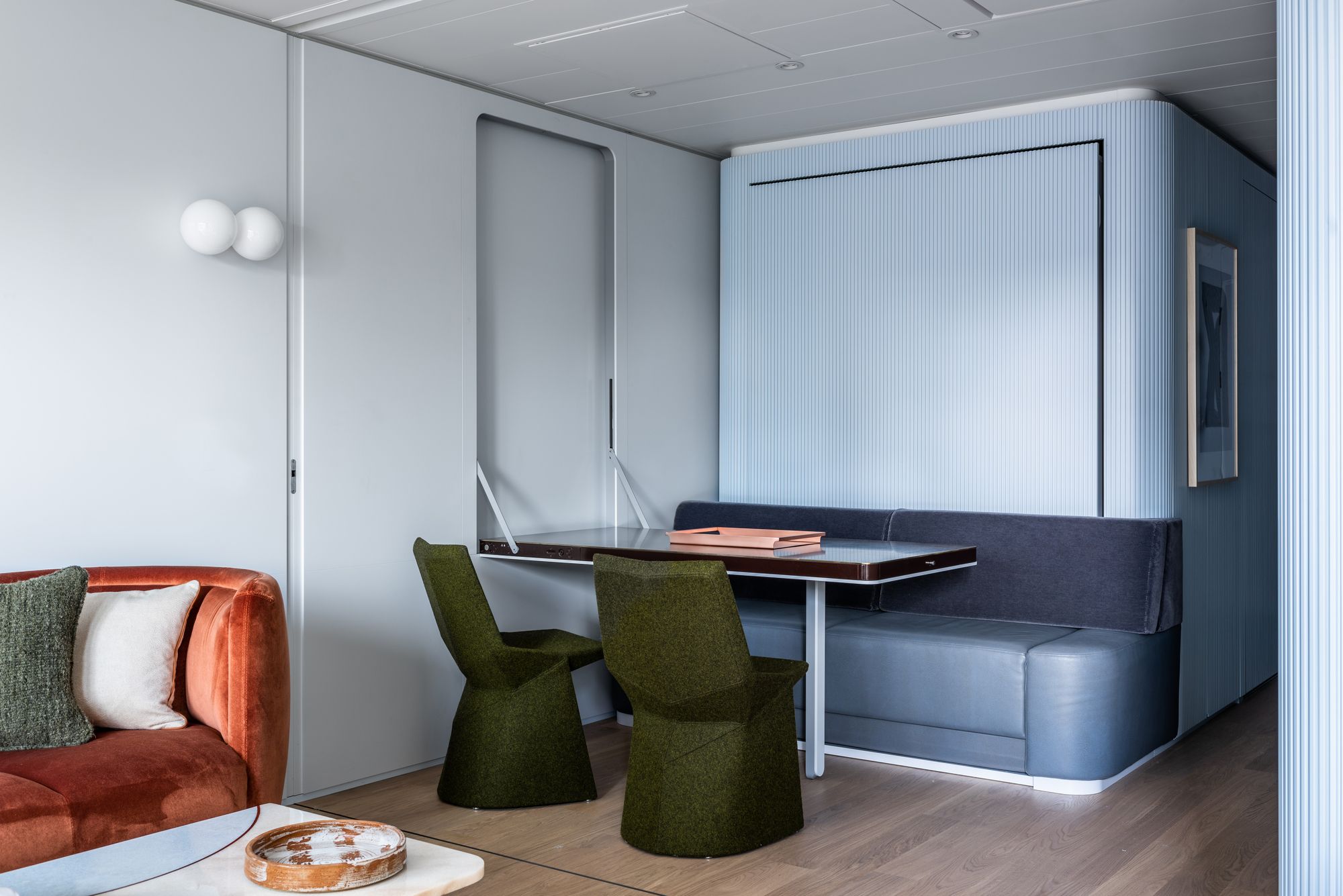
Within the 600-square-foot space, MKCA has included two bedrooms, two baths, a kitchen, a dressing room, a sitting area, a trunk room, and a landing zone. When needed, the dining area converts easily into the second bedroom, with the dining table collapsing into the wall to make way for a sleek cantilevered fold-up bed. When converted into a two-bedroom space, a sliding screen divides the apartment, allowing privacy for guests. All custom architectural elements were largely prefabricated in the shop of yacht builders outside of Vienna and installed during a five-week dry-dock period in Spain.
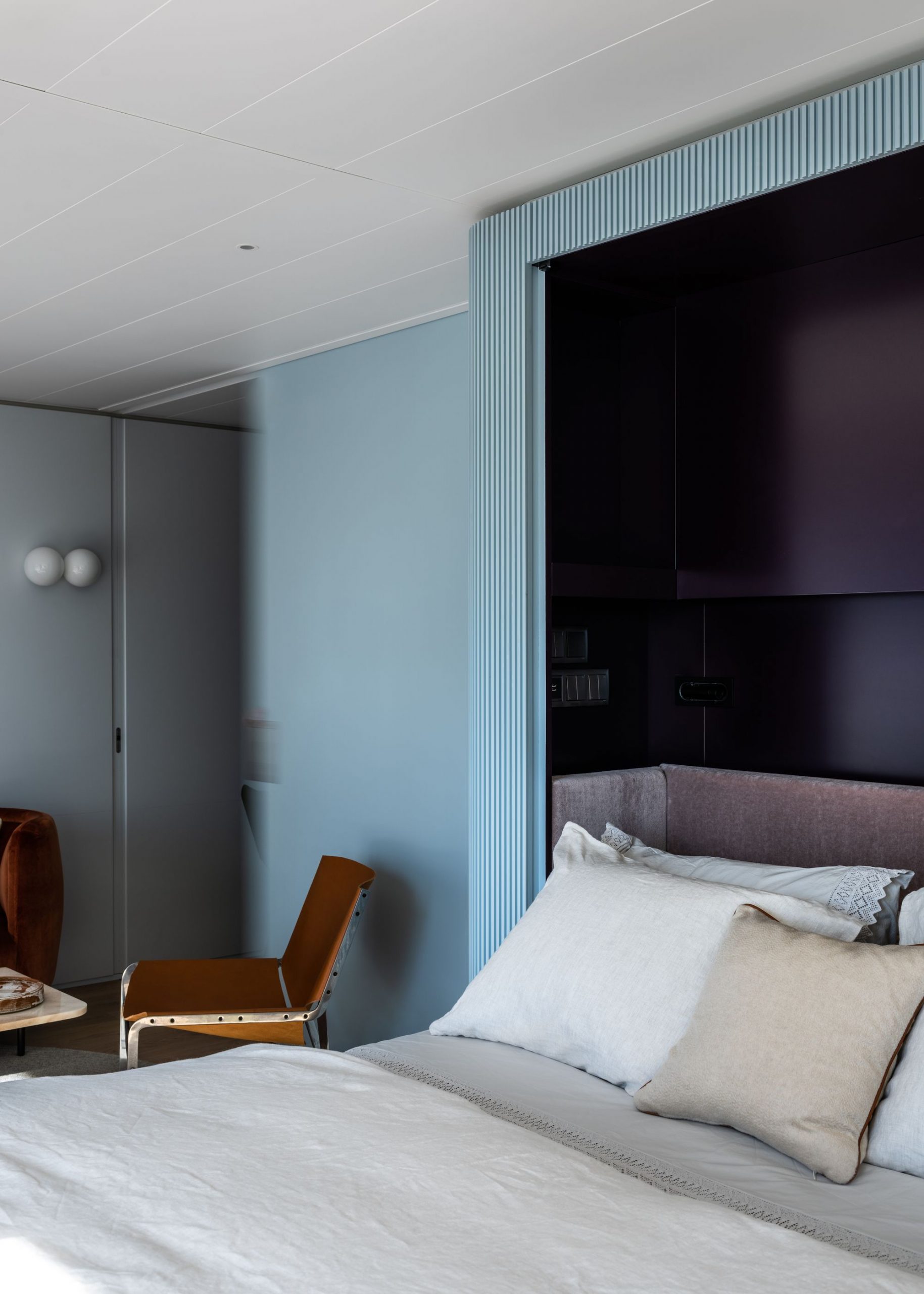
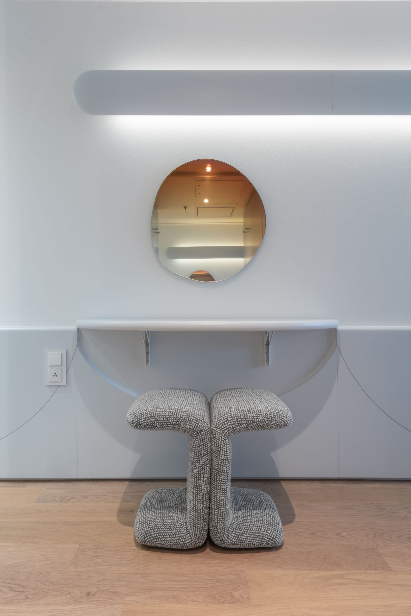
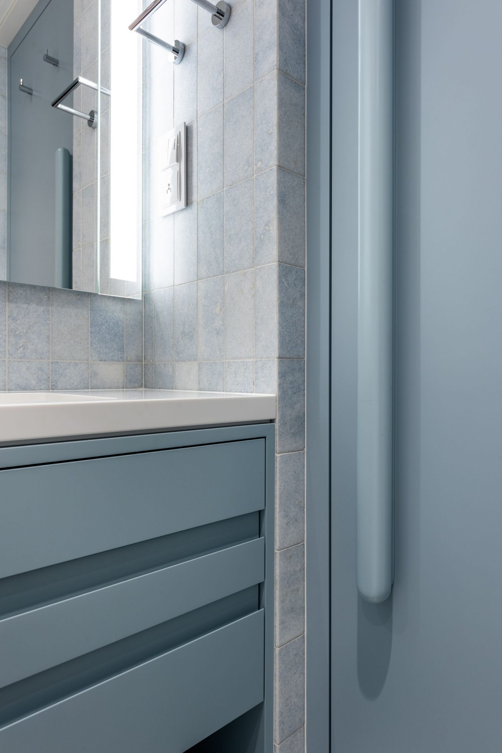
Concepts of motion and multi-functionalism underpin all aspects of the residence’s organization and aesthetic. In addition to disappearing tables and beds, MKCA has incorporated hidden lighting and integrated appliances that can be boldly revealed or neatly tucked away. The modernist embrace of industrial materials like chromed tubular steel was the inspiration for the extruded, continuous aluminum ribs that help conceal panel divisions, doors, and appliances, and also accentuate a sensation of height in the relatively low, 8-foot tall space. Unlike a modernist villa on land that references the streamlined forms and surfaces of a ship, where the ship itself is always present. The aesthetic and conceptual presence of the machine exists in the form of the hard industrial materials against the counterpoint of softer finishes and furniture, as well as in the actual engineering of custom mechanisms.
Finishes across the apartment are either impervious or designed to patina over time. This dichotomy extends to the furniture selection, whose surfaces are highly tactile, shifting from polished metals and stones to more plush materials such as mohair, velvet, and suede, and serve as sculptural elements within the space.
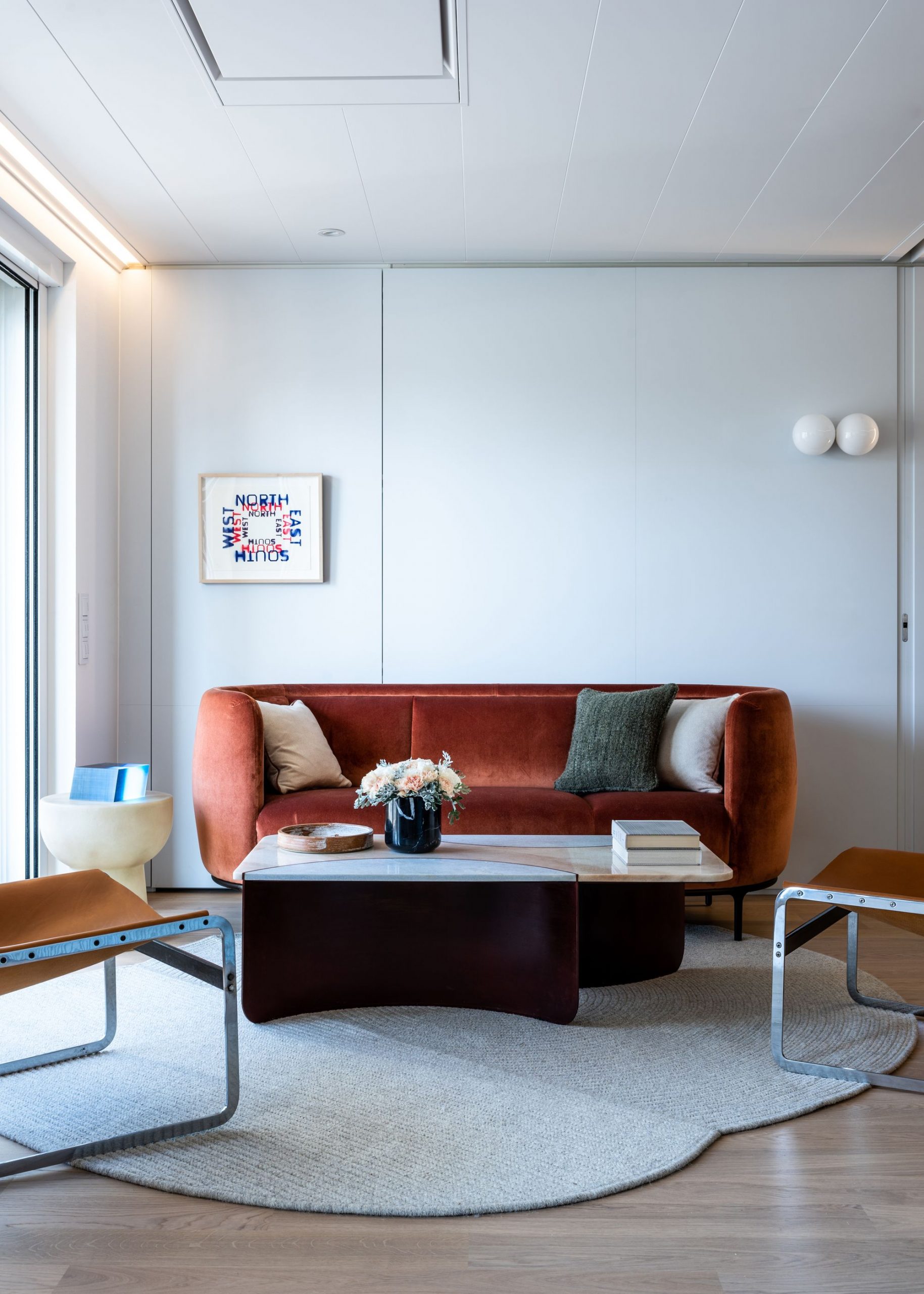
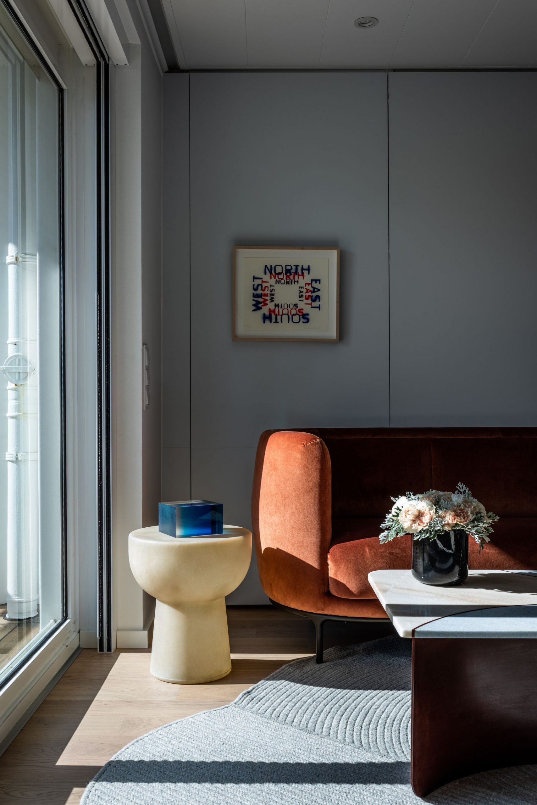
Contemporary pieces were mixed with several vintage items, in largely natural materials and rich, warm colors, as a counterpoint to the cool blue and grey, slightly machine aesthetic of the custom-fabricated elements. For example, the Vuelta sofa by Jaime Hayon through Avenue Road is custom-upholstered in high-performance velvet by Holland and Sherry, and juxtaposed with vintage saddle leather and stainless steel lounge chairs by Pierre Thielen, sourced from dealers in Holland. The ship’s furnishings were specified in the spirit of collaboration, whether sourced from independent designers, commissioned or customized specifically for the project, or custom-designed by MKCA.
Motion, and a sense of spaciousness, are further encouraged through light and reflection. The aluminum ribbing along the central volumes facilitates the play of natural and artificial light across the lacquered surfaces, while LED cove lighting embedded into the top of the ribbed surfaces gives the impression that the capsules are floating—their edges luminous. The apartment’s continuous glass wall, which leads to the private terrace and view beyond, allows for vast horizons to shapeshift from sea to land and from day to night.
Project Info:
Architects: Michael K Chen Architecture
Location: United States
Area: 600 ft²
Project Year: 2019
Photographs: Alan Tansey
Manufacturers: Waterworks, Artistic Tile, Weltzer Parkett
