Plaza of Kanagawa Institute of Technology
While working on the outdoor plaza to the KAIT workshop of Kanagawa Institute of Technology (completed in winter of 2008) Junya Ishigami + Associates considered two main characteristics: Versatility and the Semi-outdoor, and what these two would really represent within the project development.
Courtesy of Junya Ishigami + Associates
The Versatility of the plaza was in this case considered from an experiential point of view instead of a practical one. Since the campus already had multifunctional spaces, with a lack of relaxation area, the users would benefit from a unique space suggesting a more ambiguous program. Therefore, instead of moving with a specific function in mind, the architect concentrated on the versatile experience of the space with an exploration on the ways to spend time there. “The process of passing time becomes the subject”.
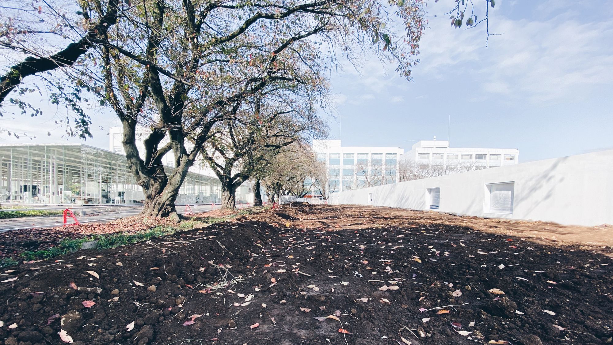
The idea of a Semi-outdoor space arose as an in-between design solution, since the campus’s existing and unchanged built landscape was problematic. The latter evidently lacked a natural diversity and provided an artificial setting (school buildings). That is why the architect thought about retaining only half of the existing environment while subliming the other half with architectural elements. Given that the design is focused on the experience, the intervention was meant as a new “outside-ness”. This was achieved through specific architectural design techniques meant to create this new composed space.
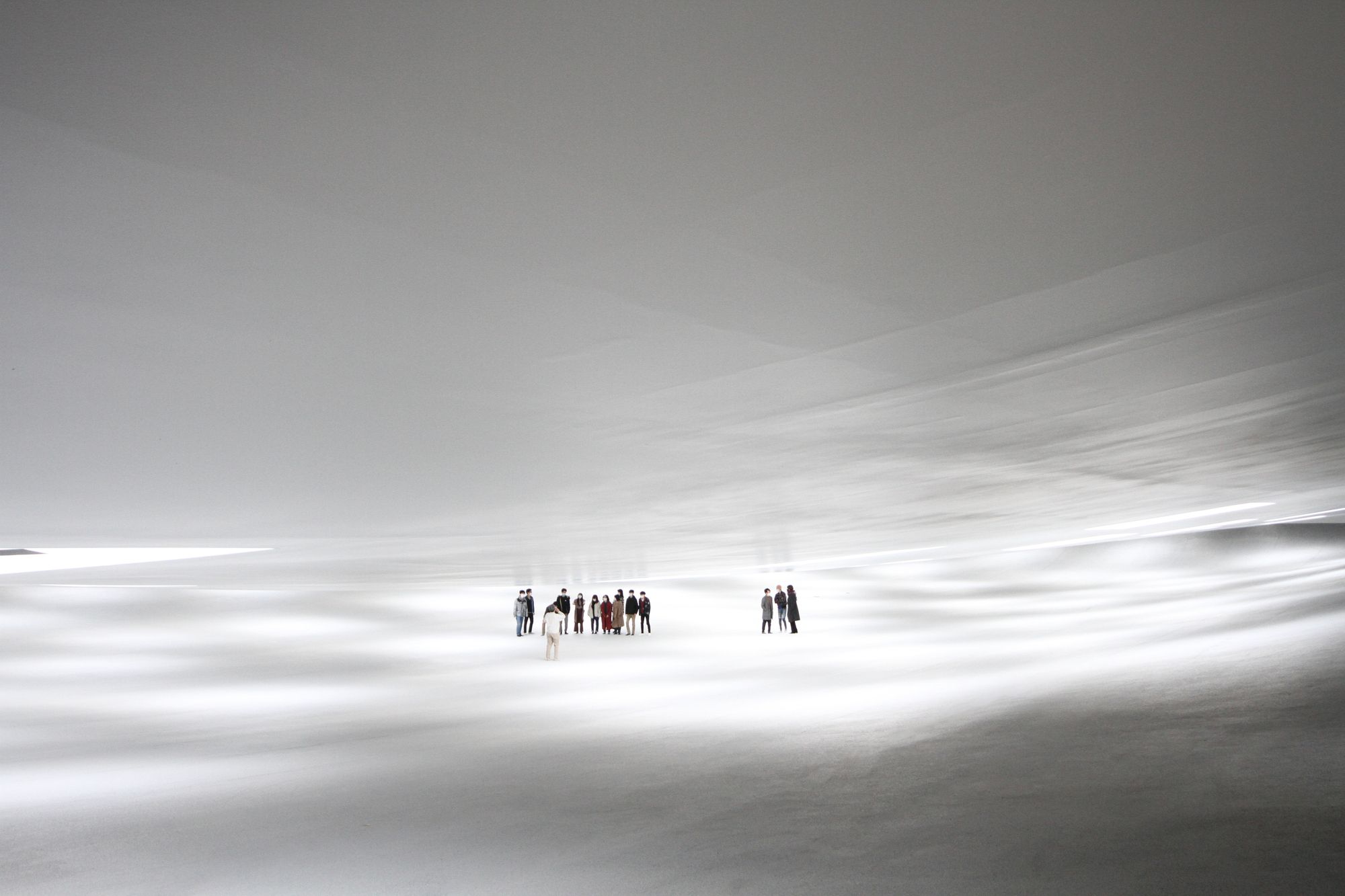
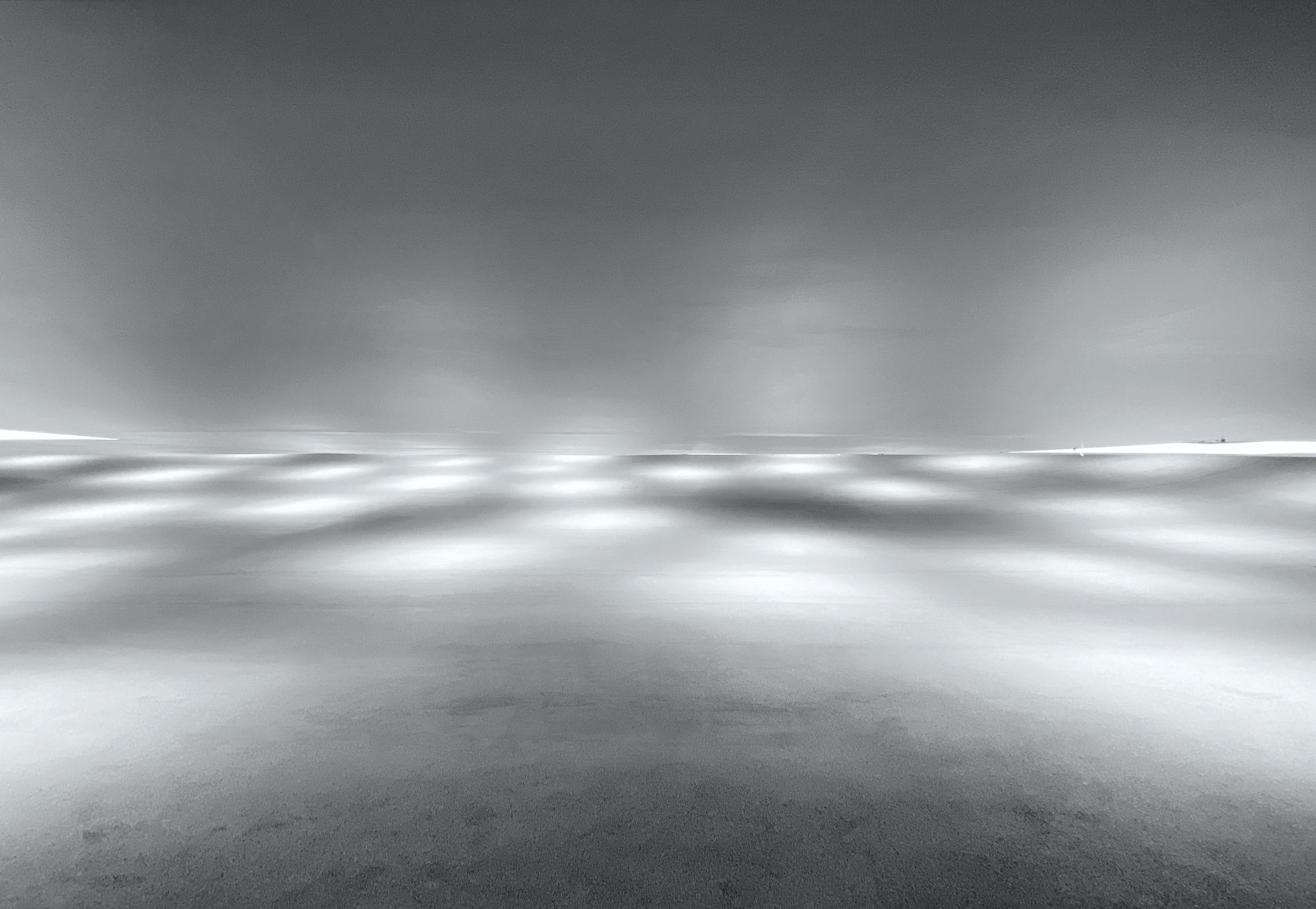
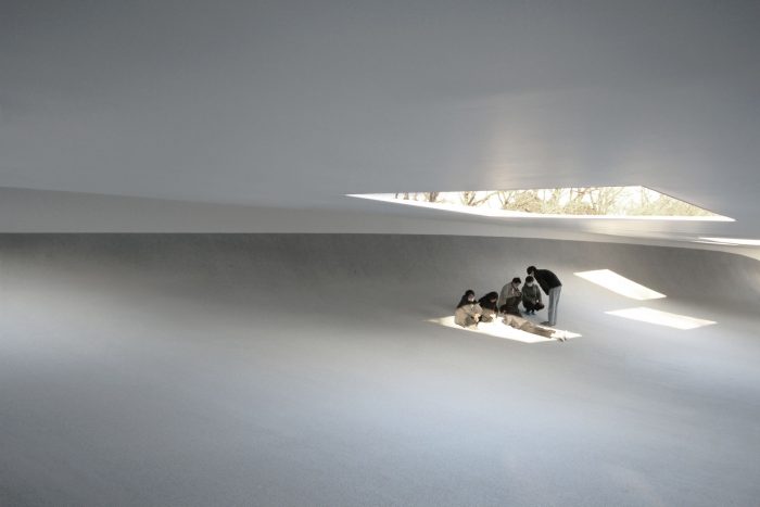
Landscape can be experienced differently by people, whether physically or mentally. The environment of the plaza was meant to be “delicate and without a sense of restraint from the existing buildings”. The created landscape is meant for users to enjoy the scenery and spend a prolonged time looking into expanding planes of ground and sky meeting at the end of the grand curved surface and leading the view towards the boundless world on the other side of the horizon.

Courtesy of Junya Ishigami + Associates
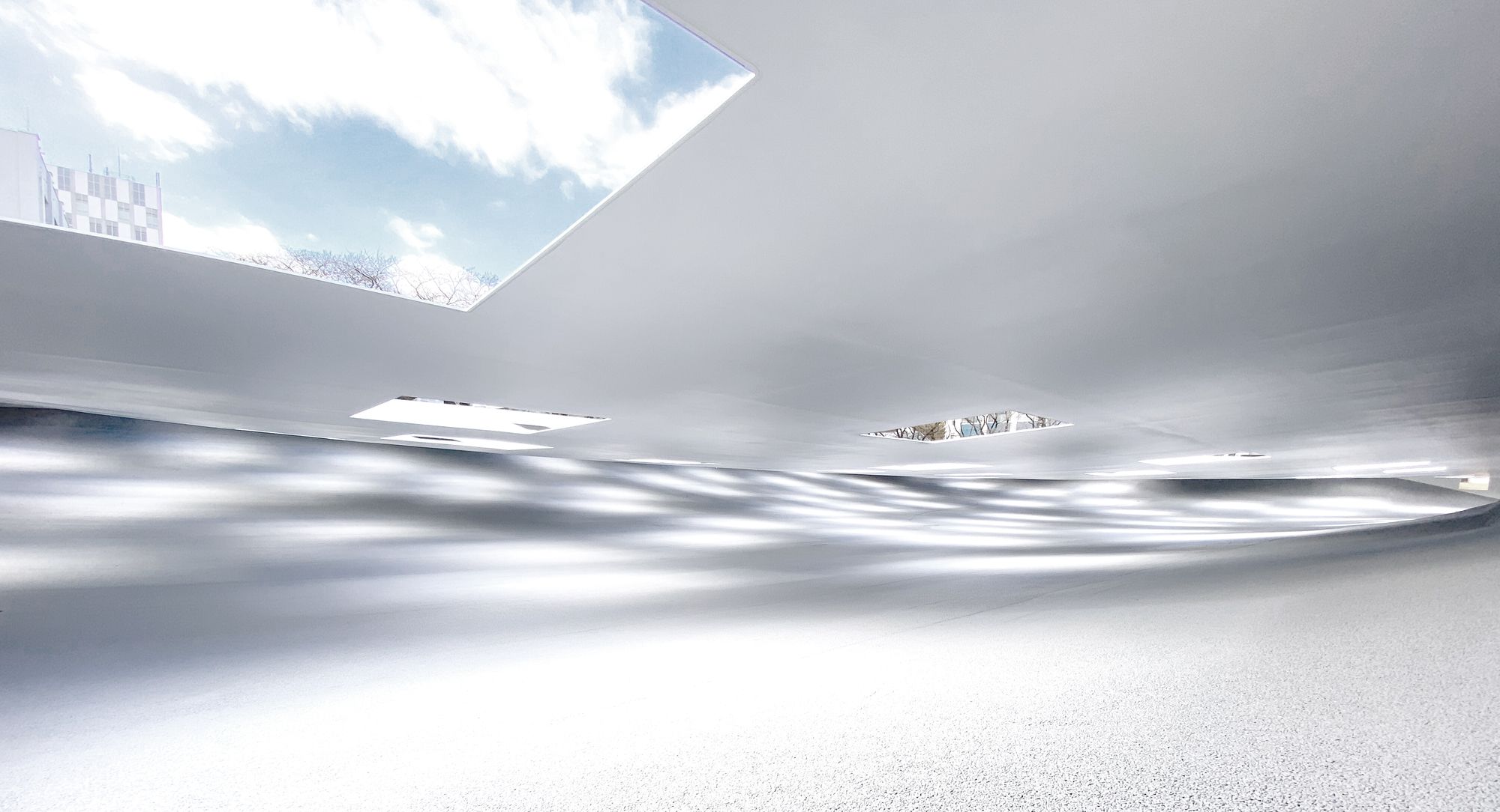
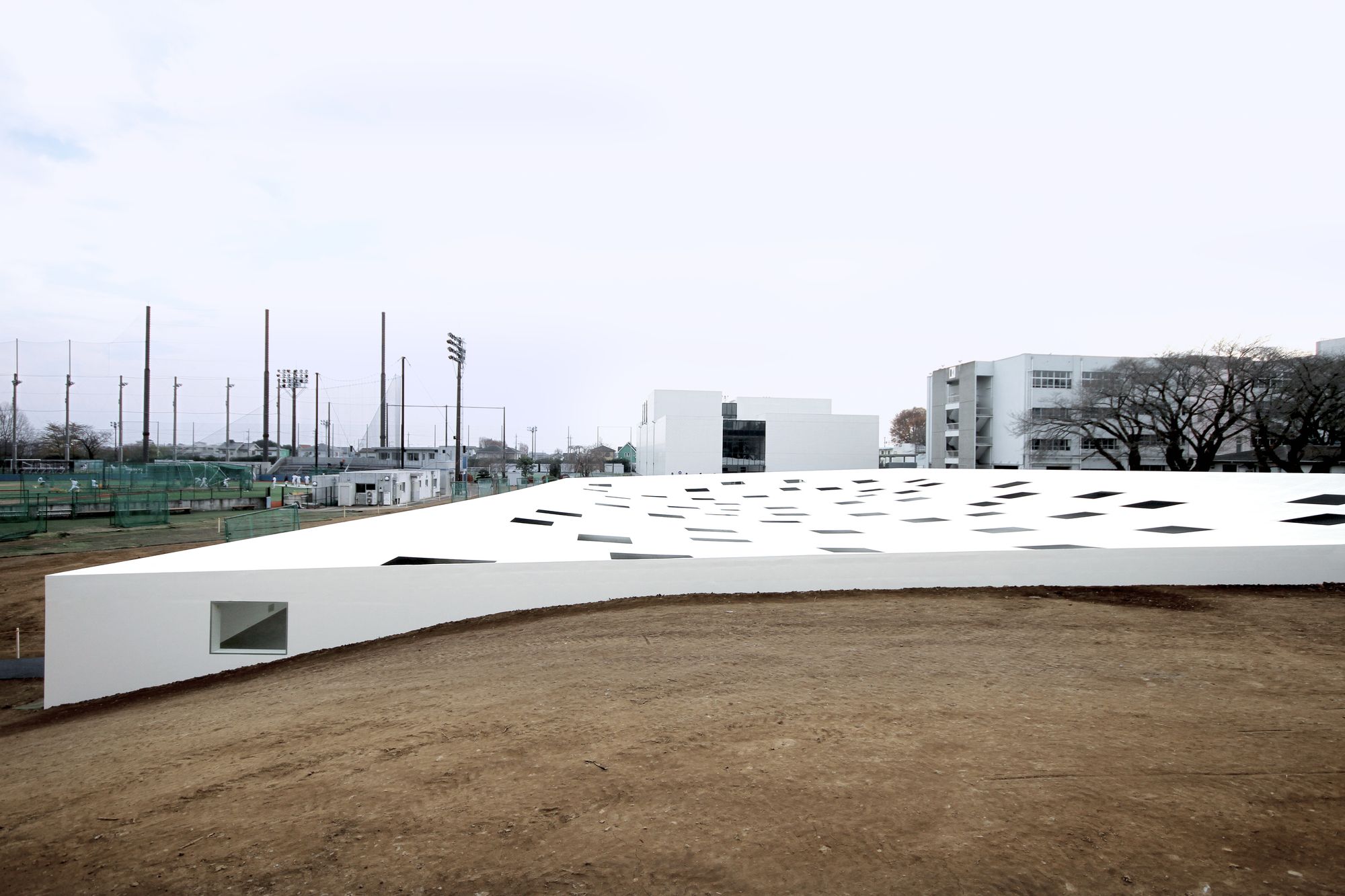
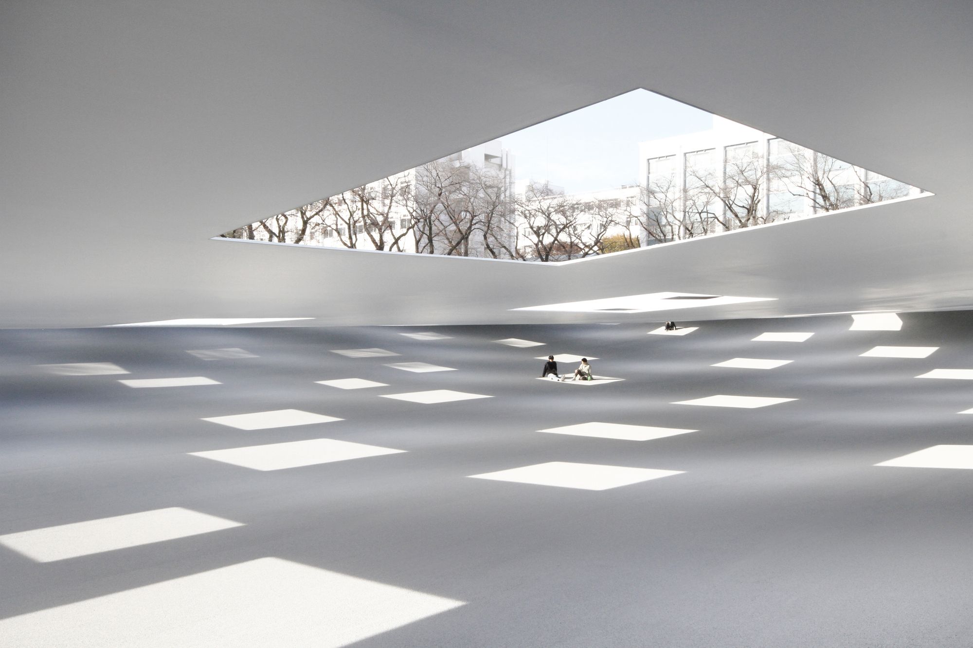
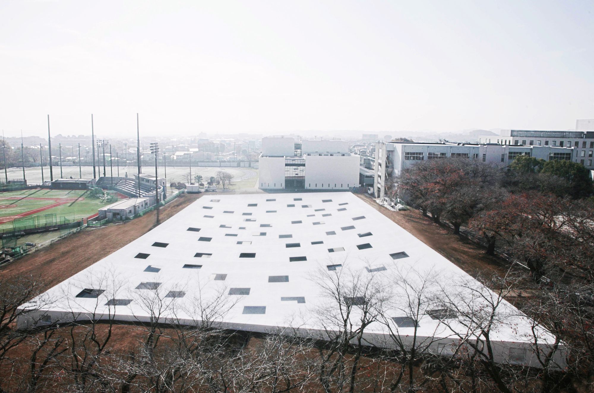
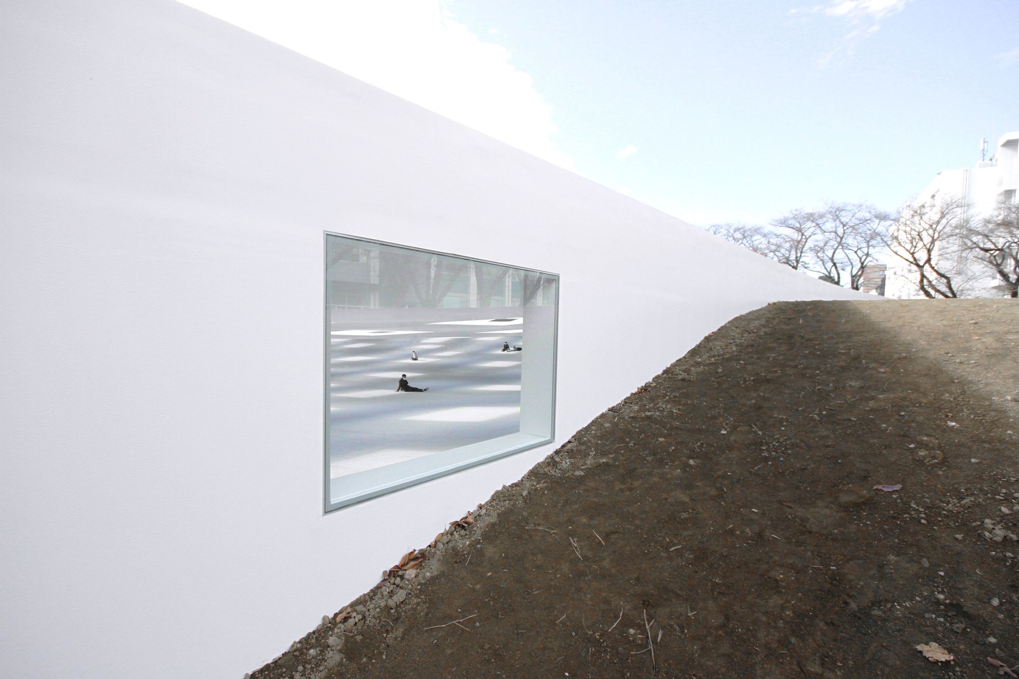
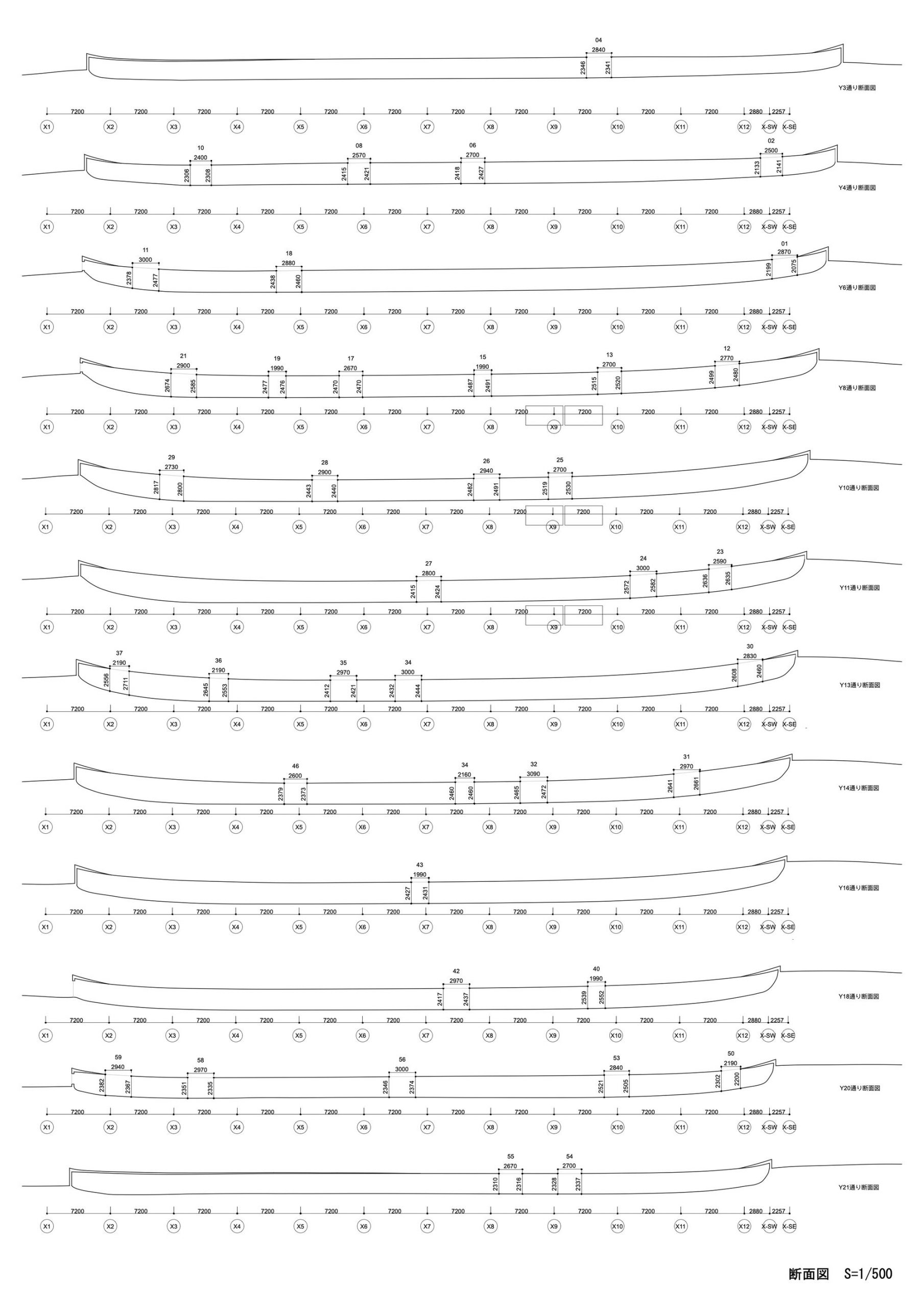
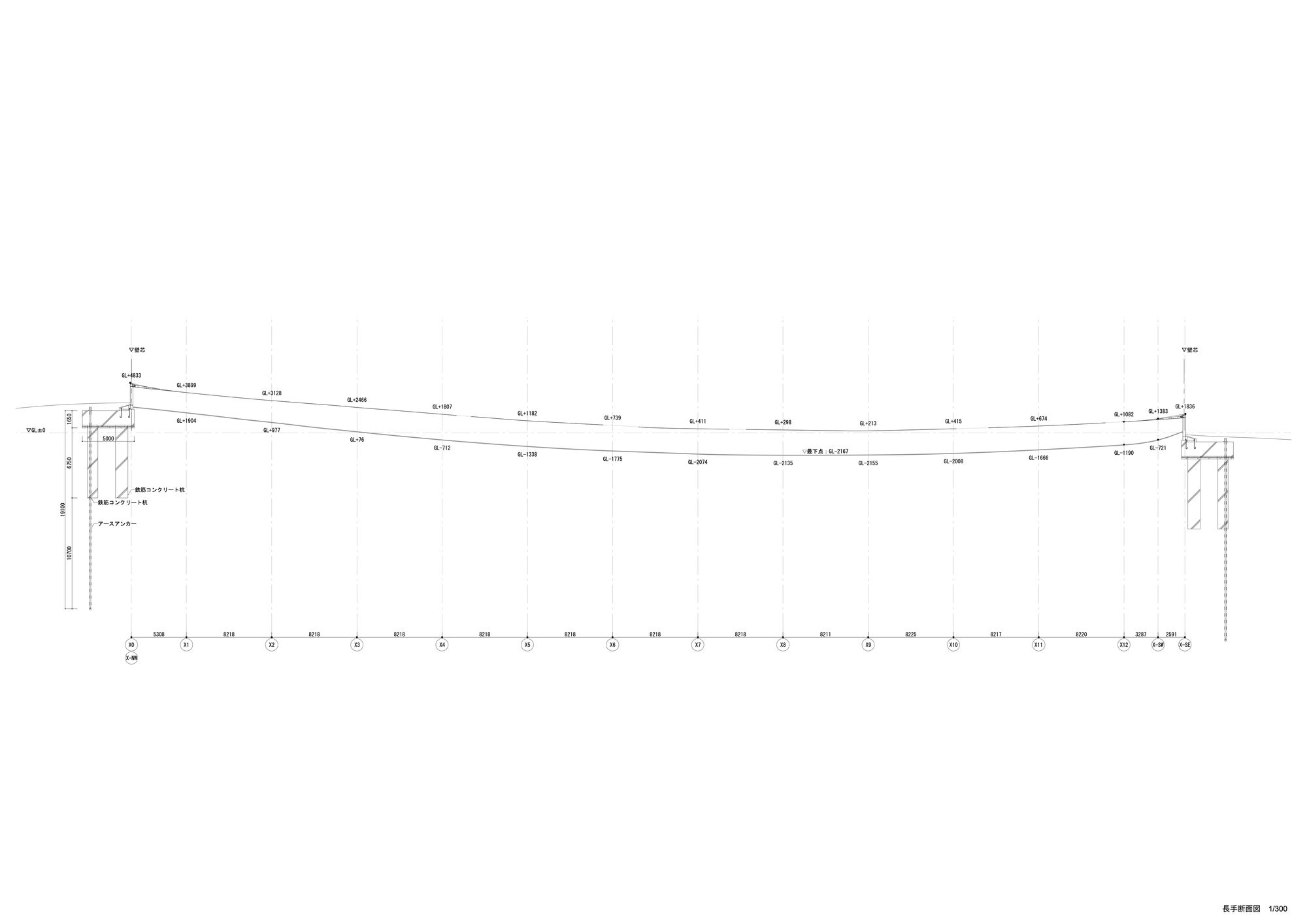
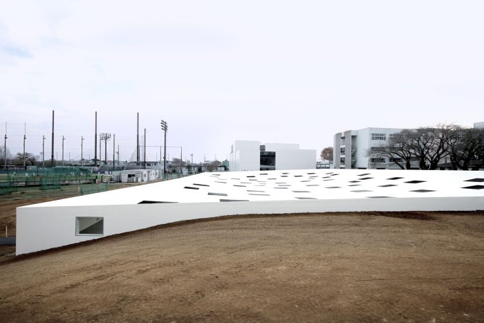
Following the first considerations of the initial scenery and the treatment it would receive, the architects had decided to build over the entirety of the site. The 2 meter height difference between the campus ground level and project plane was then exploited to create a new ground space which is integrated with the natural ground. Afterwards, the main structure was conceived as a floating iron plane supported only by the four walls and bending into a curved surface with the lack of interior support. The ground was also made concave to echo the ceiling’s bend. Both planes bend and stretch, meeting at the end and creating the horizon inside the building.
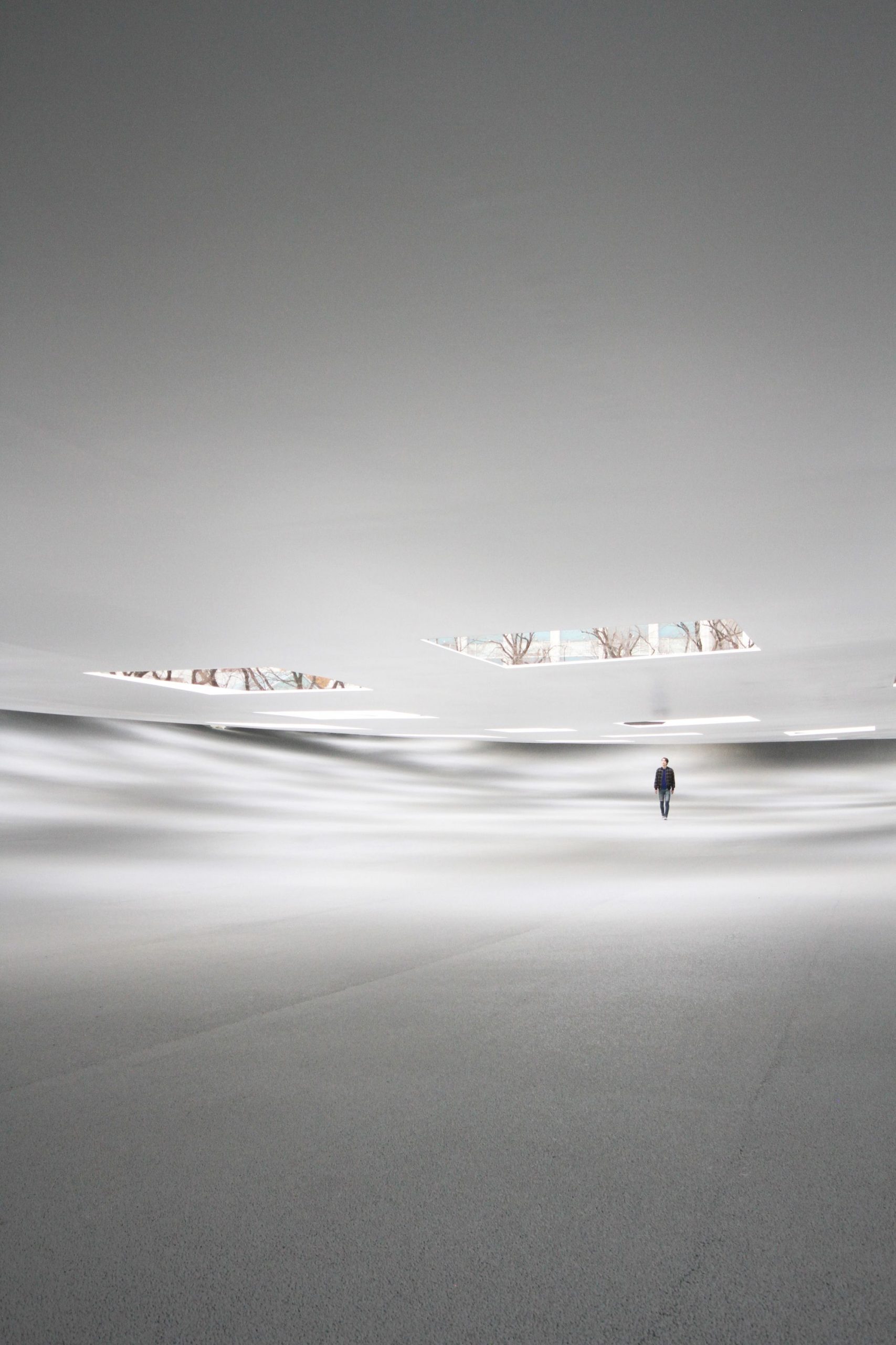
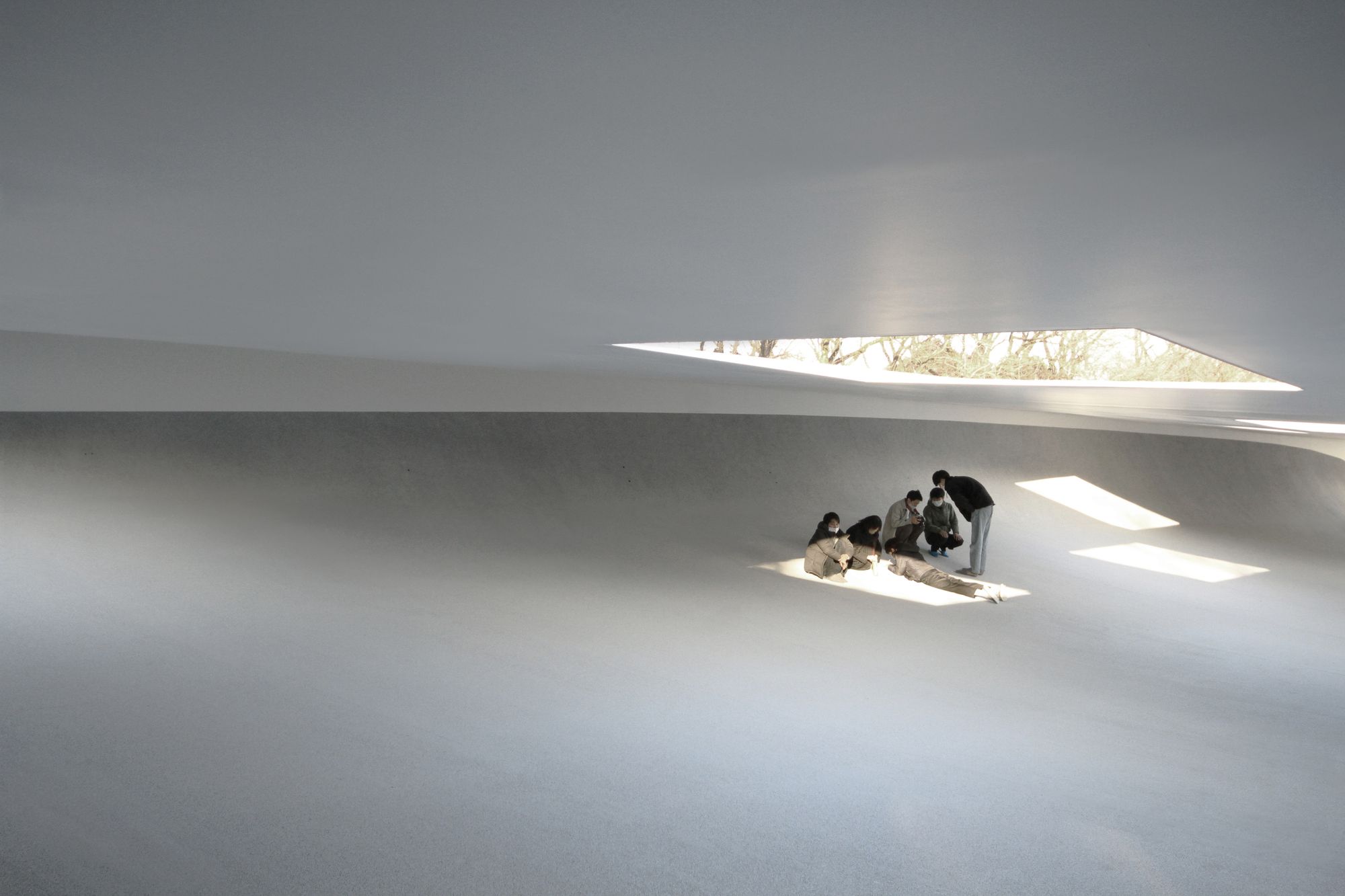
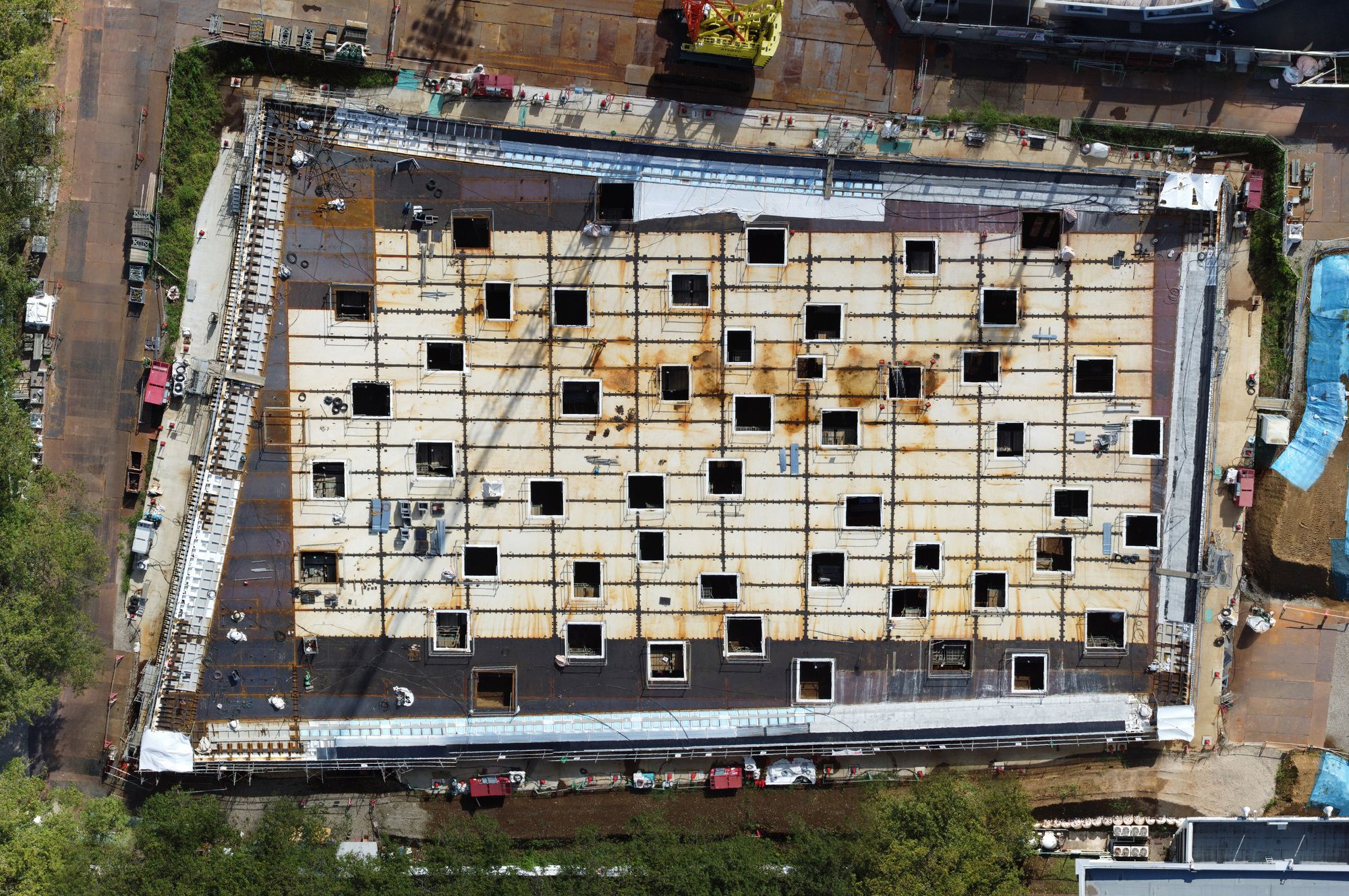
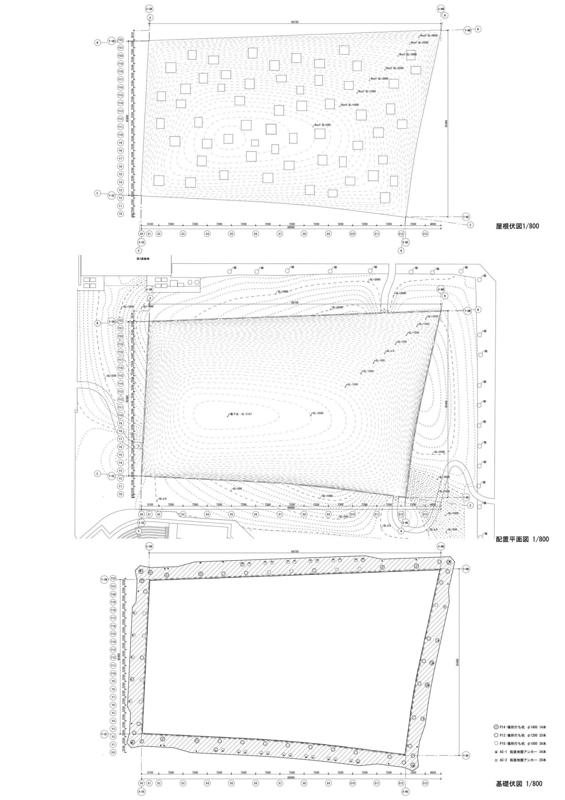
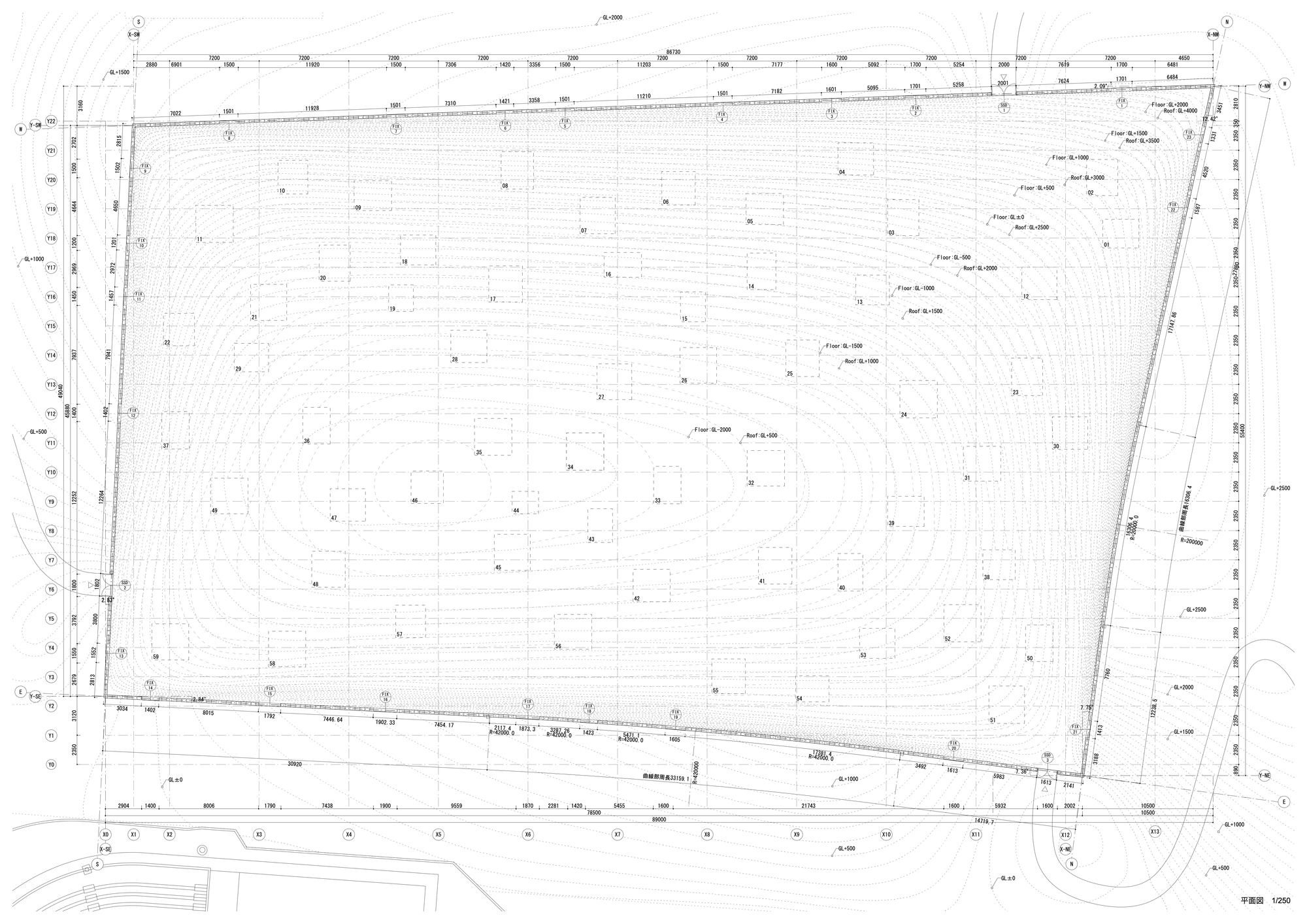
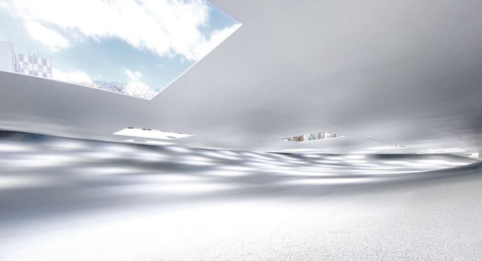
The 59 ceiling openings create a playful light filtering effect mimicking the way the sun shines through the clouds on a dim day. Accordingly, the space transforms depending on the time and weather. Rainy days offer an impressive scenery as the rain-flow comes in through the unglazed openings forming water pillars and adding an element of sound to the experience. “Thus the natural changes perceived by the body become the architectural scenery”.

Courtesy of Junya Ishigami + Associates
The grand building, which spans at a maximum of 90 meters, required a lot of specific considerations with the structural engineering. One of the things that were taken into account was the change of ceiling height which could reach 30cm due to the thermal expansion and contraction of the iron plate.
There are also 83 piles and 54 ground anchors that were set on the huge concrete foundation beam, with the ground sloping at a height difference of 5m. The resulting look of the structure then resembles a rotating suspension bridge. The human scale is also taken into account with ceiling height ranging around 2.2~2.8m, while the iron plate of the roof is 12mm thick, conforming to the dimensions of the furniture.
Ribs are installed as compression rings within 3 meters of the roof iron plate’s outer circumference in order to reduce the burden of tension exerted on the walls. The latter are 250mm thick, standard for regular building constructions.
Regarding the material use, the ground is covered with water permeable asphalt, which is treated with high pressure cleaning to completely remove the oil before painting. The rainwater can then be instantly absorbed when it infiltrates and flows through the plaza building, keeping the room dry so that it would not feel unpleasant if users were to sit.
Courtesy of Junya Ishigami + Associates
A deep connection between people and the built nature is encouraged through the plaza. Sitting on the floor is suggested though the design to maintain a direct link between the users and the architecturally developed environment. The ground becomes a comfortable hill-like slope, like a huge bed, allowing the body and environment to become merged into one scenery.
When experienced all together, the slope, light, raindrop sounds and the built horizon make an emblematic place on campus. A space that offers a raw natural comfort by guiding through specific curated experiences that is “outside-ness”.
Courtesy of Junya Ishigami + Associates
Project Info:
Architects: Junya ishigami + associates
Location: Kanagawa, Japan
Area: 4110 m²
Project Year: 2020
Photographs: Courtesy of Junya Ishigami + Associates
Courtesy of Junya Ishigami + Associates
Courtesy of Junya Ishigami + Associates
Courtesy of Junya Ishigami + Associates
Courtesy of Junya Ishigami + Associates
Courtesy of Junya Ishigami + Associates
Courtesy of Junya Ishigami + Associates
Courtesy of Junya Ishigami + Associates
Courtesy of Junya Ishigami + Associates
Courtesy of Junya Ishigami + Associates
Courtesy of Junya Ishigami + Associates
Courtesy of Junya Ishigami + Associates
Sections
Plans
Section
Plan
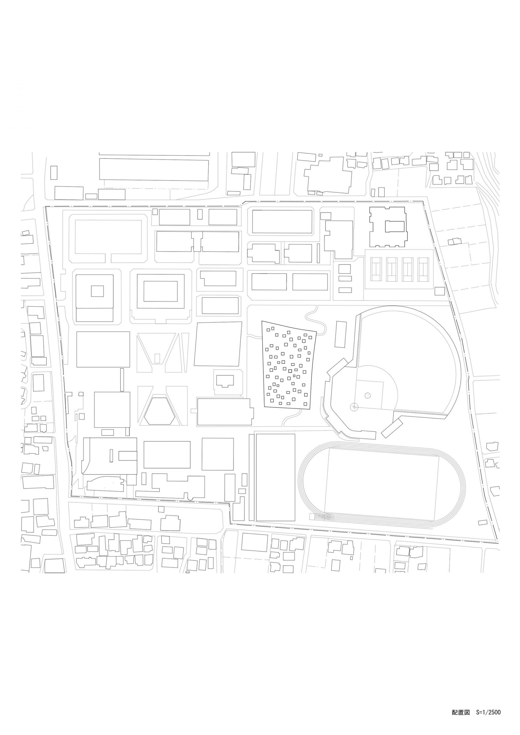
Site Plan


