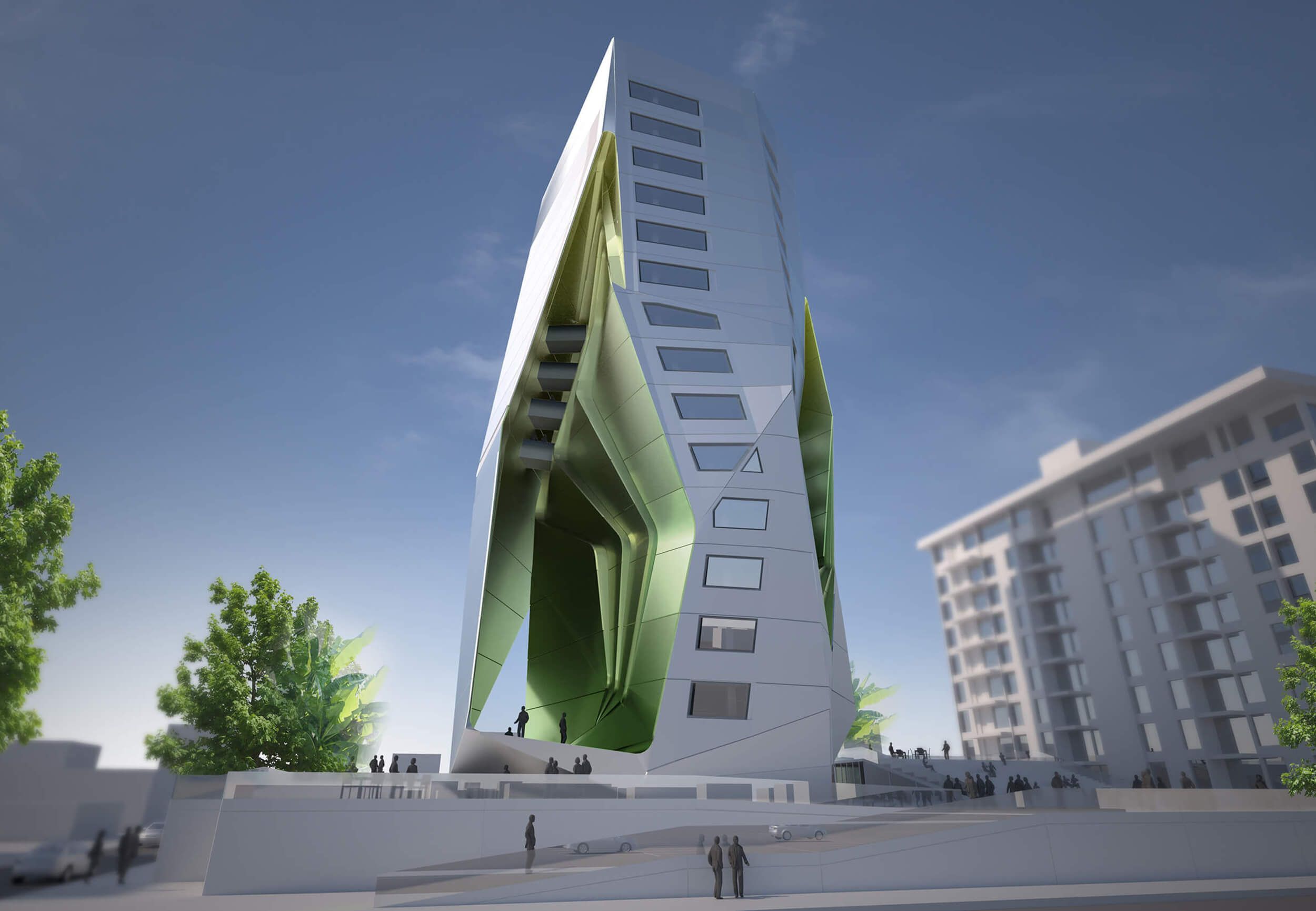
Have you ever come across a building, renderings of a building that is- a potential building- and thought, ‘Why the hell not?’ The PUCPR Dormitory planned for the Pontifical Catholic University of Puerto Rico by Tom Wiscombe Design is such a building. Contained within its scheme of building plus something else, is an intelligent building which pushes the envelope of design while being a functional and feasible project. The world of contemporary architecture is filled with futuristic and sculptural building which have been realized, but there are few buildings which act as an appropriate interlude between everyday architecture and that opposite end.
Below is a further description of the project, provided by the architects.
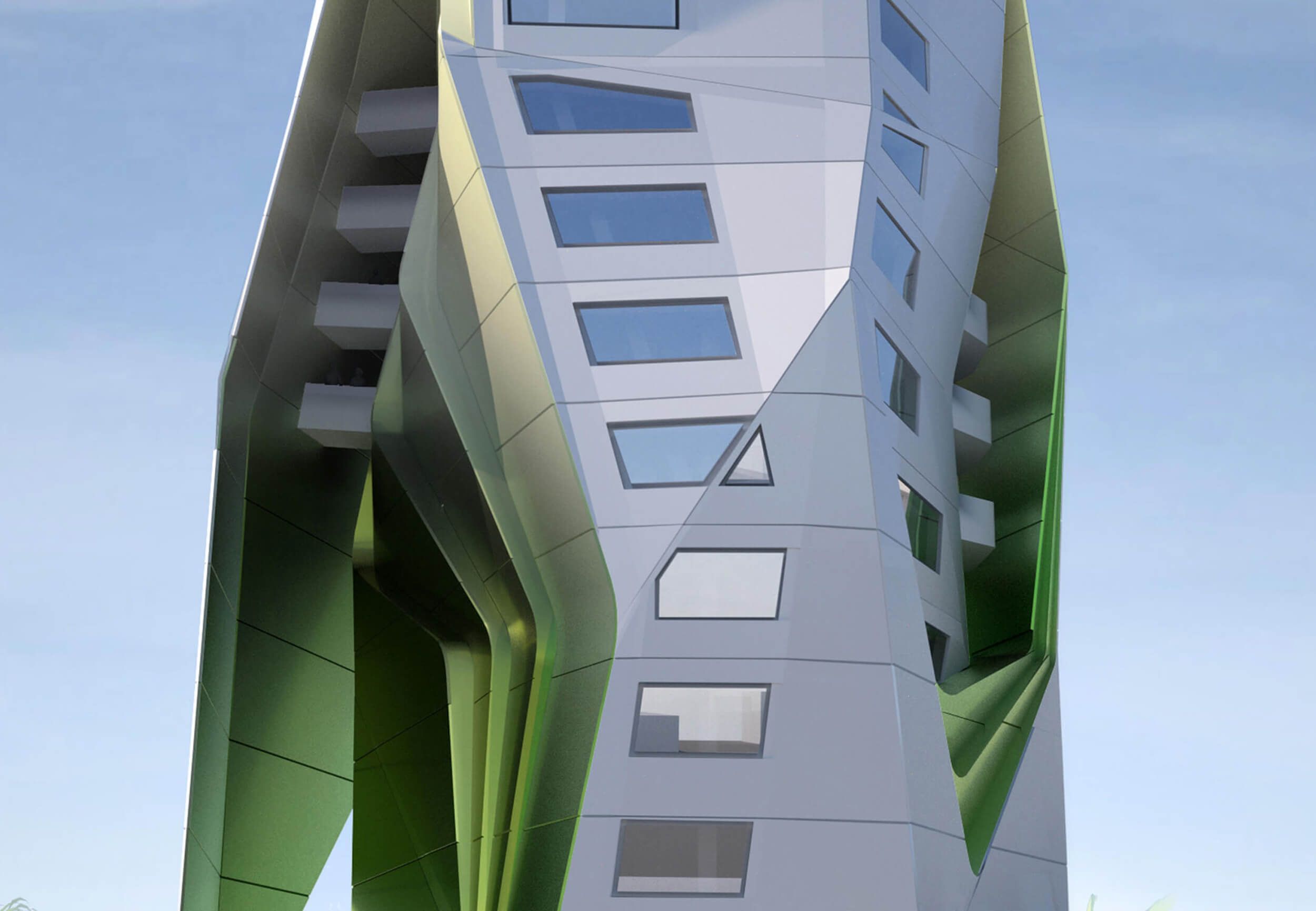
This tower design is part of our recent body of work dealing with surface-to-volume form. In this case, the model used is the implied outer shell, which means that a volumetric figure is partially enclosed by razor-edge skins which delaminate and form a partial secondary enclosure. This partial enclosure creates interiorized urban spaces which belong both to the building and the city, confounding the separation implied by all acts of architecture. These interiorized spaces are highly characterized in terms of formal and chromatic articulation. Tracery and relief, together with a lemon-lime vertical gradient, create a surprising verticality and depth-effect from the street. Acting as a foil, the floor plate and window stratification of the building enhances these effects. The extreme difference between these two worlds, one metric, programmatic, and extended in space, and the other, cavernous, shimmering, and alien is critical for the success of the project.
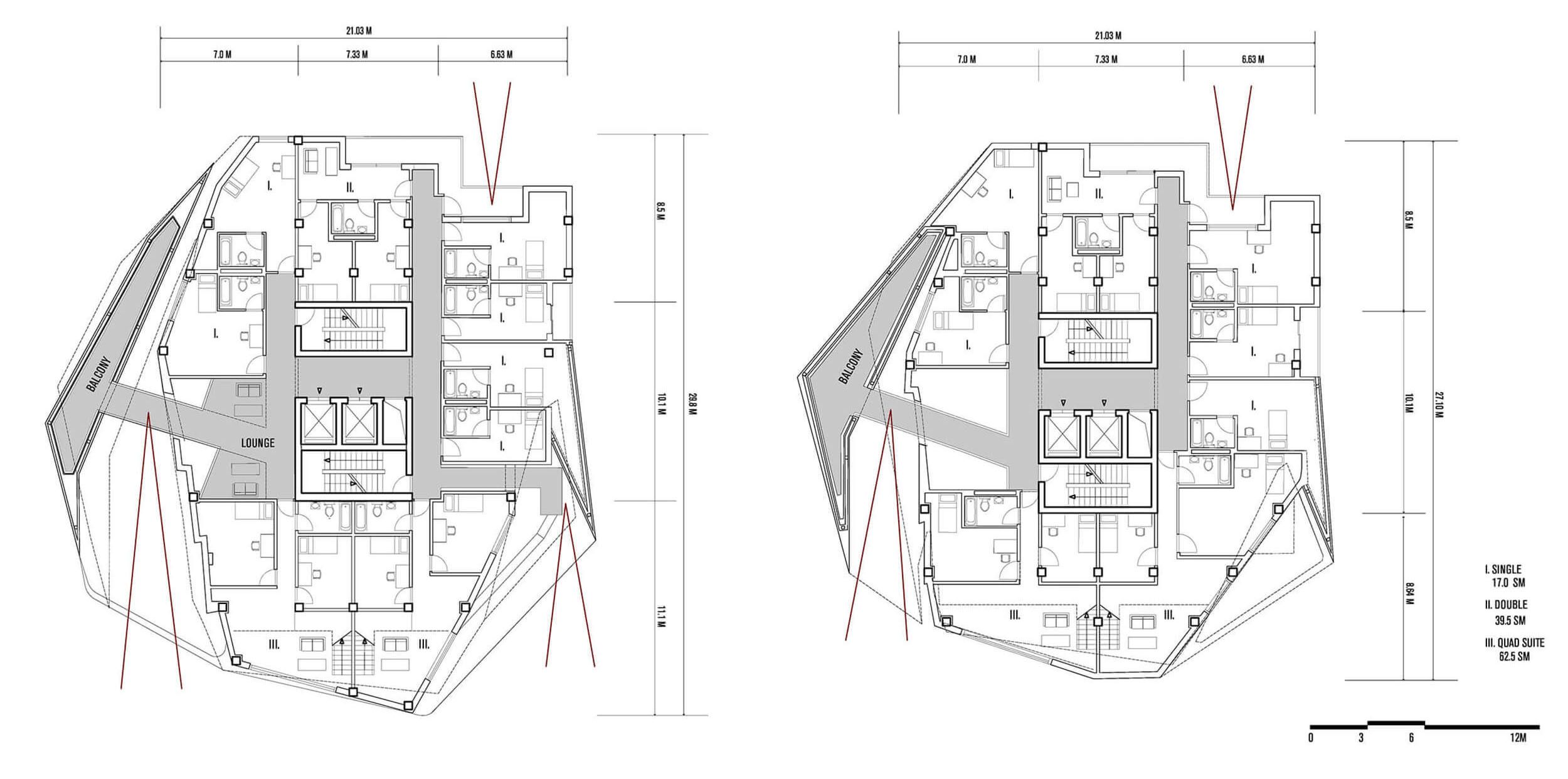
 One of the secondary effects of the delaminating skins is that they provide shade and sanctuary from the intense Puerto Rican sun and rain. Protected, shared balconies are also located within the surface itself, where it thickens. These poche spaces are accessed by sky-bridges from double-height student lounges; the bridges allow views back out to the University campus to the east.
Finally, the tower is set on a plinth, which creates a new urban ground. The building is nestled into the plinth rather than protruding from it, something rarely seen in a tower typology. The plinth defines secure space for student life, including a student-run restaurant and an open air amphitheater. It contains all of the parking and support services for the building.
By Matt Davis
Courtesy of Tom Wiscombe Design


