Fluidity; by design we associate such a word with nature. It alone stands as a testament to that which we perceive as a natural element. To what extent we as artists perceive fluid is often subject to the controversy of bias and self-rule. A strong example of fluidity is adaptation, found often in the abstract or fractional works of the mind’s eye of an artist. The ability to adapt is a natural association of fluidity, a design that, while absorbent of the core value, is wholly the product of ever growing evolution, be it art or architecture. With art and architecture growing hand in hand, adaptable design is often the focal point of this debated topic.
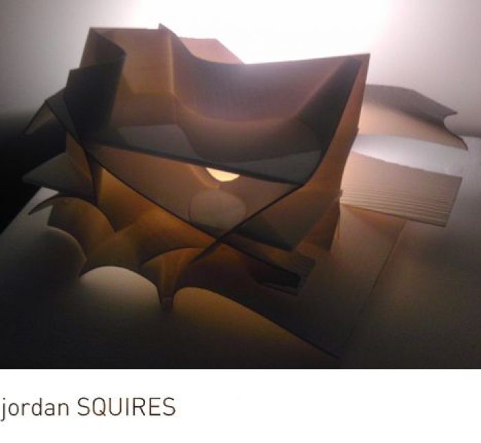
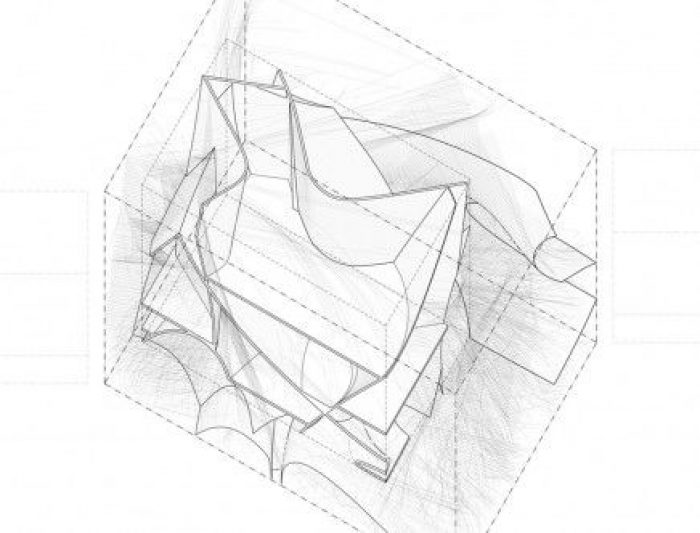
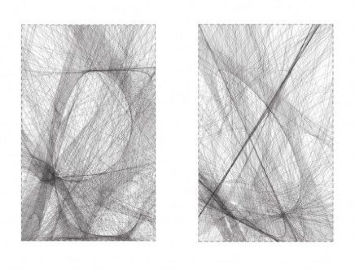
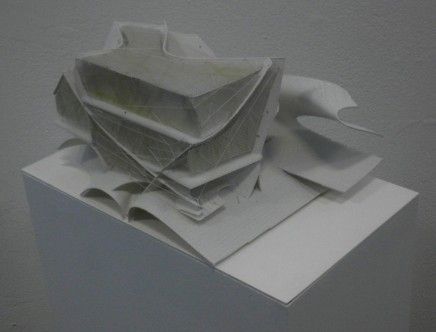
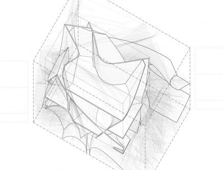
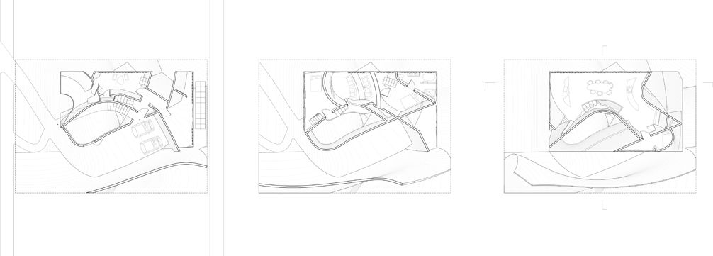
Jordan Squires, creator of Reservoir House has taken all that we know as comfort, be it shelter or sustenance and has spun an intricate design worthy of anyone’s praise. The fluid nature of the design was created using a grid but isn’t a representative of the method of construction. The start of this project was an idea about converging elements pertaining to the vehicle and the courtyard into a three dimensional grid. This grid helped ensure that an elegant composition could be viewed in any plan or section of the building, reflecting the beauty of the original drawings he produced. “]
When architects use a grid to guide their work, more often than not, it drives the whole project and thus becomes very evident in the structure, whether it was desired or not. But with the Reservoir House, the grid is lost in the mix of fluid lines that effortlessly flow from elevation to plan, bringing a unity to the design without taking the grid too literally. Because grids themselves are quite adaptable, this process can probably produce several different results, each just as intricate and beautiful as the next, with limitless possibilities with shape and form.
Diagram
Diagram
Sketch
Plan
Diagram


