Wright & Wright’s library and study center for St John’s College, Oxford, has been named RIBA South Building of the Year in the institute’s 2021 Regional Awards
The finely detailed Library and Study Centre, which rehouses the college’s special collections, was one of 13 regional award winners. The conservation award went to Winchester Cathedral’s South Transept Exhibition Spaces by Nick Cox Architects with Metaphor, whose client, Winchester Cathedral, was also named Client of the Year. The Sustainability Award went to Architype’s Bicester Eco Business Centre.
Despite the challenges of Covid-19, the RIBA South jury were delighted by the quality and range of buildings submitted for the 2021 RIBA South Awards programme. Forty projects were entered and 19 buildings were shortlisted; this is an extremely impressive achievement for the South Region and resulted in stiff competition. It was marvelous to see an emphasis placed on landscaping, placemaking, craftsmanship and attention to detail being celebrated with sensitive integration within context. — Wendy Perring, Regional Jury Chair
RIBA South Award winners
-
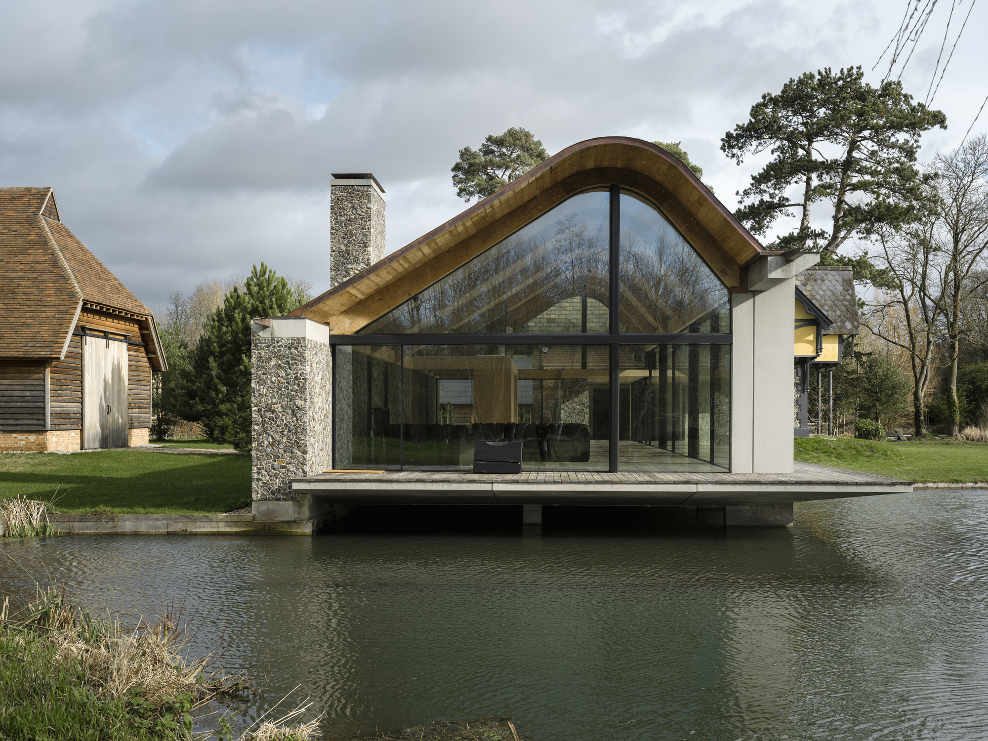
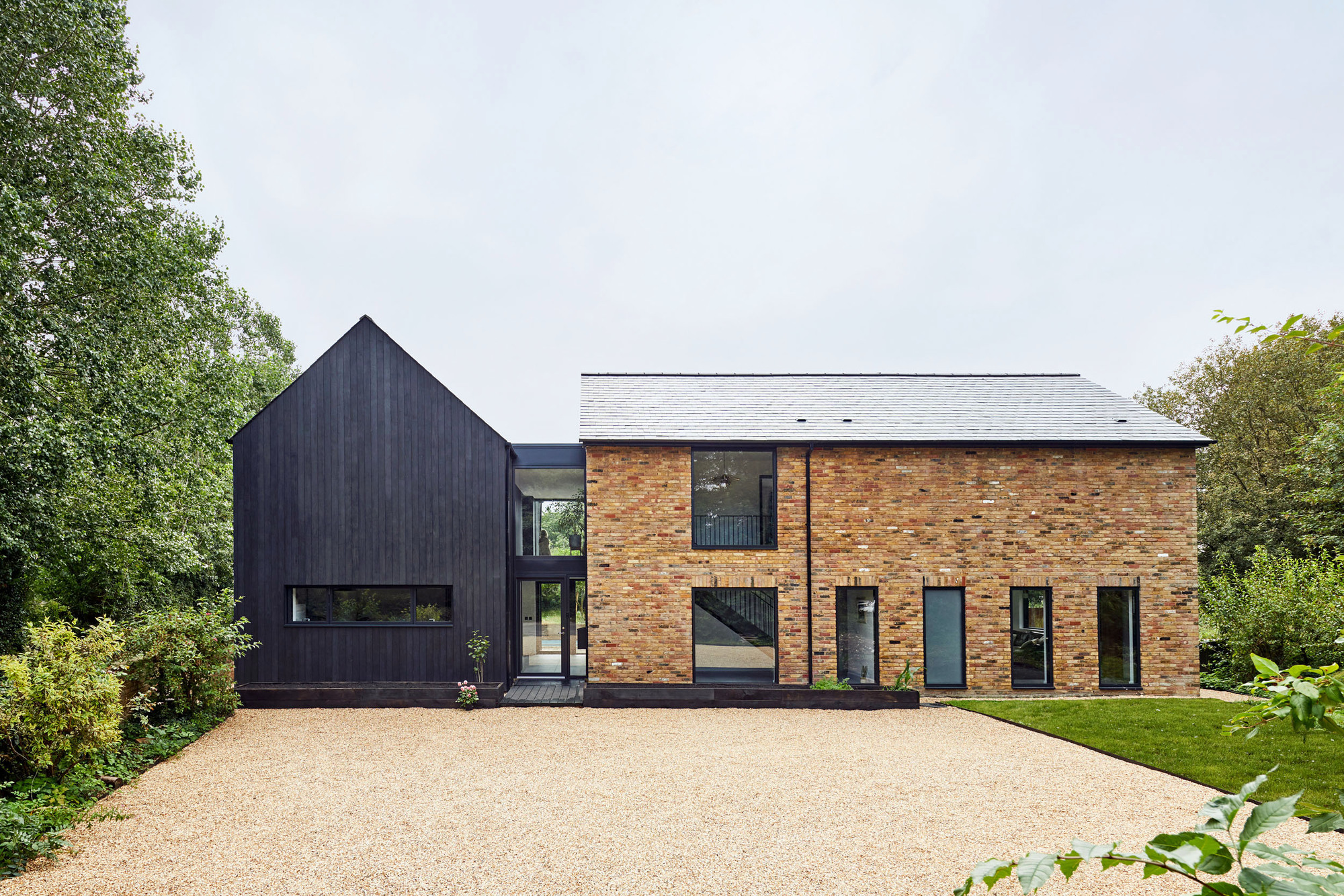
KH House by Delvendahl Martin Architects

KH House. Image © Royal Institute of British Architects
From the moment you arrive at KH House the quality of what lies within is evident. Gracefully adjoining the Grade II Listed building, the new element held off the old, with an elegant, glazed connection and delicate concrete details that immediately evidence a thoughtful lightness of touch. The traditionally constructed flint spine wall references the listed building and is beautifully crafted. The flint-work is expressed internally through the linking passageway between old and new, imbuing the physical connection with tactility.
This is a plasterboard-free extension that is both sensory and beautiful. Whilst the primary entrance remains through the listed building, the flint spine wall and immaculately conceived concrete steps pique interest and encourage entrance through the pavilion instead. Whilst it may have not been the architect’s intent to detract attention away from the old, the glazed gable and long vista do draw you inwards.
-
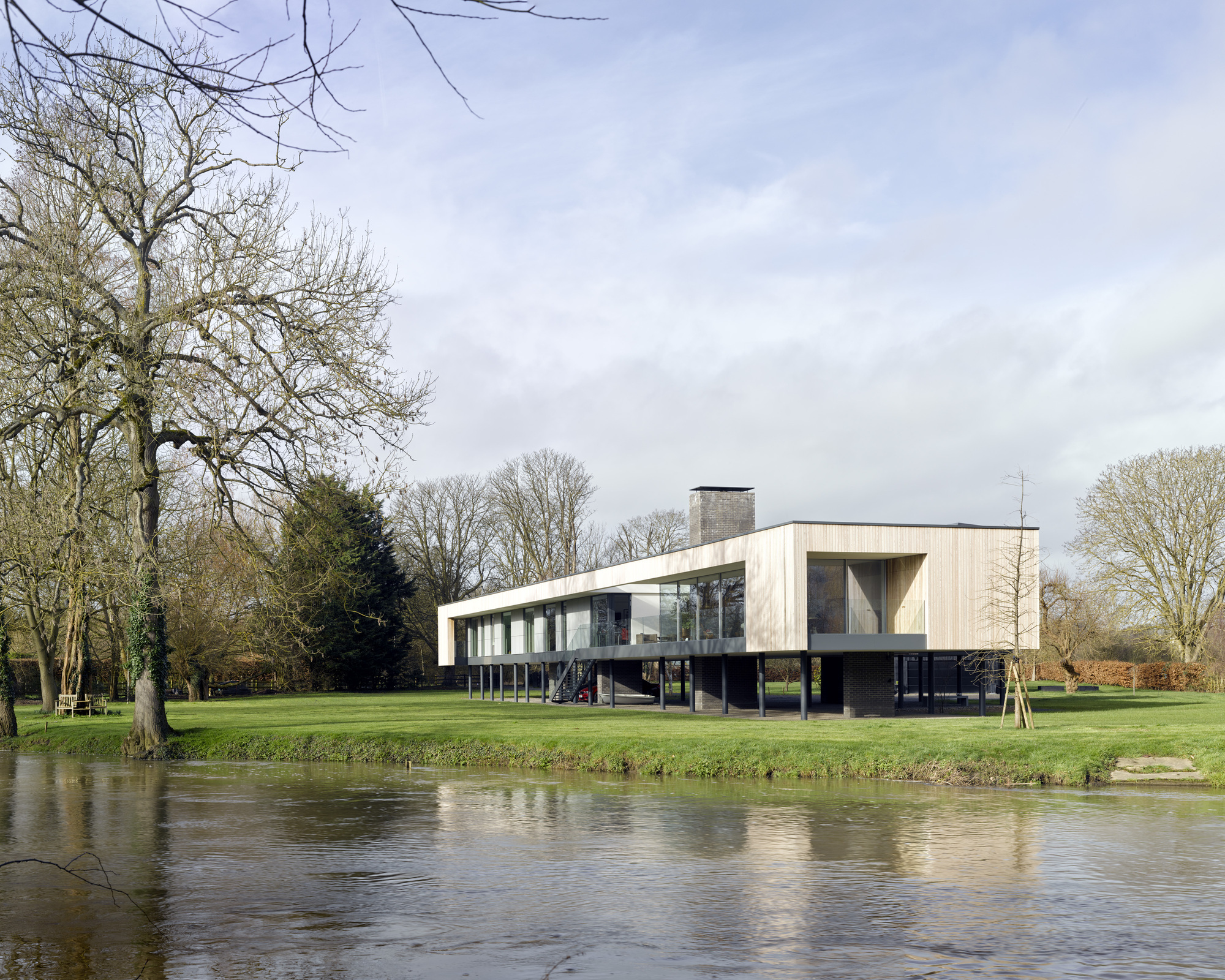
Narula House by John Pardey Architects

The Narula House. Image © Royal Institute of British Architects
Narula sits on a stunning plot on a bend in the river Thames near Walden. Accessed from a long private road this is familiar territory for John Pardey Architects (JPA) who have completed two previous houses nearby. The plot sits in flood zone 3b and floods periodically up to 1.2m.
As a reminder of this, the dinghy is on show in the under-croft of the house waiting. It was a stunning summer’s day when I visit, where the shade of the under-croft offered a cool repose from the heat. I do wonder what this space feels like in the depths of winter, but the river is so present on the site that this does not feel contrived. People in boats bob past with regularity during my visit.
The external steel staircase appears both elegant and durable, if somewhat akin to embarking a ship. The crafted front door opens into the longest corridor space I have encountered in a private home. The house is an elevated box, eroded between the living and sleeping wings to create a partly covered courtyard space. This is a welcome move given that physical connection to the garden below is difficult and allows the client to be in the landscape and enjoy the stunning setting.
-
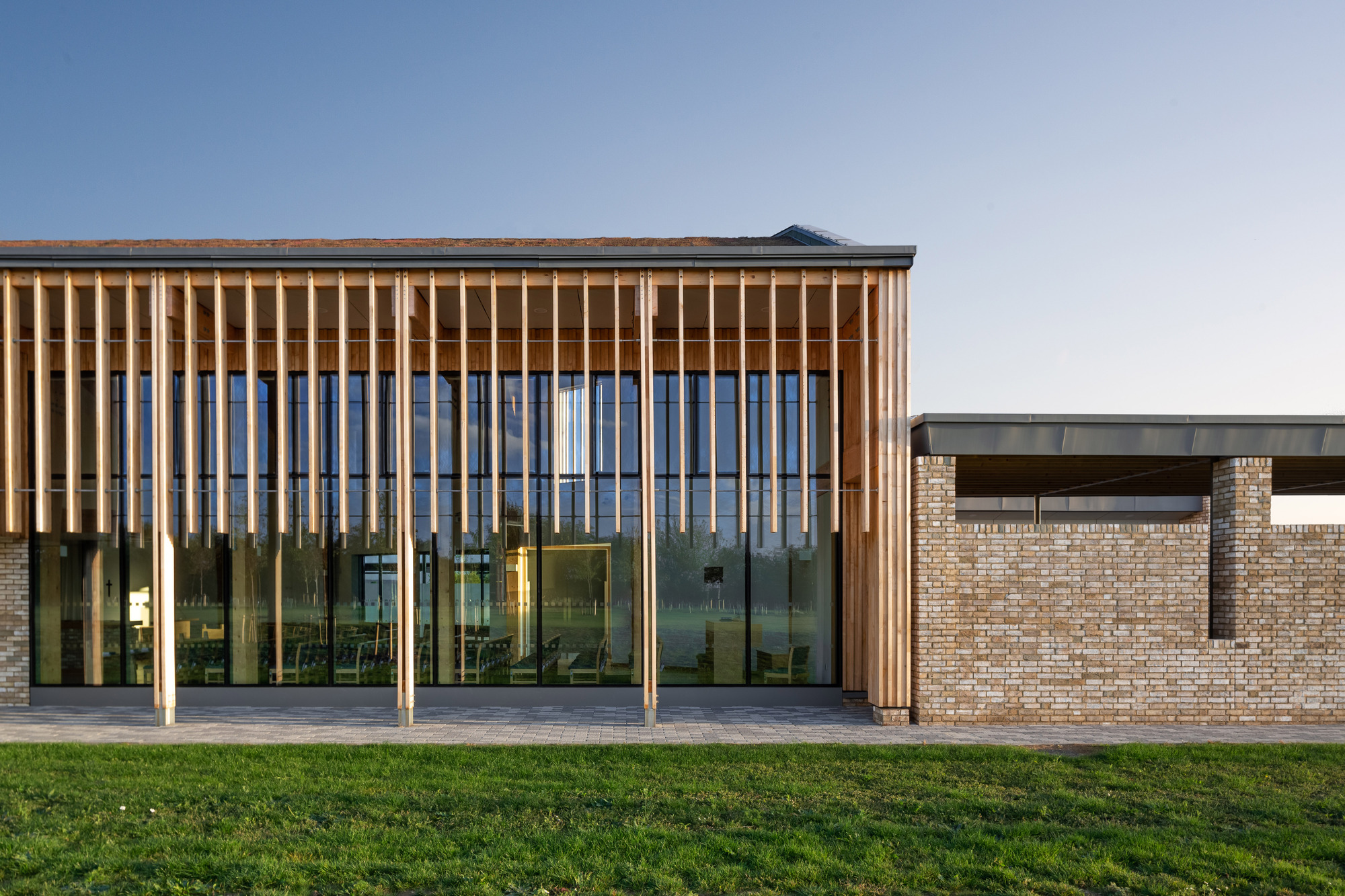
Bierton Crematorium, Aylesbury, by Haverstock

Bierton Crematorium. Image © Royal Institute of British Architects
Set on a slightly elevated landscape North of Aylesbury and the village of Bierton, the design of this new crematorium demonstrates a considered approach to the traditional layout whilst incorporating different cultural needs and providing a respectful setting. The building sits low in the landscape and utilizes natural and tonal materials that complement that successfully. Although some of the formal planting and arboretum is still establishing, the wild meadow remembrance walk and car parking landscaping provide an indication of how well this has been considered jointly with the building as part of the overall concept.
-
MK Gallery, Milton Keynes, by 6a architects

MK Gallery. Image © Royal Institute of British Architects
A high level of research, interrogation, collaboration, and consultation from an enthusiastic team has delivered a building and facility that remains true to the ethos of the original masterplan and aesthetic. Existing interior spaces have been opened up and reconfigured to provide a better user experience and flexibility as one passes through to other facilities, including the new performance space.
The reworking of the original gallery spaces, with a new window to the plaza, which combined with the new galleries, provides an enfilade connection through all the galleries to the parkland beyond. The use of 2 color palette ranges, extracted from the original MK concepts provides clear wayfinding whilst also reinforcing the original idea of the muted picturesque against the vibrant cosmopolitan.
-
Samarkand by Napier Clarke Architects

Samarkand. Image © Royal Institute of British Architects
-
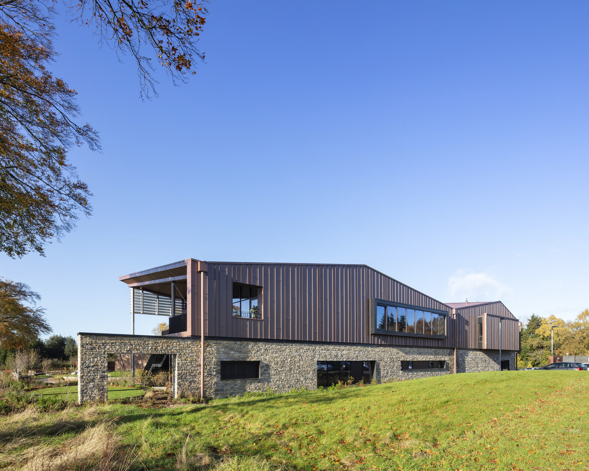
Promega UK Headquarters, Southampton, by ArchitecturePLB with Perkins+Will

Promega. Image © Royal Institute of British Architects
Architecture PLB was briefed to create a ‘home from home atmosphere with excellent natural light, a connection to nature, and workspaces which would offer future flexibility and accommodate change. Located deep in a business park, this building is unexpected in its context. Arrival is by car and one’s first impression is that you have come to visit a very large contemporary home.
The aspiration to create a home from home is evident throughout, and the plan arrangement and roof form (expressed internally and very beautifully) help to achieve this. The potentially larger scale of the corporate office is broken down to an almost domestic scale. The materials used throughout are rich in texture and mostly natural. The drystone wall expressed to the entrance elevations helps to further underline the feeling of a home from home in a rural context. To the courtyard elevation, walls become brick and are nicely detailed. Internally the walls are exposed concrete on the ground floor.
-
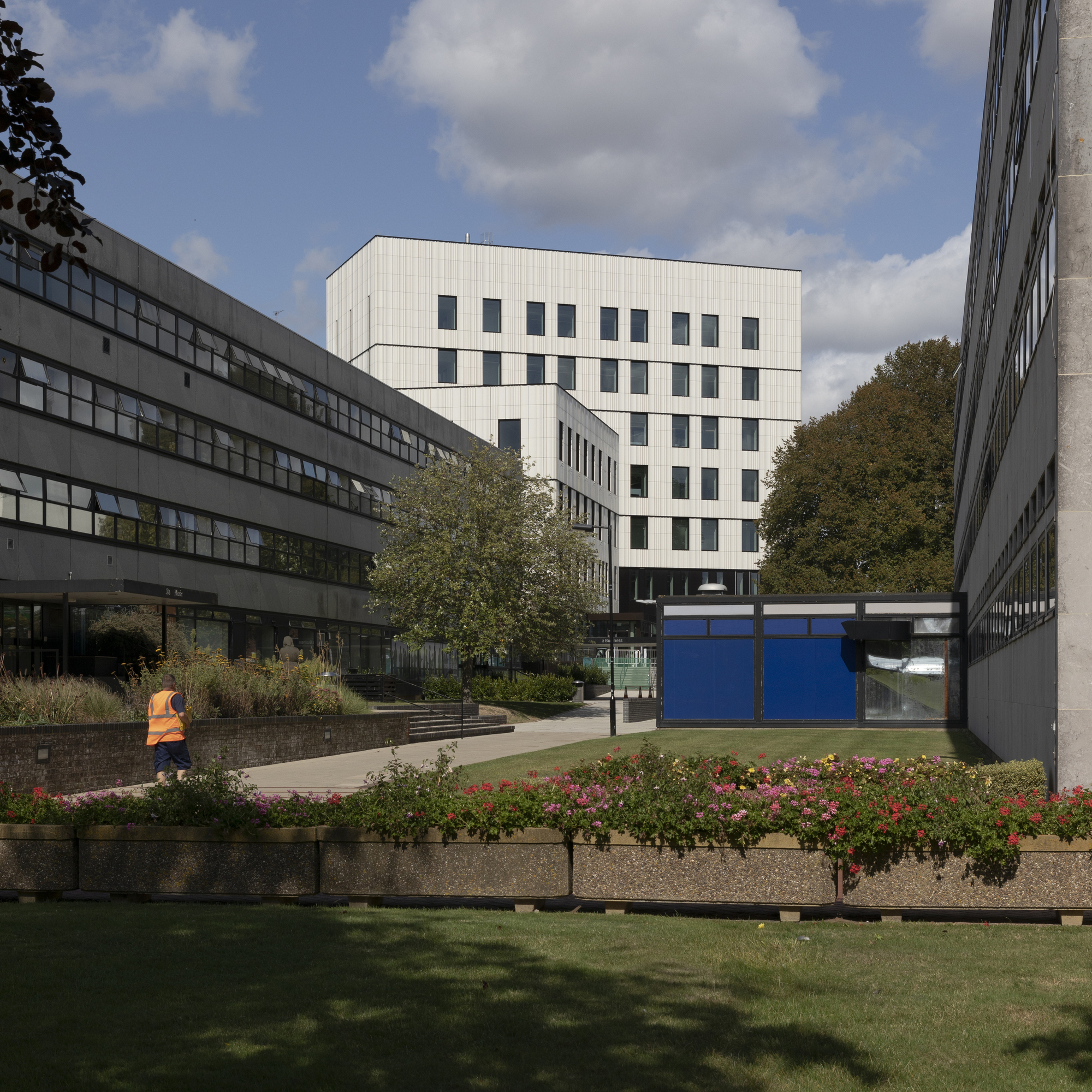
University of Southampton Centenary Building, Southampton, by Feilden Clegg Bradley Studios

University of Southampton . Image © Royal Institute of British Architects
On first impressions the Centenary Building appears as a rational and quiet scheme, sitting comfortably within what is a relatively uninspiring setting. Whilst it is taller than the surroundings, it has a calm presence. Arriving by car it feels somewhat a victim of context, surrounded by a sea of car parking.
Fortunately, most users will arrive on foot, or by bus which will be a more engaging approach only to be improved when the ground floor café opens. Once the café’s active frontage is implemented, this northern corner will hopefully be more animated with views through to the new shared space of Jubilee Road. This will interface with the public real will undoubtedly benefit the context.
-
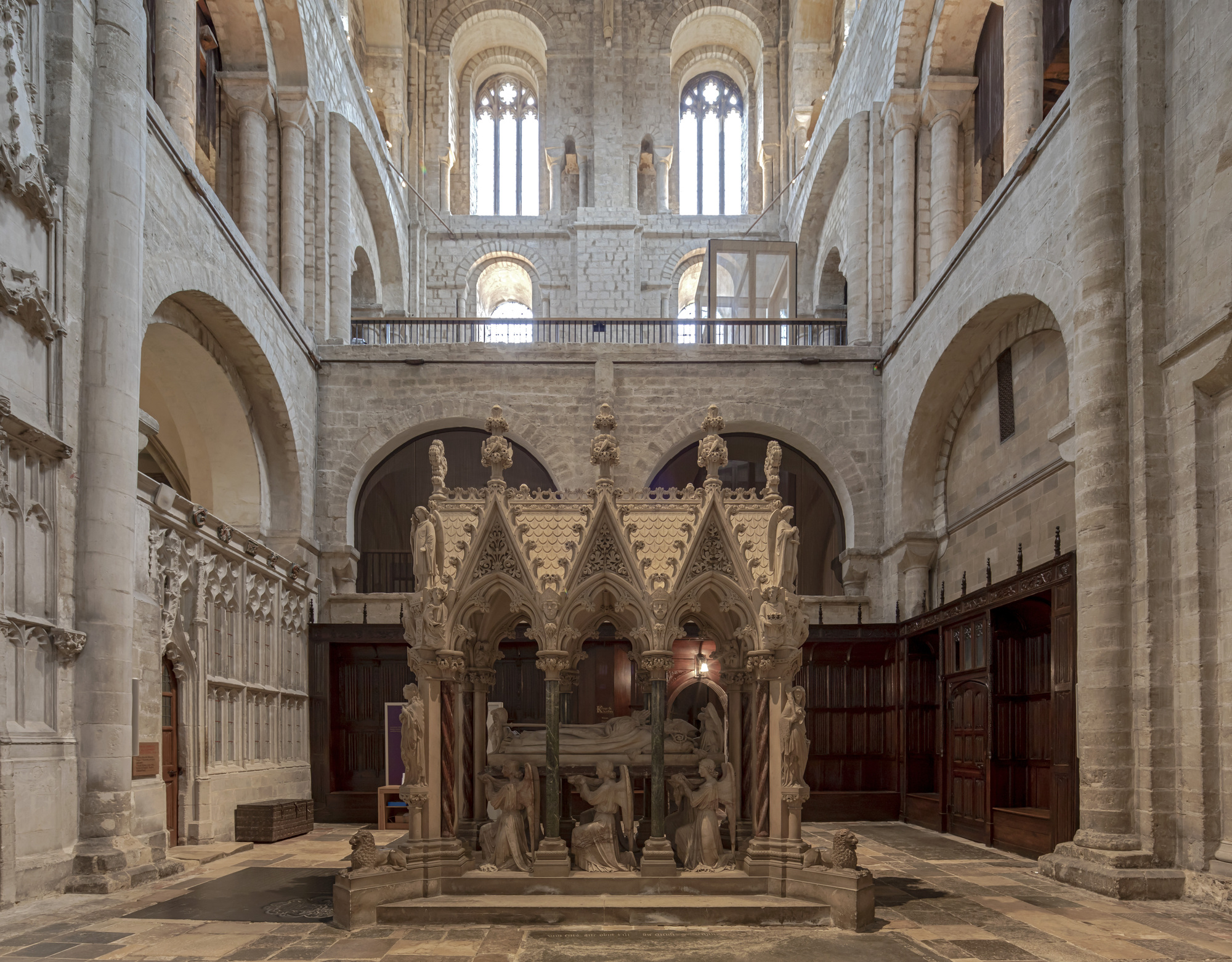
Winchester Cathedral South Transept Exhibition Spaces, Winchester, by Nick Cox Architects with Metaphor

Winchester Cathedral. Image © Royal Institute of British Architects
Fortunately, I knew that I was heading to the South transept otherwise, I may have completely missed this wonderful little intervention and the client admitted that they did need better signage, which I agree with. This is the first lift to be inserted into a medieval cathedral in the UK, no small undertaking, and interestingly the cathedrals in the UK formed their own regulatory body (the CFC), and as such planning permission was not necessary however it sounds as though they were extremely thorough.
-
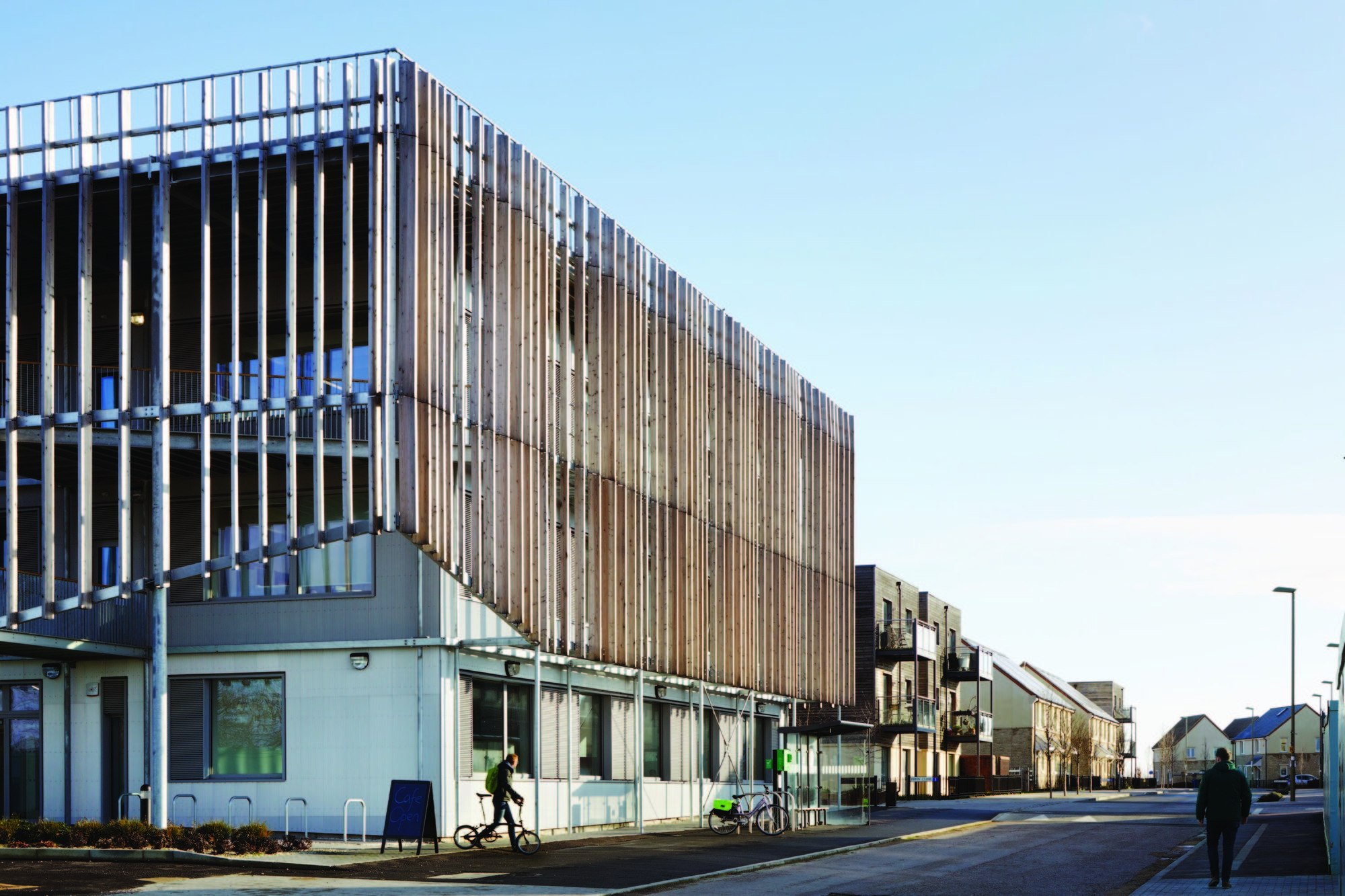
Bicester Eco Business Centre, Bicester, by Architype

Bicester Eco Busines. Image © Royal Institute of British Architects
Part of a wider eco-town development and setting a benchmark for others to follow, this project is highly regarded by its users. The center has quickly become a hub for the new community that continues to grow around it. It demonstrates what is readily achievable with well-thought-through planning, spatial arrangements, client and end-user participation.
It is commendable that, to the everyday users, it fulfills its functions in an office workspace without being complicated to use or understand. Internally, suites of open plan or cellular offices share meeting rooms and kitchens which are arranged around an open central atrium walkway and which become impromptu collaboration areas, with access to external balconies.
-
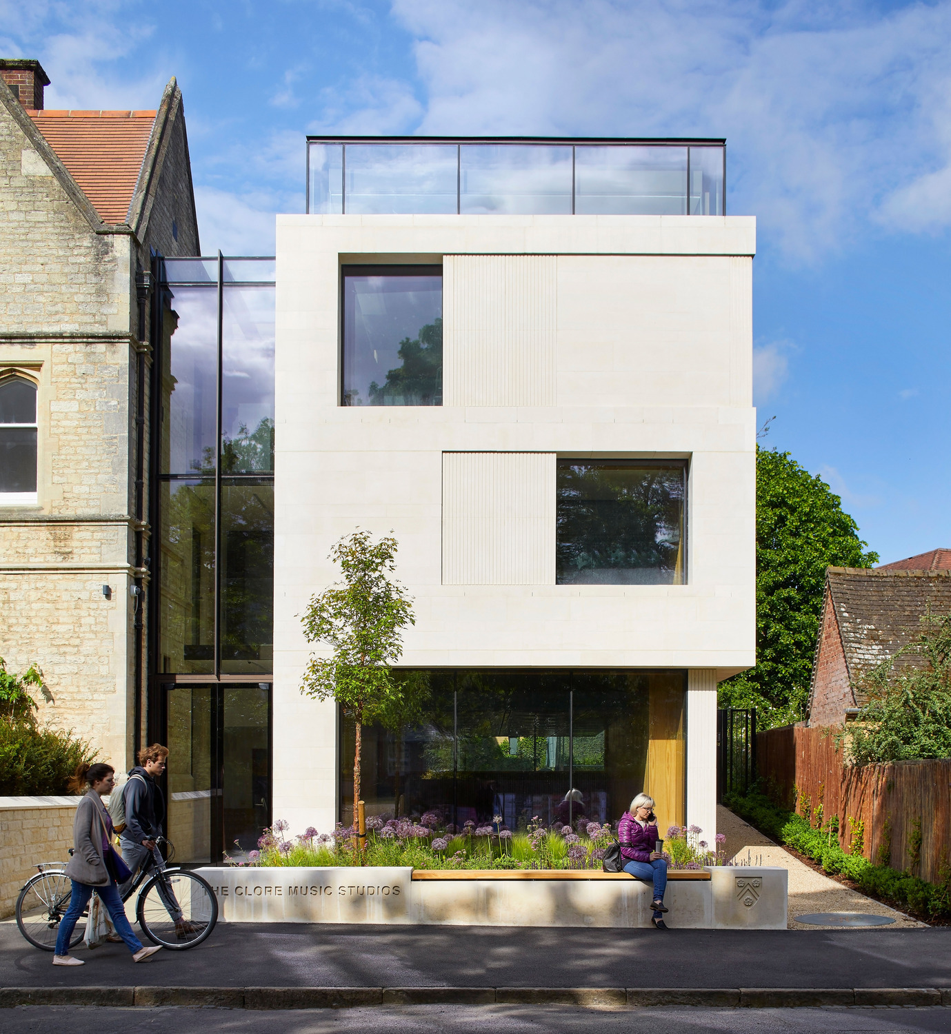
The Clore Music Studios, New College, Oxford, by John McAslan + Partners

The Clore Music. Image © Royal Institute of British Architects
What appears to be a simple form has been borne out of many constraints, including planning restricting the height, a Civil War Rampart restricting the width, the desire to tie the building in with the adjacent accommodation, and the essential need to have a lift large enough to get piano’s to the top floor whilst not sacrificing floor space. The challenge has been successfully resolved with a stack of music studios and performance spaces that cater to the musicians’ needs enveloped in stone and glass that respects the streetscape well. The stonework has in parts been worked, to add texture and detail to what could have been an otherwise flat stone box.
-
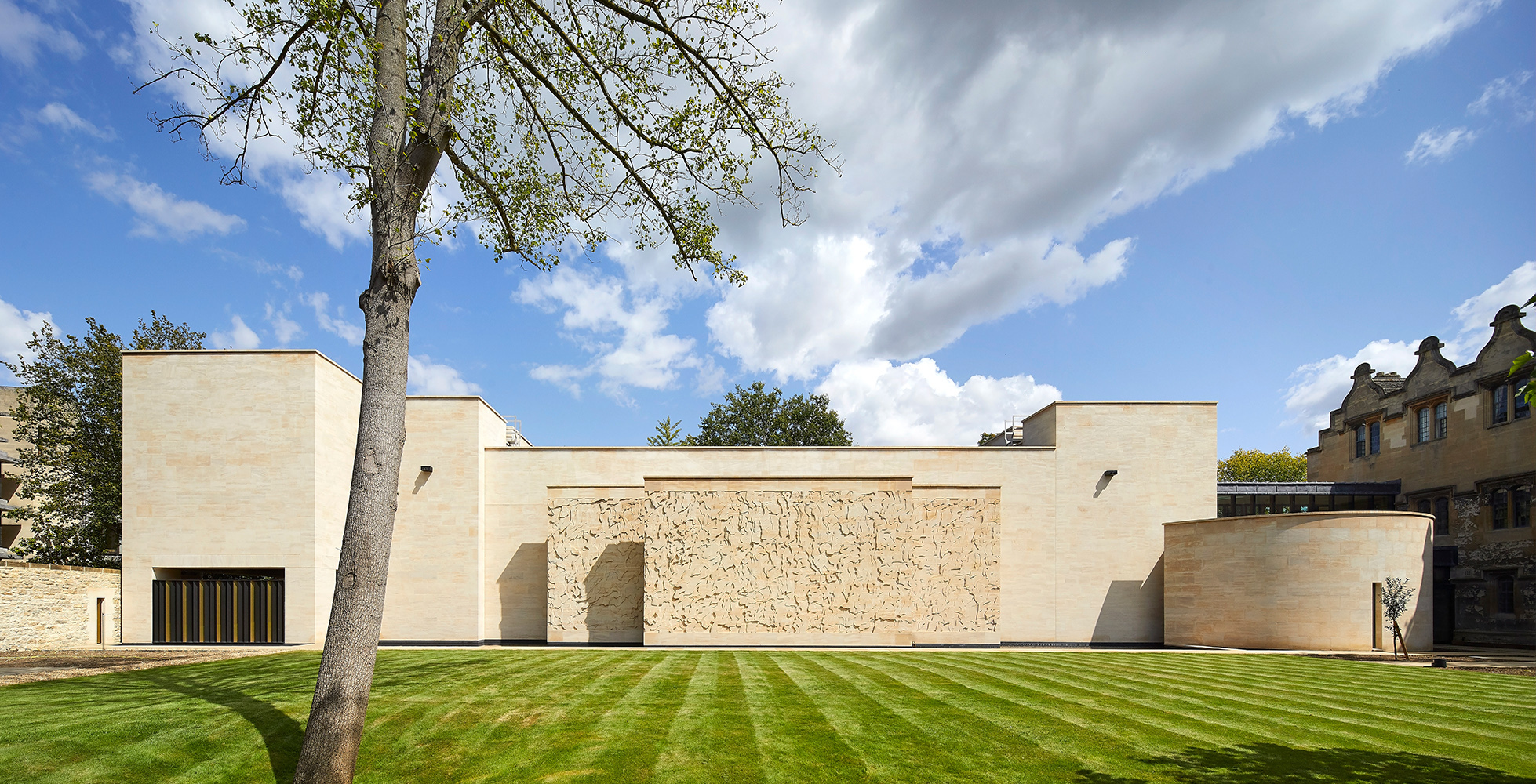
Library and Study Centre, St John’s College, Oxford, by Wright & Wright Architects

Library and Study. Image © Royal Institute of British Architects
Oxford’s Colleges have a history of commissioning architecture that is designed to enhance the education of future generations as well as providing a legacy to the built environment. As Colleges expand in the City, they become more constrained, and finding new sites becomes a greater challenge, especially when looking within their own grounds. In developing the brief for the new library and study center, St Johns College together with Wright & Wright has achieved a building that delivers on many levels. There is a robust sustainable design criterion, the commissioning of artisans for elements such as the stone artwork and joinery, combined with an attention to details, connections, and overall materials and finishes which do not go unnoticed.
-
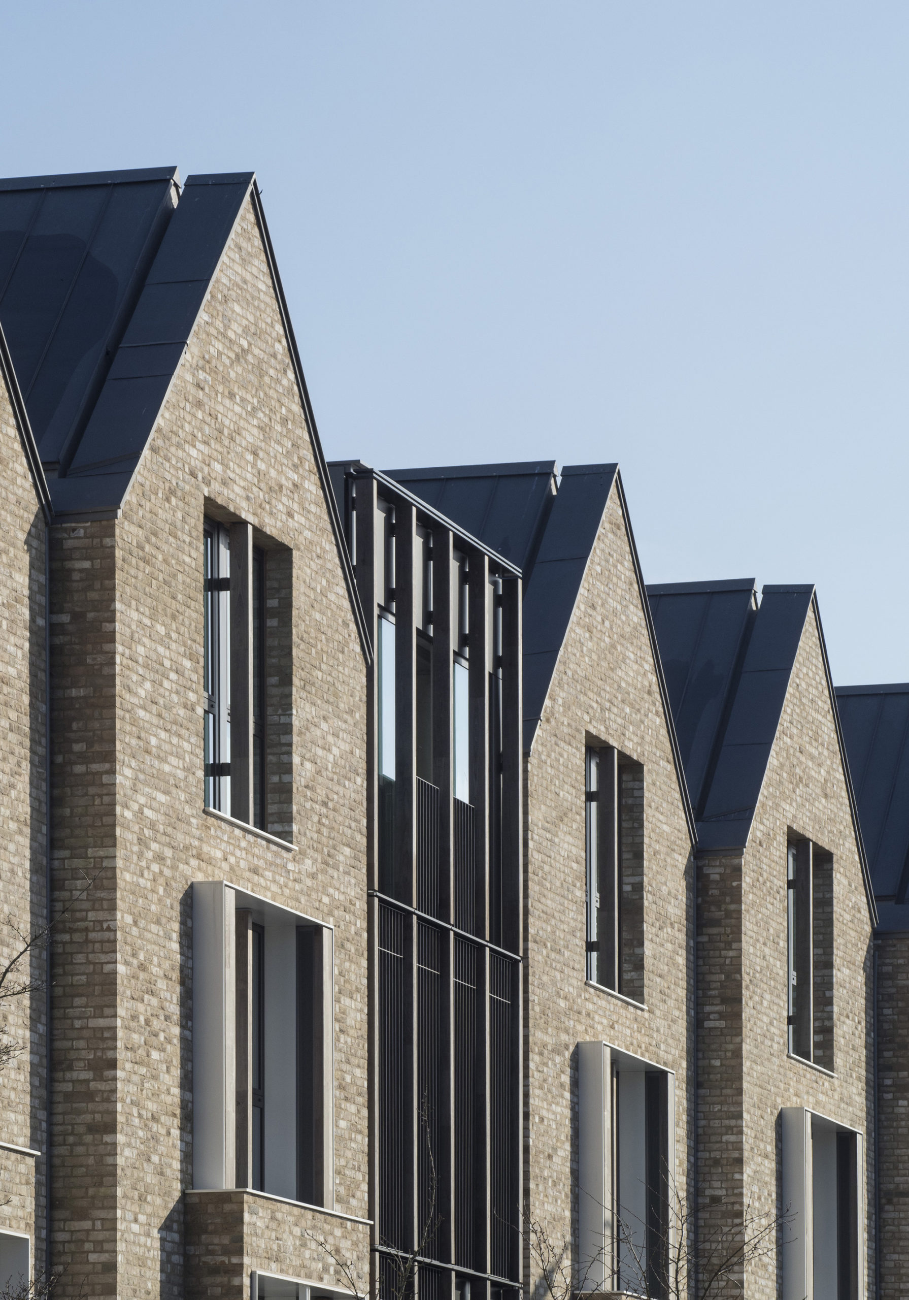
The Dorothy Wadham Building, Oxford, by Allies and Morrison

The Dorothy Wadham. Image © Royal Institute of British Architects
The architectural language replicates the traditional villas along the Iffley Road, with a contemporary update. Arrangement of the accommodation blocks around a landscaped garden allows a private green space for students to relax or meet. The main building on Iffley Road maintains the height and grandeur, whilst the buildings addressing the side streets step-down to respect the traditional scale of the cottage terraces typical of the area. This method of integrating the new scheme into the area is used again with the retention of a rear access lane across the back of the site which provides space to the new communal facilities building and cycle stores.
-
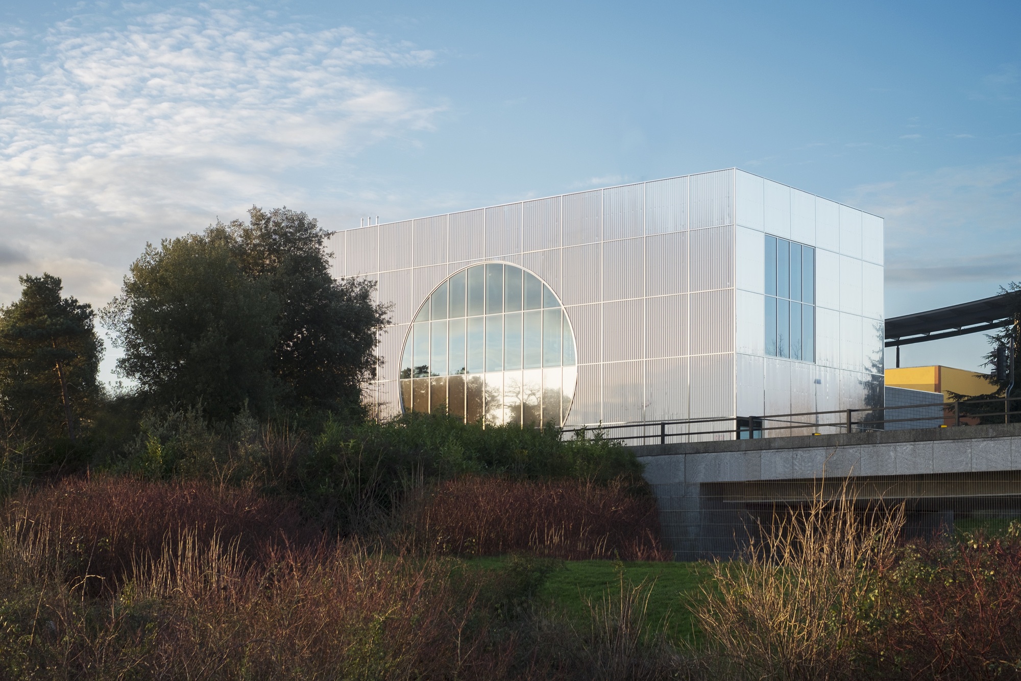
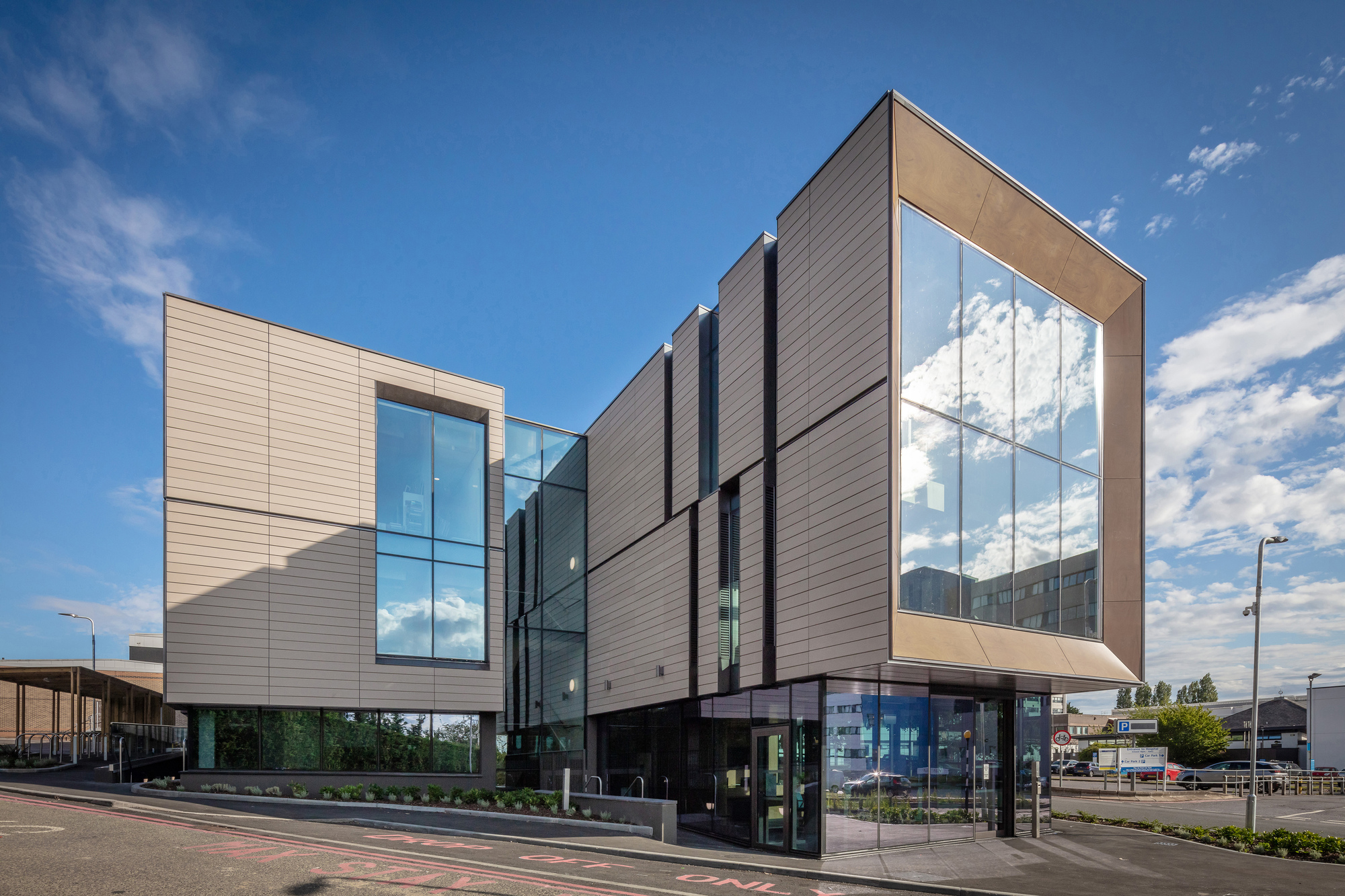
The Wolfson Building, John Radcliffe Hospital, Oxford, by Francis-Jones Morehen Thorp

The Wolfson Building . Image © Royal Institute of British Architects
The congested, awkward, sloping site, providing additional spaces to the existing facility and bring together a complementary research group. Clear architectural form, simple palette of external materials resembling two stretched volumes on either side of a central glazed circulation area sitting above a solid base. Façade build-up and detailing create a visually interesting yet simple appearance, concealing the components of the natural ventilation system.
The shortlist for the RIBA Stirling Prize for the best building of the year will be drawn from the RIBA National Award-winning projects. An overall victor will be announced on Thursday, 14 October.


