Ropemaker
Macquarie’s Ropemaker Place was designed as a model for a new transparency in banking services revolving around an open atrium and connecting staircase. By virtue of their size, large corporations face a spatial problem of creating a unified community and leveraging their considerable knowledge sharing potential. Macquarie, an Australian financial services company, took a radical approach to connecting its separate divisions with its new London headquarters. Having been fragmented in different buildings, Macquarie leased 216,000SF in 6 large floors for 1,800 staff, in a new LEED Platinum/BREAAM rated building.
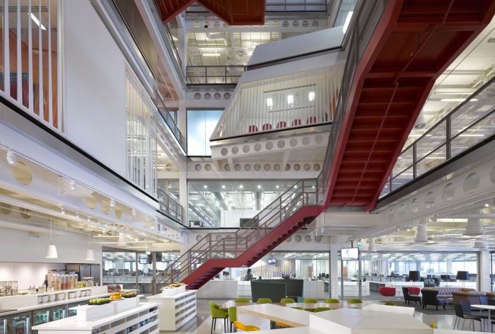
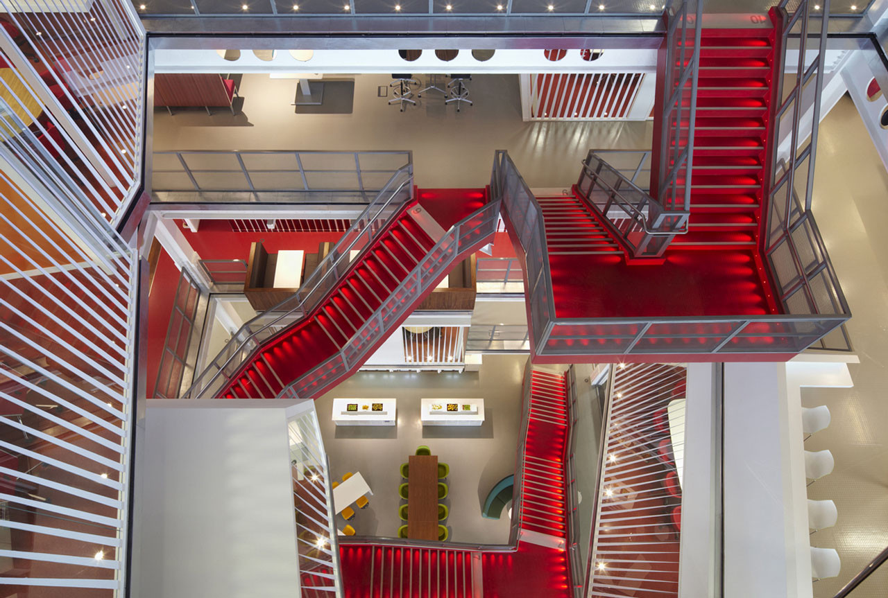
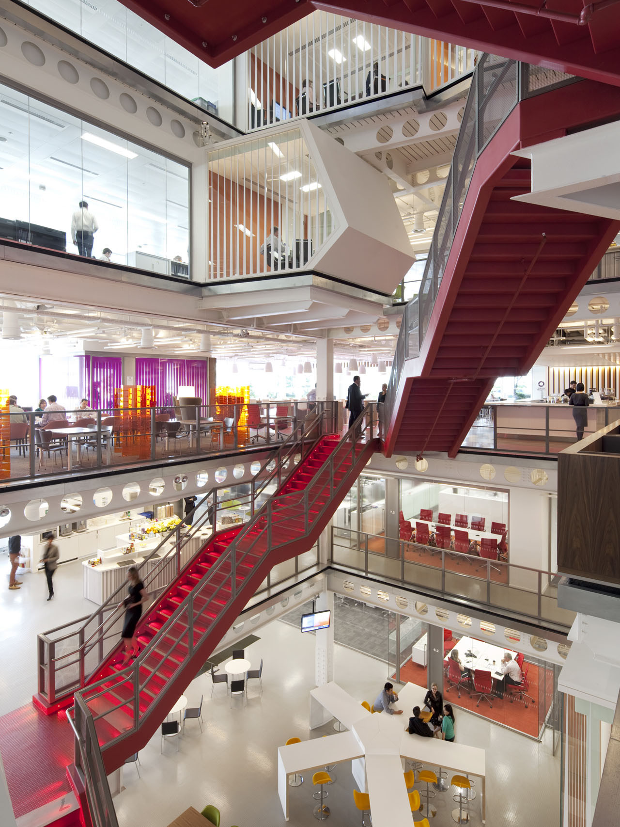
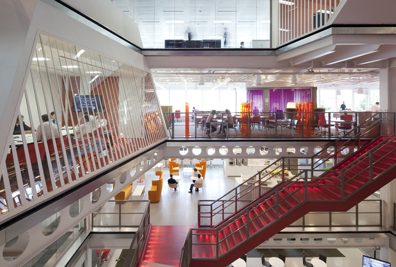
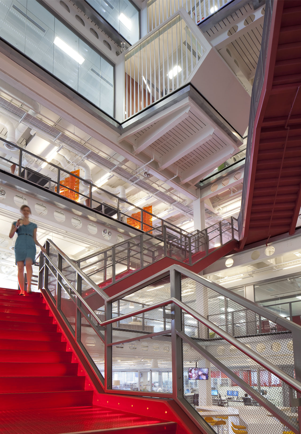
Stacked floors in office buildings present an innate barrier to business connectivity. In an effort to facilitate a clear and open connection between the corporate divisions, we worked with Macquarie to carve out a new vertical opening in the form of an Atrium. Working between the existing structural steel bays, a six-story organically shaped volume was created. Planned along desire lines connecting the different functions, a new continuous staircase traverses the Atrium and has become the visible banner of connectivity. To stress its importance in connectivity, the stair was painted red, with LED lights illuminating the treads.
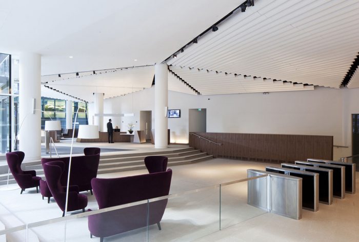
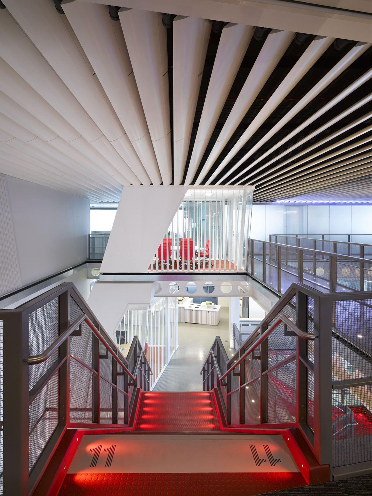
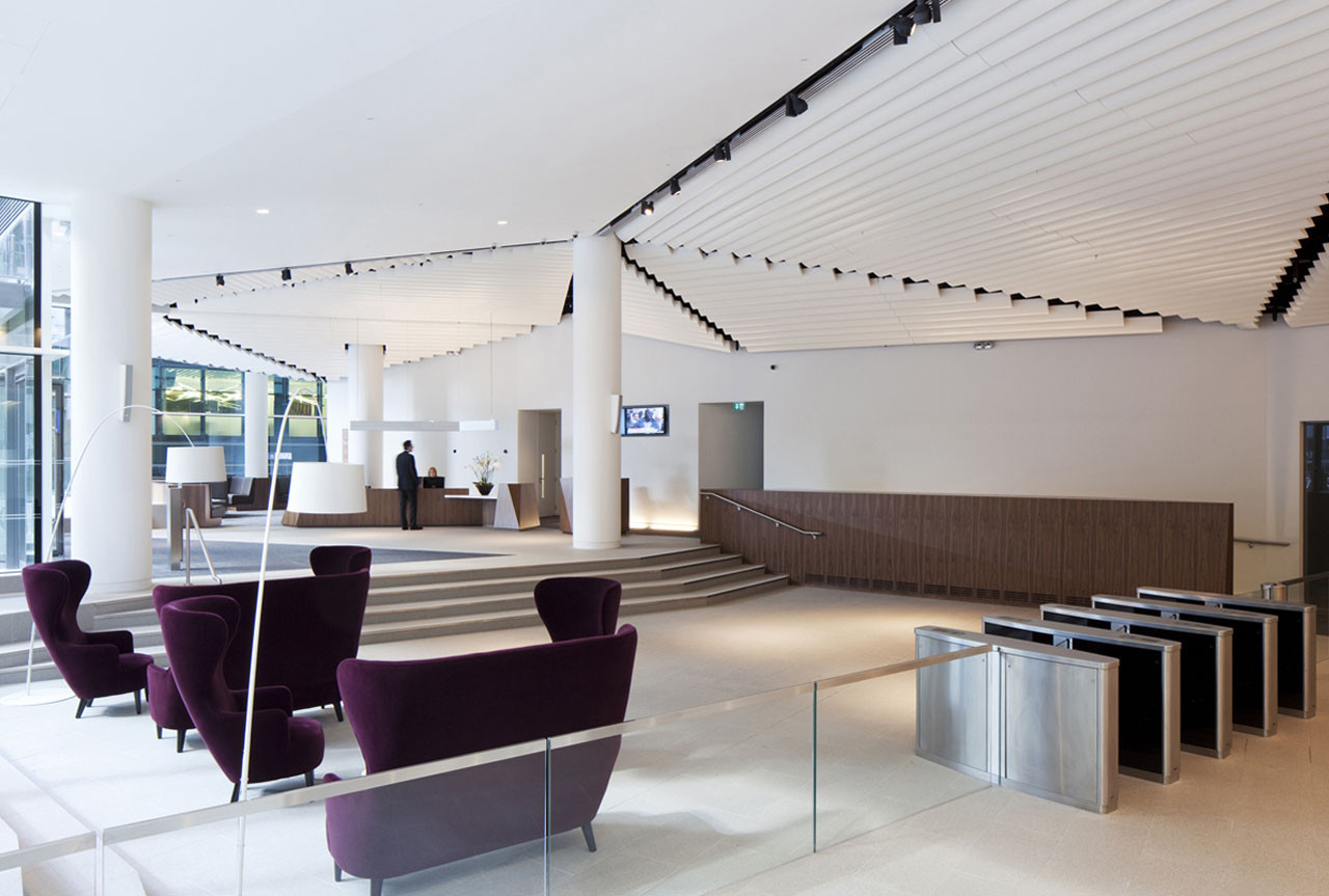
While the Atrium serves to connect the businesses, it also becomes a bridge into the workings of the bank for visitors. Clients and visitors are greeted in the ground floor lobby and emerge, via elevators, on the Level 11 Guest Relations area. From here, they engage in confidential dealings in private rooms, use the conference or event spaces, or meet within the dramatic atrium volume and enjoy clear views into all the Macquarie workspace.
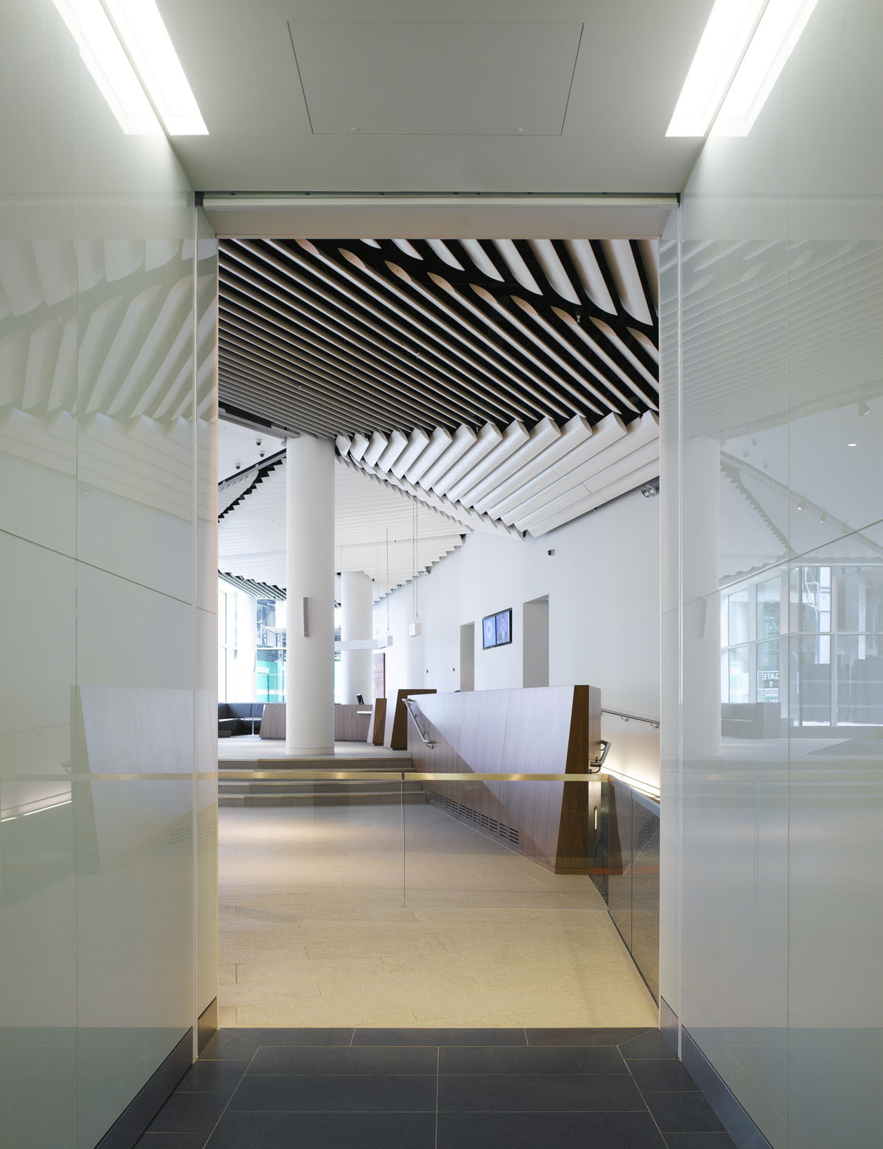
Just as there are different experiences for visitors and users, two separate messages about the brand coincide. The entry sequence for visitors is shaped by a message of simplicity and restraint which begins at the ground floor street presence and follows through to the Level 11 guest spaces. The linear ‘pin-stripe’ of City tradition informs the architectural design and graphics, with a more exuberant expression in the linear ceiling treatment.Once immersed in the Atrium space, the brand becomes more animated and informal, with the building structure exposed and the clear message that this is a modern factory for work.
Many sustainability initiatives are achieved with the building, including significant decreases in energy consumption, waste and elevator usage, and net carbon footprint reduction, in line with the top rated BREAAM building. Structural beams cut out of the Atrium were reused to create bridges and cantilevered pods. Engineered cellular space reduces churn costs, and a computer-controlled daylight harvesting system with LED lighting provides significant energy savings. Furthermore, an emphasis on foot traffic using the Atrium staircase has cut elevator usage by 75% while promoting employee health.
The visible energy of people circulating and interacting in the highly transparent Atrium serves as the catalyst for drawing the different business units together and provides the synergy to collaborate with each other in new business ventures. It further underscores the financial services company’s brand as an agile, forward thinking and highly collaborative 21st Century Company.
Project Info
Architects: Clive Wilkinson Architects
Location: Ropemaker Place, London
Executive Architect: Pringle Brandon
Client: Macquarie Group Ltd
Area: 217.500 SF (20.207 SM)
Year: 2011
Type: Office Building
Photographs: Courtesy of Clive Wilkinson Architects
Courtesy of Clive Wilkinson Architects
Courtesy of Clive Wilkinson Architects
Courtesy of Clive Wilkinson Architects
Courtesy of Clive Wilkinson Architects
Courtesy of Clive Wilkinson Architects
Courtesy of Clive Wilkinson Architects
Courtesy of Clive Wilkinson Architects
Courtesy of Clive Wilkinson Architects
Courtesy of Clive Wilkinson Architects


