Santa Fe de Bogotá Foundation
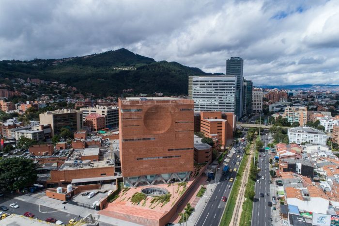
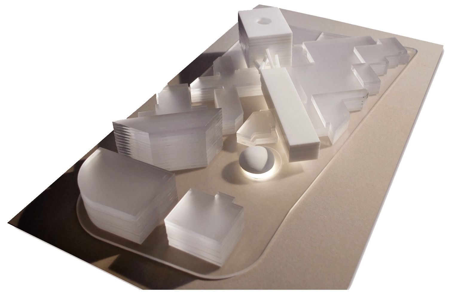
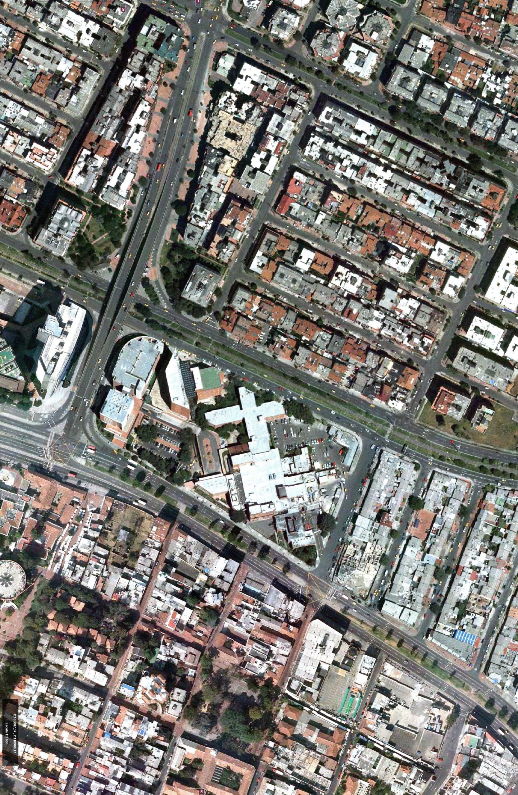
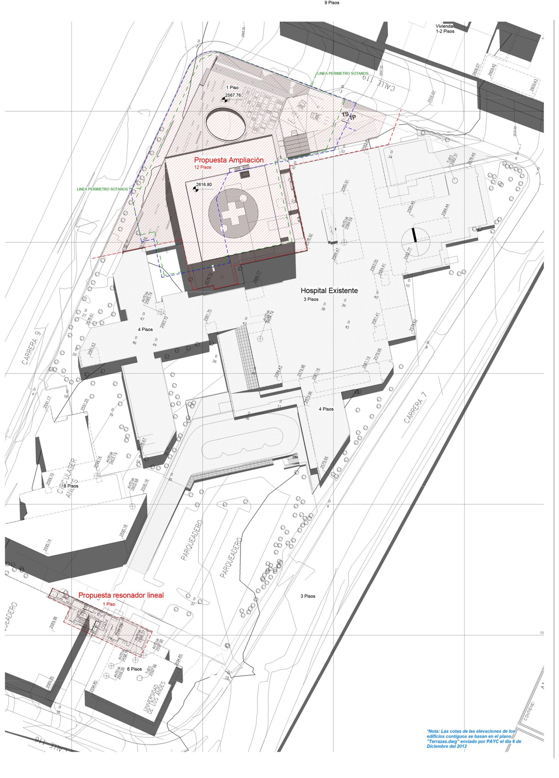
The comprehension of a metropolitan scale is fundamental at the moment of thinking in an integral architectonical answer. More than solving a need for the expansion of the hospital, the project should commit to solving more of what it is requested, taking advantage of the good location of the intervention area. The project is located in a place in the city where two of the main avenues: 9th and 7th avenue almost connect. Our proposal looks forward to be a diagonal connector and work as a catalyzer for new flows, activities and human relationships.
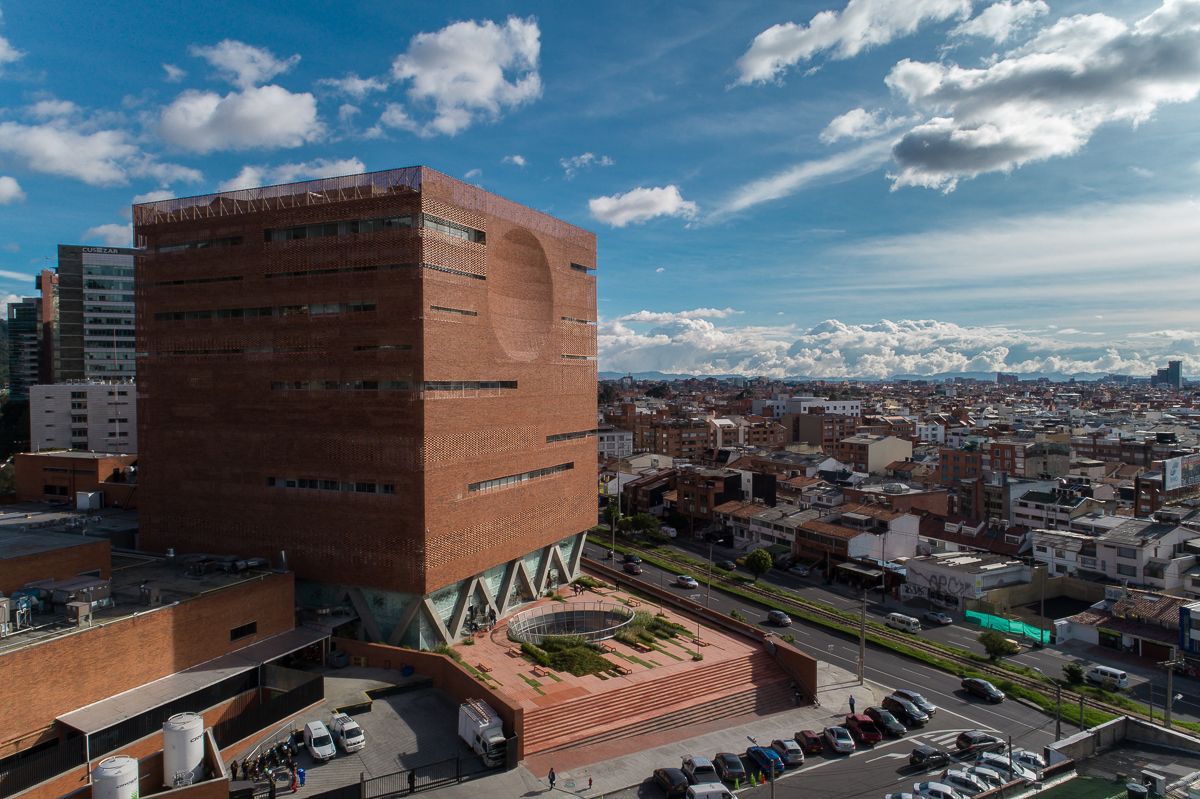
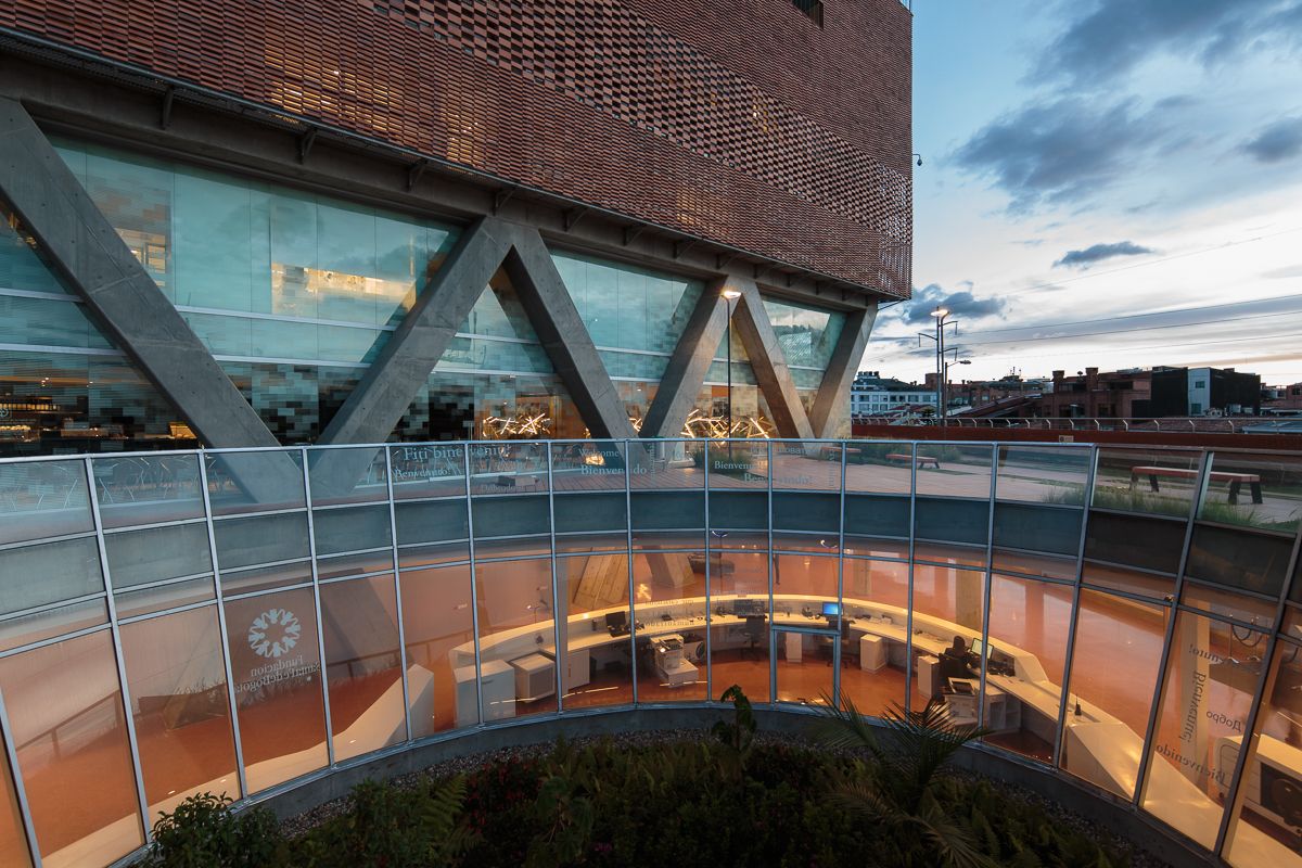
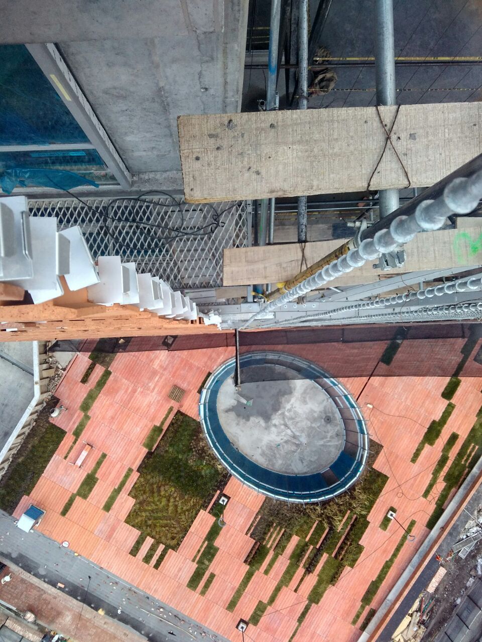
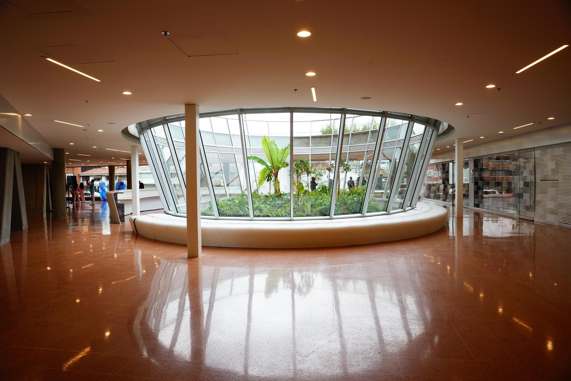
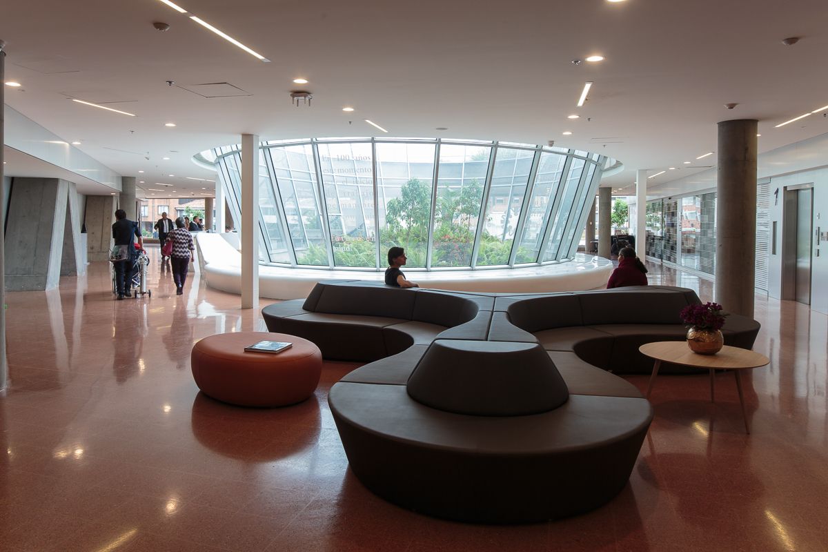
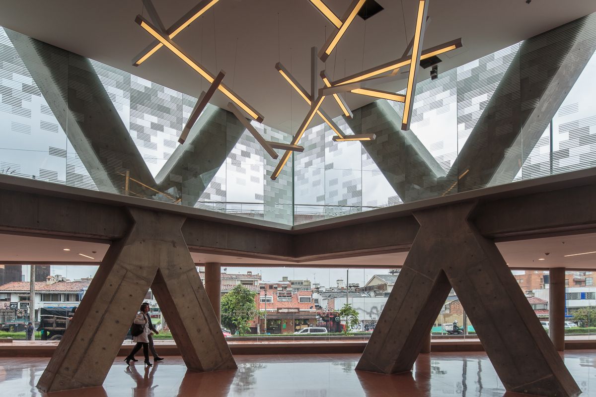
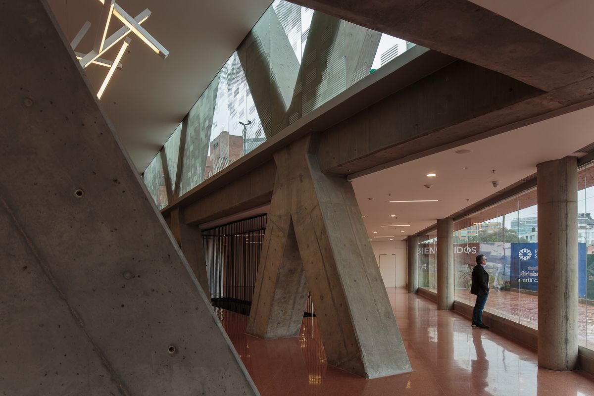
We designed dos big open spaces at the edges of the two avenues, both with a lot of vegetation, green areas, commercial stores, coffee shops and a multipurpose auditorium that will create a relationship between pedestrians and the area. Open spaces, even if they are separated from the existing hospital, they will look connected at the pedestrian level by the main lobby of the building, as well as generating new flows and activities, turning the building into an urban bridge. We state a complete urban solution that will make the University Hospital as a reference and meeting point in its environment.
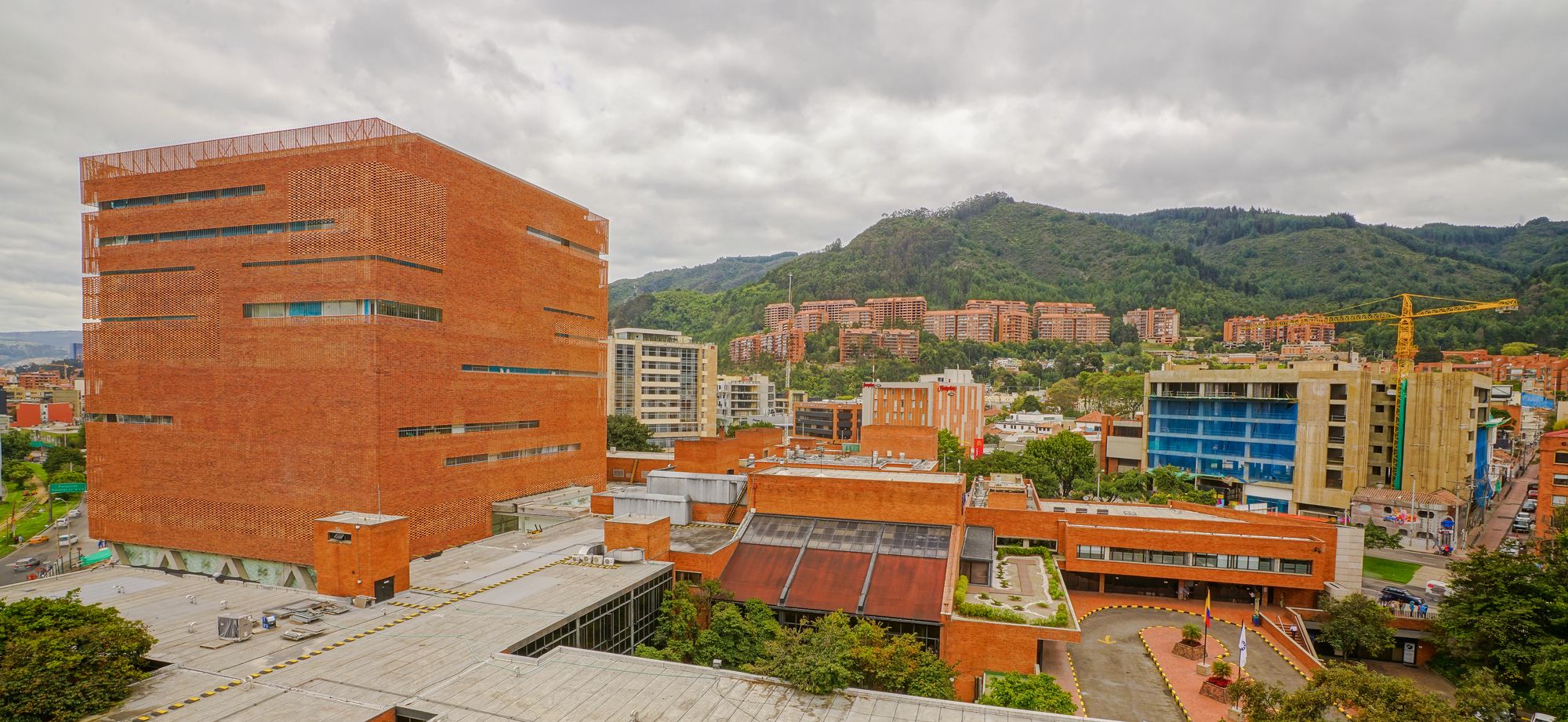
There is a condition in the hospital that must be solved and it is fragmentation. Originally Santa Fe Hospital had been developed through time within different master plans. Initially, it was thought as a clear and ordered hospital complex which would have expansions according to the plans. The first master plan proposed the second cross for inpatients, when it was built it would allow an axial circulation complementing the actual flow, giving spaces for patios and open areas.
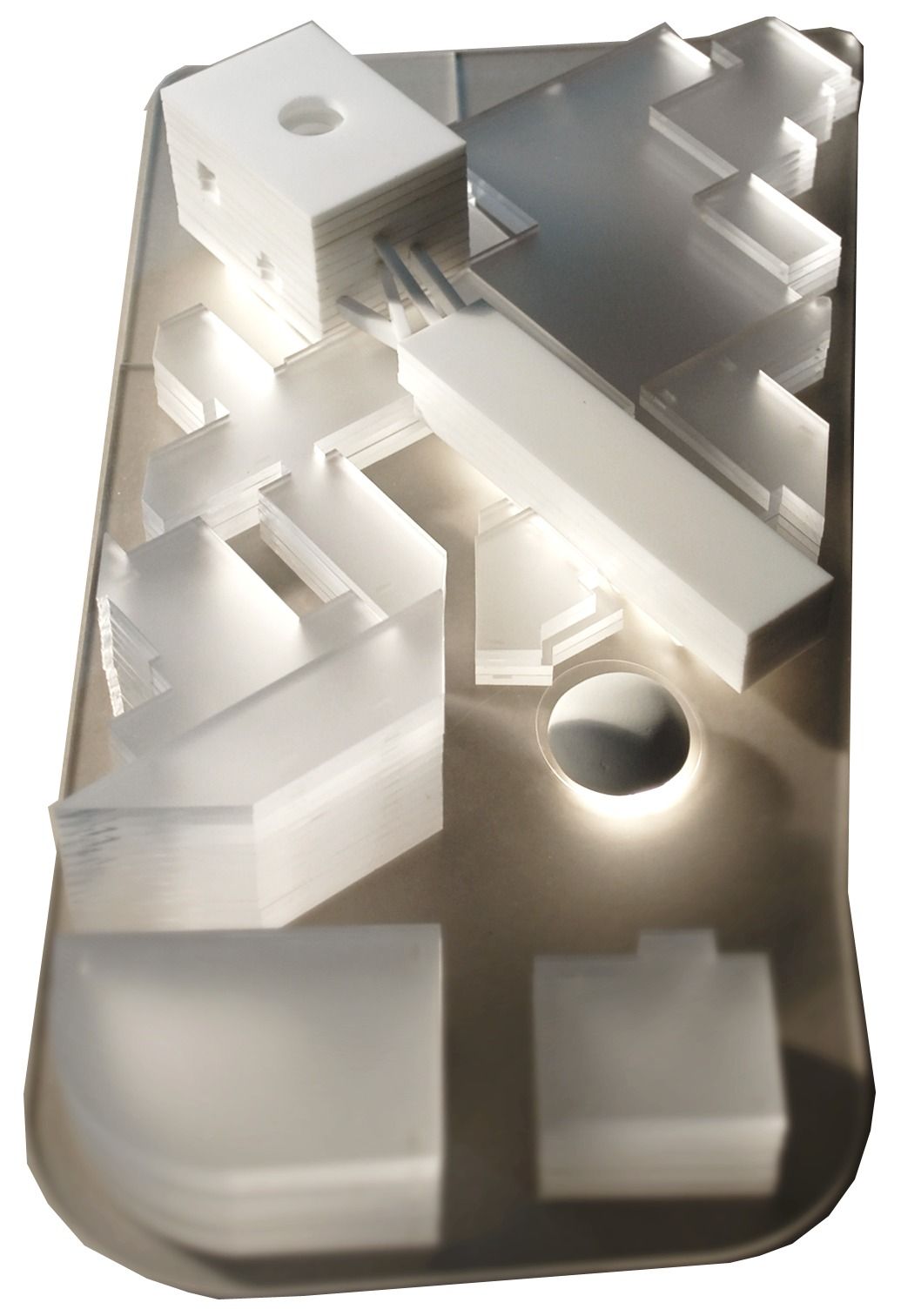
The actual hospital is the result of an addition of architectonical pieces that answer to programmatic needs, technological and scientific advances. In consequence, this has created a maze of buildings and flows. Our proposal tries to retake the initial idea of a complex. The idea of the connector building recovers the proposal of the axe between the existing and the new buildings. It wants to take aside the idea of joining buildings and punctual expansions and understand the hospital as a totality. This will generate necessary connections for the correct operation of the different levels, avoiding the uncontrolled growth of small pieces without relation. We propose a building with a core that will reorganize the actual vertical and horizontal flows as well as working as a linking element between the new and the existent.
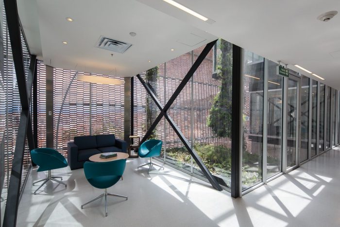
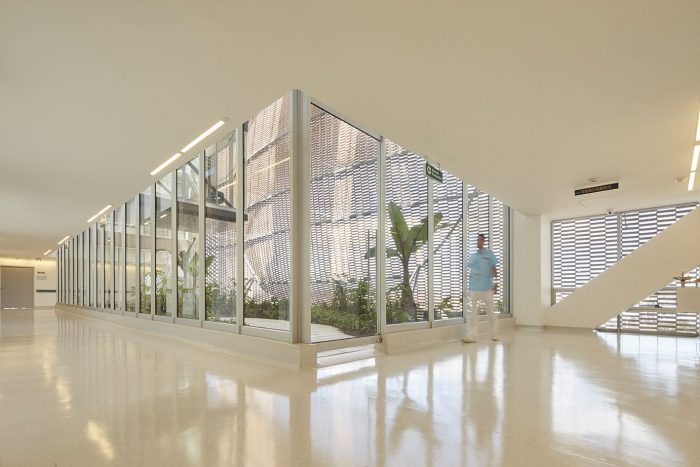
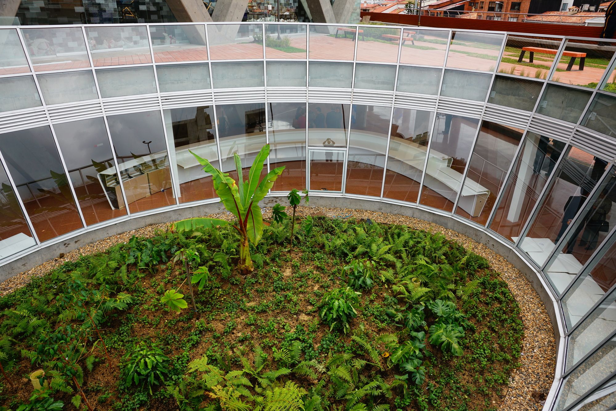
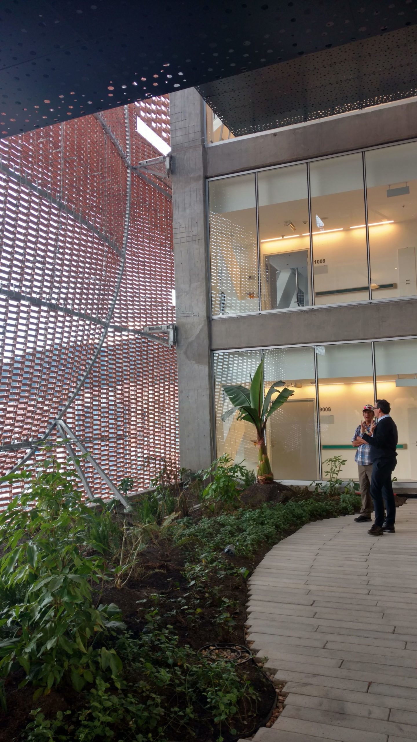
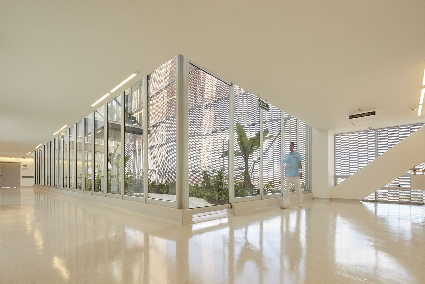
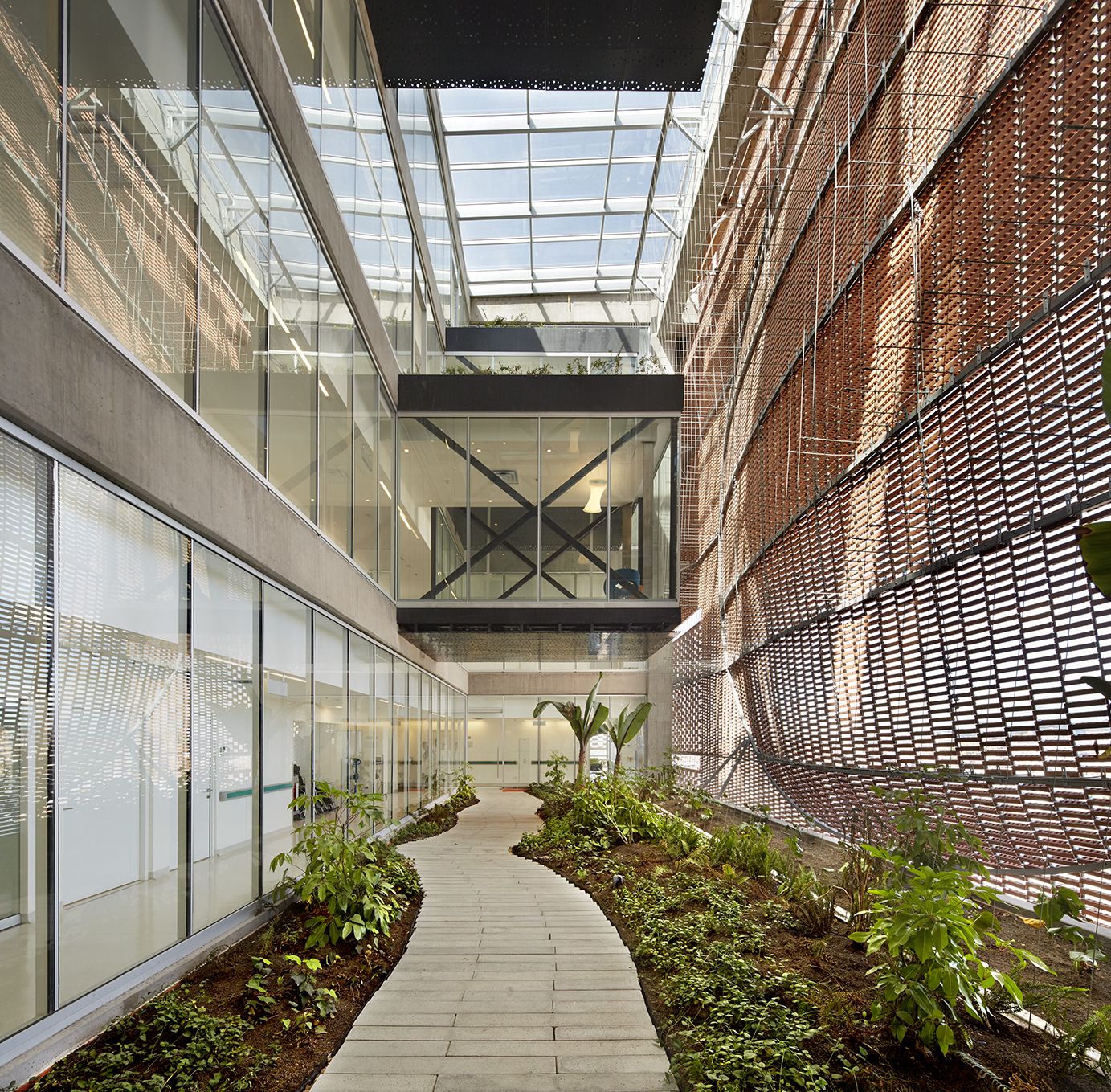
Therefore we want to rescue the intention of the patio and natural lighting in each of the spaces, an element of vital meaning in the healing process. With this unifying strategy, our proposal is not only an expansion it turns to be organizing and bounding element.
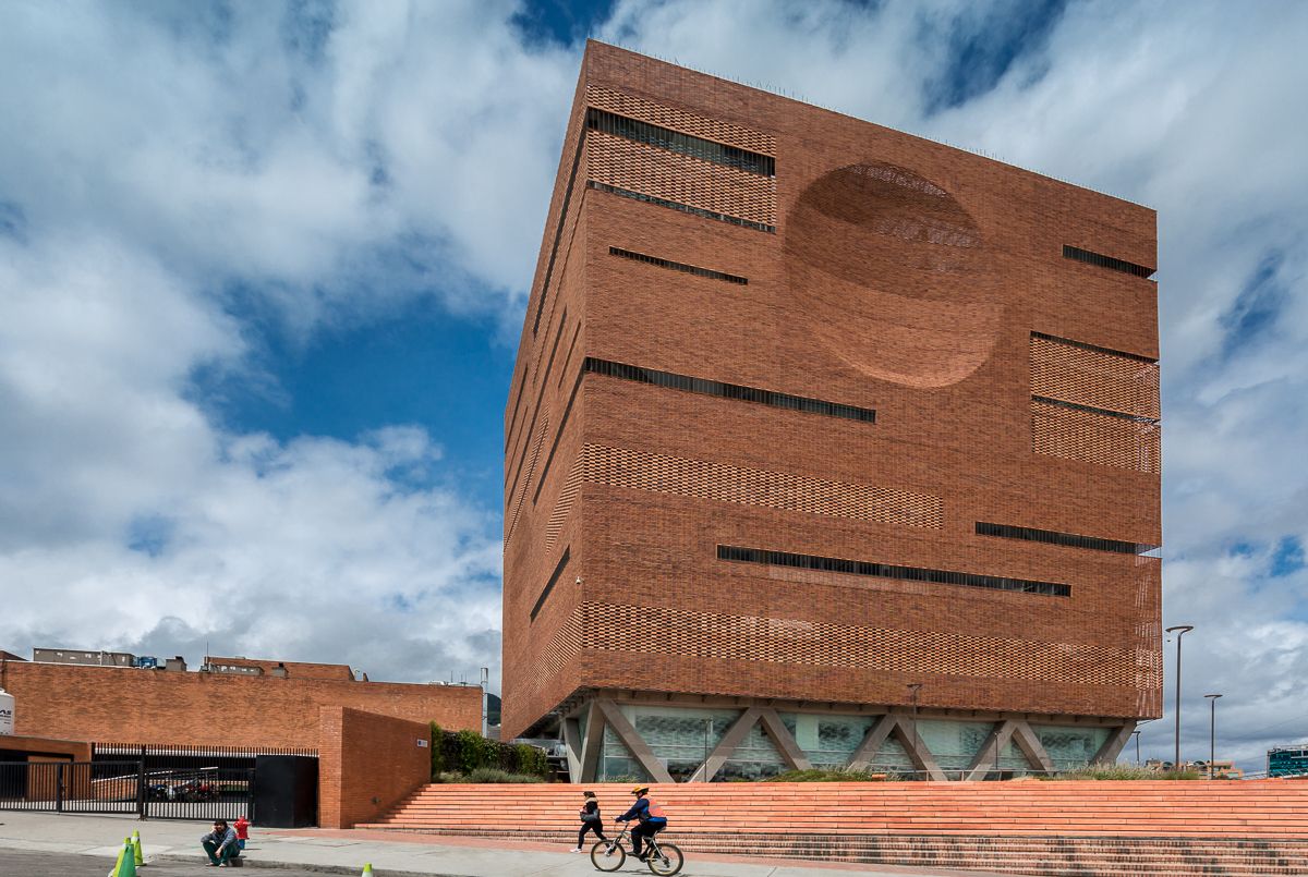
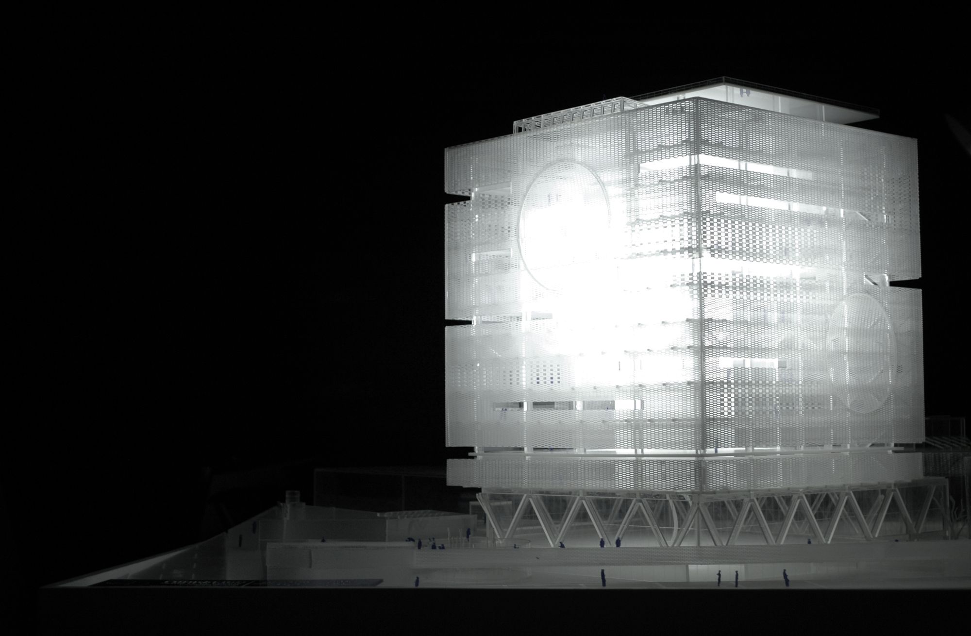
The new building more than reorganizing the existent hospital, it states clear segregation of the future spaces. A building only for inpatients and the others for ICU and intermediate care; they differ in form and size because of their special functional requirements. Joined in their form only in the base by the main lobby, both buildings work as one when they connected by bridges, stairs, and ramps. The bridges allow an easy connection, direct and adaptable to all differentiated flows.
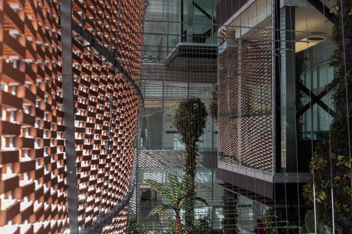
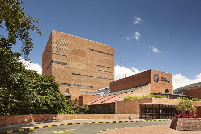
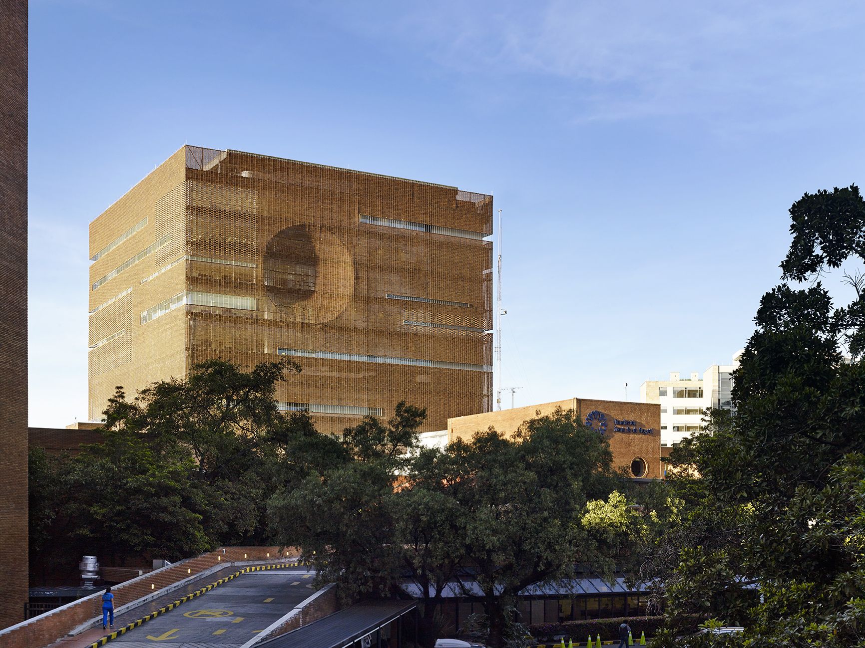
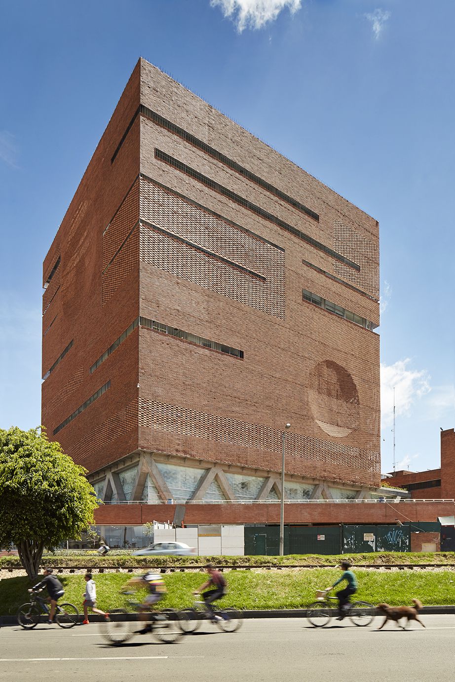
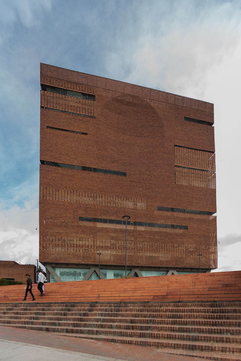
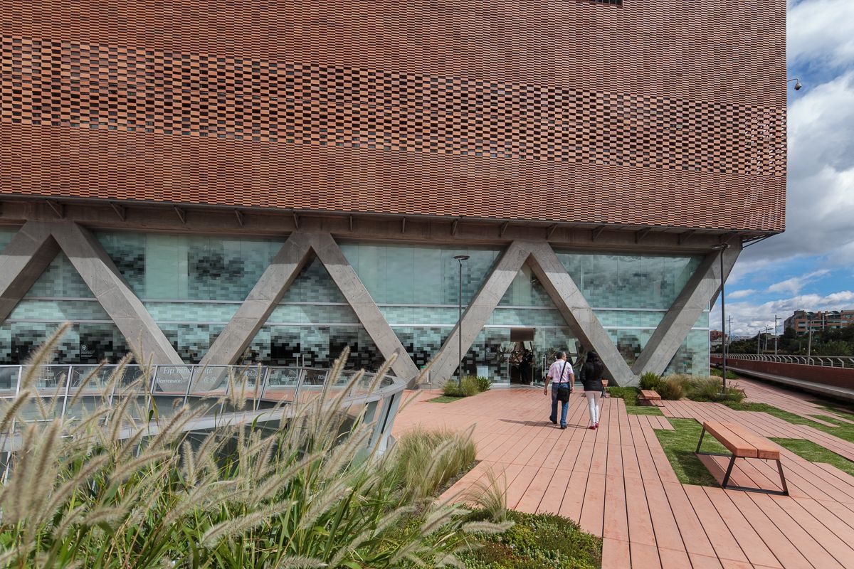
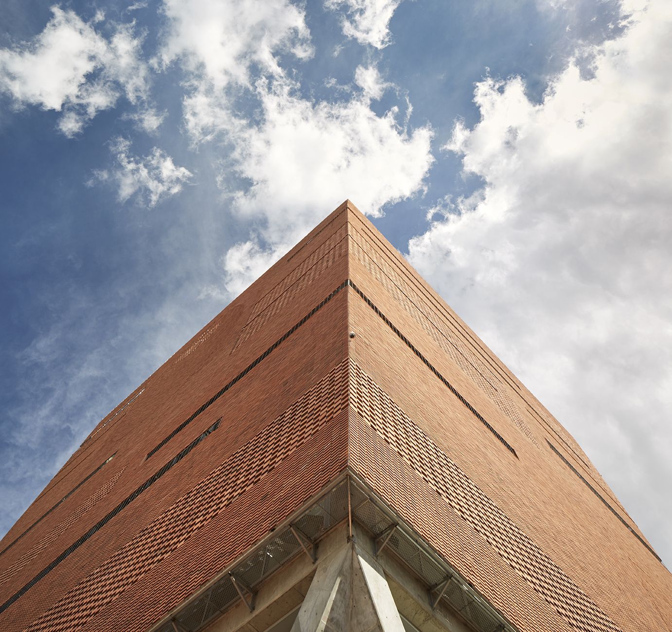
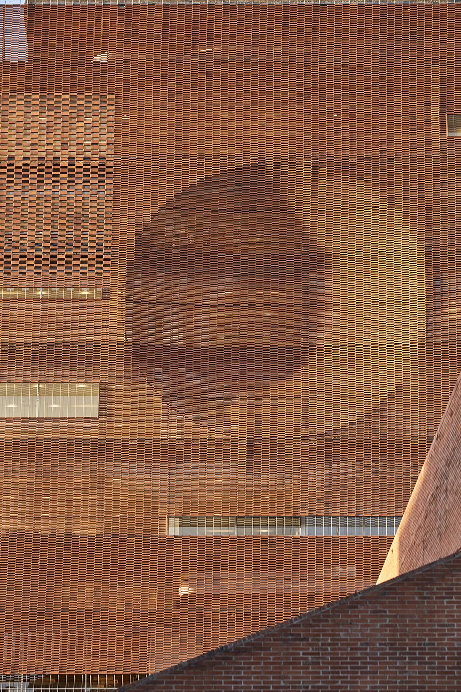
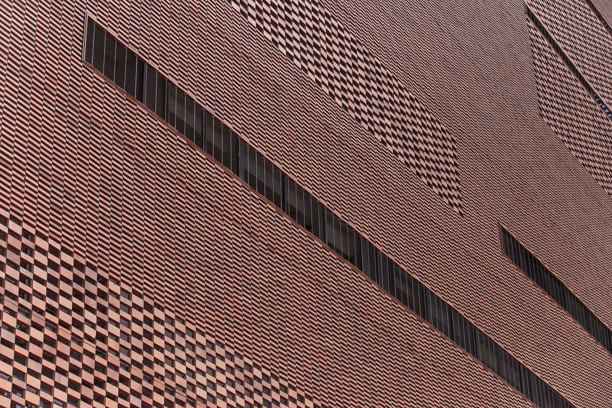
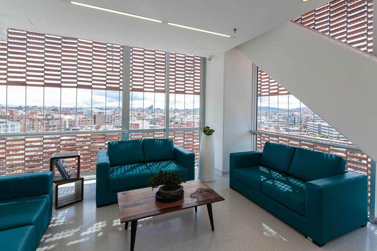
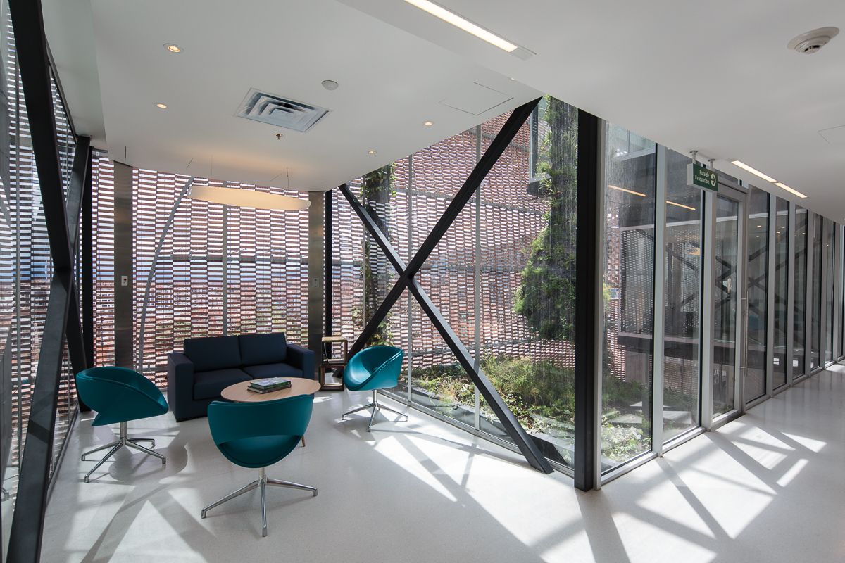
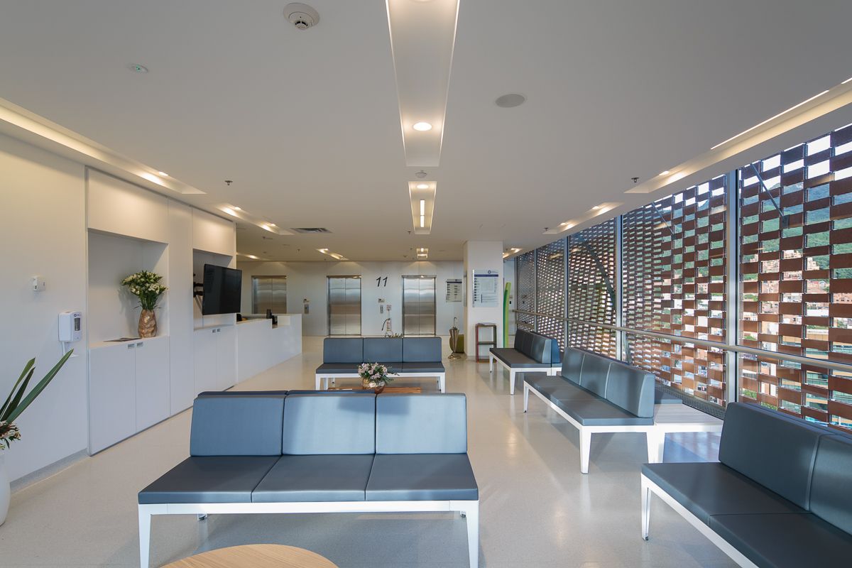
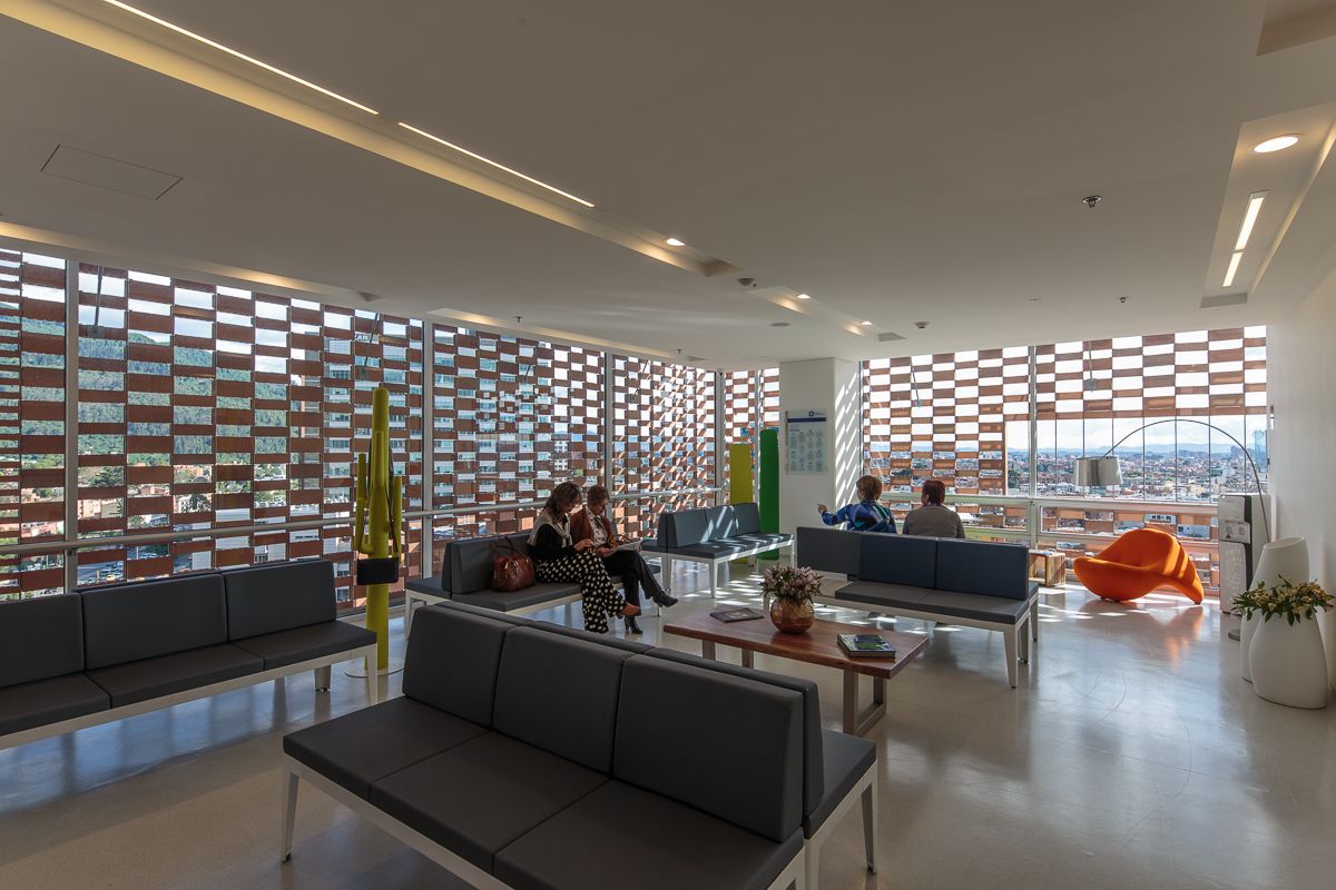
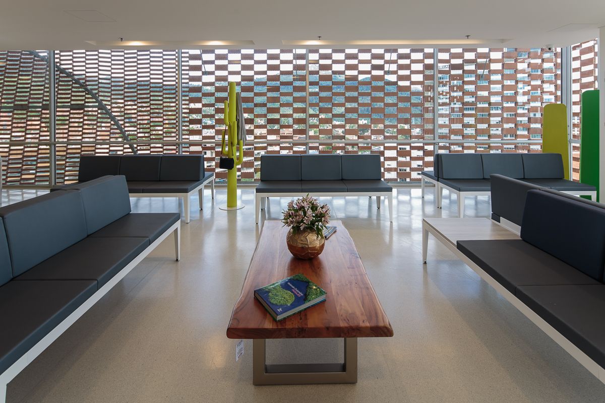
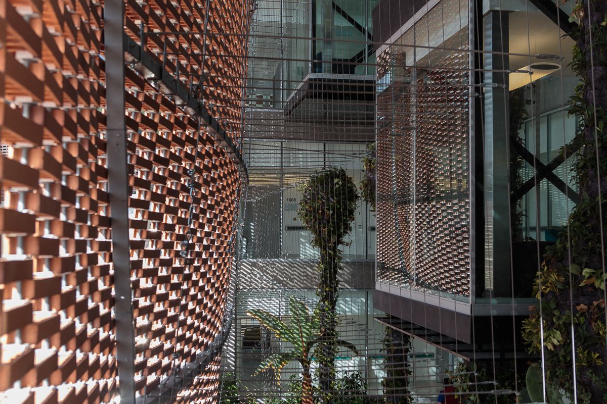
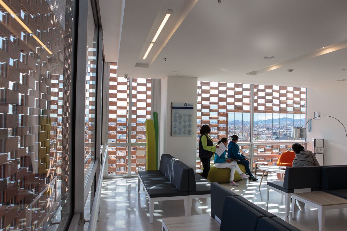
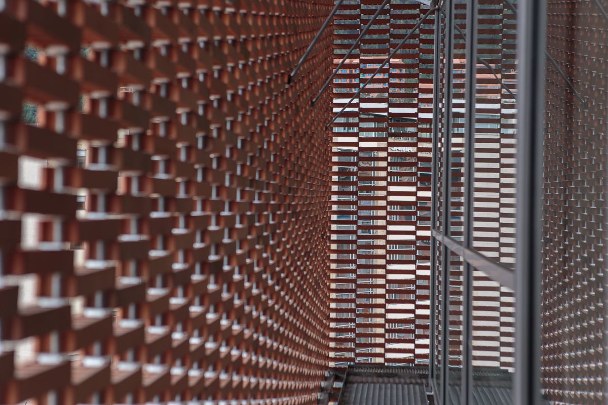
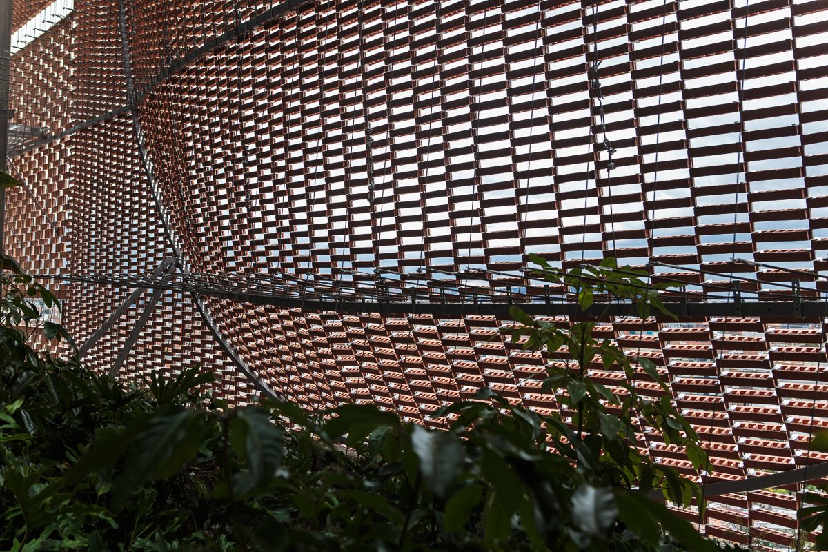
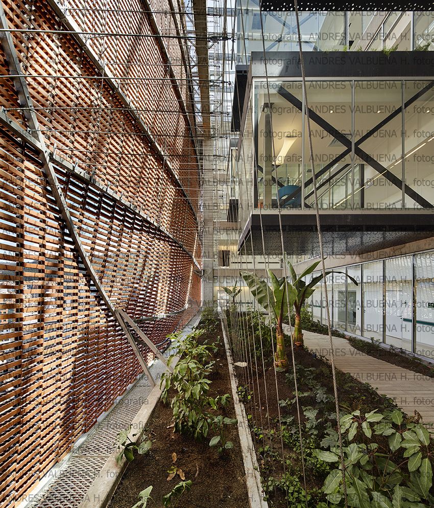
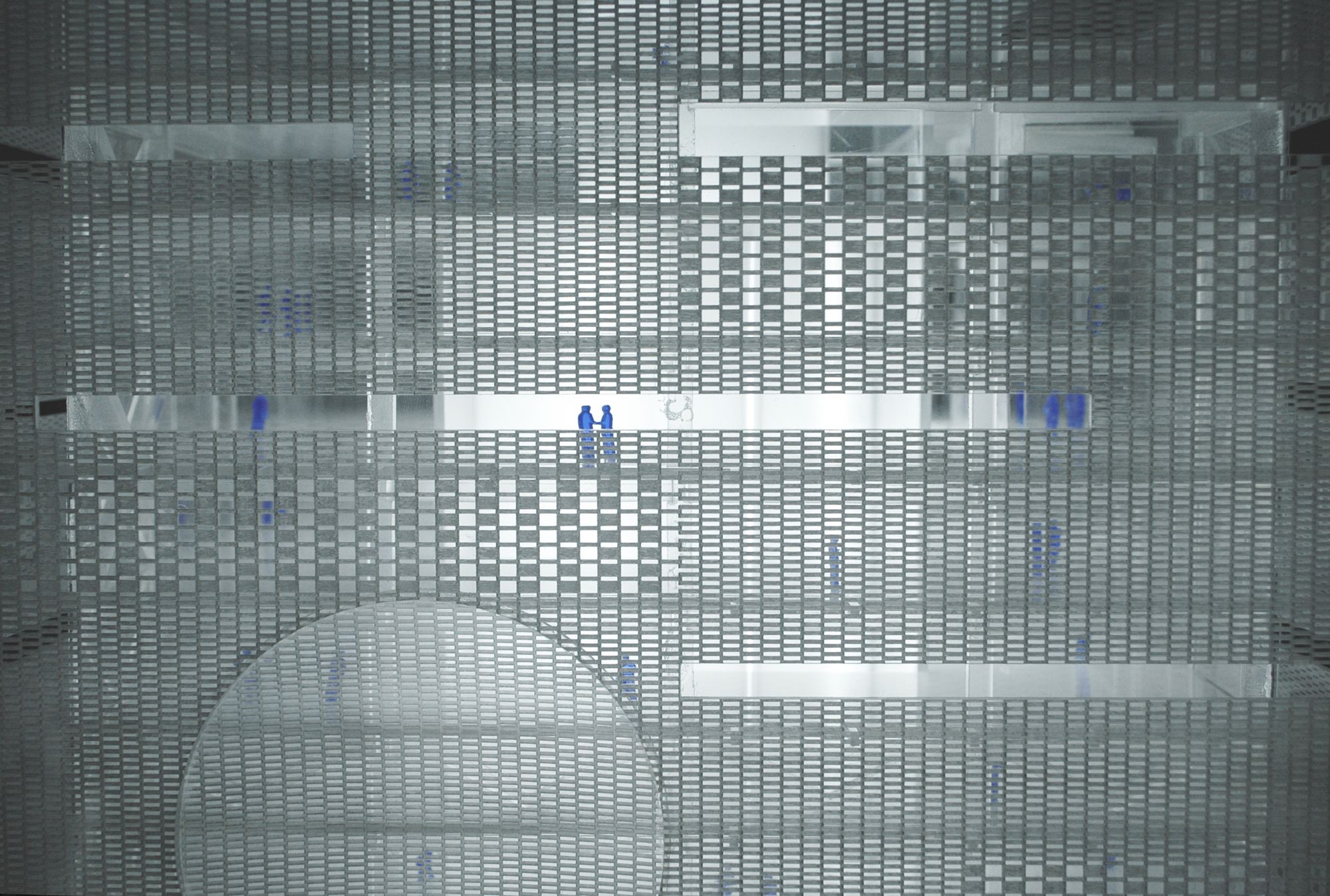
The building´s image is an important element of the iconic design. Through its materiality and configuration, the façade leaves its condition of only working as skin and turns to be an element of meanings and functions; it turns to be an element of identity for the foundation, configuring an integral element of the whole campus. We will use a brick façade that will allow the proper integration of the actual language of the hospital, raising the idea of sobriety in the architectonical design. On the other hand, the facades innovation in which the brick would not be used as a structural element but as an aesthetical one. The Mudejar configuration will generate particular ambiances inside of the building. The disposition of the bricks will let natural light come in different levels and intensities. This façade allows the use of the brick wall as a membrane that helps to have a semi-private relation with the exterior. The relation with the outside increases when having windows from bottom to top, the highs of the windows change because the person who spends more time in the room is laid down the patient and needs to have a view from the bed. The patients have the possibility to look to the city, the mountains, and the sky. On the back of the brick skin, there is a glazed skin to prevent pollution, contamination, noise and whether isolation for a really temperature and sound control.
It is the patient who gives sense to the hospital and he has to be in the first place always. In the second place, it is the staff that requires adequate ambiances to do their work with the best attitude. A third group is a population that goes to the building for different reasons. Our conceptual proposal is to do a high, singular and emblematic building. We understand the foundation need as an architectonical idea and not a conventional hospital.
-Patient-oriented: focus on the needs and worries of the patients presented by their families and friends. Lowering environmental conditions that generate stress. Maintain the patient’s dignity and privacy. Comfortable and positive ambiances under the hospitality principles. Add life exaltation elements. Allow quick changes in technology and treatment protocols. Divide patients, staff and logistics areas, in terms of flows and organization. Staffs time efficiency with the patients as well as the patient’s time in the hospital.
– Safety: precise control when we have really delimited the private areas from the public ones.
– Well-being: management of the best interior environmental quality will guarantee patients wellness and health for this the hospital took care of: contamination control, protection and control, thermic control, visual and smell comfort, perception comfort, light comfort.
Project Info
Architects: Equipo de Mazzanti Architects
Location: Bogota, Colombia
Architect in Charge: Giancarlo Mazzanti
Design Team: Giancarlo Mazzanti, Sebastián Negret, Fredy Fortich, Alberto Aranda, Felipe Pombo, Rocío Lamprea, César Grisales, Juan Sebastián Muñoz, Lorenza Baroncelli, Marcela Gómez, Julián Gaviria
Area: 32000.0 m2
Year: 2016
Type: Medical Center
Photographs: Alejandro Arango, Andrés Valbuena, Fundación Santa fe
photography by © Alejandro Arango
Courtesy by © Andrés Valbuena
photography by © Alejandro Arango
photography by © Alejandro Arango
photography by © Alejandro Arango
photography by © Alejandro Arango
photography by © Alejandro Arango
photography by © Alejandro Arango
photography by © Fundación Santa fe
photography by © Alejandro Arango
Courtesy by © Andrés Valbuena
photography by © Alejandro Arango
photography by © Alejandro Arango
Courtesy of El Equipo de Mazzanti
Courtesy of El Equipo de Mazzanti
photography by © Fundación Santa fe
photography by © Alejandro Arango
photography by © Alejandro Arango
photography by © Alejandro Arango
photography by © Alejandro Arango
photography by © Alejandro Arango
photography by © Alejandro Arango
photography by © Alejandro Arango
photography by © Alejandro Arango
photography by © Alejandro Arango
photography by © Andrés Valbuena
photography by © Alejandro Arango
photography by © Alejandro Arango
photography by © Alejandro Arango
photography by © Andrés Valbuena
photography by © Alejandro Arango
photography by © Andrés Valbuena
Model 01. Image Courtesy of El Equipo de Mazzanti
Model 02. Image Courtesy of El Equipo de Mazzanti
Model 03. Image Courtesy of El Equipo de Mazzanti
Model 04. Image Courtesy of El Equipo de Mazzanti
Situation
Location
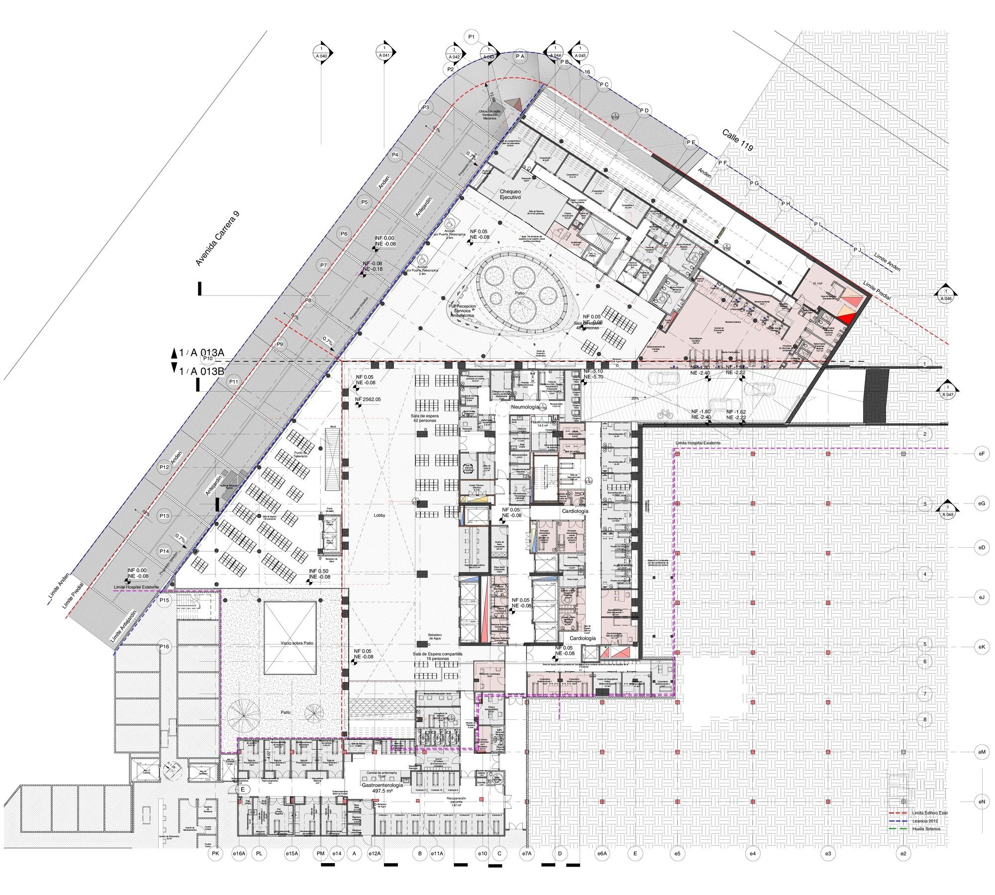
1st floor plan
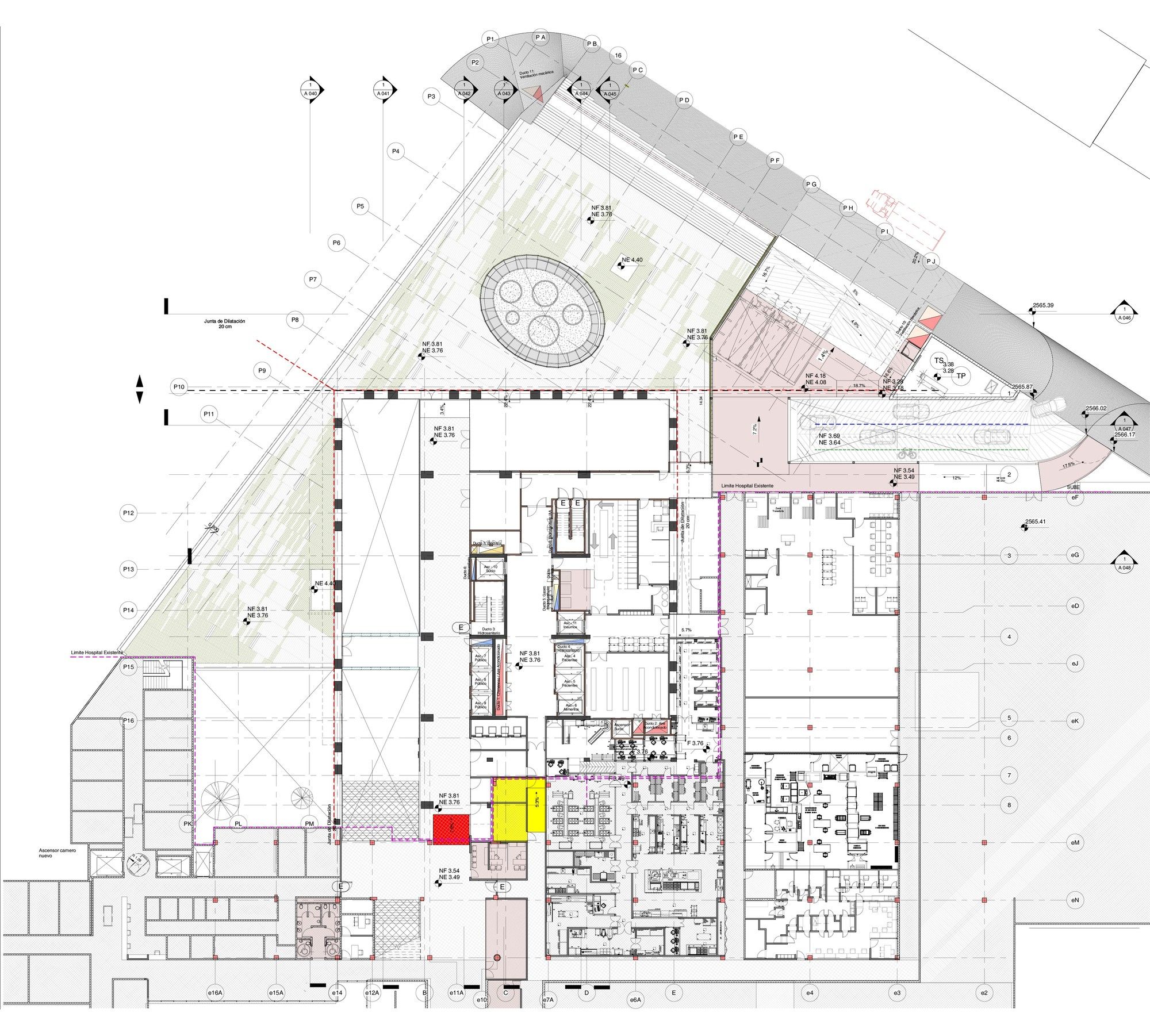
2nd floor plan
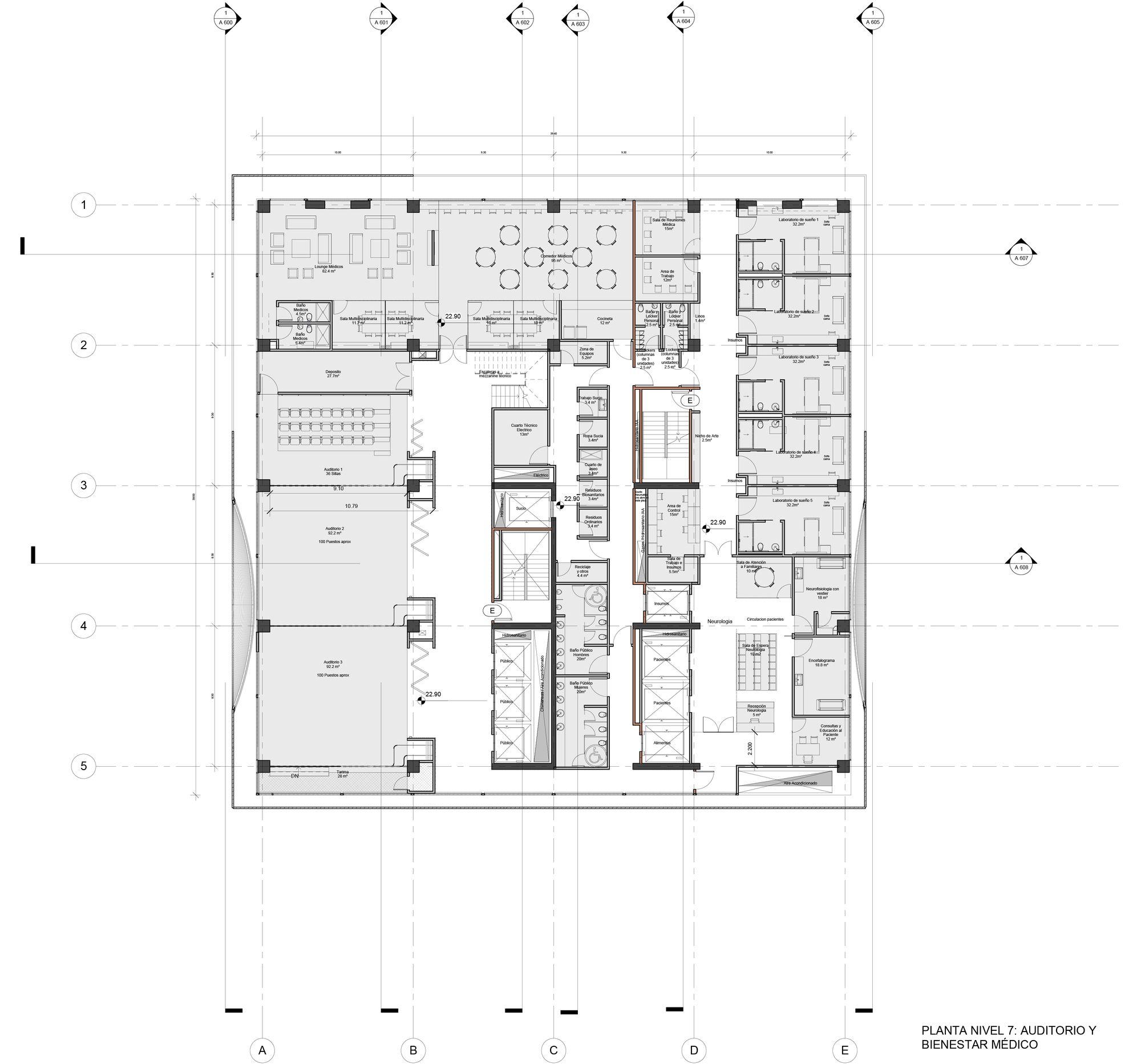
7th floor plan
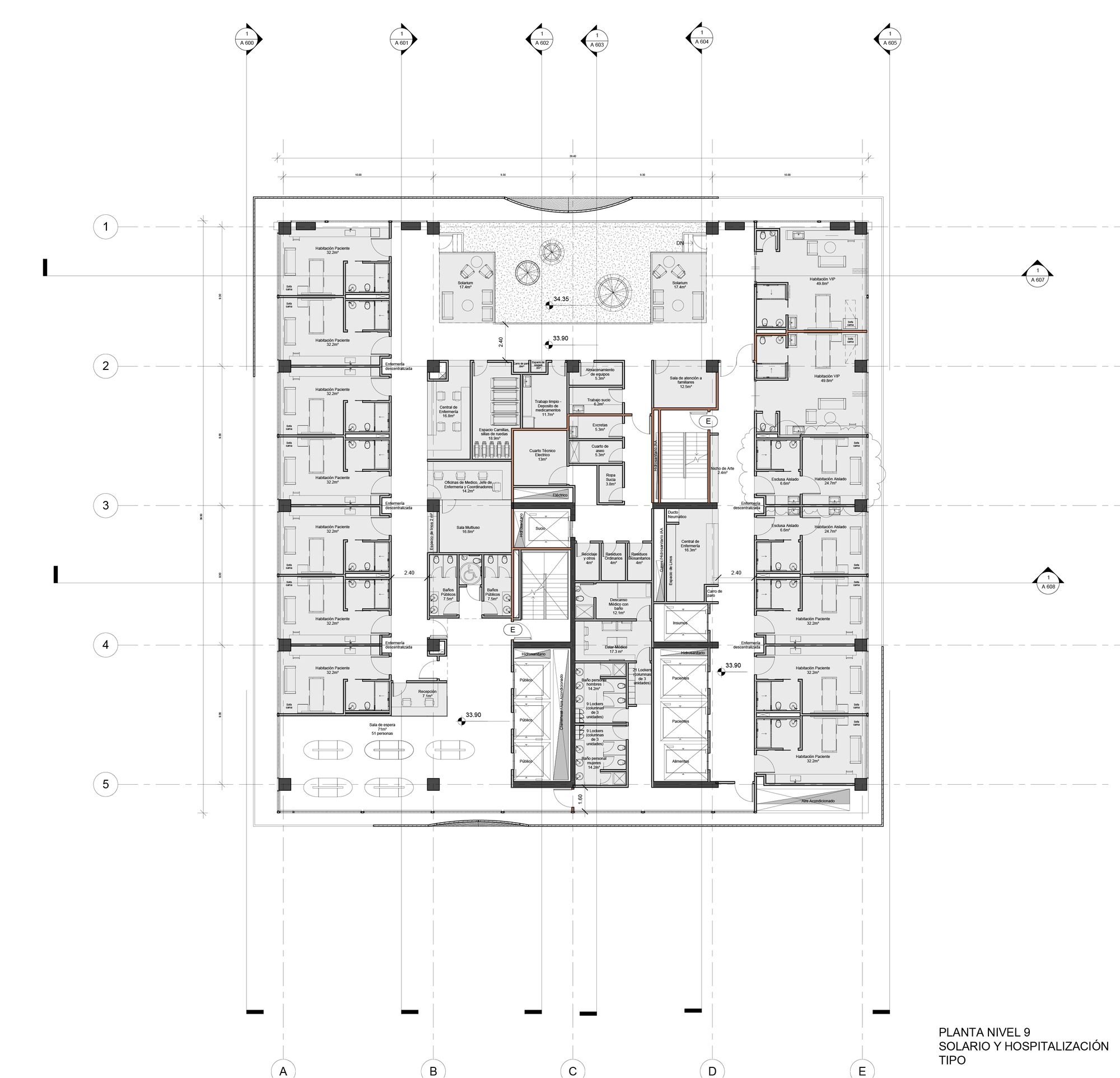
9th floor plan
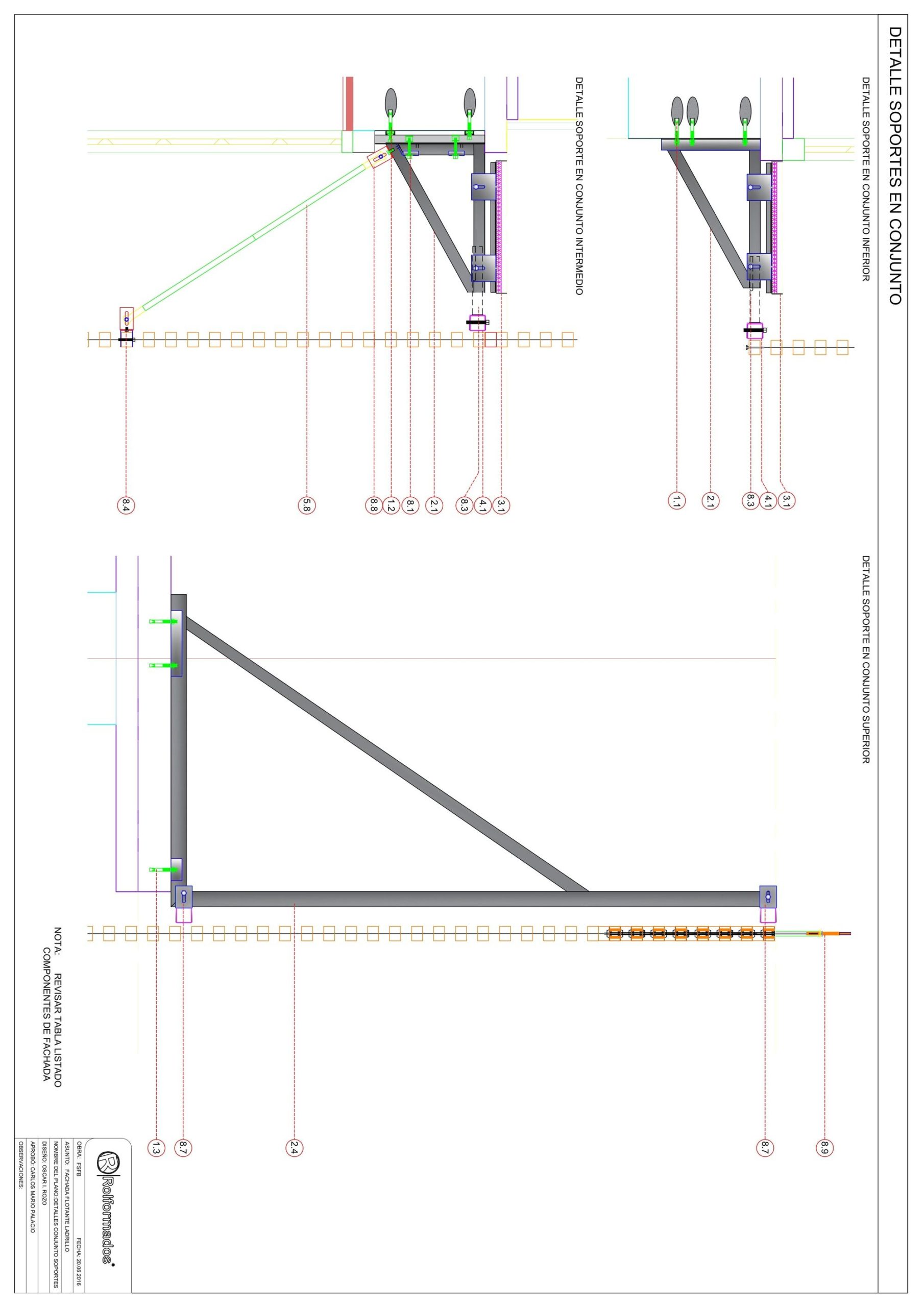
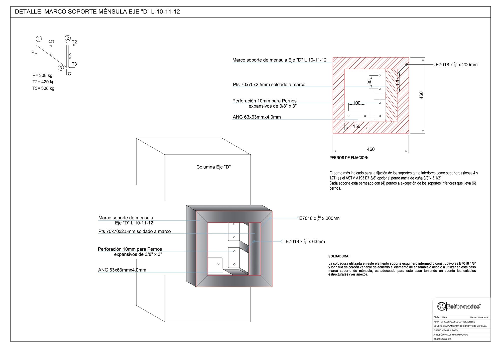
Brackets Details 001
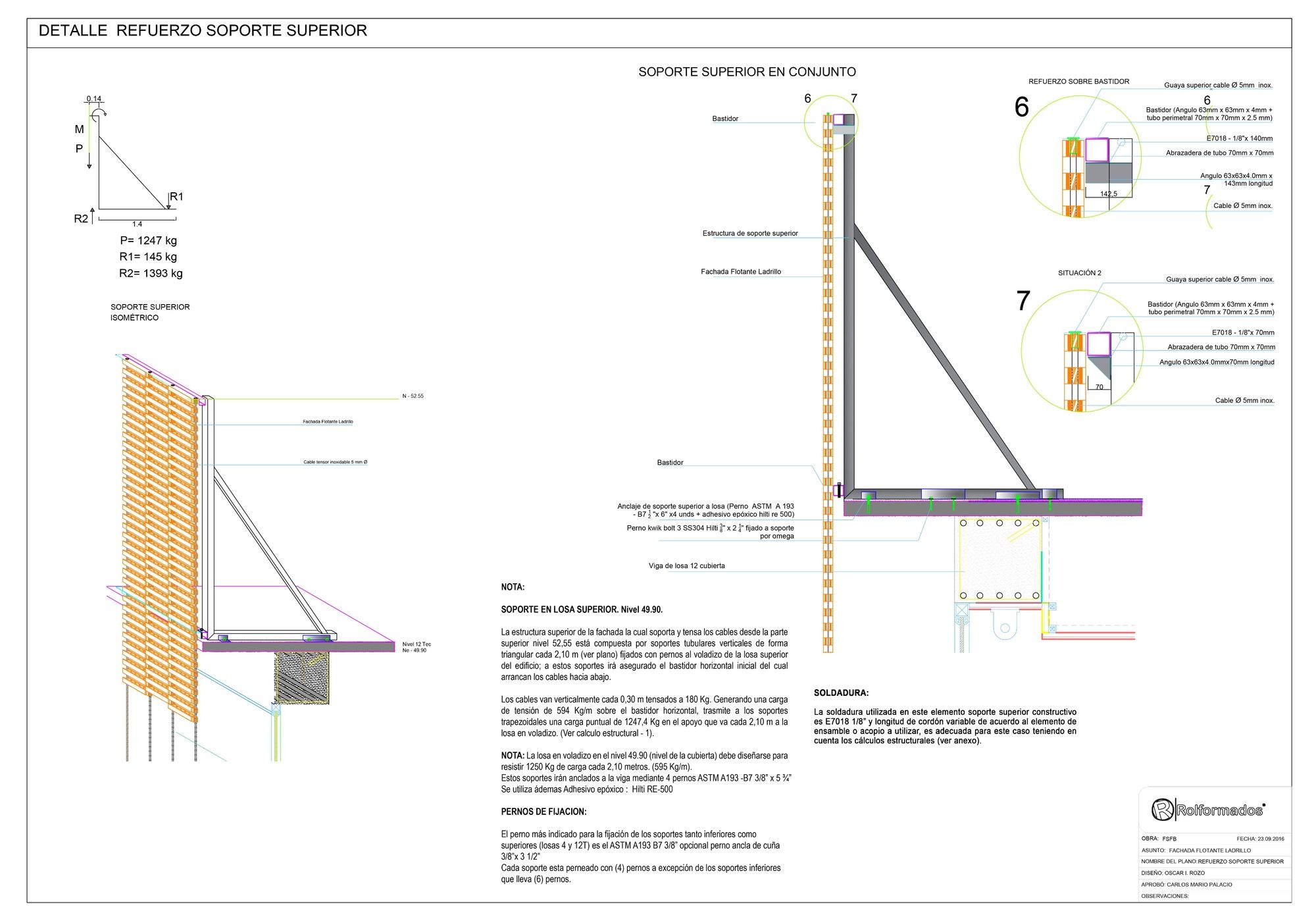
Brackets Details 002
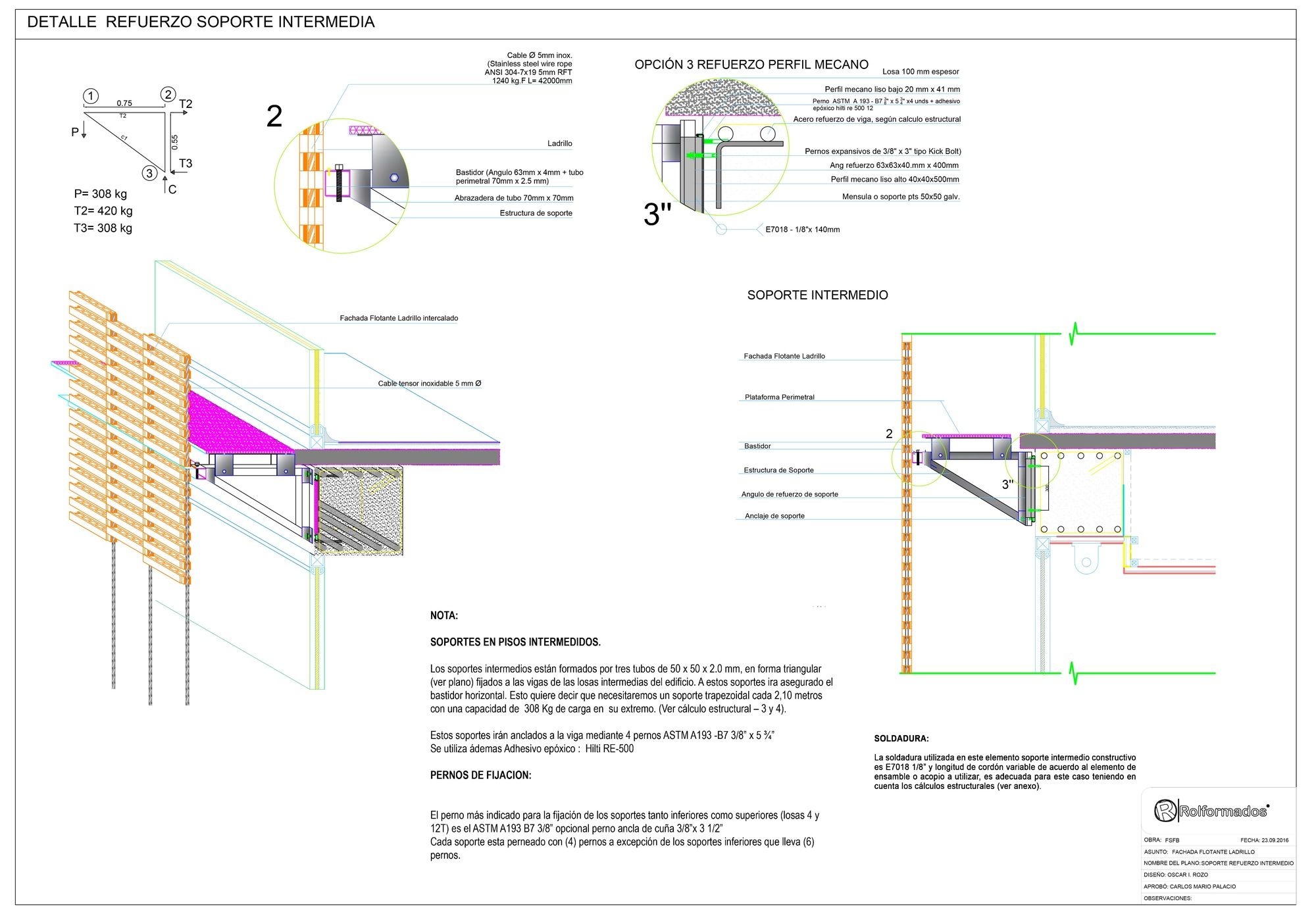
Brackets Details 003
Brackets Details 004
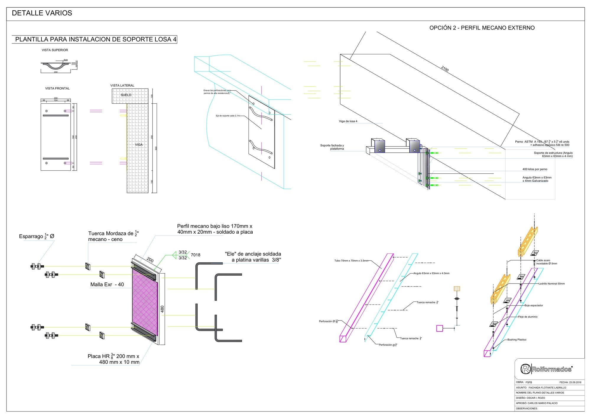
Various details
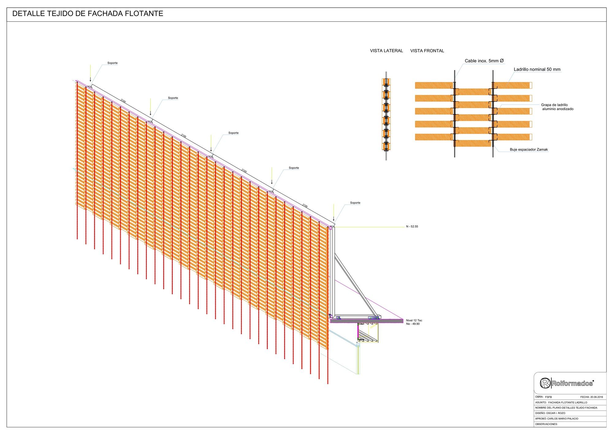
Facade Detail
Axonometric
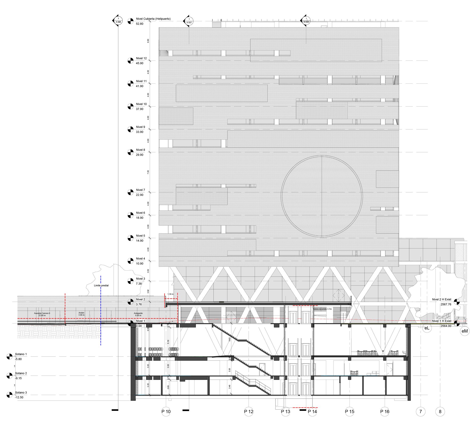
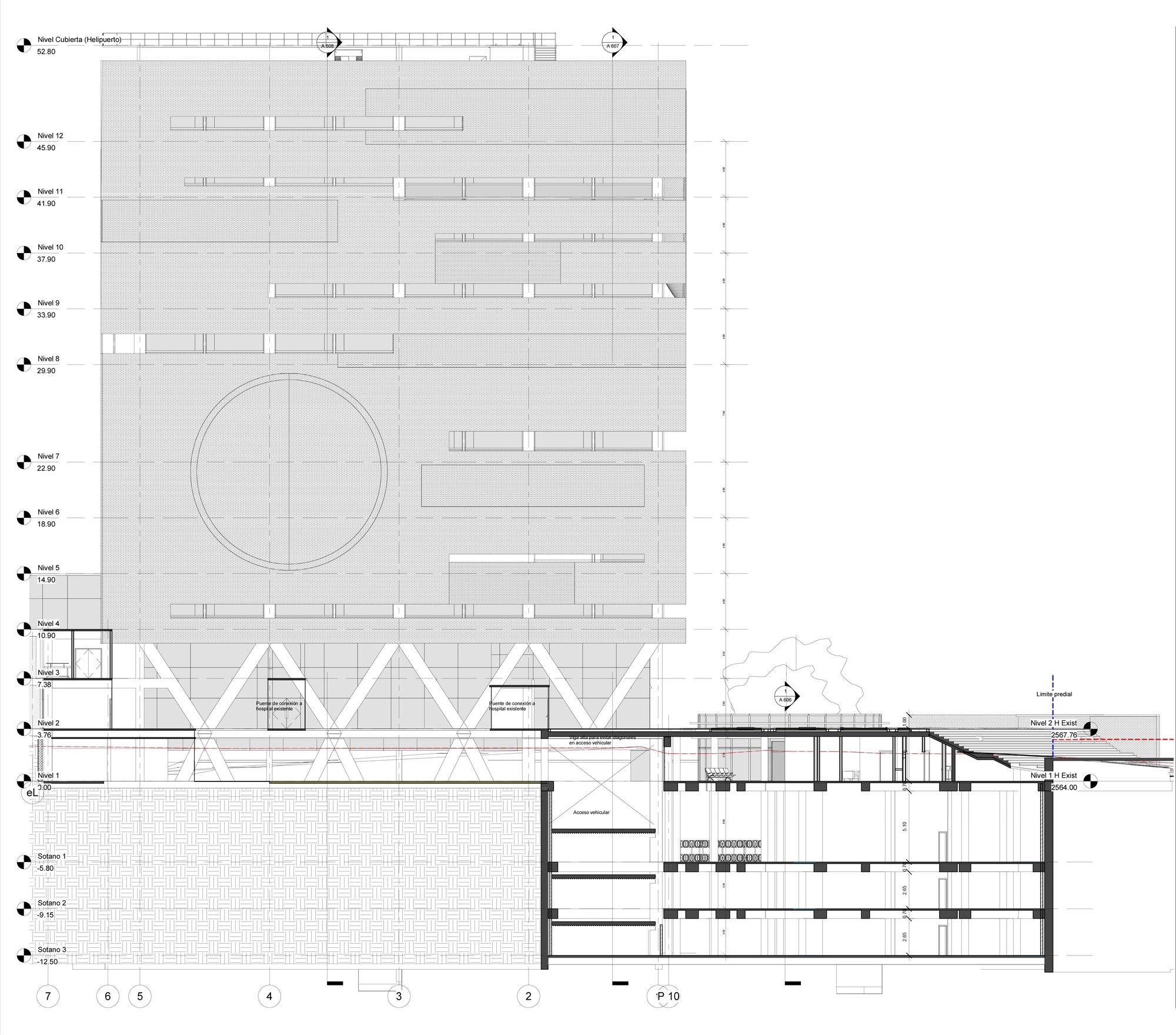
Section 01
Section 01


