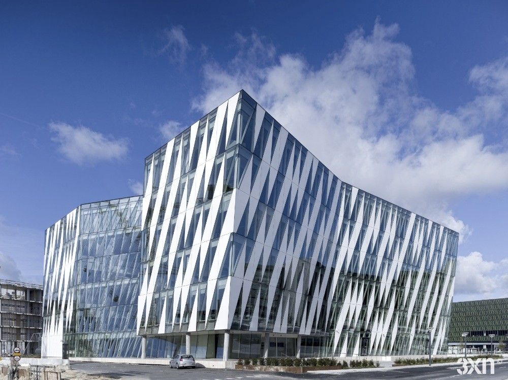
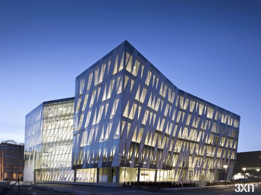
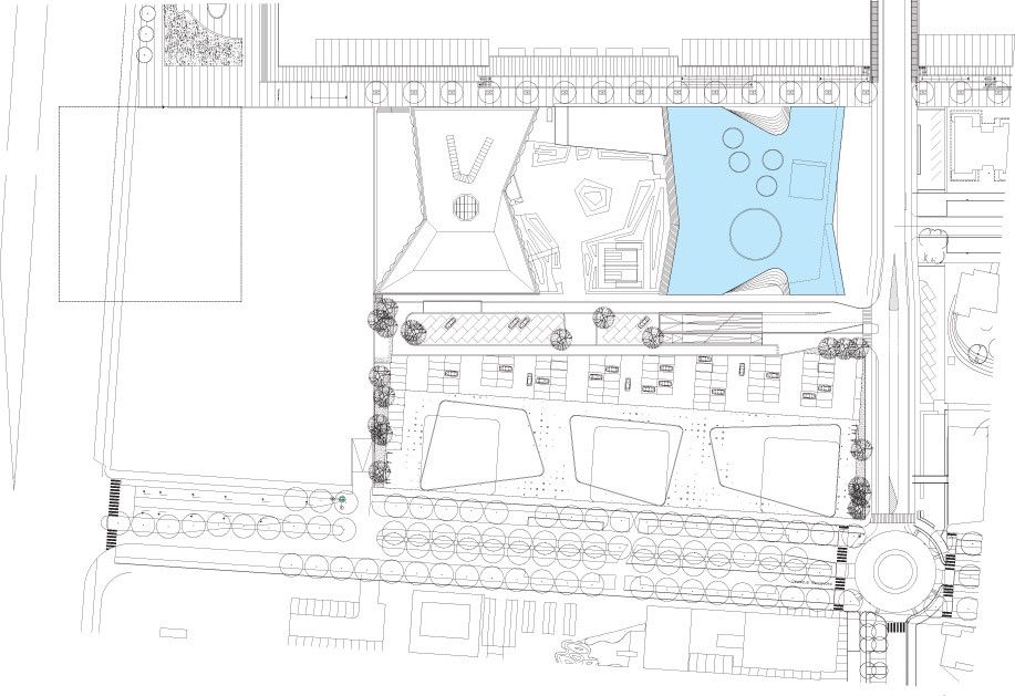
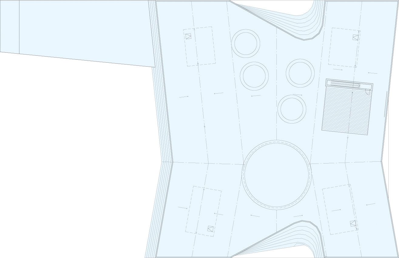
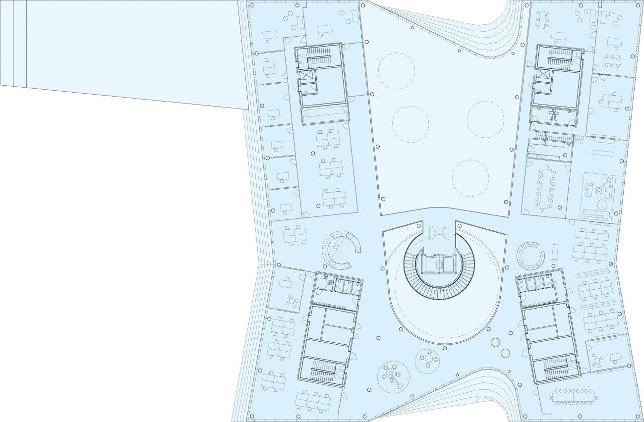
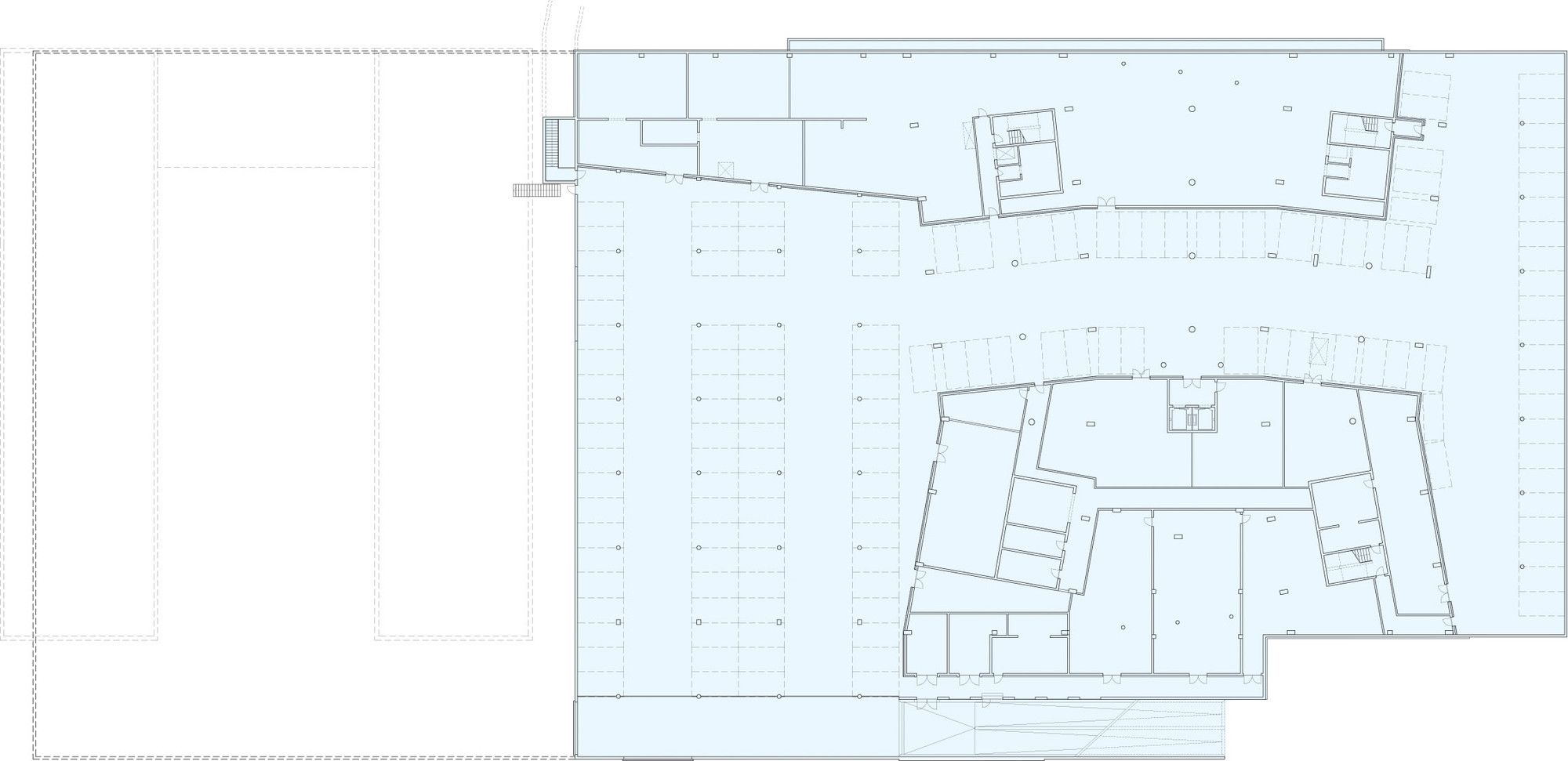
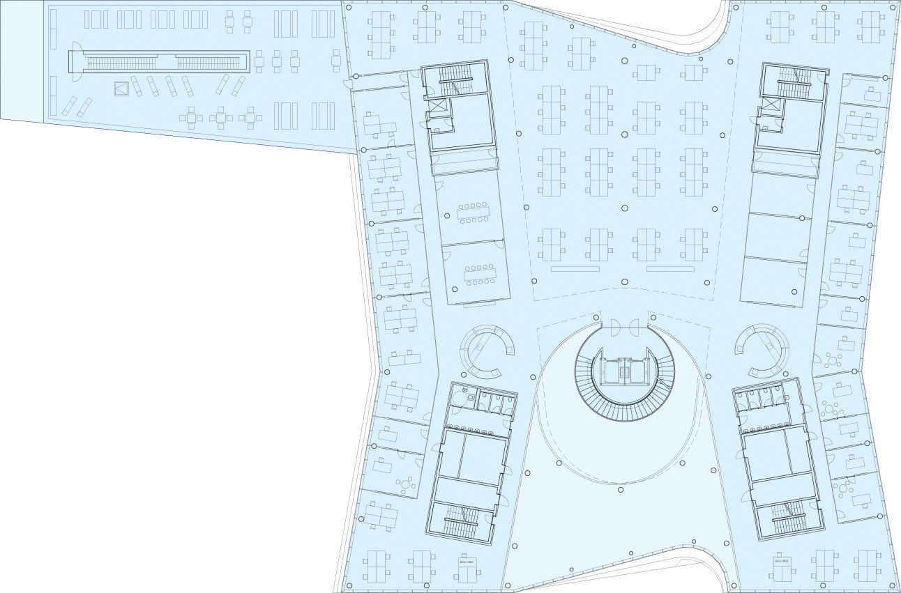
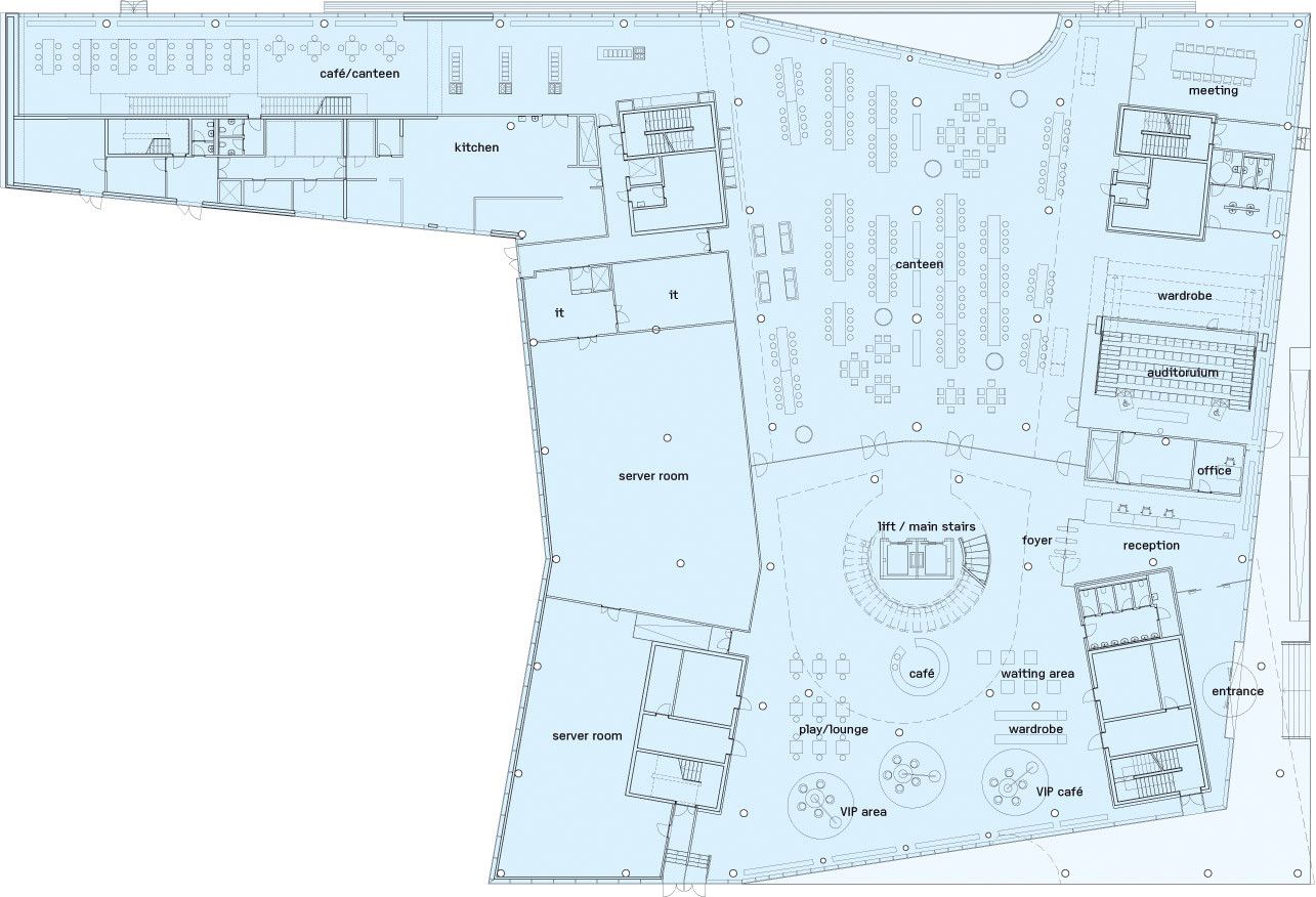
In 2004 Saxo Banking initiated an international competition for the design of a new bank to be constructed in Copenhagen, Denmark, which was won by 3XN. Four years later in 2008, the structure was completed with a project size of 16,000 square meters with a 6,700 square meter basement. Functioning as Saxo Bank’s head office, the design of the building draws on the cutting edge profile of the dynamic internet bank while retaining the importance of constructing an environment that is comfortable for its inhabitants.Though Saxo Bank is an internet bank with dealings in online trading across global capital markets where their clients primarily meet their bank in cyber space, having little interaction with the building itself, the head office retains an iconic image that highlights its importance. Originally conceived as two logs facing their gable ends to the canal, joined together by a retracted glass façade, the building combines curves and sharp angles in a new interpretation of modern seaside architecture.
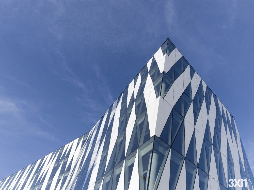
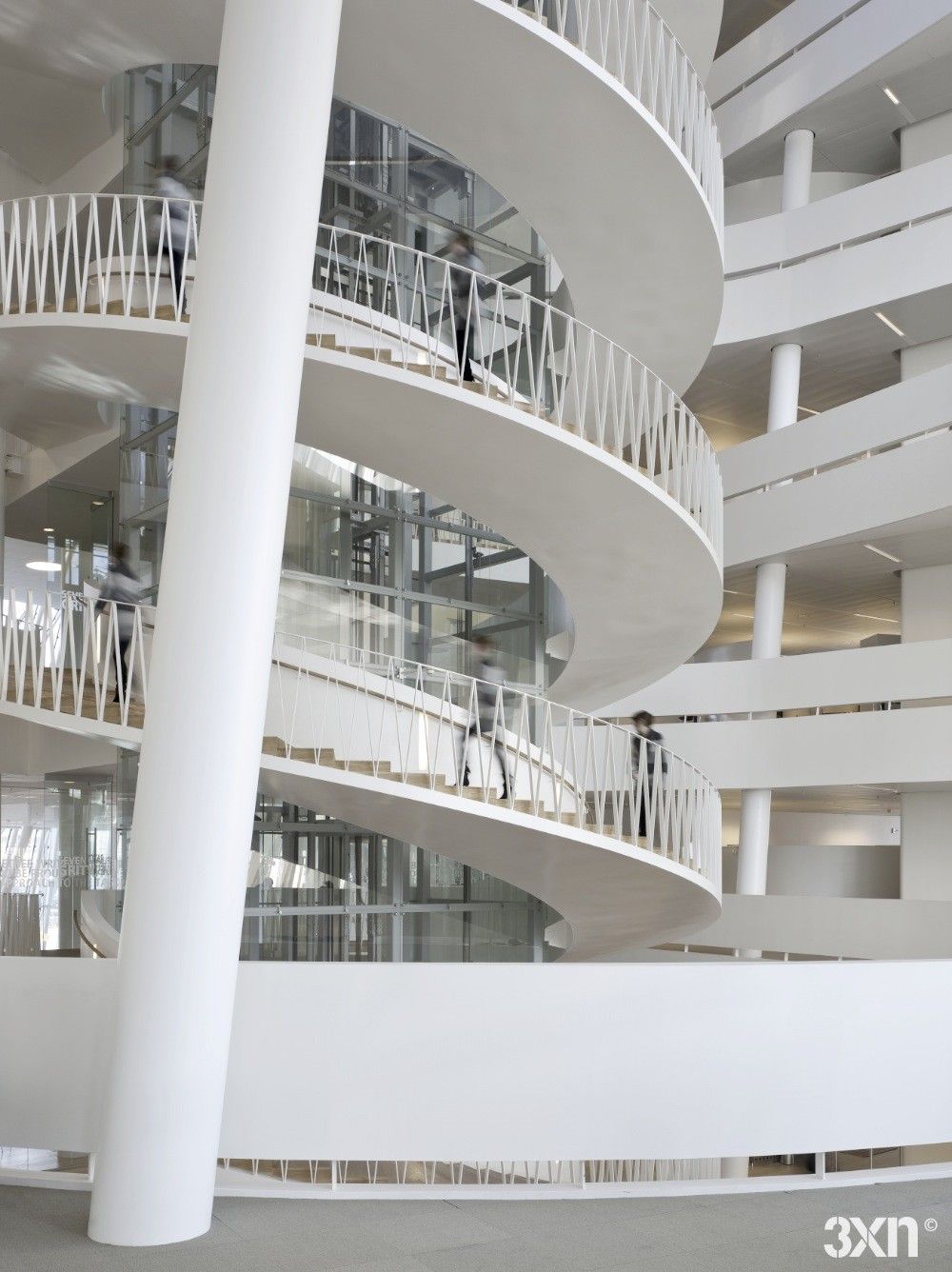
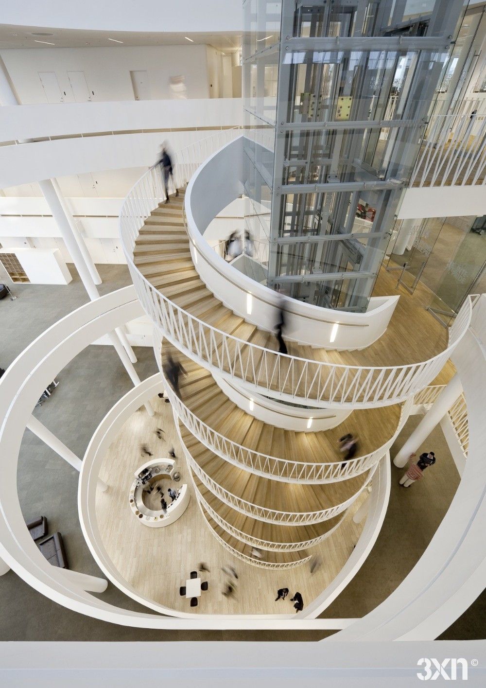
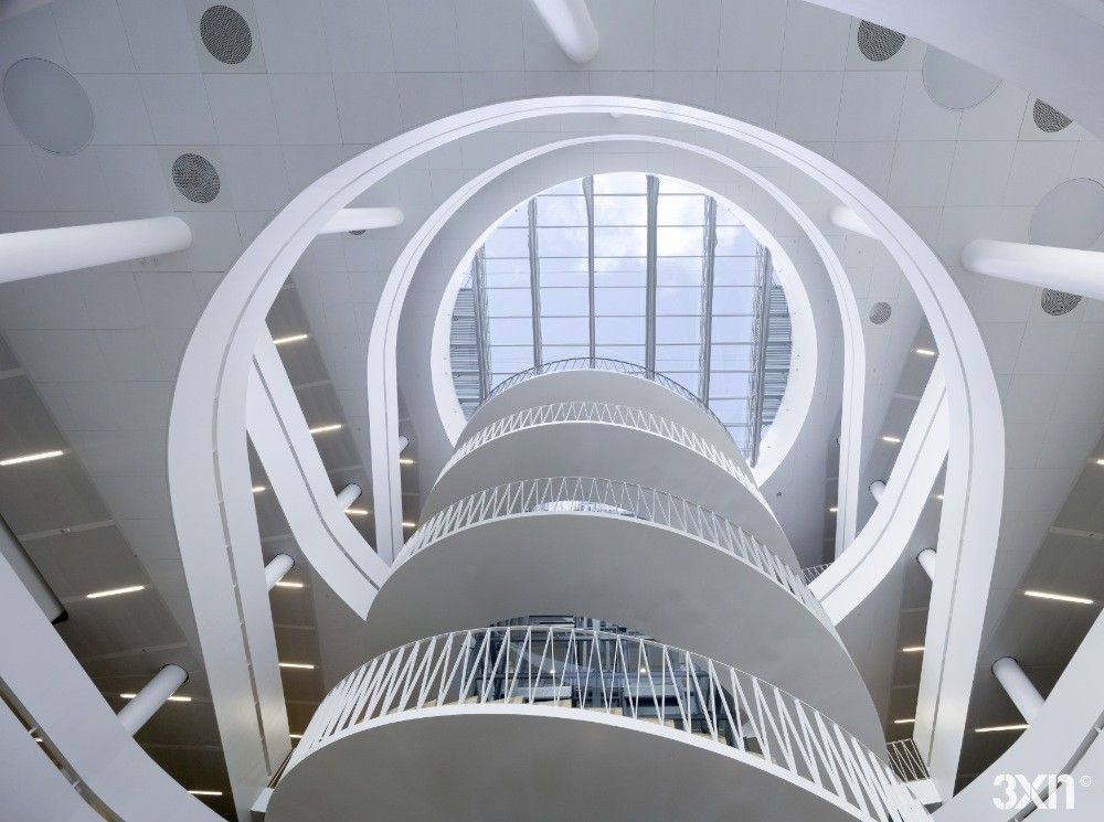
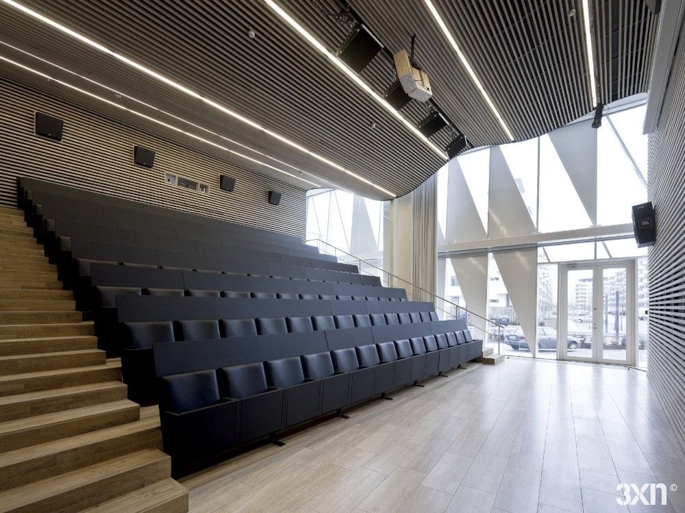
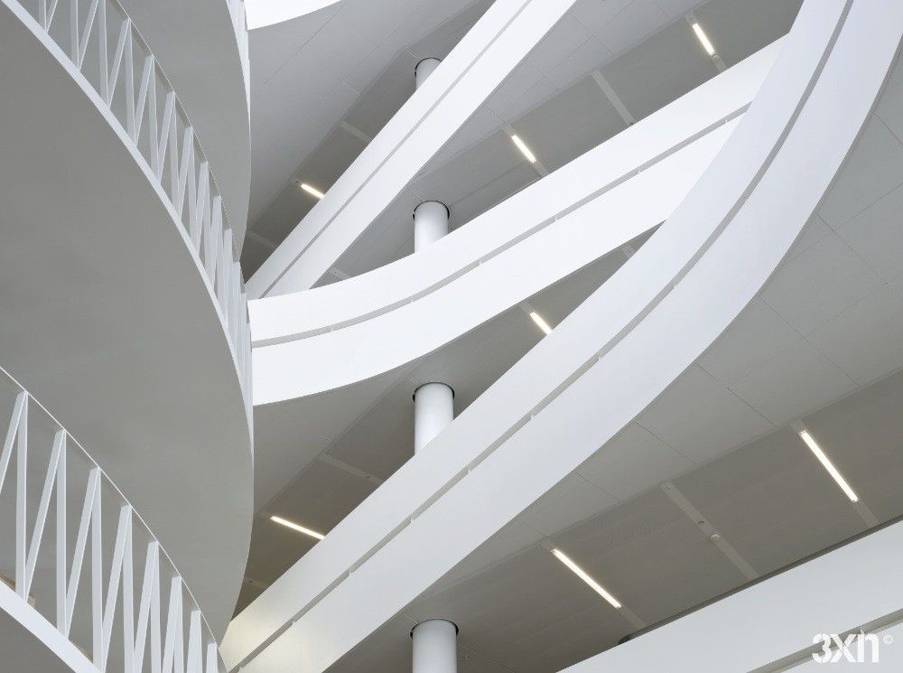
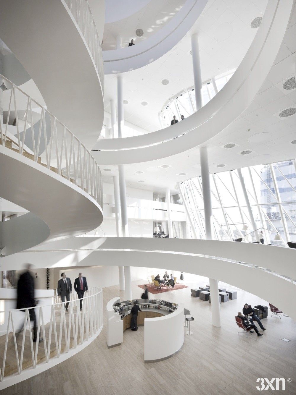
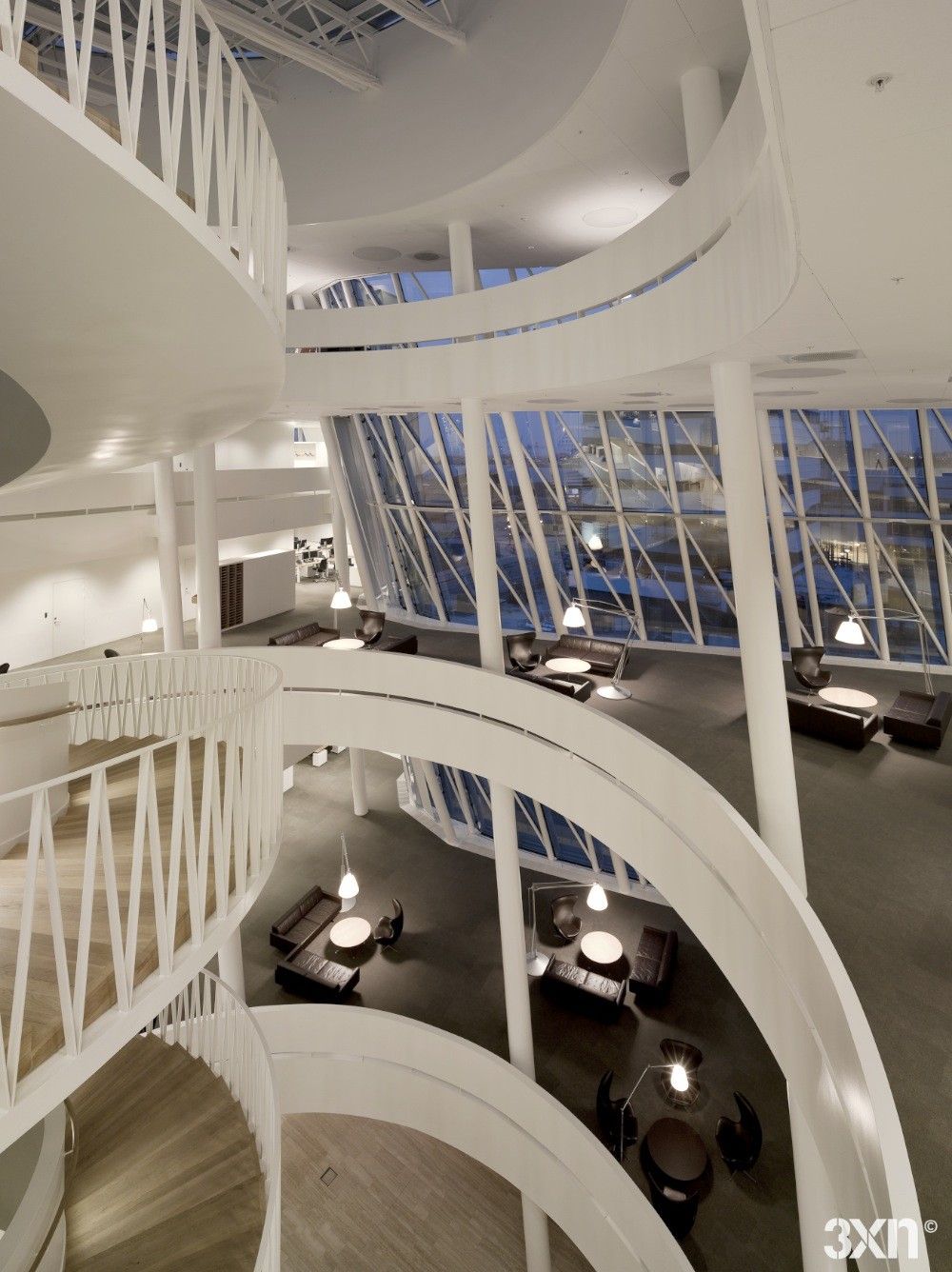
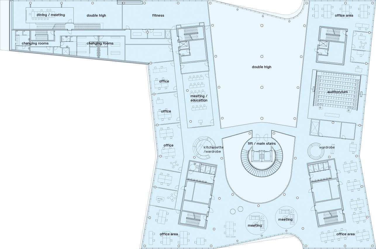
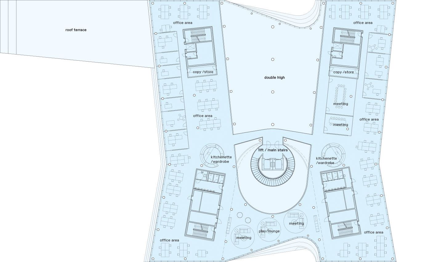
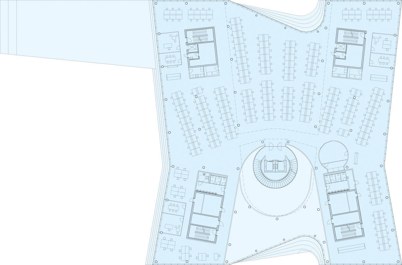
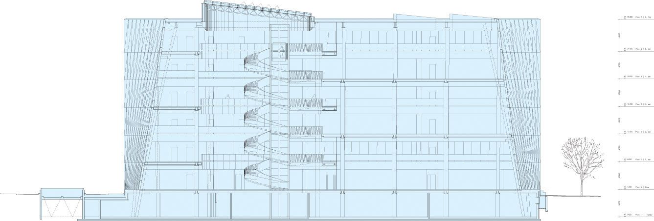
The exterior facades are dynamically expressive framing views in a zig-zag cut-up sort of fashion. The facades are made up of green glass and white cladding carried out as double curved glass walls, capturing the colors of the sea and the sky. Despite the fact that the elevations appear to be busy and chaotic, they give the building a greater memorable quality.The dramatic exterior is contrasted with the simplicity and elegance on the interior. The open plans center on a softly shaped top-let atrium with a winding main staircase. The trading floor located at the top of the building contains state of the art technology and a highly international staff of professional bankers. The interior design highly reflects the banks conviction that architecture and design plays an important role for staff performance and dedication.
It is evident that a considerable amount of attention was given to the interior conditions and functional aspects of this building that have a nice ease and flow to them dictated by the spiral staircase. The design for Saxo Bank steps away from the traditional colder, strict nature that people have come to associate with banks that rely on appearing steadfast and secure, and instead utilizes architecture to help it stand out as a technology advanced organization that thrives on the new.
