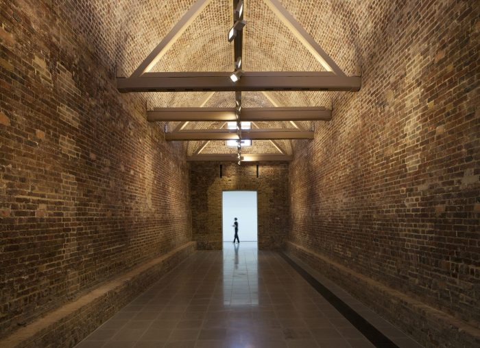
Serpentine Sackler Gallery: World-renowned architect Zaha Hadid Architects was commissioned to redesign a gunpowder magazine from 1805 – a beautiful historic building in Kensington Gardens. The challenge was set by the site’s Grade II* listing which by definition of the English Heritage’s body gives the magazine the state of being especially valued and culturally significant.“What we’ve done is take this beautiful historic building and very respectfully turn it into a first-class destination for culture”, says Julia Peyton-Jones, the co-director of the new gallery, the Sackler gallery [named after Dr. Mortimer and Theresa Sackler and their 14.5 million pounds sterling donation to the Serpentine gallery]. Thus, Hadid’s signature curvaceous design transforms the outlook of the magazine, which is the main aim of the project – to turn the renovated building into Serpentine’s second exhibition space in Kensington gardens.
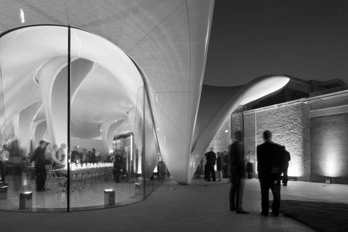
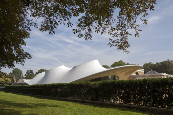
In the renovation project, a significant contrast of shape, form, texture and sense is present. This contrast however, is what brings out the value of the Neo-classical building and brings new cultural aesthetics in. Zaha Hadid Architects’s proposal offers a prominent extension with an eye-catching fluid roof and a transparent glazed façade. Her contribution to architecture has sought to seduce, shape and evoke emotional responses, as the architect herself admits her fluid structures are designed around the concept of emotion.
In this particular case, a striking [and emotional] contrast is set between the straight columns of the Neo-classical side of the building and the organic-morphed roof extension. It [the roof] dynamically slopes downwards only to briefly touch the ground and thus, mimics the structural balance of the old. Afterwards, the eye of the beholder is provoked by the same sloping curve which now is sharply ascending upwards again. This is the main focal point of the extension and the main entrance to the space as well.
The newly renovated site is set to accommodate the additional gallery for the Serpentine, a restaurant and a social zone. With these additions in mind, the new is meant to compliment the old not only architecturally, but functionally and is now, 208 years later, open for public use again.
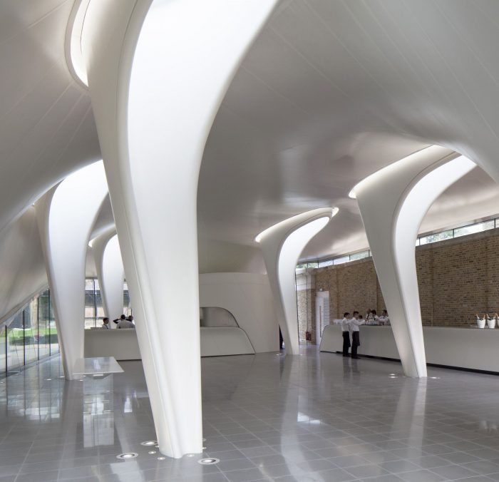
One very interesting feature in the interior design of the extension is present in the lobby: the organically shaped columns. They, in a very respectful manner, depict a repetition of the Classical canon of the function of a column: a representation of light and shadow spaces. Zaha’s interpretation is the effective accommodation of light within the columns. Hence, these newly added smoth supports oppose against the hard yellow brick with their smooth texture and white colour, giving the space a positive and welcoming atmosphere. And yet, the rhythmic repetition of the old building is mimicked and complimented by the rhythmic dynamic of the composition of the extension – by its fluidity, smoothness, and flawlessness.
Courtesy of Zaha hadid


