Shakin’ Stevens Residence
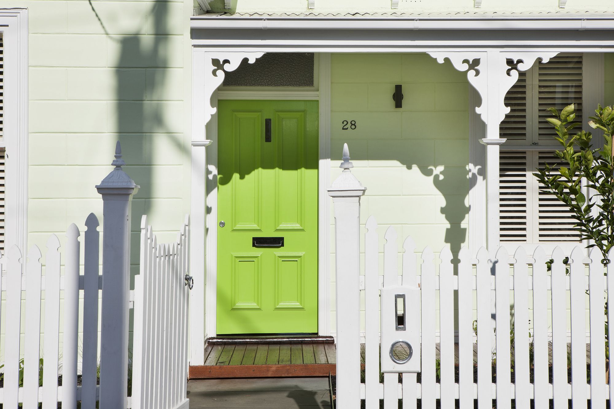
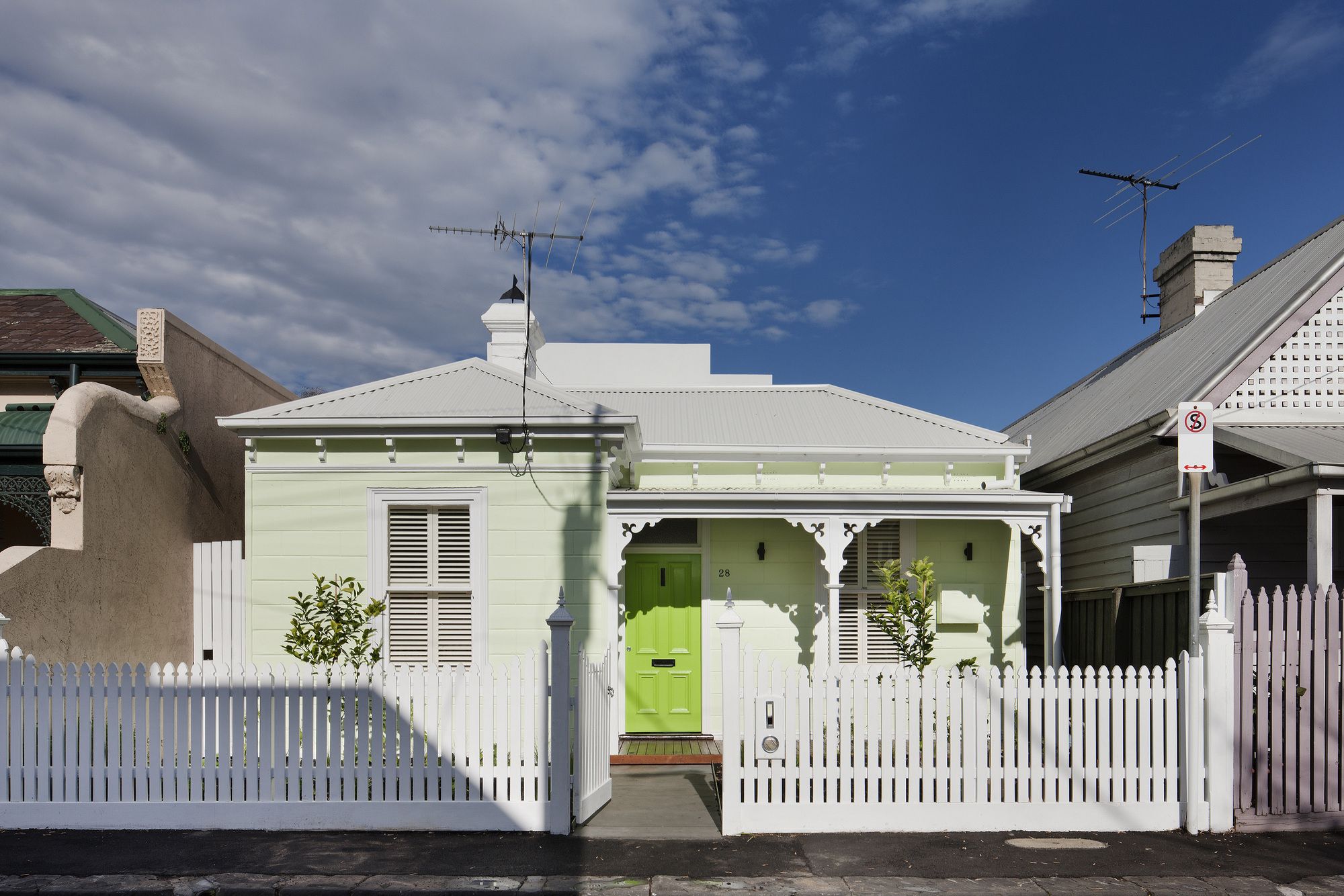
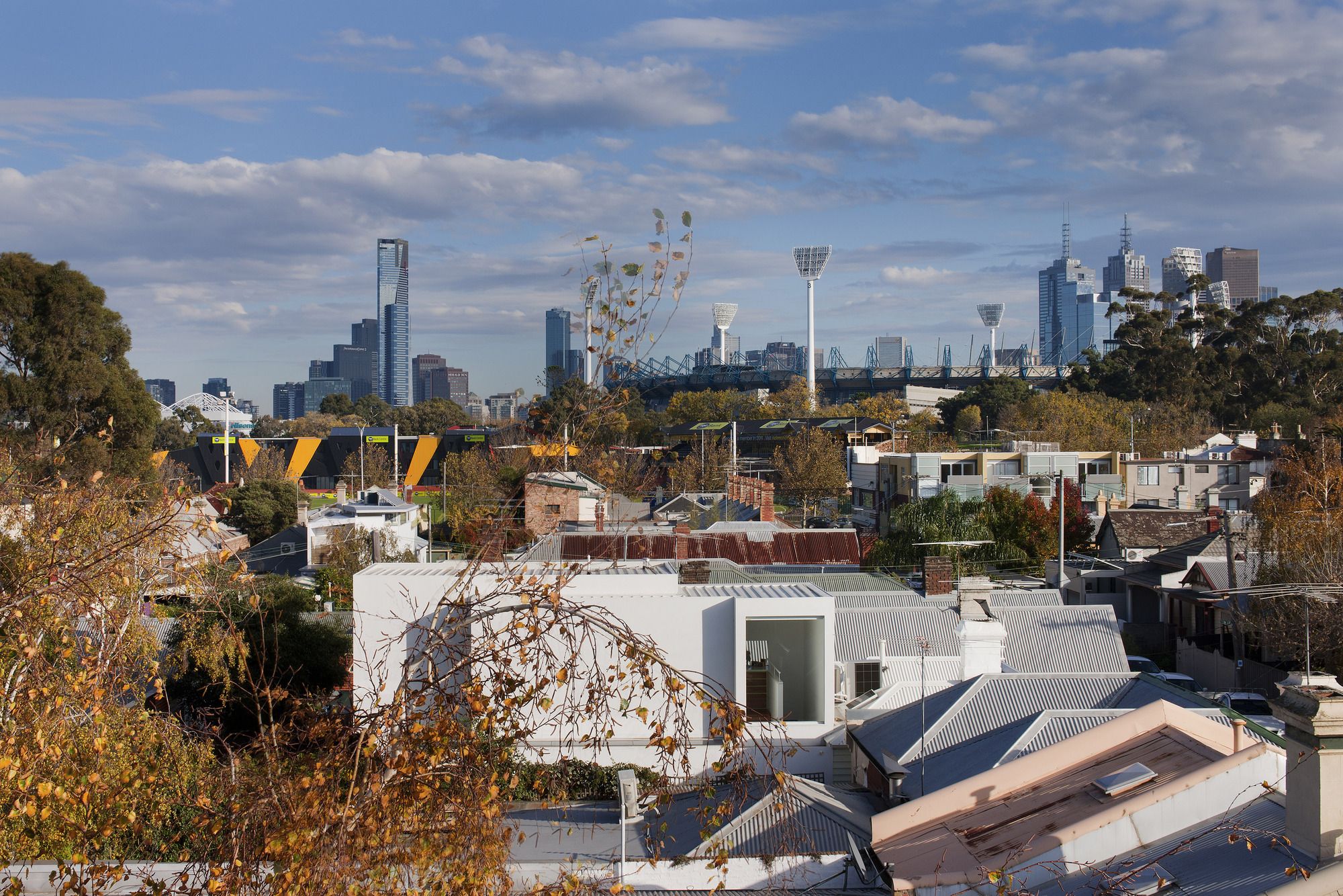
This compact double fronted Victorian workers cottage in set within a gritty one way street in Richmond – a stone’s throw from the MCG and just down from the corner of the infamous Royal Hotel. Unlike other boom style Victorian double front dwellings in Australian cities this cottage is compact and quaint. This area of Richmond (in a process of gentrification) contains mostly compact and heterogeneous building types built up to the street with comparatively narrow or short lot sizes and in many cases not designed for the long term.
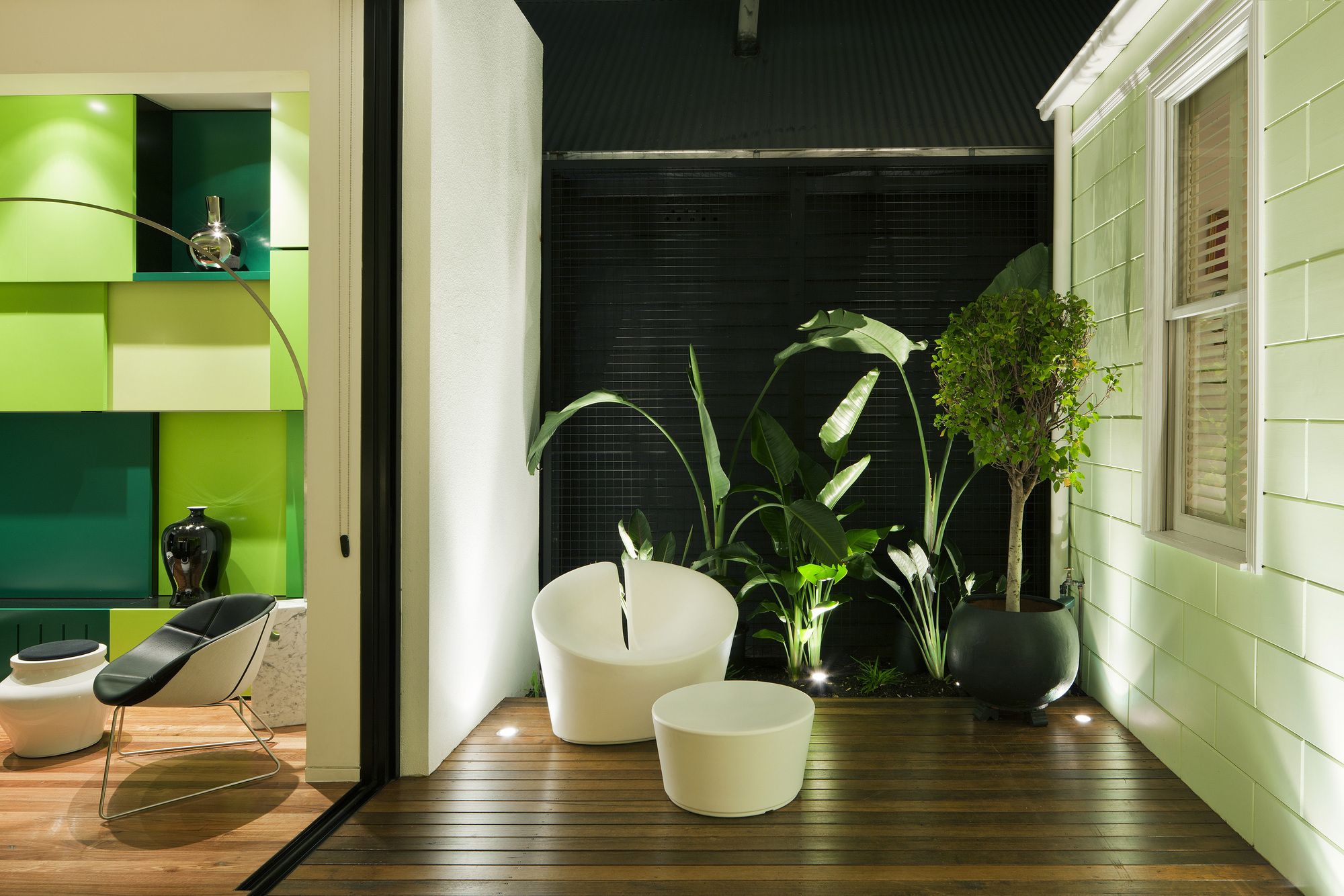
The conceptual drive for the interior of this house is largely in response to a brief which crystallised into a need to be connected with ‘green’ space. Beyond the heritage front the project wanted to not necessarily increase floor area but to increase amenity. To make spaces feel bigger, more functional, to be light filled, and to visually extend &borrow from within and beyond the site.
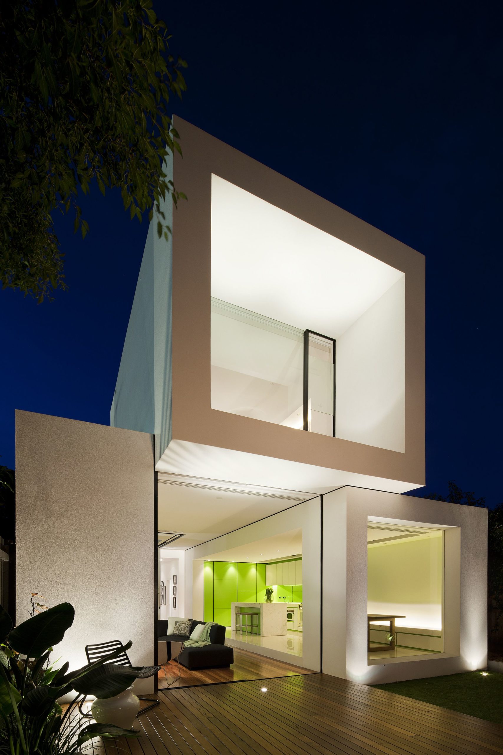
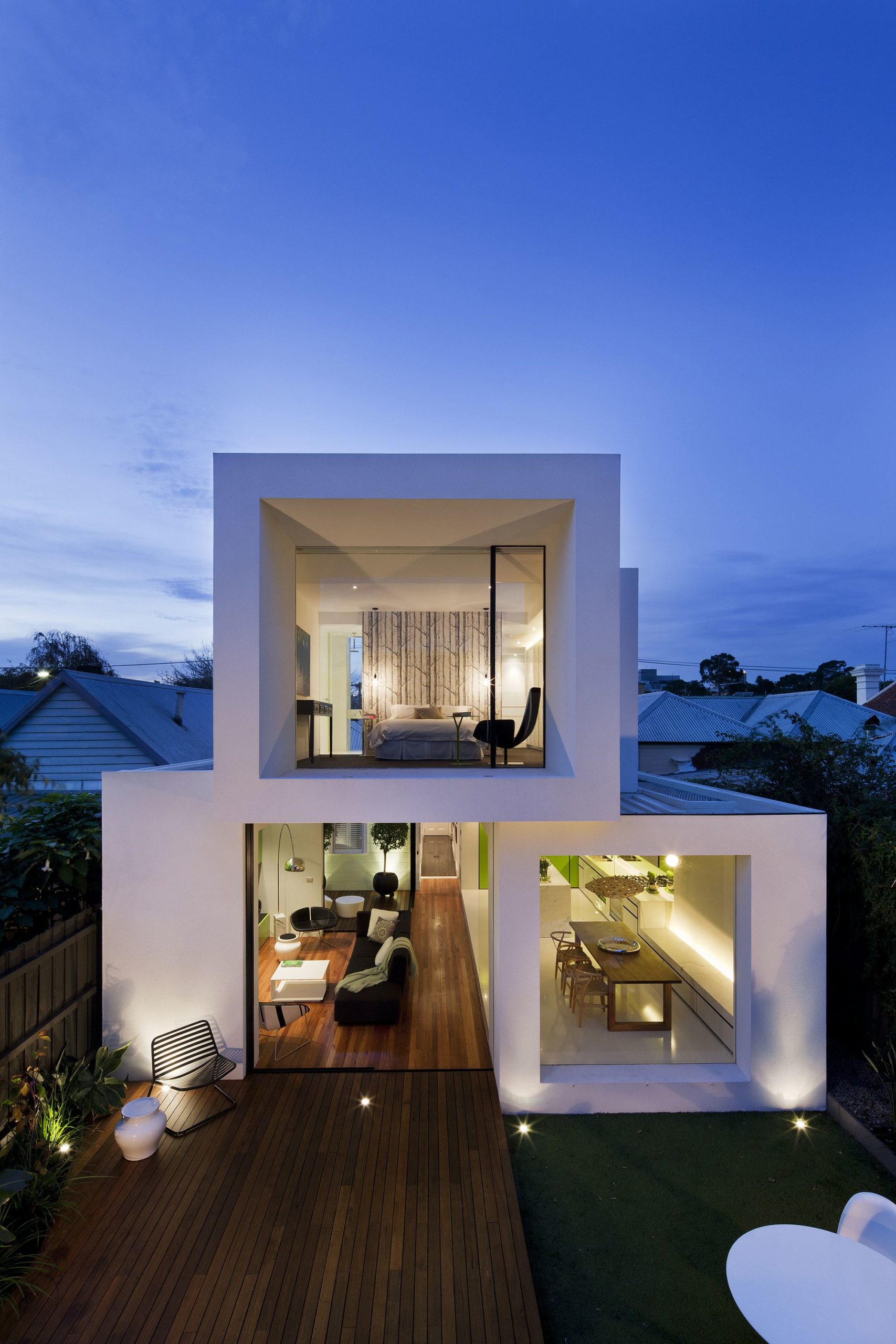
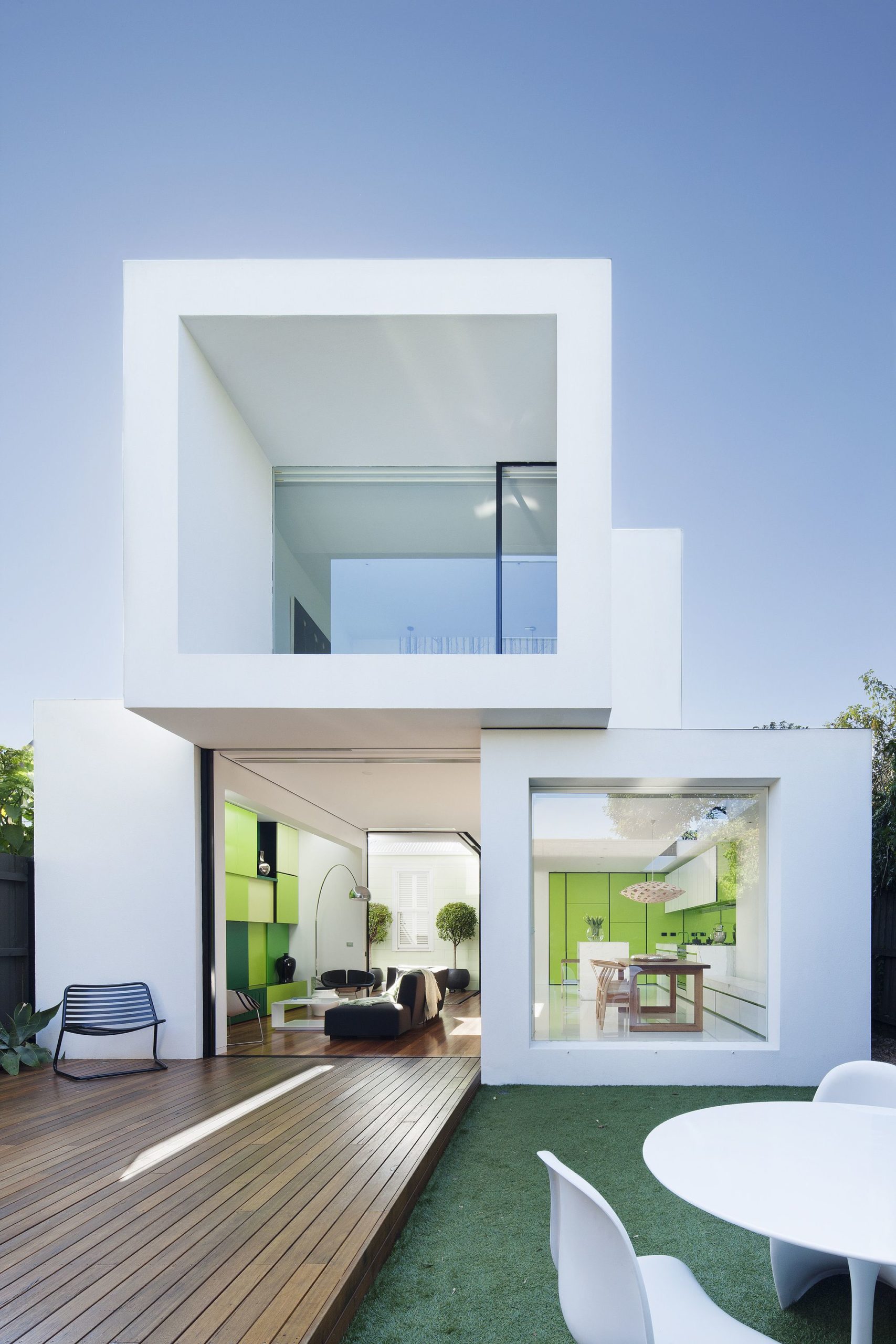
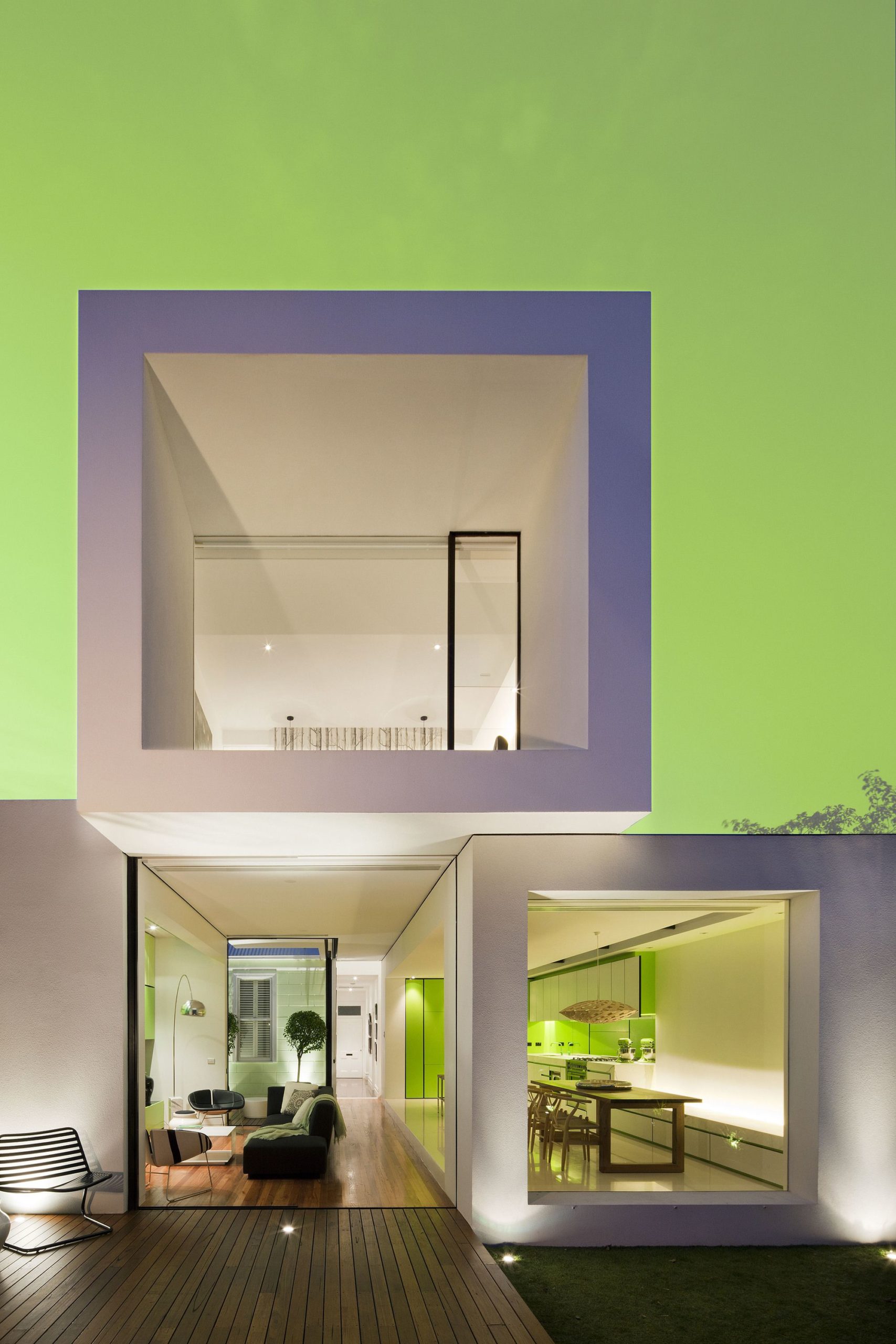
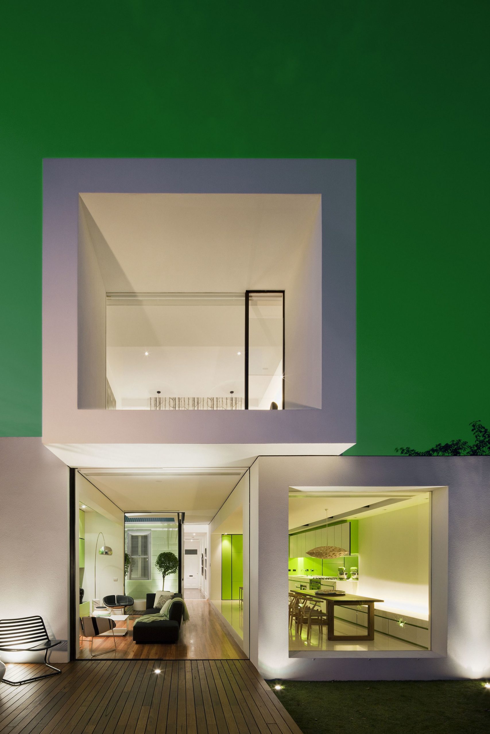
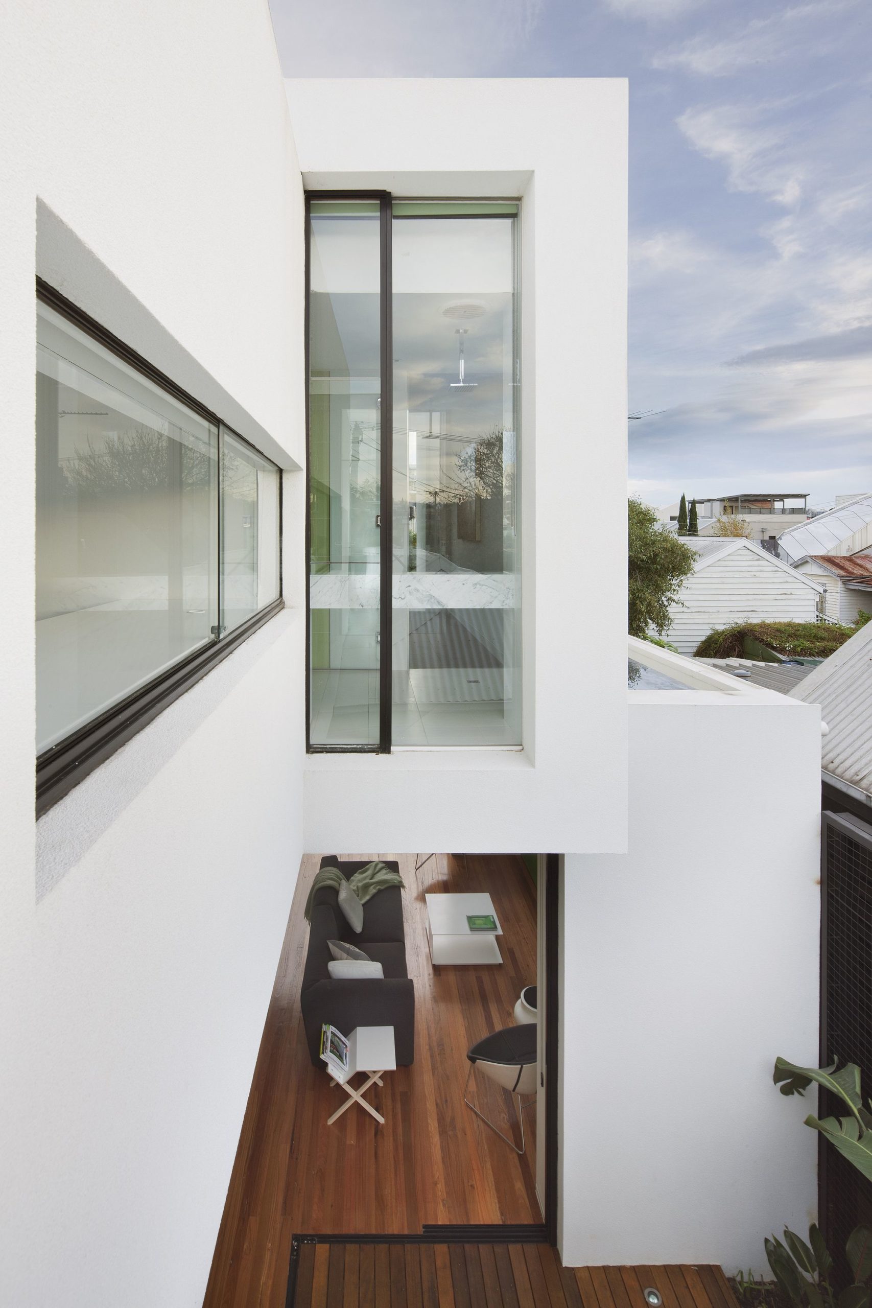
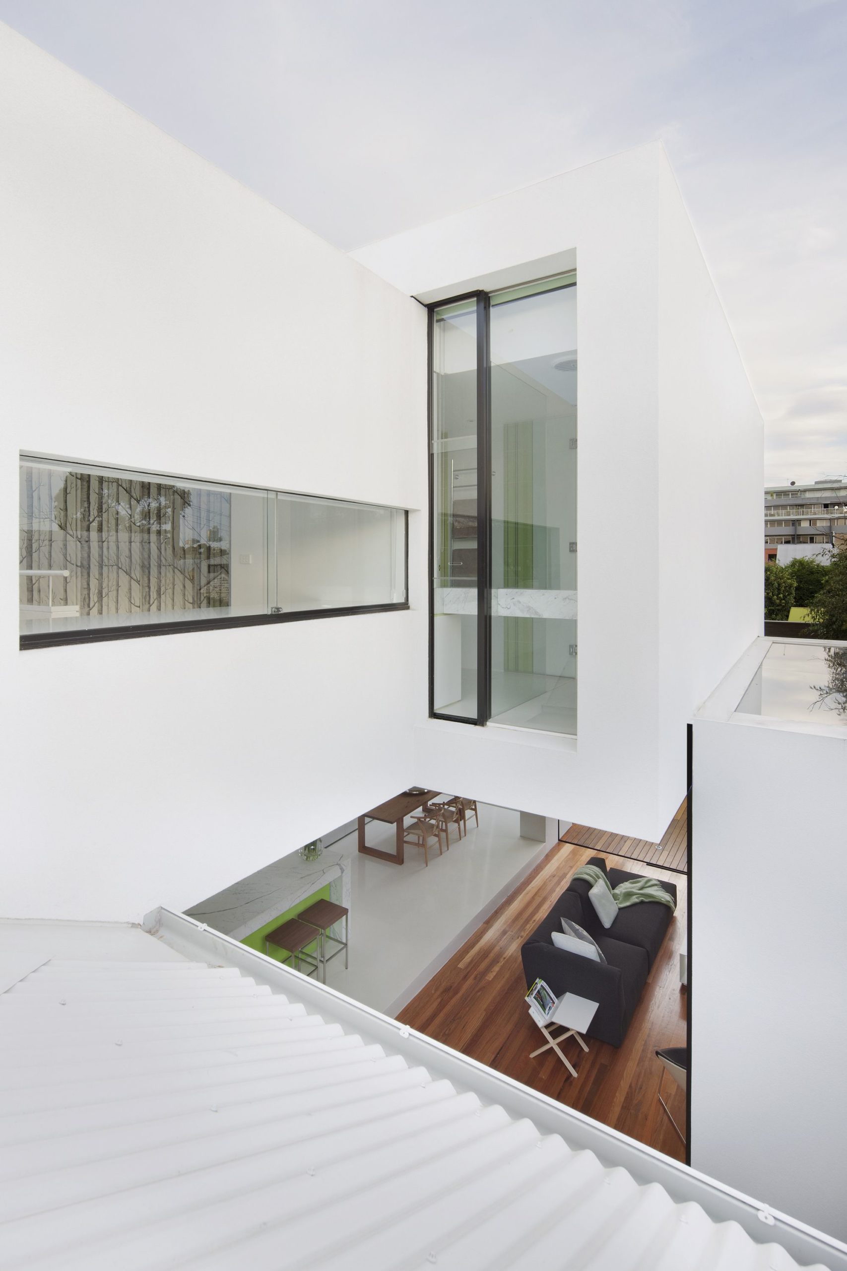
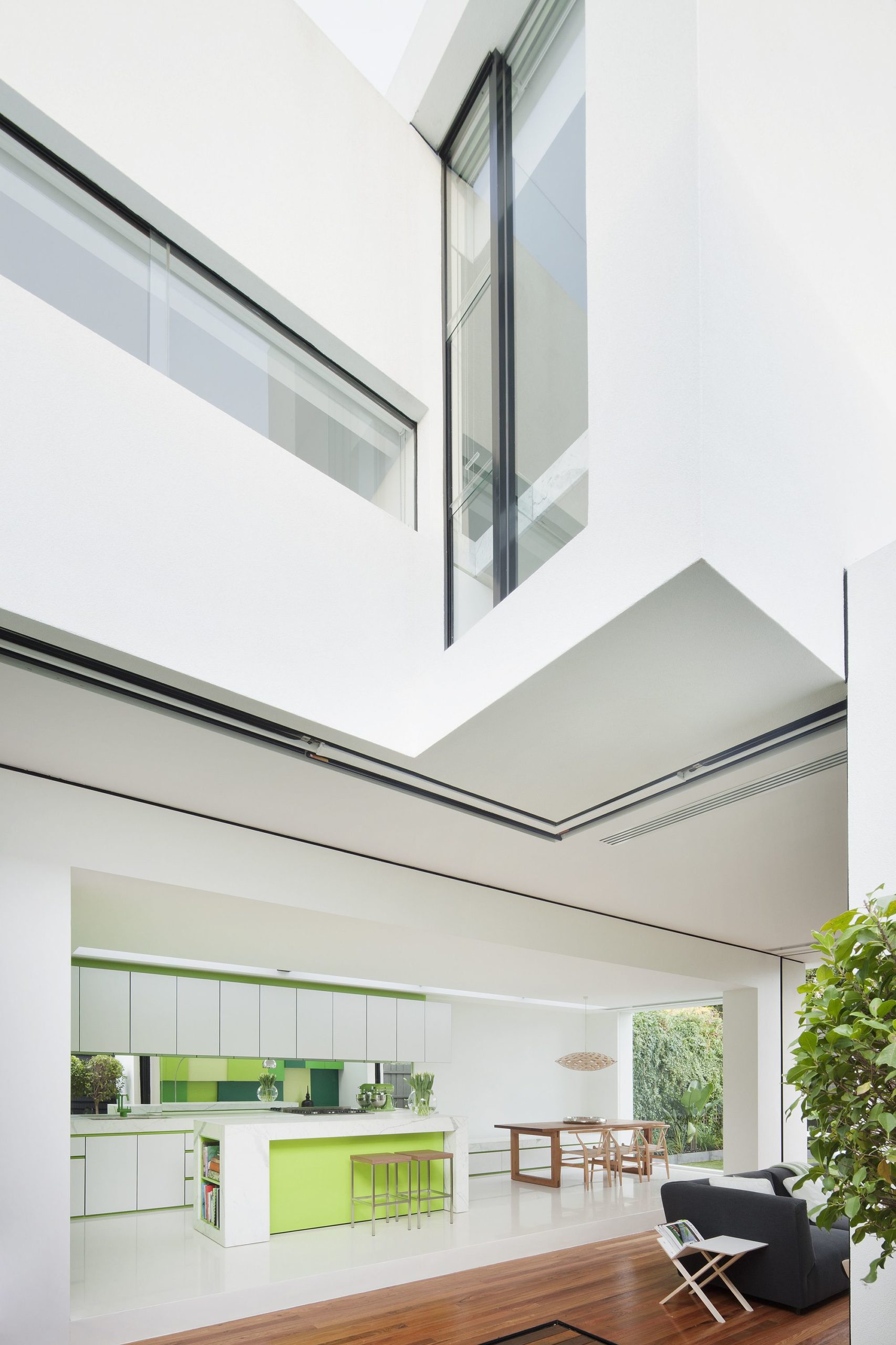
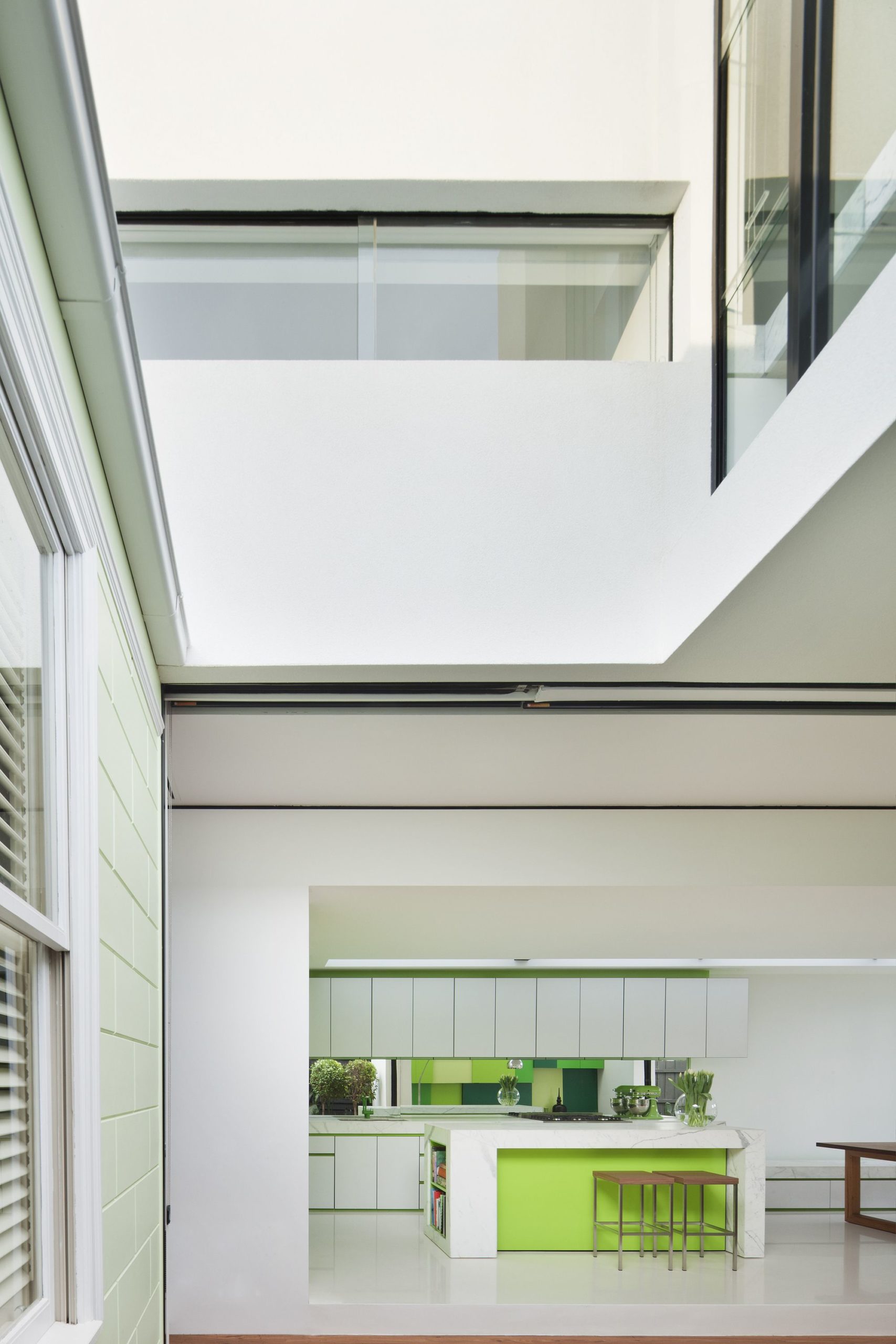
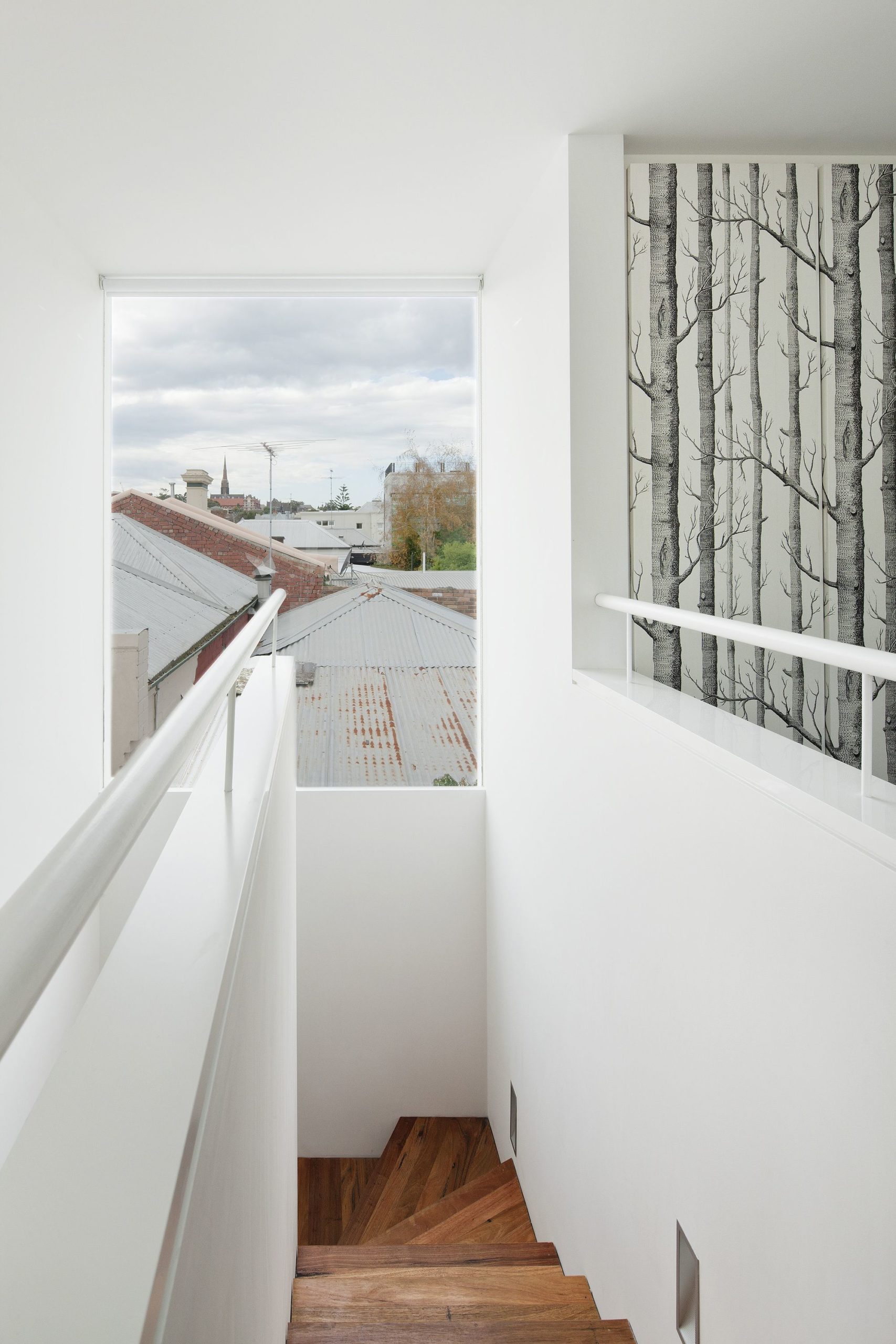
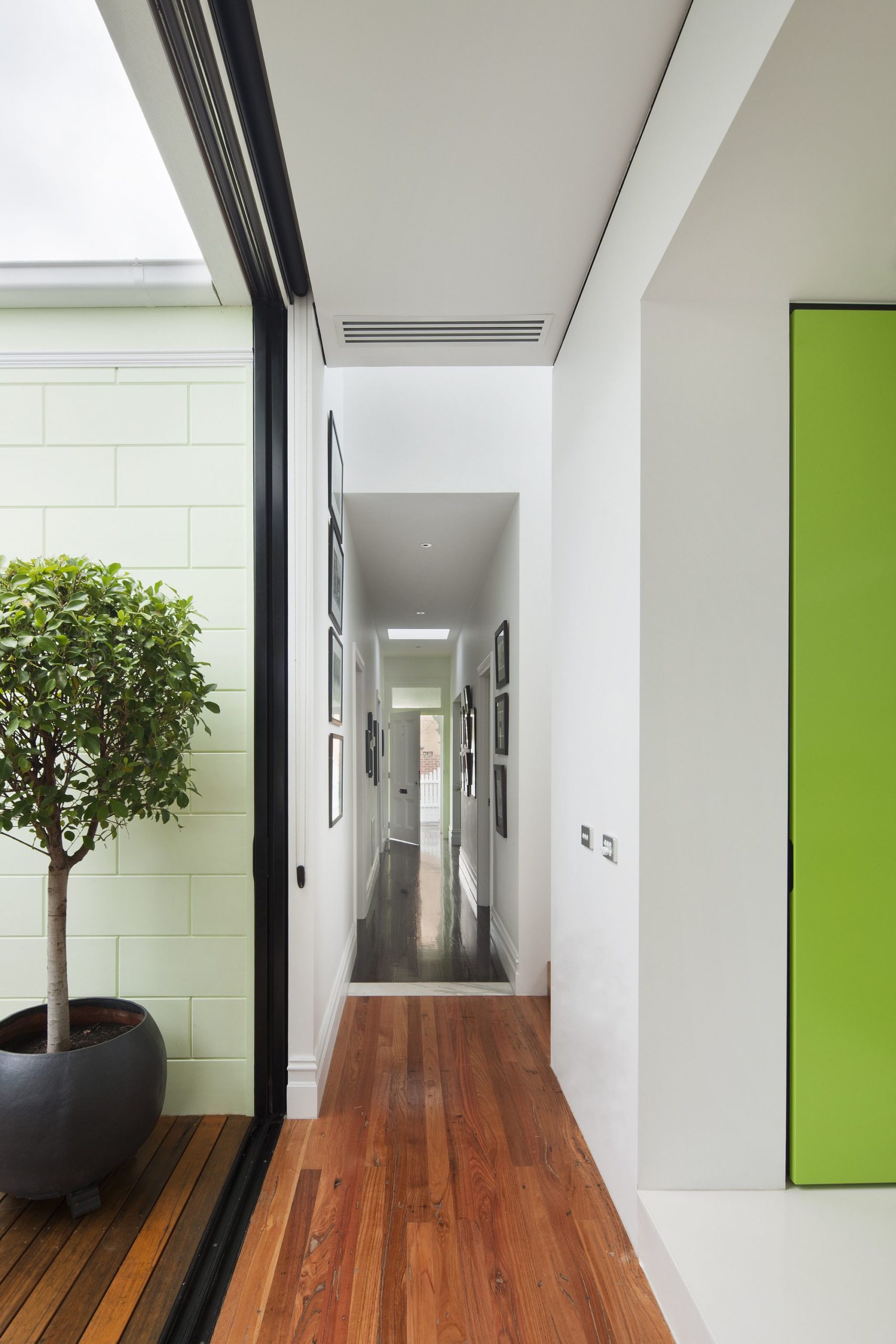
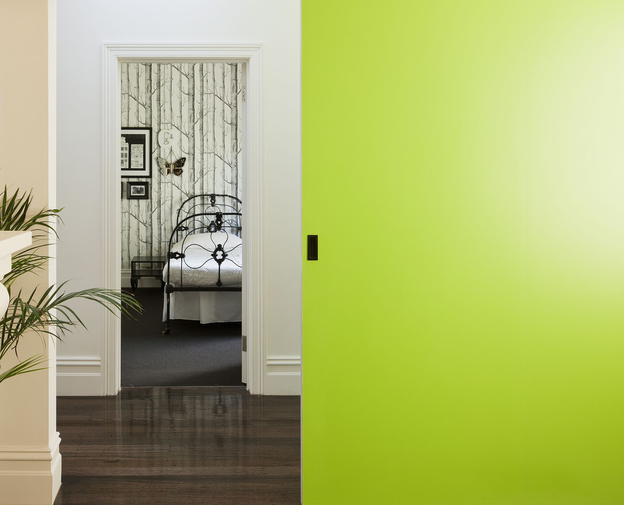
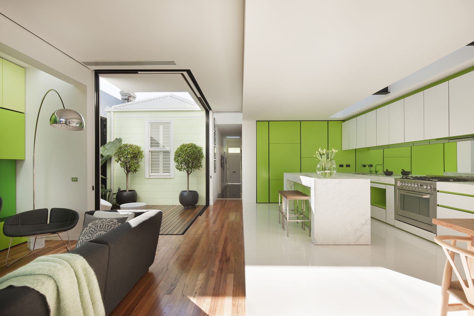
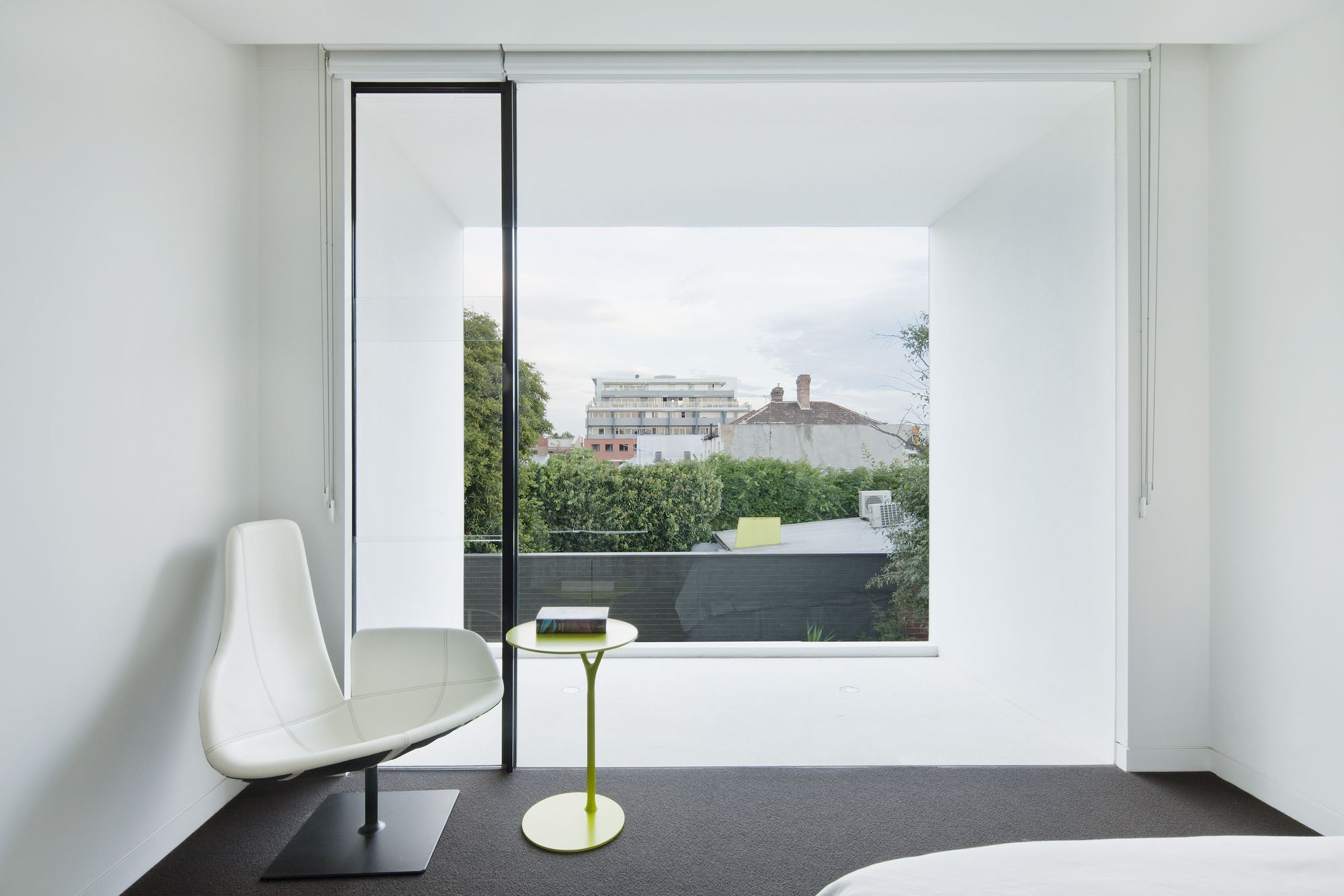
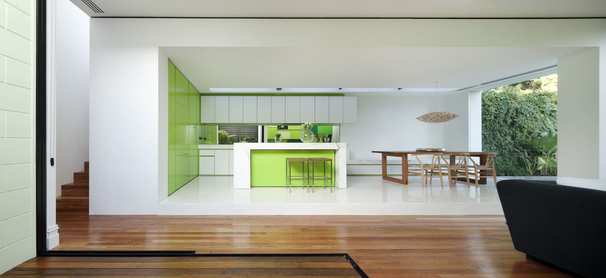
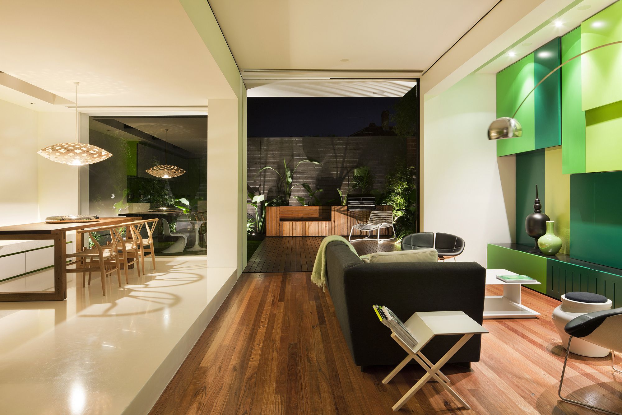
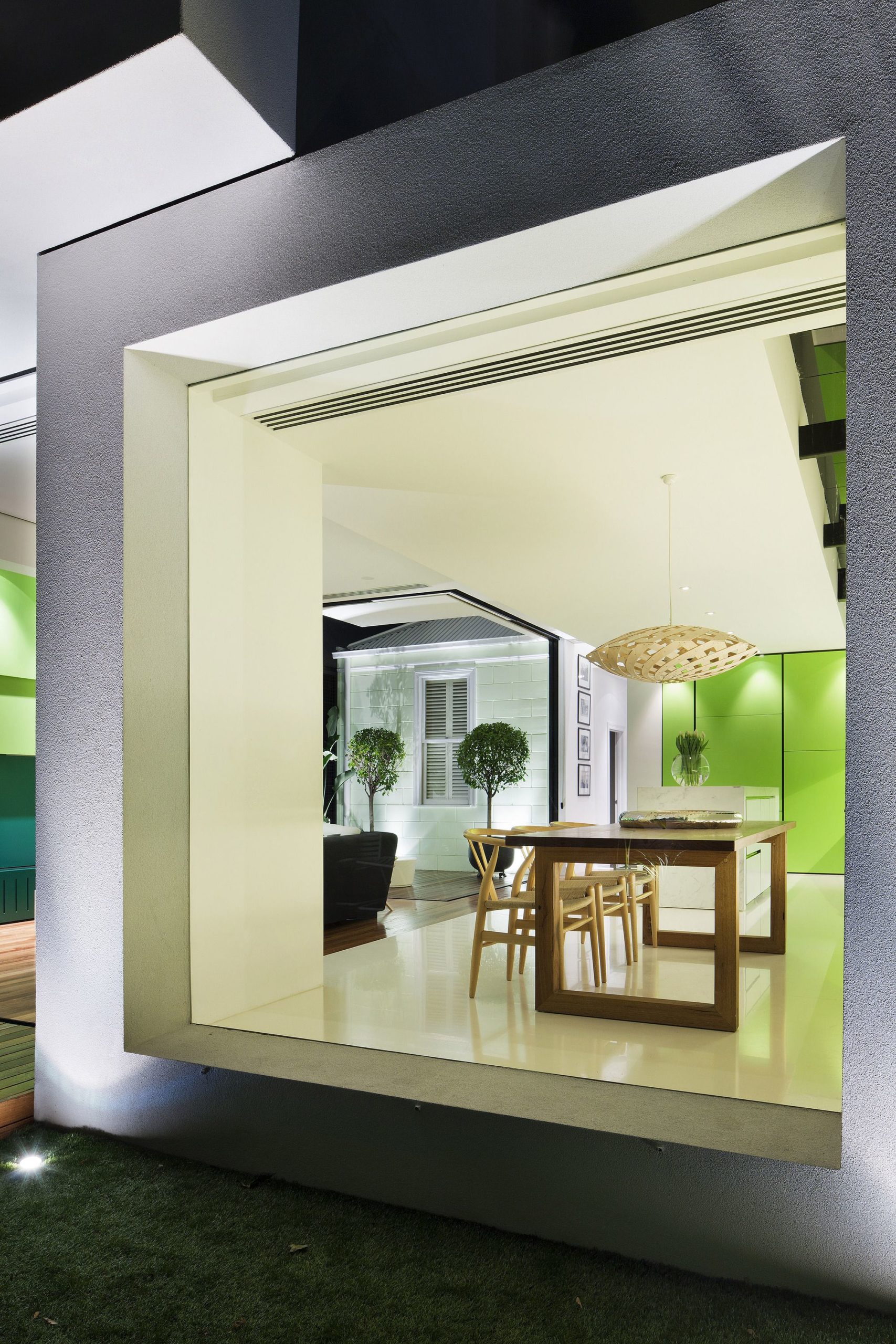
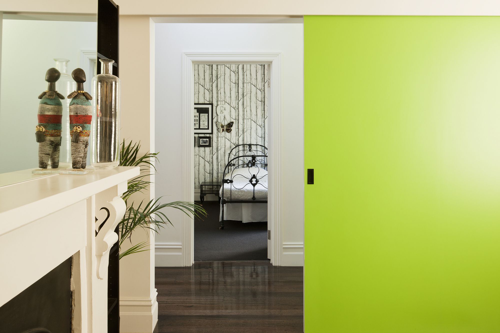
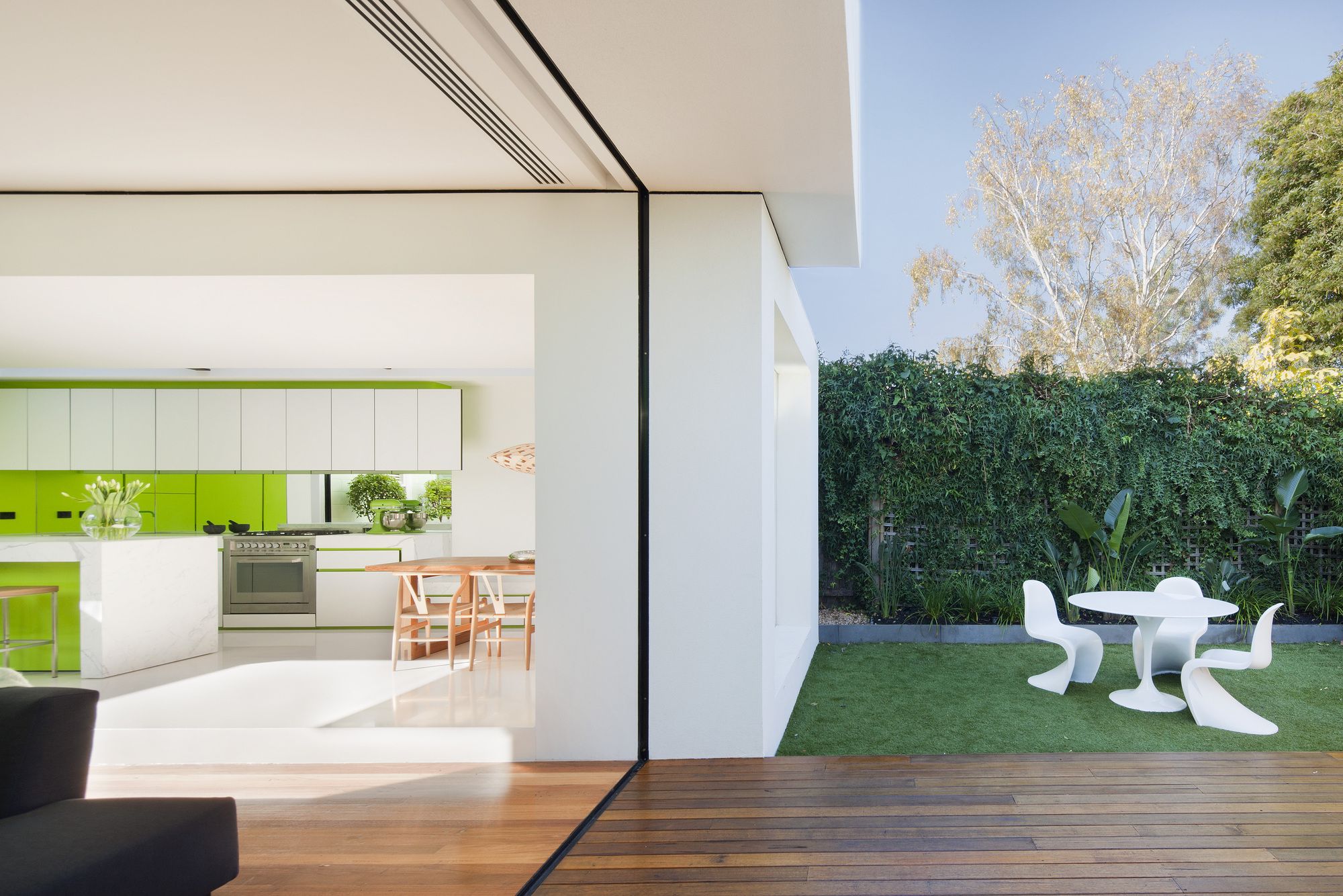
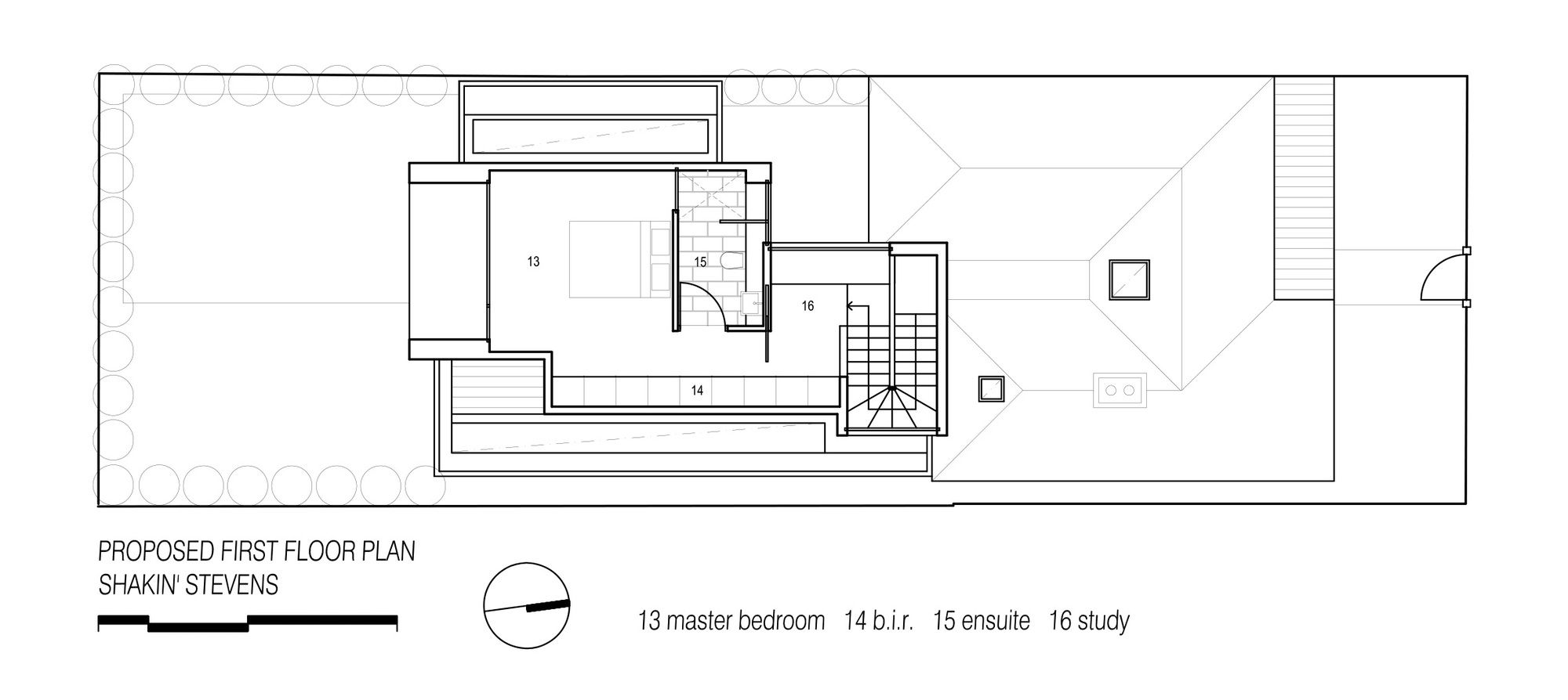
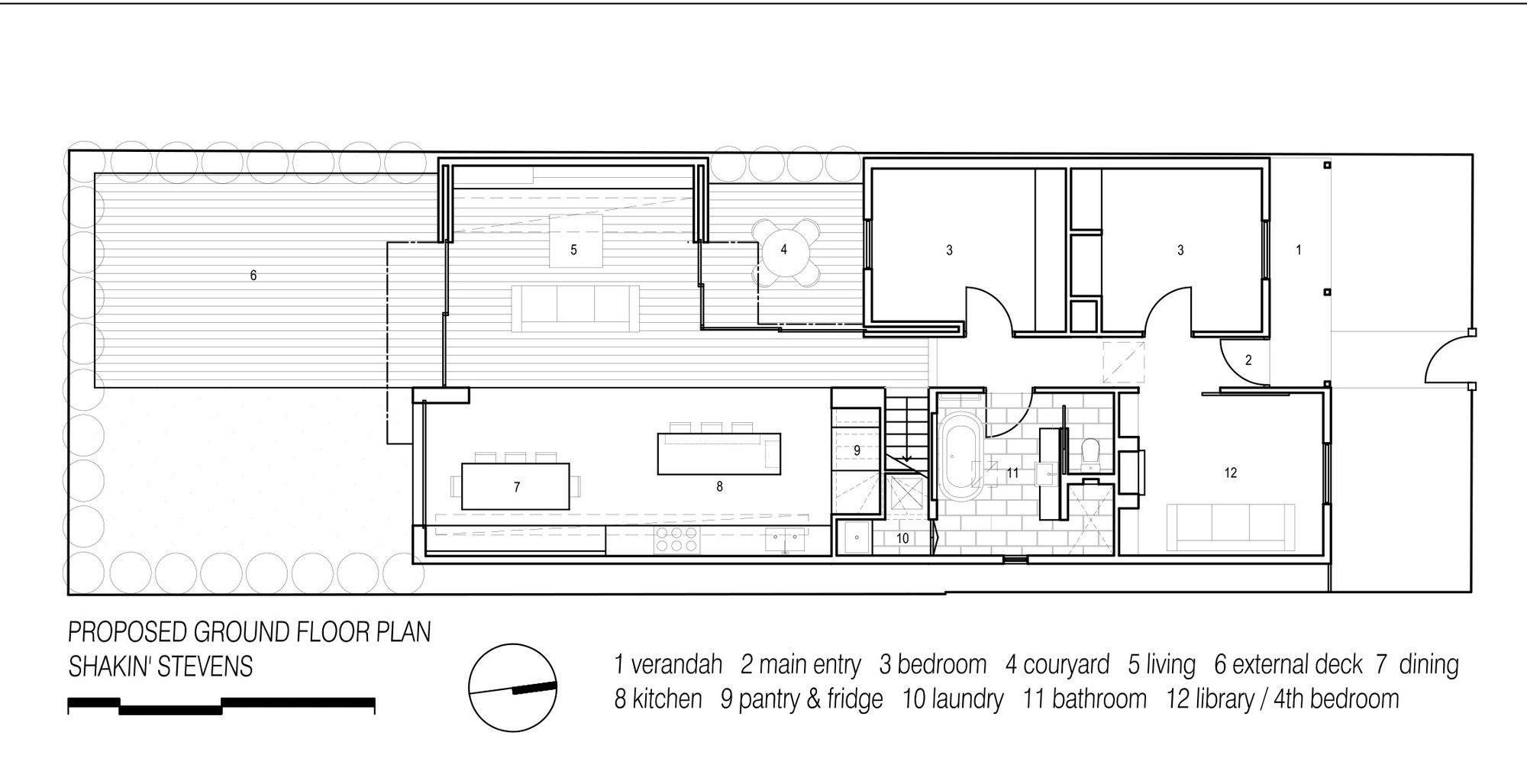
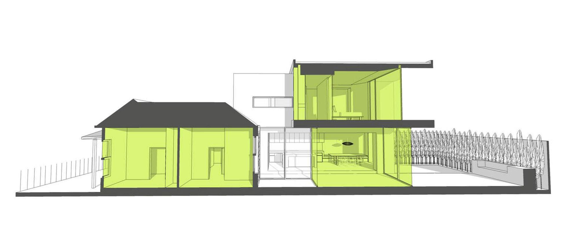
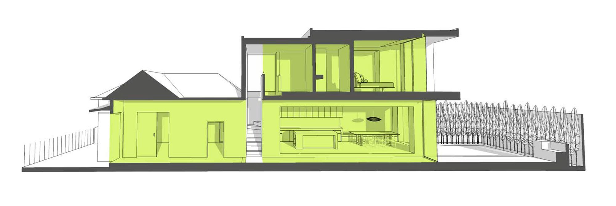
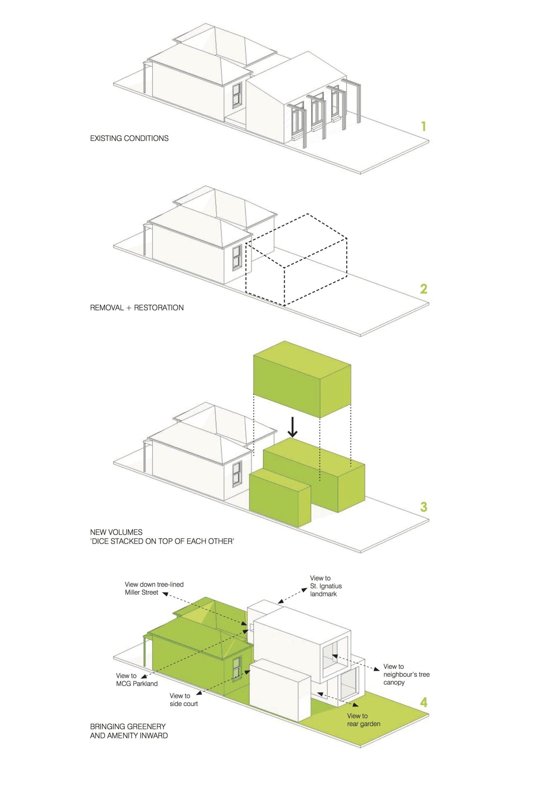
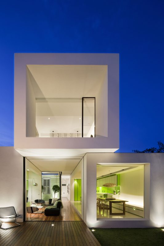
‘Shakin’ Stevens’ is not only about a coloured front door but the experience of what’s beyond it. Conceptually beyond this green door, there are no doors; the newer space is about flow and continuity where delineation of space is soft and less finite than expected from the street. In a clear formal idea the rear composes 3 extruded white cubes that look essentially like they have been let go, landing like dice randomly on top of each other next to a Victorian (monopoly) house. The 3 cubes, as with the existing villa, are composed so as to be immediately deciphered internally or externally and in clear programmatic zones all house different functions. The cubes which are opened at their ends (or sides where required) are utilised as devices to orchestrate views to green elements within the structure and to greenery within or beyond the site.
At just over 200sqm & 25m depth, opportunities arose from site constraints. The site boundary walls were conceptually designated as internal and lined with perimeter greenery set for maturity. The existing building was seen as an endearing element worth retaining, to be celebrated and re-programmed through colour and detail into the whole.
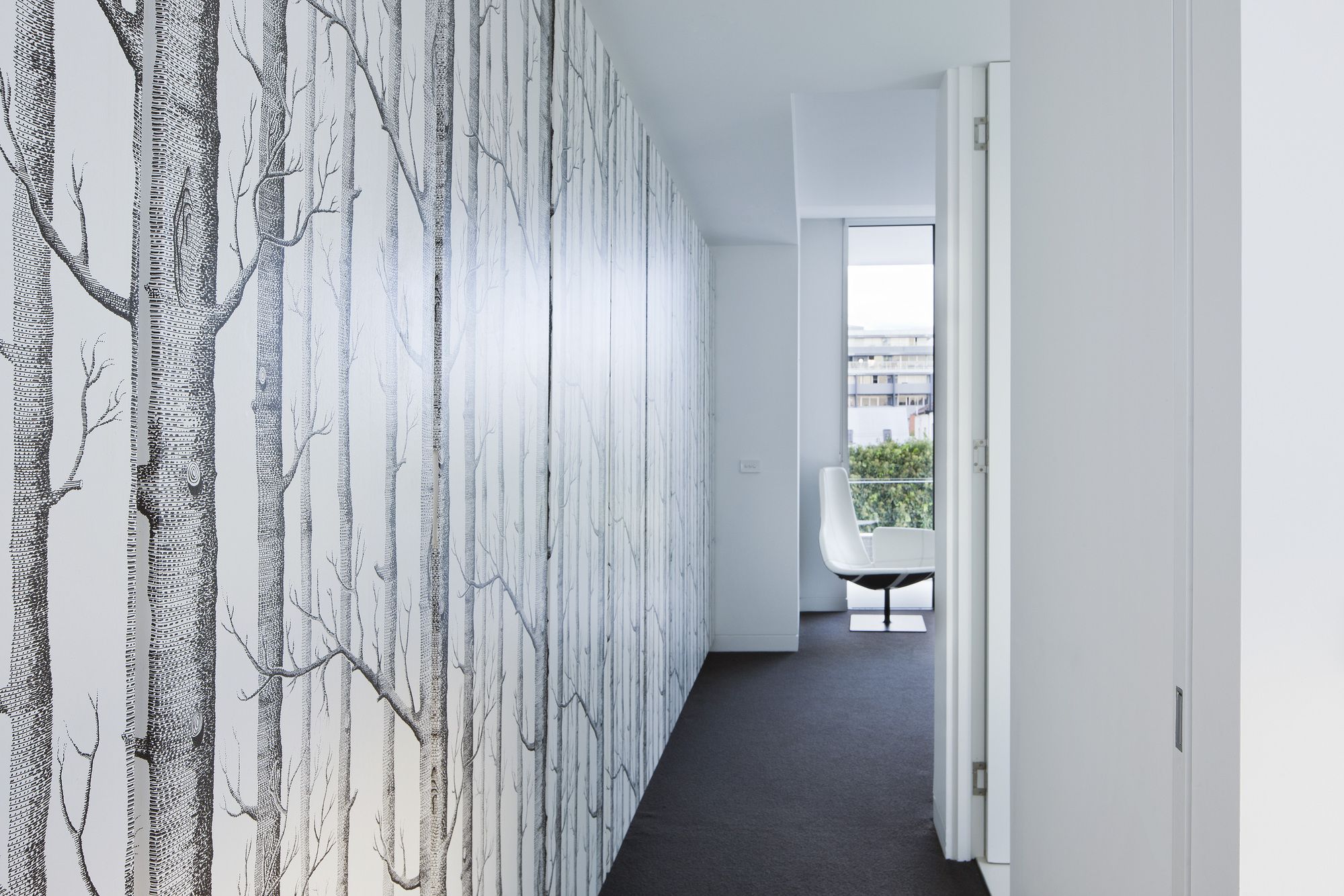
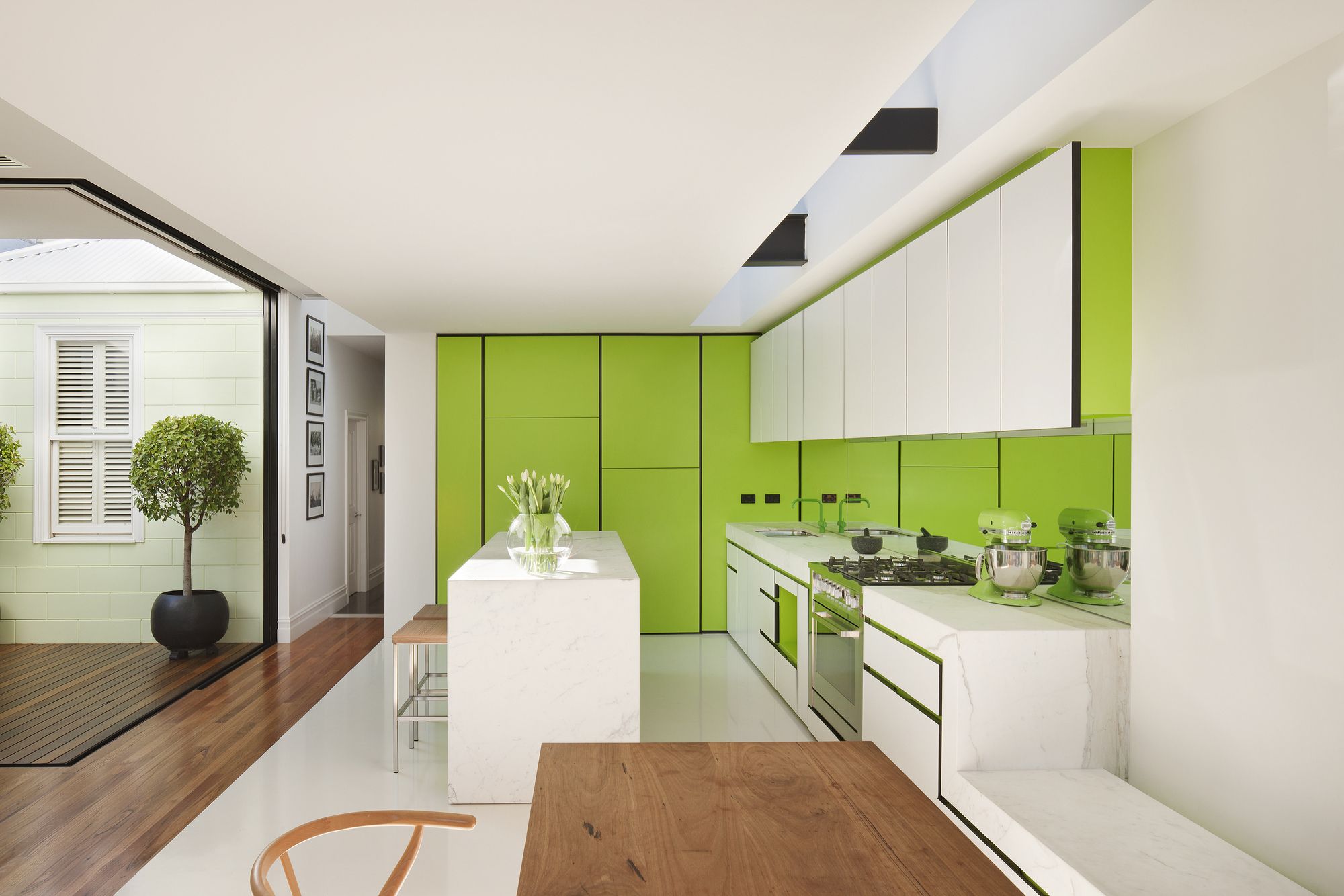
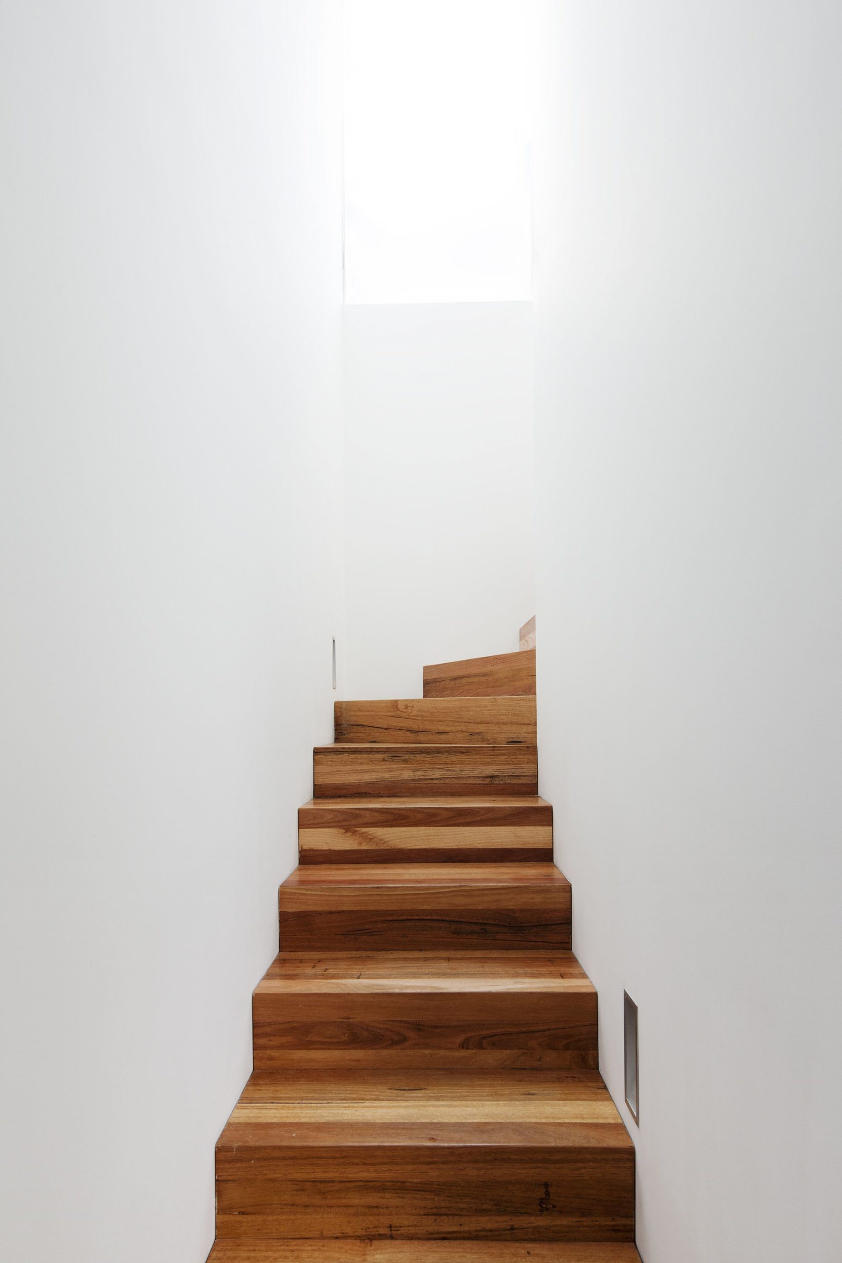
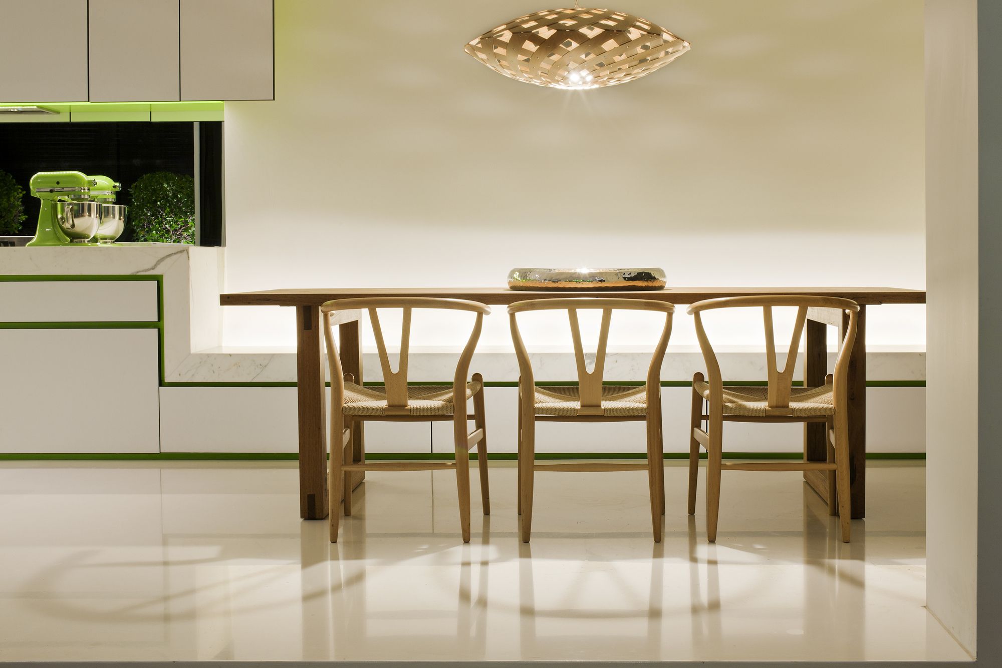
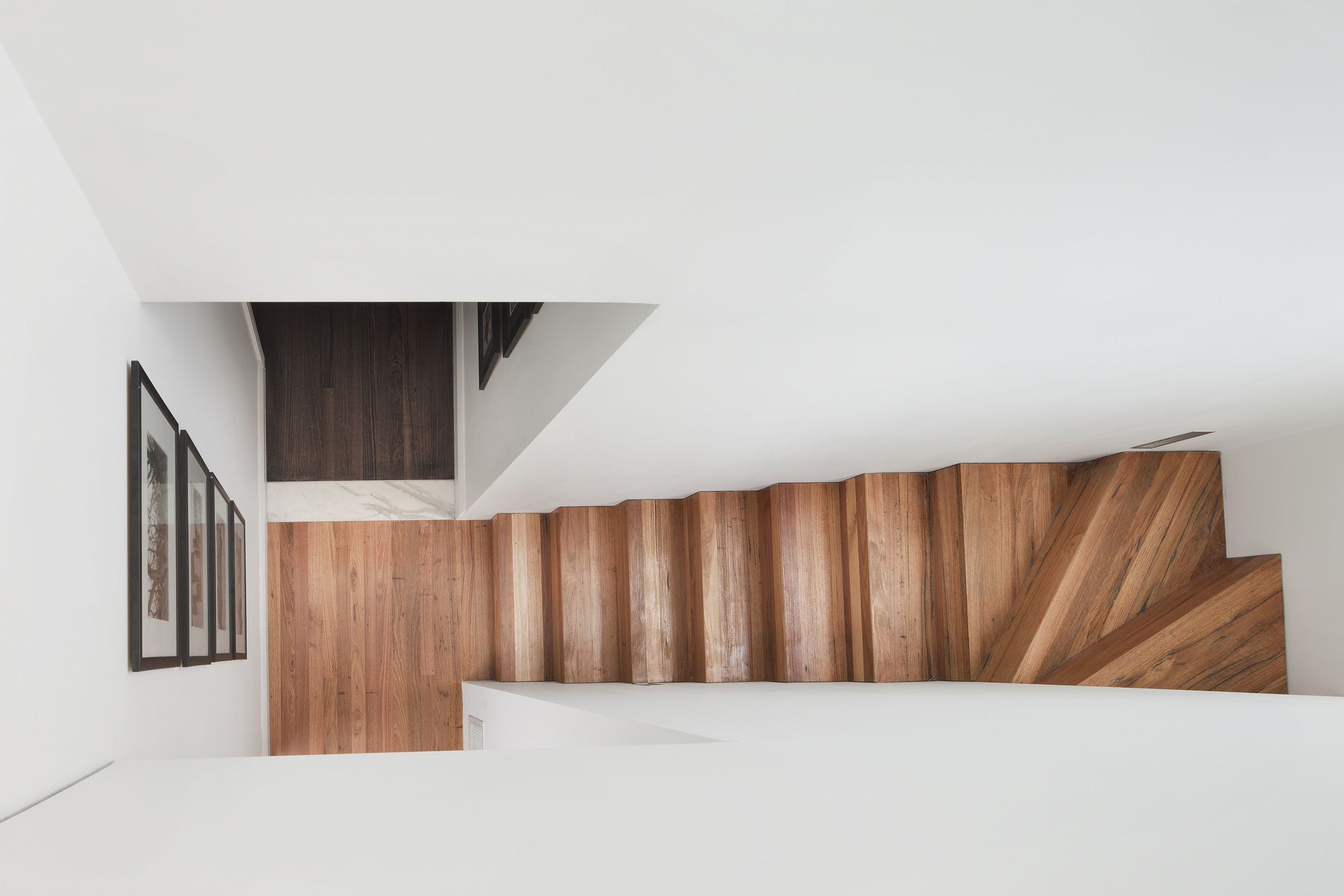
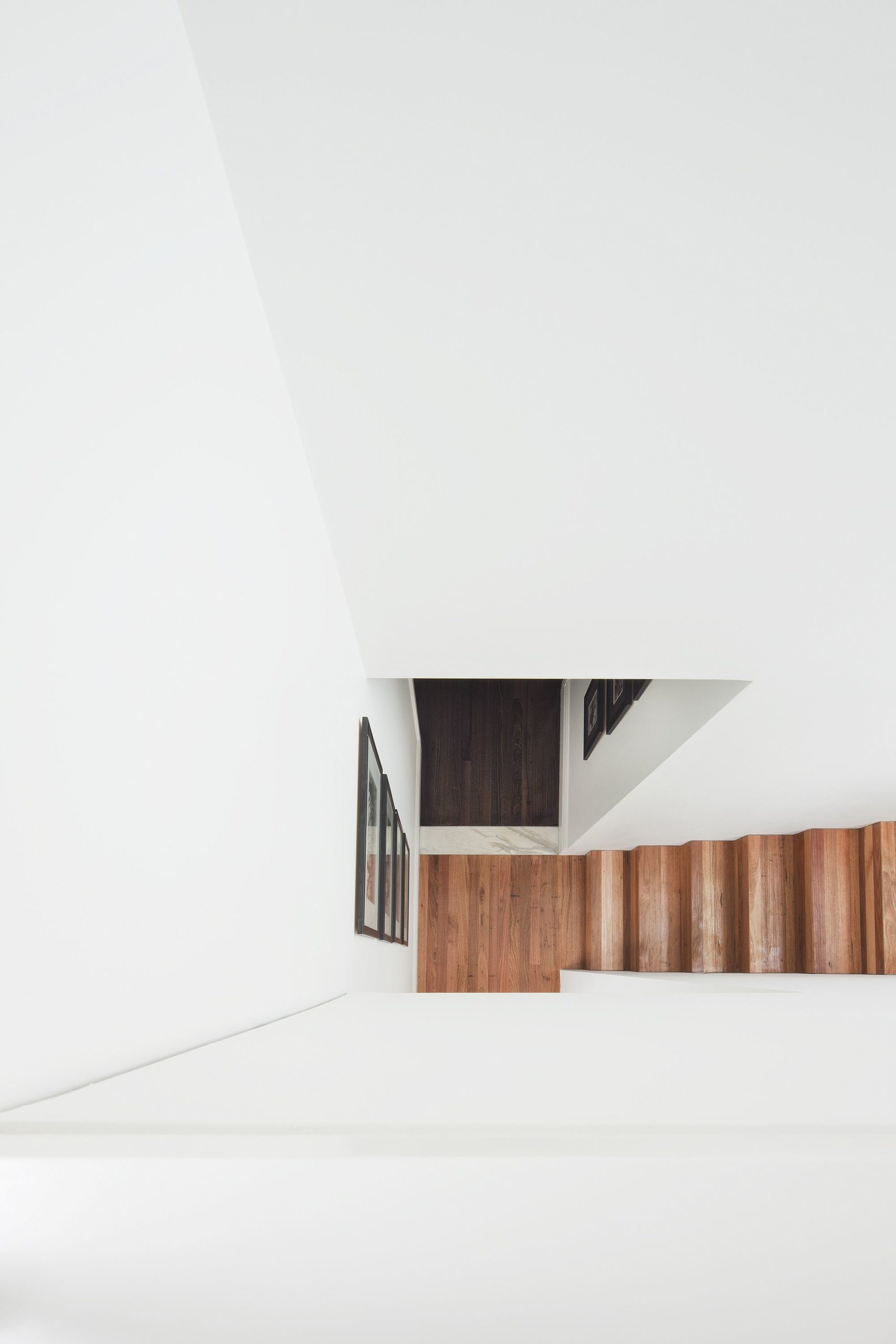
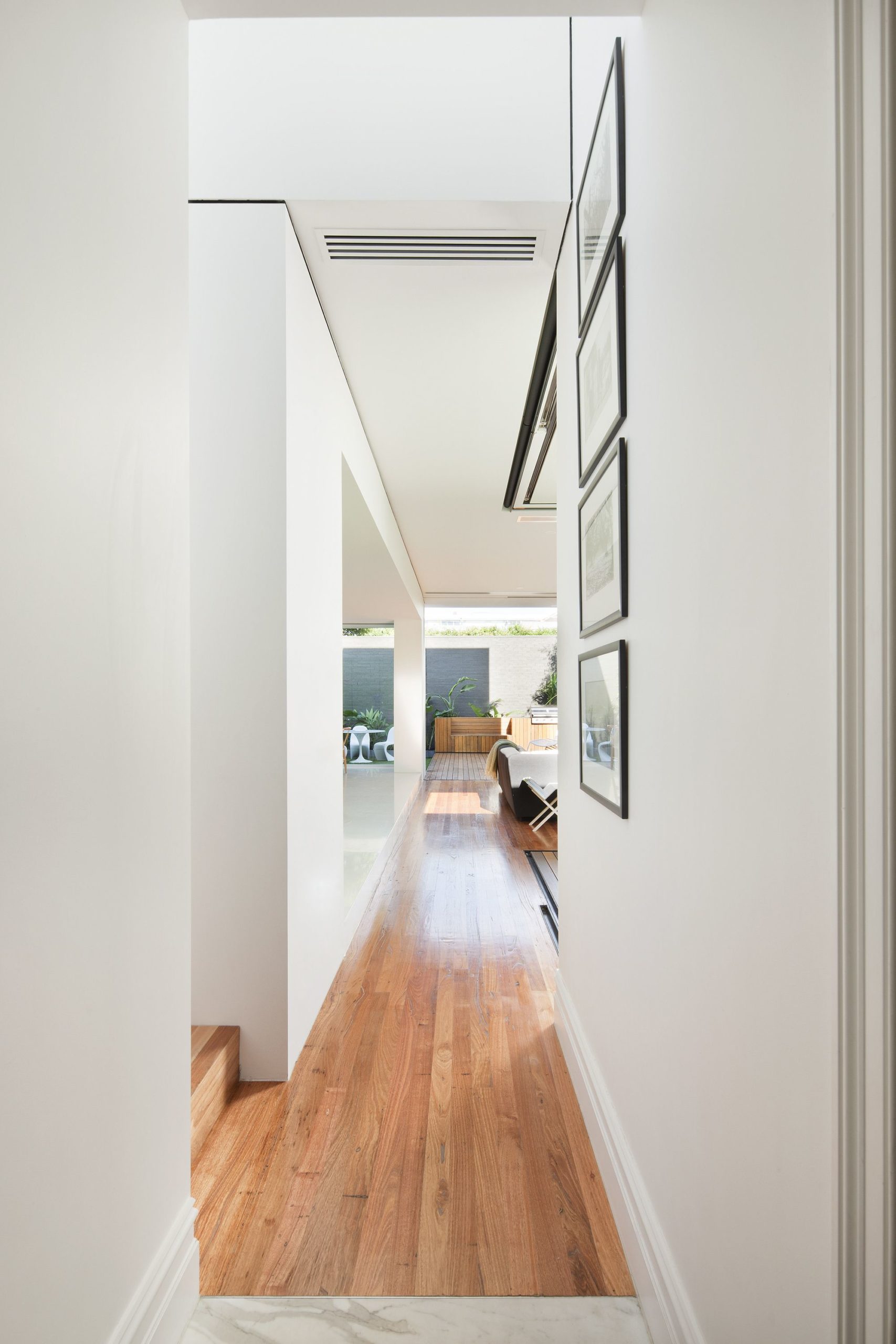
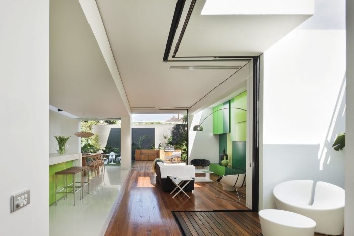
The rear spaces both internal &external are about volume & enclosure and conversely lack of it, flexibility to be undefined, spaces you move through rather in or out of. Definition is brought through the allocation of detail- ensuring structural tolerances mean cubes don’t touch, concealing fixed window framing so materials run flush continuously through thresholds. Variation of volume, material and colour similarly assist the clarity and expression of the formal idea whilst also being practical to particular spaces – living is more open, dining more intimate. ‘Non-cube’ materials are deliberately recessive – recycled timber floorboards line circulation areas while glazed panels conceal into cube walls.
‘Shakin’ utilises many micro level ESD principles – siting, sun protection, thermal mass, passive temperature regulation, low embodied energy (& cost @ $550k) construction techniques& materials, structural depth with high R values. A grey water system, 2 side water storage tanks, fake grass & ‘succulent’ planting temper water usage whilst providing intrinsic features of the colour scheme.
Beyond these at a macro level this interior is about future robustness meaning users now have the amenity to avoid suburbia using up precious planet resource and transport time. They have borrowed what was previously laying dormant within and beyond their walls. This is the real ‘sustainability’- a model for space/s that can sustain user types (a couple, 2 couples, a family with teenagers, guests) through separation of sleeping zones about a flexible living zone that they can up-size (externally). This interior proposes to extend beyond its enclosure & embrace its ‘green-ness’!
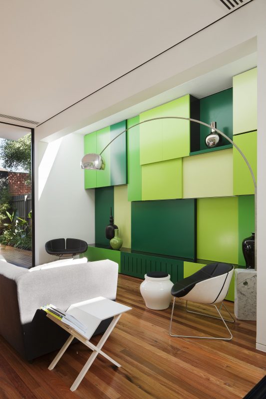
The structures of different periods are connected yet seemingly separated by a central courtyard and vertical stair chasm. Colour & detail variation are utilised tactfully to exaggerate the settings & temporal divisions of the structures. Although clearly a strategy of ‘viva la difference’ the different structures are married by shades of green chosen to adorn feature elements within each.
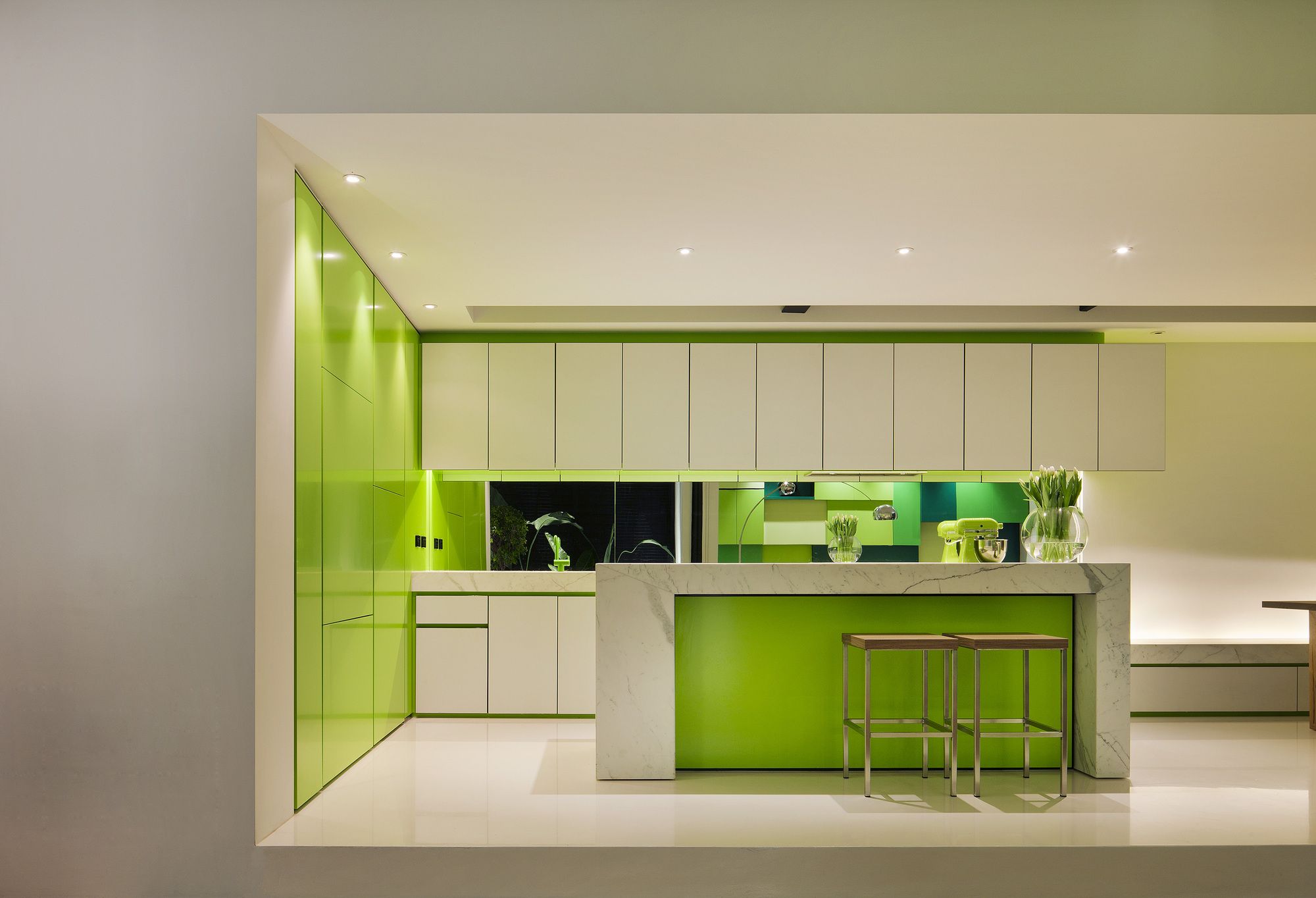
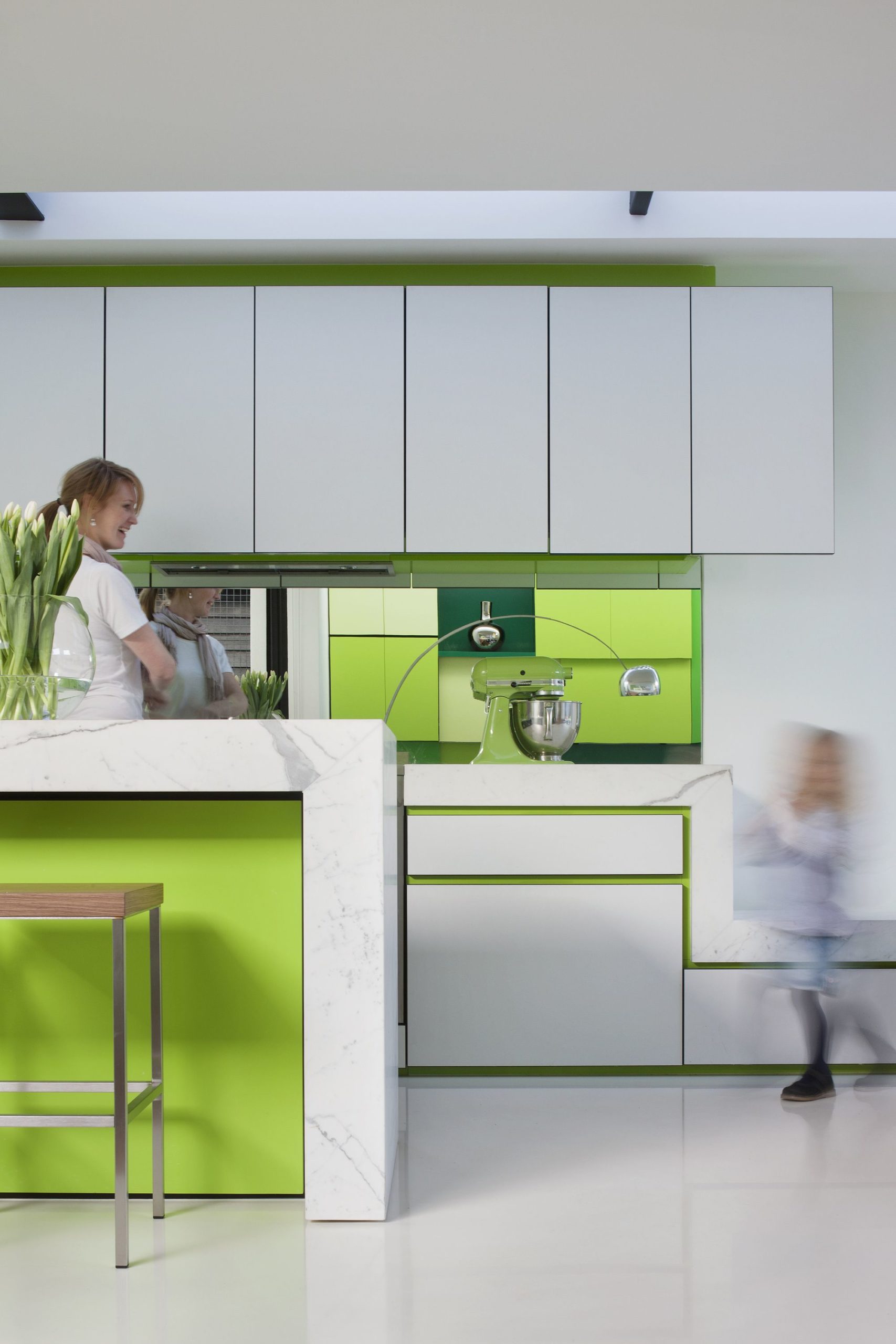
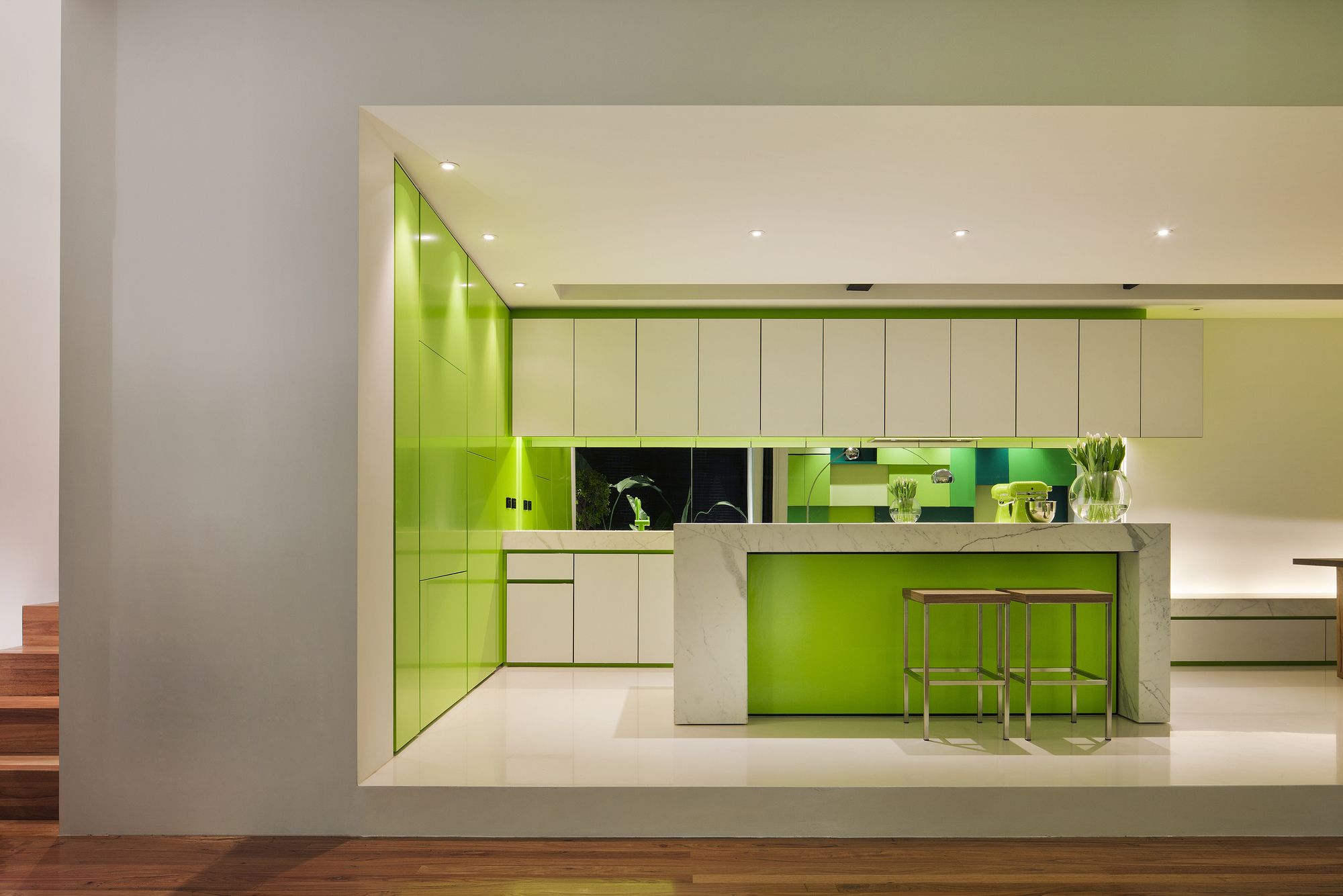
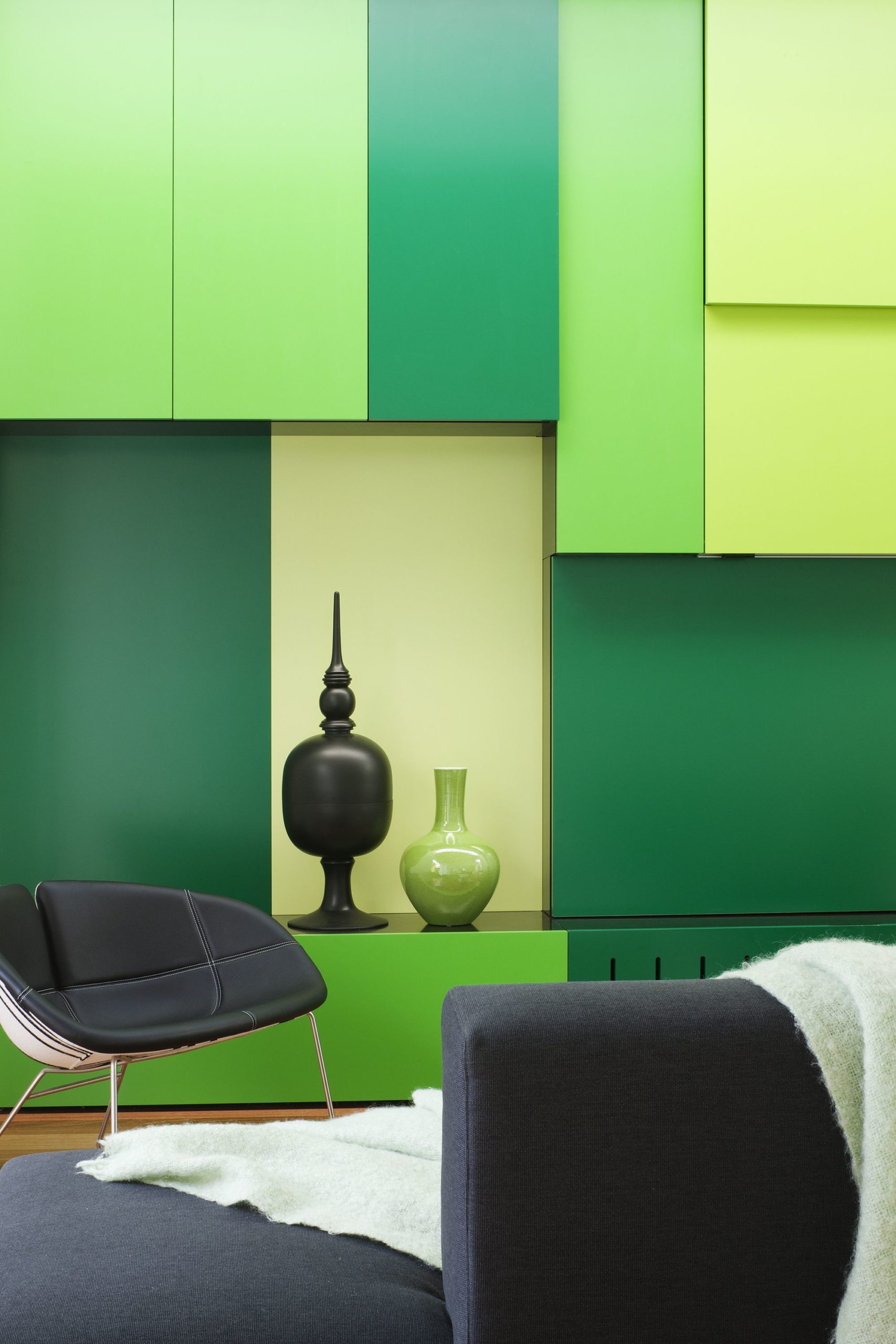
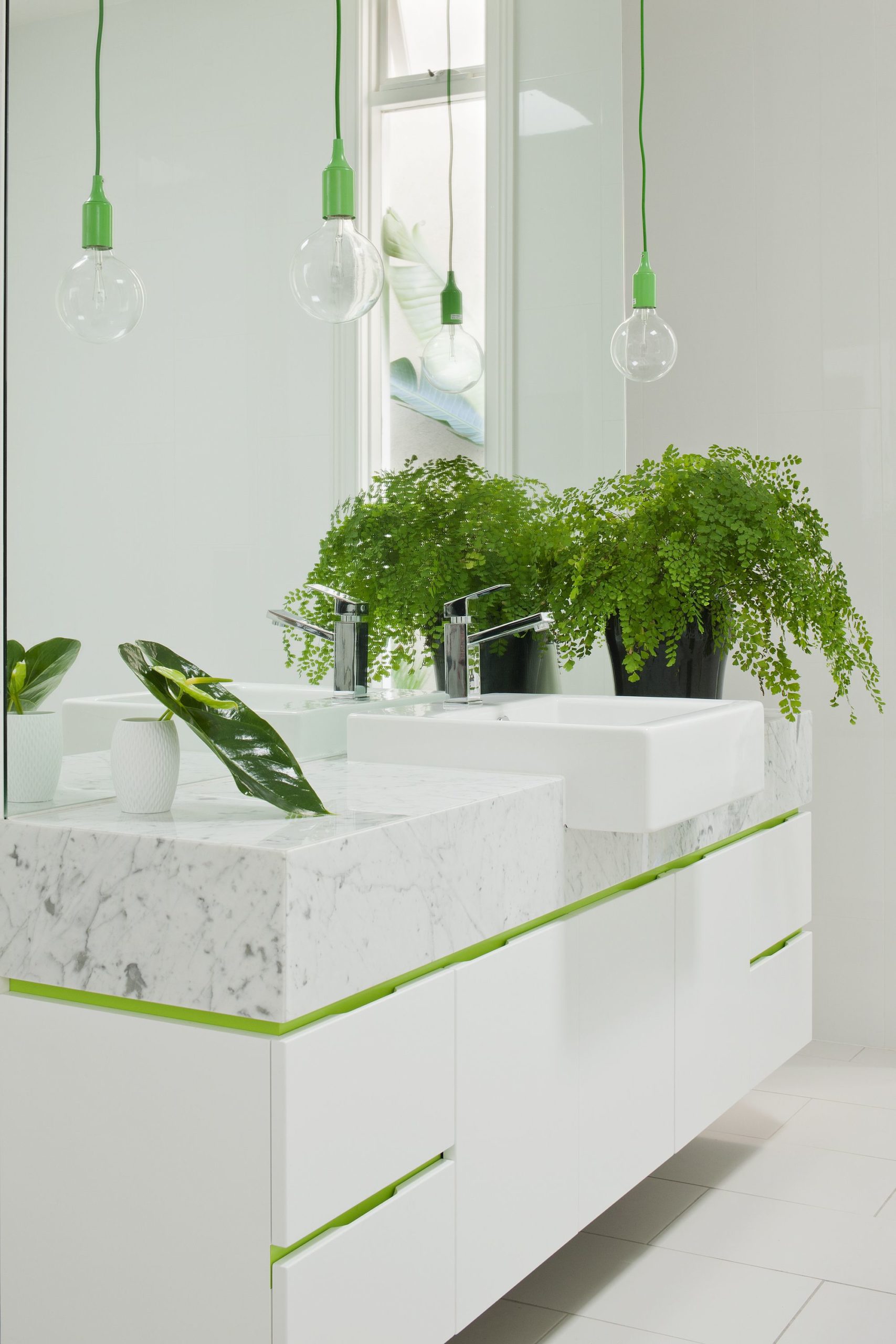
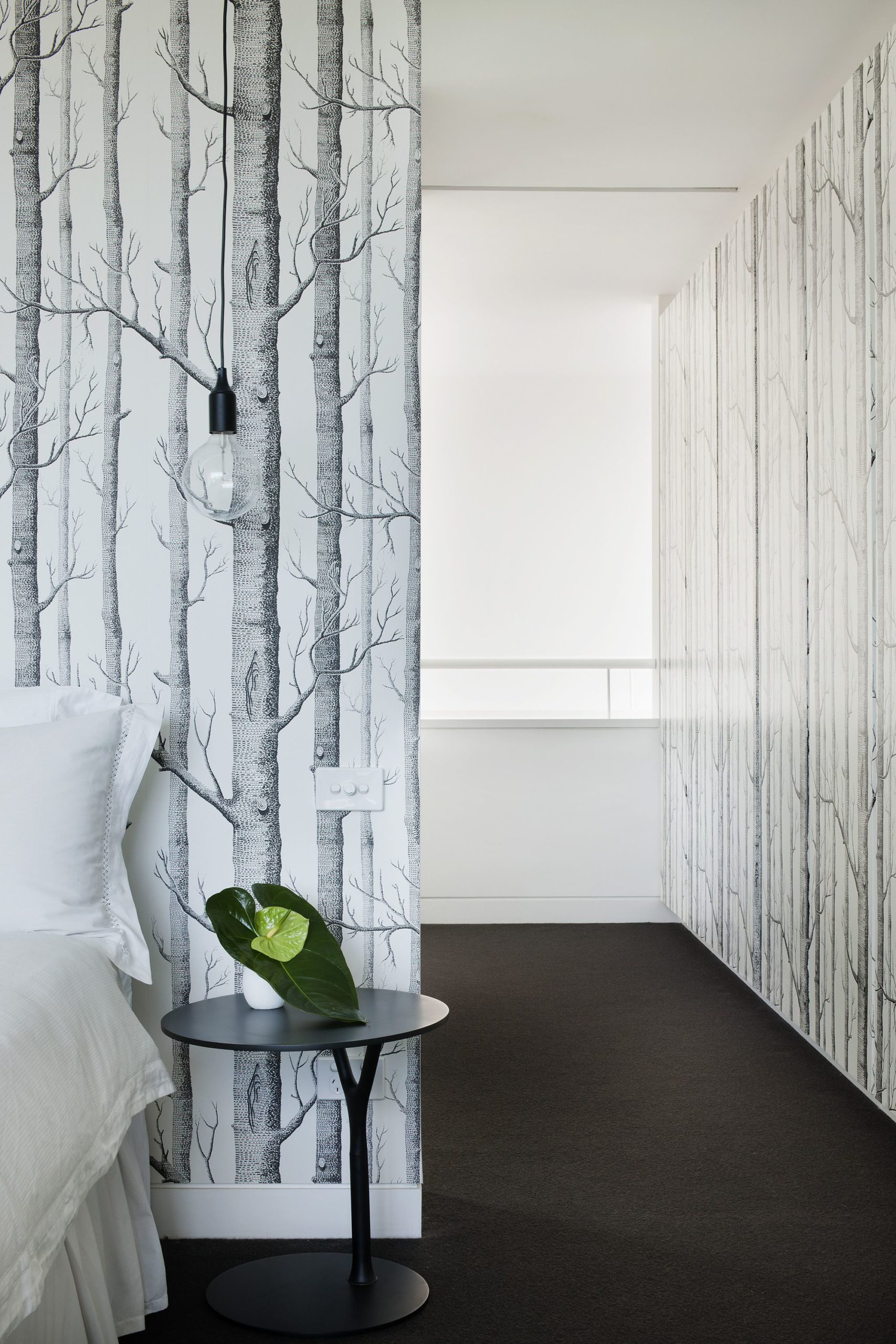
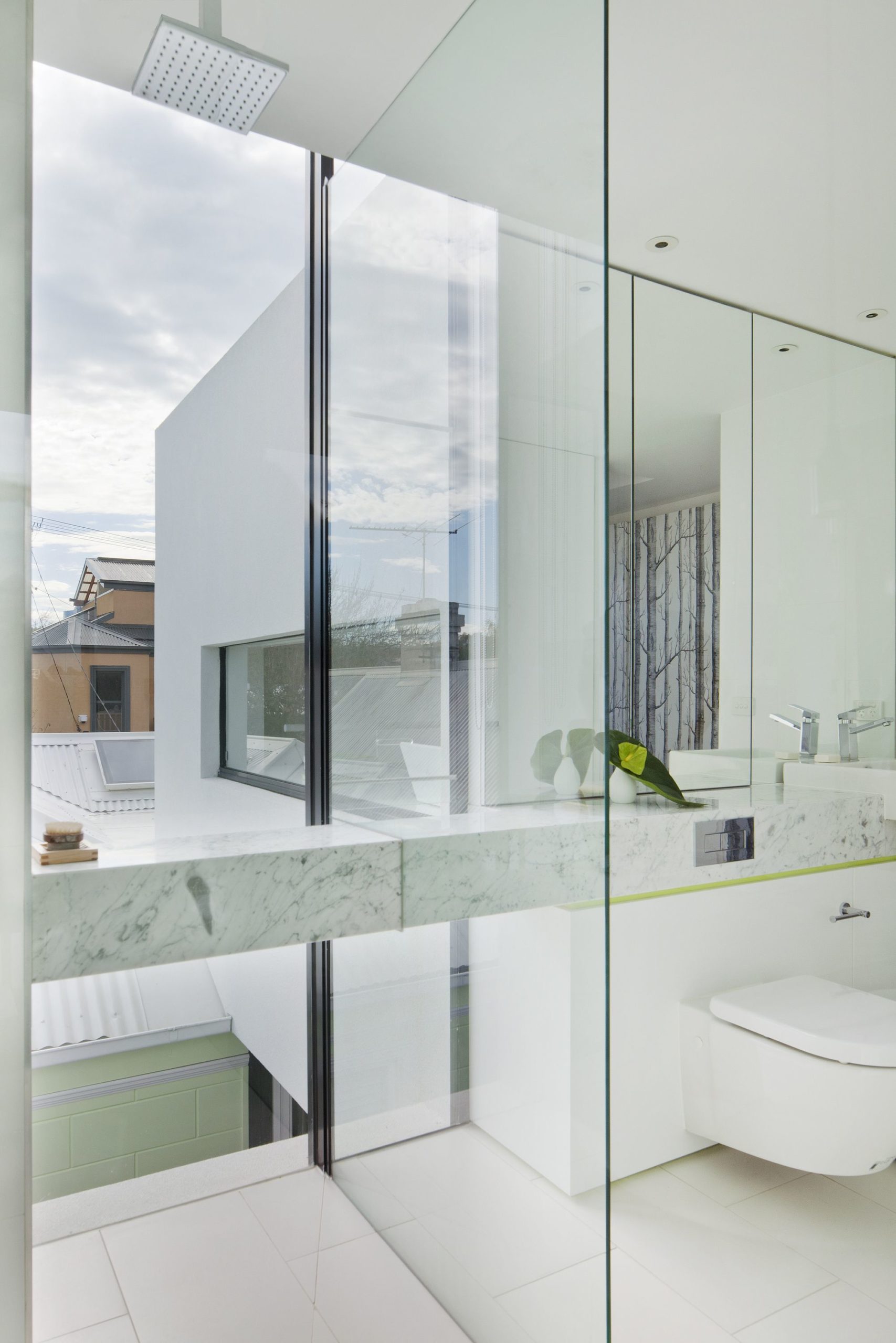
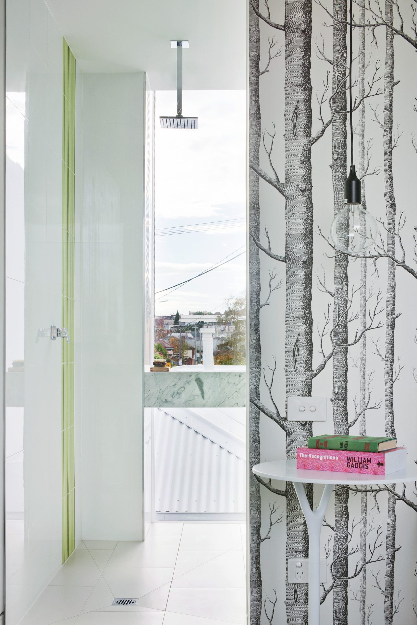
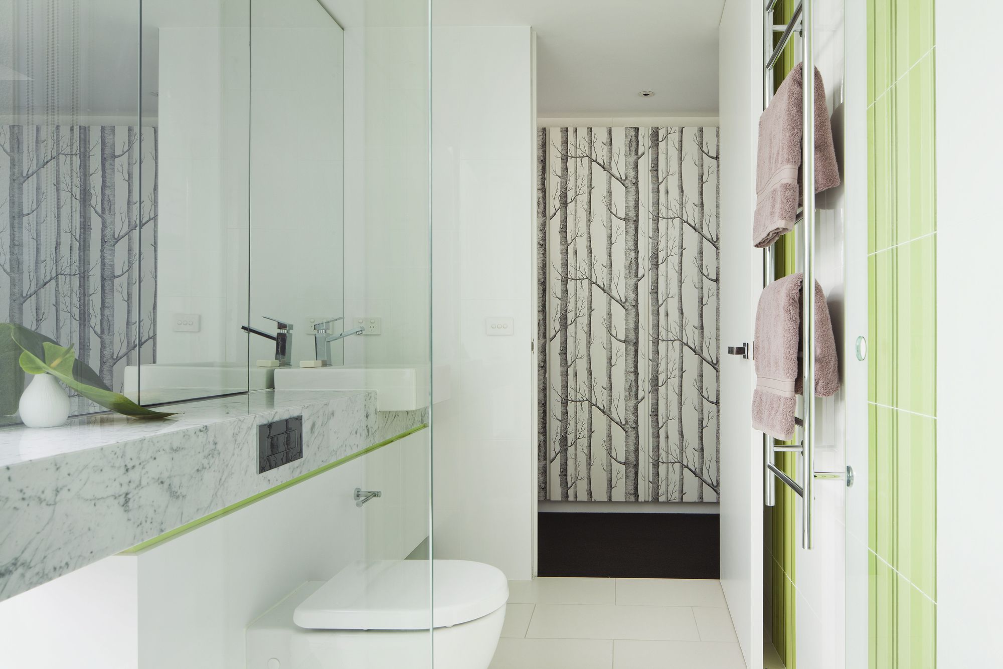
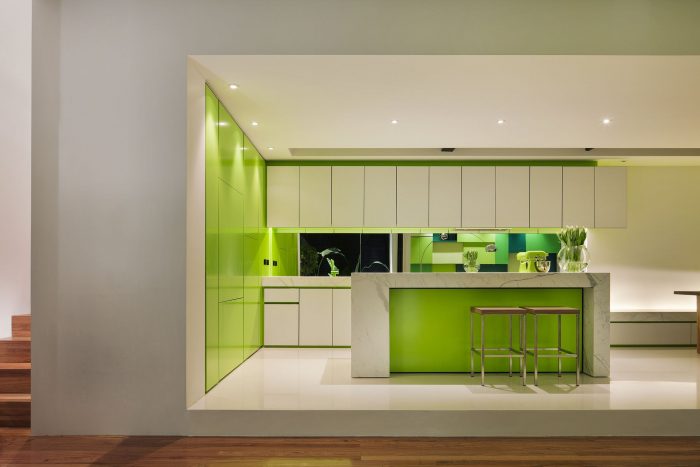
The client requested a predominantly white interior with a feature highlight colour. Green became an obvious choice, working in combination with the proximity of the garden. The green spaces within and beyond the site -instead of being the backdrop to the white interior – became the focus. The white cubes became the lens for these events– effectively assisting in bringing the green inside and dissolving barriers of enclosure. Interior, exterior and landscape -through colour- all inform each other with equal importance. Colour was vitally important in adding glow and clarity to this expression.
Project Info
Architects: Matt Gibson Architecture + Design
Location: Melbourne, Australia
Area: 200.0 sqm
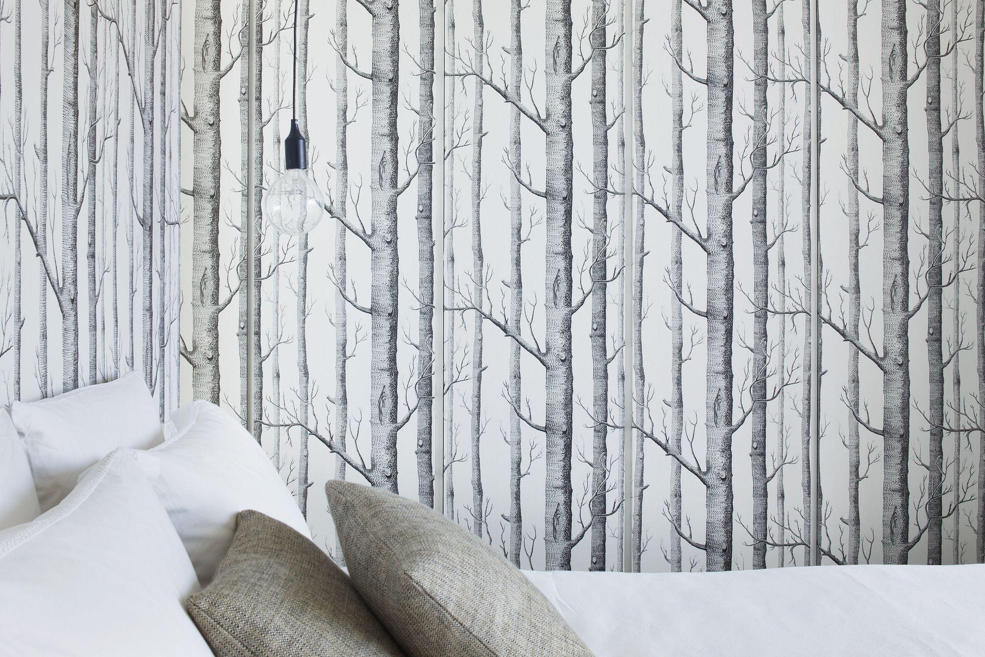
Manufacturers: Cole and Son
Year: 2010
Type: Residential
Photographs: Shannon McGrath
