That China is the home to some of the newest and most progressive projects in contemporary architecture is no secret. But this word, ‘new’, makes me think of the time that a homeless man walking past me on the sidewalk turned, and pointing to a car parked on the curb, asked me, ‘Is this is? We invent the car at the turn of the twentieth century, and all we’ve really done is make it prettier… change the paint?’ I muttered that he was right and I hadn’t really seen it that way before. And I walked away marveling at the poignancy of what this town crazy had said. After that point, the word new has always been tempered in my mind by the question of what we’ve really done. Is it prettier, or is there something new? Something prettier can certainly be ‘new’ in its own right, but what is it like underneath? Is it chrome atop rusting iron, or is it adamantium?
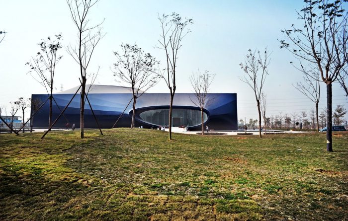
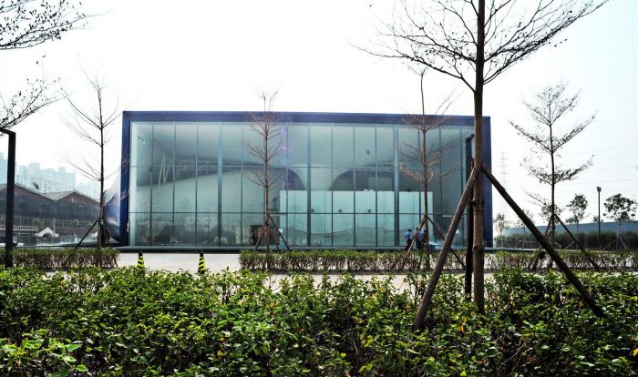
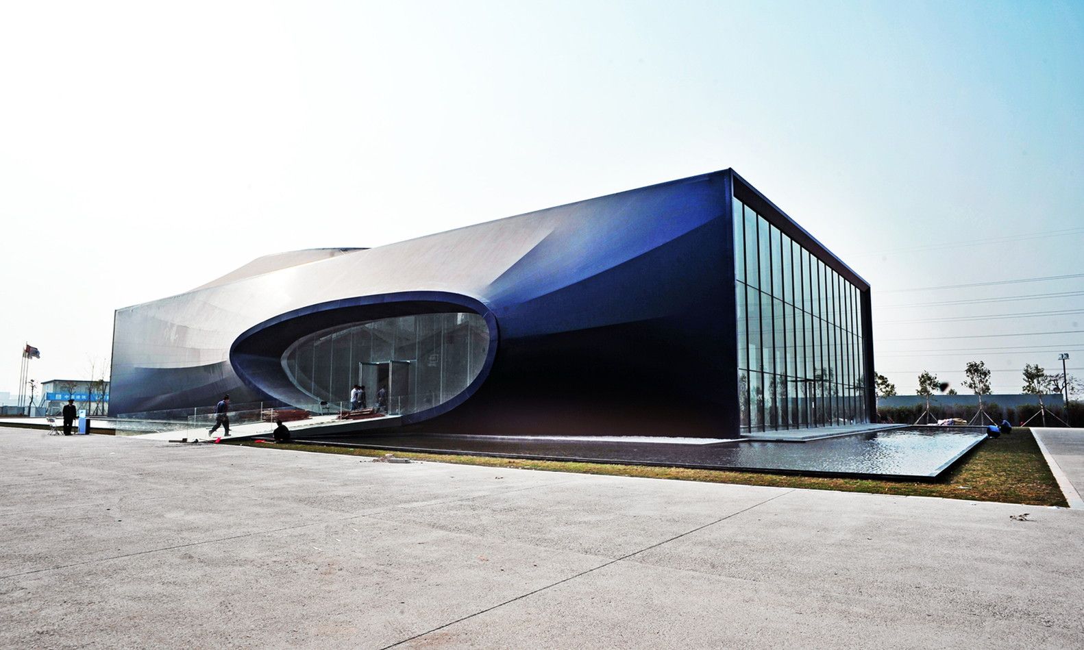
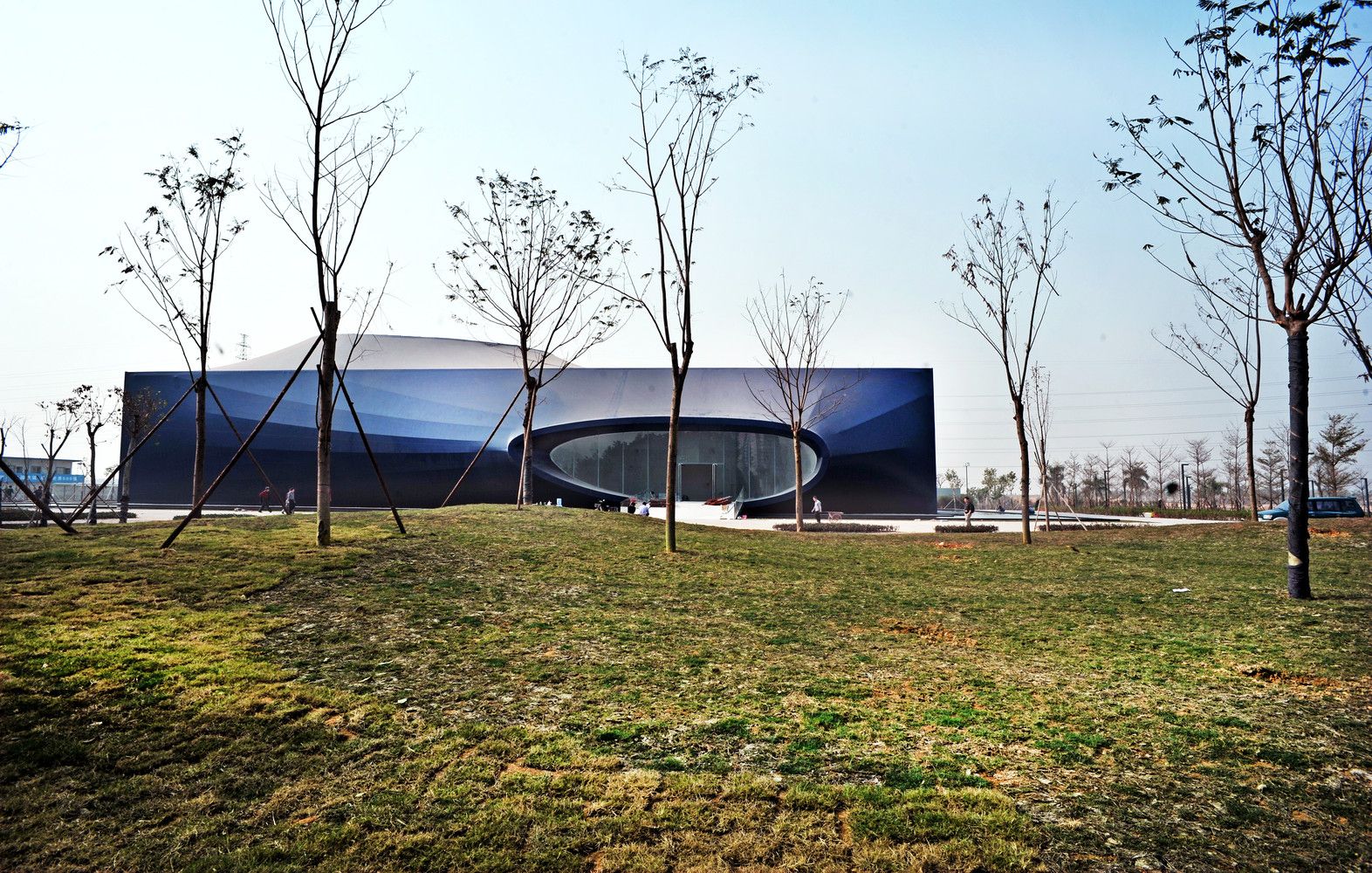
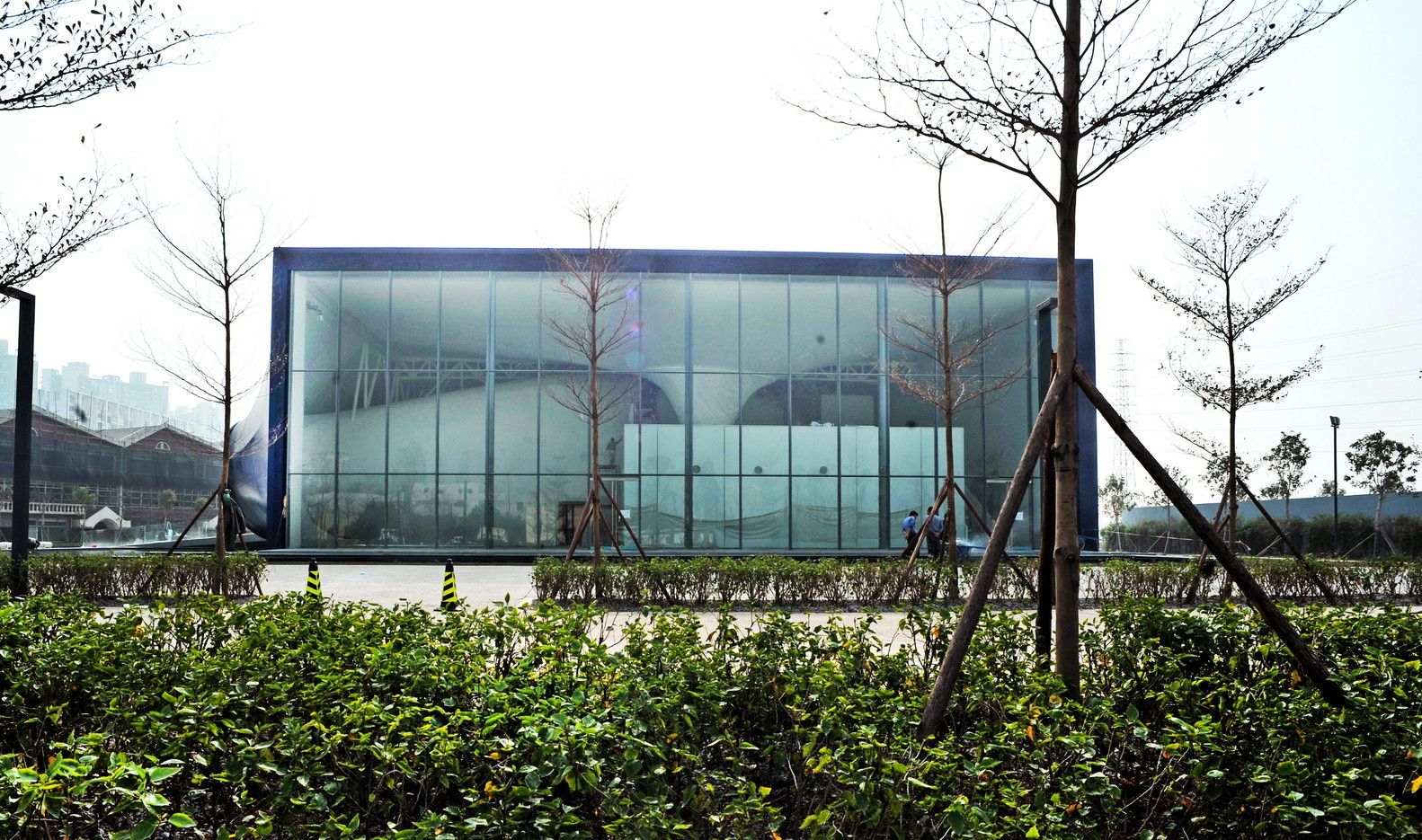
In Shenzhen, a building which I feel fits into the latter category of ‘new’ is in the progress of construction. The Shenzhen Qianhai Exhibition Center designed by Urbanus is not your typical building. Using a tensile membrane material, curvilinear and rectilinear share a common space. The architects state that ‘[The] Qianhai Exhibition Center expresses the idea of the new area’s aggressive breakthrough and structural reform in an abstract way.’ The concept of a city, whose form or current existence wasn’t even imaginable 30 years ago, is not one which can be copy & pasted from an existing template. It is necessarily newly sourced.
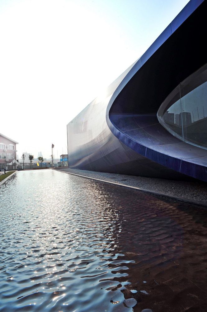
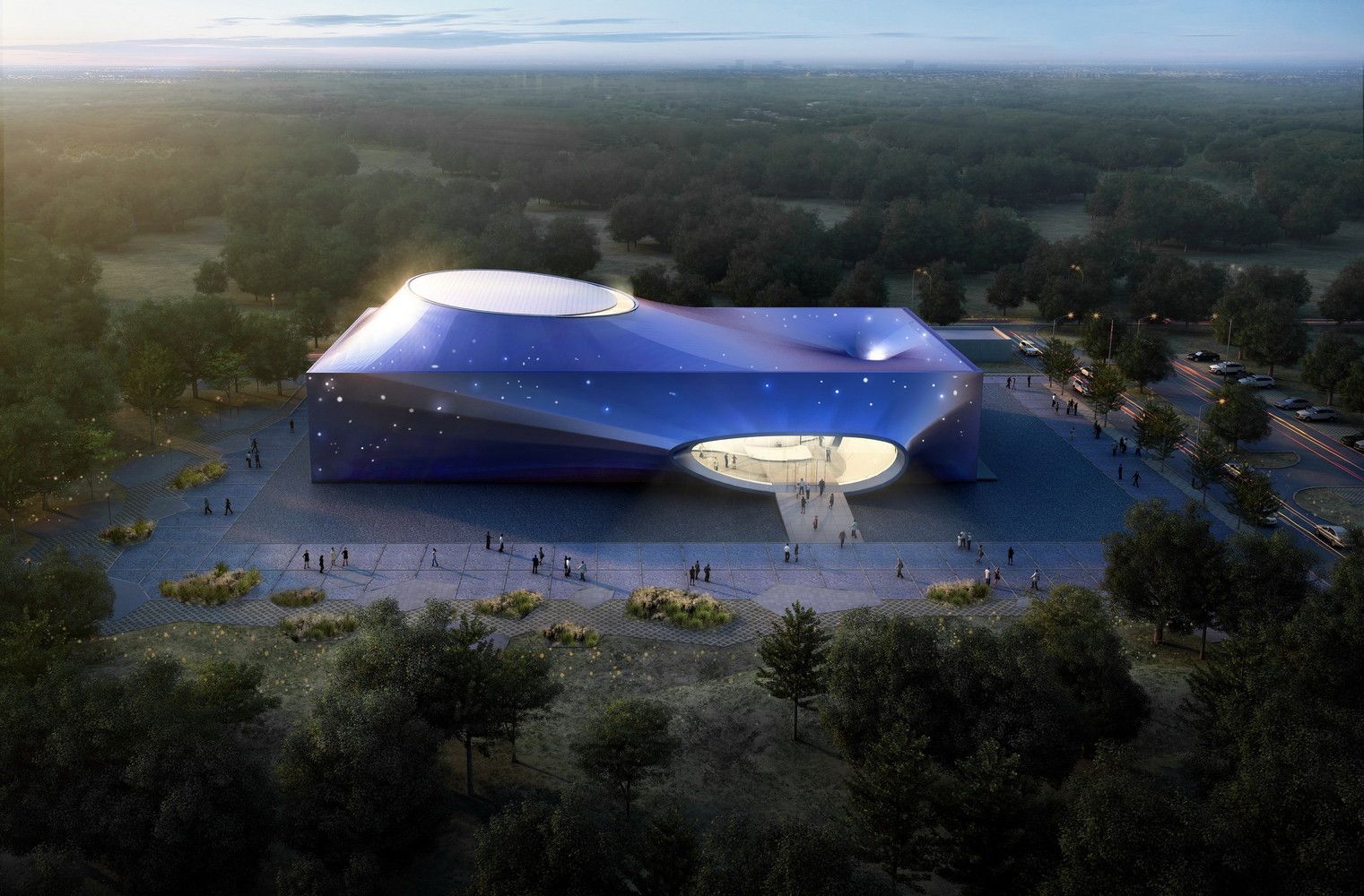
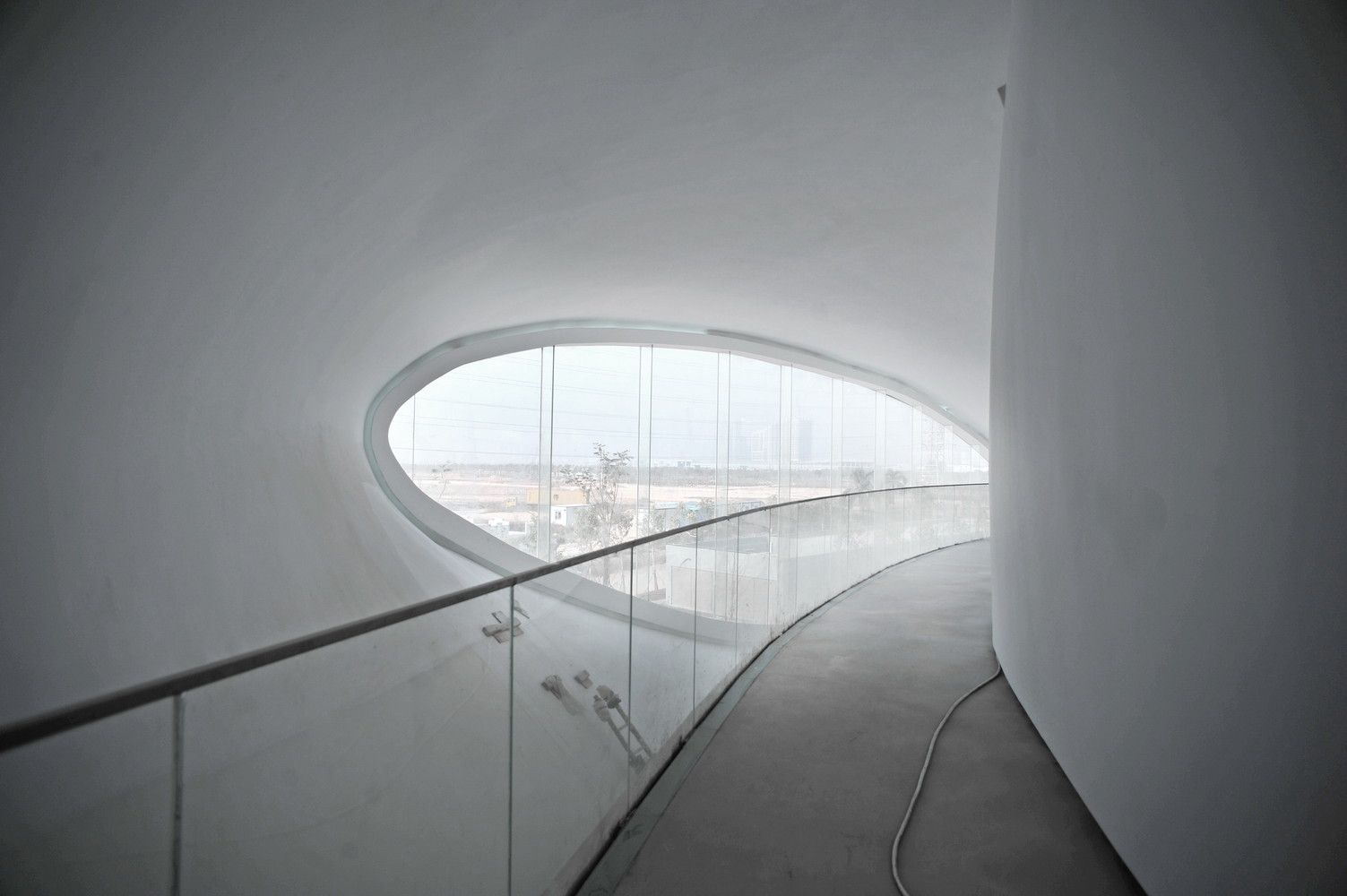
The building jumps a hurdle common to most attempts at innovative architecture. It is composed of an innovative material and approach to enclosure and fenestration, but it packs all of this into a form which is pleasing to look upon, but not overly flashy or bold. The form, a rectangular plot located at the juncture between two roads separating the new from the existing/old, is clad in a mature, serious gray with hints of blue. The cladding stretches across the form between massive wall-born oculi and an even more massive oculus which extends out of the roof.
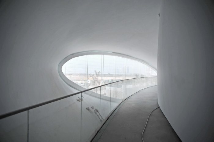
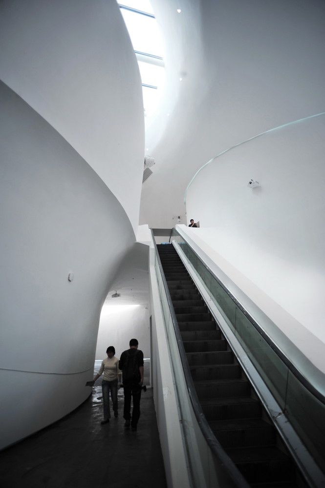
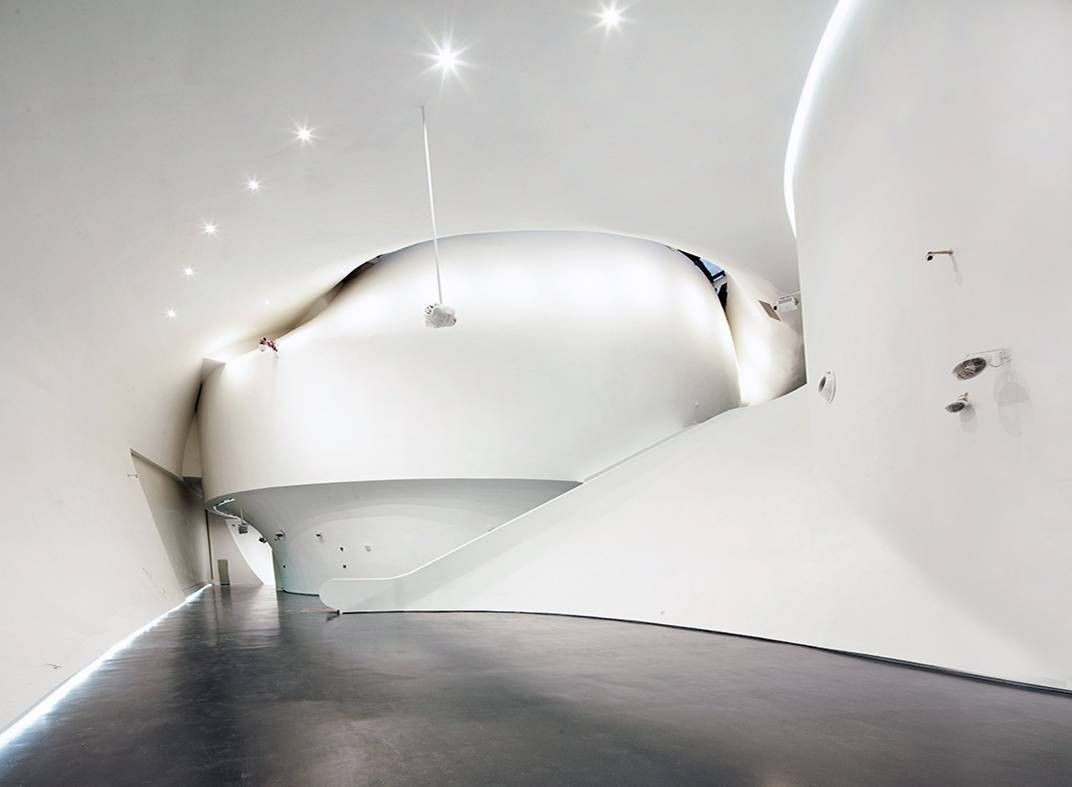
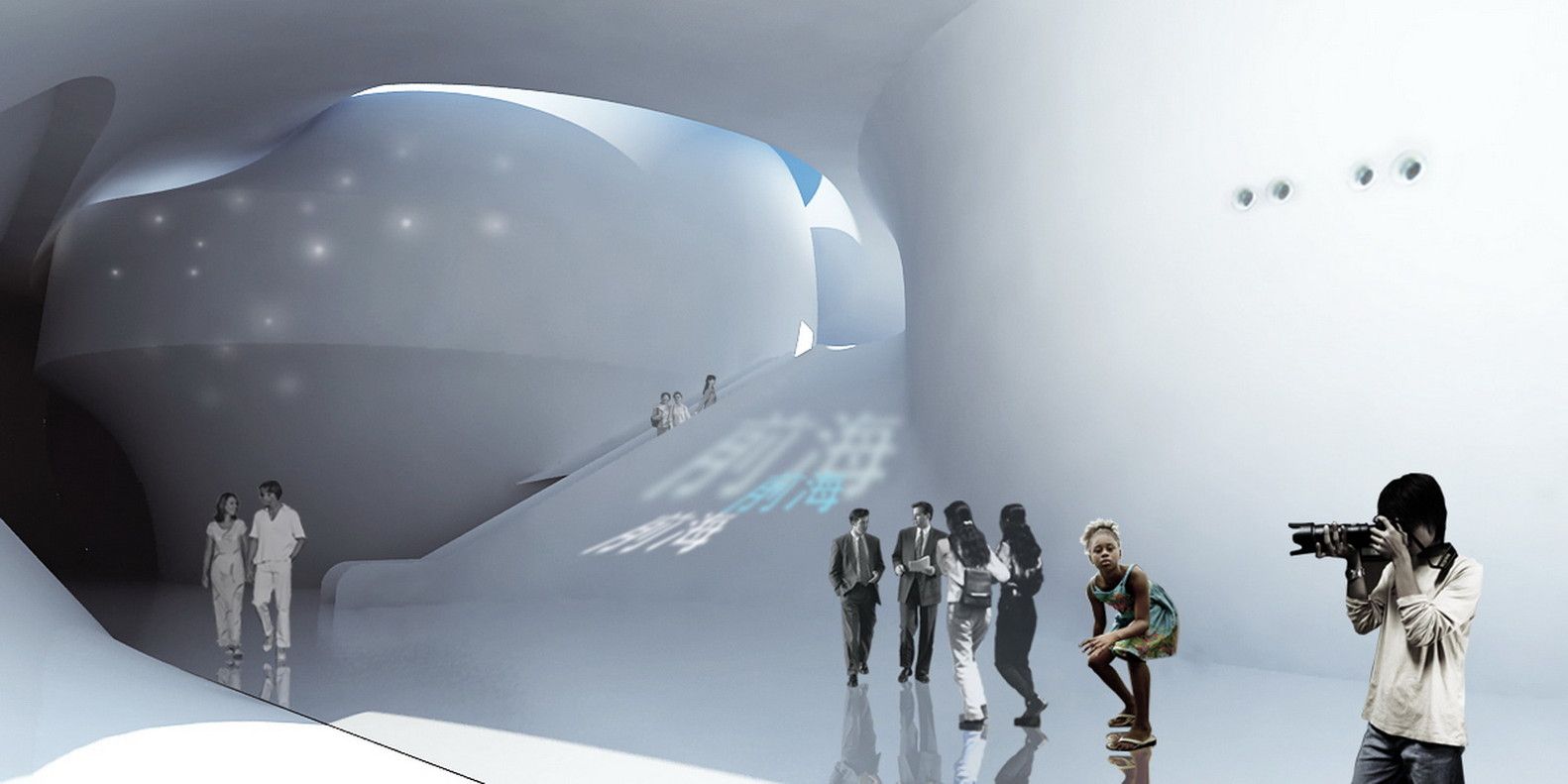
This extending form sits opposing a corresponding dip creating a balance to the roof plan. It is a gravity well-like dip- very steep, singularity-esque. This gravitational presence extends down into the interior space and creates an overarching sense of unity between building parts and systems.
By Matt Davis
Courtesy of Urbanus
Courtesy of Urbanus
Courtesy of Urbanus
Courtesy of Urbanus
Courtesy of Urbanus
Courtesy of Urbanus
Courtesy of Urbanus
Courtesy of Urbanus
Courtesy of Urbanus


