Shibori Office’s Concept:
This is a site office of a real estate development where visitors can familiarise themselves with the salient features of the premium Apartment scheme.
Therefore, it became more than just a workspace — it also carried the responsibility of demonstrating some of the core concepts of the upcoming scheme — which were attention to context, an out-of-the-box articulation, and the harnessing of natural resources integrating the core philosophy of biophilia.
The site stands at a corner junction and will eventually enjoy the widest road in the city. It is surrounded by prime educational institutes and hi-tech office buildings. Light is everywhere. Its dynamism and incredible ability to transform any space throughout the day through the drama it creates in conjunction with architectural features are unmatched.
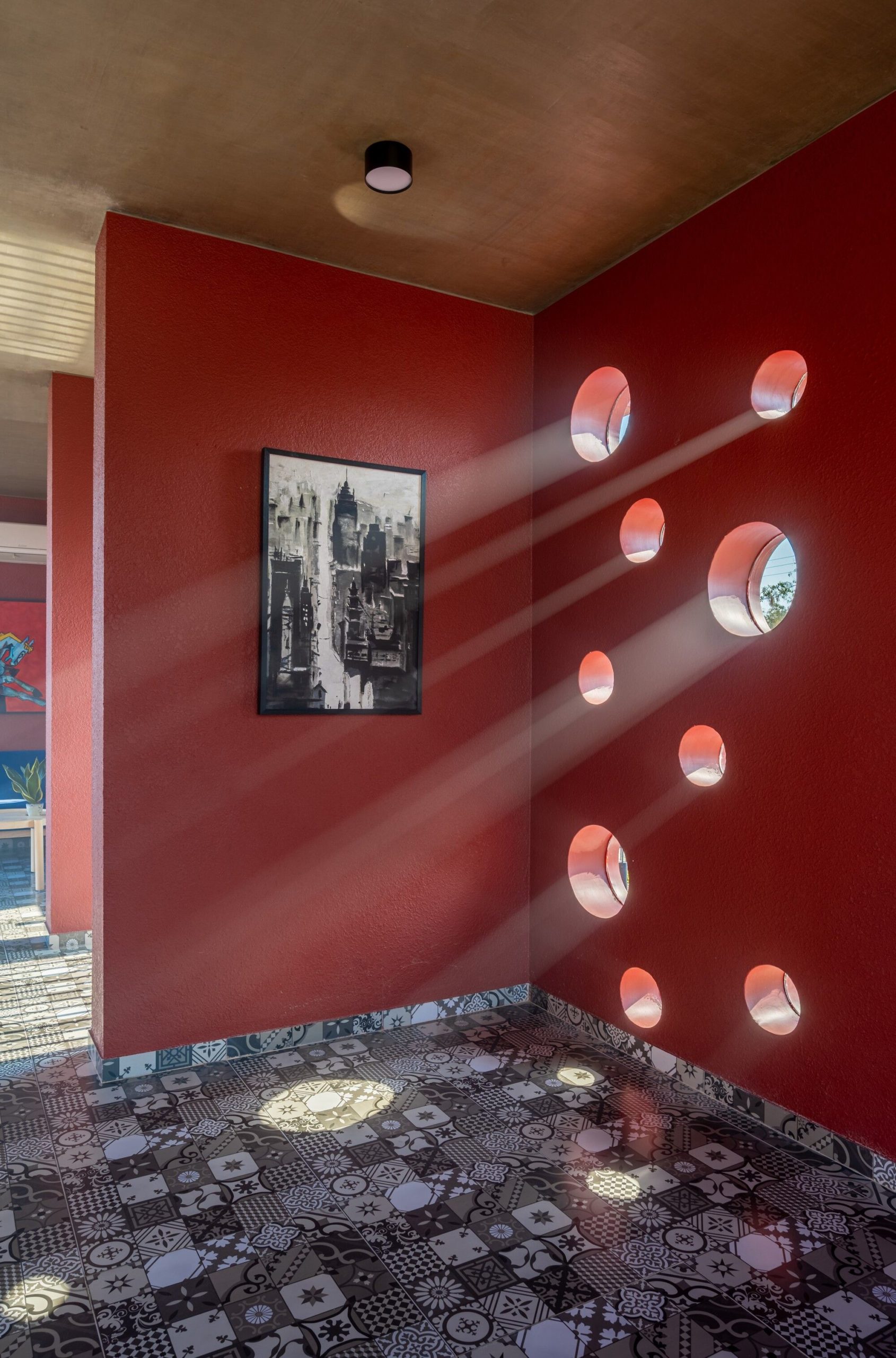
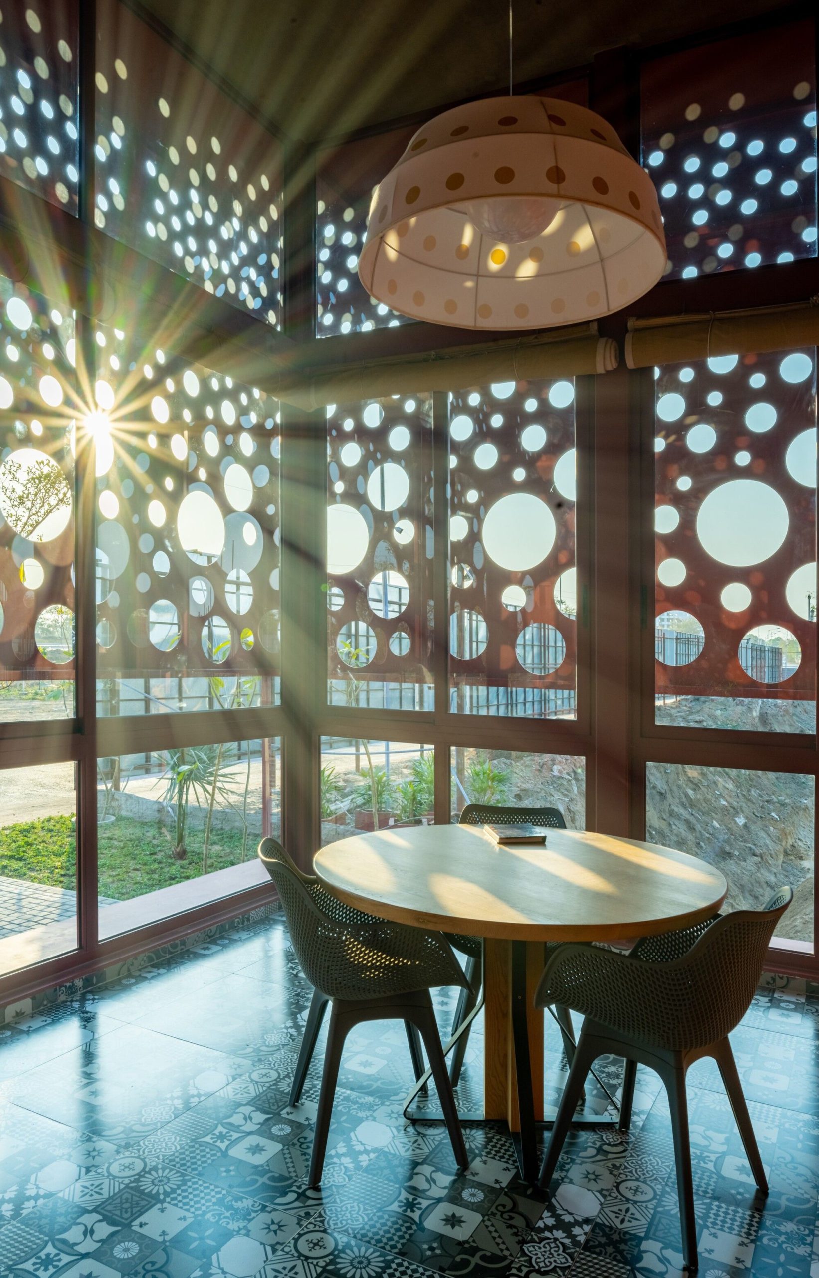
In this particular case, the epiphany was the rays of light flowing in through the holes in a tin roof of a structure at the site. The dotted effect of the sunlight had a powerful effect on that space, and we set out to harness a little bit of that power.
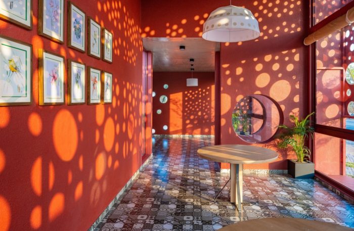
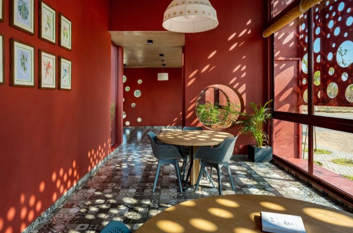
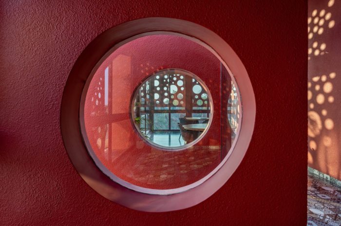
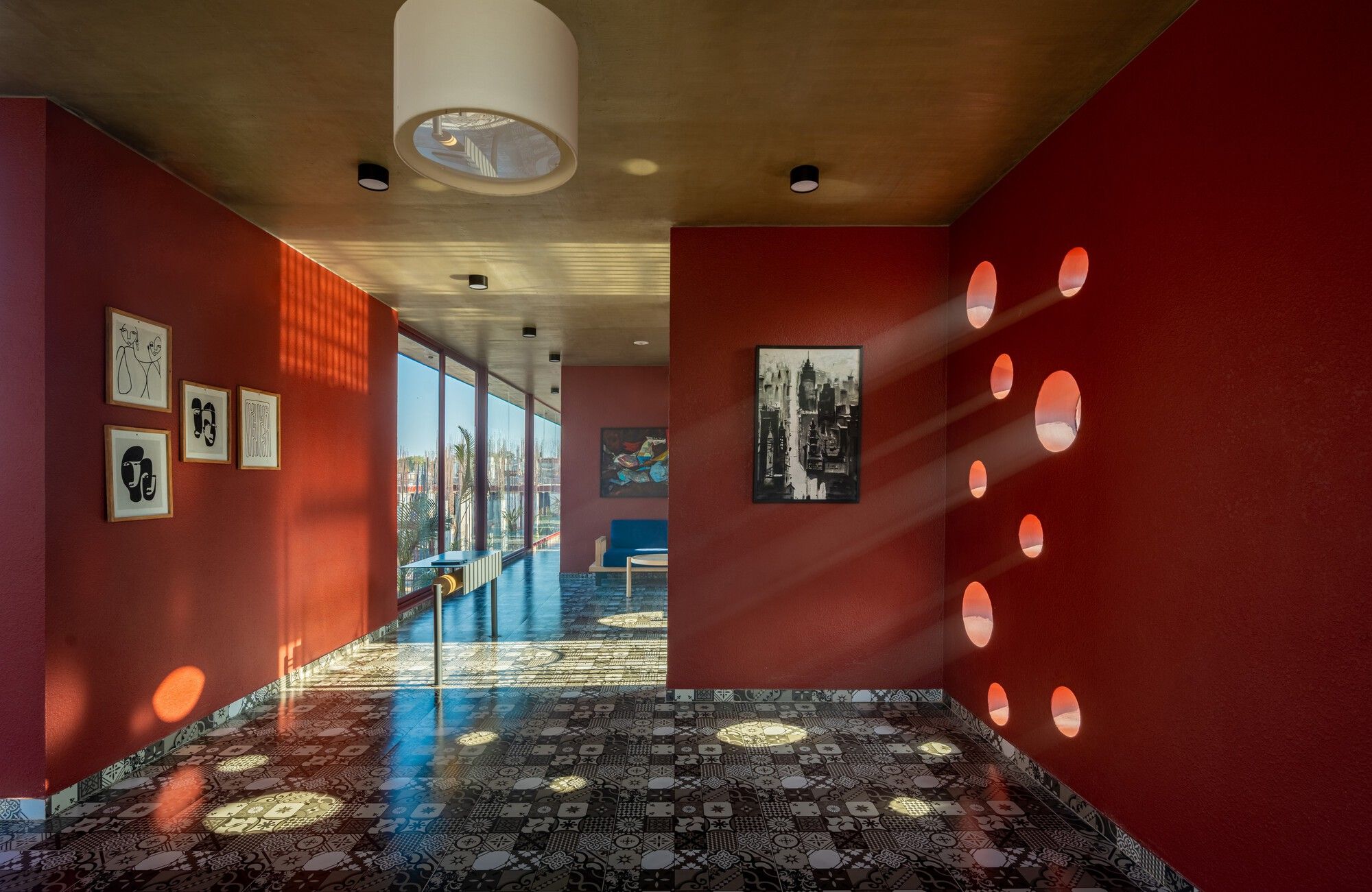
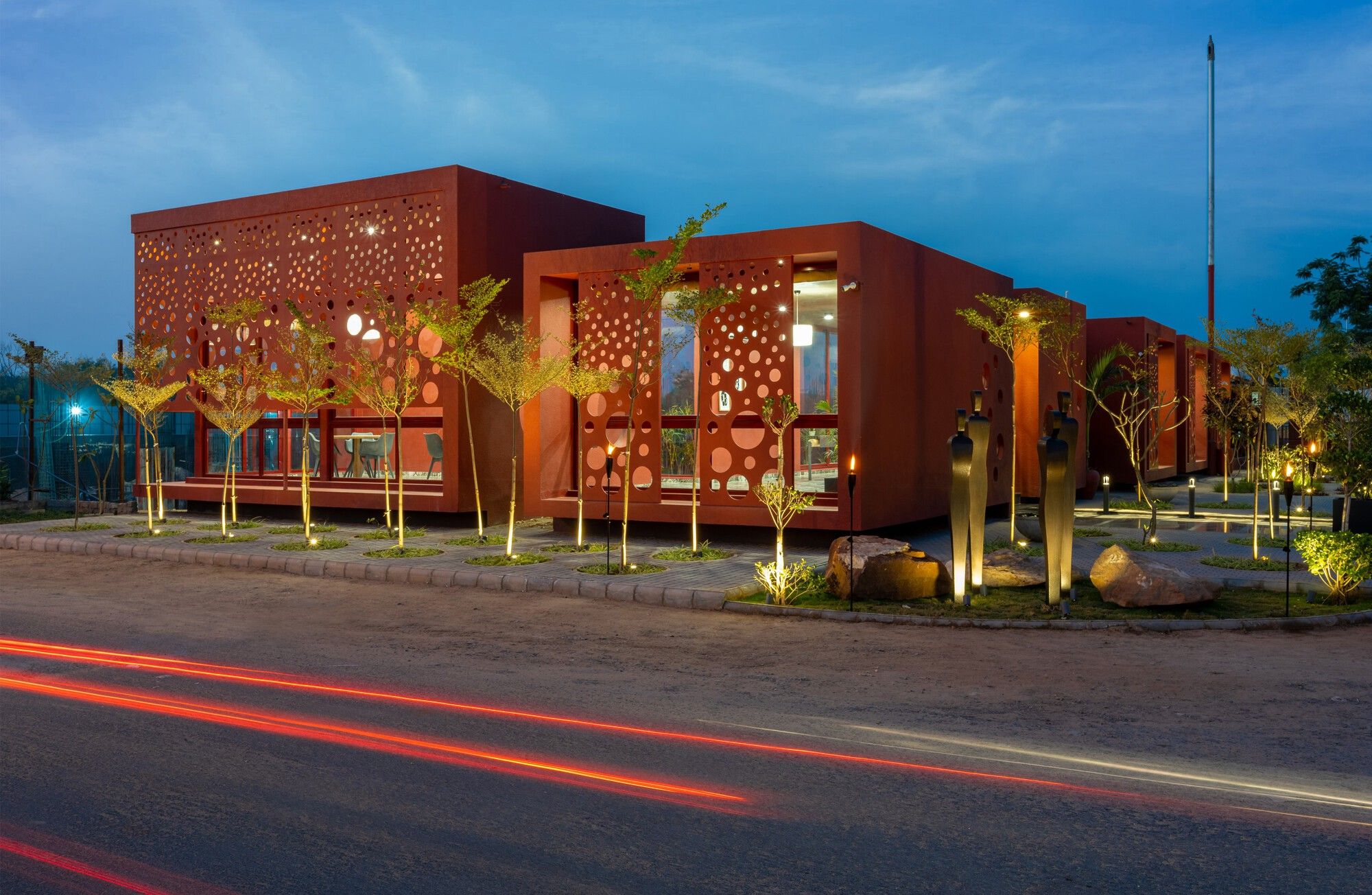
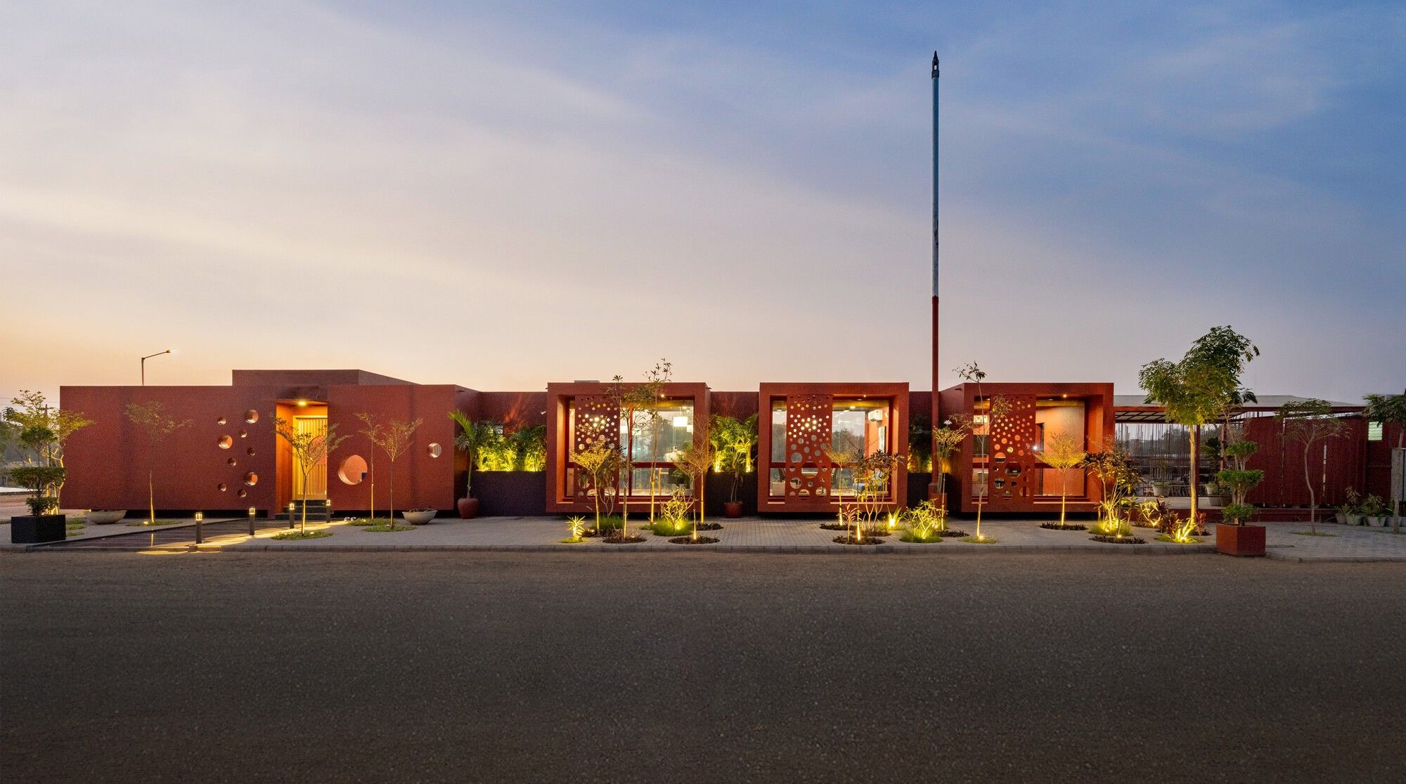
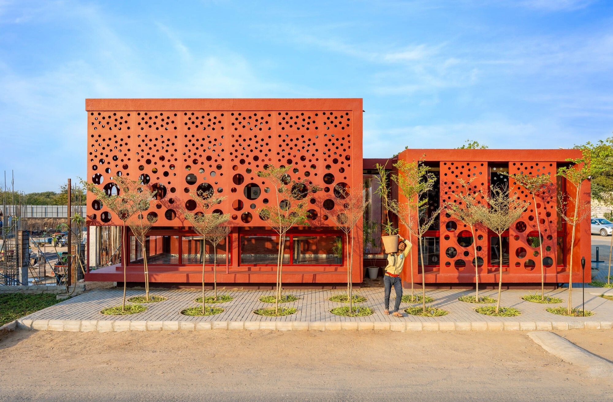
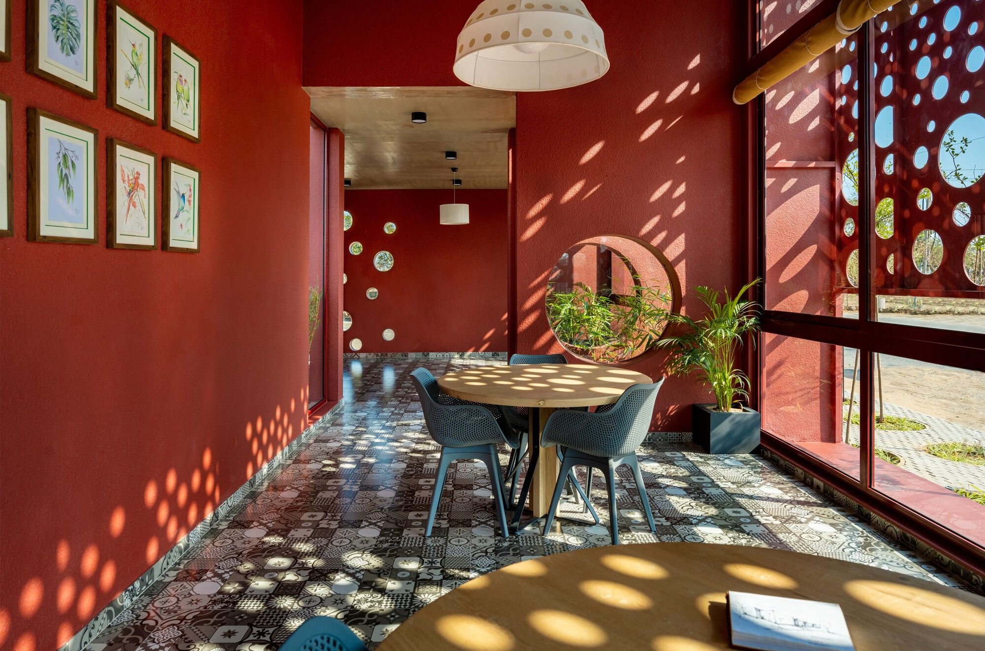
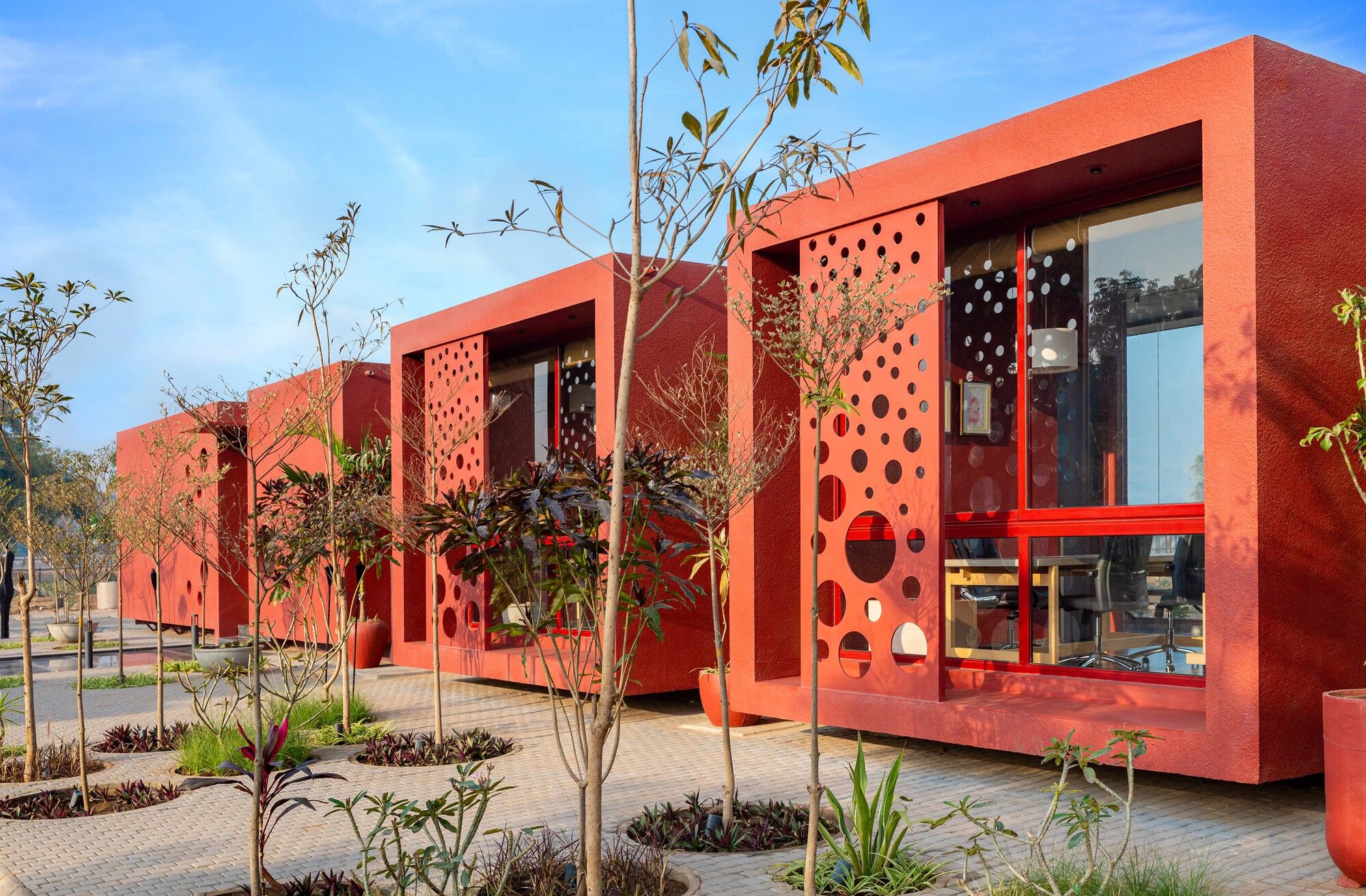
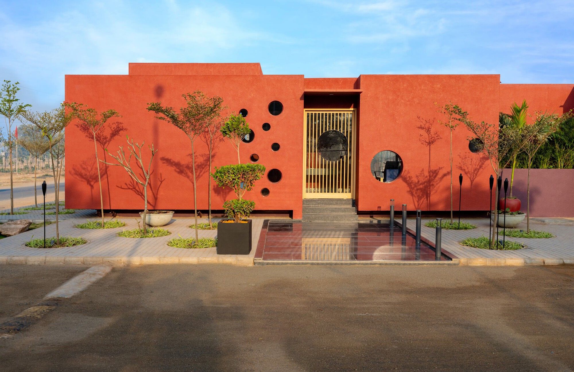
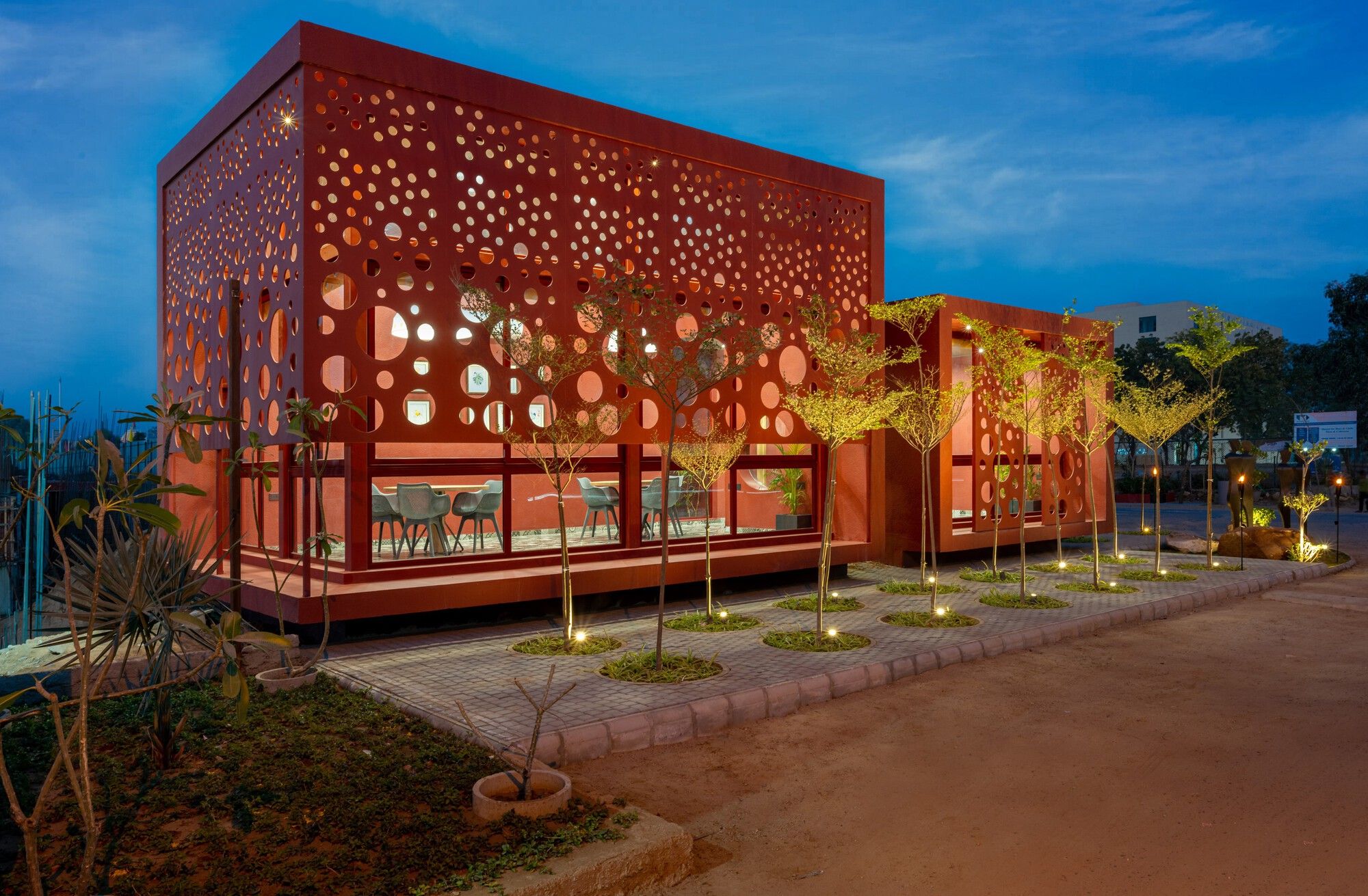
The result was a perforated built fabric that was permeable to sunlight. The dots turned our minds to Shibori, the Japanese resist dyeing technique characterized by circles and circular forms. Spatially, the circles/cut-outs are actually a perforated entrance/envelope which welcomes sunlight and creates patterns that enact a powerful drama through the day.
The gradation of punctures is strategic: the larger cut-outs are at the bottom and the smaller ones are at the upper part to allow the sunlight to come in a controlled, comfortable manner. In tandem with sunlight, materials, textures, and color play their part, too, in the narrative.
Also Read: 8 Types of Perforated Skin Elevations & 8 Impressive Examples
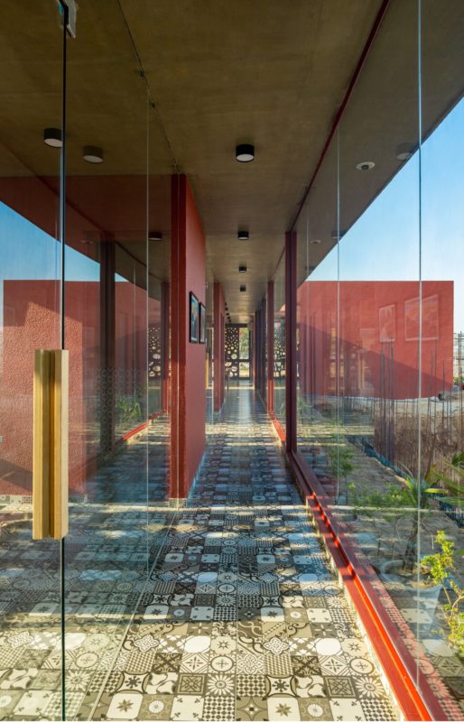
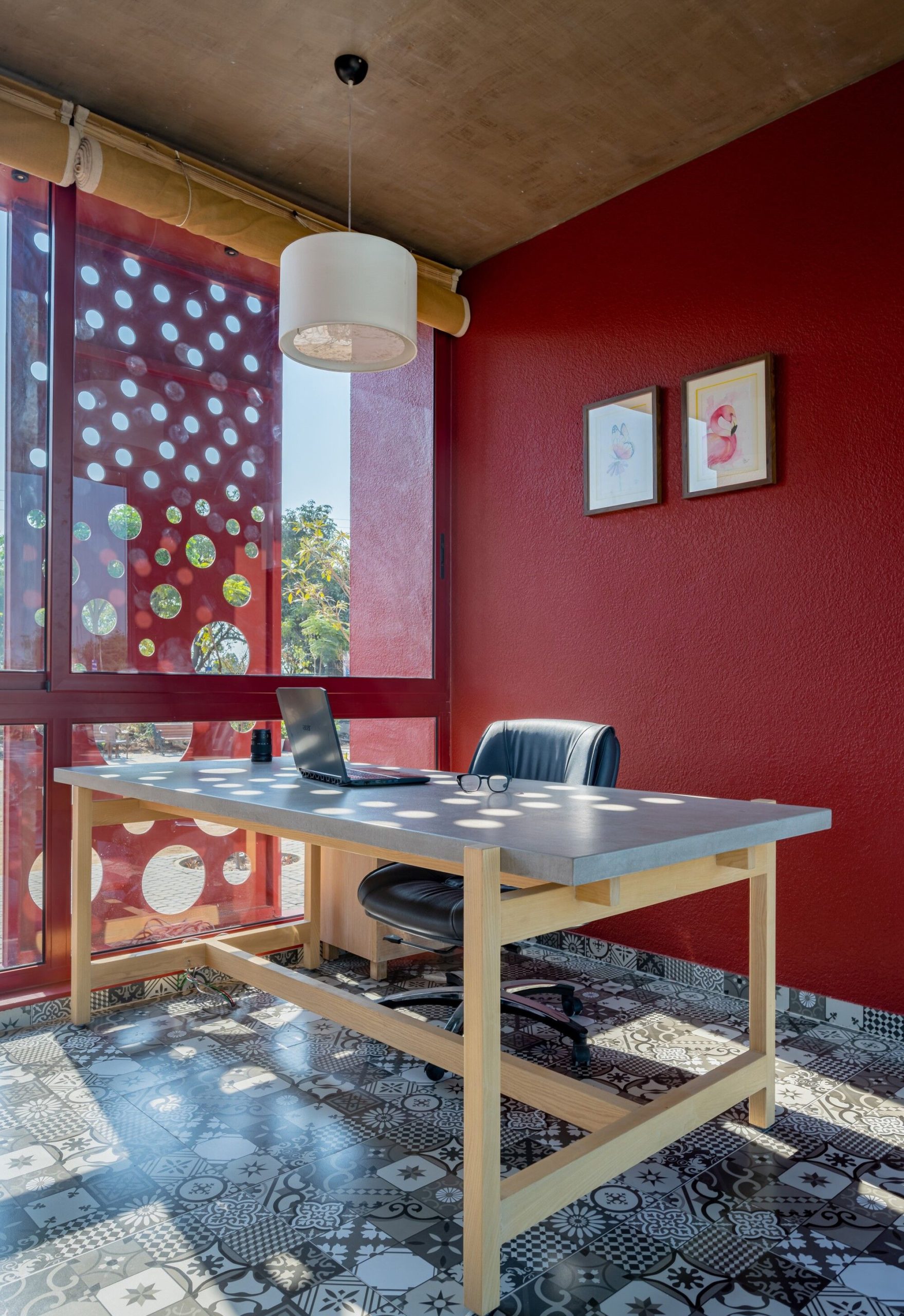
The concrete architectural envelope is painted a bright terracotta red, which, under the sun’s effulgence, becomes even more riveting and eye-catching. The simple, mature, and functional interiors are articulated in MS, wood, and ceramic patterned tiles. These, too, are uplifted by the spectacular sciagraphy that unfolds through the day in the most effective way.
We decided to move away from the usual stereotype of a ‘site office’ to something that was timeless and created a landmark. This was manifested as architecture that invited the sun to create a spatial experience underpinned by a play of light and shadow. The structure transformed a site office into a dynamic asset for the company and a landmark for the city.
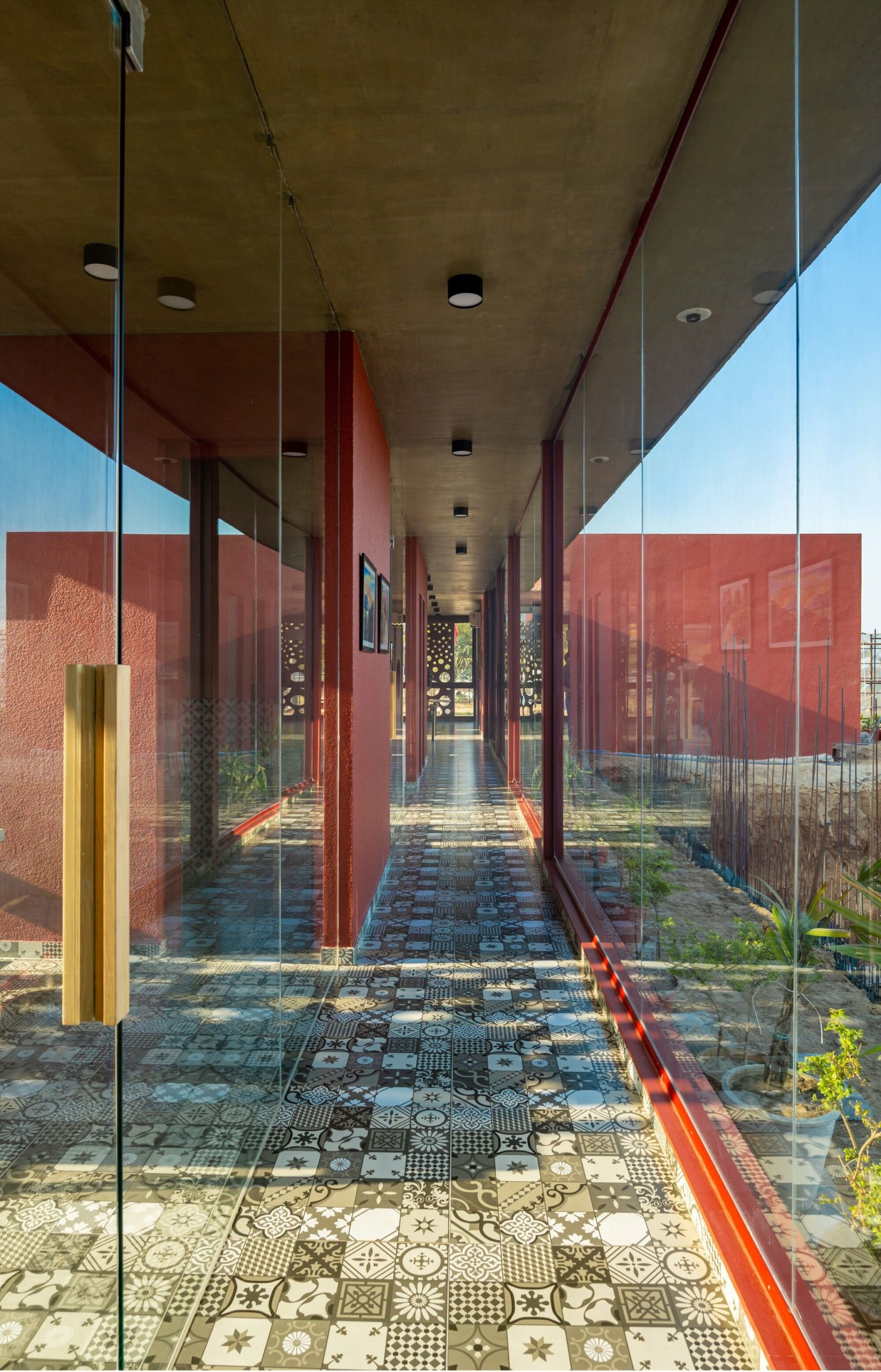
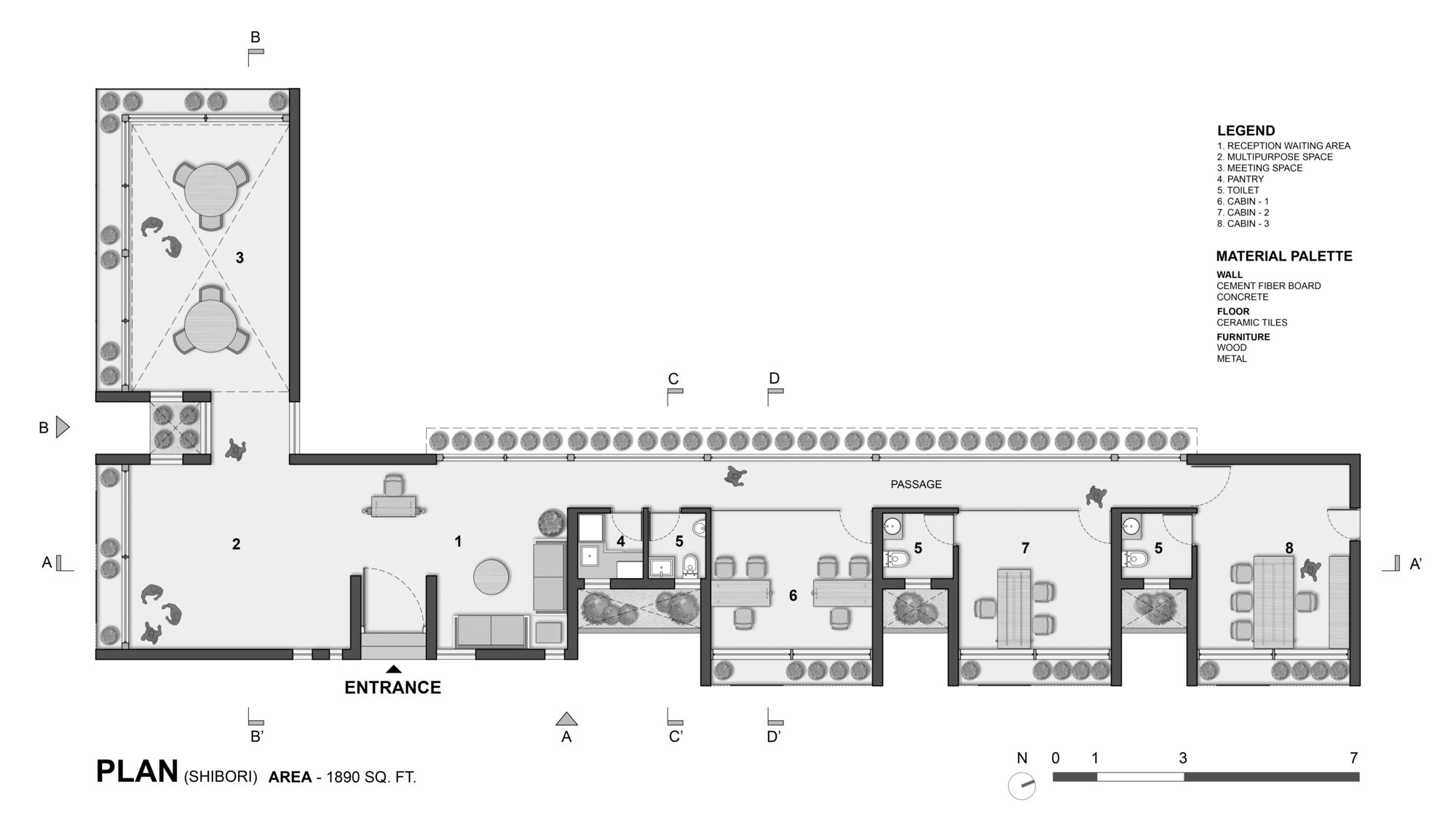
Space is the form of a simple L, with a multipurpose room at the junction of the two arms. One part is dedicated to the reception/waiting area and a series of cabins, orchestrated linearly, while the other comprises the meeting room. Pockets of courtyards play a dual role to unify spaces as well as acting as an intervening buffer.
These also positively impact indoor air quality and consequently, the health of users. The plinth of the L-shaped office is elevated by 1.5 feet to create a floating effect. The facade that faces the road has full gazing screened by brise soleils with circular cut-outs to protect from the harsh southwest sunlight. This tempered natural light makes the spaces look less confined and brings about vitality, energy, and productivity.
The inside façade of the L shape is fully glazed so that all the office remains connected in view and spirit to the ongoing construction and derives some of its energy from the movement of the workers. A continuous fully glazed window lets light in and offers an unobstructed view and a protected connection to the outdoors.
The dramatic effect of the cut-outs as shadows is captured throughout the day, with each moment bringing a different feel — from the soft morning light to the evening sunset — transforming the space from one hour to the next. The story that unfolds is a saga of love between sunlight and the perforated screen, and the vibration it creates in the space.
Light as empowerment of space. Light is an animating force. Light as a medium of well-being. Light as a design tool. We explored all these aspects and created a space that stood at the intersection of these ideas. The architectural envelope was not designed for itself, but as a meaningful screen that would allow us to articulate this core concept. More so, it also became an element that played a pragmatic role in interior development and impacted the interiors such that the inside and the outside became one.
And one could not exist without the other. This project highlights several aspects of our philosophy. The respect for natural resources, a harnessing of earth energies, and most importantly, a meaningful and biophilic design that converses with the environment.
This is not a superficial façade treatment but a Meaningful Screen as an Architecture element serving as a functional element for the interior too. The purity of the structure in conversation with sunlight highlights the ethos of the design philosophy.
The orientation/ adaptation of the program, in general, was calibrated to comprise as much greenery as possible in the spatial experience and sensorial perception. The visual extension of architectural understanding of contemporary design and how it moves beyond sizes. The multi-functional and multi-disciplinary character of the structure has a deep emotional relationship between the building and humans celebrating light and shadow.
Project Info:
Architects: The Grid Architects
Location: India
Lead Architect: Snehal Suthar, Bhadri Suthar
Area: 1890 ft²
Project Year: 2021
Photographs: Panjwani Vinay
Manufacturers: Carpenters, HRS Aluglaze Pvt. Ltd, Habibi Carpenters, Local Nursery
Project Name: Shibori Office
© Panjwani Vinay
© Panjwani Vinay
© Panjwani Vinay
© Panjwani Vinay
© Panjwani Vinay
© Panjwani Vinay
© Panjwani Vinay
© Panjwani Vinay
© Panjwani Vinay
© Panjwani Vinay
© Panjwani Vinay
© Panjwani Vinay
© Panjwani Vinay
© Panjwani Vinay
details
section
section
section
elevation
floor plan
elevation


