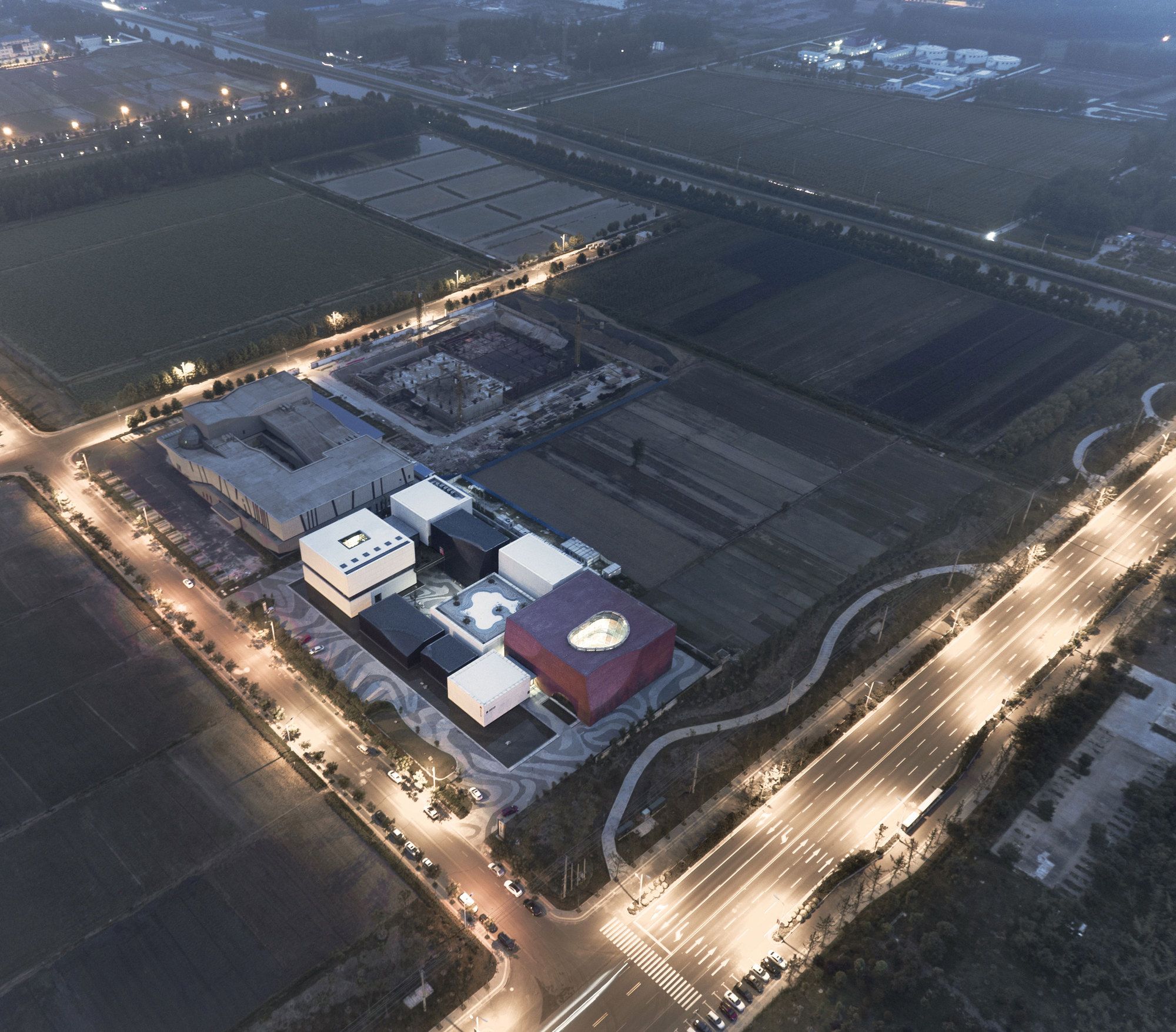
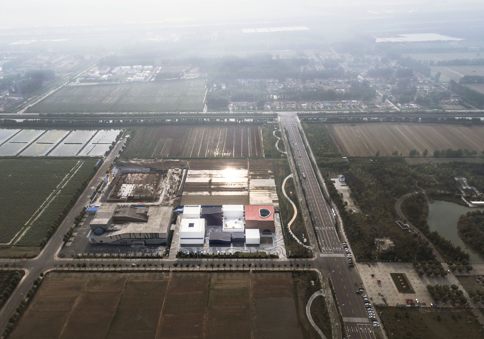
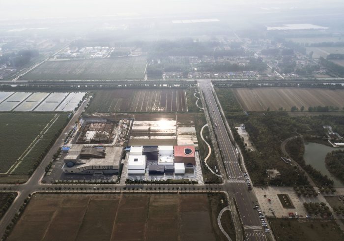
Shuyang Art Gallery designed by UAD, This project is located in the hometown of traditional calligraphy, Shuyang, Jiangsu province, and is positioned as the calligraphy art gallery to display and inherit Shuyang calligraphic style.
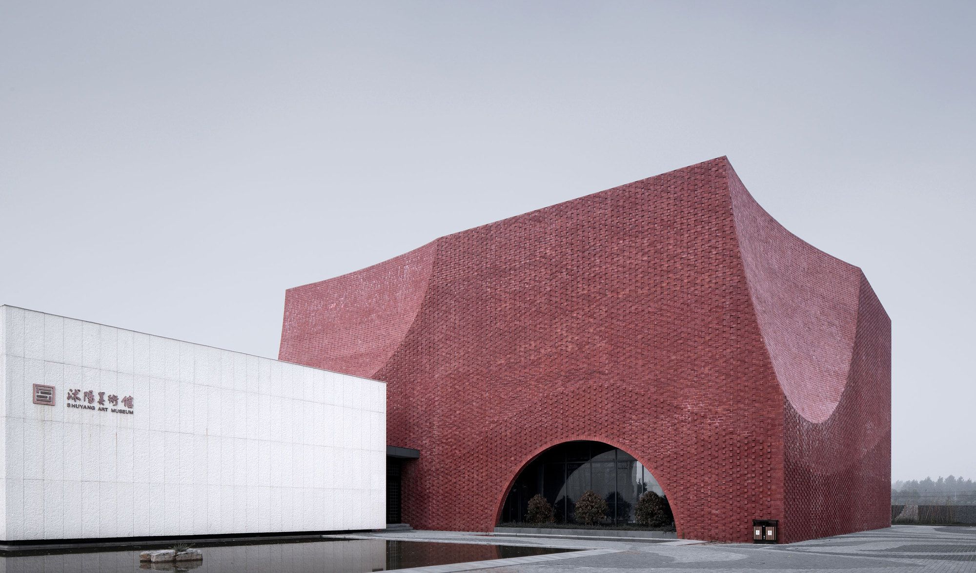
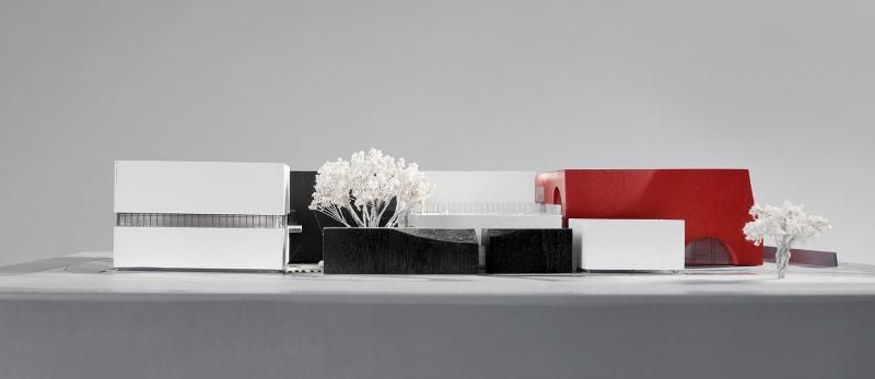
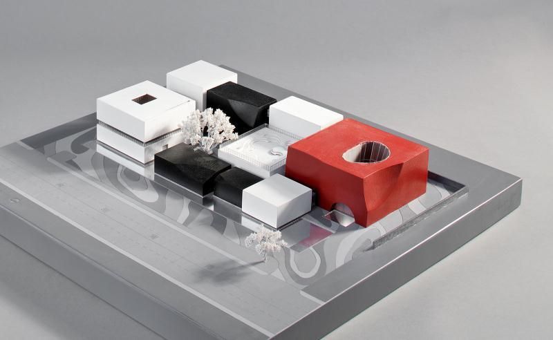
The concept of architecture abstracts the most fundamental three colors, black, white and red of Chinese calligraphy from rice-paper, brush-pen, seal and creates a pure space experience with pure colors.
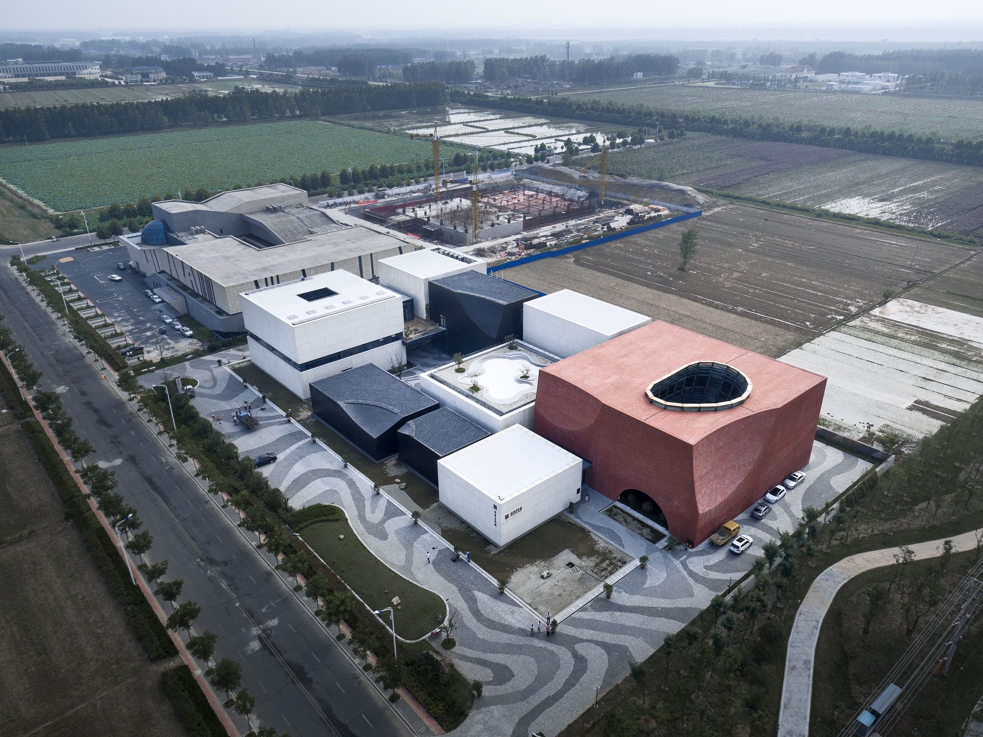
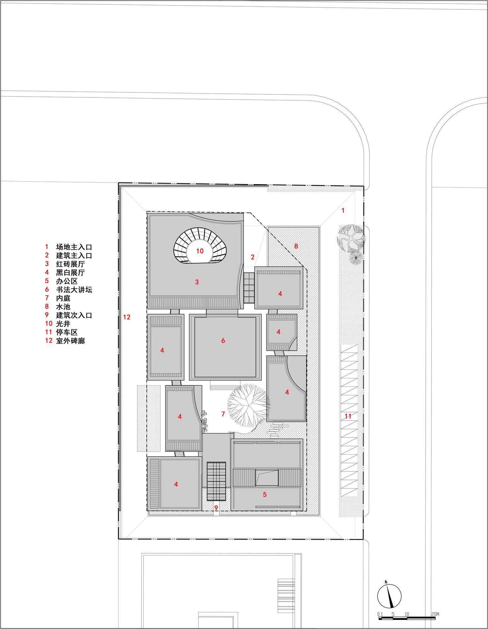
The aesthetic interest of the calligraphy in the architectural layout referring to Zheng Banqiao ’s calligraphic style is to respond to the ideological and practical work, the light and heavy, and the opening and closing of the calligraphy through controlling the size of the building, space, the contrast of the materials and so on.
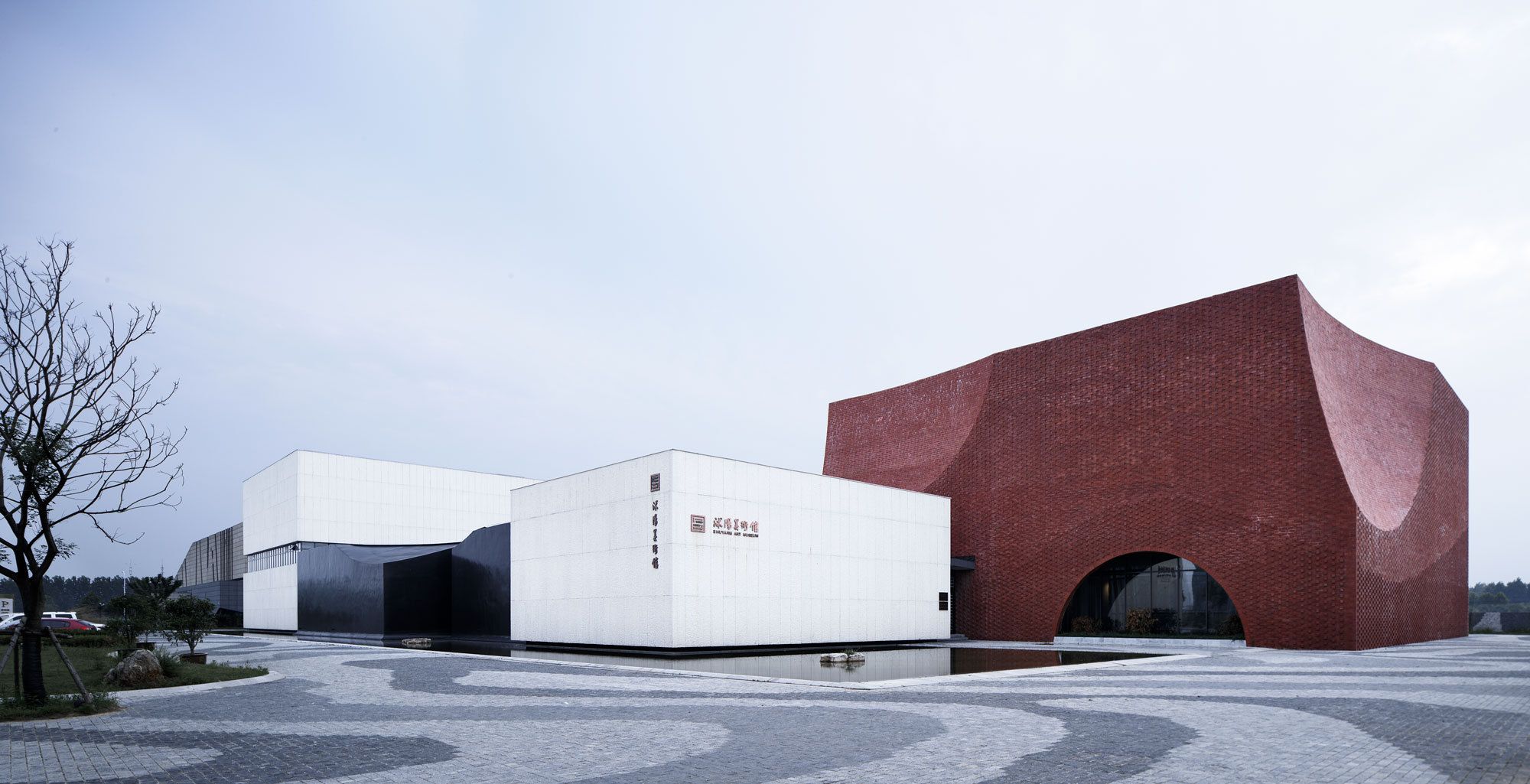
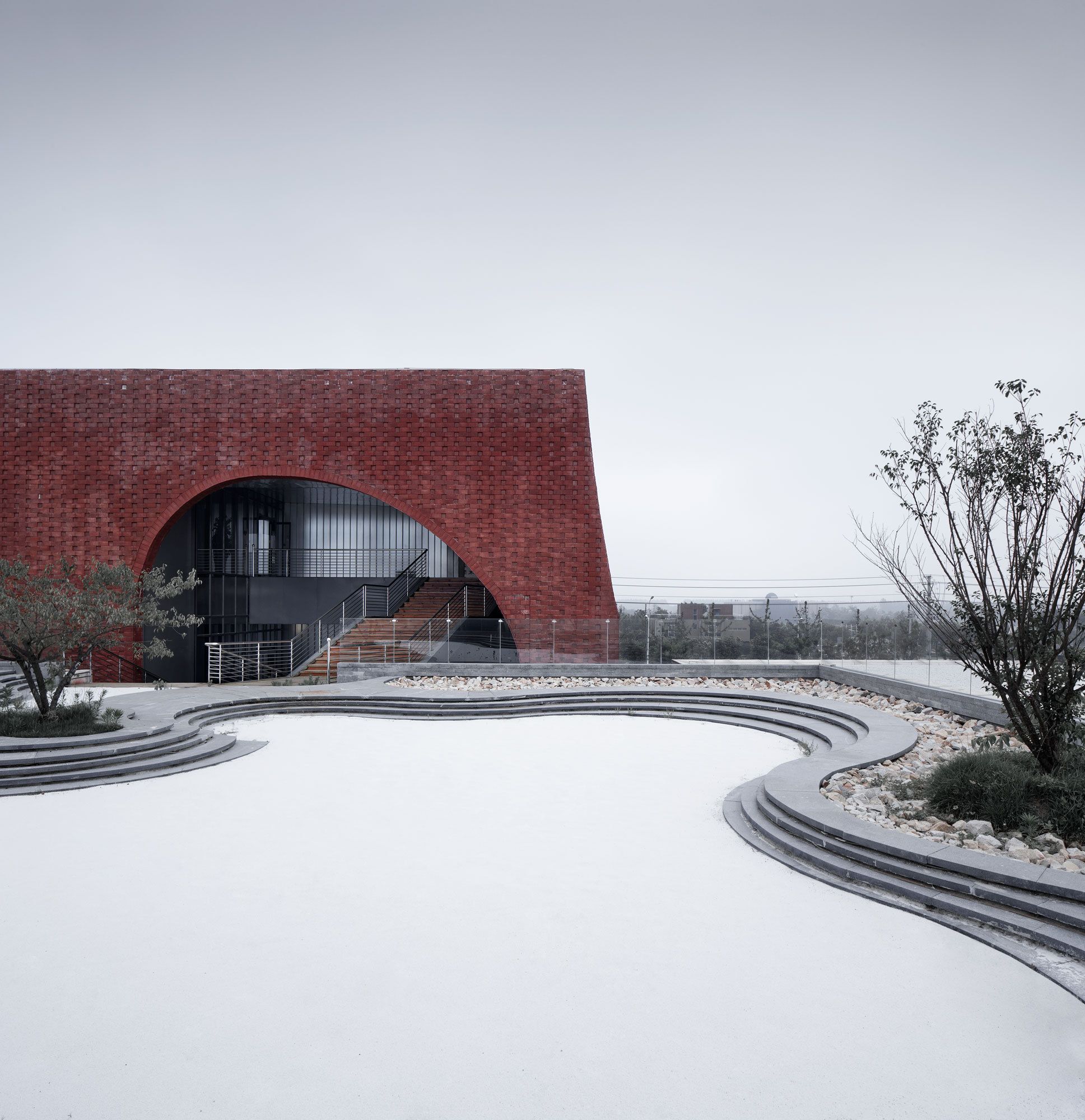
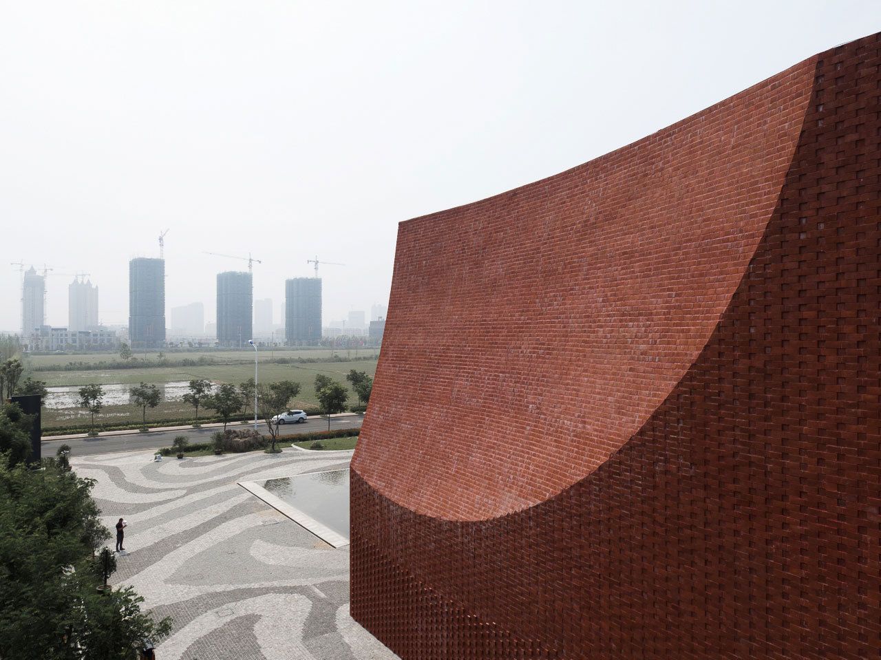
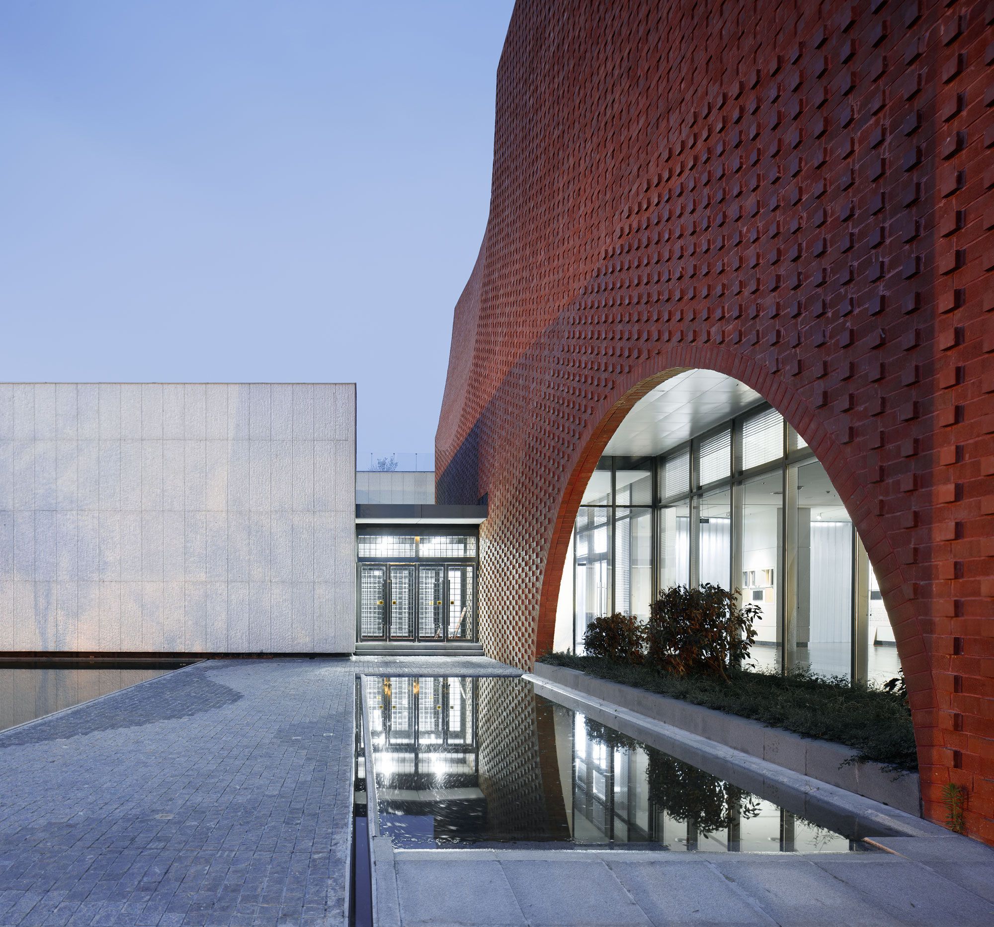
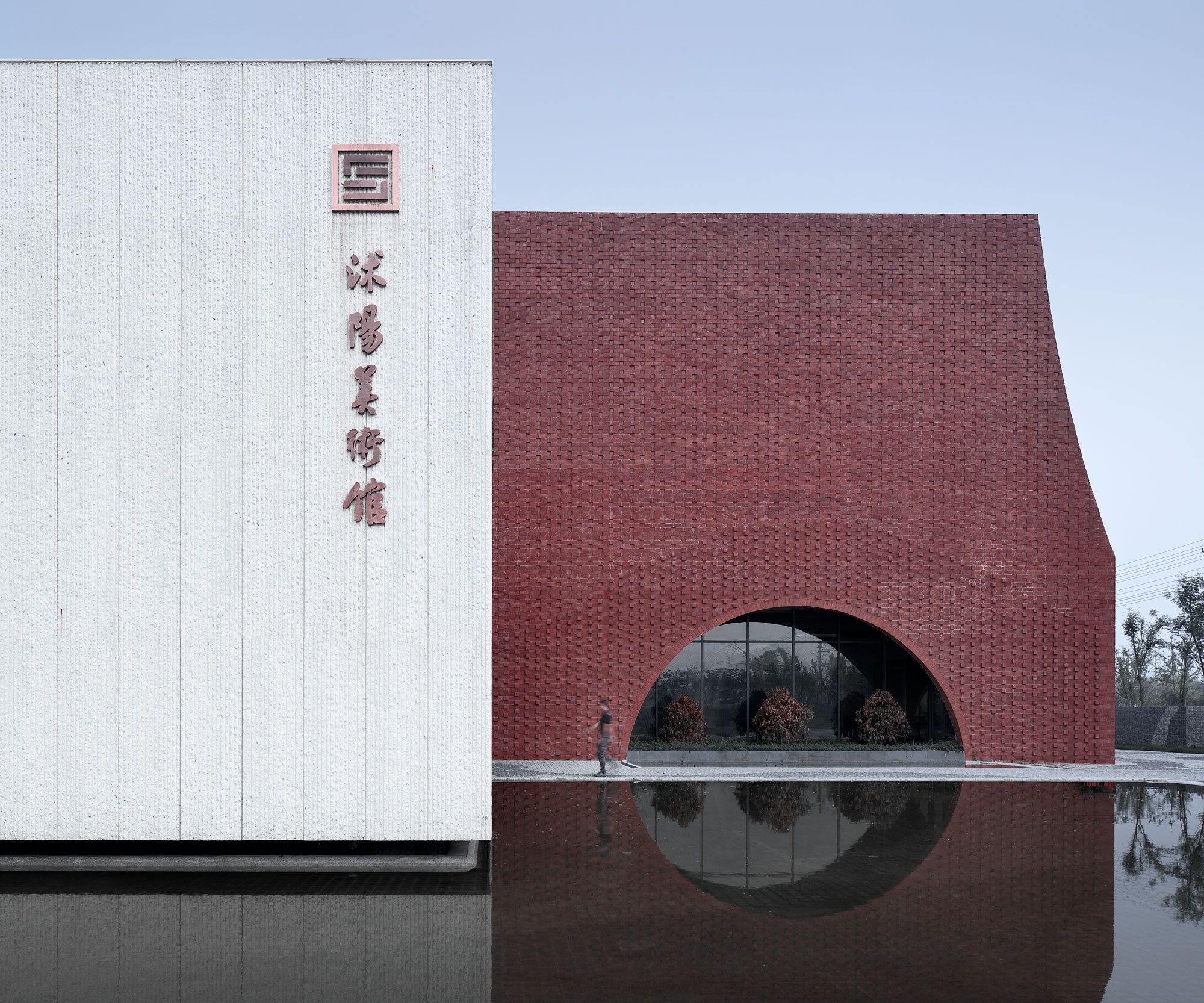
The largest exhibition hall along the street has the red-bricked exterior wall, like a condensed seal printed on the elegant scroll of ink and wash. The way of cutting the corner through the arc surface strengthens the iconic character of the building along the street, forming a unique lasting appeal. Red brick is Yixing clay brick, adopting three kinds of lining according to the different locations. The lower brick head outstands the wall, and the upper part intrudes the wall and cut part is flatly lined, forming different textures.
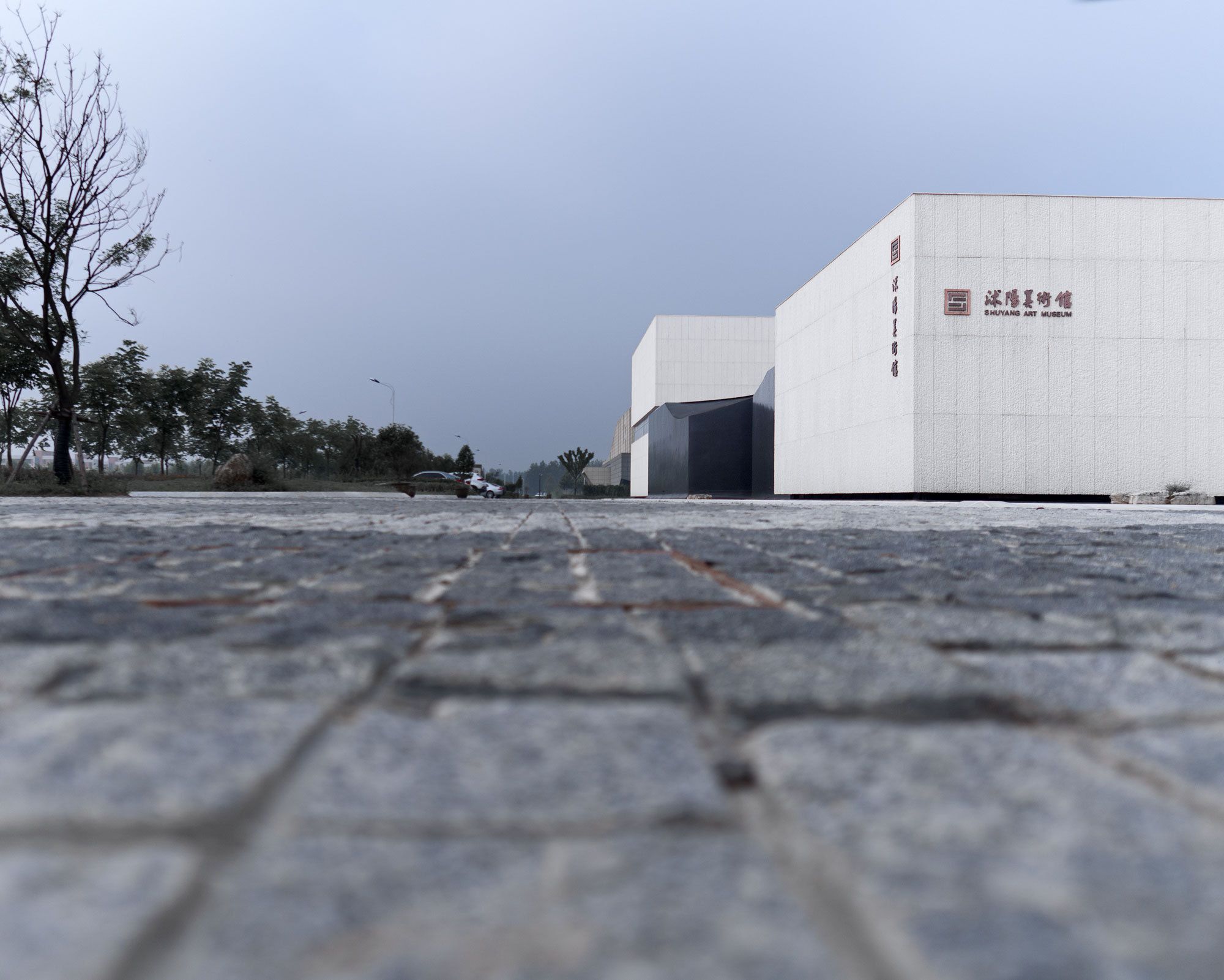
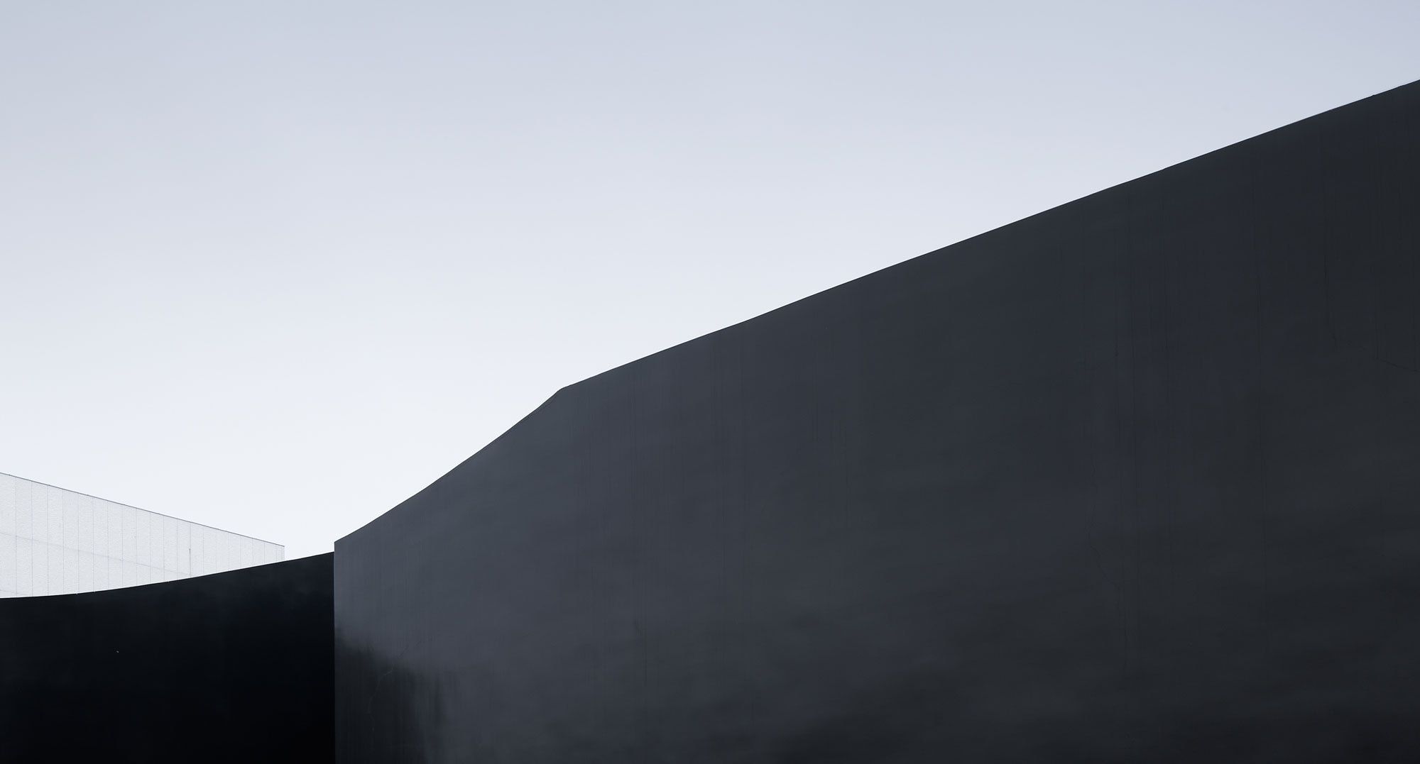
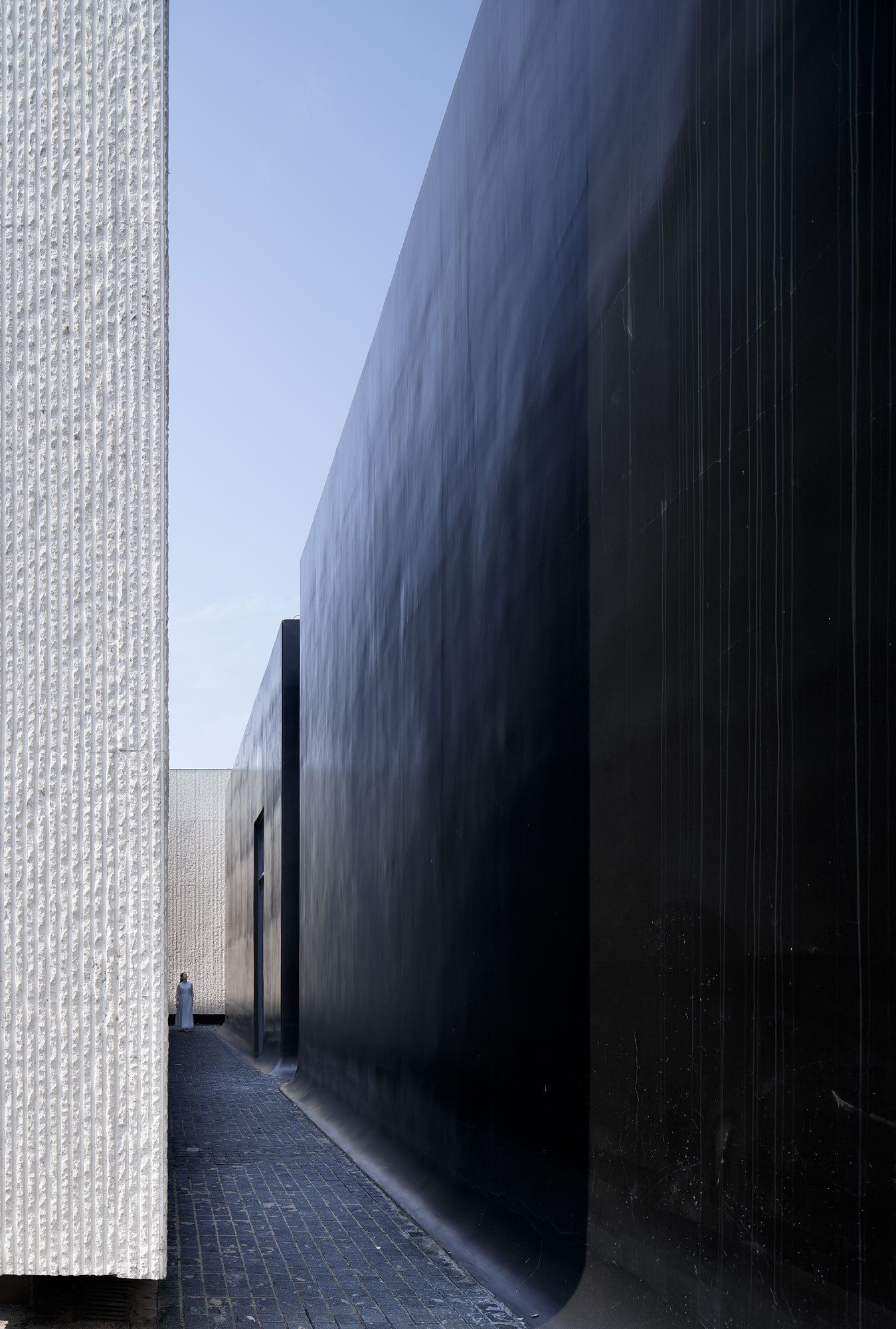
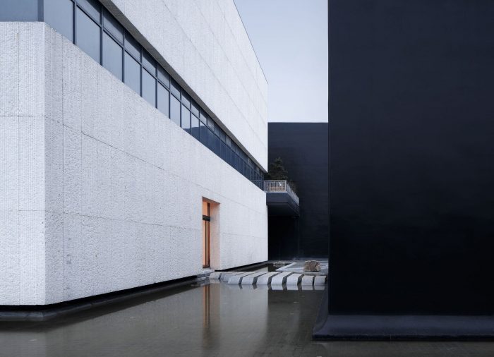
The ink volume and angle are cut and painted with dark grey fluorocarbon paint, and the wall presents a subtle color change in the blue sky, such as the giant stone, such as the ink block, with a simple and profound texture. At the bottom of the body, the rounded corners are processed to show the sense of gravity in calligraphy.
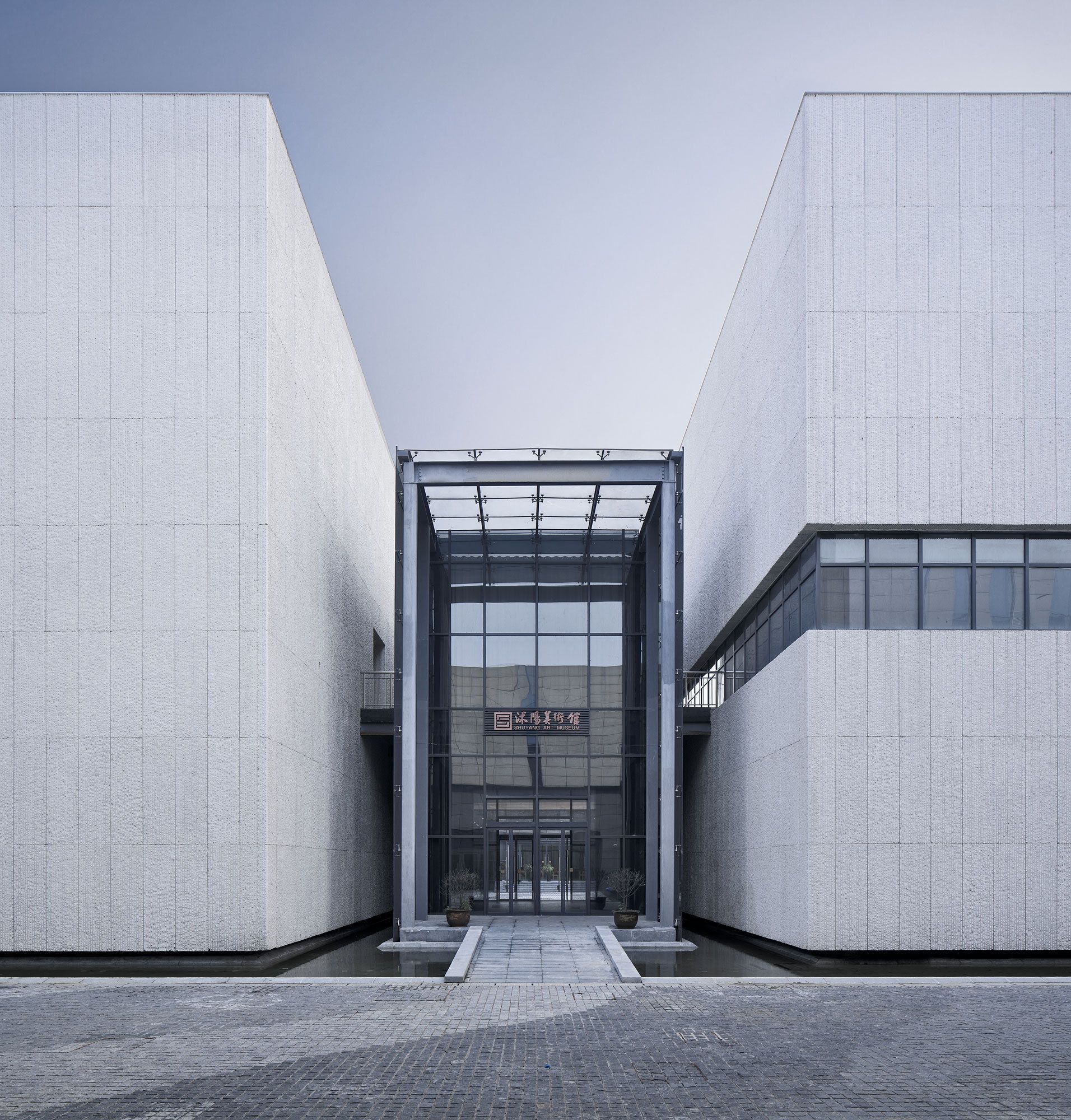
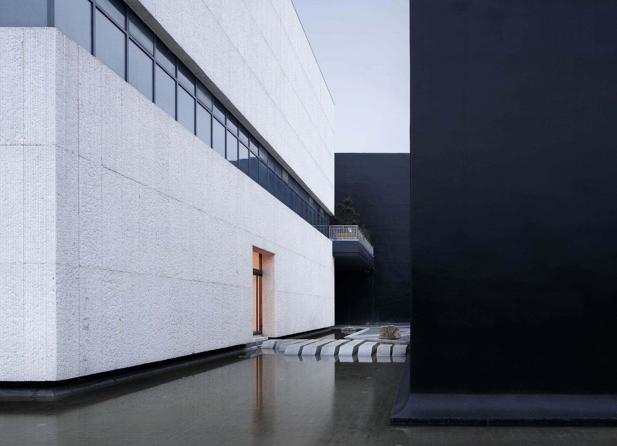
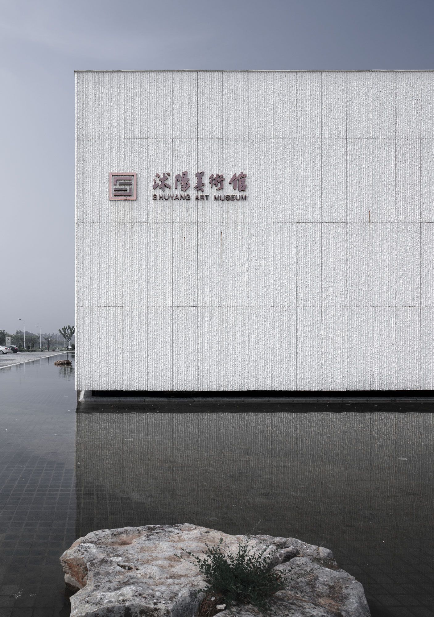
The white volume selects prefabricated concrete hanging board, and the surface is treated with a vertical chisel, such as rice-paper, which formed a delightful contrast to the smooth and fine ink surface. The bottom of the body is overhanging to show a floating state, reflecting the spirit of detachment in calligraphy.
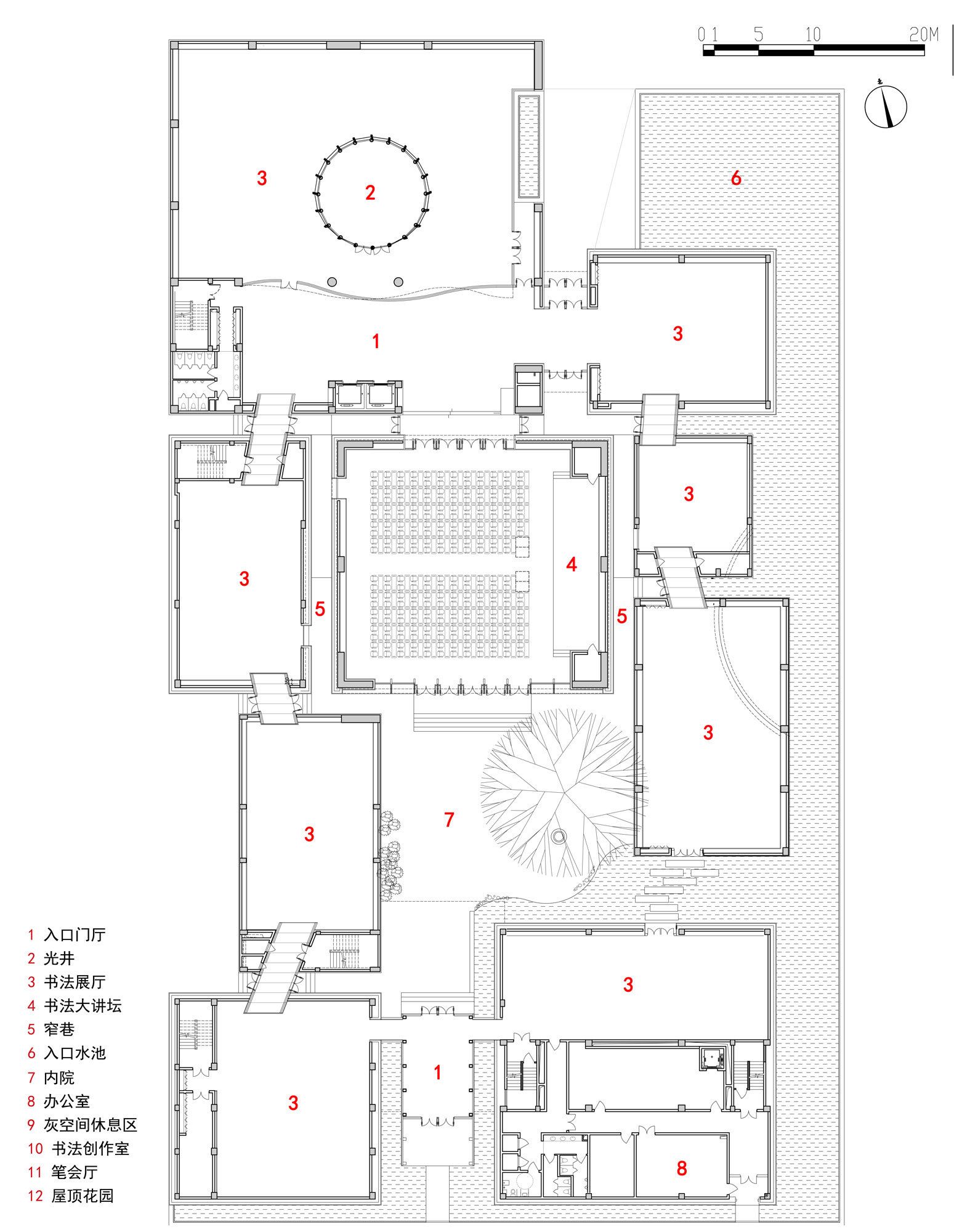
The tranquil water in the entrance is set up to keep off the noise of the outside world, and the visitors are introduced into the gallery by a bridge on the surface of the water. The continuous transition of space makes the visitors compose the mind quickly before entering the exhibition hall.
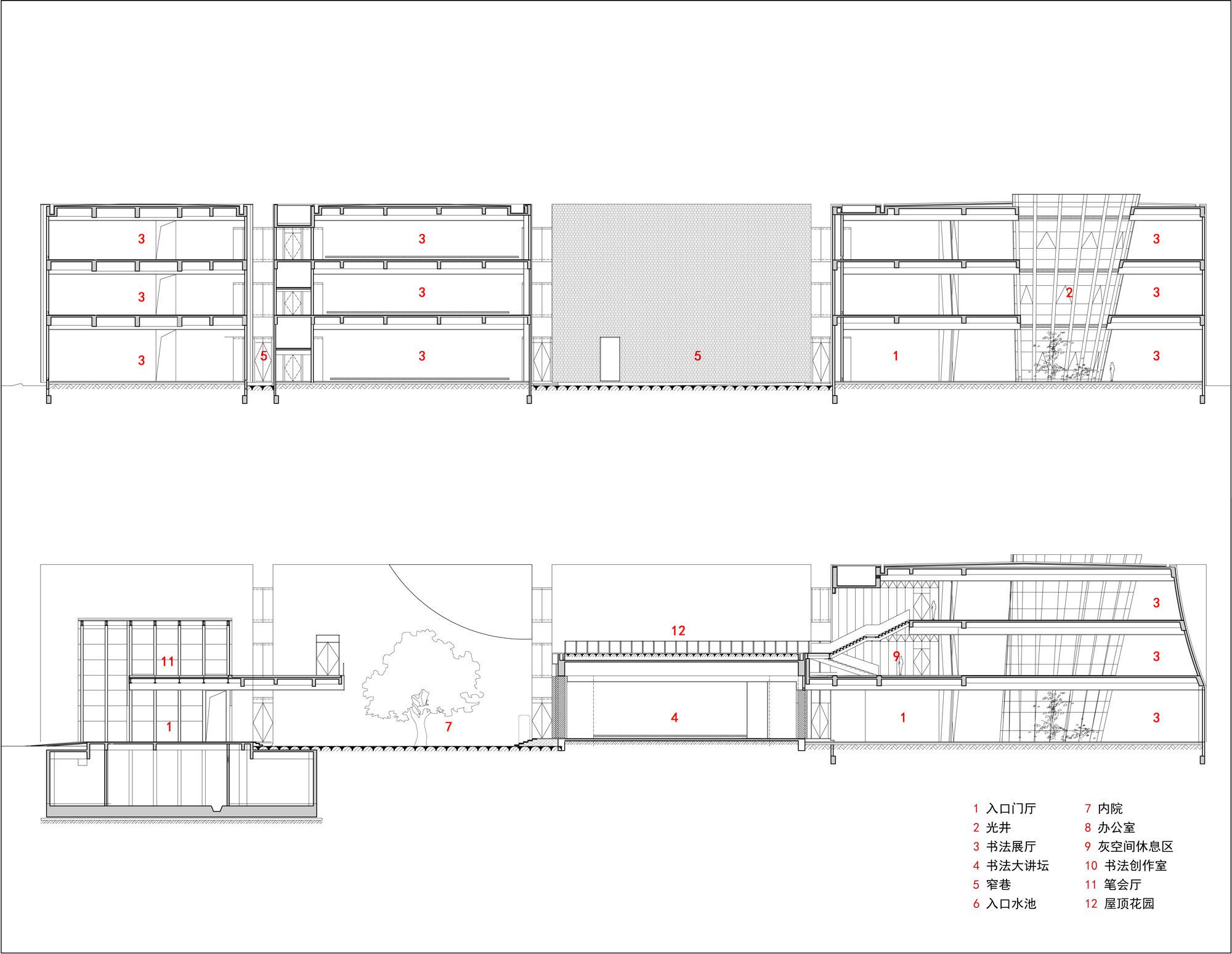
The spatial relationship is controlled by the layout of “sparse enough to run a horse, dense enough with no needle”. It is close to keeping a narrow lane of only 2 meters wide. Both sides are pure black and white volume, making people feel to walk among the books. Space will turn to an open courtyard and create an open space effect.
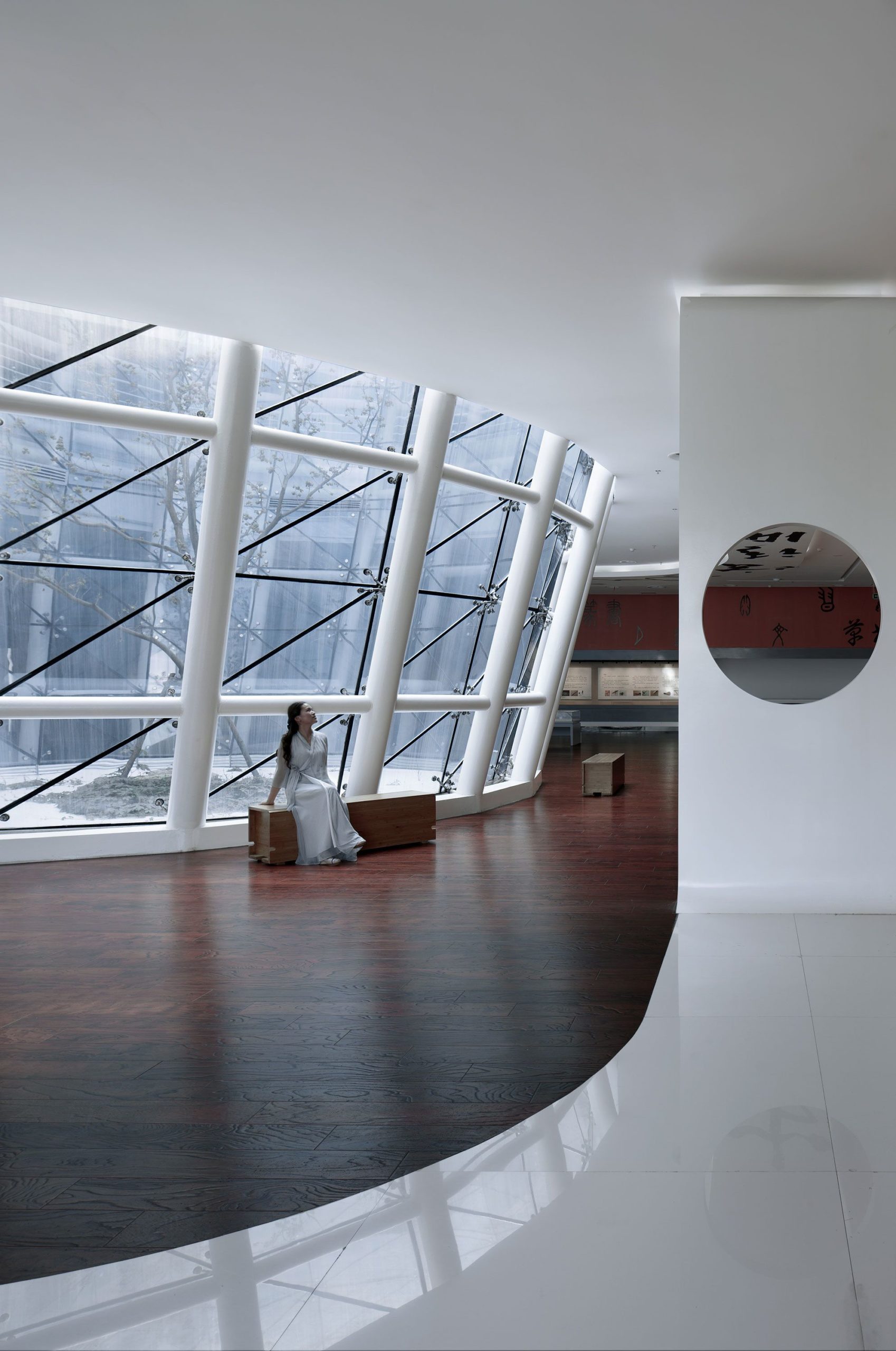
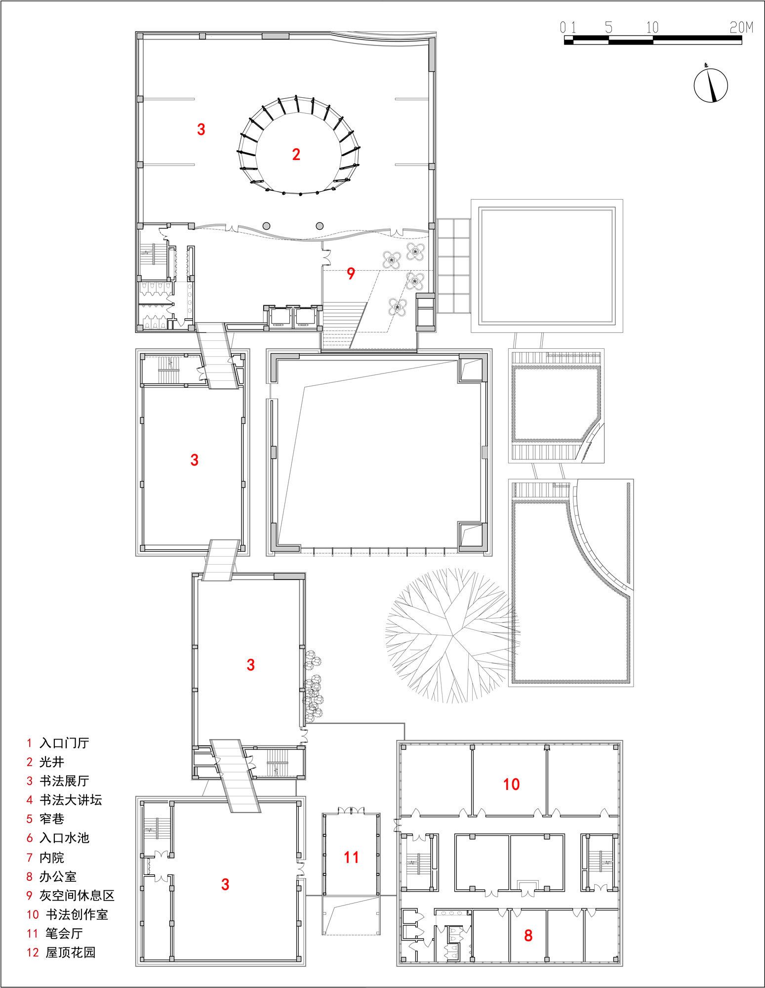
There is a gray space in the way that the volume of the body is dug in an introverted manner, and the outdoor space can be extended into the indoor rest area. The tourists can enjoy the interesting space experience during the visit.
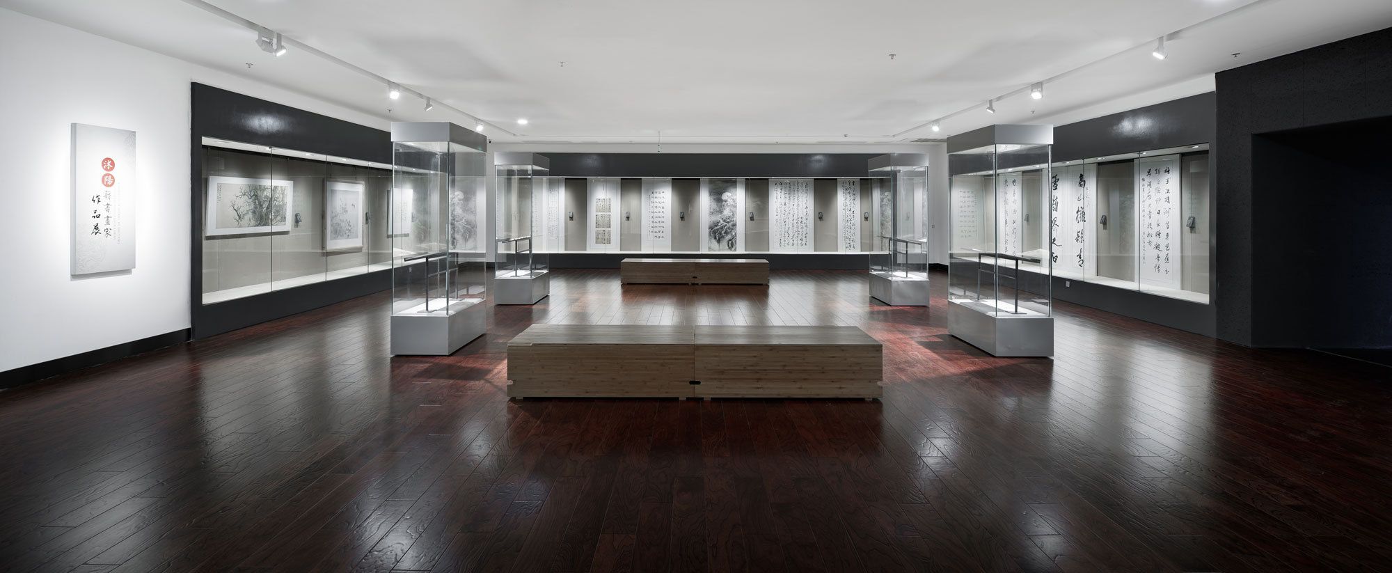
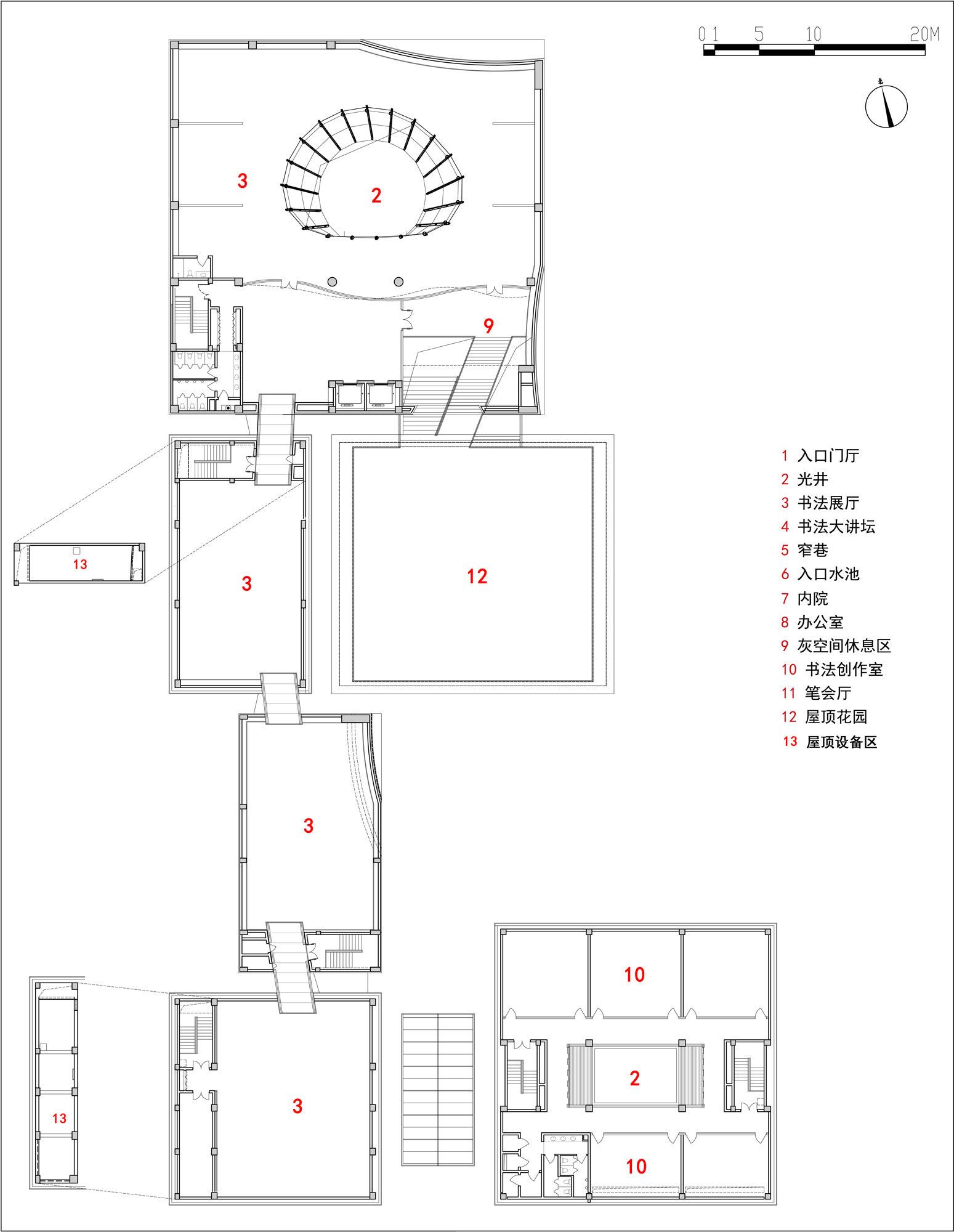
All the exhibition halls are open space without columns, which can be arranged freely according to the exhibition needs. Glass corridor connects the exhibition halls, in order to facilitate continuous exhibition. In the middle of the red-bricked exhibition hall, there are light wells through 3 floors, which creates a bright and transparent indoor space.
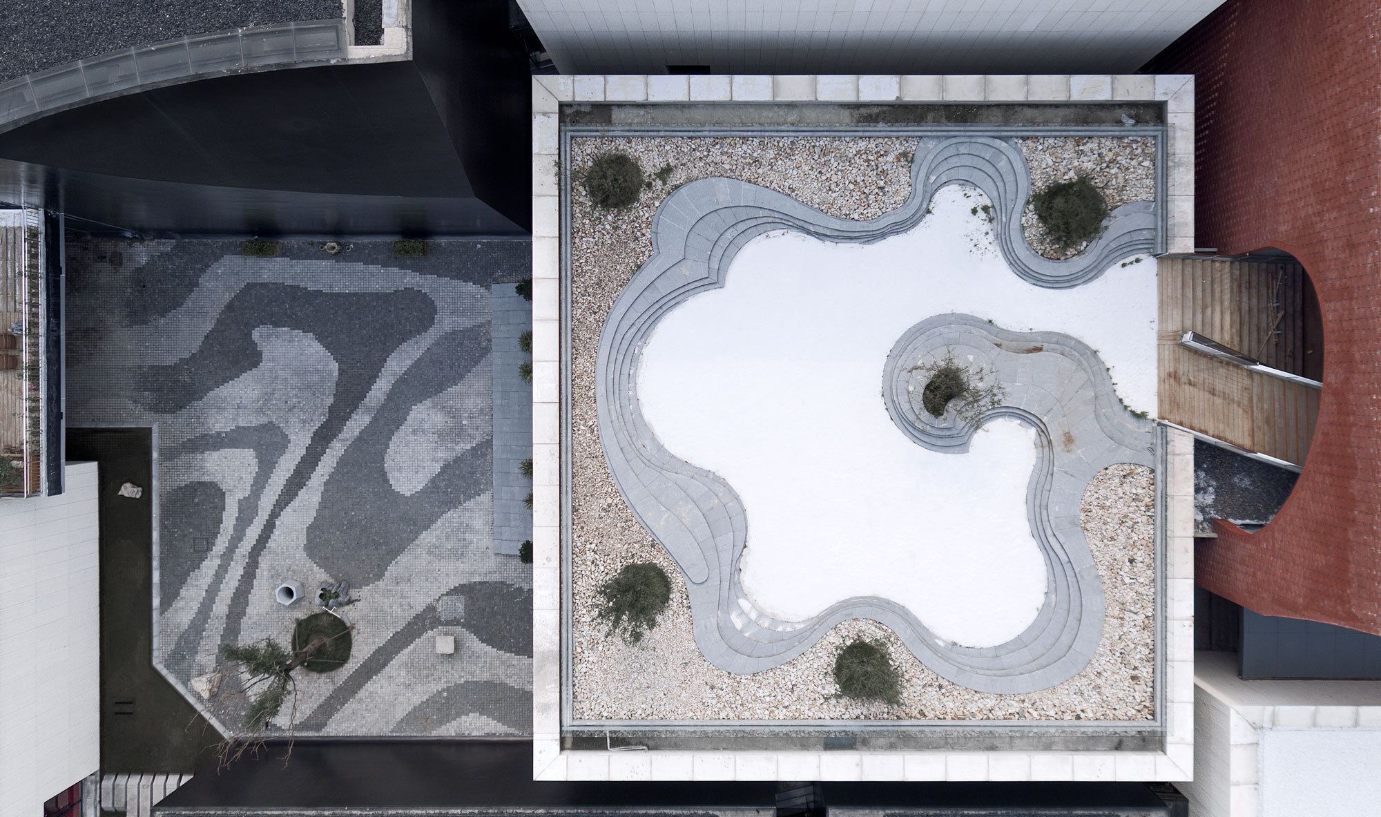
The paved road and roofed courtyards are inspired by the abstract pattern of the ink spreading. Through the different grayscale changes of the granites in the paved fields, an ink painting is formed.
Project Info:
Architects: Architectural Design and Research Institute of Zhejiang University
Location: Nanjing W Rd, Shuyang Xian, Suqian, Jiangsu, China
Lead Architects: Danshen Dong
Design Team: Jian Chen, Jian Ni, Yi Cai
Area: 10475.0 m2
Project Year: 2013
Photographs: Qiang Zhao
Project Name: Shuyang Art Gallery
