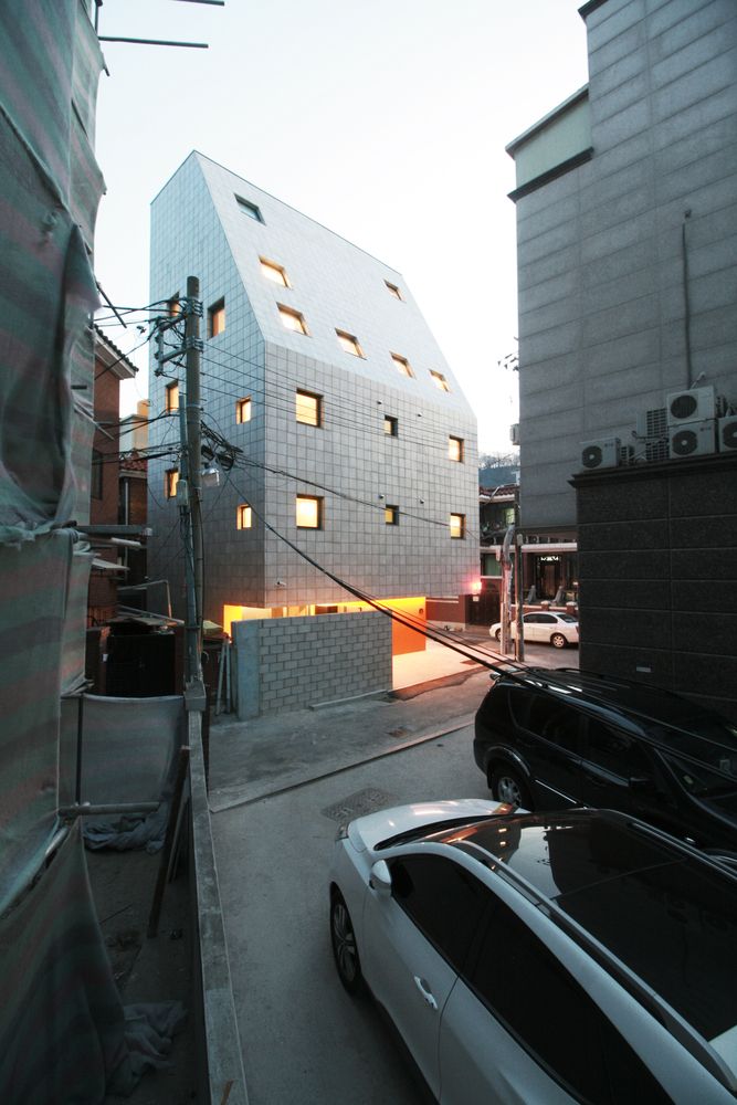
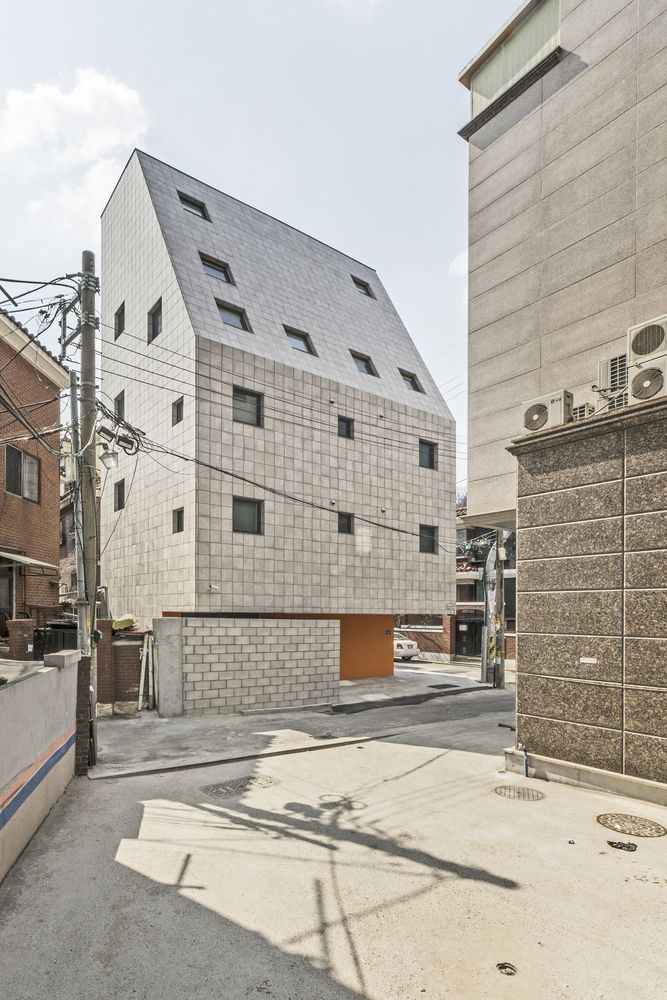
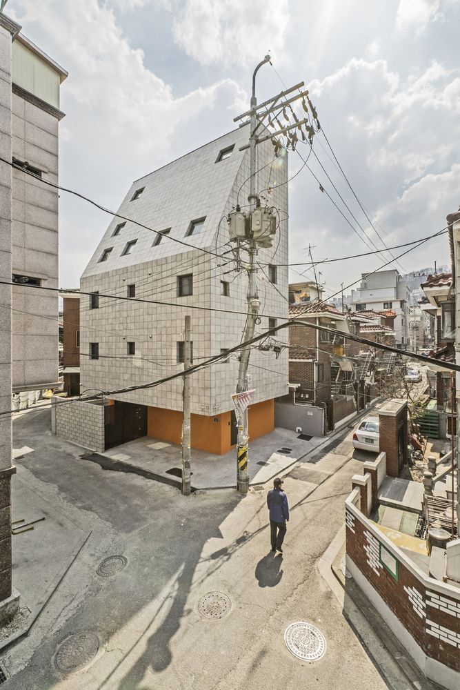
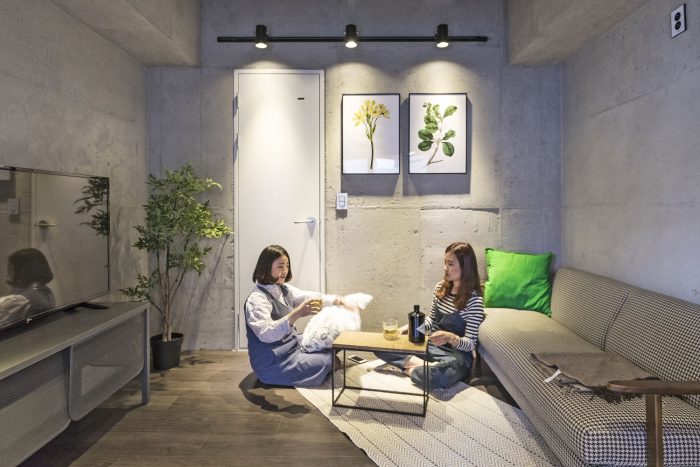
Sodam-Sodam is a house share. The very first question we asked ourselves about this project was: “what is the most unique charm of a share house in today’s housing reality?”
The answer was simple: nicely designed and spacious spaces such as a kitchen, dining room, living room and bathroom, all of which individuals may not be able to afford or dream of—at least in a crowded and expensive city like Seoul.
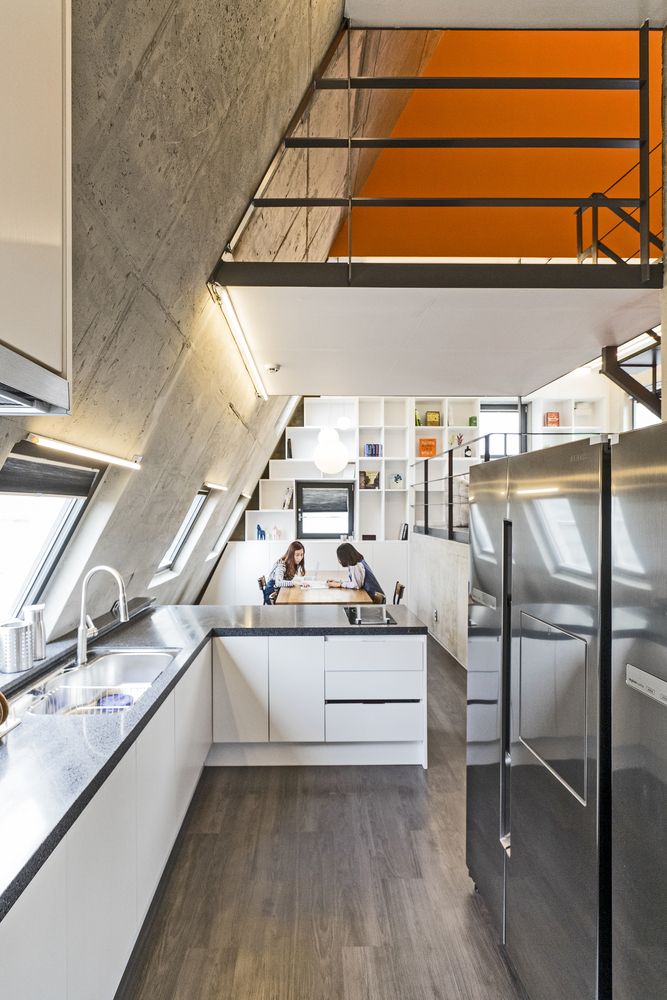
As such, what we had to do was also simple and clear, that is, to make those common spaces mentioned earlier as spacious and nice as possible within a limited area.
First, we needed to decide on where to locate those common spaces. In some of the existing share houses in Korea, such spaces are usually located on the 1st floor. The reason would be to maximize and diversify space by connecting the area with exterior space.
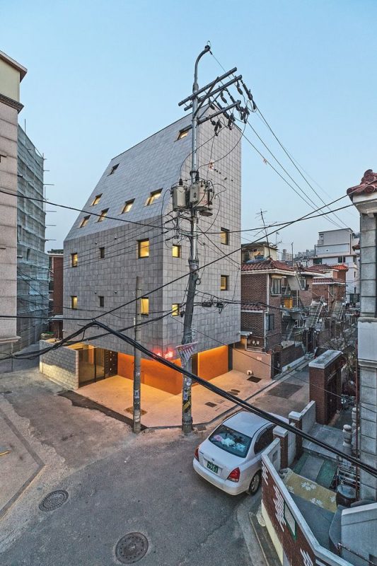
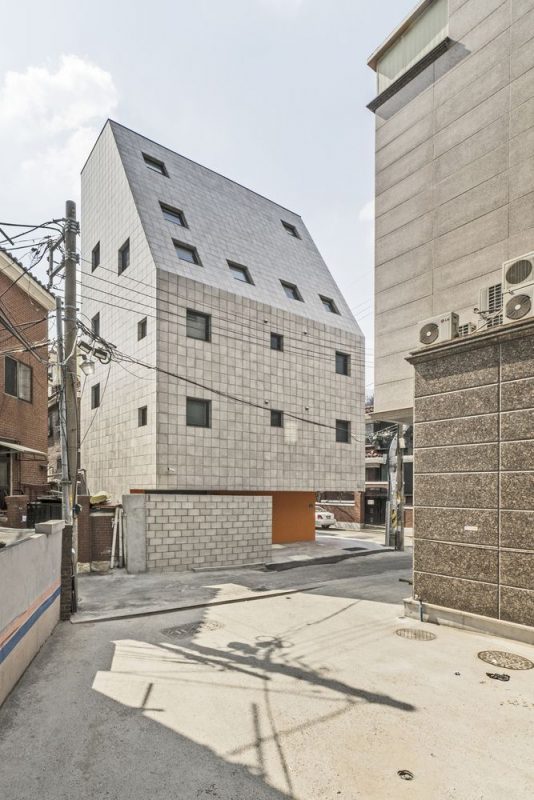
However, as Sodam-Sodam is located in the middle of a highly dense residential area in Shinrim-dong of Seoul and is to be built for women only, the possibility of utilizing such an exposed space in comfort (or even doing barbecue) seemed pretty much low. Not to mention, the blockage of sunlight by surrounding buildings when built on a lower level ground.
If so, what is the biggest advantage of this site?
It would be a wonderful view of a whole neighborhood and a nearby mountain, full sunlight from the south as well as a benefit of protected privacy, all of which are possible by neighboring buildings of three or fewer stories.
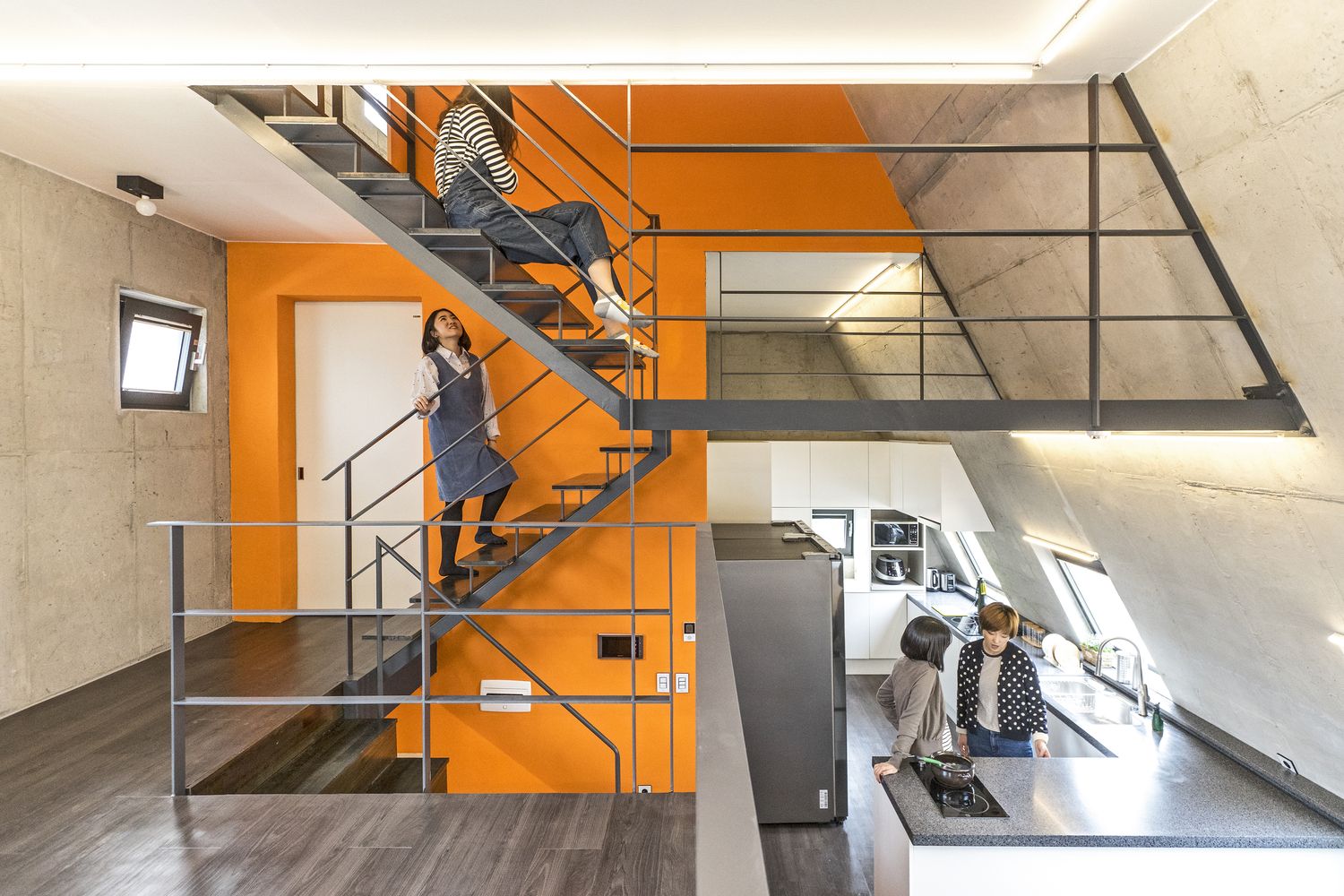
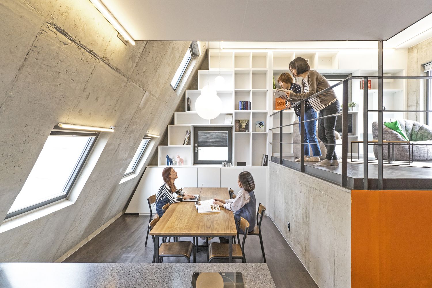
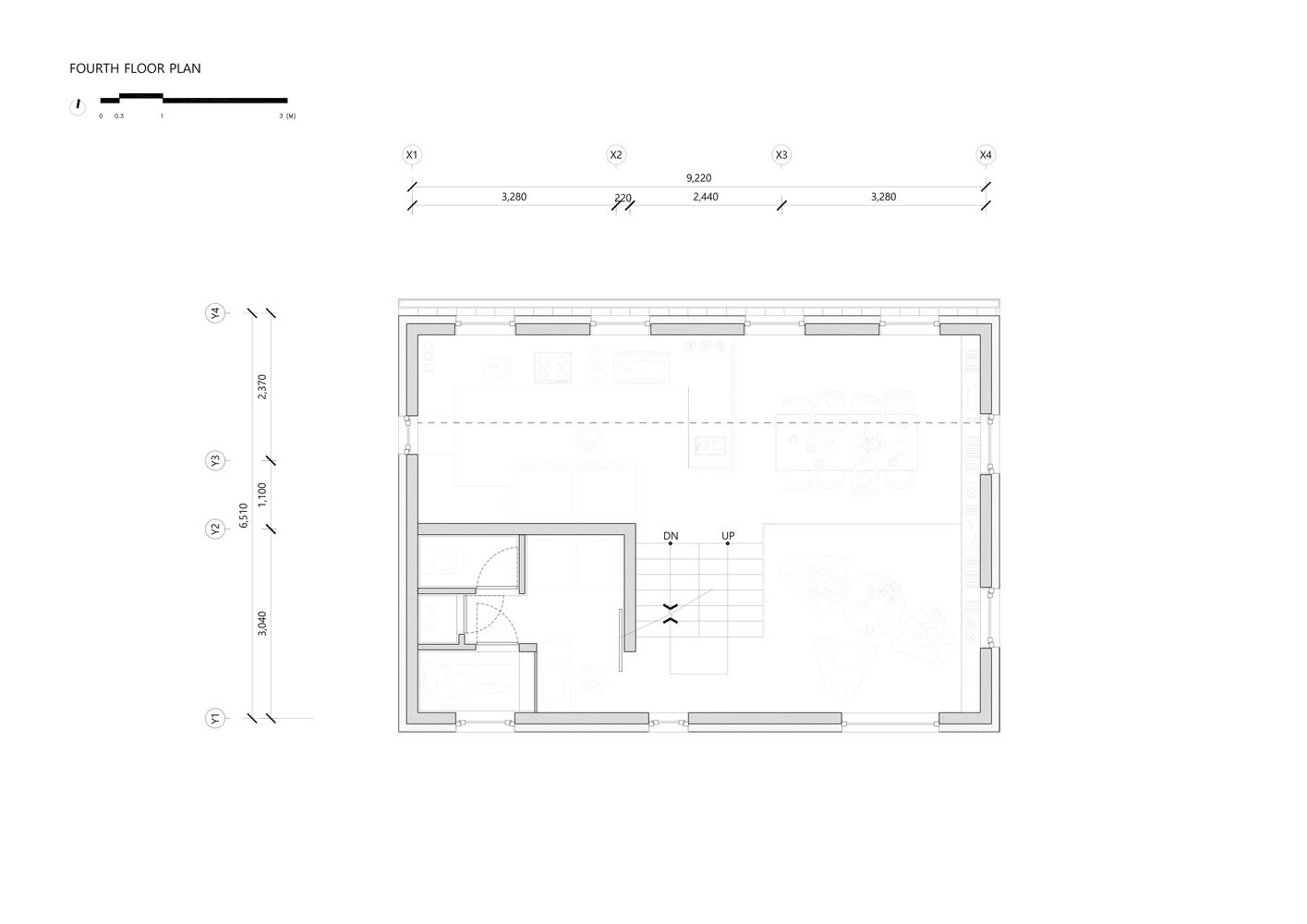
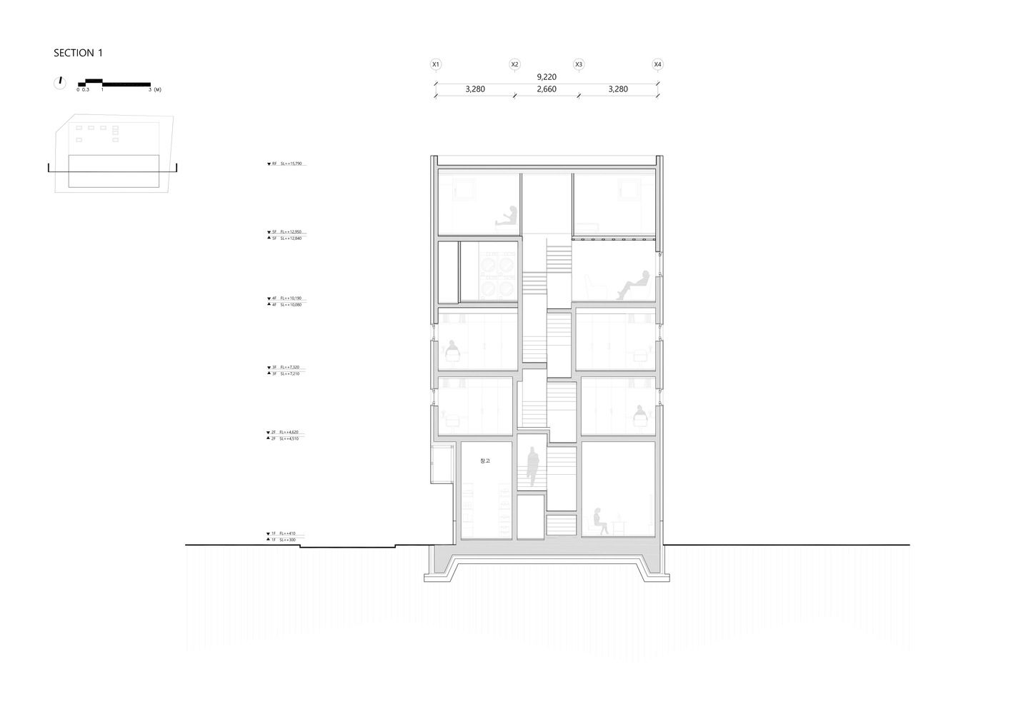
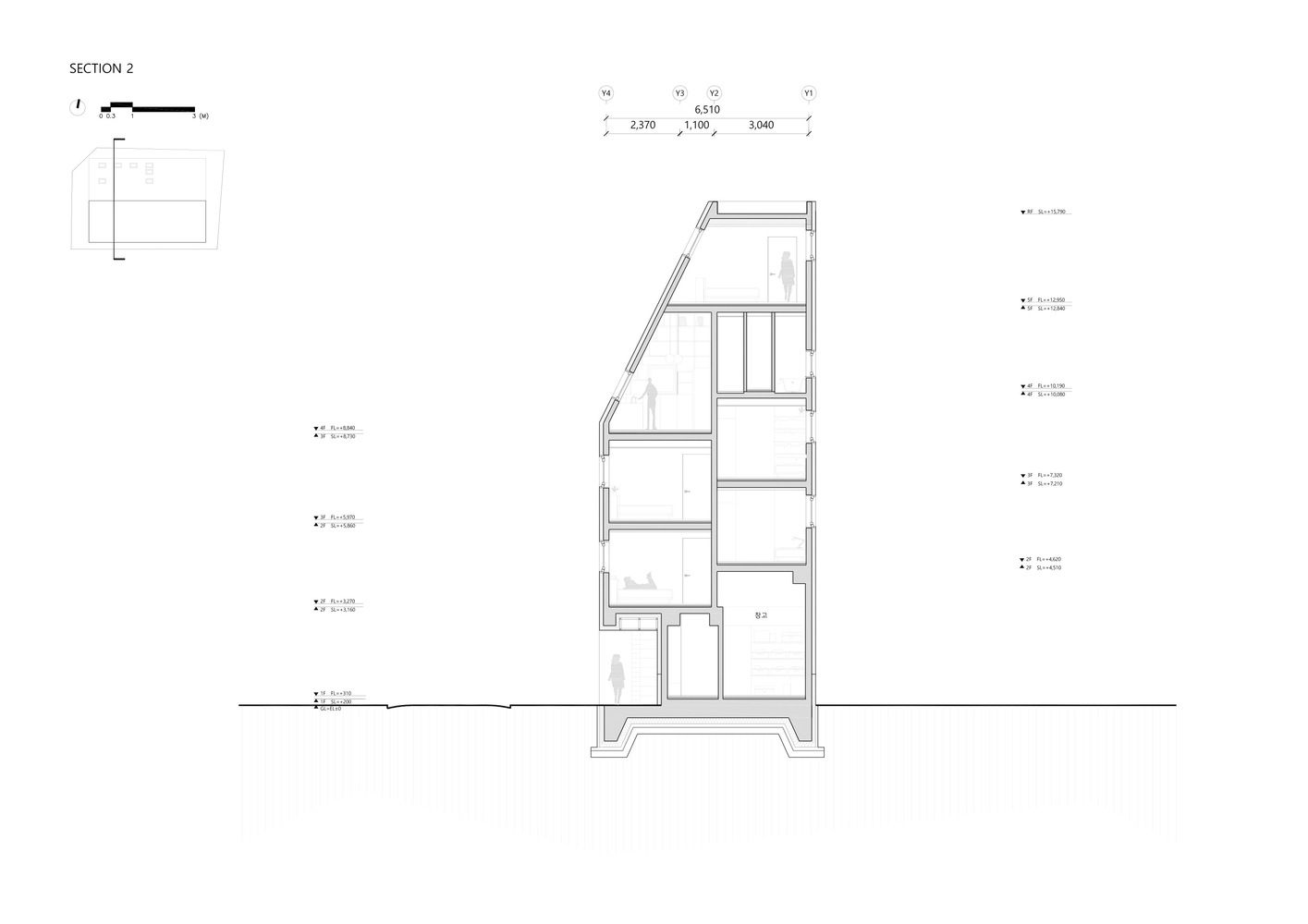
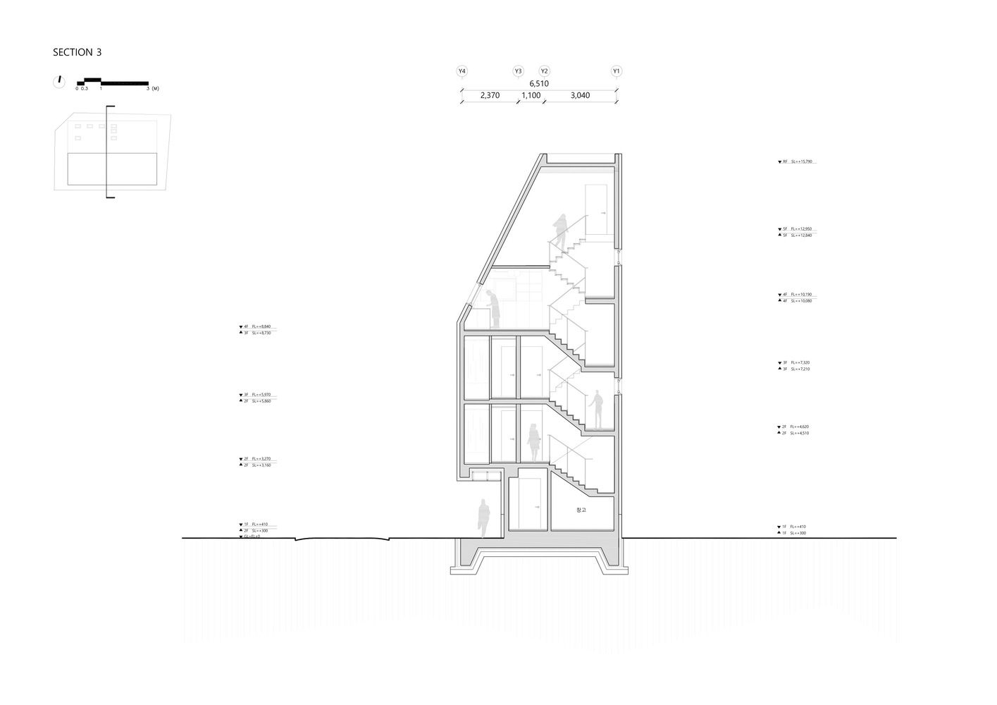
Therefore, we decided to locate the common space not on a lower level but on the top one, creating a spacious high ceiling kitchen with personal storage space and a dining space with a hardwood table connected to the kitchen. From a cozy sofa in the living room that is a half level lower, one could enjoy the view of a nearby mountain through a wide window.
Moreover, one could also soak in a bathtub of a common bathroom and admire the view of the sky and the mountain. All of these would not be possible or affordable, particularly in Seoul, if it were not a “share house”.
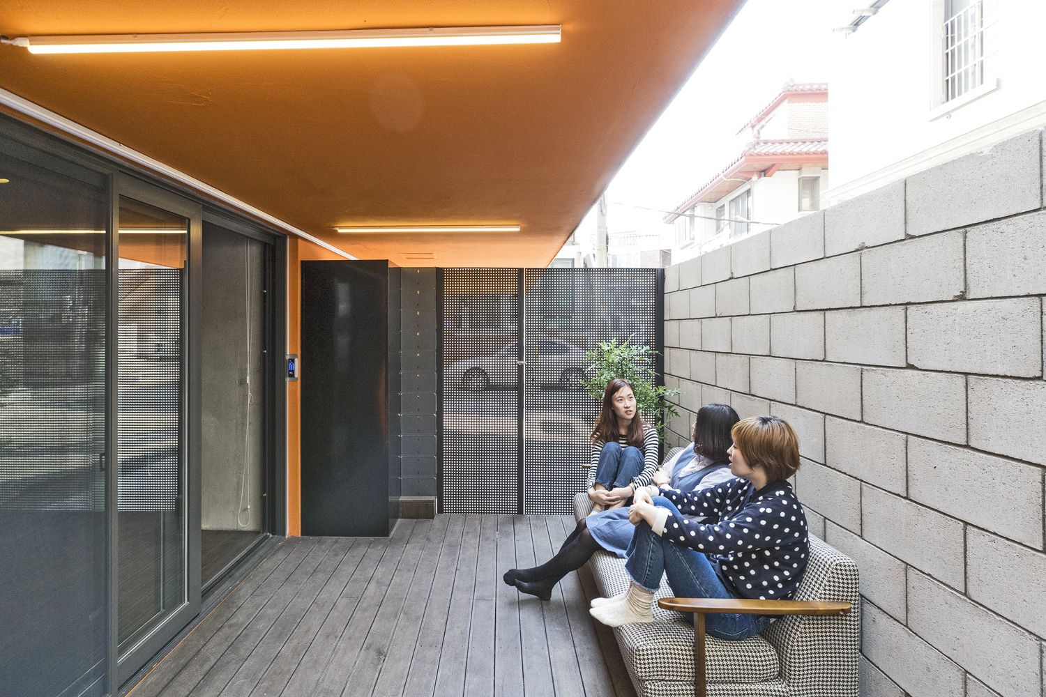
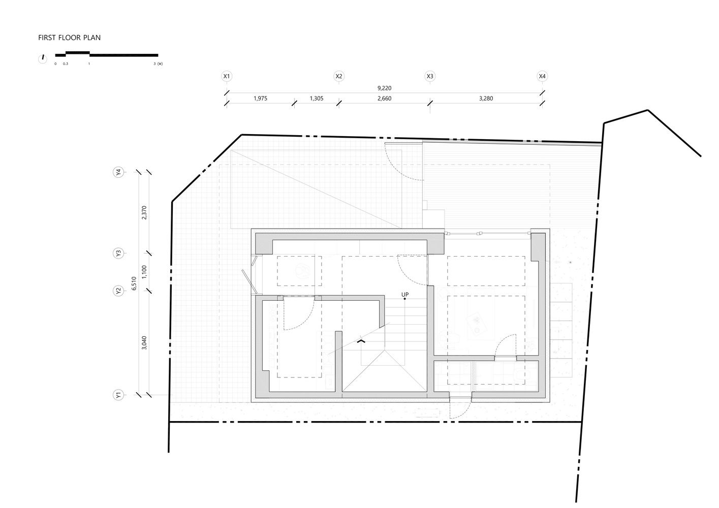
In addition to this common space of a great view and sight on the top floor, there is another common space of different aspects on the 1st floor. That is a space where people could quietly watch movies, chat together or share their little hobbies. Space is directly linked to a little outside terrace surrounded by a fence for extra purposes.
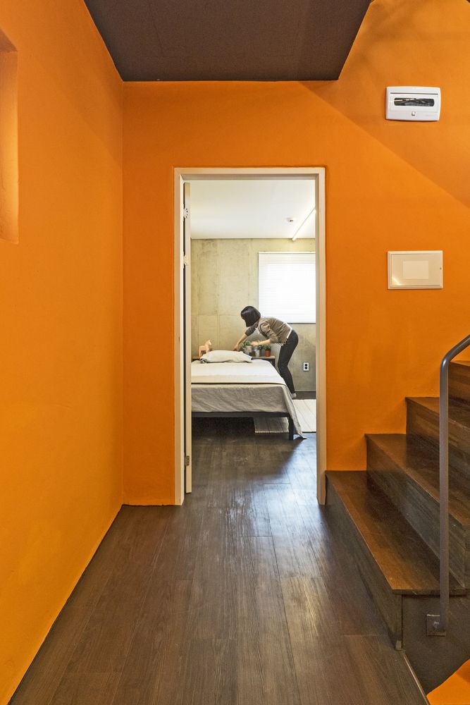
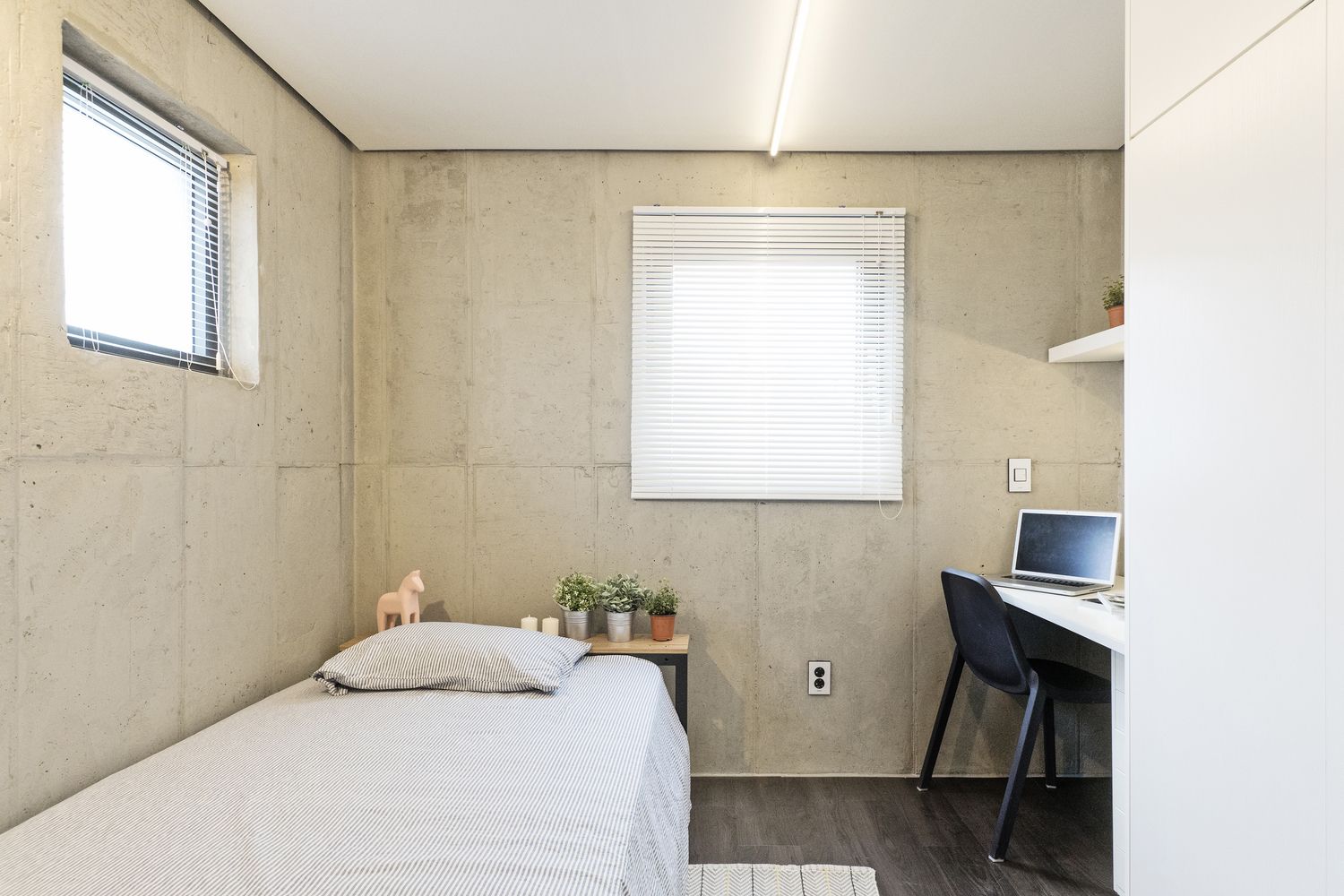
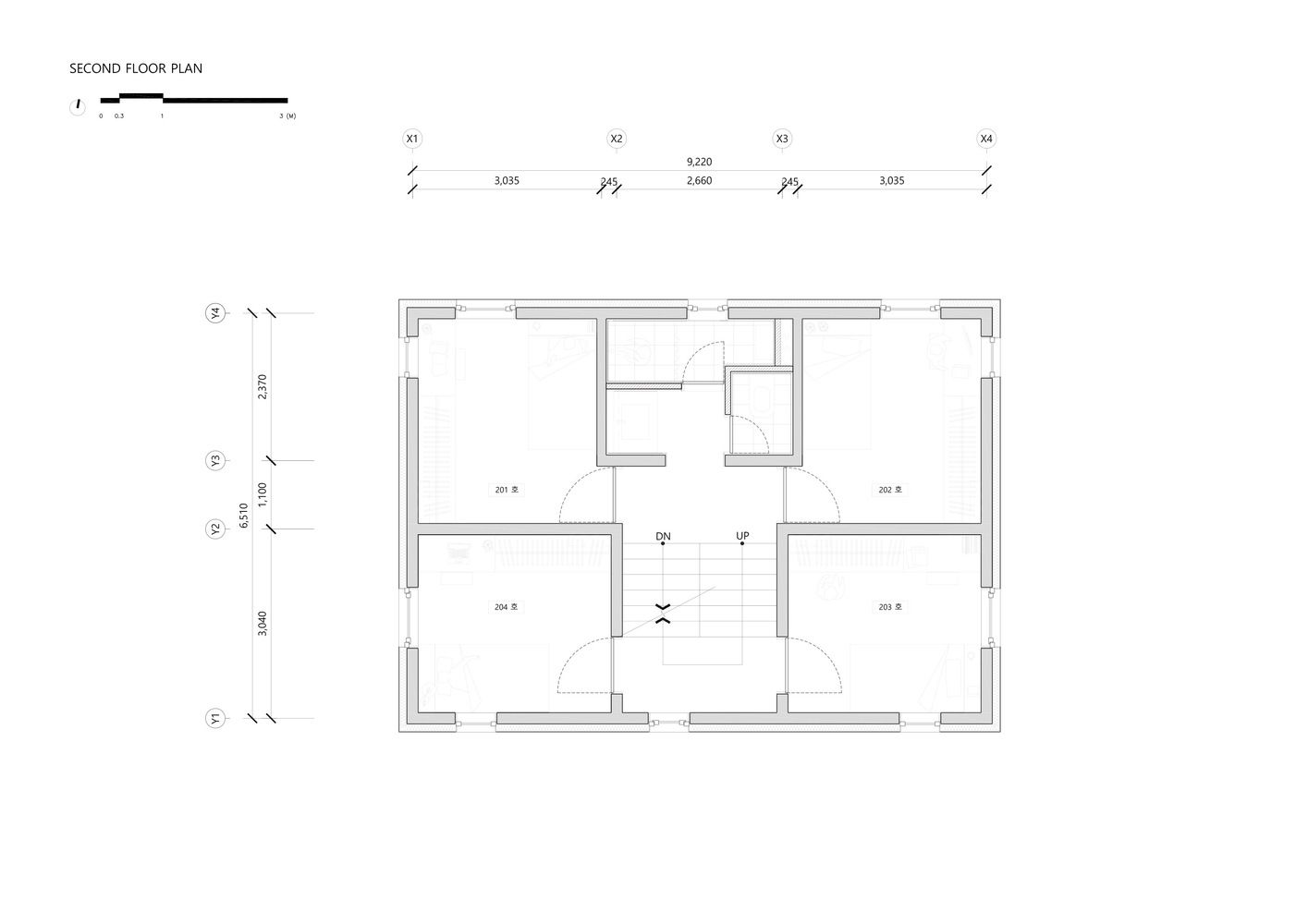
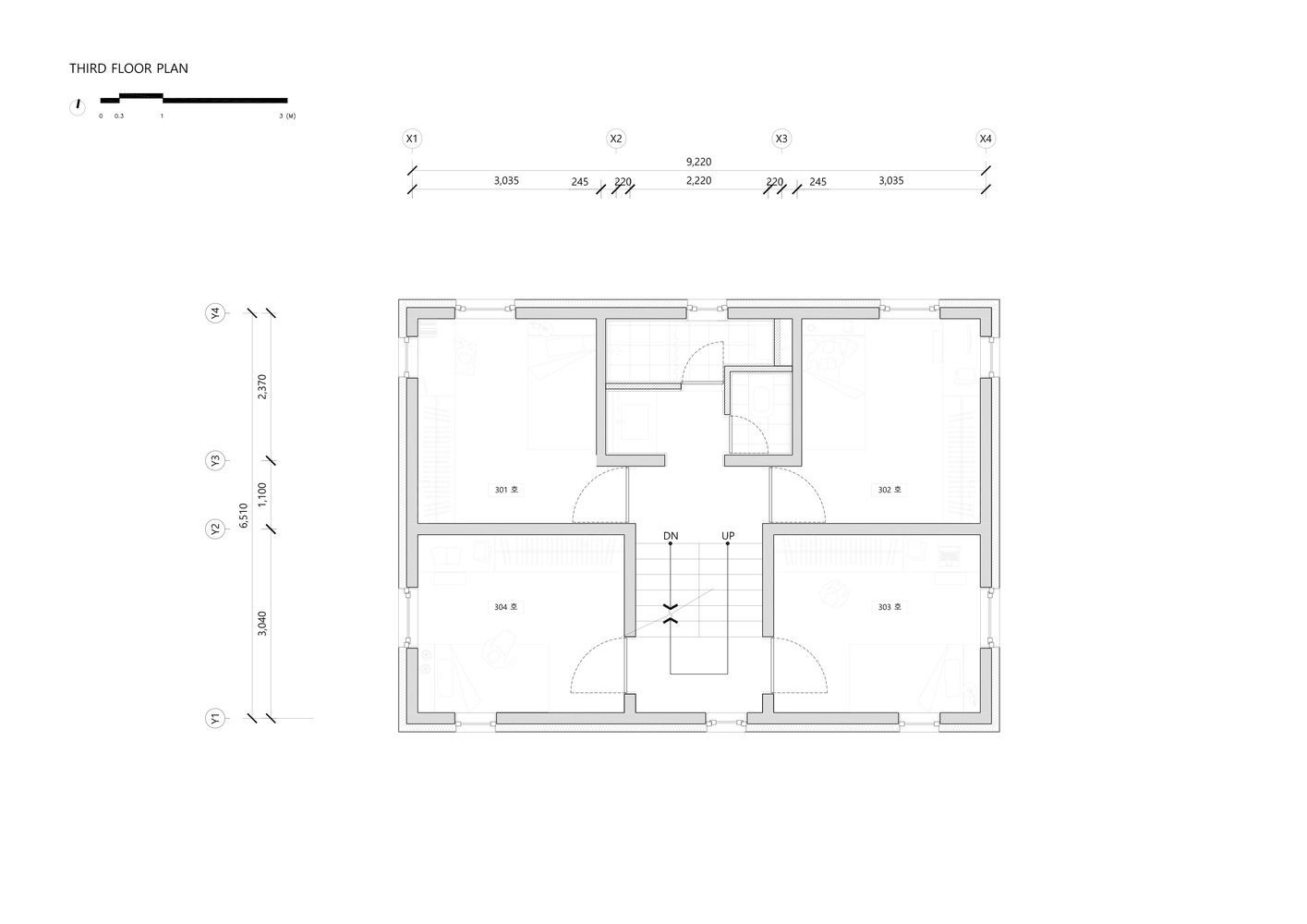
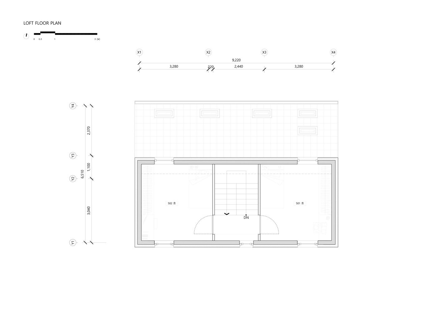
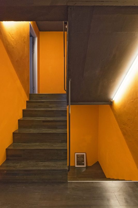
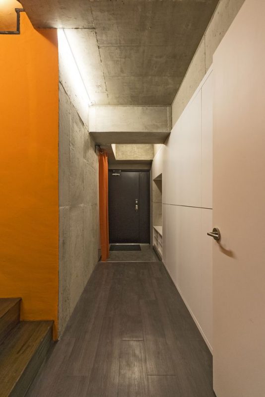
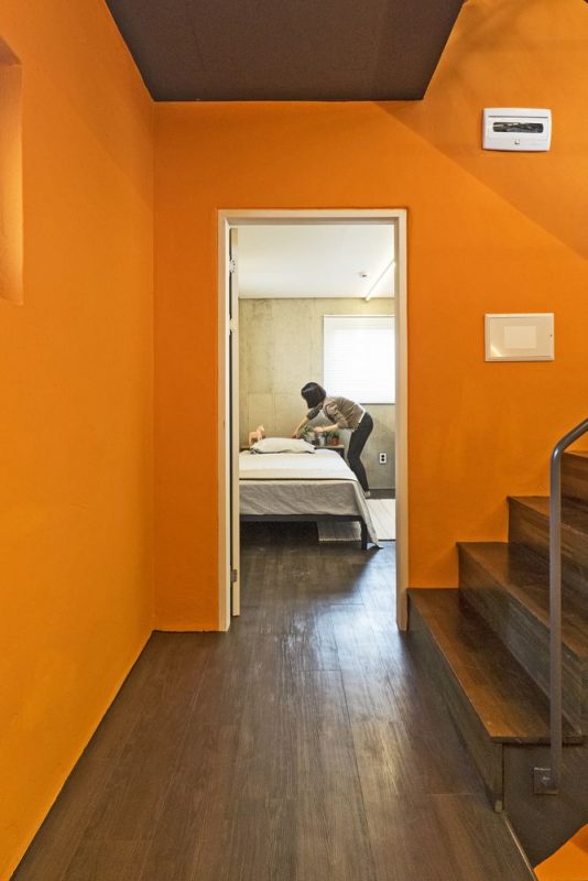
For the floors of individual rooms, we used a skip-floor structure in order to ensure maximum space in respective rooms and to make a journey to the top floor as relatively natural as possible. By eliminating corridor space that connects each room, we were able to not only secure extra space but also change the perception of a building from a vertical ‘floor’ concept to a whole ‘space’ one by making a vertical movement more natural. Moreover, a staircase that runs through the middle of the building and the same color added to both its interior and exterior bring about complete unity to space.
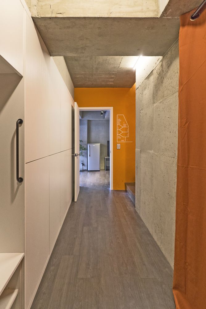
Each plan has an independent toilet, a bathroom and a washing machine and a dry-type hand basin that also works as a powder space. In order to tackle the problem of lacking storage in the house share, there is a built-in closet in each room for everyday use as well as an extra individual storage space on the 1st floor for storing items in large-volume or of rare use. Likewise, there is personal storage space in other common areas such as a front entrance, a bathroom, a kitchen. In other words, it is a concept of sharing space (and a very few items) while using one’s own items.
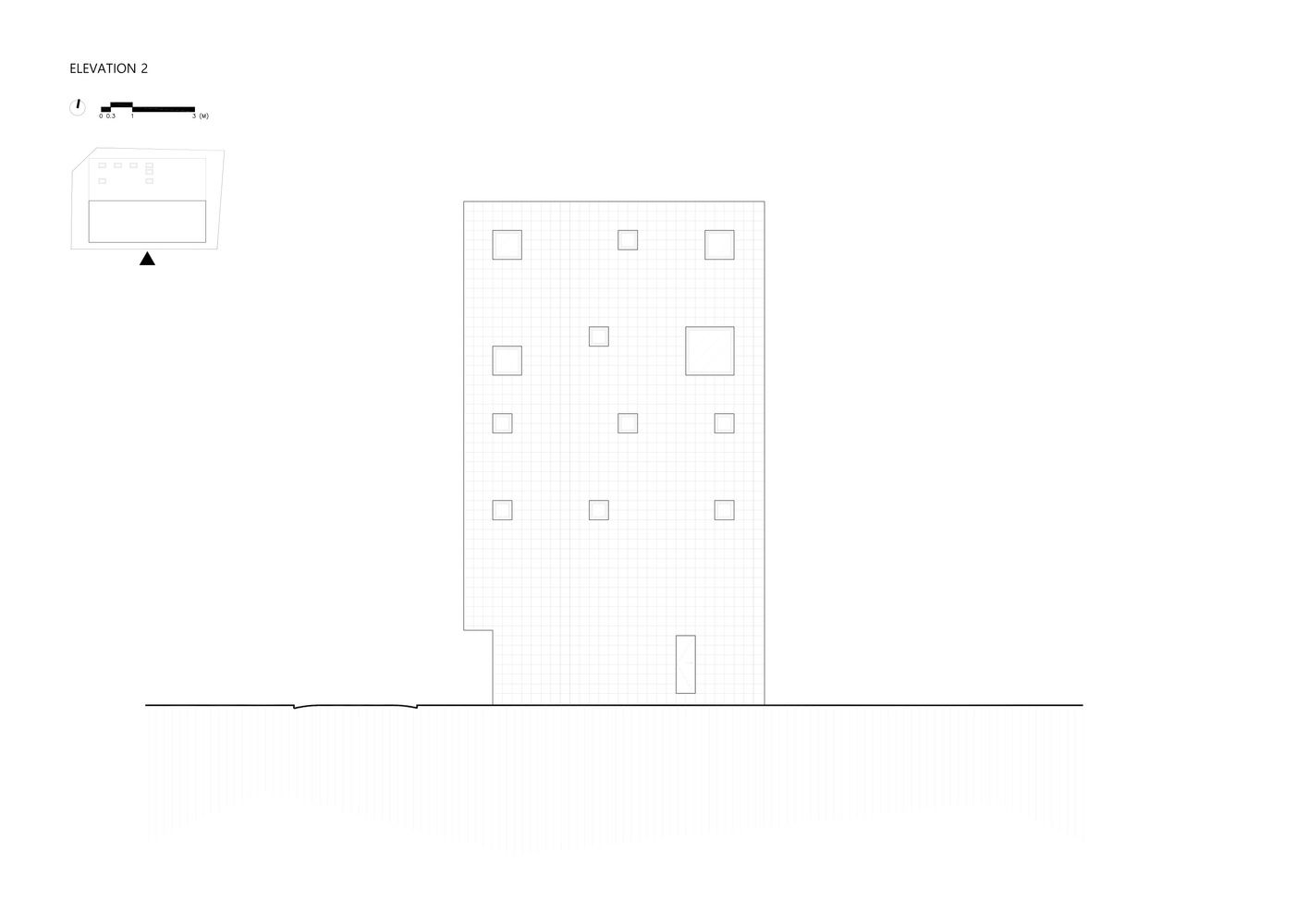
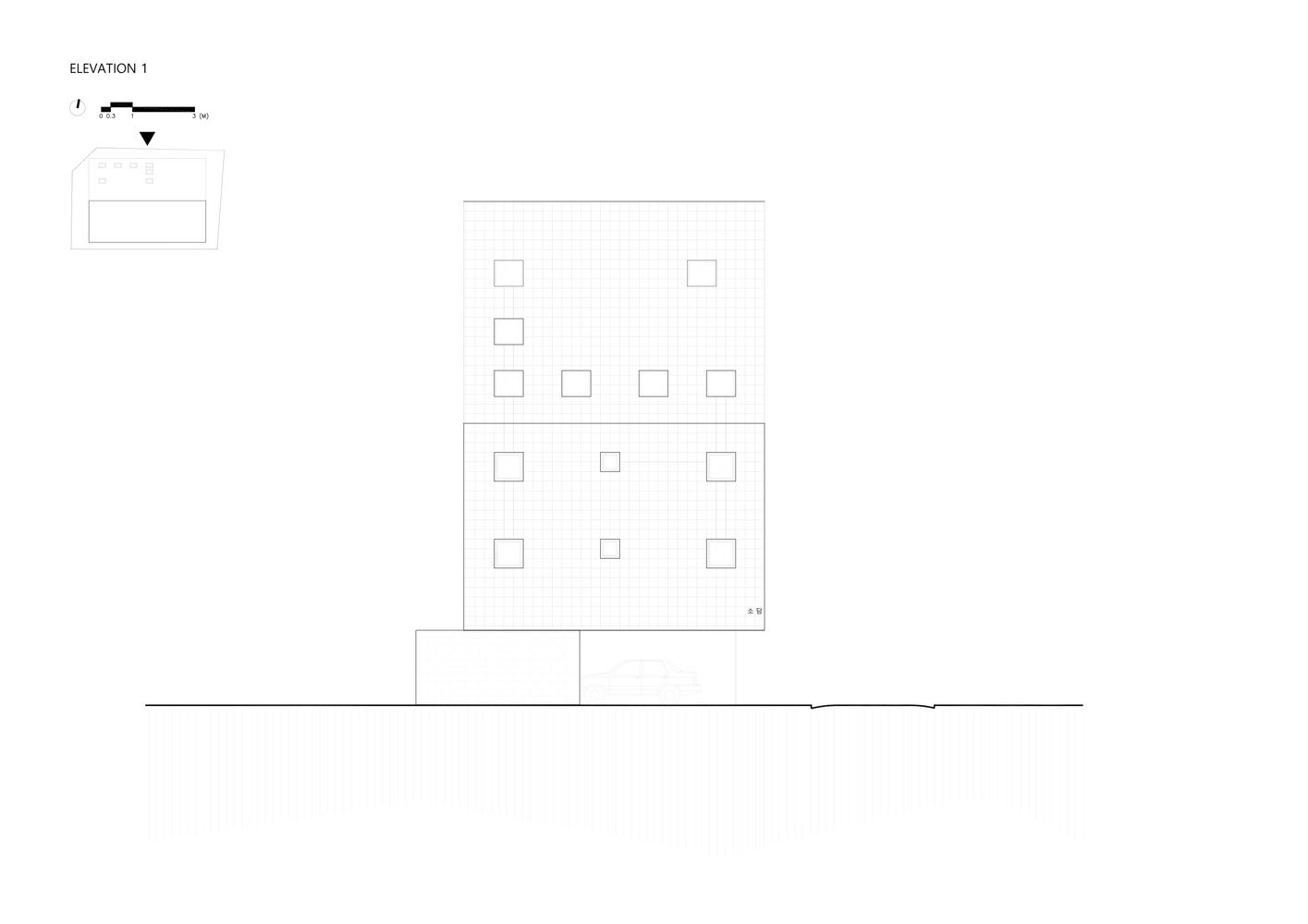
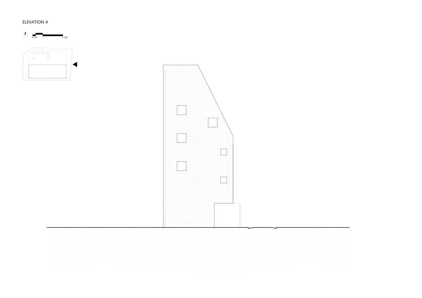
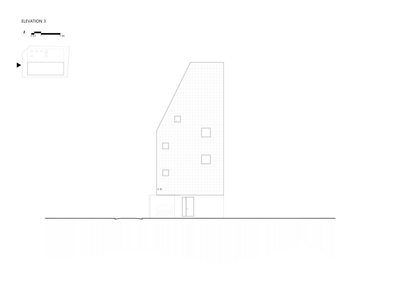
As for the exterior, we wanted to embody an image of simplicity and decency. It was an attempt to create a distinct but refined image within the neighborhood that is already filled with disordered buildings and complex signs.
Project Info:
Architects: JYA-RCHITECTS
Location: Sillim-dong, Gwanak-Gu, Seoul, South Korea
Area: 198.34 sqm
Project Year: 2016
Photographs: Hwang Hyochel
Manufacturers: Hanyang
Construction: Lewoo Construction
Structure: RC(reinforced concrete)

