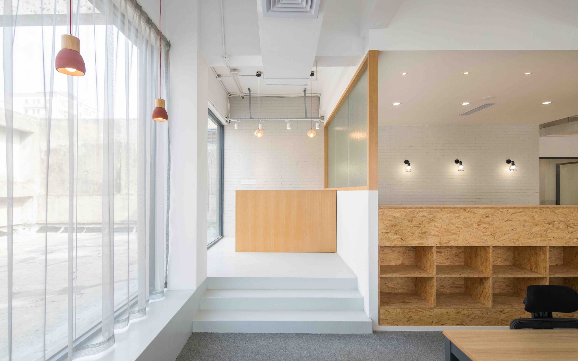
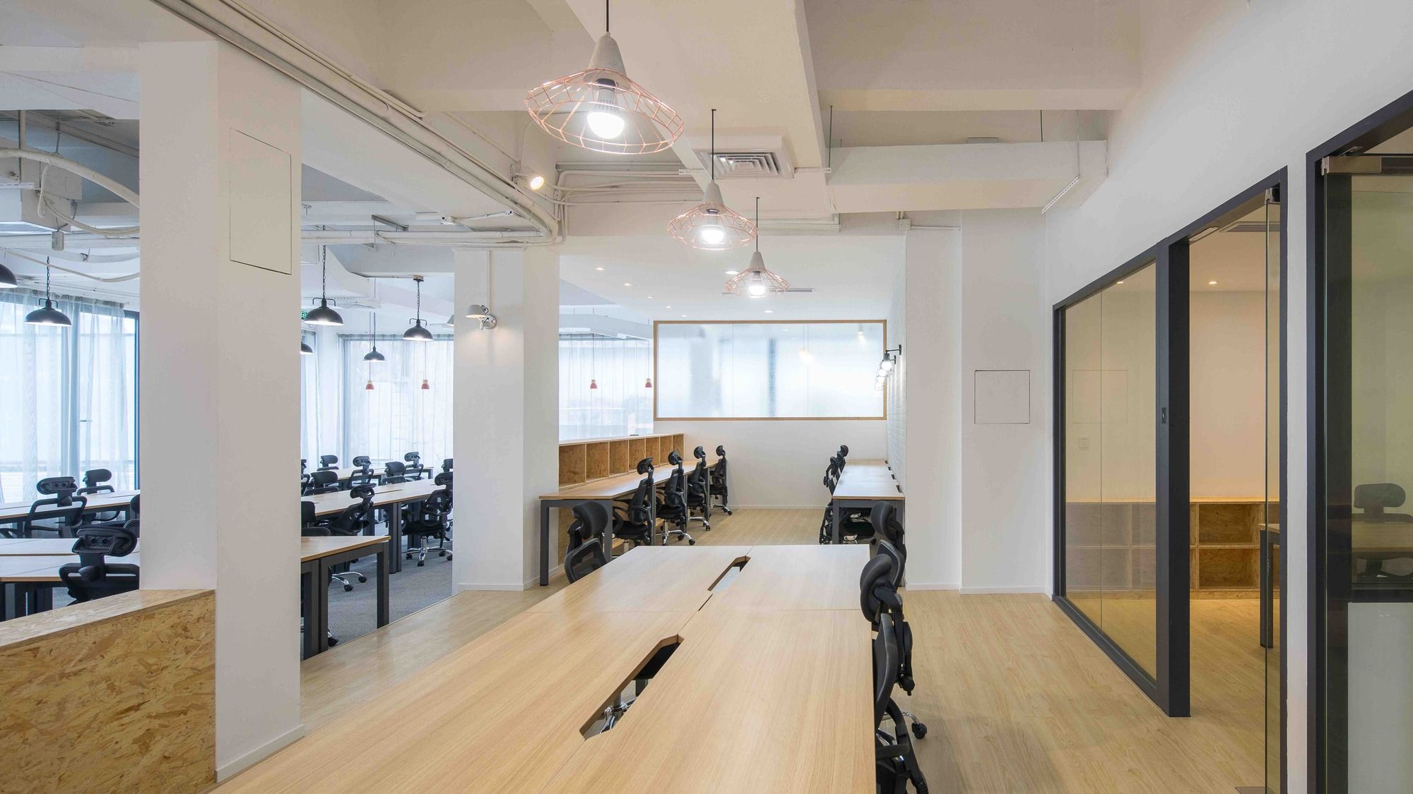
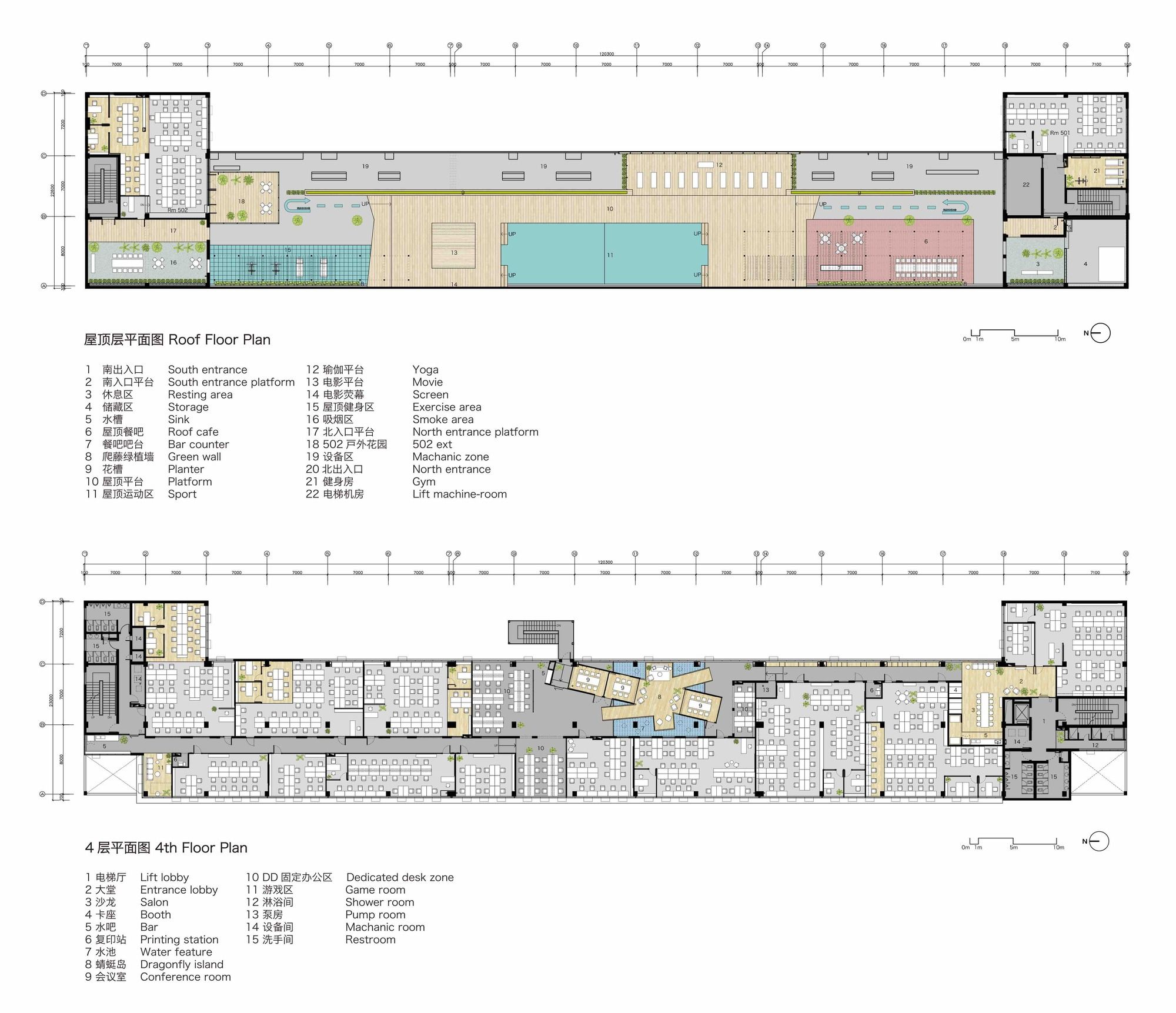
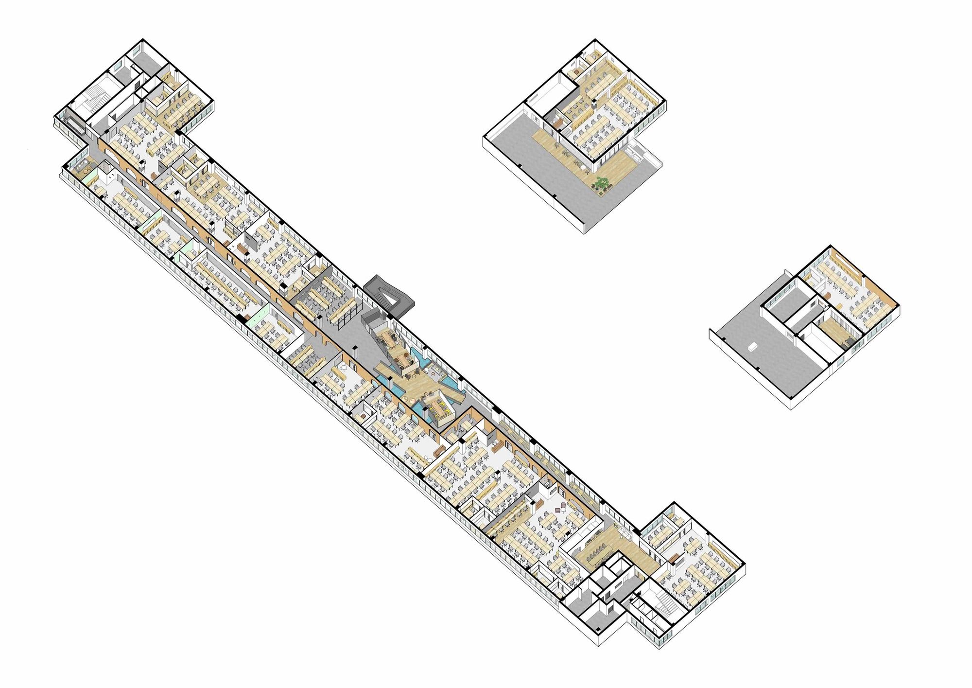
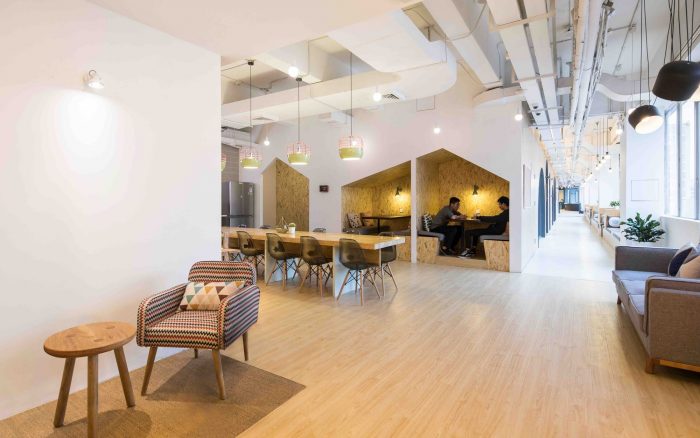
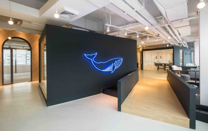
SimplyWork Designed by 11architecture, The site for this project was selected on the top floor and the penthouse of an existing industrial building located at the outer rim of Shenzhen city, and it was renovated into a co-working space that consisted of fifteen office rooms, individuals’ dedicated desks, and a series of shared spaces including meeting rooms, drink bars, and lounges.
Working scenes are often depicted as the image that people sitting in front of repetitive desks in an abstract office room. We don’t support this image that simply represented the transient state of commodified office space but propose an alternative image of working with a unique office environment specific to each site context.
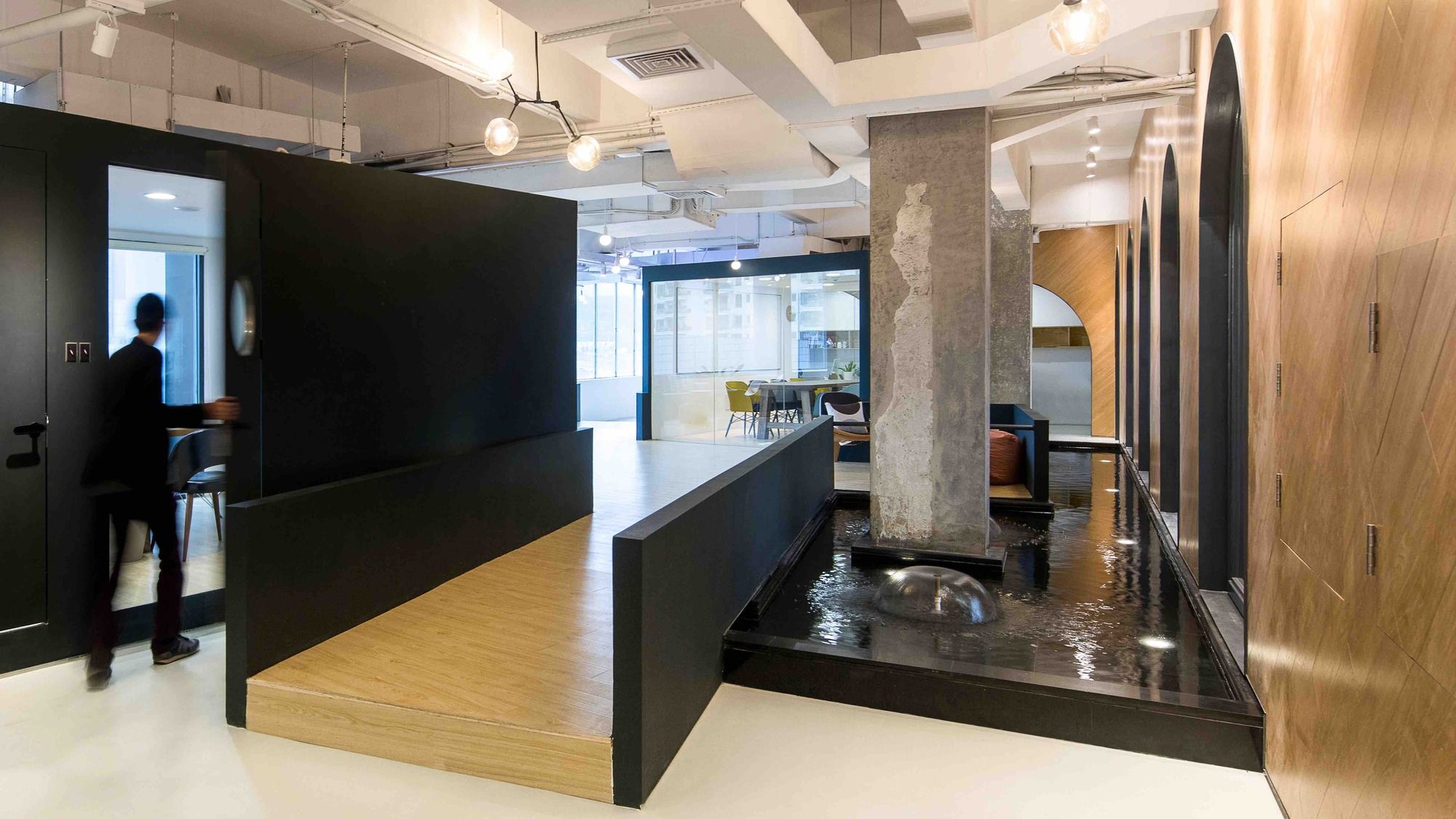
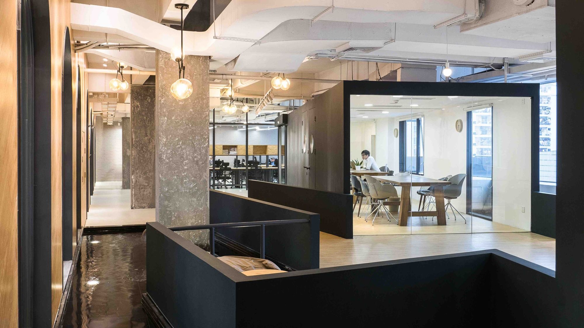
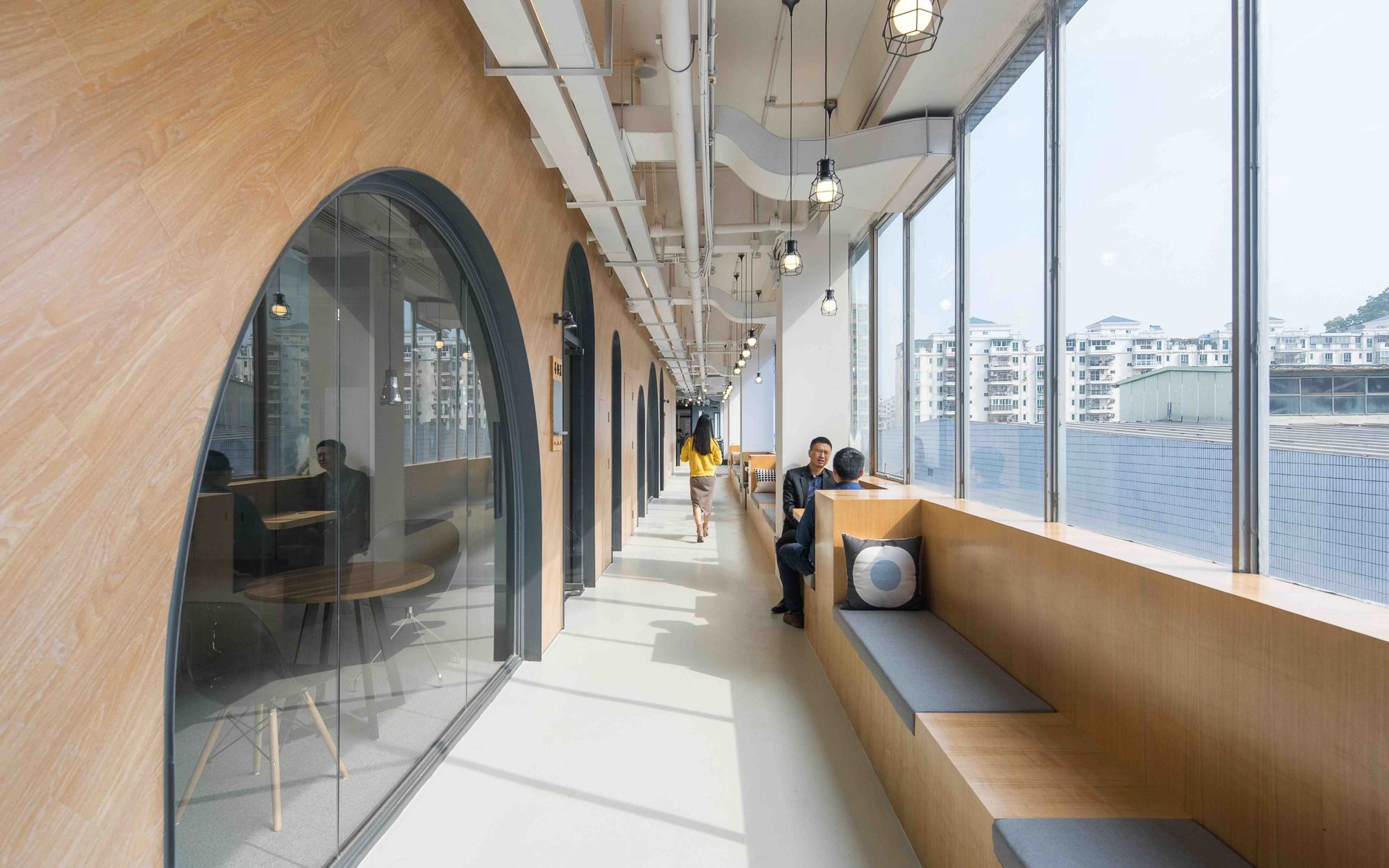
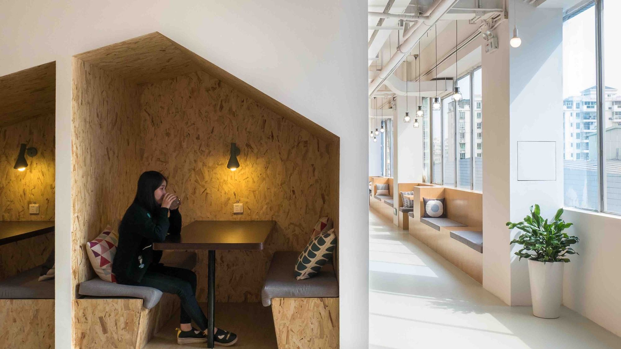
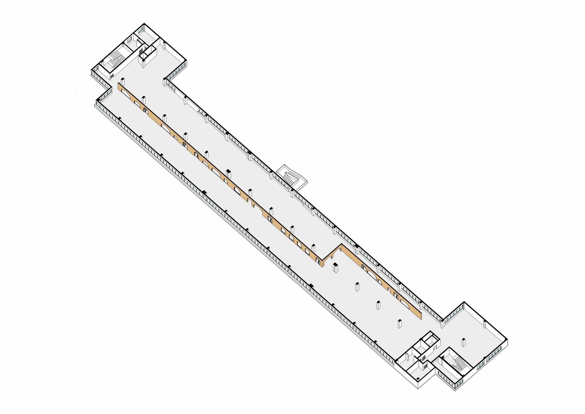
The site of this project had common conditions of industrial buildings, simple expansion of a floor with a regular arrangement of columns; but it also had a peculiarity in its shape, which was the length of 120m in sharp contrast to the depth of only 15m. The linearity was a strong character of the site that could make this project unique, but it also required careful consideration of how to design a circulation path over the site while providing an enjoyable spatial experience without being too dull. This question was answered by the design of the main circulation path that looked like a landscaped street in a city. A variety of spatial settings were proposed and put together like a collage along the path, and its spatial complexity brought the about enjoyable experience of wandering around.
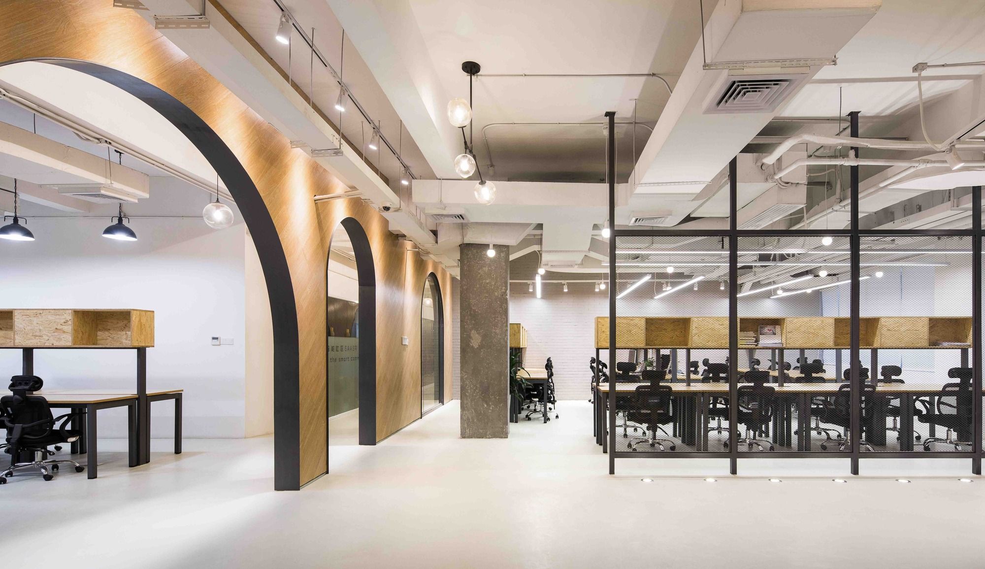
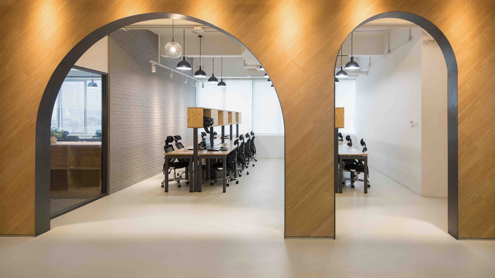
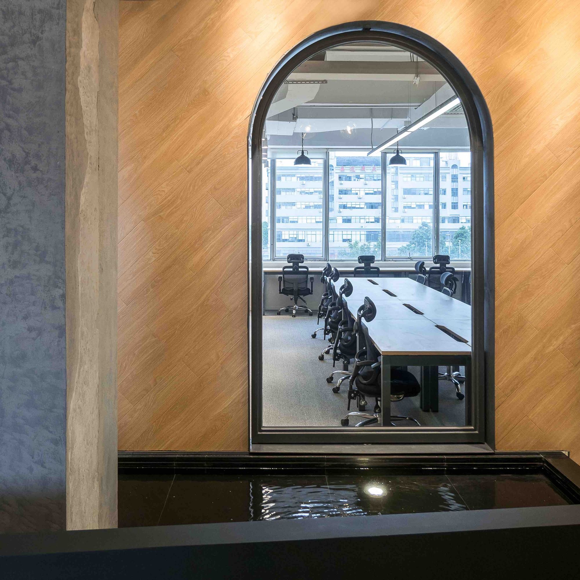
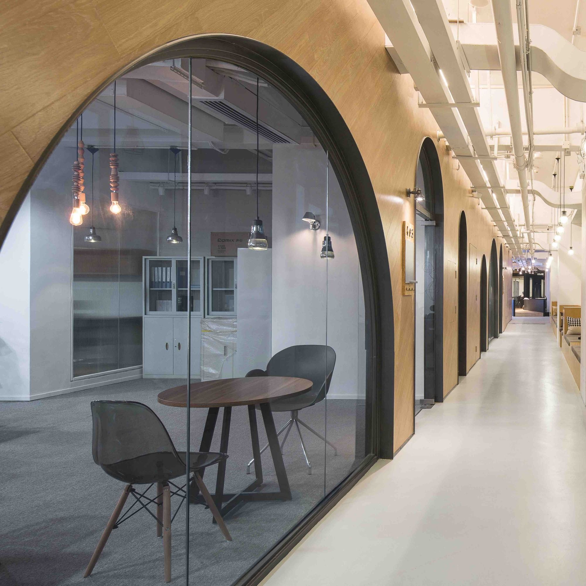
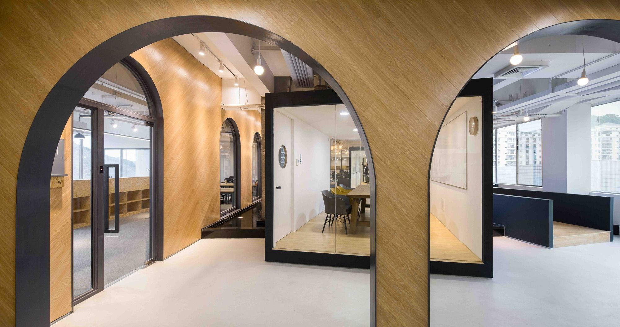
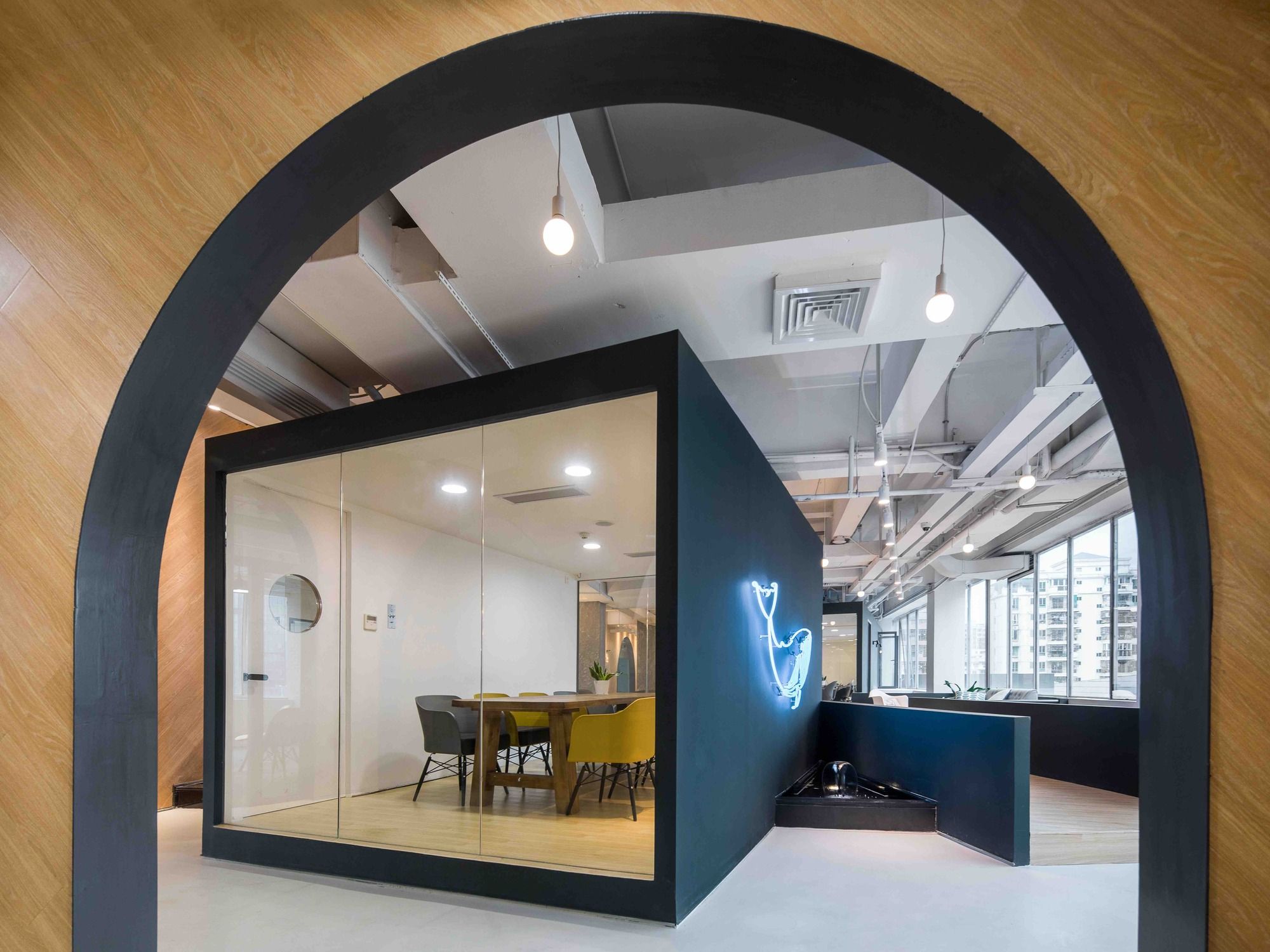
One of the noticeable elements in this design is a long wall with many arch openings. This wall responded to the linear character of the site by its placement; that is to say, it ran through the whole site and created a street, a plaza, and some pocket spaces. Although it went zigzag in the middle, it was designed as a continuous one-piece wall. Our idea for this project was not only to take care of surfaces but also to build a “structure” such as this one-piece wall because we believed it was an effective gesture to resist the transient state of commodified office space.
This wall was built in the thickness of 20cm, thicker than usual; its solidness visually reinforced the existence of the “structure” at the site in contrast to the lightness of partition walls. The side faces of the wall were clad with timber material and it was placed in a diagonal pattern, and the arch openings were shaped in different sizes and arranged irregularly on the wall. These expressions contributed to the dynamic visual effect along the path, and also reinforced the uniqueness of the wall specific to the site.
The overall appearance of this wall resembles the remains of a Roman aqueduct in a city. A tall and long ancient water bridge stands in a city with strong existence because of its heroic appearance in contrast to the surrounding refined housing blocks; the authenticity of its primitive material and arch structure; and the fact that it has existed in that place for a long period of time. We were aware of the image that a Roman aqueduct carried with it and it was intentional to include such an image in our design of one-piece wall as its connotation.
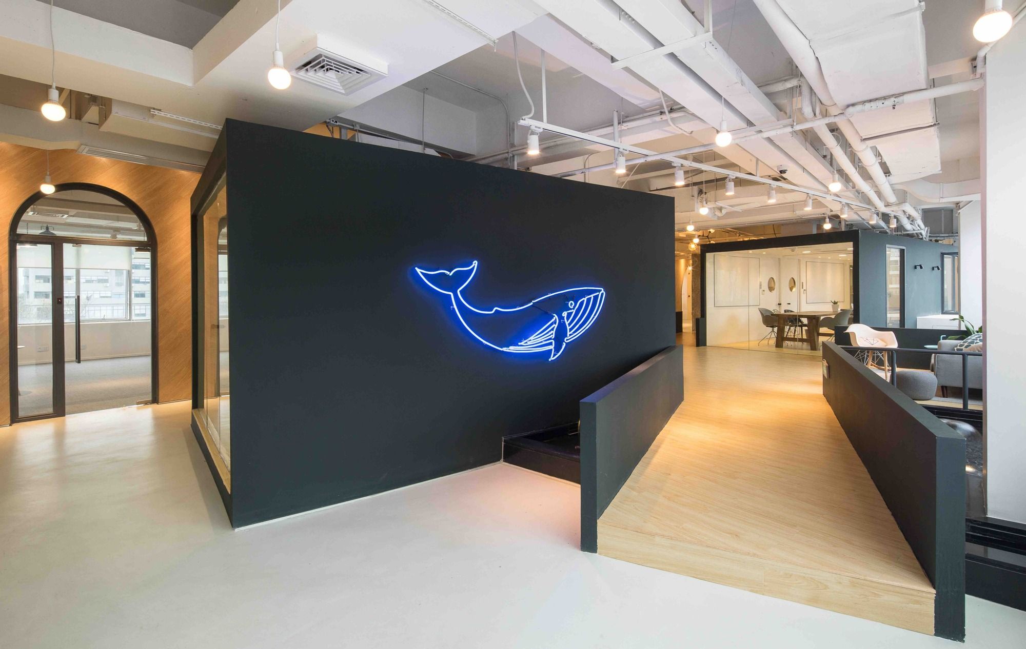
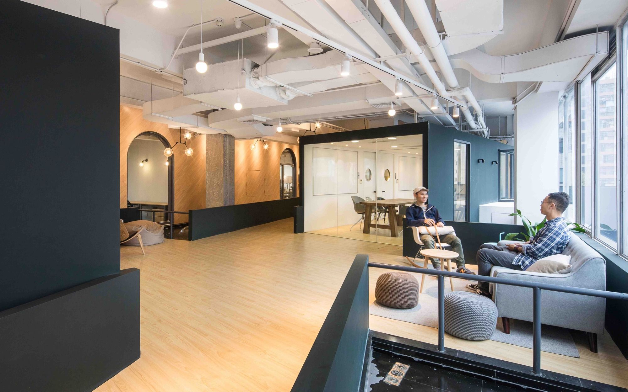
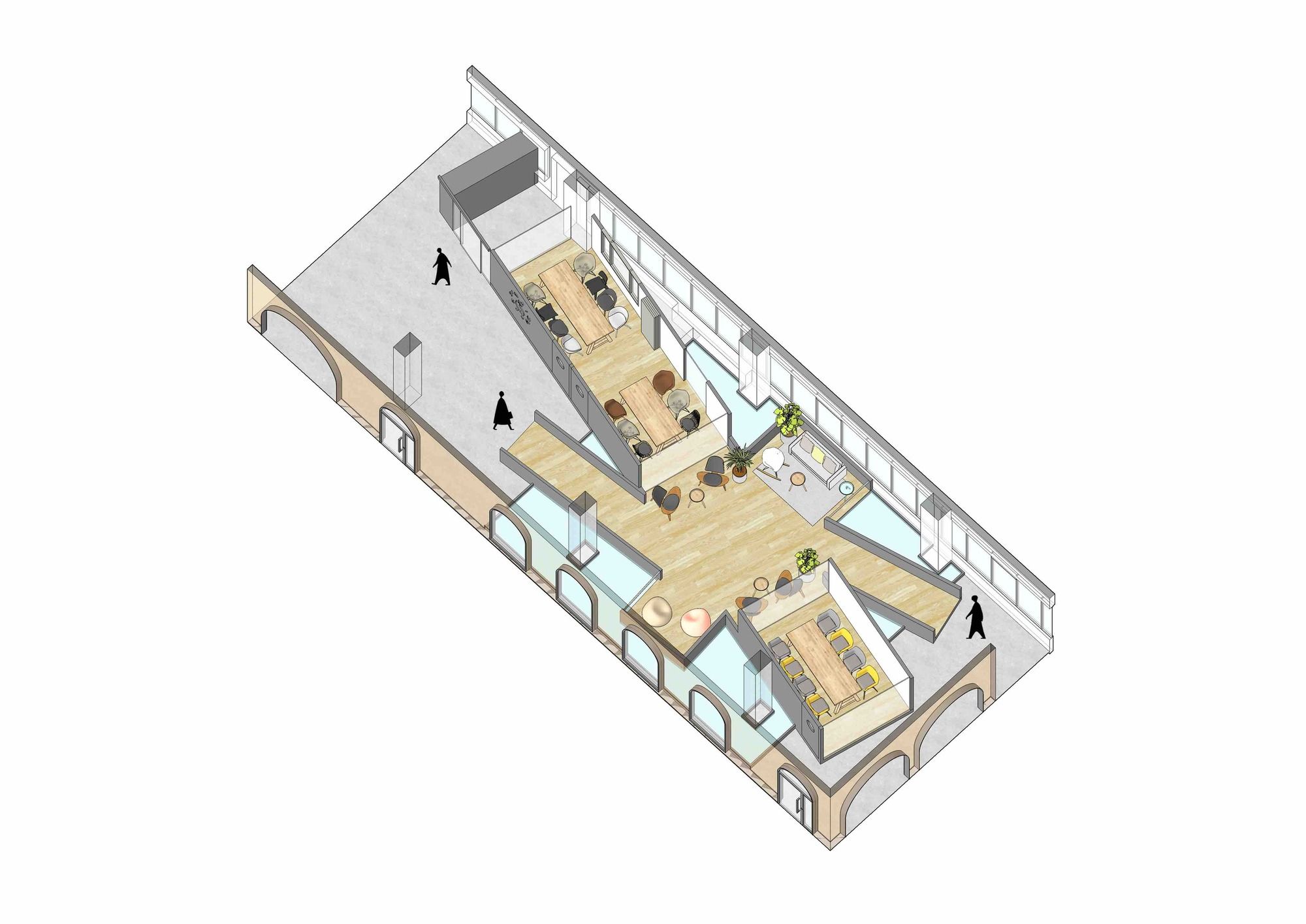
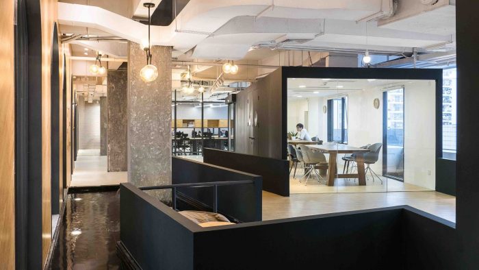
The “dragonfly island” is a raised platform consisting of three discussion rooms and a relaxing lounge. The idea for this space was to design an independent object detached from the surroundings and provide a relaxing environment away from the working section. It was given a unique form similar to a dragonfly and put on the water in an open space, dissociated from the dominant framework of the industrial building. It was colored black without any material texture and kept abstract in order to distinguish itself from surrounding elements such as structural columns with rough concrete surface and the long one-piece wall with timber texture. Furniture and lighting fixtures were also carefully selected in order to provide a relaxing environment.
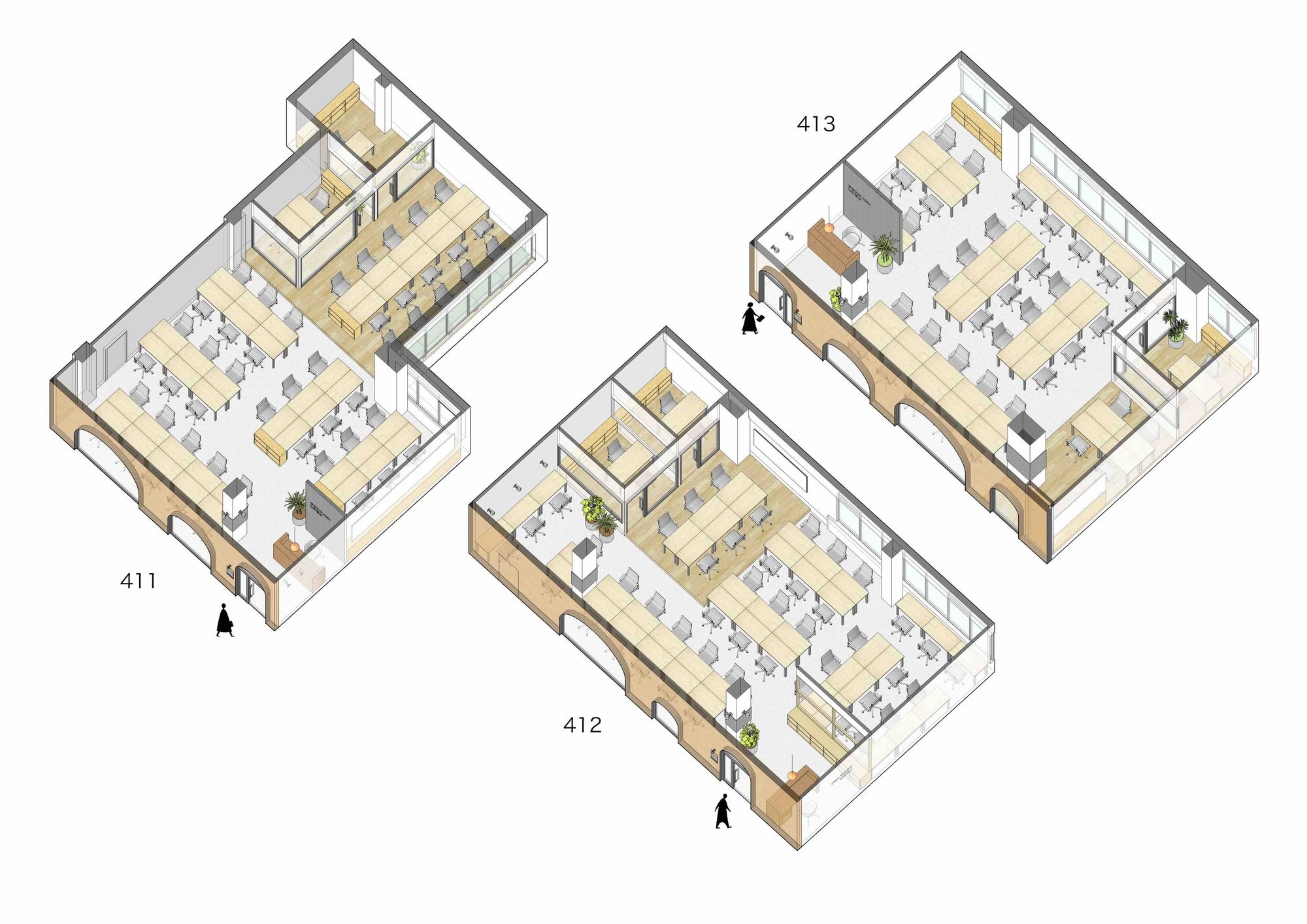
There are fifteen office rooms designed for this project from the smallest one for 6 people to the big ones for over 60 people. As required by the client, all the rooms were well furnished and made ready for tenants to start working right away. When designing these office rooms, we imagined some stories and spatial experiences of people who were working in there. They were not abstract office rooms, but each room was designed uniquely to its own condition; they had different shapes and sizes and different spatial relationship to the fronting street and to the view outside, and desks were grouped and arranged in relationship to all kinds of conditions.
Project Info:
Architects: 11architecture
Location: 4F Vanke Xinghuo Online, Tianshu Building, 2 Wuhe Ave South, Longgang Qu, Shenzhen Shi, Guangdong Sheng, China
Design Team: Fujimori Ryo, Xie Jing, Luo Ming Gang, Yang Jian You
Area: 2100.0 m2
Project Year: 2017
Photographs: ZC Architectural Photography Studio
Project Name: SimplyWork 6.0 Co-Working Space
