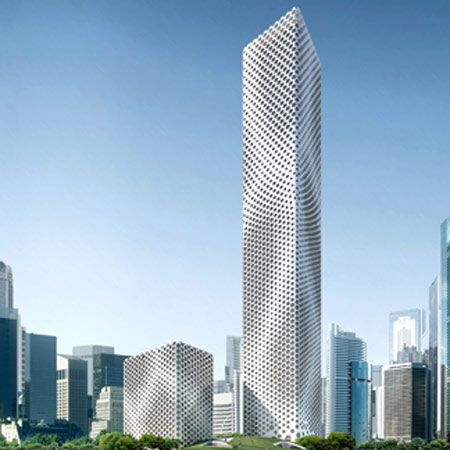
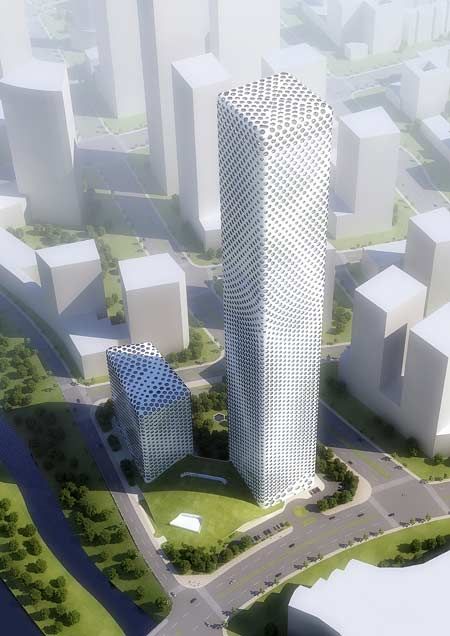
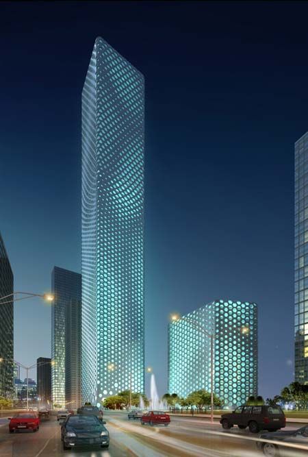
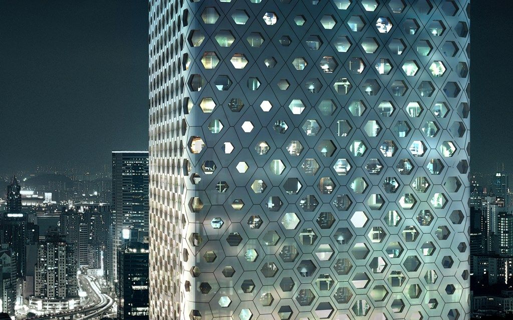
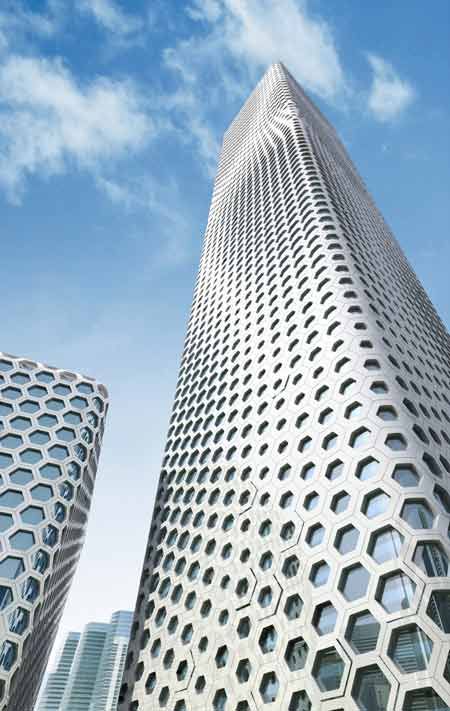
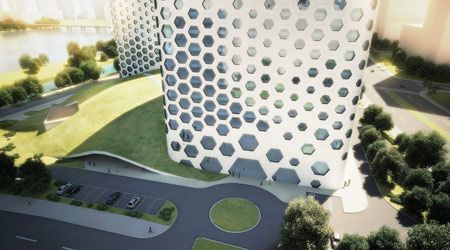
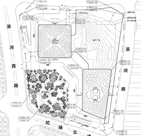
The Sinosteel International Plaza in Tianjin, China by MAD is scheduled to be completed in 2013. The buildings are designed to house office and hotel space occupying a total site area of 26,666 square meters. The tallest tower, Tower A, has a total building area of 228,638 square meters with a height of 358 meters compared to the smaller tower, Tower B, with its building area of 69,216 square meters and a height of 95 meters.
According to the architect, “The Tianjin CBD development illuminated a shift in national economic resources from Beijing to Tianjin, and the creation of a future urban megopolis in northern China. What type of architecture would demonstrate these ambitions without sacrificing its ties to the locality?
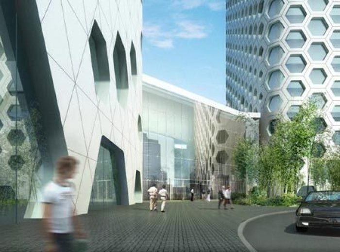
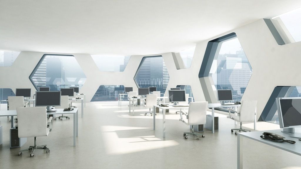
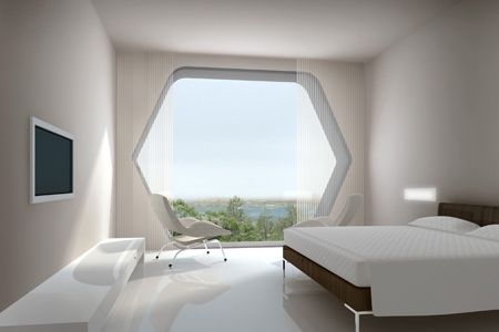
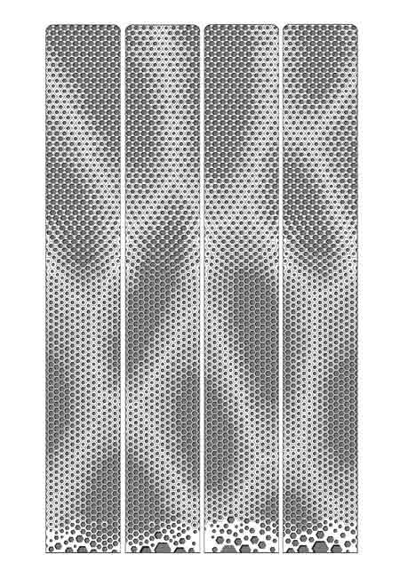
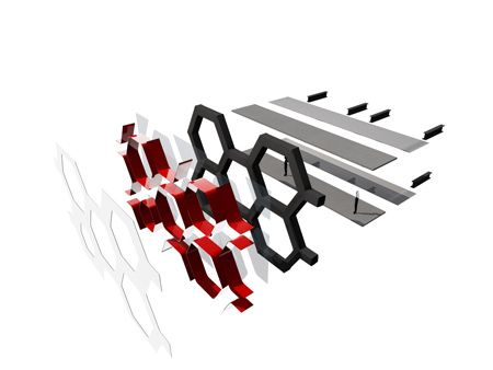
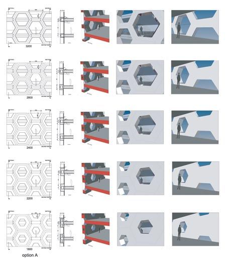
The design concept combines geometry, structure and cultural symbolism as a repetitive motif: a hexagonal façade, multiplying and evolving across the building. This façade is made up of five standardize units of hexagonal windows; it signifies the heritage value in Chinese architecture. These windows flow across the building in a naturally evolving pattern, as if organic cells multiplying. This design detail animates the façade, creating an ever-changing image of the building from each different perspective. The façade is also the backbone of the building structure, exoskeleton, and sheer solid surface. This removes the necessity for internal columns beyond the building’s core, freeing up space within the structure for a much more flexible use.
From a very simple concept, yet deeply rooted in ancient Chinese architecture, a subtle and sensitive building arises. Sinosteel International Plaza will establish a different urban landscape and soften the hard edge of the concrete jungle we live in, our modern city.”
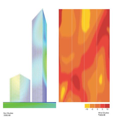
In my opinion, I’m on the fence when it comes to this project. It utilizes smart ideas and rational thinking in order to create a finished product such as the apertures on the façade being generated by the mapping of air flow and solar direction to aid passive climate control and the skin also being used as the structure for the building. But it is difficult to see creativity playing a part in the architecture as I feel as though I’ve seen this sort of façade effect on several other designs as of recently. The design itself is simple and is merely a rounded box making it seem as though this project was more about developing this cladding than pursuing the internal conditions within the building. However it’s commendable that this building is being built and it does represent an elegant solution for an office and hotel tower.
Courtesy of MAD Architects
Courtesy of MAD Architects
Courtesy of MAD Architects
Courtesy of MAD Architects
Courtesy of MAD Architects
Courtesy of MAD Architects
Courtesy of MAD Architects
Courtesy of MAD Architects
Courtesy of MAD Architects
Courtesy of MAD Architects
Courtesy of MAD Architects
Courtesy of MAD Architects
Courtesy of MAD Architects
Courtesy of MAD Architects
Courtesy of MAD Architects


