I’ve always been intrigued with renovation and refurbishment, because of the opportunity to tell a story, and the fork in the road that decides whether the project will conform to existing conditions or strikingly contrast them.
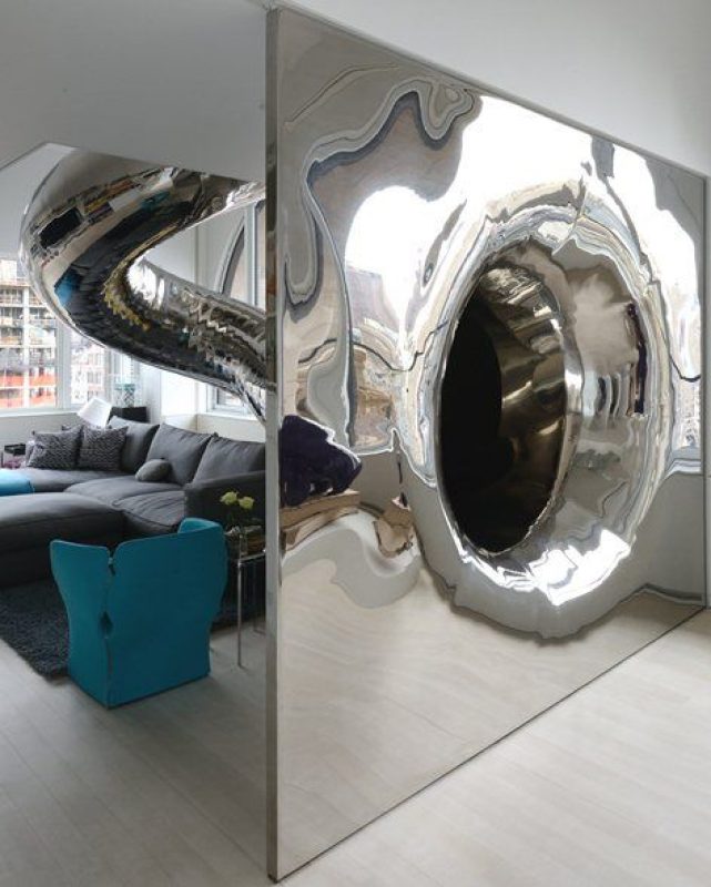
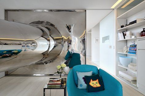
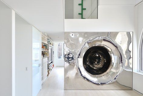
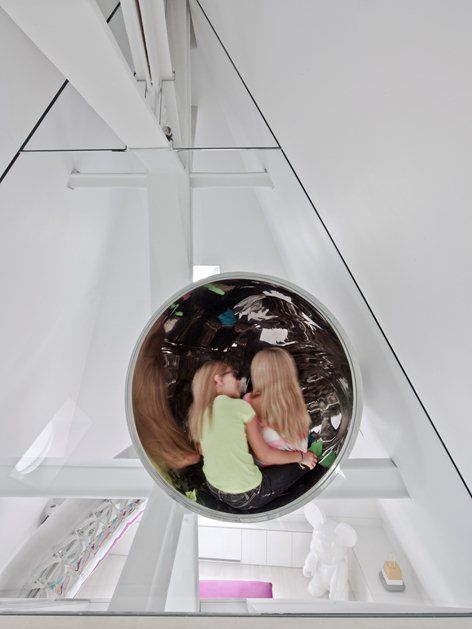
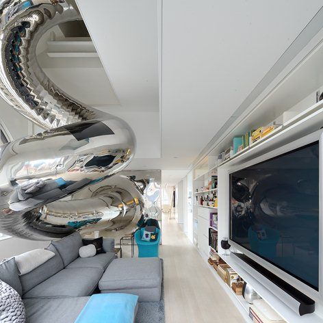
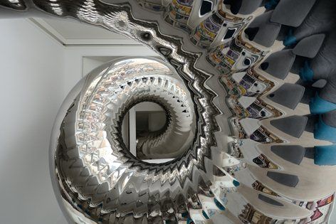
Skyhouse, a four-story penthouse in Manhattan, is definitely drastic change on the inside. It is what I think of as ‘dissection’ architecture: you’re going in with the precision and carefulness of a scalpel, to completely transform an interior while the shell stays intact. A by-product of this process is now that you have a clean slate, there’s room for seemingly absurd propositions. In this case, the striking four-story-high stainless steel slide throughout the space.
Ideas are easily dismissed as fantastical, which is unfortunate. A dream house has become almost trivial, but I say why not? Architecture has the ability to make things that start out in the imagination into a habitable reality. What if fantasy is what reality yearns to be and as designers we can bring two closer together through our practice.
The contrast is successful: from no-change on the outside to absolute change on the inside. The renovation process was thorough and extensive. Hatson explains it here: ‘This is a complex interior with a number of dramatic elements… The penthouse involved a complete re-imagining of the interior and all of the remarkable relationships between this space and the vertical cityscape around it.’
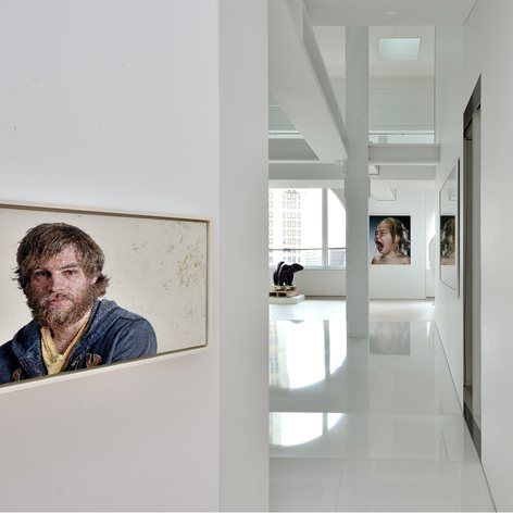
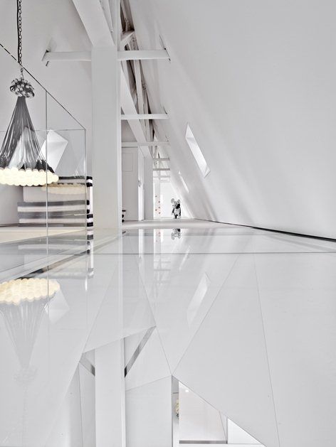
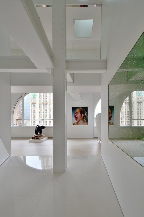
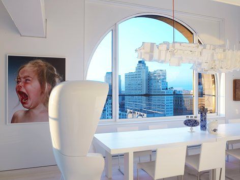
Though the slide as an idea is playful, I just don’t see that playfulness being cohesive throughout the building. The space seems to be too pristine to be interactive. The polished stainless steel make the slide look sculptural but not very inviting. The same goes to the rest of the material palette: it wants to be playful by incorporating certain functions but then the execution is so refined, it seems untouchable. The finishes are absolutely white; it’s hard to imagine kids running around. Maybe the fact is, there’s a natural crude aspect to playfulness, and the space seems too refined and polished to foster such playfulness. Walls have a capability to be more imagination-inducing than a toy. I think incorporating properties like that make a space most playful. Once that is achieved, toys (that are now placed on white shelves) and a giant slide would fit in more.
Courtesy of David Hotson – Ghislaine Viñas
I do salute them for the intent. One key point to keep in mind is that the space is made for the clients and their tastes. That said, the architect and interior designer both had very thorough attention to detail.
From David Hotson:
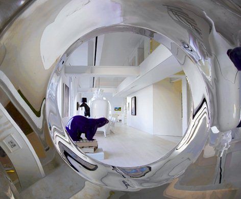
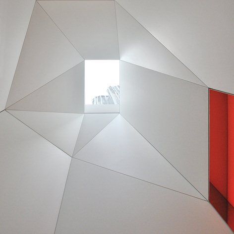
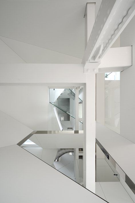
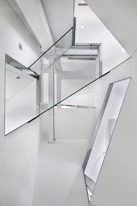
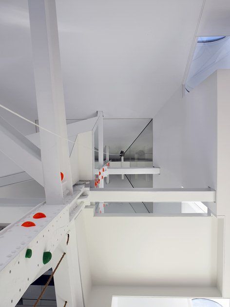
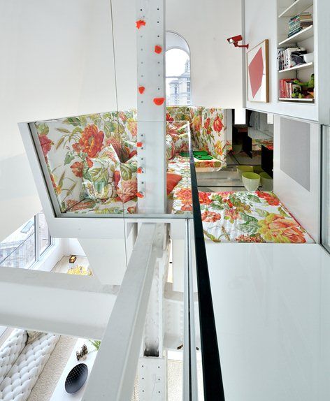
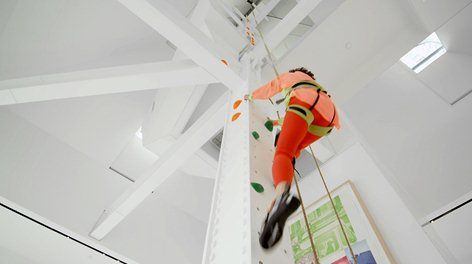
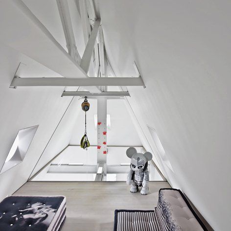
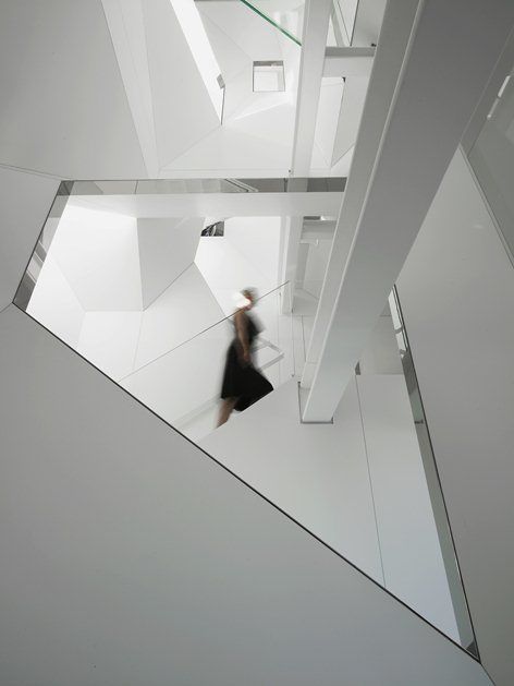
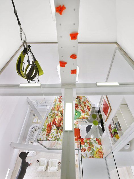
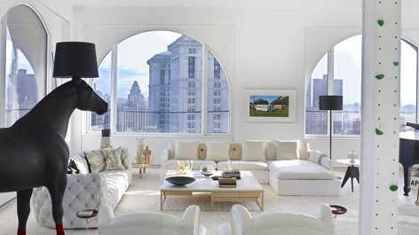
The residence features a four-story high entry hall spanned by structural glass bridges and illuminated by ingenious skylights borrowing light from upper level rooms, a fifty-foot tall living room ascended by climbing holds anchored to the central column, and a mirror-polished stainless steel slide that coils down through rooms and over stairways before it flares out to form a distorted wall at one end of the entry gallery.
Courtesy of David Hotson – Ghislaine Viñas
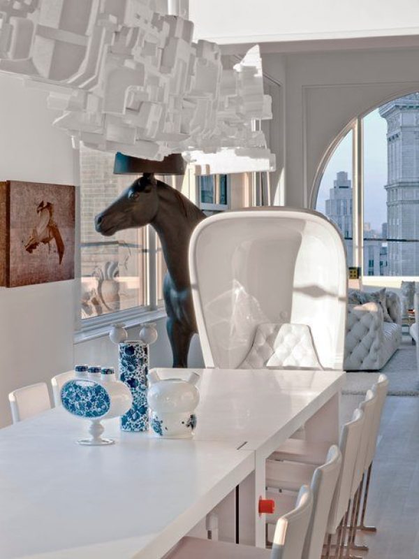
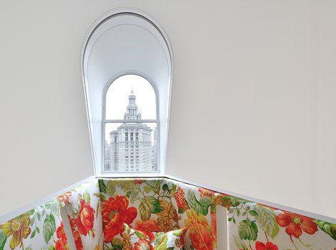
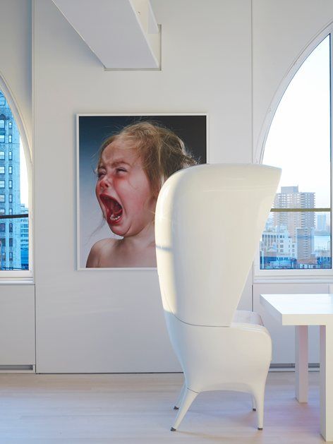
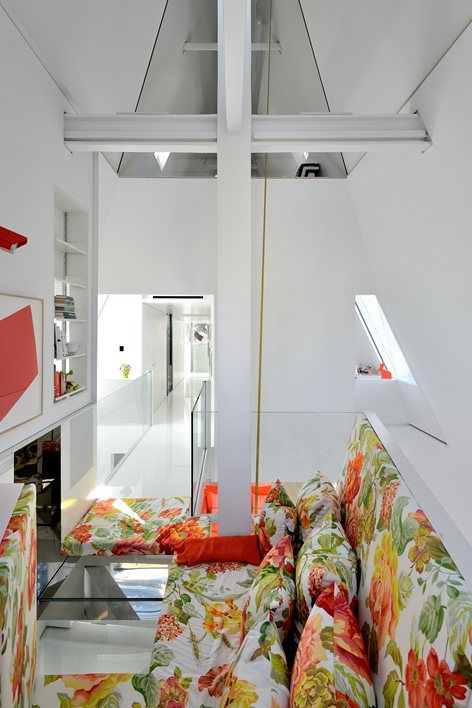
Juxtaposed with this spatial drama, Viñas’ incandescent colors, startling overscaled floral patterns, whimsical menagerie of animal forms, tongue-in-cheek lighting fixtures and sly pop-cultural references create a playful and lighthearted foil to the vertiginous architecture.






By Aiysha Alsane
Courtesy of David Hotson – Ghislaine Viñas


