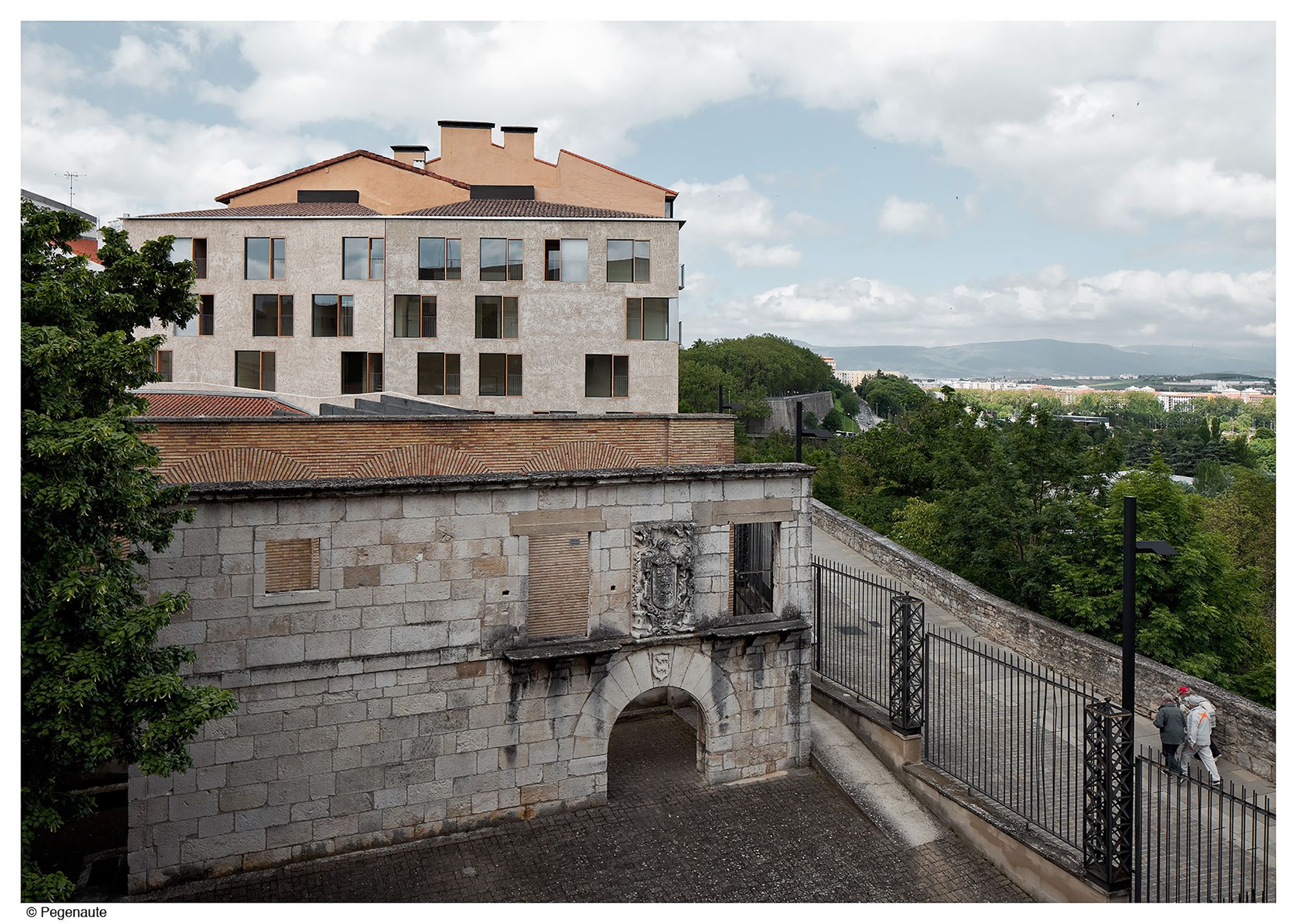
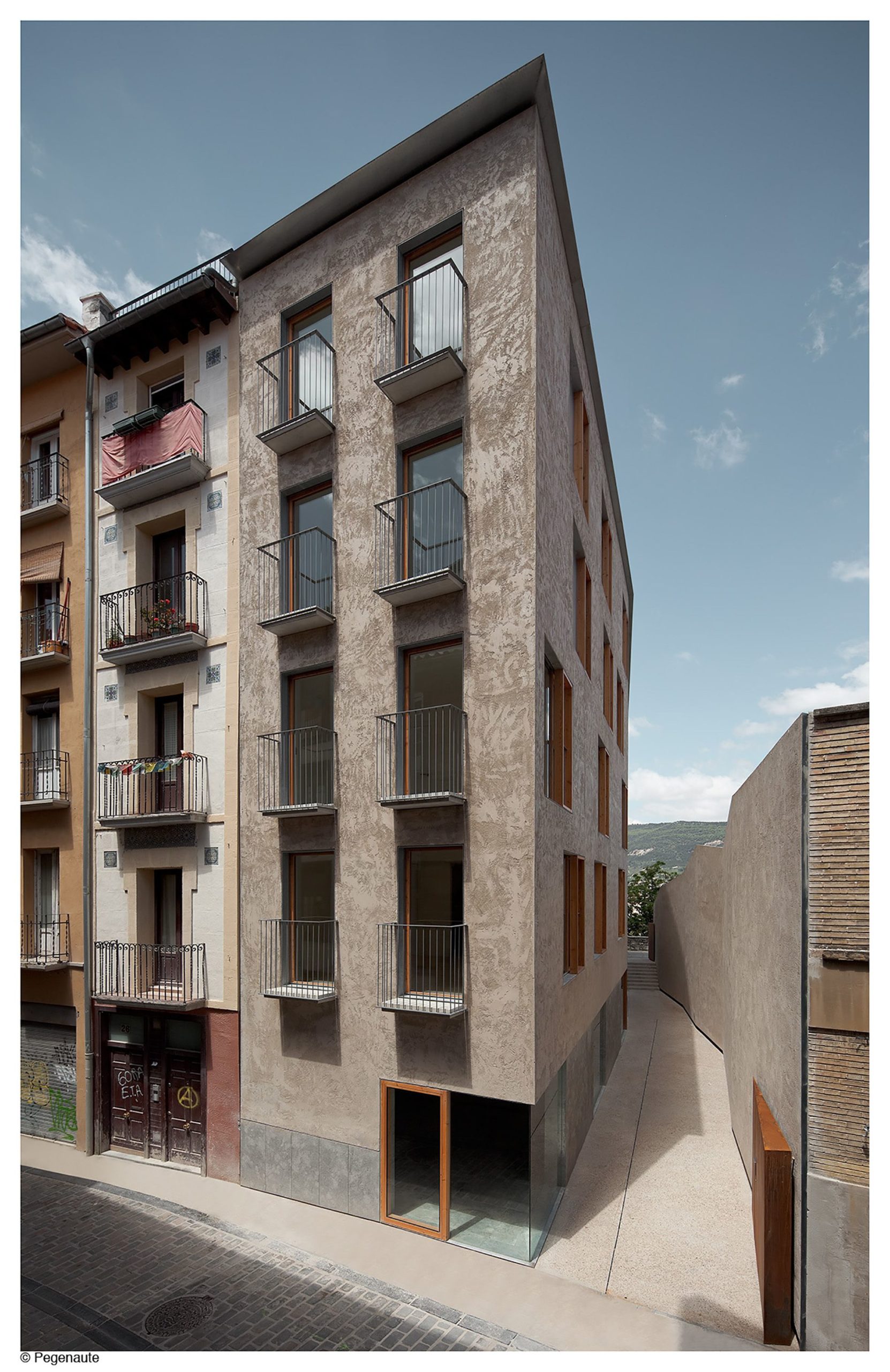
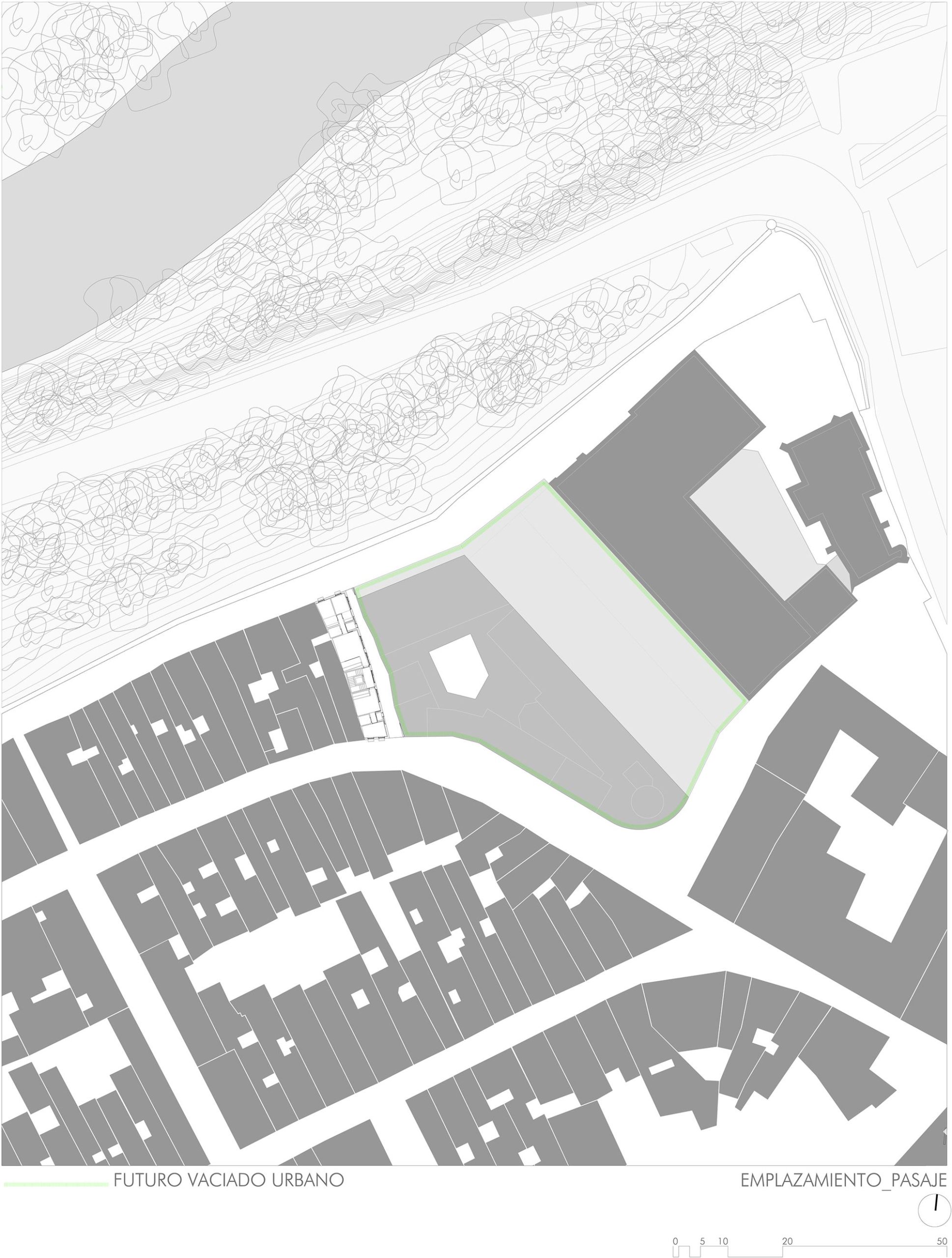
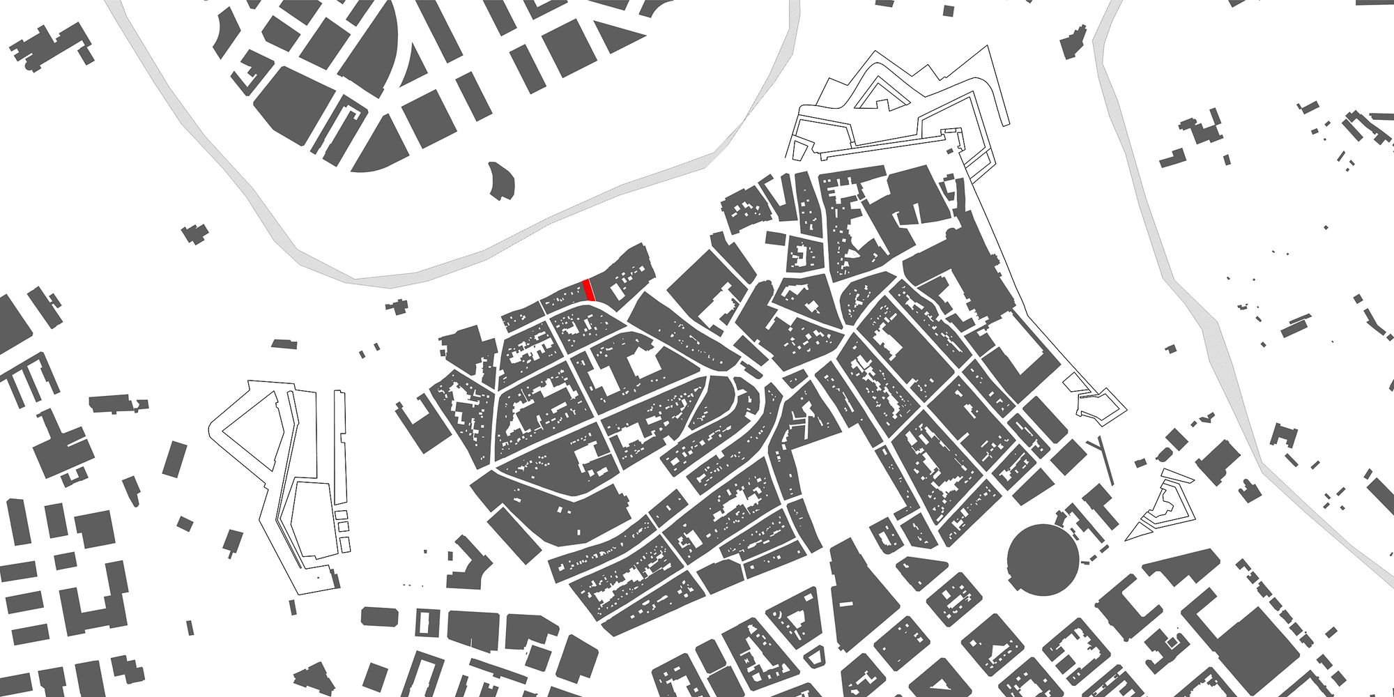
The project Social Housing was designed by Pereda Pérez Arquitectos, located on the north limit of the old town of Pamplona, at the end of the plateau where it is placed, next to Ronda Promenade, the limit of the medieval walled area.
This project has been promoted by the public administration, in order to revitalize the most degraded zone of the old town within the municipal housing plan.
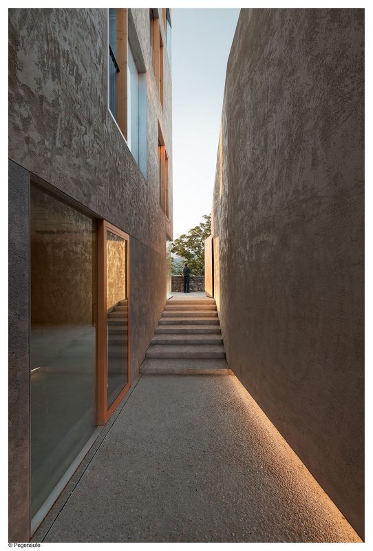
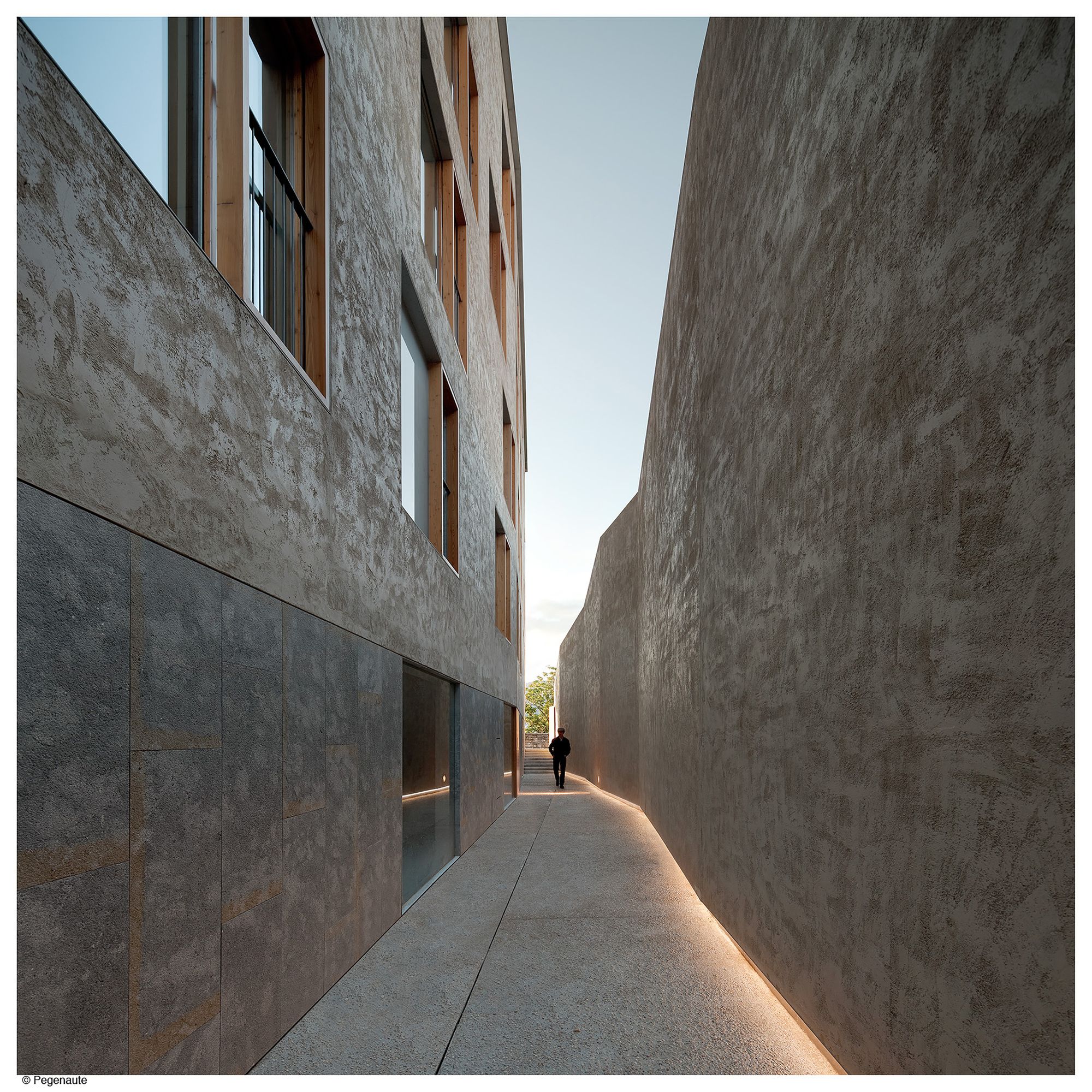
The project was included in a high-interest urban plan. The new building, which takes up the demolition of an existing one, had to complete the preexisting block and to face a new urban space, a new generation square on the medieval wall. Due to the difficult economic situation, this urban development was postponed, incorporating into the project the definition of a passageway of semi-private nature which allowed the viability of the initiative.
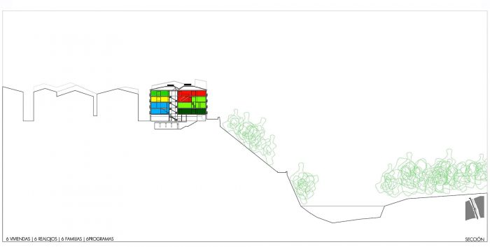
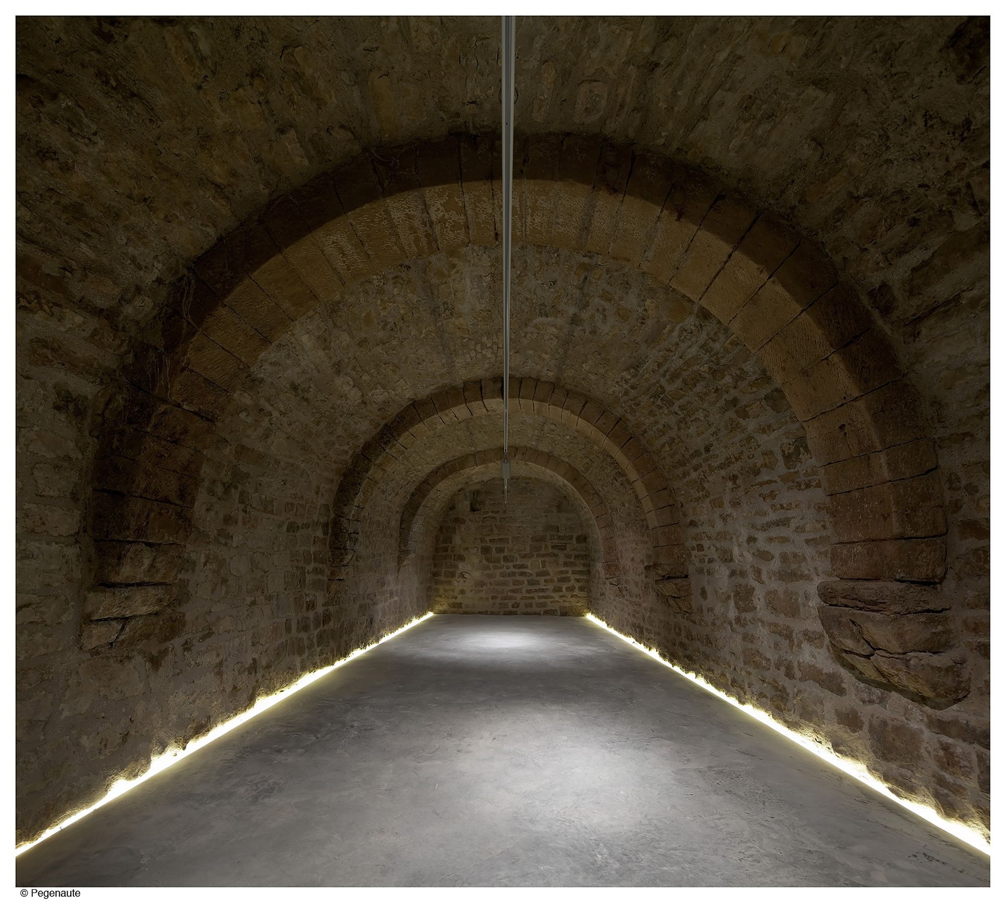
The program consisted basically of apartments to be used as rehousing, which specific detail of the program was unknown at the time of the competition. Exclusively was known that six apartments had to be built; for six rehousing of six families and hence with six different programs, in addition of different trade premises on the ground floor, to promote the commercial activity of the zone and the restoration of a medieval cavern located in the basement of the old building.
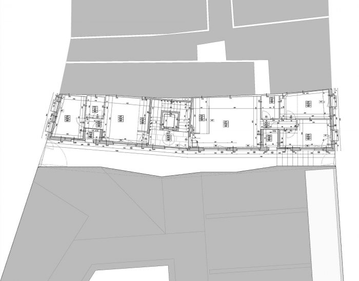
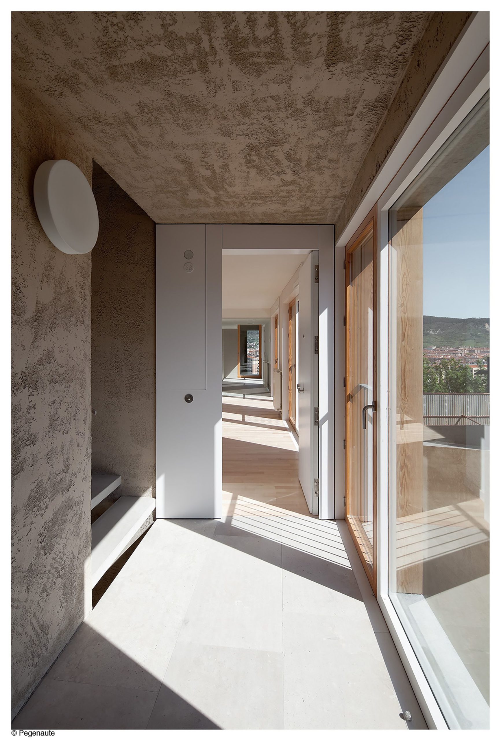
Besides the initial uncertainty of the program, the design of the competition aimed, as a starting point, for an organizational strategy to solve the necessities of the future rehousing. This plot, facing the urban situation generated, undertook a new approach of the building different to the ones at the surroundings, where the typical rule placed the most important spaces towards the streets, and interior bedrooms. The project linked the position of the bedrooms to the lateral streets and the most public areas of the apartments to the new generation square; and between both located the corridor of humid spaces (bad rooms and clotheslines) which made at the same time more legible the organizational structure designed. Finally, kitchens were placed open to the “livings”, separated by a glass, in coherence with the most public nature of those spaces.
At the same time, it was aimed at the most optimal solution for the communications core, in comparison with more “special” solutions considering the formal and special resolution of the stairs, which allowed on a so small plot, an occupation of the surface smaller and hence, more square meters assigned to the apartment surface. It position and small size allowed to locate in one side an apartment of 40 m2 and in the other side one of 65 m2, in which spaces, with certain naturalness, it could be occupied with one single and two rooms apartments with the organizational rule previously established.
The proposal of the competition considering such occupational strategy of the building understood that the development of the plan was optimized and any manipulation would not allow a better solution considering the uses and location criteria. But on the other hand, it was possible a development of the spaces of the apartments which allow a higher flexibility as a response for the uncertain future of the users. In such way, it could be possible to vary, connecting spaces with different levels, from approximately 40 m2 apartment to a 75 m2 and from 65 m2 to 90 m2 making twice the half of the surface, and even reaching a surface of 120 m2. Hence this approach was not only an optimal solution, in addition, could cover the usual spectrum of the surfaces of the future programs unknown at this stage.
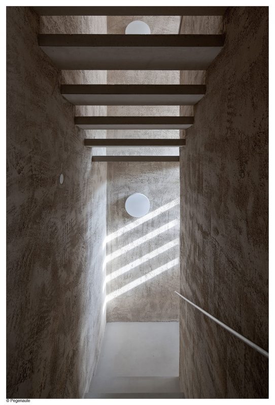
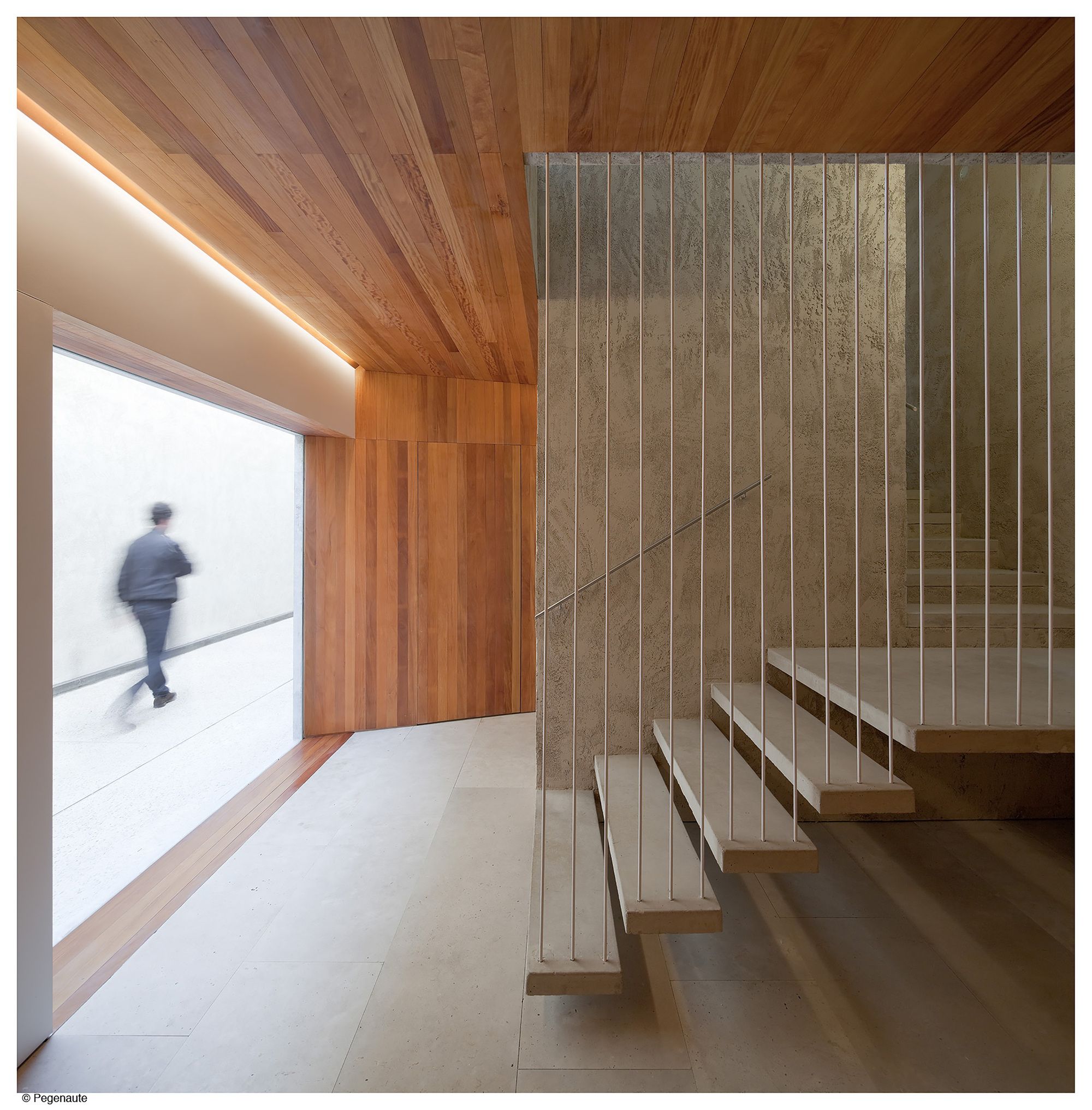
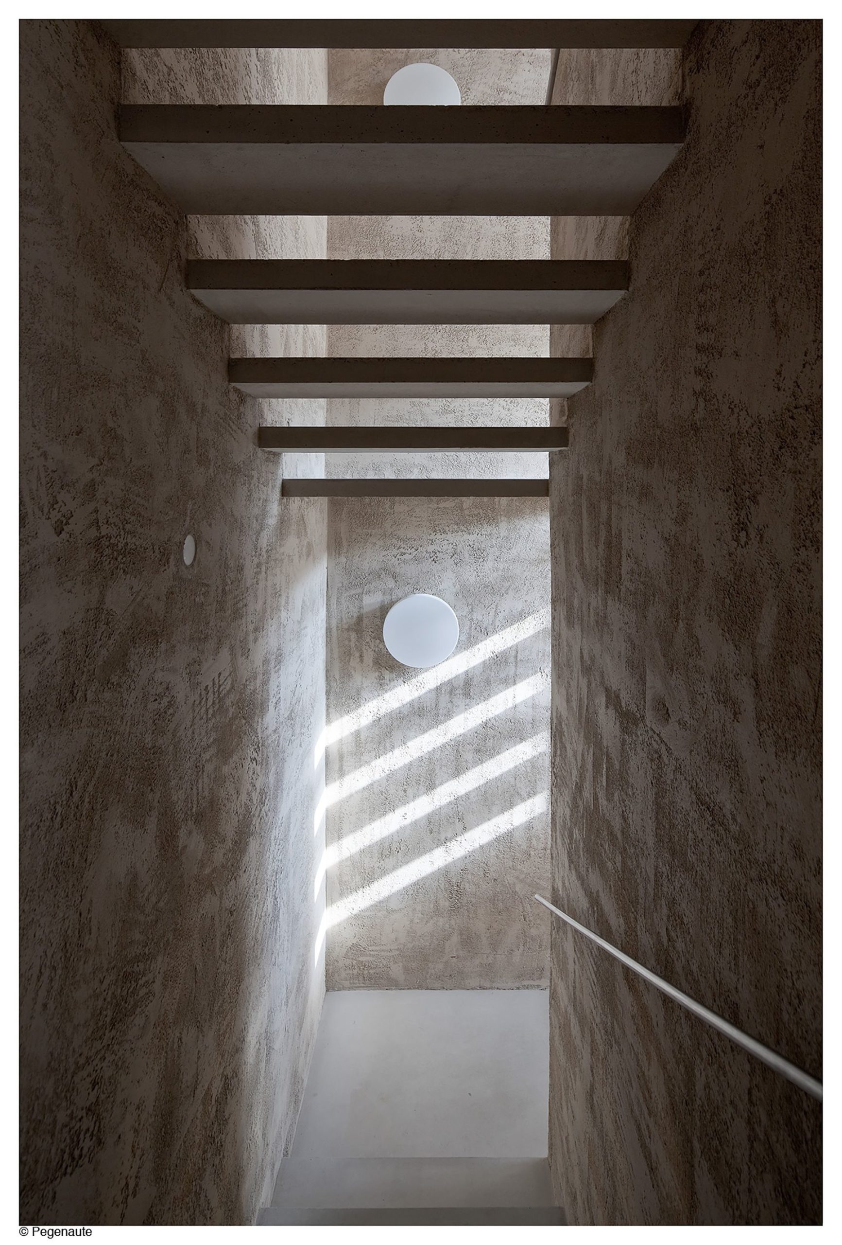
The communications core, in spite of its optimized configuration, we understood it might have more presence than just a series of stairs where occurs the up and down movement. That one was formalized with concrete PISAS which kept free the risers and hence allowed the light pass through: to understand the stair as a singular space beyond of the functional use and to take advantage of the visual depth in spite of its small size.
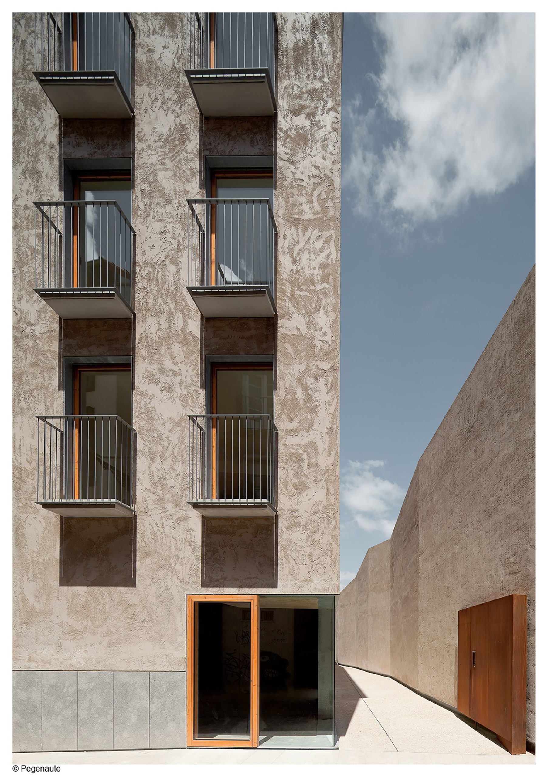
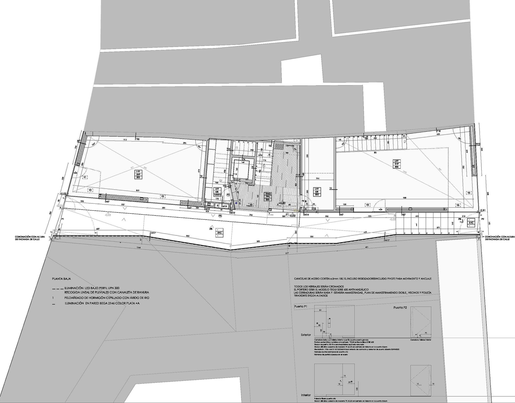
At the ground floor two trade premises connected to the public space, located on both sides of the communication core. In one of them, it was integrated the XVI century arched area of the preexisting basement, which had to be preserved.
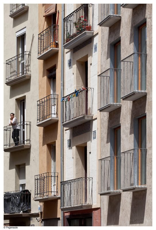
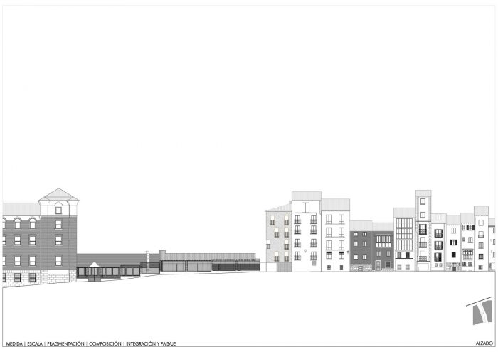
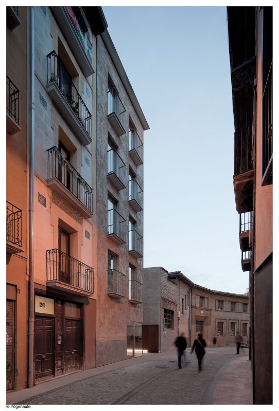
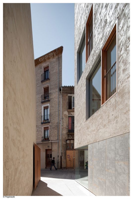
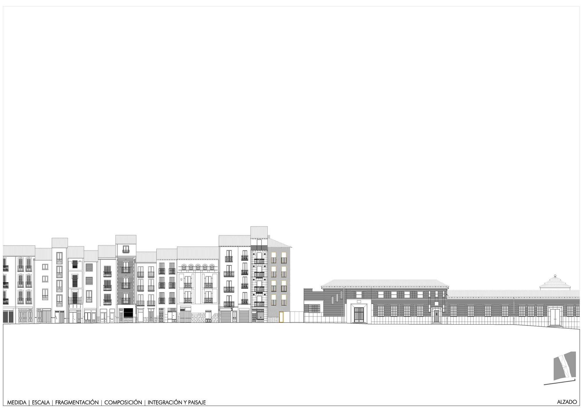
The project, from the intuition, pretended to be presented at the junction of two pieces following the growth criteria of the old town, where the sum of pieces generated from the public space forms the blocks. In that way it was warrantied a more natural integration, adding its façades, its scale, its fragmentation, and composition a certain urban continuity to the existing one.
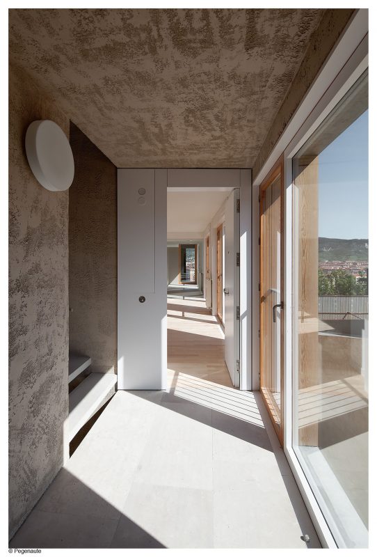
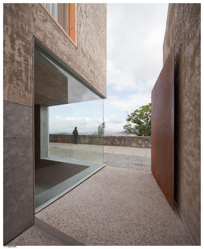
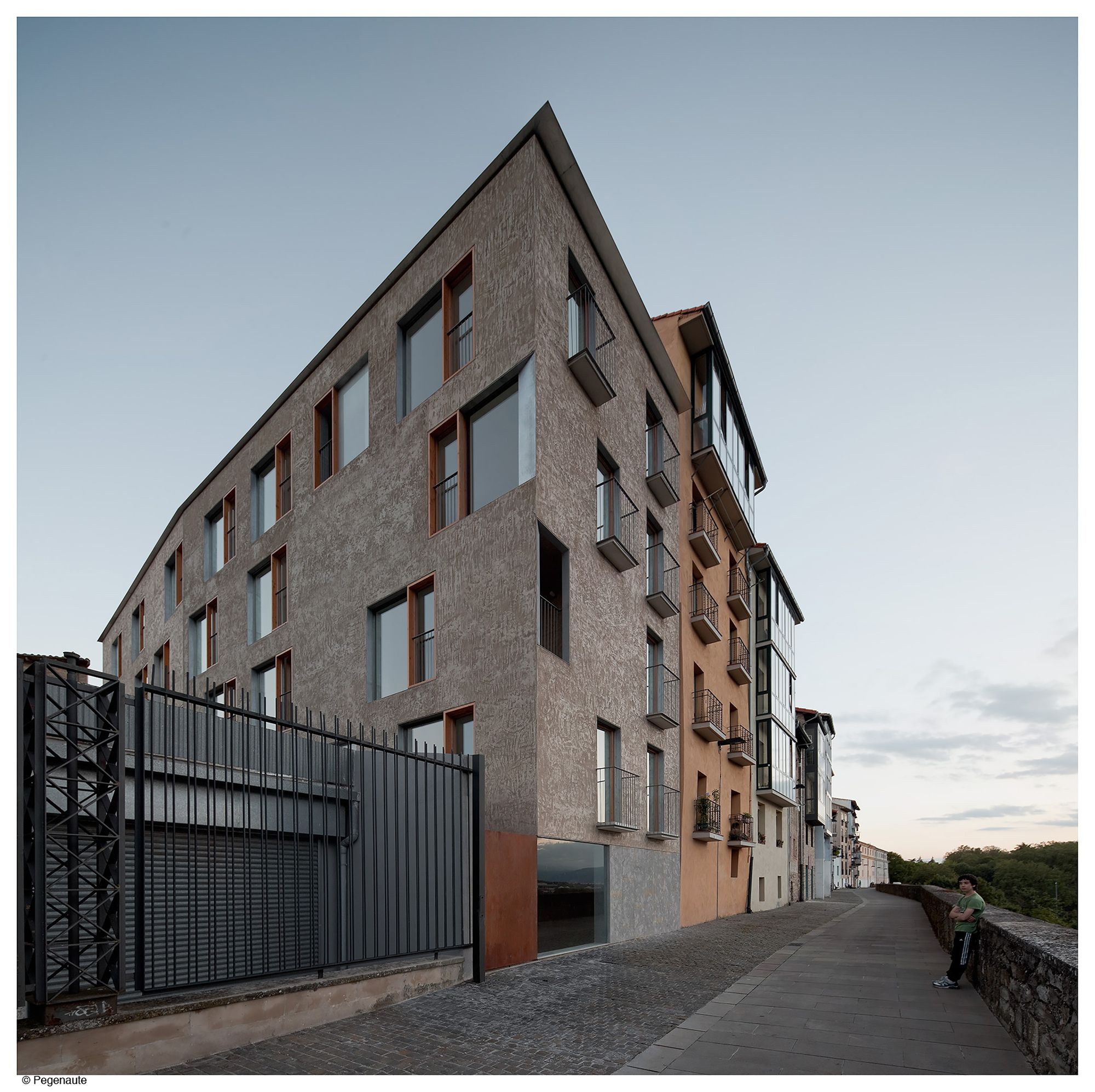
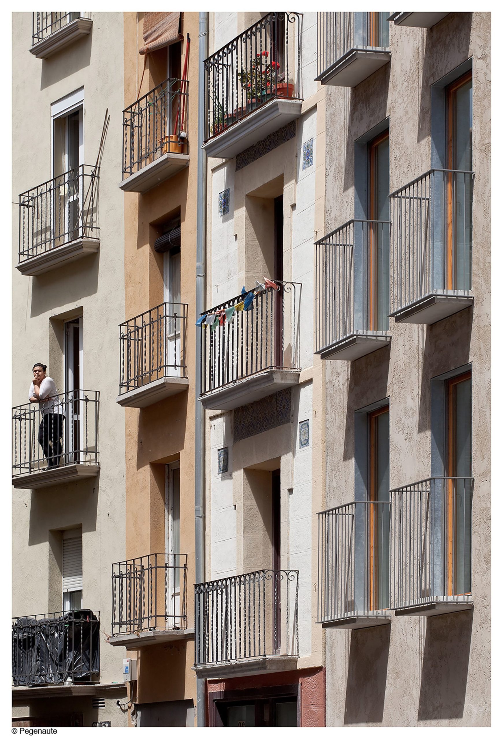
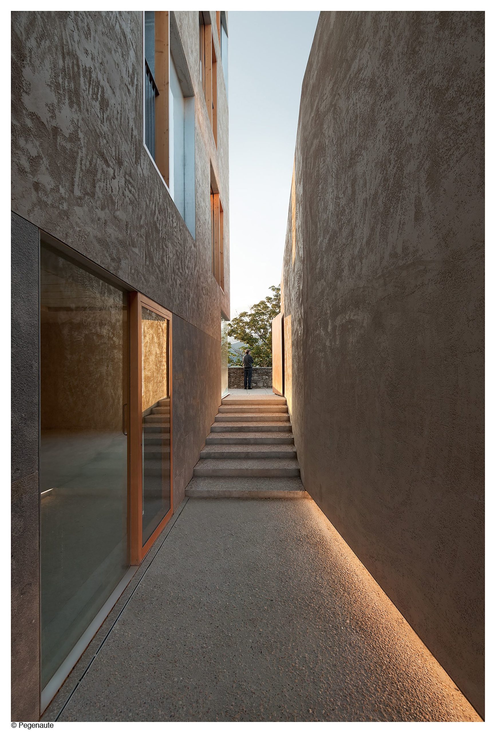
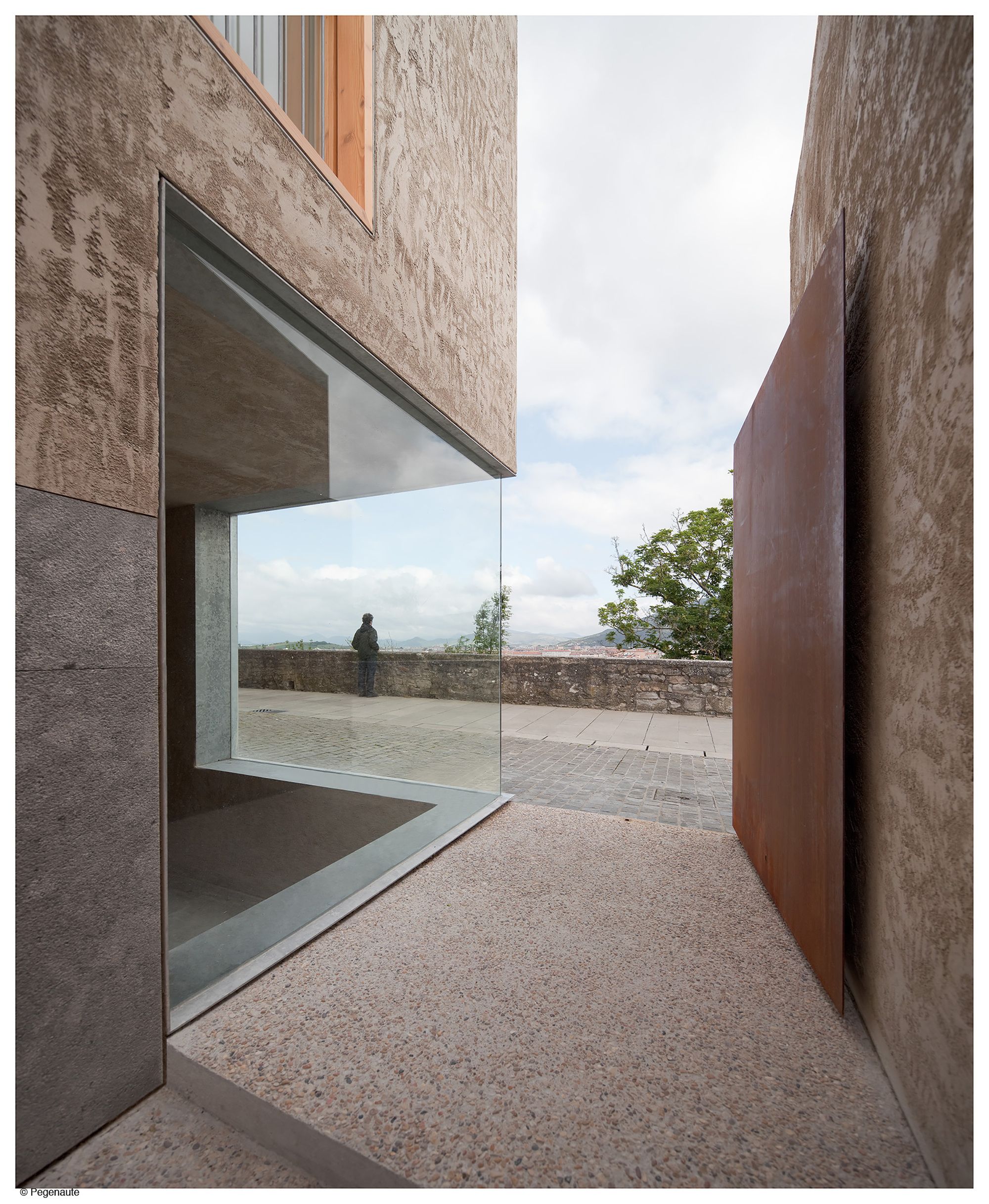
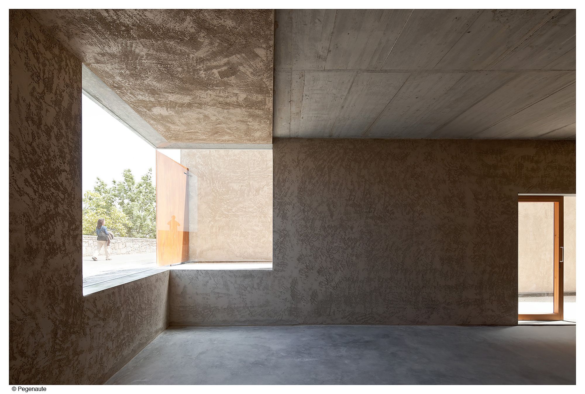
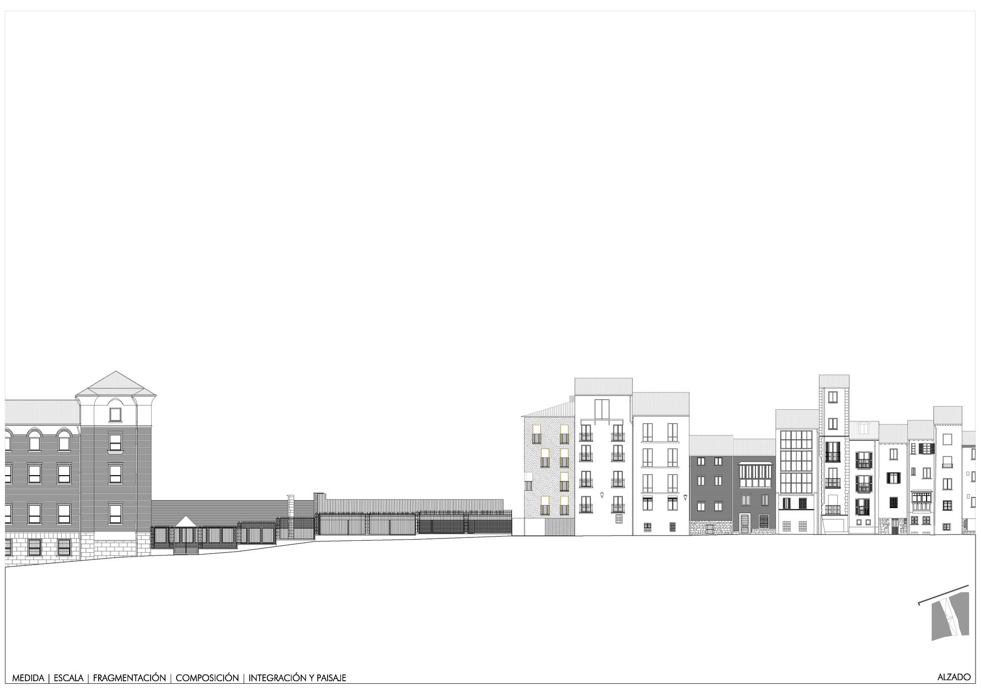
The design of the façades pays attention to two different situations according to the position in the public space: in one side from the streets seeking a certain anonymous presence of the proposal giving continuity to what there “happened”: to the normative trace and rigorous of the axial order in Descalzos street, and apparently without regular pattern as consequence of the character of the “back” of the buildings at the Ronda Promenade and in the other side from the new square which transformed the party wall in a singular elevation, free of references and normative context. This façade with double level, the spaces in the wall gain a bigger size, big square windows in comparison with space which faces and the enjoyable landscape with a free order which allowed move the uncertainty of the section and program.
The treatment of the party wall of the adjacent nursery was incorporated into the project formalizing finally the passageway. This canvas of the same façade material is folded and absorbs the irregularities of such building which had to be maintained.
Beyond the most organizational questions and others as the attention on the scale, are the fragmentation and piece coupling. The project has to do with the color and texture of its finishing aiming to coexist with the old, with the patina of the time made material already wore down. Has to be with the design and the composition of spaces in the matter as well as has to be with corner moldings and the gravity artifice. With the chromatic austerity and material which speaks about the time passing, its dry trace, avoiding the superfluous which time finally delete, as integrator mechanism and as all that will be materially adapted to the “time speed” of the already existing. Since the architecture work goes into a correlation of facts in the time which has there occurred, our activity is understood as a part of a sequence.
Project Info:
Architects: Pereda Pérez Arquitectos
Location: Calle Descalzos, 24, 31001 Pamplona, Navarra, Spain
Architects in Charge: Carlos Pereda Iglesias, Óscar Pérez Silanes
Photographs: Pedro Pegenaute
Collaborator: Teresa Gridilla
Surveyor: Atec
Constructor: Construcciones A.Erro y Eugui
Project Name: Social Housing
photography by © Pedro Pegenaute
photography by © Pedro Pegenaute
photography by © Pedro Pegenaute
photography by © Pedro Pegenaute
photography by © Pedro Pegenaute
photography by © Pedro Pegenaute
photography by © Pedro Pegenaute
photography by © Pedro Pegenaute
photography by © Pedro Pegenaute
photography by © Pedro Pegenaute
photography by © Pedro Pegenaute
photography by © Pedro Pegenaute
photography by © Pedro Pegenaute
photography by © Pedro Pegenaute
photography by © Pedro Pegenaute
Site Plan 2
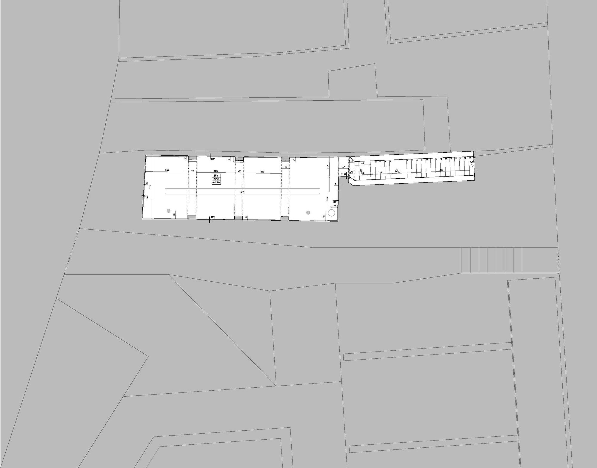
Site Plan 1
Basement Plan
Ground floor plan
Main plan
Elevación 1
Elevación 2
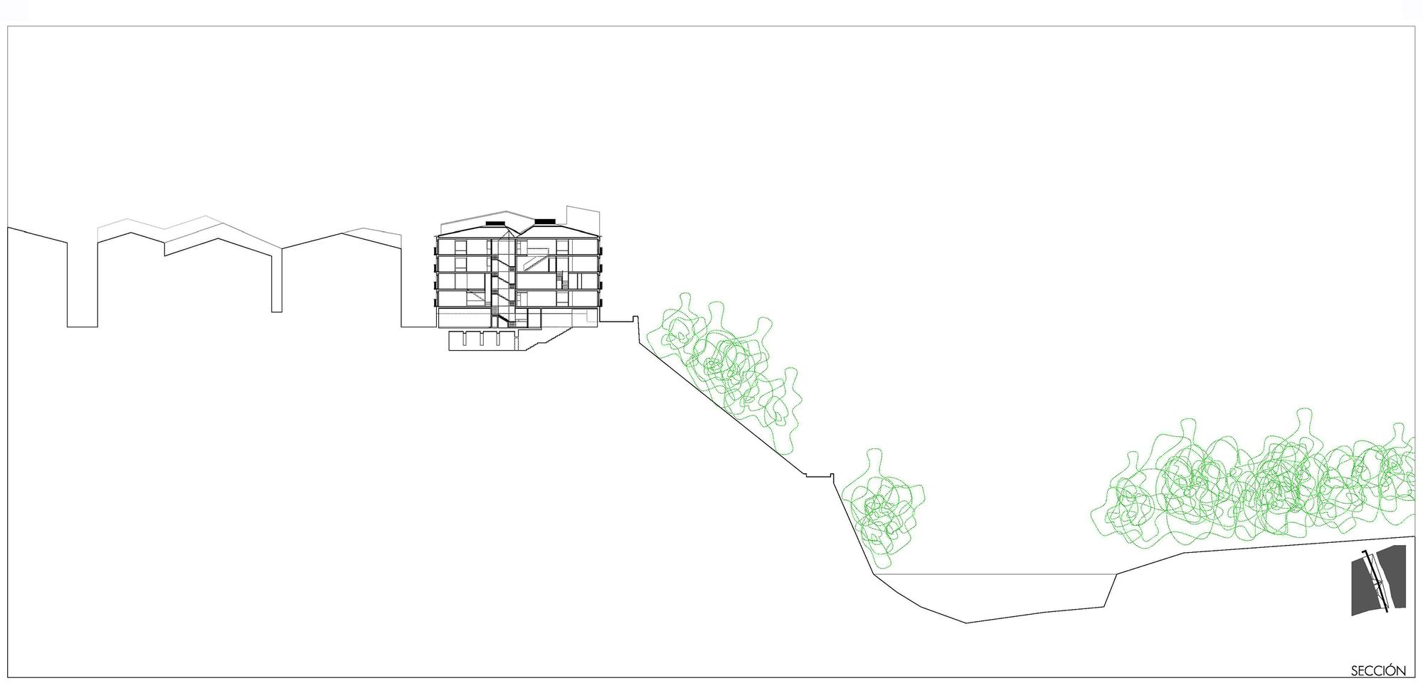
Section 1
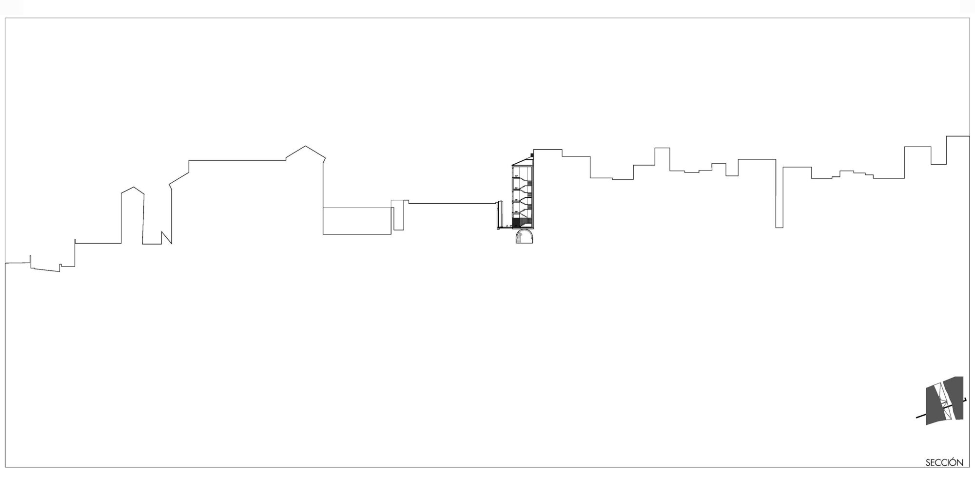
Section 2
Diagram


