Sound Poster
Tell me and I’ll forget; show me and I may remember, involve me and I’ll understand.
Dutch graphic designer, Trapped in Suburbia have always been inspired by this line and have always focussed their designs around it. At some point of our life, we all get fascinated by posters. Be it minimal design or the one with bright colours or the one with our favorite superhero. But these designers take it to the next level.
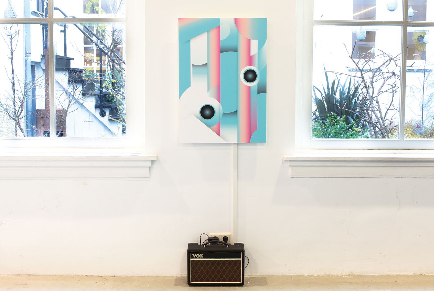
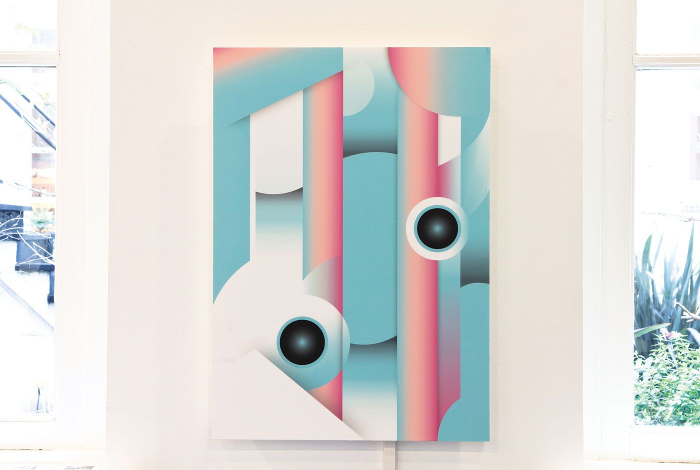
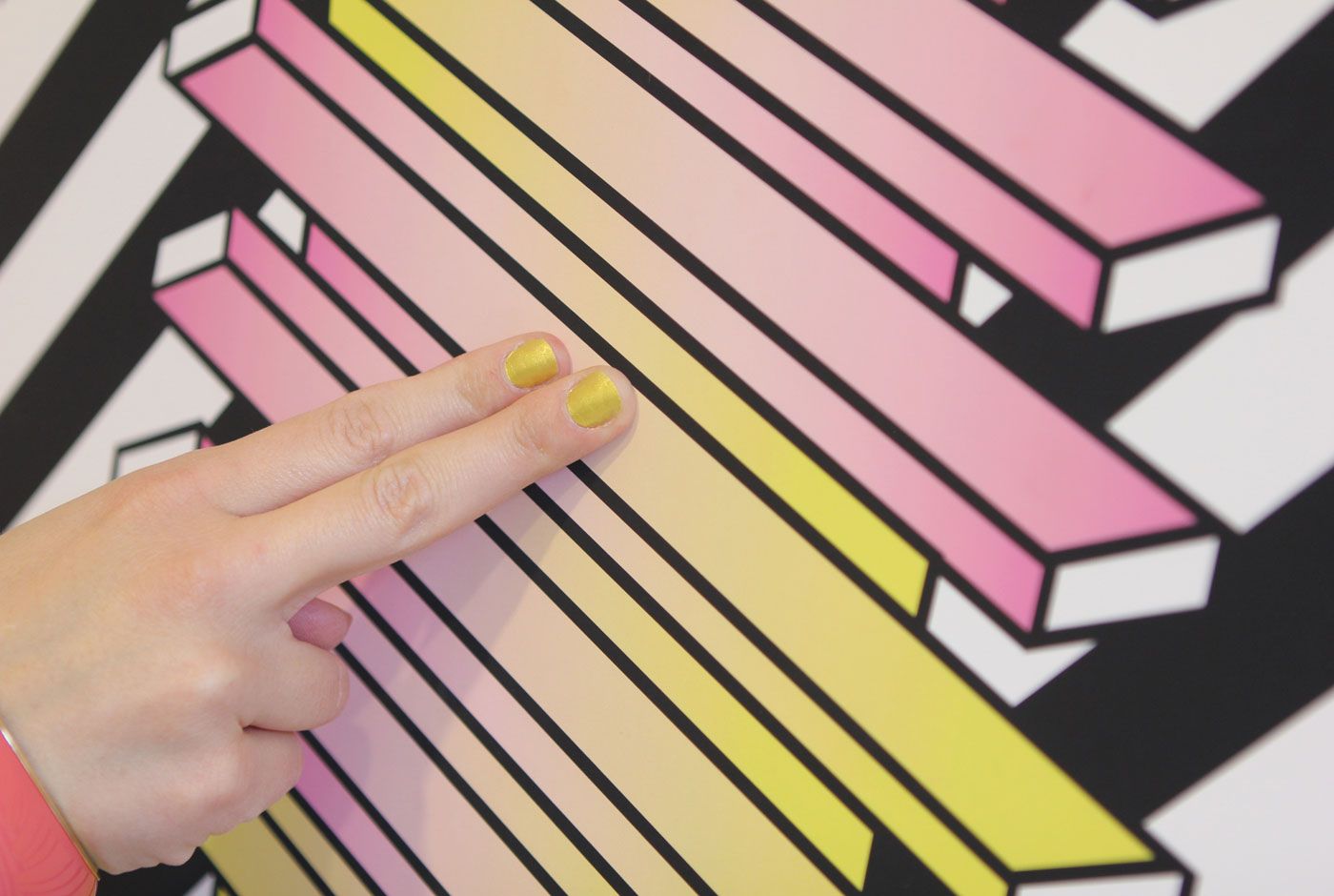
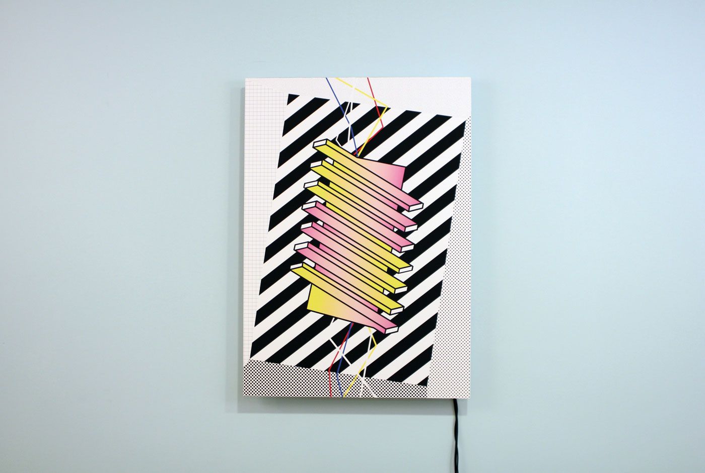
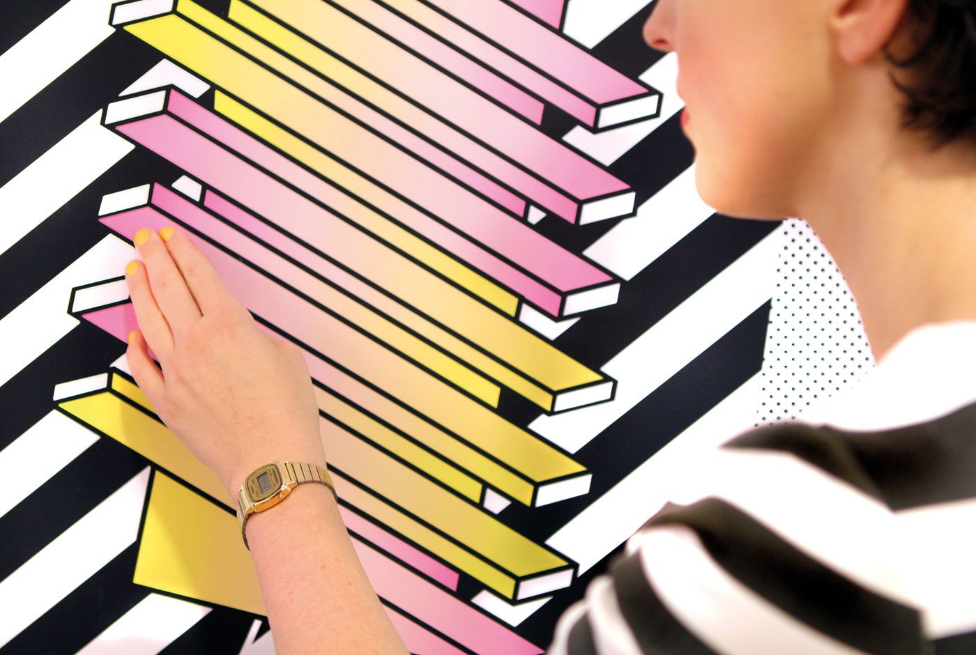
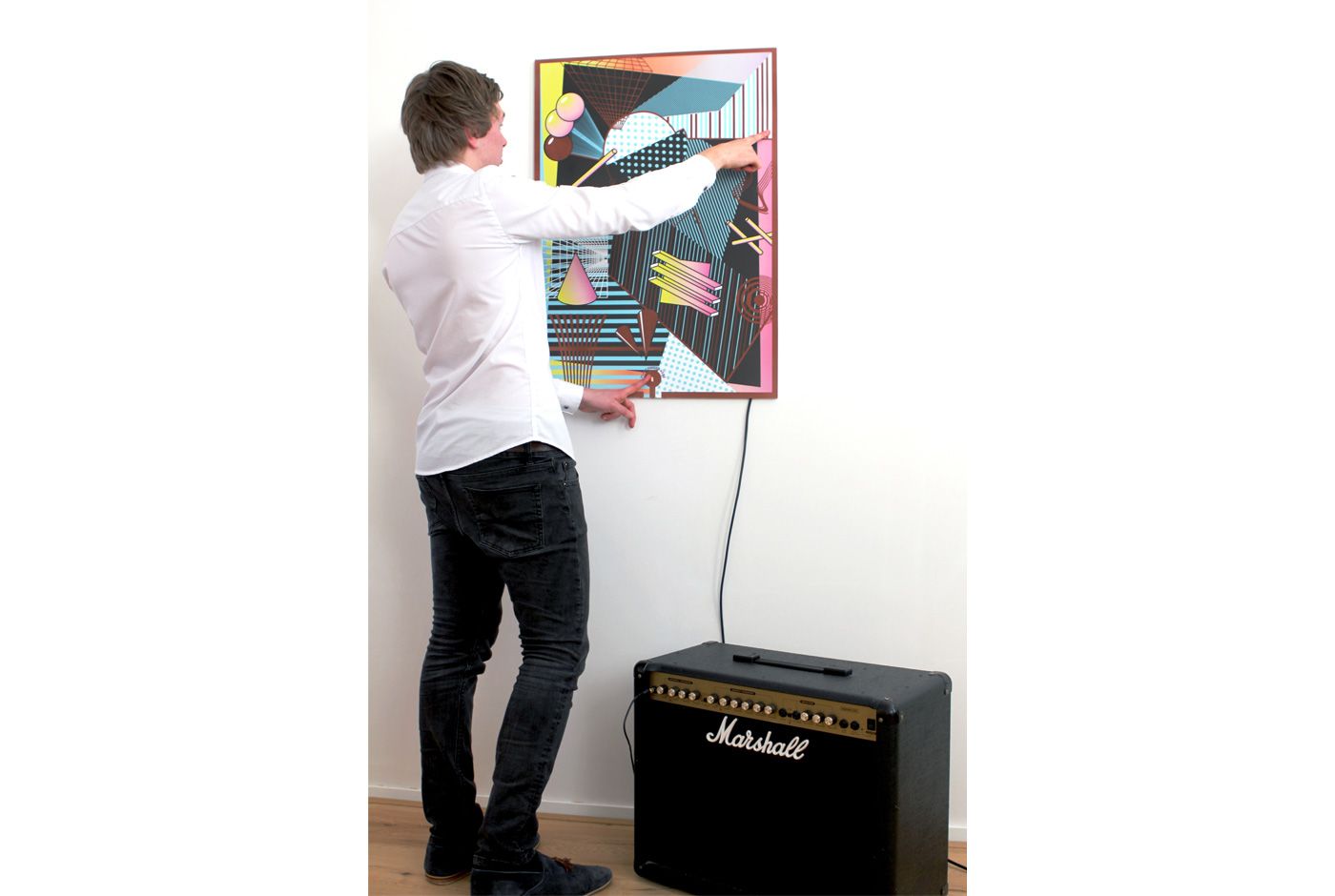
They have always focussed on engaging their audience and what would be a better way if the poster on your wall responds to your movements or touch? In 2013, they released their first design, Sound Poster 1.0, which created synth-like abstract sounds on human touch. The poster was not only sound dynamic but visually too.
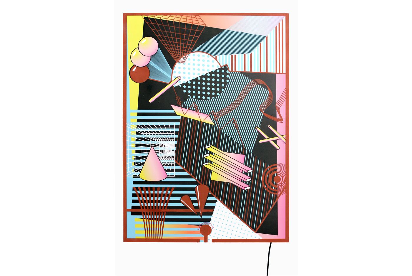
The idea of sound posters was further refined with new technologies and resulted in creating three new Sound posters this year. Now, the Sound Poster 2.0 is all about creating music. Users can create their own beat by touching different samples as it has a multiplayer installation.
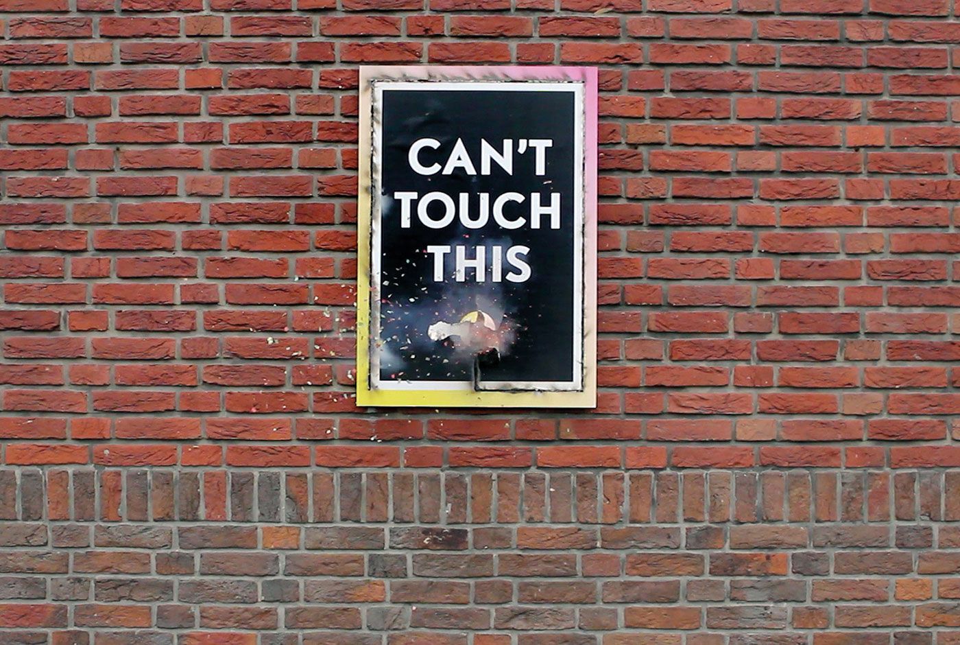
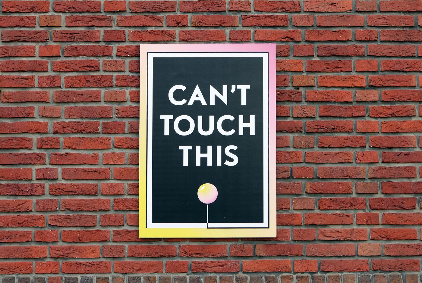
Sound Poster 3.0 is explained as “pure adolescent behaviour” by the designer. It is that age where you want to blow something up and feel like doing anything for that adrenaline rush. Do watch out for the poster’s warning!
With the Sound Poster 4, the touch is no longer needed. It is just controlled by viewer’s motion in front of the poster. It is based on the hand motion which controls the sound. On the same principle the designer made a series of 25 sound posters – Auto play. The design which reacts to passing cars and cyclist and pedestrians. Making the passer-by feel noticed and makes sure the design does not go unnoticed itself.
In these designs the poster get attached to the technology. But the designers strongly believe in the combination in new and old technology. One of the things I personally agree on.
“New technology doesn’t need to defeat old. Combining both produces scenarios you would never get if you were to only use one.”
– Richard Fussey, designer, Trapped in Suburbia.
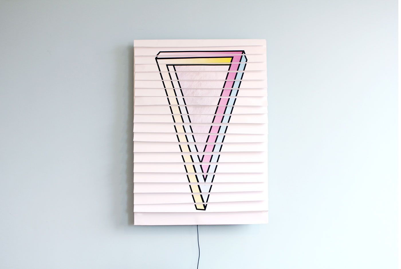
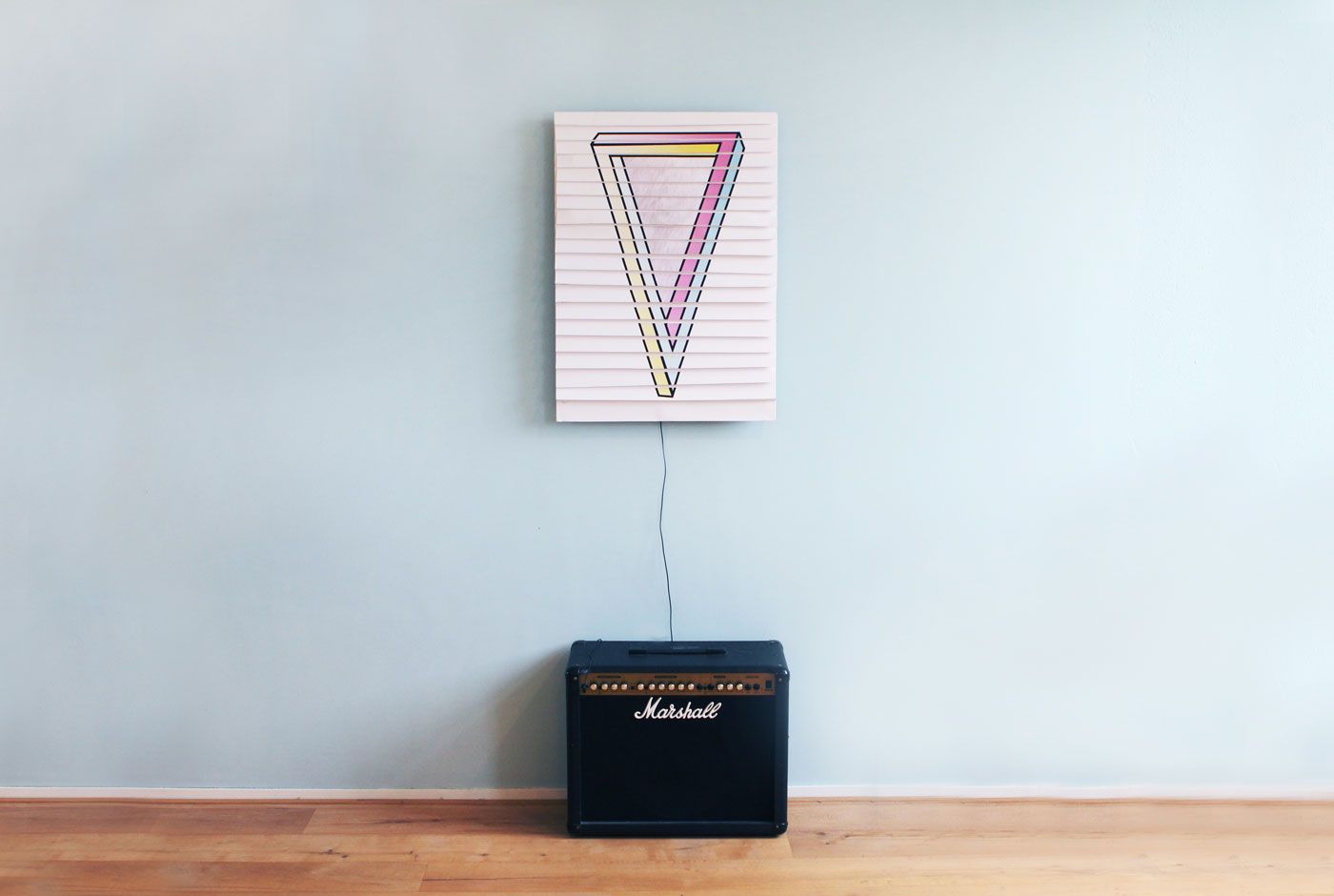
Among all the posters, comes my favourite one – Shy Poster. It is one of the most adorable, fun and peppy posters. As the name says, it won’t let you get a glimpse of itself under any circumstances.
These design promises to engage you, as the designers don’t design for you, they design involving you. You complete the design.
by : Sanjana Malhotra
Courtesy of Trapped In Suburbia.
Courtesy of Trapped In Suburbia.
Courtesy of Trapped In Suburbia.
Courtesy of Trapped In Suburbia.
Courtesy of Trapped In Suburbia.
Courtesy of Trapped In Suburbia.
Courtesy of Trapped In Suburbia.
Courtesy of Trapped In Suburbia.
Courtesy of Trapped In Suburbia.
Courtesy of Trapped In Suburbia.
Courtesy of Trapped In Suburbia.


