Square Compositions Penthouse
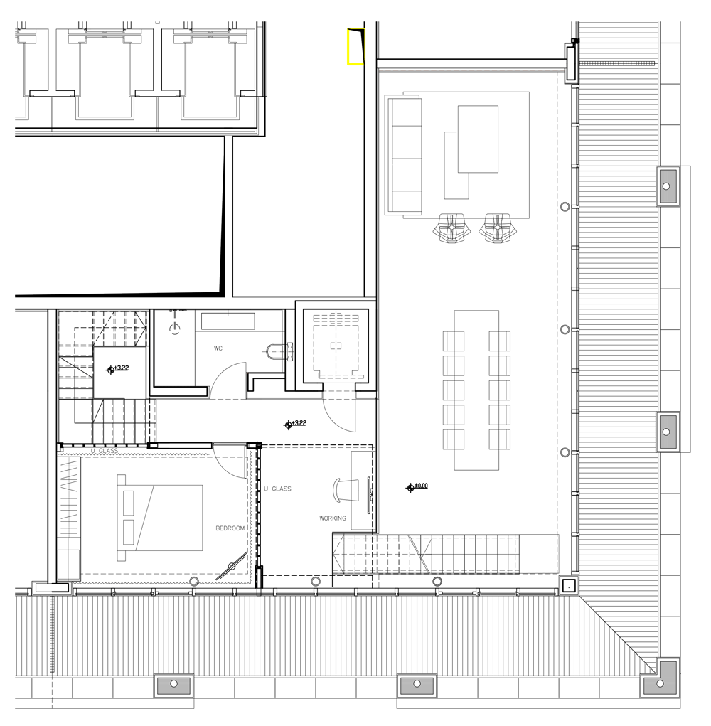
Four consecutive corner apartments in a building in the Tsamert Complex in Tel Aviv have been combined into one spacious apartment. The interior design is simple and consists of two public levels that also contain two private levels.
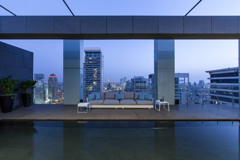
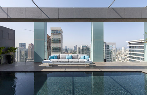
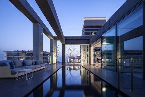
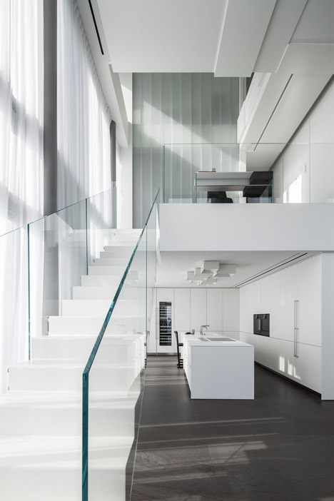
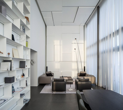
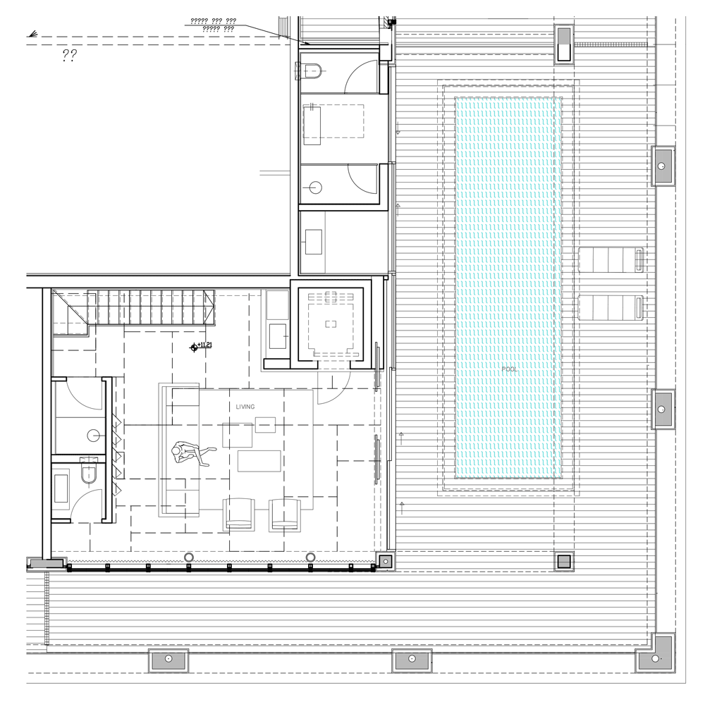
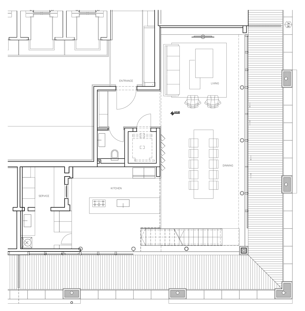
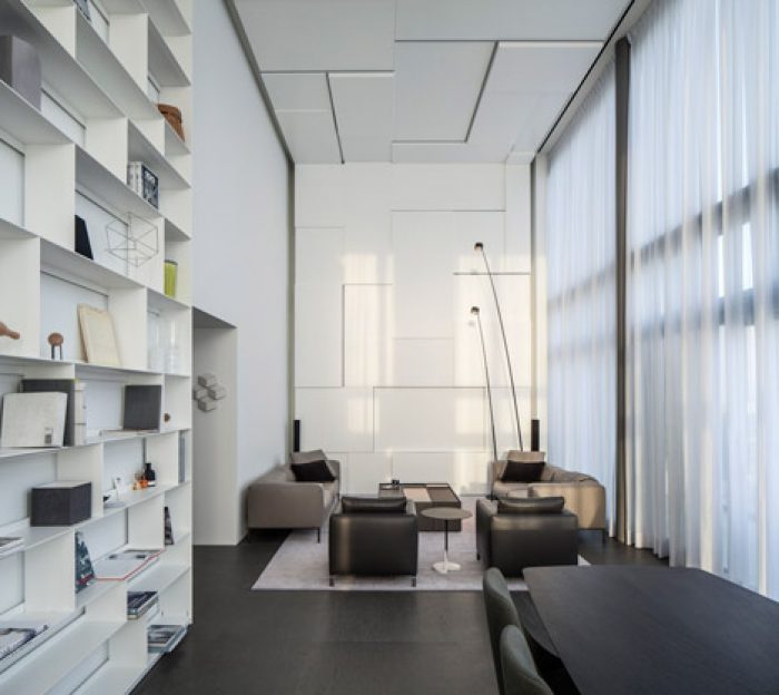
The apartment‘s entrance is through the lower level, which contains the kitchen, dining area and a large double sized living area. The entire level is also surrounded by a balcony. In a similar fashion the penthouse floor is designed as an upper living area with a large salon overlooking the balcony and a swimming pool and a kitchen and bathrooms. The effect is of two different and separate living levels that make possible a range of social activities and interactions at one and the same time.
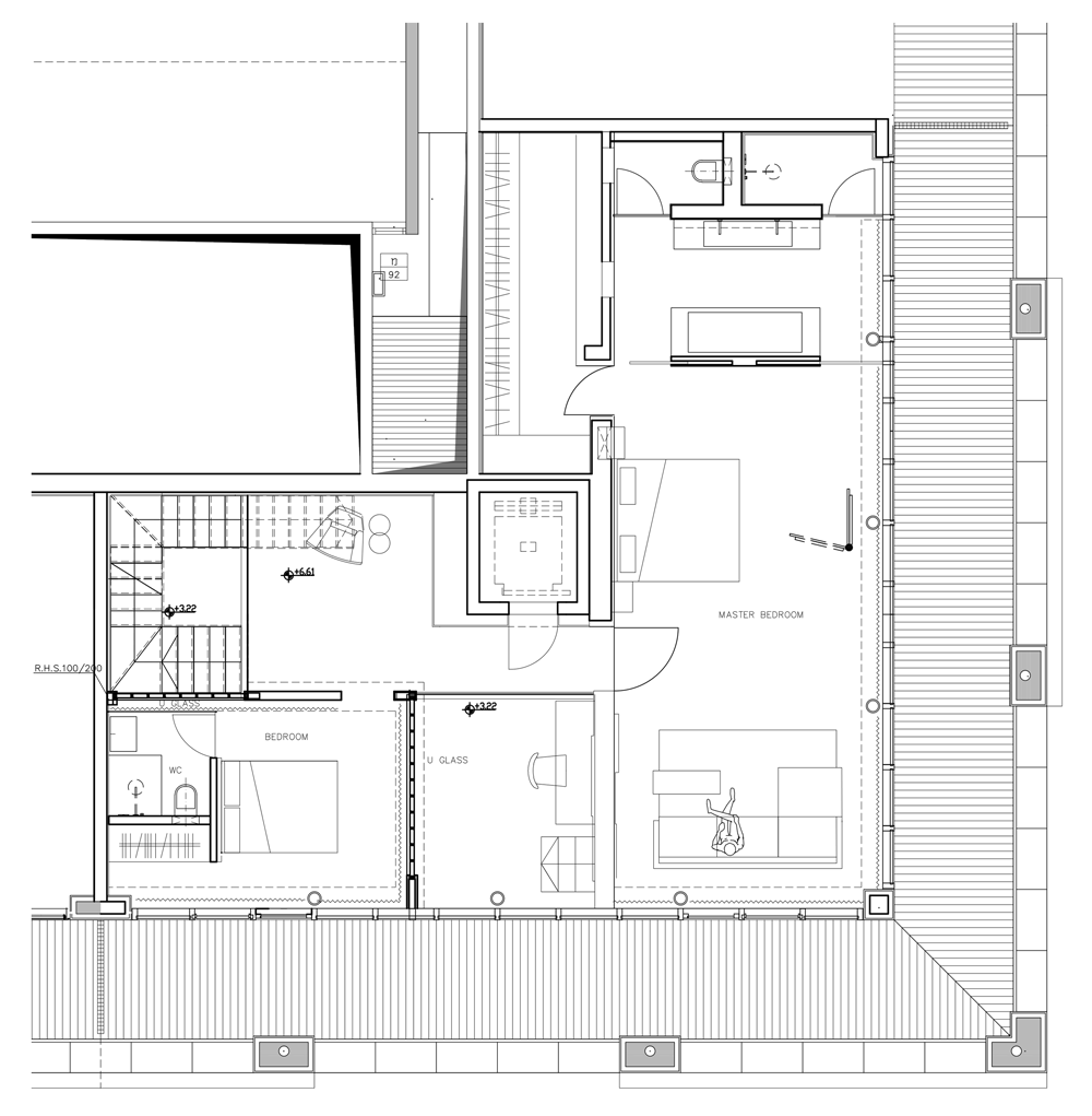
Between the two public spaces, we find the private areas – bedrooms and work areas that also have their own, private outside spaces.
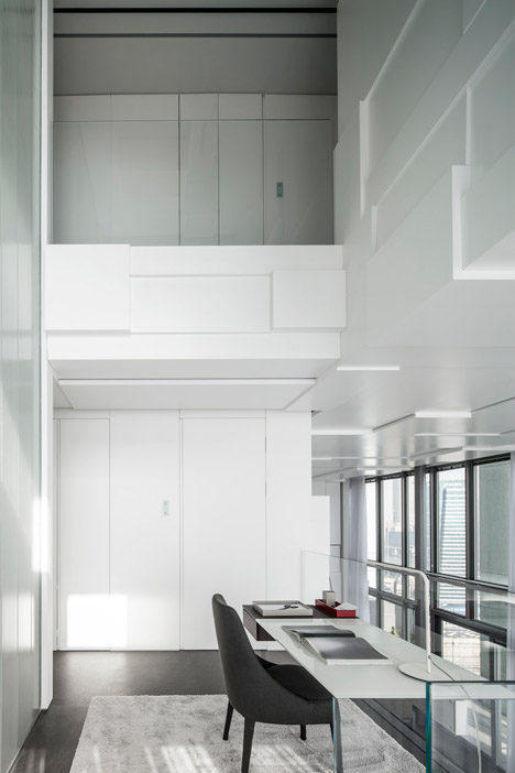
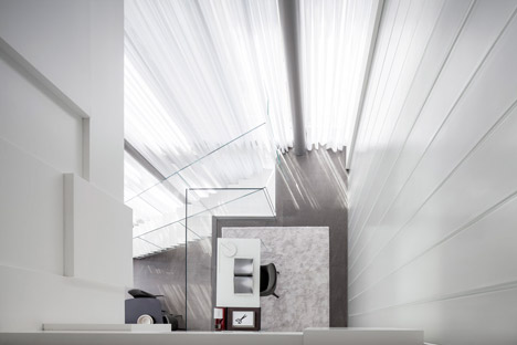
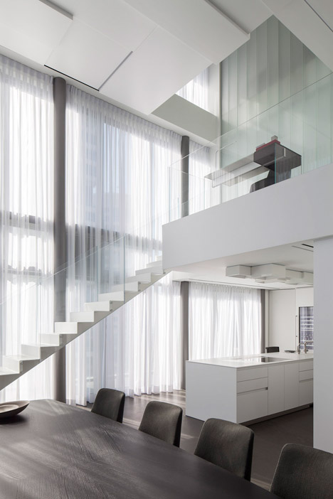
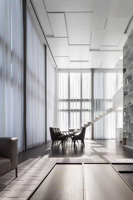
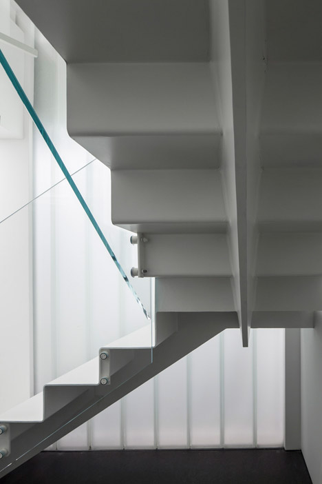
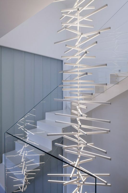
The physical connection between the spaces is made possible by the use of elevators and stairs. These are designed as a pathway that looks out over the seemingly ever-changing design – a topological framework in white that seems to rise and fall, following and enveloping the internal walls, floors and ceiling bringing together the facets of the prism into a deceptive and gravity free space composed of patches of white and shade. A patchwork of clearly defined lines, like a plant creeping up a clear trellis.
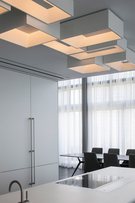
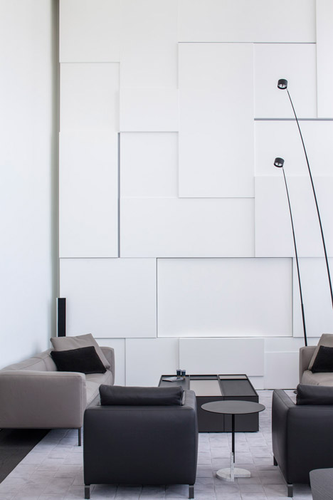
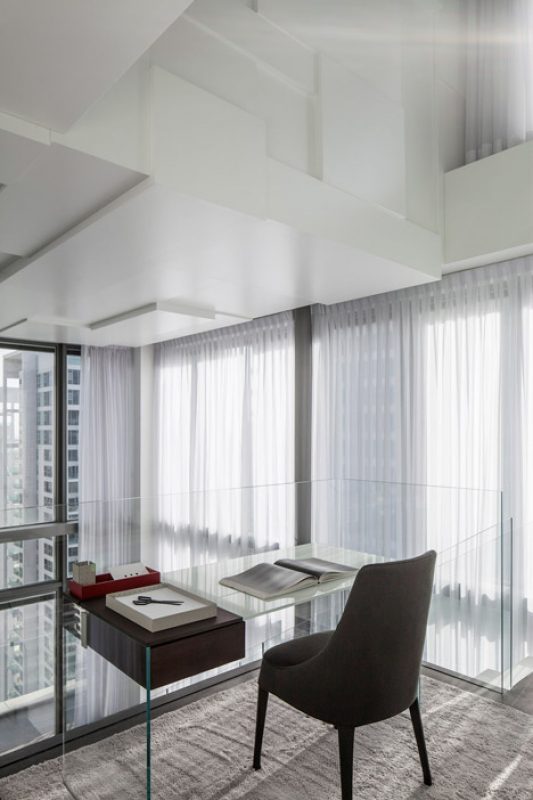
The envelope’s panels are emphasized to bring out the white from its neutral, flat boundaries into the space’s monolithic effect – like a piece of sculpture that catches and presents the space. This nullifies the need for any additional design elements other than those that light and accompany the space. These include the lighting elements, which provide natural light, and the staircases, also designed as a white prism that is both flat and expanded. The topographical white is further enhanced by the large, orthogonal glass walls that cast a myriad rays of light differing in their shade and brightness.
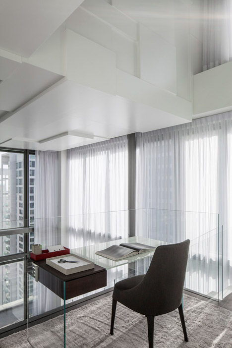
Next to them, we find a wall of linear translucent glass panels that act as a Japanese rice paper room divider that identifies the space without cutting it off from the totality. The use of glass also adds and emphasizes the white, creeping framework and adds an additional dynamic created by the people moving through the space. In a similar fashion movement and views in the space are also emphasized by the work areas and sitting areas that are placed by the stairways as terraces that both observe and are observed.
The careful selection of materials and hues is also evident in the apartment’s other elements such as the floors and the furniture – monochromatic, reserved and deep – that surprise the viewer as they envelope the light and the brightness. The space is full of fragments of naturally appearing light and shade in yellow and grey hues that appear as a compact, stable and uniform unit. Despite it being almost completely exposed on all its sides, the invasion of the outside urban environment is seen in a restrained, organic and non-threatening fashion.
Project Info
Architects: Pitsou Kedem Architects
Location: Tel Aviv, Israel
Year: 2015
Design team: Pitsou Kedem , Hila Sela
In charge architect: Hila Sela
Type: Residential
Photographs: Amit Geron
