Contemporary libraries now a day have a massive weight on them having to compete with digital libraries. Some integrate the newer technology, some choose to remain pure and house only books. So the question arises how to design a library that promotes its use. In some cases this problem can be solved simply by having the library be integrated with other programs within it to draw a larger user base. On the other hand, the architecture itself can be what draws the visitor in as it is able to captivate them and in turn have them ask questions that they want to seek the answer to. After all, no matter what sort of cladding or structure the building is made of, a library still stands as a place for learning, growth, and knowledge.
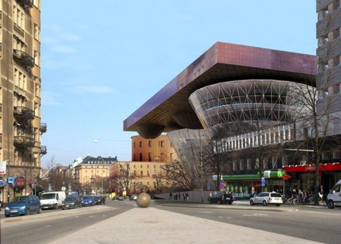
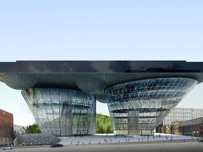
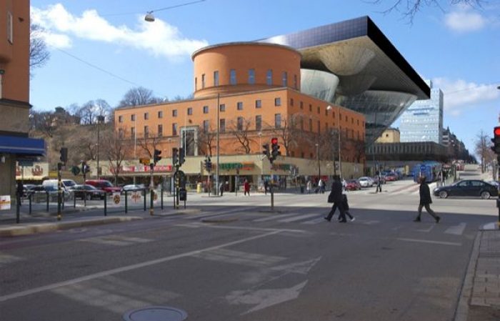
The proposal for the Stockholm Public Library by Bundi Pradono Architects at first glance one would not assume was a library at all with its creative design. The idea for the design is based on a suspended slab set upon two large transparent pilotis, which is quite literally translated into the finished proposal. The concept itself, while simple, allows the form to provide multiple functions and benefits in the hopes that the building will serve as both a public venue and a research retreat.
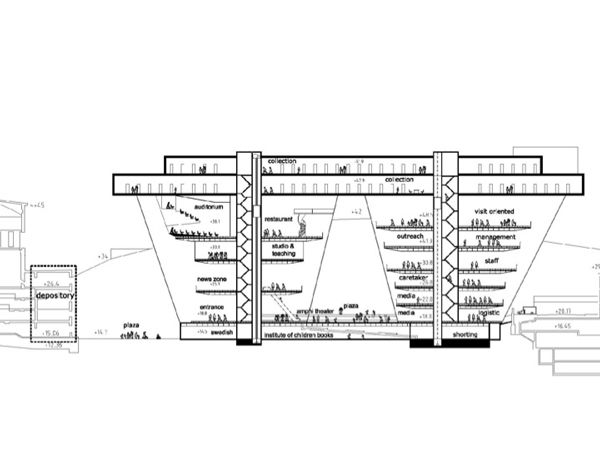
By elevating the two collection floors of the library, the base of the building is freed to create a more welcoming street front with a large plaza. The glass columns not only support the collection of books on the top, but contain various public spaces such as studios, an auditorium, restaurant, news room, and reading areas as well as an office. The open view shed protected by the large mass above provides an open and compelling space to socialize in, acting as a communications hub for the city, and another means of gathering information.
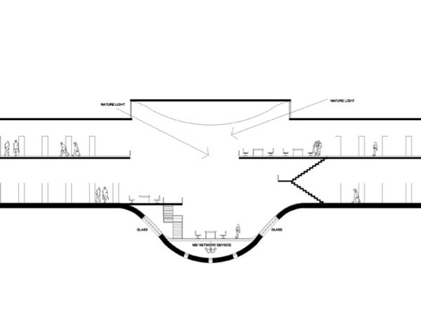
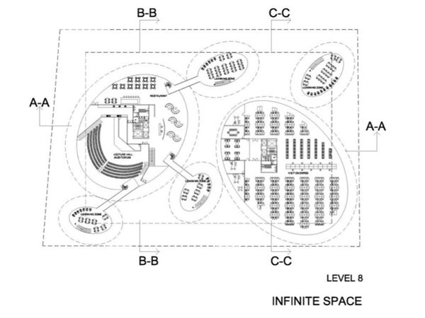
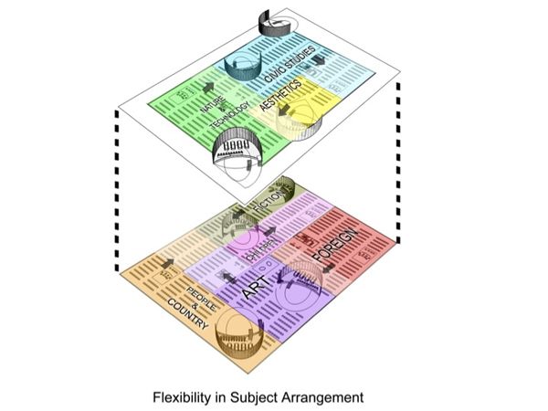
The main two levels stretch out over the site and contain the main book collection. The strong distinction between the large highly transparent pilotis and the massing containing the books emphasizes the elevated level of knowledge within the upper portions of the library. Reading areas punctuate the floor plates, dipping below and opening to the ceiling where daylight glazing is incorporated into the roof deck. The oval shape of these reading pod’s were designed to contrast the monolithic slab, to give the impression of a more informal area for research and immersion within the stark nature of the design. The various apertures between the two floors also are intended to stimulate knowledge exchange among the library’s varied collection.


