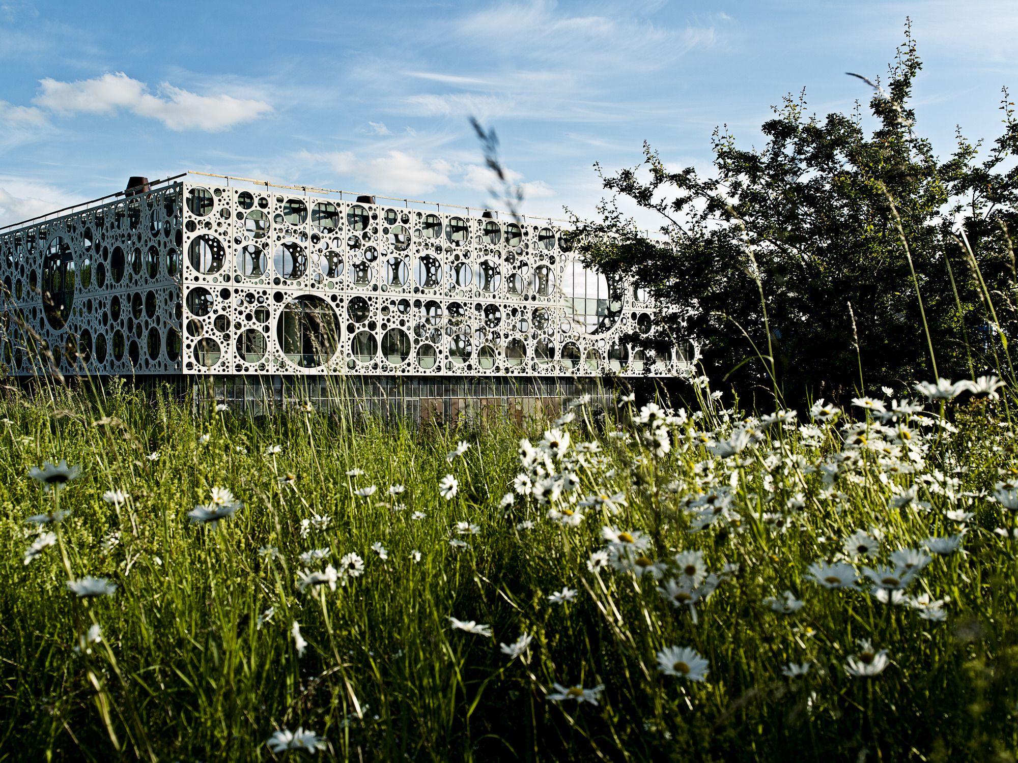
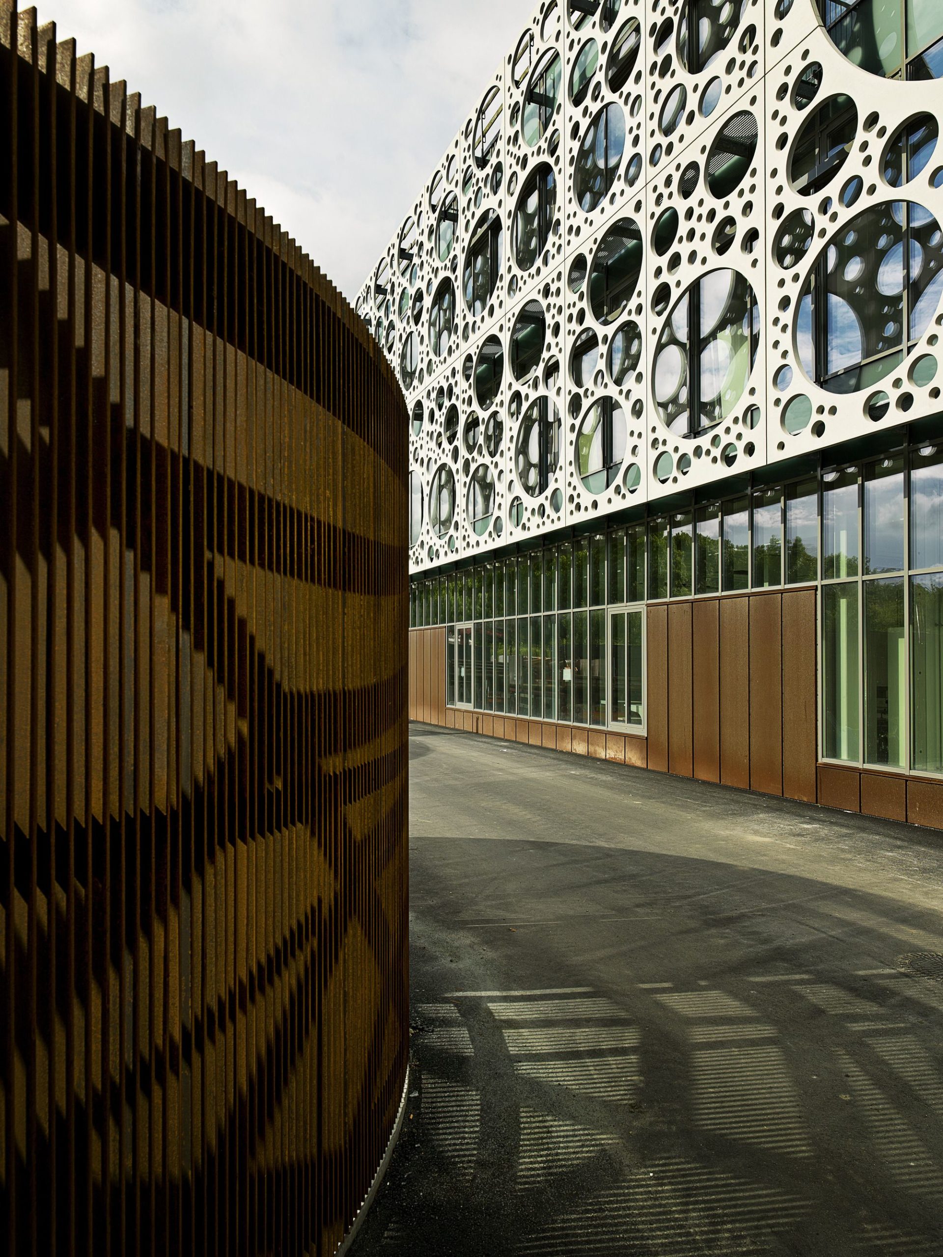
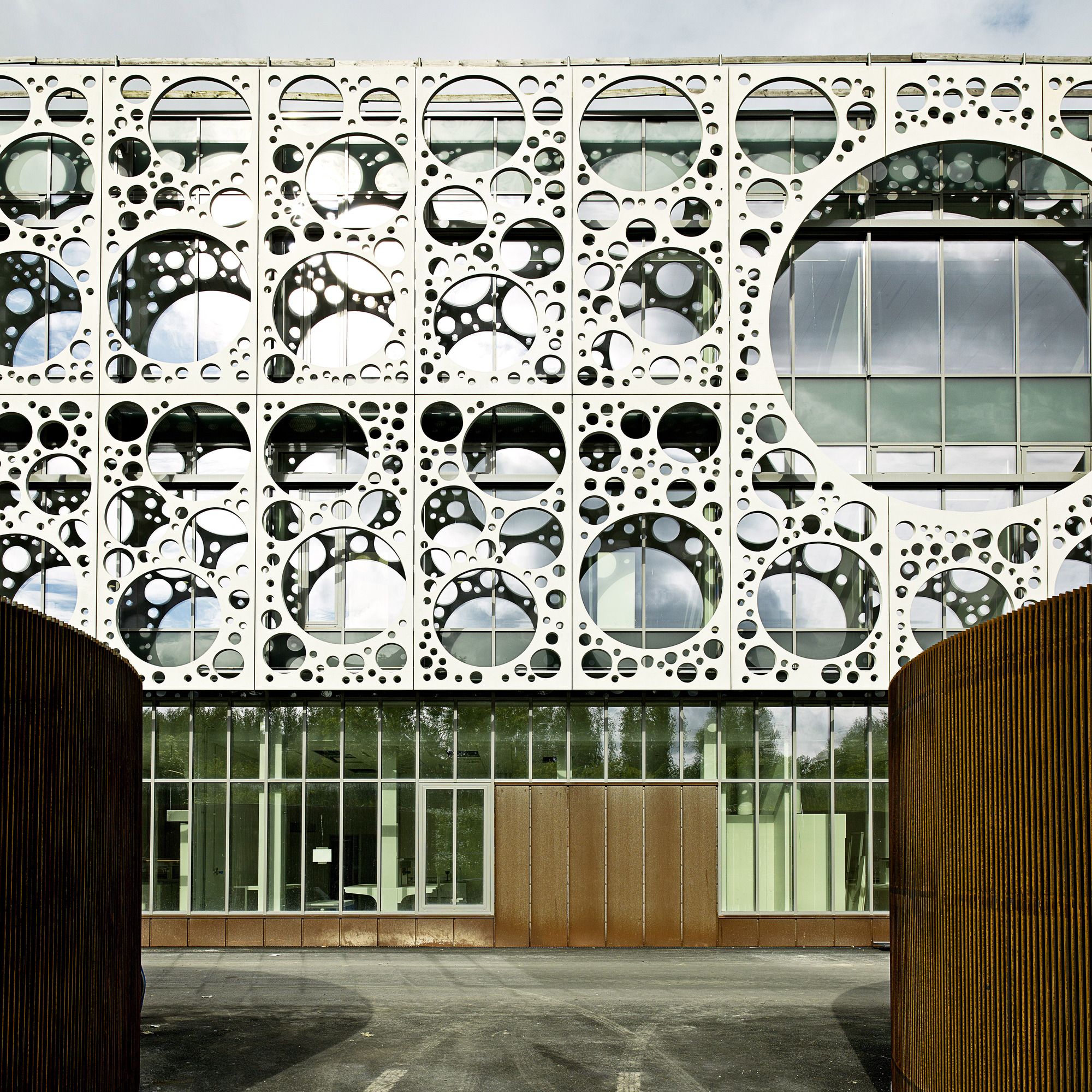
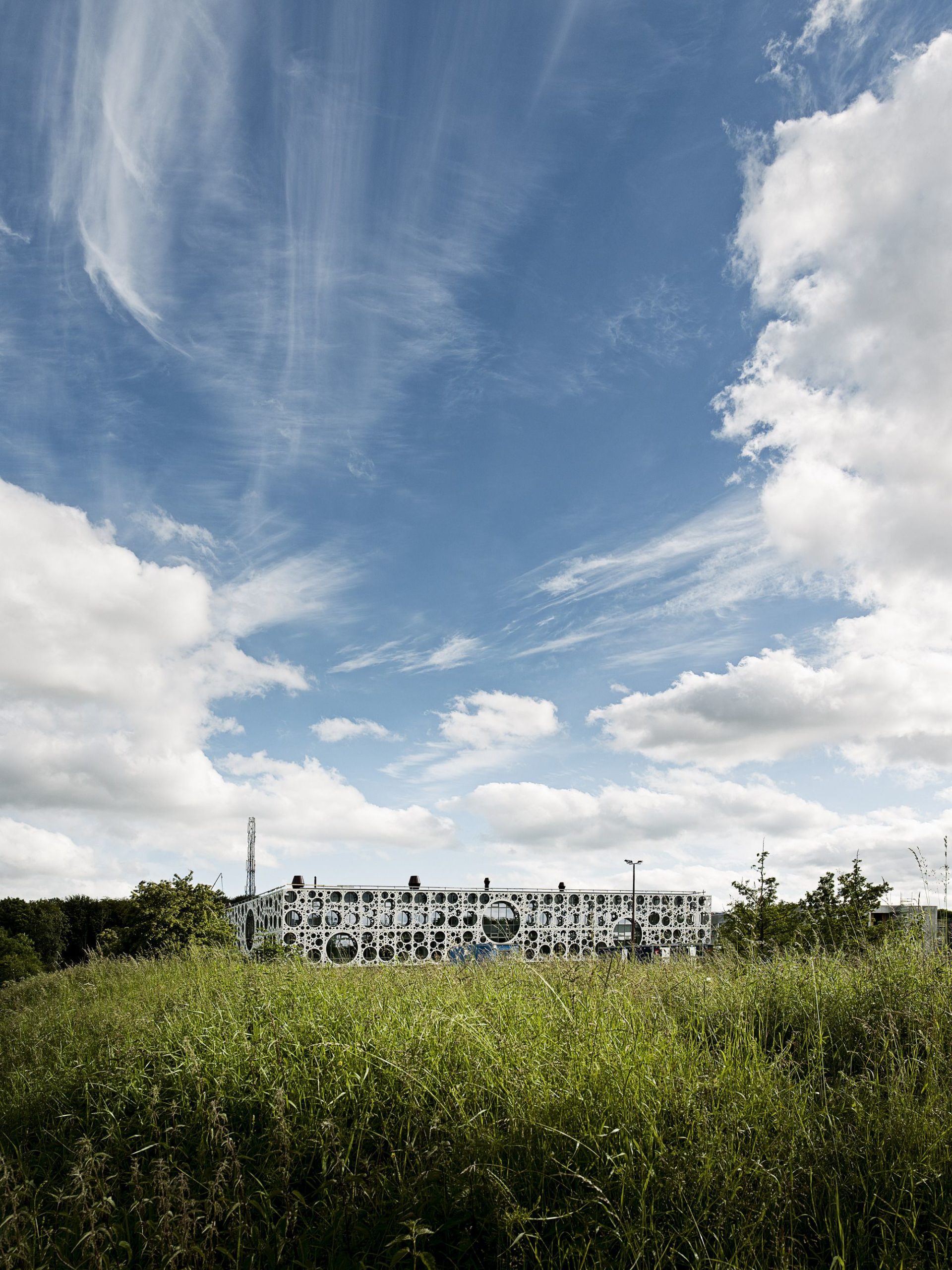
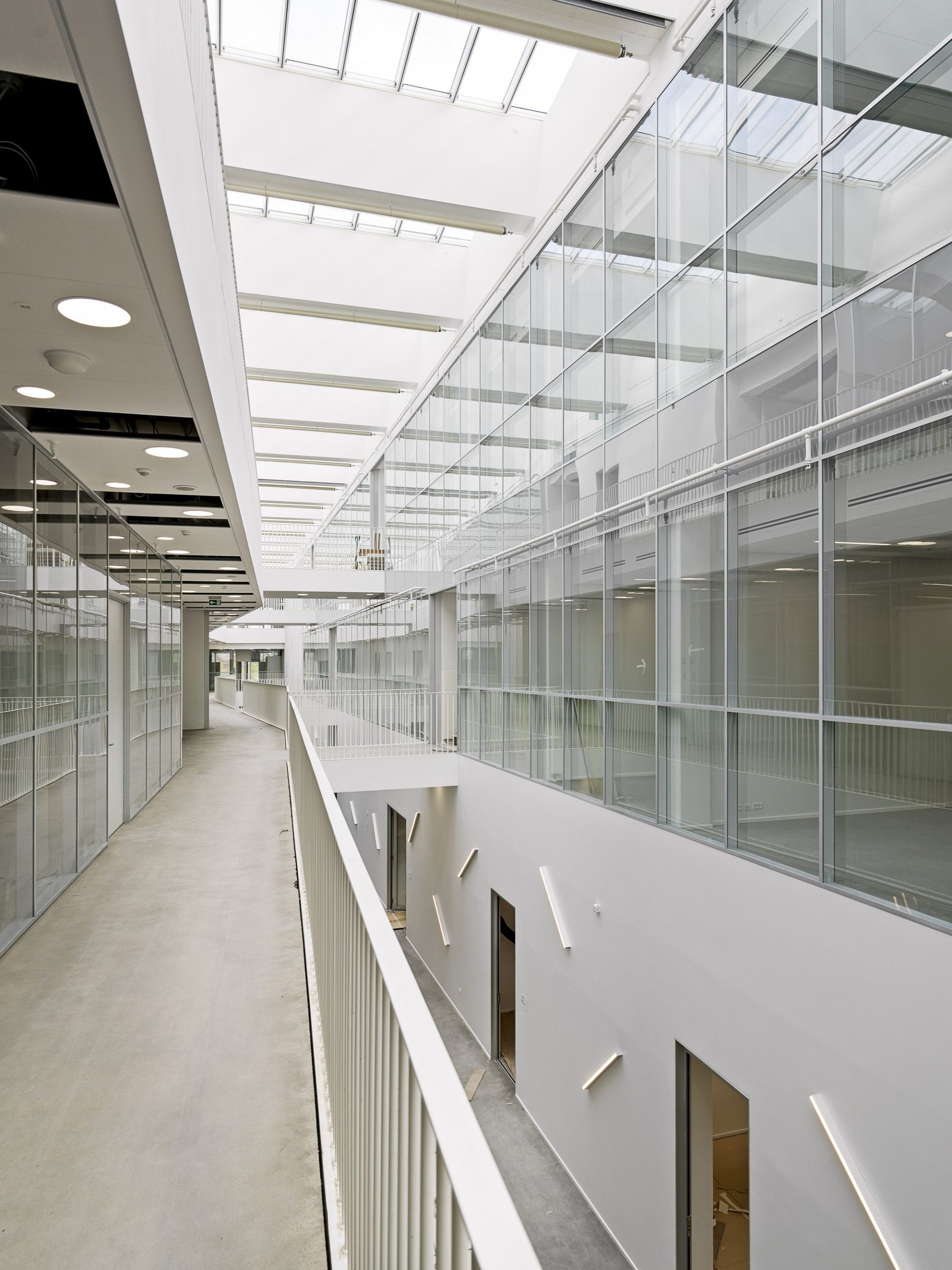
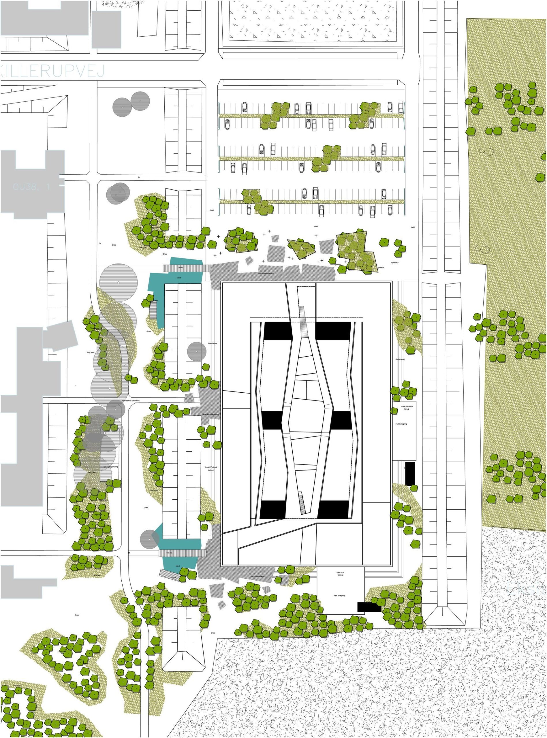
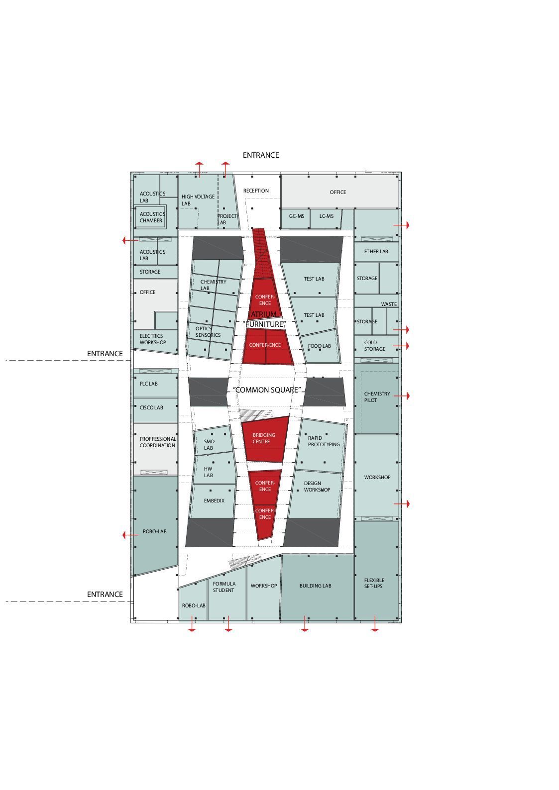
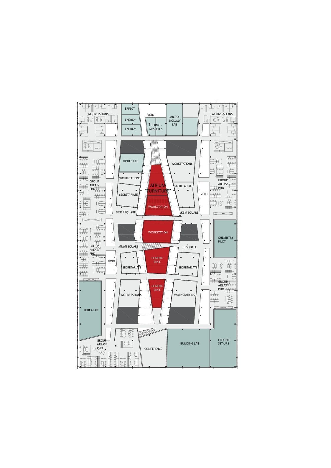
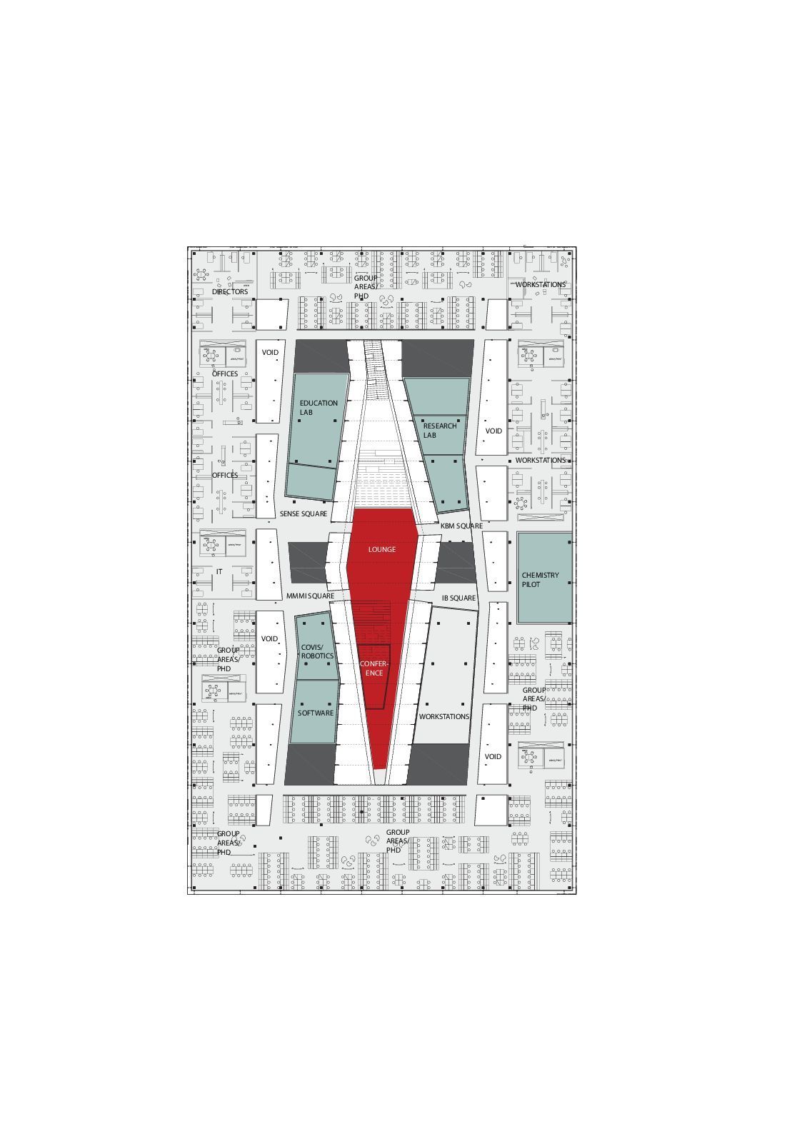
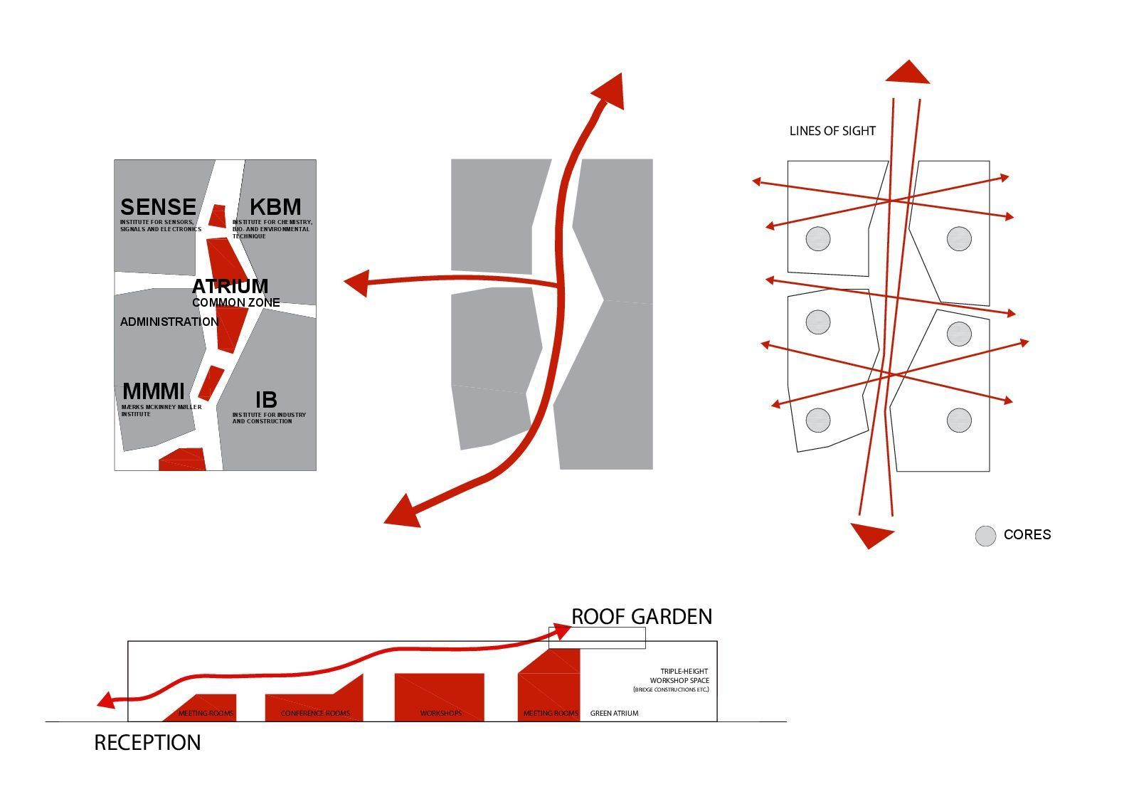
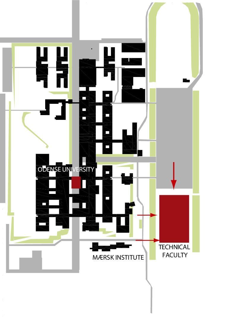
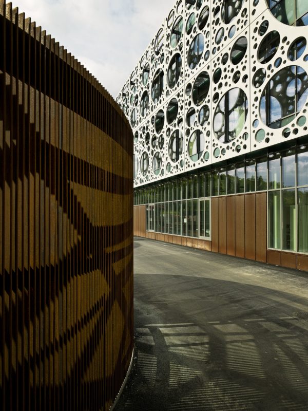
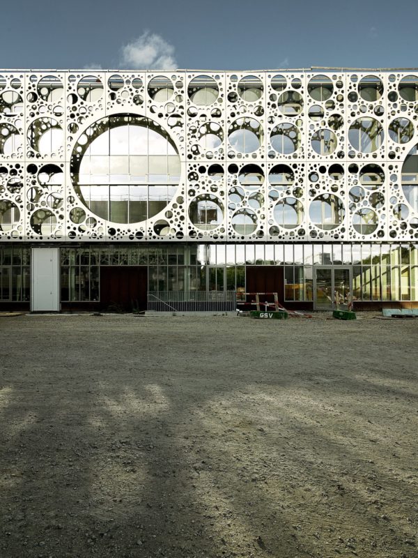
The University of Southern Denmark-or more commonly SDU-in Odense has got a new addition to its campus in mid-2015. This new addition is now housing the Faculty of Engineering and, therefore, provides a cutting-edge research centre and education environment for four different institutes. “The four institutes sharing the building are conducting world-class research in various fields such as material and construction science nano-optics, environmental sciences and robotics,” stated the architects. The construction of this 20000 square-meter project has commenced in 2011 and took just four years to be delivered.

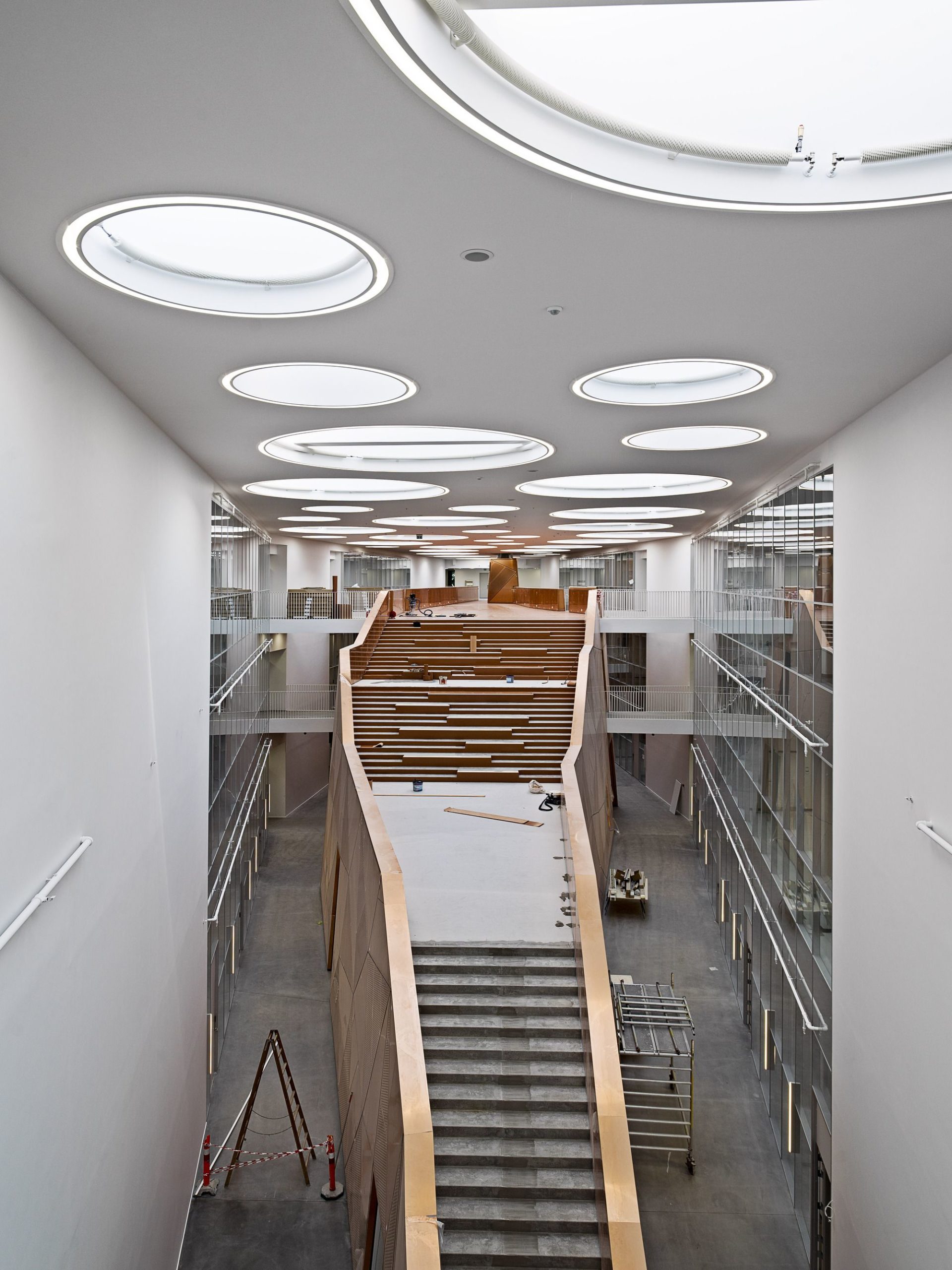
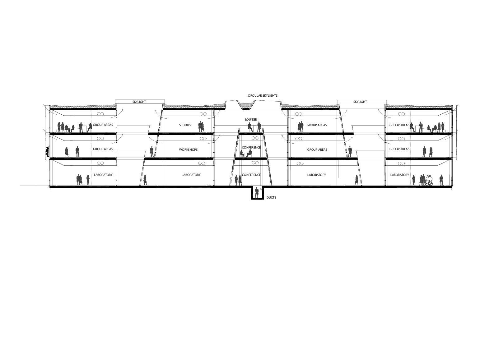
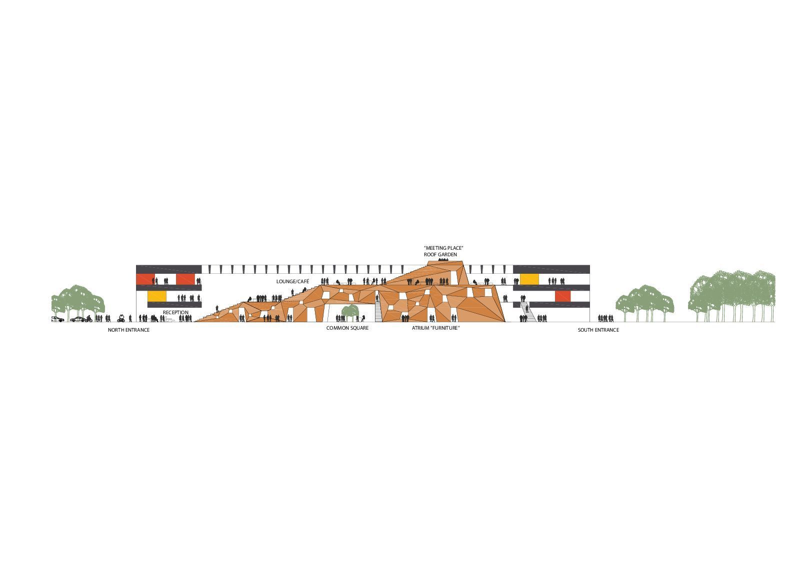
At the heart of the full height atrium sits a magnificent piece of furniture which is essentially a gigantic staircase that acts as a circulation element connecting the bridges while it can also accommodate for various functions, events and even become a meeting place. It provides students with access to the roof where a garden, cafe and lounge area are located, offering great views to the green surroundings. The interior layout of the building as a whole is designed to be flexible and able to adapt to the different needs and functions through time and season. This is possible due to a combination of the solid core elements and sliding wall systems that adapt to the number of users at a specific time. This design has led to the larger labs being places on the ground floor so as to have easier access to the outdoors for performing various activities.
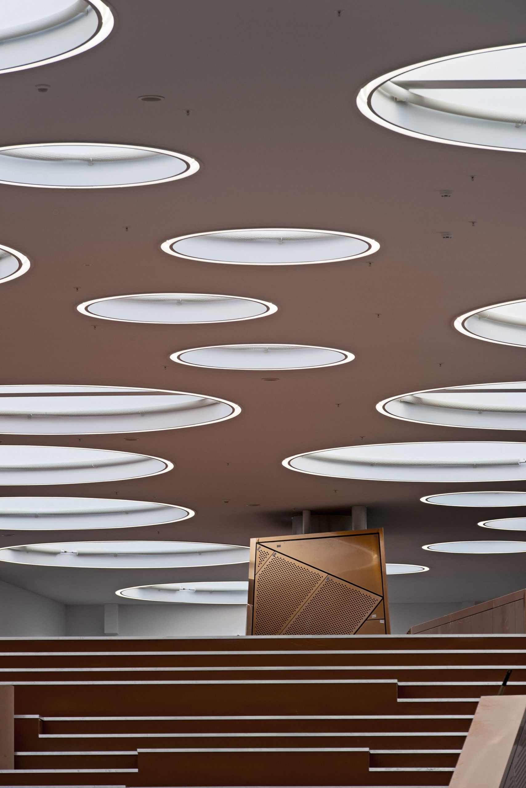
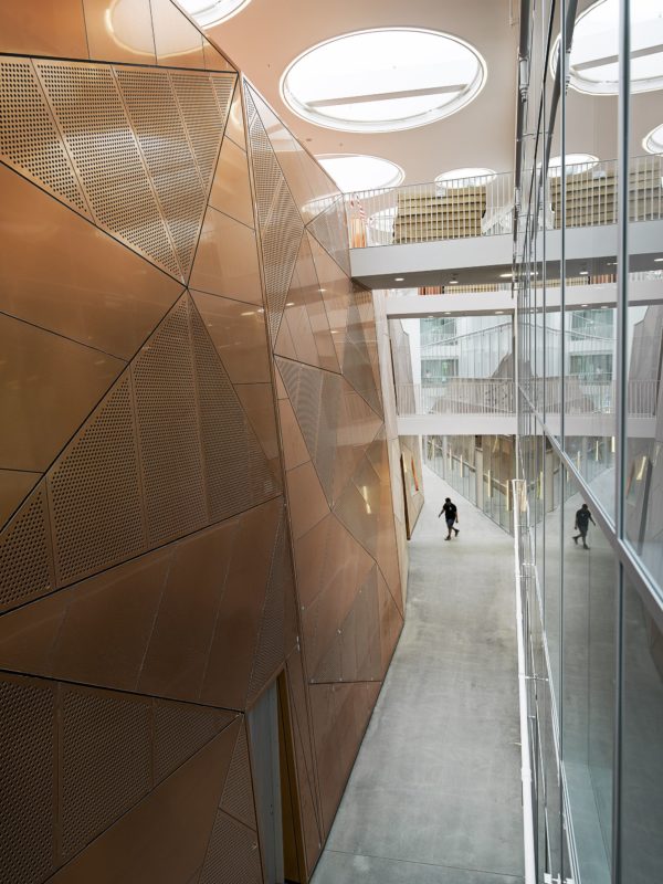
 It is a great design that is going to work for years to come in my opinion. But we do not know for sure yet of its performance as a technical neither technically of practically because the first academic year of it official use is the coming September. Finally, I am not convinced about the circular openings as I do not see any relationship with the rest of the campus or its history. To my eyes, I see just an idea that was made up at 2 am in the morning. The geometric order of the openings is very strict at some points and I am wondering whether all these spaces need the same shadow and natural light throughout the day. The layout has been designed to be flexible but then they have placed this strictly fixed skin on the exterior. It is a real eye-catcher and something that will grab the attention of everyone from all over the campus, but dear architects you could have done better on this one.
