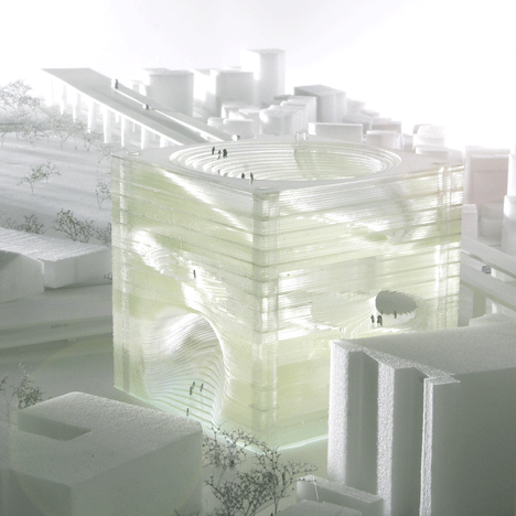
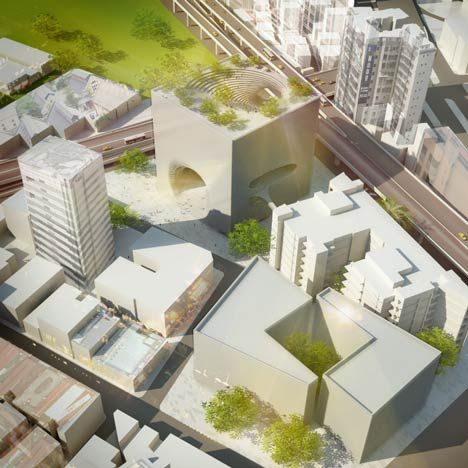
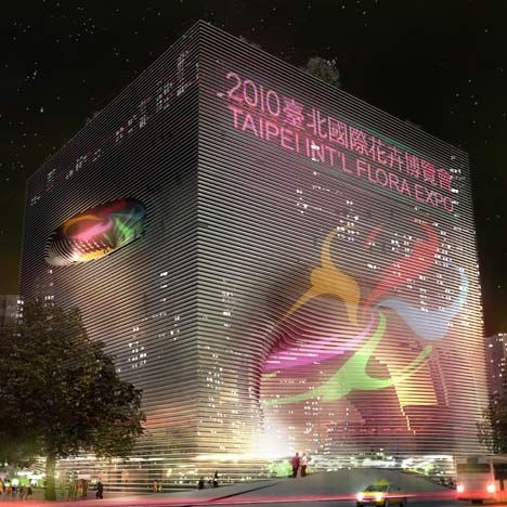
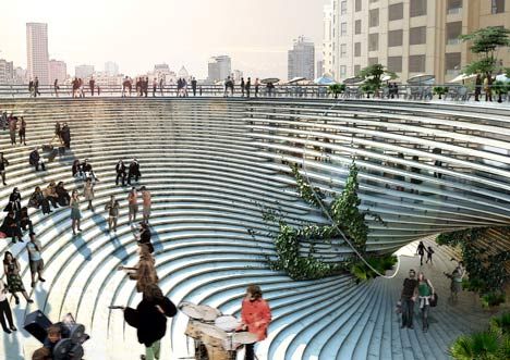
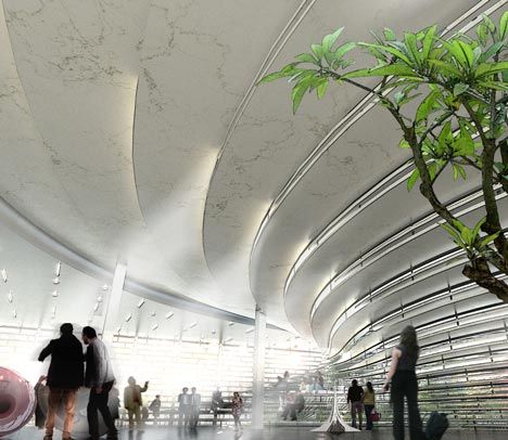
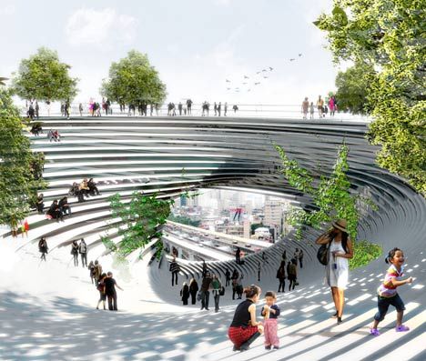
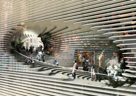
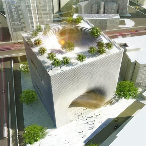
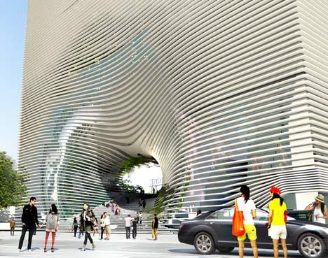
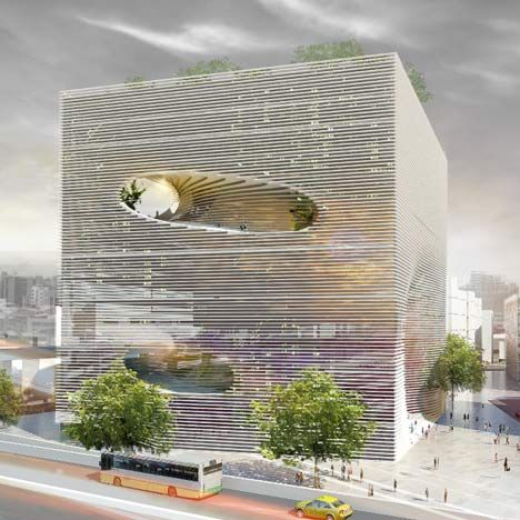
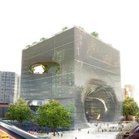
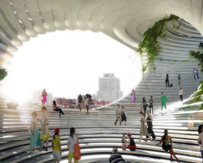
Danish starchitect firm BIG designed, back in 2011, a technology centre for Taipei, in Taiwan, called TEK (Technology, Entertainment and Knowledge Centre). It consists of a cube-shaped volume composed of concrete lamellas, which people can use just like a large staircase in order to go from the ground floor all the way to the building’s top. In a way, you climb the building’s façade, as it recedes and inverts unto itself. The lamellas also create informal sitting areas for the users throughout the building.
As the studio’s name suggests, this building could be said to adhere to the theory of “Bigness”, as proposed by Rem Koolhas in his important essay “Bigness, or on the problem of large”. If one were to sum it up, “Bigness” proposes that size, in itself, has an ideological program, in architecture. Buildings beyond a certain scale acquire the property of “Bigness” – they have a different way of being architecture, where a certain type of thought and reasoning is made possible, that according to Koolhas “instigates the regime of complexity that mobilizes the full intelligence of architecture and its related fields.”
Well, TEK3 (TEK to the cube) is without doubts, an exercise on the problem of the large. It’s a 57x57x57 meter cube, that, according to the studio: “contains an almost urban mix of programs with no obvious hierarchy”, as would be expected of a building of such a BIG status (all puns in this article are proudly intended).
Here we find a curious hybrid between the city street and the vertical access, consolidating in the shape of a mighty cube. The spiraling street attempts to arrange all programs around itself, as if the sheer Bigness of the building conferred it the power to interfere, in a deep way, with issues pertaining to the urban.
Spaces for retail, exhibition, food, hotel and offices are all provided for in TEK. It’s a building-made-institution, through it’s scale and it’s wide programmatic requisites. BIG makes justice to their name, understanding and demonstrating perfectly the requisites for such an impositive architectural gesture – keeping nonetheless a sense of clarity and coherence, both in thought and in practice, that not many architects nor buildings can boast about.
By:Daniel Anthony Fraga
