The Renovation of Ankang Library
Project Background: Ankang is a prefecture-level city located in the south of Shanxi Province in the People’s Republic of China, bordering Hubei province to the east, Chongqing municipality to the south, and Sichuan province to the southwest. Located in the old Ankang city, the original library was opened in 1984 and over the duration of time, the library building and its facilities have started to fall behind the fast-developing information age in terms of hardware and software, prompting a need for a comprehensive regeneration program.
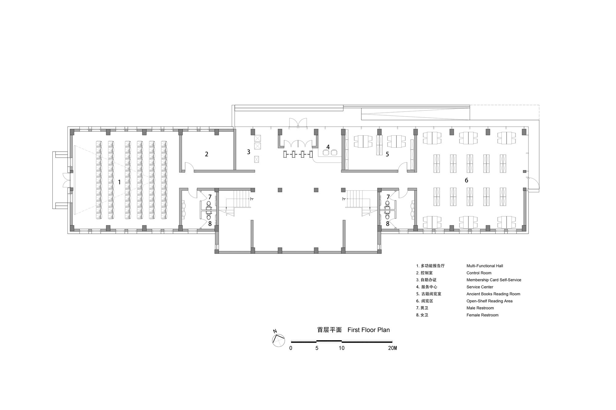
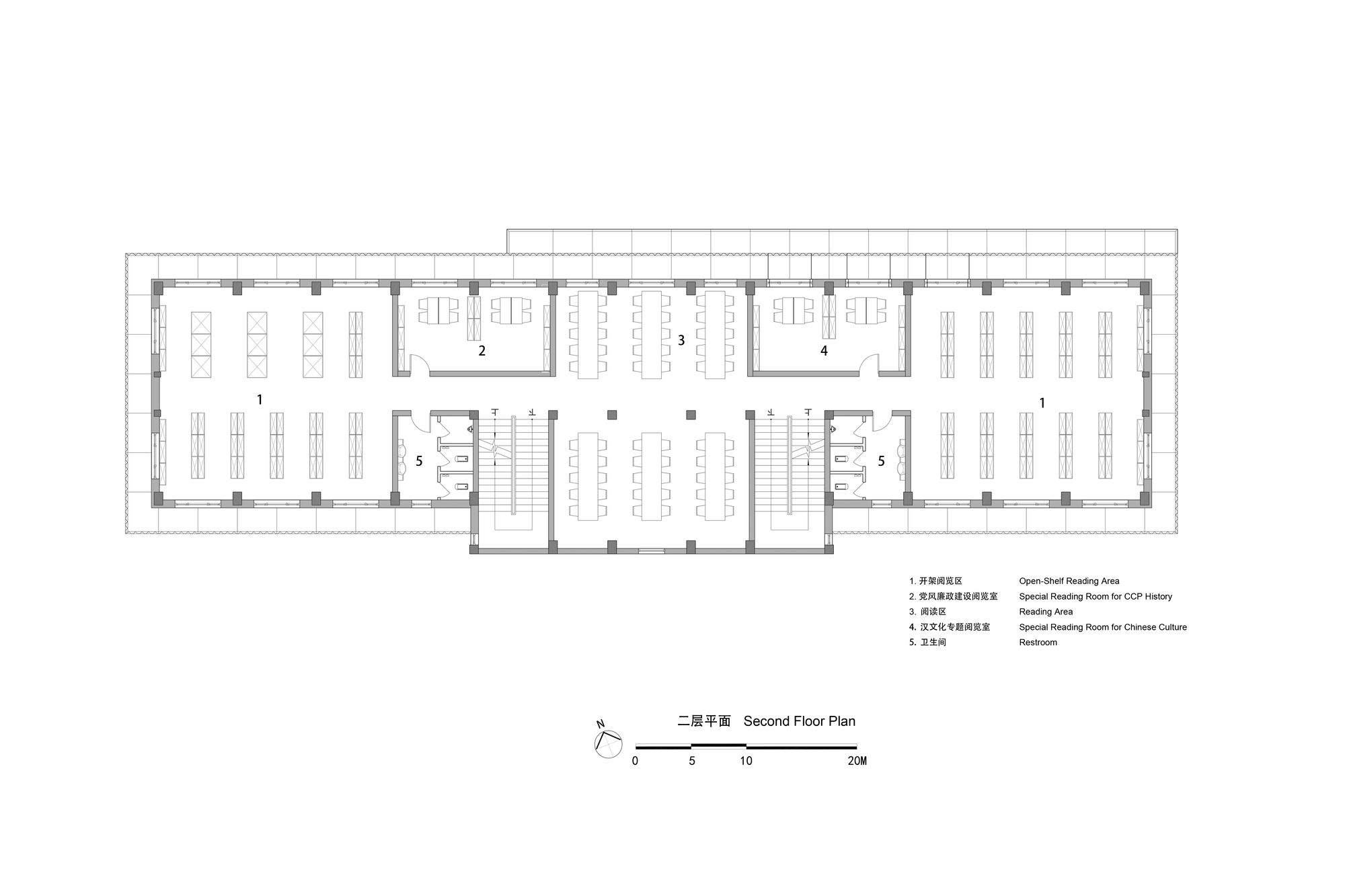
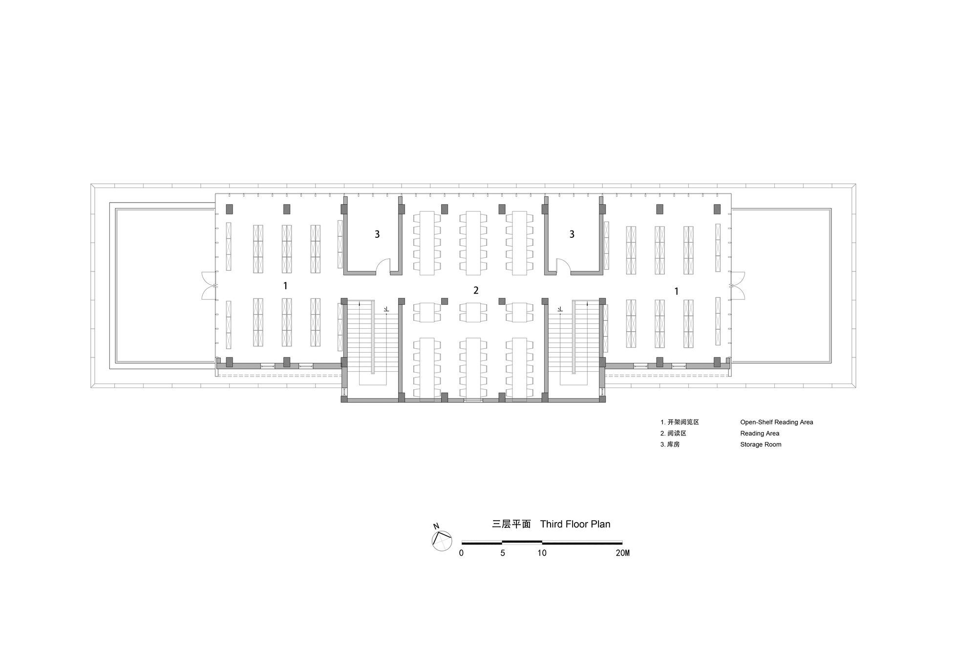
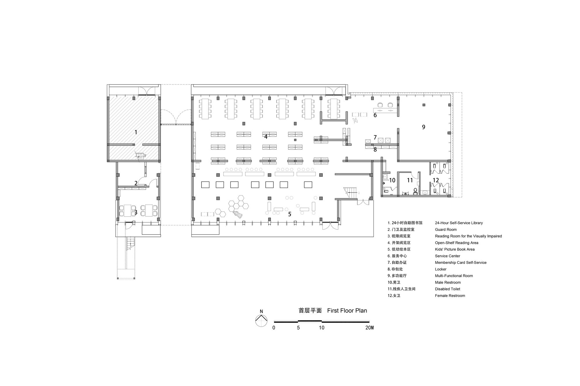
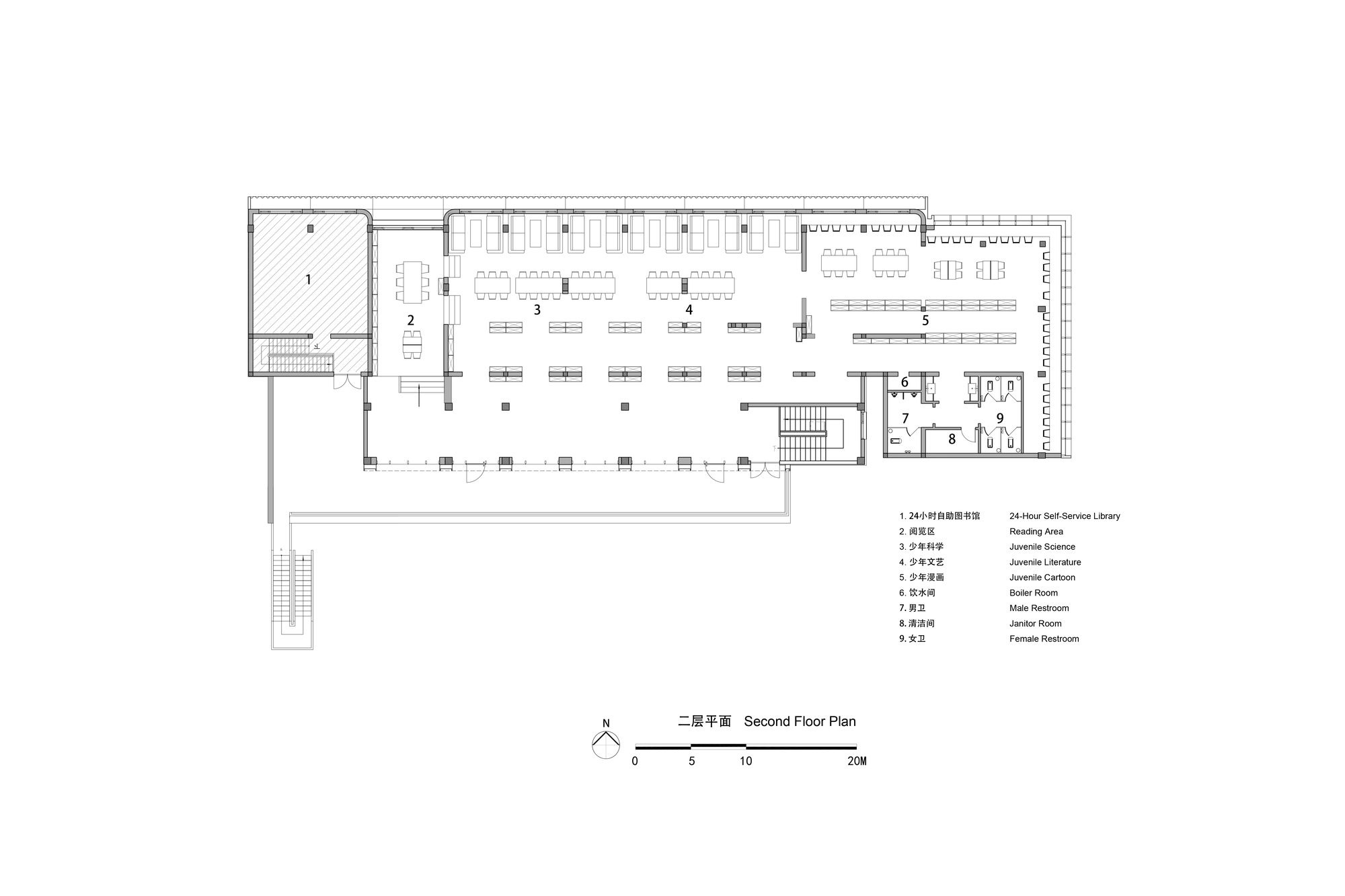
The renovated Ankang library consists of three buildings: The North Building facing the street, the Main Building of the library positioned in the centre, and the self-use office building at the southern end of the courtyard. The renovation focuses on the North Building and Main Building.
The design principle aim was to rejuvenate the old library into a seemingly new, open, and welcoming community space, highlighting and creating a strong contrast with its existing context.
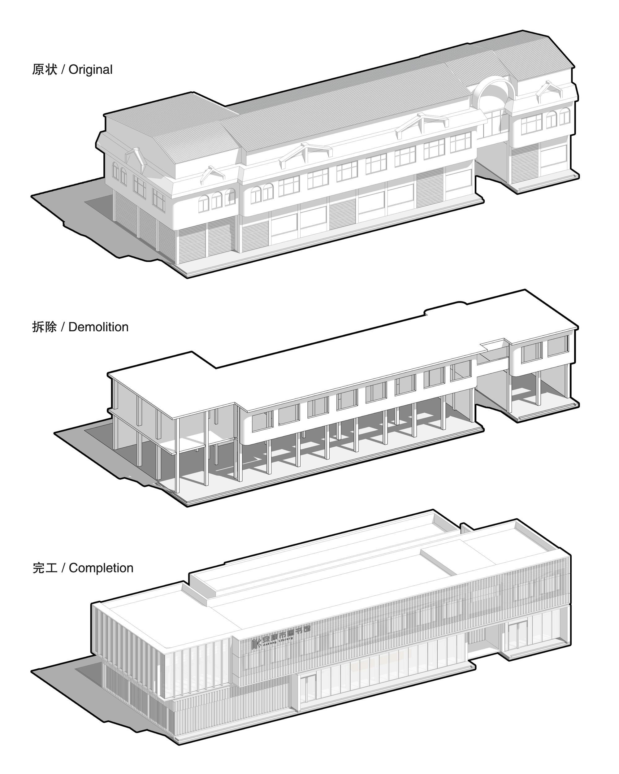
Renovation of North Building: Located at the crossroads of the urban street network, the North building utilized mixed structural systems and outdated design techniques in its construction. Before the renovation, the first and the second floors of the building were rented out to small restaurants and shops, while the third floor of the building was built using color steel plates and was unapproved construction work.
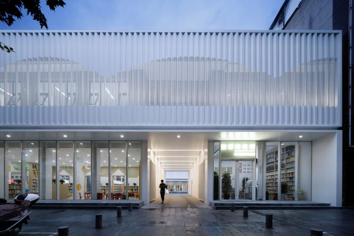
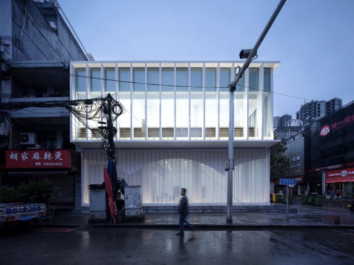
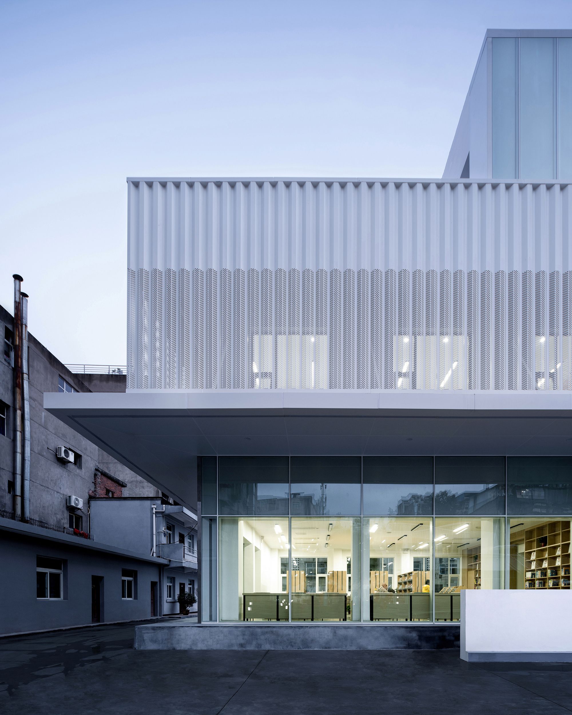
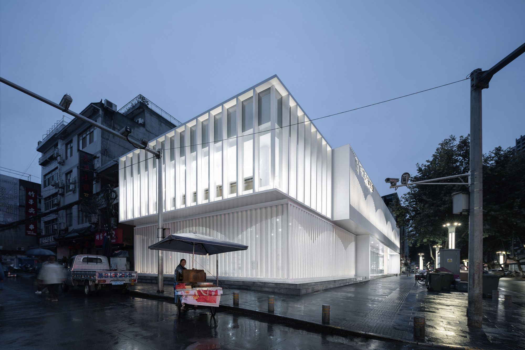
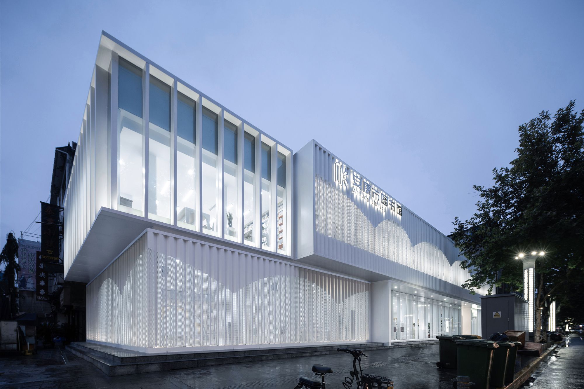
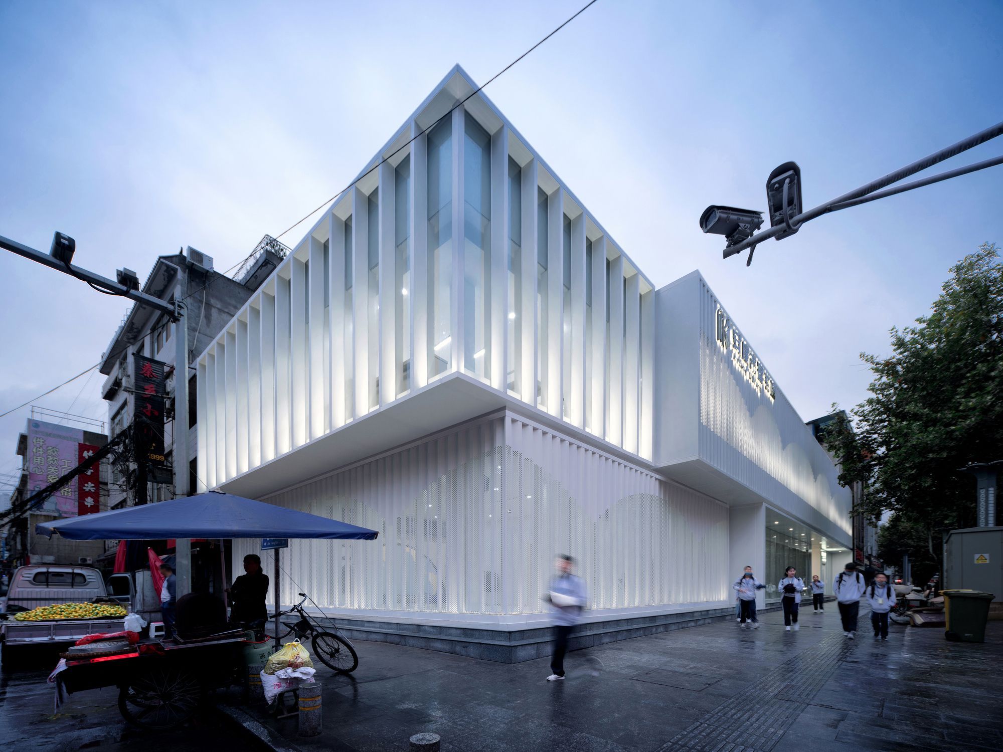
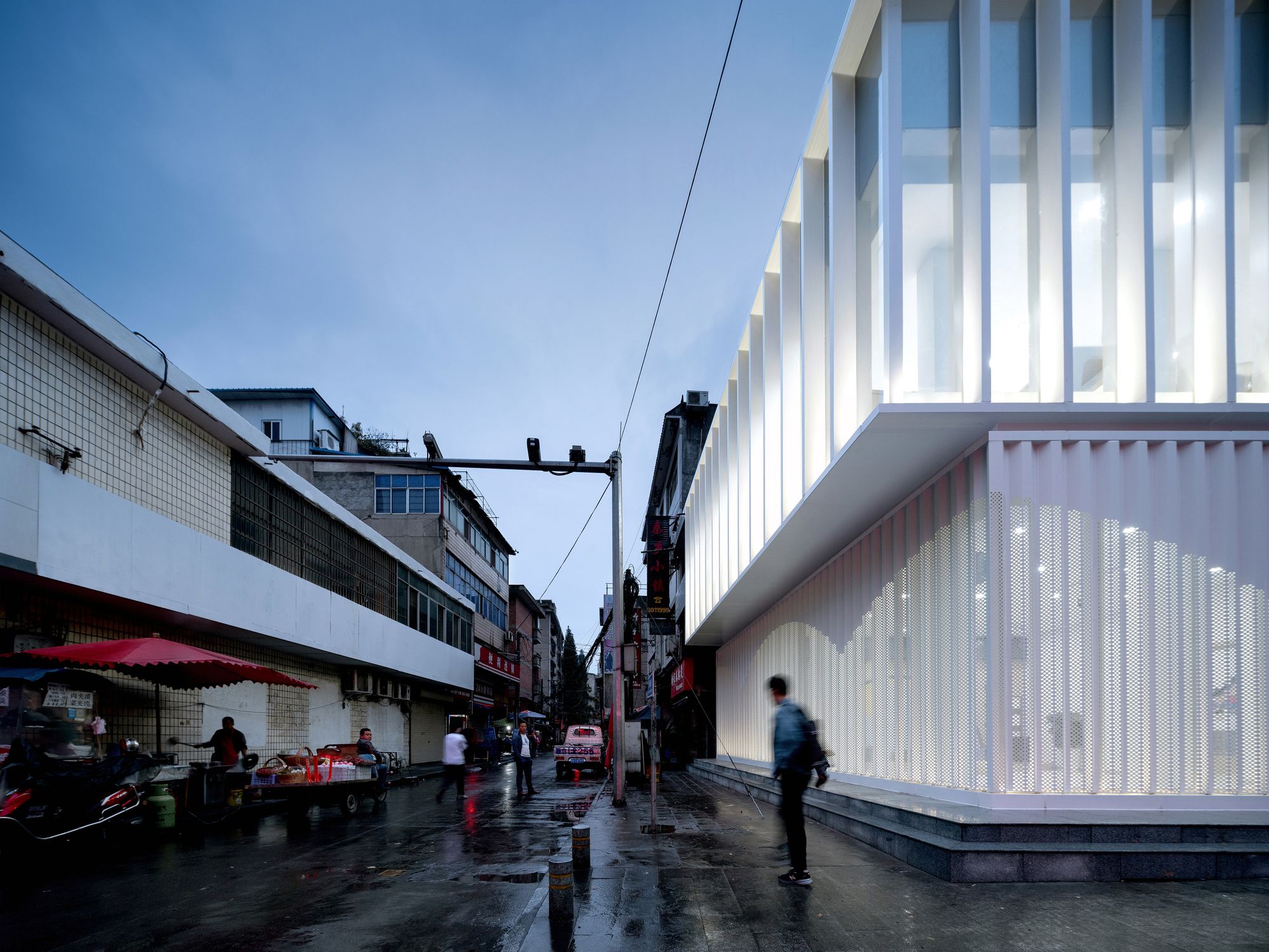
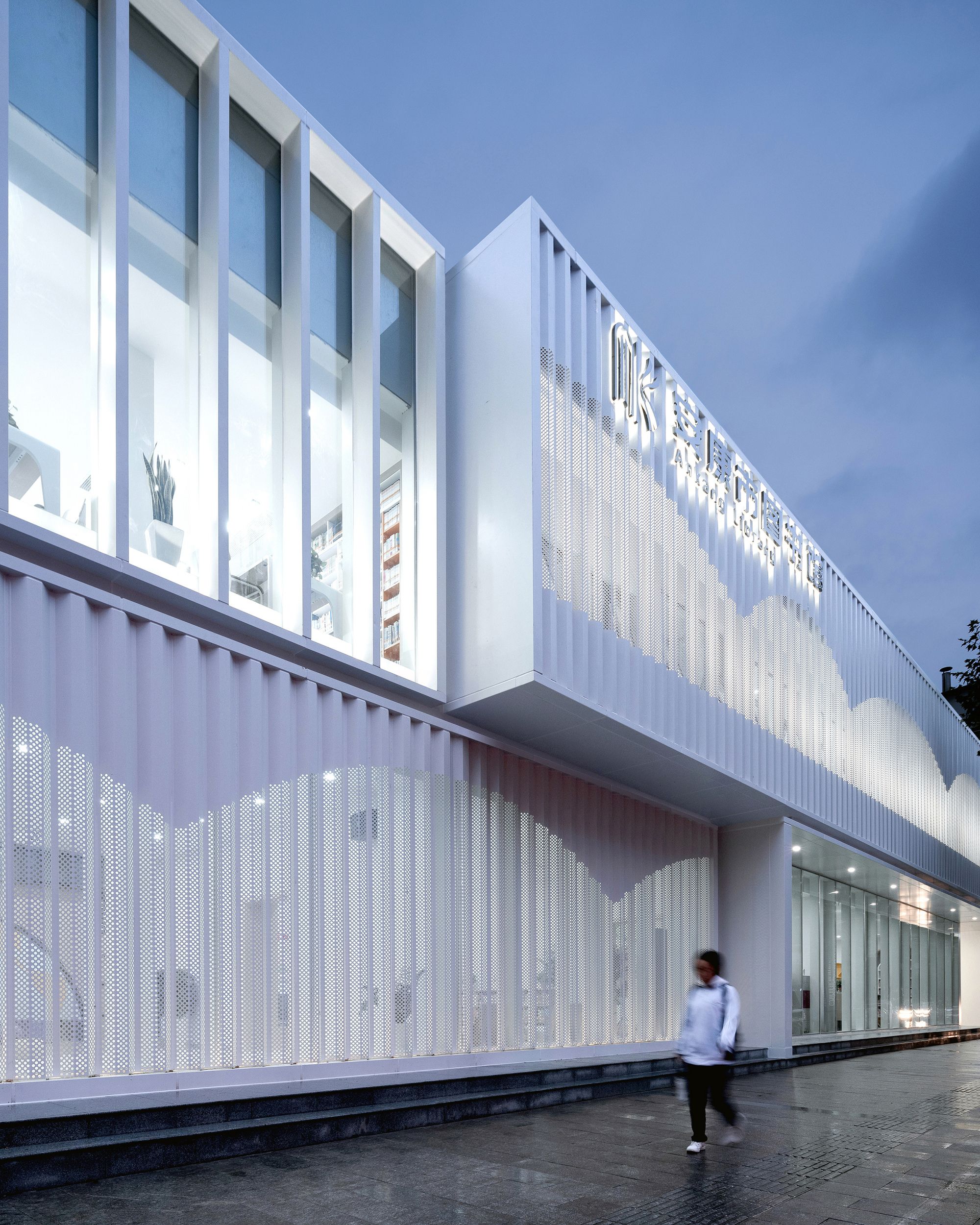
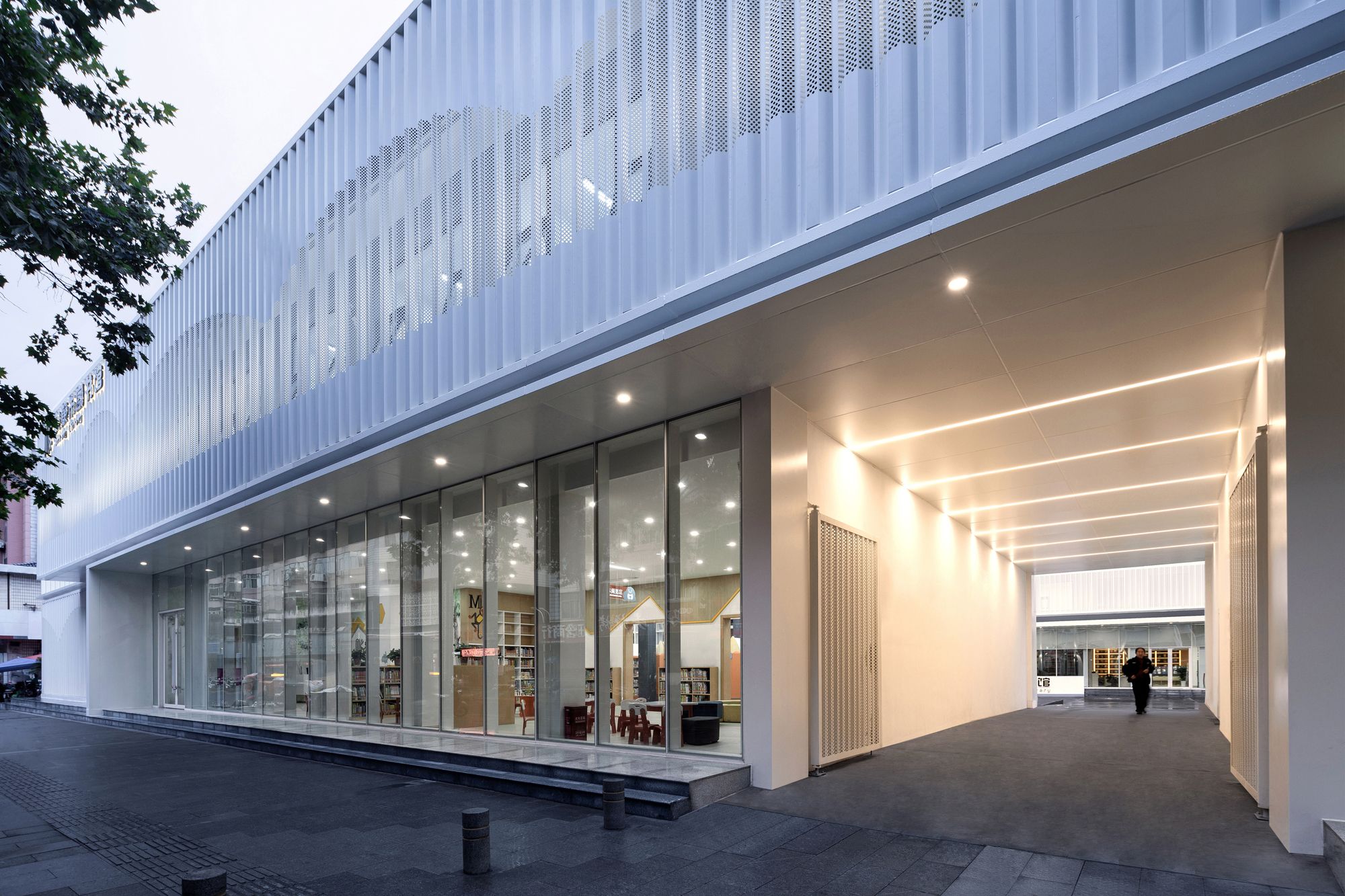
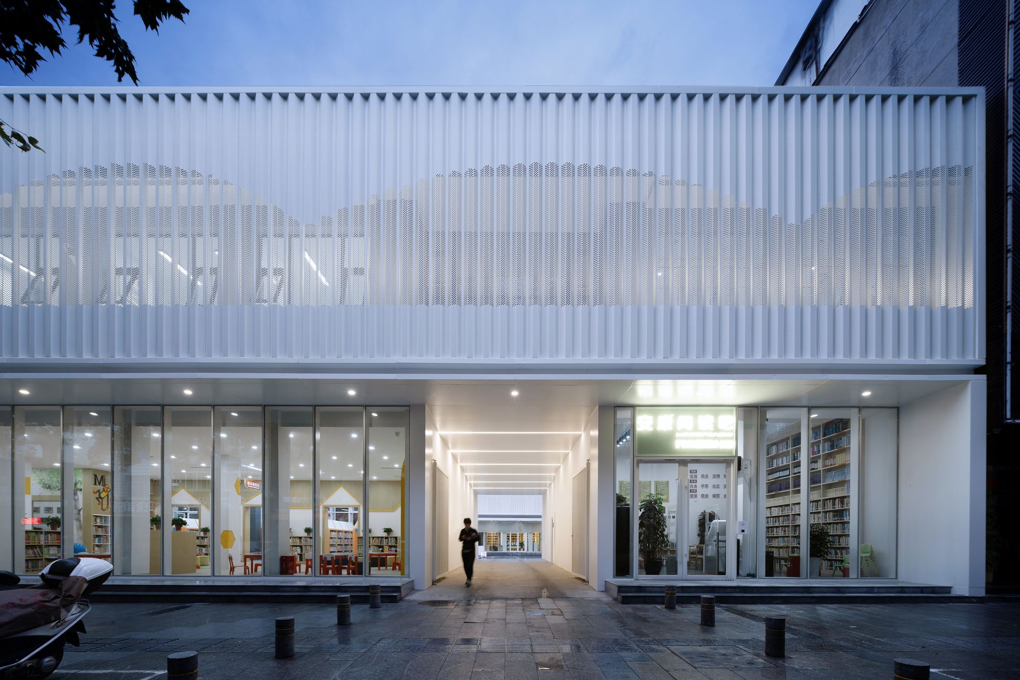
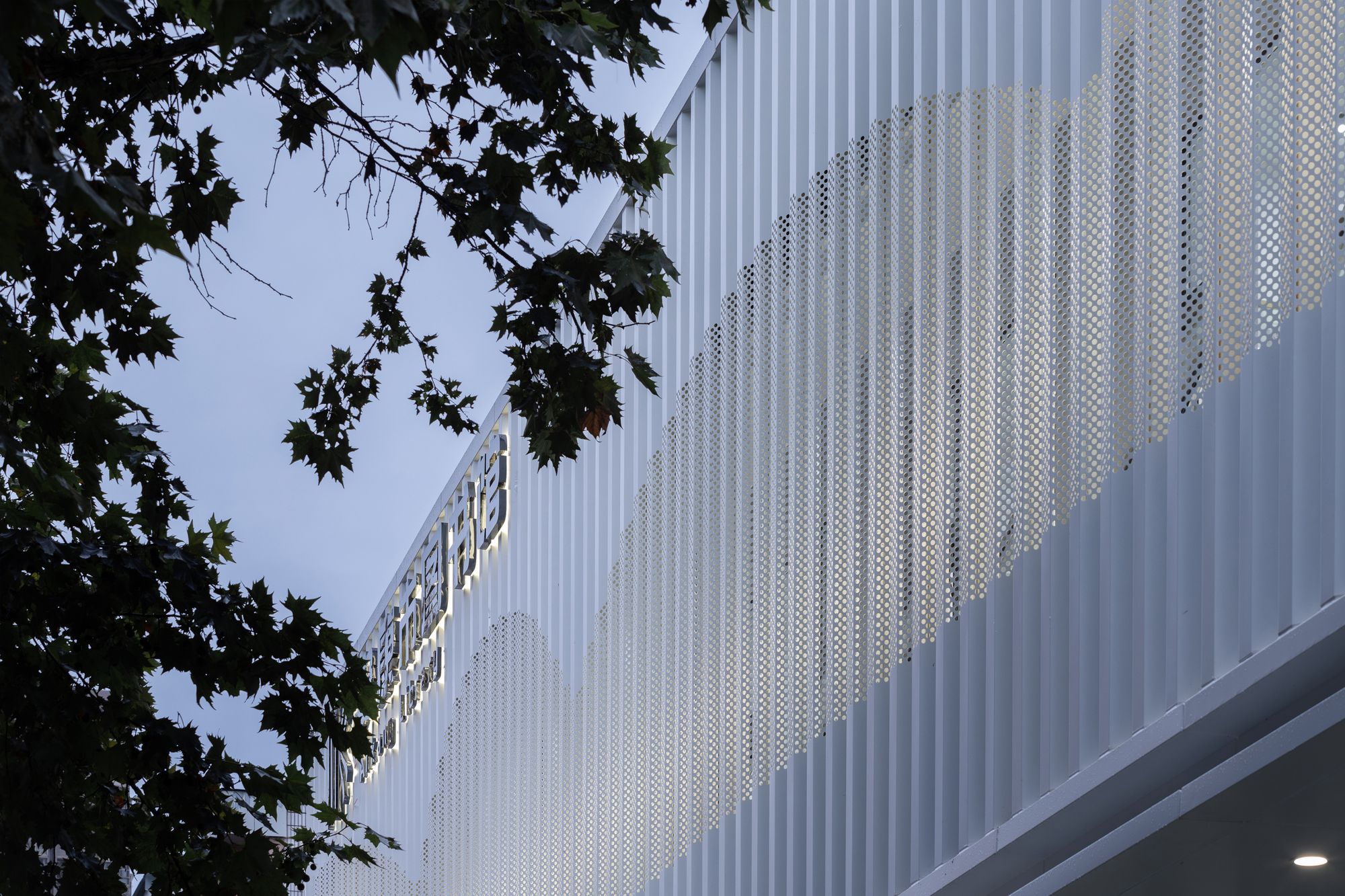
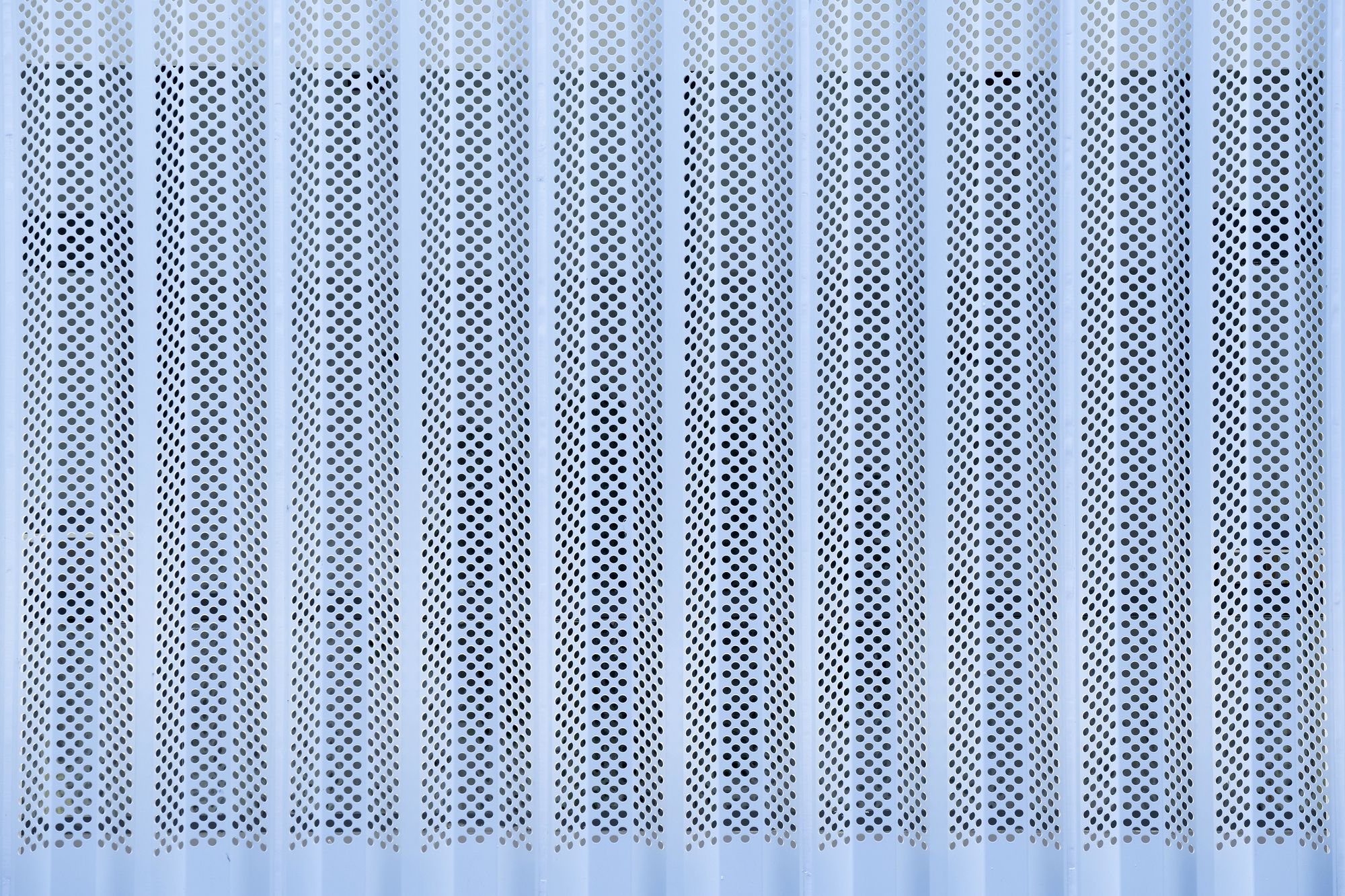
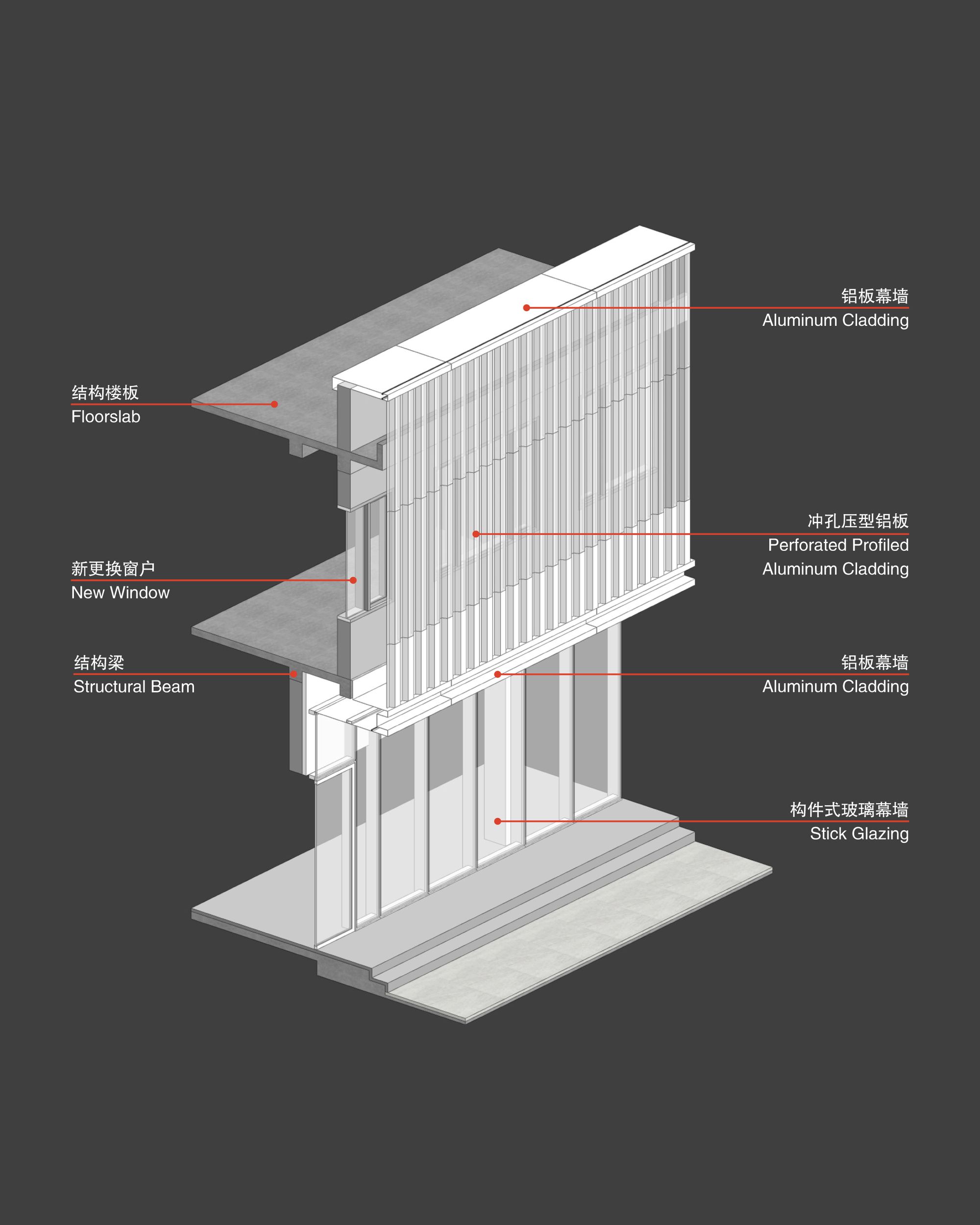
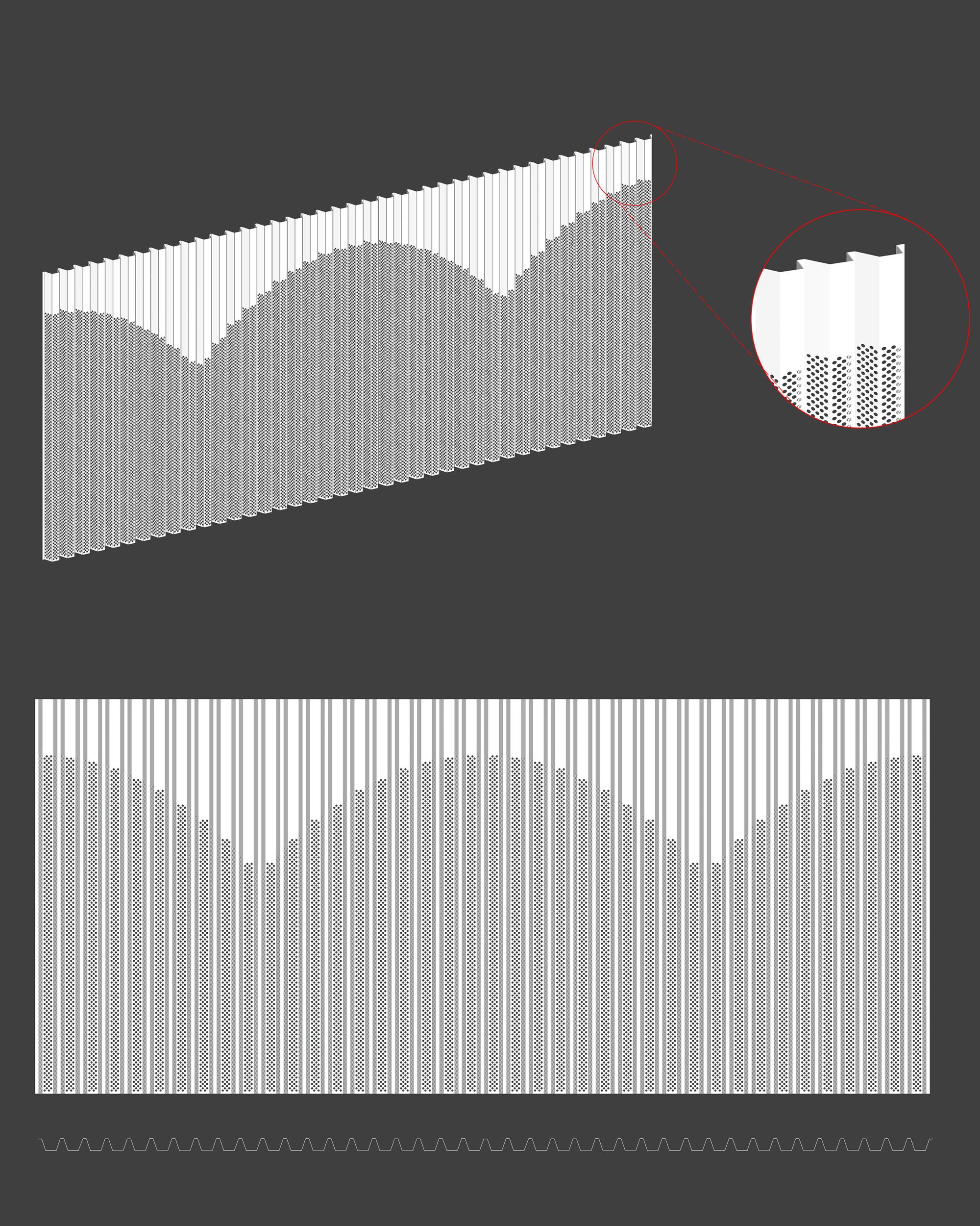
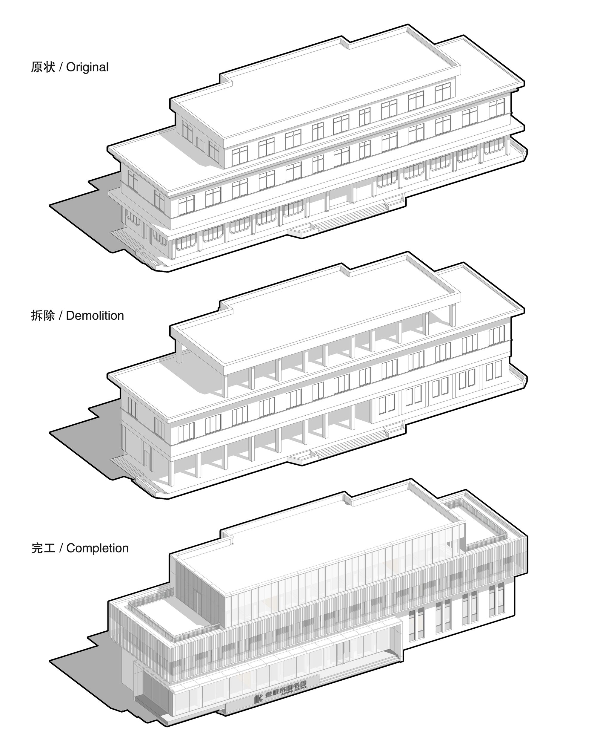
During the renovation of the North Building, the facade decoration elements and the unapproved constructed floor (third floor) were removed. However, the original building structure and exterior wall were left unchanged. According to the orthogonal grid formed by columns and floors, four intersecting building volumes were introduced into the main facade of the North Building, which reshaped the richness and expressiveness of the building. Among them, transparent glass curtain walls were adopted in the two diagonally opposite volumes, which narrows the distance between the library and the citizens and shows an open and friendly temperament. The other two volumes were wrapped in perforated aluminum cladding, which covers the original external wall of the building on the premise of satisfying natural lighting, and at the same time forms the overlapping effect of double facades and the combination of opaque and translucent. By controlling the perforated areas, a series of jumping arcs are introduced to the facade along the street, which not only enriches the visual experience but also acts as a metaphor for an open book. The color of the reconstructed building sits in contrast to the language of its urban context, however, this juxtaposition also creates harmony in its contrast as this frenetic urban language frames the calmness and tranquility of the regenerated elevation.
Renovation of Main Building: Located in the middle of the courtyard, the main building is a three-story building with a frame structure built in the 1980s. The exterior wall of the main building adopts the traditional window-wall system. Over the duration of time, the doors and windows have aged badly, in addition to parts of the exterior wall falling away
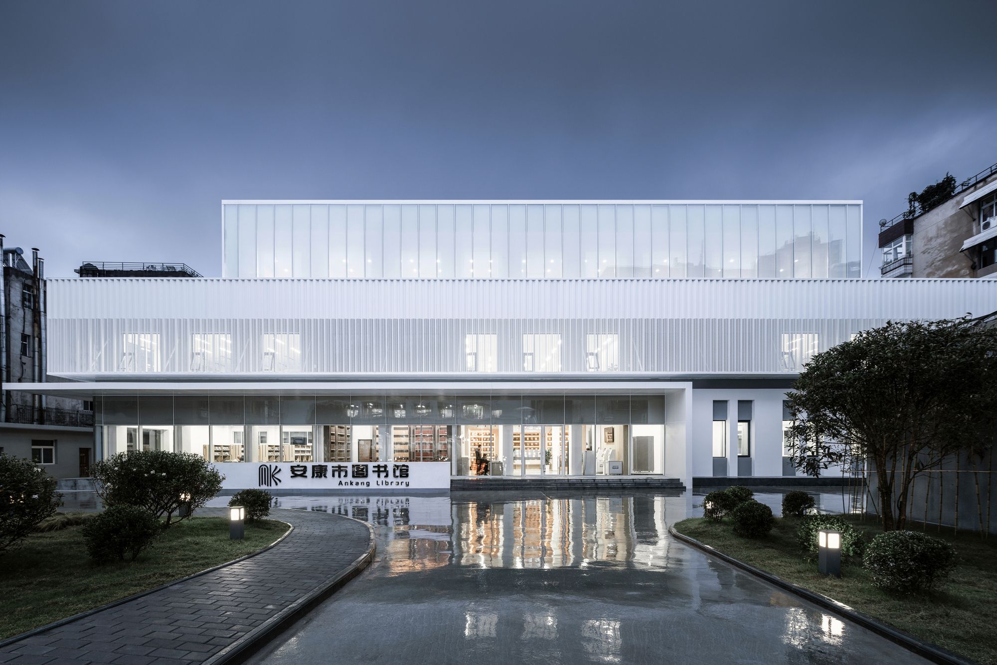
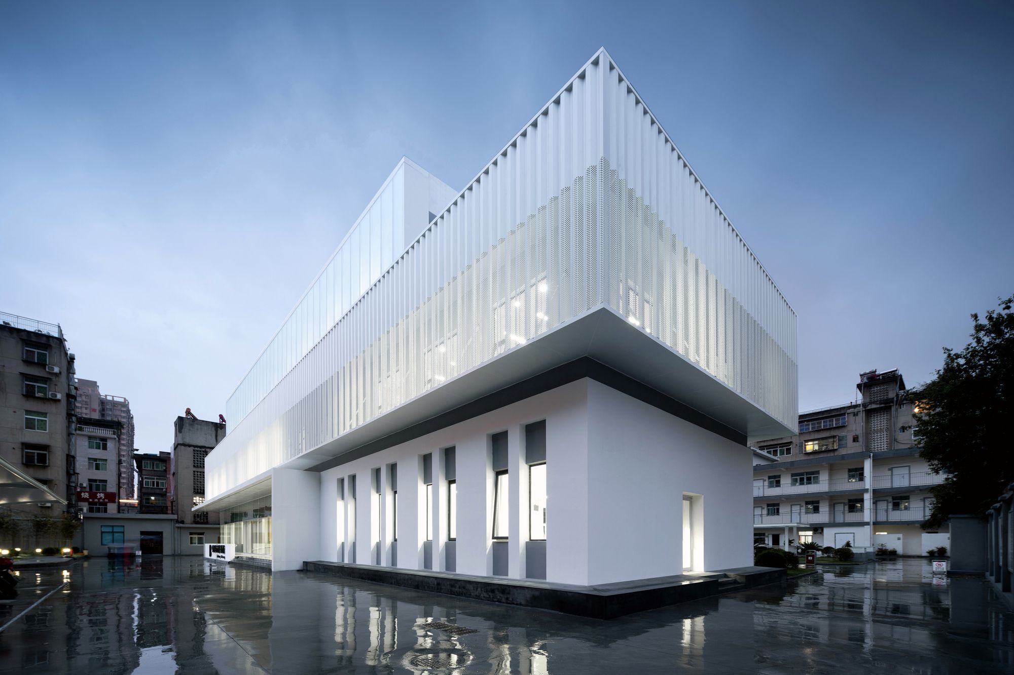
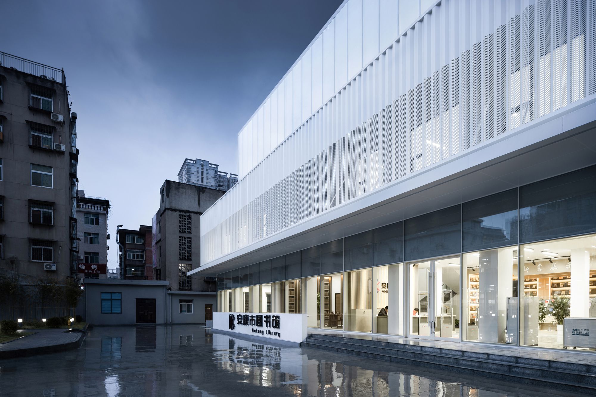
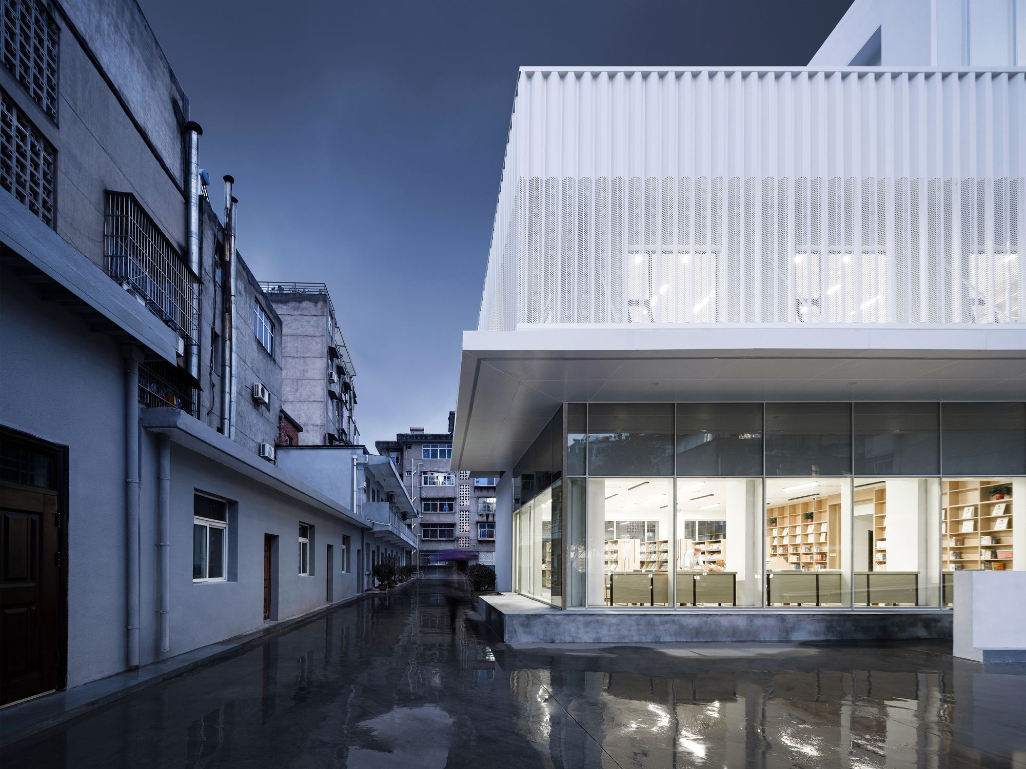
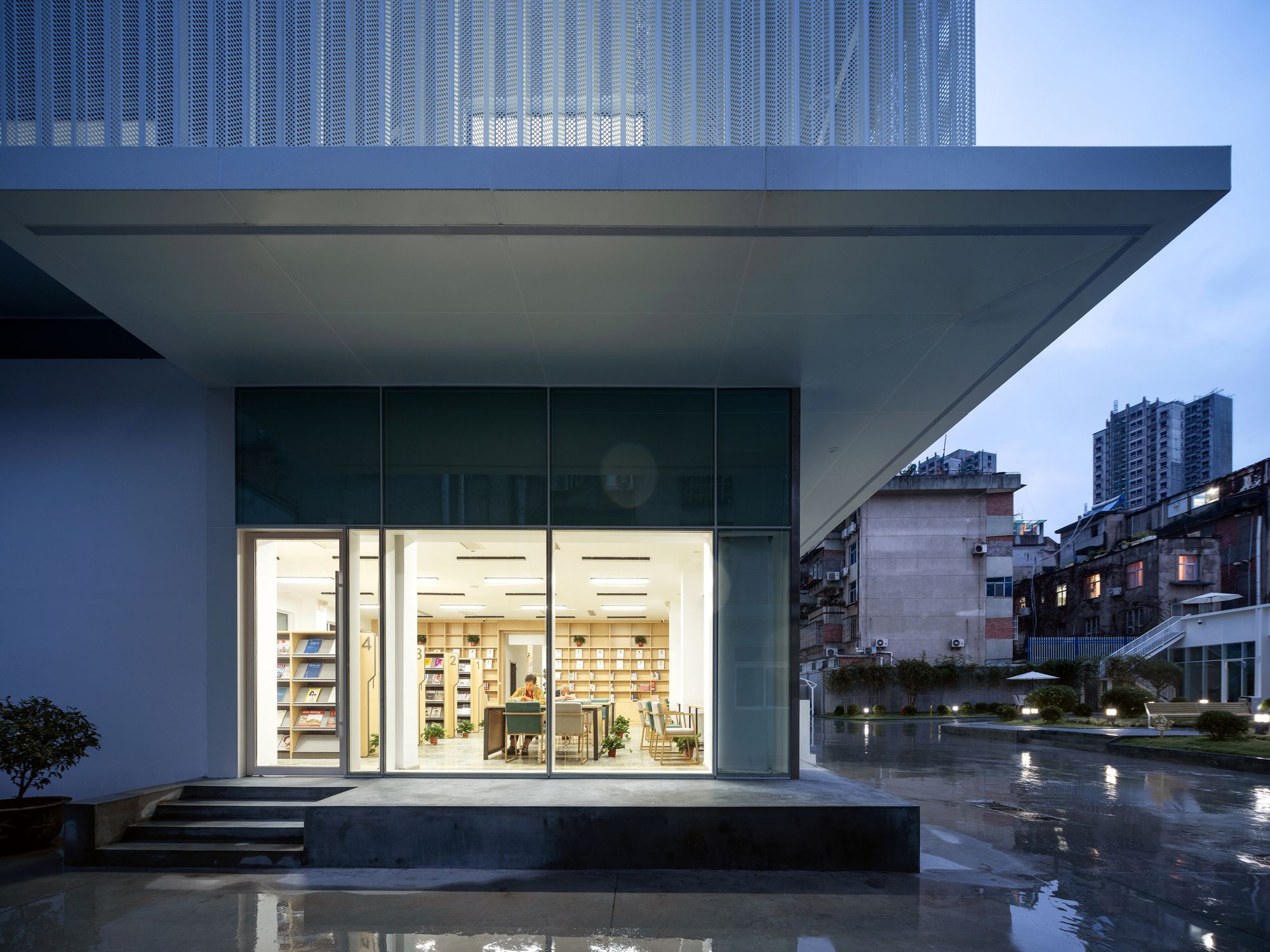
The renovation principle of the main building is to preserve the original building structure including certain supporting walls and extract some external walls of the first and third floors of the main facade to improve the transparency and openness of the building. The new building follows the original three-stage characteristics, with a transparent glass curtain wall, perforated aluminum cladding, and glass curtain wall lined with sunshade curtain on the first to third floors, forming three clear lateral volumes, with a simple and pure shape, just like three books stacked in between the old city buildings.
A Juxtaposition of Place: The two buildings adopt a modern curtain wall system, forming a concise massing and pure colour. The transparent glass curtain wall combined with the delicate perforated aluminum plate creates an effect akin to a halo. When the two buildings are seen with the vibrant and disordered old city, the following strong contrast brings unexpected drama and contrast. Forty years of passed time are visible with these two urban realms, like a surreal space-time dislocation. In the contrast between the new and the old, the two sides contrast each other, so that both new and old have the meaning of existence and form an antagonistic symbiosis. In this context, new and old are neither commendatory nor derogatory, they are merely different state of affairs. In addition, the juxtaposition of the place also exists in people’s behavior. Inside the building is a quiet and attentive reading atmosphere, and a window is separated by the street snack’s market. The juxtaposition of these two conditions of the place, the calm and tranquility of the library set against the frenetic energy of the city street, create a counterpoint of tension.
Project Info:
Architects: UUA (United Units Architects)
Location: Ankang , China
Area: 4000 m²
Project Year: 2020
Photographs: Lian He
Aerial view. Image © Lian He
Main building. Image © Lian He
Main building. Image © Lian He
Main building. Image © Lian He
Main building. Image © Lian He
Main building. Image © Lian He
Main building. Image © Lian He
Main building. Image © Lian He
Main building. Image © Lian He
Main building. Image © Lian He
Main building. Image © Lian He
Main building. Image © Lian He
North building. Image © Lian He
North building. Image © Lian He
North building. Image © Lian He
North building. Image © Lian He
North building. Image © Lian He
Photography by © Lian He
Photography by © Lian He
North building. Image © Lian He
North building. Image © Lian He
North building. Image © Lian He
North building. Image © Lian He
North building. Image © Lian He
North building. Image © Lian He
Before vs after north building. Image © Lian He
Before vs after of main building. Image © Lian He
Facade detail
Facade detail
Facade detail
Facade detail
1F plan of main building
2F plan of main building
3F plan of main building
1F plan of north building
2F plan of north building
Renovation strategy of main building
Renovation strategy of north building


