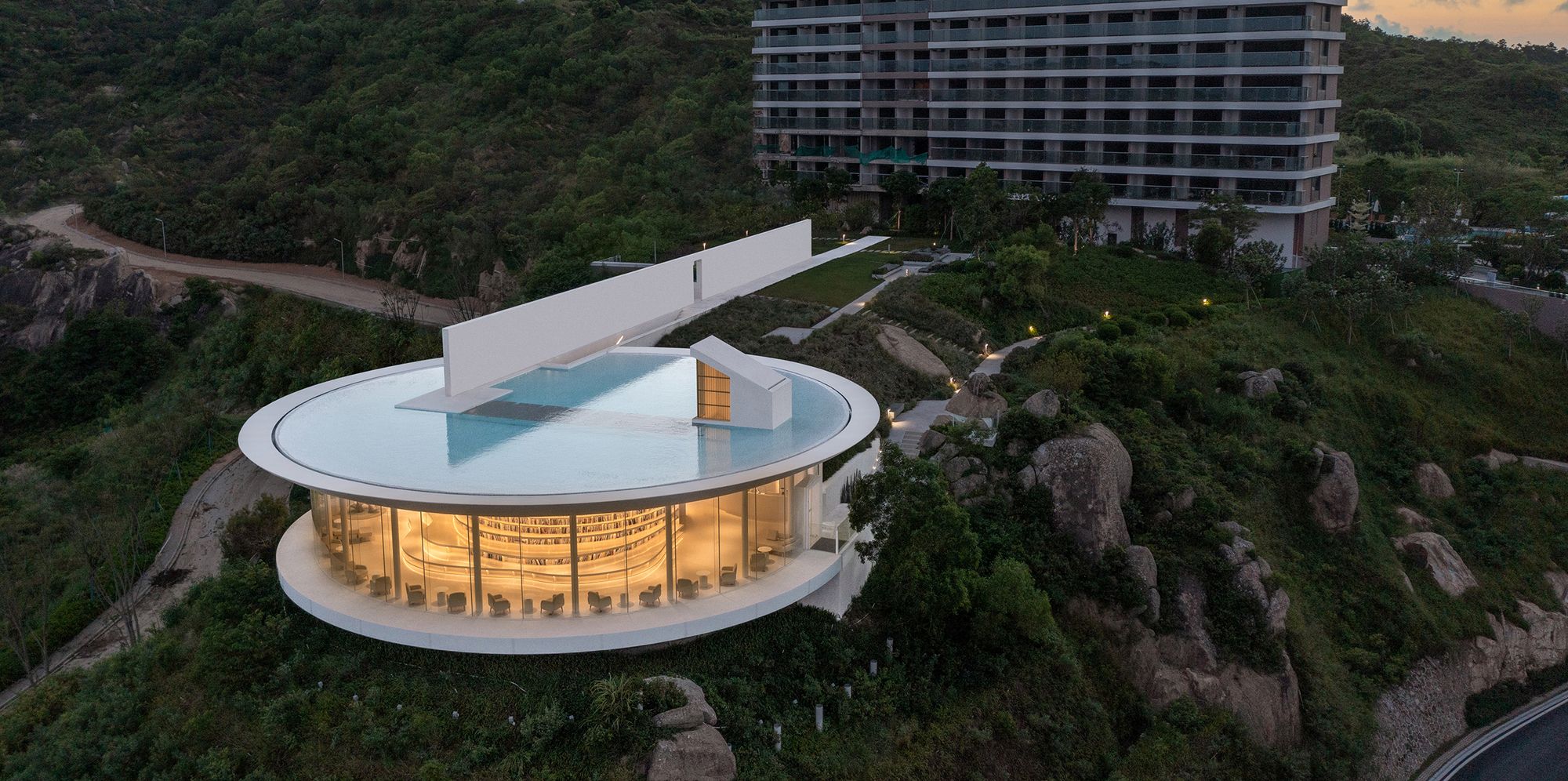
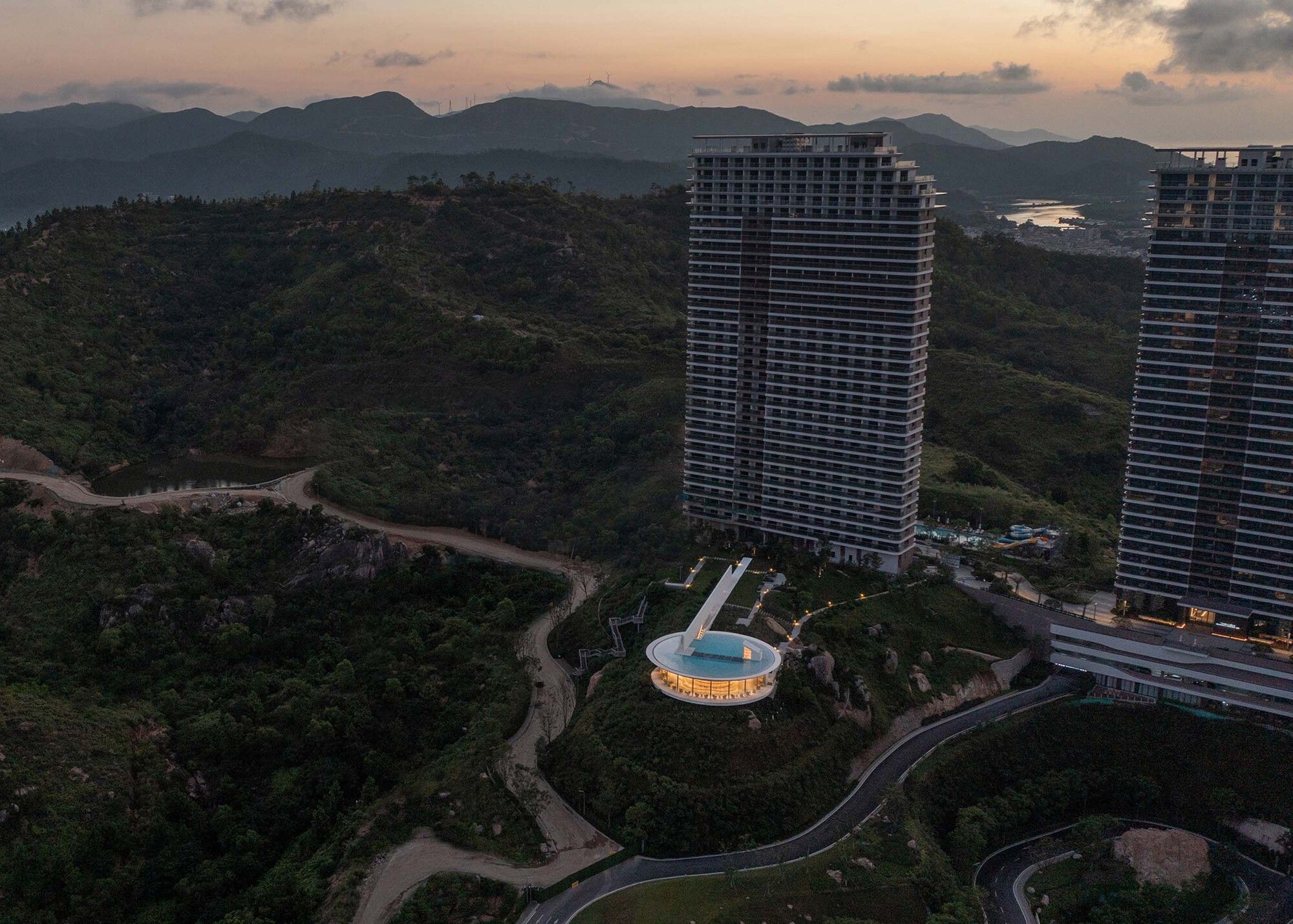
There are additional difficulties in the base: multiple residential structures are to the east and southeast of the base, and the significant volume of the home partially obscures the view of the building. Furthermore, the library’s height must be rigorously limited to prevent low-rise inhabitants on the north side of the building from viewing the sea. A multi-story structure southwest of the park has an unappealing look and detrimental influence on the library’s sea view.
The Water Drop Library’s Design Concept
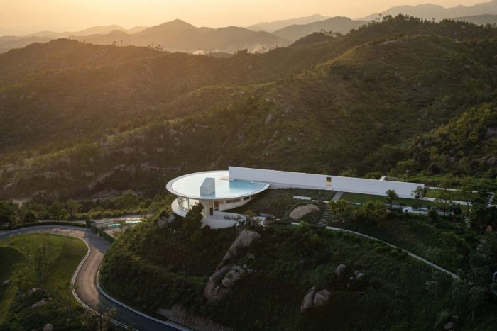
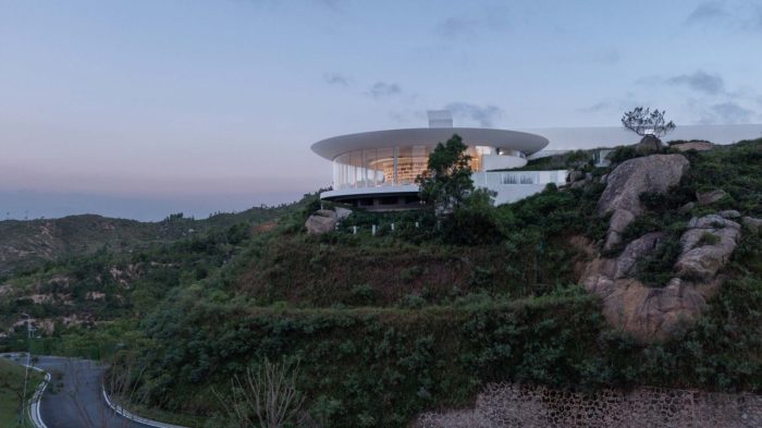
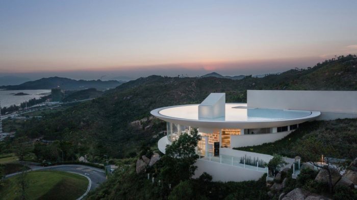
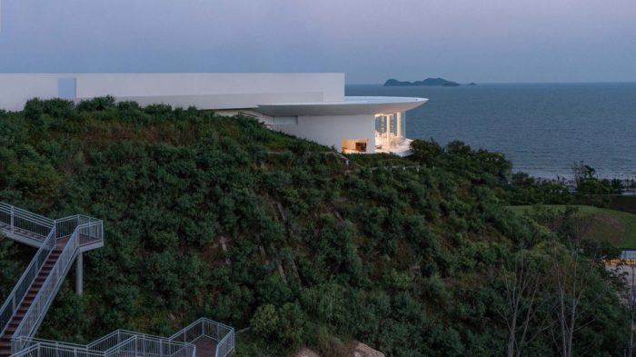
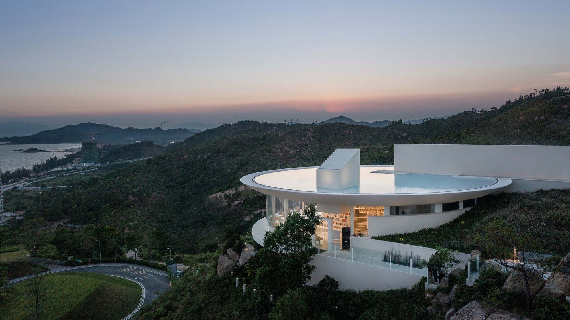
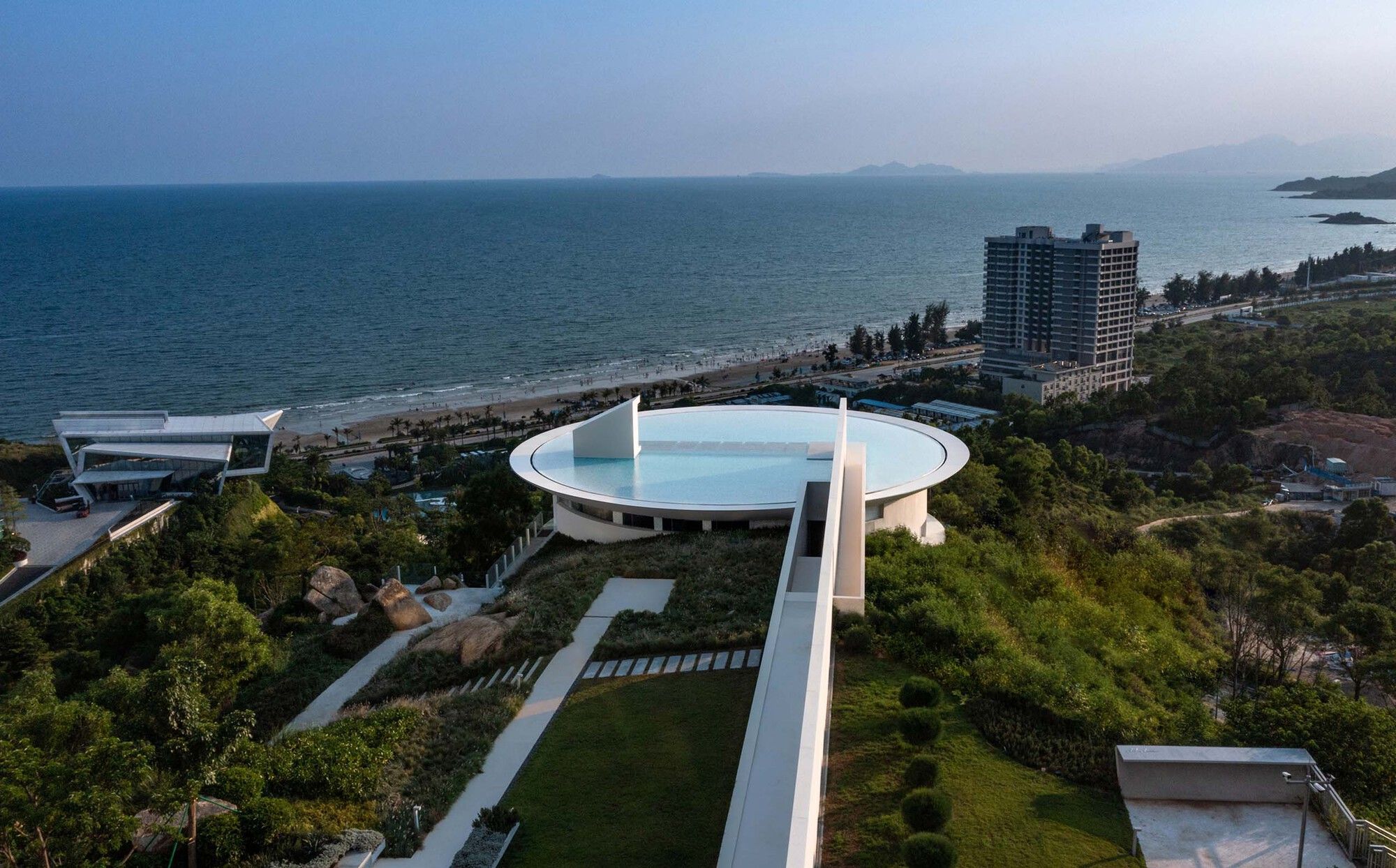
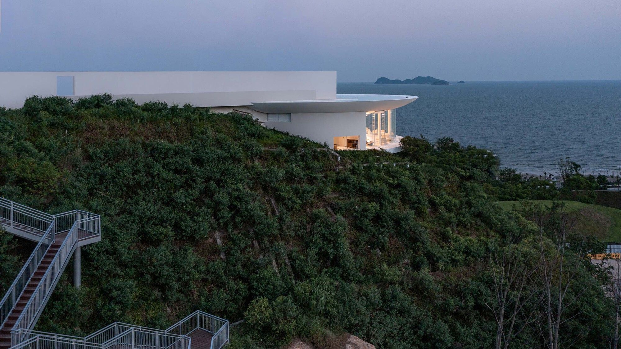
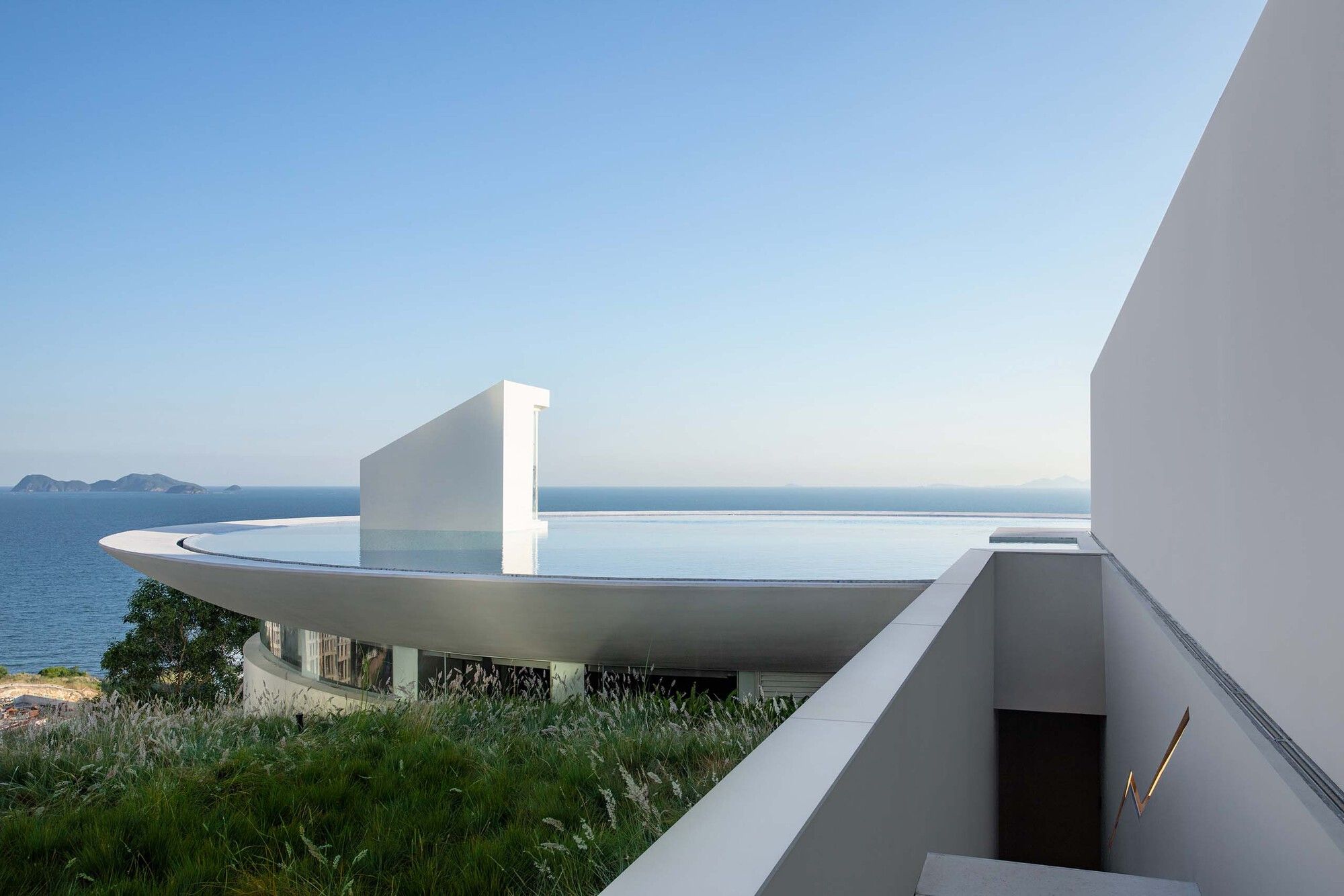
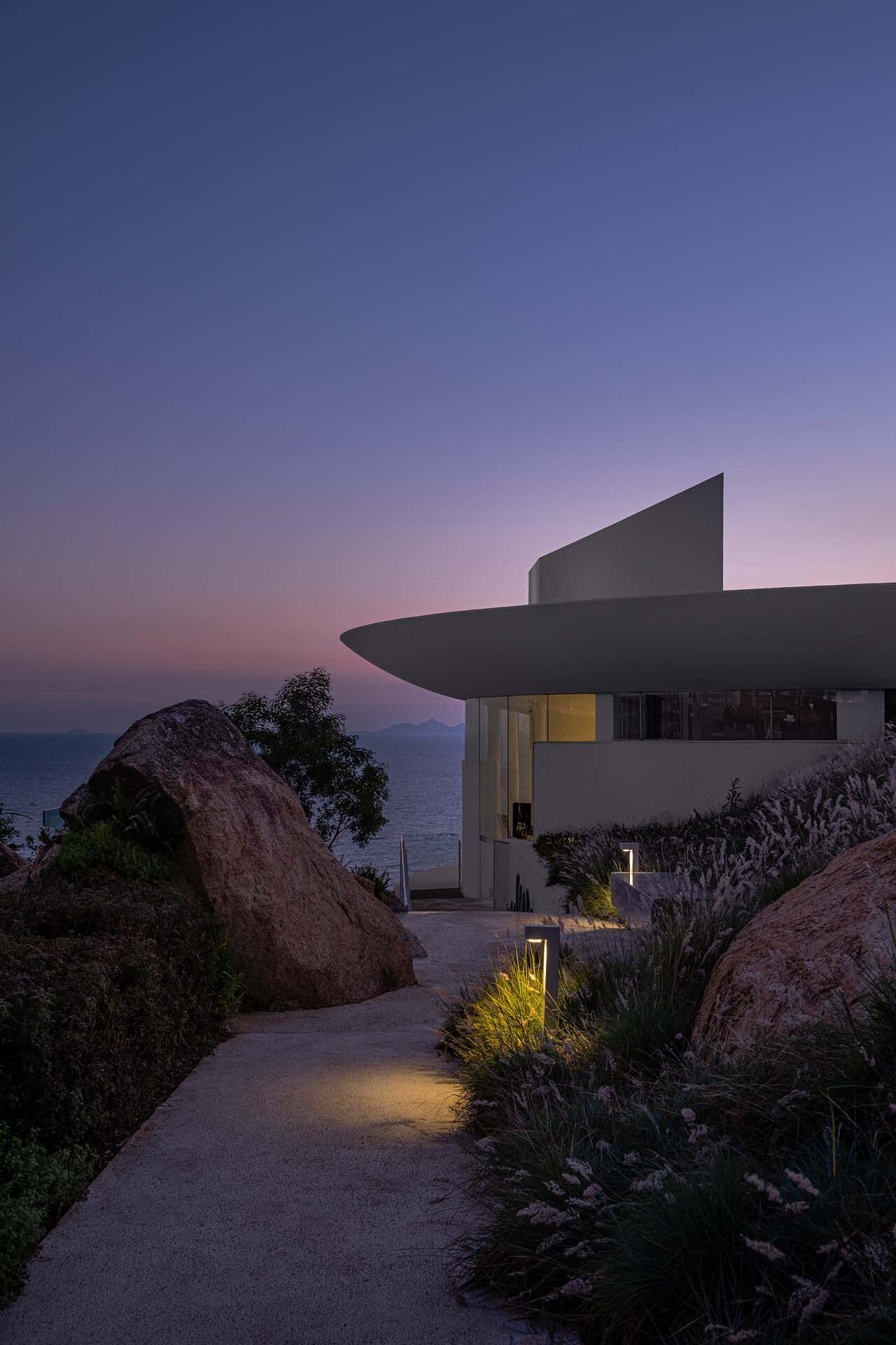
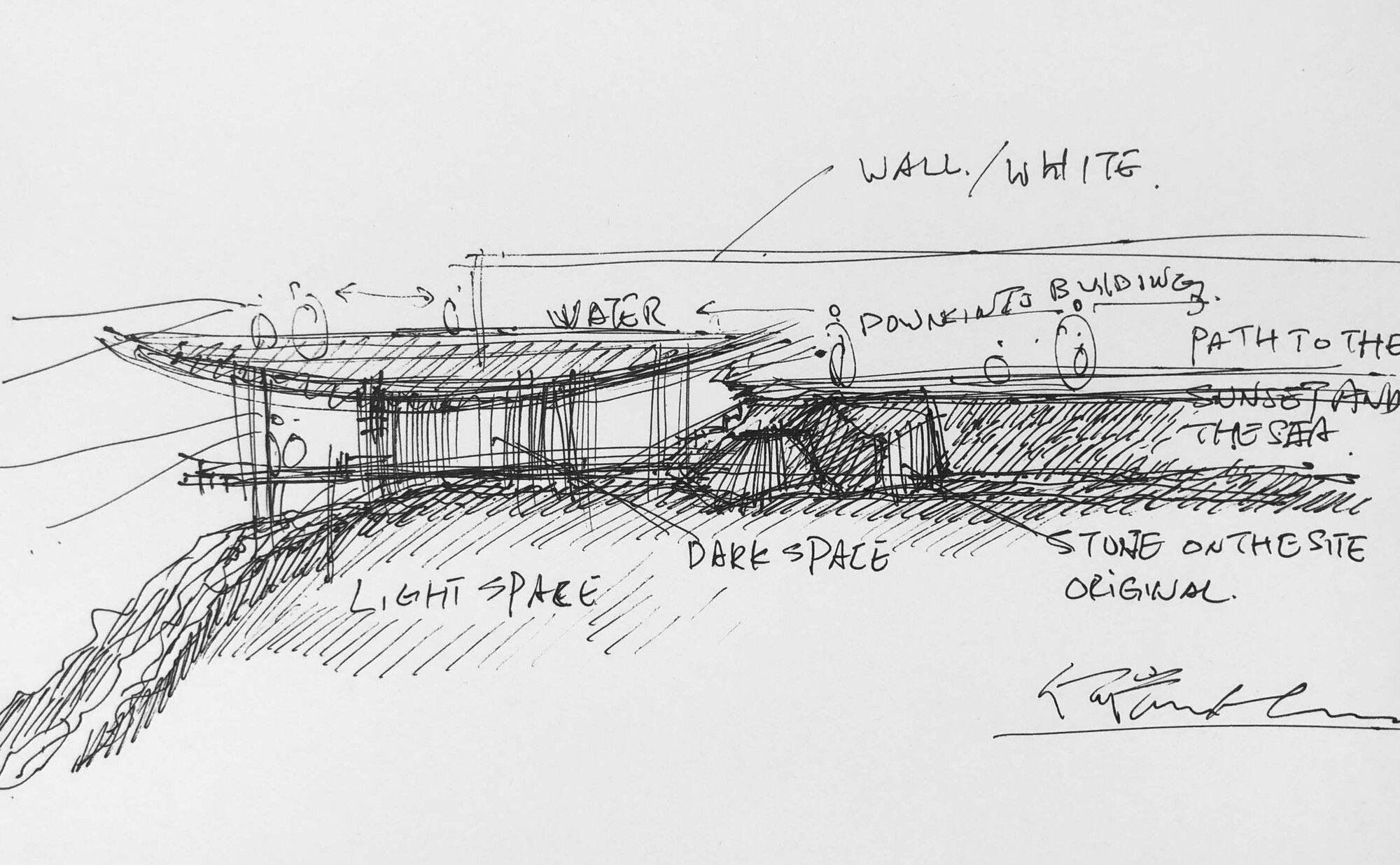
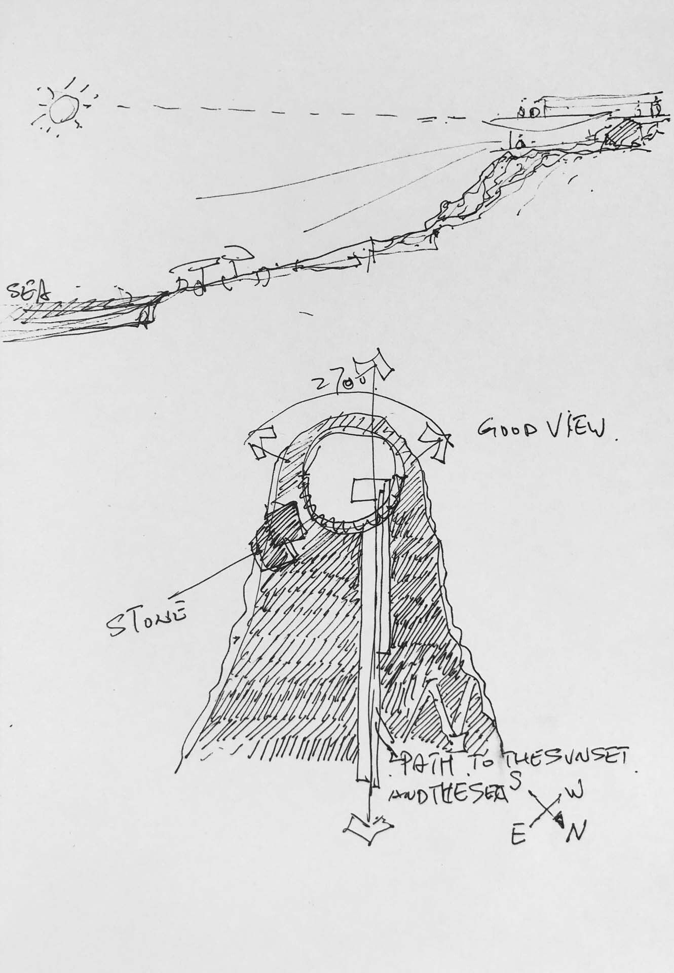
Location and form: a white library ( The Water Drop Library ) submerged beneath a pool of water. The design attempts to merge the library’s cultural characteristics, the site’s environmental attributes, and the public attributes of current society. Based on the topographic height difference, the building is proposed to be located at the end of the mountaintop and positioned at the cliff mouth. The structure is incorporated into the hill and becomes a part of the landscape. Such treatment may not only provide the largest viewing area for the library but also manage the height of the building to the maximum degree possible based on decreasing the amount of earthwork while not blocking the view of the sea from the dwelling behind.
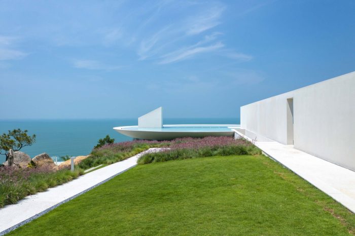
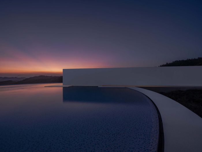
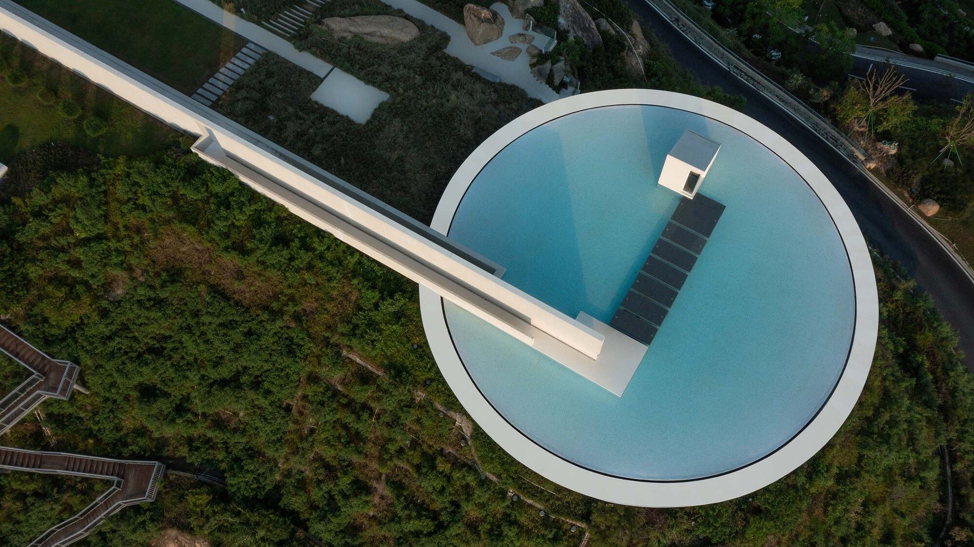
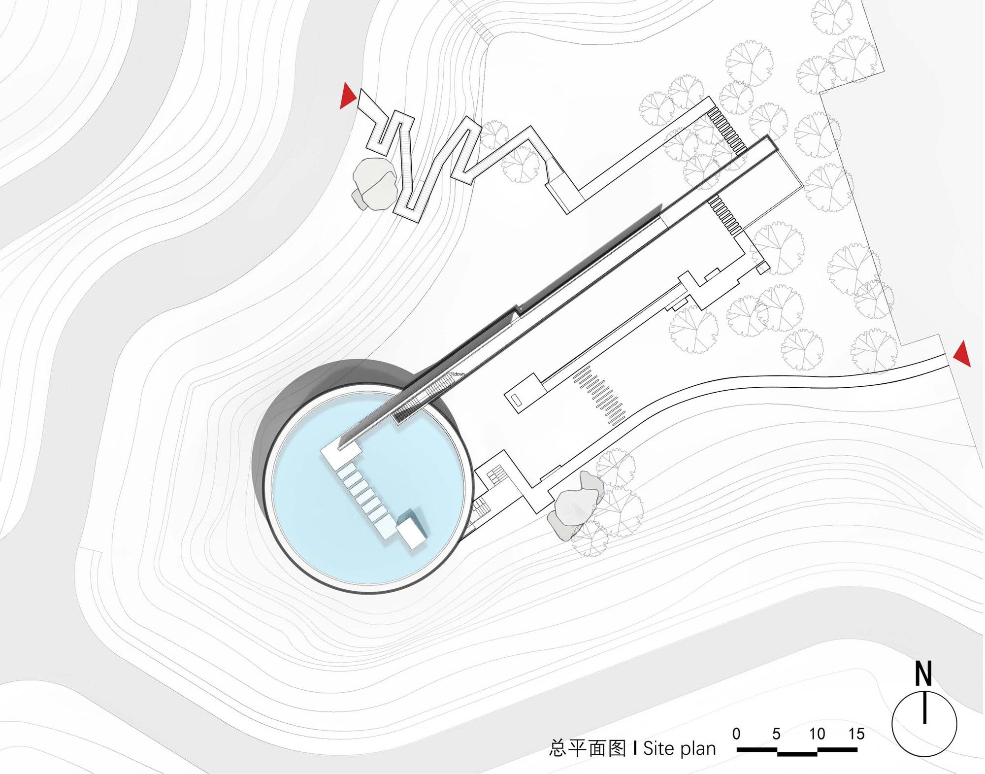
Looking down from a high point, the library’s modeling attempts for poetic tension: the structure is quite geometric – a circle plus a straight line. The major portion of the structure has a circular plane, and the straight line is the outdoor corridor and long wall that leads visitors from the top of the hill into the building. The whole library is white, with the borders of the corridor, long wall, and ceiling emphasizing the geometric design. The roof part of the structure is bowl-shaped, and the transparent glass in the reading area makes the roof appear suspended. The pool inside the bowl-shaped roof lends the structure a dramatic meaning – an underwater library.
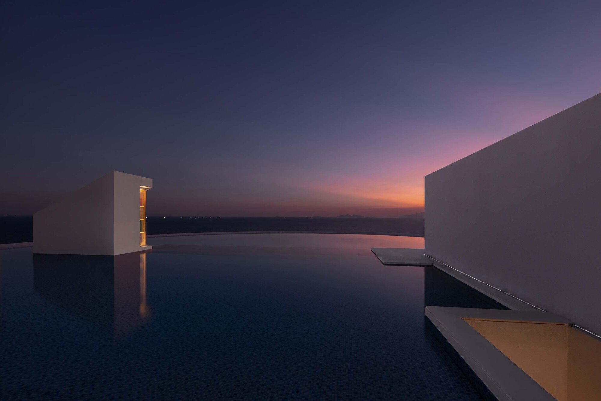
The lengthy wall protects the location from adverse conditions in the southwest and serves as a guide. It draws readers’ attention to the pool and the sea and directs them to approach and enter the structure along this line. The sinking sun will extend the shadows along the long wall and corridor for a few minutes before it sinks into the sea at sunset. This provides a romantic touch to the structure.
Spatial sequence: overlapping of light and dark, opening and closing, circuitousness and straightness
The procedure for entering the library is complex. Because the structure is on a hill, the architects constructed a winding route on the hill’s north slope. Readers must step up and recognize the discomfort of learning in their somewhat fatigued bodies. As a result, it is also known as “a path to the mountain of books.” When you reach the summit of the mountain, you will see a straight corridor and a long wall that leads people to the sea and buildings with a “tough” mentality. Readers must follow this arrangement to be taken into the undersea library. The building’s central usage space is placed beneath the pool. Entering the structure is a quest to re-discover nature and oneself. To enter the building, walk down the corridor and “dive in” beneath the pool.
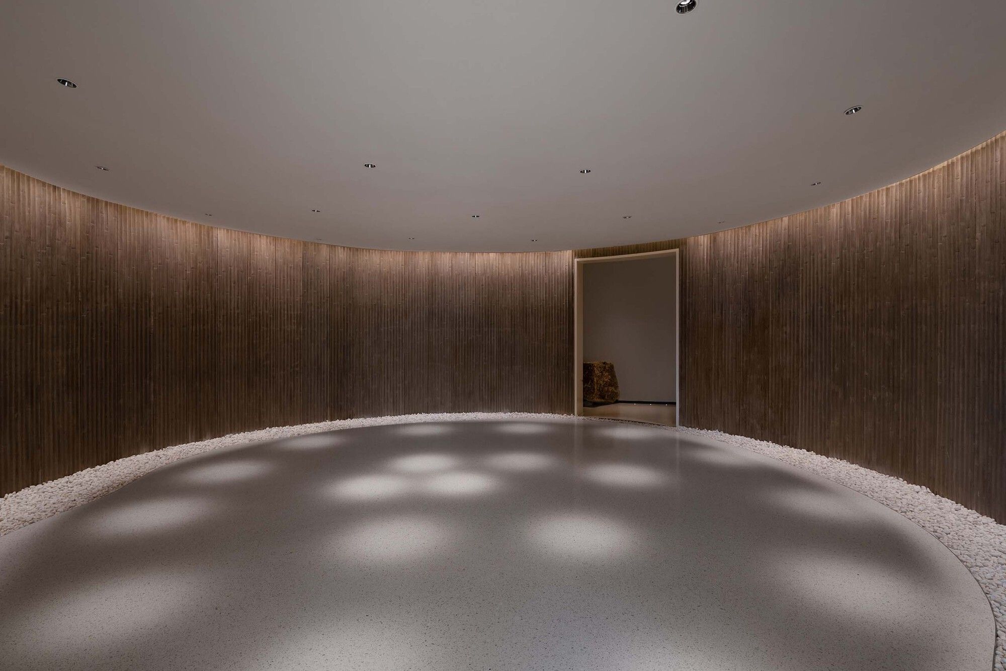
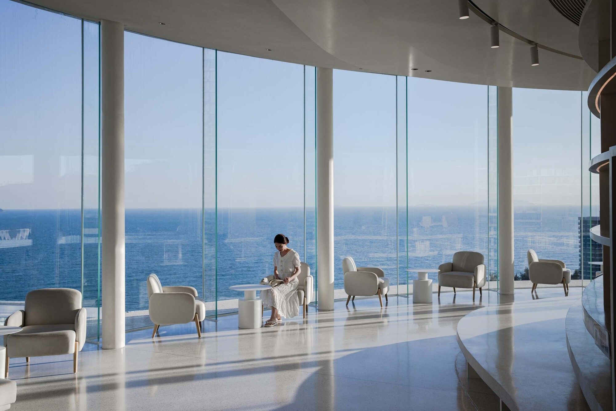
The architects plan to create dramatic areas with overlapping light and dark, opening and shutting. The porch, positioned at the end of the outside corridor, a very short transition zone, is the first scene for those entering the building. You will access the circular space in the middle of the structure by turning left from the porch. The space’s UI is basic and contemplative. The architects want this location to be mysterious and gloomy. It serves as a guide to getting inside the reading area. Small exhibits or gatherings are also permitted. The gloomy room is linked by a “hole” to the reading space, placed in the building’s outer ring, and is a light semi-circular space. It features about 270 degrees of translucent and open floor glass, through which you can see the blue sky and sea. Another building entrance and exit are located in the southeast, from which visitors can leave the library and then return to the top of the hill via circumnavigating rocks.
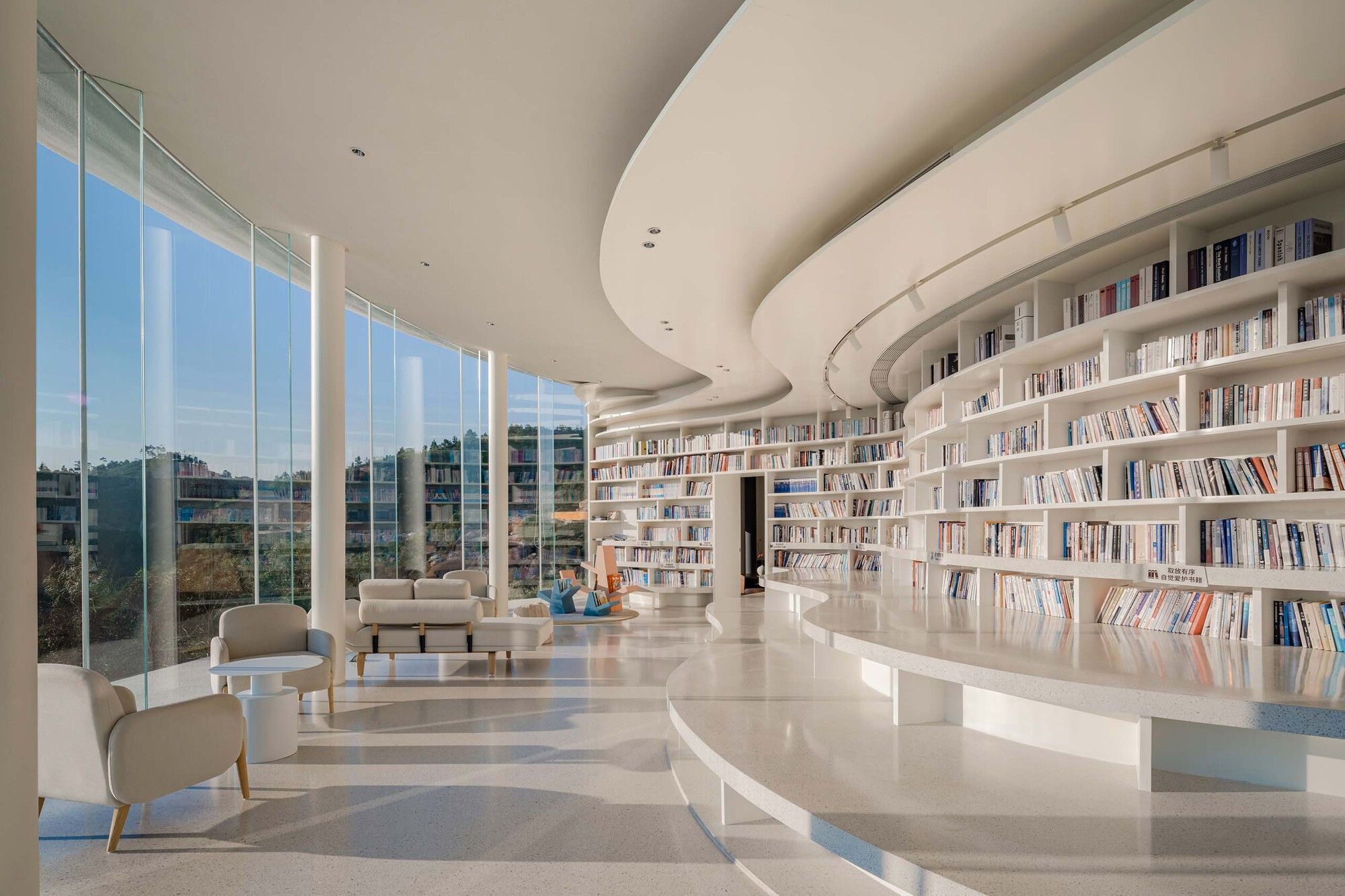
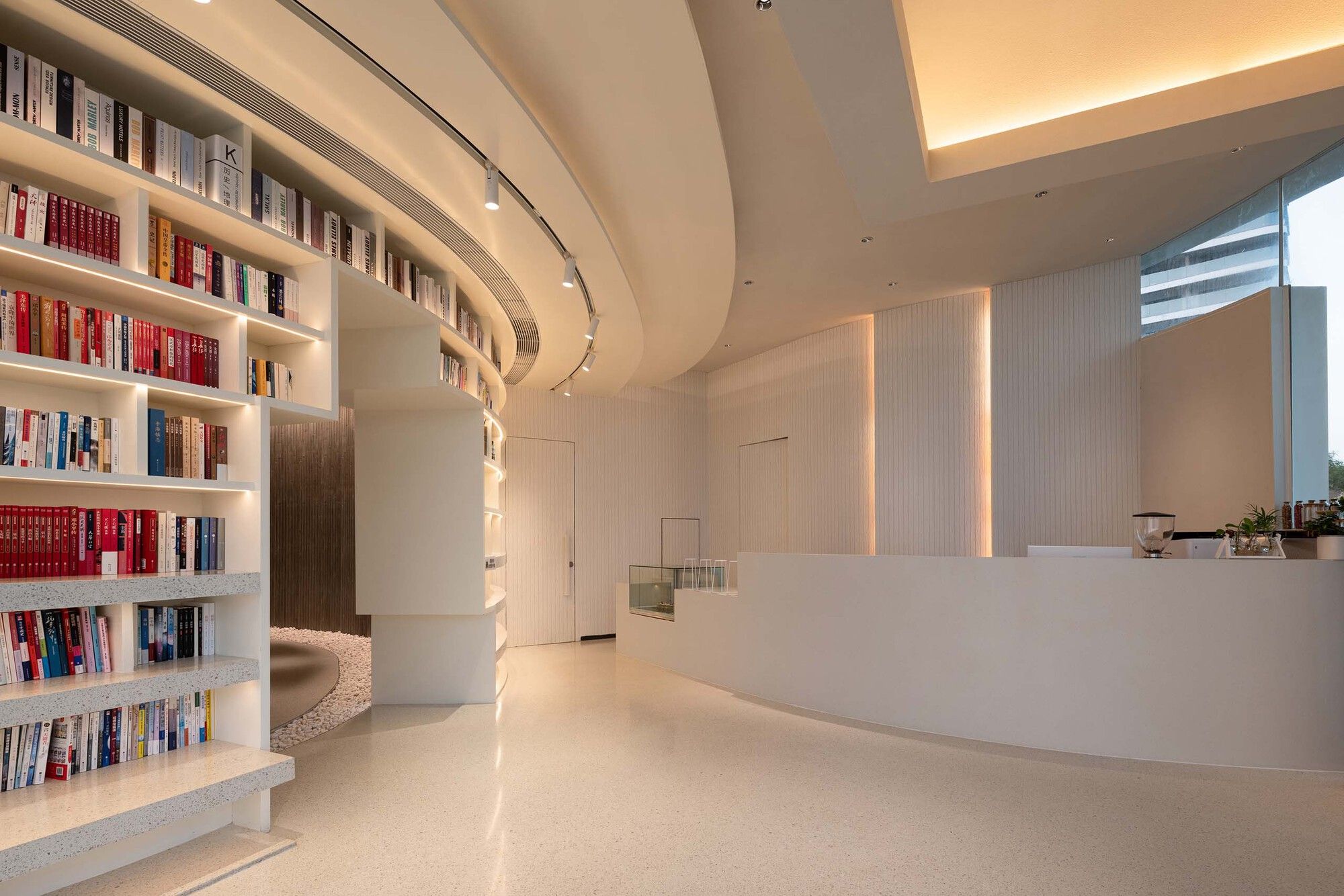
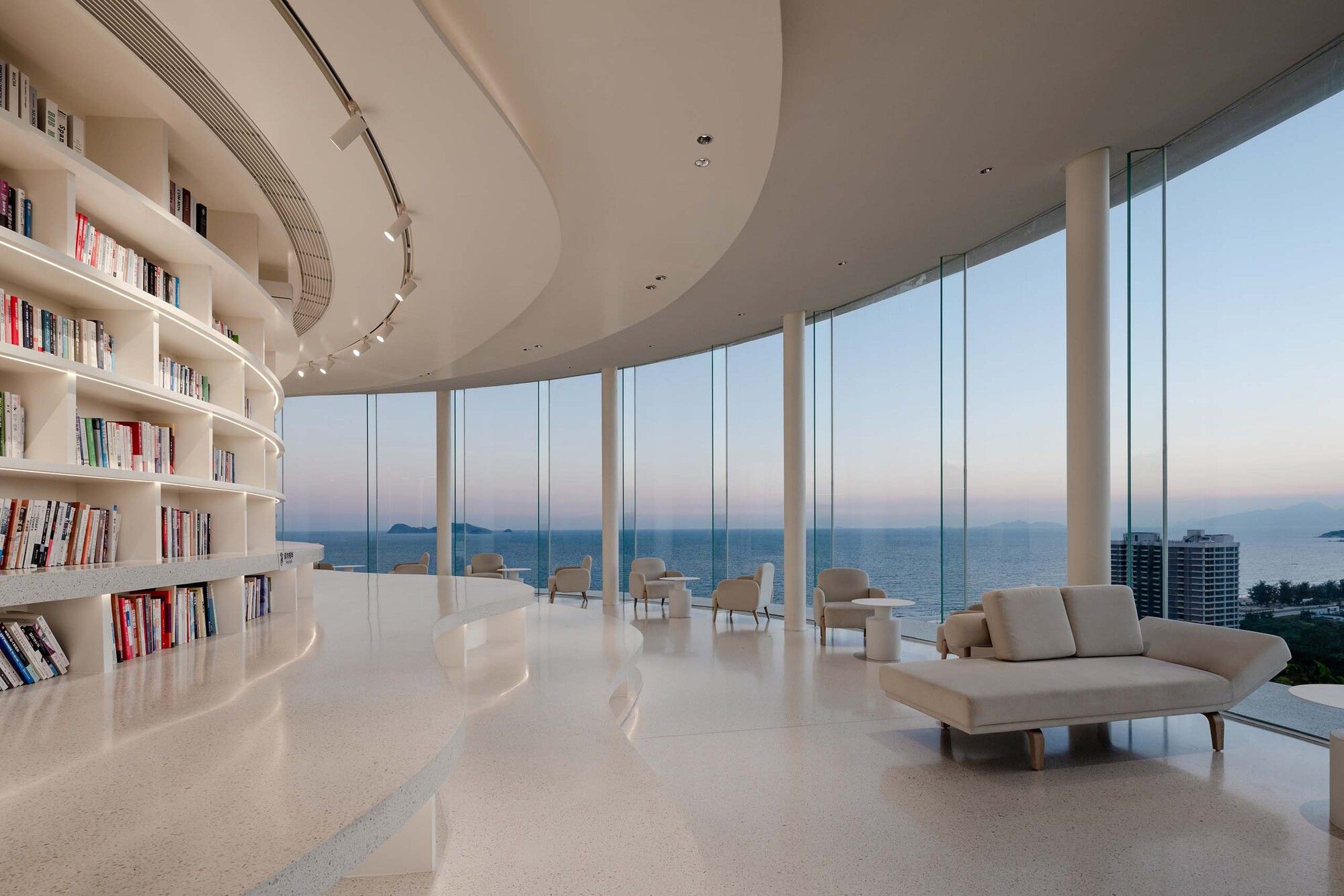
Light, color, and materials deduce the idea of space in the indoor environment. The reading area’s indoor tone is primarily white, light gray, and other bright colors, and the curve form is employed to produce a pleasant and trendy ambiance. Along the outside glass curtain wall are seats and tiny tables where readers may read peacefully while taking in the landscape. The bookshelves are organized in a ring along the inner wall and expand outward to make a cloud-like pattern in the ceiling and ground areas. The section that extends to the ground also serves as a free reading space, where some readers who prefer not to sit straight can spend the afternoon reading, reclining, or lolling.
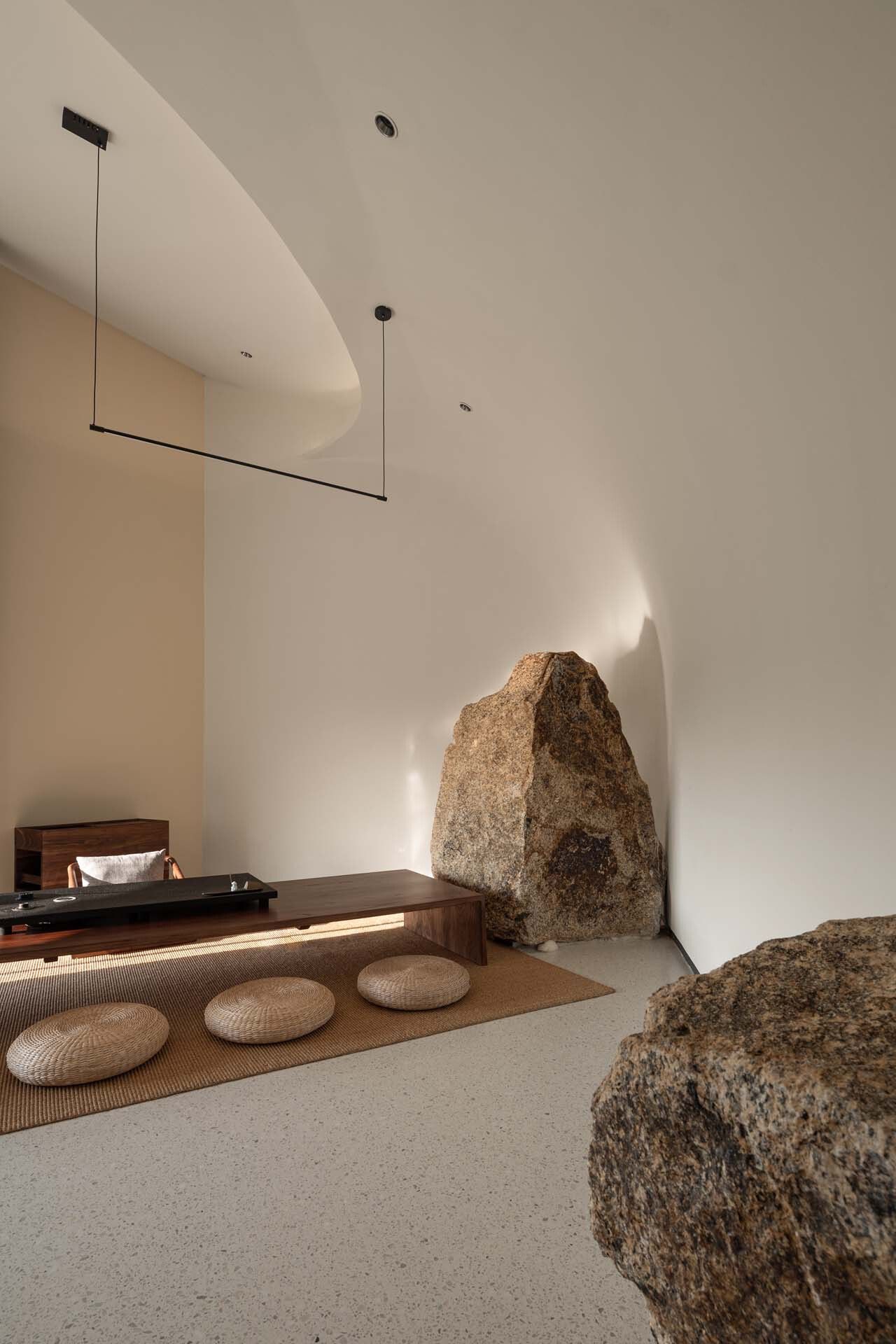
The VIP tea room and bathrooms are on opposite ends of the reading area. The VIP tea room is a private haven. The inside maintains the modest decor, with tea tables and seats that may be utilized for seclusion or group discussions. A unique stone has been used to embellish the space. Sitting facing the stone, you may enjoy a close-up view of the mountain and stone while reading and drinking tea. A dramatic atmosphere is expressly made for the toilets, and the contrast colors and optical fiber gadgets provide users with tangible indications.
The water bar is placed between the restrooms and the reading area, separating the dynamic and the static regions while also serving as a transitional point. A light entrance to the roof pool may be found in the bar area’s ceiling. The architects purposefully included a color device on the south side of the facade’s daylighting hole. The sunshine is depicted as colored light through it, which is spread into the area in a fuzzy manner, bringing character to the structure.
Pool and landscape: a conversation between man, sea, and sky. The project’s landscape aspires to be clean. The vegetation near the foot of the structure is primarily low-awn grass and green plants, which contrast with the clean design of the building. Several stones on the property have been meticulously conserved and blended with the path to becoming the prospect while viewing the project. The white corridor and tall wall at the hill’s summit become natural relics. Users are drawn to the clean geometric shapes, which point them toward the roof pool and the sea.
The roof pool has an almost romantic feel about it. The architects and proprietors intend to surprise consumers in this little southern city. Guests can access the daylighting aperture and platform in the pool’s center via the stepping stones on the water’s surface by following the concealed route on the north side of the long wall. There is no barrier around the pool, ensuring the building’s integrity and purity. To guarantee safety, the architects employed the stepping stones and the water depth around the platform to prevent people from entering the pool. People may view the sea level in the distance by peering over the pool from a precise spot on the top of the hill. Water, sky, and sea are all intertwined right now.
Conclusion: Construction is based on both tactile experience and visual communication. The design of this library maintains the 3andwich Design team’s continuous design approach for landscape architecture. The site serves as the beginning point for the design. The structure is adequately immersed in the landscape, yet it has a feeling of being and connects people and the environment. Architecture does not seek out natural mimicry on purpose. The compact geometry demonstrates abstraction as an artifact as well as environmental sensitivity. At the same time, the structure is rich in drama and narrative. It does not eschew visualization and distribution on purpose. The architects anticipate that the structure will be capable of combining on-site tactile experience and visual communication.
Project Info:
Area: 450 m²
Year: 2022
Photographs: Weiqi Jin, Huizhou Shuangyue Bay Real Estate Investment and Development Co., Ltd.
Landscape Design: TOPOS Landscape Architects
Lighting Design: Guangzhu International Lighting Design Co. Ltd (Beijing)
Principal Architects: Wei He, Long Chen
Project Architects: Ziyi Wang (architecture), Xiangting Meng (interior)
Design Team: Junjie Zhou, Yuexiao Wan, Song Liu, Wanchen Sang, Yong Liu, Yanming Zhu, Ziming Yan (intern)
Structure Engineer: Congjian Pan
Owner Design Management Team: Shaochuan Luo, Shaowen Liu, Yanfei Yu, Guohao Li
Owner Engineering Management Team: Zhifei Liu, Yonghua Lin
Owner: Huizhou Shuangyue Bay Real Estate Investment and Development Co., Ltd.
City: Huizhou
Country: China
© Weiqi Jin
© Weiqi Jin
© Weiqi Jin
© Weiqi Jin
© Weiqi Jin
© Weiqi Jin
© Weiqi Jin
© Weiqi Jin
© Weiqi Jin
© Weiqi Jin
© Huizhou Shuangyue Bay Real Estate Investment and Development Co., Ltd.
© Weiqi Jin
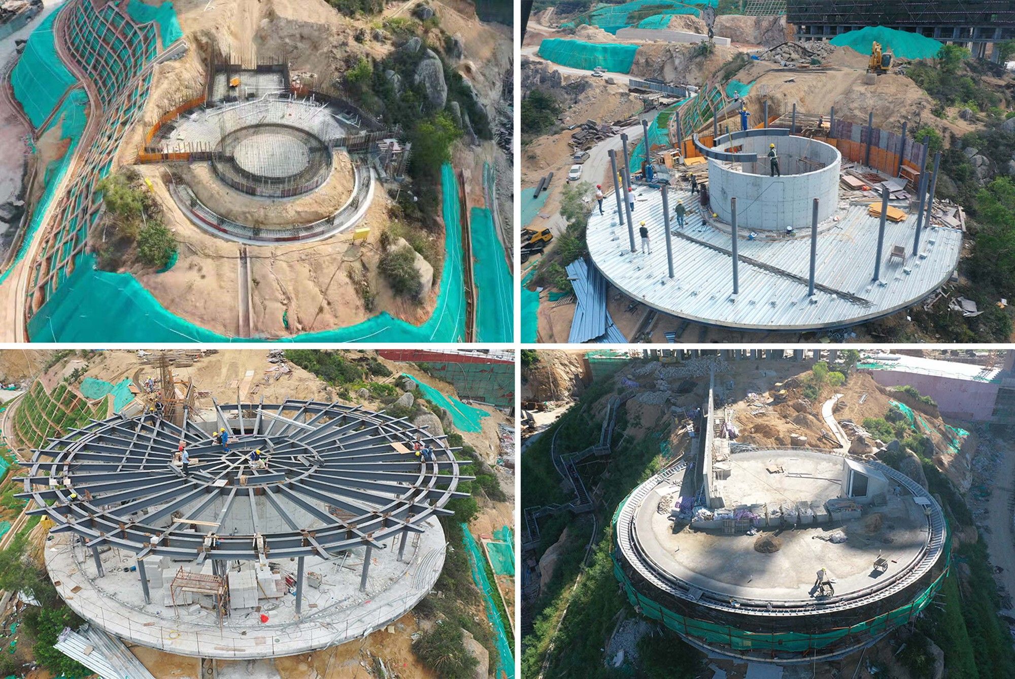
construction process. Image © Huizhou Shuangyue Bay Real Estate Investment and Development Co., Ltd.
© Weiqi Jin
© Weiqi Jin
© Weiqi Jin
© Weiqi Jin
© Weiqi Jin
© Weiqi Jin
© Weiqi Jin
© Weiqi Jin
© Weiqi Jin
section
plan
south elevation
sketch
sketch


