The Yard Master’s Building
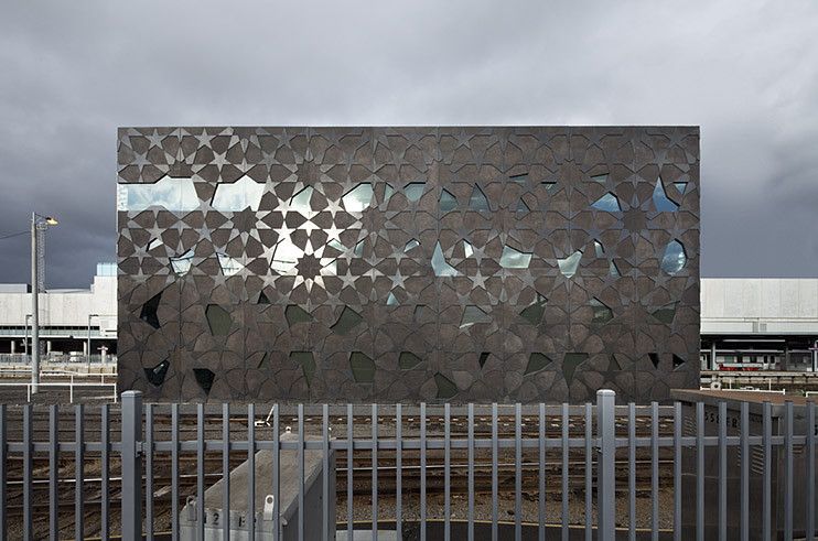
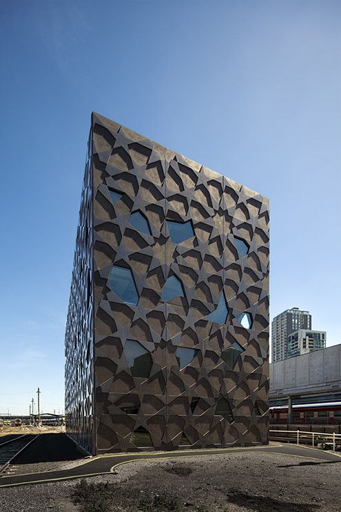
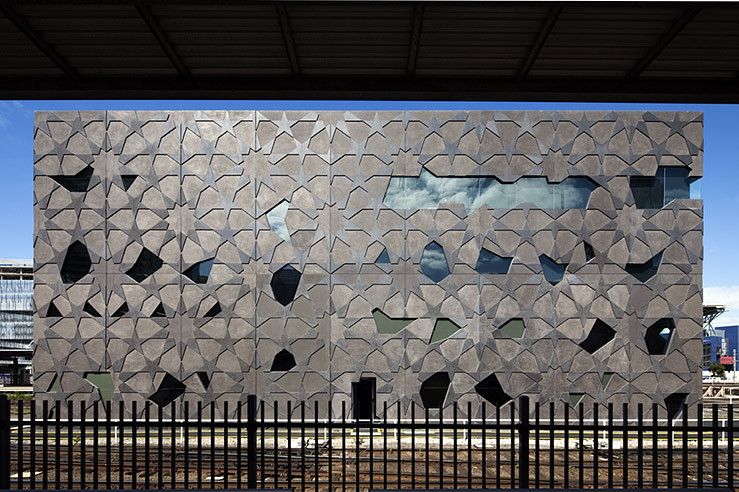
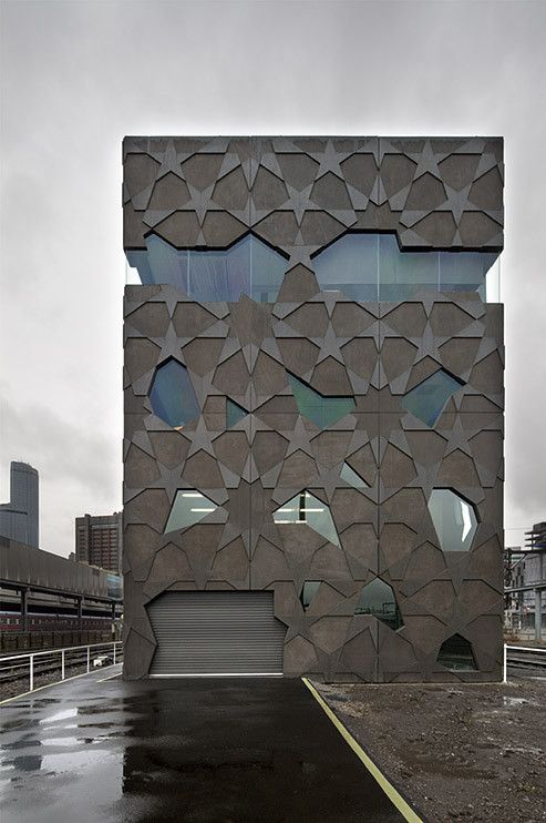
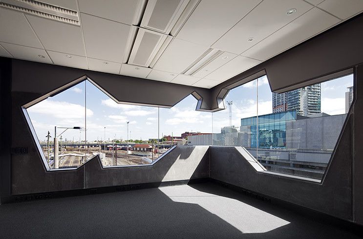
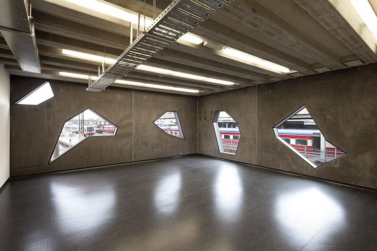
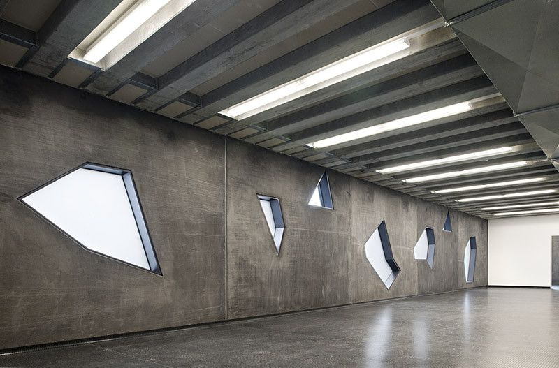
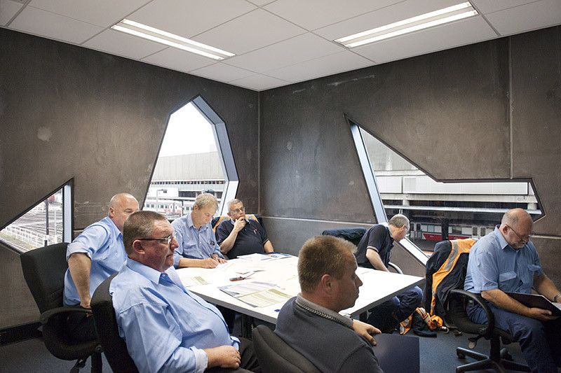
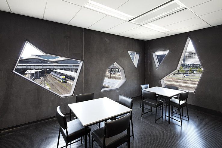
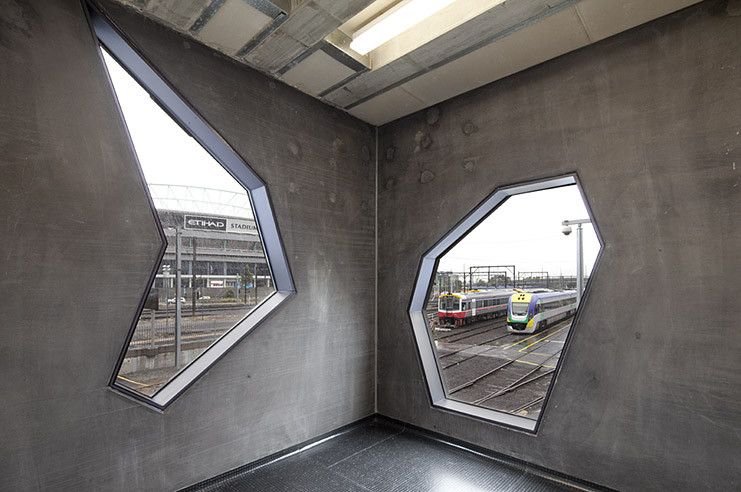
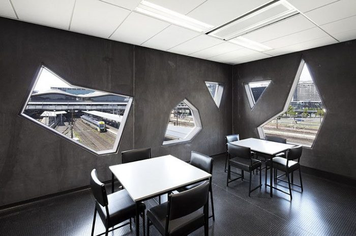
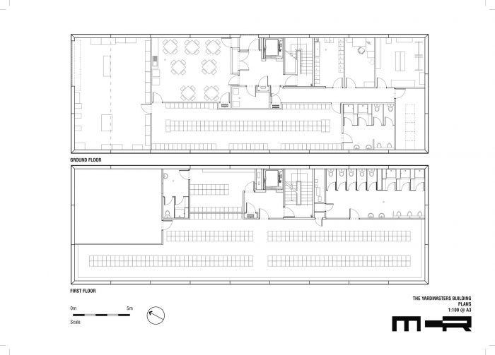
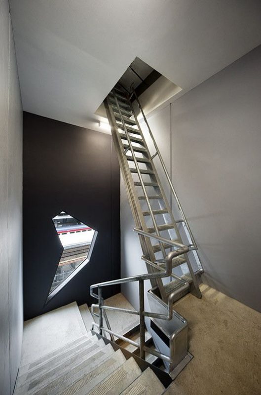
The Yardmasters Building, designed by is an operations facility located on an island site within the Southern Cross Rail Yard which confidently presents itself as a ‘public’ entity. Viewed in the round, it offers itself back to the city as an exquisite, mysterious box: a jewel in the junk-heap. The project involved extensive consultation with representatives of the diverse users, their respective union representatives, and management and associated authorities. So that the building’s public interface would not be contingent upon the inevitable machinations of this complex stakeholders mix, the planning was contained within a simple flexible shell. Internally, the building is robust and matter of fact. A rational system of glazing integrated with the repeated external pattern allowed each room to have at least one beautiful and exotic window. The cost and complexity of constructing within a rail environment is considerable. As it ages, the patina of the facade will express its environment, as if it had always been there or simply emerged from the ground.
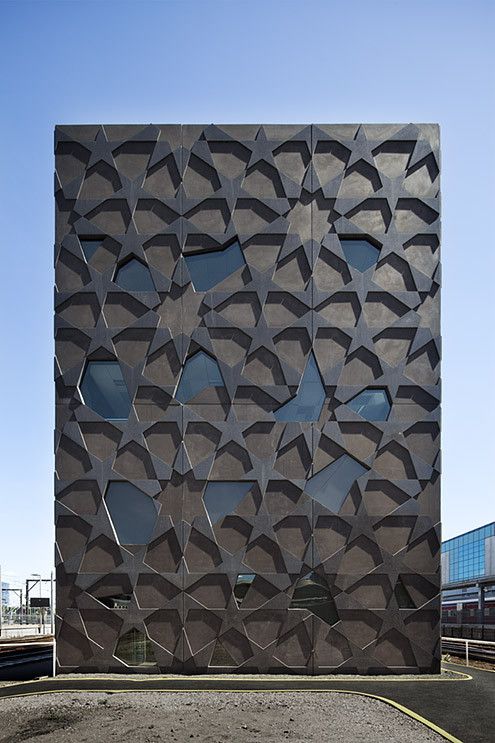
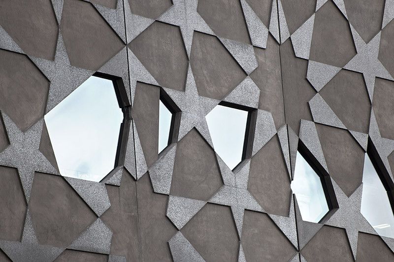
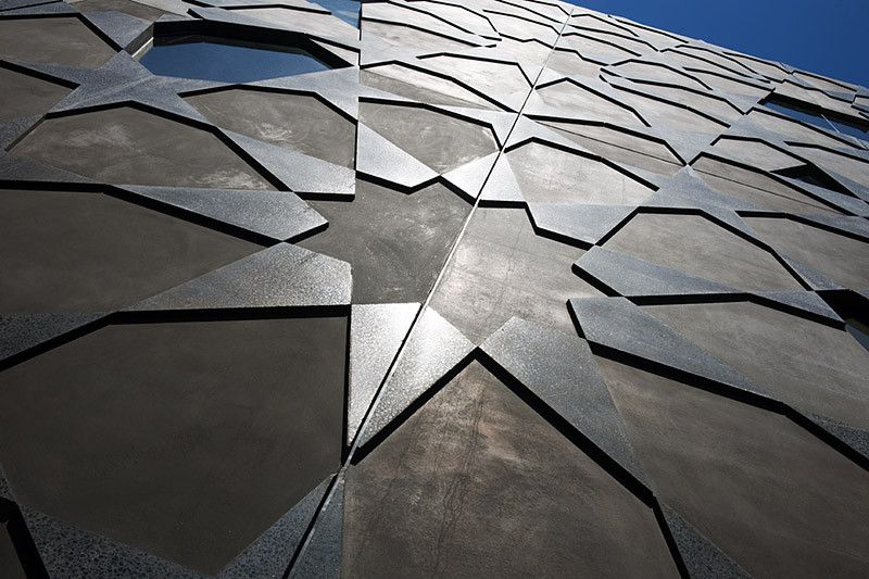
With it’s unique arabesque pattern in the midst of rail lines the building cannot pass unremarked.
This building is moody. With the Melbourne weather, these moods change rapidly. In providing interest and delight to the rail experience, this ‘Southern Crustacean’ is a building that says that public infrastructure matters and, by extension, that the public matter. Although inaccessible to the public, the extreme exposure of the building renders it highly visible from a number of vantages. Its inaccessibility, the no-mans land of the rail yard environment, became an opportunity: what was proposed was a jewellery box of exquisite proportions, its mystery amplified by its contrast to the grit that surrounds it. In providing delight to the rail experience, it says that public infrastructure matters and, by extension, that the public matter. The delicate polished patterning belies a robust and sophisticated façade that drastically minimizes energy consumption and takes sustainability seriously without the clip-ons.
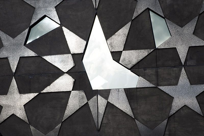
The complexity and cost of constructing within a rail environment is significant. The strategy was to minimize on site construction, rail disruption and therefore cost. This involved providing as much architectural value off-site as possible. A double skin pre-caste concrete system was used. Within the outer ‘biscuit face’ a pattern was caste, the relief polished. The panel system required multiple processes not attempted before. They provided enormous value in terms of the buildings aesthetic and thermal performance. Exposed internal mass, insulated from the outside environment is supplemented by a chilled beam A/C system. Windows are sealed from free airborne particles and the fumes of the rail environment.
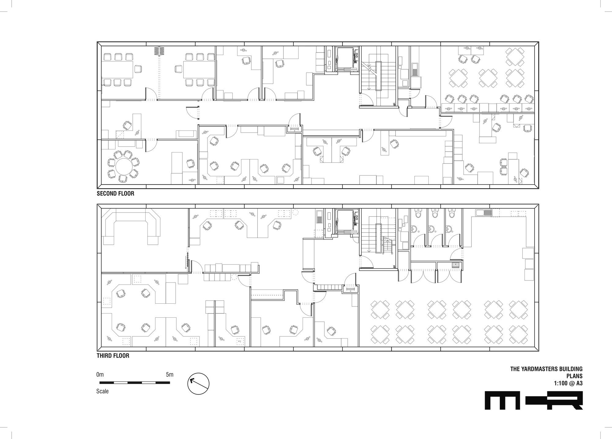
The project required consultation with representatives of the diverse users, their respective union representatives, management and relevant and associated authorities. The complexity of the stakeholder group and their multiple interests required a strategy of developing a simple flexible shell. The progress of the building, its public interface would then not be held hostage to the inevitable machinations of a complex stakeholders mix.
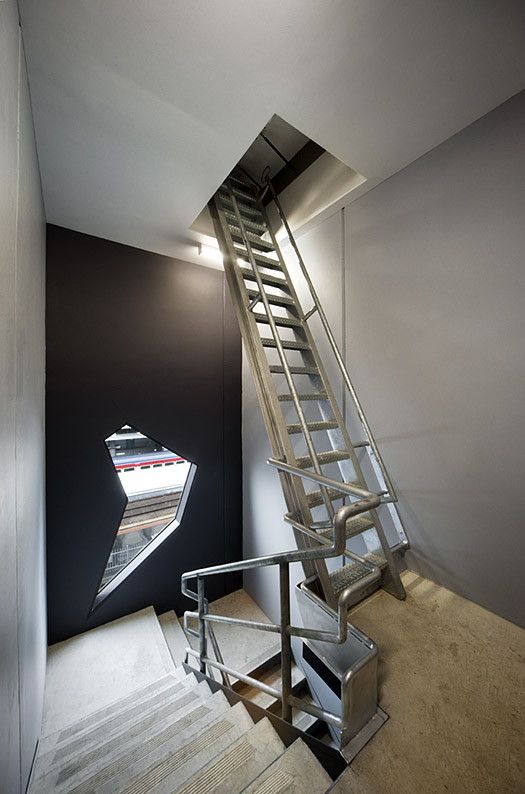
The internal layouts are simple and partitioned. Inevitable this will change as it did many times throughout the design process. Internally the building is robust and matter of fact, measured without appearing frugal. For us each room was to have at least one beautiful and exotic window. The building was carefully cost managed. Panel sizes geared towards optimizing production and minimizing energy. Materials were chosen for their robustness – maintenance in this environment comes at too high a price. The patina was to match the rusted charcoal of its environment, as if it had always been there or simply emerged from the ground. This building is moody, and with the Melbourne weather it changes rapidly. So no matter how bad the day was, the last minute burst of late afternoon sun reminds us that it was truly worth it.
Architects: McBride Charles Ryan
Design Team: Rob McBride, Debbie Ryan, Drew Williamson, Andrew Hayne, Fang Cheah, Michelle James, Scott Crowe, Johanna Brunner, Angela Woda, David Fraser
Photographs: John Gollings
