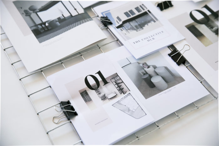
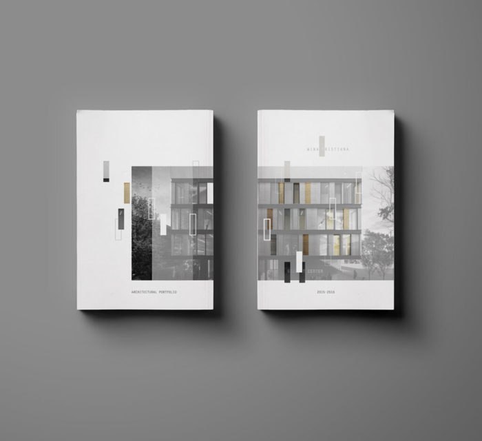
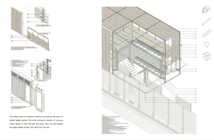
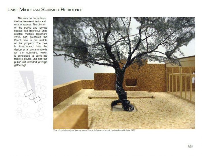
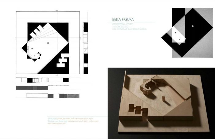
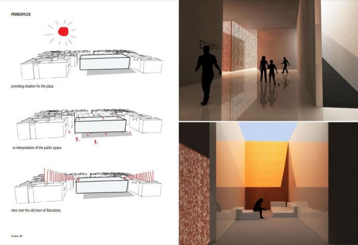
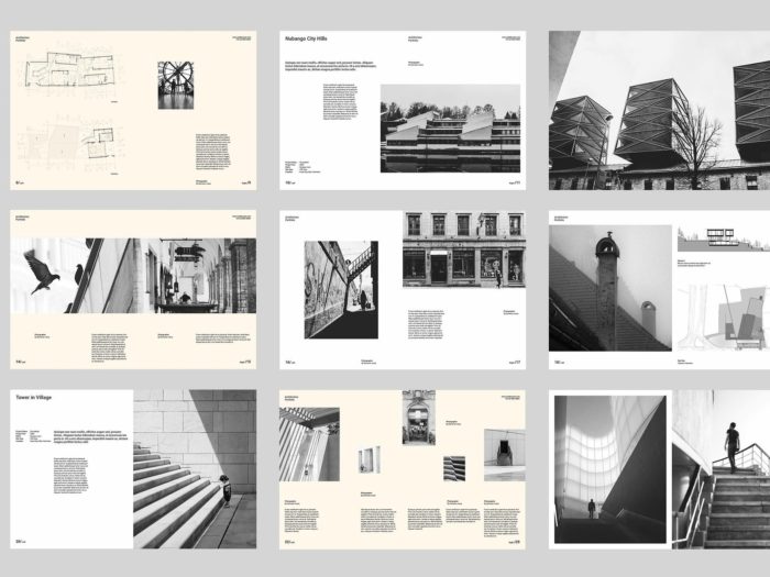
The architecture portfolio is the most incredible tool for students or professional architects to present themselves and their work to potential employers, clients, or tutors. Always remember that an architecture portfolio reflects your character, attitude, and view of the world, so just be yourself and follow simple tips to get the best out of it. Also, check for other strategies to develop your architecture career.
10 Architecture Portfolio Tips:
Whether to get architecture jobs with no experience or want to build up your academic and professional career, there are some golden rules for organizing your work, presenting your skills, and standing out from the crowd in the demanding field of architecture. In this article, we’ll give you some pointers on how to put together a solid architecture portfolio for your architectural services.
1. Listen to the audience
The first question you should ask yourself before organizing your architecture portfolio is, “who is the audience?”. If you are applying for a position in an architectural firm, do some research online. Try to find out the field of their projects (landscape architecture, residence design, internal design) and adjust accordingly.
Highlight the projects that are more relevant to theirs and focus on the ones that you think can add a new perspective to the firm. Show them that you have completely understood the role you are supposed to follow, but you also have to offer a fresh and innovative point of view on design and architecture.
2) Establish a Story
Your architecture portfolio should culminate in an entry in the Narrative. This goal is aided by the applicant’s impressive portfolio, showcasing their design and software prowess. Why? Because it ultimately shapes how people perceive you as a character.
Everything that has come before serves the story. Trust and warmth are also conveyed through powerful design language, coherence, originality, and high-quality work.
3) PDF or Online portfolio, Which one is better for you?
Although creating your architecture portfolio on an online template can be much easier and faster, PDF is the option. Sometimes servers crash, navigation on the site can be complicated, and the recipient can quickly become frustrated and move on to another applicant.
PDF functions on every device; it can be easily downloaded, and you don’t need internet access to read it. Moreover, you have complete control of your work’s appearance and formatting and the advantage of promoting your graphic design skills instead of using ready-made templates. Just make sure your file size is no more than 5MB so it can be sent with every mail service.
Also Read: 10 Tips to Improve your Architecture Resume
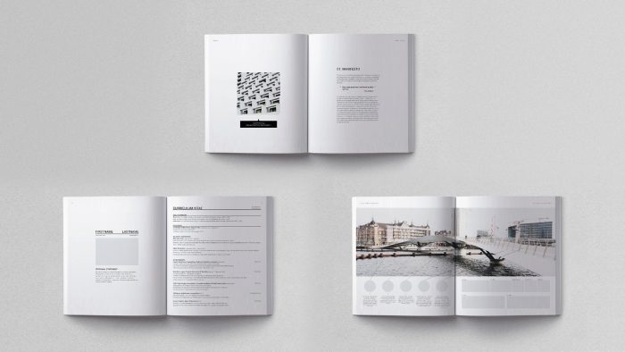
4) Create an appealing CV page
It is usually the first page of your architecture portfolio, so it has to make an excellent first impression. Choose a good professional photo of yourself and stick only to the relevant and necessary information about your education and work experience. In this era of globalization, with companies expanding their projects abroad, knowledge of foreign languages is highly appreciated. Don’t forget to mention them and your computer skills concerning design and architectural programs that you can easily use.
Being an architect combines our personality, knowledge gained through education, and experiential processes in our everyday lives. If you are interested in photography, traveling, or other hobbies in your free time, try to include them to give an overall view of your character and interests.
5) Make every effort to be reliable
Create consistent design concepts for your layout from the beginning. Use a uniform typeface and font size throughout the layout, create a grid for all visual elements, and ensure smooth transitions between the project’s various sections.
This makes it simple for people to follow your stories about your projects and focus on the information they need. Creating a consistent design aesthetic across all your early efforts may prove challenging. Once you’ve established a solid design language, you can bend the guidelines to put your unique stamp on things.
6) Select your best projects
Sometimes we fall into the trap of presenting every project we have ever done, from the first year of architecture school to the last sketch we made for a friend’s friend. Over-detailing leads to endless portfolios that require valuable reading time and lack self-evaluation.
Take a moment and select up to 8-10 of your projects that best reflect your work and skills. If you have doubts about a project or its results or think it doesn’t suit the firm’s profile, leave it out. If you want to focus on your evolution through the years, try not to go back further than five years and make a wise selection.
7) Less is more
Keep your portfolio as simple and short as possible. Long presentations and texts tend to exhaust and confuse the reader and distract them from the primary purpose of creating a brief image of your personality and skills quickly. Usually, firms don’t spend more than 1 minute on each portfolio, so ensure they can get the best out of your work and experience this time.
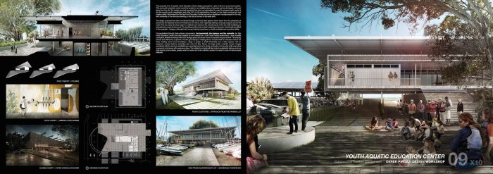
Please give them a general idea of each project, and some clues about the design problem, process, and final solution, using minimal readable text accompanied with high-quality, relevant pictures. The less they need to read to understand your ideas, the better. Instead of analyzing thoroughly every step of the design process, label the images with short comments that show your intentions, followed by the visual content.
8) Include team projects; it’s essential!
Although an architecture portfolio is a personal presentation, you must show you can work in teams. We all have participated in projects that require teamwork and interdisciplinary relationships. Being communicative, flexible, and contributing to the team with a specific role given, is a highly appreciated skill in big firms and companies.
All you have to do is name the project, give credit to the other partners, and focus on the parts of the project that you completed on your own. Whether it is a technical drawing or a solution to a functional problem, your contribution must be highlighted as a valuable factor.
9) Pay attention to fonts and grammar
- Spelling and grammar are easily spotted, even if the text is minimal and short. Always use a spelling and grammar corrector before submitting your portfolio.
- Your designs and ideas might be great and innovative, but the misspelled text looks unprofessional.
- Avoid overdoing it with font styles, or you will lack consistency and order.
- Choose among 2-3 fonts (Comis Sans is forbidden!) and adjust sizes to emphasize where you need it.
- Variety is fine as long it does not compromise on clarity and legibility.
10) Use your drawing skills
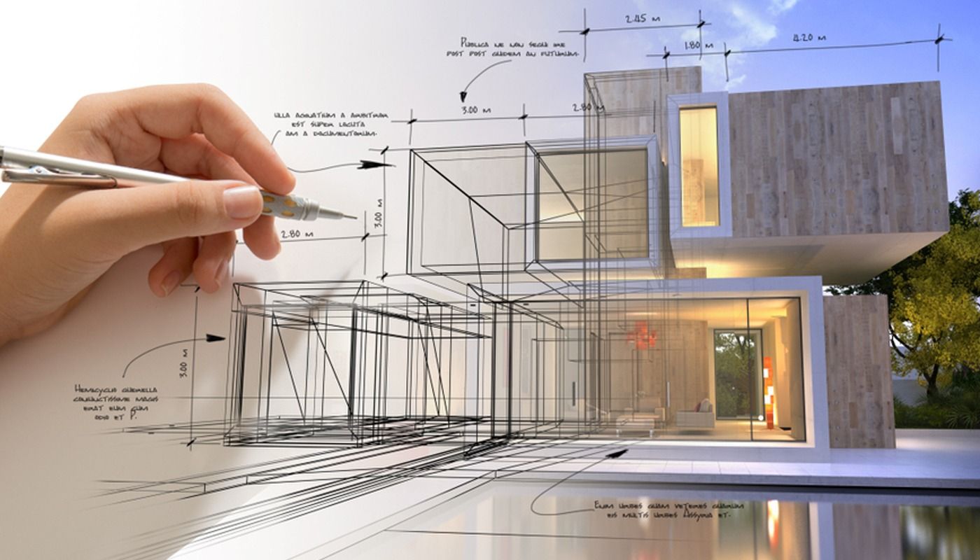
Using technology in the design process is essential and always required in job positions. Renderings and 3D representations give us an overall view of the final result and various options on materials and surfaces. However, being able to communicate through quick sketches and drawings is still a necessity.
So, if you are good at sketching or model-making by hand, don’t hesitate to include it in your portfolio. It shows your ability to understand basic concepts and ideas and communicate them to your colleagues on short notice. It also consists of a medium of quick problem-solving competence.
11) Don’t be afraid of blank space
The presentation of your work is as much important as the content. Overloaded portfolios with images, texts, and renderings are usually doomed to be ignored. Having more pages with less content per page is preferable to using every inch of your page to fit everything in there. Keep your background clean, and don’t use a distractive color that will take attention from your projects. White or light gray is an excellent option to go.
Maintaining a consistent format with logical section breaks will give your images the necessary space to “breathe.” Following a system and geometry throughout your portfolio will provide a good impression of you as an architect. Imagine the design of your architecture portfolio as an architectural synthesis: proportions, geometry, aesthetics, and function are essential factors of the design process. Always think of quality, not quantity.
12) Update frequently
Your architecture portfolio is a living document and should evolve as the architects evolve with every new project and the challenges they face in their professional field. A good option is to update it every six months or at least yearly. Waiting longer tends to allow for work or documentation to go missing. Keep your projects organized and be prepared for every job opportunity that you may come across.
13) Integrate Any Relevant Personal Projects
Including some personal work at the conclusion of your architecture portfolio is a terrific way to set yourself apart from the competition. Don’t feel obligated to include sketches and artwork just because everyone else does. Look for something out of the ordinary, and don’t hesitate to stir things up.
14) First and foremost, be honest
Neither your architecture portfolio nor resume should you make up or embellish any information. The most ethical course of action is always to be truthful. Even if you get hired, you risk having your employment taken away from you because of the lies you told, as the truth is exposed relatively swiftly. So, please, act as you usually would.


