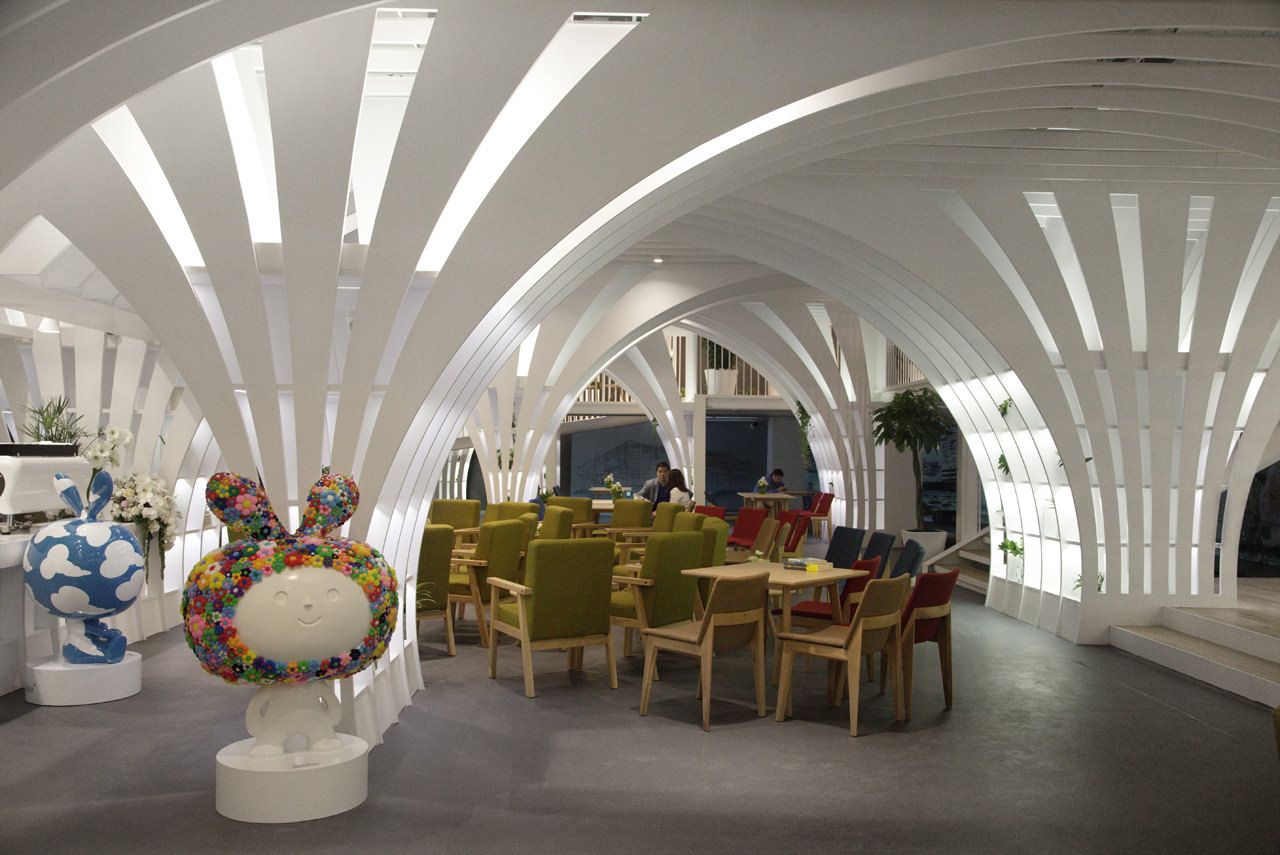
Designed for FUNMIX Beijing, after the dandelion-based children’s character Toby, this interior provides a working atmosphere fit for the employees of the toy store and café. Penda successfully reimagines the world of Toby architecturally, engaging both adults and children within the space, by using identifiable characteristics of Toby and his friends.
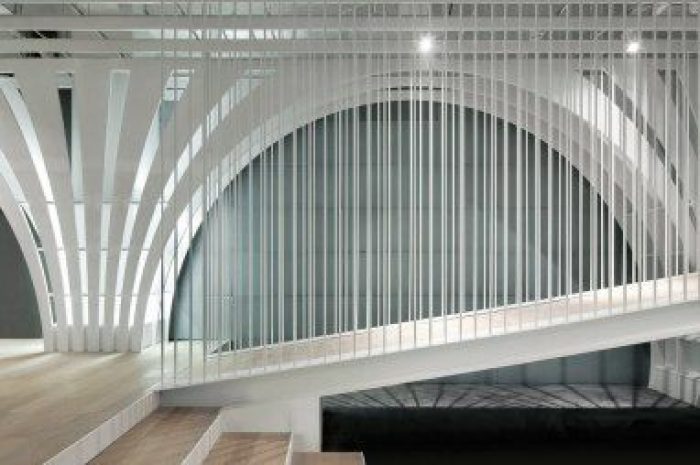
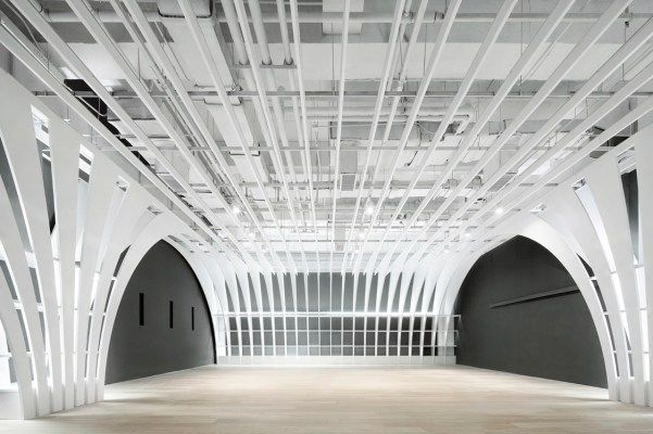
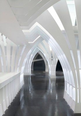
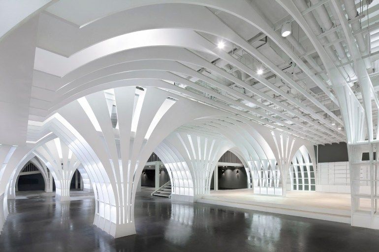
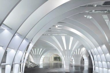
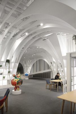
The space designed makes use if vaulting, allowing a dynamic experience while the user goes through the 800 square meters store. The columns forming the vaults allow for multifunctional use, as they display products and merchandise offered by the store, as well as providing book storage. They themselves are modeled after the likes of Toby, holding the 4,5m ceiling with expansive sprouts that form the bays.
The contrasting colors of the supporting structures and the floor is stark, allowing complimentary dialogue between the elements. This poetic connection between the vertical an horizontal elements in the interior has a playful nature, suited to the brand of Toby and his friends. The lighting fixtures that Penda equipped these almost wistful structures with help create a delicate aesthetic for the columns, reducing their usually overbearing nature.
by Thelma Ndebele .
photography by © Xia Zhi
photography by © Xia Zhi
photography by © Xia Zhi
photography by © Xia Zhi
photography by © Xia Zhi
photography by © Xia Zhi
photography by © Xia Zhi
Courtesy of Penda


