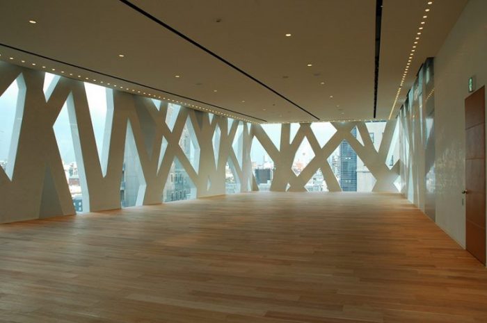
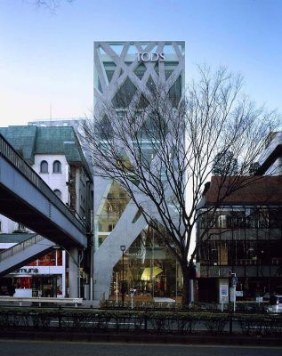
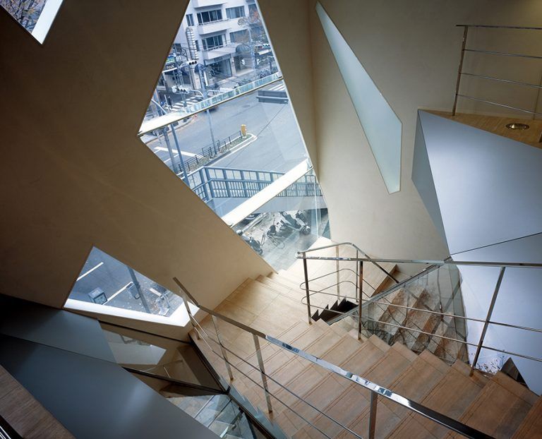
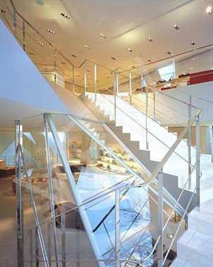
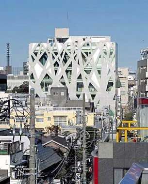
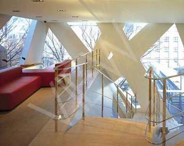
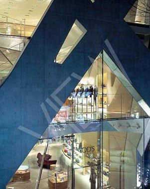
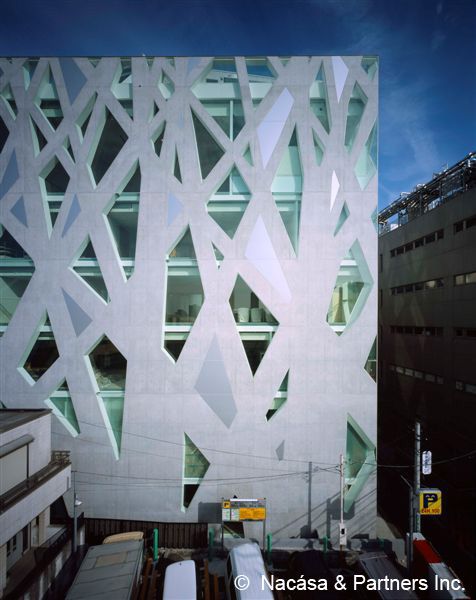
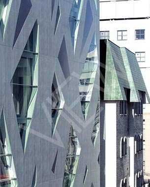
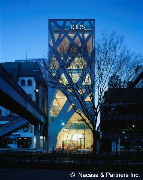
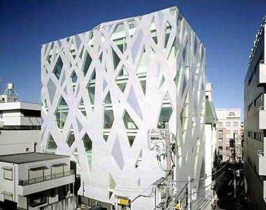
TOD’S Omotesando Building designed by Toyo Ito & Associates: Located in the fashionable Omotesando area of Tokyo, this building was built especially for Tod’s, an Italian shoe and handbag brand. The lower levels of this seven-story building are used as a shop, with the middle and upper levels containing offices and a multi-purpose space. Since the site is L-shaped and has a narrow frontage, in order to give the building a unified volume we enclosed the site with a wall that gives the impression of a row of zelkova trees. This exterior surface serves as both graphic pattern and structural system, and is composed of 300mm-thick concrete and flush-mounted frameless glass. The resulting surface supports floor slabs spanning 10-15 meters without any internal columns. In relation to environment around the site in Omotesando, where many luxury brand boutiques have been built, by selecting concrete as a material Toyo Ito & Associates daringly proposed a substance and strength absent from the adjacent “glass architecture”. This concrete structure, however, is not simply used as in conventional architecture to express the volume or the massiveness of the walls. More than being merely a pattern or a structure, this building instead acquires a new dimension relating to the notion of surface.
Toyo Ito & Associates various studies started with the question, “How can we escape the conventional notion of a wall structure?” In other words, we were seeking a way to avoid transparent openings in an opaque volume. Instead of distinguishing transparency from opaqueness, we were seeking a new method that would simultaneously define and unite them – we were attempting to relate all the lines (columns), surfaces (walls), and openings in an innovative way. Our studies suddenly moved in a different direction after formulating the question: “Shouldn’t it be possible to create a surface as structure that directly expresses the flow of force, so long as it is formed as a structural diagram drawn as a pattern of thick lines on a flat surface?”]
After passing through this process, the idea of using a structure composed of overlapping tree silhouettes was conceived, in a sense, suddenly. Our direction was set with a certain excitement when, following various investigations, we found that through the tree shape, we could order various conditions in an innovative way that is very different from conventional geometry. Trees are organisms that stand by themselves, and therefore their shape has an inherent structural rationality. The pattern of overlapped tree silhouettes also generates rational flows of force. Having adapted the branched tree diagram, as you move higher up the building, the thinner and more numerous the branches become, with a higher ratio of openings. Thus, the building unfolds as interior spaces with slightly different atmospheres relating to the various intended uses. Rejecting the obvious distinctions between walls and openings, lines and planes, two- and three-dimensions, transparency and opaqueness, this building is characterized by distinctive type of abstractness. The tree silhouette creates a new image, with a constant tension generated between the building’s symbolic concreteness and its abstractness. For this project, we intended to create a building that through its architectural newness expresses both the vivid presence of a fashion brand and strength in the cityscape that will withstand the passage of time.
The description provided by Toyo Ito & Associates, Architects, of their TOD’S Omotesando Building. Read it and be fulfilled.
photography by © Edmund Sumner
photography by © Edmund Sumner
photography by © Edmund Sumner
photography by © Edmund Sumner
photography by © Edmund Sumner
photography by © Edmund Sumner
photography by © Edmund Sumner
photography by © Edmund Sumner
photography by © Edmund Sumner
photography by © Edmund Sumner


