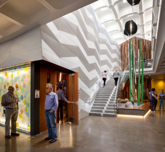
UC San Diego – Galbraith Hall Interior Renovation
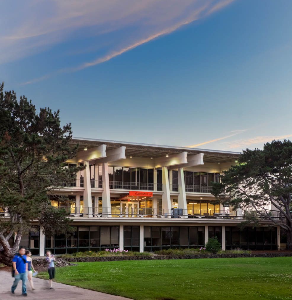
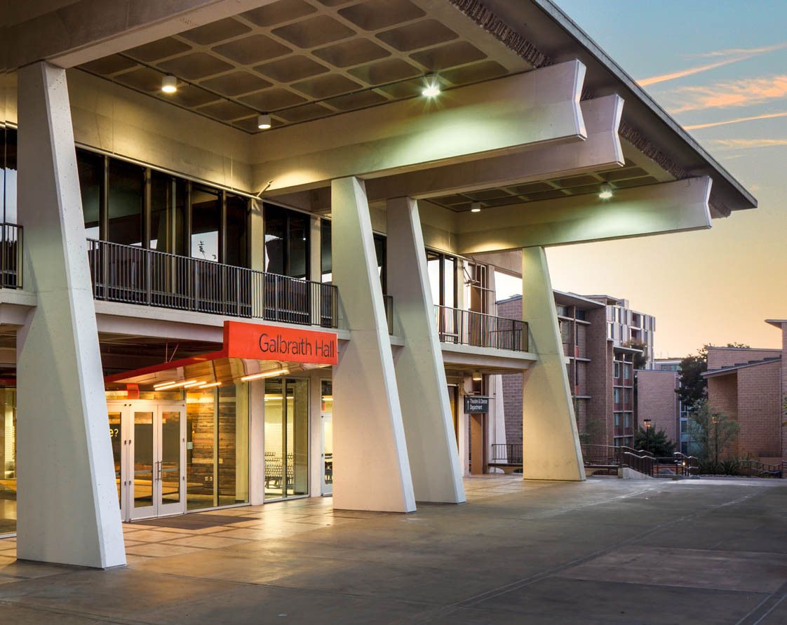
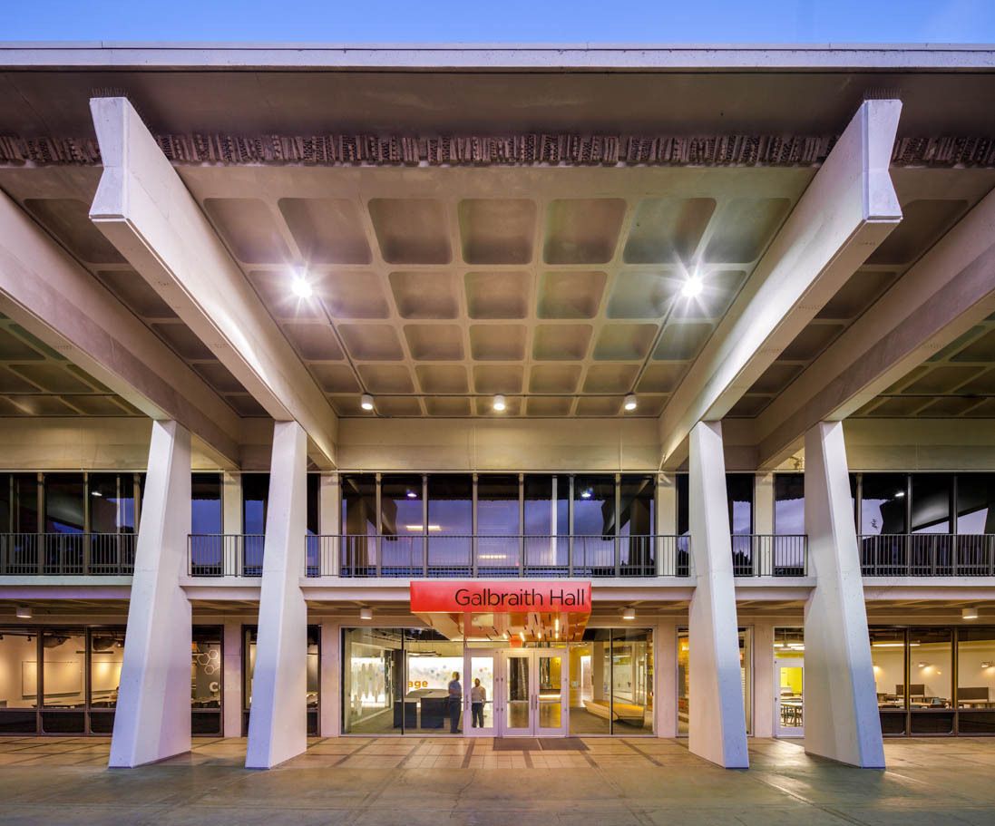
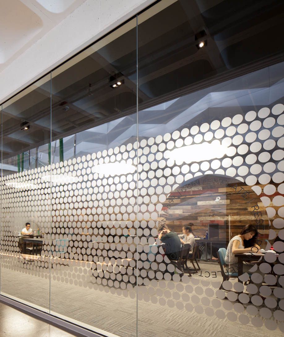
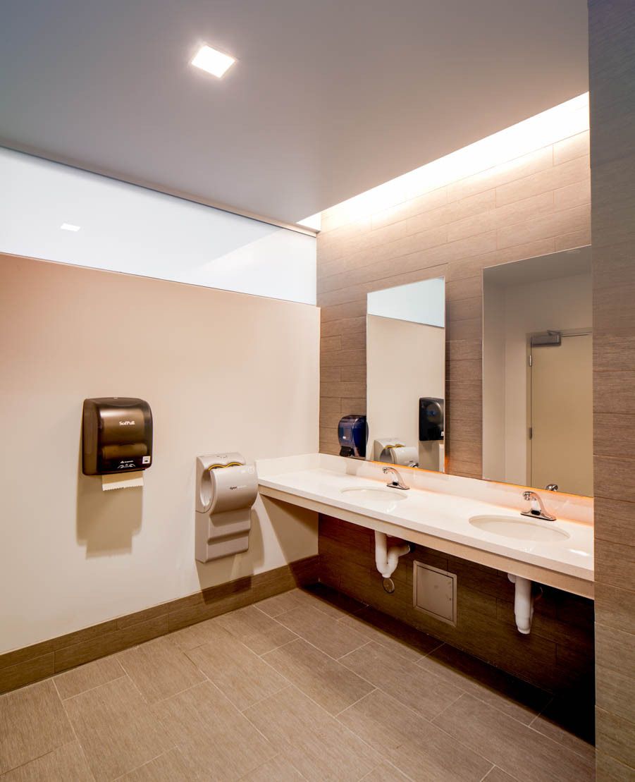
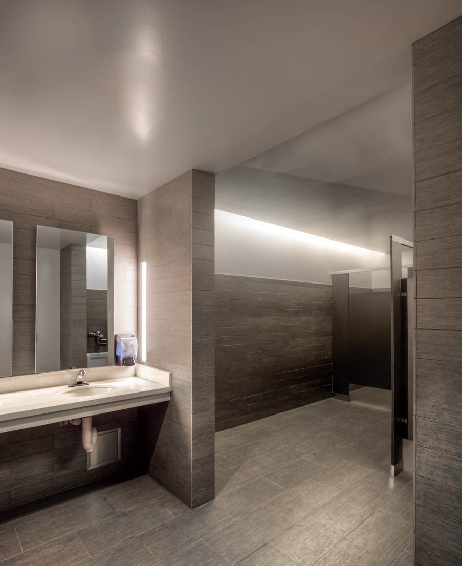
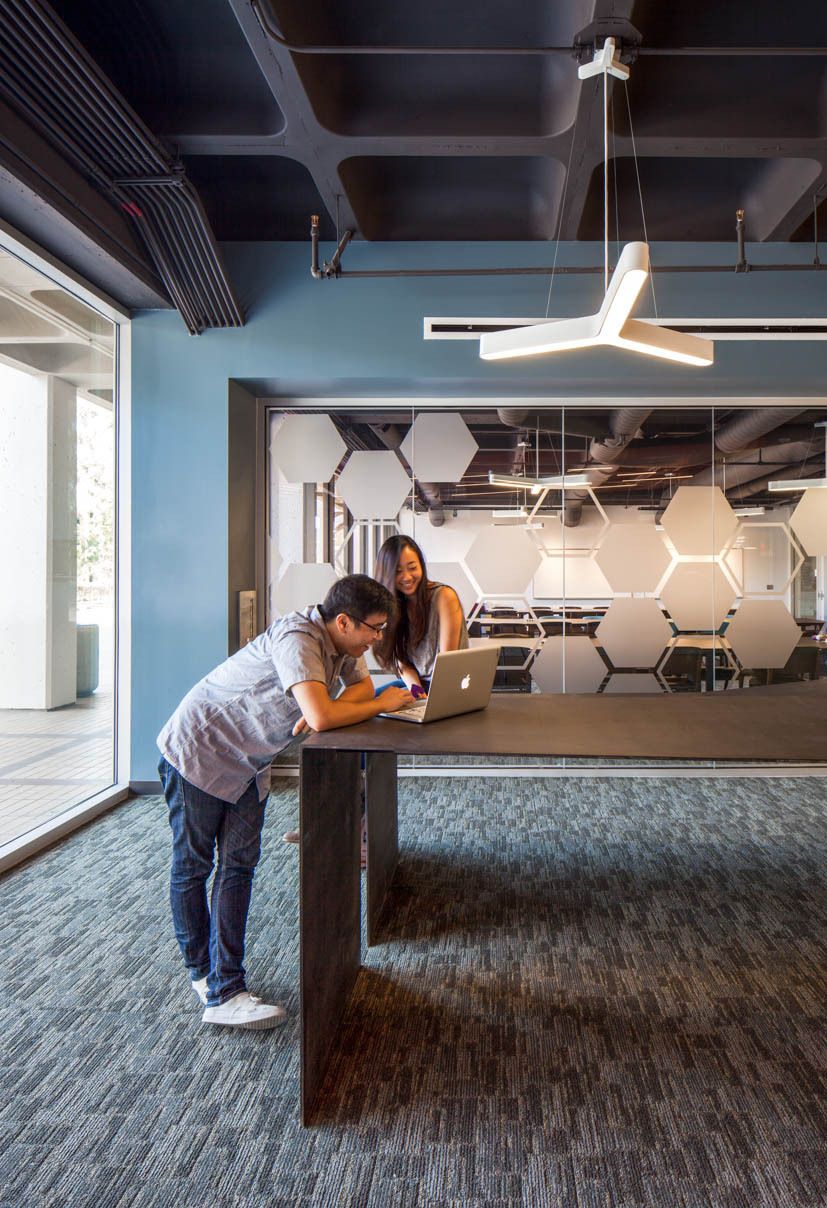
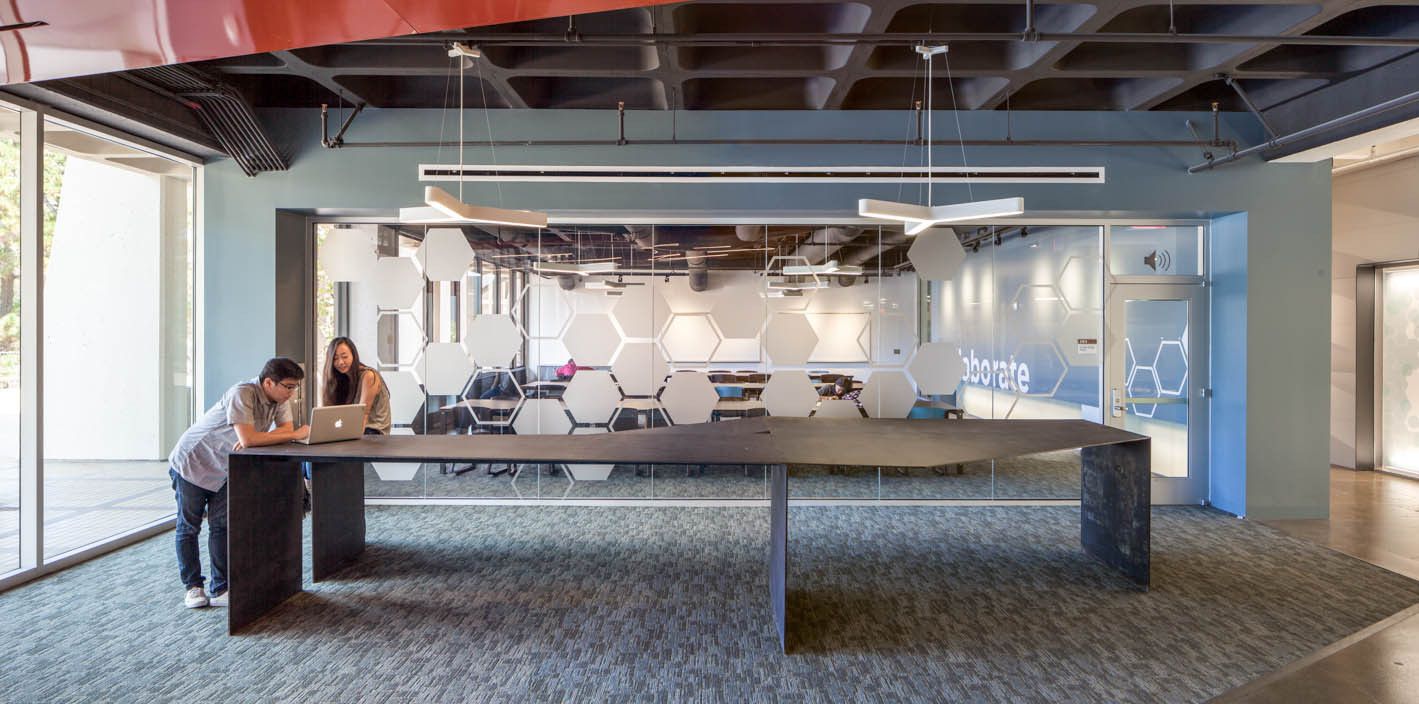
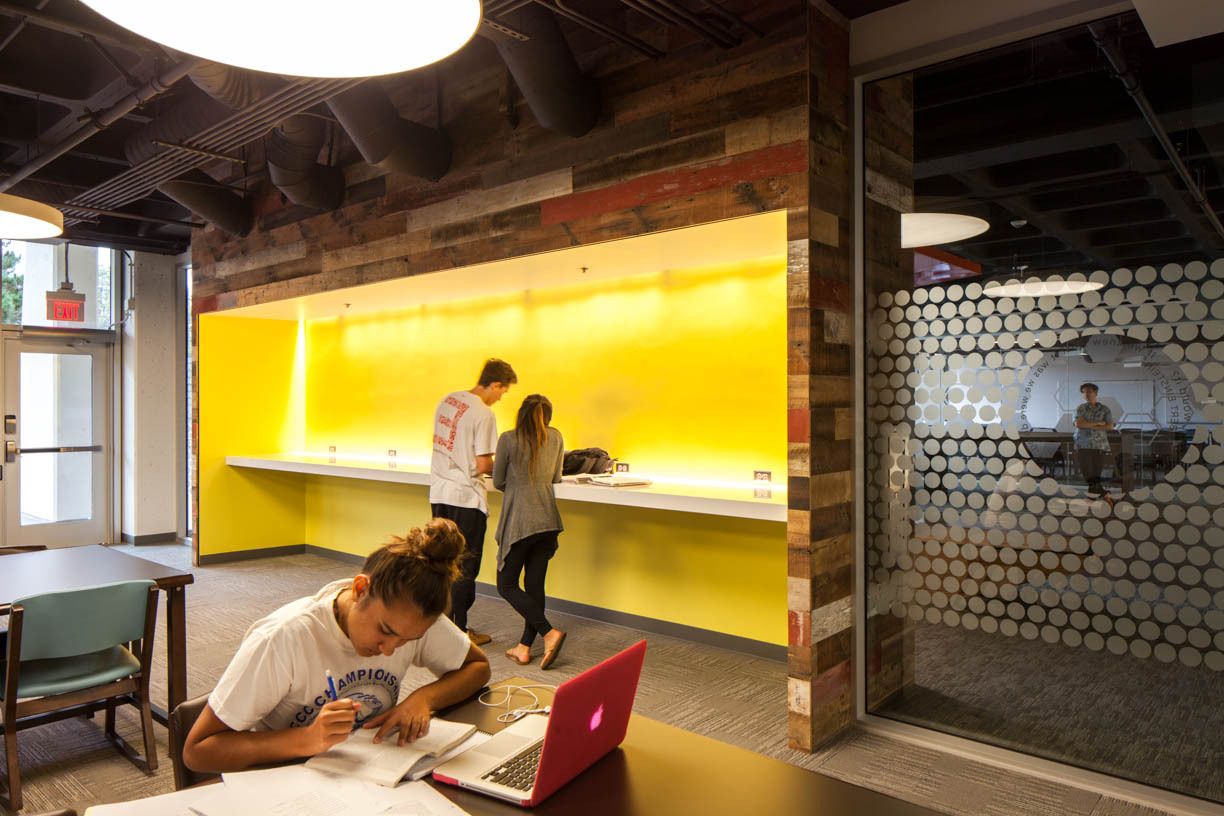
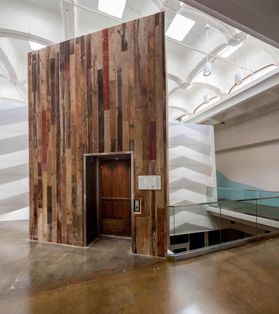
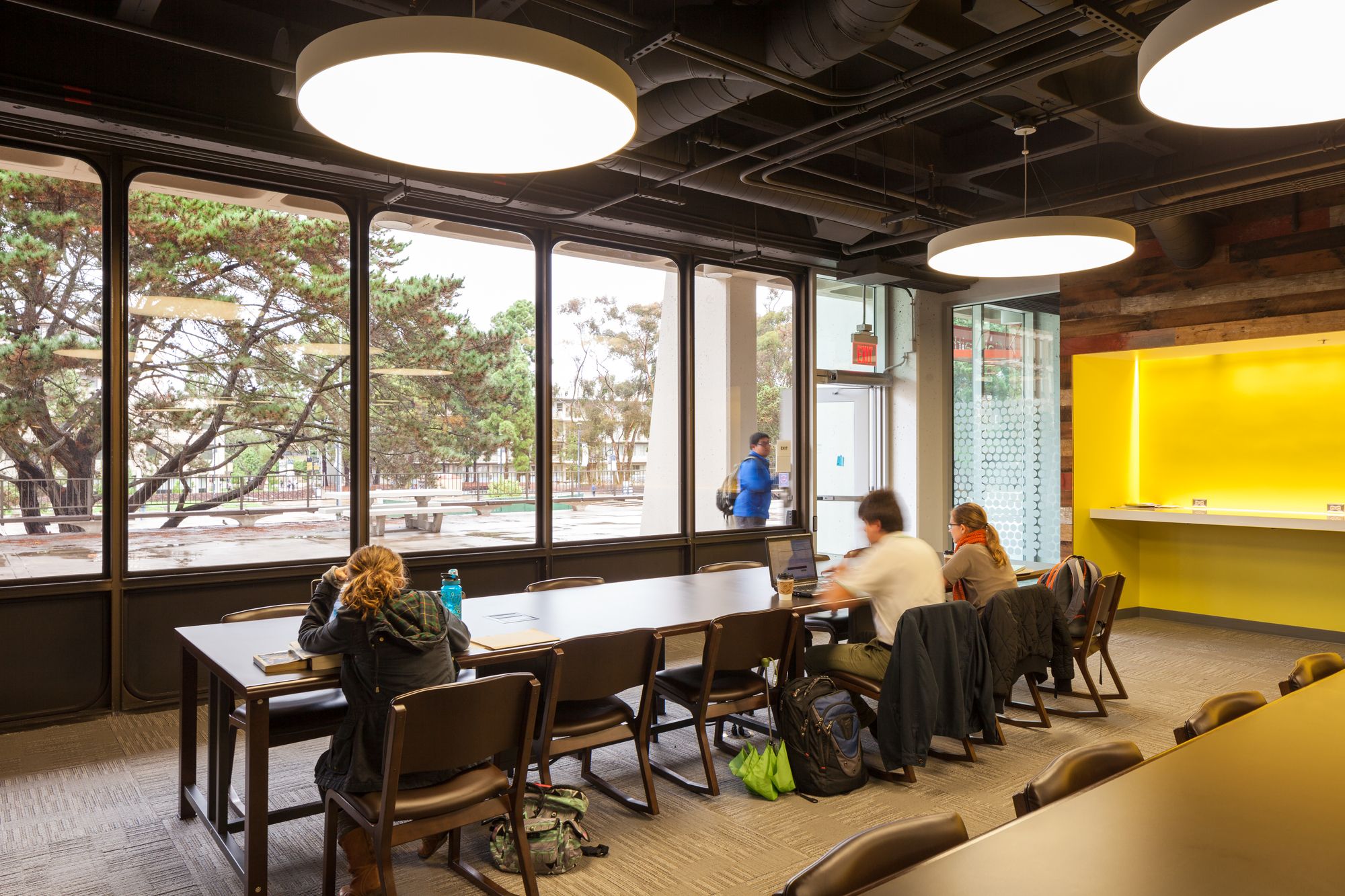
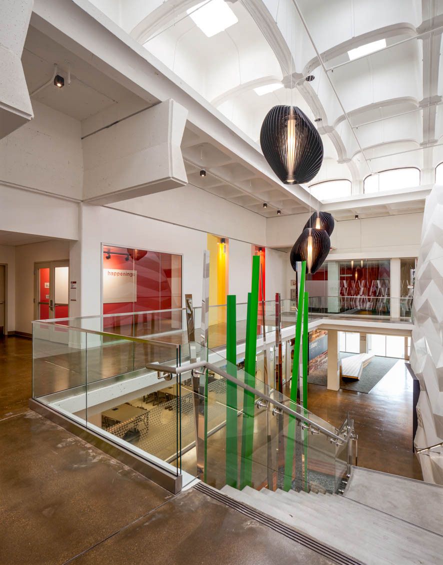
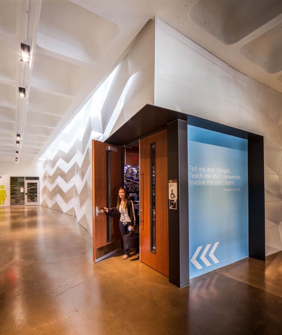
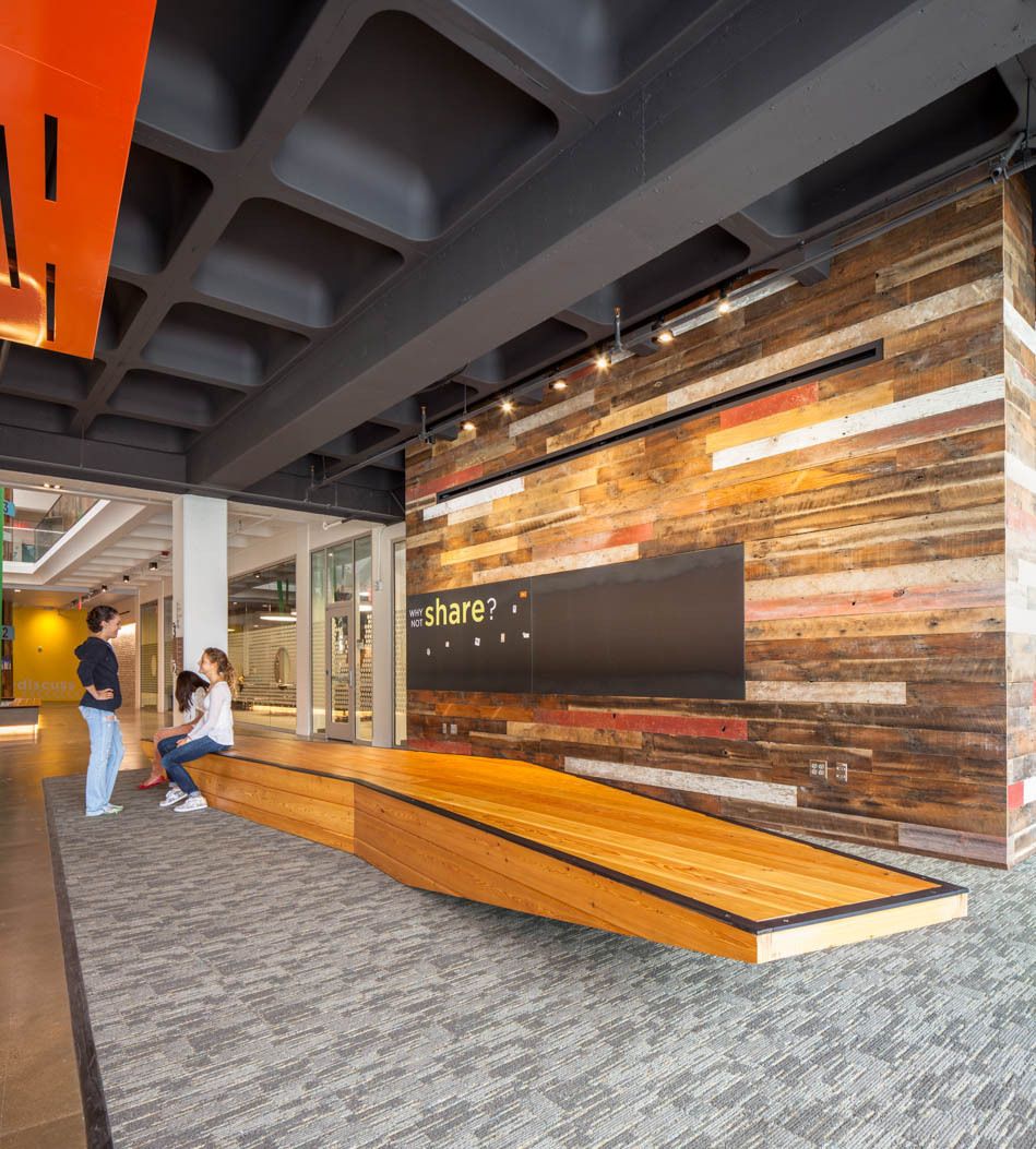
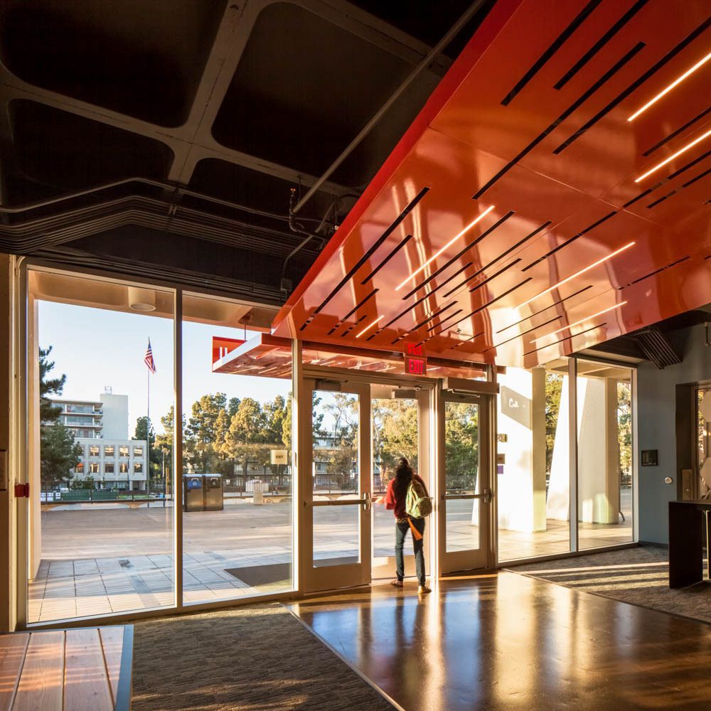
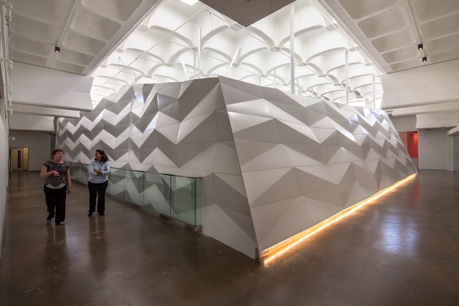
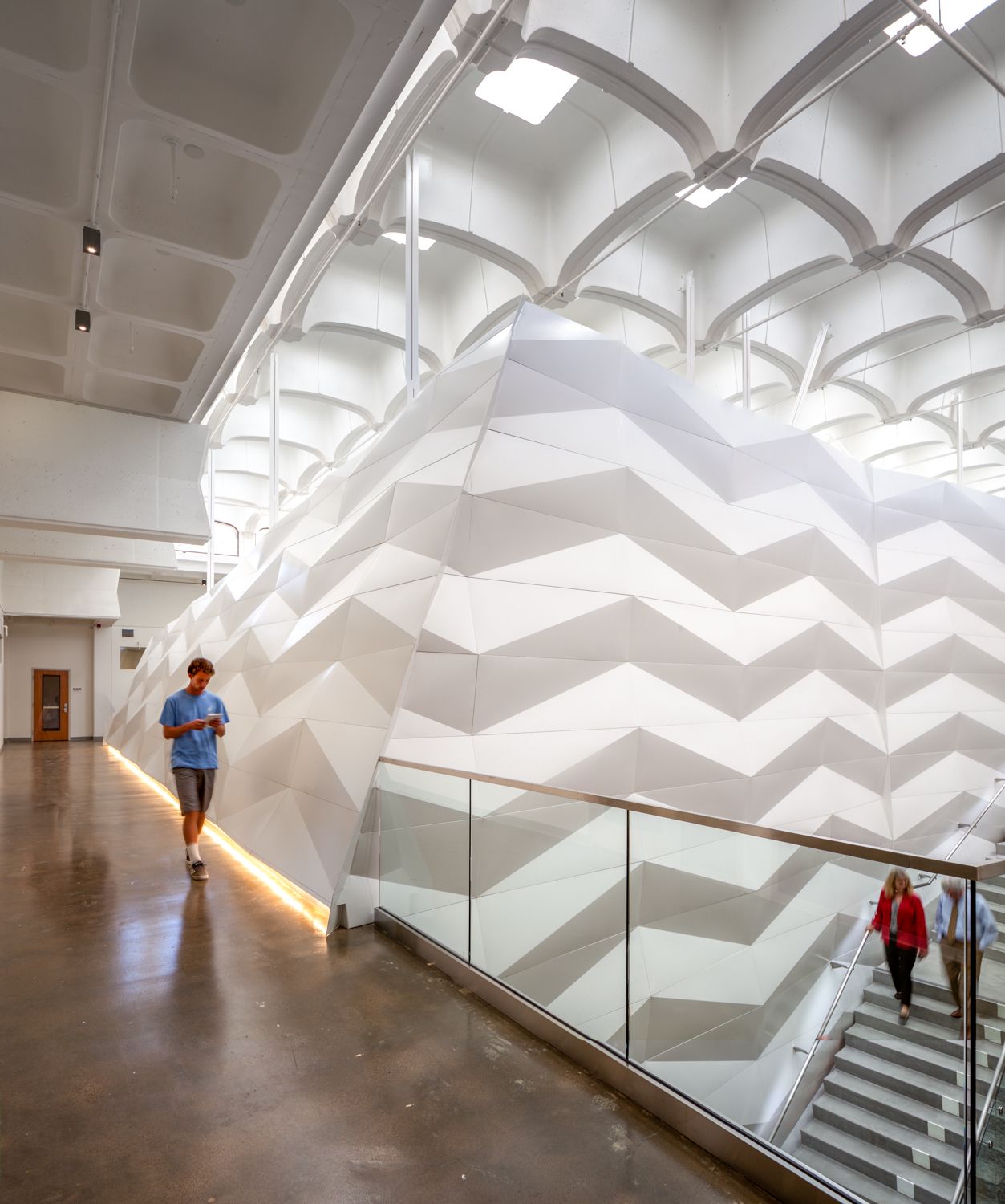
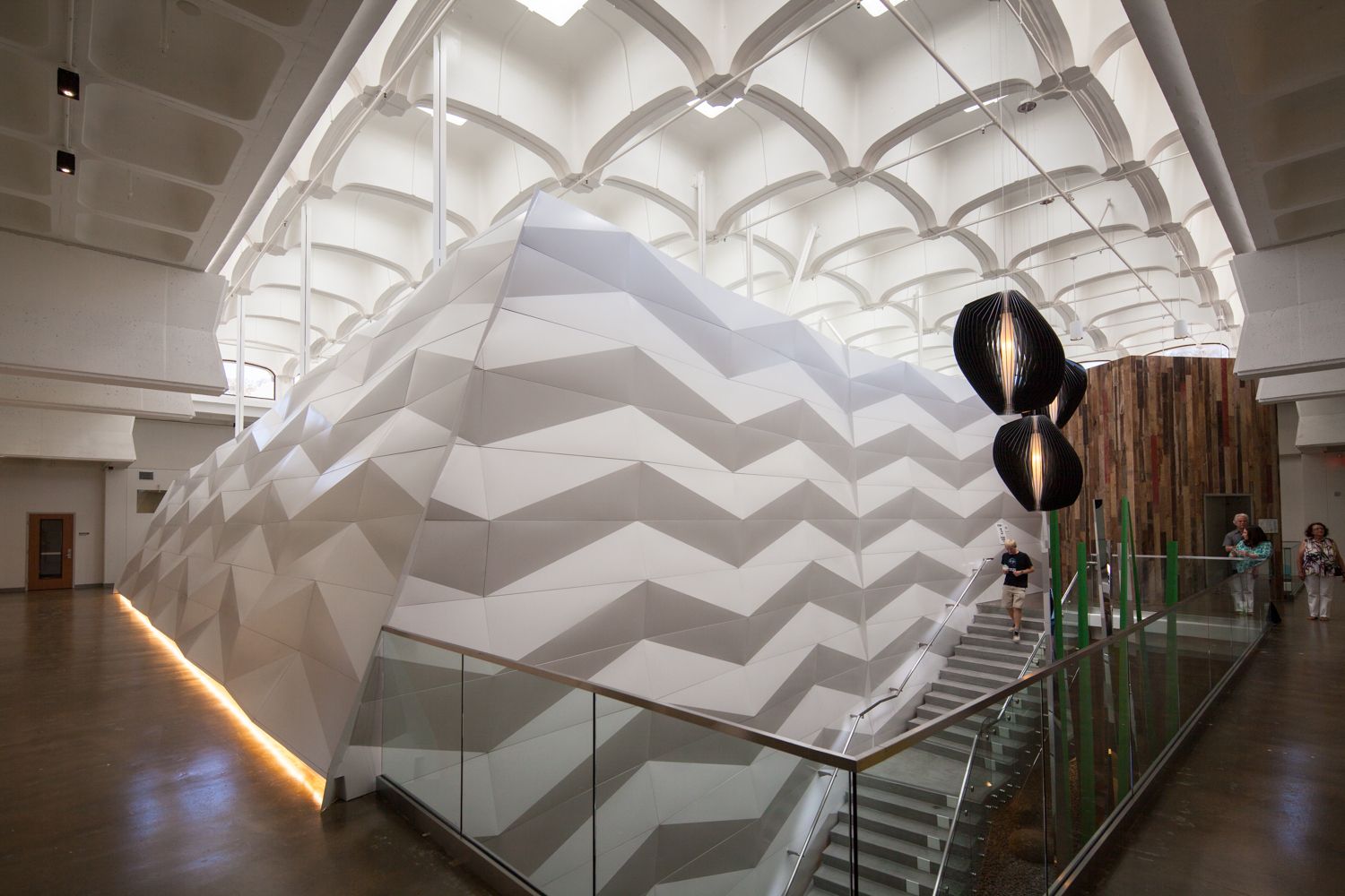
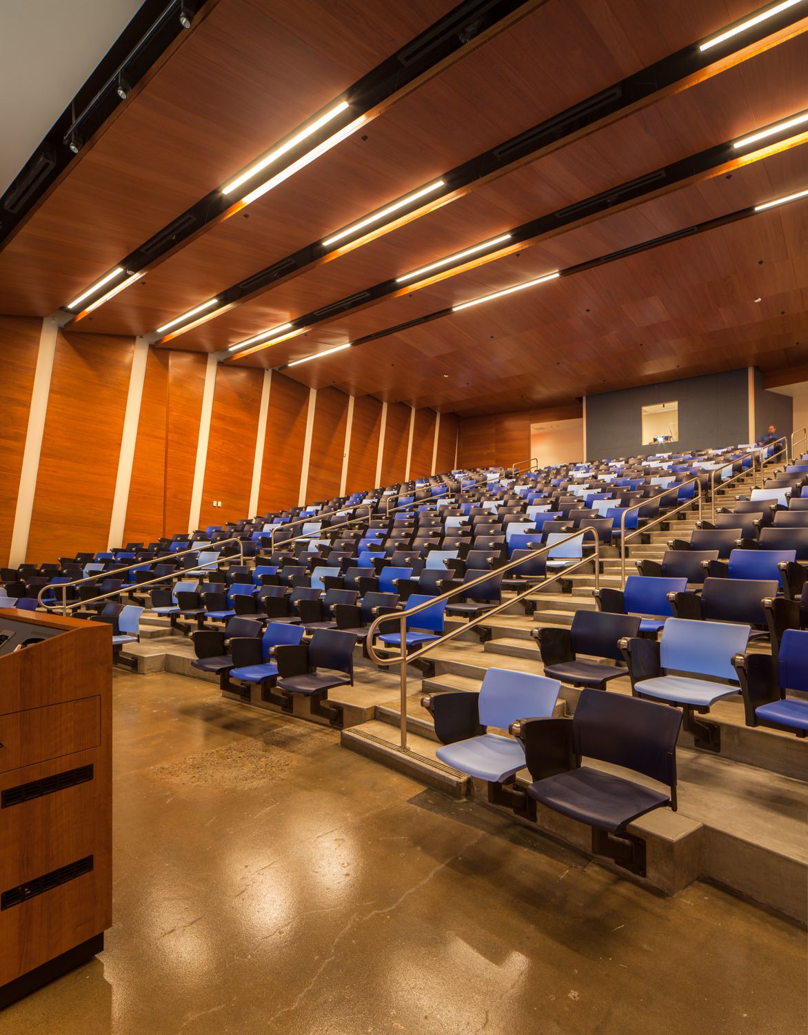
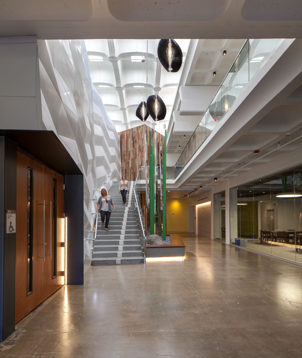
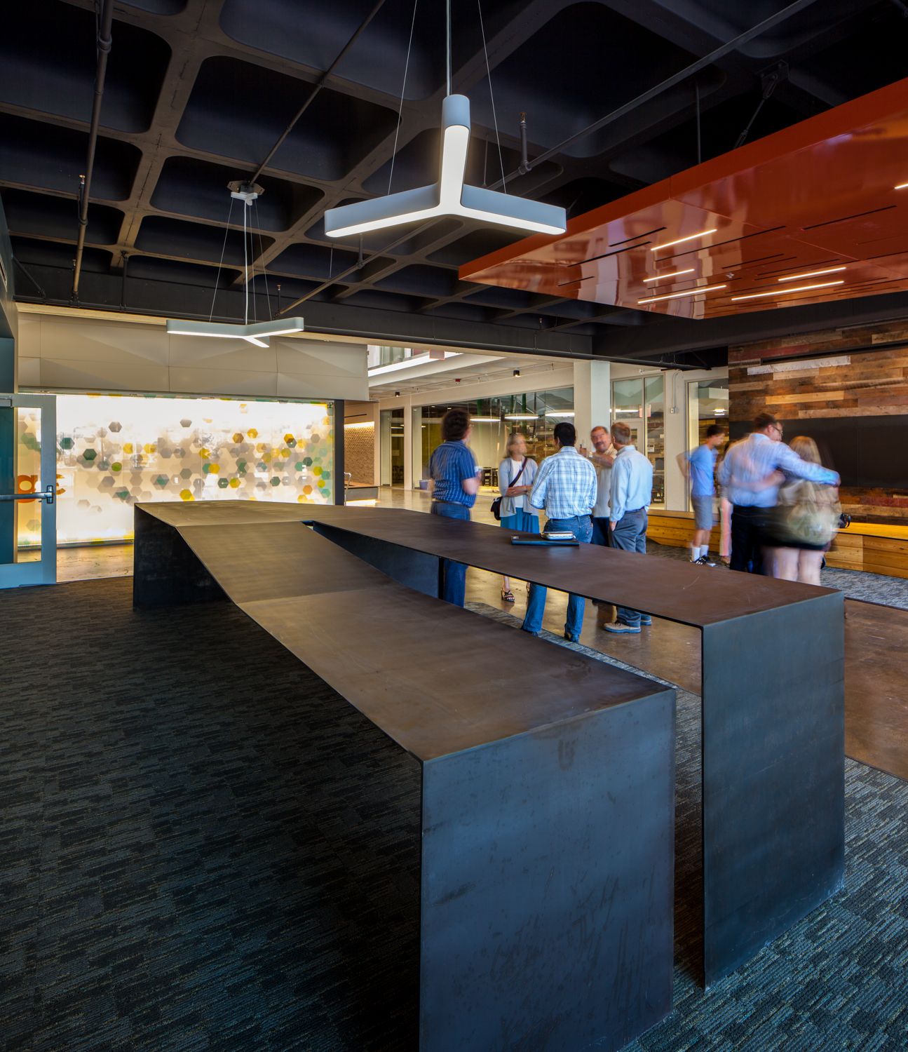
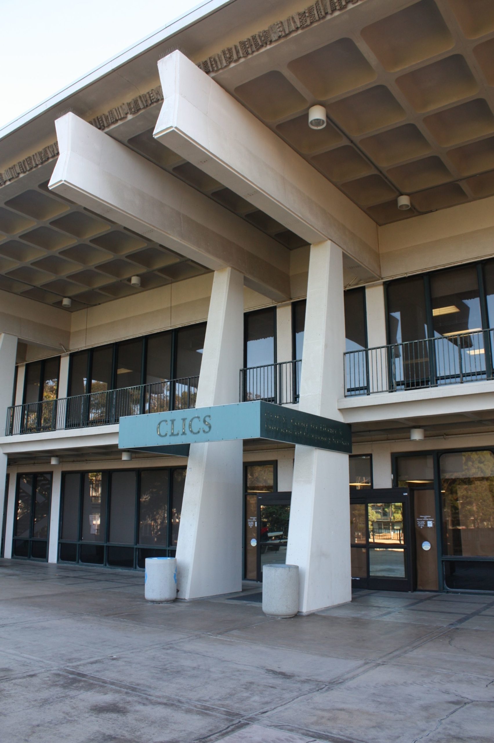
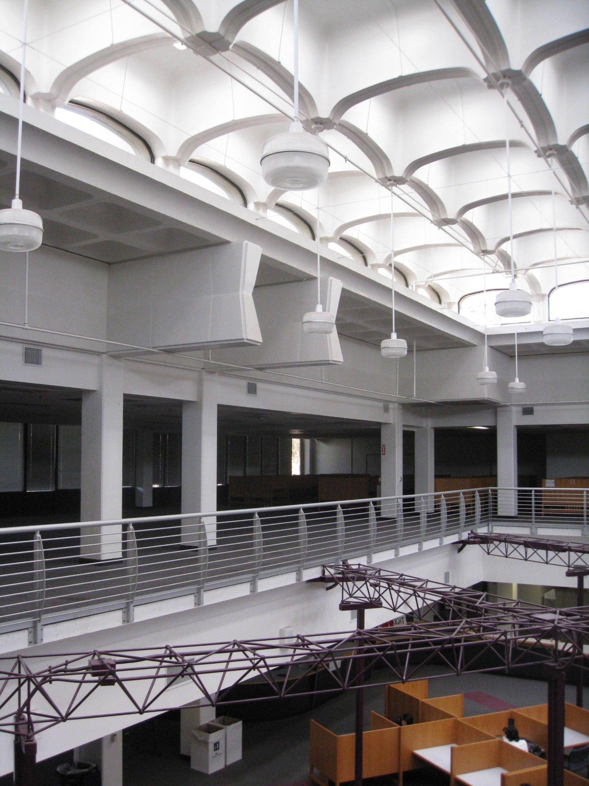
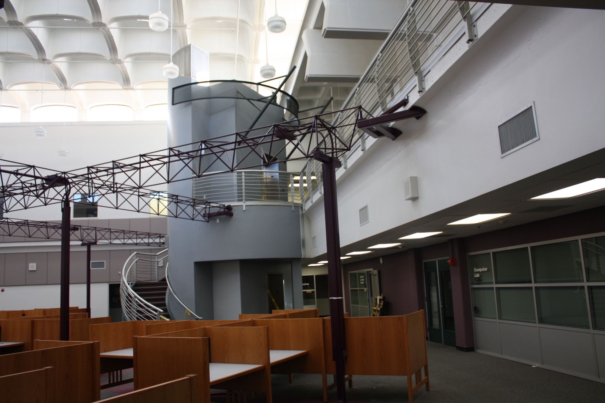
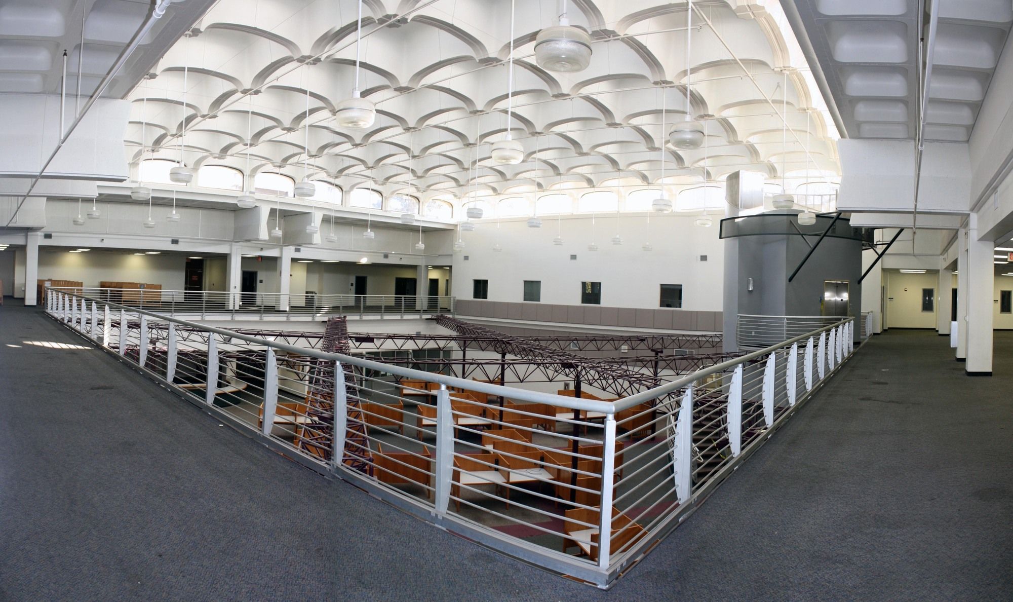
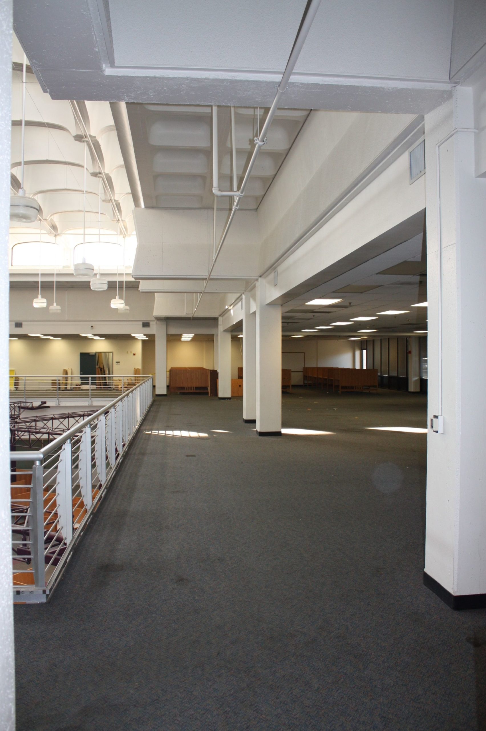
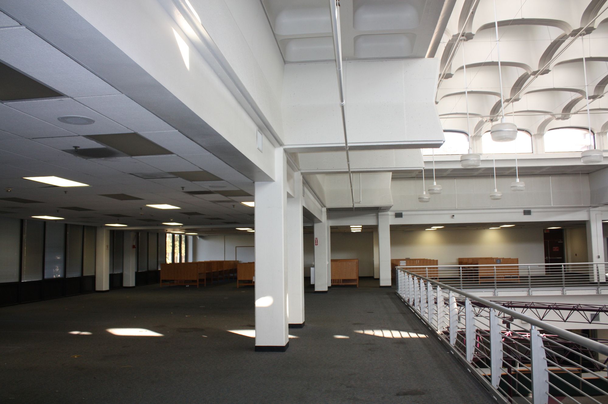
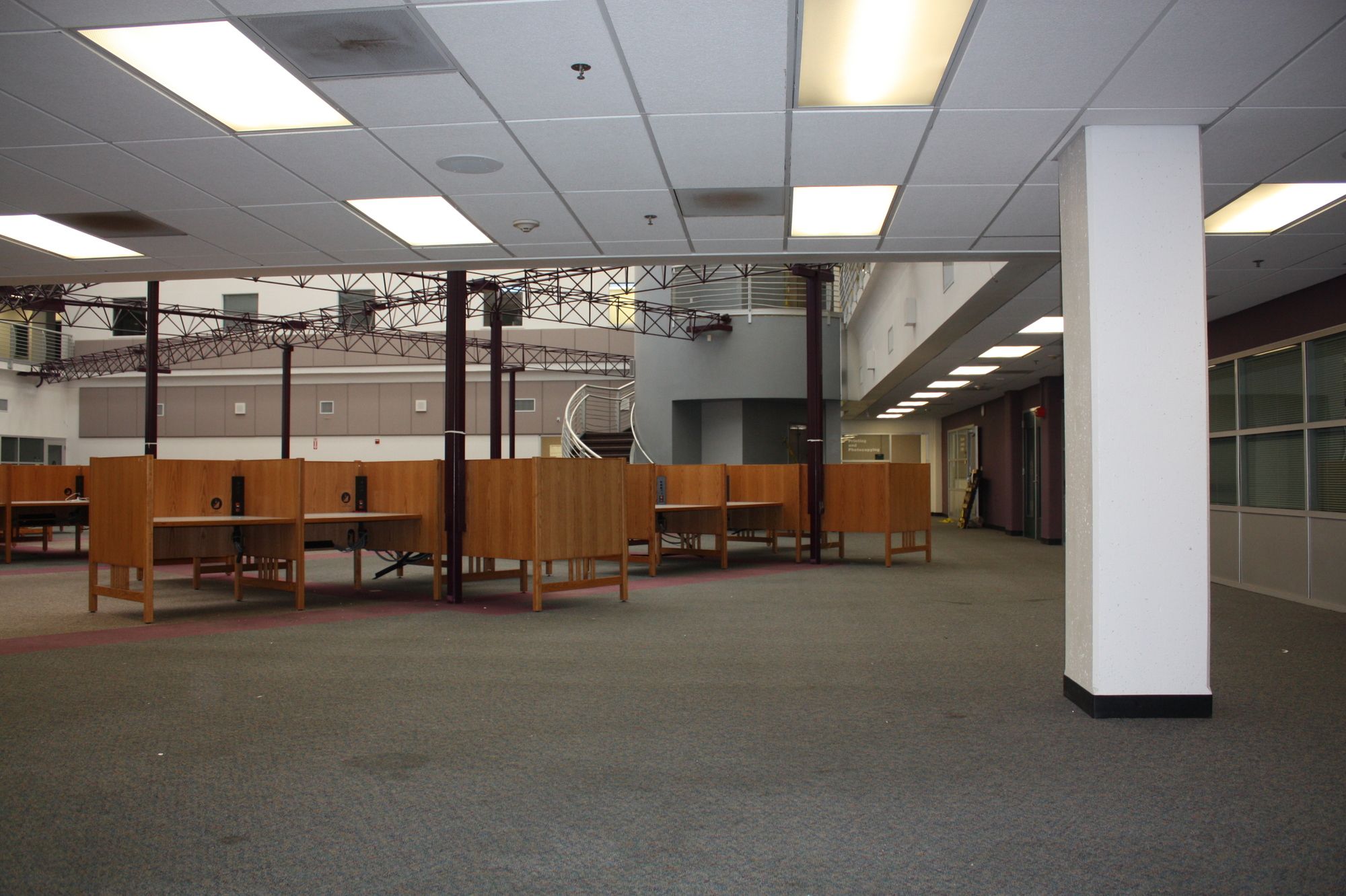
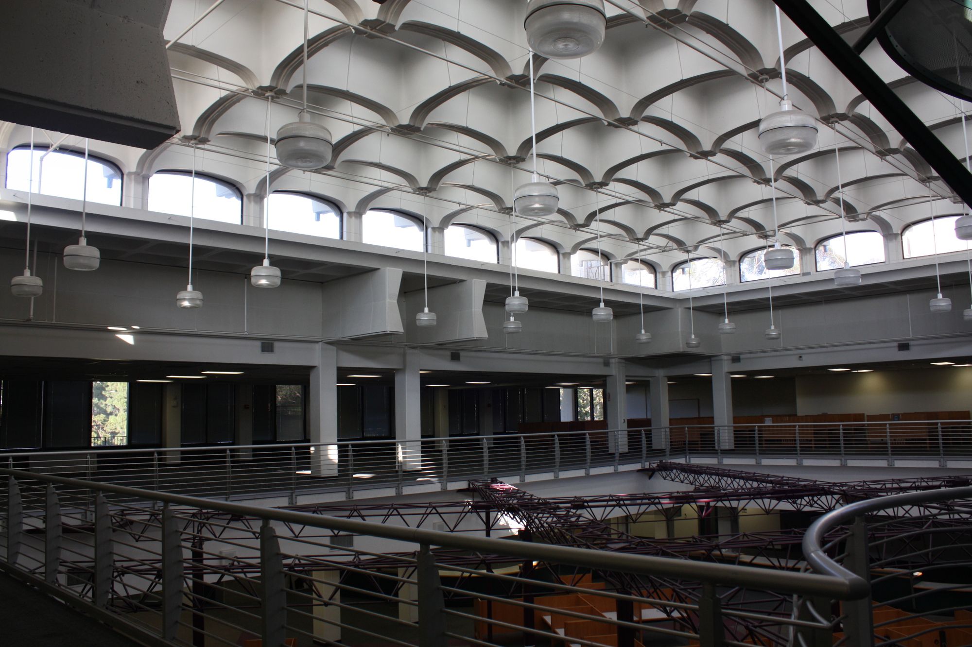
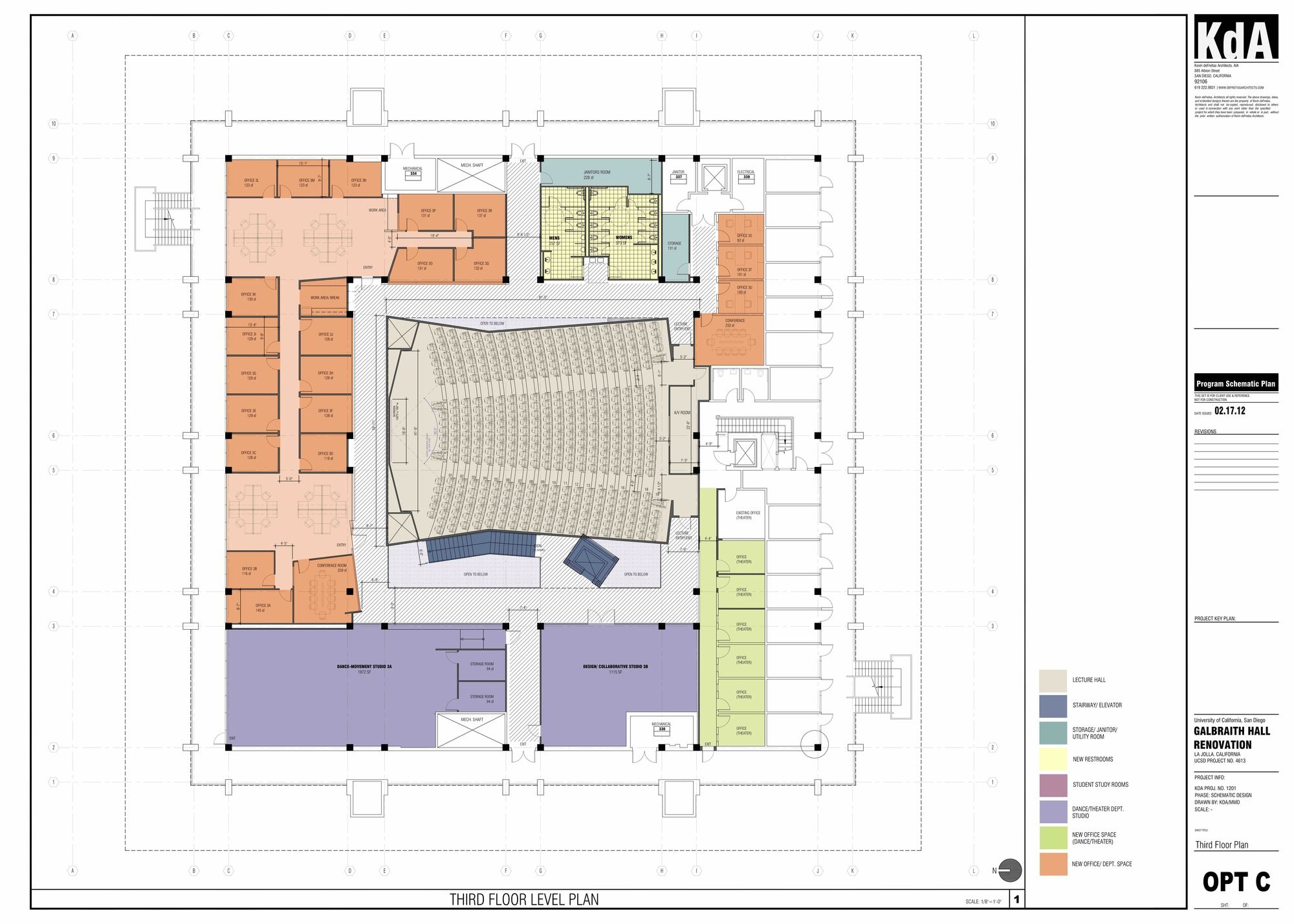
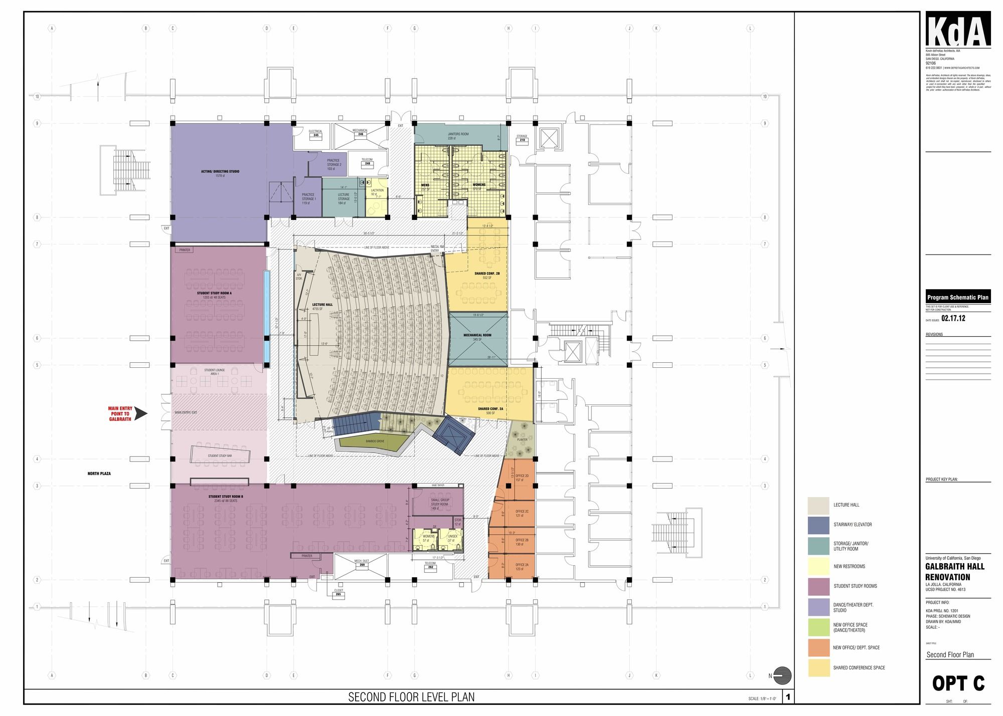
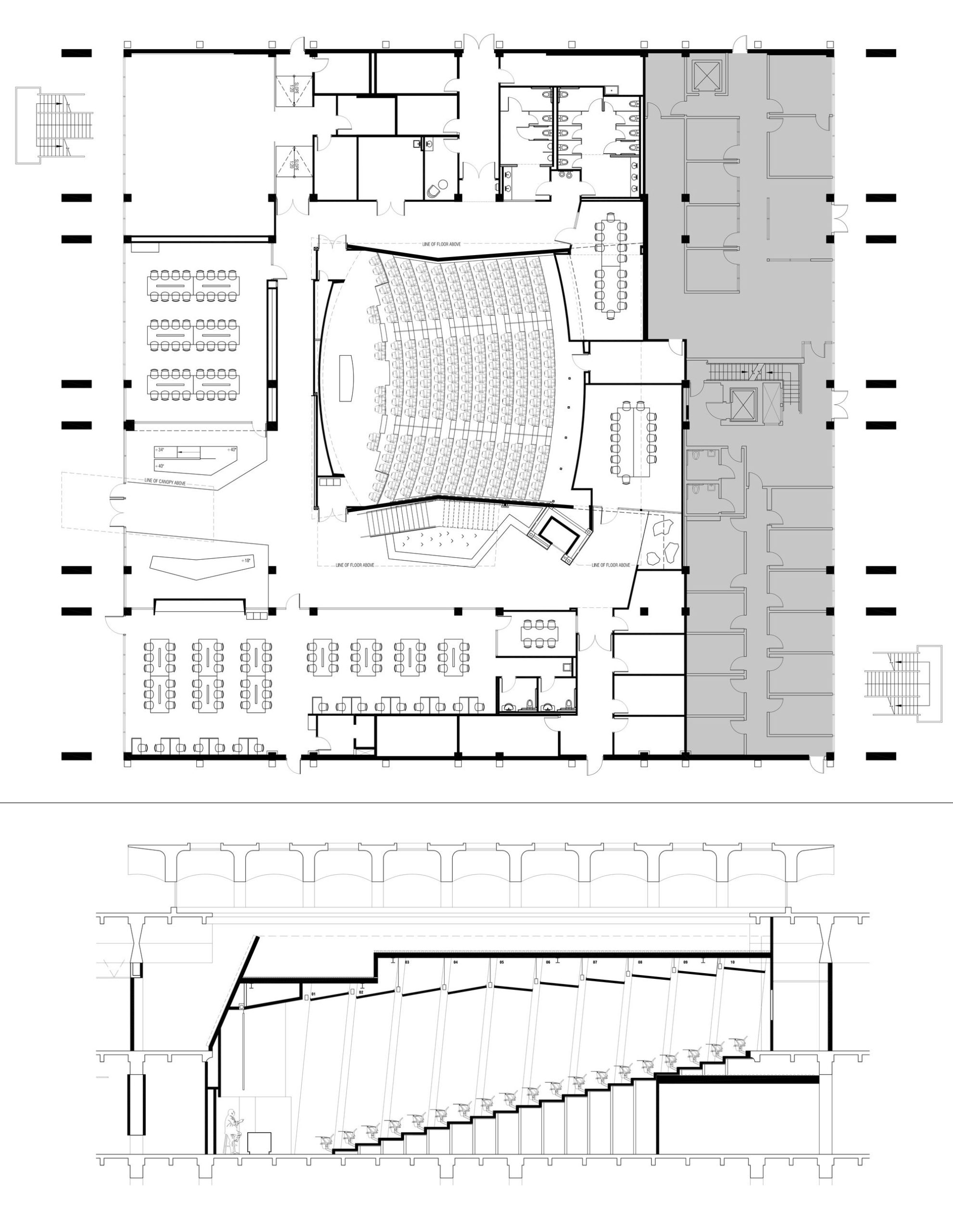
This project involved adaptively repurposing a local University’s 1960’s era library into a new diverse mixed-use program. 30,000 s.f. of the former reading room and book stack areas were transformed to accommodate a new 420 seat lecture auditorium, a pair of student study halls, three theater & dance practice studios, shared conference rooms, faculty offices, new ADA restrooms, and typ. support spaces. Respecting the original mid-century design, layers of dated remodel work was removed to expose the building’s concrete structure, specifically the beautiful waffle slab. There were several existing constraints that the new lecture hall had to accommodate, a confined 70’ square footprint in the plan, the necessity of connecting the upper and lower floor plates, and somehow working around the oddly rotated free-standing elevator.
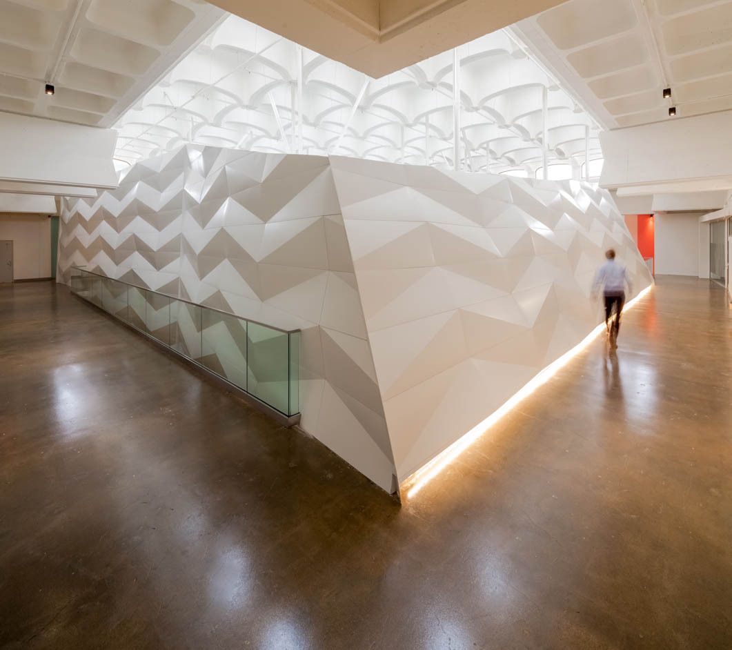
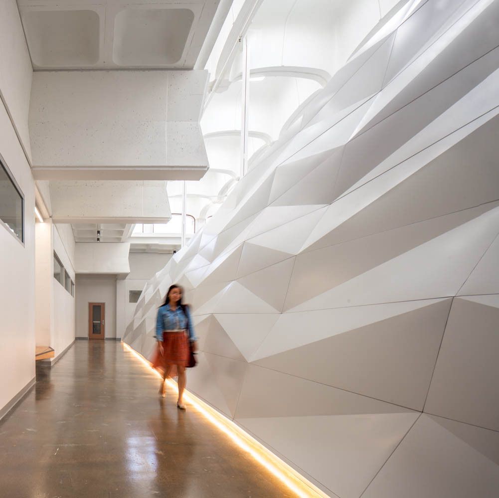
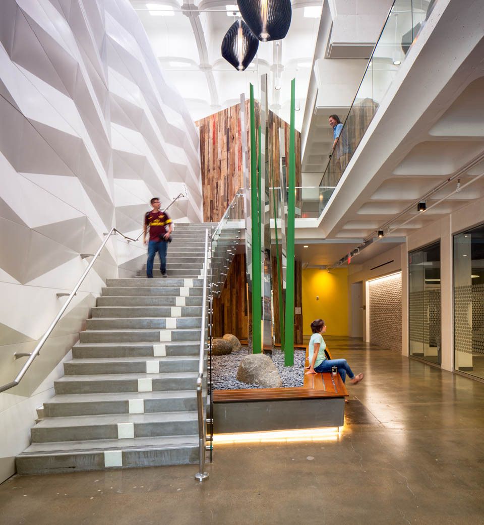
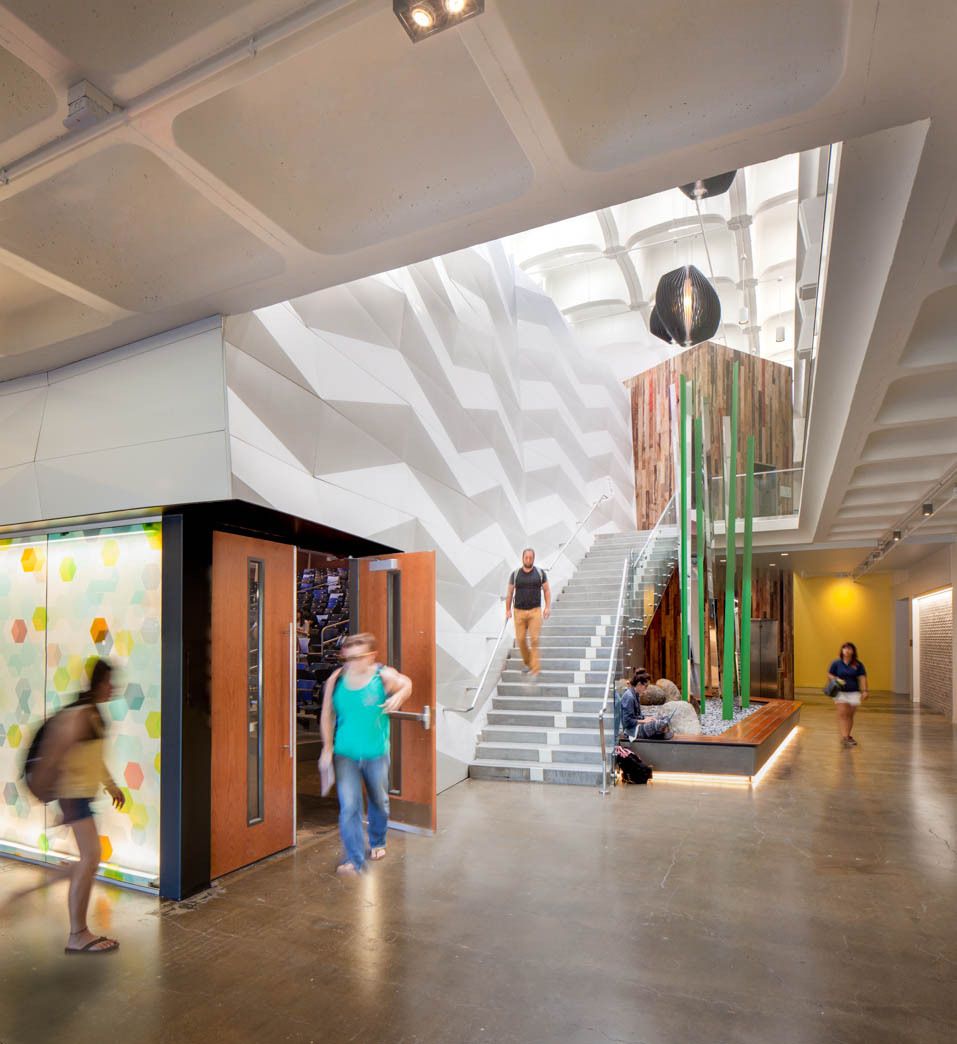
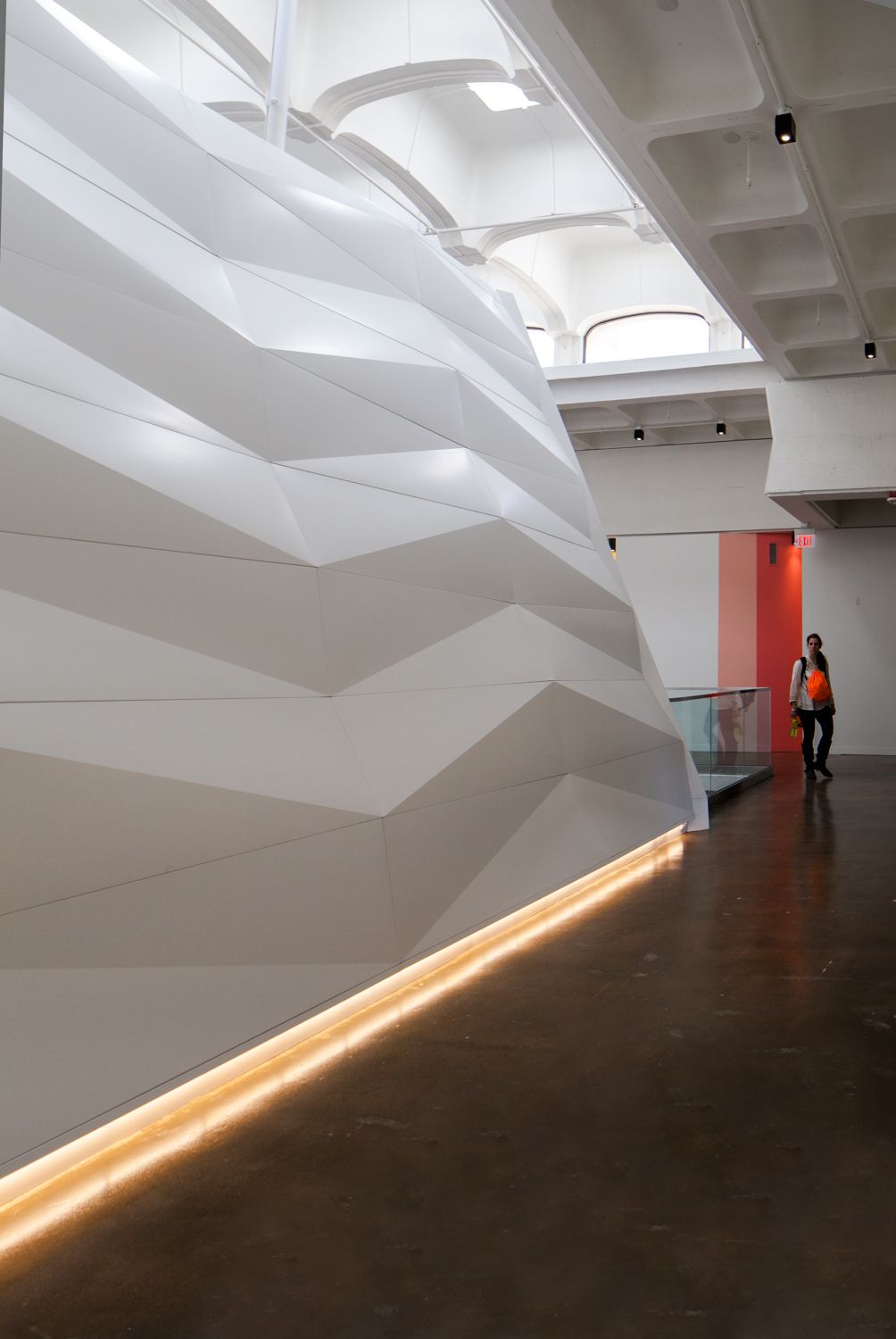
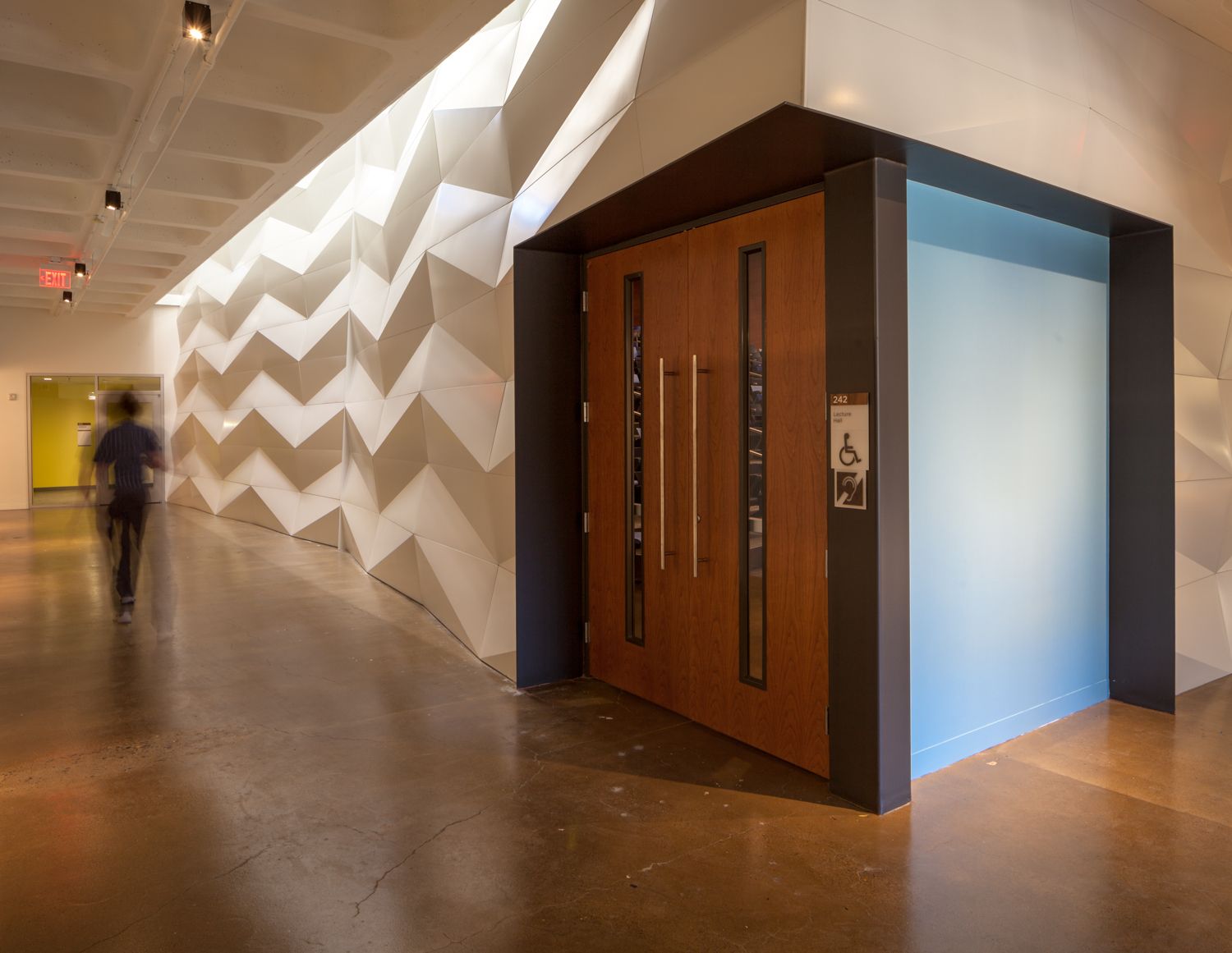
 Taking this context into consideration it made sense to pinch the plan like an hourglass and construct the walls slightly out of plumb to incorporate the elevator and to allow the abundant natural daylight from the skylights to wash down to all areas of the floors below. This move not only improved the quality of the space, but it also dramatically reduced energy consumption while also enhancing the acoustical performance of the auditorium and adjacent interior spaces.
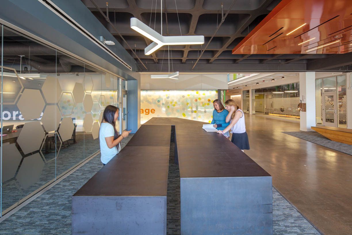
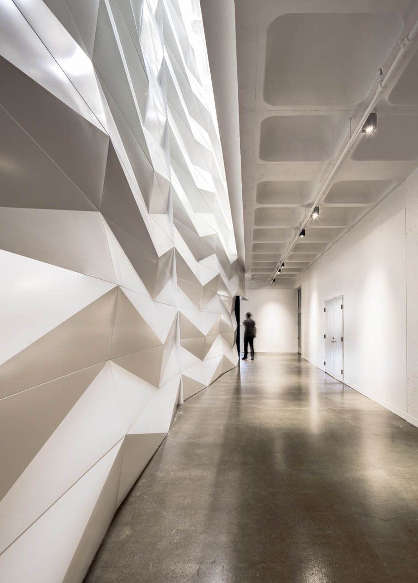
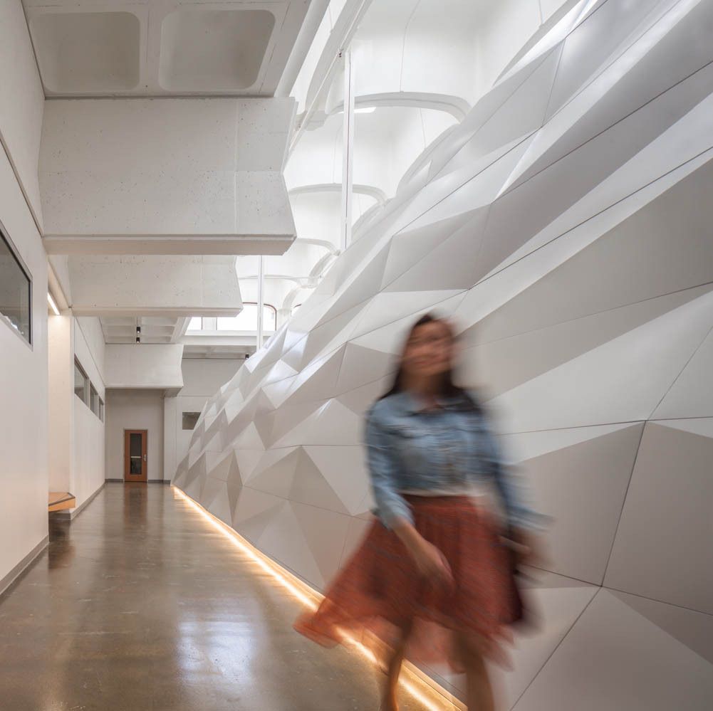
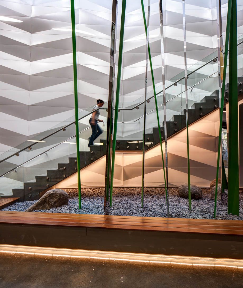
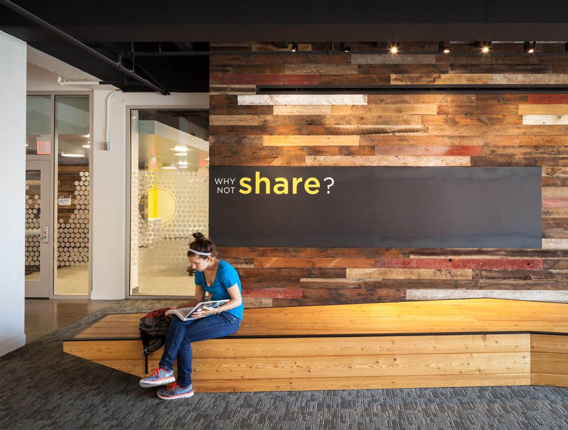
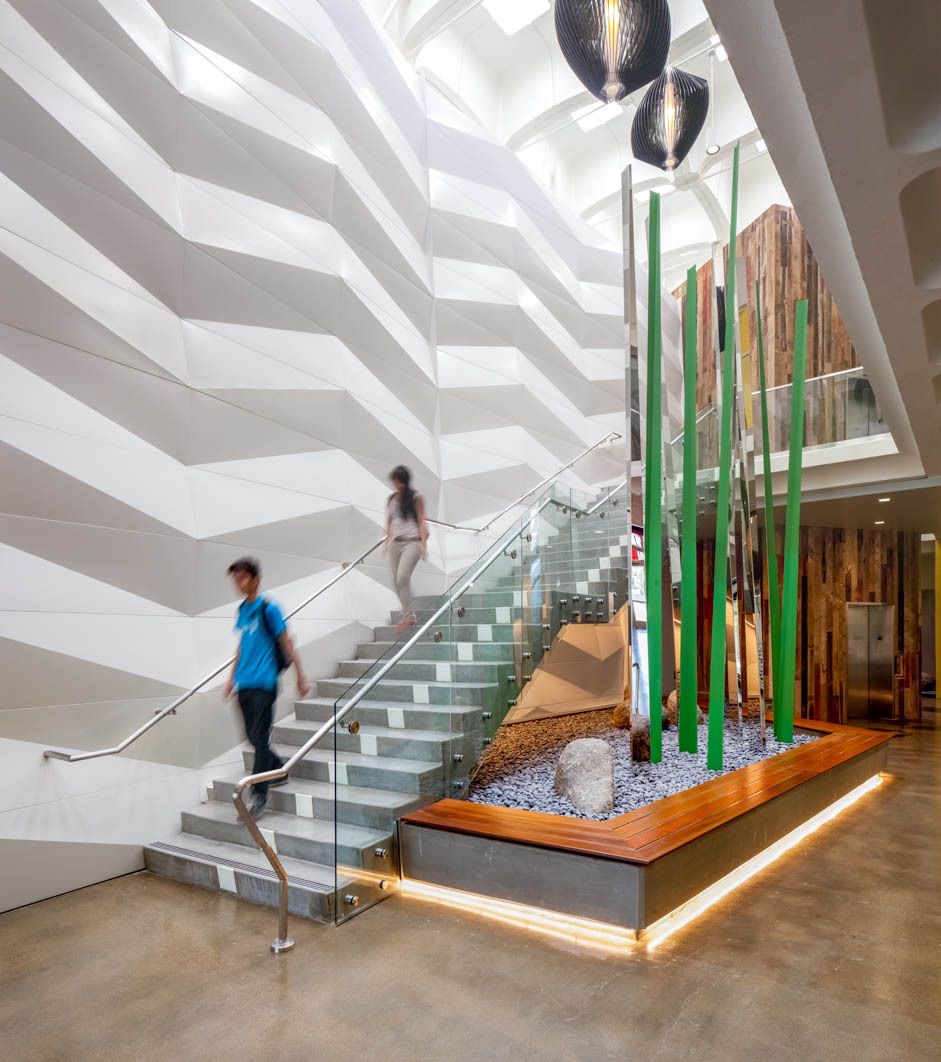
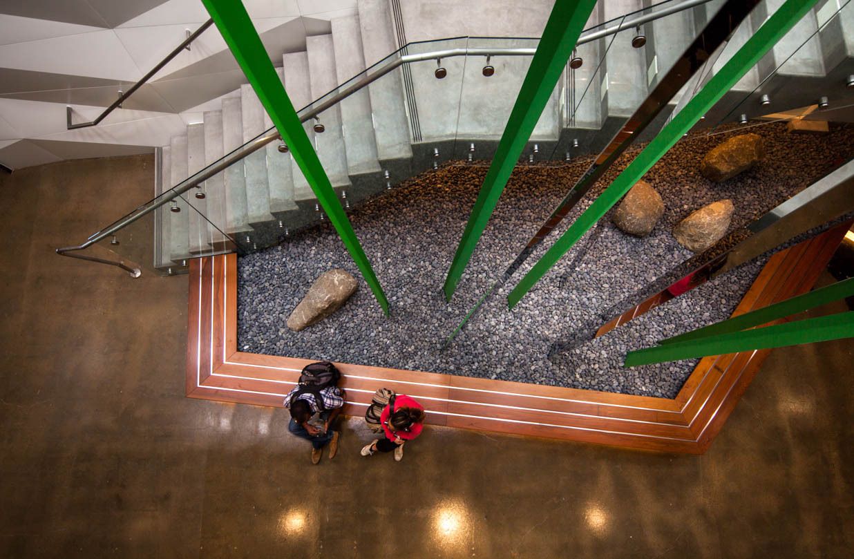
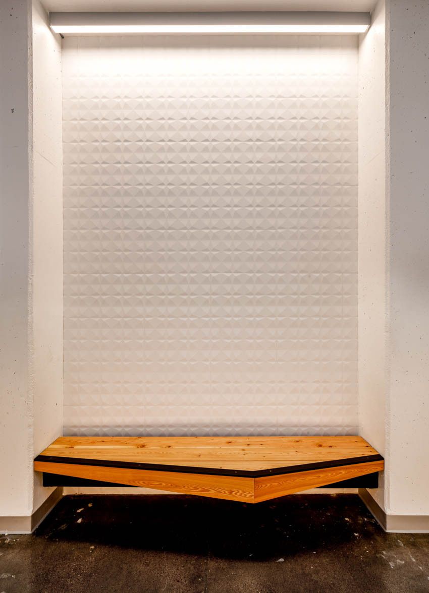
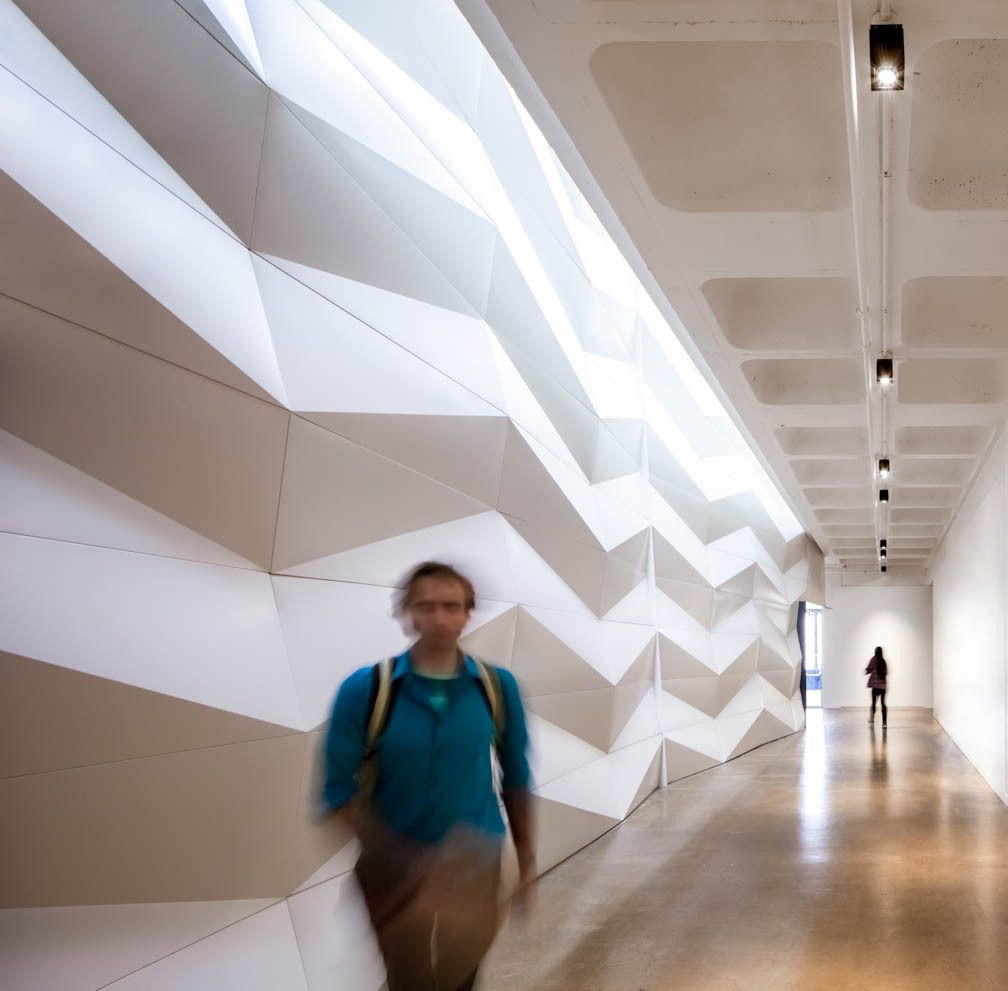
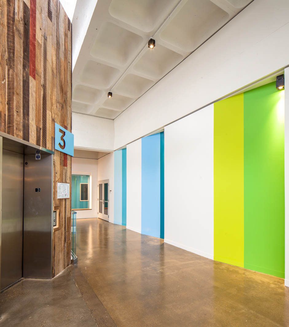
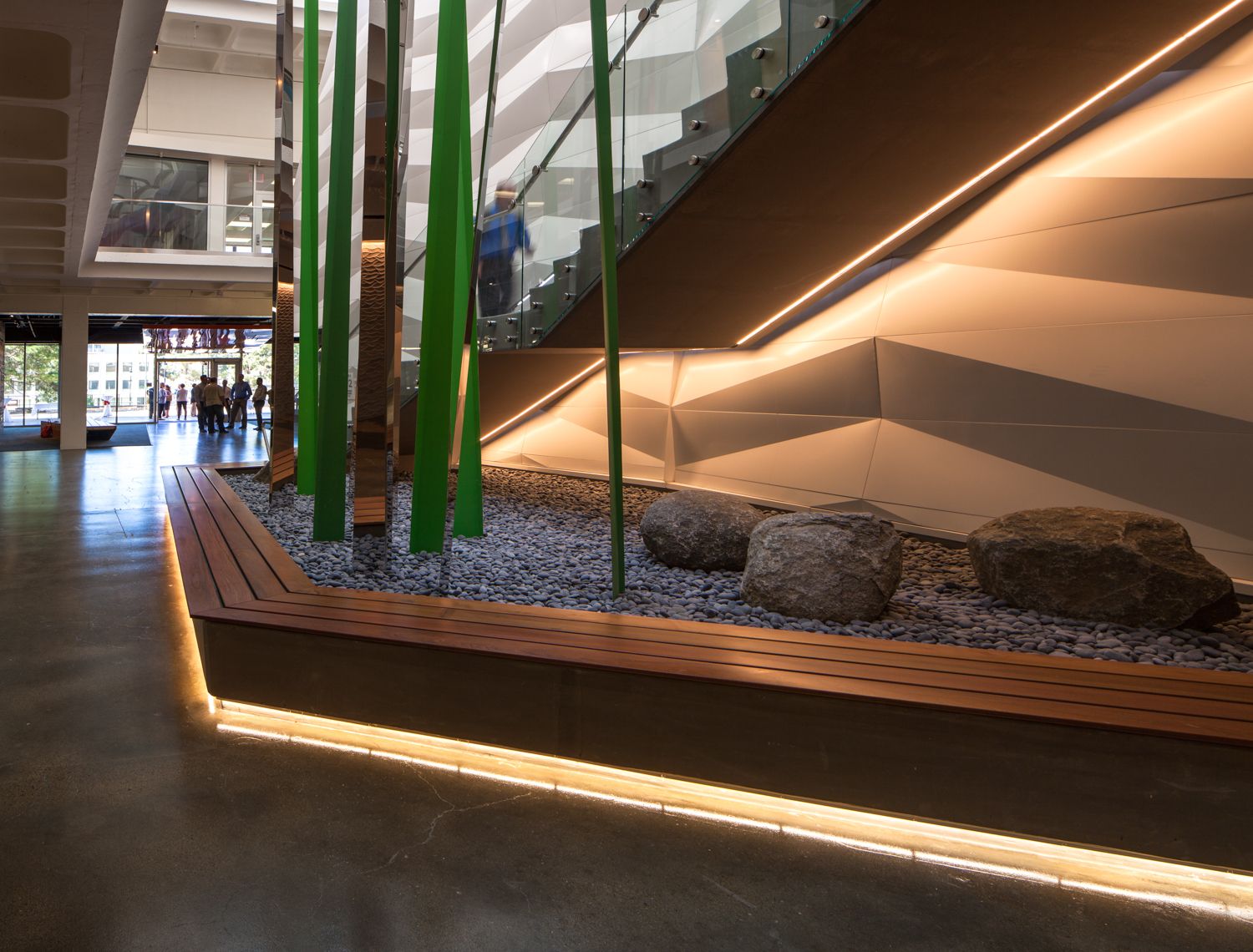
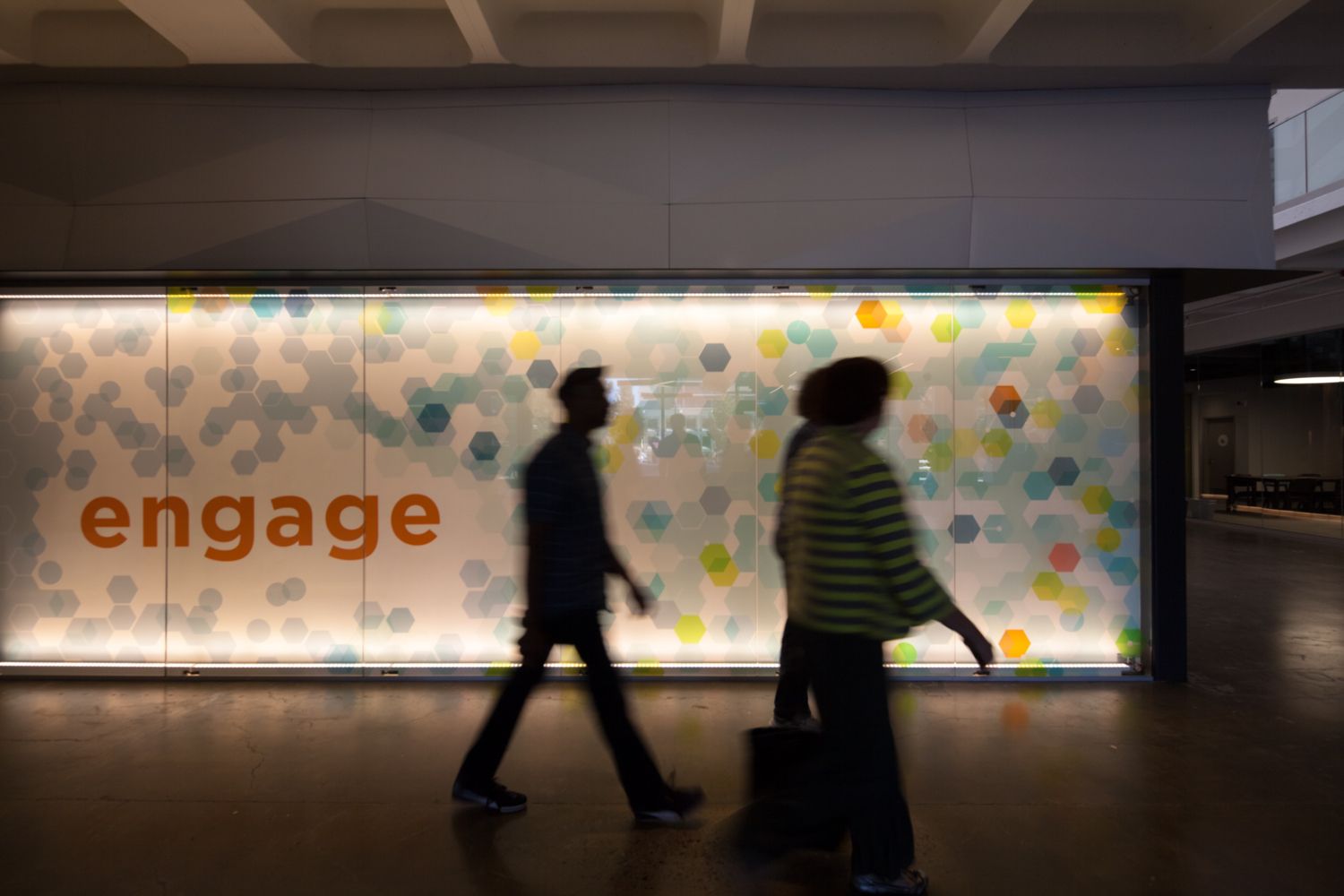
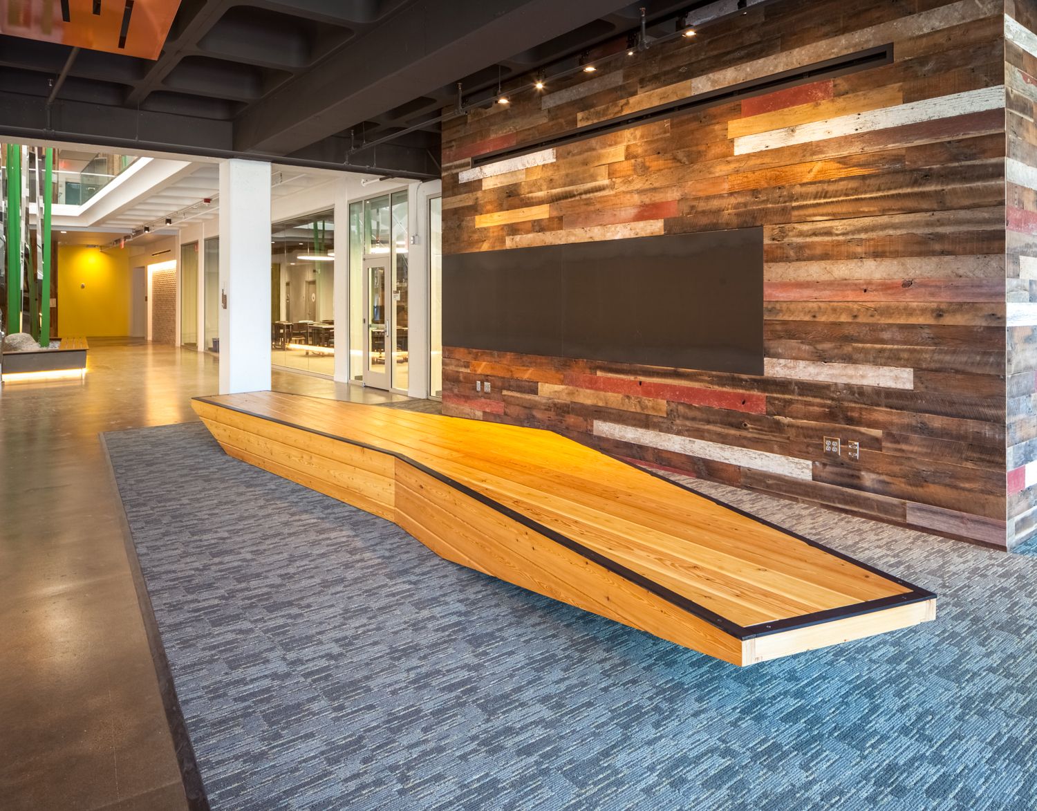
 Where your eyes go, so goes the rest of you! With this in mind the material palette, textures, lighting, and splashes of color are strategically placed to draw users through the building. Visible from the entry, and nearly everywhere else inside, the tall abstracted stainless blades of grass anchor the central light well creating a point of reference and help users intuitively navigate the space. The white auditorium walls are clad in a custom break-metal geometric pattern, which riffs on mid-century era shadow blocks, subtly marking the passage of time as the sun’s movement changes the tone-on-tone color throughout the day.
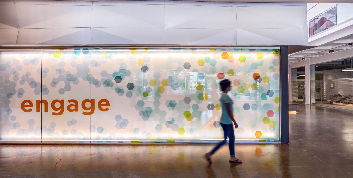
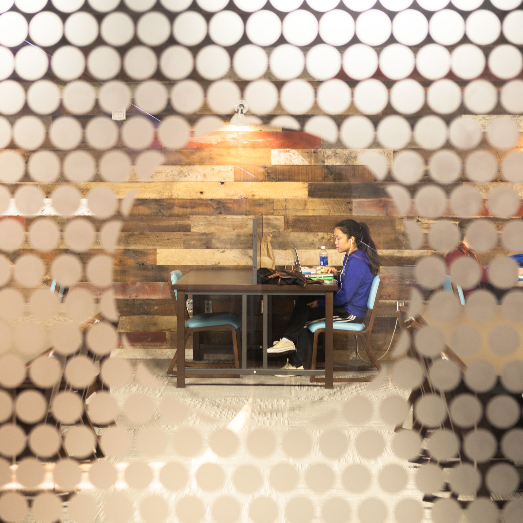
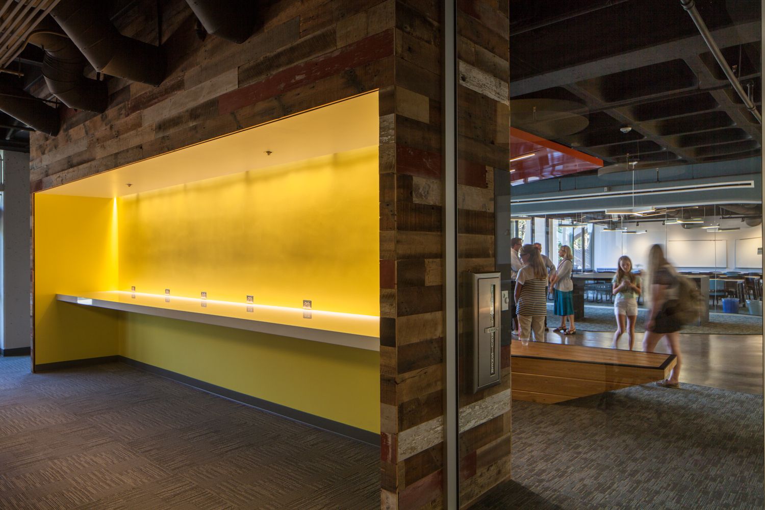
 This re-energized interior is bright, airy, dynamic, and comfortable, meant to feel more like a living room than a laboratory; a terrific place for students and faculty to engage, discuss, practice, and learn. The porcelain tiles in matte white were used to capture the subtle variations of natural light that moved throughout the day, adding warmth, texture, and a reference to time.
 Project Info
Architects: Kevin DeFreitas Architects
Location: San Diego, California
Architects in Charge: Kevin DeFreitas, Manish Desai
Manufacturers: Zurn, Pilkington, Porcelanosa Grupo, Dunn Edwards
Environmental Graphics + Signage: Bowyer, Emily Desai
Structural Engineer: DCI Engineers
Lighting Designer: Syska Hennessy Group Robert Fagnant
Mechanical, Electrical + Plumbing Engineer: Syska Hennessy Group
Acoustical Engineer: VSA & Associates
LEED Consultant: Green Fields Consulting
Custom Furniture: Christopher James Gay Designs
Original Architect: Deems, Lewis, Martin 1964
LEED Rating: Gold, CI
Year: 2013
Type: Mixed Use, Offices, Cultural center
Photographs: Darren Bradley
